think smart think neutral think helvetica
DESCRIPTION
Typography BookletTRANSCRIPT

.1think helvetica
think HELVETICA
think smartthink neutral

.1think helvetica
“When something is constructed as well as Helvetica, it should last for a
couple of hundred years, just like great architecture.”
-Danny van den Dungen-

1. think smartthink neutral
ABCDEFGHIJKLMNOPQRSTUVWXYZabcdefghijklmnopqrstuvwxyz1234567890?.!,(*”&#@$}>

.2think helvetica
Helvetica is considered as a sans-serif type face. It has been used
widely since first invented on 1957.
It is the most ubiquitous design that represent clarity and
simplicity of modernism. It is neutral and democratic, it can be used in a wide variety scope, be
it as a display text, or a bodytext.

3. think smartthink neutral
Helvetica was developed by Max Miedinger with Eduard
Hoffmann in 1957 for the Haas Type Foundryin Münchenstein, Switzerland. It was modeled after Akzidenz-Grotesk (thefirst sans-serif) and the design was based on Schelter-Grotesk and Haas’ Normal Grotesk.
It is originally named Neue Hass Grotesk, but then changed to ‘Helvetia’, which is the original Latin name for Switzerland, in 1960 by Haas’ German parent company, Stempel Company. But Eduard Hoffmann disagree, he thought it wouldn’t be appropriate to name a type after a country. He then decided on ‘Helvetica’ which meant ‘Swiss’.
sho
rt h
isto
ry
In 2007, director Gary Hustwit released a documentary, Helvetica, to coincide with the fiftieth anniversary of the typeface.
On 2008 a Helvetica exhibition was held at Laforet Museum in Harajuku, sponsored by Grand Petit Publishing and Asmik Ace Entertainment, with screenings of the film, workshops, and more. The Japanese edition of the film was released during that time.
Also, an exhibition called “50 Years of Helvetica” was dispkayed in Museum of Modern Art in New York City from April 2007 to March 2008.
Helvetica was rated #1 on FontShop Germany’s list “Best Fonts of All Time”.
acknowledgement

.4think helvetica
Lat in , Cyr i l l ic , Hebrew, Greek, Japanese, Korean, Hindi , Urdu, Vietnamese and even Khmer.
The Chinnese is st i l l developed.
LANGUAGE VERSIONS

5. think smartthink neutral
USAGE
N e w Y o r k C i t y
Helvetica is a popular choice for commercial wordmark. There are
many company that uses Helvetica for their logo, such as Nestle,
Kawasaki, Evian, BMW, Microsoft, Muji, Tupperware, Mattel, Energizer,
Target, Orange, Lufthansa, Panasonic and many more.
Helvetica is used by Apple Inc. in Mac OS X (as default font for
sans-serif/Swiss generic font family), iOS (previously iPhone OS),
and the iPod. It is also widely used by the U.S. government; for
example, federal income tax forms are set
in Helvetica, and NASA uses the type on the Space
Shuttle orbiter.
New York City’s Metropolitan Transportation Authority uses
Helvetica for many of its subway signs since 1989. Before that, from
1970 until 1989 the standard font was Standard Medium, another
Akzidenz Grotesk-like sans-serif, as
defined by Unimark’s New York City Transit Authority
Graphic Standards Manual.
The MTA system is still rife with a proliferation of Helvetica-like
fonts, including Arial, in addition to some old remaining signs in
Medium Standard, and a few anomalous signs in Helvetica Narrow.

.6think helvetica
The Chicago Transit Authority uses
Helvetica on its signage for the Chicago
‘L’. The former state owned operator of
the British railway system developed its
own Helvetica-based Rail Alphabet font,
which was also adopted by the National
Health Service and the British Airports
Authority. Additionally, it was
also adopted by Danish railway
company DSB for a time period.
C a n a d a
C h i c a g o
M a d r i dP h i l a d e l p h i a
U n i t e d S t a t e s
Canada’s federal government uses
Helvetica as its identifying typeface,
with three variants being used in its
corporate identity program, and
encourages its use in all federal
agencies and websites.
Philadelphia’s SEPTA uses Helvetica
exclusively for its signage.
The logo and graphic identity of
the “Metro” (Underground) in
Madrid are Helvetica Regular
and Helvetica Neue.
Helvetica is also used in the United
States television rating system.

Max
Mie
ding
erth
e de
sign
er
“THE PERSONBEHIND THE
FAME OF HELVETICA”
7. think smartthink neutral
When he was 16, Max Miedinger
became an apprentice typesetter at
a book printing office in Zurich. After
four years of appren¬ticeship, he
entered the School of Arts and
Crafts, Abendkurse in Zurich.
At 26, he became a typographer in
the ad¬vertising studio of the Globe
department store chain where he
refined his skills for ten years.
From there he moved on to the
Haas Type Foundry.
He was an independent designer
after leaving the Haas Foundry.
Miedinger also designed Helvetica,
Helvetica Condensed, Helvetica Inserat,
Helvetica Neue, Helvetica Textbook,
Monospace 821 and Swiss 721.

.8think helvetica
The fact that the typeface is clean-cut and simple means that it can be used as a neutral platform in a wide variety of settings, it is the particular context and content of the messages that convey their meaning.The optimism with which Helvetica was created and taken up worldwide proved it had all the right qualities for rejuvenating attitudes to and uses of design. The great thing about Helvetica is that no matter the size, the spacing or the lewading, you can still see the consistency and that is the beauty of Helvetica. Due to widespread use, Miedinger’s font grew into an anonymous, almost generic-looking font. Because it was embraced and used so often, it became the norm. In fact, the Helvetica font ended up being the default font choice almost from its inception. And when laser printers and desktop publishing software took off, Helvetica had a firm foundation as the sans serif font of choice.

o v9. think smart
think neutral
Helvetica means “Swiss” which is appropriate because Helvetica uses the Swiss style of graphic design which relies heavily on sans serif styling and a preference for photography over illustrations.
o v vO
o o. .
3.10think
helvetica
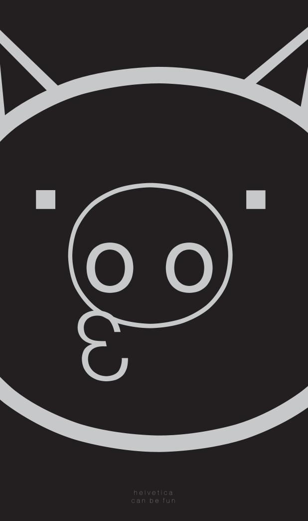
h e l v e t i c ac a n b e f u n

11. think smartthink neutral
t h e f a m i l y
vl ln
io

Helvetica Condensed Bold Helvetica Condensed
Black Helvetica Ultra Light Helvetica Ultra Light Helvetica Light
Helvetica Light Italic Helvetica Regular Helvetica Italic Helvetica Medium Helvetica Bold
Helvetica Bold Italic
.12think helvetica
Y
Y 333
33
33
3 33
3 333
33
YY Y
YYY
Y

HELVE TICAHELVE
TICAHELVE
TICAHELVE
TICA HELVE
TICA13. think smartthink neutral

HELVE TICAHELVE
TICAHELVE
TICAHELVE
TICA HELVE
TICA .14think helvetica
comparisonHelve t i ca m igh t l ook the same as the res t o f sans-se r i f
t ype face , bu t ac tua l l y He lve t i ca i s un ique in i t ’s own way.

There were other fonts released in 1957 besides Helvetica. Those fonts are Univers and Folio. The three of them are sometimes confused with each other, because each is
based on the 1898 typeface Akzidenz-Grotesk.
15. think smartthink neutral

.16think helvetica
After Helvetica was released, lots of similar fonts were created and among them are these popular fonts: Arial, Futura, and Gill Sans.

17. think smartthink neutral
v a r iHelvetica NarrowThe width is between Helvetica Compressed and Helvetica Condensed. It is mathematically squashed to 82% of the original width, resulting in distorted letterforms and thin vertical strokes next to thicker horizontals.
Adobe doesn not allowed such distor-tion and so Helvetica Condensed is recommended instead.
Helvetica LightDesigned by Stempel’s artistic director Erich Schultz-Anker, in conjunction with Arthur Ritzel.

.18think helvetica
Helvetica Textbook1, 4, 6, 9, I, J, a, f, j, q, u, μ, and ¶ are drawn differently from the original version.
Helvetica CompressedDesigned by Matthew Carter.Tighter than Helvetica Condensed. It has a curved tail Q, downward pointing branch in r and tilde bottom £.
The family consists of : Helvetica Compressed, Helvetica Extra Compressed, Helvetica Ultra Compressed fonts.
a n t s

19. think smartthink neutral
Helvetica Rounded Has rounded stroke terminators.
The family consists: bold, bold oblique, blactk, black oblique, bold condensed, bold outline
fonts were made
Helvetica WorldAlso called Helvetica Linotype.
It supports Arabic, Cyrillic, Greek, Hebrew and Vietnamese scripts. The
family consists of 4 fonts in 2 weights and 1 width, with complementary italics. Latin kerning and spacing
were redesigned to have consistent spacing.
1957
1978
1978
Helvetica InseratUsage : advertising industry.
Similar metric as Helvetica Black Condensed, but more squared
appearance. The strokes in $, ¢ are replaced by non-strikethrough version and the 4 is opened at top

.20think helvetica
1983
2009
Neue Helvetica Neue Helvetica has heavier punctuation marks, increased spacing in the numbers and more structurally unified set of heights and widths.
Uses a numerical design classification scheme, like Univers. The family consists of 51 fonts including 9 weights in 3 widths (8, 9, 8 in normal, condensed, extended widths respectively).
Neue Helvetica W1GExtra versions: Latin Extended, Greek, Cyrillic scripts support, including subscript or superscript

21. think smartthink neutral
Characteristics
Helvetica has small open counter for both uppercase and lowercase ‘c’ and smallcase ‘e’
It has a double-storey ‘a’ with a curvy tail and the eye looks like a tear drop
The terminal of the small f is close to its cross stroke and the lenght
of the terminal and the cross stem is the same
Bracketed top serif of number 1
Wide bowl and rounded off
square tail of R
The uppercase G has a spur and
wide bar a

.22think helvetica
aDouble-storey a with a curvy tail and the eye looks like a tear drop
- - - e y e - - -

23. think smartthink neutral
RWide bowl and rounded off square tail of R
- - - b o w l - -
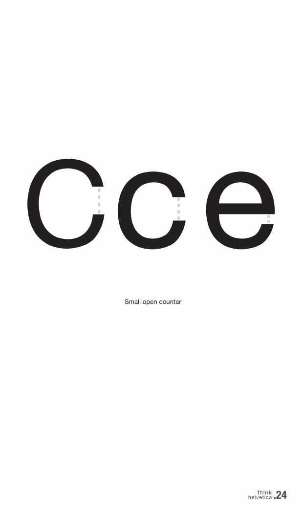
CceSmall open counter
.24think helvetica
R

25. think smartthink neutral
FactsIt is a free commision font and so it is used widely.
Helvetica is a type face with titling figures, means
that the letters have consistent height, it is the
exactopposite of text figures (ex: Georgia).
It is best for bodytext, although Helvetica doesn’t
have two-storey “g” it’s still easy to read as a
paragraph because the x-height is quite
tall and the width is quite narrow.
It’s still okay for a display font because the
uppercase letter stands out and suitable to
give a modern futuristic feelings.

.28think helvetica
Helvetica was a real step from the 19th century typeface. We were impressed by that because it was more neutral, and neutralism was a word that we loved. It should be neutral. It shouldn’t have a meaning in itself. The meaning is in the content of the text and not in the typeface. Wim Crouwel

29. think smartthink neutral
think HELVETICA
think smartthink neutral
© Bernadeta Sugianto