the ultimate guide to logo design
TRANSCRIPT

7/27/2019 The Ultimate Guide to Logo Design
http://slidepdf.com/reader/full/the-ultimate-guide-to-logo-design 1/38
THE ULTIMATE GUIDE TO LOGO DESIGN: 40 PRO TIPSUPDATED: Create a brilliant logo design with this expert advice. We reveal everything
you need to know to craft successful logos. (article from Creative Bloq website)
Logo design is all around us. To the general public, logos serve as an instantreminder of a company or a product; to the client they‟re the point of recognition on
which their branding hangs; and to us designers they represent the challenge of
incorporating our clients' ideologies into one single graphic.
No wonder, then, that logo design features so prominently in our lives. In an age
where everyone must have a website to support their product, service or the company behind it, the demand for a top-class logo has never been higher.
More examples of logo design are out there than ever before, and with that comes the
challenge of being different. How do you create something original that stands out in
a sea of identities? And how do we create something quickly while retaining quality?
In this article, we'll first look at the basic principles of creating a logo design andshare some pro tips for finessing your process...

7/27/2019 The Ultimate Guide to Logo Design
http://slidepdf.com/reader/full/the-ultimate-guide-to-logo-design 2/38
PREPARATION
01. Research your audience
Good logo design doesn't just create something that looks nice - it has to communicate a brand message
Creating a logo design isn't just about creating a pretty visual. What you're doing, or taking part in, is developing a brand and communicatinga position. It makes sense, then, that the first step in creating a logo design should be to research these concepts.
Involving the client at this early stage is advised, as your interpretation of their brand may be different from theirs, and it's essential that the
message is clear before any actual designing takes place.
02. Immerse yourself in the brand
Before even beginning to sketch out ideas for a logo design, spend some time compiling the equivalent of an M15 dossier on your client's
brand: who they are, what they do and what their demographic is.
Look at previous iterations of their logo design and ask yourself what doesn't represent the brand on these. Then compile a 'dos and don'ts'
checklist before your creative work starts.

7/27/2019 The Ultimate Guide to Logo Design
http://slidepdf.com/reader/full/the-ultimate-guide-to-logo-design 3/38
03. Do your online research
Logo Moose is a great research resource for logo design
Two great starting points for online logo design research are Logo Moose and Logo Gala. One thing to be mindful of is knowing when to stopyour logo design research. It's best to look at what did and didn't work out of 10 relevant logo designs than swamp yourself with 50
extraneous ones.
04. Seek inspiration
If you‟re struggling for ideas, try looking up key words in a dictionary or thesaurus or searching Google images for inspirat ion. If you keep a
sketch book then look at previous drawings – you‟re bound to have unused ideas from previous projects, so you may already be sitting on the perfect solution.

7/27/2019 The Ultimate Guide to Logo Design
http://slidepdf.com/reader/full/the-ultimate-guide-to-logo-design 4/38
05. Fight the temptation to imitate
Remember your logo design will need to be used in a variety of different sizes and formats
We all have our design heroes and sometimes we love them so much we want to imitate their styles. Well, they do say imitation is thesincerest form of flattery. However, in the real world it's just a lazy way to solve a creative problem.
Ask yourself whether the style you're using is appropriate for the client's needs. Do they really want a logo design that has the same typeface
Saul Bass used for Quaker Oats in the 70s?

7/27/2019 The Ultimate Guide to Logo Design
http://slidepdf.com/reader/full/the-ultimate-guide-to-logo-design 5/38
06. Don't let clients dictate
Point 2 does not equate to doing what the client tells you. Look through the brief from your client and begin to ask questions about any
vagueness or lazy brief writing you might find there. 'The logo should be iconic' and 'The logo should be memorable' are two extremely
clichéd phrases you need to pull your client up about.
A man kicking a chicken dressed as Father Christmas is memorable but for the wrong reasons. So, as with all commissioned design work, you
need to manage your client's expectations, set realistic goals and find out what exactly your work needs to convey. Logo designs becomeiconic and memorable: they're not created that way.
07. Create a board and rip it up
You could research logo designs all day as there are books and websites by the score containing examples of them. Only make mood boards
out of ones that share similar values. Look at your mood board and analyse what isn't successful about these logo designs. Then rip those
boards up and use these rules as a guide for your own unique creation.

7/27/2019 The Ultimate Guide to Logo Design
http://slidepdf.com/reader/full/the-ultimate-guide-to-logo-design 6/38
INITIAL DESIGN WORK
08. Sketch it out
Get the pencil and pad out before switching on your computer. Picture credit: Ben Powell at www.gogetcreative.co.uk
With a solid understanding of what needs to be communicated, it‟s on to the first sketches: more often than not, these should be the pen and
paper kind. This enables you to be experimental and not get caught up in the finer details.
It's tempting to move straight onto the computer first, but Ben Powell advises you resist the urge. "What did you learn to do first, use a
computer or a pencil and paper?" he asks rhetorically. "Sketching is a much faster way to produce initial ideas before you even touch
Photoshop. It doesn't matter if it's complete chicken-scratch sketching as long as it conveys your ideas correctly and you understand it."

7/27/2019 The Ultimate Guide to Logo Design
http://slidepdf.com/reader/full/the-ultimate-guide-to-logo-design 7/38
09. Create vectors
Vectors are a good 'in-between' stage of logo design. Picture credit: Ben Powell at www.gogetcreative.co.uk
After starting with a sketch, some designers then progress to more technical sketches on graph paper. But the best way to save any pain and
frustration with later iterations of your logo design is to produce it using vectors. Here Illustrator CS6 is your friend as you'll be able to rescaleyour creation without losing any quality. You can copy and paste your logo design into Photoshop as a 'smart object' (again with no loss of
scalable quality), if you need to combine it with other elements.
If you're creating a logo design for screenbased media, be particularly careful of thin lines or very light typefaces. Also consider that different
monitors can make text and graphics appear pixelated or rough.

7/27/2019 The Ultimate Guide to Logo Design
http://slidepdf.com/reader/full/the-ultimate-guide-to-logo-design 8/38
NAILING THE TYPOGRAPHY
10. Choose your typeface carefully
Microsoft's new logo design represents a trend towards clear and functional typography
Typography is obviously central to good logo design. You have two main routes to choose from: creating your own custom typeface or adapting an existing one.
If you create a custom typeface, try not to make it too fashionable because it could date quickly. Keep it simple and legible. Consider thewords that you‟re depicting – if they‟re unusual then a simple typeface might work best; if they‟re common words then you can usually be
more creative as they‟re easier to recognise.
11. Adapt an existing typeface
There's no rule to say you have to create your own typeface, though: consider adapting an existing one.
Removing, extending or joining parts of letters may be enough to make your design unique. It‟s amazing how little you need to see of some
letters for you to still be able to recognise them.

7/27/2019 The Ultimate Guide to Logo Design
http://slidepdf.com/reader/full/the-ultimate-guide-to-logo-design 9/38
12. Avoid gimmicky fonts
Don't be tempted to make your logo design stand out by using gimmicky fonts. They're the equivalent of typographic chintz and there's a
reason why most of them are free. For sheer professionalism's sake you should avoid them at all costs.
Most gimmicky fonts are too fancy, too weak, and are most likely being used (badly) on a hundred different cheap business cards right now.When it comes to logo design, keep your font choices classic and simple and avoid over-garnishing.
13. Consider a type-only approach
Stylised typeface forms Victoria Inn's logo design. Picture credit: Ben Powell at www.gogetcreative.co.uk
You may want to produce a simple execution of a logo design for your client that uses the strength of the typography alone.
Fonts come in all shapes and sizes that resonate differently with strength (slab type fonts, big and powerful); class and style (fonts with
elegant scripts or serifs); movement and forward thinking (type that is slanted). Provided the qualities of the font - be it bespoke or off-the-
shelf - match the qualities of the brand, you're onto a winner.

7/27/2019 The Ultimate Guide to Logo Design
http://slidepdf.com/reader/full/the-ultimate-guide-to-logo-design 10/38
A strong bespoke type treatment for the Unatittel Art Collective by Luke Prowse
Bone up on your typography knowledge by reading this primer and check out the inspired logos designers around the globe have createdusing type alone here.

7/27/2019 The Ultimate Guide to Logo Design
http://slidepdf.com/reader/full/the-ultimate-guide-to-logo-design 11/38
USE OF SPACE
14. Think about the space around your logo design
The British Council has an exclusion zone based on the discs that make up part of its design
Most brand books will specify an exclusion zone. This is an area around the logo design that can‟t be occupied by other content, to protect the
integrity of the logo (and brand by extension).
When you‟re creating a logo design, you need to consider how it should be used. If, for example, your design is intended to be viewed over the top of a photographic image, make sure you present it to the client in that way, and specify that it should be reproduced in this manner
each time it‟s used.

7/27/2019 The Ultimate Guide to Logo Design
http://slidepdf.com/reader/full/the-ultimate-guide-to-logo-design 12/38
15. Use negative space effectively
The FedEx identity is a well-cited example of effective use of negative space in logo design
Some of the best logo designs have hidden meaning in their negative space. A classic example is the Fed Ex logo, which uses the combinationof the letters E and x to form an arrow in the negative space. There are many other great examples where a logo design looks ordinary at first
glance, but reveals interesting and well-thought-out details on further examination. Try to use this principle to add value to your logo design,
but don‟t add shapes and pictorial elements in negative space just because you can!

7/27/2019 The Ultimate Guide to Logo Design
http://slidepdf.com/reader/full/the-ultimate-guide-to-logo-design 13/38
GRAPHIC DESIGN
16. Make your design active, not passive
Twitter's logo design has morphed from a static bird into one in flight over the years, suggesting motion and movement
If you‟re using a device within your logo design that facilitates it, consider adding a sense of movement to your design. This doesn‟t mean
you need to add cartoon-like motion lines, but rather think about the size, position and rotation of elements within your design.
A fish will look in motion if it‟s mid- jump or swim, but will look static if drawn side on as if it‟s been mounted on a wall. You also need totake into account the direction of the implied motion.
In the west, motion towards the left of the stage suggests backwards, regressive movement, while motion towards the right feels progressive
and forward-thinking. This culture-based understanding is formed because we read from left to right. Things are different in the far East, so
make sure you understand where your principal market is.

7/27/2019 The Ultimate Guide to Logo Design
http://slidepdf.com/reader/full/the-ultimate-guide-to-logo-design 14/38
17. Consider tones as well as colours
Logo designs need to work in black and white as well as colour. If your logo design uses colour to convey meaning, think about how you can
reflect that meaning when the colour is removed. Sometimes this may mean changing the contrast relationship between different elements of
your design so that they still convey meaning when reproduced in monotones.
18. Be experimental
Cut & Splice's logo design is ever-morphing and never the same twice

7/27/2019 The Ultimate Guide to Logo Design
http://slidepdf.com/reader/full/the-ultimate-guide-to-logo-design 15/38
Don't feel you have to be constricted by formal notions of what a logo design is or does. For example, designer Luke Prowse came up with a
highly original use of logo and brand identity for music event Cut & Splice, celebrating experimental composer's Karlheinz Stockhausen's
Aus dem Seben Tagen.
Playing with the experimental composer's lifetime obsession with 'controlled chance', Luke created a logo design that is never the same twice,
both online and digitally printed. In online form the logo design continually morphs and pulsates like an ever-evolving compositionalsoundscape.
Another incarnation of the experimental Cut & Splice logo design

7/27/2019 The Ultimate Guide to Logo Design
http://slidepdf.com/reader/full/the-ultimate-guide-to-logo-design 16/38
KEEP IT CLEAN AND MODERN
19. Don't use more than two fonts
Obviously, there are always going to be exceptions to this rule. But as a general principle, restricting yourself to just one or two typefaces is agood idea if you want your logo design to be clear and uncluttered.
20. Ensure it works on dark backgrounds
YouTube's logo works well against any background, light or dark
The client may be happy seeing your logo design against a white background, but be wary of him coming back a year later saying that thecompany is producing new marketing material and demand it will work against a dark background too. Sorting that out in advance is never a
bad thing. (The same goes for using the logo in monochrome.)
21. Keep abreast of trends
Pay attention to current logo design trends doesn't mean slavishly following them. But in the same way that you need to break the rules, to
buck the trend (or start a new one) you need to know what you're up again. For a quick round up of current logo trends, head to this article.
22. Subtract as much as possible

7/27/2019 The Ultimate Guide to Logo Design
http://slidepdf.com/reader/full/the-ultimate-guide-to-logo-design 17/38
A simple but evocative logo design produced by Luke Prowse for Tempestra Underwear
Subtraction is a great technique for removing redundancy in any creative endeavour. It means continually asking yourself questions that beginwith, "Does this logo need...", "Does this make sense?", "Does this match the brief" and "Is this self-indulgent?".

7/27/2019 The Ultimate Guide to Logo Design
http://slidepdf.com/reader/full/the-ultimate-guide-to-logo-design 18/38
Over time, most logo designs get simplified - Wendy's recent redesign is a prime example
If you can't rationalise an element that's part of your logo design, the chances are you need to remove it from the overall piece. When your logo design is at its simplest, it's probably at its strongest.
23. Don't try to do too much
Don't try to make the logo design do too much: it doesn't have to reflect every aspect of the company's history or demonstrate what the
product or service is. A computer company's logo design doesn't have to show a computer (Apple's doesn't). A restaurant logo design doesn't
have show food (McDonald's) doesn't. Keep it simple.
7/27/2019 The Ultimate Guide to Logo Design
http://slidepdf.com/reader/full/the-ultimate-guide-to-logo-design 19/38
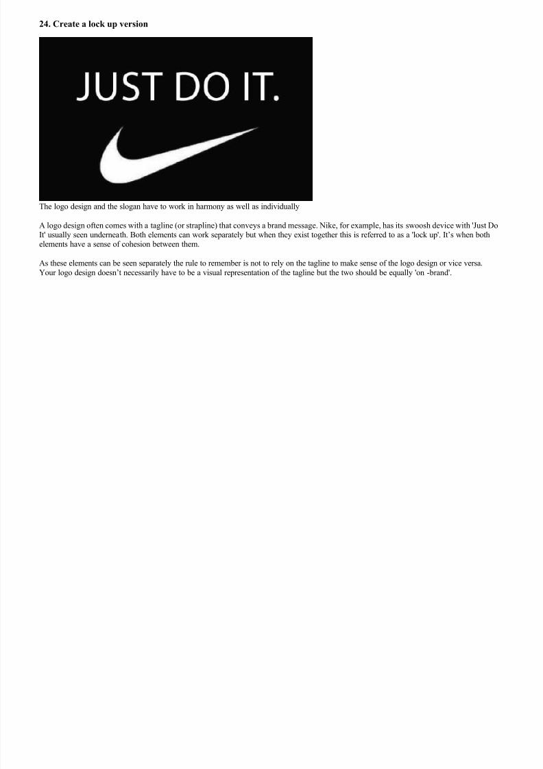
24. Create a lock up version
The logo design and the slogan have to work in harmony as well as individually
A logo design often comes with a tagline (or strapline) that conveys a brand message. Nike, for example, has its swoosh device with 'Just DoIt' usually seen underneath. Both elements can work separately but when they exist together this is referred to as a 'lock up'. It‟s when bothelements have a sense of cohesion between them.
As these elements can be seen separately the rule to remember is not to rely on the tagline to make sense of the logo design or vice versa.
Your logo design doesn‟t necessarily have to be a visual representation of the tagline but the two should be equally 'on-brand'.

7/27/2019 The Ultimate Guide to Logo Design
http://slidepdf.com/reader/full/the-ultimate-guide-to-logo-design 20/38
25. Make your logo design responsive
The demands of responsive web design apply to logos as much as any other web graphics
If your logo design is going to be primarily used on websites and apps, consider how to make it responsive. Simply reducing or enlarging alogo according to its context isn‟t always the best solution. As the content area and device capabilities increase, you may need to add extra
details to the logo graphic itself. Check out this demo by Anthony Calzadilla to learn more.

7/27/2019 The Ultimate Guide to Logo Design
http://slidepdf.com/reader/full/the-ultimate-guide-to-logo-design 21/38
FUNCTIONALITY
26. Create different size versions
Logo designs have to be consistent for all manner of different applications. Picture credit: Ben Powell at www.gogetcreative.co.uk
Your logo design is amazing, beautiful, and stunning... but only on your 24in full HD monitor. Shrink that baby down to 100 pixels and whathave you got? A little undecipherable splodge.
Experiment with your designs at different sizes. If you‟ve already got
them on your computer, zoom in and out to see if they work as tiny icons or when they‟re full screen.
27. Make it legible
Most clients need a vector version of the logo design in order to be able to scale it up, cut it out and colour separate it. Equally, you need
something that will be legible in lowest denominator media such as newsprint, and work online and on mobile devices.
Once you have something, print it out. Print variations in type weight and style, as well as inverted versions of your logotype and mark. Print
large versions and paste them to the wall or lay them out on the floor. Look at them for as much time as it takes to really let things sink in.

7/27/2019 The Ultimate Guide to Logo Design
http://slidepdf.com/reader/full/the-ultimate-guide-to-logo-design 22/38
28. Create non-print variants
As well as print you need to come up with variants that show how it can work on computer screens, mobile devices and other "real world"
uses, whether on a uniform or a billboard at Old Trafford.
Show all these variations to your clients to indicate how you‟ve thought things through how (if needed) their logo design could be used or teeny-tiny on a business franked letter.
Think about creating an insignia version of the logo design for when it occupies small spaces, and perhaps a clear and a greyscale version.This will go a long way to proving to your client they're getting value for money and a logo design that can be used everywhere.
Your logo design may need to be altered to work on different media, such as being reproduced in cotton embroidery
It‟s quite common to have a slightly different version of a logo design for reproduction on clothing. The best way to get this right is to talk to
an embroiderer, shoe-manufacturer, etc, as appropriate.

7/27/2019 The Ultimate Guide to Logo Design
http://slidepdf.com/reader/full/the-ultimate-guide-to-logo-design 23/38

7/27/2019 The Ultimate Guide to Logo Design
http://slidepdf.com/reader/full/the-ultimate-guide-to-logo-design 24/38
BUSINESS CONSIDERATIONS
30. Don't confuse 'logo' with 'brand'
Part of the 'bigger picture' for the use of the Wolff Olins 2012 Olympic Games logo design
'A logo isn't just the brand' is the most common tip to remember when creating a company's identity.
The 2012 Olympic Games logo design by Wolff Olins was universally mocked when released in 2007. Mostly this was due to mediarestrictions which meant they couldn't explain or show how this logo design was going to be used as part of the successful London 2012
games brand and not necessarily in isolation.
If you‟re presenting a logo design which is mostly going to be seen 'locked up' with a strapline or connected to another visual device thenshow examples of this in your initial presentation.

7/27/2019 The Ultimate Guide to Logo Design
http://slidepdf.com/reader/full/the-ultimate-guide-to-logo-design 25/38
31. Get the tone right
An example of three type treatments by Luke Prowse - authoritative, friendly and fun
Imagine you were looking online for an accountant and come across a firm called Harewood's Accounting Services which had a logo designmade up of a weedy serif font and an image of a hare sat on a plank of wood. You'd doubt whether this crowd were worth taking seriously.This fictitious company could well have multiple awards and reams of happy solvent customers, but such a logo design wouldn‟t inspire any
trust or admiration for the services they offer.
A logo design represents a business's professionalism and poor visual jokes don't work. Use fonts which sum up the 'brand mood'.

7/27/2019 The Ultimate Guide to Logo Design
http://slidepdf.com/reader/full/the-ultimate-guide-to-logo-design 26/38
FEEDBACK
32. Show your logo design around
Kudawara's logo design was memorable for the wrong reasons
Quite a few of us will remember the Japanese pharmacy a few years ago whose logo design received worldwide recognition for beingunintentionally rather saucy. You of course could argue that the logo is fine and there are a lot of people in the world with dirty minds. But
let's get real: how this got through final client approval is anyone's guess.
After you've completed your logo design, send it round to your mates and family for a bit of feedback. Look at it sideways, look at it upside
down and reverse it. Look at it every which way you can. Then send it to the client. You wouldn't want another Kudawara on your handswould you?

7/27/2019 The Ultimate Guide to Logo Design
http://slidepdf.com/reader/full/the-ultimate-guide-to-logo-design 27/38
33. Stick to your convictions
Regular client feedback is crucial to avoid wasting everyone's time. Picture credit: Ben Powell at www.gogetcreative.co.uk
Sheffield-based graphic and UI designer Ben Powell suggests: "It's so important to get regular feedback from your client, but equallyimportant that you make it clear you are the designer and that‟s why you've been employed.
"As soon as a client begins suggesting things like, 'Let's make that text a bit bigger, and try this typeface', your mark becomes diluted. It's
your job as the designer to make this clear from the start."
34. Ask the client specific questions
When your logo design is finished, try not to ask vague questions to your client such as, "Do you like it?", or, "What do you think?". You may
as well ask if they like apples or oranges.
Questions you should ask include: "Does it meet the brief?" amd "Does this represent your core brand values?". If they avoid the question and
just say they don't like it, ask for specifics. After all it's their brand and they should know.
35. Test it internationally
If you can, show it to as many different nationalities as possible, especially for a logo that is going to be used globally. You never know
whether something that looks completely innocent in one culture may look unintentionally rude, offensive, or both in another. For example, in1998, the Nike Air Bakin made national headlines when Arab-American groups thought the way “Air” was written on the shoe looked too
similar to “Allah” written in Arabic.

7/27/2019 The Ultimate Guide to Logo Design
http://slidepdf.com/reader/full/the-ultimate-guide-to-logo-design 28/38

7/27/2019 The Ultimate Guide to Logo Design
http://slidepdf.com/reader/full/the-ultimate-guide-to-logo-design 29/38
STYLE GUIDES
38. Create a logo style guide
The Channel 4 style guide explains in detail how its logo design can and can't be used
Style guides determine the way a logo design can be used and usually include colour options, size restraints, positioning, typefaces and how
the logo design works on different backgrounds. Check out the Channel 4 style guide for a great example of the sort of guide you should beaiming to set up.

7/27/2019 The Ultimate Guide to Logo Design
http://slidepdf.com/reader/full/the-ultimate-guide-to-logo-design 30/38
39. Dictate colour options
A style guide should illustrate all possible colour options for a logo design. It should include any Pantone colours used with a breakdown for
CMYK and RGB. Other options to include are: colour and mono logo designs on white, colour and mono on black and colour and mono on
an image background.
40. Specify sizes
Some logo designs only work down to a certain size. This might be because they become illegible or simply lose their impact. Specify the
minimum size for your logo design and bear in mind how it looks on screen as this may differ from a printed version. Offer an alternative in pixels.
41. Advise on positioning
The positioning of your logo design may not be required in a style guide, but depending on the style and shape of your design there may be a position that you think works best. For example, text that‟s ranged right might look best on the right-hand side of the page.
42. Advise on spacing
Give consideration to the amount of space around a logo design and try to explain this without using units of measurement. For example, thespace below the logo design should be a quarter of its width. This ensures that whatever size the logo design is used at, the correct space can
be calculated easily.
43. Define no-nos
If there are any ways that your logo design should not be used then make sure you specify them. The main reason for a style guide is to ensurethe appearance of your logo design remains consistent, so explain how the logo should not be misinterpreted and illustrate your points with
examples.

7/27/2019 The Ultimate Guide to Logo Design
http://slidepdf.com/reader/full/the-ultimate-guide-to-logo-design 31/38
GOING FURTHER
44. Download the logo design flowchart
Download the flow chart to improve your logo design process
Still not sure where to begin with logo design? No problem. Deliver winning logo designs every time by following the step-by-step processesin Johnson Banks' foolproof flowchart.
45. Further readingThe biggest mistakes logo designers make Logo design: 5 questions to ask about the brand
The 10 biggest logo redesigns of 2012
Words: Paul Wyatt, Aaron Kitney and Tom May
Award winning creative director, author and film maker Paul Wyatt is a part of the production collective '3 Men & a camera' and regular
columnist for .net magazine.
Aaron Kitney is a freelance graphic designer and art director based in London and Vancouver. He specialises in branding, identity, web
design, publication design, packaging and book design.

7/27/2019 The Ultimate Guide to Logo Design
http://slidepdf.com/reader/full/the-ultimate-guide-to-logo-design 32/38
Liked this? Read these!
What is typography? Learn the basic rules and terms of type!
75 top typography tutorials
COMMENTS
peteyagmin July 27, 2012 at 19:52I'm sorry but, 'Will it animate well?' - are you serious? When was this chart created? Circa 1991? Let me dig out my copy of ULead Web
Razor...
tmxd August 25, 2012 at 06:22
Your flowchart is a sharping tool to stir up the brain in the right direction. Thank you very much!
Yusuf November 03, 2012 at 04:51
I love always logo design and i found always experiences logo design.
BlogClerks November 03, 2012 at 22:28
This is a great set of guidelines for proper logo design. There are so many traps that people fall into when trying to design a logo. With socialmedia in play, I think variants are a must these days.
Alex at BlogClerks.com
lydia December 19, 2012 at 07:25
These are really ultimate tips for LOGO designers,im gonna share with our Witmart freelance designers.

7/27/2019 The Ultimate Guide to Logo Design
http://slidepdf.com/reader/full/the-ultimate-guide-to-logo-design 33/38
logodesignteam January 26, 2013 at 17:22
I loved the tips. Very nicely written post. Yes, most people do get confused between 'logo'and 'brand'. I would like to add one more thing, thatwe at http://www.LogoDesignTeam.com give a lot of importance to - colours should be choosen wisely so that reproducing the EXACT
SAME colour in all the countries does not become a challenge.
robinthebs February 04, 2013 at 07:57
Well compiled article. Re: logo design is one of the hardest and most aspect part of design, its a good well explained article.
inkspot February 15, 2013 at 20:28
Loved this post. I have a series of complimentary items that you have covered very well. I warn clients that designing their brand identity willtake from 2-3 weeks and that it is a process. I also explain that it is a choreographed dance (collaboration) between my client and myself. You
have to get them involved so that they understand the story behind their logo & business model. They then will take all that information and
share it with their community and target market.To see more of my thoughts on branding for my clients, see my blog at www.inkspotgraphics.com/blog
thank you for sharing.Mike Johnson
HatimZS February 16, 2013 at 06:25
This is one of the most ideal guide for logo designers!
LeeYoungCreativeDesign February 20, 2013 at 08:03Great post, it's easy to lose sight of the key points sometimes when creating a new logo or refreshing an old design, this is a handy guide to
keep you focused and on-track.

7/27/2019 The Ultimate Guide to Logo Design
http://slidepdf.com/reader/full/the-ultimate-guide-to-logo-design 34/38
betterwebads March 03, 2013 at 11:52
Great post! Looking forward for more posts like this. Great help to my site - http://www.betterwebads.com Thanks!
Cardography March 07, 2013 at 07:15The Fedex logo is indeed a good example of how to use negative space on logo design. I never thought the arrow was intentionally created
until I saw the logo featured here: http://designandprint.wordpress.com/2013/02/10/using-negative-space-to-h...
colorguide March 09, 2013 at 17:34
Eventually the Logos tend to be too simple or supplied or are made with common sense about what they represent, with which also representsthe color .
Designsift March 12, 2013 at 13:12When creating a logo design, it‟s better to get good ideas & practice and more can find at http://designsift.com/
igepe March 14, 2013 at 23:27
Very useful article since I do a lot logo designing for online competition. And the step by step creative flow chart could be adapted for my
other graphic design work at http://igepeworks.wordpress.com/
michael403 March 22, 2013 at 06:31

7/27/2019 The Ultimate Guide to Logo Design
http://slidepdf.com/reader/full/the-ultimate-guide-to-logo-design 35/38
These 30 tips are the key salient features to keep in mind when you are involved in a professional logo design. Like these tips, all the
designers should try to create their logos from every aspect so that customer satisfies from the designer.
http://www.infinitylogodesign.co.uk/logo-design/
LogoDesignLondon March 23, 2013 at 14:41
Great guide! For more tips on professional logo design also visit our website: http://www.logodesignlondon.co.uk and our blog for moreinformation. Professional design and branding is crucial to get right.
48hourslogo March 26, 2013 at 16:26Excellent post! I will say that this is probably the most complete article I've seen about logo designs. I'm sure many of our designers at
http://www.48hourslogo.com will find it very useful! Thanks!
blendmarketing March 28, 2013 at 16:03
Great post. The main thing I take away from it however is how far behind the times the current Google brand is. We must be due for anexciting reveal some time soon?
Logotypers March 29, 2013 at 23:49
I know this will look like spam, but it is not. Is my honest input to this awesome article. We have built a new way that helps people to do hisown creative logo, co-working with designers. It's a very simple method. You can watch it in our site http://www.logotypers.com
cmurray April 03, 2013 at 03:12
Thanks for such a great article. I recently graduated and am in the process of starting my own company, so needless to say I'm far too broke toafford having a logo designed; this helped a bunch!

7/27/2019 The Ultimate Guide to Logo Design
http://slidepdf.com/reader/full/the-ultimate-guide-to-logo-design 36/38
pickydesigns April 07, 2013 at 04:33
A great writing. Couldn't stop reading until the end.I helped with designing a logo for yellowcrowd.ca and after reading this article, i'm having doubts about the results we got.
You got me thinking now :(
JackieatWebydo April 07, 2013 at 10:17
I've read a lot of articles on creating logos, but this is one of the most thought out lists I have ever seen. The best advice is asking the right
questions to the client and remembering that you are in control. Never ask, ''what do you think about..." because that's when the designer losesall the control. These tips will surely give designers the right tips to create the ultimate logos.
pickydesigns April 08, 2013 at 01:24
Someone willing to give me a feedback on the logo for http://www.yellowcrowd.ca the logo is fairly new and i see no issue getting it revised
or completely changed. Need to know if the logo communicate the right message
If the design is executed rightMind you that the file is in vector so the res is not an issue here.
thanx
ritwick April 14, 2013 at 11:56
I just stumbled onto this article while i was looking for logo designers through google for our innovative website http://www.centpage.com which would be useful for every person browsing the internet.I must say this is an excellent article covering every aspect of logo design. The Kudwara pharmacy example was convincing. Anyways if you
are reading this comment please suggest me a logo designer or design a logo for me if you can and i might pay to have it. Thanks. Bye.

7/27/2019 The Ultimate Guide to Logo Design
http://slidepdf.com/reader/full/the-ultimate-guide-to-logo-design 37/38
pickydesigns April 15, 2013 at 04:27
We are getting design projects from all over but are still in need of more professional designers to complete our logo and other projects.
If you are a freelancer and are looking to work on Logo, Website and other graphics designs please drop by and register as a designer onhttp://www.pickydesigns.com
Since we do not have thousands of designers registered with us, your chances of winning projects right of the bat is great.Thank you!
LeciaAmaral April 15, 2013 at 11:57 Not sure if I'm just blind (in which case I'm sorry ha ha ha) but so wish there was a printer friendly version so I could print it out!
AnilAmrit April 17, 2013 at 18:11Brilliant article and good reading back to basics tip even as an experienced designer myself. Will be adding 'Responsive Logo Design' to my
design process from now on.
socialfaerie April 18, 2013 at 11:39
Really fantastic article, covers a lot. My favourite has to be 17 - Subtract a lot. The company I work for have just had a brand refresh (Check it out and our reasoning here http://ow.ly/kbgzu ) Although we've kept certain elements, to maintain consistency and to show how we've
evolved, the key part of our new logo is how stripped down it is. When you look at really good logos, what strikes you is that they don't need
any peripheral parts, they are iconic because they are simple and you just get it. This is what I feel we have achieved at 3seven9.
quaverlove April 20, 2013 at 15:37Very interesting read!As a beginner in this field, I value good information.
Vignesh April 21, 2013 at 19:13

7/27/2019 The Ultimate Guide to Logo Design
http://slidepdf.com/reader/full/the-ultimate-guide-to-logo-design 38/38
very useful ..Must read article for the people who are into logo designing..i have recommended this for some of my logo designers..
chrisianoulas April 26, 2013 at 12:57This article is important for every graphic designers who need to get better on designing skill and handle the clients. At all times, A designer
has to put their mind‟s and convince the client and understand him correctly. How to finger a client‟s work and deal with client is also an
important impression. Thanks a lot for sharing such a wonderful quantity of information.
AppliedVisual May 01, 2013 at 05:11
This is could easily be turned into a checklist for anyone needing to tighten up their logo skills. For me, subtraction (#22) has worked miraclesfor me. I take away until I can't remove one more thing without it working. I love minimal design because it communicates volumes and gives
the viewer the opportunity to use different parts of the brain which connects them deeper to the logo or brand.
godesigning May 09, 2013 at 11:40
It is very comprehensive article regarding logo designing tips and techniques. All these 40 tips are very important for every designer as wellas business owner who wants to get a professional, unique and meaningful logo design for his business. Most important points you shared are
"Seek inspiration" and "Make your design active, not passive". Seek inspiration is one of the most important thing for a designer, i will saywithout working on this step no one can create a perfect logo design.
AjayRana17 May 10, 2013 at 14:42
I would recommend this post to every every graphic designers who wants to come up with great designs for their clients. We at
www.ideazinc.com too understands the significance of these tips while designing a good logo. Great post admin. Would like to come againfor the next post.