the theory of everything poster analysis
TRANSCRIPT

The Theory of Everything Poster Analysis

The Theory of Everything follows the early life of the physicist Stephen Hawking (Eddie Redmayne) during his time studying at Cambridge in the 1960’s. The film tells the story of how he fell in love with his wife Jane Hawking (Felicity Jones) and his journey through his ALS diagnosis at 21.
Disability is presented well in this movie, it follows the journey of a real person so therefore gives a more realistic view of the lives of people with disabilities. The movie presents disability well because it presents it in a realistic way.
The poster contains many standard poster features, including: picture, tagline, credit block, use of star names and the release date. The poster uses actors as USP’s for the film, Eddie Redmayne is a well known actor and has won many film awards including an Oscar and an ACCA award. Felicity Jones has also won awards including an Empire Award and a Gotham Award. By having two well-known actors playing the lead roles people are more likely to be attracted to the film. The tagline “The incredible story of Jane and Stephen Hawking” is also likely to attract an audience because the film focuses on one of the most well-known people in history.
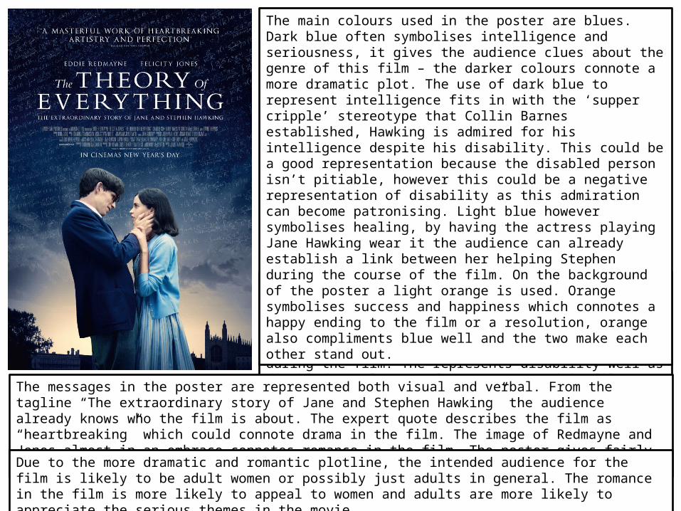
The main objects used on the poster are Stephen (Eddie Redmayne) and Jane (Felicity Jones) and they are represented photographically. The two are shown with Stephen holding Jane’s face, the closeness of the two characters connotes romance during the film. The represents disability well as disabled people are often represented in films as non-sexual.
The main colours used in the poster are blues. Dark blue often symbolises intelligence and seriousness, it gives the audience clues about the genre of this film – the darker colours connote a more dramatic plot. The use of dark blue to represent intelligence fits in with the ‘supper cripple’ stereotype that Collin Barnes established, Hawking is admired for his intelligence despite his disability. This could be a good representation because the disabled person isn’t pitiable, however this could be a negative representation of disability as this admiration can become patronising. Light blue however symbolises healing, by having the actress playing Jane Hawking wear it the audience can already establish a link between her helping Stephen during the course of the film. On the background of the poster a light orange is used. Orange symbolises success and happiness which connotes a happy ending to the film or a resolution, orange also compliments blue well and the two make each other stand out.
The messages in the poster are represented both visual and verbal. From the tagline “The extraordinary story of Jane and Stephen Hawking” the audience already knows who the film is about. The expert quote describes the film as “heartbreaking” which could connote drama in the film. The image of Redmayne and Jones almost in an embrace connotes romance in the film. The poster gives fairly clear messages to the audience both verbally and visually.
Due to the more dramatic and romantic plotline, the intended audience for the film is likely to be adult women or possibly just adults in general. The romance in the film is more likely to appeal to women and adults are more likely to appreciate the serious themes in the movie.
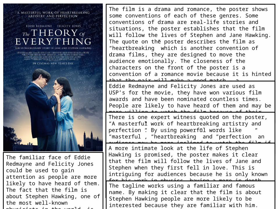
The film is a drama and romance, the poster shows some conventions of each of these genres. Some conventions of drama are real-life stories and situations, the poster establishes that the film will follow the lives of Stephen and Jane Hawking. The quote on the poster describes the film as “heartbreaking” which is another convention of drama films, they are designed to move the audience emotionally. The closeness of the characters on the front of the poster is a convention of a romance movie because it is hinted that the pair will make a good match – a convention of the romance genre. Romance films often deal with emotions as well, the “heartbreaking” nature of the film hints that it will deal with character emotions.
Eddie Redmayne and Felicity Jones are used as USP’s for the movie, they have won various film awards and have been nominated countless times. People are likely to have heard of them and may be more willing to watch the film because of their success in the film industry.
There is one expert witness quoted on the poster, “A masterful work of heartbreaking artistry and perfection”. By using powerful words like “masterful”, “heartbreaking” and “perfection” an audience may be more inclined to watch the film if they know that it has been praised so much.
A more intimate look at the life of Stephen Hawking is promised, the poster makes it clear that the film will follow the lives of Jane and Stephen when they first fell in love. This is intriguing for audiences because he is only known for his work in physics, having a more in depth view of his life is likely to be interesting for an audience.
The familiar face of Eddie Redmayne and Felicity Jones could be used to gain attention as people are more likely to have heard of them. The fact that the film is about Stephen Hawking, one of the most well-known physicists in the world, is also used to gain attention for the film.
The tagline works using a familiar and famous name. By making it clear that the film is about Stephen Hawking people are more likely to be interested because they are familiar with him.

Overall I would say that the poster is good. It is appealing because of the use of colour and the positioning of the text and objects, it draws attention to the key information and is easy to look at because there isn’t too much going on. The poster establishes what the film is centred around and targets a specific audience. The use of stars makes an audience more familiar with the characters because they are likely to have seen them in other films, this means that the poster appeals to many different people whilst still reaching it’s intended audience.
I would say that the poster communicates effectively with it’s audience because the genres of the film are made clear, what the film is about it also very clear. This means that the poster targets the audience that it wants.
One alternative reading of the poster could be that it romanticises disability, this could cause offense to disabled people which harms the marketing message because people are deterred from watching the film.