the growing distance between people and jobs in ... · pdf filebrookings | march 2015 1 the...
TRANSCRIPT
BROOKINGS | March 2015 1
The growing distance between people and jobs in metropolitan America Elizabeth Kneebone and Natalie Holmes
“ As people and
jobs continued
to suburbanize
and spread out
in the 2000s, the
number of jobs
near the typical
resident fell.”
Findings
Proximity to employment can influence a range of economic and social outcomes, from local fiscal health to the employment prospects of residents, particularly low-income and minority workers. An analysis of private-sector employment and demographic data at the census tract level reveals that:
n Between 2000 and 2012, the number of jobs within the typical commute distance for residents in a major metro area fell by 7 percent. Of the nation’s 96 largest metro areas, in only 29---many in the South and West, including McAllen, Texas, Bakersfield, Calif., Raleigh, N.C., and Baton Rouge, La.---did the number of jobs within a typical commute distance for the aver-age resident increase. Each of these 29 metro areas also experienced net job gains between 2000 and 2012.
n As employment suburbanized, the number of jobs near both the typical city and suburban resident fell. Suburban residents saw the number of jobs within a typical commute distance drop by 7 percent, more than twice the decline experienced by the typical city resident (3 per-cent). In all, 32.7 million city residents lived in neighborhoods with declining proximity to jobs compared to 59.4 million suburban residents.
n As poor and minority residents shifted toward suburbs in the 2000s, their proximity to jobs fell more than for non-poor and white residents. The number of jobs near the typical Hispanic (-17 percent) and black (-14 percent) resident in major metro areas declined much more steeply than for white (-6 percent) residents, a pattern repeated for the typical poor (-17 percent) versus non-poor (-6 percent) resident.
n Residents of high-poverty and majority-minority neighborhoods experienced particularly pronounced declines in job proximity. Overall, 61 percent of high-poverty tracts (with poverty rates above 20 percent) and 55 percent of majority-minority neighborhoods experienced declines in job proximity between 2000 and 2012. A growing number of these tracts are in suburbs, where nearby jobs for the residents of these neighborhoods dropped at a much faster pace than for the typical suburban resident (17 and 16 percent, respectively, versus 7 percent).
For local and regional leaders working to grow their economies in ways that promote opportunity and upward mobility for all residents, these findings underscore the importance of understand-ing how regional economic and demographic trends intersect at the local level to shape access to employment opportunities, particularly for disadvantaged populations and neighborhoods. And they point to the need for more integrated and collaborative regional strategies around economic development, housing, transportation, and workforce decisions that take job proximity into account.
BROOKINGS | March 20152
Introduction
The 2000s ushered in significant demographic and economic changes that have redrawn the map of economic opportunity in metropolitan America.
Two economic downturns and the weak recoveries that followed left the nation with fewer jobs in 2010 than in 2000. As jobs declined, they continued to push farther outward within
the nation’s largest metro areas. Almost every major metro area saw jobs shift away from the urban core during the 2000s.1
As jobs suburbanized, so did people. Minorities and the poor suburbanized at the fastest pace, such that, by 2010 in the nation’s largest metro areas, the majority of every major ethnic and racial group and the majority of the poor lived in suburbs for the first time.2
Where people and jobs locate within metro areas over time affects how close they are to one another. The outward shift of both people and jobs in the 2000s changed their proximity to each other, and often not for the better.
This study takes a new approach to determine how many jobs people live near, or what we term job proximity, throughout the United States. Proximity can influence a range of outcomes, from the fis-cal health of a community to employment opportunities for residents. Differences across people and places in job proximity, and trends over time, illustrate how economic and demographic shifts in the 2000s reshaped the map of economic opportunity for different communities and populations.
Past research on the relationship between where people work and live often focused on understand-ing how the suburbanization of wealth and jobs may have affected access to employment opportuni-ties for poor and minority residents left behind in the central city. These studies of what has been referred to as spatial mismatch or job accessibility have employed a variety of measures, including dissimilarity indexes (which compare the degree to which population and jobs locate together within communities), correlations between race and commute times or distances, and differences in labor market outcomes across cities and suburbs.3
But the suburbanization of minority and poor residents since 2000 requires both a broader framing of the question---one that recognizes that, while economic opportunity has shifted within regions, so too have traditionally disadvantaged populations---as well as a more geographically fine-grained under-standing of how proximity to employment varies from neighborhood to neighborhood and for different types of residents within metropolitan areas.
To carry out this analysis, we constructed a database that pulls together multiple sources of demo-graphic and employment data for every census tract---small areas of about 4,000 people on average---in the nation. With that information, we assess the number of jobs proximate to each neighborhood (i.e., census tract) in the country, and how that proximity changed between 2000 and 2012, the most recent year for which we have data. Within the nation’s largest metro areas, we pay particular atten-tion to how patterns and trends vary for different types of residents (e.g., by race and ethnicity and by poverty status) and communities (e.g., high-poverty or majority-minority neighborhoods).
The importance of proximity
How jobs and people move within regions over time affects the proximity of jobs and people to one another, and thus influences several important outcomes. For local governments that derive a portion of their revenues from the area’s commercial and industrial tax base, proximity to jobs can influence local fiscal health and the quality of public services.4 For
residents, proximity can affect access to private services, like retail.5 But perhaps most important for the purposes of this analysis, proximity to jobs can affect the
employment outcomes of residents. People who live closer to jobs are more likely to work.6 They also face shorter job searches and spells of joblessness.7
Proximity to employment proves particularly important to certain kinds of workers and residents. For instance, the duration of joblessness among black, female, and older workers tends to be more sensitive to job accessibility than it is for other kinds of workers.8 For poor residents, living closer to jobs increases the likelihood of working and leaving welfare.9 Proximity matters for lower-income,
BROOKINGS | March 2015 3
DEFINITIONS AND DATA SOURCESFor this analysis, we created a national database of local-level demographic and private-sector employment data.* According to U.S. Bureau of Labor Statistics data, private-sector jobs account for 84 percent of all U.S. employment.
The database contains data from the following U.S. Census Bureau sources: the 2000 and 2012 ZIP Business Patterns series, the 2011 Longitudinal Employer-Household Dynamics (LEHD) program, Census 2000 (from the GeoLytics Neighborhood Change Database), and the 2009-13 American Community Survey. All data have been compiled to conform to 2010 census tract boundaries.
To assess the number of private-sector jobs near different neighborhoods (i.e., census tracts) and types of residents, we use the following measures and terms.
Typical commute distance: We use census-tract-level data on commute flows to determine the median commute dis-tance within each metro area and for the nonmetropolitan portion of each state. The distance measured is the Euclidean distance between the origin and destination tract, or the distance “as the crow flies.”
Metro areas vary considerably in terms of size, infrastructure and development patterns, and distribution of people and jobs. These differences lead to differences in typical commute distances across regions. In the Atlanta metro area, which spans 29 counties and contains more than 5 million people and 2 million jobs, the typical commute distance is 12.8 miles. In contrast, in the Stockton, Calif. metro area, which covers just one county with fewer than 700,000 residents and more than 160,000 jobs, the typical commute distance is 4.7 miles. (For a full list of typical com-mute distances, see Appendix B.)
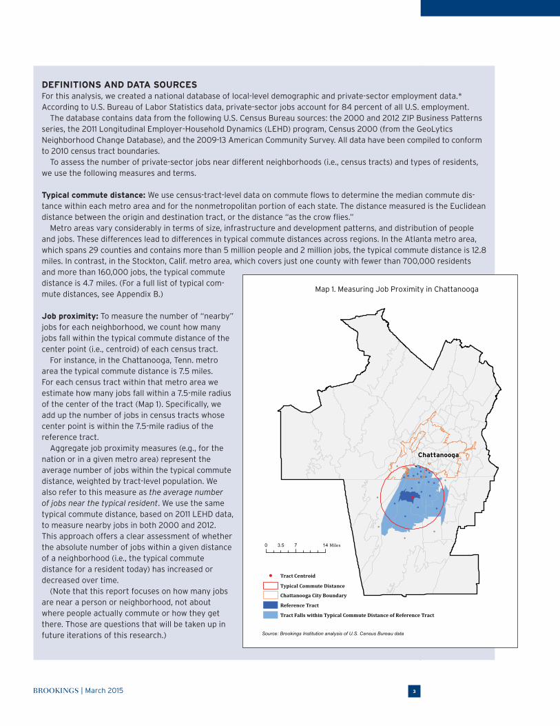
Job proximity: To measure the number of “nearby” jobs for each neighborhood, we count how many jobs fall within the typical commute distance of the center point (i.e., centroid) of each census tract.
For instance, in the Chattanooga, Tenn. metro area the typical commute distance is 7.5 miles. For each census tract within that metro area we estimate how many jobs fall within a 7.5-mile radius of the center of the tract (Map 1). Specifically, we add up the number of jobs in census tracts whose center point is within the 7.5-mile radius of the reference tract.
Aggregate job proximity measures (e.g., for the nation or in a given metro area) represent the average number of jobs within the typical commute distance, weighted by tract-level population. We also refer to this measure as the average number of jobs near the typical resident. We use the same typical commute distance, based on 2011 LEHD data, to measure nearby jobs in both 2000 and 2012. This approach offers a clear assessment of whether the absolute number of jobs within a given distance of a neighborhood (i.e., the typical commute distance for a resident today) has increased or decreased over time.
(Note that this report focuses on how many jobs are near a person or neighborhood, not about where people actually commute or how they get there. Those are questions that will be taken up in future iterations of this research.)
●
0 7 143.5 Miles
Reference Tract
Chattanooga City Boundary
Tract Falls within Typical Commute Distance of Reference Tract
● Tract Centroid
Typical Commute Distance
Source: Brookings Institution analysis of U.S. Census Bureau data
●
●
●●
●
●●
●
●
●●
●
●
●
●●
●
●
●
●
●●
●
●
●
●
●
●
ChattanoogaChattanooga
Map 1. Measuring Job Proximity in Chattanooga

BROOKINGS | March 20154
lower-skill workers in particular because they tend to be more constrained by the cost of housing and commuting. They are more likely to face spatial barriers to employment, thus their job search areas tend to be smaller and commute distances shorter.10 In contrast, higher-income, higher-skill workers, who can afford to commute by car and exercise more choice in where they work and live, have more prospects than just the jobs near their neighborhoods and commute longer distances on average.11
Of course, being close to jobs does not guarantee employment. Poor and minority residents often face additional barriers that affect employment levels even when they live close to jobs. For instance, for poor residents living in areas of concentrated poverty, the positive effects of job proximity dimin-ish or can disappear altogether.12 In addition, workers have to compete for jobs.13 And the types of jobs nearby, in terms of industry, wages, and skill requirements, affect the earnings and competitiveness of local residents, depending on their education and skill levels.
With the database we have constructed, we now have the tools to better understand these proximity dynamics in a more nuanced, geographically detailed way throughout the United States. Future analy-ses will address these multifaceted dynamics, including skills alignment and wage levels, in greater detail. But first we must consider the baseline question of what job proximity in general looks like for different communities and types of people, and how that has changed over time.
This analysis offers an important starting point for assessing how economic opportunity is distrib-uted within the major metro areas where most people live and work. The findings have implications for local and regional leaders striving to grow their economies in ways that promote opportunity and upward mobility for all residents.
Findings
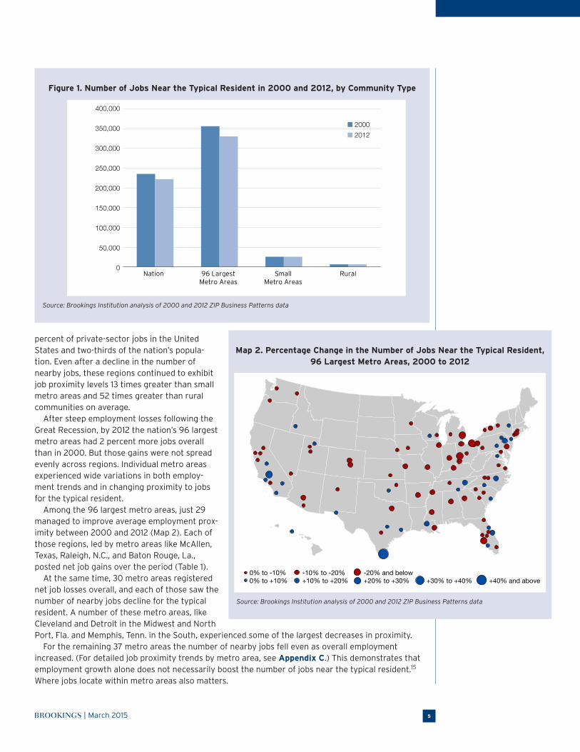
Between 2000 and 2012, the number of jobs within the typical commute distance for residents in a major metro area fell by 7 percent On average across the United States, the number of jobs within a typical commute distance declined by 6 percent between 2000 and 2012 (Figure 1). Not all types of communities shared evenly in that trend. The average number of nearby jobs changed little in rural or small metro areas over this period, but for the typical resident in the nation’s largest metro areas, the number of nearby jobs fell by 7 percent.
A number of factors help shape proximity to employment within and across communities, includ-ing the overall number of jobs.14 For instance, the 96 largest metro areas are home to more than 70
Cities: To illustrate how job proximity varies within metro areas, we measure proximity separately for cities and suburbs within the nation’s 96 largest metro areas.** We define cities as the first named city in the official metropolitan statistical area title, as well as any other city in the official title that has a population of 100,000 or more. Any census tract with a center point that falls inside one of these cities is considered part of the city for that metro area.
Suburbs: Suburbs include any census tract in the 96 largest metro areas with a center point that falls outside of a city.
For a detailed discussion of data sources and methods, see Appendix A.
For additional resources and an interactive data tool go to http://www.brookings.edu/research/reports2/2015/03/24-people-jobs-distance-metropolitan-areas-kneebone-holmes.
*ZIP Business Patterns data, the primary source of jobs data for this analysis, exclude information on the self-employed population, employees of private households,
railroad employees, agricultural production workers, and most government employees.
**Typically we report data for the 100 largest metro areas in the nation. However, commute data are not available for Massachusetts. This means that we do not pres-
ent results for four metro areas that fall entirely or partly in Massachusetts, namely the Boston, Providence (R.I.), Springfield, and Worcester regions. Future iterations
of this research will include these regions as data become available.
BROOKINGS | March 2015 5
percent of private-sector jobs in the United States and two-thirds of the nation’s popula-tion. Even after a decline in the number of nearby jobs, these regions continued to exhibit job proximity levels 13 times greater than small metro areas and 52 times greater than rural communities on average.
After steep employment losses following the Great Recession, by 2012 the nation’s 96 largest metro areas had 2 percent more jobs overall than in 2000. But those gains were not spread evenly across regions. Individual metro areas experienced wide variations in both employ-ment trends and in changing proximity to jobs for the typical resident.
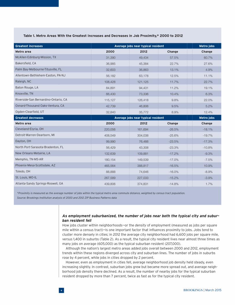
Among the 96 largest metro areas, just 29 managed to improve average employment prox-imity between 2000 and 2012 (Map 2). Each of those regions, led by metro areas like McAllen, Texas, Raleigh, N.C., and Baton Rouge, La., posted net job gains over the period (Table 1).
At the same time, 30 metro areas registered net job losses overall, and each of those saw the number of nearby jobs decline for the typical resident. A number of these metro areas, like Cleveland and Detroit in the Midwest and North Port, Fla. and Memphis, Tenn. in the South, experienced some of the largest decreases in proximity.
For the remaining 37 metro areas the number of nearby jobs fell even as overall employment increased. (For detailed job proximity trends by metro area, see Appendix C.) This demonstrates that employment growth alone does not necessarily boost the number of jobs near the typical resident.15 Where jobs locate within metro areas also matters.
Figure 1. Number of Jobs Near the Typical Resident in 2000 and 2012, by Community Type
400,000
350,000
300,000
250,000
200,000
150,000
100,000
50,000
0Nation 96 Largest
Metro AreasSmall
Metro AreasRural
■ 2000■ 2012
Source: Brookings Institution analysis of 2000 and 2012 ZIP Business Patterns data
Map 2. Percentage Change in the Number of Jobs Near the Typical Resident, 96 Largest Metro Areas, 2000 to 2012
0% to -10%0% to +10% +40% and above+30% to +40%
-20% and below+20% to +30%
-10% to -20%+10% to +20%
Source: Brookings Institution analysis of 2000 and 2012 ZIP Business Patterns data
BROOKINGS | March 20156
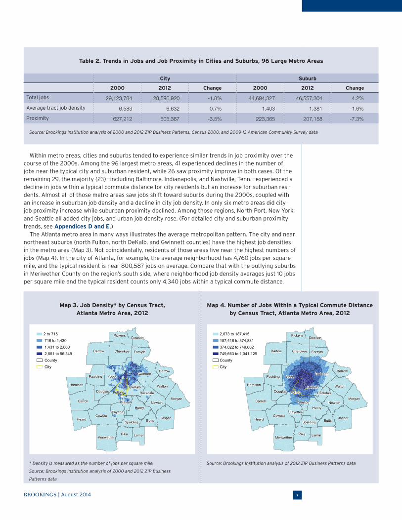
As employment suburbanized, the number of jobs near both the typical city and subur-ban resident fellHow jobs cluster within neighborhoods---or the density of employment (measured as jobs per square mile within a census tract)---is one important factor that influences proximity to jobs. Jobs tend to cluster more densely in cities; in 2012 the average city neighborhood had 6,600 jobs per square mile, versus 1,400 in suburbs (Table 2). As a result, the typical city resident lives near almost three times as many jobs on average (605,000) as the typical suburban resident (207,000).
Although the nation’s largest metro areas added jobs overall between 2000 and 2012, employment trends within these regions diverged across city and suburban lines. The number of jobs in suburbs rose by 4 percent, while jobs in cities dropped by 2 percent.
However, even as employment in cities fell, average neighborhood job density held steady, even increasing slightly. In contrast, suburban jobs grew but became more spread out, and average neigh-borhood job density there declined. As a result, the number of nearby jobs for the typical suburban resident dropped by more than 7 percent, twice as fast as for the typical city resident.
Table 1. Metro Areas With the Greatest Increases and Decreases in Job Proximity,* 2000 to 2012
Greatest increases Average jobs near typical resident Metro jobs
Metro area 2000 2012 Change Change
McAllen-Edinburg-Mission, TX 31,390 49,434 57.5% 60.7%
Bakersfield, CA 36,985 45,384 22.7% 27.6%
Palm Bay-Melbourne-Titusville, FL 32,603 36,863 13.1% 4.9%
Allentown-Bethlehem-Easton, PA-NJ 56,182 63,178 12.5% 11.1%
Raleigh, NC 108,428 121,125 11.7% 22.7%
Baton Rouge, LA 84,891 94,431 11.2% 19.1%
Knoxville, TN 66,430 73,336 10.4% 6.3%
Riverside-San Bernardino-Ontario, CA 115,127 126,418 9.8% 22.0%
Oxnard-Thousand Oaks-Ventura, CA 42,739 46,806 9.5% 5.2%
Ogden-Clearfield, UT 32,840 35,772 8.9% 12.4%
Greatest decreases Average jobs near typical resident Metro jobs
Metro area 2000 2012 Change Change
Cleveland-Elyria, OH 220,056 161,694 -26.5% -18.1%
Detroit-Warren-Dearborn, MI 408,549 304,038 -25.6% -19.7%
Dayton, OH 99,990 76,466 -23.5% -17.3%
North Port-Sarasota-Bradenton, FL 56,429 43,308 -23.3% -10.8%
New Orleans-Metairie, LA 132,639 109,881 -17.2% -9.3%
Memphis, TN-MS-AR 180,154 149,539 -17.0% -7.5%
Phoenix-Mesa-Scottsdale, AZ 465,564 388,817 -16.5% 10.9%
Toledo, OH 88,888 74,646 -16.0% -8.9%
St. Louis, MO-IL 267,589 227,033 -15.2% -3.9%
Atlanta-Sandy Springs-Roswell, GA 439,806 374,831 -14.8% 1.7%
*Proximity is measured as the average number of jobs within the typical metro area commute distance, weighted by census tract population.
Source: Brookings Institution analysis of 2000 and 2012 ZIP Business Patterns data
BROOKINGS | August 2014 7
Within metro areas, cities and suburbs tended to experience similar trends in job proximity over the course of the 2000s. Among the 96 largest metro areas, 41 experienced declines in the number of jobs near the typical city and suburban resident, while 26 saw proximity improve in both cases. Of the remaining 29, the majority (23)---including Baltimore, Indianapolis, and Nashville, Tenn.---experienced a decline in jobs within a typical commute distance for city residents but an increase for suburban resi-dents. Almost all of those metro areas saw jobs shift toward suburbs during the 2000s, coupled with an increase in suburban job density and a decline in city job density. In only six metro areas did city job proximity increase while suburban proximity declined. Among those regions, North Port, New York, and Seattle all added city jobs, and urban job density rose. (For detailed city and suburban proximity trends, see Appendices D and E.)
The Atlanta metro area in many ways illustrates the average metropolitan pattern. The city and near northeast suburbs (north Fulton, north DeKalb, and Gwinnett counties) have the highest job densities in the metro area (Map 3). Not coincidentally, residents of those areas live near the highest numbers of jobs (Map 4). In the city of Atlanta, for example, the average neighborhood has 4,760 jobs per square mile, and the typical resident is near 800,587 jobs on average. Compare that with the outlying suburbs in Meriwether County on the region’s south side, where neighborhood job density averages just 10 jobs per square mile and the typical resident counts only 4,340 jobs within a typical commute distance.
Table 2. Trends in Jobs and Job Proximity in Cities and Suburbs, 96 Large Metro Areas
City Suburb
2000 2012 Change 2000 2012 Change
Total jobs 29,123,784 28,596,920 -1.8% 44,694,327 46,557,304 4.2%
Average tract job density 6,583 6,632 0.7% 1,403 1,381 -1.6%
Proximity 627,212 605,367 -3.5% 223,365 207,158 -7.3%
Source: Brookings Institution analysis of 2000 and 2012 ZIP Business Patterns, Census 2000, and 2009-13 American Community Survey data
Map 3. Job Density* by Census Tract, Atlanta Metro Area, 2012
Map 4. Number of Jobs Within a Typical Commute Distance by Census Tract, Atlanta Metro Area, 2012
Pickens Dawson
CherokeeBartow Forsyth
GwinnettBarrow
Walton
MorganNewton
Rockdale
DeKalbFulton
CobbPaulding
Haralson
Carroll
Douglas
ClaytonHenry
JasperButtsSpalding
LamarPikeMeriwether
FayetteCoweta
Heard
■ 2 to 715
■ 716 to 1,430
■ 1,431 to 2,860
■ 2,861 to 56,349
■ County
■ City
Pickens Dawson
CherokeeBartow Forsyth
GwinnettBarrow
Walton
MorganNewton
Rockdale
DeKalbFulton
CobbPaulding
Haralson
Carroll
Douglas
ClaytonHenry
JasperButtsSpalding
LamarPikeMeriwether
FayetteCoweta
Heard
Pickens Dawson
CherokeeBartow Forsyth
GwinnettBarrow
Walton
MorganNewton
Rockdale
DeKalbFulton
CobbPaulding
Haralson
Carroll
Douglas
ClaytonHenry
JasperButtsSpalding
LamarPikeMeriwether
FayetteCoweta
Heard
■ 2,673 to 187,415
■ 187,416 to 374,831
■ 374,822 to 749,662
■ 749,663 to 1,041,129
■ County
■ City
Pickens Dawson
CherokeeBartow Forsyth
GwinnettBarrow
Walton
MorganNewton
Rockdale
DeKalbFulton
CobbPaulding
Haralson
Carroll
Douglas
ClaytonHenry
JasperButtsSpalding
LamarPikeMeriwether
FayetteCoweta
Heard
* Density is measured as the number of jobs per square mile.
Source: Brookings Institution analysis of 2000 and 2012 ZIP Business
Patterns data
Source: Brookings Institution analysis of 2012 ZIP Business Patterns data

BROOKINGS | March 20158
Although the Atlanta region gained jobs overall during the 2000s, the number of nearby jobs fell for the typical resident as employment spread out within the metro area. The city of Atlanta shed jobs during the 2000s (-8 percent), while its suburbs experienced net employment gains (4 percent). At the same time, job density fell on average in both the city and suburbs. Thus, typical residents in both locations saw their proximity to jobs decline, by 11 percent in the city and 14 percent in the suburbs.
Jobs and job proximity changed by different degrees within metro Atlanta from 2000 to 2012. Job change (Map 5) and residents’ change in proximity to jobs (Map 6) tended to track one another, albeit not perfectly. (To explore local-level proximity trends in more detail, visit the interactive data tool.) Residents of the region’s urban core---the city of Atlanta and its inner suburbs in Fulton, DeKalb, Cobb, and Clayton counties---saw the number of nearby jobs fall between 2000 and 2012. Most residents in the middle- and outer-ring suburbs (except those on the region’s southern periph-ery), by contrast, experienced an uptick in the number of jobs within the typical commute distance.
Even in metro areas where jobs declined during this period, like Chicago, Hartford, Conn., San Francisco, and St. Louis, “favored quarters”---defined by Christopher Leinberger as the part (or parts) of a region that disproportionately attract job relocation or growth and investment---benefited from growing employment clusters and, in turn, improving proximity.16 For instance, in the St. Louis region, total jobs fell by 4 percent between 2000 and 2012 and the number of jobs near the typical resident declined by 15 percent. Even as much of central and northern St. Louis County and eastern St. Charles County registered declines in both jobs and proximity, a corridor of job growth running from the western edge of St. Louis County through the central portion of St. Charles and much of Lincoln County (Map 7) yielded proximity gains for residents in those areas (Map 8). Similar clusters of increasing jobs and job proximity emerged in middle- and outer-ring suburbs to the south and east of the city as well.
Altogether, 53 percent of city residents (or 32.7 million people) in the nation’s largest metro areas lived in neighborhoods that lost proximity to jobs, compared to 43 percent of suburban residents (or 59.4 million people).17 As the Atlanta and St. Louis examples illustrate, the diverse experiences of resi-dents and neighborhoods within metro areas underscore the importance of looking beneath regional labor market trends to understand sub-regional shifts in economic opportunity, and how they affect residents in different parts of the metro area.
Map 5. Percentage Change in the Number of Private-Sector Jobs by Census Tract, Atlanta Metro Area, 2000 to 2012
Map 6. Percentage Change in the Number of Nearby Jobs by Census Tract, Atlanta Metro Area, 2000 to 2012
■ -70.6 to -35.0
■ -34.9 to 0.0
■ 0.1 to 100.0
■ 100.1 to 953.0
■ County
■ City
■ -37.8 to -15.0
■ -14.9 to 0.0
■ 0.1 to 38.0
■ 38.1 to 77.0
■ County
■ City
Source: Brookings Institution analysis of 2000 and 2012 ZIP Business Patterns data

BROOKINGS | March 2015 9
As poor and minority residents shifted toward suburbs in the 2000s, their proximity to jobs fell more than for non-poor and white residentsClearly, where one lives within a metro area plays a significant role in determining proximity to jobs. Because residents of different races and socioeconomic status distribute differently within regions, wide variations in proximity patterns exist across these groups.
In large metro areas, where more than two-thirds of residents (69 percent) live in the suburbs, white and non-poor residents are more suburbanized than average (77 percent and 71 percent, respectively). Lower suburbanization rates for minorities and the poor reflect the legacy of restrictive zoning and housing policies that inhibited their ability to move to suburbia. Because suburbs exhibit lower job densities than cities, typical white and non-poor residents today live near fewer jobs on average than poor residents or people of color (Figure 2).
Yet majorities of every major racial and ethnic group, and the poor, in major metro areas live in suburbs today. In 2012, 63 percent of Asians, 60 percent of Hispanics, 55 percent of the poor, and 52 percent of blacks living in the largest 96 metro areas studied here lived in suburbs. The suburbs in which they live, however, can differ markedly in their proximity to jobs.
As noted earlier, being closer to more jobs does not itself ensure better employment outcomes. Poor and minority residents may live closer to more jobs on average than white residents, but they still tend to exhibit lower employment rates and wage levels in comparison. However, proximity might matter more for these groups given the constraints they face in terms of transportation options or access to work supports like child care, particularly in the suburbs; these constraints tend to make a job seeker’s search area smaller.18
In that light, it is concerning that the number of nearby jobs fell by the greatest margins for minori-ties and the poor. The number of jobs near the typical Hispanic (-17 percent) and black (-14 percent) resident in major metro areas declined much more steeply than for white (-6 percent) residents, a pat-tern repeated for the typical poor (-17 percent) versus non-poor (-6 percent) resident.
These trends reflect in part the different economic trajectories of the areas in which these groups live: 52 percent of poor and 57 percent of black residents lived in neighborhoods where the number of nearby jobs declined, compared to 45 percent of white and non-poor residents.
Map 7. Percentage Change in the Number of Private-Sector Jobs by Census Tract, St. Louis Metro Area, 2000 to 2012
Map 8. Percentage Change in the Number of Nearby Jobs by Census Tract, St. Louis Metro Area, 2000 to 2012
Calhoun
Jersey
Macoupin
Bond
Clinton
Madison
St. Clair
St. Louis citySt. LouisCounty
MonroeJefferson
Franklin
Warren St. Charles
Lincoln
Calhoun
Jersey
Macoupin
Bond
Clinton
Madison
St. Clair
St. Louis citySt. LouisCounty
MonroeJefferson
Franklin
Warren St. Charles
Lincoln
■ -66.9 to -33.0
■ -32.9 to 0.0
■ 0.1 to 55.0
■ 55.1 to 111.4
■ County
■ CityCalhoun
Jersey
Macoupin
Bond
Clinton
Madison
St. Clair
St. Louis citySt. LouisCounty
MonroeJefferson
Franklin
Warren St. Charles
Lincoln
Calhoun
Jersey
Macoupin
Bond
Clinton
Madison
St. Clair
St. Louis citySt. LouisCounty
MonroeJefferson
Franklin
Warren St. Charles
Lincoln
■ -26.2 to -15.0
■ -14.9 to 0.0
■ 0.1 to 24.0
■ 24.1 to 48.9
■ County
■ City
Source: Brookings Institution analysis of 2000 and 2012 ZIP Business Patterns data

BROOKINGS | March 201510
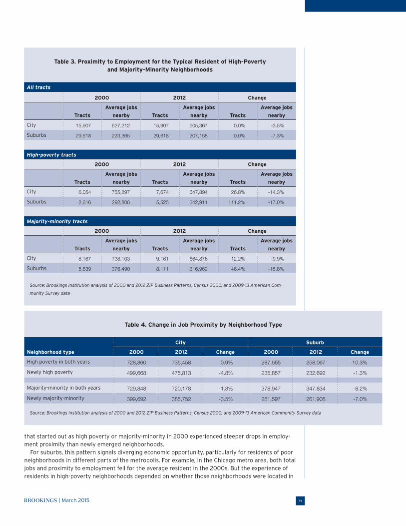
Residents of high-poverty and majority-minority neighborhoods experienced particularly pronounced declines in job proximity As poor and minority residents suburbanized over the course of the 2000s, they did not do so evenly across regions. Instead, some of the fastest increases in those populations occurred in com-munities with disproportionate numbers of such residents. As a result, the number of high-poverty neighborhoods (i.e., census tracts with poverty rates of 20 percent or more) and majority-minority neighborhoods (i.e., census tracts in which non-Hispanic whites made up less than 50 percent of residents) in suburbs rapidly caught up with the number in cities (Table 3). In just over a decade, the number of high-poverty suburban neighborhoods more than doubled, and majority-minority suburban neighborhoods grew by almost half.
High-poverty and majority-minority neighborhoods in the nation’s largest metro areas tend to overlap one another: At the end of the 2000s, almost three-quarters (72 percent) of high-poverty neighborhoods were also majority-minority, while more than half (55 percent) of majority-minority neighborhoods were also high poverty. Unlike neighborhoods in the “favored quarter” that tended to see rising numbers of jobs and increasing job proximity in the 2000s, these neighborhoods tended to locate on the “wrong side” of the region: 61 percent of high-poverty tracts and 55 percent of majority-minority neighborhoods experienced declines in job proximity during that time.
Whether in cities or in suburbs, residents of high-poverty and majority-minority neighborhoods saw the number of jobs within a typical commute distance fall at a faster pace during the 2000s than did residents of other neighborhoods. In cities, those living in high-poverty and majority-minority neighborhoods experienced a 14 and 10 percent decline in the number of nearby jobs, respectively, far outpacing the 3 percent decline experienced by the average city resident. For suburban residents in high-poverty and majority-minority tracts, the number of nearby jobs dropped by 17 and 16 percent, respectively, in the 2000s, well above the suburban average of 7 percent. (For detailed data on trends in high-poverty and majority-minority neighborhoods, see Appendices F and G.)
In part, these trends may reflect the tendency of jobs to decline in areas where concentrations of poor and minority residents are present or increasing. In cities, neighborhoods that became high poverty or majority-minority in the 2000s saw their proximity to jobs decline faster than areas that started the decade as high poverty or majority-minority (Table 4). In suburbs, however, neighborhoods
Figure 2. Change in Number of Jobs Near the Typical Large-Metro Resident, by Race, Ethnicity, and Poverty Status, 2000 and 2012
■ 2000■ 2012
600,000
500,000
400,000
300,000
200,000
100,000
0Total White Black Hispanic Asian Non-Poor Poor
-7%
-6%
-14%
-17%-9%
-6%
-17%
Source: Brookings Institution analysis of 2000 and 2012 ZIP Business Patterns data
BROOKINGS | March 2015 11
that started out as high poverty or majority-minority in 2000 experienced steeper drops in employ-ment proximity than newly emerged neighborhoods.
For suburbs, this pattern signals diverging economic opportunity, particularly for residents of poor neighborhoods in different parts of the metropolis. For example, in the Chicago metro area, both total jobs and proximity to employment fell for the average resident in the 2000s. But the experience of residents in high-poverty neighborhoods depended on whether those neighborhoods were located in
Table 3. Proximity to Employment for the Typical Resident of High-Poverty and Majority-Minority Neighborhoods
All tracts
2000 2012 Change
Tracts
Average jobs
nearby Tracts
Average jobs
nearby Tracts
Average jobs
nearby
City 15,907 627,212 15,907 605,367 0.0% -3.5%
Suburbs 29,618 223,365 29,618 207,158 0.0% -7.3%
High-poverty tracts
2000 2012 Change
Tracts
Average jobs
nearby Tracts
Average jobs
nearby Tracts
Average jobs
nearby
City 6,054 755,897 7,674 647,894 26.8% -14.3%
Suburbs 2,616 292,808 5,525 242,911 111.2% -17.0%
Majority-minority tracts
2000 2012 Change
Tracts
Average jobs
nearby Tracts
Average jobs
nearby Tracts
Average jobs
nearby
City 8,167 738,103 9,161 664,876 12.2% -9.9%
Suburbs 5,539 376,490 8,111 316,962 46.4% -15.8%
Source: Brookings Institution analysis of 2000 and 2012 ZIP Business Patterns, Census 2000, and 2009-13 American Com-
munity Survey data
Table 4. Change in Job Proximity by Neighborhood Type
Neighborhood type
City Suburb
2000 2012 Change 2000 2012 Change
High poverty in both years 728,860 735,458 0.9% 287,565 258,067 -10.3%
Newly high poverty 499,668 475,813 -4.8% 235,857 232,692 -1.3%
Majority-minority in both years 729,848 720,178 -1.3% 378,947 347,834 -8.2%
Newly majority-minority 399,692 385,752 -3.5% 281,597 261,908 -7.0%
Source: Brookings Institution analysis of 2000 and 2012 ZIP Business Patterns, Census 2000, and 2009-13 American Community Survey data

BROOKINGS | March 201512
inner-ring suburbs or further out in the metro area (Figure 3). All such neighborhoods in the inner-ring suburbs of Cook County saw the number of nearby jobs decline, whether they were persistently poor places or neighborhoods that had more recently crossed the high-poverty threshold. However, in the suburbs beyond Cook County, where most of the metro area’s newly high-poverty suburban neigh-borhoods emerged over the decade, the picture was more mixed.
Similar patterns characterize the Seattle region, which unlike metro Chicago gained jobs during the 2000s and held steady in terms of the typical resident’s proximity to jobs. Seattle’s suburbs were home to the majority of the region’s high-poverty neighborhoods in 2012 and those that emerged during the 2000s. As was the case nationally, Seattle suburbs that had been poorer for longer were more likely to experience a decline in the number of jobs within a typical commute distance. This was particularly true for residents of high-poverty neighborhoods in the inner-ring suburbs of King County, who were much more likely to see nearby jobs shrink than were their counterparts in farther-out Pierce and Snohomish counties.
The trends nationally and in Chicago and Seattle suggest that recent growth of low-income popu-lations in suburbs may be occurring in places that are gaining proximity to jobs, or at least holding steady in that regard. That is a positive sign. At the same time, however, those emerging communi-ties tend to lie farther out in metro areas, where overall proximity to employment is lower than in areas closer to the urban core. In addition, the trends also suggest that the longer these communities struggle with elevated poverty rates, the more likely it is that they will experience steeper losses in the number of nearby jobs.
Figure 3. Share of High-Poverty Neighborhoods With Declining Job Proximity, Chicago and Seattle Suburbs
100%
80%
60%
40%
20%
0%Cook County
SuburbsOther Chicago
SuburbsKing County
SuburbsOther Seattle
Suburbs
■ All High Poverty
■ High Poverty in Both Years
■ Newly High Poverty
Source: Brookings Institution analysis of 2000 and 2012 ZIP Business Patterns, Census 2000, and 2009-13 American
Community Survey data
BROOKINGS | March 2015 13
Implications
These findings offer insight into the ways in which the shifting distribution of jobs and people within metro areas shape proximity to employment opportunities for different residents over time.
Given the positive effects that stem from proximity to jobs for communities and residents ---from a healthier fiscal tax base, to improved services, to better employment outcomes---the broad trend toward decreases in the number of nearby jobs, and the disproportionately steep declines expe-rienced by low-income and minority residents for whom proximity is particularly important, should prompt targeted attention and action from regional policymakers and leaders. The disparate patterns and trends in job proximity that exist within metro areas suggest a number of key takeaways for these stakeholders.
Labor markets are regional but economic opportunity is often dictated by local conditionsMetropolitan areas are defined the way they are precisely because they are regional labor markets, characterized by strong economic ties across communities. But the findings of this analysis emphasize the importance of looking beyond how regions as a whole are performing economically or changing demographically. These data reveal the extent to which neighborhoods and residents experience those dynamics differently.
Simply attracting more jobs or adding population is not enough to guarantee positive outcomes for metropolitan residents or even equal access to economic opportunity. Clearly, where people live and where jobs locate within metro areas make a difference, shaping the number and types of employment options near different neighborhoods and residents. The way those patterns shift across places over time can create winners and losers within a metro area, or “wrong side” and “right side” of the region dynamics, even in metro areas that perform well on overall growth measures.
Because of these geographic and demographic disparities within metro areas, regional economic development efforts should not only prioritize metrowide goals, but they should also include assess-ments of the impact of regional and local strategies on proximity to employment for different resi-dents and neighborhoods within the metro area. In addition to identifying potential gaps in skills training or work supports for disadvantaged populations, understanding the shifting map of proximity can help illuminate geographic barriers to employment that may require tailored housing or transpor-tation strategies to overcome.
To return to the metro Seattle example, residents in the South Beacon Hill neighborhood just inside Seattle’s southern border live in an area that saw the number of nearby jobs grow to well over half a million by 2012. But, just south of the Seattle border in suburban Tukwila, residents find themselves in a very different position: The number of jobs within a typical commute distance has fallen since 2000, and residents count only half as many jobs nearby compared to their South Beacon Hill counterparts.19 For higher-income residents who can afford to commute by car to reach good jobs elsewhere in the region, this gap may be surmountable. But for Tukwila’s growing low-income population (one in four residents lives below the poverty line), these disparities pose greater barriers to connecting to eco-nomic opportunity. A newly implemented policy that may help mitigate some of these barriers is King County’s decision to discount public transit fares based on income for those living below twice the federal poverty level, which stands to help ease the commuting cost burden for those workers.
Strategies to connect low-income and minority residents to economic opportunity must take into account the growing suburbanization of these populationsIn the past, lower levels of job proximity for suburban residents may have primarily raised concerns about the strain on infrastructure and commute times caused by the number of suburban workers driving to their jobs elsewhere in the metro area. But the increasing share of poor and minority resi-dents living in the suburbs, and the emergence of more areas of concentrated disadvantage and racial segregation outside the urban core, raise new concerns about the ability of these residents to con-nect to employment opportunities in the first place. As more suburban communities, including more middle-ring and exurban suburbs, become home to low-income and minority residents (and in turn,
BROOKINGS | March 201514
more high-poverty and majority-minority neighborhoods), more places struggle with challenges long associated with inner cities. But they do so often without the same infrastructure or support systems that exist in most big cities and, as this analysis has shown, without the same proximity to employ-ment opportunities.
That is all to say that increasing access to economic opportunity for low-income and minority residents, particularly those in economically disadvantaged or minority neighborhoods, means not only understanding the barriers that may impede these residents from taking advantage of nearby job opportunities but also understanding that the new geography of these populations means that a growing number may not have many job opportunities nearby to begin with. Moreover, simply adapt-ing strategies used to increase economic opportunity for high-poverty or majority-minority neighbor-hoods in the inner city may not be sufficient to address the realities---including additional barriers like lack of affordable housing or transportation options or safety net and work supports---that may exist in the suburbs.
For instance, in Park Forest, Ill., a South Cook County suburb of Chicago, almost three-quarters of the community’s 22,500 residents are racial or ethnic minorities, and one in five is poor. If Park Forest were a neighborhood in Chicago, residents would live near roughly seven times more jobs on average, and those facing employment challenges or barriers could look for assistance from nearby workforce and job training services and make use of extensive transit options to help them reach both services and job opportunities. Instead, the lack of nonprofit capacity in this suburban community complicates efforts to provide struggling residents with workforce training and employment services. Limited public transit options and the distance between this suburb and areas of denser employment opportu-nities in the urban core make it that much harder to overcome challenges related to lower levels of job proximity in Park Forest and its neighboring suburbs.
As Park Forest works to improve outcomes for its residents and the community as a whole, the municipality has been integrating its planning around affordable housing, transit-oriented develop-ment, and workforce training. For example, it is currently pursuing the redevelopment of a complex of affordable housing units and seeking to increase workforce training and social service capacity by building those services and training facilities into the redevelopment plan. But the municipality is not working alone. Park Forest has been actively partnering with established regional nonprofits to bring their expertise and services to the housing redevelopment project and to the south suburbs more broadly. Park Forest also has been an active participant in the Chicago Southland Housing and Community Development Collaborative. Through the collaborative, 24 south suburban municipali-ties are working together to collectively plan for and implement housing and community development goals as a sub-region. They are also increasingly working together to attract economic development to the south suburbs and promote more transit-oriented development.
The efforts underway in Chicago’s south suburbs to address the multifaceted challenges they face underscore today’s reality. In an era of limited resources and broadening geographic need, creating economic opportunity in struggling communities---from equipping disadvantaged workers to be com-petitive for jobs, to overcoming spatial barriers to finding and keeping employment, to attracting more good jobs to the area---will take more than individual or siloed interventions.
Achieving regional growth that is shared across places and diverse populations will require collaborative solutionsThe dynamics that have shaped these job proximity patterns across and within metro areas did not emerge by themselves. Local, regional, and state leaders put them in play (whether purposefully or by default) through policy decisions around economic development, land use, taxation, infrastructure, and housing that together affected development patterns within regions. These same policy levers will influence how these trends unfold moving forward.
However, crafting solutions that balance local assets, challenges, and needs with regional goals is not something that can be done piecemeal by individual municipalities or communities. To foster growth that is truly regional in its reach and that does not exacerbate inequality or leave low-income and minority residents behind, communities will need to coordinate and collaborate as they plan and implement policy decisions that affect metropolitan development patterns.
Some metro areas have an established history and practice of collaborative strategies to build from.

BROOKINGS | March 2015 15
In some cases, as in metropolitan Denver, the East Bay communities of Alameda and Contra Costa counties outside of San Francisco, or Cleveland and its inner-ring suburbs in Cuyahoga County, commu-nities have implemented formal agreements to work collaboratively on economic development strate-gies. The agreements discourage the “poaching” of jobs across jurisdictional borders and encourage retention of existing employers. Montgomery County, Ohio and the Minneapolis-St. Paul region have taken these agreements a step further, creating fiscal mechanisms to share the returns of regional economic development across jurisdictions to mitigate local fiscal disparities.
A growing number of metro areas, like Baltimore, Chicago, San Francisco, Seattle, and St. Louis, have created integrated regional plans. These plans combine economic development strategies with planning around regional housing and transportation needs to promote denser, mixed-use, and more sustainable development patterns. In addition, metro areas like Washington, D.C. use tools like joint development agreements between the regional transit authority and public and private partners to encourage affordable housing around transit sites. Metro Denver has also brought an equity compo-nent to the expansion of its regional transit system through tools like the Denver Regional Equity Atlas, which helps identify areas of greatest opportunity and need in terms of housing, health care, educa-tion, and employment, and the Denver Regional Transit-Oriented Development Fund, a public-private pool of funds that supports the preservation and creation of affordable housing and community facili-ties around transit sites.
Targeted collaborative efforts have also emerged in suburbs facing growing challenges of poverty. For instance, building on its sub-regional planning efforts around housing and community and eco-nomic development, the Chicago Southland Housing and Community Development Collaborative has created a number of tools to help implement its goals, including founding a land bank and a transit-oriented development fund and creating clear metrics to help target investments within the collabora-tive’s footprint. Cook County, Ill. has also signaled its support of such collaborative efforts across the county’s 131 municipalities through initiatives like Planning for Progress. This initiative integrates the county’s planning processes for its federally funded community development, affordable housing, and economic development programs to better align and target federal, state, and local funding and to sup-port integrated and collaborative uses of those funds.20
Similarly, Prince George’s County, Md., a suburban county adjacent to Washington, D.C., has also taken an integrated approach to challenges in its highest-need communities. Based on a comprehen-sive demographic and economic assessment, county leadership selected six priority high-need neigh-borhoods in which to better target and align limited government resources. Called the Transforming Neighborhoods Initiative, the goal of this integrated approach is to more effectively leverage the county’s investments to improve the economic, education, health, and public safety outcomes in these struggling communities.21
Building job proximity metrics into such collaborative and integrated efforts, and ensuring regional and local strategies include an understanding of how these dynamics affect low-income and minority residents in particular, can help inform more targeted and effective strategies that build better path-ways to economic opportunity for communities and residents region-wide.

BROOKINGS | March 201516
Next steps
These findings provide a base from which to understand the local impact of broader regional shifts in where jobs locate and where people live. While these findings already point to important implications for policymakers at the local and regional levels, the national dataset we have constructed can be mined in different ways to answer additional important and
related questions that affect access to economic opportunity.In subsequent studies we plan to continue to build on this base by exploring issues such as:
■n The types of jobs near different communities and residents. What do the wage levels, educa-tion requirements, and industry mix of nearby jobs look like? How do the skill profiles of nearby jobs compare to the education levels of residents, particularly in distressed or majority-minority neighborhoods?
■n Commuting patterns within regions. How do proximity patterns relate to where workers com-mute within regions, and to commute times and modes of transportation? How do those relation-ships vary for different types of residents and neighborhoods?
■n The distribution of affordable housing. How do the distribution and availability of affordable housing options map onto job proximity patterns, particularly in areas of greater employment opportunity?
With the data and findings in this report, and the series of research to follow, local and regional leaders can better understand the ways in which proximity to jobs varies within their regions and the disparate local impacts shifts in employment and population have on nearby job options for different residents. These tools should help inform regional and local strategies to target economic develop-ment efforts and better align housing, transportation, and workforce decisions.

BROOKINGS | March 2015 17
Appendix A: Data sources and methods
This analysis examines the number and characteristics of private-sector jobs proximate to all U.S. neighborhoods in 2000 and 2012. It is based on an original database constructed from the U.S. Census Bureau’s ZIP Business Patterns, the Longitudinal Employer-Household Dynamics Origin-Destination Employment Statistics (LEHD-LODES) program, the 2009-13
American Community Survey (ACS) five-year estimates, and Census 2000 data from the GeoLytics’ Neighborhood Change Database 2010.
Geographic typologiesWe assign all census tracts to one of the following, mutually exclusive categories: “large metro,” “small metro,” and “nonmetropolitan” areas. Of the 381 metropolitan statistical areas (MSA) defined by the Office of Management and Budget in 2013, the 100 with the largest total population---per the 2010 decennial census---are considered large metro areas. Tracts falling within any MSA not among the 100 largest are considered to be in a small metro area. All others are considered nonmetropolitan or rural.22
For tracts that fall within the 100 largest metropolitan areas, we further categorize them as either “urban” or “suburban.” Urban tracts are those that fall within the first named city in the MSA’s official title, as well as all other cities in the MSA title with population totals greater than 100,000 (also per the 2010 decennial census). Tracts that fall within the 100 largest metropolitan areas but outside of these primary cities are considered suburban.
Employment data: ZIP Business PatternsPrivate-sector employment totals are drawn from the U.S. Census Bureau’s ZIP Code Business Pat-terns data.23 These data come from the Business Register, an establishment-level survey that “contains the most complete, current, and consistent data for business establishments” in the United States.24 We compare data for years 2000 and 2012, the most recent year for which data are available.
In cases where the Census Bureau suppresses ZIP code employment totals, we impute based on national average employment totals by firm size. For the year 2000, employment totals were imputed for 5,241 ZIP codes out of 38,024 (13.8 percent). In 2012, employment totals were imputed for 9,179 ZIP codes out of 38,818 (23.6 percent).
For consistency and comparability over time and across data sets, we allocate ZIP-code-level jobs data to 2010 census tract boundaries. ZIP codes are not geographic areas: they represent postal dis-tribution routes, and change at the discretion of the U.S. Postal Service---sometimes multiple times per year. Of the nearly 40,000 ZIP codes in the United States, approximately 11,000 are “point ZIP codes,” which may be unique to a single, large employer or may represent P.O. boxes. For non-point ZIP codes (“polygon ZIP codes”), it is possible to approximate their shape with geographic boundaries.25
We follow a two-step procedure to allocate ZIP code employment totals to 2010 census tracts. First, we distribute jobs associated with polygon ZIP codes to census tracts according to the distribution of the 2010 census count of households.26 Next, we allocate 100 percent of jobs associated with a given point ZIP code to the census tract in which the point ZIP code falls.27 Final tract-level job totals reflect the sum of allocated polygon ZIP code jobs and point ZIP code jobs.
Employment data: Longitudinal Employer-Household DynamicsWe also pull data from the Longitudinal Employer-Household Dynamics Origin-Destination Employ-ment Statistics. Beginning in 2002, LEHD-LODES began releasing state-reported statistics on employment at the census block level for participating states. It includes information on commute flows, wage and education levels of current workers, and the industry designation of jobs. Over time, more states have opted to participate and share data. By the 2011 data release, the most recent avail-able, all states but Massachusetts provided data in LEHD-LODES version 7.0.
We aggregate LEHD-LODES’ block-level statistics to 2010 census tract boundaries and use them to estimate the median Euclidean commute distance between origin and destination tracts for each neighborhood.
We compared LEHD commute data to the Census Transportation Planning Products (CTPP), which also model tract-to-tract commutes, based on the 2006-10 five-year ACS. Although typical commutes
BROOKINGS | March 201518
from the CTPP and LEHD are strongly correlated, we found that typical within-metropolitan-area commutes from the CTPP were shorter than those from the LEHD, which is consistent with earlier documentation.28 Ultimately, we opted to use the LEHD-LODES because of concerns with the CTPP (discussed below), and because LEHD-LODES is also the source of data on wage, education, and indus-try variables, which we will use in future analyses.
There are data-quality tradeoffs between the CTPP and LEHD-LODES. As mentioned earlier, as of release version 7.0, LEHD-LODES reported no workplace or commute data for Massachusetts. And, because Minnesota was the only state whose unemployment records reported the establishment-level location of jobs, spatial commute patterns observed in Minnesota for establishments with multiple locations (about 40 percent of all jobs in the LEHD-LODES) were used to create a probability model that assigns jobs associated with a multi-establishment firm nationally to a specific establishment.29
However, the CTPP is based on a relatively small national household survey (the ACS), so it has fewer origin-destination pairs than the modeled LEHD origin-destination file---and represents five years of averaged data, 2006-10. It is possible that the small ACS sample could miss lower-frequency commutes and consequently over-weight more-frequent commute trips. Additionally, because self-employed per-sons who work from home are systematically more likely to appear in household survey results than in employer survey or administrative survey results, this could pull down the average commute distance in CTPP.30 Finally, in up to 25 percent of cases, workplace addresses are not reported and must be imputed. For these reasons, we opt to use the LEHD as the source of commute data.
Demographic dataTract demographic characteristics on population, poverty, and race and ethnicity in 2000 come from the GeoLytics Neighborhood Change Database 2010. A joint project of GeoLytics, Inc. and the Urban Institute, the Neighborhood Change Database 2010 is a proprietary data source that presents histori-cal data from the decennial census normalized to 2010 census tract boundaries.
Our primary data source for population, poverty, and race characteristics of residential tracts in 2012 is the 2009-13 five-year American Community Survey estimates, the latest available.31 All data are downloaded through the National Historical Geographic Information System (NHGIS).32
Defining proximityFor this analysis, we define proximity as the “typical” commute distance for each of the nation’s offi-cial MSAs, per 2013 Office of Management and Budget definitions, and the nonmetropolitan remainder of each U.S. state.33 Using the LEHD-LODES, we calculate the median geodetic distance between 2010 census tract household-weighted centroids, weighted by the number of commuters traveling between pairs of tracts within the same MSA or nonmetropolitan remainder of the state.
After testing alternative specifications (using geographic-, population-, and 2011 private-job-weighted centroids), we opt to use 2010 household count centroid weights because they more accu-rately reflect tract population centers than do geographic centroids, and they offer more complete coverage than 2011 private job weights from LEHD-LODES. For the 654 tracts for which household-weighted centroids could not be calculated (out of 73,057, or just under 1 percent of all tracts), we substitute geographic centroids---for which census gazetteer files offer 100 percent coverage.34
Weighted census tract coordinates (Xc, Y
c) are calculated as follows:
DefiningproximityForthisanalysis,wedefineproximityasthe“typical”commutedistanceforeachofthenation’sofficialMSAs,per2013OfficeofManagementandBudgetdefinitions,andthenonmetropolitanremainderofeachU.S.state.33UsingtheLEHD‐LODES,wecalculatethemediangeodeticdistancebetween2010censustracthousehold‐weightedcentroids,weightedbythenumberofcommuterstravelingbetweenpairsoftractswithinthesameMSAornonmetropolitanremainderofthestate.Aftertestingalternativespecifications(usinggeographic‐,population‐,and2011private‐job‐weightedcentroids),weopttouse2010householdcountcentroidweightsbecausetheymoreaccuratelyreflecttractpopulationcentersthandogeographiccentroids,andtheyoffermorecompletecoveragethan2011privatejobweightsfromLEHD‐LODES.Forthe654tractsforwhichhousehold‐weightedcentroidscouldnotbecalculated(outof73,057,orjustunder1percentofalltracts),wesubstitutegeographiccentroids—forwhichCensusgazetteerfilesoffer100percentcoverage.34
Weightedcensustractcoordinates(Xc,Yc)arecalculatedasfollows:
�� � �∑ ��������� ��∑ ������� � and�� �
�∑ ��������� ��∑ ������� �
Whereiisacensusblockincensustractc,piisthepopulation(orcountofhouseholdsorjobs)inblocki,andxiandyiarethex‐andy‐coordinatesofthegeographiccentroidofblocki.35TocalculatetypicalcommutedistancesforeachMSA,weaggregateLEHD‐LODESblock‐levelobservations(comprisingpairsofresidenceandworkplacecensusblocksandthemodelednumberofcommutersmakingthetrip)tothetractlevel,andeliminatetractpairsthatdonotfallwithinthesameMSA.WecalculatethegeodeticdistancebetweentractpaircentroidsandcollapsetothemediancommutedistancebyMSA,weightedbythenumberofcommutersmakingagiventrip.Thesameprocedureisapplied,bystate,toresidentsofnonmetropolitanareascommutingtononmetropolitanareas.Thus,eachof381MSAsinthecountryisassigneditsowntypicalcommutedistance,andeachstateisassignedatypicalcommutedistanceforthenonmetropolitanremainder.Notethatthesamecommutedistanceisusedtoevaluateproximityin2000and2012.Usingafixedcommutedistancetomeasureproximityinbothyearsofferscomparabilityovertimeandfacilitatesassessmentoftheabsolutechangeinthenumberofjobswithinagivendistanceofeachtract.Incontrast,allowingcommutedistancestovaryovertimewouldintroduceissuesofendogeneityandcomplicateinterpretationoflocaljobtrends.
Where i is a census block in census tract c, pi is the population (or count of households or jobs) in
block i, and xi and y
i are the x- and y-coordinates of the geographic centroid of block i.35
To calculate typical commute distances for each MSA, we aggregate LEHD-LODES block-level observations (comprising pairs of residence and workplace census blocks and the modeled number of commuters making the trip) to the tract level, and eliminate tract pairs that do not fall within the same
BROOKINGS | March 2015 19
MSA. We calculate the geodetic distance between tract pair centroids and collapse to the median com-mute distance by MSA, weighted by the number of commuters making a given trip. The same proce-dure is applied, by state, to residents of nonmetropolitan areas commuting to nonmetropolitan areas. Thus, each of 381 MSAs in the country is assigned its own typical commute distance, and each state is assigned a typical commute distance for the nonmetropolitan remainder.
Note that the same commute distance is used to evaluate proximity in 2000 and 2012. Using a fixed commute distance to measure proximity in both years offers comparability over time and facilitates assessment of the absolute change in the number of jobs within a given distance of each tract. In contrast, allowing commute distances to vary over time would introduce issues of endogeneity and complicate interpretation of local job trends.
We create a master file of pairs of census tracts whose household-weighted centroids are located within 13 miles of each other. (Thirteen miles is slightly longer than the longest calculated typical com-mute distance.) Typical commute distances are merged into the file, and tract pairs whose distance exceeds that of the typical commute are dropped. The resulting file of tract pairs contains approxi-mately 9.2 million observations.
A note about Massachusetts: Because commute data were not available for Massachusetts at the time of this analysis, we are not able to calculate a typical commute distance for the 1,838 census tracts that fall in the state or in one of the eight metropolitan areas partially or completely located in the state. Thus, while we are able to allocate job totals to these census tracts, we omit the metro areas that fall primarily or partially in Massachusetts from our analysis of proximate job totals.
Key metricsThe key metrics we present include the average number of jobs near the typical resident: specifically, the population-weighted average number of jobs within the median commute distance for each metro area or nonmetropolitan state remainder.
Total allocated job counts for 2000 and 2012 are merged onto workplace tract pairs in the master proximate tract file and collapsed to individual residential tracts. Demographic characteristics for 2000 and 2009-13 are merged onto residential tracts. Residential tracts are further classified by geo-graphic typology, as described above.
Averages for a given year are obtained by collapsing to that year’s population-weighted mean job total values by metro area. Averages by type of resident---i.e., poor, African American, etc.---are obtained by weighting on the given population characteristic from the same year. Averages for types of tracts---i.e., urban vs. suburban, high poverty (poverty rates of 20 percent or more), majority-minor-ity (half or more of residents identify as a racial or ethnic minority)---are obtained by following the same collapse procedure, but restricted to tracts that meet the given characteristic.

BROOKINGS | March 201520
Appendix B. Typical Commute Distances, 96 Large Metro Areas Metro name Typical commute* (mi.)
Akron, OH 6.1Albany-Schenectady-Troy, NY 7.1Albuquerque, NM 6.7Allentown-Bethlehem-Easton, PA-NJ 5.9Atlanta-Sandy Springs-Roswell, GA 12.8Augusta-Richmond County, GA-SC 7.0Austin-Round Rock, TX 8.6Bakersfield, CA 5.6Baltimore-Columbia-Towson, MD 8.6Baton Rouge, LA 8.0Birmingham-Hoover, AL 10.1Boise City, ID 6.0Bridgeport-Stamford-Norwalk, CT 5.4Buffalo-Cheektowaga-Niagara Falls, NY 6.5Cape Coral-Fort Myers, FL 7.3Charleston-North Charleston, SC 8.0Charlotte-Concord-Gastonia, NC-SC 9.7Chattanooga, TN-GA 7.5Chicago-Naperville-Elgin, IL-IN-WI 10.0Cincinnati, OH-KY-IN 8.7Cleveland-Elyria, OH 7.8Colorado Springs, CO 5.9Columbia, SC 9.0Columbus, OH 8.6Dallas-Fort Worth-Arlington, TX 12.2Dayton, OH 6.6Deltona-Daytona Beach-Ormond Beach, FL 5.9Denver-Aurora-Lakewood, CO 8.5Des Moines-West Des Moines, IA 6.4Detroit-Warren-Dearborn, MI 10.4El Paso, TX 7.0Fresno, CA 5.6Grand Rapids-Wyoming, MI 7.2Greensboro-High Point, NC 6.9Greenville-Anderson-Mauldin, SC 8.0Harrisburg-Carlisle, PA 6.0Hartford-West Hartford-East Hartford, CT 7.3Houston-The Woodlands-Sugar Land, TX 12.2Indianapolis-Carmel-Anderson, IN 9.2Jackson, MS 8.7Jacksonville, FL 9.1Kansas City, MO-KS 8.9Knoxville, TN 9.1Lakeland-Winter Haven, FL 6.9Las Vegas-Henderson-Paradise, NV 7.2Little Rock-North Little Rock-Conway, AR 8.2Los Angeles-Long Beach-Anaheim, CA 8.8Louisville/Jefferson County, KY-IN 7.6Madison, WI 6.8McAllen-Edinburg-Mission, TX 6.4

BROOKINGS | March 2015 21
Appendix B. Typical Commute Distances, 96 Large Metro Areas (continued) Metro name Typical commute* (mi.)
Memphis, TN-MS-AR 8.9Miami-Fort Lauderdale-West Palm Beach, FL 8.6Milwaukee-Waukesha-West Allis, WI 7.4Minneapolis-St. Paul-Bloomington, MN-WI 9.5Nashville-Davidson--Murfreesboro--Franklin, TN 11.0New Haven-Milford, CT 5.0New Orleans-Metairie, LA 6.2New York-Newark-Jersey City, NY-NJ-PA 7.7North Port-Sarasota-Bradenton, FL 5.9Ogden-Clearfield, UT 5.7Oklahoma City, OK 8.6Omaha-Council Bluffs, NE-IA 6.0Orlando-Kissimmee-Sanford, FL 9.1Oxnard-Thousand Oaks-Ventura, CA 5.3Palm Bay-Melbourne-Titusville, FL 6.6Philadelphia-Camden-Wilmington, PA-NJ-DE-MD 7.8Phoenix-Mesa-Scottsdale, AZ 11.4Pittsburgh, PA 8.1Portland-Vancouver-Hillsboro, OR-WA 7.1Provo-Orem, UT 5.5Raleigh, NC 8.5Richmond, VA 8.7Riverside-San Bernardino-Ontario, CA 9.1Rochester, NY 7.4Sacramento--Roseville--Arden-Arcade, CA 8.0St. Louis, MO-IL 10.0Salt Lake City, UT 6.5San Antonio-New Braunfels, TX 8.8San Diego-Carlsbad, CA 8.5San Francisco-Oakland-Hayward, CA 8.0San Jose-Sunnyvale-Santa Clara, CA 6.4Scranton--Wilkes-Barre--Hazleton, PA 5.2Seattle-Tacoma-Bellevue, WA 9.0Spokane-Spokane Valley, WA 5.6Stockton-Lodi, CA 4.7Syracuse, NY 6.5Tampa-St. Petersburg-Clearwater, FL 8.5Toledo, OH 6.0Tucson, AZ 7.3Tulsa, OK 8.0Urban Honolulu, HI 6.6Virginia Beach-Norfolk-Newport News, VA-NC 7.6Washington-Arlington-Alexandria, DC-VA-MD-WV 9.1Wichita, KS 6.7Winston-Salem, NC 7.1Youngstown-Warren-Boardman, OH-PA 5.8
Note: Typical commute distance is defined as the median within-metro-area commute distance.
Source: Brookings Institution analysis of 2011 Longitudinal Employer-Household Dynamics data

BROOKINGS | March 201522
Endnotes
1. Edward L. Glaeser and Matthew E. Kahn, “Decentralized
Employment and the Transformation of the American
City,” National Bureau of Economic Research Working
Paper 8117 (2001); Elizabeth Kneebone, “Job Sprawl
Stalls: The Great Recession and Metropolitan Employment
Location” (Washington: Brookings Institution, 2013).
2. William Frey, “Melting Pot Cities and Suburbs: Racial
and Ethnic Change in Metro America in the 2000s”
(Washington: Brookings Institution, 2011); Elizabeth
Kneebone and Alan Berube, Confronting Suburban
Poverty in America (Washington: Brookings Press, 2013).
3. John F. Kain, “The Spatial Mismatch Hypothesis: Three
Decades Later,” Housing Policy Debate 3, no. 2 (1992);
Daniel Immergluck, “Job Proximity and the Urban
Employment Problem: Do Suitable Nearby Jobs Improve
Neighbourhood Employment Rates?” Urban Studies
35, no. 1 (1998); Steven Raphael and Michael Stoll, “Job
Sprawl and the Suburbanization of Poverty” (Washington:
Brookings Institution, 2010); Laurent Gobillon and Harris
Selod, “Spatial Mismatch, Poverty, and Vulnerable
Populations,” in Handbook of Regional Science (New York:
Springer, 2012).
4. Philip Kloha, Carol S. Weissert, and Robert Kleine,
“Developing and Testing a Composite Model to Predict
Local Fiscal Distress,” Public Administration Review 65,
no. 3 (2005); Beth Walter Honadle, Beverly Cigler, and
James M. Costa, Fiscal Health for Local Governments
(Amsterdam: Elsevier Academic Press, 2003).
5. Matt Fellowes, “Making Markets an Asset for the Poor,”
Harvard Law and Policy Review 1 (2007).
6. Immergluck, “Job Proximity and the Urban Employment
Problem”; Scott W. Allard and Sheldon Danziger,
“Proximity and Opportunity: How Residence and Race
Affect the Employment of Welfare Recipients,” Housing
Policy Debate 13, no. 4 (2002).
7. Gobillon and Selod, “Spatial Mismatch, Poverty, and
Vulnerable Populations”; Fredrik Andersson, John C.
Haltiwanger, Mark J. Kutzbach, Henry O. Pollakowski, and
Daniel H. Weinberg, “Job Displacement and Duration of
Joblessness: The Role of Spatial Mismatch,” National Bureau
of Economic Research Working Paper 20066 (2014).
8. Andersson et al., “Job Displacement and Duration of
Joblessness.”
9. Allard and Danzinger, “Proximity and Opportunity.”
10. Immergluck, “Job Proximity and the Urban Employment
Problem.”
11. Brookings Institution analysis of 2011 Longitudinal
Employer-Household Dynamics data finds that the typical
resident in the nation’s largest metro areas earning less
than $15,000 a year commutes 7.6 miles, while the typical
resident earning more than $40,000 a year commutes
9.6 miles on average. See also Stuart A. Gabriel and
Stuart S. Rosenthal, “Commutes, Neighborhood Effects,
and Earnings: An Analysis of Racial Discrimination and
Compensating Differentials,” Journal of Urban Economics
40, no. 1 (1996): 61-83; Sara McLafferty, “Gender, Race,
and the Determinants of Commuting: New York in 1990,”
Urban Geography 18, no. 3 (1997): 192-212.
12. Lingqian Hu and Genevieve Giuliano, “Poverty
Concentration, Job Access, and Employment Outcomes,”
Journal of Urban Affairs 00, no. 0 (2014): 1-17.
13. Keith R. Ihlanfeldt and David L. Sjoquist, “The Spatial
Mismatch Hypothesis: A Review of Recent Studies and
Their Implications for Welfare Reform,” Housing Policy
Debate 9, no. 4 (1998).
14. Metro-level employment changes appear to matter even
more to changes in proximity over time than population
trends. The correlation coefficient between total job
change and change in average job proximity is 0.81 com-
pared to a correlation coefficient of 0.45 for population
change and change in proximity.
15. The correlation coefficient between job change and
proximity change is 0.77 for regions that improved job
proximity in the 2000s, compared with 0.6 for regions
with declines in job proximity between 2000 and 2012.
16. Christopher Leinberger, The Option of Urbanism: Investing
in a New American Dream (Washington: Island Press, 2009).
17. The larger absolute number of people affected by declin-
ing job proximity in the suburbs helps explain the steeper
declines the typical suburban resident registered com-
pared to the typical city resident over this time period.
18. See, e.g., Elizabeth Roberto, “Commuting to Opportunity:
The Working Poor and Commuting in the United States”
(Washington: Brookings Institution, 2008); Ajay Chaudry
et al., “Child Care Choices of Low-Income Working
Families” (Washington: Urban Institute, 2011); Immergluck,
“Job Proximity and the Urban Employment Problem.”
19. Visit the interactive data tool to compare Seattle census
tract 53033011700 to Tukwila census tract 53033028200.
BROOKINGS | March 2015 23
20. For more detail on Planning for Progress, see
www.blog.cookcountyil.gov/economicdevelopment/
planning-for-progress.
21. For more details on the Prince George’s initia-
tive, see www.princegeorgescountymd.gov/sites/
ExecutiveBranch/CommunityEngagement/
TransformingNeighborhoods/Pages/default.aspx.
22. The OMB defines a total of 388 metropolitan statistical
areas in 2013; 381 of these are in the continental U.S. and
Hawaii (Alaska has no MSAs), and the remaining seven are
in Puerto Rico.
23. ZIP Business Patterns data exclude information on the
self-employed population, employees of private house-
holds, railroad employees, agricultural production work-
ers, and most government employees.
24. See www.census.gov/econ/cbp/overview.htm.
25. PolicyMap provides an accessible explanation of ZIP code
boundaries at www.policymap.com/blog/2013/04/tips-
on-zips-part-iii-making-sense-of-zip-code-boundaries/.
26. For polygon ZIP codes, employment totals are allocated
to census tracts based on 2010 census block household
counts. Using GIS mapping software, we join 2010 census
block geographic centroids to 2012 ZIP code polygons
(from ESRI shapefiles), and create an allocation factor
equal to the block household total divided by the ZIP code
household total. After testing allocation factors based
on 2010 census household and population block totals,
as well as 2011 LEHD block job totals, we opt to use block
household totals. The spatial distribution of households
is strongly related to that of jobs, and coverage of block
household counts is more complete than that of jobs data
in the LEHD, which goes back only to 2002.
27. For the purposes of this analysis, we retain all point ZIP
codes except P.O. box point ZIPs. Because non-P.O. box
point ZIP codes are associated with a single, large institu-
tion, we assume that jobs associated with other types of
point ZIP codes are actually associated with the census
tract in which the point ZIP code falls. It is less defensible
to assume the same about jobs associated with P.O. boxes,
which may serve a much larger geographic area. Thus, we
eliminate P.O. box ZIP codes---which represent approxi-
mately 1 million jobs, or less than 1 percent of all 2011
jobs---from this analysis.
28. See Matthew R. Graham, Mark J. Kutzback, and Brian
McKenzie, “Design Comparison of LODES and ACS
Commuting Data Products,” U.S. Census Bureau (2014),
and Bruce D. Spear, “NCHRP 08-36, Task 098: Improving
Employment Data for Transportation Planning,” prepared
for AASHTO Standing Committee on Planning (2011),
www.camsys.com/pubs/NCHRP08-36-98.pdf.
29. For an explanation of the origin and construction of
LEHD data, see John M. Abowd, Bryce E. Stephens, Lars
Vilhuber, Fredrik Andersson, Kevin L. McKinney, Marc
Roemer, and Simon Woodcock, “The LEHD Infrastructure
Files and the Creation of the Quarterly Workforce
Indicators,” in Producer Dynamics: New Evidence From
Micro Data, Timothy Dunne, J. Bradford Jensen, and Mark
J. Roberts, eds. (University of Chicago Press: 2009),
www.nber.org/chapters/c0485.pdf.
30. See Katharine G. Abraham, John C. Haltiwanger, Kristin
Sandusky, and James Spletzer, “Exploring Differences
in Employment Between Households and Establishment
Data,” National Bureau of Economic Research Working
Paper 14805 (2009), www.nber.org/papers/w14805.pdf,
and Spear, “NCHRP 08-36, Task 098.”
31. The American Community Survey is the successor to the
long-form decennial census, a national household survey
that estimates population characteristics, including edu-
cational attainment (beyond population and race counts
obtained from the short-form census). In order to obtain
reliable estimates for geographic areas with populations
below 20,000, it is necessary to use multiple-year average
data; and tract estimates are available only from pooled
five-year data.
32. Minnesota Population Center, National Historical
Geographic Information System: Version 2.0 (Minneapolis:
University of Minnesota, 2011).
33. Consistent with existing literature, we found that com-
mutes from census tracts with poverty rates at or above
20 percent were shorter than typical commutes for the
whole metro area. Additionally, we found that commutes
from the suburban portion of metropolitan areas were
longer than those from inner cities. We opted to define
the “typical” commute as the median for the whole met-
ropolitan area to provide a consistent benchmark across
communities and populations within a region, although
use of this definition may overstate “nearby” jobs for
poor residents.
34. Job-weighted centroids, calculated from LEHD-LODES,
were not available for 2,298 2010 census tracts. Census
2010 gazetteer files are available at www.census.gov/geo/
maps-data/data/gazetteer2010.html.
35. Fahui Wang, Quantitative Methods and Applications in GIS
(New York: Taylor & Francis, 2006), 85.

BROOKINGS | March 201524
Acknowledgments
The authors would like to thank Harry Holzer, Robin Snyderman, and Michael Stoll and our Brookings colleagues Bruce Katz, Amy Liu, Alan Berube, Mark Muro, Robert Puentes, Jody Franklin, Nick Marchio, Jonathan Rothwell, Adie Tomer, and Jill Wilson for their comments on a draft of this paper. Thanks as well to Brian McKenzie, Siddharth Kulkarni, and Jesus Trujillo for their feedback on the methodology.
This publication has been made possible thanks to the commitment and financial support of The Annie E. Casey Foundation and The Ford Foundation.
The Brookings Institution is a private, nonprofit organization. Its mission is to conduct high-qual-ity, independent research and, based on that research, to provide innovative, practical recommen-dations for policymakers and the public. The conclusions and recommendations of any Brookings publication are solely those of its author(s), and do not reflect the views of the Institution, its management, or its other scholars.
Brookings recognizes that the value it provides is in its absolute commitment to quality, indepen-dence, and impact. Activities supported by its donors reflect this commitment.
For More Information
Metropolitan Policy Program at Brookings1775 Massachusetts Avenue, NWWashington D.C. 20036-2188telephone 202.797.6000fax 202.797.6004web site www.brookings.edu/metro

About the Metropolitan Policy Program at BrookingsCreated in 1996, the Brookings Institution’s Metropolitan Policy Program provides decision makers with cutting-edge research and policy ideas for improving the health and prosperity of cities and metropolitan areas including their component cities, suburbs, and rural areas. To learn more visit www.brookings.edu/metro.
1775 Massachusetts Avenue, NW Washington D.C. 20036-2188telephone 202.797.6000fax 202.797.6004web site www.brookings.edu
telephone 202.797.6139 fax 202.797.2965web site www.brookings.edu/metro