storytelling: the next step for visualization
TRANSCRIPT
Storytelling: The Next Step for Visualization
Robert Kosara, Jock Mackinlay Tableau Software [email protected], [email protected]
Abstract Presentation and communication of data have so far played a minor role in visualization research, with
most work focused on exploration and analysis. We propose that presentation, in particular using
elements from storytelling, is the next logical step and should be a research focus of at least equal
importance as each of the other two.
Stories package information into a structure that is easily remembered, which is important in many
collaborative scenarios when an analyst is not the same person as the one who makes decisions, or
simply needs to share information with peers. Data visualization lends itself well to being a
communication medium for storytelling, in particular when the story also contains a lot of data. We
review the literature on storytelling and presentation and outline the research area.
Keywords Visualization, visual communication, narrative, storytelling
Introduction Visualization research has traditionally focused on the exploration and analysis of data. As visualization
is used in more real-world settings, decisions made based on results from these tasks becomes more
and more important. Since the analysts who use visualization often are not the ones making the
decisions, they need to communicate their findings to the decision makers.
In the early days of visualization, much of the work was focused on novel techniques. The plethora of
techniques led to the question: which one to use, and for what task? This gave rise to evaluation papers
that compared techniques, and tried to ascertain the perceptual mechanisms behind specific
techniques.
We have a good understanding of the design space of visualization now, to the point where we are able
to find suitable techniques for most data sets and tasks. More research is clearly needed in this area, but
there is a body of existing work that provides useful ways of working with data.
While these techniques cover the exploration and analysis of data, ways of presenting and
communicating data are still lacking. Tying facts together into a story is one of the most effective ways
of presenting them and making a point. Stories have proven to be not only an incredibly popular way of
conserving information and passing it on, they also provide the connective tissue between facts to make
them memorable [1].
In this paper, we review the literature and history of presentation and storytelling in visualization,
discuss examples, and outline a research program to develop storytelling as a visualization task of equal
importance to exploration and analysis.
Story Definition and Model We define a story as an ordered sequence of steps, with a clearly defined path through it. Each step can
contain text, images, visualizations, video, or any combination thereof. In this paper, we focus on stories
that primarily consist of visualization steps, which can include text and images, but are mainly based on
data.
Order is a key feature of stories. In traditional stories, order roughly corresponds with time, which is
crucial to understand causality: events that happen earlier can influence later events, but not the other
way around [1]. Stories are often not told in a linear fashion, but rather use flashbacks and other literary
devices. However, within each segment, the order is consistent, and the order of different segments
also needs to be made clear in order for the story to be comprehensible.
Our working model for how stories are constructed is based on the way journalists work. They collect
information through research, interviews, etc., which gives them the key facts. They then tie those
together into a story that may look very different, and not directly use any of the source materials (like
data collected, recorded interviews, etc.). Since the goals and tasks during the research phase are
different from writing, so are the tools. Some of the material from the research phase, such as pieces of
video, might end up in the final story. Most of the source material only serves as the raw material for
the written piece, however.
In this model, the data analyst uses visualization for both the exploration/analysis and the presentation.
However, the way it is used can be very different, the choice of technique will differ, as does how much
and which data is shown.
Visualization researchers often tacitly assume that the tools used for analysis are usable for presentation
just as well as for their original purpose. We believe that to be a very limiting assumption, however.
The History of Storytelling in Visualization While information visualization has largely focused on exploration and analysis in its 20-odd years of
existence, some of the earliest examples of data visualization were created to show and explain, not to
analyze. Florence Nightingale used her charts not to analyze data about the causes of death in the
Crimean War, but to make the numerically illiterate politicians of the time aware of the size of the
problem. Similarly, John Snow's famous map of Cholera cases in 1850's London was not used to find the
water pump that was spreading the disease, but to present the evidence after Snow had identified it as
the most likely cause using other means [2].
Similarly, Charles Minard's famous map of Napoleon's march on Moscow (Figure 3) is primarily a means
of telling the story of the soldiers' plight, and less an analytic tool for understanding complex data.
In the modern visualization literature, the earliest work on storytelling we are aware of is a paper by
Gershon and Ward [3] that describes the use of storytelling techniques to show the development of a
hostage situation. While the paper makes many interesting points about the power of storytelling, it
arguably does not describe actual visualization, since it is mostly based on map views without numerical
data. It does, however, describe the need to communicate the key information about a situation clearly
and concisely, and argues that stories are a good vehicle for this purpose.
More recently, Segel and Heer [4] classified the patterns and approaches used by news media to tell
stories visually. They identified a number of approaches that are commonly used, including different
layouts and semantic story structures. One of the most interesting structures is what they call the
Martini glass, which starts with a broad introduction, then narrows to make a particular point, and then
opens up interaction and exploration to the viewer.
Hullman and Diakopoulos [5] explored the role of rhetoric in narrative visualization, and how it frames
the data being presented. They identified a number of approaches to communicate authority,
completeness of data, etc., and showed how these cues can be used to prioritize particular
interpretations.
On the evaluation side, Robertson et al. [6] looked into the effectiveness of animation in presentation
and analysis, in particular the type used by gapminder, and found its effectiveness to be limited.
However, gapminder has shown the effectiveness of animated transitions for explaining visualizations
and getting people interested in the data, which is a dimension that study unfortunately did not explore.
Given that the goal of presentation is generally to get a point across and have the audience remember
it, the effect of visualization on memory is important. Bateman et al. [7] studied the effects of
embellishments on memory and found more embellished charts (infographics) to be easier to
remember. Just like stories, embellishments add context to the presented information that makes it
easier to remember and recall.
Data-based information graphics are often considered bad visualization, and when they are done for
marketing purposes, they often are. However, visual journalism has a history of informative and well-
designed graphics that attract readers' attention without distracting from the data. Little work has been
done on understanding the techniques of journalism from the academic perspective, but interest in the
area is growing. A recent book by Cairo [8] provides valuable insights into the journalistic process and
the common roots of visualization research, perceptual background, and journalistic mission.
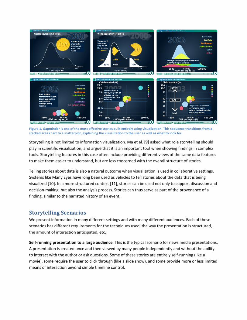
Figure 1. Gapminder is one of the most effective stories built entirely using visualization. This sequence transitions from a stacked area chart to a scatterplot, explaining the visualization to the user as well as what to look for.
Storytelling is not limited to information visualization. Ma et al. [9] asked what role storytelling should
play in scientific visualization, and argue that it is an important tool when showing findings in complex
tools. Storytelling features in this case often include providing different views of the same data features
to make them easier to understand, but are less concerned with the overall structure of stories.
Telling stories about data is also a natural outcome when visualization is used in collaborative settings.
Systems like Many Eyes have long been used as vehicles to tell stories about the data that is being
visualized [10]. In a more structured context [11], stories can be used not only to support discussion and
decision-making, but also the analysis process. Stories can thus serve as part of the provenance of a
finding, similar to the narrated history of an event.
Storytelling Scenarios We present information in many different settings and with many different audiences. Each of these
scenarios has different requirements for the techniques used, the way the presentation is structured,
the amount of interaction anticipated, etc.
Self-running presentation to a large audience. This is the typical scenario for news media presentations.
A presentation is created once and then viewed by many people independently and without the ability
to interact with the author or ask questions. Some of these stories are entirely self-running (like a
movie), some require the user to click through (like a slide show), and some provide more or less limited
means of interaction beyond simple timeline control.
The goal of these stories is similar to that of a written feature story: getting a point across and explaining
it in sufficient detail for the viewer to understand and to trust that the story is based on real facts and
data.
A key concern with these stories is often to draw the reader in. For this purpose, they often present a
static view that provides a teaser and a first bit of information that does not require interaction. This is
similar to a catchy title and lede that are meant to peak the reader's curiosity and make them read the
rest of an article. There are also often additional hints or affordances to direct the user to certain
interactions to get the story started or to advance to the next step.
In addition to informing about an issue, a story often tries to raise awareness and create interest in a
topic a reader may not otherwise have been aware of. To provide a deeper connection with the story, it
can allow the viewer to dig deeper into the data, or at least find out how it relates to her, for example by
providing a map that she can focus on her immediate area.
Live presentation by a speaker in front of an audience. This model, exemplified by Hans Rosling and his
gapminder presentation, is similar to the way many business presentations are given today. The main
difference is in how the presenter can respond to questions, which partially obviates the need for an
open exploration part at the end, but also poses other challenges.
A presentation based on a live visualization allows the presenter to pause the story and interact in
response to questions. It is even conceivable that the presentation adapt to changes made at one point
that carry forward through different presentation steps. In addition to the usual kinds of interactions
used in visualization, there is an additional layer of annotation, highlighting, etc., that can be useful in
presenting.
Individual (or small-group) presentation of results. While this scenario might not seem different from
the previous one, it does potentially involve more interaction between the presenter and the audience.
This requires the presentation tool to be more flexible than a simple slide show, so that it is possible to
answer questions that come up during the presentation. For example, in a discussion of quarterly
results, questions about specific sales or marketing measures might come up that were not part of the
story, but are of interest to people in the audience.
In addition to being able to ask and answer questions, it also appears useful to be able to record the
kinds of questions asked so they can be reviewed later. A well-presented story is likely to lead to new
questions that need to be considered when creating a revision, or that the presenter wants to follow up
on. This way, the presentation becomes a vehicle not only for dissemination of information, but also for
collecting and condensing additional knowledge.
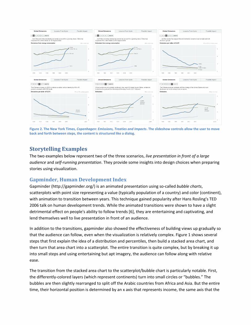
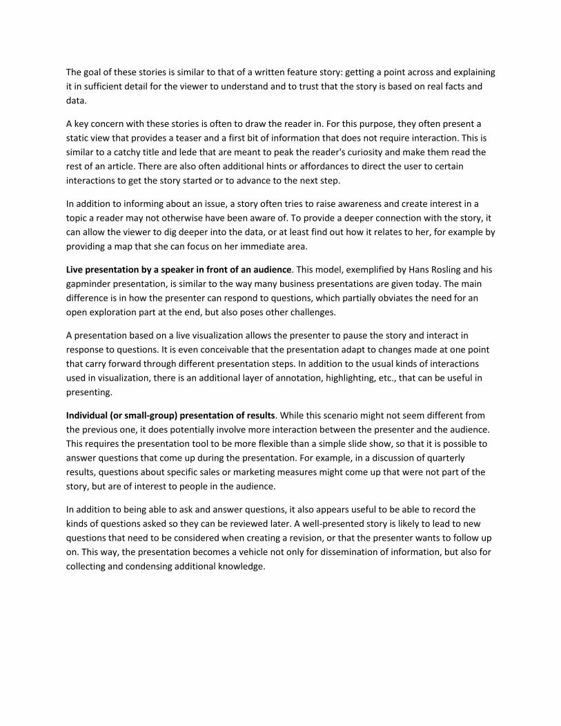
Figure 2. The New York Times, Copenhagen: Emissions, Treaties and Impacts. The slideshow controls allow the user to move back and forth between steps, the content is structured like a dialog.
Storytelling Examples The two examples below represent two of the three scenarios, live presentation in front of a large
audience and self-running presentation. They provide some insights into design choices when preparing
stories using visualization.
Gapminder, Human Development Index Gapminder (http://gapminder.org/) is an animated presentation using so-called bubble charts,
scatterplots with point size representing a value (typically population of a country) and color (continent),
with animation to transition between years. This technique gained popularity after Hans Rosling's TED
2006 talk on human development trends. While the animated transitions were shown to have a slight
detrimental effect on people's ability to follow trends [6], they are entertaining and captivating, and
lend themselves well to live presentation in front of an audience.
In addition to the transitions, gapminder also showed the effectiveness of building views up gradually so
that the audience can follow, even when the visualization is relatively complex. Figure 1 shows several
steps that first explain the idea of a distribution and percentiles, then build a stacked area chart, and
then turn that area chart into a scatterplot. The entire transition is quite complex, but by breaking it up
into small steps and using entertaining but apt imagery, the audience can follow along with relative
ease.
The transition from the stacked area chart to the scatterplot/bubble chart is particularly notable. First,
the differently-colored layers (which represent continents) turn into small circles or “bubbles.” The
bubbles are then slightly rearranged to split off the Arabic countries from Africa and Asia. But the entire
time, their horizontal position is determined by an x axis that represents income, the same axis that the
area chart also used. Once the bubbles are explained, a vertical axis is unrolled, which the bubbles stick
to. This animation very simply but clearly explains the idea that the location of the bubbles is
determined by not just one value, but two (the second one being a measure for health).
The popularity of gapminder is certainly partly due to Hans Rosling's personality and energetic style of
presentation. But the techniques and ideas used certainly appear effective and useful, even though only
a few of them have been studied with any depth. A more thorough understanding of all the different
aspects of this presentation would be extremely useful to guide further development of presentation
tools using visualization. In particular, does engagement help people understand data or get in the way?
Which kinds of animation are helpful, and which only distract? What is the trade-off between distraction
and engagement? Etc.
New York Times, Copenhagen: Emissions, Treaties and Impacts In a story on the Copenhagen climate conference, the New York Times used slide show controls to
provide a way of stepping through (Figure 2 and http://nyti.ms/sFYztk). The structure of the content is
interesting because it describes a relatively complex subject, with different players who have different
goals and ideas about what should be done. The story walks the reader through those differences and
also shows the results of implementing the protocol in countries that have already agreed to it. While
the slide show metaphor is very simple, it allows almost any story to be told. This particular story has a
he-said-she-said kind of structure, which is surprisingly engaging (somewhat like a dialog in a play or
movie).
The story is also of interest because its comparison of different metrics that lead to different
interpretations mirrors a common use case in business data. There are often many ways of measuring
things, which lead to clashing views of the same process. Understanding the differences and creating a
common view is a difficult task that can be supported with a well-constructed story.
Using a visualization like a line chart also lends itself to simple interaction, like highlighting, which is used
quite effectively in this example. While the interaction is limited to only allow highlighting of grayed-out
data values in some views, it also focused and does not let the user stray too far from the point of the
story. This makes it easy to pick up the thread after the user has interacted (or not), and so allows the
insertion of interaction points in multiple places without the story becoming overly complex. There are
certainly other possible design choices, but this very focused one represents a very pragmatic but still
interesting point in the visual storytelling design space.
Research Directions Storytelling research in visualization straddles the boundaries of several fields, including traditional
computer graphics and visualization, cognitive psychology, and the many different theories about
storytelling in the social sciences [12].
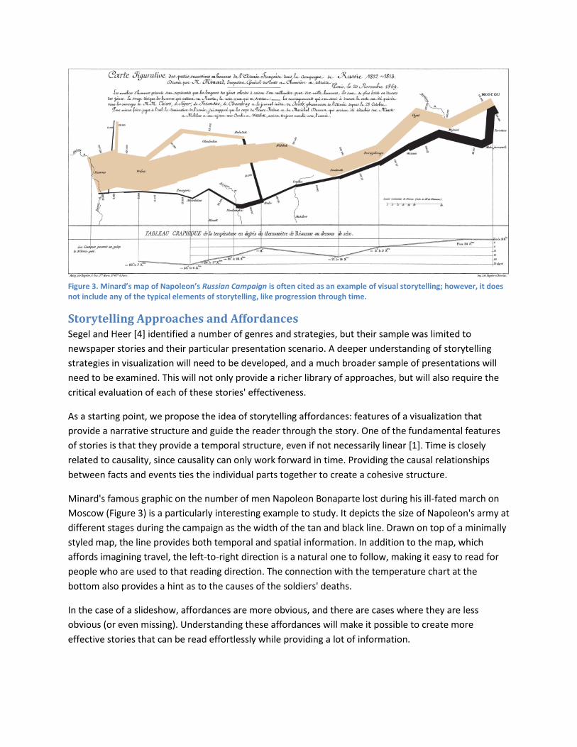
Figure 3. Minard’s map of Napoleon’s Russian Campaign is often cited as an example of visual storytelling; however, it does not include any of the typical elements of storytelling, like progression through time.
Storytelling Approaches and Affordances Segel and Heer [4] identified a number of genres and strategies, but their sample was limited to
newspaper stories and their particular presentation scenario. A deeper understanding of storytelling
strategies in visualization will need to be developed, and a much broader sample of presentations will
need to be examined. This will not only provide a richer library of approaches, but will also require the
critical evaluation of each of these stories' effectiveness.
As a starting point, we propose the idea of storytelling affordances: features of a visualization that
provide a narrative structure and guide the reader through the story. One of the fundamental features
of stories is that they provide a temporal structure, even if not necessarily linear [1]. Time is closely
related to causality, since causality can only work forward in time. Providing the causal relationships
between facts and events ties the individual parts together to create a cohesive structure.
Minard's famous graphic on the number of men Napoleon Bonaparte lost during his ill-fated march on
Moscow (Figure 3) is a particularly interesting example to study. It depicts the size of Napoleon's army at
different stages during the campaign as the width of the tan and black line. Drawn on top of a minimally
styled map, the line provides both temporal and spatial information. In addition to the map, which
affords imagining travel, the left-to-right direction is a natural one to follow, making it easy to read for
people who are used to that reading direction. The connection with the temperature chart at the
bottom also provides a hint as to the causes of the soldiers' deaths.
In the case of a slideshow, affordances are more obvious, and there are cases where they are less
obvious (or even missing). Understanding these affordances will make it possible to create more
effective stories that can be read effortlessly while providing a lot of information.
Evaluation Testing stories for effectiveness is quite different form the way evaluation is done in visualization today.
While there are undoubtedly many interesting stories to be found in news media such as the The New
York Times, The Washington Post, and others, there are no clearly defined metrics or evaluation
methods to measure their effectiveness. Developing these will require the definition of, and agreement
on, goals: what do we expect stories to achieve, and how do we measure it?
Currently, many visualizations are evaluated based on the time it takes to complete a task and accuracy
of the responses. These are not relevant for understanding stories, though. Meaningful metrics for
stories might include engagement and interest, ability to remember key points, being able to make
more informed decisions, etc.
Controlled studies today are often done in the lab, and typically within a relatively short time frame.
Evaluation of stories will require a very different approach, to account for different scenarios and to
reflect real-world uses. The use of crowd-sourcing platforms like Amazon's Mechanical Turk is making it
possible for visualization studies to reach a wider and more diverse audience than the usual student
population used in lab studies (i.e., a wider range of ages and backgrounds, a more even gender
representation, etc.). These and other ideas will be necessary to get stories in front of the types of
people who are also the audience for news media.
Memory, Context, Embellishments The effects of visualization on memory have not been studied in much depth. While this is
understandable when it comes to analysis, presentations need to create memories in order to be
effective. Visualization tends to be generic and minimalist: analysts prefer techniques that work with a
wide range of datasets, and adding embellishments (``chart junk'' like images or even just unusual color
schemes) to visualizations is generally verboten.
However, features that set a visualization apart from the others are exactly the ones that make it
memorable. Bateman et al's study [7] provided a first glimpse into this topic, but there were flaws in the
study design, the kinds of visualizations and infographics uses were limited, and there was no
interactivity or presenter. The space of possible questions to ask and configurations to test is huge, and
the results of studies in this area will be of immediate use to people working with more and more data.
What other strategies are there to make a visualization memorable? Are unusual visualization
techniques useful for memory, or do they get in the way more than they help? What elements can be
added to make a visualization unique, in particular ones that can be automatically generated without
the program having to have an understanding of the problem domain?
Interaction Interaction is one of the most important parts of visualization: being able to not just see the data, but
quickly change the view, add different data, etc., makes analyzing it much faster and more effective.
Stories are traditionally told without interaction, and unlike analysis processes are predefined and
meant to be delivered in their entirety.
Among the attempts at interactive storytelling, computer games are perhaps the most interesting and
certainly the most popular. However, it is debatable whether computer games are really stories and not
really worlds that can be explored by the player (similar to exploration or analysis of data).
There are clearly uses for interaction in visualization stories that interfere little with a story arc. At the
very least, opening up the visualization for interaction after the end of the story provides a convenient
starting point for exploration, and goes beyond a simple slide show. Pausing the story to interact is also
a scenario that is easy to imagine, in particular when that is done in response to questions from the
audience when using visualization for a live presentation.
There is a trade-off between interaction and focus, since interaction likely distracts from the story.
Stories that respond to and change based on interaction, e.g., by selecting a particular part of the data
or questions that the user is interested in, are also conceivable. However, it is unclear how to
incorporate this into a story flow without becoming a distraction, and without the interaction interfering
with the flow and point of the story.
Annotations and Highlights Visualization is a powerful tool, but to tell a story it might need to be augmented with other means of
communication: written text, audio, video, links to more information, etc. Also, to guide the user
through the story, highlighting, arrows, and other tools might be necessary.
Most visualization research considers the visualization as entirely self-contained and independent of its
use and surroundings. To make it part of a story, it needs to fit in with other elements of an article or
other presentation, however. The balance of text and visualization becomes an issue where too much
text can take away from the data, but too little text can leave the viewer confused and unable to see the
connections.
Depending on where a visualization story might be placed, how it is tied into a publication or web site,
etc., will all influence design decisions that go into building the visualization.
Learning from Other Disciplines Storytelling has been practiced, and is being practiced, by many other disciplines. There is a huge
opportunity to learn from them, similar to the way in which visualization has incorporated ideas from
cognitive science, illustration, statistics, and many other fields.
Of particular interest are ideas from the performing arts and film, in particular those sub-disciplines that
are concerned with telling stories: screenwriting, choreography, directing, etc. Another discipline is
journalism, in particular with the increasing focus on integrated stories that contain text, images, audio,
video, as well as more and more numbers.
In addition to providing access to a vast collection of knowledge, looking to other disciplines also opens
up considerable opportunities for collaboration with artists, designers, filmmakers, and journalists.
Techniques Specific to Storytelling Any visualization can be used as part of a story, but some techniques lend themselves better to
storytelling than others. Some techniques might not be very useful for exploration or analysis, but
effective for telling stories.
As an example, techniques like the connected scatterplot (where the points in a scatterplot are
connected with a line in some order, for example by year) or the slope graph (essentially a single axis
pair from parallel coordinates, usually with only a small number of lines) are not generally very useful for
analysis. For particular data, they can be very effective as storytelling devices, however. How well they
work not only depends on the structure of the data, but on the actual values. If the connected
scatterplot results in a large number of tangled lines, it does not provide any value. But if the values
change relatively smoothly, but in slightly unexpected ways, it provides the starting point for a story.
We are not aware of a systematic study of visualization techniques for their effectiveness as storytelling
devices. Such studies are needed to gain a better understanding of the design space of visualization
techniques that are useful in storytelling.
Stories and Collaboration Storytelling is an inherently collaborative activity: there is no point in creating a story if there is no
audience. Little work has been done on collaboration in visualization, so storytelling could provide an
interesting starting point for more. As described in the small group presentation scenario above, stories
naturally lead to questions, which lead to discussions, which lead to deeper analysis.
Stories are not only a good way to present data, they also work as a means of packaging information and
knowledge in a way that is easy to pick up by another person. Perhaps visual data stories will become
the way of preserving information about complex data and processes in the future, to pass on
knowledge – not unlike they once were the main means of preserving and passing on information
before reading and writing were common skills.
Conclusions Storytelling promises to open up entirely new avenues of research in visualization. Going from
exploration to analysis to presentation is a natural progression, which is mirrored by the research effort
focused on these steps over time. As the field becomes more mature and provides many useful
techniques for the first two steps, we need to start focusing on presentation. This is even more
important as visualization gets used for decision-making, where the succinct presentation of important
facts is crucial.
Bibliography
[1] M. Austin, Useful Fictions: Evolution, Anxiety, and the Origins of Literature. University of Nebraska Press, 2011.
[2] S. Johnson, The Ghost Map. Riverhead Trade, 2007.
[3] N. Gershon and W. Page, “What Storytelling Can Do for Information Visualization,” Communications of the ACM, vol. 44, no. 8, pp. 31–37, 2001.
[4] E. Segel and J. Heer, “Narrative Visualization: Telling Stories with Data,” Transactions on Visualization and Computer Graphics, vol. 16, no. 6, pp. 1139–1148, 2010.
[5] J. Hullman and N. Diakopoulos, “Visualization Rhetoric: Framing Effects in Narrative Visualization,” Transactions on Visualization and Computer Graphics, vol. 17, no. 12, pp. 2231–2240, Dec. 2011.
[6] G. Robertson, R. Fernandez, D. Fisher, B. Lee, and J. Stasko, “Effectiveness of Animation in Trend Visualization,” Transactions on Visualization and Computer Graphics, vol. 14, pp. 1325–1332, 2008.
[7] S. Bateman, R. Mandryk, C. Gutwin, A. Genest, D. McDine, and C. Brooks, “Useful Junk? The Effects of Visual Embellishment on Comprehension and Memorability of Charts,” in ACM Conference on Human Factors in Computing Systems (CHI), 2010, pp. 2573–2582.
[8] A. Cairo, The Functional Art. New Riders Press, 2012.
[9] K.-L. Ma, I. Liao, J. Frazier, H. Hauser, and H.-N. Kostis, “Scientific Storytelling Using Visualization,” Computer Graphics and Applications (CG&A), Visualization Viewpoints, vol. 32, no. 1, pp. 12–19, 2012.
[10] C. M. Danis, F. B. Viegas, M. Wattenberg, and J. Kriss, “Your Place or Mine? Visualization as a Community Component,” in CHI, 2008, pp. 275–284.
[11] W. Willett, J. Heer, J. M. Hellerstein, and M. Agrawala, “CommentSpace: Structured Support for Collaborative Visual Analysis,” in CHI, 2011, pp. 3131–3140.
[12] L. Zunshine, Why We Read Fiction: Theory of Mind and the Novel. Ohio State University Press, 2012.
Biographical Sketches Robert Kosara is Visual Analytics Researcher at Tableau Software, with a special interest in the
communication of, and storytelling with, data. He has a Ph.D. in Computer Science from Vienna
University of Technology. Robert can be reached at [email protected].
Jock Mackinlay is Senior Director of Visual Analysis at Tableau Software, his research interests include
information visualization and human-computer interaction. He has a Ph.D. in Computer Science from
Stanford University. Jock is member of the IEEE Computer Society and the ACM. His email address is