step-by-step strategy & guidelines for successful … setting up pivot points 28 9 setting up...
TRANSCRIPT

Step-By-Step Strategy & Guidelines
For Successful Forex Trading
By Maurice Perry
www.slumdogforex.com
Copyright © 2010
2
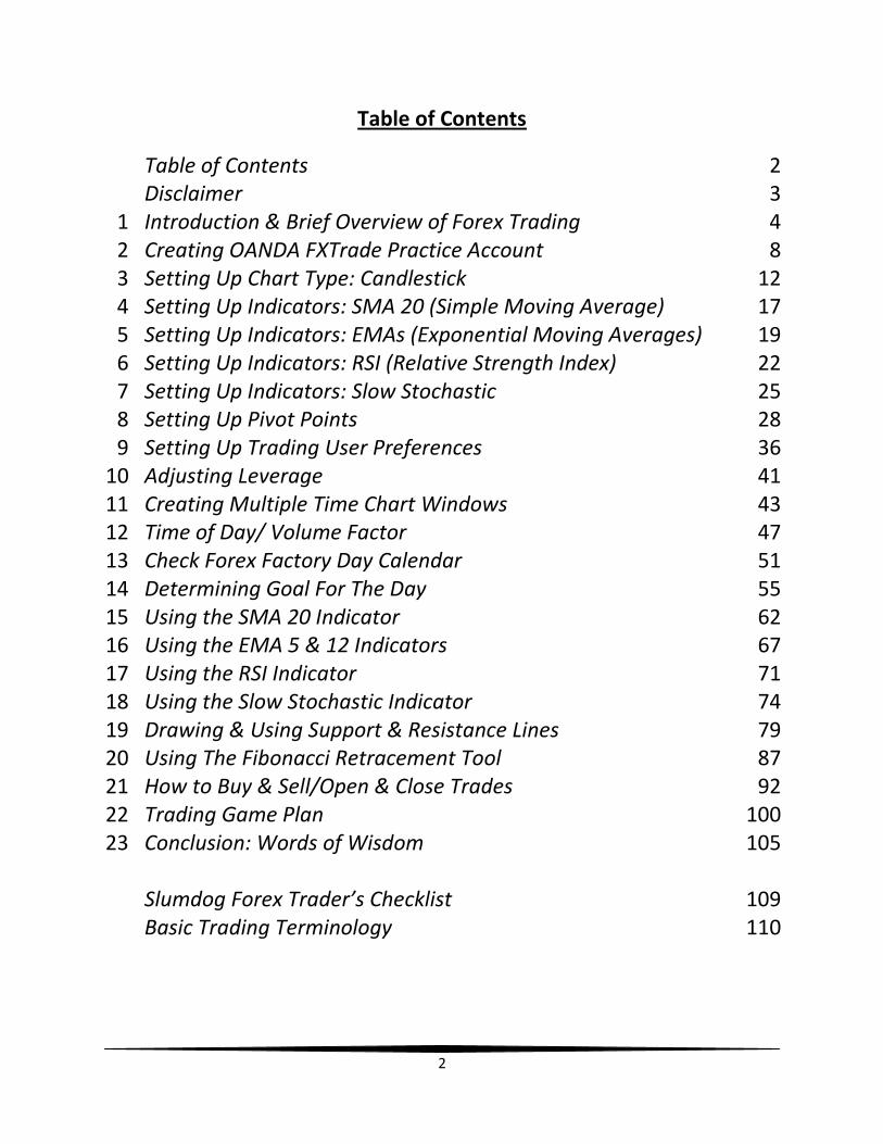
Table of Contents
Table of Contents 2 Disclaimer 3
1 Introduction & Brief Overview of Forex Trading 4 2 Creating OANDA FXTrade Practice Account 8 3 Setting Up Chart Type: Candlestick 12 4 Setting Up Indicators: SMA 20 (Simple Moving Average) 17 5 Setting Up Indicators: EMAs (Exponential Moving Averages) 19 6 Setting Up Indicators: RSI (Relative Strength Index) 22 7 Setting Up Indicators: Slow Stochastic 25 8 Setting Up Pivot Points 28 9 Setting Up Trading User Preferences 36
10 Adjusting Leverage 41 11 Creating Multiple Time Chart Windows 43 12 Time of Day/ Volume Factor 47 13 Check Forex Factory Day Calendar 51 14 Determining Goal For The Day 55 15 Using the SMA 20 Indicator 62 16 Using the EMA 5 & 12 Indicators 67 17 Using the RSI Indicator 71 18 Using the Slow Stochastic Indicator 74 19 Drawing & Using Support & Resistance Lines 79 20 Using The Fibonacci Retracement Tool 87 21 How to Buy & Sell/Open & Close Trades 92 22 Trading Game Plan 100 23 Conclusion: Words of Wisdom 105
Slumdog Forex Trader’s Checklist 109 Basic Trading Terminology 110
3
Disclaimer
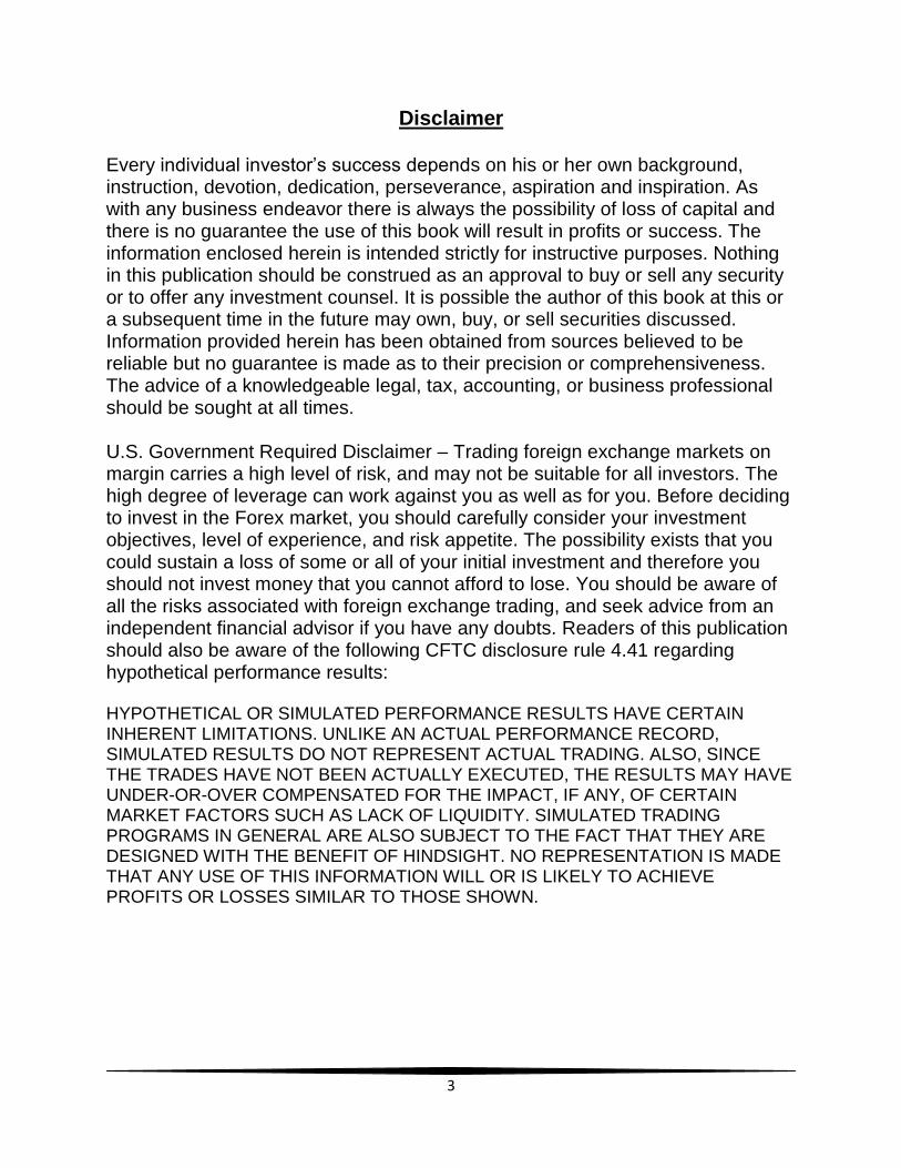
Every individual investor’s success depends on his or her own background, instruction, devotion, dedication, perseverance, aspiration and inspiration. As with any business endeavor there is always the possibility of loss of capital and there is no guarantee the use of this book will result in profits or success. The information enclosed herein is intended strictly for instructive purposes. Nothing in this publication should be construed as an approval to buy or sell any security or to offer any investment counsel. It is possible the author of this book at this or a subsequent time in the future may own, buy, or sell securities discussed. Information provided herein has been obtained from sources believed to be reliable but no guarantee is made as to their precision or comprehensiveness. The advice of a knowledgeable legal, tax, accounting, or business professional should be sought at all times. U.S. Government Required Disclaimer – Trading foreign exchange markets on margin carries a high level of risk, and may not be suitable for all investors. The high degree of leverage can work against you as well as for you. Before deciding to invest in the Forex market, you should carefully consider your investment objectives, level of experience, and risk appetite. The possibility exists that you could sustain a loss of some or all of your initial investment and therefore you should not invest money that you cannot afford to lose. You should be aware of all the risks associated with foreign exchange trading, and seek advice from an independent financial advisor if you have any doubts. Readers of this publication should also be aware of the following CFTC disclosure rule 4.41 regarding hypothetical performance results: HYPOTHETICAL OR SIMULATED PERFORMANCE RESULTS HAVE CERTAIN INHERENT LIMITATIONS. UNLIKE AN ACTUAL PERFORMANCE RECORD, SIMULATED RESULTS DO NOT REPRESENT ACTUAL TRADING. ALSO, SINCE THE TRADES HAVE NOT BEEN ACTUALLY EXECUTED, THE RESULTS MAY HAVE UNDER-OR-OVER COMPENSATED FOR THE IMPACT, IF ANY, OF CERTAIN MARKET FACTORS SUCH AS LACK OF LIQUIDITY. SIMULATED TRADING PROGRAMS IN GENERAL ARE ALSO SUBJECT TO THE FACT THAT THEY ARE DESIGNED WITH THE BENEFIT OF HINDSIGHT. NO REPRESENTATION IS MADE THAT ANY USE OF THIS INFORMATION WILL OR IS LIKELY TO ACHIEVE PROFITS OR LOSSES SIMILAR TO THOSE SHOWN.
4
Chapter 1
Introduction & Brief Overview of Forex Trading
Hello, and welcome to Slumdog Forex. My name is Maurice Perry
and I’d like to thank you for purchasing this book tutorial. My hope and
desire is for the knowledge that I have gained over the last four years of
forex trading to be shared with you within the following chapters of this
book. So prepare to sit back, relax and enjoy the ride!
But before we get into any serious detail, I would like to first do a
brief overview of what forex trading actually is. Forex trading is the
trading or exchange of currencies. Whether it is the U.S. Dollar (USD)
traded or exchanged for the Euro, or the USD exchanged for the
Japanese Yen, forex trading is basically the exchanging of two different
currencies. It’s similar to if someone were to take a trip overseas to
another country. Let’s use Japan as an example. Some people would
like to have their money exchanged before they make it to their
destination, Japan in this instance. So they would go to their bank or a
local currency exchange in order to exchange the USD or a certain
amount or value of the USD for whatever the current value of the
Japanese Yen is. So upon arrival, they would not have to worry about
exchanging currencies there. Nor would they have to worry about the
exchange rates changing while in mid-air!
With forex trading, we basically look to buy another currency at
its lowest rate, and we wait until the value of that currency rises to a
certain level before we sell it. It’s similar to trading stocks and
commodities - buy low, sell high.
5
One of the things that I really love about forex trading is that you
have the ability to trade virtually at any hour of the day, five days a
week. This definitely allows for more flexibility, especially if you have a
work schedule that may not be conducive for you to trade during
certain trading peak hours of the day. The beautiful thing is that forex
trading can be done 24 hours a day. For instance, let’s say that you
work 2nd shift and your work hours are from 3-11 PM. Well, when you
get off at 11 PM, the next major peak time of trading is typically
between the hours of 12 AM and 3 AM (CST). Let’s say that you work
3rd shift, from 11 PM to 7 AM. If you can get home by 8 AM, you would
get home just in time for the New York Stock Exchange (NYSE) opening
bell at 8:30 AM (CST). This would be in the midst of the major peak time
of trading activity. Also, you would be able to trade in the evening time
as well, between the peak hours of 6 PM and 9 PM (CST). So, the good
thing is the flexibility that exists with trading forex.
Forex rates, the price or value of a pair of currencies at any given
moment, are determined by three things:
1. Economic Factors
2. Political Conditions
3. Market Psychology
Economic factors consist of the ripple effect that may occur after
financial reports are released daily, weekly, monthly or quarterly.
Reports such as “New Home Sales”, “Non-Farm Employment Change”,
“Oil Inventory”, and many more can have drastic impact upon the
economy, and thus, will affect the value of a country’s currency as well.
Political conditions can affect the value of currencies when a
government becomes unstable or stabilizes. When there is a change of
6
governmental structure of a nation, or in the case of America, when
one administration moves in, and another moves out, this can affect
the nation’s currency value. Or if there is indecisiveness on Capitol Hill
regarding legislation that may impact the economy, this can also cause
the fluctuation of the USD.
Market psychology analyzes the speculative tendencies of traders
as a whole. Traders will try to guess what direction the market may go
next, based off of previous movements and indicators that they have
set up. When there is a noticeable change of directions with the forex
rate, you may witness the rise in volume (indicates the worth of a
market move; high volume usually means a greater push in one
direction or the other – the more traders that trade in one direction
simultaneously, the greater the volume). I will talk more about volume,
as well as volatility later on in the book.
There are two strategies that are used in forex trading. One
strategy is called Fundamental Analysis. The other strategy is called
Technical Analysis. Fundamental Analysis is the use of what was
mentioned previously (Economic Factors, Political Conditions and
Market Psychology) to determine the general direction a currency may
be headed to, as well as when there could be a good time to buy or sell.
With Technical Analysis, the trader is using various indicators and
different levels to determine when is the proper time to buy or sell.
With the strategy that I use, which will be taught in Slumdog
Forex, both Fundamental Analysis, as well as Technical Analysis, are
used. We will pay attention to the financial reports that are released,
and will be aware of the political conditions of the countries of which
7
are associated with the currencies that we are trading. But we will also
use technical indicators to assist us with our trading as well.
Probably the greatest thing about forex trading, especially with
the platform and service/broker that I trade with/through, is that you
could trade with as little as one dollar! Now granted, I’m not telling
you to just invest one dollar into forex trading. That’s not the message
that I want to convey. The point that I’m trying to make is that there is
not a minimum balance that is needed in order to have, or maintain a
forex account, especially with the broker that I use.
Before we dive into the “meat and potatoes” of forex trading and
our strategy, the first thing that I want to do is help get you started with
creating a practice account with OANDA FXTrade, the service/broker
and platform that I use to trade with. So in the next chapter, I will walk
you through the process of setting up your practice account.
8
Chapter 2
Creating OANDA FXTrade Practice Account
Let’s get you started with creating a practice account. Open your
web browser, and in the web address bar, type the following web
address:
www.fxtrade.oanda.com
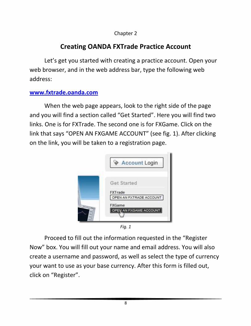
When the web page appears, look to the right side of the page
and you will find a section called “Get Started”. Here you will find two
links. One is for FXTrade. The second one is for FXGame. Click on the
link that says “OPEN AN FXGAME ACCOUNT” (see fig. 1). After clicking
on the link, you will be taken to a registration page.
Fig. 1
Proceed to fill out the information requested in the “Register
Now” box. You will fill out your name and email address. You will also
create a username and password, as well as select the type of currency
your want to use as your base currency. After this form is filled out,
click on “Register”.

9
You will then receive an email that says “OANDA FXGame Account
Activation” in the subject heading. Within this email there will be a link
that you will have to click on in order to activate your account. When
you click on the link, you will be taken to a web page that lets you know
that your account has been activated (see fig. 2). There is a hyperlink
that you can click on – “Login to FXGame”. You will then be taken to the
OANDA Login page (see fig. 3).
Fig. 2
Fig. 3
When you arrive at the OANDA Login page, feel free to bookmark
this page with your web browser so that you’ll have easy access to it.
On my home PC, as well as my laptop, I set this page as my Home Page.
After doing that, you will see that the Account pull-down menu is
already set for “FXGame” and the Type pull-down menu will be set for
10
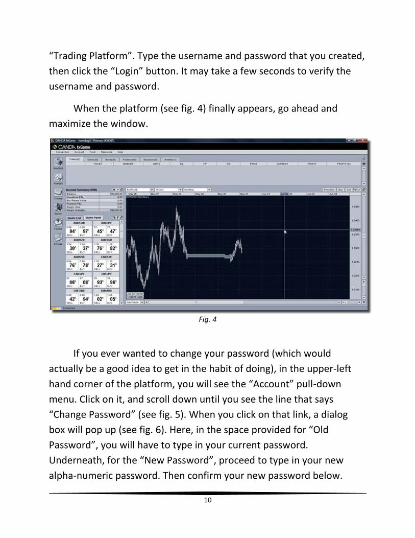
“Trading Platform”. Type the username and password that you created,
then click the “Login” button. It may take a few seconds to verify the
username and password.
When the platform (see fig. 4) finally appears, go ahead and
maximize the window.
Fig. 4
If you ever wanted to change your password (which would
actually be a good idea to get in the habit of doing), in the upper-left
hand corner of the platform, you will see the “Account” pull-down
menu. Click on it, and scroll down until you see the line that says
“Change Password” (see fig. 5). When you click on that link, a dialog
box will pop up (see fig. 6). Here, in the space provided for “Old
Password”, you will have to type in your current password.
Underneath, for the “New Password”, proceed to type in your new
alpha-numeric password. Then confirm your new password below.
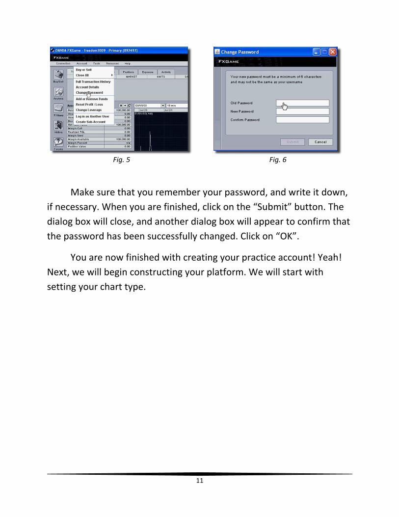
11
Fig. 5 Fig. 6
Make sure that you remember your password, and write it down,
if necessary. When you are finished, click on the “Submit” button. The
dialog box will close, and another dialog box will appear to confirm that
the password has been successfully changed. Click on “OK”.
You are now finished with creating your practice account! Yeah!
Next, we will begin constructing your platform. We will start with
setting your chart type.
12
Chapter 3
Setting Up Chart Type: Candlestick
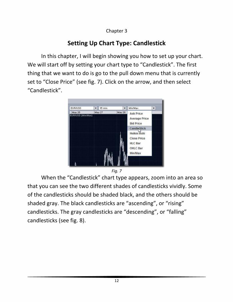
In this chapter, I will begin showing you how to set up your chart.
We will start off by setting your chart type to “Candlestick”. The first
thing that we want to do is go to the pull down menu that is currently
set to “Close Price” (see fig. 7). Click on the arrow, and then select
“Candlestick”.
Fig. 7
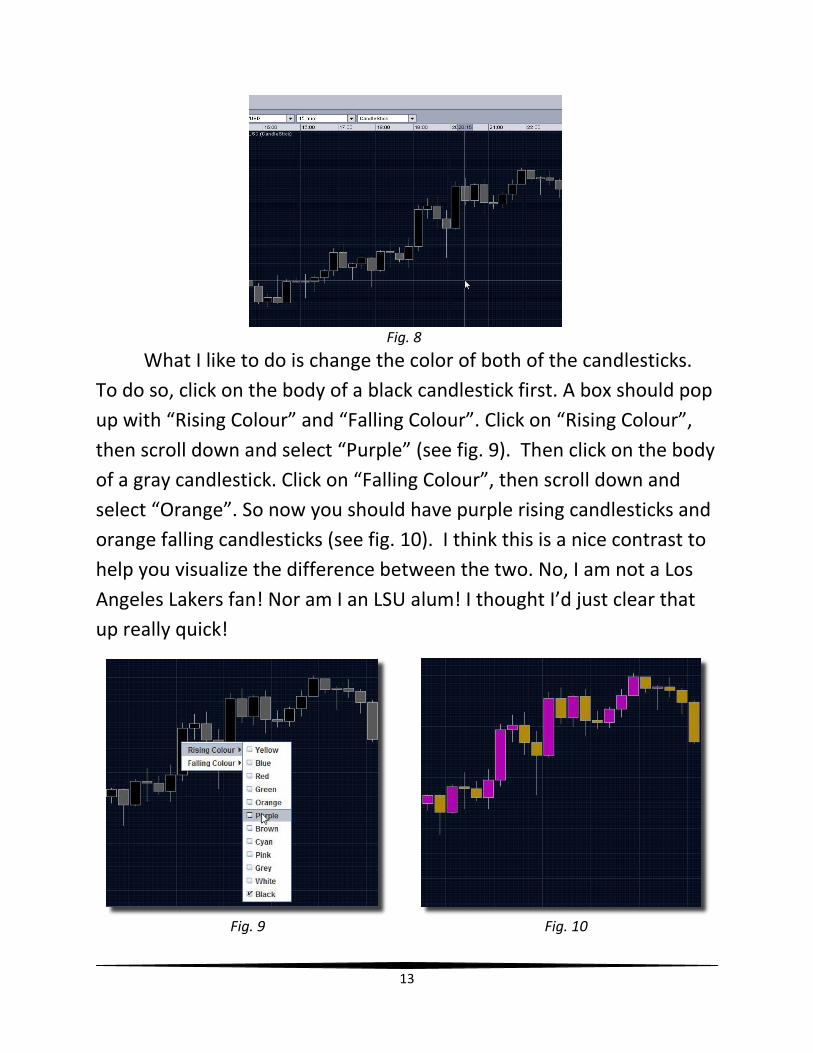
When the “Candlestick” chart type appears, zoom into an area so
that you can see the two different shades of candlesticks vividly. Some
of the candlesticks should be shaded black, and the others should be
shaded gray. The black candlesticks are “ascending”, or “rising”
candlesticks. The gray candlesticks are “descending”, or “falling”
candlesticks (see fig. 8).
13
Fig. 8
What I like to do is change the color of both of the candlesticks.
To do so, click on the body of a black candlestick first. A box should pop
up with “Rising Colour” and “Falling Colour”. Click on “Rising Colour”,
then scroll down and select “Purple” (see fig. 9). Then click on the body
of a gray candlestick. Click on “Falling Colour”, then scroll down and
select “Orange”. So now you should have purple rising candlesticks and
orange falling candlesticks (see fig. 10). I think this is a nice contrast to
help you visualize the difference between the two. No, I am not a Los
Angeles Lakers fan! Nor am I an LSU alum! I thought I’d just clear that
up really quick!
Fig. 9 Fig. 10
14
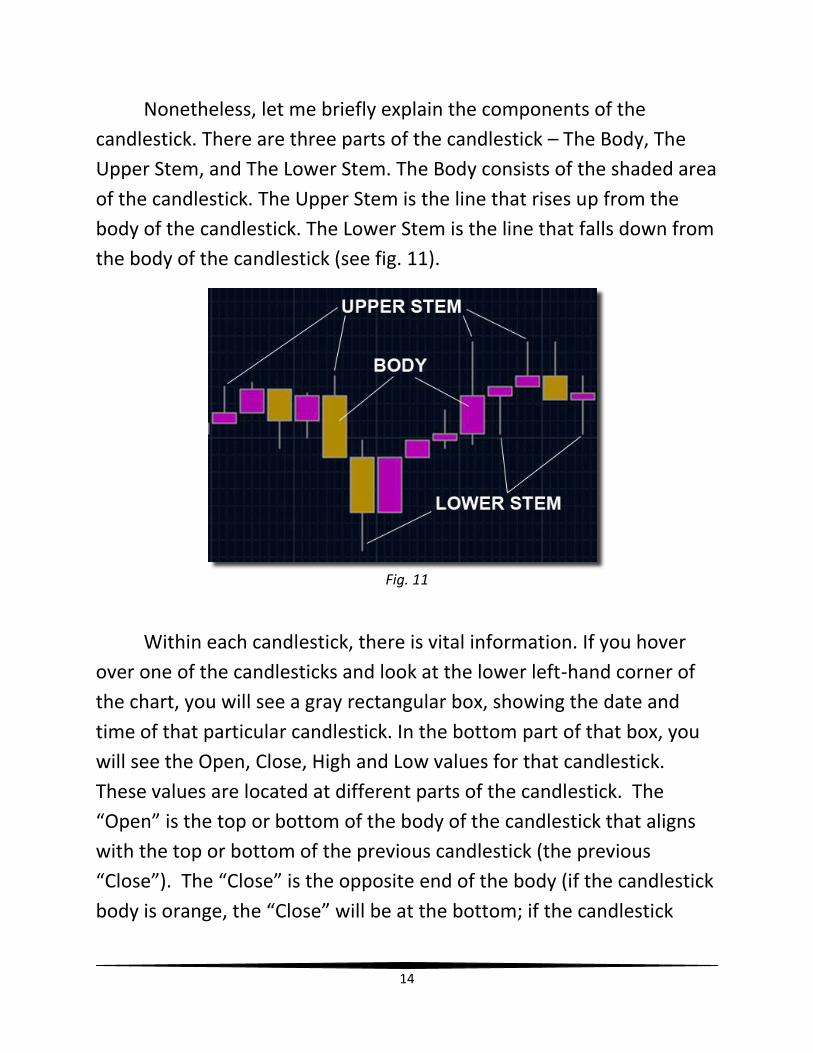
Nonetheless, let me briefly explain the components of the
candlestick. There are three parts of the candlestick – The Body, The
Upper Stem, and The Lower Stem. The Body consists of the shaded area
of the candlestick. The Upper Stem is the line that rises up from the
body of the candlestick. The Lower Stem is the line that falls down from
the body of the candlestick (see fig. 11).
Fig. 11
Within each candlestick, there is vital information. If you hover
over one of the candlesticks and look at the lower left-hand corner of
the chart, you will see a gray rectangular box, showing the date and
time of that particular candlestick. In the bottom part of that box, you
will see the Open, Close, High and Low values for that candlestick.
These values are located at different parts of the candlestick. The
“Open” is the top or bottom of the body of the candlestick that aligns
with the top or bottom of the previous candlestick (the previous
“Close”). The “Close” is the opposite end of the body (if the candlestick
body is orange, the “Close” will be at the bottom; if the candlestick
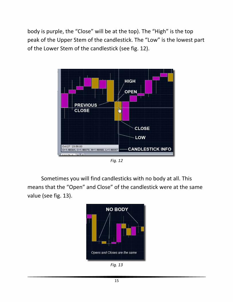
15
body is purple, the “Close” will be at the top). The “High” is the top
peak of the Upper Stem of the candlestick. The “Low” is the lowest part
of the Lower Stem of the candlestick (see fig. 12).
Fig. 12
Sometimes you will find candlesticks with no body at all. This
means that the “Open” and Close” of the candlestick were at the same
value (see fig. 13).
Fig. 13

16
Those are the basic components of the candlestick. You should
now save the profile. Go to Tools, and select “Save Current Profile”.
In the next chapter, we will set up the SMA 20 Indicator.
17
Chapter 4
Setting Up Indicators: SMA 20 (Simple Moving Average)
Now I will show you how to begin setting up the various indicators
that I use. The first indicator that we will set up is called the SMA 20
line. SMA stands for Simple Moving Average. I’ll go into more detail
later.
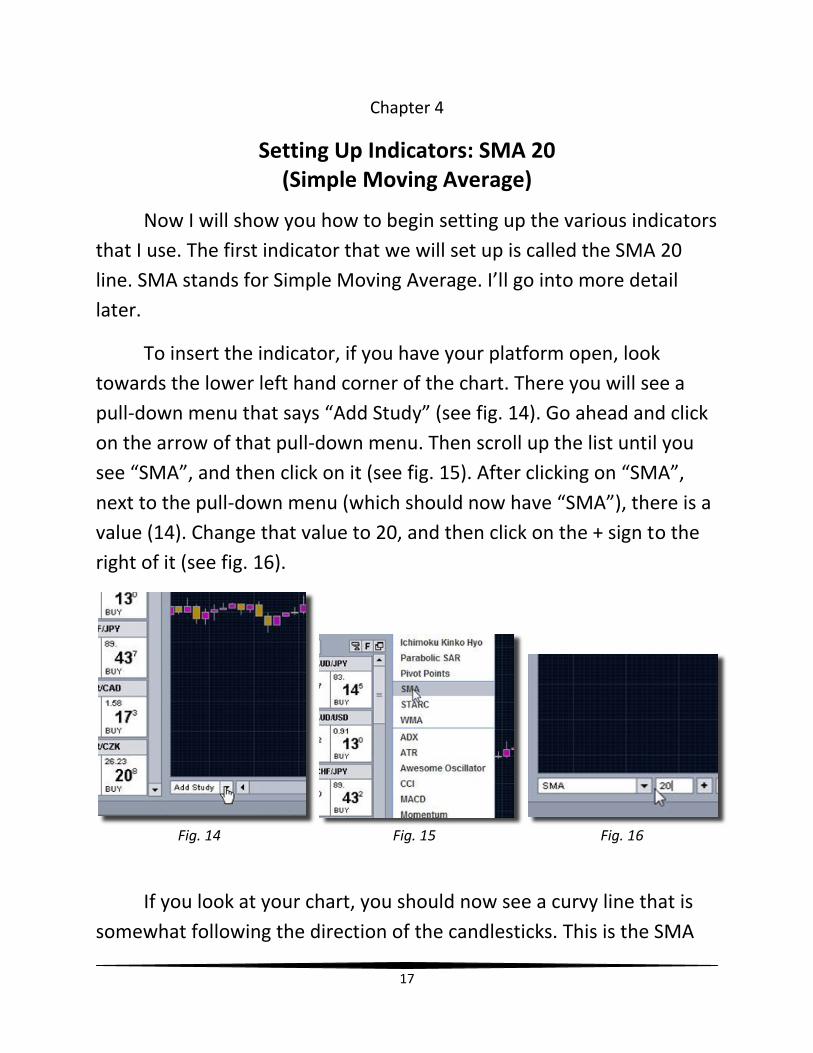
To insert the indicator, if you have your platform open, look
towards the lower left hand corner of the chart. There you will see a
pull-down menu that says “Add Study” (see fig. 14). Go ahead and click
on the arrow of that pull-down menu. Then scroll up the list until you
see “SMA”, and then click on it (see fig. 15). After clicking on “SMA”,
next to the pull-down menu (which should now have “SMA”), there is a
value (14). Change that value to 20, and then click on the + sign to the
right of it (see fig. 16).
Fig. 14 Fig. 15 Fig. 16
If you look at your chart, you should now see a curvy line that is
somewhat following the direction of the candlesticks. This is the SMA
18
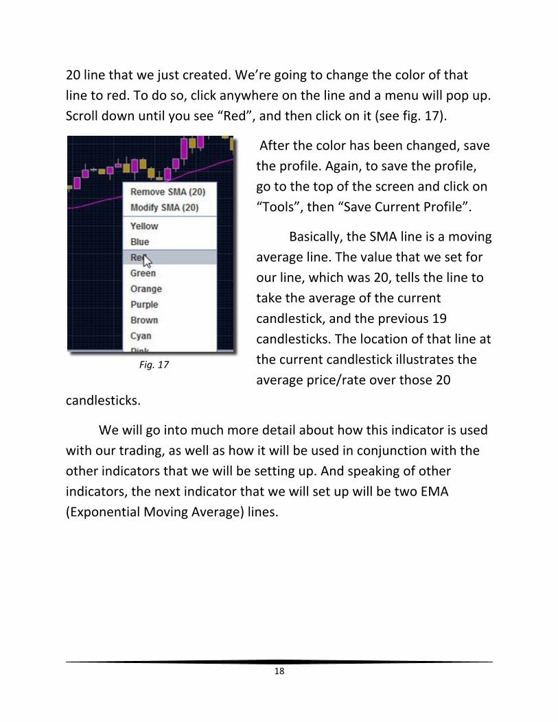
20 line that we just created. We’re going to change the color of that
line to red. To do so, click anywhere on the line and a menu will pop up.
Scroll down until you see “Red”, and then click on it (see fig. 17).
After the color has been changed, save
the profile. Again, to save the profile,
go to the top of the screen and click on
“Tools”, then “Save Current Profile”.
Basically, the SMA line is a moving
average line. The value that we set for
our line, which was 20, tells the line to
take the average of the current
candlestick, and the previous 19
candlesticks. The location of that line at
the current candlestick illustrates the
average price/rate over those 20
candlesticks.
We will go into much more detail about how this indicator is used
with our trading, as well as how it will be used in conjunction with the
other indicators that we will be setting up. And speaking of other
indicators, the next indicator that we will set up will be two EMA
(Exponential Moving Average) lines.
Fig. 17
19
Chapter 5
Setting Up Indicators: EMAs (Exponential Moving Averages)
In this chapter I will show you how to set up your EMA
(Exponential Moving Average) lines. There will be two different lines
that we will be setting up. To begin, click on “Add Study”, just as we did
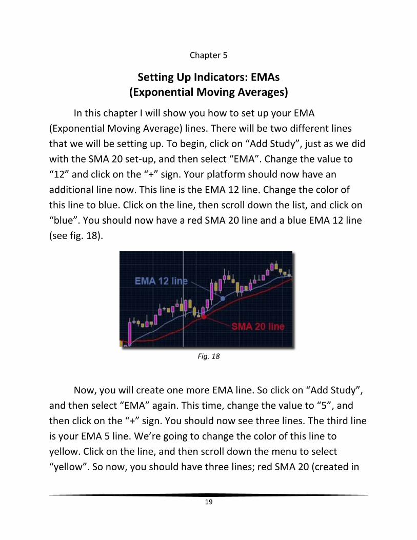
with the SMA 20 set-up, and then select “EMA”. Change the value to
“12” and click on the “+” sign. Your platform should now have an
additional line now. This line is the EMA 12 line. Change the color of
this line to blue. Click on the line, then scroll down the list, and click on
“blue”. You should now have a red SMA 20 line and a blue EMA 12 line
(see fig. 18).
Fig. 18
Now, you will create one more EMA line. So click on “Add Study”,
and then select “EMA” again. This time, change the value to “5”, and
then click on the “+” sign. You should now see three lines. The third line
is your EMA 5 line. We’re going to change the color of this line to
yellow. Click on the line, and then scroll down the menu to select
“yellow”. So now, you should have three lines; red SMA 20 (created in
20
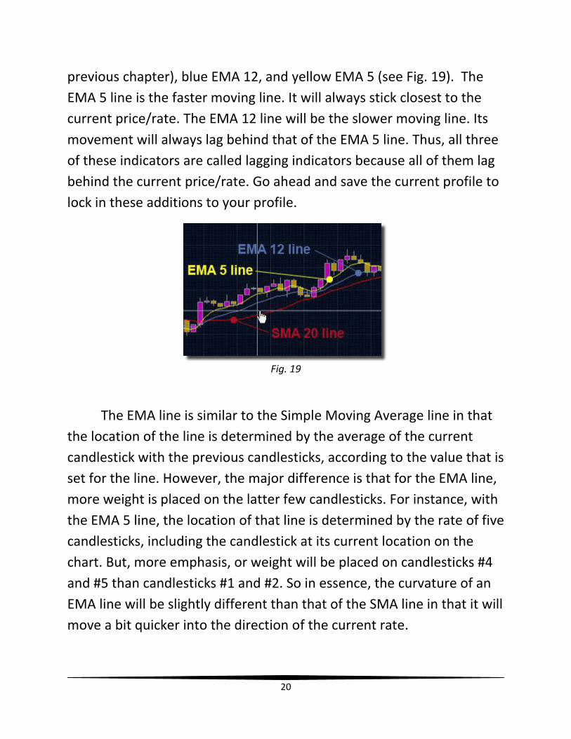
previous chapter), blue EMA 12, and yellow EMA 5 (see Fig. 19). The
EMA 5 line is the faster moving line. It will always stick closest to the
current price/rate. The EMA 12 line will be the slower moving line. Its
movement will always lag behind that of the EMA 5 line. Thus, all three
of these indicators are called lagging indicators because all of them lag
behind the current price/rate. Go ahead and save the current profile to
lock in these additions to your profile.
Fig. 19
The EMA line is similar to the Simple Moving Average line in that
the location of the line is determined by the average of the current
candlestick with the previous candlesticks, according to the value that is
set for the line. However, the major difference is that for the EMA line,
more weight is placed on the latter few candlesticks. For instance, with
the EMA 5 line, the location of that line is determined by the rate of five
candlesticks, including the candlestick at its current location on the
chart. But, more emphasis, or weight will be placed on candlesticks #4
and #5 than candlesticks #1 and #2. So in essence, the curvature of an
EMA line will be slightly different than that of the SMA line in that it will
move a bit quicker into the direction of the current rate.

21
I will talk later about how all three of these lines are used to
determine when to enter into trades and when to exit. But the next
indicator that I want to show you how to set up is the RSI indicator.
22
Chapter 6
Setting Up Indicators: RSI (Relative Strength Index)
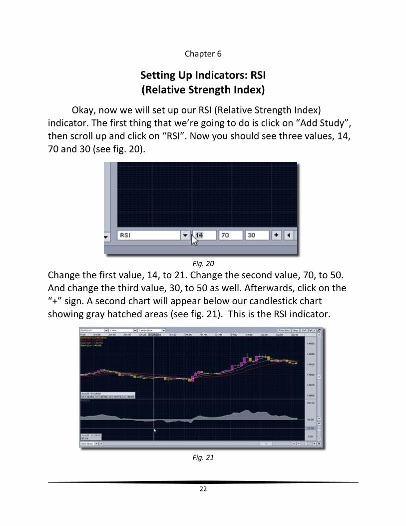
Okay, now we will set up our RSI (Relative Strength Index) indicator. The first thing that we’re going to do is click on “Add Study”, then scroll up and click on “RSI”. Now you should see three values, 14, 70 and 30 (see fig. 20).
Fig. 20
Change the first value, 14, to 21. Change the second value, 70, to 50. And change the third value, 30, to 50 as well. Afterwards, click on the “+” sign. A second chart will appear below our candlestick chart showing gray hatched areas (see fig. 21). This is the RSI indicator.
Fig. 21
23
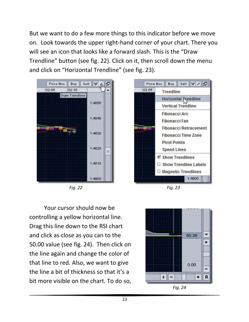
But we want to do a few more things to this indicator before we move
on. Look towards the upper right-hand corner of your chart. There you
will see an icon that looks like a forward slash. This is the “Draw
Trendline” button (see fig. 22). Click on it, then scroll down the menu
and click on “Horizontal Trendline” (see fig. 23).
Your cursor should now be
controlling a yellow horizontal line.
Drag this line down to the RSI chart
and click as close as you can to the
50.00 value (see fig. 24). Then click on
the line again and change the color of
that line to red. Also, we want to give
the line a bit of thickness so that it’s a
bit more visible on the chart. To do so,
Fig. 22 Fig. 23
Fig. 24
24
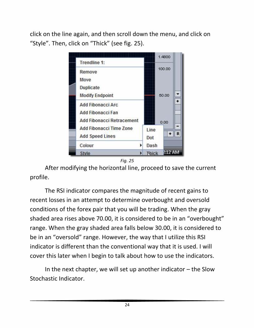
click on the line again, and then scroll down the menu, and click on
“Style”. Then, click on “Thick” (see fig. 25).
Fig. 25
After modifying the horizontal line, proceed to save the current
profile.
The RSI indicator compares the magnitude of recent gains to
recent losses in an attempt to determine overbought and oversold
conditions of the forex pair that you will be trading. When the gray
shaded area rises above 70.00, it is considered to be in an “overbought”
range. When the gray shaded area falls below 30.00, it is considered to
be in an “oversold” range. However, the way that I utilize this RSI
indicator is different than the conventional way that it is used. I will
cover this later when I begin to talk about how to use the indicators.
In the next chapter, we will set up another indicator – the Slow
Stochastic Indicator.
25
Chapter 7
Setting Up Indicators: Slow Stochastic
The next indicator to set up is the Slow Stochastic Indicator.
Similar to the RSI, it is typically used to identify overbought and
oversold conditions. A Stochastic value above 80 is considered
overbought and below 20 is considered oversold.
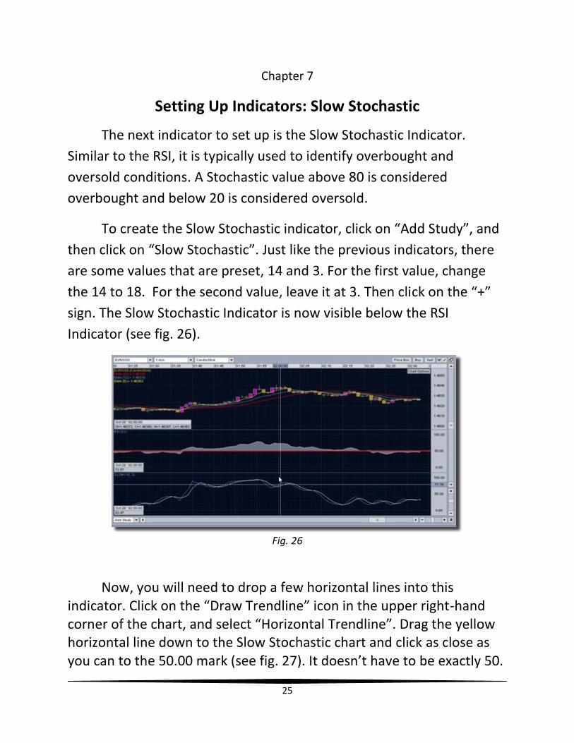
To create the Slow Stochastic indicator, click on “Add Study”, and
then click on “Slow Stochastic”. Just like the previous indicators, there
are some values that are preset, 14 and 3. For the first value, change
the 14 to 18. For the second value, leave it at 3. Then click on the “+”
sign. The Slow Stochastic Indicator is now visible below the RSI
Indicator (see fig. 26).
Fig. 26
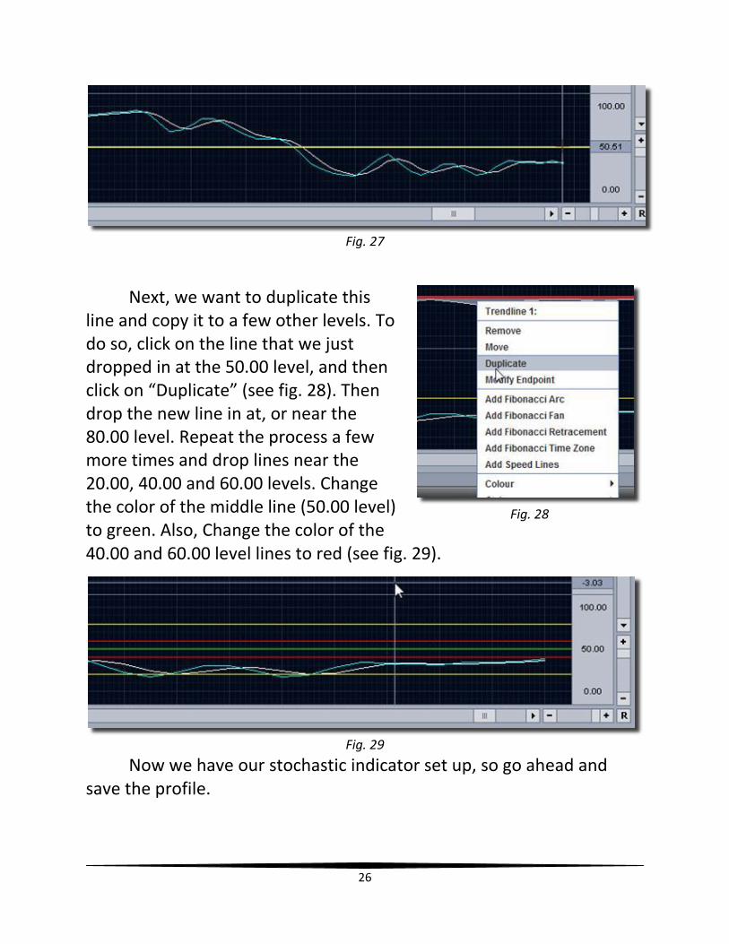
Now, you will need to drop a few horizontal lines into this indicator. Click on the “Draw Trendline” icon in the upper right-hand corner of the chart, and select “Horizontal Trendline”. Drag the yellow horizontal line down to the Slow Stochastic chart and click as close as you can to the 50.00 mark (see fig. 27). It doesn’t have to be exactly 50.
26
Fig. 27
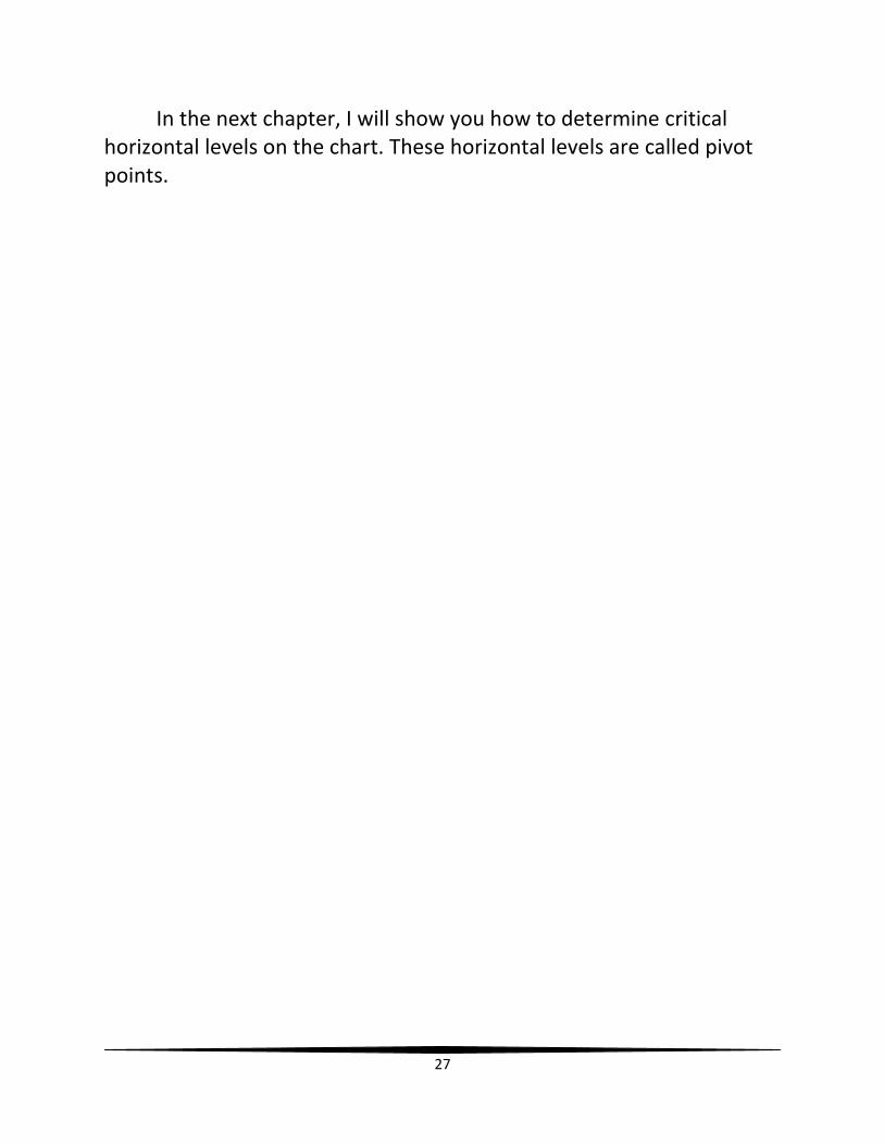
Next, we want to duplicate this line and copy it to a few other levels. To do so, click on the line that we just dropped in at the 50.00 level, and then click on “Duplicate” (see fig. 28). Then drop the new line in at, or near the 80.00 level. Repeat the process a few more times and drop lines near the 20.00, 40.00 and 60.00 levels. Change the color of the middle line (50.00 level) to green. Also, Change the color of the 40.00 and 60.00 level lines to red (see fig. 29).
Fig. 29
Now we have our stochastic indicator set up, so go ahead and save the profile.
Fig. 28
27
In the next chapter, I will show you how to determine critical horizontal levels on the chart. These horizontal levels are called pivot points.
28
Chapter 8
Setting Up Pivot Points
In this chapter I will show you how to set up pivot points. Pivot
points are extremely important in technical analysis, in that they signify
the points where the overall trend in price, or rate changes. They can
be determined for any time frame, with the daily time frame being
most common. I like to set up the daily and 4-hour pivot points on my
charts.
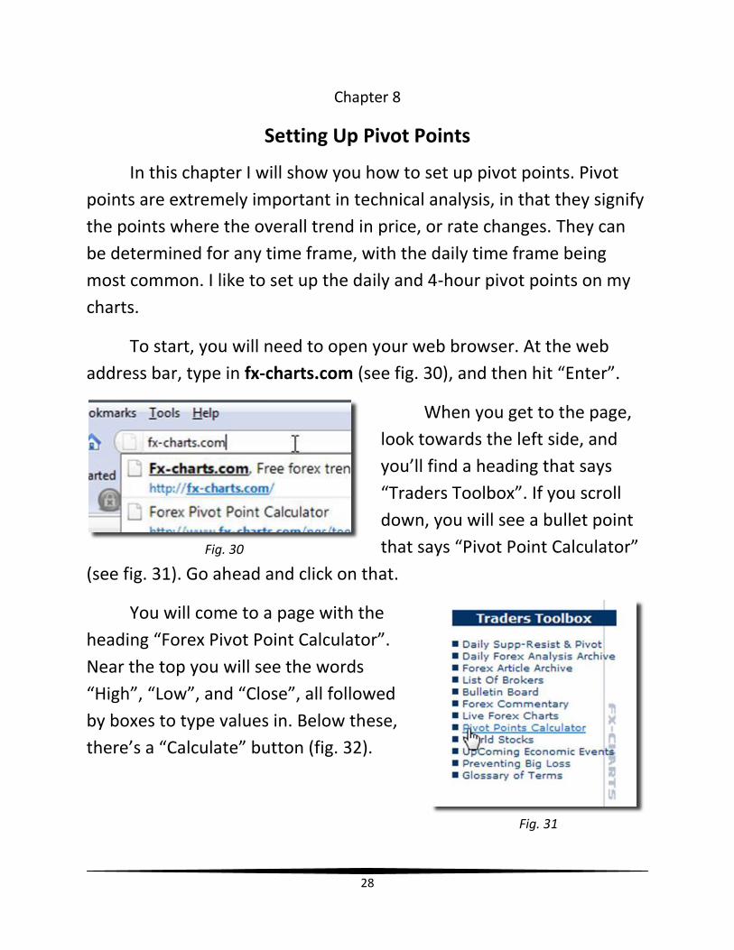
To start, you will need to open your web browser. At the web
address bar, type in fx-charts.com (see fig. 30), and then hit “Enter”.
When you get to the page,
look towards the left side, and
you’ll find a heading that says
“Traders Toolbox”. If you scroll
down, you will see a bullet point
that says “Pivot Point Calculator”
(see fig. 31). Go ahead and click on that.
You will come to a page with the
heading “Forex Pivot Point Calculator”.
Near the top you will see the words
“High”, “Low”, and “Close”, all followed
by boxes to type values in. Below these,
there’s a “Calculate” button (fig. 32).
Fig. 30
Fig. 31
29
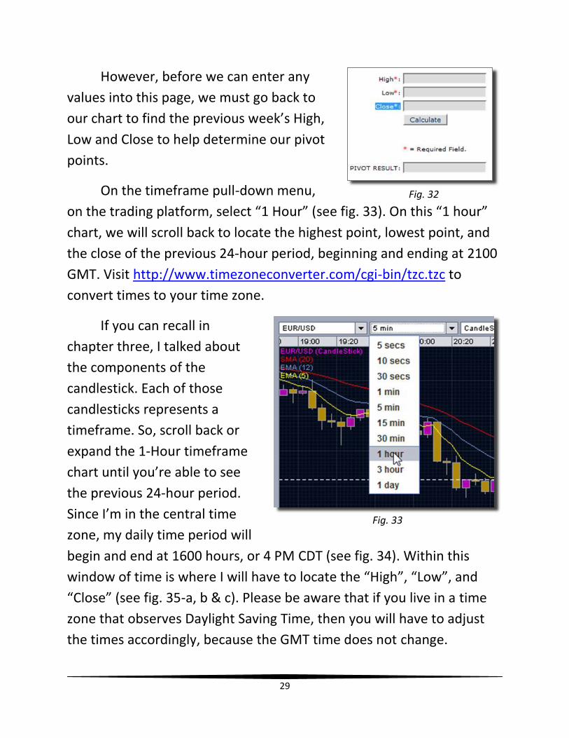
However, before we can enter any
values into this page, we must go back to
our chart to find the previous week’s High,
Low and Close to help determine our pivot
points.
On the timeframe pull-down menu,
on the trading platform, select “1 Hour” (see fig. 33). On this “1 hour”
chart, we will scroll back to locate the highest point, lowest point, and
the close of the previous 24-hour period, beginning and ending at 2100
GMT. Visit http://www.timezoneconverter.com/cgi-bin/tzc.tzc to
convert times to your time zone.
If you can recall in
chapter three, I talked about
the components of the
candlestick. Each of those
candlesticks represents a
timeframe. So, scroll back or
expand the 1-Hour timeframe
chart until you’re able to see
the previous 24-hour period.
Since I’m in the central time
zone, my daily time period will
begin and end at 1600 hours, or 4 PM CDT (see fig. 34). Within this
window of time is where I will have to locate the “High”, “Low”, and
“Close” (see fig. 35-a, b & c). Please be aware that if you live in a time
zone that observes Daylight Saving Time, then you will have to adjust
the times accordingly, because the GMT time does not change.
Fig. 32
Fig. 33
30
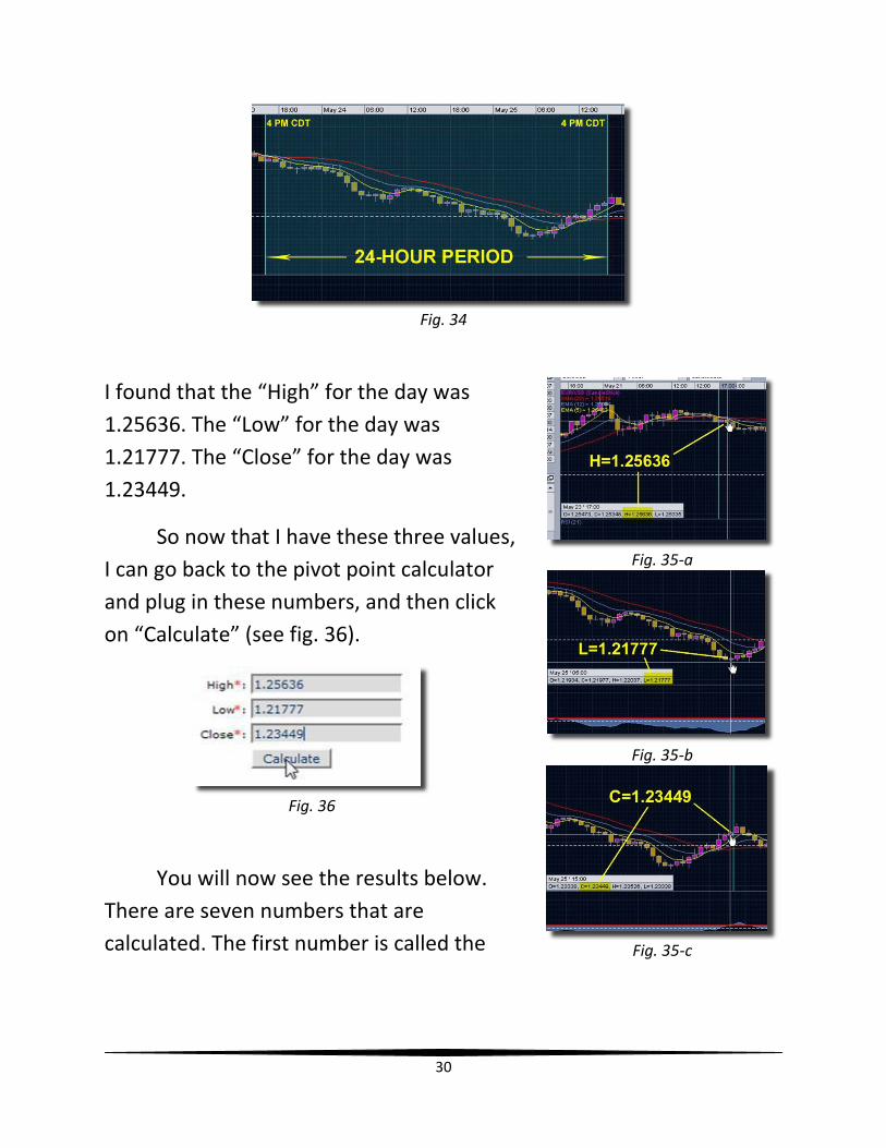
Fig. 34
I found that the “High” for the day was
1.25636. The “Low” for the day was
1.21777. The “Close” for the day was
1.23449.
So now that I have these three values,
I can go back to the pivot point calculator
and plug in these numbers, and then click
on “Calculate” (see fig. 36).
Fig. 36
You will now see the results below.
There are seven numbers that are
calculated. The first number is called the
Fig. 35-a
Fig. 35-b
Fig. 35-c
31
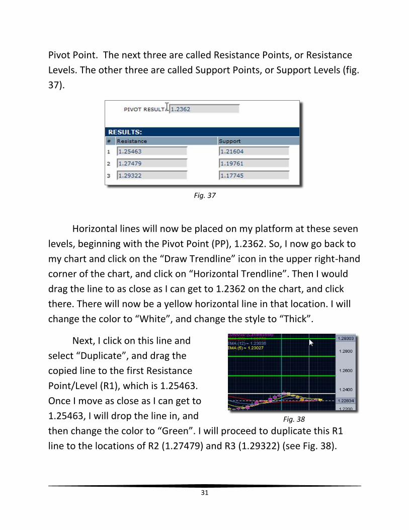
Pivot Point. The next three are called Resistance Points, or Resistance
Levels. The other three are called Support Points, or Support Levels (fig.
37).
Fig. 37
Horizontal lines will now be placed on my platform at these seven
levels, beginning with the Pivot Point (PP), 1.2362. So, I now go back to
my chart and click on the “Draw Trendline” icon in the upper right-hand
corner of the chart, and click on “Horizontal Trendline”. Then I would
drag the line to as close as I can get to 1.2362 on the chart, and click
there. There will now be a yellow horizontal line in that location. I will
change the color to “White”, and change the style to “Thick”.
Next, I click on this line and
select “Duplicate”, and drag the
copied line to the first Resistance
Point/Level (R1), which is 1.25463.
Once I move as close as I can get to
1.25463, I will drop the line in, and
then change the color to “Green”. I will proceed to duplicate this R1
line to the locations of R2 (1.27479) and R3 (1.29322) (see Fig. 38).
Fig. 38

32
Now, I have to do the same for the Support Points/Levels. I’ll start
by copying the PP line to the first Support Point/Level (S1), which is
1.21604. When the line is dropped in place, change the color to
“Purple”; the style will already be set to “Thick”. Afterwards, I will
continue to duplicate this S1 line to the locations of S2 (1.19761) and S3
(1.17745). When finished, I now have all of my daily pivot points in
place (see fig. 39). I will now save my profile to be sure that these lines
are locked in.
Fig. 39
Then I would repeat the process to show the pivot points for the
4-Hour time frame. These pivot points will have to be updated more
frequently than the daily pivot points because they are determined by
the previous 4-hour block of market activity. The 4-Hour pivot point
blocks are as follows: 0900-1300 GMT, 1300-1700 GMT, 1700-2100
GMT, 2100-0100 GMT, 0100-0500 GMT, and 0500-0900 GMT (to
convert these times to your time zone, use the following website:
http://www.timezoneconverter.com/cgi-bin/tzc.tzc. To calculate these
pivot points, take the “High”, “Low” and “Close” of the previous 4-Hour
block and plug those values into the pivot point calculator. When the
values are given, draw horizontal lines at the appropriate locations on
the chart. Use the same color scheme as the daily pivot points (green-
resistance lines, white pivot point, purple support lines), but change the
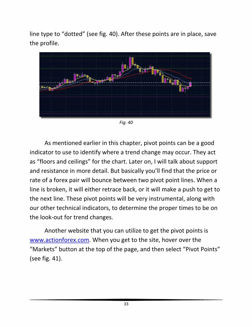
33
line type to “dotted” (see fig. 40). After these points are in place, save
the profile.
Fig. 40
As mentioned earlier in this chapter, pivot points can be a good
indicator to use to identify where a trend change may occur. They act
as “floors and ceilings” for the chart. Later on, I will talk about support
and resistance in more detail. But basically you’ll find that the price or
rate of a forex pair will bounce between two pivot point lines. When a
line is broken, it will either retrace back, or it will make a push to get to
the next line. These pivot points will be very instrumental, along with
our other technical indicators, to determine the proper times to be on
the look-out for trend changes.
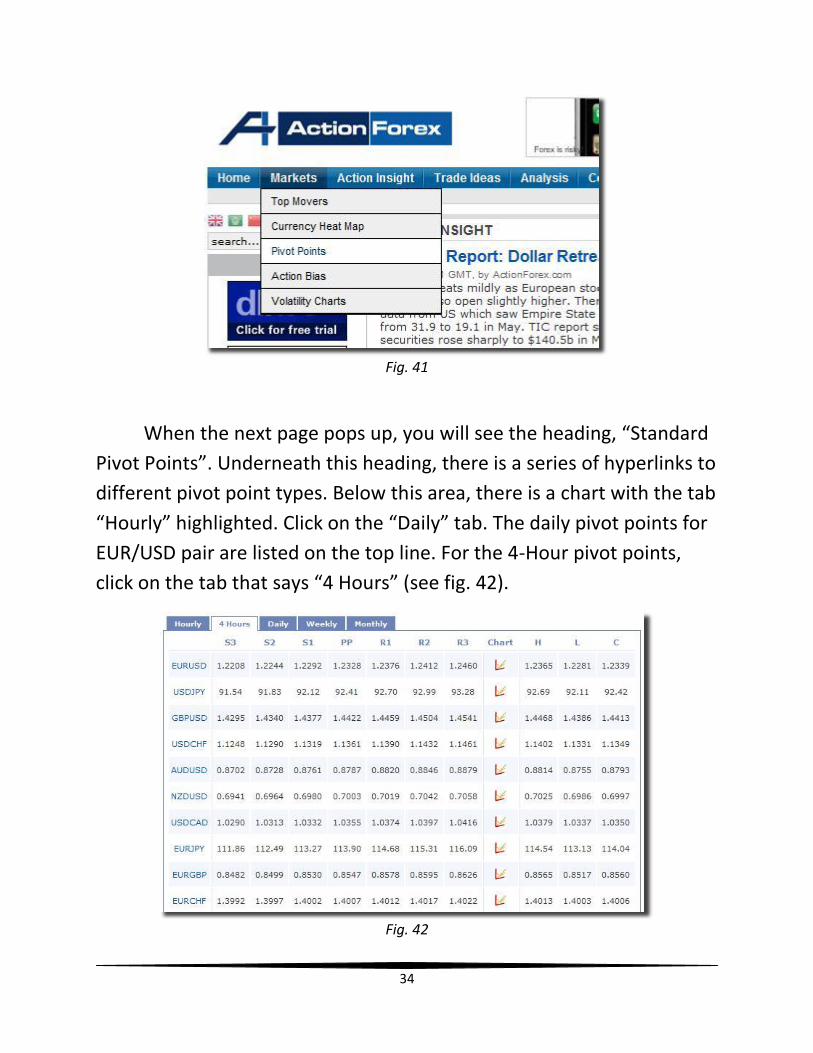
Another website that you can utilize to get the pivot points is
www.actionforex.com. When you get to the site, hover over the
“Markets” button at the top of the page, and then select “Pivot Points”
(see fig. 41).
34
Fig. 41
When the next page pops up, you will see the heading, “Standard
Pivot Points”. Underneath this heading, there is a series of hyperlinks to
different pivot point types. Below this area, there is a chart with the tab
“Hourly” highlighted. Click on the “Daily” tab. The daily pivot points for
EUR/USD pair are listed on the top line. For the 4-Hour pivot points,
click on the tab that says “4 Hours” (see fig. 42).
Fig. 42
35
There may be a slight difference in the values of each of the
levels, but they are still in very close proximity and are valid for the
purpose in which we use them. So, if you want to find the high, low and
close and insert them into the calculator on www.fx-charts.com, that’s
fine. If you want to use the chart on www.actionforex.com, that’s fine
as well. Or, if you want to learn how to calculate the pivot points on
your own, you can check out the following site:
http://www.investopedia.com/ask/answers/forex/forex-pivot-
points.asp
Another website that you can use to determine pivot points is
http://www.pivotpointcalculator.com/. With this site, a fourth support
and resistance line is given.
Now that you have learned how to set up your trading platform
by creating the key indicators that we will be using, I will show you in
the next chapter how to set up your User Preferences.
36
Chapter 9
Setting Up Trading User Preferences
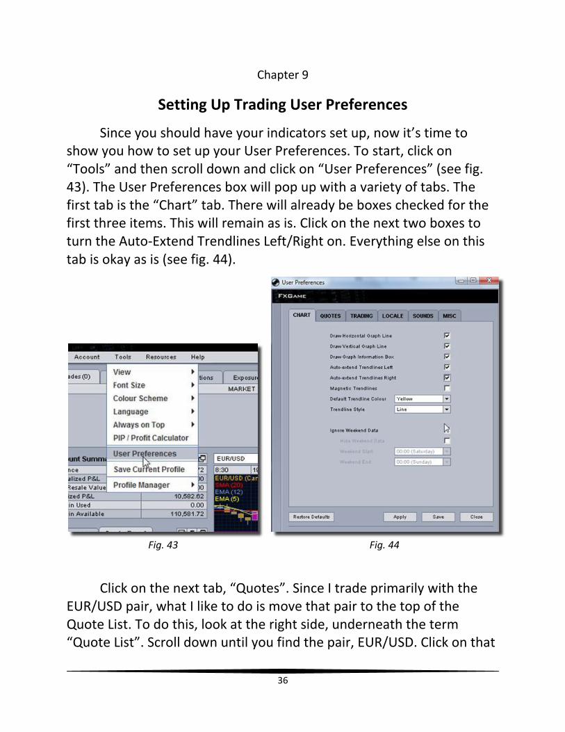
Since you should have your indicators set up, now it’s time to show you how to set up your User Preferences. To start, click on “Tools” and then scroll down and click on “User Preferences” (see fig. 43). The User Preferences box will pop up with a variety of tabs. The first tab is the “Chart” tab. There will already be boxes checked for the first three items. This will remain as is. Click on the next two boxes to turn the Auto-Extend Trendlines Left/Right on. Everything else on this tab is okay as is (see fig. 44).
Fig. 43 Fig. 44
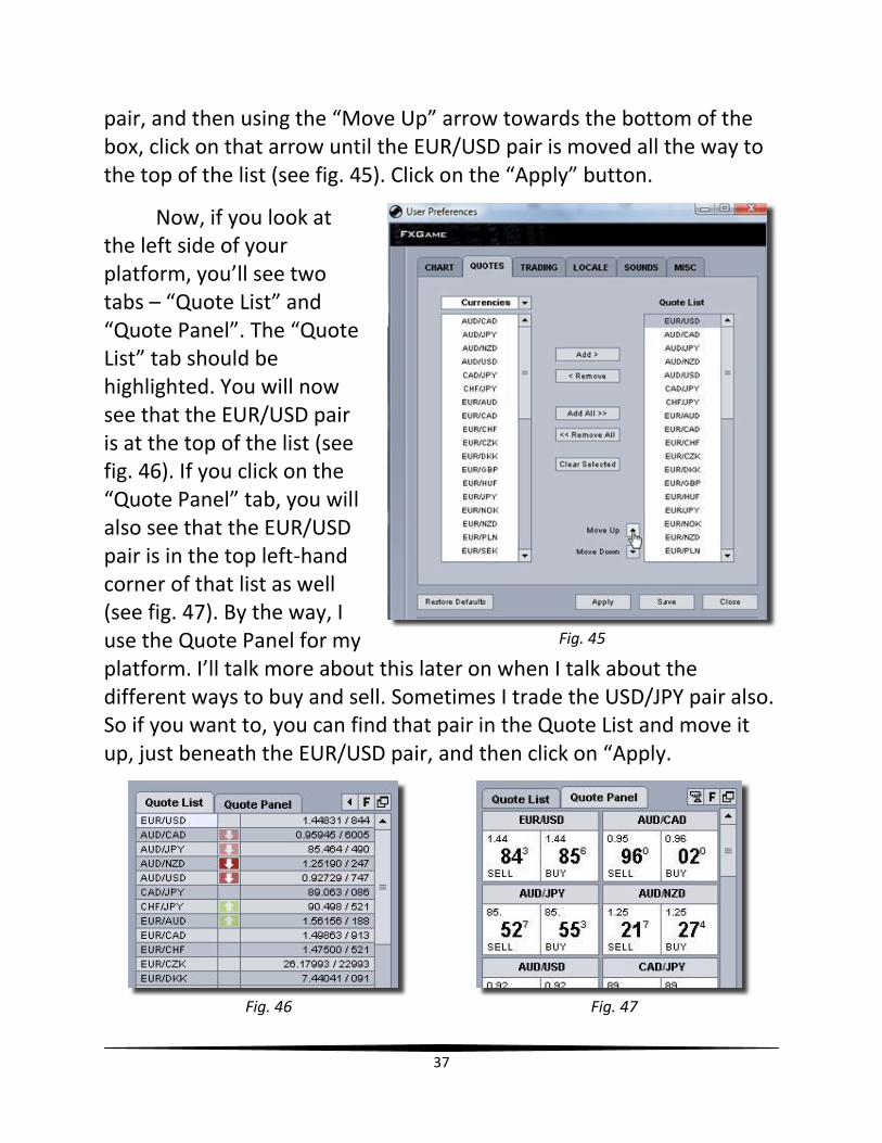
Click on the next tab, “Quotes”. Since I trade primarily with the EUR/USD pair, what I like to do is move that pair to the top of the Quote List. To do this, look at the right side, underneath the term “Quote List”. Scroll down until you find the pair, EUR/USD. Click on that
37
pair, and then using the “Move Up” arrow towards the bottom of the box, click on that arrow until the EUR/USD pair is moved all the way to the top of the list (see fig. 45). Click on the “Apply” button.
Now, if you look at the left side of your platform, you’ll see two tabs – “Quote List” and “Quote Panel”. The “Quote List” tab should be highlighted. You will now see that the EUR/USD pair is at the top of the list (see fig. 46). If you click on the “Quote Panel” tab, you will also see that the EUR/USD pair is in the top left-hand corner of that list as well (see fig. 47). By the way, I use the Quote Panel for my platform. I’ll talk more about this later on when I talk about the different ways to buy and sell. Sometimes I trade the USD/JPY pair also. So if you want to, you can find that pair in the Quote List and move it up, just beneath the EUR/USD pair, and then click on “Apply.
Fig. 46 Fig. 47
Fig. 45
38
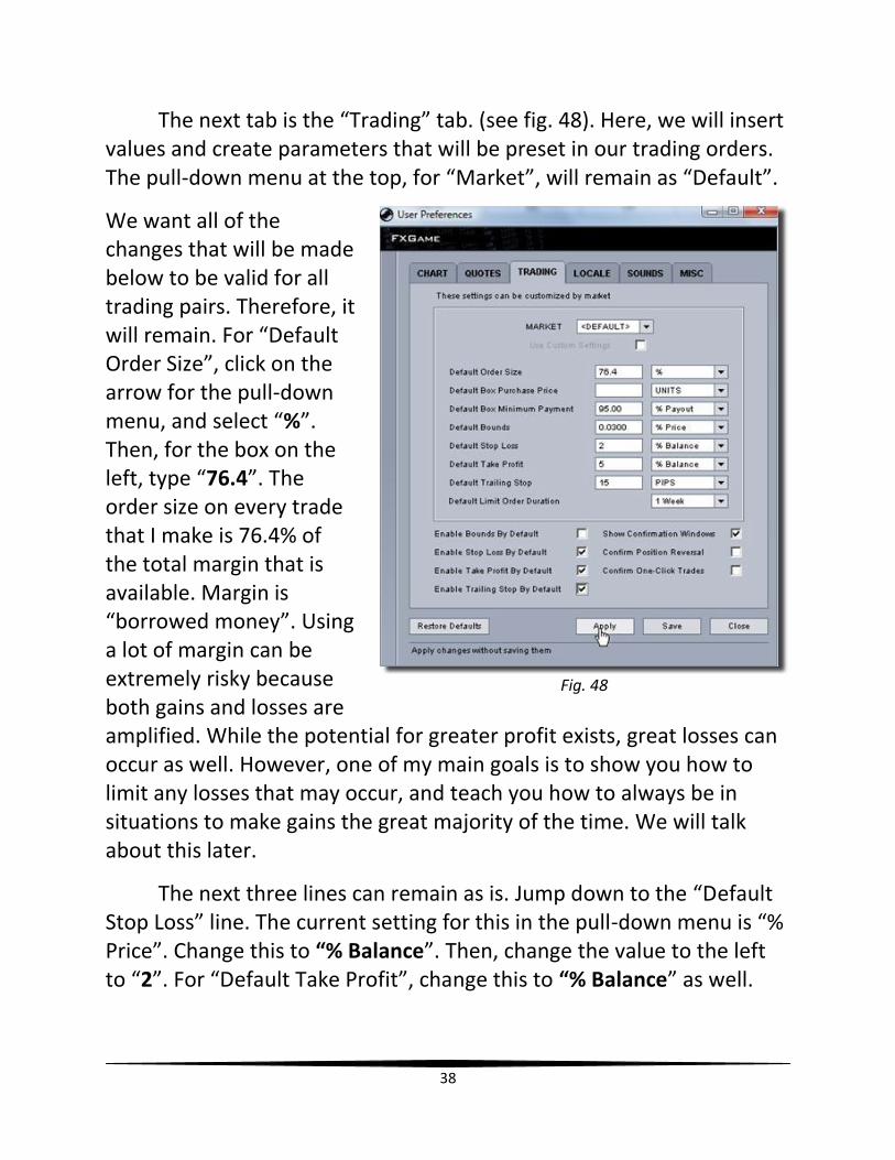
The next tab is the “Trading” tab. (see fig. 48). Here, we will insert values and create parameters that will be preset in our trading orders. The pull-down menu at the top, for “Market”, will remain as “Default”.
We want all of the changes that will be made below to be valid for all trading pairs. Therefore, it will remain. For “Default Order Size”, click on the arrow for the pull-down menu, and select “%”. Then, for the box on the left, type “76.4”. The order size on every trade that I make is 76.4% of the total margin that is available. Margin is “borrowed money”. Using a lot of margin can be extremely risky because both gains and losses are amplified. While the potential for greater profit exists, great losses can occur as well. However, one of my main goals is to show you how to limit any losses that may occur, and teach you how to always be in situations to make gains the great majority of the time. We will talk about this later.
The next three lines can remain as is. Jump down to the “Default Stop Loss” line. The current setting for this in the pull-down menu is “% Price”. Change this to “% Balance”. Then, change the value to the left to “2”. For “Default Take Profit”, change this to “% Balance” as well.
Fig. 48
39
Then change the value to “5”. Depending on your daily goal, which we will discuss later, this value may change.
For “Default Trailing Stop”, change the pull-down menu to “PIPS”. Set the value to “15”. “Default Limit Order Duration” can remain as is.
For the items at the bottom of the “Trading” tab, place checks in the boxes of the following:
Enable Stop Loss By Default
Enable Take Profit By Default
Enable Trailing Stop By Default
Remove the checkmark from “Confirm One-Click Trades”. Click on “Apply” afterwards.
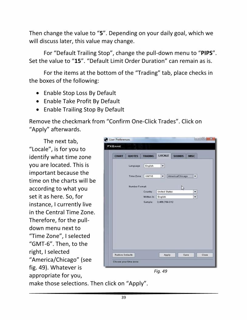
The next tab, “Locale”, is for you to identify what time zone you are located. This is important because the time on the charts will be according to what you set it as here. So, for instance, I currently live in the Central Time Zone. Therefore, for the pull-down menu next to “Time Zone”, I selected “GMT-6”. Then, to the right, I selected “America/Chicago” (see fig. 49). Whatever is appropriate for you, make those selections. Then click on “Apply”.
Fig. 49
40
For the “Sounds” tab, here you can upload any compatible sound files to your account to assign to various events/actions that will take place. For example, you can have different sounds assigned for the price hitting your “Take Profit” and “Stop Loss lines” so that if you were in another room, you will know when one of the actions takes place.
For the last tab, “Misc”, everything can remain as is. So, now, you can click on “Apply”, then “Save”.
In the next chapter, I will show you how to adjust the leverage setting for your account.
41
Chapter 10
Adjusting Leverage
In this chapter, I will show you how to adjust your leverage setting. Leverage is when the investor only funds part of the amount traded. It is a ratio of the amount used in a transaction to the required deposit.
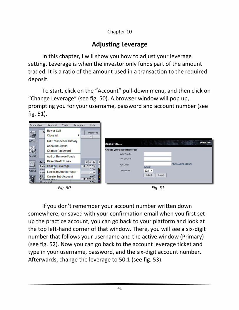
To start, click on the “Account” pull-down menu, and then click on “Change Leverage” (see fig. 50). A browser window will pop up, prompting you for your username, password and account number (see fig. 51).
Fig. 50 Fig. 51
If you don’t remember your account number written down somewhere, or saved with your confirmation email when you first set up the practice account, you can go back to your platform and look at the top left-hand corner of that window. There, you will see a six-digit number that follows your username and the active window (Primary) (see fig. 52). Now you can go back to the account leverage ticket and type in your username, password, and the six-digit account number. Afterwards, change the leverage to 50:1 (see fig. 53).
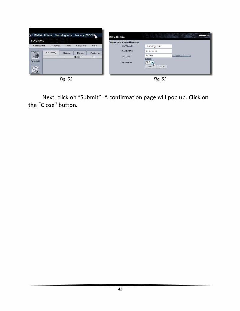
42
Fig. 52 Fig. 53
Next, click on “Submit”. A confirmation page will pop up. Click on the “Close” button.
43
Chapter 11
Creating Multiple Time Chart Windows
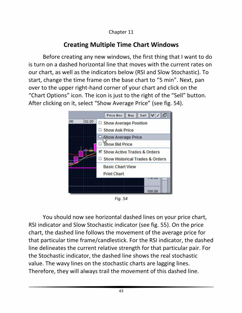
Before creating any new windows, the first thing that I want to do is turn on a dashed horizontal line that moves with the current rates on our chart, as well as the indicators below (RSI and Slow Stochastic). To start, change the time frame on the base chart to “5 min”. Next, pan over to the upper right-hand corner of your chart and click on the “Chart Options” icon. The icon is just to the right of the “Sell” button. After clicking on it, select “Show Average Price” (see fig. 54).
Fig. 54
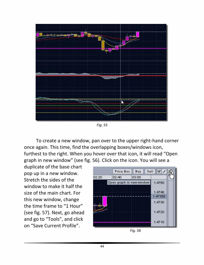
You should now see horizontal dashed lines on your price chart, RSI indicator and Slow Stochastic indicator (see fig. 55). On the price chart, the dashed line follows the movement of the average price for that particular time frame/candlestick. For the RSI indicator, the dashed line delineates the current relative strength for that particular pair. For the Stochastic indicator, the dashed line shows the real stochastic value. The wavy lines on the stochastic charts are lagging lines. Therefore, they will always trail the movement of this dashed line.
44
Fig. 55
To create a new window, pan over to the upper right-hand corner once again. This time, find the overlapping boxes/windows icon, furthest to the right. When you hover over that icon, it will read “Open graph in new window” (see fig. 56). Click on the icon. You will see a duplicate of the base chart pop up in a new window. Stretch the sides of the window to make it half the size of the main chart. For this new window, change the time frame to “1 Hour” (see fig. 57). Next, go ahead and go to “Tools”, and click on “Save Current Profile”.
Fig. 56
45
Fig. 57
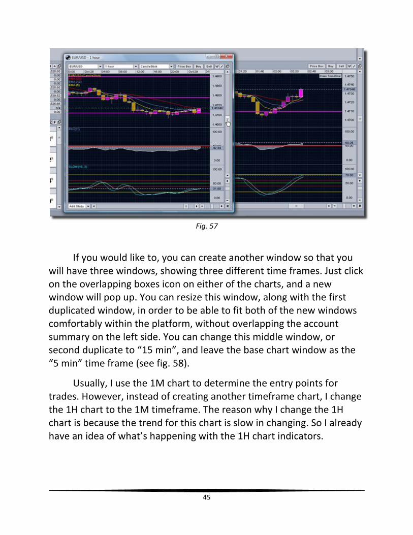
If you would like to, you can create another window so that you will have three windows, showing three different time frames. Just click on the overlapping boxes icon on either of the charts, and a new window will pop up. You can resize this window, along with the first duplicated window, in order to be able to fit both of the new windows comfortably within the platform, without overlapping the account summary on the left side. You can change this middle window, or second duplicate to “15 min”, and leave the base chart window as the “5 min” time frame (see fig. 58).
Usually, I use the 1M chart to determine the entry points for trades. However, instead of creating another timeframe chart, I change the 1H chart to the 1M timeframe. The reason why I change the 1H chart is because the trend for this chart is slow in changing. So I already have an idea of what’s happening with the 1H chart indicators.

46
Fig. 58
I will talk about how to use all of these windows in conjunction with one another later. But in the next chapter, I will share information about the proper times to trade.
47
Chapter 12
Time of Day/ Volume Factor
There are certain times of the day that are more conducive for successful forex trading than others. When trading, it is helpful to trade at the same time as many others, who may in fact, be using indicators and systems that are similar to yours. Because many traders use some type of lagging indicator to dictate when to open and close trades, a signal to trade in one way or the other will be followed by a strong rush of traders hopping on board and riding the “trend-train” to their destination!
The best time to trade, in my opinion, is between the hours of 6 AM and 12 PM CST. The reason why this is such a critical time to trade, especially the early hours of this range, is because of the following reasons:
1. It’s near the opening bell of the New York markets 2. It’s near the closing bell of the European markets 3. It’s the evening in Asia and Australia.
The hours around the opening bell (8:30 AM CST) is usually where you will be able to find the most market activity. Therefore, I typically trade between the hours of 7-11 AM CST. This is a peak time for trading because the volume is the greatest during this period. Volume is a significant gauge in technical analysis as it is used to determine the value of a market move. If the markets have made a strong price move, either up or down, the apparent force of that move depends on the volume for that time frame. The higher the volume during that price move, the more important the move.
So, not only are there people in North America that are trading at this time, but there are people in Europe, Asia and Australia that are trading as well. While it is 6 AM CST/7 AM EST in New York, it is only
48
8 PM CST/9 PM EST in Japan. So Asian and Australian traders are also influencing the direction the forex rates go.
The next best time to trade, in my opinion, is between the hours of 1 AM and 3 AM CST. At this time, the Asian and Australian Markets are preparing to close. Meanwhile, the European markets are opening. So, once again, there is an overlapping of trading markets that will affect currency rates.
The third best time to trade is between the hours of 6 PM and 9 PM CST. The Asian and Australian markets open at 6 PM, and of course, traders in Europe, as well as America are still awake and may look to make quick gains as well.
There are a few things that you must be aware of when trading.
NEVER enter a trade five minutes prior to financial news releases/ economic reports
Before news releases/reports, there will be a lot of speculation. Some
will hedge their bets that the price/rate will go up. Some will think that
the price/rate will go down. This period of uncertainty creates what is
called volatility. Volatility refers to the amount of indecision or risk
49
about the size of changes in a security's value. A higher volatility means
that a pair’s (i.e., EUR/USD) worth can probably be spread out over a
larger range of values. Meaning, the price of the pair can fluctuate
considerably over a short time period in either direction. A lower
volatility means that a pair's value does not rise and fall severely, but
instead, changes in value at a stable pace over a period of time.
WAIT five to ten minutes after financial/economic news releases
Usually, the market drastically reacts to news releases. The price/rate
will take off into one direction or the other. It will then move strongly in
that direction for a minute or two. Then the movement will slow down,
and then begin to retrace (reversal in the movement of a pair's price,
countering the prevailing trend). A lot of times, you’ll find that the
price/rate will actually retrace all the way back to where the price was
before the news report. At this point, sometimes it will continue in the
retraced direction, or it may rebound and go back into the direction
that it took after the news release. Sometimes, it will move side-ways
for a while after returning back to its previous location. But just as a
word of wisdom, simply wait for the extreme volatility and noise of the
pair to calm down before thinking about entering a trade.
NEVER trade while the Fed Chairman is speaking… EVER!!!
Something that I’ve noticed is that whenever the Fed Chairman speaks,
there is usually a lot of volatility in the markets. Market psychology
begins to affect the stability of the rate when traders try to decipher
every word that comes from the mouth of the chairman! In this
instance, just sit back, relax, listen to what is being said, but do not
react to it. Again, just wait five to ten minutes before you resume
trading.
50
A website that I utilize to let me know when important
financial/economic news reports will be released is
www.forexfactory.com. I will cover this site in the next chapter and will
talk about its value to you, the forex trader.
51
Chapter 13
Check Forex Factory Day Calendar
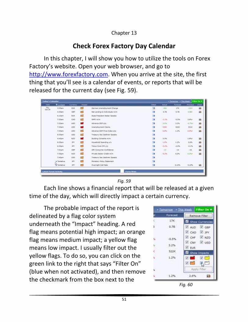
In this chapter, I will show you how to utilize the tools on Forex Factory’s website. Open your web browser, and go to http://www.forexfactory.com. When you arrive at the site, the first thing that you’ll see is a calendar of events, or reports that will be released for the current day (see Fig. 59).
Fig. 59
Each line shows a financial report that will be released at a given time of the day, which will directly impact a certain currency.
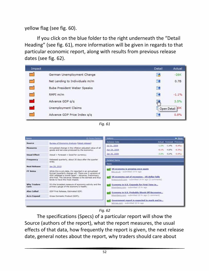
The probable impact of the report is delineated by a flag color system underneath the “Impact” heading. A red flag means potential high impact; an orange flag means medium impact; a yellow flag means low impact. I usually filter out the yellow flags. To do so, you can click on the green link to the right that says “Filter On” (blue when not activated), and then remove the checkmark from the box next to the
Fig. 60
52
yellow flag (see fig. 60).
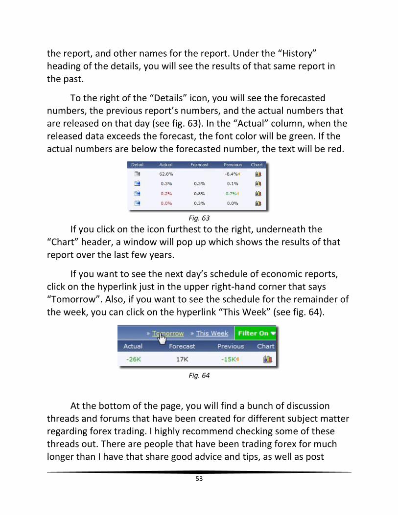
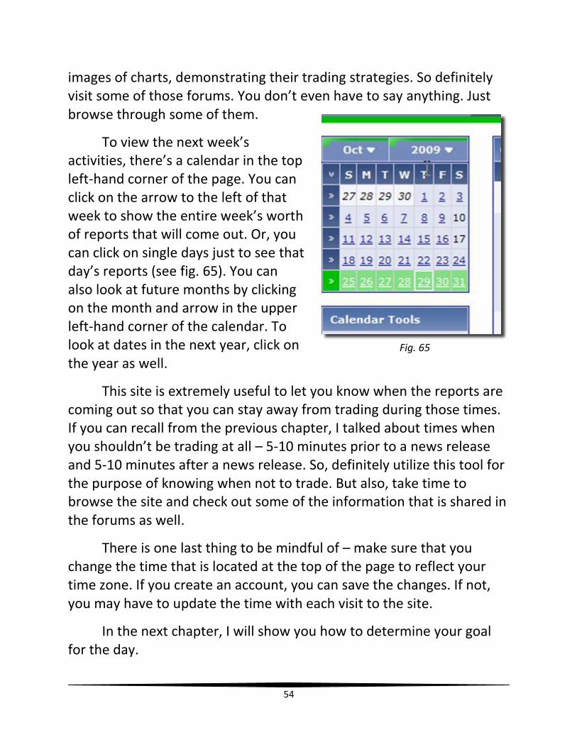
If you click on the blue folder to the right underneath the “Detail Heading” (see fig. 61), more information will be given in regards to that particular economic report, along with results from previous release dates (see fig. 62).
Fig. 61
Fig. 62
The specifications (Specs) of a particular report will show the Source (authors of the report), what the report measures, the usual effects of that data, how frequently the report is given, the next release date, general notes about the report, why traders should care about
53
the report, and other names for the report. Under the “History” heading of the details, you will see the results of that same report in the past.
To the right of the “Details” icon, you will see the forecasted numbers, the previous report’s numbers, and the actual numbers that are released on that day (see fig. 63). In the “Actual” column, when the released data exceeds the forecast, the font color will be green. If the actual numbers are below the forecasted number, the text will be red.
Fig. 63
If you click on the icon furthest to the right, underneath the “Chart” header, a window will pop up which shows the results of that report over the last few years.
If you want to see the next day’s schedule of economic reports, click on the hyperlink just in the upper right-hand corner that says “Tomorrow”. Also, if you want to see the schedule for the remainder of the week, you can click on the hyperlink “This Week” (see fig. 64).
Fig. 64
At the bottom of the page, you will find a bunch of discussion threads and forums that have been created for different subject matter regarding forex trading. I highly recommend checking some of these threads out. There are people that have been trading forex for much longer than I have that share good advice and tips, as well as post
54
images of charts, demonstrating their trading strategies. So definitely visit some of those forums. You don’t even have to say anything. Just browse through some of them.
To view the next week’s activities, there’s a calendar in the top left-hand corner of the page. You can click on the arrow to the left of that week to show the entire week’s worth of reports that will come out. Or, you can click on single days just to see that day’s reports (see fig. 65). You can also look at future months by clicking on the month and arrow in the upper left-hand corner of the calendar. To look at dates in the next year, click on the year as well.
This site is extremely useful to let you know when the reports are coming out so that you can stay away from trading during those times. If you can recall from the previous chapter, I talked about times when you shouldn’t be trading at all – 5-10 minutes prior to a news release and 5-10 minutes after a news release. So, definitely utilize this tool for the purpose of knowing when not to trade. But also, take time to browse the site and check out some of the information that is shared in the forums as well.
There is one last thing to be mindful of – make sure that you change the time that is located at the top of the page to reflect your time zone. If you create an account, you can save the changes. If not, you may have to update the time with each visit to the site.
In the next chapter, I will show you how to determine your goal for the day.
Fig. 65
55
Chapter 14
Determining Goal For The Day
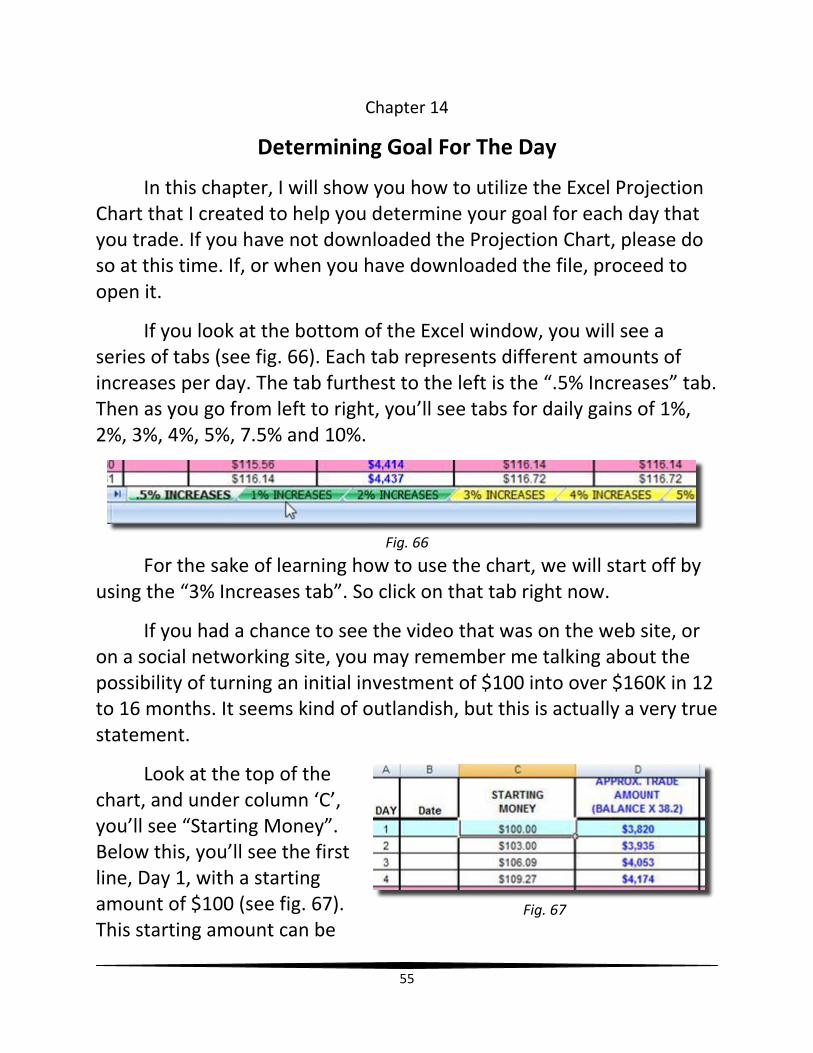
In this chapter, I will show you how to utilize the Excel Projection Chart that I created to help you determine your goal for each day that you trade. If you have not downloaded the Projection Chart, please do so at this time. If, or when you have downloaded the file, proceed to open it.
If you look at the bottom of the Excel window, you will see a series of tabs (see fig. 66). Each tab represents different amounts of increases per day. The tab furthest to the left is the “.5% Increases” tab. Then as you go from left to right, you’ll see tabs for daily gains of 1%, 2%, 3%, 4%, 5%, 7.5% and 10%.
For the sake of learning how to use the chart, we will start off by using the “3% Increases tab”. So click on that tab right now.
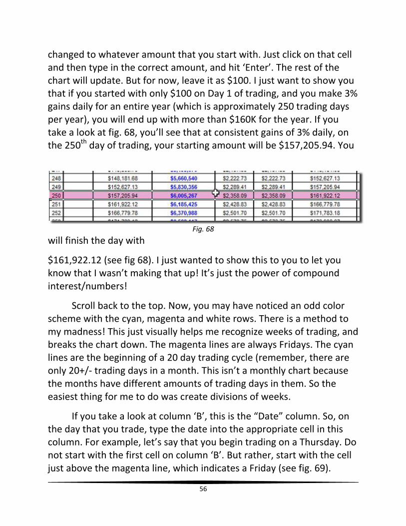
If you had a chance to see the video that was on the web site, or on a social networking site, you may remember me talking about the possibility of turning an initial investment of $100 into over $160K in 12 to 16 months. It seems kind of outlandish, but this is actually a very true statement.
Look at the top of the chart, and under column ‘C’, you’ll see “Starting Money”. Below this, you’ll see the first line, Day 1, with a starting amount of $100 (see fig. 67). This starting amount can be
Fig. 66
Fig. 67
56
changed to whatever amount that you start with. Just click on that cell and then type in the correct amount, and hit ‘Enter’. The rest of the chart will update. But for now, leave it as $100. I just want to show you that if you started with only $100 on Day 1 of trading, and you make 3% gains daily for an entire year (which is approximately 250 trading days per year), you will end up with more than $160K for the year. If you take a look at fig. 68, you’ll see that at consistent gains of 3% daily, on the 250th day of trading, your starting amount will be $157,205.94. You
will finish the day with
$161,922.12 (see fig 68). I just wanted to show this to you to let you know that I wasn’t making that up! It’s just the power of compound interest/numbers!
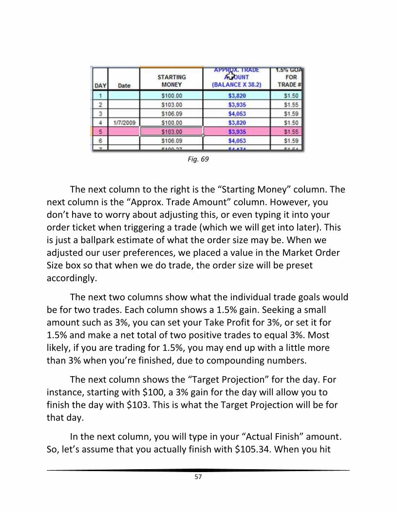
Scroll back to the top. Now, you may have noticed an odd color scheme with the cyan, magenta and white rows. There is a method to my madness! This just visually helps me recognize weeks of trading, and breaks the chart down. The magenta lines are always Fridays. The cyan lines are the beginning of a 20 day trading cycle (remember, there are only 20+/- trading days in a month. This isn’t a monthly chart because the months have different amounts of trading days in them. So the easiest thing for me to do was create divisions of weeks.
If you take a look at column ‘B’, this is the “Date” column. So, on the day that you trade, type the date into the appropriate cell in this column. For example, let’s say that you begin trading on a Thursday. Do not start with the first cell on column ‘B’. But rather, start with the cell just above the magenta line, which indicates a Friday (see fig. 69).
Fig. 68
57
Fig. 69
The next column to the right is the “Starting Money” column. The next column is the “Approx. Trade Amount” column. However, you don’t have to worry about adjusting this, or even typing it into your order ticket when triggering a trade (which we will get into later). This is just a ballpark estimate of what the order size may be. When we adjusted our user preferences, we placed a value in the Market Order Size box so that when we do trade, the order size will be preset accordingly.
The next two columns show what the individual trade goals would be for two trades. Each column shows a 1.5% gain. Seeking a small amount such as 3%, you can set your Take Profit for 3%, or set it for 1.5% and make a net total of two positive trades to equal 3%. Most likely, if you are trading for 1.5%, you may end up with a little more than 3% when you’re finished, due to compounding numbers.
The next column shows the “Target Projection” for the day. For instance, starting with $100, a 3% gain for the day will allow you to finish the day with $103. This is what the Target Projection will be for that day.
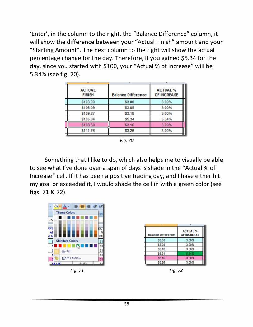
In the next column, you will type in your “Actual Finish” amount. So, let’s assume that you actually finish with $105.34. When you hit
58
‘Enter’, in the column to the right, the “Balance Difference” column, it will show the difference between your “Actual Finish” amount and your “Starting Amount”. The next column to the right will show the actual percentage change for the day. Therefore, if you gained $5.34 for the day, since you started with $100, your “Actual % of Increase” will be 5.34% (see fig. 70).
Fig. 70
Something that I like to do, which also helps me to visually be able to see what I’ve done over a span of days is shade in the “Actual % of Increase” cell. If it has been a positive trading day, and I have either hit my goal or exceeded it, I would shade the cell in with a green color (see figs. 71 & 72).
Fig. 71 Fig. 72
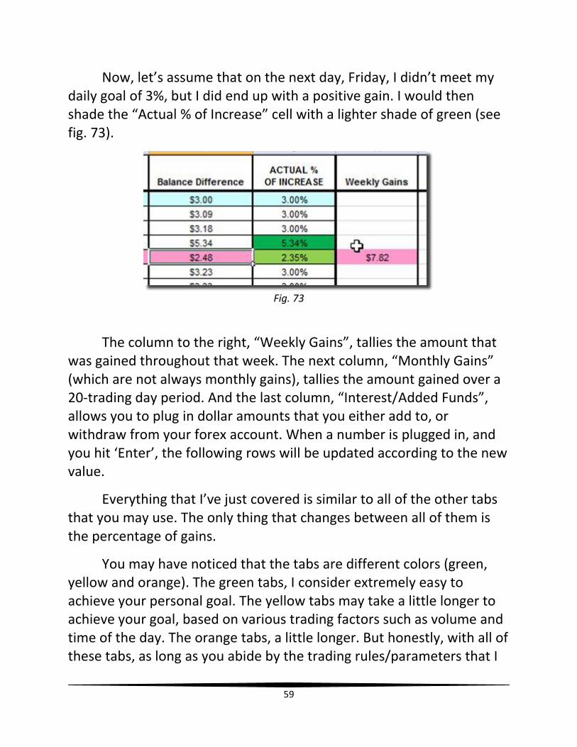
59
Now, let’s assume that on the next day, Friday, I didn’t meet my daily goal of 3%, but I did end up with a positive gain. I would then shade the “Actual % of Increase” cell with a lighter shade of green (see fig. 73).
Fig. 73
The column to the right, “Weekly Gains”, tallies the amount that was gained throughout that week. The next column, “Monthly Gains” (which are not always monthly gains), tallies the amount gained over a 20-trading day period. And the last column, “Interest/Added Funds”, allows you to plug in dollar amounts that you either add to, or withdraw from your forex account. When a number is plugged in, and you hit ‘Enter’, the following rows will be updated according to the new value.
Everything that I’ve just covered is similar to all of the other tabs that you may use. The only thing that changes between all of them is the percentage of gains.
You may have noticed that the tabs are different colors (green, yellow and orange). The green tabs, I consider extremely easy to achieve your personal goal. The yellow tabs may take a little longer to achieve your goal, based on various trading factors such as volume and time of the day. The orange tabs, a little longer. But honestly, with all of these tabs, as long as you abide by the trading rules/parameters that I
60
will share with you in the next few chapters, you should have no problem achieving your goals, no matter what the percentage may be for the day. If you can catch a trend right when it’s beginning, especially in the morning, it may be very easy to hit 7.5% in just one trade. And even 10% with one trade is doable at times! There have been times when I’ve gained between 16%-18% with just one trade!
In terms of a strategy that I use, I personally try to hit the 7.5% mark daily. The way that I do this is by trading in the morning between 7 and 10 AM CST to get a small gain of 3%. Then in the evening time, I’ll try to get an even smaller gain, like 2%. So that leaves me with 2.5% left to gain. So if I’m up late at night, I’ll gain the remaining amount after 1 AM. However, sometimes, when I know there’s going to be a major run, I’ll gain all 7.5% in the morning. Or, I’ll gain half of it in the morning, and the other half in the evening. So, this is an example of how you really don’t have to stay in front of the computer forever to trade. All it takes is a few minutes at the right time to get in, and get out with small gains. And even if I don’t meet my goal of 7.5% everyday, I’m happy with a gain, period. I’m happy to end the day with more than I started the day with. That’s all that matters – small, consistent gains for an extended period of time!
Take some time to plug in dollar amounts on each tab to help you identify a goal that you think you’ll be able to achieve. See what you can make after half of a year (125 days), one year, two years and five years (some of the larger percentage gains don’t go past two years, so you may need to copy and paste to enlarge the chart). Whether it’s .5% per day, 1% per day, 4% per day, decide which tab will work best for you and your own personal goals, AND STICK WITH THAT TAB! Do not get into the habit of switching tabs/goals. This can be detrimental to your overall efforts of making your goal. If you make more than your goal, fine. If you make less than your goal, fine. Just stick with your goal!

61
Okay! Now it’s finally time to get into the good stuff! I will begin to show you how to use the various indicators in the following chapters!
62
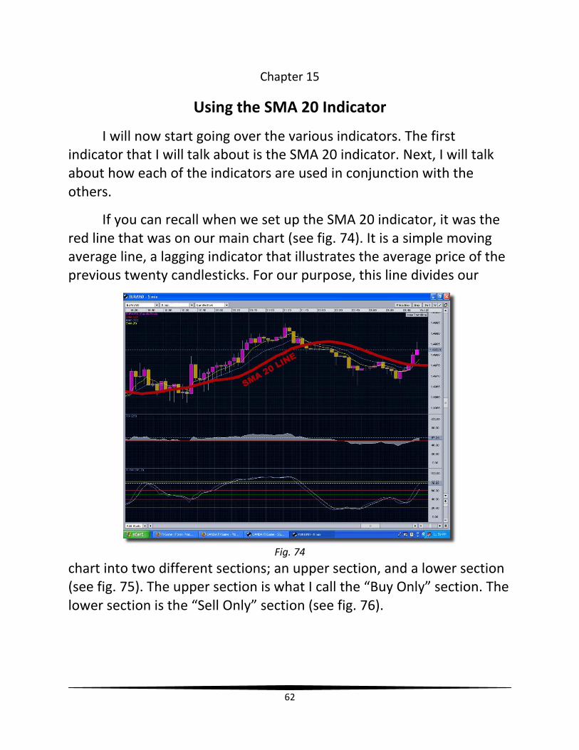
Chapter 15
Using the SMA 20 Indicator
I will now start going over the various indicators. The first indicator that I will talk about is the SMA 20 indicator. Next, I will talk about how each of the indicators are used in conjunction with the others.
If you can recall when we set up the SMA 20 indicator, it was the red line that was on our main chart (see fig. 74). It is a simple moving average line, a lagging indicator that illustrates the average price of the previous twenty candlesticks. For our purpose, this line divides our
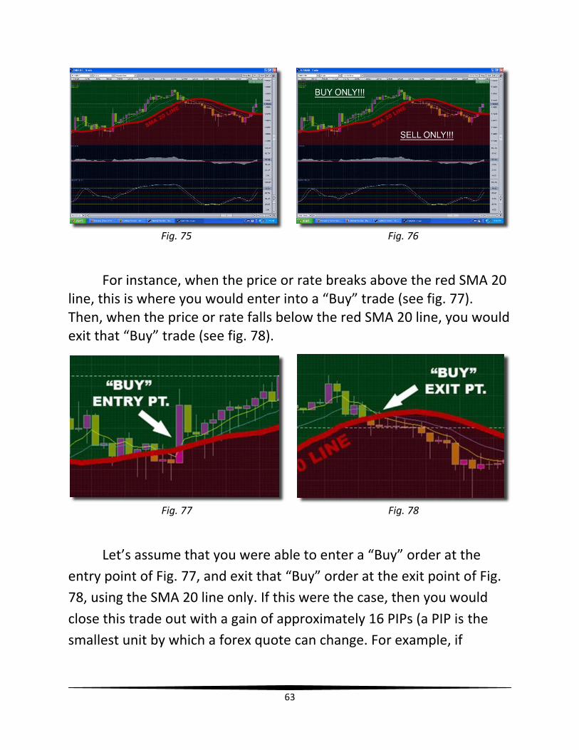
chart into two different sections; an upper section, and a lower section (see fig. 75). The upper section is what I call the “Buy Only” section. The lower section is the “Sell Only” section (see fig. 76).
Fig. 74
63
For instance, when the price or rate breaks above the red SMA 20 line, this is where you would enter into a “Buy” trade (see fig. 77). Then, when the price or rate falls below the red SMA 20 line, you would exit that “Buy” trade (see fig. 78).
Fig. 77 Fig. 78
Let’s assume that you were able to enter a “Buy” order at the
entry point of Fig. 77, and exit that “Buy” order at the exit point of Fig.
78, using the SMA 20 line only. If this were the case, then you would
close this trade out with a gain of approximately 16 PIPs (a PIP is the
smallest unit by which a forex quote can change. For example, if
Fig. 75 Fig. 76
64
EUR/USD is now quoted at 1.4767 and it moves up 2 pips, it will be
quoted at 1.4769) (see fig. 79).
Fig. 79
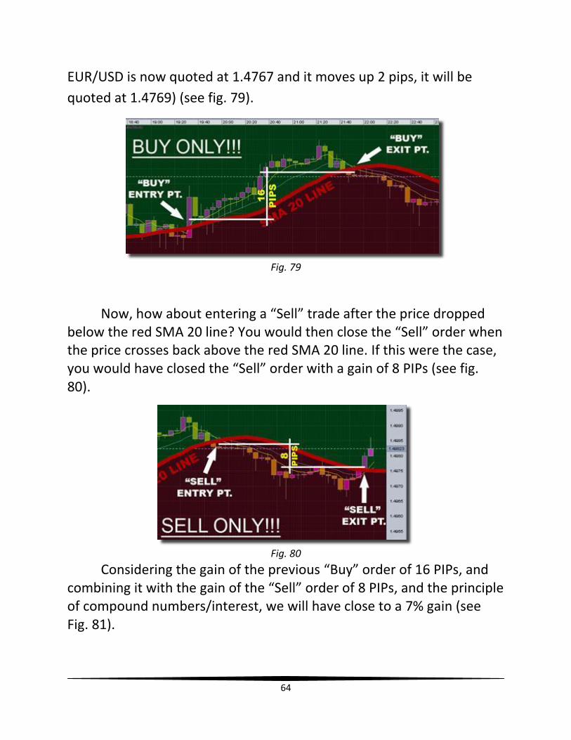
Now, how about entering a “Sell” trade after the price dropped below the red SMA 20 line? You would then close the “Sell” order when the price crosses back above the red SMA 20 line. If this were the case, you would have closed the “Sell” order with a gain of 8 PIPs (see fig. 80).
Fig. 80
Considering the gain of the previous “Buy” order of 16 PIPs, and combining it with the gain of the “Sell” order of 8 PIPs, and the principle of compound numbers/interest, we will have close to a 7% gain (see Fig. 81).
65
Fig. 81
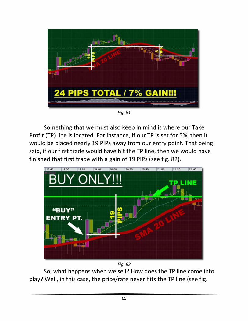
Something that we must also keep in mind is where our Take Profit (TP) line is located. For instance, if our TP is set for 5%, then it would be placed nearly 19 PIPs away from our entry point. That being said, if our first trade would have hit the TP line, then we would have finished that first trade with a gain of 19 PIPs (see fig. 82).
Fig. 82
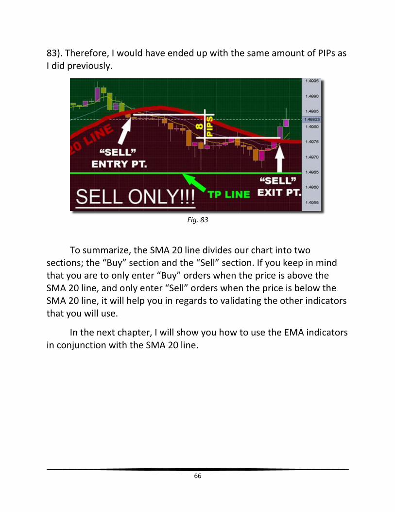
So, what happens when we sell? How does the TP line come into play? Well, in this case, the price/rate never hits the TP line (see fig.
66
83). Therefore, I would have ended up with the same amount of PIPs as I did previously.
Fig. 83
To summarize, the SMA 20 line divides our chart into two sections; the “Buy” section and the “Sell” section. If you keep in mind that you are to only enter “Buy” orders when the price is above the SMA 20 line, and only enter “Sell” orders when the price is below the SMA 20 line, it will help you in regards to validating the other indicators that you will use.
In the next chapter, I will show you how to use the EMA indicators in conjunction with the SMA 20 line.
67
Chapter 16
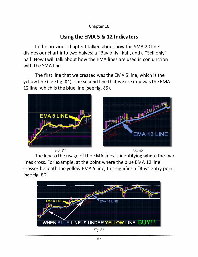
Using the EMA 5 & 12 Indicators
In the previous chapter I talked about how the SMA 20 line divides our chart into two halves; a “Buy only” half, and a “Sell only” half. Now I will talk about how the EMA lines are used in conjunction with the SMA line.
The first line that we created was the EMA 5 line, which is the yellow line (see fig. 84). The second line that we created was the EMA 12 line, which is the blue line (see fig. 85).
Fig. 84 Fig. 85
The key to the usage of the EMA lines is identifying where the two lines cross. For example, at the point where the blue EMA 12 line crosses beneath the yellow EMA 5 line, this signifies a “Buy” entry point (see fig. 86).
Fig. 86
68
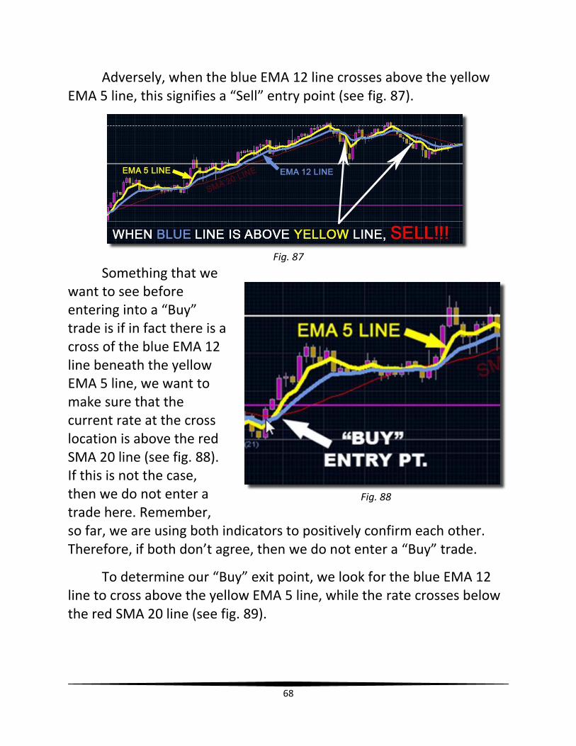
Adversely, when the blue EMA 12 line crosses above the yellow EMA 5 line, this signifies a “Sell” entry point (see fig. 87).
Fig. 87
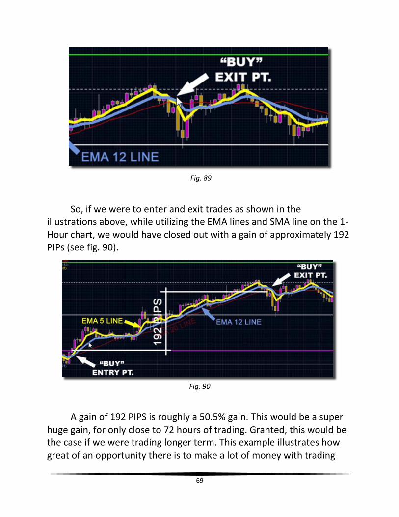
Something that we want to see before entering into a “Buy” trade is if in fact there is a cross of the blue EMA 12 line beneath the yellow EMA 5 line, we want to make sure that the current rate at the cross location is above the red SMA 20 line (see fig. 88). If this is not the case, then we do not enter a trade here. Remember, so far, we are using both indicators to positively confirm each other. Therefore, if both don’t agree, then we do not enter a “Buy” trade.
To determine our “Buy” exit point, we look for the blue EMA 12 line to cross above the yellow EMA 5 line, while the rate crosses below the red SMA 20 line (see fig. 89).
Fig. 88
69
Fig. 89
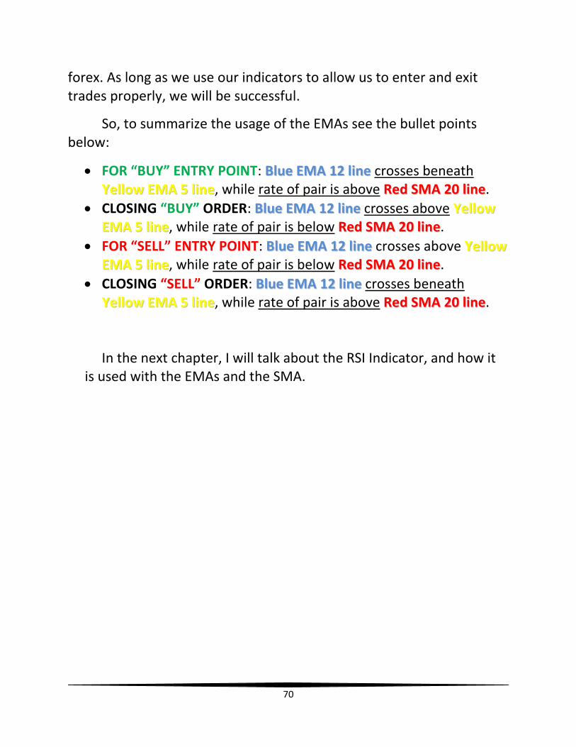
So, if we were to enter and exit trades as shown in the illustrations above, while utilizing the EMA lines and SMA line on the 1-Hour chart, we would have closed out with a gain of approximately 192 PIPs (see fig. 90).
A gain of 192 PIPS is roughly a 50.5% gain. This would be a super huge gain, for only close to 72 hours of trading. Granted, this would be the case if we were trading longer term. This example illustrates how great of an opportunity there is to make a lot of money with trading
Fig. 90
70
forex. As long as we use our indicators to allow us to enter and exit trades properly, we will be successful.
So, to summarize the usage of the EMAs see the bullet points below:
FOR “BUY” ENTRY POINT: BBlluuee EEMMAA 1122 lliinnee crosses beneath
YYeellllooww EEMMAA 55 lliinnee, while rate of pair is above RReedd SSMMAA 2200 lliinnee.
CLOSING “BUY” ORDER: BBlluuee EEMMAA 1122 lliinnee crosses above YYeellllooww
EEMMAA 55 lliinnee, while rate of pair is below RReedd SSMMAA 2200 lliinnee.
FOR “SELL” ENTRY POINT: BBlluuee EEMMAA 1122 lliinnee crosses above YYeellllooww
EEMMAA 55 lliinnee, while rate of pair is below RReedd SSMMAA 2200 lliinnee.
CLOSING “SELL” ORDER: BBlluuee EEMMAA 1122 lliinnee crosses beneath
YYeellllooww EEMMAA 55 lliinnee, while rate of pair is above RReedd SSMMAA 2200 lliinnee.
In the next chapter, I will talk about the RSI Indicator, and how it is used with the EMAs and the SMA.
71
Chapter 17
Using the RSI Indicator
In the two previous chapters, I talked about how to use the SMA and EMA indicators. Now, I will talk about how to use the RSI indicator, along with the previous two indicators.
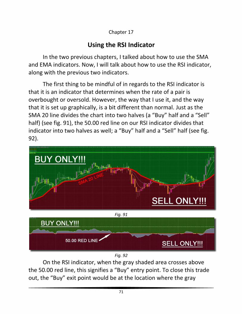
The first thing to be mindful of in regards to the RSI indicator is that it is an indicator that determines when the rate of a pair is overbought or oversold. However, the way that I use it, and the way that it is set up graphically, is a bit different than normal. Just as the SMA 20 line divides the chart into two halves (a “Buy” half and a “Sell” half) (see fig. 91), the 50.00 red line on our RSI indicator divides that indicator into two halves as well; a “Buy” half and a “Sell” half (see fig. 92).
Fig. 91
Fig. 92
On the RSI indicator, when the gray shaded area crosses above the 50.00 red line, this signifies a “Buy” entry point. To close this trade out, the “Buy” exit point would be at the location where the gray
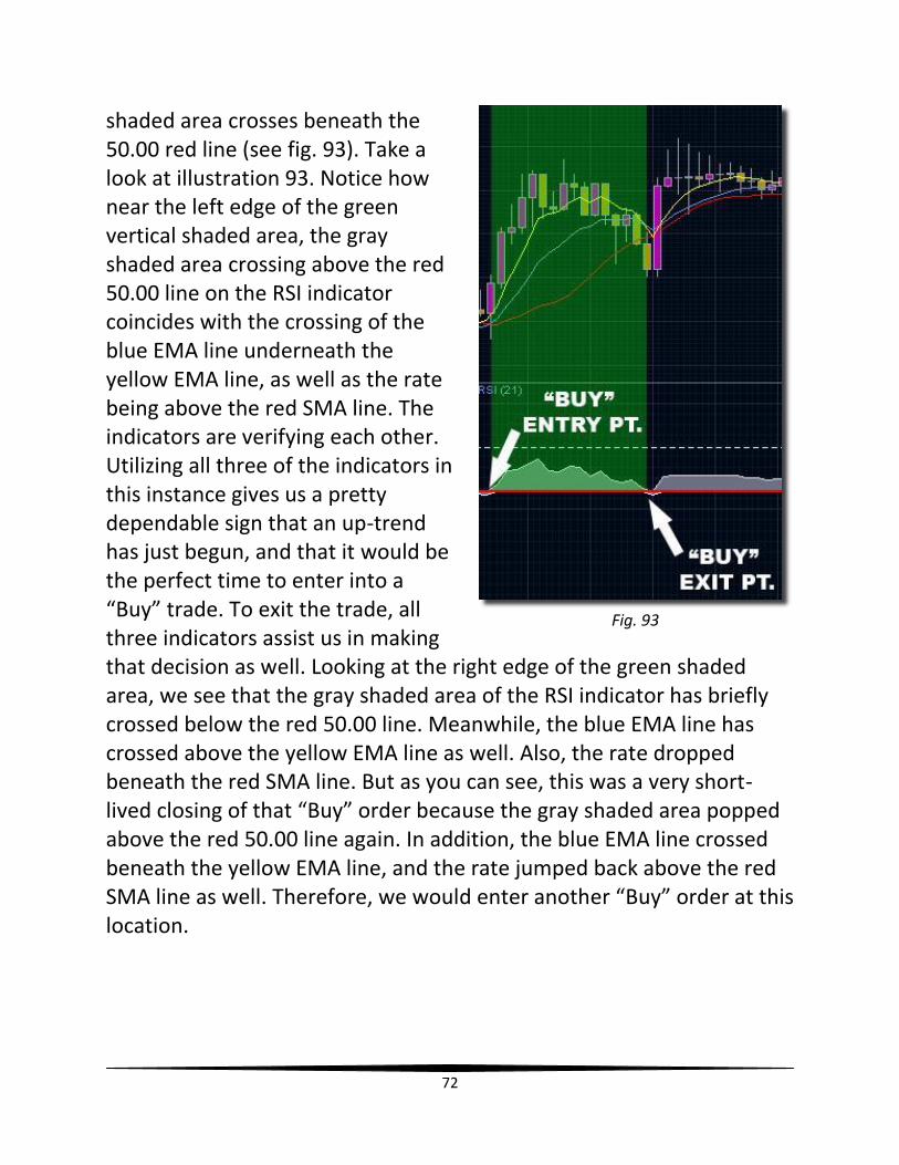
72
shaded area crosses beneath the 50.00 red line (see fig. 93). Take a look at illustration 93. Notice how near the left edge of the green vertical shaded area, the gray shaded area crossing above the red 50.00 line on the RSI indicator coincides with the crossing of the blue EMA line underneath the yellow EMA line, as well as the rate being above the red SMA line. The indicators are verifying each other. Utilizing all three of the indicators in this instance gives us a pretty dependable sign that an up-trend has just begun, and that it would be the perfect time to enter into a “Buy” trade. To exit the trade, all three indicators assist us in making that decision as well. Looking at the right edge of the green shaded area, we see that the gray shaded area of the RSI indicator has briefly crossed below the red 50.00 line. Meanwhile, the blue EMA line has crossed above the yellow EMA line as well. Also, the rate dropped beneath the red SMA line. But as you can see, this was a very short-lived closing of that “Buy” order because the gray shaded area popped above the red 50.00 line again. In addition, the blue EMA line crossed beneath the yellow EMA line, and the rate jumped back above the red SMA line as well. Therefore, we would enter another “Buy” order at this location.
Fig. 93
73
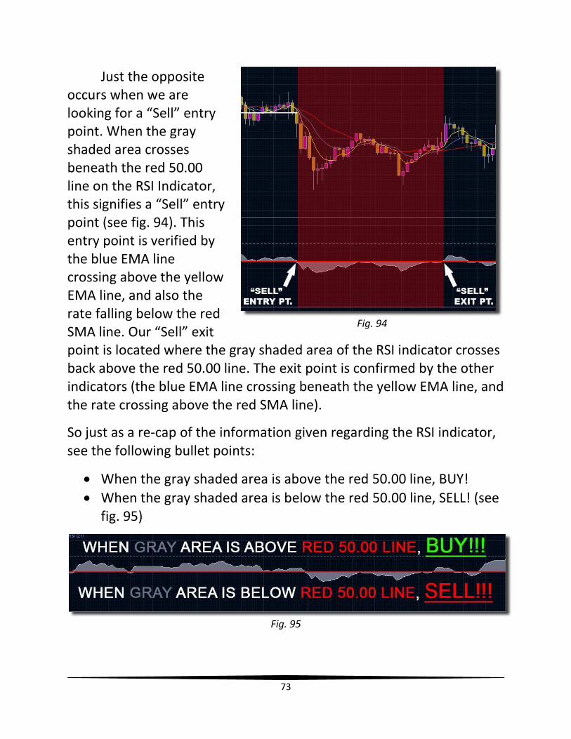
Just the opposite occurs when we are looking for a “Sell” entry point. When the gray shaded area crosses beneath the red 50.00 line on the RSI Indicator, this signifies a “Sell” entry point (see fig. 94). This entry point is verified by the blue EMA line crossing above the yellow EMA line, and also the rate falling below the red SMA line. Our “Sell” exit point is located where the gray shaded area of the RSI indicator crosses back above the red 50.00 line. The exit point is confirmed by the other indicators (the blue EMA line crossing beneath the yellow EMA line, and the rate crossing above the red SMA line).
So just as a re-cap of the information given regarding the RSI indicator, see the following bullet points:
When the gray shaded area is above the red 50.00 line, BUY!
When the gray shaded area is below the red 50.00 line, SELL! (see fig. 95)
Fig. 95
Fig. 94
74
Chapter 18
Using the Slow Stochastic Indicator
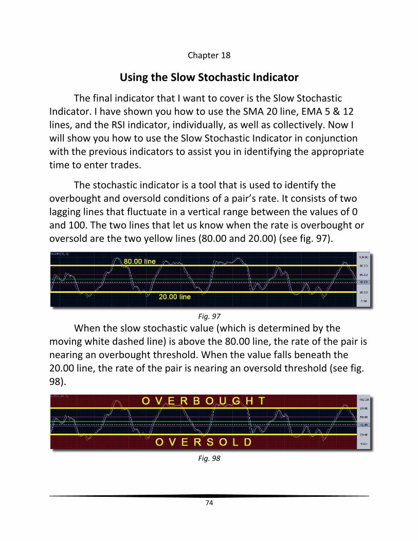
The final indicator that I want to cover is the Slow Stochastic Indicator. I have shown you how to use the SMA 20 line, EMA 5 & 12 lines, and the RSI indicator, individually, as well as collectively. Now I will show you how to use the Slow Stochastic Indicator in conjunction with the previous indicators to assist you in identifying the appropriate time to enter trades.
The stochastic indicator is a tool that is used to identify the overbought and oversold conditions of a pair’s rate. It consists of two lagging lines that fluctuate in a vertical range between the values of 0 and 100. The two lines that let us know when the rate is overbought or oversold are the two yellow lines (80.00 and 20.00) (see fig. 97).
Fig. 97
When the slow stochastic value (which is determined by the moving white dashed line) is above the 80.00 line, the rate of the pair is nearing an overbought threshold. When the value falls beneath the 20.00 line, the rate of the pair is nearing an oversold threshold (see fig. 98).
Fig. 98
75
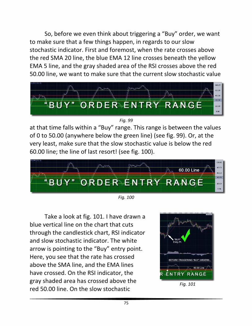
So, before we even think about triggering a “Buy” order, we want to make sure that a few things happen, in regards to our slow stochastic indicator. First and foremost, when the rate crosses above the red SMA 20 line, the blue EMA 12 line crosses beneath the yellow EMA 5 line, and the gray shaded area of the RSI crosses above the red 50.00 line, we want to make sure that the current slow stochastic value
at that time falls within a “Buy” range. This range is between the values of 0 to 50.00 (anywhere below the green line) (see fig. 99). Or, at the very least, make sure that the slow stochastic value is below the red 60.00 line; the line of last resort! (see fig. 100).
Fig. 100
Take a look at fig. 101. I have drawn a blue vertical line on the chart that cuts through the candlestick chart, RSI indicator and slow stochastic indicator. The white arrow is pointing to the “Buy” entry point. Here, you see that the rate has crossed above the SMA line, and the EMA lines have crossed. On the RSI indicator, the gray shaded area has crossed above the red 50.00 line. On the slow stochastic
Fig. 99
Fig. 101
76
indicator, the white dot denotes the current location of the slow stochastic value, which was below the red 60.00 line. All of the indicators are telling me that this would be a good time to enter a “Buy” trade. Thus, the beautiful bright green checkmark that you see!
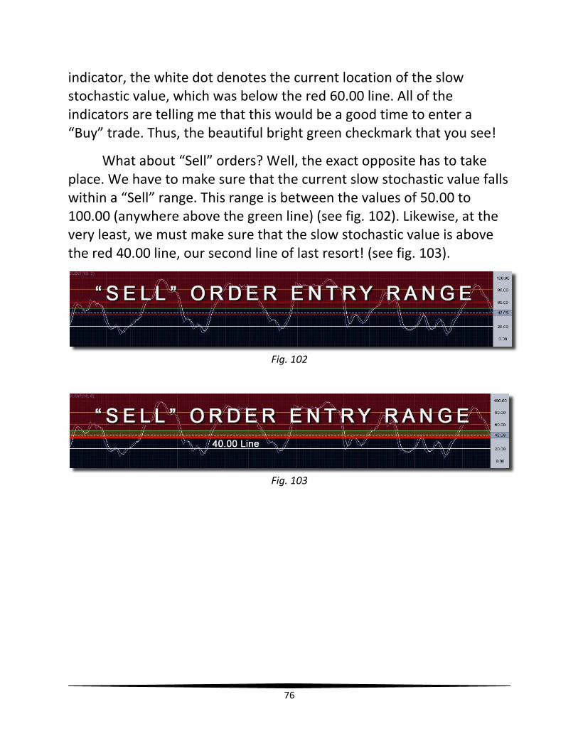
What about “Sell” orders? Well, the exact opposite has to take place. We have to make sure that the current slow stochastic value falls within a “Sell” range. This range is between the values of 50.00 to 100.00 (anywhere above the green line) (see fig. 102). Likewise, at the very least, we must make sure that the slow stochastic value is above the red 40.00 line, our second line of last resort! (see fig. 103).
Fig. 102
Fig. 103
77
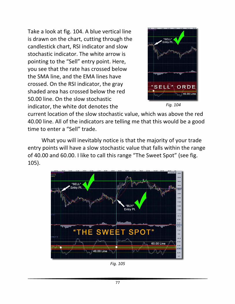
Take a look at fig. 104. A blue vertical line is drawn on the chart, cutting through the candlestick chart, RSI indicator and slow stochastic indicator. The white arrow is pointing to the “Sell” entry point. Here, you see that the rate has crossed below the SMA line, and the EMA lines have crossed. On the RSI indicator, the gray shaded area has crossed below the red 50.00 line. On the slow stochastic indicator, the white dot denotes the current location of the slow stochastic value, which was above the red 40.00 line. All of the indicators are telling me that this would be a good time to enter a “Sell” trade.
What you will inevitably notice is that the majority of your trade entry points will have a slow stochastic value that falls within the range of 40.00 and 60.00. I like to call this range “The Sweet Spot” (see fig. 105).
Fig. 105
Fig. 104
78
So, this is how I use the slow stochastic indicator in conjunction with the other indicators. It prevents me from entering into “Buy” trades when the rate is close to being overbought. It also prevents me from entering into “Sell” trades when the rate is close to being oversold. I always want to enter trades at the precise time, when momentum is first building for the new trend/direction. I don’t want to enter trades when they’re half-baked, or near burnout/exhaustion. Therefore, I wait until I know there’s “enough gas in the tank” of the slow stochastic indicator, which will help me get to my final destination, my Take Profit line! I hope that makes sense!
Okay. In the next chapter, I’m going to discuss something that is absolutely critical for all traders to understand. It is the concept of Support and Resistance, the staple of trading with all known markets.
79
Chapter 19
Drawing & Using Support & Resistance Lines
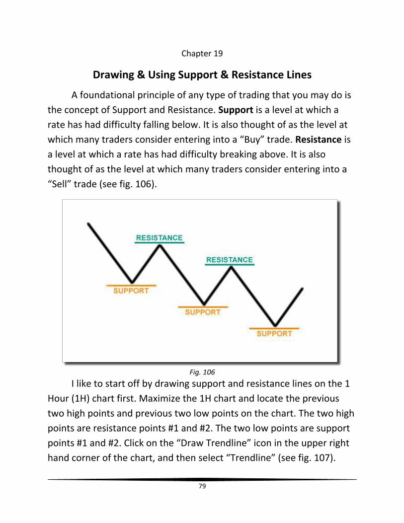
A foundational principle of any type of trading that you may do is
the concept of Support and Resistance. Support is a level at which a
rate has had difficulty falling below. It is also thought of as the level at
which many traders consider entering into a “Buy” trade. Resistance is
a level at which a rate has had difficulty breaking above. It is also
thought of as the level at which many traders consider entering into a
“Sell” trade (see fig. 106).
Fig. 106
I like to start off by drawing support and resistance lines on the 1
Hour (1H) chart first. Maximize the 1H chart and locate the previous
two high points and previous two low points on the chart. The two high
points are resistance points #1 and #2. The two low points are support
points #1 and #2. Click on the “Draw Trendline” icon in the upper right
hand corner of the chart, and then select “Trendline” (see fig. 107).
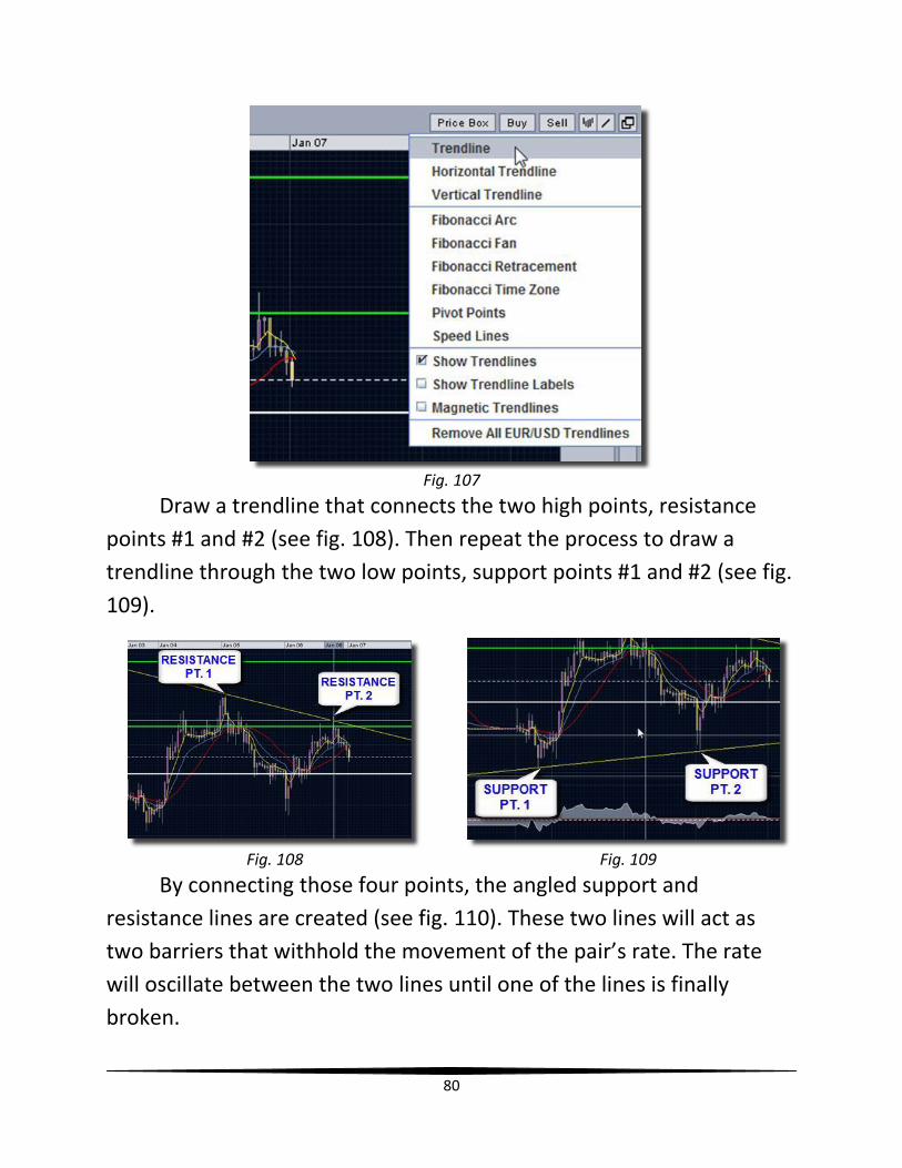
80
Fig. 107
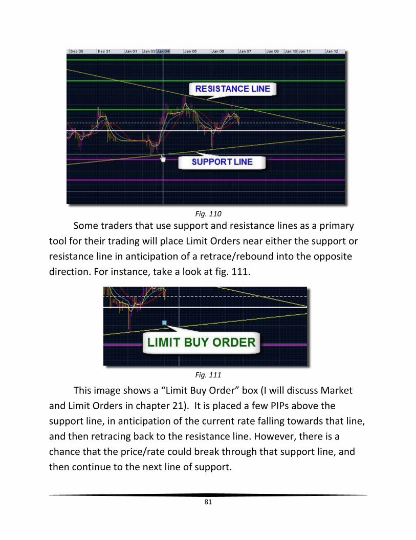
Draw a trendline that connects the two high points, resistance
points #1 and #2 (see fig. 108). Then repeat the process to draw a
trendline through the two low points, support points #1 and #2 (see fig.
109).
Fig. 108 Fig. 109
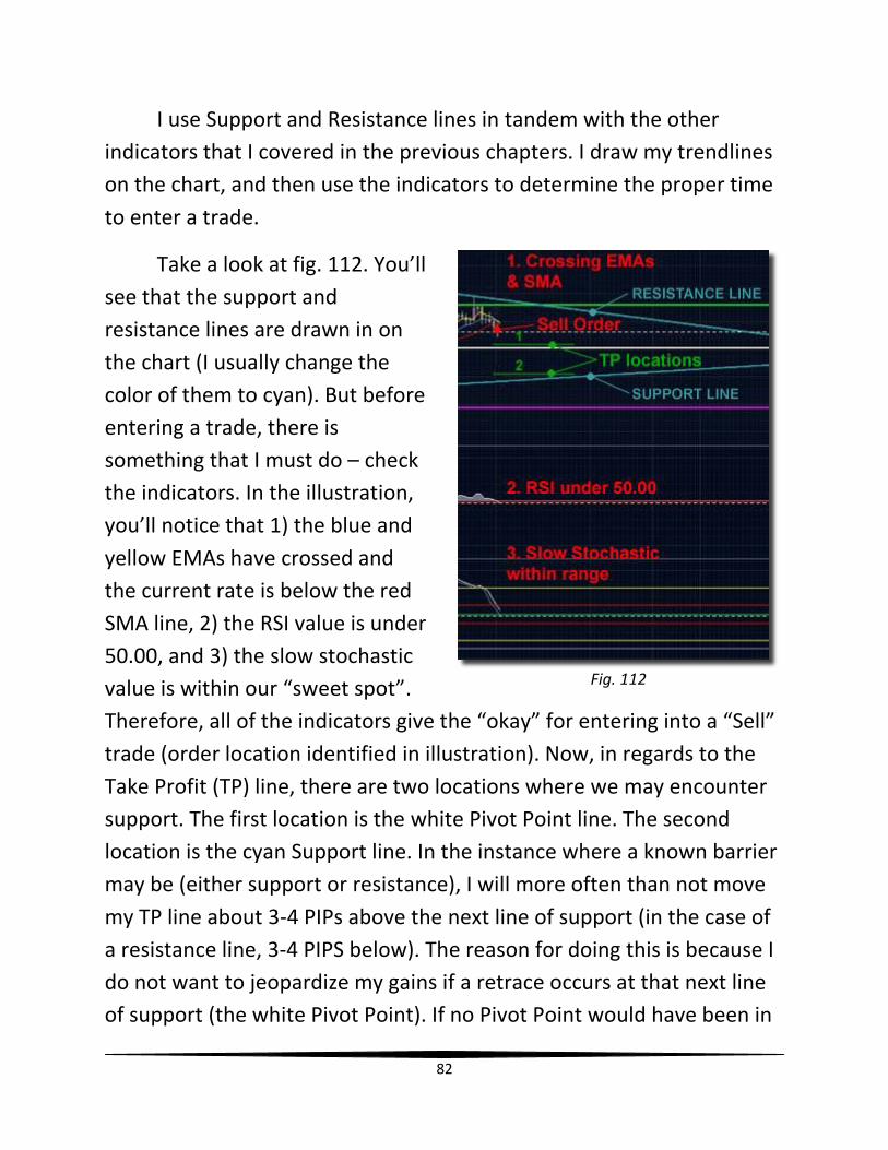
By connecting those four points, the angled support and
resistance lines are created (see fig. 110). These two lines will act as
two barriers that withhold the movement of the pair’s rate. The rate
will oscillate between the two lines until one of the lines is finally
broken.
81
Some traders that use support and resistance lines as a primary
tool for their trading will place Limit Orders near either the support or
resistance line in anticipation of a retrace/rebound into the opposite
direction. For instance, take a look at fig. 111.
This image shows a “Limit Buy Order” box (I will discuss Market
and Limit Orders in chapter 21). It is placed a few PIPs above the
support line, in anticipation of the current rate falling towards that line,
and then retracing back to the resistance line. However, there is a
chance that the price/rate could break through that support line, and
then continue to the next line of support.
Fig. 110
Fig. 111
82
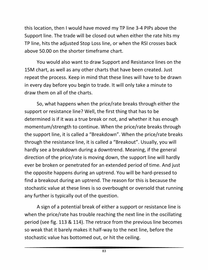
I use Support and Resistance lines in tandem with the other
indicators that I covered in the previous chapters. I draw my trendlines
on the chart, and then use the indicators to determine the proper time
to enter a trade.
Take a look at fig. 112. You’ll
see that the support and
resistance lines are drawn in on
the chart (I usually change the
color of them to cyan). But before
entering a trade, there is
something that I must do – check
the indicators. In the illustration,
you’ll notice that 1) the blue and
yellow EMAs have crossed and
the current rate is below the red
SMA line, 2) the RSI value is under
50.00, and 3) the slow stochastic
value is within our “sweet spot”.
Therefore, all of the indicators give the “okay” for entering into a “Sell”
trade (order location identified in illustration). Now, in regards to the
Take Profit (TP) line, there are two locations where we may encounter
support. The first location is the white Pivot Point line. The second
location is the cyan Support line. In the instance where a known barrier
may be (either support or resistance), I will more often than not move
my TP line about 3-4 PIPs above the next line of support (in the case of
a resistance line, 3-4 PIPS below). The reason for doing this is because I
do not want to jeopardize my gains if a retrace occurs at that next line
of support (the white Pivot Point). If no Pivot Point would have been in
Fig. 112
83
this location, then I would have moved my TP line 3-4 PIPs above the
Support line. The trade will be closed out when either the rate hits my
TP line, hits the adjusted Stop Loss line, or when the RSI crosses back
above 50.00 on the shorter timeframe chart.
You would also want to draw Support and Resistance lines on the
15M chart, as well as any other charts that have been created. Just
repeat the process. Keep in mind that these lines will have to be drawn
in every day before you begin to trade. It will only take a minute to
draw them on all of the charts.
So, what happens when the price/rate breaks through either the
support or resistance line? Well, the first thing that has to be
determined is if it was a true break or not, and whether it has enough
momentum/strength to continue. When the price/rate breaks through
the support line, it is called a “Breakdown”. When the price/rate breaks
through the resistance line, it is called a “Breakout”. Usually, you will
hardly see a breakdown during a downtrend. Meaning, if the general
direction of the price/rate is moving down, the support line will hardly
ever be broken or penetrated for an extended period of time. And just
the opposite happens during an uptrend. You will be hard-pressed to
find a breakout during an uptrend. The reason for this is because the
stochastic value at these lines is so overbought or oversold that running
any further is typically out of the question.
A sign of a potential break of either a support or resistance line is
when the price/rate has trouble reaching the next line in the oscillating
period (see fig. 113 & 114). The retrace from the previous line becomes
so weak that it barely makes it half-way to the next line, before the
stochastic value has bottomed out, or hit the ceiling.
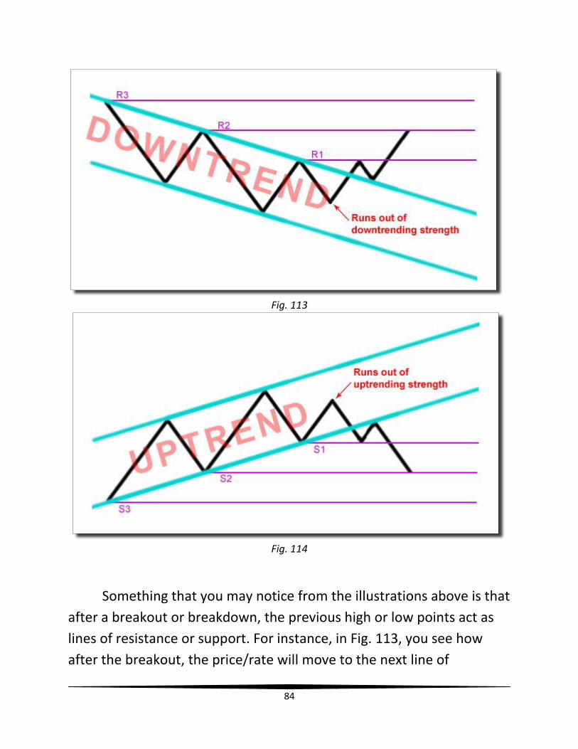
84
Fig. 113
Fig. 114
Something that you may notice from the illustrations above is that
after a breakout or breakdown, the previous high or low points act as
lines of resistance or support. For instance, in Fig. 113, you see how
after the breakout, the price/rate will move to the next line of
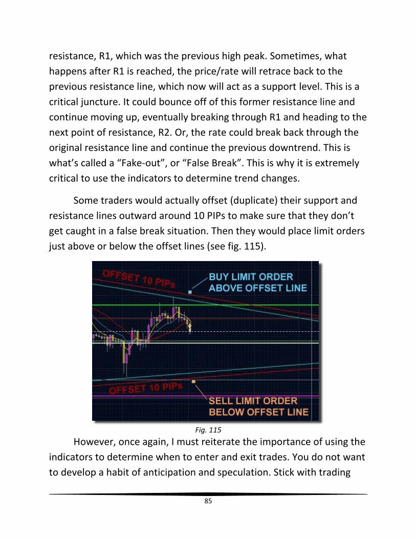
85
resistance, R1, which was the previous high peak. Sometimes, what
happens after R1 is reached, the price/rate will retrace back to the
previous resistance line, which now will act as a support level. This is a
critical juncture. It could bounce off of this former resistance line and
continue moving up, eventually breaking through R1 and heading to the
next point of resistance, R2. Or, the rate could break back through the
original resistance line and continue the previous downtrend. This is
what’s called a “Fake-out”, or “False Break”. This is why it is extremely
critical to use the indicators to determine trend changes.
Some traders would actually offset (duplicate) their support and
resistance lines outward around 10 PIPs to make sure that they don’t
get caught in a false break situation. Then they would place limit orders
just above or below the offset lines (see fig. 115).
Fig. 115
However, once again, I must reiterate the importance of using the
indicators to determine when to enter and exit trades. You do not want
to develop a habit of anticipation and speculation. Stick with trading

86
what you see, in regards to the indicators. Support and resistance lines
are extremely useful tools that can forewarn you of potential trend
changes. Nonetheless, I believe that it would not be wise to use these
lines exclusively. The more tools/indicators that convey the same thing,
the better!
In the next chapter, I’m going to briefly talk about another useful
tool that you can use. It’s called the Fibonacci Retracement tool.
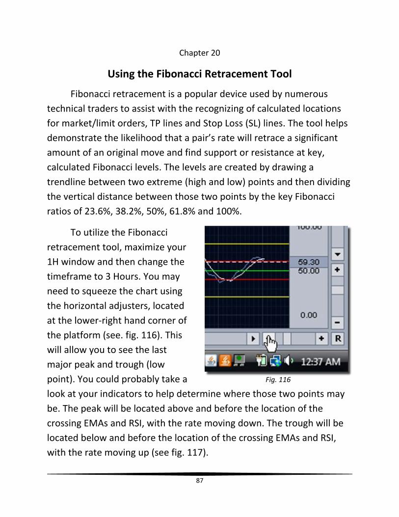
87
Chapter 20
Using the Fibonacci Retracement Tool
Fibonacci retracement is a popular device used by numerous
technical traders to assist with the recognizing of calculated locations
for market/limit orders, TP lines and Stop Loss (SL) lines. The tool helps
demonstrate the likelihood that a pair’s rate will retrace a significant
amount of an original move and find support or resistance at key,
calculated Fibonacci levels. The levels are created by drawing a
trendline between two extreme (high and low) points and then dividing
the vertical distance between those two points by the key Fibonacci
ratios of 23.6%, 38.2%, 50%, 61.8% and 100%.
To utilize the Fibonacci
retracement tool, maximize your
1H window and then change the
timeframe to 3 Hours. You may
need to squeeze the chart using
the horizontal adjusters, located
at the lower-right hand corner of
the platform (see. fig. 116). This
will allow you to see the last
major peak and trough (low
point). You could probably take a
look at your indicators to help determine where those two points may
be. The peak will be located above and before the location of the
crossing EMAs and RSI, with the rate moving down. The trough will be
located below and before the location of the crossing EMAs and RSI,
with the rate moving up (see fig. 117).
Fig. 116
88
Fig. 117
To draw the Fibonacci
retracement tool onto the chart,
click on the “Draw Trendline”
icon, and then select “Fibonacci
Retracement” (see fig. 118).
Before I continue, I want to
make this point clear. When
inserting the Fibonacci
retracement overlay, always
remember to go from right to
left. Meaning, the first click that
you will make is on the high
point or low point to the right.
You would then drag the overlay
to the high point, or low point to the left. In the example that you will
Fig. 118
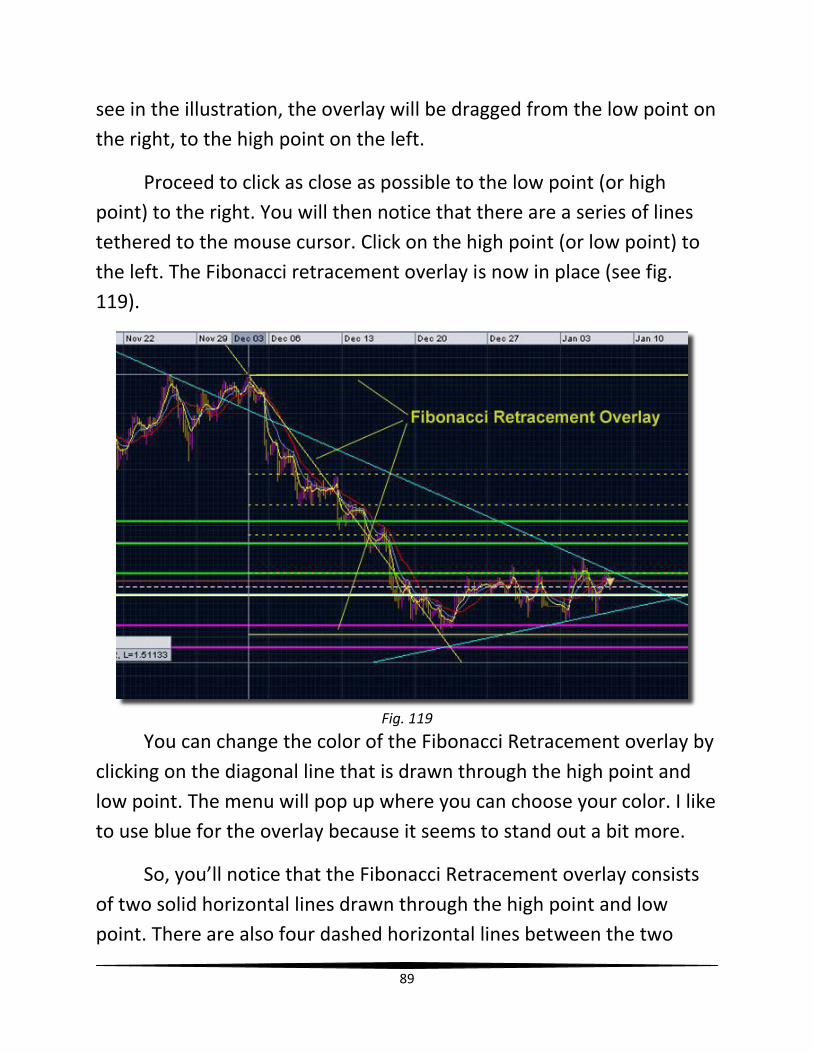
89
see in the illustration, the overlay will be dragged from the low point on
the right, to the high point on the left.
Proceed to click as close as possible to the low point (or high
point) to the right. You will then notice that there are a series of lines
tethered to the mouse cursor. Click on the high point (or low point) to
the left. The Fibonacci retracement overlay is now in place (see fig.
119).
Fig. 119
You can change the color of the Fibonacci Retracement overlay by
clicking on the diagonal line that is drawn through the high point and
low point. The menu will pop up where you can choose your color. I like
to use blue for the overlay because it seems to stand out a bit more.
So, you’ll notice that the Fibonacci Retracement overlay consists
of two solid horizontal lines drawn through the high point and low
point. There are also four dashed horizontal lines between the two
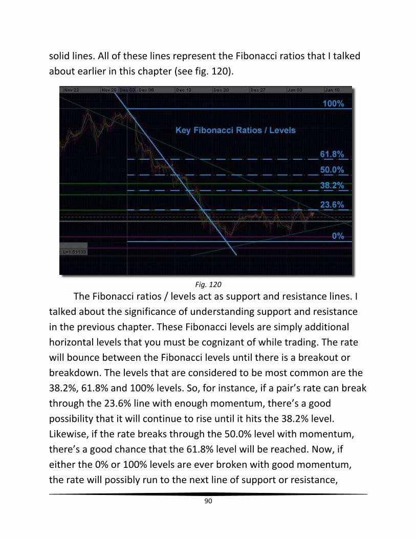
90
solid lines. All of these lines represent the Fibonacci ratios that I talked
about earlier in this chapter (see fig. 120).
Fig. 120
The Fibonacci ratios / levels act as support and resistance lines. I
talked about the significance of understanding support and resistance
in the previous chapter. These Fibonacci levels are simply additional
horizontal levels that you must be cognizant of while trading. The rate
will bounce between the Fibonacci levels until there is a breakout or
breakdown. The levels that are considered to be most common are the
38.2%, 61.8% and 100% levels. So, for instance, if a pair’s rate can break
through the 23.6% line with enough momentum, there’s a good
possibility that it will continue to rise until it hits the 38.2% level.
Likewise, if the rate breaks through the 50.0% level with momentum,
there’s a good chance that the 61.8% level will be reached. Now, if
either the 0% or 100% levels are ever broken with good momentum,
the rate will possibly run to the next line of support or resistance,
91
whether that is a pivot point line, or the horizontal level of a previous
high or low point.
Now, you’re probably thinking, “This chart looks a mess right
now!” It’s not as bad as you may think. Keep in mind that although you
can draw this Fibonacci Retracement overlay on any timeframe, I
usually only draw it onto the 3 Hour timeframe. So, if you wanted to
have this on your 15 Min and 5 Min charts, then I’d suggest changing
the timeframe on those charts to 3 Hour, and then drawing it in.
Afterwards, change the timeframe back, and then save the profile.
In the next chapter, I will show you the various ways to buy, sell,
open and close positions.

92
Chapter 21
How to Buy & Sell / Open & Close Trades
Now that I have shown you in previous chapters how to use the
various indicators and tools to determine when to open and close
trades, I will now show you the various ways that you can buy and sell,
or, open and close positions.
The following diagrams display the various methods you can use
to open the Order Box, which will be discussed in further detail later in
this chapter.
Buy/Sell button – In the upper left hand corner of the platform
Fig. 121
Buy or Sell – Under “Account” pull-down menu
Fig. 122
Buy Button/Sell Button – Located at the upper right-hand corner of the platform on any of the multiple time chart windows that were created
Fig. 123
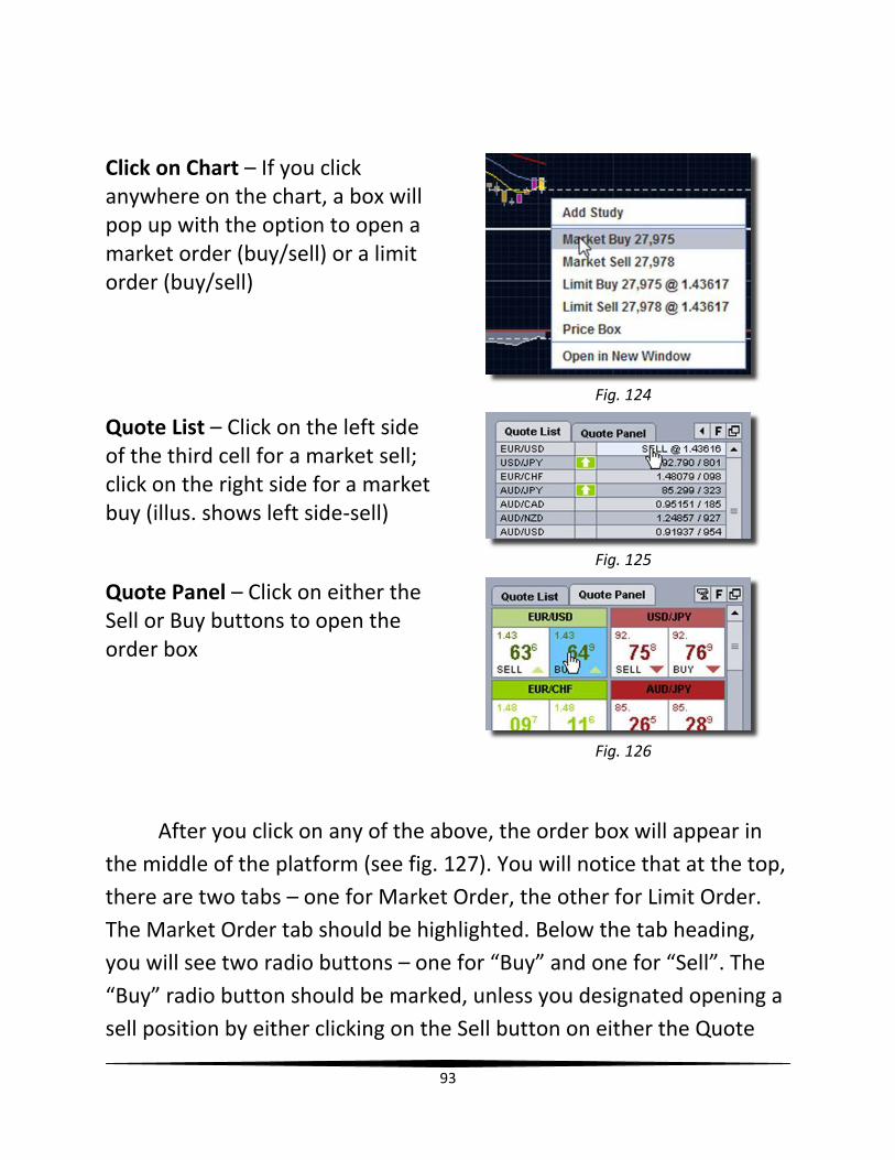
93
Click on Chart – If you click anywhere on the chart, a box will pop up with the option to open a market order (buy/sell) or a limit order (buy/sell)
Fig. 124
Quote List – Click on the left side of the third cell for a market sell; click on the right side for a market buy (illus. shows left side-sell)
Fig. 125
Quote Panel – Click on either the Sell or Buy buttons to open the order box
Fig. 126
After you click on any of the above, the order box will appear in
the middle of the platform (see fig. 127). You will notice that at the top,
there are two tabs – one for Market Order, the other for Limit Order.
The Market Order tab should be highlighted. Below the tab heading,
you will see two radio buttons – one for “Buy” and one for “Sell”. The
“Buy” radio button should be marked, unless you designated opening a
sell position by either clicking on the Sell button on either the Quote
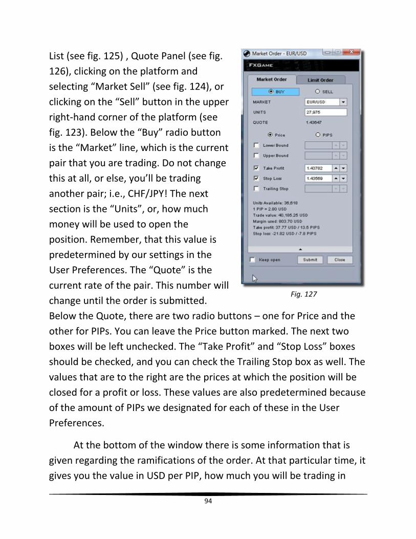
94
List (see fig. 125) , Quote Panel (see fig.
126), clicking on the platform and
selecting “Market Sell” (see fig. 124), or
clicking on the “Sell” button in the upper
right-hand corner of the platform (see
fig. 123). Below the “Buy” radio button
is the “Market” line, which is the current
pair that you are trading. Do not change
this at all, or else, you’ll be trading
another pair; i.e., CHF/JPY! The next
section is the “Units”, or, how much
money will be used to open the
position. Remember, that this value is
predetermined by our settings in the
User Preferences. The “Quote” is the
current rate of the pair. This number will
change until the order is submitted.
Below the Quote, there are two radio buttons – one for Price and the
other for PIPs. You can leave the Price button marked. The next two
boxes will be left unchecked. The “Take Profit” and “Stop Loss” boxes
should be checked, and you can check the Trailing Stop box as well. The
values that are to the right are the prices at which the position will be
closed for a profit or loss. These values are also predetermined because
of the amount of PIPs we designated for each of these in the User
Preferences.
At the bottom of the window there is some information that is
given regarding the ramifications of the order. At that particular time, it
gives you the value in USD per PIP, how much you will be trading in
Fig. 127
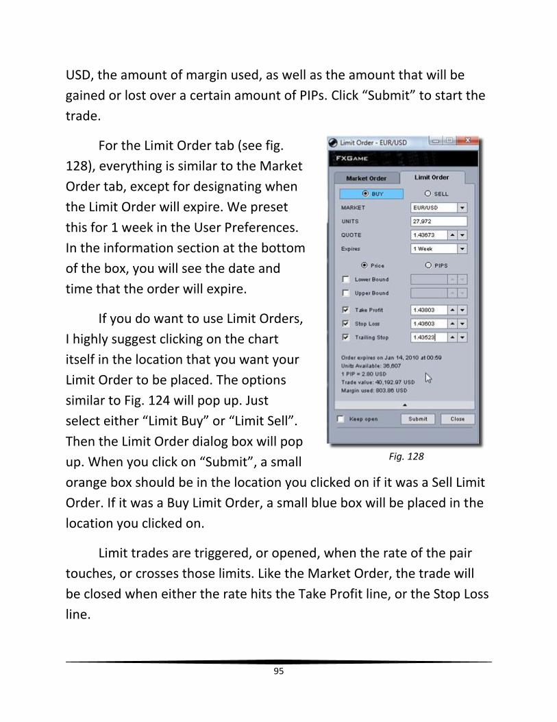
95
USD, the amount of margin used, as well as the amount that will be
gained or lost over a certain amount of PIPs. Click “Submit” to start the
trade.
For the Limit Order tab (see fig.
128), everything is similar to the Market
Order tab, except for designating when
the Limit Order will expire. We preset
this for 1 week in the User Preferences.
In the information section at the bottom
of the box, you will see the date and
time that the order will expire.
If you do want to use Limit Orders,
I highly suggest clicking on the chart
itself in the location that you want your
Limit Order to be placed. The options
similar to Fig. 124 will pop up. Just
select either “Limit Buy” or “Limit Sell”.
Then the Limit Order dialog box will pop
up. When you click on “Submit”, a small
orange box should be in the location you clicked on if it was a Sell Limit
Order. If it was a Buy Limit Order, a small blue box will be placed in the
location you clicked on.
Limit trades are triggered, or opened, when the rate of the pair
touches, or crosses those limits. Like the Market Order, the trade will
be closed when either the rate hits the Take Profit line, or the Stop Loss
line.
Fig. 128
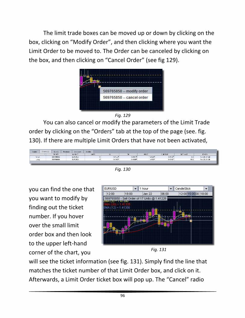
96
The limit trade boxes can be moved up or down by clicking on the
box, clicking on “Modify Order”, and then clicking where you want the
Limit Order to be moved to. The Order can be canceled by clicking on
the box, and then clicking on “Cancel Order” (see fig 129).
Fig. 129
You can also cancel or modify the parameters of the Limit Trade
order by clicking on the “Orders” tab at the top of the page (see. fig.
130). If there are multiple Limit Orders that have not been activated,
Fig. 130
you can find the one that
you want to modify by
finding out the ticket
number. If you hover
over the small limit
order box and then look
to the upper left-hand
corner of the chart, you
will see the ticket information (see fig. 131). Simply find the line that
matches the ticket number of that Limit Order box, and click on it.
Afterwards, a Limit Order ticket box will pop up. The “Cancel” radio
Fig. 131
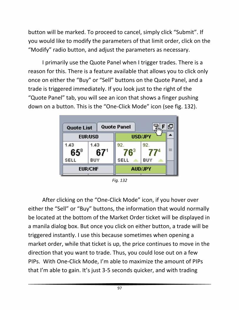
97
button will be marked. To proceed to cancel, simply click “Submit”. If
you would like to modify the parameters of that limit order, click on the
“Modify” radio button, and adjust the parameters as necessary.
I primarily use the Quote Panel when I trigger trades. There is a
reason for this. There is a feature available that allows you to click only
once on either the “Buy” or “Sell” buttons on the Quote Panel, and a
trade is triggered immediately. If you look just to the right of the
“Quote Panel” tab, you will see an icon that shows a finger pushing
down on a button. This is the “One-Click Mode” icon (see fig. 132).
Fig. 132
After clicking on the “One-Click Mode” icon, if you hover over
either the “Sell” or “Buy” buttons, the information that would normally
be located at the bottom of the Market Order ticket will be displayed in
a manila dialog box. But once you click on either button, a trade will be
triggered instantly. I use this because sometimes when opening a
market order, while that ticket is up, the price continues to move in the
direction that you want to trade. Thus, you could lose out on a few
PIPs. With One-Click Mode, I’m able to maximize the amount of PIPs
that I’m able to gain. It’s just 3-5 seconds quicker, and with trading
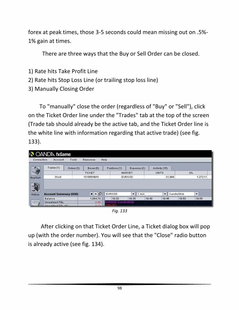
98
forex at peak times, those 3-5 seconds could mean missing out on .5%-
1% gain at times.
There are three ways that the Buy or Sell Order can be closed.
1) Rate hits Take Profit Line
2) Rate hits Stop Loss Line (or trailing stop loss line)
3) Manually Closing Order
To "manually" close the order (regardless of "Buy" or "Sell"), click
on the Ticket Order line under the "Trades" tab at the top of the screen
(Trade tab should already be the active tab, and the Ticket Order line is
the white line with information regarding that active trade) (see fig.
133).
Fig. 133
After clicking on that Ticket Order Line, a Ticket dialog box will pop
up (with the order number). You will see that the "Close" radio button
is already active (see fig. 134).
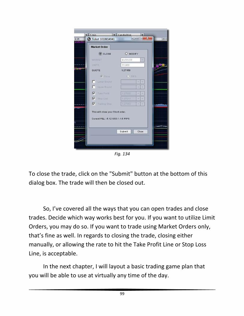
99
Fig. 134
To close the trade, click on the "Submit" button at the bottom of this
dialog box. The trade will then be closed out.
So, I’ve covered all the ways that you can open trades and close
trades. Decide which way works best for you. If you want to utilize Limit
Orders, you may do so. If you want to trade using Market Orders only,
that’s fine as well. In regards to closing the trade, closing either
manually, or allowing the rate to hit the Take Profit Line or Stop Loss
Line, is acceptable.
In the next chapter, I will layout a basic trading game plan that
you will be able to use at virtually any time of the day.
100
Chapter 22
Trading Game Plan
Alright! Up to this point I have laid the foundation in regards to understanding the various indicators, utilizing tools such as Forex Factory, the pivot point calculator, and the excel projection chart. Now, I want to give you a very simple game plan that you can utilize every time you trade. But, just like with any type of sports event, the game isn’t the only thing that happens. There are pre-game warm-ups and post game interviews too! With aerobics, there’s a warm-up time, the actual workout itself, then a cool-down period. The same thing will apply to your forex trading. There’s “Pre-Trade Preparation”, “Execution”, and “Post-Trading Analysis”.
PRE-TRADE PREPARATION
Modify Daily/4-Hour Pivot Points – Make sure that the pivot points have been updated before trading. It is imperative that these lines of potential support and resistance are accurate.
Modify Fibonacci Retracement Tool (If Necessary) – If you insert the Fibonacci Retracement Tool into the 1H chart (after changing it to 3H), then you may not have to modify it for a while. However, if either the upper bound or lower bound is broken, then after a true retrace (trend change determined by the indicators), you will have to delete the previous Fib. Retracement Tool, and then insert another one.
Check Forex Factory for Upcoming Financial News Reports – It is important that you check to see what economic data will be released before you start trading. This will prevent you from being caught with a position open and it being pre-maturely stopped by a sudden increase of volatility in the market.
101
Check Projection Chart for Day’s Goal – The projection chart is like the road map to your future financial freedom. Never trade without a specific goal in mind. Identify your target. Then determine how many trades it will take to reach your target.
Adjust TP According to Trading Strategy for Day’s Goal – If your daily goal is only 2%, then make sure you change the Take Profit amount to 2% of Balance in the User Preferences. If your daily goal is 5%, decide whether you want to set the TP amount to 5%, or gain that 5% in two trades, gaining 2.5% with each trade.
Draw Support and Resistance Lines on 1H, 15M & 5M Charts – This is a very critical step that you must take before trading. You will need to know where all areas of support and resistance are on these charts.
EXECUTION
Entering a Trade – You will want to utilize the 1M chart to enter trades, whether going long (buying) or short (selling). Something that I take into consideration is what the trends, RSI and Slow Stochastic values are on the 5M and 15M charts. The ideal scenario for entering into a “Buy” position is when the 5M and 15M chart RSI values are below the 50.00 mark, and the Slow Stochastic values are within the “sweet spot” (between 40.00 and 60.00). If this is the case, change one of the charts to the 1M time frame, and then wait until all of the indicators signify the appropriate time for entry (see fig. 135). Look for just the opposite when preparing to enter a “Sell” position. The benefit of using the 1M chart for entry is it allows you to be able to “ride the wave” of a trend change as close to its beginning as possible, which could be an additional 7-10 PIPs, in comparison to just using the 5M chart indicators to determine entry.
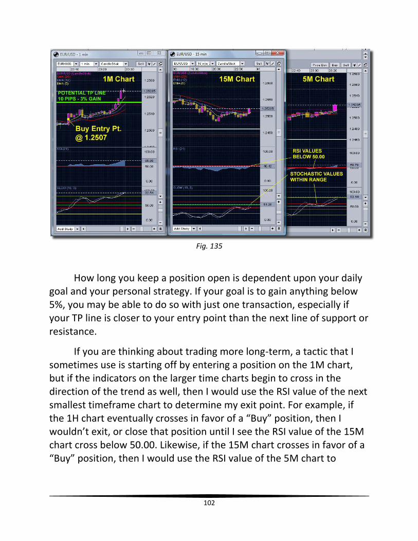
102
Fig. 135
How long you keep a position open is dependent upon your daily goal and your personal strategy. If your goal is to gain anything below 5%, you may be able to do so with just one transaction, especially if your TP line is closer to your entry point than the next line of support or resistance.
If you are thinking about trading more long-term, a tactic that I sometimes use is starting off by entering a position on the 1M chart, but if the indicators on the larger time charts begin to cross in the direction of the trend as well, then I would use the RSI value of the next smallest timeframe chart to determine my exit point. For example, if the 1H chart eventually crosses in favor of a “Buy” position, then I wouldn’t exit, or close that position until I see the RSI value of the 15M chart cross below 50.00. Likewise, if the 15M chart crosses in favor of a “Buy” position, then I would use the RSI value of the 5M chart to
103
determine the exit point. Of course, the opposite applies for all short positions.
Moving the Stop Loss (SL) Line Above or Below Entry Point – THIS IS VERY IMPORTANT! Something that you want to get into the habit of doing is moving the red SL line just above or below your entry point so that if there is a sudden retracing of the rate, when the rate hits your SL line, you won’t lose money. If your TP is more than 10 PIPs away (3%), wait until the rate moves 8-10 PIPs away, towards your TP line, before moving the SL line just above your entry point (for a sell position, move SL line just below entry point). To move the line, just click on it, and click on “Modify Stop Loss Line”. You will then be able to drag it to its new position. This is a critical part of limiting any losses and managing your money. Afterwards, continue to manually drag the SL line along the red SMA 20 line, lagging 3-4 candlesticks behind the current/active candlestick. This will help you finish with a positive gain, regardless of retracement, while at the same time, allowing some “wiggle room” for any volatility or price action that may take place so that your trade won’t be pre-maturely stopped.
Redraw Trendlines if Necessary – If a trendline is broken and a new peak or trough is set, be sure to update the trendlines.
POST-TRADING ANALYSIS
Type results Into Projection Chart – Whatever your final result is, make sure that you plug it into the projection chart so that you’ll have your goal for the next day.
Journal About Your Trading Experience – It’s good to write about how your trading day went. Talk about the difficulties of the day, what you could have done differently, or any new things that you may have learned, or recognized. This can prove to be helpful in regards to

104
mentally recalling situations that worked for you, and identifying situations that could be detrimental.
In the final chapter, I will conclude by sharing some very important
things to keep in mind while trading.
105
Chapter 23
Conclusion: Words of Wisdom
All good things must come to an end! Hopefully, I was able to
clearly lay the foundation for successful forex trading. From learning
how to set up your practice account and platform, to understanding the
proper steps to take before trading each day, to being cognizant of
economic factors that could affect the movement of a forex pair, to
understanding your daily goal, to proper execution of trades, I know
that with this information, you will be well on your way to future
prosperity!
But before I close, I would like to share some “Words of Wisdom”
with you. Throughout the years of forex trading, I’ve taken my lumps,
bumps and bruises, like most beginners and novices. However, I count
it all joy, in regards to the amount of knowledge, understanding and
wisdom that I’ve gained over this period of time. While trading,
something that I use to do is write down some lines and clichés onto
post-it sticky notes. These notes would literally cover the outside edges
of my monitor! Though it seemed weird to my wife at the time, the
notes really helped me stay focused and remember the many little
things while trading. I would read each note every day before trading.
That way, those reminders would be fresh in my mind. So, if you want
to, you can do the same! Just jot the following bullet points down on
post-it notes and apply them to your monitor! It just may help you also!
THE TREND IS YOUR FRIEND! – Probably the most important
thing to keep in mind while trading. This is a very famous cliché in
the realm of trading. You’ll find yourself getting into a lot of
trouble if you make a habit of fighting against the current trend.
106
DISCIPLINE! – When you develop your game plan or determine
your goal for the day, stick with it.
PATIENCE! – Rome wasn’t built in a day, and your forex account
balance won’t be built in a day either!
LITTLE BY LITTLE! – Understand that little gain upon little gain
equals big gains over time. This is the basic element of
compounding interest or compounding numbers.
LOW VOLUME, NO TRADING! – If it seems as if there is little
movement, especially in the evening time or non-peak hours, you
may want to think about not trading at all. Use discretion. If you
do trade during these times, you may want to chop your goal in
half for the day.
DON’T TRY TO CATCH A FALLING KNIFE! WAIT UNTIL IT HITS THE
FLOOR BEFORE YOU PICK IT UP! – Do not try to predict or
assume that there will be a retrace or turn-around in the market.
Wait until a definite “floor or ceiling” has been determined.
DON’T SPECULATE! USE THE INDICATORS! – You have created
the various indicators for a reason - to alert you when a trend has
truly changed.
TRADE WHAT YOU SEE, NOT WHAT YOU THINK! – Again, do not
speculate. Only trade what your indicators tell you to trade.
BE CONTENT WITH THE CROSS! – Be comfortable with waiting on
the various indicators to cross, i.e., the pair’s rate crossing above
or below the SMA 20 line, the EMA 5 & 12 lines crossing, and the
RSI value crossing above or below 50.00. Once again, I cannot
reiterate this enough; stay away from speculation! If there is not
a definitive signal from all of the indicators, do not open a
position.
107
NO TRADING 5 MINUTES BEFORE ECONOMIC NEWS REPORTS! –
You will want to stay away from the speculative volatility before
the financial/economic news reports are released.
WAIT 5-10 MINUTES AFTER ECONOMIC NEWS REPORTS! – You
do not want to get caught in the craziness that happens
immediately after a lot of the news reports. Some people try to
take advantage of the potential major swings. But this can eat
you alive as well. So the safest bet is to be still until the “noise” of
the pair has diminished, and a general direction for the pair is
determined.
TIGHTEN STOP LOSS LINE! –I usually move my SL line above or
below my entry point when the rate of the pair moves 8-10 PIPs
away from the entry point, and towards my Take Profit line. After
this, I then move the SL line to the point on the SMA 20 line that
is 3-4 candlesticks behind the current candlestick. This will allow
me to, at worst, be able to close out a trade breaking even, or
with a positive gain in the event of a sudden retracement. This is
a critical tactic to use to make sure that losses do not occur.
KNOW WHEN TO FOLD ‘EM! – Another key element of managing
your money is to know when to walk away from trading for the
day. If you achieve your goal for the day, walk away. Contrarily, if
you so happen to lose 8% or more for the day, walk away, and try
again the next day. You may lose a battle, but it doesn’t mean
you’ve lost the war!
REGARDLESS OF DAILY GOAL, 20% OR GREATER, YOU’RE DONE
FOR THE DAY! – If you are not trading to hit your TP line, but you
are waiting for the RSI on the shorter timeframe to cross above or
below 50.00, if your percentage gained reaches 20%, PLEASE
108
close the position and enjoy the rest of your day AWAY FROM
THE PLATFORM! I had times where I’ve gained 20%+ in one day,
but lost it all back, and then some. So, to prevent you from
making the same silly mistakes I made, please take heed of this
advice! It’s easy to get sucked into believing that you can
continue to make that type of gain throughout the rest of the
day. The truth is that the longer you trade in one session, the
more dangerous it can be for you. So, allow 20% to be your cap.
With the strategy and margin that we use, a 20% gain is
approximately 76 PIPs.
STAY FOCUSED!!! – Understand what your goal is. Know what
your strategy is to achieve that goal. Be attentive during your
trading time, and limit the amount of distractions around you as
best as possible.
So, there you have it! Some words of wisdom to propel you and
keep you on track for financial freedom!
Practice using these indicators in the practice account for a few
months. Discover a comfortable daily goal for yourself and determine
the amount of time that you will be able to trade. For some, a 1-2%
gain may be all that they can do. For others, 5-7% may be the daily goal.
The most important thing to remember is to make sure that you are
making positive gains daily.
I would love to get some feedback as you utilize the information
that I’ve shared with you in this book. Feel free to email me at any time
Thanks, once again, and happy trading!
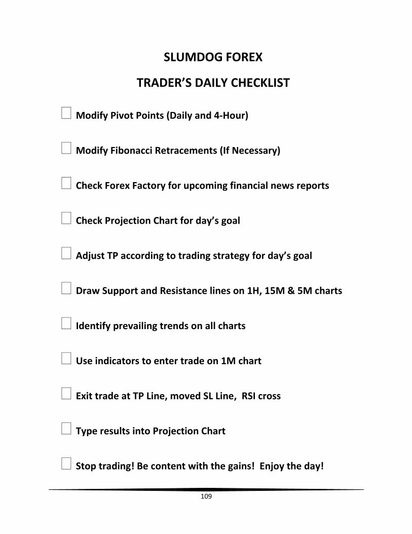
109
SLUMDOG FOREX
TRADER’S DAILY CHECKLIST
Modify Pivot Points (Daily and 4-Hour)
Modify Fibonacci Retracements (If Necessary)
Check Forex Factory for upcoming financial news reports
Check Projection Chart for day’s goal
Adjust TP according to trading strategy for day’s goal
Draw Support and Resistance lines on 1H, 15M & 5M charts
Identify prevailing trends on all charts
Use indicators to enter trade on 1M chart
Exit trade at TP Line, moved SL Line, RSI cross
Type results into Projection Chart
Stop trading! Be content with the gains! Enjoy the day!
110
Basic Trading Terminology
Ask Price: The price requested by the trader. This usually indicates the
lowest price a seller will accept.
Base Currency: The currency that the investor buys or sells (i.e. EUR in
EURUSD).
Bid/Ask: The Bid rate is the rate at which you can sell. The Ask (or offer)
rate is the rate at which you can buy.
Bid Price: The price offered by the trader. This usually indicates the
highest price a purchaser will pay.
Breakdown: A price movement through an identified level of support,
which is usually followed by heavy volume and sharp declines.
Technical traders will short sell the underlying asset when the price of
the security breaks below a support level because it is a clear indication
that the bears are in control and that additional selling pressure is likely
to follow.
Breakout: A price movement through an identified level of resistance,
which is usually followed by heavy volume and increased volatility.
Traders will buy the underlying asset when the price breaks above a
level of resistance. Once a resistance level is broken, it is regarded as
the next level of support when the asset experiences a pullback. Most
traders use chart patterns and other technical tools such as trend lines
to identify possible candidates that are likely to break through a
support/resistance level.
111
Channel: The technical range between support and resistance levels
that a stock price has traded in for a specific period of time.
Cross: When trading with currencies, the investor buys one currency
with another. These two currencies form the cross: for example,
EURUSD.
Exchange Rate: What one currency is worth in terms of another, for
example the Australian dollar might be worth 69 US cents or 85 yen.
Exponential Moving Average (EMA): A type of moving average that is
similar to a simple moving average, except that more weight is given to
the latest data. The exponential moving average is also known as
"exponentially weighted moving average". (MA): An indicator
frequently used in technical analysis showing the average value of a
security's price over a set period. Moving averages are generally used
to measure momentum and define areas of possible support and
resistance.
Fakeout: term used in technical analysis to refer to a situation in which
a trader enters into a position in anticipation of a future transaction
signal or price movement, but the signal or movement never develops
and the asset moves in the opposite direction.
Leverage: The investor only funds part of the amount traded.
Long: To buy.
Margin: Buying with borrowed money can be extremely risky because
both gains and losses are amplified. That is, while the potential for
greater profit exists, this comes at a hefty price - the potential for
112
greater losses. Margin also subjects the investor to a number of unique
risks such as interest payments for use of the borrowed money.
Margin Used: The amount of your account balance and Unrealized P&L
that is reserved for margin. This amount is equal to the Position Value
multiplied by your margin ratio. The margin ratio is the inverse of
leverage; for example, 50:1 leverage equals a 0.02 margin ratio.
Margin Available: The amount of your Balance and Unrealized P&L
available as margin for new trading transactions. It is equal to your Net
Asset Value minus Margin Used.
PIP: The smallest unit by which a Forex cross price quote changes. So if
EURUSD bid is now quoted at 0.9767 and it moves up 2 pips, it will be
quoted at 0.9769.
Relative Strength Index (RSI): A technical momentum indicator that
compares the magnitude of recent gains to recent losses in an attempt
to determine overbought and oversold conditions of an asset. It is
calculated using the following formula:
RSI = 100 - 100 / 1 + RS
RS = Average of x days' up closes / Average of x days' down closes
The RSI is best used as a valuable complement to other stock-picking
tools.
Resistance: The price/pair stops rising because sellers start to
outnumber buyers.
113
Retracement: A reversal in the movement of a pair's price, countering
the prevailing trend.
Reversal: A change in the direction of a price trend. On a price chart,
reversals undergo a recognizable change in the price structure. An
uptrend, which is a series of higher highs and higher lows, reverses into
a downtrend by changing to a series of lower highs and lower lows. A
downtrend, which is a series of lower highs and lower lows, reverses
into an uptrend by changing to a series of higher highs and higher lows.
It is also referred to as a "trend reversal", "rally" or "correction".
Scalping: Opening and closing a position in seconds or minutes for a
few pips of profit
Secondary Currency: The currency that the investor trades the base
currency against (i.e. USD in EURUSD).
Short: To sell.
Short Position: A position that benefits from a decline in market prices.
Sideways Trend: Describes the horizontal price movement that occurs
when the forces of supply and demand are nearly equal. A sideways
trend is often regarded as a period of consolidation before the price
continues in the direction of the previous move. A sideways price trend
is also commonly known as a "horizontal trend".
Spread: The difference between the bid and the ask rate.
Stochastic: Typically used to identify overbought and oversold
conditions, the indicator consists of two lines: % K and %D. These two
lines fluctuate in a vertical range between 0 and 100. Readings above
114
80 are considered overbought and readings below 20 are considered
oversold.
Support: The price level which, historically, a stock has had difficulty
falling below. It is thought of as the level at which a lot of buyers tend
to enter the market.
Trading Forex: A currency trade is the simultaneous buying of one
currency and selling of another one.
Trend: The general direction of a market or of the price of an asset.
Trends can vary in length from short, to intermediate, to long term. If
you can identify a trend, it can be highly profitable, because you will be
able to trade with the trend. As a general strategy, it is best to trade
with trends, meaning that if the general trend of the market is headed
up, you should be very cautious about taking any positions that rely on
the trend going in the opposite direction. A trend can also apply to
interest rates, yields, equities and any other market which is
characterized by a long-term movement in price or volume.
Trendline: A line that is drawn over pivot highs or under pivot lows to
show the prevailing direction of price. Trendlines are a visual
representation of support and resistance in any time frame.
Volatility: Refers to the amount of uncertainty or risk about the size of
changes in a security's value. A higher volatility means that a security's
value can potentially be spread out over a larger range of values. This
means that the price of the security can change dramatically over a
short time period in either direction. A lower volatility means that a
security's value does not fluctuate dramatically, but changes in value at
a steady pace over a period of time.
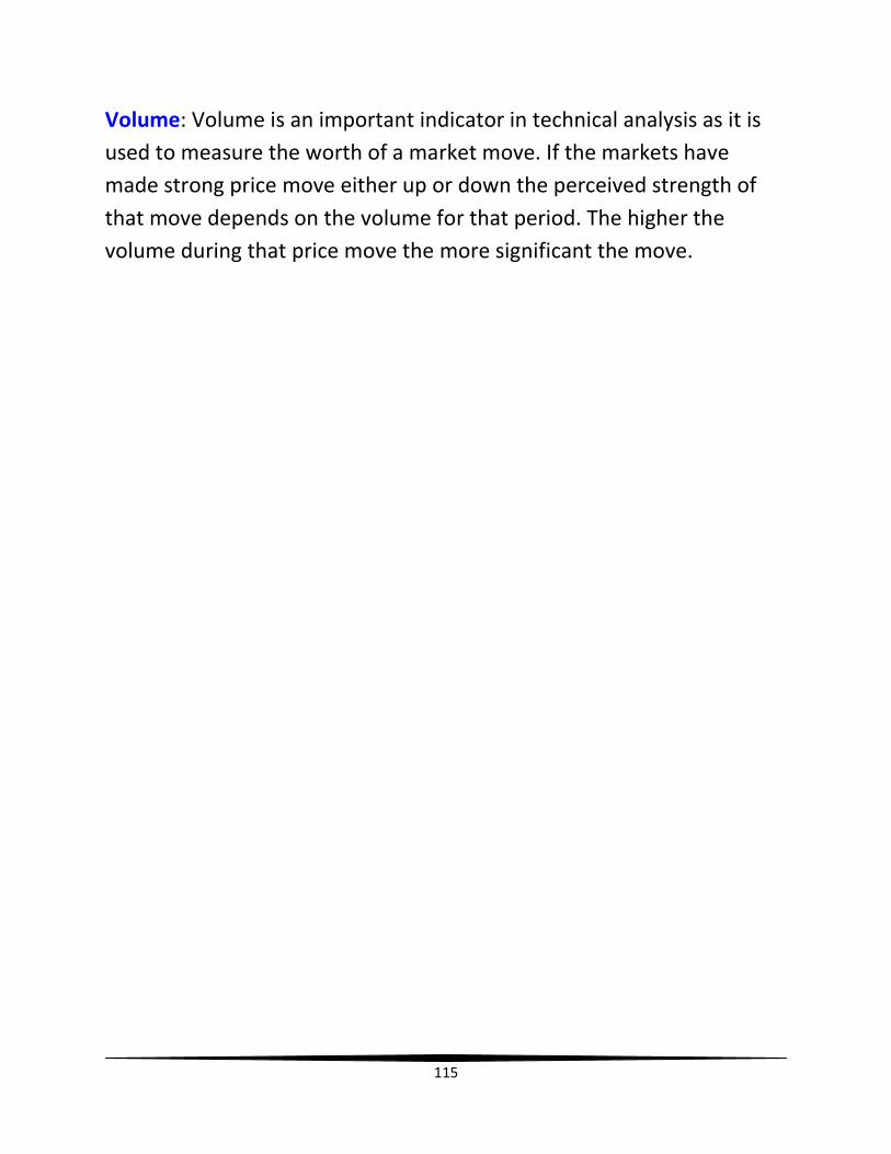
115
Volume: Volume is an important indicator in technical analysis as it is
used to measure the worth of a market move. If the markets have
made strong price move either up or down the perceived strength of
that move depends on the volume for that period. The higher the
volume during that price move the more significant the move.