statistical literacy guideresearchbriefings.files.parliament.uk/documents/sn04944/sn04944.pdf ·...
TRANSCRIPT
Statistical Literacy Guide
This guide is a compilation of notes on individual subjects produced by the Social & General Statistics Section of the Library. Its aim is to help MPs and their staff better understand statistics that are used in press stories, research, debates, news releases, reports, books etc.
Paul Bolton (editor)
Contributing authors:
Julien Anseau
Lorna Booth
Rob Clements
Richard Cracknell
David Knott
Gavin Thompson
Ross Young
2
Statistical literacy guide
Contents
1. Introduction ...................................................................................................................................... 2
2. Some basic concepts and calculations ........................................................................................... 3
2.1. Percentages ............................................................................................................................ 3
2.2. Averages ................................................................................................................................. 5
2.3. Measures of variation/spread .................................................................................................. 7
2.4. Rounding and significant places ............................................................................................. 8
3. Simple applied methods .................................................................................................................. 9
3.1. Index numbers......................................................................................................................... 9
3.2. Adjusting for inflation ............................................................................................................. 12
3.3. Calculating swings ................................................................................................................ 17
4. Practical guidance for ‘consuming’ statistical information ............................................................. 18
4.1. How to read charts ................................................................................................................ 18
4.2. How to spot spin and inappropriate use of statistics ............................................................. 23
4.3. Uncertainty and risk .............................................................................................................. 30
5. Introduction to more advanced statistical concepts ...................................................................... 36
5.1. Confidence intervals and statistical significance ................................................................... 36
5.2. A basic outline of regression analysis ................................................................................... 40
6. Links to useful resources .............................................................................................................. 44
1. Introduction
This guide is a compilation of notes on individual subjects produced by the Social & General
Statistics Section of the Library. Its aim is to help MPs and their staff better understand
statistics that are used in press stories, research, debates, news releases, reports, books
etc. While a few sections of this guide show how to make basic calculations to help produce
statistics, the focus is to help readers when they consume statistics; something that we all do
on a daily basis. It is these skills, the skills of statistical literacy, which can help us all be
better statistical consumers – those who understand basic concepts and are more engaged
in debates which use statistical evidence, are less passive and accepting of arguments that
use statistics, better at spotting and avoiding common statistical pitfalls, able to make quick
calculations of their own and have an idea where to look for data.
The guide has four main parts. The first covers some very basic concepts and calculations.
While these are basic they are essential building blocks for the other sections and make up
many of the cases where you get problems with statistics. The second looks at some slightly
more complicated areas that are relevant to the work of MPs and their staff. The third part is
largely concerned with tips on how to be a better statistical consumer. The final part includes
two sections on more advanced statistical methods which give a brief introduction and are
mainly aimed at defining terms that readers may see used in material intended for a general
audience. This guide only covers a small part of what can help us improve our statistical
literacy and at the end it lists some other useful online resources.
3
2. Some basic concepts and calculations
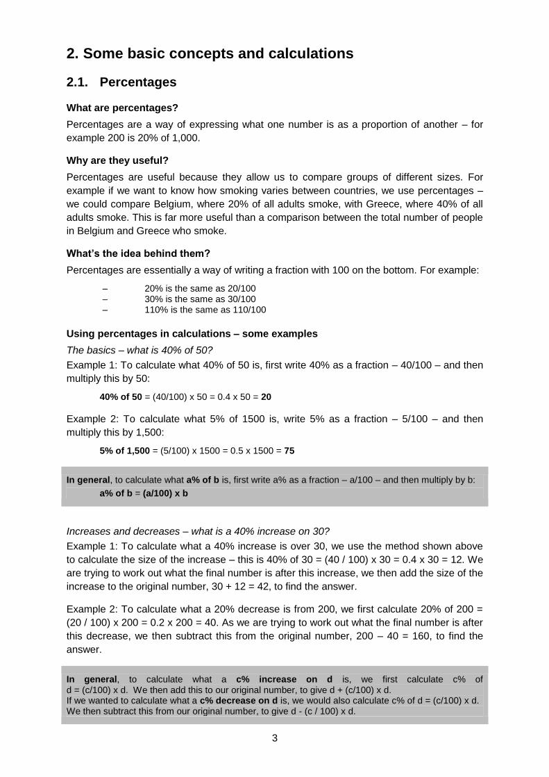
2.1. Percentages
What are percentages?
Percentages are a way of expressing what one number is as a proportion of another – for
example 200 is 20% of 1,000.
Why are they useful?
Percentages are useful because they allow us to compare groups of different sizes. For
example if we want to know how smoking varies between countries, we use percentages –
we could compare Belgium, where 20% of all adults smoke, with Greece, where 40% of all
adults smoke. This is far more useful than a comparison between the total number of people
in Belgium and Greece who smoke.
What’s the idea behind them?
Percentages are essentially a way of writing a fraction with 100 on the bottom. For example:
– 20% is the same as 20/100 – 30% is the same as 30/100 – 110% is the same as 110/100
Using percentages in calculations – some examples
The basics – what is 40% of 50?
Example 1: To calculate what 40% of 50 is, first write 40% as a fraction – 40/100 – and then
multiply this by 50:
40% of 50 = (40/100) x 50 = 0.4 x 50 = 20
Example 2: To calculate what 5% of 1500 is, write 5% as a fraction – 5/100 – and then
multiply this by 1,500:
5% of 1,500 = (5/100) x 1500 = 0.5 x 1500 = 75
In general, to calculate what a% of b is, first write a% as a fraction – a/100 – and then multiply by b:
a% of b = (a/100) x b
Increases and decreases – what is a 40% increase on 30?
Example 1: To calculate what a 40% increase is over 30, we use the method shown above
to calculate the size of the increase – this is 40% of 30 = (40 / 100) x 30 = 0.4 x 30 = 12. We
are trying to work out what the final number is after this increase, we then add the size of the
increase to the original number, 30 + 12 = 42, to find the answer.
Example 2: To calculate what a 20% decrease is from 200, we first calculate 20% of 200 =
(20 / 100) x 200 = 0.2 x 200 = 40. As we are trying to work out what the final number is after
this decrease, we then subtract this from the original number, 200 – 40 = 160, to find the
answer.
In general, to calculate what a c% increase on d is, we first calculate c% of d = (c/100) x d. We then add this to our original number, to give d + (c/100) x d. If we wanted to calculate what a c% decrease on d is, we would also calculate c% of d = (c/100) x d. We then subtract this from our original number, to give d - (c / 100) x d.
4
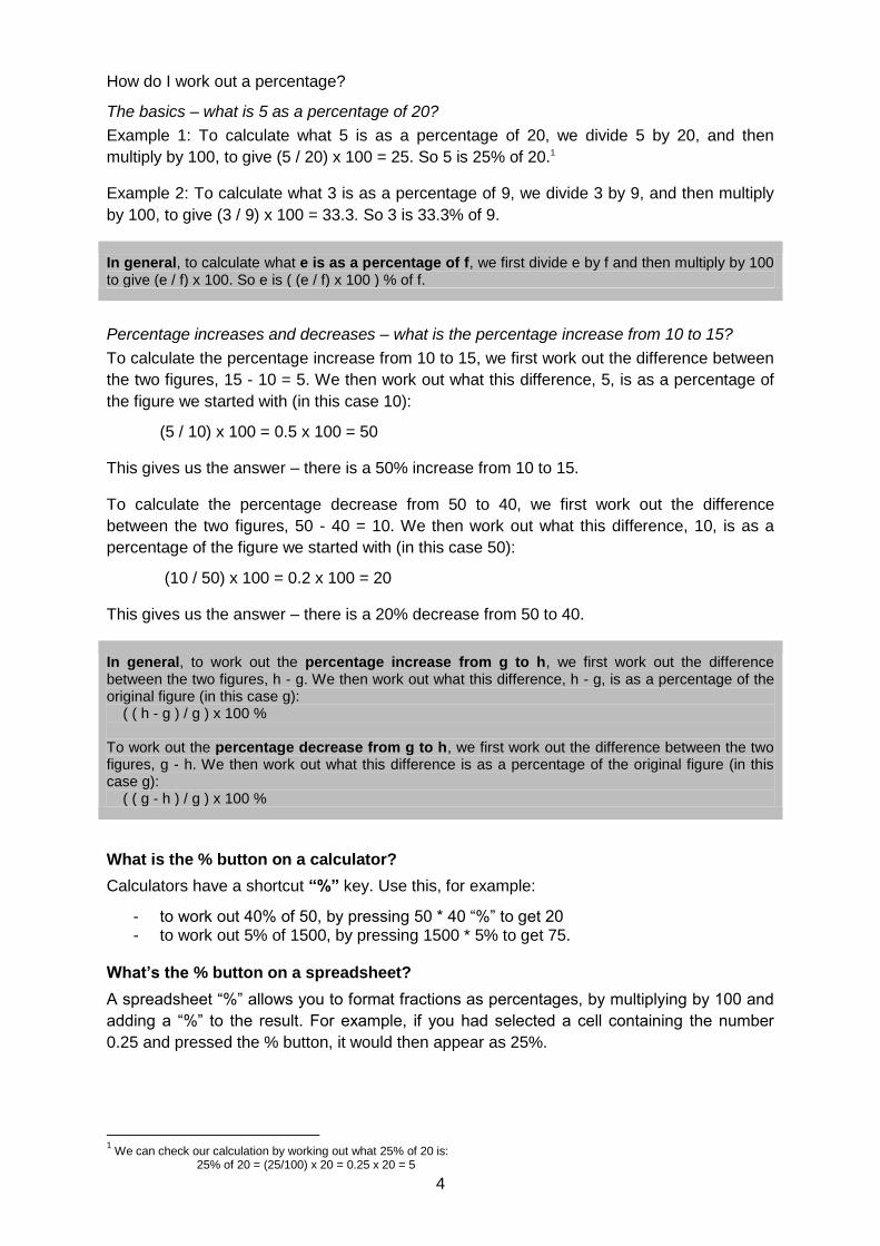
How do I work out a percentage?
The basics – what is 5 as a percentage of 20?
Example 1: To calculate what 5 is as a percentage of 20, we divide 5 by 20, and then
multiply by 100, to give (5 / 20) x 100 = 25. So 5 is 25% of 20.1
Example 2: To calculate what 3 is as a percentage of 9, we divide 3 by 9, and then multiply
by 100, to give (3 / 9) x 100 = 33.3. So 3 is 33.3% of 9.
In general, to calculate what e is as a percentage of f, we first divide e by f and then multiply by 100 to give (e / f) x 100. So e is ( (e / f) x 100 ) % of f.
Percentage increases and decreases – what is the percentage increase from 10 to 15?
To calculate the percentage increase from 10 to 15, we first work out the difference between
the two figures, 15 - 10 = 5. We then work out what this difference, 5, is as a percentage of
the figure we started with (in this case 10):
(5 / 10) x 100 = 0.5 x 100 = 50
This gives us the answer – there is a 50% increase from 10 to 15.
To calculate the percentage decrease from 50 to 40, we first work out the difference
between the two figures, 50 - 40 = 10. We then work out what this difference, 10, is as a
percentage of the figure we started with (in this case 50):
(10 / 50) x 100 = 0.2 x 100 = 20
This gives us the answer – there is a 20% decrease from 50 to 40.
In general, to work out the percentage increase from g to h, we first work out the difference between the two figures, h - g. We then work out what this difference, h - g, is as a percentage of the original figure (in this case g): ( ( h - g ) / g ) x 100 % To work out the percentage decrease from g to h, we first work out the difference between the two figures, g - h. We then work out what this difference is as a percentage of the original figure (in this case g): ( ( g - h ) / g ) x 100 %
What is the % button on a calculator?
Calculators have a shortcut “%” key. Use this, for example:
- to work out 40% of 50, by pressing 50 * 40 “%” to get 20 - to work out 5% of 1500, by pressing 1500 * 5% to get 75.
What’s the % button on a spreadsheet?
A spreadsheet “%” allows you to format fractions as percentages, by multiplying by 100 and
adding a “%” to the result. For example, if you had selected a cell containing the number
0.25 and pressed the % button, it would then appear as 25%.
1 We can check our calculation by working out what 25% of 20 is:
25% of 20 = (25/100) x 20 = 0.25 x 20 = 5
5
What are the potential problems with percentages?
If percentages are treated as actual numbers, results can be misleading. When you work
with percentages you multiply. Therefore you cannot simply add or subtract percentage
changes. The difference between 3% and 2% is not 1%. In fact 3% is 50% greater,2 but
percentage changes in percentages can be confusing and take us away from the underlying
data. To avoid the confusion we say 3% is one percentage point greater than 2%.
Similarly when two or more percentage changes follow each other they cannot be
summed, as the original number changes at each stage. A 100% increase followed by
another 100% increase is a 300% increase overall.3 A 50% fall followed by a 50% increase
does not bring you back to the original number as these are percentages of different
numbers, is a 25% fall overall.4
2.2. Averages
Am I typical?
A common way of summarising figures is to present an average. Suppose, for example, we
wanted to look at incomes in the UK the most obvious summary measurement to use would
be average income. Another indicator which might be of use is one which showed the
spread or variation in individual incomes. Two countries might have similar average
incomes, but the distribution around their average might be very different and it could be
useful to have a measure which quantifies this difference.
There are three often-used measures of average:
Mean – what in everyday language would think of as the average of a set of figures.
Median – the ‘middle’ value of a dataset.
Mode – the most common value
Mean
This is calculated by adding up all the figures and dividing by the number of pieces of data.
So if the hourly rate of pay for 5 employees was as follows:
£5.50, £6.00, £6.45, £7.00, £8.65
The average hourly rate of pay per employee is:
5.5+6.0+6.45+7.0+8.65 = 33.6 = £6.72
5 5
It is important to note that this measure can be affected by unusually high or low values in
the dataset –outliers- and the mean may result in a figure that is not necessarily typical. For
example, in the above data, if the individual earning £8.65 per hour had instead earned £30
the mean earnings would have been £10.99 per hour – which would not have been typical of
those of the group. The usefulness of the mean is often as a base for further calculation –
estimated the cost or effect of a change, for example. If we wanted to calculate how much it
2
We can see this in an example – 2% of 1000 is 20, and 3% of 1000 is 30. The percentage increase from 20 to 30 is 50%.
3 We can see this in another example – a 100% increase on 10 gives 10+10 = 20. Another 100% increase gives
20+20=40. From 10 to 40 is a 300% increase. 4 Again we can see this in an example – a 50% decrease on 8 gives 8 - 4 =4. A 50% increase then gives 4 + 2 = 6. From 8
to 6 is a 25 % decrease.
6
would cost to give all employees a 10% hourly pay increase, then this could be calculated
from mean earnings (multiplied back up by the number of employees).
Median
If we are concerned with describing a set of date by giving an average or typical value then it
is sometimes preferable to use the median rather than the mean. The median is the value
such that exactly half the data items exceed it and half are below it.
The conventional way of calculating the median is to arrange the figures in order and take
the middle value. If there is no middle value because there is an even number of figures,
then, conventionally, the median is taken to be mid-way between the two middle points. In
the earnings example the middle value is £6.45 and this is the median for that data:
£5.50, £6.00, £6.45, £7.00, 8.65
The median is less affected by values at the extremes than the mean. It can therefore be a
better guide to typical values.
Mode
The mode is the value that occurs most frequently. It is often thought of as not particularly
useful in statistical textbooks! But in real life we often use the mode, without realising we are
using a measure of average. The ‘top 10’, ‘most popular’, ‘2nd favourite’ are simply looking at
the most common, or 2nd most common values, ie. modal measures.
Grouped data
Where data have already been grouped into bands – 1 to 10, 11 to 20, 21 to 30 etc - it is not
possible to exactly calculate the mean, an estimate can be made by assigning the mid-point
of each band to the observations in that group. In effect you assume the actual values are
spread evenly within each band. Where classes are open-ended groups – over 50, less than
5 etc. you have to make a guess at an appropriate value. When you have done this, you can
assess how sensitive your estimate is to the assumed value by re-calculating the average
using an alternative assumption (using a spreadsheet to do the calculations also makes it
easy to investigate this). It also possible to estimate the median for grouped data, by looking
for the class above and below which 50% fall. Sometimes it is necessary to estimate where
the 50% boundary is within a class.
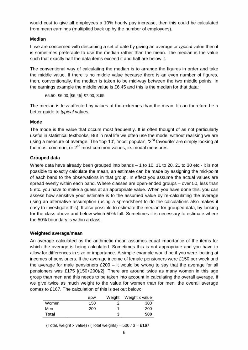
Weighted average/mean
An average calculated as the arithmetic mean assumes equal importance of the items for
which the average is being calculated. Sometimes this is not appropriate and you have to
allow for differences in size or importance. A simple example would be if you were looking at
incomes of pensioners. It the average income of female pensioners were £150 per week and
the average for male pensioners £200 – it would be wrong to say that the average for all
pensioners was £175 [(150+200)/2]. There are around twice as many women in this age
group than men and this needs to be taken into account in calculating the overall average. If
we give twice as much weight to the value for women than for men, the overall average
comes to £167. The calculation of this is set out below:
£pw Weight Weight x value
Women 150 2 300
Men 200 1 200
Total 3 500
(Total, weight x value) / (Total weights) = 500 / 3 = £167
7
2.3. Measures of variation/spread
Range and quantiles
The simplest measure of spread is the range. This is the difference between the largest and
smallest values.
If data are arranged in order we can give more information about the spread by finding
values that lie at various intermediate points. These points are known generically as
quantiles. The values that divide the observations into four equal sized groups, for example,
are called the quartiles. Similarly, it is possible to look at values for 10 equal-sized groups,
deciles, or 5 groups, quintiles, or 100 groups, percentiles, for example. (In practice it is
unlikely that you would want all 100, but sometimes the boundary for the top or bottom 5% or
other value is of particular interest)
One commonly used measure is the inter-quartile range. This is the difference between the
boundary of the top and bottom quartile. As such it is the range that encompasses 50% of
the values in a dataset.
Mean deviation
For each value in a dataset it is possible to calculate the difference between it and the
average (usually the mean). These will be positive and negative and they can be averaged
(again usually using the arithmetic mean). For some sets of data, for example, forecasting
errors, we might want our errors over time to cancel each other out and the mean deviation
should be around zero for this to be the case.
Variance and standard deviation
The variance or standard deviation (which is the square root of the variance) is the most
commonly used measure of spread or volatility.
The standard deviation is the root mean square deviation of the values from their arithmetic
mean, ie. the square root of the sum of the square of the difference between each value and
the mean. This is the most common measure of how widely spread the values in a data set
are. If the data points are all close to the mean, then the standard deviation is close to zero.
If many data points are far from the mean, then the standard deviation is far from zero. If all
the data values are equal, then the standard deviation is zero.
There are various formulas and ways of calculating the standard deviation – these can be
found in most statistics textbooks or online5. Basically the standard deviation is a measure of
the distance from of each of the observations from the mean irrespective of whether then
differences is positive or negative (hence the squaring and taking the square root).
The standard deviation measures the spread of the data about the mean value. It is useful in
comparing sets of data which may have the same mean but a different range. For example,
the mean of the following two is the same: 15, 15, 15, 14, 16 and 2, 7, 14, 22, 30. However,
the second is clearly more spread out and would have a higher standard deviation. If a set
has a low standard deviation, the values are not spread out too much. Where two sets of
data have different means, it is possible to compare their spread by looking at the standard
deviation as a percentage of the mean.
Where the data is normally distributed, the standard deviation takes on added importance
and this underpins a lot of statistical work where samples of a population are used to
5 For example http://office.microsoft.com/en-gb/excel-help/stdev-HP005209277.aspx
8
estimate values for the population as a whole (for further details see the section on
Statistical significance/confidence intervals).
2.4. Rounding and significant places
Rounding is the process of reducing the number of significant digits in a number. This can
help make it easier to remember and use. The result of rounding is a "shorter" number
having fewer non-zero digits yet similar in magnitude. The most common uses are where
numbers are “longest” –very large numbers rounded to the nearest billion, or million, or very
long decimals rounded to one or two decimal places. The result is less precise than the
unrounded number.
Example: Turnout in Sedgefield in the 2005 General Election was 62.213 percent. Rounded
to one decimal place (nearest tenth) it is 62.2 percent, because 62.213 is closer to 62.2 than
to 62.3. Rounded to the nearest whole number it becomes 62% and to the nearest ten it
becomes 60%. Rounding to a larger unit tends to take the rounded number further away
from the unrounded number.
The most common method used for rounding is the following:
Decide what units you want to round to (hundreds, thousands, number of decimal places etc.) and hence which is the last digit to keep. The first example above rounds to one decimal place and hence the last digit is 2.
Increase it by 1 if the next digit is 5 or more (known as rounding up)
Leave it the same if the next digit is 4 or less (known as rounding down)
Further examples:
i. 8.074 rounded to 2 decimal places (hundredths) is 8.07 (because the next digit, 4, is less than 5).
ii. 8.0747 rounded to 2 decimal places is 8.07 (the next digit, 4, is less than 5).
iii. 2,732 rounded to the nearest ten is 2,730 (the next digit, 2 is less than 5)
iv. 2,732 rounded to the nearest hundred is 2,700 (the next digit, 3, is less than 5)
For negative numbers the absolute value is rounded, for example:
i. −6.1349 rounded to 2 decimal places is −6.13
ii. −6.1350 rounded to 2 decimal places is −6.14
Although it is customary to round the number 4.5 up to 5, in fact 4.5 is no nearer to 5 than it
is to 4 (it is 0.5 away from either). When dealing with large sets of data, where trends are
important, traditional rounding on average biases the data slightly upwards.
Another method is the round-to-even method (also known as unbiased rounding). With all
rounding schemes there are two possible outcomes: increasing the rounding digit by one or
leaving it alone. With traditional rounding, if the number has a value less than the half-way
mark between the possible outcomes, it is rounded down; if the number has a value exactly
half-way or greater than half-way between the possible outcomes, it is rounded up. The
round-to-even method is the same except that numbers exactly half-way between the
possible outcomes are sometimes rounded up - sometimes down. Over a large set of data
the round-to-even rule tends to reduce the total rounding error, with (on average) an equal
9
portion of numbers rounding up as rounding down. This generally reduces the upwards
skewing of the result.
The round-to-even method is the following:
Decide which is the last digit to keep.
Increase it by 1 if the next digit is 6 or more, or a 5 followed by one or more non-zero digits.
Leave it the same if the next digit is 4 or less
Otherwise, all that follows the last digit is a 5 and possibly trailing zeroes; then change the last digit to the nearest even digit. That is, increase the rounded digit if it is currently odd; leave it if it is already even.
Examples:
i. 8.016 rounded to 2 decimal places is 8.02 (the next digit (6) is 6 or more)
ii. 8.015 rounded to 2 decimal places is 8.02 (the next digit is 5, and the previous digit (1) is odd)
iii. 8.045 rounded to 2 decimal places is 8.04 (the next digit is 5, and the previous digit (4) is even)
iv. 8.04501 rounded to 2 decimal places is 8.05 (the next digit is 5, but it is followed by non-zero digits)
The process of rounding results in a less precise figure. This explains why rounded
percentage totals do not always add up to 100 and why rounded absolute numbers do not
always sum to the total.
Rounding to n significant places is a form of rounding by handling numbers of different
scales in a uniform way. This gives a rule to where numbers are rounded to. A digit that is
closer to the start of a number is “larger” and therefore considered more significant. The
number of significant places tell us where to start rounding; from then on the rules are the
same.
Examples. Rounding to 2 significant figures:
i. 15,420 becomes 15,000 (the 1 and the 5 are the first two significant figures and the next digit, 4, is less than 5)
ii. 0.001586 becomes 0.0016
iii. 0.5 becomes 0.50 (the trailing zero indicates rounding to 2 significant figures)
iv. 88,920 becomes 89,000
Rounding to 3 significant figures
i. 15,420 becomes 15,400 (the 1, 5 and 4 are the first two significant figures and the next digit, 2, is less than 5)
ii. 0.001586 becomes 0.00159
iii. 0.5 becomes 0.500 (the trailing zero indicates rounding to 3 significant figures)
iv. 88,920 becomes 88,900
3. Simple applied methods
3.1. Index numbers
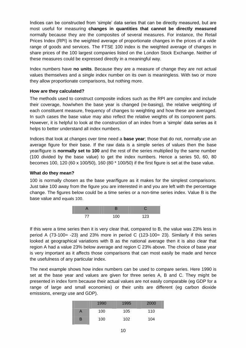
What are index numbers?
Index numbers are a way of presenting proportionate changes in a common format. Their
most common use is looking at changes over time, but they are not restricted to this and can
be used to compare differences between local areas, groups of the population etc.
10
Indices can be constructed from ‘simple’ data series that can be directly measured, but are
most useful for measuring changes in quantities that cannot be directly measured
normally because they are the composites of several measures. For instance, the Retail
Prices Index (RPI) is the weighted average of proportionate changes in the prices of a wide
range of goods and services. The FTSE 100 index is the weighted average of changes in
share prices of the 100 largest companies listed on the London Stock Exchange. Neither of
these measures could be expressed directly in a meaningful way.
Index numbers have no units. Because they are a measure of change they are not actual
values themselves and a single index number on its own is meaningless. With two or more
they allow proportionate comparisons, but nothing more.
How are they calculated?
The methods used to construct composite indices such as the RPI are complex and include
their coverage, how/when the base year is changed (re-basing), the relative weighting of
each constituent measure, frequency of changes to weighting and how these are averaged.
In such cases the base value may also reflect the relative weights of its component parts.
However, it is helpful to look at the construction of an index from a ‘simple’ data series as it
helps to better understand all index numbers.
Indices that look at changes over time need a base year; those that do not, normally use an
average figure for their base. If the raw data is a simple series of values then the base
year/figure is normally set to 100 and the rest of the series multiplied by the same number
(100 divided by the base value) to get the index numbers. Hence a series 50, 60, 80
becomes 100, 120 (60 x 100/50), 160 (80 * 100/50) if the first figure is set at the base value.
What do they mean?
100 is normally chosen as the base year/figure as it makes for the simplest comparisons.
Just take 100 away from the figure you are interested in and you are left with the percentage
change. The figures below could be a time series or a non-time series index. Value B is the
base value and equals 100.
If this were a time series then it is very clear that, compared to B, the value was 23% less in
period A (73-100= -23) and 23% more in period C (123-100= 23). Similarly if this series
looked at geographical variations with B as the national average then it is also clear that
region A had a value 23% below average and region C 23% above. The choice of base year
is very important as it affects those comparisons that can most easily be made and hence
the usefulness of any particular index.
The next example shows how index numbers can be used to compare series. Here 1990 is
set at the base year and values are given for three series A, B and C. They might be
presented in index form because their actual values are not easily comparable (eg GDP for a
range of large and small economies) or their units are different (eg carbon dioxide
emissions, energy use and GDP).
1990 1995 2000
A 100 105 110
B 100 102 104
A B C
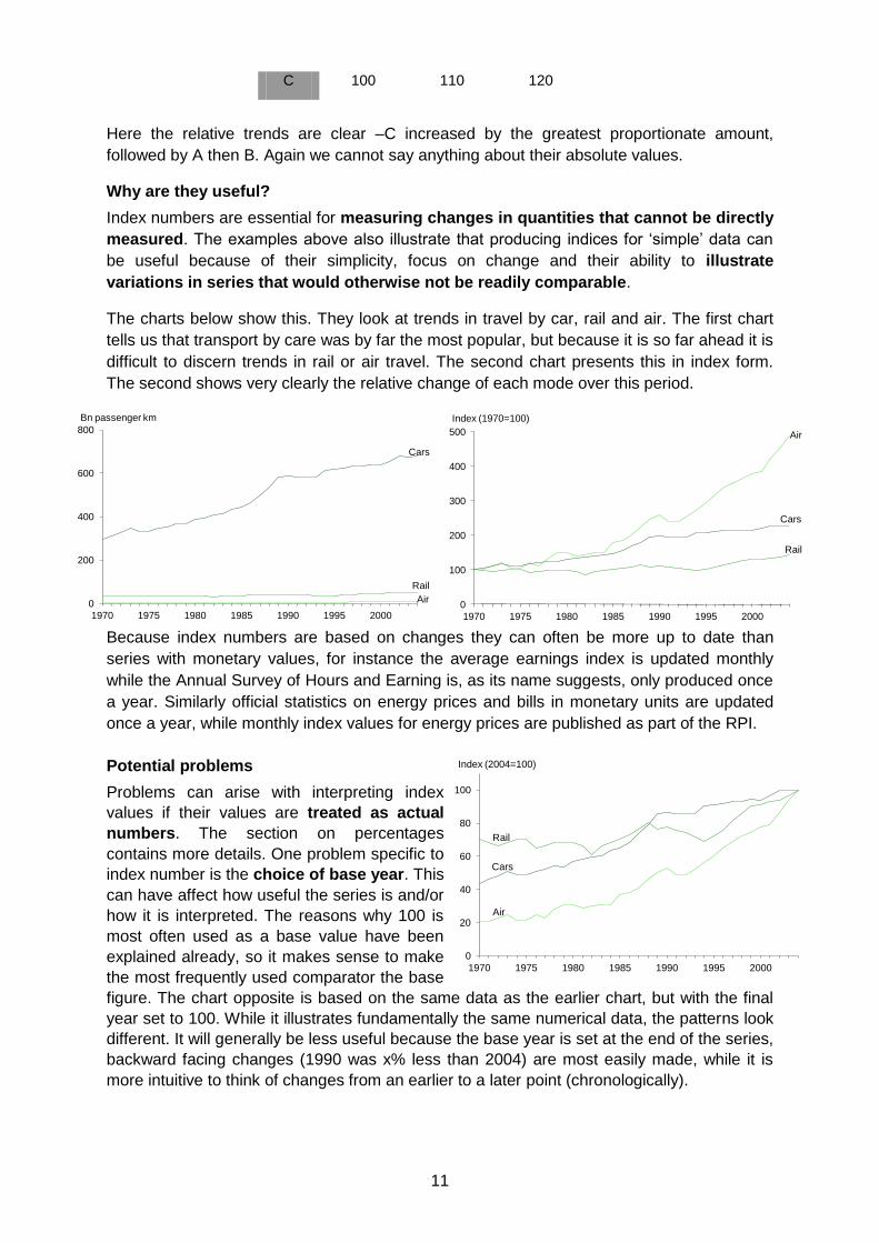
77 100 123
11
C 100 110 120
Here the relative trends are clear –C increased by the greatest proportionate amount,
followed by A then B. Again we cannot say anything about their absolute values.
Why are they useful?
Index numbers are essential for measuring changes in quantities that cannot be directly
measured. The examples above also illustrate that producing indices for ‘simple’ data can
be useful because of their simplicity, focus on change and their ability to illustrate
variations in series that would otherwise not be readily comparable.
The charts below show this. They look at trends in travel by car, rail and air. The first chart
tells us that transport by care was by far the most popular, but because it is so far ahead it is
difficult to discern trends in rail or air travel. The second chart presents this in index form.
The second shows very clearly the relative change of each mode over this period.
Because index numbers are based on changes they can often be more up to date than
series with monetary values, for instance the average earnings index is updated monthly
while the Annual Survey of Hours and Earning is, as its name suggests, only produced once
a year. Similarly official statistics on energy prices and bills in monetary units are updated
once a year, while monthly index values for energy prices are published as part of the RPI.
Potential problems
Problems can arise with interpreting index
values if their values are treated as actual
numbers. The section on percentages
contains more details. One problem specific to
index number is the choice of base year. This
can have affect how useful the series is and/or
how it is interpreted. The reasons why 100 is
most often used as a base value have been
explained already, so it makes sense to make
the most frequently used comparator the base
figure. The chart opposite is based on the same data as the earlier chart, but with the final
year set to 100. While it illustrates fundamentally the same numerical data, the patterns look
different. It will generally be less useful because the base year is set at the end of the series,
backward facing changes (1990 was x% less than 2004) are most easily made, while it is
more intuitive to think of changes from an earlier to a later point (chronologically).
Cars
Rail
Air0
200
400
600
800
1970 1975 1980 1985 1990 1995 2000
Bn passenger km
Cars
Rail
Air
0
100
200
300
400
500
1970 1975 1980 1985 1990 1995 2000
Index (1970=100)
Cars
Rail
Air
0
20
40
60
80
100
1970 1975 1980 1985 1990 1995 2000
Index (2004=100)
12
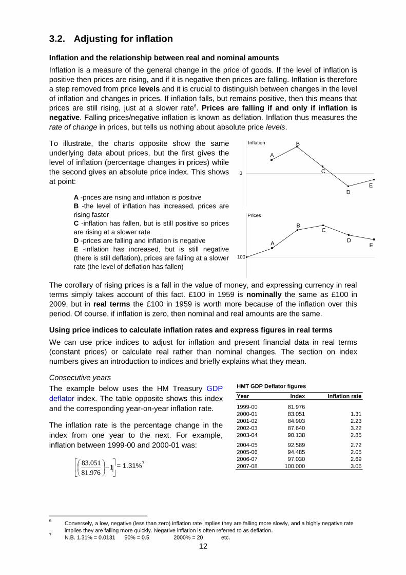
3.2. Adjusting for inflation
Inflation and the relationship between real and nominal amounts
Inflation is a measure of the general change in the price of goods. If the level of inflation is
positive then prices are rising, and if it is negative then prices are falling. Inflation is therefore
a step removed from price levels and it is crucial to distinguish between changes in the level
of inflation and changes in prices. If inflation falls, but remains positive, then this means that
prices are still rising, just at a slower rate6. Prices are falling if and only if inflation is
negative. Falling prices/negative inflation is known as deflation. Inflation thus measures the
rate of change in prices, but tells us nothing about absolute price levels.
To illustrate, the charts opposite show the same
underlying data about prices, but the first gives the
level of inflation (percentage changes in prices) while
the second gives an absolute price index. This shows
at point:
A -prices are rising and inflation is positive
B -the level of inflation has increased, prices are
rising faster
C -inflation has fallen, but is still positive so prices
are rising at a slower rate
D -prices are falling and inflation is negative
E -inflation has increased, but is still negative
(there is still deflation), prices are falling at a slower
rate (the level of deflation has fallen)
The corollary of rising prices is a fall in the value of money, and expressing currency in real
terms simply takes account of this fact. £100 in 1959 is nominally the same as £100 in
2009, but in real terms the £100 in 1959 is worth more because of the inflation over this
period. Of course, if inflation is zero, then nominal and real amounts are the same.
Using price indices to calculate inflation rates and express figures in real terms
We can use price indices to adjust for inflation and present financial data in real terms
(constant prices) or calculate real rather than nominal changes. The section on index
numbers gives an introduction to indices and briefly explains what they mean.
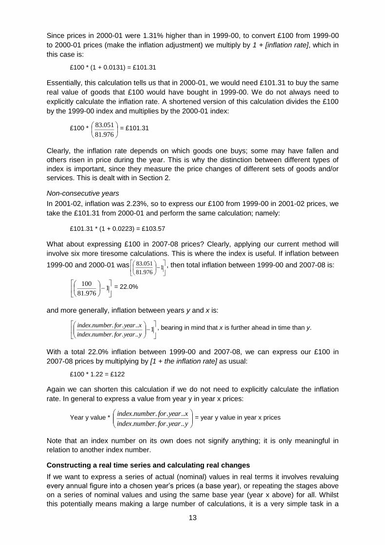
Consecutive years
The example below uses the HM Treasury GDP
deflator index. The table opposite shows this index
and the corresponding year-on-year inflation rate.
The inflation rate is the percentage change in the
index from one year to the next. For example,
inflation between 1999-00 and 2000-01 was:
1
976.81
051.83 = 1.31%7
6 Conversely, a low, negative (less than zero) inflation rate implies they are falling more slowly, and a highly negative rate
implies they are falling more quickly. Negative inflation is often referred to as deflation. 7 N.B. 1.31% = 0.0131 50% = 0.5 2000% = 20 etc.
E
A
C
D
B
0
Inflation
EA
100
C
D
B
Prices
HMT GDP Deflator figures
Year Index Inflation rate
1999-00 81.976
2000-01 83.051 1.31
2001-02 84.903 2.23
2002-03 87.640 3.22
2003-04 90.138 2.85
2004-05 92.589 2.72
2005-06 94.485 2.05
2006-07 97.030 2.69
2007-08 100.000 3.06
13
Since prices in 2000-01 were 1.31% higher than in 1999-00, to convert £100 from 1999-00
to 2000-01 prices (make the inflation adjustment) we multiply by 1 + [inflation rate], which in
this case is:
£100 * (1 + 0.0131) = £101.31
Essentially, this calculation tells us that in 2000-01, we would need £101.31 to buy the same
real value of goods that £100 would have bought in 1999-00. We do not always need to
explicitly calculate the inflation rate. A shortened version of this calculation divides the £100
by the 1999-00 index and multiplies by the 2000-01 index:
£100 *
976.81
051.83 = £101.31
Clearly, the inflation rate depends on which goods one buys; some may have fallen and
others risen in price during the year. This is why the distinction between different types of
index is important, since they measure the price changes of different sets of goods and/or
services. This is dealt with in Section 2.
Non-consecutive years
In 2001-02, inflation was 2.23%, so to express our £100 from 1999-00 in 2001-02 prices, we
take the £101.31 from 2000-01 and perform the same calculation; namely:
£101.31 * (1 + 0.0223) = £103.57
What about expressing £100 in 2007-08 prices? Clearly, applying our current method will
involve six more tiresome calculations. This is where the index is useful. If inflation between
1999-00 and 2000-01 was
1
976.81
051.83 , then total inflation between 1999-00 and 2007-08 is:
1
976.81
100 = 22.0%
and more generally, inflation between years y and x is:
1
.....
.....
yyearfornumberindex
xyearfornumberindex , bearing in mind that x is further ahead in time than y.
With a total 22.0% inflation between 1999-00 and 2007-08, we can express our £100 in
2007-08 prices by multiplying by [1 + the inflation rate] as usual:
£100 * 1.22 = £122
Again we can shorten this calculation if we do not need to explicitly calculate the inflation
rate. In general to express a value from year y in year x prices:
Year y value *
yyearfornumberindex
xyearfornumberindex
.....
..... = year y value in year x prices
Note that an index number on its own does not signify anything; it is only meaningful in
relation to another index number.
Constructing a real time series and calculating real changes
If we want to express a series of actual (nominal) values in real terms it involves revaluing
every annual figure into a chosen year’s prices (a base year), or repeating the stages above
on a series of nominal values and using the same base year (year x above) for all. Whilst
this potentially means making a large number of calculations, it is a very simple task in a
14
spreadsheet. Once done, changes can be calculated in percentage or absolute terms. The
choice of base year does not affect percentage change calculations, but it will affect the
absolute change figure, so it is important to specify the base year.8
Different price indices
A price index is a series of numbers used to show general movement in the price of a single
item, or a set of goods9, over time. Thus, insofar as every good has a price that changes
over time, there are as many inflation ‘rates’ as there are different groupings of goods and
services. When the media talk about ‘personal inflation rates’, they are referring to changes
in the prices of things that a particular individual buys.
In general, any price index must consist of a set of prices for goods, and a set of
corresponding weights assigned to each good in the index.10 The value of the index is a
weighted average of changes in prices. For consumer indices, these weights should reflect
goods’ importance in the household budget; a doubling in the price of chewing gum should
not, for instance, affect the index as much as a doubling in energy bills.
The GDP deflator
The GDP deflator measures the change in price of all domestically produced goods and
services. It is derived by dividing an index of GDP measured in current prices by a constant
prices (chain volume) index of GDP. The GDP deflator is different from other inflation
measures in that it does not use a subset of goods; by the definition of GDP, all domestically
produced goods are included. In addition, there is no explicit mechanism to assign
importance (weights) to the goods in the index; the weights of the deflator are implicitly
dictated by the relative value of each good to economic production.
These unique features of the GDP deflator make its interpretation slightly less intuitive.
Whilst consumer/producer inflation indices reflect average change in the cost of goods
typically bought by consumers/producers, the GDP deflator is not representative of any
particular individual’s spending patterns. From the previous example, a possible
interpretation could be as follows: suppose in 1999-00 we spent the £100 on a tiny and
representative fraction of every good produced in the economy; then the GDP deflator tells
us that we would need 1.31% more money (£101.31) to buy that same bundle in 2000-01.
The GDP is normally used to adjust for inflation in measures of national income and public
expenditure where the focus is wider than consumer items alone.
The Consumer Price Index (CPI) and the Retail Price Index (RPI)11
The Office for National Statistics (ONS) publishes two measures of consumer price inflation:
the CPI and the RPI12. Each is a composite measure of the price change of around 650
goods and services on which people typically spend their money. The most intuitive way of
thinking about the CPI/RPI is to imagine a shopping basket containing these goods and
services. As the prices of the items in the basket change over time, so does the total cost of
the basket; CPI and RPI measure the changing cost of this basket.
A ‘perfect’ consumer price index would be calculated with reference to all consumer goods
and services, and the prices measured in every outlet that supplies them. Clearly, this isn’t
practicable. The CPI/RPI use a representative sample of goods and the price data collected
8 For instance we can say ‘a 5% real increase’ without a base year, but ‘a £5 million real increase’ needs a base year
specified, since if prices are rising, a later base year will give us a higher figure and vice versa. It is good practice to use the latest year’s prices as the base year.
9 Hereon, the expression ‘goods’ encompasses both goods and services
10 Clearly, when charting just one price, there is no need for weighting as the good has complete importance in the index.
11 Differences between the CPI and the RPI are not considered in this note; broadly they arise from differences in formula
and coverage. 12
Another commonly-used index, the RPIX, simply excludes mortgage interest payments from the RPI

15
for each good is a sample of prices: ‘currently, around 120,000 separate price quotations are
used… collected in around 150 areas throughout the UK’ (ONS, 2008).
RPI and CPI data can both be downloaded from the ONS Consumer Price Indices release.
The RPI is commonly used to adjust for inflation faced by consumers. It is also used as a
basis to uprate many state benefits and as the normal interest rate for student loans.
Selection of items and application of weights in the CPI/RPI
Some items in the CPI/RPI are sufficiently important within household budgets that they
merit their place in the basket per se: examples include petrol, electricity supply and
telephone charges. However, most goods are selected on the basis that changes in their
price reflect price changes for a wider range of goods. For instance, the CPI contains nine
items which together act as ‘bellwethers’ for price change in the ‘tools and equipment for the
house and garden’ class.
The number of items assigned to a class depends on its weight in the index, and the
variability of prices within the class; for instance, tobacco has only five items whilst food has
over a hundred. Each year, the weights and contents of the basket are reviewed, and
alterations are made to reflect changing patterns of consumer spending. Spending changes
may arise from substitution in the face of short-term price fluctuation or changing tastes (e.g.
butter to margarine), or from the development of new goods. For example, in 2008 35mm
camera films were replaced by portable digital storage media. In total, eight items were
dropped from the CPI/RPI in 2008, including CD singles, lager ‘stubbies’ and TV repair
services.
16
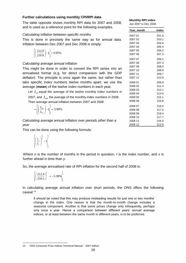
Further calculations using monthly CPI/RPI data
The table opposite shows monthly RPI data for 2007 and 2008,
and is used as a reference point for the following examples.
Calculating inflation between specific months
This is done in precisely the same way as for annual data.
Inflation between Dec 2007 and Dec 2008 is simply:
%95.019.210
9.212
Calculating average annual inflation
This might be done in order to convert the RPI series into an
annualised format (e.g. for direct comparison with the GDP
deflator). The principle is once again the same, but rather than
take specific index numbers twelve months apart, we use the
average (mean) of the twelve index numbers in each year.
Let 07I equal the average of the twelve monthly index numbers in
2007, and 08I the average of the monthly index numbers in 2008.
Then average annual inflation between 2007 and 2008
%99.3107
08
I
I
Calculating average annual inflation over periods other than a
year
This can be done using the following formula:
1
12
n
y
x
I
I
Where n is the number of months in the period in question, I is the index number, and x is
further ahead in time than y.
So, the average annualised rate of RPI inflation for the second half of 2008 is:
%38.3
5.216
9.2122
In calculating average annual inflation over short periods, the ONS offers the following
caveat:13
It should be noted that this may produce misleading results for just one or two months’
change in the index. One reason is that the month-to-month change includes a
seasonal component. Another is that some prices change only infrequently, perhaps
only once a year. Hence a comparison between different years’ annual average
indices, or at least between the same month in different years, is to be preferred.
13 ONS Consumer Price Indices Technical Manual – 2007 edition
Jan 2007 to Dec 2008
Year, month Index
2007 01 201.6
2007 02 203.1
2007 03 204.4
2007 04 205.4
2007 05 206.2
2007 06 207.3
2007 07 206.1
2007 08 207.3
2007 09 208.0
2007 10 208.9
2007 11 209.7
2007 12 210.9
2008 01 209.8
2008 02 211.4
2008 03 212.1
2008 04 214.0
2008 05 215.1
2008 06 216.8
2008 07 216.5
2008 08 217.2
2008 09 218.4
2008 10 217.7
2008 11 216.0
2008 12 212.9
Monthly RPI index
17
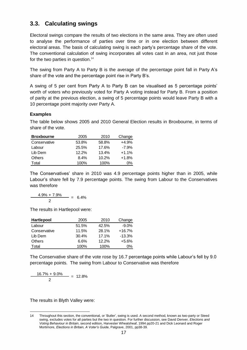
3.3. Calculating swings
Electoral swings compare the results of two elections in the same area. They are often used
to analyse the performance of parties over time or in one election between different
electoral areas. The basis of calculating swing is each party’s percentage share of the vote.
The conventional calculation of swing incorporates all votes cast in an area, not just those
for the two parties in question.14
The swing from Party A to Party B is the average of the percentage point fall in Party A’s
share of the vote and the percentage point rise in Party B’s.
A swing of 5 per cent from Party A to Party B can be visualised as 5 percentage points’
worth of voters who previously voted for Party A voting instead for Party B. From a position
of parity at the previous election, a swing of 5 percentage points would leave Party B with a
10 percentage point majority over Party A.
Examples
The table below shows 2005 and 2010 General Election results in Broxbourne, in terms of
share of the vote.
The Conservatives’ share in 2010 was 4.9 percentage points higher than in 2005, while
Labour’s share fell by 7.9 percentage points. The swing from Labour to the Conservatives
was therefore
The results in Hartlepool were:
The Conservative share of the vote rose by 16.7 percentage points while Labour’s fell by 9.0
percentage points. The swing from Labour to Conservative was therefore
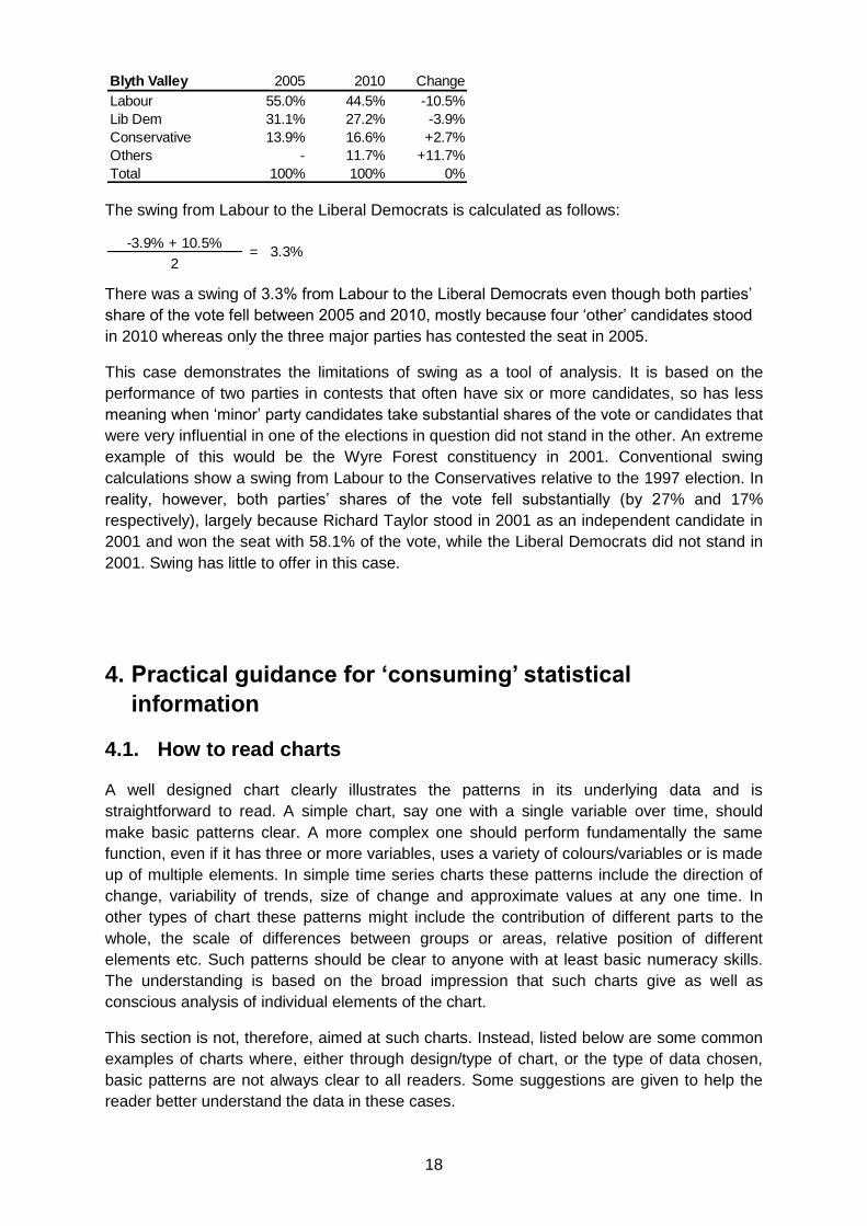
The results in Blyth Valley were:
14 Throughout this section, the conventional, or ‘Butler’, swing is used. A second method, known as two-party or Steed
swing, excludes votes for all parties but the two in question. For further discussion, see David Denver, Elections and Voting Behaviour in Britain, second edition, Harvester Wheatsheaf, 1994 pp20-21 and Dick Leonard and Roger Mortimore, Elections in Britain, A Voter’s Guide, Palgrave, 2001, pp38-39.
Broxbourne 2005 2010 Change
Conservative 53.8% 58.8% +4.9%
Labour 25.5% 17.6% -7.9%
Lib Dem 12.2% 13.4% +1.1%
Others 8.4% 10.2% +1.8%
Total 100% 100% 0%
4.9% + 7.9%
2= 6.4%
Hartlepool 2005 2010 Change
Labour 51.5% 42.5% -9.0%
Conservative 11.5% 28.1% +16.7%
Lib Dem 30.4% 17.1% -13.3%
Others 6.6% 12.2% +5.6%
Total 100% 100% 0%
16.7% + 9.0%
2= 12.8%
18
The swing from Labour to the Liberal Democrats is calculated as follows:
There was a swing of 3.3% from Labour to the Liberal Democrats even though both parties’
share of the vote fell between 2005 and 2010, mostly because four ‘other’ candidates stood
in 2010 whereas only the three major parties has contested the seat in 2005.
This case demonstrates the limitations of swing as a tool of analysis. It is based on the
performance of two parties in contests that often have six or more candidates, so has less
meaning when ‘minor’ party candidates take substantial shares of the vote or candidates that
were very influential in one of the elections in question did not stand in the other. An extreme
example of this would be the Wyre Forest constituency in 2001. Conventional swing
calculations show a swing from Labour to the Conservatives relative to the 1997 election. In
reality, however, both parties’ shares of the vote fell substantially (by 27% and 17%
respectively), largely because Richard Taylor stood in 2001 as an independent candidate in
2001 and won the seat with 58.1% of the vote, while the Liberal Democrats did not stand in
2001. Swing has little to offer in this case.
4. Practical guidance for ‘consuming’ statistical
information
4.1. How to read charts
A well designed chart clearly illustrates the patterns in its underlying data and is
straightforward to read. A simple chart, say one with a single variable over time, should
make basic patterns clear. A more complex one should perform fundamentally the same
function, even if it has three or more variables, uses a variety of colours/variables or is made
up of multiple elements. In simple time series charts these patterns include the direction of
change, variability of trends, size of change and approximate values at any one time. In
other types of chart these patterns might include the contribution of different parts to the
whole, the scale of differences between groups or areas, relative position of different
elements etc. Such patterns should be clear to anyone with at least basic numeracy skills.
The understanding is based on the broad impression that such charts give as well as
conscious analysis of individual elements of the chart.
This section is not, therefore, aimed at such charts. Instead, listed below are some common
examples of charts where, either through design/type of chart, or the type of data chosen,
basic patterns are not always clear to all readers. Some suggestions are given to help the
reader better understand the data in these cases.
Blyth Valley 2005 2010 Change
Labour 55.0% 44.5% -10.5%
Lib Dem 31.1% 27.2% -3.9%
Conservative 13.9% 16.6% +2.7%
Others - 11.7% +11.7%
Total 100% 100% 0%
-3.9% + 10.5%
2= 3.3%
19
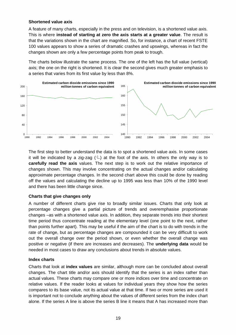
Shortened value axis
A feature of many charts, especially in the press and on television, is a shortened value axis.
This is where instead of starting at zero the axis starts at a greater value. The result is
that the variations shown in the chart are magnified. So, for instance, a chart of recent FSTE
100 values appears to show a series of dramatic crashes and upswings, whereas in fact the
changes shown are only a few percentage points from peak to trough.
The charts below illustrate the same process. The one of the left has the full value (vertical)
axis; the one on the right is shortened. It is clear the second gives much greater emphasis to
a series that varies from its first value by less than 8%.
The first step to better understand the data is to spot a shortened value axis. In some cases
it will be indicated by a zig-zag ( ) at the foot of the axis. In others the only way is to
carefully read the axis values. The next step is to work out the relative importance of
changes shown. This may involve concentrating on the actual changes and/or calculating
approximate percentage changes. In the second chart above this could be done by reading
off the values and calculating the decline up to 1995 was less than 10% of the 1990 level
and there has been little change since.
Charts that give changes only
A number of different charts give rise to broadly similar issues. Charts that only look at
percentage changes give a partial picture of trends and overemphasise proportionate
changes –as with a shortened value axis. In addition, they separate trends into their shortest
time period thus concentrate reading at the elementary level (one point to the next, rather
than points further apart). This may be useful if the aim of the chart is to do with trends in the
rate of change, but as percentage changes are compounded it can be very difficult to work
out the overall change over the period shown, or even whether the overall change was
positive or negative (if there are increases and decreases). The underlying data would be
needed in most cases to draw any conclusions about trends in absolute values.
Index charts
Charts that look at index values are similar, although more can be concluded about overall
changes. The chart title and/or axis should identify that the series is an index rather than
actual values. These charts may compare one or more indices over time and concentrate on
relative values. If the reader looks at values for individual years they show how the series
compares to its base value, not its actual value at that time. If two or more series are used it
is important not to conclude anything about the values of different series from the index chart
alone. If the series A line is above the series B line it means that A has increased more than
0
40
80
120
160
200
1990 1992 1994 1996 1998 2000 2002 2004
Estimated carbon dioxide emissions since 1990million tonnes of carbon equivalent
140
145
150
155
160
165
1990 1992 1994 1996 1998 2000 2002 2004
Estimated carbon dioxide emissions since 1990million tonnes of carbon equivalent
20
B since the base year, not (necessarily) that A is greater than B. The section on index
numbers gives more background.
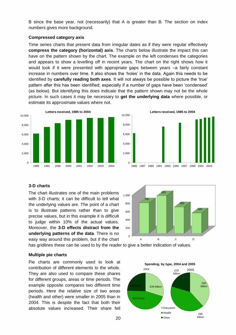
Compressed category axis
Time series charts that present data from irregular dates as if they were regular effectively
compress the category (horizontal) axis. The charts below illustrate the impact this can
have on the pattern shown by the chart. The example on the left condenses the categories
and appears to show a levelling off in recent years. The chart on the right shows how it
would look if it were presented with appropriate gaps between years –a fairly constant
increase in numbers over time. It also shows the ‘holes’ in the data. Again this needs to be
identified by carefully reading both axes. It will not always be possible to picture the ‘true’
pattern after this has been identified; especially if a number of gaps have been ‘condensed’
(as below). But identifying this does indicate that the pattern shown may not be the whole
picture. In such cases it may be necessary to get the underlying data where possible, or
estimate its approximate values where not.
3-D charts
The chart illustrates one of the main problems
with 3-D charts; it can be difficult to tell what
the underlying values are. The point of a chart
is to illustrate patterns rather than to give
precise values, but in this example it is difficult
to judge within 10% of the actual values.
Moreover, the 3-D effects distract from the
underlying patterns of the data. There is no
easy way around this problem, but if the chart
has gridlines these can be used to by the reader to give a better indication of values.
Multiple pie charts
Pie charts are commonly used to look at
contribution of different elements to the whole.
They are also used to compare these shares
for different groups, areas or time periods. The
example opposite compares two different time
periods. Here the relative size of two areas
(health and other) were smaller in 2005 than in
2004. This is despite the fact that both their
absolute values increased. Their share fell
0
2,000
4,000
6,000
8,000
10,000
1985 1992 1996 2000 2001 2002 2003 2004
Letters received, 1985 to 2004
0
2,000
4,000
6,000
8,000
10,000
1985 1987 1989 1991 1993 1995 1997 1999 2001 2003
Letters received, 1985 to 2004
£34 billion
£52 billion
£28 billion
2004
Education
Health
Other
£60 billion
£65 billion
£32 billion
2005
Spending, by type, 2004 and 2005
0
200
400
600
800
1,000
A B C D
750
925
650
500
21
because the size of education increased by a greater proportion. Pie charts are better at
focussing on proportionate contributions from a small number of elements and may give the
wrong impression in a case such as this.
In some charts the size of the second pie may be changed in proportion to the difference in
the total. Even in these cases the pattern of the underlying data may not be clear as people
are generally less good at perceiving differences in area than in alternatives such as length
or position on a line.
Again the key to better understanding the data is to identify this problem by reading the
values. If only percentage figures are given a total may be added to the chart, if not, there is
no way of spotting this and the chart is misleading. If you know the values or total then some
assessment of relative changes can be made, but this is not always straightforward.
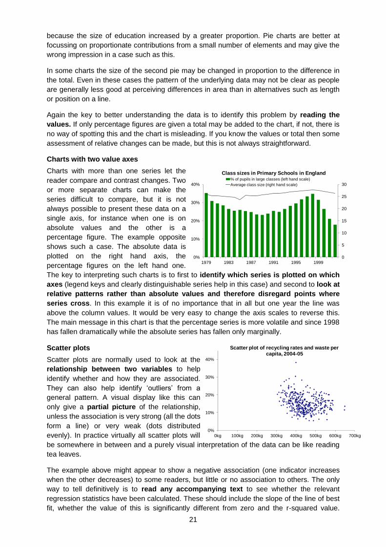
Charts with two value axes
Charts with more than one series let the
reader compare and contrast changes. Two
or more separate charts can make the
series difficult to compare, but it is not
always possible to present these data on a
single axis, for instance when one is on
absolute values and the other is a
percentage figure. The example opposite
shows such a case. The absolute data is
plotted on the right hand axis, the
percentage figures on the left hand one.
The key to interpreting such charts is to first to identify which series is plotted on which
axes (legend keys and clearly distinguishable series help in this case) and second to look at
relative patterns rather than absolute values and therefore disregard points where
series cross. In this example it is of no importance that in all but one year the line was
above the column values. It would be very easy to change the axis scales to reverse this.
The main message in this chart is that the percentage series is more volatile and since 1998
has fallen dramatically while the absolute series has fallen only marginally.
Scatter plots
Scatter plots are normally used to look at the
relationship between two variables to help
identify whether and how they are associated.
They can also help identify ‘outliers’ from a
general pattern. A visual display like this can
only give a partial picture of the relationship,
unless the association is very strong (all the dots
form a line) or very weak (dots distributed
evenly). In practice virtually all scatter plots will
be somewhere in between and a purely visual interpretation of the data can be like reading
tea leaves.
The example above might appear to show a negative association (one indicator increases
when the other decreases) to some readers, but little or no association to others. The only
way to tell definitively is to read any accompanying text to see whether the relevant
regression statistics have been calculated. These should include the slope of the line of best
fit, whether the value of this is significantly different from zero and the r-squared value.
0
5
10
15
20
25
30
0%
10%
20%
30%
40%
1979 1983 1987 1991 1995 1999
Class sizes in Primary Schools in England% of pupils in large classes (left hand scale)
Average class size (right hand scale)
0%
10%
20%
30%
40%
0kg 100kg 200kg 300kg 400kg 500kg 600kg 700kg
Scatter plot of recycling rates and waste per capita, 2004-05
22
These tell the reader how changes in one variable affect the other and the strength of any
association. In the example above a 10kg increase in waste per capita was associated with
recycling rates that were 0.2% higher. While the slope of the line of best fit was significantly
less than zero this simple model does not explain much of the pattern as only 7% of the
variation in one was explained by variation in the other. The sections on regression and
confidence intervals and statistical significance give more background.
Logarithmic scales
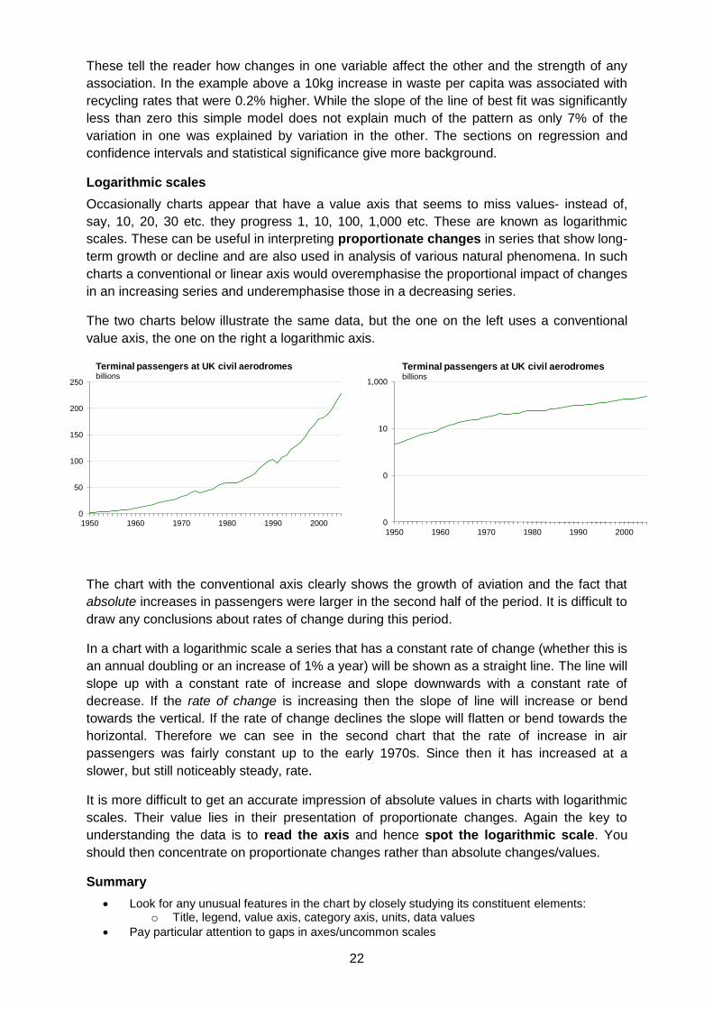
Occasionally charts appear that have a value axis that seems to miss values- instead of,
say, 10, 20, 30 etc. they progress 1, 10, 100, 1,000 etc. These are known as logarithmic
scales. These can be useful in interpreting proportionate changes in series that show long-
term growth or decline and are also used in analysis of various natural phenomena. In such
charts a conventional or linear axis would overemphasise the proportional impact of changes
in an increasing series and underemphasise those in a decreasing series.
The two charts below illustrate the same data, but the one on the left uses a conventional
value axis, the one on the right a logarithmic axis.
The chart with the conventional axis clearly shows the growth of aviation and the fact that
absolute increases in passengers were larger in the second half of the period. It is difficult to
draw any conclusions about rates of change during this period.
In a chart with a logarithmic scale a series that has a constant rate of change (whether this is
an annual doubling or an increase of 1% a year) will be shown as a straight line. The line will
slope up with a constant rate of increase and slope downwards with a constant rate of
decrease. If the rate of change is increasing then the slope of line will increase or bend
towards the vertical. If the rate of change declines the slope will flatten or bend towards the
horizontal. Therefore we can see in the second chart that the rate of increase in air
passengers was fairly constant up to the early 1970s. Since then it has increased at a
slower, but still noticeably steady, rate.
It is more difficult to get an accurate impression of absolute values in charts with logarithmic
scales. Their value lies in their presentation of proportionate changes. Again the key to
understanding the data is to read the axis and hence spot the logarithmic scale. You
should then concentrate on proportionate changes rather than absolute changes/values.
Summary
Look for any unusual features in the chart by closely studying its constituent elements: o Title, legend, value axis, category axis, units, data values
Pay particular attention to gaps in axes/uncommon scales
0
50
100
150
200
250
1950 1960 1970 1980 1990 2000
Terminal passengers at UK civil aerodromesbillions
0
0
10
1,000
1950 1960 1970 1980 1990 2000
Terminal passengers at UK civil aerodromesbillions
23
Any unusual feature(s) may mean you have to adapt the broad impression you initially get from the visual elements of the chart and limit the type of inferences you can draw
Read any accompanying text before making any firm conclusions
If all else fails try to get the underlying data
4.2. How to spot spin and inappropriate use of statistics
Statistics can be misused, spun or used inappropriately in many different ways. This is not
always done consciously or intentionally and the resulting facts or analysis are not
necessarily wrong. They may, however, present a partial or overly simplistic picture:
The fact is that, despite its mathematical base, statistics is as much an art as it is a
science. A great many manipulations and even distortions are possible within the
bounds of propriety.
(How to lie with statistics, Darrell Huff)
Detailed below are some common ways in which statistics are used inappropriately or spun
and some tips to help spot this. The tips are given in detail at the end of this note, but the
three essential questions to ask yourself when looking at statistics are:
Compared to what? Since when? Says who?
This section deals mainly with how statistics are used, rather than originally put together.
The casual reader may not have time to investigate every methodological aspect of data
collection, survey methods etc., but with the right approach they will be able to better
understand how data have been used or interpreted. The same approach may also help the
reader spot statistics that are misleading in themselves.
Some of the other sections look at related areas in more detail. There are a number of books
that go into far more detail on the subject such as How to lie with statistics by Darrell Huff,
Damned lies and statistics and Stat-Spotting. A Field Guide to Identifying Dubious Data, both
by Joel Best and The Tiger That Isn't: Seeing Through a World of Numbers by Michael
Blastland and Andrew Dilnot. The following websites contain material that readers may also
find useful:
Channel 4 FactCheck
Straight Statistics
NHS Choices –behind the headlines
UK Statistics Authority
STATS – US research organisation with a mission to ‘improve the quality of scientific and statistical information in public discourse and to act as a resource for journalists and policy makers on scientific issues and controversies’
Common ways in which statistics are used inappropriately or spun
Lack of context. Context is vital in interpreting any statistic. If you are given a single statistic
on its own without any background or context then it will be impossible to say anything about
what it means other than the most trivial. Such a contextual vacuum can be used by an
author to help put their spin on a statistic in the ways set out here. Some important areas of
context are detailed below:
Historical –how has the statistic varied in the past? Is the latest figure a departure from the previous trend? Has the statistic tended to vary erratically over time? The quantity in question may be at a record high or low level, but how long has data been collected for?
24
Geographical –is the statistic the same as or different from that seen in other (comparable) areas?
Population if the statistic is an absolute value –this is important even if the absolute value is very large or very small. How does the value compare to the overall population in question. What is the appropriate population/denominator to use to calculate a rate or percentage? The actual choice depends on what you want to use the rate/percentage to say. For instance, a road casualty rate based on the total distance travelled on the roads (casualties per 1,000 passenger km) is more meaningful than one based on the population of an area (casualties per 1,000 population). The rate is meant to look at the risk of travelling on the roads in different areas or over time and the total distance travelled is a more accurate measure of exposure to this risk than the population of an area.
Absolute value if the statistic is a rate/percentage –what does this percentage (change) mean in things we can actually observe such as people, money, crimes operations etc? For instance, the statement “cases of the disease increased by 200% in a year” sounds dramatic, but this could be an increase in observed cases from one in the first year to three in the second.
Related statistics –does this statistic or statistics give us the complete picture or can the subject be measured in a different way? (See also the section below on selectivity) Are there related areas that also need to be considered?
Definitions/assumptions –what are the assumptions made by the author in drawing their conclusions or making their own calculations? Are there any important definitions or limitations of this statistic?
A related area is spurious comparisons that do not compare like for like. These are easier
to pass off if there is minimal context to the data. Examples include, making comparisons at
different times of the year when there is a seasonal pattern, using different time periods,
comparing data for geographical areas of very different sizes, or where the statistic has a
different meaning or definition. Comparisons over a very long time period may look at a
broadly similar statistics, but if many other factors have changed a direct comparison is also
likely to be spurious. For instance comparing the number of deaths from cancer now with
those 100 years ago –a period when the population has increased greatly, life expectancy
has risen and deaths from some other causes, especially infectious diseases, have fallen.
These changes should be acknowledged and a more relevant statistic chosen.
Selection/omission. Selecting only the statistics that make your point is one of the most
straightforward and effective ways in which statistics are spun. The author could be selective
in the indicators or rates they choose, their source of data, the time period used for
comparison or the countries, population groups, regions, businesses etc. used as
comparators. The general principle applied by authors who want to spin by selection is that
the argument/conclusion comes first and data is cherry picked to support and ‘explain’ this.
Such an approach is entirely opposite to the ‘scientific method’ where observations, data
collections and analysis are used to explore the issue and come before the hypothesis which
is then tested and either validated or rejected.
Improvements in statistical analysis software and access to raw data (ie. from Government
surveys) make the process of ‘data mining’ much easier. This is where a researcher subjects
the data to a very large number of different analyses using different statistical tests, sub-
groups of the data, outcome measures etc. Taking in isolation this can produce useful
‘hidden’ findings from the data. But, put alongside selective reporting of results, it increases
the likelihood of one or more ‘positive’ findings that meet a preconceived aim, while other
results can be ignored.
25
The omission of some evidence can be accidental, particularly ‘negative’ cases –studies with
no clear findings, people who tried a diet which did not work, planes which did not crash,
ventures which did not succeed etc.- as the ‘positive’ cases are much more attention
grabbing –studies with clear results, people who lost weight on the latest diet, successful
enterprises etc. Ignoring what Nassim Nicholas Taleb calls ‘silent evidence’15 and
concentrating on the anecdotal can lead people to see causes and patterns where, if the
full range of evidence was viewed, there are none.
It is highly unlikely that every piece of evidence on a particular subject can be included in a
single piece of work whether it be academic research or journalism. All authors will have to
select to some degree. The problem arises when selection results in a different account from
one based on a balanced choice of evidence.
Charts and other graphics. Inappropriate or inaccurate presentation is looked at in detail in
the section on charts. Charts can be used to hide or obscure trends in underlying data while
purporting to help the reader visual patterns in complex information. A common method is
where chart axes are ‘adjusted’ in one form or another to magnify the actual change or to
change the time profile of a trend. Many charts in the print and visual media are put together
primarily from a graphic design perspective. They concentrate on producing an attractive
picture and simple message (something that will help their product sell) which can be at the
expense of statistical integrity. These aims are compatible if there is input and consideration
on both sides and there are examples of good practice in the media.16
Sample surveys are a productive source of spin and inappropriate use of statistics.
Samples that are very small, unrepresentative or biased, leading questions and selective
use by the commissioning organisation are some of the ways that this comes about. The
samples and sampling section gives more background.
Confusion or misuse of statistical terms. Certain statistical terms or concepts have a
specific meaning that is different from that in common usage. A statistically significant
relationship between variables means that the observation is highly unlikely to have been the
result of chance (the likelihood it was due to chance will also be specified). In common
usage significant can mean important, major, large etc. If the two are mixed up, by author or
reader, then the wrong impression will be given or the meaning will be ambiguous. If an
author wants to apply spin, they may use the statistical term to give an air of scientific
impartiality to their own value judgement. Equally a researcher may automatically assume
that a statistically significant finding has important implications for the relevant field, but this
will not always be the case. The section on statistical significance gives further background.
A (statistically significant) correlation between two variables is a test of association. An
association does not necessarily mean causation, less still a particular direction of cause
and effect. The section on Regression gives some advice on the factors to consider when
deciding whether an association is causal.
Uncertainty is an important concept that can be lost, forgotten or ignored by authors. Say, for
instance, research implies that 60-80% of children who were brought up in one particular
social class will remain in the same class throughout their life. It is misleading to quote either
end of this range, even phrases such as “up to 80%” or “as few as 60%” do not give the
whole picture and could be the author’s selective use of statistics. Quoting the whole range
15
Nassim Nicholas Taleb, The Black Swan. The impact of the highly improbable. (2007) 16
See for instance some of the interactive and ‘static’ data graphics used by The New York Times. The finance sections of most papers tend to contain fewer misleading or confusing charts or tables than the rest of the paper.
26
not only makes the statement more accurate it also acknowledges the uncertainty of the
estimate and gives a measure of its scale. As statistician John W Tukey said:
"Be approximately right rather than exactly wrong."
Much social science especially deals with relatively small differences, large degrees of
uncertainty and nuanced conclusions. These are largely the result of complex human
behaviour, motivations and interactions which do not naturally lead to simple definitive
conclusions or rules. Despite this there is a large body of evidence which suggest that
people have a natural tendency to look for simple answers, see patterns or causes where
none exist and underestimate the importance of random pure chance. The uncertainty and
risk section looks at this more fully.
Ambiguous definitions are another area where language can impact on the interpretation
of statistical facts. Ambiguous or incorrect definitions can be used, to make or change a
particular point. For instance migration statistics have terms for different groups of migrants
that use a precise definition, but the same terms are more ambiguous in common usage.
This can be used to alter the meaning of a statistic. For instance, “200,000 economic
migrants came to the UK from Eastern Europe last year” has very different meaning to
“200,000 workers came to the UK from Eastern Europe last year”. Similarly mixing up terms
such as asylum seeker with refugee, migrant, economic migrant or illegal immigrant change
the meaning of the statistic. George Orwell, writing just after the end of the Second World
War, said of the misuse of the term ‘democracy’:17
Words of this kind are often used in a consciously dishonest way. That is, the person who uses
them has his own private definition, but allows his hearer to think he means something quite
different.
Averages. The values of the mean and median will be noticeably different where the
distribution is uneven (such as for incomes, wealth or a number of statistics relating to age).
The term average generally refers to the mean. Ideally the type of average should be
specified when the mean and median are known or thought to be different. This potential
ambiguity can be used by authors to select the average that better makes their case. The
measures of average and spread section gives more detail.
An author may also use an ambiguous, subjective or personal definition of average to mean
‘typical’ –such as the typical family, country or school. Such subjectivity gives them scope to
be selective and makes the definition of ‘average’ much less clear.
Rounding can help the reader better understand the quantities involved by not getting lost in
unnecessary detail or over precise numbers. However, using rounded numbers to make
further calculations can lead to incorrect answers if all or most of the rounding is in the same
direction. Calculations should be made on unrounded data and the results rounded.
Rounding can also be used intentionally to make a number seem smaller or larger than it is.
Both types become more of a problem with higher degrees of rounding or rounding to fewer
‘significant places’. For instance 0.5 rounded to the nearest whole number becomes 1; a
100% increase.
Similarly through rounding it is possible to make it look like two plus two equals five:
2.3 + 2.3 = 4.6
But when each element is rounded to the nearest whole number it becomes
17
George Orwell, Politics and the English Language, Horizon April 1946.
27
2 + 2 =5
The rounding and significant places section gives more background.
Reading too much into the data. Authors may draw conclusions from data that are not fully
supported by it. Their implication is that their conclusion naturally follows from the statistical
evidence. Again, this could be due to spinning or a misunderstanding of the limits or
meaning of the statistics and the logical steps involved in their argument. “Places at UK
medical schools have been cut by 10% so in a few years time there will be a shortage of
NHS doctors”. This statement uses the statistic to present the conclusion as a fact. If one
thinks logically about the statement it implies that the only factor that affects the supply of
NHS doctors is UK medical school places and that demand for doctors will remain constant.
In fact the supply of NHS doctors is affected by many more factors including foreign-trained
doctors coming to the UK, the age profile and retirement rates of current doctors, the number
leaving the profession (pre-retirement) or returning to it, drop-out rates at medical school,
medical students training in the UK and working overseas, propensity to work in the private
sector, changes in working hours, and so on.
It may be that the conclusion has some merit. But, if other contributory factors are ignored
the reader may not be aware of the imbalance between assumption and fact. If assumptions
are made but not mentioned by the author then the reader will not be able to make their own
judgements about them. This situation, as with many other real world situations, is more
complex. A (possibly unwitting) desire to view such factors in simple black and white terms
with straightforward causes and effects can lead to inappropriate use of statistics.
A related inappropriate use of a statistic is to link data on the extent of a phenomenon to a
dramatic or shocking anecdote. While the anecdote is related to the phenomenon it is
selected as an example of the most shocking or dramatic. The most extreme cases are
normally the rarest. By linking the extent data to the extreme example the author could be
attempting to get the reader to imagine that all the cases of this phenomenon are as extreme
as the example given. In reality a large majority of the cases will be less extreme and
dramatic than the example given.
Many events and their related statistics vary around an average (mean) where the most
likely events are close to average and their occurrence becomes less and less likely the
further they are from average. Their distribution is said to be ‘normal’ or bell-shaped or
approximate to these. When an observation or result is particularly high compared to the
mean we expect the next one to be lower (closer to the mean) and vice versa. This is known
as regression to the mean. It does not always happen, but the most likely follow-up to an
extreme outcome is a less extreme one simply because most outcomes are less extreme.
Ignoring this effect means reading too much into the data by viewing random variation as
real change. Observations about regression to the mean have in part been adopted into
common terms such as ‘beginners luck’, the ‘difficult second album’ or the ‘sophomore
slump’18. The particular problem with not recognising this phenomenon is that observed
changes are viewed as being real and linked to a particular intervention or attribute..
18
An alternative statistical interpretation for all three is that we remember the extreme results which are much more ‘available’ –the band with the chart-topping debut album or the rookie footballer who sets a new scoring record- and ignore the large majority of more average results –the moderate selling debut albums, bands who cannot get a deal or first year players who only make the reserves. When the next ‘observation’ is made for the successful debutants –sales of the next album or performances in the following year- it is much more likely that they will perform less well or closer to average. So success is labelled beginners’ luck and the second album is viewed as much more difficult.
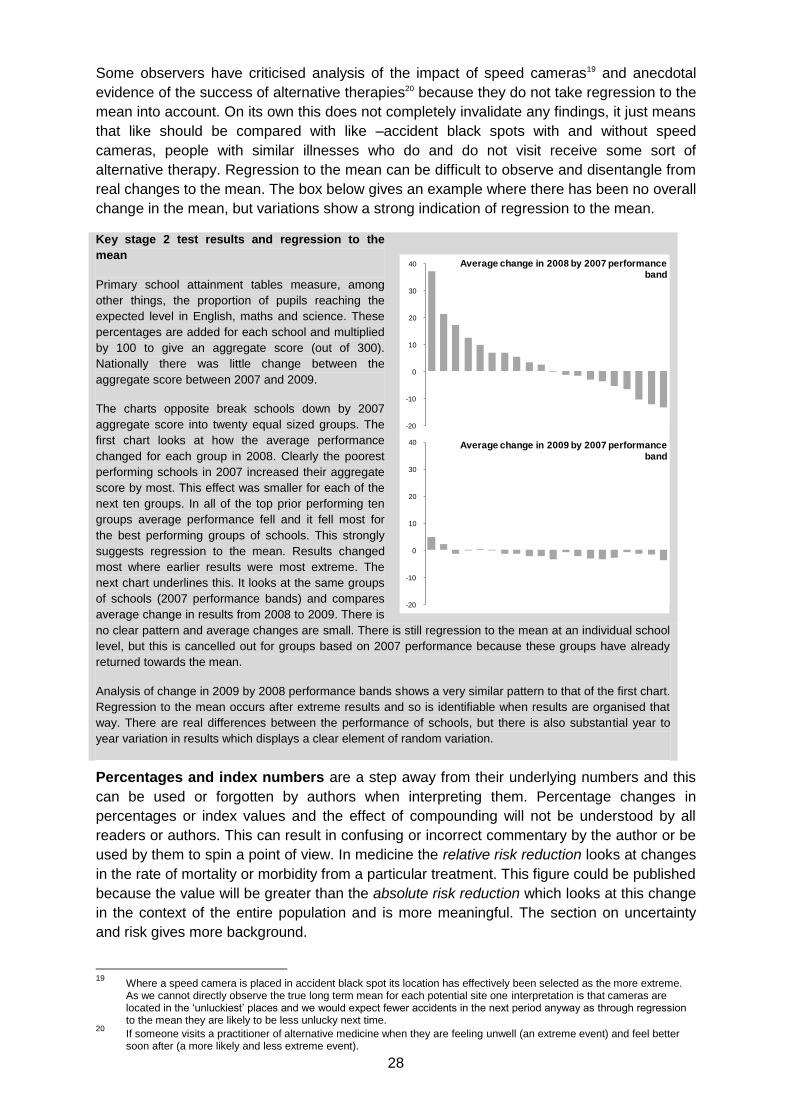
28
Some observers have criticised analysis of the impact of speed cameras19 and anecdotal
evidence of the success of alternative therapies20 because they do not take regression to the
mean into account. On its own this does not completely invalidate any findings, it just means
that like should be compared with like –accident black spots with and without speed
cameras, people with similar illnesses who do and do not visit receive some sort of
alternative therapy. Regression to the mean can be difficult to observe and disentangle from
real changes to the mean. The box below gives an example where there has been no overall
change in the mean, but variations show a strong indication of regression to the mean.
Key stage 2 test results and regression to the
mean
Primary school attainment tables measure, among
other things, the proportion of pupils reaching the
expected level in English, maths and science. These
percentages are added for each school and multiplied
by 100 to give an aggregate score (out of 300).
Nationally there was little change between the
aggregate score between 2007 and 2009.
The charts opposite break schools down by 2007
aggregate score into twenty equal sized groups. The
first chart looks at how the average performance
changed for each group in 2008. Clearly the poorest
performing schools in 2007 increased their aggregate
score by most. This effect was smaller for each of the
next ten groups. In all of the top prior performing ten
groups average performance fell and it fell most for
the best performing groups of schools. This strongly
suggests regression to the mean. Results changed
most where earlier results were most extreme. The
next chart underlines this. It looks at the same groups
of schools (2007 performance bands) and compares
average change in results from 2008 to 2009. There is
no clear pattern and average changes are small. There is still regression to the mean at an individual school
level, but this is cancelled out for groups based on 2007 performance because these groups have already
returned towards the mean.
Analysis of change in 2009 by 2008 performance bands shows a very similar pattern to that of the first chart.
Regression to the mean occurs after extreme results and so is identifiable when results are organised that
way. There are real differences between the performance of schools, but there is also substantial year to
year variation in results which displays a clear element of random variation.
Percentages and index numbers are a step away from their underlying numbers and this
can be used or forgotten by authors when interpreting them. Percentage changes in
percentages or index values and the effect of compounding will not be understood by all
readers or authors. This can result in confusing or incorrect commentary by the author or be
used by them to spin a point of view. In medicine the relative risk reduction looks at changes
in the rate of mortality or morbidity from a particular treatment. This figure could be published
because the value will be greater than the absolute risk reduction which looks at this change
in the context of the entire population and is more meaningful. The section on uncertainty
and risk gives more background.
19
Where a speed camera is placed in accident black spot its location has effectively been selected as the more extreme. As we cannot directly observe the true long term mean for each potential site one interpretation is that cameras are located in the ‘unluckiest’ places and we would expect fewer accidents in the next period anyway as through regression to the mean they are likely to be less unlucky next time.
20 If someone visits a practitioner of alternative medicine when they are feeling unwell (an extreme event) and feel better
soon after (a more likely and less extreme event).
-20
-10
0
10
20
30
40 Average change in 2009 by 2007 performance band
-20
-10
0
10
20
30
40 Average change in 2008 by 2007 performance band
29
The choice of base year for percentage change figures will affect the size of the numbers
involved. For instance, “this year’s imports are 100% greater than last year” and “last year’s
imports were 50% less than those for this year” mean exactly the same thing. The same
process can be used in index numbers to affect the change in index values. The sections on
index numbers and percentages give more background.
Statistics on money are particularly prone to spinning or misuse. Underlying changes over
time can be used or ignored selectively to give the author a more persuasive figure. Any
comparison of values in different time periods should be converted to a common price base
or real prices. Without this then any difference will be the result of underlying inflation as well
as the ‘real’ difference. The section on how to adjust for inflation gives some practical advice
on compiling a real terms price series and highlights some of the potential confusion
between falling levels of inflation and falling prices. This confusion was common in late 2008
and early 2009 when inflation was falling, but still positive and there was a general
expectation that inflation would soon turn negative and hence prices would actually fall. It is
important to remember that prices are falling if and only if inflation is negative.
Converting a financial time series to real prices may not give a complete picture on its own. If
it is funding for a specific service where the underlying demand is expected to change, then
a rate based on an indicator of that demand will give a more complete picture. For instance
“Funding is set to increase by 40% in real terms by 2010, this means expenditure can rise
from £100 per head to £140”.
Where the money covers a period of more than one year then a lack of clarity about the
actual values for individual years and the start and end point used to calculate headline
changes can leave room for ambiguity or spinning. For instance the phrase “there will be a
cash increase of £6 billion over the period 2005 to 2008”, could mean the 2008 level will be
£6 billion more than in 2005. It could also mean that the sum of annual increases compared
to 2005 is £6 billion (£1 billion in year 1, £2 billion in year 2 and £3 billion in year 3). In this
latter case the 2008 figure is £3 billion less.
Tips on how spot spinning or misuse of statistics
The list below gives a range of ways for the reader to help themselves to identify spin or
inappropriate use, or cases where a doubt remains that can only be answered by looking at
the underlying data.
General questions to ask yourself:
What product or point of view is the author trying to ‘sell’?
Are there any statistics or background that is obviously missing?
Do the author’s conclusions logically follow from the statistics?
Are comparisons made like-for-like?
If there is any doubt about the original source of the statistic –Who created them and how, why and when were they created?
If a really simplified version is needed then try:
Compared to what? Since when? Says who?
More specific points to look out for
Statistics without any context, background or comparisons
Totals without rates or without any comparators
Percentages without any absolute values
A case that is made without any consideration of contrary or inconclusive evidence
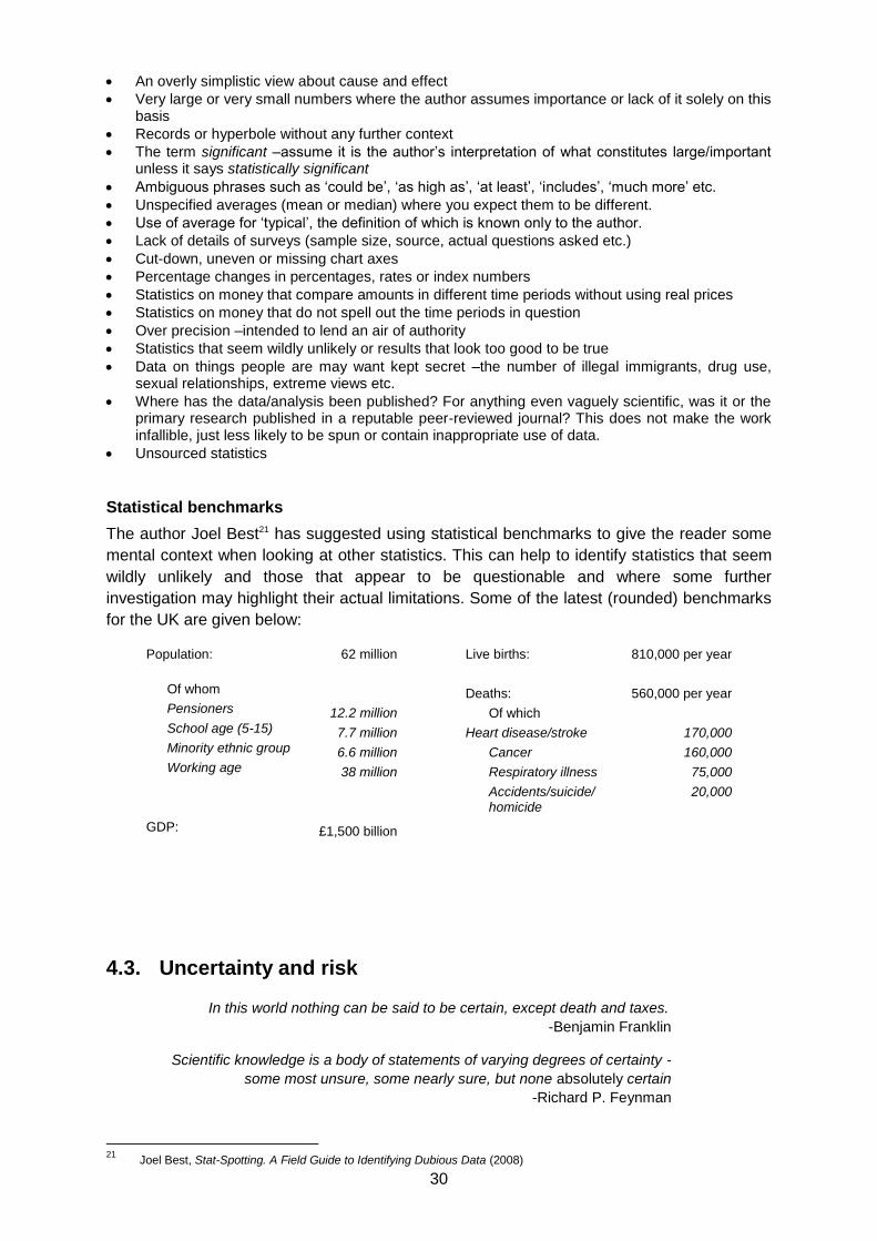
30
An overly simplistic view about cause and effect
Very large or very small numbers where the author assumes importance or lack of it solely on this basis
Records or hyperbole without any further context
The term significant –assume it is the author’s interpretation of what constitutes large/important unless it says statistically significant
Ambiguous phrases such as ‘could be’, ‘as high as’, ‘at least’, ‘includes’, ‘much more’ etc.
Unspecified averages (mean or median) where you expect them to be different.
Use of average for ‘typical’, the definition of which is known only to the author.
Lack of details of surveys (sample size, source, actual questions asked etc.)
Cut-down, uneven or missing chart axes
Percentage changes in percentages, rates or index numbers
Statistics on money that compare amounts in different time periods without using real prices
Statistics on money that do not spell out the time periods in question
Over precision –intended to lend an air of authority
Statistics that seem wildly unlikely or results that look too good to be true
Data on things people are may want kept secret –the number of illegal immigrants, drug use, sexual relationships, extreme views etc.
Where has the data/analysis been published? For anything even vaguely scientific, was it or the primary research published in a reputable peer-reviewed journal? This does not make the work infallible, just less likely to be spun or contain inappropriate use of data.
Unsourced statistics
Statistical benchmarks
The author Joel Best21 has suggested using statistical benchmarks to give the reader some
mental context when looking at other statistics. This can help to identify statistics that seem
wildly unlikely and those that appear to be questionable and where some further
investigation may highlight their actual limitations. Some of the latest (rounded) benchmarks
for the UK are given below:
Population:
Of whom
Pensioners
School age (5-15)
Minority ethnic group
Working age
GDP:
62 million
12.2 million
7.7 million
6.6 million
38 million
£1,500 billion
Live births:
Deaths:
Of which
Heart disease/stroke
Cancer
Respiratory illness
Accidents/suicide/ homicide
810,000 per year
560,000 per year
170,000
160,000
75,000
20,000
4.3. Uncertainty and risk
In this world nothing can be said to be certain, except death and taxes.
-Benjamin Franklin
Scientific knowledge is a body of statements of varying degrees of certainty -
some most unsure, some nearly sure, but none absolutely certain
-Richard P. Feynman
21
Joel Best, Stat-Spotting. A Field Guide to Identifying Dubious Data (2008)

31
…the greatest geniuses and greatest works have never concluded.
-Gustave Flaubert
The concepts of uncertainty and risk are key to many areas of statistics and hence statistical
literacy. Some of the other sections look at specific aspects of the measurement,
interpretation and presentation of uncertainty. This section gives a general overview of these
concepts, highlights their connection to other aspects of statistical literacy and looks at the
communication and understanding of risk.
Single events
For the purposes of this section an event or outcome is uncertain if there is a possibility that
it can or cannot happen. If there is absolutely no possibility of it happening there is no
uncertainty –it will not happen. If it is absolutely certain that it will occur there is no
uncertainty –it will happen. Some events or outcomes which are certain become uncertain if
they are further defined by time or space. For instance it is certain that someone will
eventually die, but uncertain when this will happen.
Risk is a quantified uncertainty. It may be quantified by experience or theory. It is important
not to view the term as solely connected to negative outcomes. They can be positive, neutral
or negative. For instance it is uncertain whether a set of six specific numbers will be drawn in
the Lottery in any given week. It may be highly unlikely that this one combination will come
up, but it is possible, so the outcome is uncertain. The risk of this (positive) outcome can be
quantified by theory. Assuming that the selection process is unbiased then the risk that any
one set of six numbers will be drawn from 49 is one in 14 billion for each draw. Risk is
equivalent to probability, odds, likelihood etc. but the single term is used here as defined.
Quantities and frequencies
The concept of uncertainty can also be extended from individual events to quantities and
frequencies –for instance a population projection, a project’s cost estimate or the number of
days that it will rain in the next week. Here the uncertainty is usually more obvious as the
quantity is clearly being estimated or the associated event has not yet happened. When this
uncertainty is quantified then the result is normally a maximum and minimum range or a
central estimate ± an amount or percentage. The process for quantifying this range can also
be theoretical (for instance in sample survey results) or experience (what are the previous
highest and lowest costs of each element of the project?). Some of the latter type may not
be much more than best guesses. In such cases the ranges may not prove to be accurate,
but if they are best guesses the principle is the right one and they can be improved over
time. At the very least a range acknowledges there is some uncertainty associated with the
quantity in question.
Examples where uncertainty/risk is defined
Single events
Examples of risks associated with single events are less common. The most prominent ones
are for natural events. Most weather forecasts in the UK tend not to define risks for everyday
events such as rain. Phrases such as “scattered showers” are more common than “ ..a 20%
chance of rain in this region”. However, such quantified risks are behind weather forecasts
and so-called probability forecast and forecast that give a confidence range are produced by
the Met Office for some users. The Met Office uses risk assessments for its weather
warnings. If the risk of a severe or extreme weather event is thought to be 60% or more in a
certain area in the next few days then an early warning is issued. If the risk of an imminent
severe/extreme event is estimated at 80% or more than a flash warning is issued. More
information about how the Met Office approaches uncertainty can be viewed at Using
ensemble forecasts in probability and decision-making.
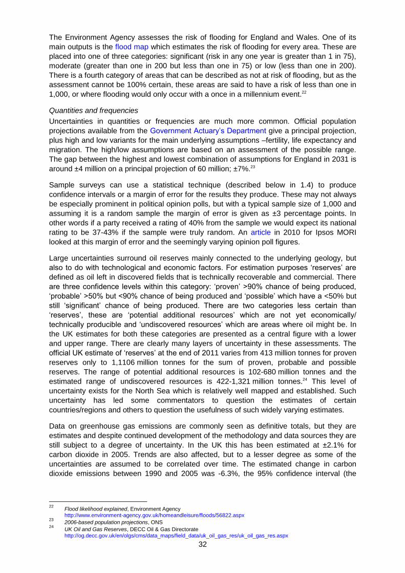
32
The Environment Agency assesses the risk of flooding for England and Wales. One of its
main outputs is the flood map which estimates the risk of flooding for every area. These are
placed into one of three categories: significant (risk in any one year is greater than 1 in 75),
moderate (greater than one in 200 but less than one in 75) or low (less than one in 200).
There is a fourth category of areas that can be described as not at risk of flooding, but as the
assessment cannot be 100% certain, these areas are said to have a risk of less than one in
1,000, or where flooding would only occur with a once in a millennium event.22
Quantities and frequencies
Uncertainties in quantities or frequencies are much more common. Official population
projections available from the Government Actuary’s Department give a principal projection,
plus high and low variants for the main underlying assumptions –fertility, life expectancy and
migration. The high/low assumptions are based on an assessment of the possible range.
The gap between the highest and lowest combination of assumptions for England in 2031 is
around ±4 million on a principal projection of 60 million; ±7%.23
Sample surveys can use a statistical technique (described below in 1.4) to produce
confidence intervals or a margin of error for the results they produce. These may not always
be especially prominent in political opinion polls, but with a typical sample size of 1,000 and
assuming it is a random sample the margin of error is given as ±3 percentage points. In
other words if a party received a rating of 40% from the sample we would expect its national
rating to be 37-43% if the sample were truly random. An article in 2010 for Ipsos MORI
looked at this margin of error and the seemingly varying opinion poll figures.
Large uncertainties surround oil reserves mainly connected to the underlying geology, but
also to do with technological and economic factors. For estimation purposes ‘reserves’ are
defined as oil left in discovered fields that is technically recoverable and commercial. There
are three confidence levels within this category: ‘proven’ >90% chance of being produced,
‘probable’ >50% but <90% chance of being produced and ‘possible’ which have a <50% but
still ‘significant’ chance of being produced. There are two categories less certain than
‘reserves’, these are ‘potential additional resources’ which are not yet economically/
technically producible and ‘undiscovered resources’ which are areas where oil might be. In
the UK estimates for both these categories are presented as a central figure with a lower
and upper range. There are clearly many layers of uncertainty in these assessments. The
official UK estimate of ‘reserves’ at the end of 2011 varies from 413 million tonnes for proven
reserves only to 1,1106 million tonnes for the sum of proven, probable and possible
reserves. The range of potential additional resources is 102-680 million tonnes and the
estimated range of undiscovered resources is 422-1,321 million tonnes.24 This level of
uncertainty exists for the North Sea which is relatively well mapped and established. Such
uncertainty has led some commentators to question the estimates of certain
countries/regions and others to question the usefulness of such widely varying estimates.
Data on greenhouse gas emissions are commonly seen as definitive totals, but they are
estimates and despite continued development of the methodology and data sources they are
still subject to a degree of uncertainty. In the UK this has been estimated at ±2.1% for
carbon dioxide in 2005. Trends are also affected, but to a lesser degree as some of the
uncertainties are assumed to be correlated over time. The estimated change in carbon
dioxide emissions between 1990 and 2005 was -6.3%, the 95% confidence interval (the
22
Flood likelihood explained, Environment Agency http://www.environment-agency.gov.uk/homeandleisure/floods/56822.aspx 23
2006-based population projections, ONS 24
UK Oil and Gas Reserves, DECC Oil & Gas Directorate http://og.decc.gov.uk/en/olgs/cms/data_maps/field_data/uk_oil_gas_res/uk_oil_gas_res.aspx
33
range within which we can be reasonably confident that the ‘true’ value lies) was -3.7% to
-8.9%. Ranges are larger still for other greenhouse gases25
The concept of uncertainty
Using the definitions set out above it should become clear that very few events in our daily
lives are truly 100% certain. This does not mean they are completely random, or that we
know nothing about the risk of them happening, only that we cannot be entirely sure.
Accepting that there is some uncertainty involved is a necessary first step in investigating the
associated risk and considering alternative possible outcomes. Psychologist Gerd
Gigerenzer has called the belief that an event is absolutely certain (even if it is not) the
‘illusion of certainty’.26 He has cited this as one of the causes of innumeracy. Such an
outlook leaves no room for considering alternative possibilities or how likely they are and is
associated with an overly simplistic in view of causes and consequences.
It is understandable that people should want certainty and predictability. Economists assume
that most people are risk averse and are happy to pay a premium for certainty, hence the
existence of the insurance industry. In the long run with insurance companies making profits
people will on average be worse off financially than without any insurance but people's
decisions are made about individual preferences, generally with a shorter time horizon in
mind and they value the 'certainty' they gain from insurance.
If one tends to view most events as certain/wholly predictable then estimates given as
ranges which acknowledge uncertainty could be viewed as overly complex, pedantic, too
vague or just wrong. A typical response might be ‘we must know the true answer.’ An
appreciation of the concept of uncertainty lends itself to an appreciation that many everyday
events are complex and can have an element of randomness. There are some things that
we do not know for any number of reasons (it is too early to tell, little or no research has
taken place, the event is in the future etc.). The quote at the start of this section about the
uncertainties in science refers to natural and physical sciences –so called ‘hard’ science.
Uncertainties in social sciences and hence our daily lives are greater because they deal with
complex human behaviour, motivations and interactions which do not naturally lead to
simple definitive conclusions or rules.
There is an analogy when thinking about the causes of many events or their outcomes. We
are seldom 100% certain that there is a single cause of an event, or single certain outcome
from it. Causes and consequences are frequently complex and multifaceted and an
approach which outlines the possible ‘candidates’ and quantifies their relative importance
can help to address this.
One response to this uncertainty would be to say that nothing can be concluded unless you
can come up with definitive unambiguous answers with 100% certainty. This absolutist
approach would rule many activities including out all or most social science, much medicine,
insurance, many criminal prosecutions, weather forecasting etc. An approach that takes
uncertainty and complexity into account may not come up with such superficially appealing
conclusions or any definitive conclusions at all. The result of this approach should be
‘approximately right’. The estimated range may be deemed too large and it is nearly always
possible to improve the estimates and quantified risks, but the alternatives are saying
nothing in these important areas or being ‘exactly wrong’.
25
UK Greenhouse Gas Inventory, 1990 to 2005: Annual Report for submission under the Framework Convention on Climate Change, NETCEN. Annex 7
26 Reckoning with risk –learning to live with uncertainty, Gerd Gigerenzer
34
Statistical concepts and uncertainty
Given the lack of absolutes much of statistics aims to quantify exactly how likely an event is
given certain underlying assumptions about the factors involved. Key to this is an
understanding that some results could be the result of random variation. Significance
testing is used to establish how likely it is that a set of statistical results occurred by chance
and hence whether there is a relationship between the variables and if so how strong it is.
Various methods can be used to measure this strength and hence quantify the uncertainty
surrounding the results.
In statistics, a result is significant if it is unlikely to have occurred by chance. The most
common significance level, or decision rule, to judge the test results is 0.05 or 5%. If this is
met then the statistical finding that there is a relationship has at least a 95% chance (or risk)
of being true and there is a 5% (or less) chance/risk that it is false. In the terms used earlier,
the risk that we are wrong when we conclude that there is a relationship between the
variables at this level is 5% or less.
The actual probability will be calculated in a statistical test and it is this that determines the
level of certainty/robustness of the findings. This is compared to the significance level being
used. Sometimes smaller significance levels are used to show that findings are even more
robust and less likely to be due to chance. Consequently, a result which is "significant at the
1% level" is regarded as more robust than a result which is "significant at the 5% level".
More detail is given in the section on Confidence intervals and statistical significance.
Confidence intervals are closely connected to significance testing. They are a standard
way of expressing the statistical accuracy or uncertainty of a survey-based estimate.
Confidence intervals normally take a survey or sample based estimate and, based on
assumptions or knowledge about the size/variability of the entire population, give a range for
the ‘true’ value in the entire population. If an estimate has a high error level, the degree of
uncertainty is greater, the confidence interval will be wide and we can have less confidence
that the survey results describe the situation among the whole population.
The most commonly used confidence interval is 95%. If a 95% confidence level is reported
then we can be reasonably confident that ‘true’ value from the whole population lies within
this range. Formally, if the sample survey was repeated the ‘true’ value for the whole
population would fall within the corresponding confidence intervals 95% of the time. Again
more detail is given in the section on Confidence intervals and statistical significance.
Communication and understanding of risk
Different ways of presenting and communicating of risk can alter how the same underlying
data is perceived. None of the various alternatives are technically wrong, but their full
meaning may only be understood by those with a thorough understanding of probability
theory and an idea of the underlying data. Gigerenzer says that both the miscommunication
of risk and the inability to draw conclusions or inferences from known risks are elements of
innumeracy -‘the inability to reason about uncertainties and risk’.27 He sets out methods to
help better communicate and understand relative risks and conditional probability.
Relative risks
Comparing two or more risks -whether they are entirely different events, the risk of at various
periods in time or the risk of an event before and after some other event has occurred- is
normally communicated by relative risks. In medicine, for instance, a common relative risk
would be the reduction in death rates from a certain disease after taking a particular drug. So
27
ibid.
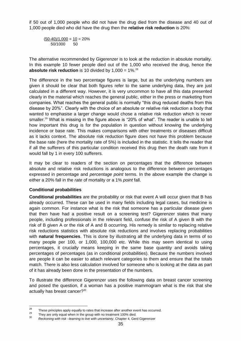
35
if 50 out of 1,000 people who did not have the drug died from the disease and 40 out of
1,000 people died who did have the drug then the relative risk reduction is 20%:
(50-40)/1,000 = 10 = 20%
50/1000 50
The alternative recommended by Gigerenzer is to look at the reduction in absolute mortality.
In this example 10 fewer people died out of the 1,000 who received the drug, hence the
absolute risk reduction is 10 divided by 1,000 = 1%.28
The difference in the two percentage figures is large, but as the underlying numbers are
given it should be clear that both figures refer to the same underlying data, they are just
calculated in a different way. However, it is very uncommon to have all this data presented
clearly in the material which reaches the general public, either in the press or marketing from
companies. What reaches the general public is normally “this drug reduced deaths from this
disease by 20%”. Clearly with the choice of an absolute or relative risk reduction a body that
wanted to emphasise a larger change would chose a relative risk reduction which is never
smaller.29 What is missing in the figure above is “20% of what”. The reader is unable to tell
how important this drug is for the population in question without knowing the underlying
incidence or base rate. This makes comparisons with other treatments or diseases difficult
as it lacks context. The absolute risk reduction figure does not have this problem because
the base rate (here the mortality rate of 5%) is included in the statistic. It tells the reader that
if all the sufferers of this particular condition received this drug then the death rate from it
would fall by 1 in every 100 sufferers.
It may be clear to readers of the section on percentages that the difference between
absolute and relative risk reductions is analogous to the difference between percentages
expressed in percentage and percentage point terms. In the above example the change is
either a 20% fall in the rate of mortality or a 1% point fall.
Conditional probabilities
Conditional probabilities are the probability or risk that event A will occur given that B has
already occurred. These can be used in many fields including legal cases, but medicine is
again common. For instance what is the risk that someone has a particular disease given
that then have had a positive result on a screening test? Gigerenzer states that many
people, including professionals in the relevant field, confuse the risk of A given B with the
risk of B given A or the risk of A and B occurring. His remedy is similar to replacing relative
risk reductions statistics with absolute risk reductions and involves replacing probabilities
with natural frequencies. This is done by illustrating all the underlying data in terms of so
many people per 100, or 1,000, 100,000 etc. While this may seem identical to using
percentages, it crucially means keeping in the same base quantity and avoids taking
percentages of percentages (as in conditional probabilities). Because the numbers involved
are people it can be easier to attach relevant categories to them and ensure that the totals
match. There is also less calculation involved for someone who is looking at the data as part
of it has already been done in the presentation of the numbers.
To illustrate the difference Gigerenzer uses the following data on breast cancer screening
and posed the question, if a woman has a positive mammogram what is the risk that she
actually has breast cancer?30
28
These principles apply equally to rates that increase after another event has occurred. 29
They are only equal when in the group with no treatment 100% died. 30
Reckoning with risk –learning to live with uncertainty, Chapter 4, Gerd Gigerenzer
36
Conditional probabilities
Breast cancer affects 0.8% of the age group
in question. If a woman has breast cancer
the probability is 90% that she will have had
a positive mammogram. If a woman does
not have breast cancer there is a 7%
probability that she will have had a positive
mammogram
Natural frequencies
Eight out of every 1,000 women in this age
group have breast cancer. Seven of these
eight will have had a positive mammogram.
70 of the remaining 992 without breast
cancer would still have had a positive
mammogram
When this question was put to physicians a clear majority overestimated the risk from the
conditional probability data, seemingly confusing the risk of having cancer given a positive
mammogram with the risk of having a positive mammogram given they have cancer. A clear
majority gave an answer that was right or very close after reading the same data expressed
in natural frequencies. All the natural frequency data requires is to select the appropriate
categories, here seven women who had breast cancer and a positive mammogram divided
by the total number of positive test results (70+7), which equals 9.1%. With conditional
probabilities fundamentally the same calculation has to be made in more steps as the base
rate (here 8%) needs to be put back into the question. The method in this case is:
The probability of having cancer and having a positive test given they have cancer
divided by the probability of having cancer and having a positive test given they have
cancer plus the probability of not having cancer and having a positive test given they
do not have cancer.
These steps are far from intuitive and need the correct percentage to be selected at each
stage. Conditional probabilities connected to screening tests in medicine are frequently
termed sensitivity and specificity. Sensitivity is the proportion of people who have the
disease who received a positive screening test result (90% in the example above).
Specificity is the proportion of people who did not have the disease and received a negative
screening result (93%) in the example above. Sensitivity is the true positive rate, specificity
the true negative rate. False positives (7% above) add up to 100% with specificity. False
negatives (10% above) add up to 100% with sensitivity. For a given test there is normally a
trade-off between sensitivity and specificity.
Using absolute risk reduction figures and natural frequencies rather than conditional
probabilities are both ways to better understand the risks in question and for people to make
informed decisions. For instance, in comparing different treatments, weighing the potential
benefits of a treatment against its costs (physical and financial) and in how professionals
communicate the implication of test results to patients. In each case there are uncertainties
involved and improved communication around the related risks and possible alternatives
means people are not only better informed, but they are better able to draw conclusions from
this information.
5. Introduction to more advanced statistical concepts
5.1. Confidence intervals and statistical significance
This section outlines the related concepts of confidence intervals and statistical significance
and gives examples of the standard way that both are calculated or tested.
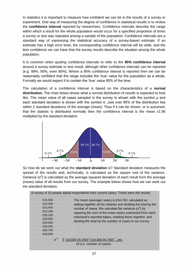
37
In statistics it is important to measure how confident we can be in the results of a survey or
experiment. One way of measuring the degree of confidence in statistical results is to review
the confidence interval reported by researchers. Confidence intervals describe the range
within which a result for the whole population would occur for a specified proportion of times
a survey or test was repeated among a sample of the population. Confidence intervals are a
standard way of expressing the statistical accuracy of a survey-based estimate. If an
estimate has a high error level, the corresponding confidence interval will be wide, and the
less confidence we can have that the survey results describe the situation among the whole
population.
It is common when quoting confidence intervals to refer to the 95% confidence interval
around a survey estimate or test result, although other confidence intervals can be reported
(e.g. 99%, 90%, even 80%). Where a 95% confidence interval is reported then we can be
reasonably confident that the range includes the ‘true’ value for the population as a whole.
Formally we would expect it to contain the ‘true’ value 95% of the time.
The calculation of a confidence interval is based on the characteristics of a normal
distribution. The chart below shows what a normal distribution of results is expected to look
like. The mean value of all cases sampled in the survey is shown with the symbol μ and
each standard deviation is shown with the symbol σ. Just over 95% of the distribution lies
within 2 standard deviations of the average (mean). Thus if it can be shown, or is assumed,
that the statistic is distributed normally then the confidence interval is the mean ±1.96
multiplied by the standard deviation.
So how do we work out what the standard deviation is? Standard deviation measures the
spread of the results and, technically, is calculated as the square root of the variance.
Variance (σ2) is calculated as the average squared deviation of each result from the average
(mean) value of all results from our survey. The example below shows how we can work out
the standard deviation.
A survey of 10 people asked respondents their current salary. These were the results:
£16,500
£19,300
£25,400
£23,200
£35,100
£46,000
£29,000
£38,200
£65,700
£49,200
The mean (average) salary is £34,760, calculated as
adding together all the salaries and dividing the total by the
number of cases. We calculate the variance (σ2) by
squaring the sum of the mean salary subtracted from each
individual’s reported salary, totalling these together, and
dividing the total by the number of cases in our survey.
σ2 =
∑ (16,500-34,760)2+(19,300-34,760)
2 ...etc.
10 (i.e. number of cases)
38
Otherwise, £2,130,944,000 divided by 10. The variance value is £213,094,400
The standard deviation is calculated as the square root of the variance, hence
√ £213,094,000, or £14,598
Where survey or test results are based on a larger sample size or results are less variable
then the confidence interval will be smaller, other things equal.
In everyday language we often use the term "significant" to mean important and this
normally involves some judgement relevant to the field of study (here substantive
significance). However, in statistical terminology "significant" means probably true and
probably not due to a chance occurrence (statistical significance). A finding may be
statistically significant without being important or substantively significant. For instance in
very large samples it is common to discover many statistically significant findings where the
sizes of the effects are so small that they are meaningless or trivial.
Significance testing is normally used to establish whether a set of statistical results are
likely to have occurred by chance. This may be to test whether the difference between two
averages (mortality for pill 1 v mortality for pill 2) is ‘real’ or whether there a relationship
between two or more variables. In the latter case these relationships are often expressed in
terms of the dependent variable and one or more independent variables. The dependent
variable is the variable against which certain effects are measured. The independent
variables are those that are being tested to see what extent, if any, they have on the
dependent variable. For example, we may wish to test how media coverage of political
parties and electors’ past voting records determine an individual’s likelihood to vote for any
one political party. In this case, media coverage and past voting record are the independent
variables, and their effect would be measured in terms of the dependent variable, in this
case reported voting intention at the next general election.
The key to most significance testing is to establish the extent to which the null hypothesis
is believed to be true. The null hypothesis refers to any hypothesis to be nullified and
normally presumes chance results only –no difference in averages or no correlation between
variables. For example, if we undertook a study of the effects of consuming alcohol on the
ability to drive a car by asking a sample of people to perform basic driving skills while under
the influence of large quantities of alcohol, the null hypothesis would be that consuming
alcohol has no effect on an individual’s ability to drive.
In statistics, a result is said to be statistically significant if it is unlikely to have occurred by
chance. In such cases, the null hypothesis cannot be shown to be true. The most common
significance level to show that a finding is good enough to be believed is 0.05 or 5%. This
means that there is a 5% chance of the observed data (or more extreme data) occurring
given that the null hypothesis is true. Where findings meet this criterion it is normally inferred
that the null hypothesis is false. While the 5% level is standard level used across most social
sciences, the 1% level (p<0.01) is also fairly common.
When a null hypothesis is rejected, but it is actually true, a so-called type I error has
occurred. In most cases this means that there is no correlation between the variables, but
the test indicates that there is. Much null hypothesis testing is aimed at reducing the
possibility of a type I error by reducing the p value and testing against a lower significance
level. The aim of this is to reduce the possibility of falsely claiming some connection; a ‘false
positive’ finding.
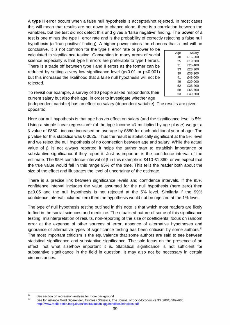
39
A type II error occurs when a false null hypothesis is accepted/not rejected. In most cases
this will mean that results are not down to chance alone, there is a correlation between the
variables, but the test did not detect this and gives a ‘false negative’ finding. The power of a
test is one minus the type II error rate and is the probability of correctly rejecting a false null
hypothesis (a ‘true positive’ finding). A higher power raises the chances that a test will be
conclusive. It is not common for the type II error rate or power to be
calculated in significance testing. Convention in many areas of social
science especially is that type II errors are preferable to type I errors.
There is a trade off between type I and II errors as the former can be
reduced by setting a very low significance level (p<0.01 or p<0.001)
but this increases the likelihood that a false null hypothesis will not be
rejected.
To revisit our example, a survey of 10 people asked respondents their
current salary but also their age, in order to investigate whether age
(independent variable) has an effect on salary (dependent variable). The results are given
opposite:
Here our null hypothesis is that age has no effect on salary (and the significance level is 5%.
Using a simple linear regression31 (of the type Income = multiplied by age plus ) we get a
value of £880 –income increased on average by £880 for each additional year of age. The
p value for this statistics was 0.0025. Thus the result is statistically significant at the 5% level
and we reject the null hypothesis of no connection between age and salary. While the actual
value of is not always reported it helps the author start to establish importance or
substantive significance if they report it. Just as important is the confidence interval of the
estimate. The 95% confidence interval of in this example is £410-£1,360, or we expect that
the true value would fall in this range 95% of the time. This tells the reader both about the
size of the effect and illustrates the level of uncertainty of the estimate.
There is a precise link between significance levels and confidence intervals. If the 95%
confidence interval includes the value assumed for the null hypothesis (here zero) then
p0.05 and the null hypothesis is not rejected at the 5% level. Similarly if the 99%
confidence interval included zero then the hypothesis would not be rejected at the 1% level.
The type of null hypothesis testing outlined in this note is that which most readers are likely
to find in the social sciences and medicine. The ritualised nature of some of this significance
testing, misinterpretation of results, non-reporting of the size of coefficients, focus on random
error at the expense of other sources of error, absence of alternative hypotheses and
ignorance of alternative types of significance testing has been criticism by some authors.32
The most important criticism is the equivalence that some authors are said to see between
statistical significance and substantive significance. The sole focus on the presence of an
effect, not what size/how important it is. Statistical significance is not sufficient for
substantive significance in the field in question. It may also not be necessary in certain
circumstances.
31
See section on regression analysis for more background 32
See for instance Gerd Gigerenzer, Mindless Statistics, The Journal of Socio-Economics 33 (2004) 587–606. http://www.mpib-berlin.mpg.de/en/institut/dok/full/gg/mindless/mindless.pdf
Age Salary
18 £16,500
25 £19,300
31 £25,400
33 £23,200
39 £35,100
41 £46,000
49 £29,000
52 £38,200
58 £65,700
63 £49,200
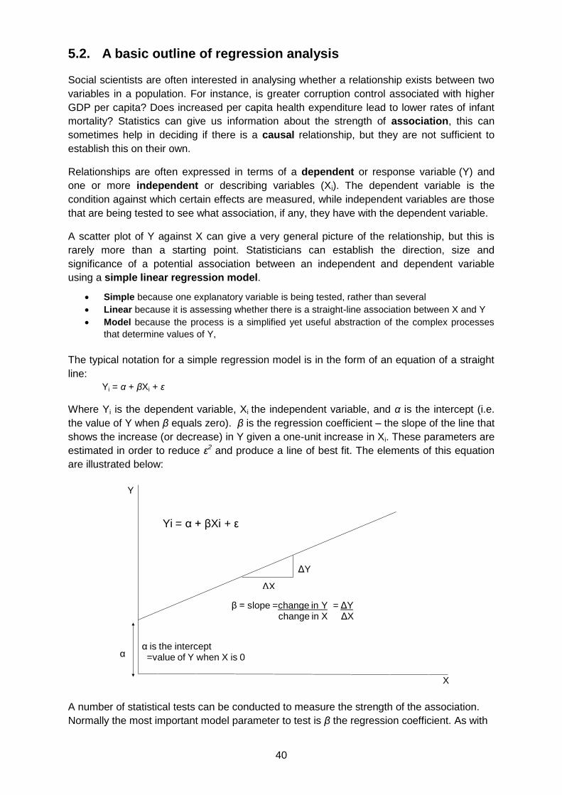
40
5.2. A basic outline of regression analysis
Social scientists are often interested in analysing whether a relationship exists between two
variables in a population. For instance, is greater corruption control associated with higher
GDP per capita? Does increased per capita health expenditure lead to lower rates of infant
mortality? Statistics can give us information about the strength of association, this can
sometimes help in deciding if there is a causal relationship, but they are not sufficient to
establish this on their own.
Relationships are often expressed in terms of a dependent or response variable (Y) and
one or more independent or describing variables (Xi). The dependent variable is the
condition against which certain effects are measured, while independent variables are those
that are being tested to see what association, if any, they have with the dependent variable.
A scatter plot of Y against X can give a very general picture of the relationship, but this is
rarely more than a starting point. Statisticians can establish the direction, size and
significance of a potential association between an independent and dependent variable
using a simple linear regression model.
Simple because one explanatory variable is being tested, rather than several
Linear because it is assessing whether there is a straight-line association between X and Y
Model because the process is a simplified yet useful abstraction of the complex processes
that determine values of Y,
The typical notation for a simple regression model is in the form of an equation of a straight
line:
Yi = α + βXi + ε
Where Yi is the dependent variable, Xi the independent variable, and α is the intercept (i.e.
the value of Y when β equals zero). β is the regression coefficient – the slope of the line that
shows the increase (or decrease) in Y given a one-unit increase in Xi. These parameters are
estimated in order to reduce ε2 and produce a line of best fit. The elements of this equation
are illustrated below:
A number of statistical tests can be conducted to measure the strength of the association.
Normally the most important model parameter to test is β the regression coefficient. As with
Y
X
Yi = α + βXi + ε
α
β = slope =change in Y = ΔYchange in X ΔX
ΔY
ΔX
α is the intercept=value of Y when X is 0

41
the section on confidence intervals and statistical significance, the starting point is
hypothesis testing.
Hypothesis:
H0 : β = 0 There is no (linear) association between X & Y in the population
Ha : β ≠ 0 There is some (linear) association between X & Y in the population
When a researcher rejects the null hypothesis, what is being said is that probability of
observing a test statistic as large as that observed in the standard test statistic - with the null
hypothesis being true - is so small enough that the researcher feels confident enough to
reject it. This probability (often known as a significance level) is often 0.05, or 0.1, but can be
as low as 0.01 (in medical trials).
The Pearson product moment correlation coefficient (or simply the correlation coefficient)
is not a model parameter, but a measure of the strength of the association between the two
variables. The correlation coefficient is denoted r and can take values from -1 to 1. A positive
figure indicates a positive correlation –an upward sloping line of best fit, and vice versa. If
r=0 then there is a complete lack of linear correlation. In practice such extreme results are
unlikely and the general rule is that values closer to +1 or -1 indicate a stronger association.
Some examples are illustrated below.
R2, sometimes known as the coefficient of determination, measures the proportion of the
variance in Y that is explained by X. It has no sign, so values closer to 1 indicate a closer
association –that X is better at predicting Y. R2 is sometimes given as the sole or most
important measure of the association between X and Y and hence the usefulness of the
model. However, a model that has a high R2 is not likely to be useful if we cannot reject the
null hypothesis β = 0. The interpretation of a particular value of R2 is not purely statistical. A
high value does not necessarily means that X causes Y or than it is a meaningful
explanation of Y. It depends on the nature of the variables being looked at. Associations in
the social sciences tend to have smaller R2 values than those in the physical sciences as
they are dealing with human factors that often involve more unexplained variation. The R2
value is not a measure of how well the model fits and a useful model can have a low value.33
33
Austin Bradford Hill, The Environment and Disease: Association or Causation?, Proceedings of the Royal Society of Medicine, 58 (1965), 295-300. Reproduced at: http://www.edwardtufte.com/tufte/hill
r=1 r=-1 r=0.8 r=-0.8 r=0
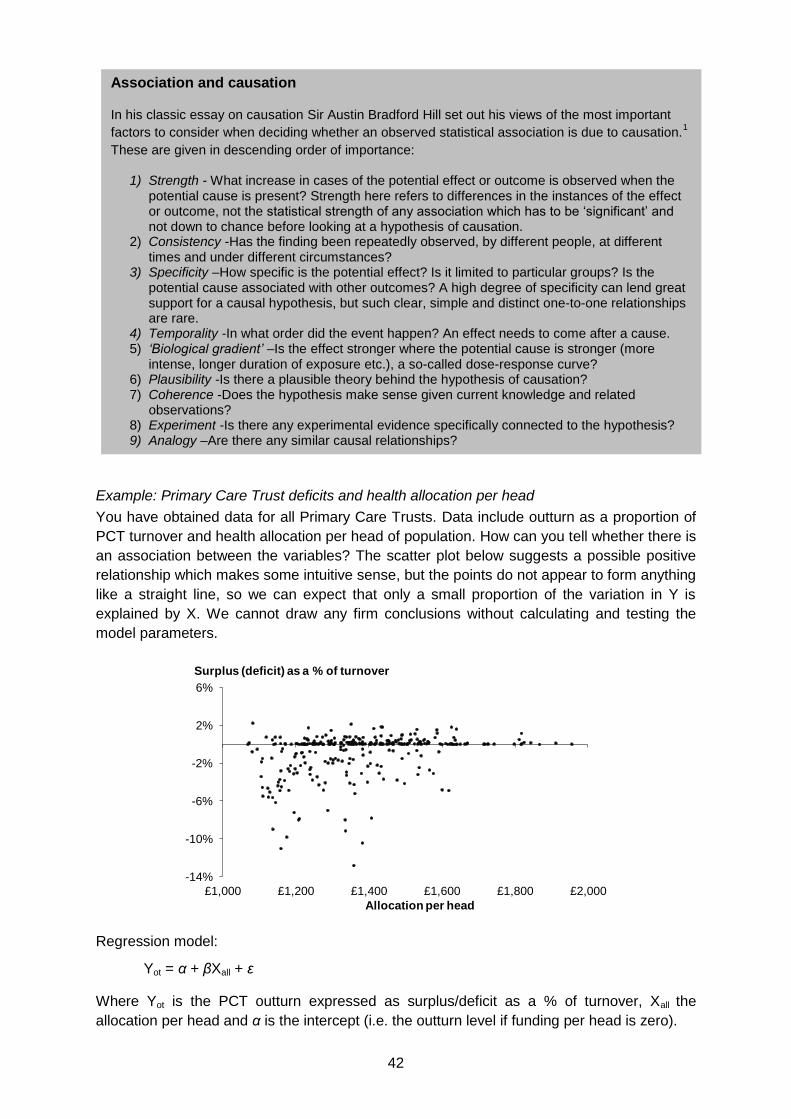
42
Example: Primary Care Trust deficits and health allocation per head
You have obtained data for all Primary Care Trusts. Data include outturn as a proportion of
PCT turnover and health allocation per head of population. How can you tell whether there is
an association between the variables? The scatter plot below suggests a possible positive
relationship which makes some intuitive sense, but the points do not appear to form anything
like a straight line, so we can expect that only a small proportion of the variation in Y is
explained by X. We cannot draw any firm conclusions without calculating and testing the
model parameters.
Regression model:
Yot = α + βXall + ε
Where Yot is the PCT outturn expressed as surplus/deficit as a % of turnover, Xall the
allocation per head and α is the intercept (i.e. the outturn level if funding per head is zero).
-14%
-10%
-6%
-2%
2%
6%
£1,000 £1,200 £1,400 £1,600 £1,800 £2,000
Allocation per head
Surplus (deficit) as a % of turnover
Association and causation
In his classic essay on causation Sir Austin Bradford Hill set out his views of the most important
factors to consider when deciding whether an observed statistical association is due to causation.1
These are given in descending order of importance:
1) Strength - What increase in cases of the potential effect or outcome is observed when the potential cause is present? Strength here refers to differences in the instances of the effect or outcome, not the statistical strength of any association which has to be ‘significant’ and not down to chance before looking at a hypothesis of causation.
2) Consistency -Has the finding been repeatedly observed, by different people, at different times and under different circumstances?
3) Specificity –How specific is the potential effect? Is it limited to particular groups? Is the potential cause associated with other outcomes? A high degree of specificity can lend great support for a causal hypothesis, but such clear, simple and distinct one-to-one relationships are rare.
4) Temporality -In what order did the event happen? An effect needs to come after a cause. 5) ‘Biological gradient’ –Is the effect stronger where the potential cause is stronger (more
intense, longer duration of exposure etc.), a so-called dose-response curve? 6) Plausibility -Is there a plausible theory behind the hypothesis of causation? 7) Coherence -Does the hypothesis make sense given current knowledge and related
observations? 8) Experiment -Is there any experimental evidence specifically connected to the hypothesis? 9) Analogy –Are there any similar causal relationships?
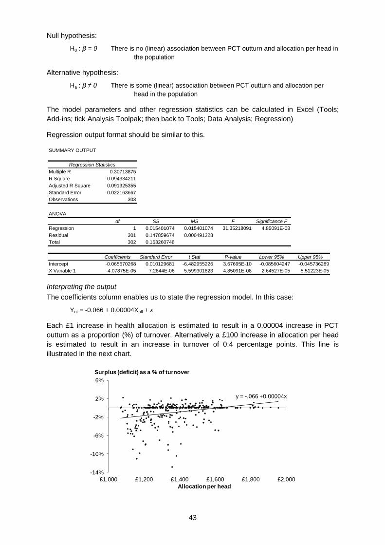
43
Null hypothesis:
H0 : β = 0 There is no (linear) association between PCT outturn and allocation per head in
the population
Alternative hypothesis:
Ha : β ≠ 0 There is some (linear) association between PCT outturn and allocation per
head in the population
The model parameters and other regression statistics can be calculated in Excel (Tools;
Add-ins; tick Analysis Toolpak; then back to Tools; Data Analysis; Regression)
Regression output format should be similar to this.
Interpreting the output
The coefficients column enables us to state the regression model. In this case:
Yot = -0.066 + 0.00004Xall + ε
Each £1 increase in health allocation is estimated to result in a 0.00004 increase in PCT
outturn as a proportion (%) of turnover. Alternatively a £100 increase in allocation per head
is estimated to result in an increase in turnover of 0.4 percentage points. This line is
illustrated in the next chart.
SUMMARY OUTPUT
Regression Statistics
Multiple R 0.30713875
R Square 0.094334211
Adjusted R Square 0.091325355
Standard Error 0.022163667
Observations 303
ANOVA
df SS MS F Significance F
Regression 1 0.015401074 0.015401074 31.35218091 4.85091E-08
Residual 301 0.147859674 0.000491228
Total 302 0.163260748
Coefficients Standard Error t Stat P-value Lower 95% Upper 95%
Intercept -0.065670268 0.010129681 -6.482955226 3.67695E-10 -0.085604247 -0.045736289
X Variable 1 4.07875E-05 7.2844E-06 5.599301823 4.85091E-08 2.64527E-05 5.51223E-05
y = -.066 +0.00004x
-14%
-10%
-6%
-2%
2%
6%
£1,000 £1,200 £1,400 £1,600 £1,800 £2,000
Allocation per head
Surplus (deficit) as a % of turnover
44
The test of statistical significance is to calculate a t-statistic (given in the regression output
above). The probability (P-value) of observing a t-test statistic as high as 5.6 gives the
answer to the hypothesis test:
H0 : β = 0 is <0.001 (P=0.0000005)
The probability that there is no linear association is extremely low so we can therefore
reject the null hypothesis. There is therefore some linear association between PCT outturn
as a % of turnover and health allocations per head. The output shows a positive linear
association between outturn and allocation per head among the population (what we
expected before the analysis). As the P-value is so low this relationship is significant at the
5% (or even 0.1%) level of significance. The 95% confidence interval for β is also given in
the regression output; 0.000026 to 0.000055. Alternatively the confidence interval of an
increase of £100 in allocation per head is 0.26 to 0.55 percentage points.
In this case R2 equals 0.09 – suggesting that 9% of the variation in PCT outturns as a
proportion of turnover are explained by changes in allocation per head. This is a low degree
of explanation and confirms the visual interpretation of a wide spread of results around the
regression line. There is a general positive association, but allocations per head explain little
of the variance in levels of deficit. The model therefore does not help to explain much of
what is going on here and is poor at predicting levels of deficit from allocations. This might
imply that other explanatory variables could be usefully added to the model. Where more
variables are added, this is called multiple regression.
6. Links to useful resources
Statistical glossaries and technical guidance
Statistics Glossary (University of Glasgow)
Glossary of statistical terms (The Institute for Statistical Education)
Glossary of statistical terms (OECD)
HyperStat Online Glossary
Online Statistics Education Glossary
Rice Virtual Lab in Statistics
Distribution fitting
Data analysis for politics and policy
General guidance and discussion of the use of statistics
'More or Less' from the BBC/Open University
Neighbourhood Statistics - guidance of best practice in statistical presentation
Local Government Data Unit Wales - A guide to presenting data (PDF)
Local Government Data Unit Wales -A guide to survey design and analysis
The work of Edward Tufte and Graphics Press
Perceptual Edge
Juice Analytics
Understanding Uncertainty
Statistics Hell
Just Plain Data Analysis

45
NHS Choices - Behind the headlines
Statistical Assessment Services (George Mason University)
Statistical graphics
Junk Charts
Infovis.net
Excelcharts.com
Infographics news
FlowingData
Improving data visualisation for the public sector
Other
Office for National Statistics
UK Statistics Authority
RSS Get Stats Campaign
Straight Statistics
StatLit statistical literacy site
International Statistical Literacy Project