social media user experience
TRANSCRIPT

Social Media User Experience
Improving Notifications, Messages, and Alerts Sent Through Social Networks and RSS
Janelle Estes, Amy Schade, and Jakob Nielsen
WWW.NNGROUP.COM 48105 WARM SPRINGS BLVD., FREMONT CA 94539–7498 USA
Copyright © Nielsen Norman Group, All Rights Reserved. To get a copy, download from: www.nngroup.com/reports/social-media-user-experience

This report is a gift for our loyal audience of usability enthusiasts. Thank you for your support over the years. We hope this information will aid your efforts to improve user experiences for everyone. This report is free, but it is still copyrighted information that may be updated from time to time, so please don’t distribute this file or host it elsewhere. Do not link directly to the PDF file (which may be rehosted at different cloud services). Instead, we encourage you to distribute the following link to this report’s summary page on our website, in order to reduce PDF shock and to allow people to decide whether to download it themselves: www.nngroup.com/reports/social-media-user-experience
The research for this report was done in 2009, but the majority of the advice may still be applicable today, because people and principles of good design change much more slowly than computer technology does.
2 [email protected] Executive Summary

Contents
Executive Summary ....................................................................... 5
User Research ....................................................................................... 5
Business Use vs. Personal Use .............................................................. 6
Managing Streams................................................................................. 7
Posting Frequency ................................................................................. 7
Finding Companies to Follow ................................................................. 8
Changes in RSS Feed Use ...................................................................... 8
Subjective Satisfaction .......................................................................... 8
Social Messaging and RSS Usability ...................................................... 9
Research Overview ...................................................................... 10
Social Networks ........................................................................... 12
Why People Join Social Networks ........................................................ 12
Use of Social Networks ........................................................................ 13
Accessing Social Networks .................................................................. 19
Finding Companies and Organizations on Social Networks .................. 19
Choosing which Companies and Organizations to Follow .................... 24
Common Message Problems ................................................................ 27
Getting Started on Social Networks ............................................. 35
RSS (Real Simple Syndication or Rich Site Summary) ................. 36
Why People Use RSS ........................................................................... 36
Use of RSS ........................................................................................... 37
Most-Used RSS readers ....................................................................... 38
Accessing RSS ..................................................................................... 39
Learning about RSS Feeds ................................................................... 39
Choosing RSS Feeds ............................................................................ 41
© NIELSEN NORMAN GROUP WWW.NNGROUP.COM 3

Common Problems With RSS Items ..................................................... 43
Deciding Which Delivery Method to Use ...................................... 47
List of Guidelines ......................................................................... 50
Design Guidelines: Social Networks ............................................. 57
Message Content ................................................................................. 57
Message Frequency and Timing ........................................................... 89
Voice and Tone .................................................................................... 96
Engaging Followers and Facilitating Discussion ................................ 103
Profile Information and Design ......................................................... 113
Building a Following and Promoting a Social Network Presence ....... 130
Design Guidelines: RSS/News Feeds ......................................... 145
News Feed Content ........................................................................... 145
News Feed Frequency ....................................................................... 155
Promoting RSS News Feeds ............................................................... 157
Subjective Satisfaction: Message Ratings .................................. 166
Usefulness ......................................................................................... 167
Information ....................................................................................... 169
Writing .............................................................................................. 171
Trust ................................................................................................. 173
Value ................................................................................................. 175
Methodology: First Study (RSS Feeds) ....................................... 177
Methodology: Second Study (Social Networks and RSS) ........... 184
Appendix ................................................................................... 202
Acknowledgements ................................................................... 207
About the Authors ..................................................................... 208
4 [email protected] Executive Summary

Executive Summary
“Mega IA” tackles the problem of distributing your information across multiple outside websites and Internet services. It’s no small challenge: it’s hard enough to architect your own site, but when additional sites offer wider distribution, it introduces another layer of difficulty in ensuring a good user experience.
USER RESEARCH To find out how users approach corporate postings on social networks and RSS, we conducted two rounds of research:
• Round 1 was conducted three years ago and focused on RSS feeds. We tested a variety of feeds with four different RSS readers, using two different methods:
o Most sessions were conducted as traditional usability studies, often using an eyetracker to give us a detailed view of how people read RSS headings and blurbs.
o We also ran several field studies, observing users in their work environments. This gave us a more naturalistic view of how people use business-oriented RSS feeds in their daily work.
• Round 2 (the new research) included four different social networks—Facebook, Twitter, MySpace, and LinkedIn—and ran additional tests of RSS feeds. This round encompassed two studies:
o Most sessions were conducted as traditional usability studies in which participants used their own RSS readers (primarily Google Reader) for the study’s RSS segment. For both social networks and RSS feeds, we asked users to sign up for messages from a few pre-determined companies and organizations during the two weeks prior to their session. We also asked users to sign up for new companies during the test so we could observe their behavior in the moment of “following” somebody new. These lab studies gave us detailed insights into participants’ browsing and reading behaviors while accessing corporate messages.
o We also conducted diary studies in which users recorded and commented on their experiences with corporate messaging over a four-week period using their existing social networks and RSS feed readers. This approach let us examine longer-term usage patterns.
In total, our research included 73 users, with a roughly equal number of men and women. Most of the participants were in the U.S., but we also studied users in the U.K. and Australia. Participants ranged in age from 20 to 59 and had a wide range of occupations, including bank manager, database administrator, electrician, insurance broker, lawyer, office manager, pharmacist, small business owner, and teacher. In Round 2, we tested messages from more than 120 companies and organizations, the majority of which were tested by a single user who was receiving the messages outside of our study. To obtain more systematic usability information, we asked multiple users to sign up for messages from the following 42 companies, and then tested their usability:
© NIELSEN NORMAN GROUP WWW.NNGROUP.COM 5

Companies and Celebrities Government Agencies and Politicians
ABC News Adidas Amazon.com Bruce Springsteen Continental Airlines CNN Dell EMI Music Australia Fairfax Digital JetBlue Airways Microsoft Windows NBA Netflix News.com.au Pepsi Seacoast Online SkyNews STA Travel Australia The Huffington Post The New York Times The Wall Street Journal The Weather Channel Australia Ticketek TripAdvisor WBZ NewsRadio WHDH Boston WMUR-TV
Australian Government Australian Institute of Sport City of Portsmouth, NH City of Sydney Department of Health and Ageing (Australia) Kevin Rudd (Australian Prime Minister) The White House United States Consumer Product Safety Commission United States Department of Education United States Environmental Protection Agency
Non-Profit Organizations and Charities
American Cancer Society Amnesty International Australia NPR (National Public Radio) Oxfam America Royal Society for the Prevention of Cruelty to Animals (RSPCA)
BUSINESS USE VS. PERSONAL USE As the above list shows, we studied only business use of social networks and RSS. We didn’t study the overwhelmingly dominant use of these services for purely personal use, where users keep in touch with their friends and family. We did test messages from some politicians and celebrities (such as sports stars and musicians), but even though they’re individuals, they function as companies and organizations in the context of posting messages on the Internet. When Australia’s Prime Minister tweets that he’s going to Tasmania, for example, it’s not to notify his local buddies that he’s available that evening for a beer. Rather, it’s to promote the fact that he’s paying attention to that state’s needs. Indeed—as some of our users noted—it’s questionable whether it’s the PM who is posting or one of his aides.
6 [email protected] Executive Summary

Our research was guided by a specific goal: we wanted to discern guidelines for companies and organizations. We weren’t interested in finding the best way for individuals to post their private updates. At the same time, business messages appear in a context that’s permeated by personal messages. This context sets the stage for use. Businesses that post too often crowd out the user’s real friends and become unpopular (and thus risk being unfollowed). Users listed too-frequent postings as their top annoyance with following companies and organizations on social networks. Users prefer a more casual style for business messages on social networks than what’s appropriate for most corporate communications. At the same time, they expect RSS feeds to be more business-like and to cut the chit-chat. Also, for some services—such as the BBC—people preferred a highly professional tone, even on social networks. RSS updates were viewed as more trustworthy and as more “official” sources than social messages. Users were also more likely to check RSS feeds at work, whereas they mainly accessed social networks from home. At the time of our research, users accessed only 6% of corporate social network updates from mobile devices (and 94% from “real” computers). The percentage of mobile use might increase as mobile usability improves, but it’s likely to remain small because corporate messages are rarely the type of must-have information that people need on the road.
MANAGING STREAMS All the media forms in our study had a single stream (i.e., timeline or “wall”) of postings, sorted in reverse chronological order with the most recent on top. Although some RSS users sorted the messages by source, the time-ordered stream was the predominant user experience. People appreciated this user interface’s utter simplicity: no special effort or commands were required beyond looking down the list and maybe scrolling a bit. Users didn’t seek out past postings that they might have missed; they were content to read only the newest information. So, once your message drops off a user’s main page, it might as well not exist. Users who continue browsing messages on the second page are almost unheard of. This contrasts with email newsletters and other email notifications that users have to manually delete. Social network updates float down the timeline and eventually dissipate on their own, requiring nothing of users. Although our participants appreciated this fact, it does make stream-based media less powerful than email newsletters in terms of maintaining a customer relationship.
POSTING FREQUENCY Most users visited Facebook and Twitter at least daily, and MySpace and LinkedIn less frequently. In the future, other services will no doubt become popular, but the basic finding will likely remain the same: some services lend themselves to frequent use and highly timely updates, whereas others live at a more relaxed pace. You should adjust your corporate postings accordingly. If you post too rarely, your material will drift out of users’ active timestreams before they visit again. But, if you post too much, you’ll crowd out other messages. The three great motivators are fear, greed, and exclusivity, and social network postings can address the latter two. Users were particularly interested in getting
© NIELSEN NORMAN GROUP WWW.NNGROUP.COM 7

deals (greed). Yet, while users recognize that corporate postings are commercial—rather than friendship-driven—they do resist overly aggressive selling. Finding the proper balance is crucial. Users want postings to be current. One user, for example, said the information she received on social networks made her feel like she was “the first to know.” Such feelings give followers a sense of exclusivity. In some cases, companies had established a presence that they didn’t bother to update. These graveyard sites gave users a very negative impression when they were looking into companies’ social features. Even more irksome were cases in which friend requests weren’t promptly answered. Start using a social networking service only if you have the budget to support reasonably frequent postings. And, if you later find out that you don’t, close it down gracefully rather than letting it get overgrown by cobwebs.
FINDING COMPANIES TO FOLLOW It’s rare for users to actively seek out companies and organizations on social networking sites. Typically, the impetus to follow a company came via a prompt of some sort—such as a recommendation from a friend, an email (newsletter or confirmation) from the company, or a link from the company’s website. Unfortunately, once users decided to follow a company, it wasn’t always easy to find it. Users often visited a company’s own site to find subscription info because current social networking sites offer poor search and navigation. Sadly, even a company’s own site sometimes failed to help users find that company’s social services. At a minimum, make sure your own search engine coughs up the appropriate pages as a “best bet” when people search for query terms like “Twitter” or “Facebook.”
CHANGES IN RSS FEED USE Because we studied RSS use in two rounds that were three years apart, we can track changes in users’ approach to this format. The main finding? Not much has changed. All 15 usability guidelines from the first research round were confirmed in Round 2. (However, we did discover several new guidelines, for a total of 24 usability guidelines for RSS feeds.) One of the main findings from Round 1 was that non-technical users didn’t typically understand what the term “RSS” meant. This remains true today, and we still recommend using a phrase like “RSS feeds” to supplement the acronym with one or more explanatory words. The biggest change from our earlier research is that RSS is now being used more and by a broader audience. Previously, RSS use was fairly experimental and mainstream users weren’t sure how to best use the features. Now, people are more accustomed to RSS and select their feeds carefully.
SUBJECTIVE SATISFACTION In Round 2, we asked people to rate their satisfaction with 292 corporate messages on various attributes using a 1–7 scale (with 7 being the best). Message usefulness scored the lowest, with an average rating of 4.3. This is lower than the satisfaction ratings in most usability studies. Clearly, companies have yet to discover how to send customers the postings they really want.
8 [email protected] Executive Summary
The messages that received the highest scores had three things in common: they contained something of substance, were timely, and provided the kind of information that users expected from the source company or organization. Although content usefulness is a problem, company trustworthiness scores were generally high, with an average rating of 5.7. The companies with lower trustworthiness scores were mainly those that included advertising in their messages.
SOCIAL MESSAGING AND RSS USABILITY As the satisfaction ratings indicate, we have a long way to go to improve the usability of social network messaging and RSS feeds. The problems start with something as simple as the choice of username. For example, the United States Department of Education’s Twitter ID was “usedgov,” which sounded to users like “used government” and was off-putting. Logos were often bad as well, particularly in the small rendering that some services offer. Users depend on the ability to scan down a stream to pick out logos and user names, but this basic need was often thwarted. The shorter the message, the more important the writing. Don’t simply repurpose the first N characters of a longer piece of content. Too many corporate feeds didn’t bother writing for the medium and suffered accordingly, as users didn’t know whether to click the links (and therefore didn’t). The good news is that we can only go up. Users do want these messages. In moderation. If they’re good.
© NIELSEN NORMAN GROUP WWW.NNGROUP.COM 9

Research Overview
The findings and recommendations in this report are based on the results of two separate rounds of research conducted to assess the usability of messages sent from companies and organizations through social networks (Facebook, Twitter, MySpace, and LinkedIn) and Real Simple Syndication (RSS). Our research included one-on-one usability test sessions, a diary study, and field research. In total, we tested more than 300 messages from more than 120 companies and organizations with 73 users located in Australia, the United Kingdom, and the United States. Participants ranged in age from 20 to 59 and used social networks and RSS feeds for personal reasons, work or career-related reasons, or both.
Lab Studies We conducted one-on-one usability test sessions in both rounds of research. In our first study, we conducted sessions with 34 users in New York City. In our second study, we conducted sessions with 19 users: 12 in Portsmouth, New Hampshire and seven in Sydney, Australia.
Study One: RSS Only
In our first lab study, we focused on RSS. Users viewed headlines using one of four different RSS readers: Awasu, Bloglines, FeedDemon, or Rojo. Each tool was populated with feeds from various news sources, websites, and blogs. Two tools (Rojo and Bloglines) were Web-based, and the other two were standalone applications. We gave users a brief explanation of RSS, and asked them to complete two tasks. In the first task, we asked users to explore the tool and read any items of interest. In the second task, we asked users to find and read a story of interest from CNN.com. Headlines from this site were set up in advance for all users.
Study Two: Social Networks and RSS
In our second lab study, we studied messages sent via RSS as well as those sent through social networks. Users reviewed messages from more than 40 different companies and organizations. Users looked at messages on social networks they already belonged to, including Facebook, Twitter, MySpace and LinkedIn, as well as messages in their own RSS readers, primarily Google Reader. Prior to the test sessions, we asked some users to sign up to receive messages through the social networks and RSS tools they used. We selected six companies or organizations for each user, based on the participant’s stated interests that were collected during the screening process. These users received messages from the companies for two weeks leading up to the study, and were asked to comment on and rate some of the more recent messages they received from these companies and organizations during the session. Additionally, users reviewed and provided feedback on messages they received on their own from companies and organizations through RSS and social networks. Finally, we asked users to identify a company, organization, or brand and find a way to receive regular updates from them through social networks or RSS.
Field Studies In addition to one-on-one usability test sessions, our first round of research included field studies, which focused on messages sent from companies and organizations through email, newsletters, RSS, and personalized Web pages. We observed six
10 [email protected] Research Overview

users in the greater New York City area as they utilized these tools in their work environments. We didn’t give participants specific tasks to complete. Instead, we captured information on how they used these tools in their everyday work.
Diary Study Our second round of research included a diary study that allowed us to gather additional data on messages sent from companies and organizations through social networks and RSS. The study was conducted over a period of four weeks, and included 14 participants from around the world: Australia, the United Kingdom, and the United States. Participants were asked to review, evaluate, and provide feedback on the recent messages they received from companies and organizations through social networks, mainly Facebook and Twitter, and RSS. Additionally, users were asked to provide information on how they used the information sent through these sites and tools. In total, each user completed 12 assignments during the four-week diary study, which allowed us to collect feedback and ratings of more than 200 messages sent from more than 70 companies and organizations through social networks and RSS. To view additional details about the methodologies used in the two rounds of research, please see our Methodology section. The methodology for our first round of research begins on page 177, and the methodology for our second round of research begins on page 184.
How to Use This Report This report focuses on messages sent from companies and organizations through social networks and RSS. Based on the way these tools are utilized—both by users and by companies and organizations—our general discussion of use, as well as findings, recommendations, and guidelines are broken out into two main areas: social networks and RSS. Our discussion of social networks begins on page 12, and the accompanying guidelines begin on page 50. Our discussion of RSS begins on page 35, and the associated guidelines begin on page 145.
© NIELSEN NORMAN GROUP WWW.NNGROUP.COM 11
Social Networks
WHY PEOPLE JOIN SOCIAL NETWORKS The main reason people joined social networks was to connect with people they knew: friends, family members, colleagues, and acquaintances. Following companies and receiving updates from them was often a benefit of using social networks, but it wasn’t the main reason people decided to join and utilize these tools. Many individuals joined these tools for the opportunity to keep in touch with their contacts. Users often joined social networks to check status updates, look at pictures, and send messages to their friends. One user said, “I joined as a way to connect with people that I don’t normally see or talk to.” Another user said, “I joined as a way to keep in touch with friends working overseas.” A couple of users mentioned the increased efficiency of social networking over email; they could effortlessly distribute information about their lives and families to everyone on their contact list with just a few keystrokes or clicks. One user said, “It’s a way of communicating with everyone about yourself without having a dialogue with them.” Curiosity caused some to make the decision to join these sites; they were curious and intrigued by them. Some heard about the sites in the news or from friends or colleagues and wanted to test them out. Several users in our study joined Twitter because they heard a lot of buzz about the site in the news. One user said, “I signed up to follow events happening in Iran. There was a lot of talk in the media about how Twitter was the main way that the uprising was being communicated, so I went to check it out and started following updates.” Some joined social networks, specifically Twitter, to keep up with their favorite celebrities and musicians. One user in our study followed Rob Thomas and sent tweets directly to him on a daily basis in the hopes of receiving a response. Another user followed Rainn Wilson to keep tabs on him. A third followed Shaquille O’Neill, because hearing about his daily activities gave him some insight into the basketball player’s life and personality. A few users joined social networks for professional or career reasons: one user in our study was looking for a job, so she used Facebook to become a fan of and receive updates from the companies she applied to. Another user, a photographer, joined MySpace and Facebook to connect with other photographers and event planners to generate leads and to find out where they were working—so she could determine where to put her marketing dollars. A third participant used Facebook to maintain a professional image as a teacher. She had two accounts: a personal account to keep in touch with friends and a professional account for students, parents, and colleagues. Others used social networks to represent a business or their employer. A recruiter used LinkedIn to locate open positions and potential candidates and used Facebook to develop more personal relationships with her clients. She kept up with her clients’ families and personal lives through their status updates and photos, and often engaged in casual conversation with them through comments and wall posts. These interactions through Facebook helped her build stronger bonds and ultimately retain her clients. Another participant, the owner of a record label, used Facebook to develop his business and connect with local artists and musicians. He had two profiles on Facebook—a business profile and a personal profile—because he wanted to separate the two types of information he sent and received through the site. Users who received messages from companies and organizations on social networks liked that the information was “opt-in versus opt-out;” if they had the time and
12 [email protected] Social Networks

desire to read the message and/or follow a related link, they could—and if they didn’t, they could ignore it. As compared to email notifications that need to be manually deleted, social network updates move down a main feed and eventually dissipate, requiring no action from the user. Users didn’t feel an obligation to keep up with past postings that they might have missed; they were content to focus on the newest information available. In general, people used social networks to keep a pulse on those that they knew. Receiving information from corporations and organizations was a side benefit—but not the main reason why users joined or signed into these services on a daily or weekly basis. One user said, “I joined Facebook for the social networking aspect of it, not to receive news or headlines. I wanted to talk with my friends.” Companies face two main challenges when disseminating information on social networks:
• They are competing with updates from many other individuals. • Updates from companies and organizations are secondary to updates from
people users know.
USE OF SOCIAL NETWORKS Participants in our study used Facebook, LinkedIn, MySpace and Twitter. By far, the most popular social network among our users was Facebook; a staggering 100% (33 users) belonged to this social network. The second most popular social network was Twitter; 58% (19 users) belonged to this social network. MySpace and LinkedIn were the least popular; 49% (16 users) belonged to MySpace and 12% (4 users) belonged to LinkedIn.
All users (100%; 33 users) used Facebook, 12% (4 users) used LinkedIn, 49% (16 users) used MySpace, and 58% (19 users) used Twitter.
The frequency with which users accessed these sites varied; some sites were accessed much more frequently than others. The most frequently accessed sites were Facebook and Twitter; 79% of those who belonged to them (26 users and 15 users, respectively) accessed the site at least once a day. In fact, many users did not only visit the sites once a day, but visited several times a day. Sixty four percent of Facebook users (21 users) accessed the site several times a day and 47% of Twitter users (9 users) accessed the site several times a day. Interestingly, all Facebook and Twitter users in our study accessed the social network sites at least once a week.
100%
12%
49% 58%
Facebook LinkedIn MySpace Twitter
Social Networks Used
© NIELSEN NORMAN GROUP WWW.NNGROUP.COM 13
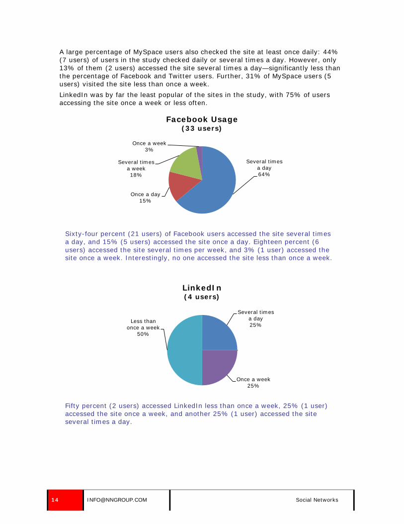
A large percentage of MySpace users also checked the site at least once daily: 44% (7 users) of users in the study checked daily or several times a day. However, only 13% of them (2 users) accessed the site several times a day—significantly less than the percentage of Facebook and Twitter users. Further, 31% of MySpace users (5 users) visited the site less than once a week. LinkedIn was by far the least popular of the sites in the study, with 75% of users accessing the site once a week or less often.
Sixty-four percent (21 users) of Facebook users accessed the site several times a day, and 15% (5 users) accessed the site once a day. Eighteen percent (6 users) accessed the site several times per week, and 3% (1 user) accessed the site once a week. Interestingly, no one accessed the site less than once a week.
Fifty percent (2 users) accessed LinkedIn less than once a week, 25% (1 user) accessed the site once a week, and another 25% (1 user) accessed the site several times a day.
Several times a day 64%
Once a day 15%
Several times a week 18%
Once a week 3%
Facebook Usage (33 users)
Several times a day 25%
Once a week 25%
Less than once a week
50%
LinkedIn (4 users)
14 [email protected] Social Networks

Thirteen percent (2 users) accessed MySpace several times a day, and 31% (5 users) accessed the site once a day. Others accessed the site less frequently: 19% (3 users) accessed the site several times a week, 6% (1 user) accessed the site once a week, and 31% (5 users) accessed the site less than once a week.
Forty-seven percent (9 users) accessed Twitter several times a day, and 32% (6 users) accessed the site once a day. Others accessed the site less frequently; 16% (3 users) accessed the site several times a week, and 5% (1 user) accessed the site once a week.
Most participants identified Facebook as the social network they accessed most frequently. Most used the site to check in on what their friends, family members, and colleagues were up to on a regular basis. One user said, “By far, I use Facebook the most. I like that I can keep up with what my friends are doing and see pictures of their kids.” Another user said, “I use Facebook the most because all my friends and family are on there, and we can share photos.” Users liked to log into the site frequently, because their friends were very active on the site, so new information appeared throughout the day in their main feed. Just as many users accessed Twitter at least once a day as accessed Facebook. However, only 47% accessed the service more than once daily, as opposed to the 64% who accessed Facebook more than once a day. There were several apparent
Several times a day 13%
Once a day 31%
Several times a week 19%
Once a week 6%
Less than once a week
31%
MySpace (16 users)
Several times a day 47%
Once a day 32%
Several times a week 16%
Once a week 5%
Twitter (19 users)
© NIELSEN NORMAN GROUP WWW.NNGROUP.COM 15

reasons for this. Some users were relatively new members who didn’t have a lot of contacts or friends on the service. Because of this, they didn’t have a lot of new information or activity to check in on. Others had some friends on the site, but their main feed was inactive because their friends rarely sent out “tweets” or updates. Many people joined Twitter, but didn’t use it to disseminate information. According to Harvard Business, 10% of Twitter users accounted for 90% of tweets.1 This was likely due to the fact that in the months prior to the study, membership of Twitter increased when it was made popular by high-profile mentions in the mainstream media. However, only a small percentage of members at the time actually used the service to send information and updates. Users visited MySpace less frequently than either Facebook or Twitter. While all users on Facebook and Twitter visited the site at least once a week, almost a third of our MySpace users visited the site less than once a week. Some didn’t use MySpace very often, because “most people don’t seem to use it anymore.” Others said that it was “boring” and “not up-to-date.” MySpace was popular when it was first launched, but people eventually migrated to Facebook. People logged in less frequently because their friends weren’t very active on MySpace anymore and new information wasn’t always available. People used LinkedIn infrequently because it was often used for professional reasons or job-hunting and not to keep up with friends and relatives. Users didn’t have an incentive to log into the service on a daily basis, unless they used it for their job—like the recruiter in our study—or they were looking for employment. Others were turned off by all the “self-promotion” on the site. The site was aimed at showing professional accomplishments, rather than sharing information.
Facebook vs. MySpace Users often compared Facebook and MySpace. Many users belonged to both sites, but used Facebook far more frequently than MySpace, because Facebook was easier to use, more appealing, and had fewer advertisements and solicitations. Companies and organizations should consider this overall trend as they utilize resources to disseminate information through social networks. Users perceived Facebook as easier to use and more up-to-date than MySpace, and considered MySpace to be the social network of the past. One user said, “MySpace is playing catch-up. They were big five years ago, and they were a little high on the hog and not continuing to morph. And then Facebook came along and has now taken off. Now MySpace is continually changing their site to be more like Facebook. The Web hip place to be is Facebook, not MySpace. MySpace is very 2004.” Another user said, “MySpace was the first phenomenon; Facebook overtook it.” Users also mentioned that Facebook was “easier to use” than MySpace. They commented on both navigation and information presentation, especially on the site’s main feed. One user said, “MySpace has a similar status feed as Facebook, only it’s shorter and not as clear.” Another user said, “Facebook is more user friendly than MySpace. They seem to be still trying to develop the website.” Comparing the main feeds on MySpace and Facebook revealed many differences that made Facebook easier to use. (The main feeds are shown on the next page.) The Facebook main feed clearly displayed the author of each message, along with an accompanying profile picture. Participants used this information to quickly identify
1 Harvard Business, “New Twitter Research: Men Follow Men and Nobody Tweets,” June 1, 2009 (http://blogs.harvardbusiness.org/cs/2009/06/new_twitter_research_men_follo.html)
16 [email protected] Social Networks

who had posted each message while they were scanning their main feeds. Also, there was an adequate amount of white space between messages, which allowed users to differentiate where each message started and ended. Additionally, users were able to see the feedback each message had received, and they had the option to contribute from the main feed. The MySpace main feed displayed the author of each message, but it was often contained within the message itself, which made it difficult for users to quickly locate. Additionally, there wasn’t a profile picture associated with each message, which made it more challenging to discern the author. There wasn’t enough white space between the messages on the MySpace main feed, which made it difficult for users to see where each message started and ended, because the messages were displayed too close to one another. Finally, users weren’t able to see what others had commented on or responded to, and they didn’t have the option to interact with the message or provide feedback from the main feed like they did on Facebook.
The Facebook main feed (left) was considered “easier to use” than MySpace’s main feed (right).
Users also commented on the “juvenile” aspect of MySpace as one of the main reasons why they no longer used the service as frequently as they once did. They said:
• “MySpace has a very ‘high school-ish’ environment. Everyone has a sparkly background with 12 songs playing on their page. Facebook is more focused.”
• “MySpace is definitely geared more towards kids in a lot of ways: the layouts, backgrounds, and pop music. It’s more for kids.”
© NIELSEN NORMAN GROUP WWW.NNGROUP.COM 17

• “My younger sister and all her friends use MySpace. I don’t use it, because it’s for a younger crowd. I use Facebook.”
Users complained about the number of advertisements and solicitations on MySpace in comparison to Facebook. One user said, “MySpace comes with more ads and promotions than Facebook.” Another user stopped using MySpace, because she kept getting solicitations from strangers. She said, “I stopped using MySpace so much, because I kept getting friend requests from weirdos.”
Twitter vs. Other Social Networks When talking about social networks, users often grouped Facebook, MySpace, and LinkedIn into one bucket, but considered Twitter a different type of service. Users talked about Twitter as a text-based informational tool, whereas Facebook, LinkedIn, and MySpace were described as more about building relationships. One user said, “Twitter is more for reading purposes, not social network purposes.” Another user said, “Twitter is different than Facebook and MySpace because I tend to think of them as more of the social networking, and I see Twitter as more information-based.” A third said, “It’s basically text messaging on the Internet.” Users also talked about the inability to share a lot of personal information on Twitter. While tweets could contain personal information, users said they were limited in the amount of information they could provide in their profile. One user talked about the lack of a true profile page on Twitter. He said, “With Twitter, you don’t have a page or a home. On MySpace and Facebook, you have all this information about yourself: groups you belong to and networks you are associated with. Twitter isn’t really about that. It’s more about idea and information sharing.”
A Twitter profile page provided limited information about the member: name, location, URL, and a short bio. The rest of the page was dedicated to tweets—the text based messages sent by the member.
18 [email protected] Social Networks

Some people used Twitter as a way to receive information, not disseminate information. Some joined the site to keep tabs on individuals—friends, colleagues, celebrities, actors, and public figures—and some companies, but rarely sent their own updates. They mainly used the site as a way to pull in and collect information. One user used the site for “news gathering,” and another used it to get promotions and sales information from the stores she frequently shopped at.
ACCESSING SOCIAL NETWORKS Users in our study accessed social networks at all times of the day. Some users had a routine: they’d log in and check their accounts in the morning, evening, or at some other designated time of day. Others logged in when they first got to work, along with checking their email. Some didn’t have a routine, and logged in randomly throughout a day or week. Other users logged in constantly or many times a day to “take a break” from work or another activity. Users logged into social networks in various places: at home, at work, or on their mobile phones. Many users logged in and checked their accounts from home as part of a nightly or daily routine. Others accessed the sites from work. Some users couldn’t access social networks at work, because the sites were blocked. A few users refused to access social networks at work, because they were too busy or didn’t think it was ethical. One user said, “I never log in at work, because I don’t have the time.” Another user said, “I access social networks outside of work hours, either before or after.” A few accessed social networks, mainly Twitter and Facebook, from a mobile phone throughout the day. One participant said, “I can access both [Facebook and Twitter] from my mobile device. There’s no real specific time when I check them.” Another participant, who didn’t have Internet access at work, said he used his phone to check in with Facebook and Twitter a couple times each day. In our diary study, users accessed 6% of social network messages from companies and organizations through their mobile phones; the rest were accessed through a laptop or desktop computer.
FINDING COMPANIES AND ORGANIZATIONS ON SOCIAL NETWORKS The most popular reason users said they belonged to social networks was to build relationships and make connections with people, not businesses or organizations. However, some users in our study followed various companies and organizations through social networks. The average number of companies and organizations users followed varied across sites. On average, users followed the highest number of companies and organizations through Twitter; users received updates from an average of six companies through this social network. Many people used Twitter as a way to collect information—not disseminate information—so they often used the site to get updates from their favorite companies or from organizations in their field or industry. Users followed fewer companies on other sites. On average, users received updates from four companies and organizations through Facebook. While people mainly used this service to receive information and updates from people, some users also received messages from companies because it was convenient to receive all updates on a single site. Users followed an average of three companies on LinkedIn, and these companies were typically tied to their job or their industry.
© NIELSEN NORMAN GROUP WWW.NNGROUP.COM 19

People followed the fewest companies through MySpace. Fewer companies and organizations were represented on this service, and most didn’t send information out on a regular basis. Users didn’t find it worthwhile to receive updates from them through the site. Users followed an average of only one company or organization on MySpace.
The average number of companies and organizations followed on social networks varied by tool. On average, users followed four on Facebook, three on LinkedIn, one on MySpace, and six on Twitter.
Users in our study talked about four ways in which they found out about or located a company’s presence on a social network:
• Recommendations from others • Email from the company or organization • The company or organization’s website • Search on the network or via a major search engine
Users rarely thought of a company and then tried to connect to them through a social network. A prompt of some sort—whether an active recommendation from a friend, a passive recommendation received through browsing friends’ connections, an email from the company or link on the company’s website informing users the company was on the social network—was normally the impetus for users to follow a company. Ease of finding out about a company’s presence was key.
Recommendations from Others Companies and organizations had an advantage on social networks, especially those who had a lot of fans or followers, because the actions of those fans and followers were virally sent to their contacts. As compared to RSS feeds, companies and organizations had a better chance of being discovered on social networks without having to do a lot of work to alert potential friends and followers. The sites often did the work for them. For example, some sites, such as Facebook, recommended companies and organizations to members based on what their friends or personal connections liked. Also, if a site member’s friend became “a fan” of a company or organization, Facebook would display this information in the member’s main feed. These updates
4
3
1
6
Facebook LinkedIn MySpace Twitter
Average Number of Companies and Organizations Followed Per Tool
20 [email protected] Social Networks

alerted potential fans of their friends’ activities and preferences—and often persuaded them to do the same.
Facebook suggested that one user become a fan of a local restaurant, The Purple Onion, because a friend had recently become a fan.
When someone was a fan of a company or organization, the company’s name and profile picture displayed on the individual’s highly visible Info tab on Facebook—alongside other important details, such as contact, education, and work information. One user said, “I sometimes will become a fan of something if I notice one of my friends is a fan.” Another user said she navigated to her friends’ pages to see what companies and organizations they followed. She said, “I look up things my friends have on their pages that seem interesting, and if I like them, I’ll become a fan, too.”
If a user was a fan of a company or organization on Facebook, the name and associated profile picture appeared on the Info tab.
© NIELSEN NORMAN GROUP WWW.NNGROUP.COM 21

In addition to receiving recommendations from friends, users who received messages from companies and organizations through social networks often checked to see who those companies and organizations followed or were fans of, especially on Twitter. Users often found new companies to follow this way, and considered this information to be “recommendations” from the companies they trusted.
Email Notification from the Company or Organization Some users became aware of a company’s presence through email communications from the organization. Users often signed up to receive updates or newsletters from companies, and some included details—and links to—their presence on social networks. When asked how she found out about a company’s presence on Facebook, one user said, “They alerted me to the fact that they were on Facebook through an email.”
An email message from ShopBop included a reference to their pages on Facebook and Twitter, which was a common way users found out a company’s presence on social networks.
Company or Organization Website Users who visited a company or organization’s website often located information about their presence on social networks on the site—especially if this information
22 [email protected] Social Networks

was prominently placed on the homepage or within a clearly marked area of the site. Oftentimes, users preferred to visit an organization’s site over searching for the company on a specific social network to find out if they had a presence on it. Users thought it was difficult to locate companies on the networks themselves, so found it easier to navigate to the company’s website to try to determine if the company had a presence on the network. For example, The Gap included clear calls to action on their homepage, which prompted users to become a fan of the retailer on Facebook or follow them on Twitter.
The Gap homepage included information about their presence on social networks.
Search Of the four ways users found out about a company’s presence on a social network, actively searching for it—on a social network site, a search engine, or the company site—was one of the least common ways users discovered this information. Users were more apt to learn about a company’s presence on a social network through word of mouth or the company itself, and they rarely sought out this information on their own. However, when users were interested in whether or not a company was on a social network, some started with a basic search on the social network site. When this was fruitless—as it often was—they turned to a large search engine, such as Google, to help them locate the organization. Rarely, users navigated to the organization’s site to run a search using the company’s search engine. Users were all too familiar with unsuccessful searches on individual sites, and preferred to rely on bigger search engines like Yahoo! and Google to help them locate the information.
© NIELSEN NORMAN GROUP WWW.NNGROUP.COM 23

One user, while trying to locate the Boston Red Sox page on MySpace, received useless search results. After his unsuccessful search, he quickly navigated to Google to find out if they had a page on the service.
CHOOSING WHICH COMPANIES AND ORGANIZATIONS TO FOLLOW Users had many reasons for wanting to follow specific companies or organizations through social networks. Some reasons were based on personal or work-related interests. Users chose to follow other organizations because of the quality of the information that was shared, combined with the immediacy of delivery. People followed companies they trusted and some even selected companies due to the dialogue those organizations had with their customers via the sites.
Personal Interests Users who followed companies or organizations for personal reasons often chose companies based on hobbies and activities. Others had general interests—such as sports or entertainment—that they used to determine which companies to follow. As one user said, “I pick them based on what I like, such as sports.” Another user said
24 [email protected] Social Networks

he picked companies that he had a general interest in, like entertainment, community service, news, and financial information. Some users had an emotional tie to the organizations they followed on social networks, and chose to follow them as a way to cope and stay engaged with the organization’s activities. One user, who was an assault victim, said that receiving updates helped her manage her emotions. She said, “There are things I deal with on a daily basis and this helps me keep things in control. It’s a great way to make sure that there is help for all victims of any assault.”
Business or Career Reasons A few people used social networks as a way to find out about job openings or career opportunities. One user followed a company on Facebook because she was looking for a job at the company. Another user followed a company on Twitter because he wanted to be notified when positions were open. A third user followed a few of the “best” companies in his city because he was unemployed and looking for work and hoped to receive information about job opportunities. Some used the tools to network professionally. One user, an owner of a record label, used Facebook to receive messages about networking events from his local Chamber of Commerce so he could attend gatherings with other small business owners. Another user, a recruiter, used LinkedIn as a way to find companies and organizations who were hiring, along with potential candidates to place in open positions. An event planner at a large university used Facebook and Twitter to monitor how other universities and colleges were utilizing the services—and to get ideas on how to disseminate information through the business accounts she created on the two sites. People used some social networks specifically for career and business purposes, and not for personal reasons. One participant used Facebook for personal reasons, and used LinkedIn strictly for business purposes. She described LinkedIn as “more business-like,” and said, “It has more of a business tone to it. Everything is about what is going on with your network and groups. Facebook is more about friends. You have to dig in LinkedIn with what’s going on with the people. In Facebook, it’s all about the people.”
Immediacy of Information Similar to RSS, users followed some companies and organizations to receive notifications about current events, company news, or other updates. Some users relied on their social networks to keep up-to-date with what was happening around them. One user talked about the immediacy of information on Facebook. She said, “You can keep on top of things. You don’t have to watch TV or CNN. Life has changed and it’s all on the computer now.” Another user said she used social networks to find out about events before they hit other media sources. She said, “It’s a good way to get quick updates on breaking news from around the world before it hits news sites, TV, radio, and other media. Everything is up to the minute.” A third user said the information she received on social networks made her feel like she was the “the first to know.” Not only do users rely on these sites to keep up with news and headlines, but they use them to hear company-specific information. One user followed her university to hear news about events, programs, and initiatives at the school. Another user followed iTunes on Facebook so she could keep up with “all new iTunes-related events.”
© NIELSEN NORMAN GROUP WWW.NNGROUP.COM 25

Usefulness & Relevancy When deciding on companies to follow, users were more likely to follow organizations that would keep them informed or make them more productive. One user talked about her decision process when considering to follow a company. She said, “When I decide to follow a company, it either has to help me be more organized, help me save time, or benefit my family or social circle.” Users appreciated timely information that was relevant to them. One user said, “The things that are interesting, useful, or informative are: retailers who post links to special offers, organizations who post updates on issues I’m interested in, and updates from my favorite charities and non-profit organizations.” Some users followed companies and organizations for links to deals, promotions, sales, and specials—and not to receive informational updates. Users expected this information to be sent from some companies, such as retailers or consumer goods companies. When asked why she followed certain companies on Twitter, one user said “I decided to follow the companies I regularly shop at.” Another user followed Philosophy to keep on top of all their sales and promotions. She said, “I wanted to be up to date with the latest specials and new products.”
A Twitter message from Philosophy included a promotion, which is why one user signed up to follow them.
Trusted Information Sources Users followed some companies and organizations, particularly news outlets, because they were trusted sources of information. Users wanted to be sure that the information they received through the sites was trustworthy and reliable—so they often chose to follow or friend familiar or well-known companies and organizations. One user followed NPR (National Public Radio) on Facebook, because she listened to their radio programs daily. Another user followed The New York Times on Twitter to receive news stories and headlines from an organization she trusted.
Ability to Communicate with the Company Directly A few people became a friend of a company to be able to directly communicate with the organization. In some instances, users preferred to contact a company through a social network over phone and email channels. One user said that was his main reason for following a company on Facebook. Another user, who followed JetBlue Airways on Twitter, talked about the opportunity to contact the company directly through the site if she ever had an issue she needed resolved. In fact, this was one of the reasons why she followed the company on Twitter, and she appreciated how responsive they were to customer questions and concerns. She tried to use JetBlue Airways when she travelled, and said she’d prefer to send a direct message through Twitter to contact the company over using the phone or email. Users appreciated the fact that these services provided an opportunity for two-way communication with the company. Not only could they post an item and receive a
26 [email protected] Social Networks

response from an organization, but they could also see how the company chimed in on issues or discussions other followers posted.
COMMON MESSAGE PROBLEMS Our study revealed a number of common problems with messages sent from companies and organizations through social networks. These common problems are discussed here as well as referenced with specific examples and scenarios in the guidelines of this report, which begin on page 50.
Short Life Span of Messages A message from a company or organization lived and died in a user’s main feed or homepage. The lifespan of a message from a company or organization could be seconds, minutes, hours, or days—depending on the number of organizations and individuals users followed on any given site. When new messages appeared, older messages were pushed down the feed and eventually dropped off the page. Once the message left the main feed or homepage, it was essentially non-existent to users. Users were aware of this problem, but understood that it was the nature of the sites they used. One user said, “Just because I subscribe to it, doesn’t necessarily mean I receive it. If they send it at 10:00 and I don’t look until 1:00, it will be down on the page.” Another user, while looking for the most recent message from a company he followed on Twitter, said, “I’m following quite a few, so it got buried.” When users were asked to locate the most recent message from a company or organization, they scanned the updates on their main feed. If a message didn’t display on the main feed, users weren’t sure what to do. To access these older messages, users had two options: click to see older posts or messages on the main feed (which users rarely did) or navigate to the company or organization’s page on the social network (which users almost never did). One user couldn’t find the most recent message from an organization in her main Facebook feed and was stumped. She said, “Nothing showed up on my main feed. I don’t know how to get to it from here.”
Most users weren’t sure how to view older messages that didn’t appear in their main feed, which could be done by clicking the Older Posts link at the bottom of the page.
Another user was looking for an update she saw on her LinkedIn homepage the day before. She couldn’t locate what she wanted, and said, “I wish I could go back to what it looked like yesterday.” Some users knew how to access older messages in their main feed, but said they rarely looked past the first screen because they didn’t have the desire. One user said, “Some of my friends are always on Facebook and burying things [in my main
© NIELSEN NORMAN GROUP WWW.NNGROUP.COM 27
feed]. I don’t go beyond the first main feed. I don’t do that because if it’s not something that’s current—like right now—I don’t care.”
Sending Too Many Messages Companies and organizations that sent messages to friends, followers, and fans through social networks were competing for real estate on main feeds. Because the lifespan of messages was typically short, some companies and organizations sent out many messages within short a timeframe to keep themselves—and their messages—visible to users. Unfortunately, this backfired. Users often listed messages sent too frequently as the top annoyance with following companies and organizations on social networks. They said:
• “I don’t like to be bombarded by messages.”
• “I don’t like it when organizations send too many messages and clog up my Twitter feed.”
• “They are sending too many notifications.”
• “I purposely don’t follow too many organizations, because I don’t want to be involved in a tsunami of tweets.”
• “I stopped following so many groups on LinkedIn, because I was getting too many updates.”
Sending too many messages can not only annoy recipients, but can also make them decide to no longer receive updates. One user in our study said she used to follow Perez Hilton on Twitter, but decided to stop receiving messages from him because he posted about five times an hour. Another user said he was considering un-friending the National Trust for Historic Preservation on Facebook, because they posted too frequently—multiple times a day.
28 [email protected] Social Networks

Perez Hilton sent nine messages within one hour, which prompted one user to stop following him on Twitter.
Not Sending Enough Messages Users didn’t want to be bombarded with messages from companies and organizations, but they did want to hear from them on a fairly regular basis. Companies who rarely—or never—sent messages quickly became stale and uninteresting. Some users were annoyed by companies who had a presence on a social network but failed to maintain or take advantage of it. Users often perceived the company as lazy or unmotivated, and questioned their commitment to interacting with their fans and followers. One user, while viewing the Continental Airlines page on MySpace, noticed they hadn’t updated the page in almost two years. He was bothered, and said, “They don’t spend any time here. They logged in two days ago, but haven’t updated in years. I don’t know why anyone would look for the Continental page on MySpace. I don’t see how this would benefit them at all.” Some users decided to stop receiving messages from companies or organization if they were sent too frequently. The same thing went for companies and organizations that sent messages on too rarely. A user in our study said she was thinking of un-following a retailer on Twitter, because they hadn’t posted any new messages or updates for over a month.
Inconsistent or Sporadic Message Frequency As users followed companies and organizations over time, they became accustomed to the average frequency in which messages were sent out. When that frequency
© NIELSEN NORMAN GROUP WWW.NNGROUP.COM 29

changed, users noticed—and questioned—the inconsistency. Often times, they wondered if something had gone wrong at the company or if the company wasn’t committed to keeping their followers informed. Some companies and organizations were sporadic right from the start, which annoyed users because they couldn’t build an expectation around when they typically received messages from them.
Untimely Messages One of the benefits of receiving updates from companies and organizations through social network sites, as described by users, was the timeliness of the information. Users often said they followed some companies and organizations so they could be “in the know.” They trusted that they would receive the most accurate and up-to-date information from the source in a timely manner. When companies and organizations failed to deliver on this expectation, their credibility suffered and users lost trust in the organization. While some users said they checked social networks to keep abreast of current issues, headlines, and other information, others weren’t convinced that social network sites were the best way to stay informed. As one user said, “I wouldn't use Facebook as a way to keep up with what's going on in the world.” These users preferred to get their news in other ways—through news sites or RSS feeds.
Sending Duplicate Messages Some companies and organizations sent out the same message (or a slight variation on a message) more than once. This irritated users, because they had to filter through something they had already received. Not only did they waste their time and energy reviewing something they’d already seen before, but the message took up prime real estate in their main feed. Four users in our study mentioned receiving duplicate messages as their top annoyance with receiving updates from companies and organizations.
Adidas sent three messages through MySpace that were essentially the same—a top annoyance identified by users.
Not Meeting Expectations When users signed up to receive messages from companies and organizations on social networks, they had expectations about the types of information they would
30 [email protected] Social Networks

receive. Some organizations, such as news outlets, were expected to send updates on breaking news and headlines. Other organizations, such as airlines, travel companies, and consumer goods companies, were expected to send information about products, sales, and promotions. And other companies, such as technology companies, were expected to send updates on technical issues, products updates, and alerts. When companies didn’t meet these expectations, users were disappointed—and had a hard time finding value in the information they did receive.
Lack of Relevancy or Usefulness People in our study were quick to skim past or dismiss updates from companies and organizations when they weren’t relevant or interesting. Companies that cover broad topics—such as breaking news, weather, sports, and entertainment—aren’t going to grab the attention of every follower with each message they send. Part of the process of checking in with a social network is filtering through what isn’t interesting and honing in on what’s appealing. As one user said, “I pick and choose the things I want to follow up on.” Another said, “I scan everything to see what they have to say and if it pertains to me. If it doesn’t, then I move on.” Users were willing to tolerate uninteresting messages from a company, but only if that same company redeemed itself later with useful messages. However, if every message sent out by a company or organization was irrelevant or uninteresting, users lost interest in the updates and essentially tuned them all out or stopped receiving messages from them altogether. Some users said that useless or irrelevant messages sent from a company or organization was what bothered them most about receiving updates through social networks. A few users stopped receiving updates from a company or organization because they weren’t interesting or appealing to them. One user stopped receiving Twitter updates from horoscope.com because the information wasn’t useful to her. Another considered unsubscribing from messages sent from Script Magazine through Facebook because they weren’t relevant or informative. Users had several approaches to handling companies that updated too frequently or had too many irrelevant posts. Users mentioned un-friending or un-following companies, and some said they used the “hide” functionality in Facebook. This allowed them to still be a “fan” of the company, but not to see updates in their feed. If they were interested in viewing the messages sent from the company after “hiding” them, they could navigate to the company’s profile page.
The “hide” functionality was located to the right of the message, and made it easy for users to stop receiving updates from specific companies or organization in their main feed.
© NIELSEN NORMAN GROUP WWW.NNGROUP.COM 31

Verbose and Wordy Messages Companies that sent long, wordy messages had two things working against them: the short attention span of users and a limited number of characters that would display on main feeds and homepages. Users didn’t want long-winded updates and messages. They wanted companies and organizations to quickly get to the point. Some social networks, such as Twitter and Facebook, truncated messages after a certain number of characters. If messages exceeded this character limit, they were cut off and often ignored by users because they didn’t make sense.
Long-winded messages annoyed users, because they took too long to read and essential information was often truncated.
Users in our study said verbose messages—and messages that were truncated—were among their top annoyances when receiving updates from companies and organizations. They said:
• “Some messages are well over a half page long and that is a lot of space to take up.”
• “Sometimes the messages get cut off.”
• “They need to make the messages short and punchy.”
• “Keep it short and sweet.”
• “I don’t like it when companies send messages that are longer than the allotted number of characters because you get partial updates and disjointed sentences.”
Unidentifiable Hyperlinks Messages often contained hyperlinks to additional details or an outside website. Since many social network sites restricted the number of characters allowed in a single message, companies and organizations often used link truncating services to condense the length of hyperlinks. Unfortunately, these condensed links didn’t provide any details about where the link would go; the domain name and additional details were completely stripped from the URL. Some users commented on their lack of confidence in knowing where a link would take them, which made them hesitant to follow it—even if they were interested in more details. One user said, “I just wish they could put the link right there. I’d rather be able to see the whole link. You are clicking on a link and you don’t know where you are going.”
A message from WBZ NewsRadio included a truncated link, but users weren’t sure where the link would take them because it was stripped of identifying information.
32 [email protected] Social Networks

Dead End Messages Because of character limitations, it’s often difficult to answer all common questions about a topic or headline in a message. Some users, after reading through an update from a company or organization, wanted more details. Some messages contained a link to a full story or additional information, but others didn’t. When users received a message that didn’t answer all their questions and didn’t include a link to more details, they weren’t sure what to do or where to find the information they needed. Often times, they didn’t try to locate the information because they didn’t know where to start.
A Twitter message from the UCF Arena referenced an article in The Baltimore Sun—but failed to provide a link to the full story.
Spelling or Grammatical Errors Users expected the tone of messages sent from companies and organizations through social networks to be informal, but they didn’t tolerate spelling or grammatical errors. In fact, they were quick to judge the credibility of the organization sending the message when this occurred.
A MySpace message from Ron Paul, a politician, contained an unfortunate spelling error (‘Repiblicans’), which immediately turned users off.
Advertisements or Sales Pitches Nobody wanted to read sales or marketing pitches in their main feed. Users expected some organizations, such as travel companies, airlines, and technology companies, to send out promotions, sales and deals, but users were turned off by companies that constantly sent hard core sales pitches. One user said she expected to receive updates and sales from an airline company, but wanted to receive informational updates as well. She said, “If it’s too often or if it just seems they are trying to get me to buy, that’s annoying. That’s why I like it when they mix in the random stuff.” Another user classified sales pitches as “spam.” He said, “It’s a waste of time and space.” A third user said, “Ads are part of my life, and I notice them everywhere. I don’t want to hear about them [on Facebook].”
A MySpace message sent from Oxfam America wasn’t well received by users; one user said it was a “thoughtless solicitation.”
© NIELSEN NORMAN GROUP WWW.NNGROUP.COM 33

Lack of Trust in Social Networks Some users had doubts about the credibility of messages sent from organizations and companies through various social networks. While some social networks, such as Facebook and Twitter, were perceived to be more credible than others, such as MySpace, some users still had a hard time trusting the information sent through these sites. A few users preferred to get their information directly from the official company site or through an RSS feed. As one user said, “There are too many hacked pages and anybody can set up a page and call it whatever they want.”
Other Noise and Interference When users logged in to social networks, they didn’t the time or attention span to read each new message from every friend, colleague, family member and organization that displays on their main feed. They picked and chose what they wanted to look at, and updates from companies and organizations were often the last thing users read. One user, when describing how he skimmed through his main feed on Facebook, said “I usually ignore updates from companies. It’s kind of like TV. I tune out the commercials.”
34 [email protected] Social Networks

Getting Started on Social Networks
The guidelines in this report (starting on page 50) provide details about having a usable presence on social network sites. Before joining a social network, however, there are some larger issues to consider. These issues are further discussed within the guidelines, but are summarized here to assist companies considering joining these sites.
• Join for the right reasons. Don’t create a presence on social networks because your competitors have one, or because it’s a trendy thing to do. Be sure you can support your presence with relevant, useful, and timely messages that will be valued by recipients.
• Allocate resources to manage your presence. Users expected companies to provide regular updates and respond to questions from fans, friends, and followers—which requires a person or team.
• Use your company name (or something close to it) as your user name, and choose a meaningful profile picture. When scanning their main feeds, an easily identifiable name and associated image helped users quickly discern the sender.
• Send messages that match user needs and expectations. Be sure you understand the types of information users expect—and want—to receive from your company or organization. Otherwise, you’ll have trouble finding and retaining fans.
• Send messages on a regular basis. There’s a fine line between sending messages too frequently and not sending them frequently enough. Base the message frequency on how often you can provide unique, compelling, timely content.
• Use an appropriate tone. Users didn’t expect messages from companies and organizations to be overly formal on social networks. Use this to your advantage; choose a tone appropriate for your brand that users will appreciate and relate to.
• Engage with users. Users appreciated companies that asked users for feedback or suggestions, responded to questions posed by followers, and participated in a two-way conversation.
• If possible, design a page that matches your brand. Some sites, such as Facebook and Twitter, allowed companies to customize their page. Be sure to create a design that allows users to draw a connection to your brand.
• Promote your social network presence on your site and through email to build a large following. Companies and organizations that have a large following were often considered more credible by users and they appeared at the top of search results pages on social networks sites.
Guidelines about social network sites begin on page 50.
© NIELSEN NORMAN GROUP WWW.NNGROUP.COM 35

RSS (Real Simple Syndication or Rich Site Summary)
WHY PEOPLE USE RSS Information sent via Real Simple Syndication or Rich Site Summary (RSS) differs from that sent via social networking sites. Though it is also short and timely information, the information sent through an RSS feed is viewed in an RSS reader, and is often displayed alongside the other RSS feeds an individual subscribes to. Unlike social networks, people used RSS feeds to receive alerts and updates exclusively from companies and organizations, and they didn’t have to deal with or filter through updates from friends, family members, and colleagues to access the information they were interested in. However, while the “noise” associated with social networks wasn’t present in RSS readers, users still needed to sift through their RSS updates to access the information that was most important or interesting to them. When asked why they used RSS feeds, many individuals talked about the opportunity to receive updates from the sources they trusted or sites they visited in a single place. They said:
• “I don’t have to go to six sites to see the news I want to look at.” • “I can’t spend a lot of time reading news on the Web. I like that you can get
all the headlines in one spot. For a person who only needs three to four sources—business, sports, and two news sources—it does have potential.”
• “The RSS was a good idea to keep you exposed to sites. Keep it in your favorites, and you can go back and forth. It’s one click away.”
People also used RSS because it was easier and more convenient to read than an email newsletter or a listing of top stories on the company’s website. One user said, “Email gets too bogged down. Going to the website is okay, but with the RSS feeds, it's like the website is coming to you.” Another user liked that he didn’t have to wait for the information to be sent through a newsletter or email communications from the company. He said, “It puts all the summarized heading information in one place rather than scrolling through an email with large summaries, and emails only come when the company sends them.” Users cited the ability to pick and choose which stand-alone pieces of information to see as another reason why they used RSS feeds. Users liked the idea that RSS let them control when to see and read information; all updates were presented, but users chose what they wanted to invest in. One said, “This allows me to pick items that are newsworthy to me.” Another user said, “I look at everything first, and then I pick and choose what I want to read.” Users also talked about the timeliness of the information sent through RSS feeds, and described the ability to easily access breaking news and information as it became available. While information sent through social networks was also fairly timely, it was not presented in a way that made it easy for users to see and access the top headlines, stories, or posts from all the companies and organizations they followed. Instead, updates appeared in a main stream—along with updates from other companies, organizations, and contacts –and quickly disappeared as new updates pushed older ones out of the main stream. RSS readers displayed the most recent stories from each feed a user subscribed to, which made it easier to view and access the most recent updates in individual RSS feeds. One user said, “I think of it as my newspaper; I check out my different sections.”
36 [email protected] RSS (Real Simple Syndication or Rich Site Summary)

While some users received updates from companies and organizations through both RSS feeds and social networks, others preferred to only use RSS feeds to receive information. Some users thought RSS feeds, which are often subscribed to through a company or organization’s official site, were more trustworthy sources than social networks. Others didn’t have the time or desire to check multiple sites or sources. One user, while viewing updates from the White House on MySpace, said, “This is a really cumbersome way to get this kind of information. You have to go through way too many steps to get to this. I’m assuming their site would have some sort of RSS feed.” Another user previously followed the BBC and Australian Football League on Facebook, but didn’t access the site enough to get the information he wanted. He said, “I found it easier to get the information through an RSS feed.”
USE OF RSS Users chose to receive information and updates from companies and organizations for many reasons and those who utilized RSS found many benefits with the tool. The use of RSS grew since our first study. In our first study, only 8 out of 40 users (20%) used an RSS reader, and in our second study, 20 out of 33 users (61%) used an RSS reader.
In our first study 20% (8 users) used RSS, and in our second study, 61% (20 users) used RSS.
This is likely due to the general unfamiliarity of RSS when we ran our first study; Of the 34 participants in our lab study, 82% (28 users) had never heard of or used RSS, three users (9%) said they had heard of it, and another three (9%) said they were familiar with it. However, it’s clear that users are now much more familiar with the tool, and use it as a way to receive updates from company and organizations. In our second study, some users accessed their RSS readers much more frequently than others; 70% (14 users) accessed their RSS reader at least once a day, 15% (3 users) accessed it several times a week, and another 15% accessed it less than once a week.
20%
61%
Study 1 Study 2
Percentage Using RSS
© NIELSEN NORMAN GROUP WWW.NNGROUP.COM 37

Forty percent (8 users) accessed RSS several times a day, and 30% (6 users) accessed the site once a day. Others accessed RSS less frequently: 15% (3 users) accessed it several times a week, and 15% (3 users) accessed it less than once a week.
MOST-USED RSS READERS Users in our second study utilized various RSS readers to view news feeds from companies and organizations. The most popular RSS reader used was Google Reader; of the 20 users that used RSS feeds in our second study, 55% (11 users) used this tool to access news feeds. Twenty percent of RSS users viewed feeds in My Yahoo! (4 users), 15% (3 users) used Outlook, 5% used Bloglines (1 user), and 5% (1 user) used Firefox Bookmarks. Most of the tools utilized in the second study, with the exception of Outlook, were browser-based, and some—such as Firefox Live Bookmarks—were integrated into other tools, which made it easier and more convenient for users to frequently check feeds.
In our second study, 55% (11 users) used Google Reader, 20% (4 users) used My Yahoo!, 15% (3 users) used Outlook, 5% (1 user) used Bloglines, and another 5% (1 user) used Firefox Live Bookmarks.
Several times a day 40%
Once a day 30%
Several times a week 15%
Less than once a week
15%
RSS Usage (20 users)
Bloglines 5%
Firefox Live Bookmarks
5%
Google Reader 55%
My Yahoo! 20%
Outlook 15%
RSS Readers Used (20 users)
38 [email protected] RSS (Real Simple Syndication or Rich Site Summary)

ACCESSING RSS Seventy percent of users accessed their RSS reader or personalized homepage, such as My Yahoo!, on a daily basis, and 40% accessed it more than once a day. Some accessed their feed reader as part of their morning routine, along with checking their email. One user browsed all the new items from his RSS feeds every morning after he cleaned out his work and personal email inboxes. He moved quickly through each headline, opening only those of interest in a new window. He didn’t read the full stories immediately, but instead opened all items of interest and later quickly skimmed through each page. He spent less than 5 seconds reading each headline and deciding whether or not to follow it. Other users accessed their RSS feeds many times over the course of the day, and didn’t have a designated time they checked for new information. One user had his RSS reader set as his homepage, so every time he accessed the Internet, he could browse new items and access anything that interested him. Another user constantly used the Internet for work, and kept his RSS reader open as one of his tabs in his browser. When he wanted to take a break or check updates, he clicked on the tab and hit the Refresh button in his browser. Some users accessed RSS feeds only at home or only at work, and some accessed their RSS feeds in both places. Interestingly, users were more likely to check RSS feeds at work as compared to updates through social networks. Most users in our study had access to their RSS reader at work, while some users couldn’t access social networks because their employers had blocked the sites. Some users perceived accessing RSS feeds at work as more professional or ethical than accessing social networks. Most users accessed RSS feeds on a PC, but some accessed them through their mobile device. One lab participant checked his RSS reader on a home PC in the morning and evening, and accessed it during the day on his mobile phone. Another mentioned that her phone buzzed every time a new update would come through her RSS reader. In our diary study, users accessed 4% of RSS messages from their mobile phones; the rest were accessed through a laptop or desktop computer.
LEARNING ABOUT RSS FEEDS Users can potentially learn about a company or organization’s RSS feeds in many ways. Users in our study talked about ways in which they find out or locate a company’s RSS feeds: from friends, family members or colleagues; from the feed reader or RSS tool they used; or from the company or organization itself—on its website or in email notifications.
Recommendations from Others Users in our study often learned about RSS feeds from friends or professional contacts. One user was focused on making sure all of his information sources were valuable and was constantly on the lookout for new RSS feeds. To locate new feeds, he asked friends and colleagues. He said, “Links from friends drag me onto a site. At conferences I’ll ask, ‘What RSS feeds do you look at?’ Or [I’ll] send out an email to my grad school list and pick from them.” Another user subscribed to a specific feed, because his friend, a CIO, often referred to it as a source of news. Unlike social networks, RSS tools don’t allow users to connect with other RSS users or explore what feeds they follow. This means that users have to proactively seek
© NIELSEN NORMAN GROUP WWW.NNGROUP.COM 39

out this information instead of haphazardly coming across it when they access their RSS tool. However, some users who subscribed to blog RSS feeds checked the other sources of information the blog recommended, and often subscribed to the RSS feeds of the recommended sources. One user subscribed to a video game RSS feed, because, “they were often cited as being a source of information on other blogs.” Another subscribed to 10 photography blogs and was always on the lookout for new feeds. He checked those sites to see what other blogs and information sources they recommended.
Feed Readers Some feed readers tried to help users locate additional feeds they might be interested in. For instance, My Yahoo! offered a search where users could look for additional RSS content. If a user searched for a sports feed, the tool returned a list of almost 4500 RSS feeds to choose from. Such tools helped users discover new feeds.
Some RSS readers, such as My Yahoo!, had search tools that suggested feeds.
Company or Organization Website Some users discovered RSS feeds by visiting a company or organization’s website. This information was often listed on the homepage or within the footer or main navigation, which made it easy for users to spot. For example, Fox News displayed a link to their RSS content in the footer navigation, which was where users looked for the call to action.
Fox News provides an RSS Feeds link in their footer navigation.
Other users looked for RSS information on sites even if it wasn’t placed prominently on the homepage. One user said he subscribed to RSS feeds if he found the site content useful. He said, “I will look for that RSS feed sign and add them.” Others conducted a search on the site if they couldn’t locate the information or call to action.
40 [email protected] RSS (Real Simple Syndication or Rich Site Summary)

Email Notification from the Company or Organization The final way users in our study found out about a company’s RSS feed was through a newsletter or email communication from the organization. Information about RSS feeds—and a link to subscribe—were often included at the bottom of a newsletter or email message sent from an organization. Users were receptive to this information, and used it as a way to sign up and begin receiving RSS updates. When asked to give advice to companies or organizations that send RSS feeds, one user said, “Advertise the fact that [you] have an RSS feed.” This advertisement can be done through an email newsletter or other email communications.2 For example, The Harvard Business School’s Working Knowledge newsletter included a link to subscribe an RSS feed, which was placed near links to subscribe and unsubscribe to the newsletter.
Harvard Business School’s Working Knowledge newsletter included a link to the site’s RSS feed at the bottom of each edition.
CHOOSING RSS FEEDS Users in our study subscribed to an average of six different news feeds from companies and organizations. Reasons for subscribing to feeds were similar to the reasons users gave for following companies on social networks. Users signed up because of personal or professional interests. They appreciated feeds that gave them relevant and useful information and relied on trusted information sources. Some signed up for feeds from different sources on related subjects to increase the breadth and depth of information they received.
2 The design of email newsletters is beyond the scope of this report; instead, please see Email Newsletter Design to Increase Conversion and Loyalty. www.p.com/reports/email-newsletter-design
© NIELSEN NORMAN GROUP WWW.NNGROUP.COM 41

Personal Interests Users received many different types of messages from companies and organizations: general news and sports headlines, corporate or company updates, technical information, and blog postings were just some of the types of updates users subscribed to. Users often chose the RSS feeds they subscribed to based on their personal interests and hobbies. One participant classified the feeds he subscribed to into two categories: world news and entertainment news, which covered his main interests and hobbies. Another user followed three different types of feeds, which covered his general interests: news, entertainment, and sports.
Professional or Business Reasons Some people used RSS feeds for professional or business reasons, and subscribed to feeds that helped them in their daily work. These users chose feeds that provided information about their industry, competitors, or the technology they used. One user subscribed to an information technology news feed because it helped him stay on top of the news in his industry. Another subscribed to feeds to get notifications on “special buys or deals” that she could use for her business. One RSS user was a blogger who needed to keep a constant eye on the day’s news stories. To do that, he checked his email for leads; listened to a NewsRadio station; checked his favorite news sites, which were bookmarked in his browser; and checked a page with RSS feeds. In his case, his job revolved around knowing the latest news and the RSS feeds were a supplement to his other sources of information.
Usefulness & Relevancy Users chose the RSS feeds they subscribed to based on personal and professional reasons and interests, but the information sent from the sources needed to be useful and relevant in order to be helpful. One user subscribed to a news source, because he liked “the quality of the news stories.” Users didn’t have patience for feeds that didn’t provide applicable information. One user explained that a feed had to prove its worth. He often signed up to receive RSS updates from a company and if he didn’t find value in the updates after a couple weeks, he’d stop receiving them.
Immediacy of Information Some users chose RSS feeds because they published timely information on a frequent basis. Some constantly checked their RSS readers for new information from the feeds they subscribed to, so feeds that sent out regular updates were favorable. Some users became frustrated with—and considered unsubscribing to—feeds that rarely provided fresh content. Users expected the information in RSS feeds to turn over on a regular basis, and chose feeds that met this expectation.
Complementary Sources of Information Some people chose RSS feeds based on the type of information they provided and whether or not they already subscribed to a feed that supplied similar content. For example, people who used RSS feeds mainly for news and headlines often chose a world news source and a local news source, and usually no more than one of each. A diary participant subscribed to The Sydney Morning Herald and The Australian. When explaining his choices, he said, “The Sydney Morning Herald is the state based newspaper for New South Wales. The Australian is the national newspaper for
42 [email protected] RSS (Real Simple Syndication or Rich Site Summary)

Australia and it contains a larger source of news from other states around Australia.” Another user subscribed to The Wall Street Journal and Seacoast Online, a local news source, to balance the headlines and news stories she received through her feed reader.
Trusted Information Sources Similar to users who followed companies and organizations on social networks, users based their RSS feed subscription choices on the reputation and trustworthiness of the company or organization. When asked why he chose to subscribe to a CNET RSS feed, one user said, “I only read [RSS feeds] from trusted and familiar companies.” Another user explained why he received The Wall Street Journal news feed. He said, “It provides the latest news in the financial, social and political arena. They’re a trusted source.” A third user talked about his RSS feeds as a whole, and said, “I selected my world news sources because they were known and trusted sources of information. For my game and movie sources, I selected known sources, and then added additional sites that were referenced on those that I was reading.”
COMMON PROBLEMS WITH RSS ITEMS Our study revealed a series of common problems with updates sent from companies and organizations through RSS feeds. We discuss these common problems with specific examples and scenarios in the guidelines of the report, which begin on page 145.
Sending Too Many Updates Companies and organizations that sent updates through news feeds were competing with updates from other companies and organizations that displayed in a user’s RSS reader. Users didn’t like to be bombarded with too many updates in a short period of time, because they felt overwhelmed and didn’t have the time to dig through all the updates. Some users accessed all their updates in a single view, while others accessed each RSS feed individually. If users chose to display all their feeds in a single view, the more active feeds pushed updates from other feeds further down—and sometimes out of—the main view. When this happened, users said the overly active feed was “drowning out” their other information sources, which annoyed them. For example, one user subscribed to a local news source, Seacoast Online, and was often bombarded by news items sent at the same time. The news items from this source pushed other items out of his main view, and he had trouble keeping up with his other feeds.
Seven RSS items were sent from Seacoast Online at the same time, which overwhelmed one user and pushed items from other sources further down his feed.
© NIELSEN NORMAN GROUP WWW.NNGROUP.COM 43

Not Sending Enough Updates Some companies and organizations didn’t provide enough new information on a regular basis to make their feeds worthwhile or valuable. News feeds that were updated infrequently were perceived as stale, and stories that displayed for weeks at a time on an RSS reader became annoying. One user in our study explained that news feed had to produce new content on a regular basis; otherwise he’d stop subscribing to them. For users who combined all their feeds into one view, infrequent updates were less noticeable. But for those who viewed each feed individually, stale content was a constant reminder that the company failed to provide new information through the feed.
Untimely Updates One of the main benefits of subscribing to RSS was the ability to receive up-to-the-minute updates from companies and organizations. Some users constantly checked their RSS readers for new content and used RSS as a way to keep on top of the latest news and headlines. When stories weren’t posted quickly enough, or if a breaking news story was considered “old news” to users, they quickly became annoyed with the feed. One user said he had no use for “late-to-the-party information.”
Non-Descriptive Headlines and Blurbs When users were checking feeds, there were many other headlines competing for their attention. Most users had the same strategy when viewing their RSS reader: they quickly scanned headlines for interesting stories, and if the headline was interesting or relevant, they’d view the summary or click to the full article. Headlines and accompanying blurbs must contain information-carrying words, and the point of the story or article must be quickly apparent—otherwise users will scan past the information. They won’t spend any time trying to decipher meaning from a non-descriptive headline or blurb. One user cited “an unclear message or title for the news story” as the top annoyance with his RSS feeds. For example, a news item sent from The Wall Street Journal had a vague headline, which made it difficult for one user to understand the point of the update. She had to read the blurb to understand exactly what the news story was about, which caused her to do extra work, annoying her.
A non-descriptive headline sent from The Wall Street Journal didn’t convey the point of the news item.
Lack of Relevancy of Usefulness Users signed up for RSS feeds because the information was considered relevant and applicable to them. Feeds that sent irrelevant updates or information that didn’t meet user expectations were quickly dismissed. Some users chose to ignore irrelevant updates and others went as far as unsubscribing from them altogether.
44 [email protected] RSS (Real Simple Syndication or Rich Site Summary)

A user said he unsubscribed from the Gizmodo news feed, because “it had too heavy of a technical focus. They reported on things like PC specifications, which don't interest me.” Another user said she unsubscribed from the Yellowpages.com news feed, because she “could get the same information using Google.” The bottom line: if users don’t find value in an update, they won’t read it. They may unsubscribe from the feed if it doesn’t prove its worth. There are maintenance issues with RSS feeds as well. Users can grow tired of a particular source. To make the most out of RSS feeds, users must put in some effort to locate quality sources and eliminate those they don’t find helpful. A few users in our study changed or updated their feeds frequently: once a week. One participant said, “I update my feeds about once a week. If I hear of or find a new one to add, I will do so. It just depends on how busy I am at the time or moment.” Others updated their feeds less frequently: once every month or two. One user approached each RSS subscription as a trial, and if the source didn’t prove itself to be reliably valuable, he’d stop receiving the feed. He made a point of updating his feeds approximately once a quarter, and said, “I’m always swapping things around.” Unsubscribing from feeds, depending on the tool used, was very simple and often involved simply a click and confirmation. This user ended two subscriptions during the field study. He’d been receiving the information for over a month and decided that neither source was valuable to him.
Advertisements Users expected to be shielded from advertisements when accessing their RSS feeds, and felt intruded upon when they were faced with solicitations. Those who came across advertisements within specific RSS feeds were annoyed because they didn’t expect to see them while trying to review their most recent updates.
The Wall Street Journal coupled their news items with advertisements, which wasn’t well-received by users.
Users are bombarded with advertisements all of the time, and those feeds that contained ads stood out from others—in a bad way. Users were likely to stop reading or unsubscribe from feeds that included advertisements.
Other Noise and Interference Users accessing RSS feeds have to deal with and manage information from many sources at once. Some users felt overwhelmed by the sheer amount of information presented on their personalized homepage or RSS reader, and had trouble focusing on a single update or feed. One user, who’d set up a My Yahoo! page with information like sports headlines and local weather wasn’t sure how to process all the information on his reader. He said, “There’s so much information—too much. I scaled it back. I had five to six frames of
© NIELSEN NORMAN GROUP WWW.NNGROUP.COM 45

information and I wasn’t looking at it. It was a mess. Too much information is overkill. It’s great to have options, but it can be overwhelming. It becomes a hassle.” Another said, “It can be overwhelming to see all that information on one page.” One participant who regularly checked his RSS feeds felt the same way. He said, “Look—I have eighty things to scan.” While this was a common complaint in our first study, users in our second study did not report feeling inundated with information. While users did complain about receiving too many updates from a single source, as noted above, they did not complain about receiving too much information overall. When we first studied RSS, it was a relatively new delivery method, and users were experimenting with it. In our second study, users were more accustomed to the use of RSS and selected feeds carefully. Users also had other ways of coping with the amount of information they received, such as setting up their feed readers to only display headlines, which made the page leaner and less overwhelming.
46 [email protected] RSS (Real Simple Syndication or Rich Site Summary)

Deciding Which Delivery Method to Use
When considering whether to utilize RSS, social networks, or both, companies and organizations should consider the ways people typically use these tools, as well as users’ expectations on the types and frequency of messages sent through them. The following tables highlight the differences and similarities between how people use the two delivery methods as well as what users expect from each.
USAGE & BEHAVIOR Social Networks RSS
Reason for use Most people joined and used social networks to connect with people. Receiving messages from companies and organizations was a side benefit.
People utilized RSS to receive news and updates from companies and organizations, not from people.
Frequency of access People accessed some sites—mainly Facebook and Twitter—very frequently; almost 80% of users accessed these two sites at least once a day.
RSS readers were accessed frequently; 70% of users in our study accessed news feeds at least once a day.
Place of access Most accessed social networks from home. A few accessed them from work or while they are on the go (through a mobile device). Some couldn’t access sites from work, because they were blocked.
People mainly accessed their RSS feeds from home or work. A few accessed them while they were on the go (through a mobile device). Users were more likely to access RSS feeds from work, because they had access to them.
Time of day accessed People typically accessed social networks in the morning or evening, and not normally during working hours.
People accessed news feeds in the morning, evening, and during working hours.
Method of access Most accessed social networks through a laptop or desktop computer. A few accessed them through a mobile device.
Most accessed social networks through a laptop or desktop computer. A few accessed them through a mobile device.
© NIELSEN NORMAN GROUP WWW.NNGROUP.COM 47

USAGE & BEHAVIOR Social Networks RSS
Finding companies and organizations
Social networks suggested companies and organizations for people to follow based on what their friends were doing. People were also alerted by the company itself (through their site or by email).
People typically found out about a company or organization’s RSS feed from the company itself (through their site or by email).
Competing messages Users had to filter through messages from people and companies—and messages from companies were secondary to messages from friends, family, and colleagues.
Users typically received messages only from companies and organizations, but they still had to filter through their feeds to find and focus on what was important to them.
Longevity of messages People paid attention to the messages on the first screen of their main feed—and didn’t pay attention or know how to access previous messages. Message turnover was high on the main feed—from minutes to hours—depending on the number of people and entities users received messages from.
People often had two views: a main feed, which compiled all updates from all feeds, and individual feed views. Message turnover was high on the main feed—from minutes to hours—depending on the number of feeds a user subscribed to. However, users could—and did—access individual feeds for anything they missed.
Communication People were able to engage in a two-way conversation with a company or organization by posing questions and sending direct messages through social networks.
RSS was a one-way conversation. Users couldn’t interact with a company or organization through an RSS feed.
48 [email protected] Deciding Which Delivery Method to Use

EXPECTATIONS Social Networks RSS
Message types Expectations varied, depending on the company and the types of information they would likely provide.
Expectations varied, depending on the company and the types of information they would likely provide.
Frequency Expectations varied from many times a day, daily, several times a week, or weekly—depending on the company or organization sending the message.
Expectations varied from many times a day, daily, several times a week, or weekly—depending on the company or organization sending the message.
Timeliness Users expected messages to be timely, especially those sent from news outlets.
Users expected messages to be timely, especially those sent from news outlets.
Trustworthiness Some users didn’t trust messages sent through social networks, because they thought “just about anyone” could set up a page and represent a company.
Users trusted messages from companies and organization sent through RSS feeds, because they often signed up to receive them through an official website.
Tone People expected informal and conversational messages, not overly stuffy or formal ones.
Users expected to receive formal news and headlines, and didn’t expect an informal or casual tone.
Message Length Messages were expected to be concise, but users were tolerant of longer messages (as long as they weren’t truncated by the site due to length).
Headlines were expected to be brief and concise, because users didn’t want to read too much to understand the gist of the news item.
Ads Ads were accepted by users, but only if they were alternated with informational messages and weren’t too “salesy.”
Users didn’t expect—or accept—ads sent through RSS. Users didn’t want to be bombarded with ads while they were checking their RSS feeds.
© NIELSEN NORMAN GROUP WWW.NNGROUP.COM 49

List of Guidelines
SOCIAL NETWORK GUIDELINES
Message Content ......................................................................... 57
1. Know your audience, and send meaningful messages that match user expectations. ............................................ 57
2. Focus on one topic or subject per message. ....................... 59
3. Utilize the small space by writing concise messages. ......... 60
4. Keep tweets below 130 characters. .................................... 62
5. Place information-carrying words at the beginning of the message. ...................................................................... 62
6. Don’t repeat your company, organization, or username in the message. .................................................................. 63
7. Provide essential details in the message. ........................... 63
8. When possible, link to additional content within the social network rather than on another site. ....................... 64
9. When appropriate, link to more details on an external site. .................................................................................... 67
10. Link to other reputable sources, not just your own site. .... 67
11. Don’t send dead end messages. ......................................... 67
12. Clearly describe where a link will take users. ..................... 68
13. Use short, readable links. ................................................... 69
14. When appropriate, provide a hyperlinked page title, short summary, and associated image with the link for additional details................................................................ 70
15. Make sure the pages the posting leads to have unique and descriptive page titles and images, followed by content written in the inverted pyramid style. ................... 71
16. Consider creating multiple profiles or accounts, such as for various geographic areas, to help target information. ....................................................................... 74
17. Vary the messages sent on different social networks......... 74
50 [email protected] List of Guidelines

18. Don’t post Twitter messages on Facebook, especially if they contain Twitter lingo. ................................................. 76
19. Send unique messages. ...................................................... 76
20. Be careful when sending out messages that build upon one another. ....................................................................... 78
21. Avoid posting information that’s only valuable to staff or employees. ..................................................................... 78
22. Vary the types of information you send. ............................. 79
23. Use videos to provide supplemental information, but provide essential information in text.................................. 82
24. Accurately describe video contents. ................................... 83
25. Don’t overuse videos. ......................................................... 84
26. Provide valuable advertisements, deals, and specials if users expect them. ............................................................. 84
27. When advertising or promoting, be discrete. ..................... 85
28. Alternate sales and promotional messages with informational messages. .................................................... 86
29. Avoid strange characters or strings of characters. ............. 87
30. Proofread your messages for spelling and grammatical errors. ................................................................................ 87
31. To draw attention or create emphasis, write keywords in all caps. .......................................................................... 88
Message Frequency and Timing ................................................... 89
32. Send messages regularly. Base message frequency on how often you can provide unique, compelling, timely content. .............................................................................. 89
33. Allocate appropriate resources to send regular messages. .......................................................................... 89
34. Don’t send messages too frequently. ................................. 92
35. If possible, send messages on with a consistent frequency. .......................................................................... 95
36. Send timely messages. ....................................................... 95
© NIELSEN NORMAN GROUP WWW.NNGROUP.COM 51

37. Send messages at the time of day when users are likely to access social networks. .................................................. 96
38. Consider posting some messages on the weekend. ............ 96
Voice and Tone ............................................................................ 96
39. Have a voice and personality that is appropriate for your company or organization. ........................................... 96
40. Be conversational and informal. ......................................... 97
41. Make sure informal updates or messages contain some information of value. .......................................................... 98
42. Use “we” and “our” in messages to convey the messages come from the company, rather than an individual at the company. ................................................. 98
43. Be careful with humor. ....................................................... 99
44. Write messages in title case or sentence case. ................ 100
45. Don’t use shorthand or abbreviations for words. ............. 100
46. Don’t “sign” messages. .................................................... 102
47. Only “retweet” messages on Twitter that match your company or organization’s voice and tone. ...................... 102
Engaging Followers and Facilitating Discussion ......................... 103
48. Engage in a two-way conversation. .................................. 103
49. Respond to questions from followers and fans within 24 hours. ............................................................................... 106
50. Monitor what Twitter users are saying about you. ........... 107
51. Be selective in what you respond to. ................................ 108
52. Be careful with replying to followers on Twitter. Users don’t have the context of the discussion. ......................... 108
53. Solicit feedback or information from followers when appropriate. ..................................................................... 109
54. Don’t ask for input or suggestions on something you are considered an expert on. ............................................ 110
55. Be careful with posting user-generated content. ............. 111
56. Be a thought leader. ......................................................... 112
52 [email protected] List of Guidelines

Profile Information and Design ................................................. 113
57. Include your company or organization name in your username. ........................................................................ 113
58. If possible, use a short, concise username. ...................... 113
59. Use your official name on your profile page, especially if you use an acronym or unofficial name as your username. ........................................................................ 114
60. Use title case for your company or organization name. .... 115
61. Include a brief mission statement or summary of what you do in your profile. ...................................................... 116
62. Include a URL to a relevant page or website. ................... 118
63. On Twitter, use a short URL that will show fully in the available space on the profile page (if possible). ............. 119
64. If an individual or team provides the messages, identify them by first name, last name, and job title. .................... 120
65. Avoid associating your company or organization with an age or gender. .................................................................. 121
66. Choose a meaningful and eye-catching profile picture. .... 121
67. Choose one icon or picture for a profile picture. ............... 124
68. Only use an image of a person as your profile picture to represent a company or organization if the individual is very well-known and recognizable. .................................. 124
69. Create a profile design that matches your brand. ............. 125
70. If you have a presence on Facebook, create an official fan page. .......................................................................... 128
71. Use a short, readable, and predictable URL for your page on social network sites. ........................................... 128
© NIELSEN NORMAN GROUP WWW.NNGROUP.COM 53

Building a Following and Promoting a Social Network Presence 130
72. Accept friend requests within 24 hours. ........................... 130
73. Try to attract a high number of followers, fans, and friends. ............................................................................. 130
74. Follow your followers on Twitter. ..................................... 132
75. Follow, friend, or become fans of reputable companies and organizations............................................................. 133
76. Place links to follow your company or organization on social networks on your homepage or within your footer navigation. ............................................................. 133
77. Pair calls to action on your homepage or within your footer navigation with appropriate logos. ........................ 135
78. Place links to social network content within the main site navigation. ................................................................ 135
79. Include a page on your site dedicated to your company’s presence on social networks. .......................... 136
80. Explain the types of information users will receive through social networks. .................................................. 138
81. Ensure that searches for social networking related terms return the page describing your presence on social networks. ............................................................... 140
82. Provide information about your social network presence in email correspondence, especially newsletters. ............. 141
83. Place information about your presence on social networks on purchase confirmation pages. ...................... 143
84. Occasionally mention your presence on social networks through your messages. ................................................... 144
85. If your social network presence can no longer be supported, provide details on how users can continue to receive information. ......................................................... 144
RSS/NEWS FEED GUIDELINES
News Feed Content .................................................................... 145
86. Focus on one topic in each item. ...................................... 145
87. Include no more than 10 words in each headline, and place information carrying words at the beginning. ......... 145
54 [email protected] List of Guidelines

88. State the key point of the content in the headline. ........... 148
89. Include a 2- to 4-line explanatory blurb for each item that supplements the headline and summarizes the article. .............................................................................. 148
90. Write a blurb specifically for use in the news feed. Do not use the first paragraph of the story as the blurb. ....... 150
91. Push information-carrying words to the beginning of the blurb. ......................................................................... 151
92. Do not repeat the headline in the blurb. ........................... 151
93. Consider placing the location of a news story (a dateline) within the blurb. ............................................... 152
94. Restrict the length of longer items, such as blog entries, with concise editing. Use formatting to help users scan content quickly. ................................................................ 152
95. Include a relevant and informative image, as appropriate. ..................................................................... 154
96. Avoid placing advertisements within news feed items. .... 154
News Feed Frequency ................................................................ 155
97. Send news feed items on a regular basis. Base message frequency on how often you can provide unique, compelling, timely content. .............................................. 155
98. Don’t send too many news feed items at once. ................ 155
99. Send updates when readers likely access their feed readers. ............................................................................ 156
Promoting RSS News Feeds ....................................................... 157
100. Place links to RSS content and subscription information in the main site navigation or at the bottom of each page of the site. ............................................................... 157
101. Use the term news feed or feed in links to RSS content. .. 157
102. Link to RSS feeds via a news feed icon ( ), rather than an XML or RSS icon. ......................................................... 158
103. Ensure that the page describing your feed(s) appears on top of your site’s search results listings for common queries. ............................................................................ 158
© NIELSEN NORMAN GROUP WWW.NNGROUP.COM 55

104. Include an explanation of RSS on your site, with information about what it is and how to use it. ................ 159
105. Don’t interrupt users with interstitial advertising if they click through to your RSS page. ....................................... 161
106. Clearly name RSS feeds. Provide descriptions of each and, if possible, content from the current feed................. 162
107. Clearly indicate if any feeds require site registration or a paid subscription. .......................................................... 163
108. Avoid referencing other methods of communication, such as newsletters and social networks, on the RSS subscription page, and vice versa. ................................... 164
109. Link to RSS feeds on the unsubscribe confirmation page for email newsletters as an alternate method of information delivery. ........................................................ 164
56 [email protected] List of Guidelines

Design Guidelines: Social Networks
MESSAGE CONTENT 1. Know your audience, and send meaningful messages
that match user expectations.
Users had varying expectations regarding the types of messages they’d receive through social networks. These expectations were highly dependent on the type of company or organization sending the information. For example, users expected news outlets, such as The New York Times and Fairfax Digital, to send the top headlines and stories from around the world. They expected other types of companies, such as non-profits or charity organizations, to send information about their initiatives, upcoming events, and requests for donations or involvement. When users didn’t receive the types of messages they expected, they often became frustrated and talked about what would be more useful to them.
One user, while reviewing a message from The New York Times, said that the message didn’t include the type of headline she expected from the news organization. She said, “For The New York Times, I would expect something on the economy. Everything is about the economy and finances, and The New York Times is what I would consider one of the ones that would focus on the economy rather than international issues for a lead [story].”
A message from The New York Times didn’t match one user’s expectations.
Users who signed up to receive Twitter updates from FairFax Digital expected to get news updates, alerts, and “hard core news-driven tweets.” Instead, they were flooded with technical support messages geared towards individual users and other superfluous content. One user was annoyed that the company didn’t send him what he expected. He said, “They aren’t telling me anything interesting. I am interested in current affairs and what’s happening around the world.” Another user expressed the same frustration, and said, “It doesn’t have the biggest headlines of the day. It seems quite random.”
© NIELSEN NORMAN GROUP WWW.NNGROUP.COM 57

Fairfax Digital tweets missed the mark with users.
Another user expected TripAdvisor to send information about deals, sales, or interesting vacation spots, but the messages sent from the company through Facebook didn’t match her expectations. She said, “With TripAdvisor, I’d appreciate a ‘great spot to go’ or ‘don’t go here.’” Instead, the most recent message she received was about a pet-only airline.
This update from TripAdvisor wasn’t what one user expected to receive from the travel company.
58 [email protected] Design Guidelines: Social Networks

2. Focus on one topic or subject per message.
Users appreciated how easy it was to skim past or ignore messages that were uninteresting or irrelevant to them because most messages were focused on a single idea or topic. Similar to items typically sent through RSS feeds, the narrow focus on a single topic or piece of information made it easy for users to quickly scan the message and decide whether or not to invest additional time reading details or accessing more information through an associated hyperlink.
Each message sent from a company and organization through a social network site should contain details about a single item: a news story, a product update, an upcoming event, a promotion, or some other piece of information. Messages that focused on one topic or subject supported typical user behavior and didn’t overwhelm users.
Most messages were focused on a single topic or idea. For example, The New York Times based a single Twitter message on a story about a freed reporter. The message contained a brief headline, along with a link to the full story on their site.
A Twitter message from The New York Times was based on a single headline, which made it easy for users to quickly scan and decide whether or not to invest additional time or effort into reading the full story.
Some messages contained too many ideas or topics for users to quickly process. When users were faced with a long message or a message that contained information about multiple topics, they became overwhelmed. Often they’d skip over the message altogether if it seemed too complex or covered too many subjects.
For example, a message from The Rachel Ray Show referenced an upcoming show, but contained information about two things: the show’s main topic and the weekly prize. The message should have been focused on one of the two topics, which would have made it simpler, shorter, and easier to quickly process.
A Facebook message from The Rachel Ray Show covered two topics. Users preferred messages that were focused on only one topic.
© NIELSEN NORMAN GROUP WWW.NNGROUP.COM 59

3. Utilize the small space by writing concise messages.
When messages were sent through social network sites, space was highly limited. Some social network sites, such as Twitter, had character limits. Others, such as Facebook, hid text after a certain number of characters.
If a message was longer than 140 characters on Twitter, the site truncated it, and it often didn’t make sense to those who received it. One user commented on a WBZ NewsRadio tweet that was truncated after the allotted 140 characters, because she couldn’t understand what they were trying to communicate. She thought they were trying to “tease” her by posting only part of the headline. She said, “They don’t finish their sentences. And you don’t get the full story, because there’s all this garbage in here. I think they are using it as a tease, but it’s not working for me.”
This tweet from WBZ NewsRadio was truncated after 140 characters, and readers couldn’t grasp what the post was about.
A message from NPR did a better job of communicating the key details in about 50 characters—well below the limit of 140 characters. One user who viewed the message knew immediately what the post was about and said she’d be brought to the full article if she were to click the associated link.
This message from NPR was descriptive and concise.
Some users were aware of space limitations, especially on Twitter, and became annoyed with companies that didn’t follow the rules and give them the information they needed. Users understood that every character counted, and messages that didn’t utilize space efficiently irked users. A message posted by the American Cancer Society on Twitter repeated the phrase “Happy Birthday to Disneyland” twice, and users had trouble understanding where the link would bring them because the message didn’t provide enough information.
One user said, “It repeats ‘Happy Birthday’ twice. With those characters they could do something more meaningful and tell me where I’d go if I click on that link.”
60 [email protected] Design Guidelines: Social Networks

The Twitter message from the American Cancer Society repeated a phrase twice, which made it difficult for users to understand the gist of the message and where they would go if they clicked on the link.
Facebook had character limitations as well, but allowed messages to be about 220 characters—80 more characters than Twitter—before they were truncated. A message sent from TripAdvisor through Facebook was too long and was cut off. One user clicked on the link to Read More, which was something users rarely did in our study, especially when truncated messages appeared among a sea of updates from friends, colleagues, and other companies.
A message from TripAdvisor, sent through Facebook, was truncated after about 220 characters. Users had to click the Read More link to view the entire message.
The full text of the message could only be seen after users clicked Read More.
Some services, such as MySpace and Facebook, gave users more space to work with, but users didn’t necessarily appreciate longer messages. They wanted short and concise updates, and didn’t want to have to read too much information.
One message, sent from the NBA through MySpace, was long-winded and referenced five individuals the reader didn’t know. After reading the message, he said, “Instead of so many names, how about just saying ‘Want to watch summer league action?’ and then provide the link. Get to the point quicker.”
© NIELSEN NORMAN GROUP WWW.NNGROUP.COM 61

The addition of a list of five names to a message from the NBA did little to entice users or clarify content.
4. Keep tweets below 130 characters.
Although Twitter allows for up to 140 characters per message, it’s critical to include fewer than that if you want others to retweet your message for a wider reach. (Retweeting is “rebroadcasting” a message someone else has posted.) Some companies used close to 140 characters—or more—leaving little to no room for the “RT@Username” that’s included in retweeted messages.
Keeping tweets below 130 characters won’t be a long-term guideline because Twitter is redesigning to remove the source attributions from the main message content for repostings. Until this redesign goes live, however, it’s best to leave slack in your original postings if you expect followers to share them.
5. Place information-carrying words at the beginning of the message.
Users tended to read only the first few characters of text as they scanned down a list, so messages should be frontloaded with descriptive keywords that catch the attention of readers.
Some companies didn’t understand the importance of leading with descriptive keywords, and wasted key real estate with repetitious or meaningless words. Amazon.com posted bargains through an Amazon Deals Twitter account, and each message included the words “Lightning Deal!” at the beginning. These two words took up too much space and pushed essential information to the end of the message. It would be best to lead with key information about the deal, and omit the repetitive “Lightning Deal!”
Each tweet sent from Amazon.com used the phrase “Lightning Deal!” at the beginning, which was meaningless and took up prime real estate in the short message. It would also be better to place the price after the product name, since the product is what may attract a potential buyer’s scanning eye. (In contrast, it’s unlikely that people would be attracted to a message purely because it’s about some unknown item selling at the intriguing price point of $27.49. Except in the rare case of somebody spending a gift certificate with that exact balance, it’s hard to imagine a user saying, “Please, please sell me something—anything—for $27.”)
Another message, sent from Adidas through MySpace, repeated the username at the beginning of the message, wasting precious real estate and pushing essential information further along in the message. Additionally, they had a long user
62 [email protected] Design Guidelines: Social Networks

name, and repeated it twice (once as the identifier and a second time in the message itself), which took up close to an entire line. Removing those four words from the beginning of the message would have allowed them to fit more of the message in the limited space MySpace allowed. Putting information-carrying words at the start of the message would have also attracted more readers.
A message from Adidas on MySpace repeated their username at the beginning of the message, which was redundant and wasted real estate.
6. Don’t repeat your company, organization, or username in the message.
The company or organization name was shown by default next to the message, along with a company logo or image. There was no need to waste real estate in the message restating known information.
One user was irked by the use of the organization’s name in an individual tweet. She said, “I get it. It’s here [in the logo], here [in the Twitter name], and here [in the tweet itself]. You are limited to the number of characters you have, you can’t get enough information in there if you keep repeating your name.”
The repetitive use of the company name within the WBZ NewsRadio wasted precious real estate and restated known information.
7. Provide essential details in the message.
When posting a message, it’s important to anticipate the top questions people have in relation to the topic or headline and provide those details in the text itself. After viewing a message from a company or organization, users often had additional questions but weren’t sure how to get them answered.
One user, while viewing an announcement about an upcoming Bruce Springsteen tour on MySpace, had a basic question about the event. She said, “[I want to know] when it starts. Usually they say ‘Summer tour’ or ‘Fall tour.’ What’s the kickoff date on this?” This critical information should have been included in the message.
This message from Bruce Springsteen didn’t answer one user’s basic question: When was the kickoff date?
© NIELSEN NORMAN GROUP WWW.NNGROUP.COM 63

Some messages did a better job of including essential details, which users appreciated. One message, sent from Amazon.com through Twitter, included the price of the item they were advertising, which was the top question one user had. Additionally, the message included a brief description of the item, along with key features and a link to view more details. The message wasn’t perfect, though. As mentioned previously, the use of “Lightning Deal!” was meaningless to users and could have been removed, allowing more space for product details.
The price of the product was prominently displayed in the tweet from Amazon.com.
8. When possible, link to additional content within the social network rather than on another site.
Users chose what they wanted to pay attention to based on their interests and available time. Some users chose to view only the message itself, but others navigated to additional details if the message included a link. Not every post interested every user, but users appreciated when there was a clear way to get additional information when they wanted it.
Some users wanted more details after reading a message, and were happy when they could stay within a social network to access them. Some sites, such as MySpace and Facebook, allowed companies to post additional notes and details that users could access within the social network site. If there are additional details that don’t fit within the message, provide a link and list those details within the social network site.
One user, while viewing a post from Ticketek, was interested in learning more about a comedy show they were featuring on Cockatoo Island. When he clicked the link for more details, he was brought to a “note” on Facebook. He appreciated that he could access more details without having to leave the site. He said, “It’s a good idea to put the information on Facebook. It’s sensible to have a continuation of a link from the initial thought or small post to more information, and then a link to their site to buy a ticket. It would be a deterrent to me buying a ticket if this flow wasn’t here.”
A Ticketek message sent through Facebook included the title and first few sentences of a note, and users could click through to additional details on Facebook.
64 [email protected] Design Guidelines: Social Networks

The Ticketek full note included additional event details, as well as a link to their site to purchase tickets.
Another user expected to be taken to additional details on Facebook if she clicked a link in an Amnesty International Australia message. She clicked the link to view more information, and was brought to the full note on Facebook. She said, “It’s good when you don’t have to completely get out of Facebook to read the whole thing.”
Additional details from Amnesty International Australia were available on Facebook when users clicked on the hyperlink in the message.
© NIELSEN NORMAN GROUP WWW.NNGROUP.COM 65

Full details relating to a message from Amnesty International Australia were available in a Facebook note.
66 [email protected] Design Guidelines: Social Networks

9. When appropriate, link to more details on an external site.
Some social network sites, such as Twitter, didn’t allow companies and organizations to post additional information within the site itself, which meant links provided in messages linked to external sources. When users were interested in more details related to a tweet, they appreciated the option to see them, even though they were taken to another site.
One user, while reviewing a message from a local news channel, said, “I like how they have pretty succinct updates and links if you want to read more.”
Users appreciated the concise, descriptive tweet sent from WHDH Boston along with a link to view story details.
10. Link to other reputable sources, not just your own site.
Some messages provided links to news articles, commentaries, and information on the sites of other reputable sources, which helped build company credibility among users. Users appreciated it when companies referenced outside sources because it showed they were willing to give credit to someone who covered something better than they could.
One user was attracted to a message sent from Microsoft Windows through Facebook, because it contained a link to an outside source—and not a link to the Microsoft site. He said, “It makes sense to link to another resource. If you found someone who can explain something simply, then let them do it. It doesn’t have to be all from the ‘House of Gates.’”
Microsoft Windows linked to an outside source in a Facebook message, which appealed to one user.
11. Don’t send dead end messages.
If users were interested in learning more about an item included in a message, they would click on the associated link to view more details. Some messages referenced a story or headline, but failed to provide a link to additional details.
© NIELSEN NORMAN GROUP WWW.NNGROUP.COM 67

A Twitter message sent from the University of Central Florida (UCF) Arena quoted an article in The Baltimore Sun, but failed to provide a link to the full story. One user was disappointed, and said, “If they are quoting The Baltimore Sun, then they should link to the article.”
A Twitter message from the UCF Arena referenced an article in The Baltimore Sun—but failed to provide a link to the full story.
12. Clearly describe where a link will take users.
Messages sent through social networks, especially Twitter, often used a link truncating service, such as TinyURL, to shorten links. While these services helped limit the length of URLs (and the message), it was nearly impossible for users to understand where they were linking to based on the URL alone. One user commented on his lack of confidence in knowing where a truncated link would bring him. He said, “Because the links are shortened, you can’t identify where you will go from the link. It’s hard to figure it out. It’s not like a regular URL where you can kind of figure it out.” Another user said, “The link itself doesn’t say anything about where I’m going. It says ‘bit.ly.’ I don’t know where it’s going to take me, so I don’t care about it. I’m not going to click on it.”
Some link truncating services, such as bit.ly, allowed a portion of the URL to be specified. For example, http://bit.ly/Clinton, was a link CNN used in a message about one of Hilary Clinton’s speeches. While this gave users an idea of the content the link led to, it did not give them information about the source of that content. Without a domain name, users couldn’t evaluate where the link would take them.
When links were truncated, they rarely carried any useful information, so it was absolutely critical for the message to describe exactly what the user would find if he clicked on the link.
One user was irritated by a tweet from the United States Environmental Protection Agency (EPA), because it was cut off mid-sentence due to the length of the message and it didn’t clearly describe where the link would take him. He said, “It’s not even a full message. This means nothing to me. You have to click on that link in order to find out what this is about. It kind of defeats the whole purpose of Twitter. There’s not even enough here that’s going to make me want to know what this is about. It’s not a good tease.”
Users didn’t feel comfortable clicking on the link in the tweet from the EPA, because the message didn’t describe where it would take them.
68 [email protected] Design Guidelines: Social Networks

Another user said that a tweet from WBZ NewsRadio didn’t explicitly describe what it was linking to, and she didn’t get any additional information from the included link. She said, “I don’t think it gives me enough information. ‘Today’s web poll?’ I don’t know what the web poll is about. It’d grab my attention more if it said ‘today’s web poll on…’ Just saying ‘today’s web poll’ doesn’t give me enough information.”
The lack of detail in the tweet from WBZ NewsRadio prevented her from following the associated link.
This same user noticed a more descriptive tweet from WBZ NewsRadio further down in her main Twitter feed and said that it did a better job of providing essential information in the message itself. She said, “It gives me the information I need and then the link to go into it if I want more.” This let her know what to expect when clicking the link.
This tweet from WBZ NewsRadio was much more descriptive, which appealed to users because they had a good understanding of what they’d find if they clicked the provided link.
Some messages used full URLs, but it was still important for them to describe exactly where the link would take users. One user, while viewing a message from Pepsi on Facebook, talked about the importance of quickly understanding where a link will bring him. He said, “All I want to know is what it’s about and where I will go if I click on this link. It’s an opt-in thing versus an opt-out, and as long as I can make my decision on the two lines I see here, then that’s all I need.”
The message sent from Pepsi through Facebook gave one user enough information to understand where the link would take him.
13. Use short, readable links.
Some messages included links that were long and difficult to decipher. Users wanted to see short, concise links—coupled with a clear description of where the link would bring them—and were annoyed by links that included long strings of characters and information that couldn’t be quickly interpreted.
© NIELSEN NORMAN GROUP WWW.NNGROUP.COM 69

A Facebook update from PostSecret included a lengthy link to Amazon.com, which took up almost two entire lines of the message. It would have been better for this message to include a short, truncated link because the message was descriptive and explained where users would go if they clicked on the link. Complete URLs are not helpful if they contain codes and strings of characters that users can’t decipher.
PostSecret could have shortened this message by using a truncated link.
14. When appropriate, provide a hyperlinked page title, short summary, and associated image with the link for additional details.
Some social network sites, such as Facebook, displayed a page title, the first few lines of text on the page, and an associated photo when users typed a URL into the status update field. The site provided the option to include this information or provide the URL only. When including a link in a Facebook message, consider whether or not this additional information will be helpful to users.
When a URL is typed into the status update box on Facebook, users have the option of posting a hyperlinked page title, short summary, and associated image.
One message, sent from the American Cancer Society, included a hyperlinked page title, page summary, and an associated image. In this example, it would have been best to provide the text-only version of the message with an associated URL. The image, hyperlinked page title, and summary didn’t add any real value, and made the message longer than it needed to be.
70 [email protected] Design Guidelines: Social Networks

The additional information—a hyperlinked page title, page summary, and image—didn’t add any real value to a message sent from the American Cancer Society through Facebook.
Another message, sent from CNN through Facebook, included a more appropriate hyperlinked page title, page summary, and associated image. The related information added value to the message by including details that provided further insight into the hyperlinked news article: a descriptive page title, a brief page summary describing the article, and an informative image.
Additional information included with a CNN headline added value to the item, providing further relevant detail.
15. Make sure the pages the posting leads to have unique and descriptive page titles and images, followed by content written in the inverted pyramid style.
When URLS are included in messages on some social network sites, such as Facebook, additional information can be posted with the message and URL, including a hyperlinked page title, a short summary, and an associated image. This information is pulled directly from the page being linked to. If you are linking to a page on your own site, be sure that the page title and associated image are descriptive and unique. Additionally, be sure that the first few sentences of the page include essential details.
A Facebook message sent from Amnesty International Australia included a link to an upcoming course. The additional information included with the message wasn’t descriptive enough, and users weren’t sure where the hyperlinked page title would lead. The page title did not include the course name, which would have made it more descriptive.
© NIELSEN NORMAN GROUP WWW.NNGROUP.COM 71

Amnesty International Australia linked to a course description on their site, but the hyperlinked page title didn’t clearly tell users where it would lead.
The Facebook message from Amnesty International Australia (above) linked to this page on their site. The link description in the Facebook message was the page title, and the summary information was the first sentence on this page. These two items should be much more descriptive.
Some companies included the same image, hyperlinked page title, and summary with each new message they sent. When the same information appeared with each message, users quickly became annoyed and considered unsubscribing from the updates.
72 [email protected] Design Guidelines: Social Networks
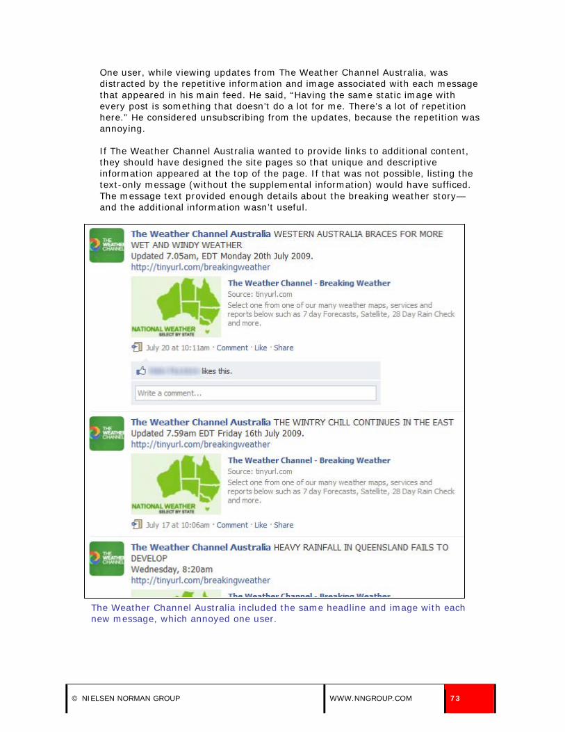
One user, while viewing updates from The Weather Channel Australia, was distracted by the repetitive information and image associated with each message that appeared in his main feed. He said, “Having the same static image with every post is something that doesn’t do a lot for me. There’s a lot of repetition here.” He considered unsubscribing from the updates, because the repetition was annoying.
If The Weather Channel Australia wanted to provide links to additional content, they should have designed the site pages so that unique and descriptive information appeared at the top of the page. If that was not possible, listing the text-only message (without the supplemental information) would have sufficed. The message text provided enough details about the breaking weather story—and the additional information wasn’t useful.
The Weather Channel Australia included the same headline and image with each new message, which annoyed one user.
© NIELSEN NORMAN GROUP WWW.NNGROUP.COM 73
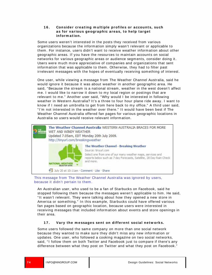
16. Consider creating multiple profiles or accounts, such as for various geographic areas, to help target information.
Some users weren’t interested in the posts they received from various organizations because the information simply wasn’t relevant or applicable to them. For instance, users didn’t want to receive weather information about other geographic areas. If you have the resources to maintain accounts on social networks for various geographic areas or audience segments, consider doing it. Users were much more appreciative of companies and organizations that sent information that was applicable to them. Otherwise, they had to filter past irrelevant messages with the hopes of eventually receiving something of interest.
One user, while viewing a message from The Weather Channel Australia, said he would ignore it because it was about weather in another geographic area. He said, “Because the stream is a national stream, weather in the west doesn’t affect me. I would like to narrow it down to my local region or postings that are relevant to me.” Another user said, “Why would I be interested in following weather in Western Australia? It’s a three to four hour plane ride away. I want to know if I need an umbrella to get from here back to my office.” A third user said, “I’m not interested in the weather over there.” It would have been best if The Weather Channel Australia offered fan pages for various geographic locations in Australia so users would receive relevant information.
This message from The Weather Channel Australia was ignored by users, because it didn’t pertain to them.
An Australian user, who used to be a fan of Starbucks on Facebook, said he stopped following them because the messages weren’t applicable to him. He said, “It wasn’t relevant. They were talking about how they opened a new store in America or something.” In this example, Starbucks could have offered various fan pages based on geographic location, because users were interested in receiving messages that included information about events and store openings in their area.
17. Vary the messages sent on different social networks.
Some users followed the same company on more than one social network because they wanted to make sure they didn’t miss any new information or updates. One user, who followed a cooking magazine on two social networks, said, “I follow them on both Twitter and Facebook just to compare if there’s any difference between what they post on Twitter and what they post on Facebook.”
74 [email protected] Design Guidelines: Social Networks

Users didn’t mind occasionally seeing similar messages from the same company on more than one social network. For example, one user, who followed TOMS Shoes on Twitter and Facebook, noticed the repetition of messages across the social networks. She said, “That’s OK. You might miss it on one of them.”
TOMS Shoes posted the same message on two social networks; the top image was an update sent through Twitter, and the bottom image was a message sent through Facebook.
However, users who followed the same company on more than one social network appreciated it when companies presented varying content on the different sites. One user followed Company C on Twitter and Facebook and noticed the difference in the messages across social networks. Although she wasn’t interested in the Facebook message, she liked that they were posting different content on the two services.
A tweet sent from Company C (top image) through Twitter was different than the message sent on the same day through Facebook (bottom image).
© NIELSEN NORMAN GROUP WWW.NNGROUP.COM 75

18. Don’t post Twitter messages on Facebook, especially if they contain Twitter lingo.
Some companies and organizations linked their accounts on Twitter and Facebook, so the messages they sent through Twitter would also be sent through Facebook. Users had a hard time understanding certain messages that were sent through Twitter and displayed on Facebook, especially those that contained Twitter lingo.
Not only were some Twitter users confused with the Twitter lingo, but Facebook users rarely understood the expressions; for example, many didn’t realize that “RT” (followed by the “@” symbol and a Twitter username) meant that the message was originally posted by someone else. Others didn’t realize that “@” (followed by a Twitter username) meant that the message was directed towards an individual or company.
One user, while viewing a message on Facebook from the Greater Dover Chamber of Commerce, commented on the use of “RT @FostersDailyDem.” He said, “What is that? An email address? I have no idea what they are talking about.” The organization had linked their Twitter and Facebook accounts, and messages sent through Twitter automatically displayed on Facebook as well.
A Facebook message sent from the Greater Dover Chamber of Commerce was originally posted on Twitter, and contained Twitter lingo that was confused one user.
19. Send unique messages.
Users became annoyed with companies that sent repetitive or similar messages, especially when they were sent within days of each other.
One user, while reviewing messages from Adidas on MySpace, became annoyed by the repetitive content. The company sent three messages about customizing a specific shoe over the course of a week, but tweaked each to be slightly different from the previous messages. These slight changes across messages were obvious to one user, who considered them all to be the same message. She said, “A lot of these posts are the same. They’ve changed it a bit between them all, but that are all basically the same. I don’t think they need to send it three times.”
76 [email protected] Design Guidelines: Social Networks

Adidas sent three messages about the same topic over the course of a week, which was unnecessary.
Another user, while viewing her group updates in Facebook, noticed the same job posting (from a recruiter) listed three times in her main feed—which pushed all other updates out of the main view and irritated her. She said, “Someone here has over-posted. She posted the same thing three times. I don’t think this woman knows what she is doing.” The recruiter should have only posted the job once, and should have used additional messages for other job openings or important announcements.
A recruiter posted the same job listing three times to the message board in a LinkedIn group, which irritated one user.
© NIELSEN NORMAN GROUP WWW.NNGROUP.COM 77

20. Be careful when sending out messages that build upon one another.
Some news outlets sent out multiple messages about the same topic or headline, which built upon one another. Users found this unnecessary, especially when they felt the story was mundane, uninteresting, or not “breaking news.”
One user, while reviewing messages in his main Twitter feed, commented on the three different messages posted about a single news story. The news channel continued to build upon a specific story about a girl who was hit by a car, but the story wasn’t interesting to the user. He said, “As a story develops, you keep getting updates. Is this supposed to be big news? Three different updates is a bit much.” The news channel should have focused on providing unique, standalone tweets, instead of sending messages that built upon one another.
Three out of the four messages sent out by WHDH Boston in one user’s main feed pertained to the same story, which seemed like overkill to him because he didn’t consider the story to be “breaking news.”
21. Avoid posting information that’s only valuable to staff or employees.
Users followed companies and organizations to receive information about breaking news, new products or product updates, sales and promotions, upcoming events, and links to interesting articles or information. Users didn’t have the patience or time to weed through updates that were geared towards a company or organization’s staff or employees. These types of updates were irrelevant to users who did not work at the company.
78 [email protected] Design Guidelines: Social Networks

One user, while viewing updates sent from Company C, a home décor company, became annoyed when she saw a post about caricatures of store employees. She said, “They posted caricatures of their employees. It’s much more an internal thing versus an external thing… and you can see why because no one commented on it. It’s like talking to yourself.”
A message sent from Company C through Facebook included information geared towards employees.
22. Vary the types of information you send.
Over time, users grew bored with messages that were too similar. They appreciated variety, especially if the content was useful and interesting. Some social network sites, such as Facebook and MySpace, allowed companies and organizations to post different types of content, such as videos, photos, events, polls, and links to articles. Other social networks, such as Twitter, allowed companies to link to these various types of content, but they couldn’t provide them on the site itself. Users appreciated when companies sent out different types of content—but only if the information was valuable.
One user was a fan of Steve Kellogg and the Sixers on Facebook, but felt the constant postings about upcoming events were tedious. After viewing their Facebook page, she said, “It’s kind of a lot of the same, which isn’t interesting to me. I’d prefer to see or hear about what they are working on, too.”
© NIELSEN NORMAN GROUP WWW.NNGROUP.COM 79

Stephen Kellogg and the Sixers’ Facebook page was flooded with event postings, which was too much of the same type of information for a fan.
Other companies and organizations did a better job of varying the types of content they provided. One user followed Ivan Misner, the founder of BNI and Referral Institute, through Facebook. He enjoyed receiving messages from him because of the variety of types of content he posted, including event information, articles, videos and photos.
80 [email protected] Design Guidelines: Social Networks
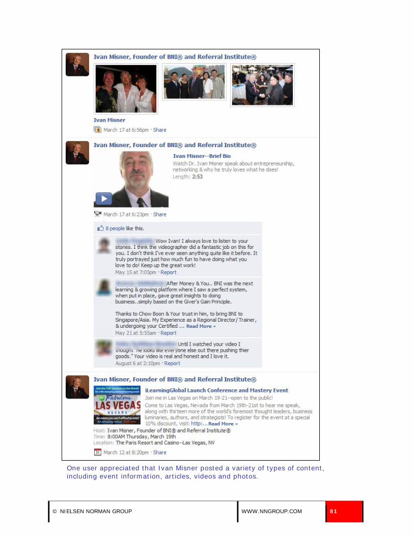
One user appreciated that Ivan Misner posted a variety of types of content, including event information, articles, videos and photos.
© NIELSEN NORMAN GROUP WWW.NNGROUP.COM 81

Another user appreciated two different types of posts on her wall from ABC News. One was a link to an image the organization posted to their profile, and the other was a headline with a link to the full story on their site. She said, “The variety of the media was quite good. Sometimes it was a photo and sometimes it was a [link to a] video. I had a preconception that it would be a series of headlines, but it’s been lots of different stuff.”
ABC News sent a good variety of headlines, pictures, and videos through Facebook.
23. Use videos to provide supplemental information, but provide essential information in text.
Don’t count on videos to convey information. Provide important details in text, using the video as a supplement to the information. Many users won’t have the patience or desire to sit through a video just to find out basic information. If the video is accompanied by descriptive text, however, they may well be enticed to watch the video.
Users appreciated when companies posted a video and included essential details within the message or through a hyperlink, so users didn’t have to watch the video if they did not want to. In this way, users could still get the information without having to sit through a video. For example, The Rachel Ray Show included a video of the host preparing a recipe. Instead of forcing users to sit through the video to get the details, they provided a link to the recipe on the show’s official site. Users could get the information they needed by following the link, and the video was provided as supplemental information.
82 [email protected] Design Guidelines: Social Networks

The Rachel Ray Show included a link to a recipe, along with a supplemental video in a Facebook message. Also, the title of this message provides the name of the dish being prepared in the video, helping users decide whether to watch it in the first place. (Compare with a hypothetical bad title, such as “Rachel prepares something really delicious” which would not be of much help since no cooking show would feature unappetizing food.)
24. Accurately describe video contents.
Users wanted to know what they were getting into before they launched a video. Messages should contain an accurate description of what the video is about so users know what to expect. Users weren’t impressed when a video was wildly different than its description.
One user watched a video from the White House’s MySpace blog, which was described as a highlight reel of President Obama’s trip to Russia. The user felt the video had a “commercial” feel and said, “It’s not what I was expecting. There wasn’t any real information in there. It was a three minute commercial. The title is misleading. It says ‘highlights from his trip,’ but it’s a commercial for the Obama administration.”
A user felt the title and description of a MySpace video from the White House did not accurately convey the contents of the video.
© NIELSEN NORMAN GROUP WWW.NNGROUP.COM 83

25. Don’t overuse videos.
Users appreciated and viewed videos when they had the time and interest, but they didn’t want to watch or launch a video with every new message. Use video sparingly because people have limited amounts of time—and videos can be time consuming. While users can quickly skim through text-based messages to decide which are of interest and which are worth pursuing, there is no good way to skim a video to see if it is worth watching.
One user was overwhelmed by the number of videos sent out by Bruce Springsteen through MySpace. She wanted different types of content, such as updates about what he was working on and tour dates. She thought the videos were interesting at first, but she quickly grew tired of them. She said, “I kind of groaned when I kept getting videos. The first one is OK, but after a while it gets old. I don’t have a lot of time to do videos, but a small news clip is fine.”
A user said she didn’t have the time to watch all the videos posted by Bruce Springsteen on MySpace, particularly since the previews provide no way to differentiate between the last seven clips.
26. Provide valuable advertisements, deals, and specials if users expect them.
Users expected some companies and organizations, such as consumer goods companies and travel companies, to provide information about deals and specials and were disappointed when they didn’t deliver. Users saw such information as beneficial to them, giving them reminders or advance notice of specials or deals or providing up-to-the-minute product information or updates.
Users liked the opportunity to receive information about sales or other ways to save money. For example, Philosophy sent a Twitter message about a promotion. Users often followed favorite brands or retailers in order to be notified of current sales and offers.
84 [email protected] Design Guidelines: Social Networks
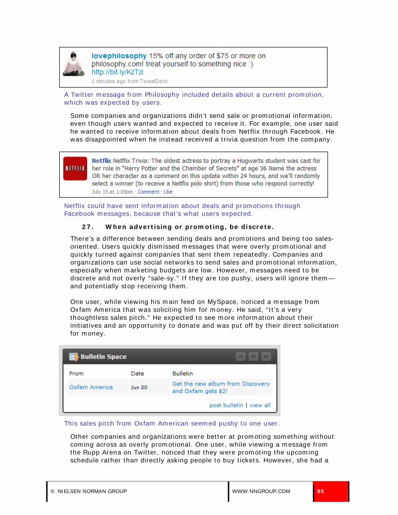
A Twitter message from Philosophy included details about a current promotion, which was expected by users.
Some companies and organizations didn’t send sale or promotional information, even though users wanted and expected to receive it. For example, one user said he wanted to receive information about deals from Netflix through Facebook. He was disappointed when he instead received a trivia question from the company.
Netflix could have sent information about deals and promotions through Facebook messages, because that’s what users expected.
27. When advertising or promoting, be discrete.
There’s a difference between sending deals and promotions and being too sales-oriented. Users quickly dismissed messages that were overly promotional and quickly turned against companies that sent them repeatedly. Companies and organizations can use social networks to send sales and promotional information, especially when marketing budgets are low. However, messages need to be discrete and not overly “sale-sy.” If they are too pushy, users will ignore them—and potentially stop receiving them.
One user, while viewing his main feed on MySpace, noticed a message from Oxfam America that was soliciting him for money. He said, “It’s a very thoughtless sales pitch.” He expected to see more information about their initiatives and an opportunity to donate and was put off by their direct solicitation for money.
This sales pitch from Oxfam American seemed pushy to one user.
Other companies and organizations were better at promoting something without coming across as overly promotional. One user, while viewing a message from the Rupp Arena on Twitter, noticed that they were promoting the upcoming schedule rather than directly asking people to buy tickets. However, she had a
© NIELSEN NORMAN GROUP WWW.NNGROUP.COM 85

feeling that people who downloaded the schedule would probably buy tickets. She said, “It looks like they are pitching the schedule, and not pitching tickets, which seems less ‘sales-y.’”
A Twitter message from the Rupp Arena pitched a schedule of upcoming events—not tickets.
Users expected to receive sales-related information from some companies, but they expected those messages to be directed at the benefit to them, the users, rather than the benefit to the organization. While the message from Rupp Arena focused on giving the user information, the Oxfam America message focused on how the organization would benefit from an action the user took.
28. Alternate sales and promotional messages with informational messages.
As previously discussed, users expected to receive sales and promotional information from some companies and organizations. However, they didn’t like it when every message sent from a company or organization tried to get them to purchase something.
Users appreciated when companies and organizations sent out a mix of informational and sales messages—and didn’t base all messages on making a sale. For example, JetBlue Airways often sent information about sales and deals through Twitter, but also sent out other useful messages—such as travel tips and suggestions. This was welcomed by users because they weren’t constantly bombarded by advertisements.
The first two Twitter messages sent by JetBlue Airways included sales and promotional information—which users expected—and the third suggested a breakfast restaurant in San Francisco, which was a helpful piece of information for those travelling to the city.
86 [email protected] Design Guidelines: Social Networks

29. Avoid strange characters or strings of characters.
Users were confused by strange characters or strange strings of characters in messages as well as characters that appeared out of place.
For instance, Amazon.com often included product codes in their Amazon Deals Twitter messages. One user, while viewing a tweet from them in her main feed, questioned the product or item number associated with the latest deal. She said, “Some of this info doesn’t make sense to me. ‘V1 X AAA’ doesn’t really mean anything to me. They could probably get away without saying that.”
The golf ball product code associated with this tweet from Amazon.com was meaningless to users.
In other instances, users were confused by characters that didn’t display correctly. One user, while viewing a blog post on the White House’s MySpace page, noticed that a question mark displayed instead of an apostrophe in the blog post title. It’s important to test how your site displays in popular browsers to catch these small—but powerful—rendering issues.
The question mark used in the blog post title should have been an apostrophe, and users noticed the mistake.
30. Proofread your messages for spelling and grammatical errors.
Users were quick to judge an organization’s credibility if there was spelling mistakes or grammatical errors in a message. They were annoyed by companies and organizations that didn’t take the time to proofread their messages. While users expected a more informal tone in such messages, they still expected the messages to be well-written and proofread.
© NIELSEN NORMAN GROUP WWW.NNGROUP.COM 87

One user received an update from the politician Ron Paul through MySpace. He quickly noticed that he spelled the word “Republican” wrong—an unfortunate error. The user said, “He should have checked his spelling more closely.”
A politician misspelled the word “republican” in a MySpace update, which was immediately noticed.
31. To draw attention or create emphasis, write keywords in all caps.
A problem with text only messages is that it’s difficult to place emphasis on something. If certain words in a message need to be stressed, use all caps—but use this technique sparingly, because users can grow tired of it and using all capital letters makes text more difficult to read.
A recruiter on LinkedIn started a discussion on the social network site, and capitalized the word “contract” to emphasis the length of an open position.
The word “contract” was capitalized to stress the length of an open position posted by a recruiter on LinkedIn.
A message sent from TD Garden emphasized a promotion by capitalizing some of the most important words in the message, “WIN TWO FREE.” While this technique put emphasis on the main point of the message, they should have capitalized the next word as well to make the phrase cohesive, “WIN TWO FREE TIX.”
A message sent from TD Garden used capital letters to draw attention to the key point.
See also guideline 44 about writing messages in title or sentence case.
88 [email protected] Design Guidelines: Social Networks

MESSAGE FREQUENCY AND TIMING
32. Send messages regularly. Base message frequency on how often you can provide unique, compelling, timely content.
Users expected companies and organizations to send messages on a frequent basis, but the exact frequency depended on the business and the type of information they sent. For example, users expected news outlets to send messages on an “as-needed” basis, but that could mean twice an hour or twice a day, depending on the amount of important news on any given day. Users following WMUR-TV, a television news station, expected them to send out new information via Twitter at least once a day and potentially multiple times a day.
Users expected other types of companies, such as travel advisors, technology companies, or non-profit organizations, to send out messages on a daily or weekly basis. For example, users following the American Cancer Society on Facebook expected the organization to send out a new message once or twice a week.
Users expected the frequency would vary depending on the social network site used to send out new messages. Users expected more frequent messages from companies and organizations on Twitter because of the “nature of the site.” Users were constantly bombarded with new updates on Twitter, so receiving new messages multiple times a day from a company or organization was expected—although not always valued.
However, on other social network sites, such as Facebook and MySpace, users expected new messages to be sent from companies and organizations less frequently, because the site didn’t have the same “sense of urgency” as Twitter. Companies and organizations were expected to send new messages through Facebook and MySpace anywhere from once a week to a couple times a day, but not nearly as often as once an hour.
33. Allocate appropriate resources to send regular messages.
Simply having a presence on a social network site was not enough. Some companies failed to update their content. Users expected companies and organizations to provide new messages and information on a regular basis. When they didn’t, users questioned the organization’s commitment to the social network and to their followers.
Don’t start using social network sites to send messages if you can’t keep the content fresh and up-to-date. When companies failed to update users regularly, users lost interest. The point of being on such networks is to provide up-to-the-minute information. If the organization cannot do that, it is better to not have a presence on these services.
One user, while reviewing his main feed on MySpace, noticed that the White House hadn’t sent out any messages since they joined the social network three months prior. He said, “I would want to see something that would prompt more interest. For example, every Friday at 3 PM, they could post the week in review
© NIELSEN NORMAN GROUP WWW.NNGROUP.COM 89

at the White House or highlights of President Obama’s week. What important things did he do?”
The only update from the White House in one user’s MySpace feed was an announcement that they joined the service—three months prior.
Another user noticed a message from Oxfam America on MySpace, which was sent three weeks prior. He questioned the organization’s involvement in the social network, and wondered how committed they were. He said, “There’s nothing else from them, and this was dated June 30. I mean how active are they on MySpace? If that’s their most recent thing, maybe they should be trying harder to get their message out.”
The lapse in communication from Oxfam America made one user wonder how committed they were to building a presence on MySpace.
Another user also commented on Oxfam America’s inactivity on MySpace after reviewing their blog posts. The organization had only published two posts in seven months, and he criticized their lack of involvement on the site. He said, “They’ve had two updates since the first of the year. If you are trying to build readership, you have to make more updates than that. It doesn’t make them look very connected or tech-savvy. If an organization like this is going to bother with a MySpace page, they need to do something with it rather than letting it sit there gathering dust.”
90 [email protected] Design Guidelines: Social Networks

Users expected more frequent MySpace updates from Oxfam America.
In addition to questioning a company or organization’s commitment to a social network if regular messages weren’t sent, users often completely missed the few messages that were sent because they were quickly buried in their main feed or homepage. Messages sent from companies and organizations competed with updates from friends, family members, colleagues, and other companies and organizations on users’ main feeds and homepages. Companies that didn’t send out regular messages missed the opportunity to be present on followers’ and friends’ main feeds and homepages because the information on these pages turned over on a very frequent basis.
One user, while viewing her main feed on Facebook, had trouble locating the newest message sent from STA Travel Australia. She had to click Older Posts at the bottom of her main feed three times—which was something users rarely did—before she saw a message from the company. She became annoyed and said, “I had to go through three screens to find it. The STA one has been lost among the other ones I have on Facebook. Amnesty and ABC have got it right. They are in your face. You can’t help but notice them.”
© NIELSEN NORMAN GROUP WWW.NNGROUP.COM 91

One user had to hit the Older Posts link on her main Facebook feed three times before she saw a message from STA Travel Australia.
34. Don’t send messages too frequently.
There was a fine line between companies and organizations posting new messages too frequently and not often enough. While users wanted to see new messages on a regular basis, they were often overwhelmed and bombarded by companies who sent messages too often. Users were irritated by companies and organizations who posted information too frequently, especially when multiple messages from the same company or organization took up too much real estate on their main feed or homepage or pushed information from other sources out of their view.
One user, while viewing his main Twitter feed, commented on the frequency of updates sent from a local news station. He said, “They send a ton of updates. It drowns out everything else I’m following. It’s kind of like they are flooding me with information. I don’t really care for that.”
92 [email protected] Design Guidelines: Social Networks

The first seven messages in one user’s Twitter feed were from a local news channel, WHDH Boston.
One user followed The Rotary Foundation on Twitter, and was surprised by the number of messages they sent out over a day or so. Updates from the organization took over his main feed on the social network. He said, “I’m surprised to see so many all close together. They are doing it on the hour. I think they are overdoing it.”
© NIELSEN NORMAN GROUP WWW.NNGROUP.COM 93

The Rotary Foundation sent out a new tweet every hour, which was overkill to one follower.
The frequency of updates is a factor in whether or not you can attract and retain your followers. Users were more apt to discontinue receiving messages from companies or organizations if they felt they were receiving messages too frequently. One user, when asked if he’d continue to follow WHDH Boston (7News) on Twitter, said, “Probably not. They send too much. They’re flooding me with information.”
Another user, when asked if she’d continue to follow TripAdvisor on Facebook, said, “Yes. They are frequent enough to be interesting, but not too frequent to be annoying. If it’s one of those things that if I’m interested, great. If not, I’ll go right by.” TripAdvisor posted new messages approximately once or twice per day on Facebook.
94 [email protected] Design Guidelines: Social Networks

A third user, when asked if she wanted to continue receiving messages from Bruce Springsteen through MySpace, said, “Probably not. He’s sending out too much stuff.”
Some users looked at the frequency of messages to determine whether or not to become a fan of a company or organization. One user was thinking about becoming a fan of Bull Moose Music on Facebook, but hadn’t done so yet. He wanted to evaluate the types and frequency of the messages they sent. He said, “I want to see what they are posting and make sure they don’t post every three seconds. I would [check in on their page] a couple more times, and in a week, if I like what I see, I would become a fan.”
35. If possible, send messages on with a consistent frequency.
Companies and organizations should decide on a general schedule or frequency for sending new messages and stick to it. Users in our study became accustomed to the frequency of messages from specific companies and organizations and were confused when the frequency changed. While some organizations, such as news organizations, can’t predict and schedule breaking news and headlines, other organizations can plan to send new messages on a consistent schedule.
One user, who was used to getting messages from The Weather Channel Australia every other day on Facebook, hadn’t received a new message in over a week. He commented on the lapse in postings, and said, “The last post was over a week ago. Has something gone wrong?”
36. Send timely messages.
Users appreciated—and found use in—messages that were timely. Companies and organizations should craft messages that are relevant to a particular time or season. For example, the American Cancer Society sent out a message through Facebook that provided tips on healthy grilling in mid-July—the most popular time to grill in the United States. Users found the information useful and relevant to the summer grilling season.
A Facebook message sent from the American Cancer Society was useful to participants, because it contained timely information.
© NIELSEN NORMAN GROUP WWW.NNGROUP.COM 95

37. Send messages at the time of day when users are likely to access social networks.
Users logged into social networks at various times throughout the day, but most users said they accessed them either in the morning before work or in the evening after dinner (or at both times). Many users who held full-time jobs weren’t able to access social networks at work because their employers had blocked the sites. Others had access at work, but rarely checked in with the sites because they were too busy during the day. For this reason, companies should consider sending new messages in the mornings and/or evenings, which is when fans, friends, and followers are likely to access social network sites.
This is a general rule. Ultimately, the best time of day to send new messages depends on the users you are trying to reach and when they are likely to access social networks.
38. Consider posting some messages on the weekend.
In addition to timing your posts during the work week, consider posting new messages on the weekend. During the weekend, users have more free time and are more likely to check in with their social networks. Additionally, you’ll be competing with fewer updates from companies and organizations, because most don’t send new messages over the weekend.
VOICE AND TONE 39. Have a voice and personality that is appropriate for
your company or organization.
Users expected messages from companies and organizations to have a more personal feel on social networks, which was different than what they expected on corporate sites and RSS feeds. Take advantage of this. Use social network sites to exude an appropriate voice and personality for your company or organization.
Microsoft, which was considered a very “corporate” and “technical” company by users, sent messages that were written from an individual’s perspective. Users appreciated the “person” behind a Microsoft Windows message sent through Facebook, which included details about how to use the Windows Media Player to set an alarm. One user said, “Having a person behind the messages is more personal. Microsoft is always sending out technical updates and patches. I work with computers, and the last thing I want to read about is something technical. But it’s nice because it’s more about something personal.”
The personal approach used in the Microsoft Windows message was appealing to one user.
96 [email protected] Design Guidelines: Social Networks

Another user followed Stonyfield Farms on Twitter, which was maintained by a woman at the company named Sarah. The username was StonyfieldSarah, which appealed to the user. She felt like she knew the individual behind the messages, and in turn, felt closer to the company. Sarah engaged with customers and followers through her tweets, which was appreciated by the user. She said, “I can see the personality coming through.”
The Twitter name StonyfieldSarah appealed to users, because it seemed like there was a person behind the tweets.
40. Be conversational and informal.
Users didn’t expect messages from companies and organizations to be overly formal on social networks. In fact, users were drawn to messages that had a conversational and informal tone.
One user, while viewing a post from a local news outlet, WHDH Boston, commented on the informality of the post. He said, “It’s like there’s someone sitting in their newsroom talking as opposed to a news headline that you would to read on their official website. So, it’s a little less formal. I wouldn’t expect less formal from a news station, but I expect it from Twitter.”
Users expected messages sent through social networks to be informal.
Another user commented on the informal tone of a message sent from Pepsi through Facebook. He said, “The slang or jargon is perfectly acceptable for Pepsi. They are talking to the consumer in a manner they will understand. It’s only appropriate for a brand like this. If it was the BBC or something designed to be a more professional service, this language wouldn’t be appropriate.”
The informal tone of the message from Pepsi was accepted by users.
An informal message sent from the Greater Dover Chamber of Commerce appealed to one user, because it was casual. The user, who viewed the message
© NIELSEN NORMAN GROUP WWW.NNGROUP.COM 97

on the organization’s Facebook page, said, “It’s not so ‘business-y.’ It’s kind of nonchalant, and seems personable.”
The Greater Dover Chamber of Commerce sent messages with an informal tone, which one user appreciated.
41. Make sure informal updates or messages contain some information of value.
Users appreciated messages from companies and organizations that had a personal feel to them. However, they expected these types of messages to be professional and contain some value. Otherwise, they were just additional messages—much like those from friends, family members, and colleagues—that were scanned quickly and essentially ignored.
One user wasn’t impressed with an update from the City of Portsmouth, NH that simply stated “TGIF.” The user who saw the message said it seemed similar to something he’d see from a friend. He said, “It’s more of a status update than pushing out information.”
This message from the City of Portsmouth, NH was useless.
Another message, sent from the Gourmet Traveller, wished followers a “Happy Friday,” but also provided a link to a recipe for the weekend. This pleased one user, because it was friendly and helpful. She said, “It becomes more personal and human… and they’ve sent me a link to a recipe.”
A tweet from the Gourmet Traveller included a personal message, but also linked to a recommended weekend recipe.
42. Use “we” and “our” in messages to convey the messages come from the company, rather than an individual at the company.
Some companies and organizations, such as JetBlue Airways, exuded a corporate or branded presence on social networks based on the language they used in their messages. Words such as “we” and “us” gave users the feeling that the messages were coming from the organization as a whole and not an individual. One user, while viewing some messages from the company on Twitter, said, “It’s done really professionally. They use the word ‘we’ all the time.”
98 [email protected] Design Guidelines: Social Networks

The use of the word “we” in JetBlue Airways’ Twitter messages gave them a big company feel.
Other companies that were perceived as large organizations in the physical world failed to carry that perception through to the messages they sent out through social networks. STA Travel Australia wrote their messages in the first person, which confused users. Users expected messages to have a company feel, because they had seen their physical store locations in Sydney and assumed they were a fairly large corporation.
One user, while viewing a message from STA Travel Australia on Facebook, commented on how they wrote the message in the first person. He said, “The one thing I don’t particularly like is how they are talking in the first person. I don’t see them as a person. I see them as a company. I would prefer they say ‘we’ need your help.” Another user talked about how he was confused when he first started receiving messages from them, because of the language they used. He said, “It’s not really a corporate post. They are coming off as a person. When I first started getting message from them, I thought I signed up for the wrong company because it wasn’t corporate enough.”
Users preferred STA Travel Australia didn’t write their messages in the first person.
43. Be careful with humor.
What organizations and companies think is entertaining or funny may not be to their followers, fans, or friends. If humor is used in messages, there’s a good chance it will offend or irritate recipients—who may ultimately decide to stop receiving updates from the company or organization.
CNN tried to use humor to talk about President Obama’s fashion choice. One user, after reviewing the message, was infuriated and said, “It would make me angry that they would waste my time with something so banal. For CNN to send that out, it just seems ridiculous. CNN should present something more relevant
© NIELSEN NORMAN GROUP WWW.NNGROUP.COM 99

and something with more substance. This is just fluff gossipy type of stuff and has no appeal to me.” Another user said, “I would not expect this from CNN.”
A CNN post about President Obama’s fashion choice was seen as inappropriate by users.
44. Write messages in title case or sentence case.
Users associated content written in all caps with yelling or screaming, which isn’t the tone that companies and organizations should strive for. Additionally, it takes more time and effort for users to scan content written in all caps as compared to information written in sentence case or title case. (However, see guideline 31 about writing individual keywords in all caps.)
Messages should be written in title case or sentence case, depending on the information being conveyed. For example, if the message contains the title of an official news story (and a link to it), title case is appropriate. If a message contains general information, sentence case is best. Capital letters can be used for emphasis, as discussed in guideline 31, but should not be used too frequently.
A message from The Weather Channel Australia on Facebook was written in all capital letters, which made it seem like the organization was “yelling” at its fans. This message should have been written in sentence case, because it was a general weather update and wasn’t referencing an official story on the site.
The use of all caps threw off the tone of the messages from The Weather Channel Australia.
45. Don’t use shorthand or abbreviations for words.
Users expected companies to be informal and conversational, but didn’t expect to see abbreviations or shorthand for words. The use of shorthand or “text speak,”
100 [email protected] Design Guidelines: Social Networks

as one user put it, made users doubt the professionalism of the company or organization sending the message.
One user, while viewing a message from WMUR-TV, noticed they used the abbreviation “u” in place of the word “you.” She said, “I’d definitely like them to spell out the entire word. That’s strange, and a little unprofessional.” Another user said, “I don’t like it. It strikes me as a little unprofessional.”
The “u” was actually part of the name “u local,” a feature of the news organization’s website. However, users read it as “you” in the message, and felt it was inappropriate.
The use of “u” instead of “you” seemed inappropriate to two users.
Another user, while viewing a message from The Kyle and Jackie-O Show on Twitter, commented on their use of abbreviated words, which made it difficult for her to quickly scan and process the message. She said, “People abbreviate everything. It’s hard to read and understand if you are not familiar with that person and how they write. It’s even more confusing when people abbreviate all or a lot of their words.”
This message sent from the Kyle and Jackie O Show on Twitter was difficult to quickly read and process, because there were lots of abbreviated words and “text speak.”
© NIELSEN NORMAN GROUP WWW.NNGROUP.COM 101
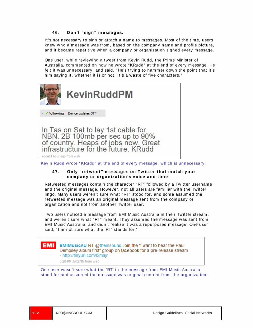
46. Don’t “sign” messages.
It’s not necessary to sign or attach a name to messages. Most of the time, users knew who a message was from, based on the company name and profile picture, and it became repetitive when a company or organization signed every message.
One user, while reviewing a tweet from Kevin Rudd, the Prime Minister of Australia, commented on how he wrote “KRudd” at the end of every message. He felt it was unnecessary, and said, “He’s trying to hammer down the point that it’s him saying it, whether it is or not. It’s a waste of five characters.”
Kevin Rudd wrote “KRudd” at the end of every message, which is unnecessary.
47. Only “retweet” messages on Twitter that match your company or organization’s voice and tone.
Retweeted messages contain the character “RT” followed by a Twitter username and the original message. However, not all users are familiar with the Twitter lingo. Many users weren’t sure what “RT” stood for, and some assumed the retweeted message was an original message sent from the company or organization and not from another Twitter user.
Two users noticed a message from EMI Music Australia in their Twitter stream, and weren’t sure what “RT” meant. They assumed the message was sent from EMI Music Australia, and didn’t realize it was a repurposed message. One user said, “I’m not sure what the ‘RT’ stands for.”
One user wasn’t sure what the ‘RT’ in the message from EMI Music Australia stood for and assumed the message was original content from the organization.
102 [email protected] Design Guidelines: Social Networks
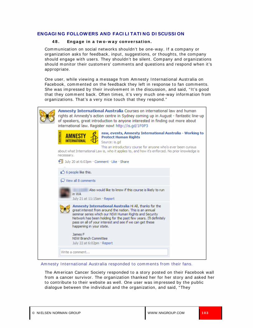
ENGAGING FOLLOWERS AND FACILITATING DISCUSSION 48. Engage in a two-way conversation.
Communication on social networks shouldn’t be one-way. If a company or organization asks for feedback, input, suggestions, or thoughts, the company should engage with users. They shouldn’t be silent. Company and organizations should monitor their customers’ comments and questions and respond when it’s appropriate.
One user, while viewing a message from Amnesty International Australia on Facebook, commented on the feedback they left in response to fan comments. She was impressed by their involvement in the discussion, and said, “It’s good that they comment back. Often times, it’s very much one-way information from organizations. That’s a very nice touch that they respond.”
Amnesty International Australia responded to comments from their fans.
The American Cancer Society responded to a story posted on their Facebook wall from a cancer survivor. The organization thanked her for her story and asked her to contribute to their website as well. One user was impressed by the public dialogue between the individual and the organization, and said, “They
© NIELSEN NORMAN GROUP WWW.NNGROUP.COM 103

commented back. She knows that they are there and they appreciate the content. I don’t expect that from companies these days.”
The American Cancer Society thanked an individual for posting about her experience with cancer.
JetBlue Airways did a good job of responding to questions and comments sent to them through Twitter. They often responded to questions and comments by sending a reply, which included a username (@username) and an explanation related to the posed issue.
One user, while reviewing their feed, noticed the series of replies to followers, and considered starting to follow them in case she ever needed to contact their customer service department. She preferred to contact them through Twitter, as opposed to email or phone, and said, “I actually really like that I have the option to follow them on Twitter and pose a question to a rep and have them get back to me. It’s easier than calling on the phone and being on hold.”
104 [email protected] Design Guidelines: Social Networks

JetBlue Airways engaged in a two-way conversation with their followers on Twitter by answering questions and responding through replies.
Not only did users notice when companies responded to messages or questions posed by friends, fans, and followers on social networks, but they also noticed when they didn’t. Users pointed out when companies and organizations were unresponsive to comments left by friends or fans, and preferred that they were more engaged. One user, while viewing a conversation on TOMS Shoes’ Facebook page, noticed a dialogue among fans about the availability of a certain shoe, but the company didn’t step in and answer their questions. She said, “Some other
© NIELSEN NORMAN GROUP WWW.NNGROUP.COM 105

users responded, but they didn’t. I definitely would expect them to respond to this.”
Users expected TOMS Shoes to respond to questions that fans had about inventory.
Interestingly, TOMS Shoes was much more responsive on Twitter. The same user reviewed their Twitter feed, and noted that they responded to questions and comments by replying to Twitter followers.
TOMS Shoes was responsive to customers on Twitter.
49. Respond to questions from followers and fans within 24 hours.
One of the benefits of sending a message to a company through a social network—as perceived by users—was that they’d get a timely response. Some preferred to reach out to organizations through social networks instead of contacting them over the phone or through email. For this reason, it’s important to respond to questions or messages sent through social networks quickly—within 24 hours. If you take too long or don’t respond at all, people notice, and the timestamps are available for all to see.
106 [email protected] Design Guidelines: Social Networks

One user became irritated with the Greater Dover Chamber of Commerce, because they had failed to continue a discussion with him about upcoming events. He said, “I was having a conversation with them back and forth, but it ends with me. They should get back to me. Don’t leave me hanging like that.”
One user was annoyed with the Greater Dover Chamber of Commerce, because they didn’t respond to a question he posed to them.
50. Monitor what Twitter users are saying about you.
It’s important to keep a pulse on what others are saying about you on social networks, and it’s easy to collect this information on Twitter. If you are able to track mentions of your company name, you’ll be able to respond to questions, complaints, or other issues. Monitoring can be done using some third-party applications or through the Twitter site itself; the Twitter site highlights tweets that include your Twitter name (@company), and other third party tools pull in tweets that include your company name, Twitter name, or other desired search terms.
© NIELSEN NORMAN GROUP WWW.NNGROUP.COM 107

51. Be selective in what you respond to.
Users understood that companies and organizations couldn’t respond to every comment or question posted or tweeted by followers, fans, and friends. Interestingly, they didn’t want companies to be too responsive.
One user said that if companies and organizations responded to everything, it became insincere. He said, “If they respond to everything, it loses its meaning.” Another user recognized that companies and organizations simply didn’t have the capacity to monitor every comment and question. She said, “I don’t expect them to respond to everything. That would be impossible.”
In general, users expected companies and organizations to respond to questions posed by friends, fans, and followers. They didn’t expect companies and organizations to respond to all general comments or posts.
52. Be careful with replying to followers on Twitter. Users don’t have the context of the discussion.
Replying to other Twitter users, which is done using the “@” symbol followed by the Twitter username, confused some users. Some users weren’t sure what the symbol stood for or its purpose. Others had trouble finding value and understanding the context of the discussion. One user talked about the effort required to follow a discussion between companies and individuals on Twitter. She said, “The commenting features with the @username… I don’t like that. It’s not really pertinent and then you have to bounce back and forth between pages to see what you were talking about.”
One user, while viewing updates from Fairfax Digital, commented on the frequent replies they sent through Twitter. He said, “There were a lot of customer support messages. It was very embryonic.” He wanted to see “hardcore news stories” from the organization through Twitter, and didn’t find value in the replies.
Another user saw a message from Fairfax Digital directed towards an individual, and didn’t think it was appropriate for the organization to send it to all their followers. He said, “I don’t know why that would go to everybody. That should be sent directly to that person.”
Users felt Fairfax Digital sent too many replies via Twitter and did not post enough information for the general audience.
108 [email protected] Design Guidelines: Social Networks

53. Solicit feedback or information from followers when appropriate.
Users weren’t interested in engaging in or following discussions if the topic wasn’t applicable to them. Users glazed past such discussions for two reasons: they weren’t appealing and they didn’t care what “strangers” had to say.
Some discussions—especially those that contained or requested valuable or helpful information—were reviewed by users. Others discussions, such as those that asked for anecdotes or personal stories—were quickly dismissed by users. Interestingly, not one user left a message or commented on a discussion in our test sessions. Most users said they didn’t usually comment on discussions, and only did so if they were passionate or genuinely interested in the content.
Some discussions, especially those that asked fans, friends, and followers for useful information or tips, were helpful to users. In particular, users found the City of Portsmouth, NH Facebook page to be interesting and useful because they prompted people for local information and suggestions that fans were genuinely interested in. Users who viewed their Facebook page were willing to engage and read through discussions that interested them.
One user, while reviewing the page, came across a message from the organization that asked fans to submit their top five favorite restaurants in the area. This user read through the comments associated with the post, and was interested in what others had to say, because he lived in the area and was always looking for new restaurants to try. He said, “The discussions are interesting to read. I can see what other people in the area recommend.” While viewing the comments, he looked for people he might know—which would make their recommendation more meaningful. Another user, who viewed the same discussion, said she reviewed it a few days earlier, because a friend had recently asked her for restaurant recommendations.
© NIELSEN NORMAN GROUP WWW.NNGROUP.COM 109

Users read through some of the 59 responses to a solicitation from the City of Portsmouth, NH for the best restaurants in the city.
Other types of discussions, which asked for useless or trivial information, were ignored by users. One user, while reviewing an update from Netflix, didn’t think the conversation was valuable enough to get involved, because it wasn’t interesting to him and he didn’t want to talk to “strangers”. He said, “Share your favorite lines from his movies? That’s not that interesting or helpful. It’s good if you are interested in getting involved in a discussion with strangers.”
Users weren’t interested in engaging in trivial discussion with Netflix and its fans.
54. Don’t ask for input or suggestions on something you are considered an expert on.
Some companies tried to engage their followers, friends, and fans by asking them for input, feedback, and suggestions on topics in which they were considered experts by users. This annoyed users, because they wanted to hear information and suggestions from experts.
One user, while viewing a request for travel tips from JetBlue Airways on Twitter, became annoyed that she had to do something in order to get travel tips from the airline company. She said, “It’s ‘travel tip Tuesday.’ It makes me have to go and reply to them as opposed to them just giving me something interesting. I don’t have the time for that.”
110 [email protected] Design Guidelines: Social Networks
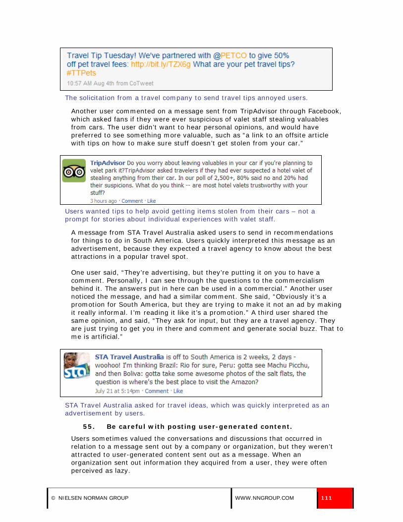
The solicitation from a travel company to send travel tips annoyed users.
Another user commented on a message sent from TripAdvisor through Facebook, which asked fans if they were ever suspicious of valet staff stealing valuables from cars. The user didn’t want to hear personal opinions, and would have preferred to see something more valuable, such as “a link to an offsite article with tips on how to make sure stuff doesn’t get stolen from your car.”
Users wanted tips to help avoid getting items stolen from their cars – not a prompt for stories about individual experiences with valet staff.
A message from STA Travel Australia asked users to send in recommendations for things to do in South America. Users quickly interpreted this message as an advertisement, because they expected a travel agency to know about the best attractions in a popular travel spot.
One user said, “They’re advertising, but they’re putting it on you to have a comment. Personally, I can see through the questions to the commercialism behind it. The answers put in here can be used in a commercial.” Another user noticed the message, and had a similar comment. She said, “Obviously it’s a promotion for South America, but they are trying to make it not an ad by making it really informal. I’m reading it like it’s a promotion.” A third user shared the same opinion, and said, “They ask for input, but they are a travel agency. They are just trying to get you in there and comment and generate social buzz. That to me is artificial.”
STA Travel Australia asked for travel ideas, which was quickly interpreted as an advertisement by users.
55. Be careful with posting user-generated content.
Users sometimes valued the conversations and discussions that occurred in relation to a message sent out by a company or organization, but they weren’t attracted to user-generated content sent out as a message. When an organization sent out information they acquired from a user, they were often perceived as lazy.
© NIELSEN NORMAN GROUP WWW.NNGROUP.COM 111

WMUR-TV, a local news outlet, posted a message through Facebook that linked to a video taken by a viewer. One user wasn’t interested in the post, because it was a link to someone’s personal video. He wanted more commentary from the organization about the story itself. He said, “It kind of strikes me as lazy. Instead of going out and finding something to talk about, they are linking us to someone’s home video.” Another user said, “It’s not that valuable.”
Users weren’t interested in user-generated content posted by a news organization.
56. Be a thought leader.
Some companies and organizations had a presence on social networks outside of their main profile page, and contributed to discussions and message boards that were seen by users exploring other areas of the site. These discussions and messages were valuable to users, especially when the information was relevant to the group.
For example, Madison Resource Funding initiated discussion on the Temporary Staffing Professional group on LinkedIn. One user appreciated the initiative, because they probed topics she was interested in reading about and commenting on. In this example, these discussion and posts weren’t necessarily tied to Madison Resource Funding’s profile on LinkedIn, but their presence within the group gave users the perception that they were a respected thought leader in the industry. One user said, “They’ve got some interesting posts. This Michael is a pretty smart guy.”
Madison Resource Funding initiated discussion within a LinkedIn Group, which was valued by one user.
112 [email protected] Design Guidelines: Social Networks

PROFILE INFORMATION AND DESIGN 57. Include your company or organization name in your
username.
When asked to locate the most recent messages from a company or organization, users often scanned for the company name or icon in their main feed. Some companies and organizations didn’t use their official company or organization name on a social network service, which caused users to skim past the update without recognizing it. Don’t assume that users know or understand a brand well enough to identify a cute or quirky username.
One user, while viewing a message from the United States Environmental Protection Agency (EPA) in her main Twitter feed was confused to see the message was from Greenversations. The Twitter name didn’t match her expectations of how the EPA should be represented on the social network. She said, “I’m assuming the EPA is Greenversations, but it doesn’t have EPA listed in the name.” To confirm that Greenversations was the EPA, she navigated to their main page on Twitter and viewed their profile information. After confirming, she explained why she was initially confused. She said, “When I think of the EPA, I think of a government agency, and then I see the title Greenversations…It just doesn’t sound as big as something as the EPA. I expected it to be more businesslike and a bit drier.”
One user wasn’t sure if this tweet was from the EPA, because the Twitter name didn’t include the organization name.
Another user was distracted by the name the United States Department of Education chose for their Twitter account, usedgov, because she thought it had a negative connotation. She said, “The name looks like short for ‘used gov’ as in ‘used government.’ I don’t think that’s a very favorable tagline. At least when you hover over it, it says it stands for U.S. Department of Education, but it seems like they could have come up with something better.”
The United States Department of Education’s Twitter name was usedgov, which sounded like “used government” to one user. The official name was available only when users hovered over the name and a tooltip displayed.
58. If possible, use a short, concise username.
When scanning a list of items, users often only look at the first few characters of each item. This means that the first few characters of an item need to be
© NIELSEN NORMAN GROUP WWW.NNGROUP.COM 113

descriptive and have strong information scent because users skip items they can’t quickly understand.
On a typical main feed or stream, the name of the organization or company was listed at the beginning of each message. If a company or organization’s name was short and concise (and used as the username), users were more likely to scan the username and part of the actual message. If a company or organization’s name was long (and used as the username), users were more likely to scan the username only and ignore the message.
If your company or organization name is lengthy, think of creative ways to truncate or abbreviate your username, but be sure to retain a username that users can quickly identify as they scan down a list of messages. It helps if you have an easily identifiable logo to couple with your condensed username.
For example, WebMD used WebMD as their username on Facebook, which was short, descriptive, and easily identifiable. Kmart used the name KmartDealsnNews on Twitter, which was unnecessarily long. They should have truncated their username to Kmart, which would be easier to scan and process.
WebMD has a short, concise Facebook username, which means users were more likely to scan to the actual message instead of only scanning the username.
Kmart had a short company name, but they unnecessarily lengthened it to KmartDealsnNews on Twitter. It’d be best to use just Kmart instead.
59. Use your official name on your profile page, especially if you use an acronym or unofficial name as your username.
Some users navigated to a company’s page on a social network when they were unsure about who sent a message that appeared on their main feed or wall. This often occurred when a company had a username that was difficult to decipher or identify.
When users navigated to an organization’s page on a social network, they looked for an official name to determine who sent the message. To help users quickly locate and be confident about who sent the message, provide a full or official
114 [email protected] Design Guidelines: Social Networks

name on the profile page. Don’t rely on abbreviations or acronyms that require interpretation, and don’t repeat your username as your official name.
The Center for Disease Control (CDC) had a presence on Twitter, and used the name CDCemergency. The name they associated with their Twitter account was almost exactly the same: CDC Emergency. Their profile should have included an official organization name, so users didn’t have to decipher what the Twitter name stood for.
The CDC should have displayed their official organization name on their Twitter profile.
60. Use title case for your company or organization name.
When people used a social network’s search engine to locate a company, they were often bombarded with a list of search results that included users’ representations of the organization they were seeking. To help your organization stand out from fan or user-based search results, use title case, because it makes you appear more “official.”
One user, while searching for the Stephen Kellogg and the Sixers band on Facebook, chose the first result in the list of 24 search results. When asked why she chose it, she said, “Everything is spelled out and capitalized correctly.”
© NIELSEN NORMAN GROUP WWW.NNGROUP.COM 115
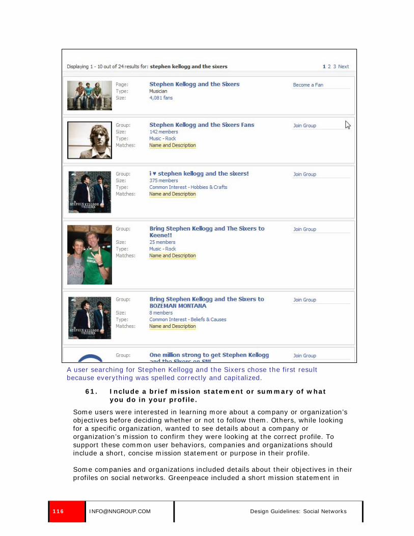
A user searching for Stephen Kellogg and the Sixers chose the first result because everything was spelled correctly and capitalized.
61. Include a brief mission statement or summary of what you do in your profile.
Some users were interested in learning more about a company or organization’s objectives before deciding whether or not to follow them. Others, while looking for a specific organization, wanted to see details about a company or organization’s mission to confirm they were looking at the correct profile. To support these common user behaviors, companies and organizations should include a short, concise mission statement or purpose in their profile.
Some companies and organizations included details about their objectives in their profiles on social networks. Greenpeace included a short mission statement in
116 [email protected] Design Guidelines: Social Networks

their Twitter profile, which clearly stated their objectives and purpose. Users could use this as a basis for understanding the organization’s main goals and intentions as well as for verifying the organization’s identity.
Greenpeace included a short mission statement on their Twitter profile.
Other companies and organizations didn’t provide a brief mission statement in their social network profiles. Instead, they wasted the allotted space on meaningless text.
The United States Department of State didn’t include any information about their objectives or goals, and used the space to welcome visitors and state the first name of the person responsible for updating the Twitter feed—which was meaningless information because it didn’t include a last name or job title. The organization should have provided a concise, brief statement about their purpose, especially because their Twitter name and official name were both “DipNote,” which wasn’t easily recognizable.
The United States Department of State didn’t include any information about the organization’s mission or purpose in their Twitter profile.
CNN provided information about the company in a question and answer format on their Facebook profile, which was truncated because it was longer than the allotted length. The company should have provided a brief, concise mission statement or purpose instead of elongating the information in a question and answer format.
© NIELSEN NORMAN GROUP WWW.NNGROUP.COM 117

CNN’s Company Overview on Facebook was inexplicably made up of a list of trivia from the CNN Tour.
62. Include a URL to a relevant page or website.
Some users clicked on the provided URL in a company or organization’s social network profile to confirm they were looking at the appropriate profile. Users also gauged the credibility of a company or organization’s representation on a social network by whether or not they provided this basic information.
Some companies and organizations provided this information on their profile page. For example, The New York Times and Vocalpoint provided links to their homepages in their profiles.
The New York Times included a link to the site’s homepage in their Twitter profile.
118 [email protected] Design Guidelines: Social Networks
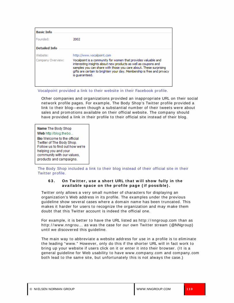
Vocalpoint provided a link to their website in their Facebook profile.
Other companies and organizations provided an inappropriate URL on their social network profile pages. For example, The Body Shop’s Twitter profile provided a link to their blog—even though a substantial number of their tweets were about sales and promotions available on their official website. The company should have provided a link in their profile to their official site instead of their blog.
The Body Shop included a link to their blog instead of their official site in their Twitter profile.
63. On Twitter, use a short URL that will show fully in the available space on the profile page (if possible).
Twitter only allows a very small number of characters for displaying an organization’s Web address in its profile. The examples under the previous guideline show several cases where a domain name has been truncated. This makes it harder for users to recognize the organization and may make them doubt that this Twitter account is indeed the official one.
For example, it is better to have the URL listed as http://nngroup.com than as http://www.nngrou... as was the case for our own Twitter stream (@NNgroup) until we discovered this guideline.
The main way to abbreviate a website address for use in a profile is to eliminate the leading “www.” However, only do this if the shorter URL will in fact work to bring up your website if users click on it or enter it into their browser. (It is a general guideline for Web usability to have www.company.com and company.com both lead to the same site, but unfortunately this is not always the case.)
© NIELSEN NORMAN GROUP WWW.NNGROUP.COM 119

64. If an individual or team provides the messages, identify them by first name, last name, and job title.
Some companies and organizations designated individuals or a team to send messages through social networks. Users wanted to know who these individuals were—especially if the messages sounded as though they were coming from an individual and not a company. Companies and organizations should provide these details to help users get a better understanding of the individuals behind the messages.
Some companies and organizations provided information about the individuals responsible for the messages sent through social networks on behalf of a company—but didn’t provide enough detail. For example, JetBlue Airways designated five individuals to send messages through Twitter and listed their names in the company’s profile on the social network. Unfortunately, they only listed first names, which was meaningless to users. Individual job titles or a team name would have provided more information about those managing the messages.
The first names of the five individuals responsible for JetBlue Airways’ Twitter messages were listed in their profile on the social network, but additional details—such as last name and job titles or a team name—weren’t included.
Bentley University provided the first and last names of two individuals responsible for the messages sent through Twitter, but failed to provide job titles or roles. These additional details would help users understand who these people are—along with their general responsibilities at the university.
Bentley University listed the full names of two individuals responsible for their Twitter messages, but didn’t include job title information.
Comcast’s customer service Twitter account included essential details about the individual responsible for sending messages, Frank Eliason. His full name, along with his job title, was provided on the Twitter profile page.
120 [email protected] Design Guidelines: Social Networks

The full name and job title of the individual managing Comcast’s customer service Twitter account were included in the profile.
65. Avoid associating your company or organization with an age or gender.
Users didn’t expect to see the same information on a company or organization’s profile as they did on individual profiles, such as profiles of family members or friends. Some company profiles included gender and age information, which was off-putting to users. Avoid specifying this information, because users didn’t think of companies and organizations as living, breathing individuals. While organizations are evolving entities, those associated with an age or gender only confused users.
One user, while searching for Continental Airlines on MySpace, noticed that the company was a “75-year old male,” and she questioned the validity of the MySpace profile. She said, “This can’t be right.”
Continental Airlines’ basic profile information included age and gender information, which confused users.
66. Choose a meaningful and eye-catching profile picture.
When users were scanning new messages on their main feed or homepage on a social network, one of the first things they noticed was the image associated with company or organization’s username. It’s important to choose an image that’s meaningful, as well as one that stands out among others. Users quickly spotted new messages from well-known companies and organizations that used their logo as a profile picture. Pictures that were too small or hard to discern were overlooked by users.
© NIELSEN NORMAN GROUP WWW.NNGROUP.COM 121

One user immediately noticed TripAdvisor’s logo next to a message on Facebook. He said, “The icon is easily recognizable.”
TripAdvisor used their logo as their profile picture on Facebook, which was easily recognizable.
Another user, while viewing her main feed on MySpace, quickly scrolled past a message from Adidas, because the profile picture was tiny and difficult to quickly recognize.
The Adidas logo was difficult to see, especially when placed alongside additional updates and associated profile pictures on the MySpace main feed.
122 [email protected] Design Guidelines: Social Networks

A third user, when asked to find the most recent update from the United States Department of Education on Twitter, had trouble locating it because the logo didn’t stand out among the others in her main feed. She scrolled past it quickly, because the image was small and subdued. After she realized she missed it, she slowly backtracked and scoured the page looking for it. When she located it, she said, “It just doesn’t grab my attention. It doesn’t have a catchy picture. Visually, it’s not cutting it for me.”
One user overlooked an update from the United States Department of Education because the image didn’t stand out among all the other tweets in her main Twitter feed.
© NIELSEN NORMAN GROUP WWW.NNGROUP.COM 123
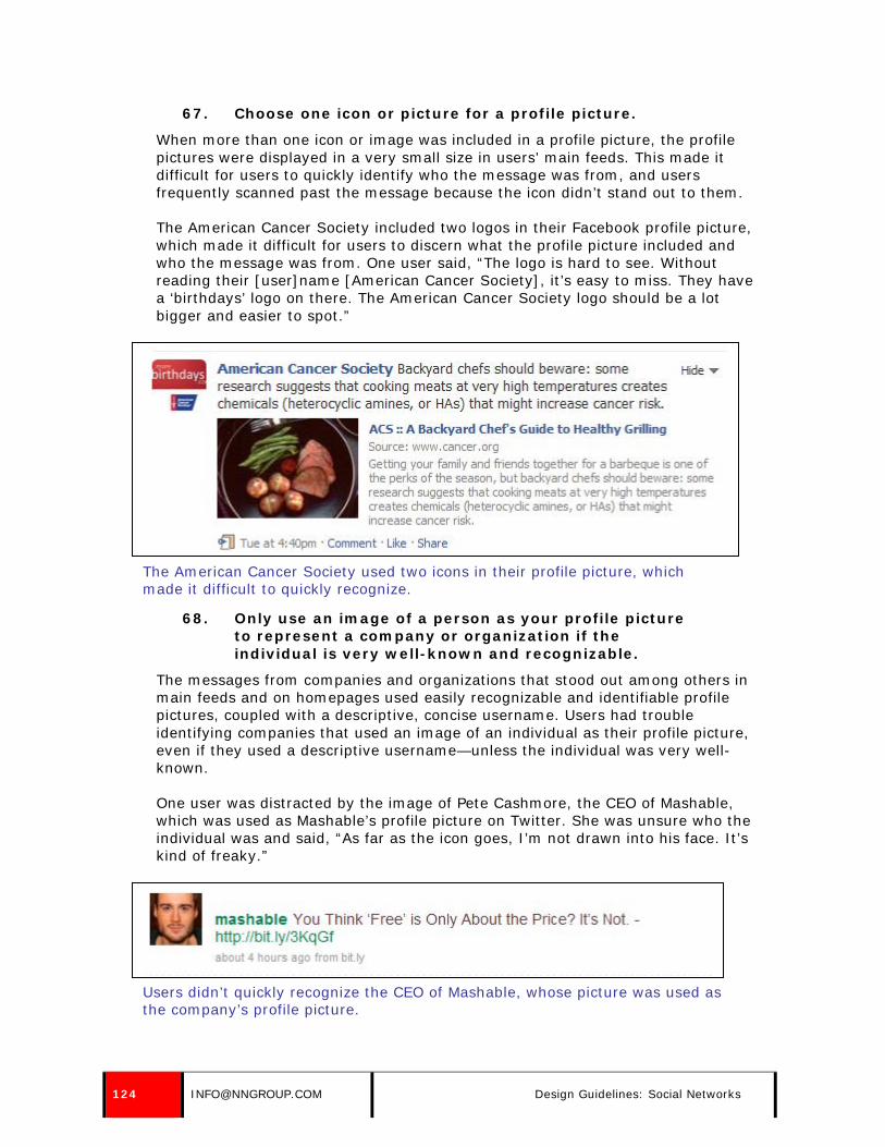
67. Choose one icon or picture for a profile picture.
When more than one icon or image was included in a profile picture, the profile pictures were displayed in a very small size in users’ main feeds. This made it difficult for users to quickly identify who the message was from, and users frequently scanned past the message because the icon didn’t stand out to them.
The American Cancer Society included two logos in their Facebook profile picture, which made it difficult for users to discern what the profile picture included and who the message was from. One user said, “The logo is hard to see. Without reading their [user]name [American Cancer Society], it’s easy to miss. They have a ‘birthdays’ logo on there. The American Cancer Society logo should be a lot bigger and easier to spot.”
The American Cancer Society used two icons in their profile picture, which made it difficult to quickly recognize.
68. Only use an image of a person as your profile picture to represent a company or organization if the individual is very well-known and recognizable.
The messages from companies and organizations that stood out among others in main feeds and on homepages used easily recognizable and identifiable profile pictures, coupled with a descriptive, concise username. Users had trouble identifying companies that used an image of an individual as their profile picture, even if they used a descriptive username—unless the individual was very well-known.
One user was distracted by the image of Pete Cashmore, the CEO of Mashable, which was used as Mashable’s profile picture on Twitter. She was unsure who the individual was and said, “As far as the icon goes, I’m not drawn into his face. It’s kind of freaky.”
Users didn’t quickly recognize the CEO of Mashable, whose picture was used as the company’s profile picture.
124 [email protected] Design Guidelines: Social Networks

69. Create a profile design that matches your brand.
Avoid relying on the social network’s default design as the design for your company or organization’s page on a social network. Some services, such as Facebook, didn’t allow users to customize the look and feel of their page (aside from a profile picture), but other services, such as MySpace and Twitter, did. Create a profile design that matches your brand and allows users to draw a connection to your corporate site.
One user compared the visual design of two government organization pages on Twitter: the United States Environmental Protection Agency (EPA) and the United States Department of Education. She strongly preferred the EPA’s design over the Department of Education’s, because “visually, it [the Department of Education] doesn’t grab me. It lacks a good logo, and the color choice is poor. It just seems too dry in comparison to this one [EPA], which uses color so you can see the information quickly. I don’t get lost on the page.”
Interestingly, the only differences between the two pages were the logos and the use of color.
One user said the use of color and an eye-catching logo gave the EPA’s Twitter page an attractive feel.
© NIELSEN NORMAN GROUP WWW.NNGROUP.COM 125
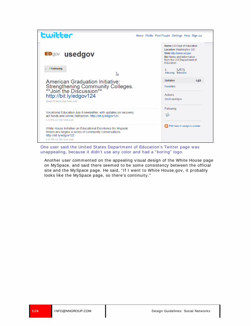
One user said the United States Department of Education’s Twitter page was unappealing, because it didn’t use any color and had a “boring” logo.
Another user commented on the appealing visual design of the White House page on MySpace, and said there seemed to be some consistency between the official site and the MySpace page. He said, “If I went to White House.gov, it probably looks like the MySpace page, so there’s continuity.”
126 [email protected] Design Guidelines: Social Networks
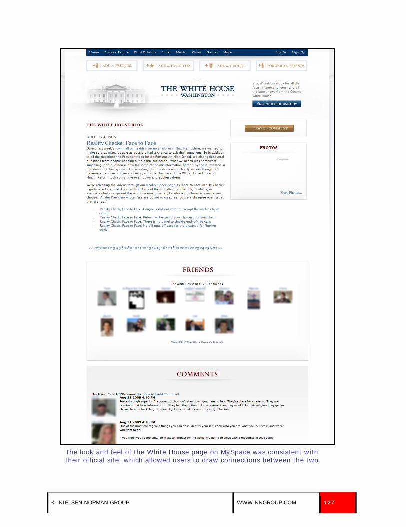
The look and feel of the White House page on MySpace was consistent with their official site, which allowed users to draw connections between the two.
© NIELSEN NORMAN GROUP WWW.NNGROUP.COM 127

70. If you have a presence on Facebook, create an official fan page.
Some social networks, such as Facebook, allowed companies to create official fan pages. Users were more apt to click on and join fan pages instead of joining groups, because the fan pages were “more official.” This was especially important when users conducted a search for a company using the social network’s search engine, because both types of pages appeared in search results.
One user, while evaluating a list of search results for Runner’s World, chose to join an official fan page over a group page. He said, “I chose ‘Runner’s World Magazine’ because it said ‘Become a Fan’ not ‘Join Group.’ The results that say ‘Become a Fan’ usually means it’s a business, but a group page can be started by anyone.”
One user selected the third search result because the call to action was “Become a Fan,” which meant it was likely a business and not an unofficial group page.
71. Use a short, readable, and predictable URL for your page on social network sites.
Some social network sites, such as Facebook, allowed companies to create a unique URL for their page. Some companies took advantage of this by creating short, readable URLs—making it easy for users to predict or remember. For example, the URL to CNN’s page on Facebook was
128 [email protected] Design Guidelines: Social Networks

http://www.facebook.com/cnn. Other companies didn’t utilize this feature, and used long, unreadable URLs that were difficult to predict or remember. For example, the Facebook URL for a local news station, WMUR-TV, was: http://www.facebook.com/pages/Manchester-NH/WMUR-TV/6439768716.
Other social networks, such as Twitter, used a company’s username as part of the URL for their page. For example, JetBlue Airways, which had a short, easy to identify username (jetblue), could be found at http://www.twitter.com/jetblue. Other companies used hard to identify usernames, which also translated to unpredictable URLs—another reason to use a short, easy to recognize username. For example, The United States Department of State’s Twitter name was dipnote, and their URL on the social network service was http://www.twitter.com/dipnote. While it was short and readable, it wasn’t intuitive or what users expected.
As customizable URLs become more prevalent, users can rely on them to get quick access to the exact information they want. Having a short, predictable URL is essential.
© NIELSEN NORMAN GROUP WWW.NNGROUP.COM 129

BUILDING A FOLLOWING AND PROMOTING A SOCIAL NETWORK PRESENCE
72. Accept friend requests within 24 hours.
Some social networks, such as MySpace and private accounts on Twitter, require companies and organizations to accept friends and followers before users can publicly interact with them: receive their updates in their main feed, write on their wall, comment on photos, and other activities. When it took too long to be accepted as a friend, users grew impatient and wondered about the credibility of the organization and their commitment to the social network. One user commented that it took almost two weeks for Oxfam America to accept his friend request on MySpace, which made him question how active they were on the site.
Another user requested to be “friends” with Continental Airlines on MySpace, but after two weeks of waiting, the company failed to accept her request. The user questioned whether or not she had completed the process correctly. She went through the process again to confirm, and MySpace displayed a message that she had already requested the company as a friend. She became annoyed, because she had wasted time trying to go through the process again. She said, “I would have expected a welcome message or some confirmation that they accepted my request.”
A third user was never accepted as a friend of the Royal Society for the Prevention of Cruelty to Animals (RSPCA) on MySpace, and compared the experience to Facebook, which allowed users to become fans of companies and organizations instantaneously. She said, “It shouldn’t take so long, because for Facebook, it added the same day. Am I doing something wrong?”
73. Try to attract a high number of followers, fans, and friends.
Users often judged the validity of a company’s presence on a social network by the number of followers or friends they had, especially when they conducted a search for a specific organization. If a company or organization had a high number of followers, fans, and friends, it often appeared at the top of the search results page—increasing both visibility and credibility. Users assumed that the real organization, especially if it was well-known, would attract a significant number of friends, followers, and fans, and unofficial representations of a company or organization would have fewer.
One user, while trying to locate Billy Joel on Twitter, was faced with a long list of search results. The account at the top of the search results page had the most followers, which swayed her to follow that account over the others in the list. She referenced the number of followers as a deciding factor when choosing which account to follow. She said, “I would look at the numbers [to choose who to follow], and there are 1800 people who follow him.”
130 [email protected] Design Guidelines: Social Networks

One user searched for Billy Joel on Twitter, and chose the first search result because it had the highest number of followers.
© NIELSEN NORMAN GROUP WWW.NNGROUP.COM 131

Another user, while locating an NPR talk show on Facebook, chose the first listing on the search results page, because it had the most fans out of the list of results. She said, “If they have the most fans, that’s probably the right one.”
One user searched for “Wait, Wait…Don’t Tell Me!” on Facebook, and chose the first search result because it had the highest number of followers.
74. Follow your followers on Twitter.
Some users thought companies or organizations were arrogant or lazy if they had a large following on Twitter, but failed to follow their own fans or followers. It also damaged the reputation of the company or organization, because users assumed that they didn’t know how to utilize Twitter correctly. Others were disappointed if a company or organization didn’t follow a lot of individuals or other companies, because they often looked at the other Twitter accounts an organization or company followed to find additional sources of information or accounts to follow.
132 [email protected] Design Guidelines: Social Networks
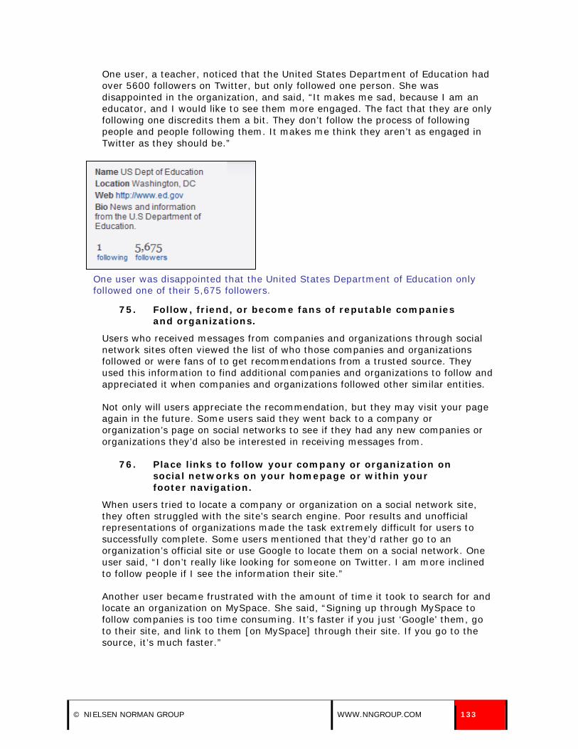
One user, a teacher, noticed that the United States Department of Education had over 5600 followers on Twitter, but only followed one person. She was disappointed in the organization, and said, “It makes me sad, because I am an educator, and I would like to see them more engaged. The fact that they are only following one discredits them a bit. They don’t follow the process of following people and people following them. It makes me think they aren’t as engaged in Twitter as they should be.”
One user was disappointed that the United States Department of Education only followed one of their 5,675 followers.
75. Follow, friend, or become fans of reputable companies and organizations.
Users who received messages from companies and organizations through social network sites often viewed the list of who those companies and organizations followed or were fans of to get recommendations from a trusted source. They used this information to find additional companies and organizations to follow and appreciated it when companies and organizations followed other similar entities.
Not only will users appreciate the recommendation, but they may visit your page again in the future. Some users said they went back to a company or organization’s page on social networks to see if they had any new companies or organizations they’d also be interested in receiving messages from.
76. Place links to follow your company or organization on social networks on your homepage or within your footer navigation.
When users tried to locate a company or organization on a social network site, they often struggled with the site’s search engine. Poor results and unofficial representations of organizations made the task extremely difficult for users to successfully complete. Some users mentioned that they’d rather go to an organization’s official site or use Google to locate them on a social network. One user said, “I don’t really like looking for someone on Twitter. I am more inclined to follow people if I see the information their site.”
Another user became frustrated with the amount of time it took to search for and locate an organization on MySpace. She said, “Signing up through MySpace to follow companies is too time consuming. It’s faster if you just ‘Google’ them, go to their site, and link to them [on MySpace] through their site. If you go to the source, it’s much faster.”
© NIELSEN NORMAN GROUP WWW.NNGROUP.COM 133

When users navigated to a company or organization’s website for information about their presence on social networks, most spent time reviewing the homepage. Some users scoured the homepage for links to sign up to follow a company through Facebook, MySpace, or Twitter.
One user went to the Dave Matthews Band site to find a way to follow them on Facebook, and quickly found the link to do so on the homepage.
The call to action to follow Dave Matthews Band on Facebook was prominently displayed on the band’s homepage.
Another user navigated to the Wait, Wait… Don’t Tell Me! site to find out if they had a presence on Twitter, and immediately located the link to follow them on the service on their homepage.
The call to action to follow the talk show on Twitter was displayed on the left hand side of the homepage.
134 [email protected] Design Guidelines: Social Networks

If the appropriate calls to action weren’t immediately visible on an organization’s homepage, some users didn’t navigate further into the site and hunt for the information. One user looked for a way to follow People Magazine on their homepage for 20 seconds before giving up and moving on. The homepage didn’t provide any links or information about the publication’s presence on social networks.
77. Pair calls to action on your homepage or within your footer navigation with appropriate logos.
Users scanned a company or organization’s homepage to learn whether or not they had a presence on social network sites. They looked for specific calls to action, such as “Follow us on Twitter” or “Become a fan on Facebook,” but they also looked for the recognizable social network logos. These logos stood out on the page and quickly drew users’ attention.
While logos drew the attention of users, the accompanying link description provided essential details: where the user would go if they clicked on the link. It’s important to include both—and not just the recognizable logo—so users don’t have to guess where the link will take them. Additionally, it’s important to make the logos clickable and link them to your profile page on the respective network—not to that network’s general homepage.
Gap included the logos for Facebook, Twitter, and YouTube on their homepage, along with specific calls to action, such as “Join us on Facebook.” These two items—a link description and a clear call to action—provided users with all the information they needed.
Gap paired recognizable social network logos with a call to action.
78. Place links to social network content within the main site navigation.
Some users, after reviewing the homepage for links to a company or organization’s presence on social networks, moved to the main navigation to locate the desired information if they couldn’t find it on the homepage. A couple
© NIELSEN NORMAN GROUP WWW.NNGROUP.COM 135
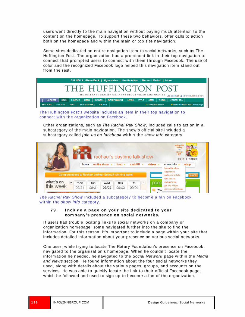
users went directly to the main navigation without paying much attention to the content on the homepage. To support these two behaviors, offer calls to action both on the homepage and within the main or top site navigation.
Some sites dedicated an entire navigation item to social networks, such as The Huffington Post. The organization had a prominent link in their top navigation to connect that prompted users to connect with them through Facebook. The use of color and the recognized Facebook logo helped this navigation item stand out from the rest.
The Huffington Post’s website includes an item in their top navigation to connect with the organization on Facebook.
Other organizations, such as The Rachel Ray Show, included calls to action in a subcategory of the main navigation. The show’s official site included a subcategory called join us on facebook within the show info category.
The Rachel Ray Show included a subcategory to become a fan on Facebook within the show info category.
79. Include a page on your site dedicated to your company’s presence on social networks.
If users had trouble locating links to social networks on a company or organization homepage, some navigated further into the site to find the information. For this reason, it’s important to include a page within your site that includes detailed information about your presence on various social networks.
One user, while trying to locate The Rotary Foundation’s presence on Facebook, navigated to the organization’s homepage. When he couldn’t locate the information he needed, he navigated to the Social Network page within the Media and News section. He found information about the four social networks they used, along with details about the various pages, groups, and accounts on the services. He was able to quickly locate the link to their official Facebook page, which he followed and used to sign up to become a fan of the organization.
136 [email protected] Design Guidelines: Social Networks
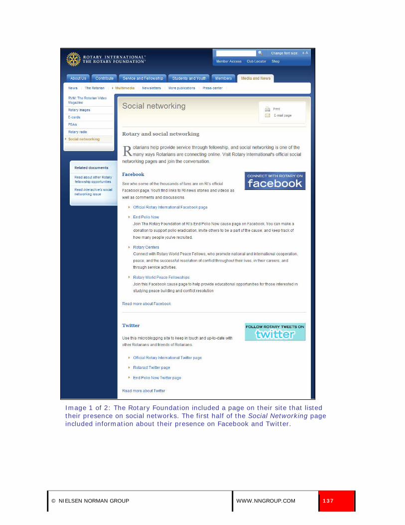
Image 1 of 2: The Rotary Foundation included a page on their site that listed their presence on social networks. The first half of the Social Networking page included information about their presence on Facebook and Twitter.
© NIELSEN NORMAN GROUP WWW.NNGROUP.COM 137
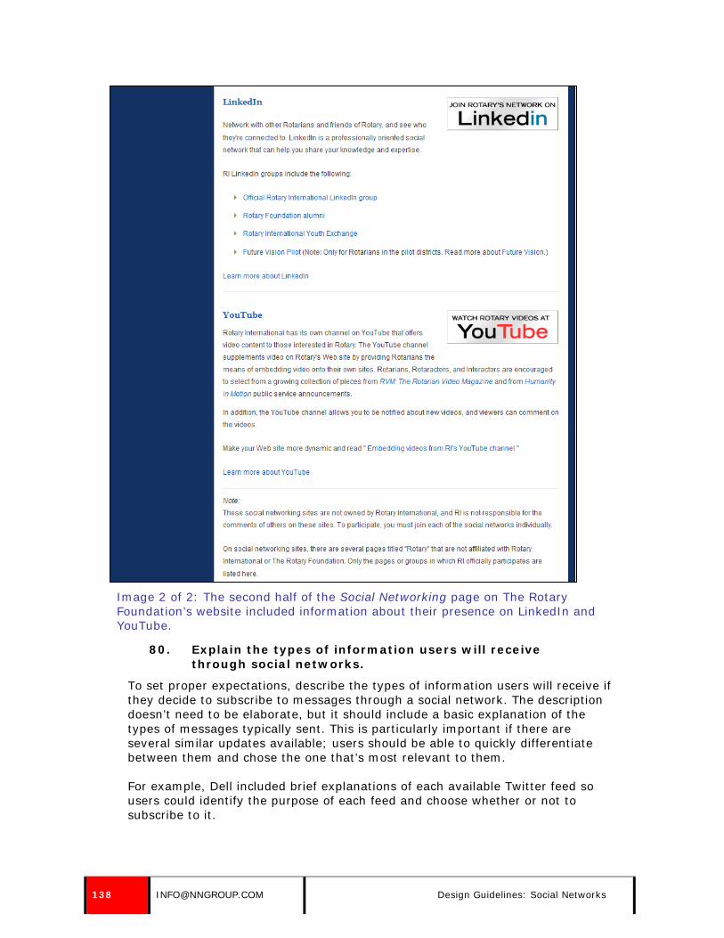
Image 2 of 2: The second half of the Social Networking page on The Rotary Foundation’s website included information about their presence on LinkedIn and YouTube.
80. Explain the types of information users will receive through social networks.
To set proper expectations, describe the types of information users will receive if they decide to subscribe to messages through a social network. The description doesn’t need to be elaborate, but it should include a basic explanation of the types of messages typically sent. This is particularly important if there are several similar updates available; users should be able to quickly differentiate between them and chose the one that’s most relevant to them.
For example, Dell included brief explanations of each available Twitter feed so users could identify the purpose of each feed and choose whether or not to subscribe to it.
138 [email protected] Design Guidelines: Social Networks
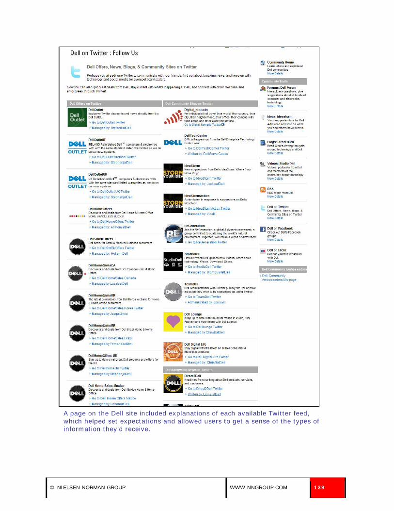
A page on the Dell site included explanations of each available Twitter feed, which helped set expectations and allowed users to get a sense of the types of information they’d receive.
© NIELSEN NORMAN GROUP WWW.NNGROUP.COM 139

81. Ensure that searches for social networking related terms return the page describing your presence on social networks.
If users had trouble locating information on a company or organization’s website about their presence on social networks, some used the site’s search engine to seek out the information. Users typed terms such as “facebook,” “twitter,” and “social networks” into search engines to locate the desired information. It’s important to ensure that the page describing your presence on social networks appears on top of your site’s search results listings for these common query terms. Additionally, companies and organizations should check search logs for other terms users may use on their site to find information about their presence on social networks and make sure those terms return proper results as well.
Depending on what search software you have installed on your site, one way to implement this guideline may be to utilize the “best bets” feature. In many search systems this feature allows the server administrator to define one or more pages that will always be forced to the top of the search engine results page (SERP) when users enter a specific keyword. So, for example, you would tell the search software that your page about your social network presence should always be the “best bet” result whenever users search for terms like “Twitter,” “tweet,” “facebook,” “social networks,” or other similar terms.
One user, who wanted to follow Apple on Twitter, had trouble locating information about their presence on the social network on the Apple site. After scanning the homepage for a link or call to action, he typed “twitter” into the site’s search engine. The search results didn’t contain anything relevant, and he said, “I can’t see anything so I’m guessing they don’t have a Twitter page.”
The results for a “twitter” search on the Apple Web site didn’t contain anything relevant.
140 [email protected] Design Guidelines: Social Networks

82. Provide information about your social network presence in email correspondence, especially newsletters.
Many users in our study mentioned that they discovered a company or organization was on a social network through a newsletter or email they received from them. Some users signed up to follow an entity by clicking on the links provided in the email communication.
One user found out Rob Thomas, her favorite musician, was on Twitter after reading one of the newsletters he sent out. Another user found out about an animal rescue group’s presence on Facebook through an email newsletter from the organization. She said, “When I first looked to rescue a pet, they were sending me a lot of emails with all of the pets who needed homes, and through one of those, I saw they had a Facebook page. That was how I came to join it.” A third user said, “Sometimes I get emails from organizations asking me to follow them on Twitter and Facebook. I follow the ones I’m interested in following.”
ShopBop included links to connect with them on Facebook and Twitter in an email newsletter. The calls to action included the social network icons, which were easy for users to recognize.
An email from ShopBop included clear calls to action to become a fan or follower of the company on Facebook and Twitter.
© NIELSEN NORMAN GROUP WWW.NNGROUP.COM 141
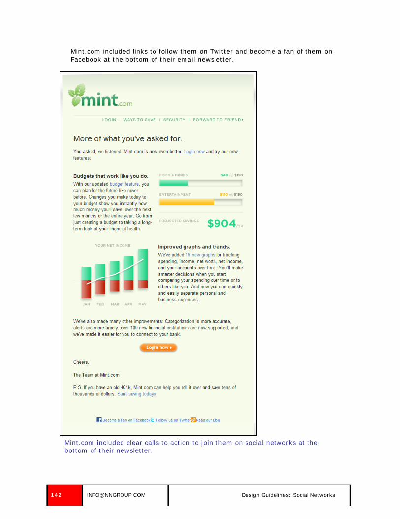
Mint.com included links to follow them on Twitter and become a fan of them on Facebook at the bottom of their email newsletter.
Mint.com included clear calls to action to join them on social networks at the bottom of their newsletter.
142 [email protected] Design Guidelines: Social Networks

83. Place information about your presence on social networks on purchase confirmation pages.
Providing information about your presence on social networks through email communications can help you build a larger following, but users may never see this information because they don’t read every email message they receive. For this reason, it’s a good idea to present this information to users when they are most attentive. For example, when users make a purchase on an e-commerce site, they are typically very involved in the process—from adding the item to the shopping cart to the purchase confirmation page. It’s a good idea to place information about your presence on social network sites on the purchase confirmation page, because users are very likely to see it—and potentially follow the calls to action. However, there’s fine line between being informative and being obnoxious; be sure you provide users with all the essential information about their order first, followed by links to your company or organization’s presence on social network sites in a secondary part of the confirmation page. Also, don’t promote social networks on earlier steps of your checkout process or other workflow screens. While people are still in the process of completing their purchase, you don’t want to distract them and possibly lose the order.
Zappos.com includes information about their social network presence on purchase confirmation pages, but it pushes essential order information further down the page.
© NIELSEN NORMAN GROUP WWW.NNGROUP.COM 143

84. Occasionally mention your presence on social networks through your messages.
As discussed previously, some users followed the same company or organization on more than one social network. However, some users didn’t realize that a company they received messages from on one social network also had a presence on another social network. For this reason, companies and organizations should provide information about their presence on other social networks in the messages they send through a specific social network.
For example, the Rupp Arena provided information about their presence on Facebook in a message they sent through Twitter. They didn’t blatantly state they were also on Facebook. Instead, they referenced their presence on the social network by tying it into a message. One user, who reviewed the message, thought it was a clever way to let people know about their presence on Facebook.
The Rupp Arena referenced their presence on Facebook within a Twitter message.
85. If your social network presence can no longer be supported, provide details on how users can continue to receive information.
Some companies may need to terminate their presence on social networks due to budget constraints, lack of resources, or other reasons. It’s important to provide followers with information about how they can continue to receive updates or information from the organization. Otherwise, users may wonder why they no longer receive messages, and the company may lose credibility if they fail to provide followers with new information. In a final message, state that the account will no longer be maintained, and link users to other resources that will provide them with timely updates: an email newsletter, an RSS feed, a different social network, or the website.
144 [email protected] Design Guidelines: Social Networks

Design Guidelines: RSS/News Feeds
NEWS FEED CONTENT 86. Focus on one topic in each item.
Similar to information sent through social networks, RSS is a good way to deliver discrete chunks of information rather than summaries or recaps of multiple items. Users didn’t expect one headline to include links to multiple items; when it did, it made it more difficult for people to use the information.
One user in our field study said, “An RSS feed with a bunch of links does me no good. I know they’re doing it because it’s difficult to get a full article for each item, but it’s a pain.” He liked to quickly review each item and click through to any story he wanted to read. When multiple items were listed together, it slowed him down.
Another user, while viewing an update from This Week in Education, became overwhelmed by the varying content and series of links in a single item. She had trouble processing the information quickly, and wasn’t sure why the post included so many links to various stories. The news feed should have presented each of these stories as a separate item.
The series of stories and links in a single RSS item from This Week in Education overwhelmed one user.
87. Include no more than 10 words in each headline, and place information carrying words at the beginning.
As mentioned previously, users only read the first few characters of each item as they scan down a list of items. When users viewed RSS feeds, they scanned them very quickly and looked for information of interest. Headlines must get to the
© NIELSEN NORMAN GROUP WWW.NNGROUP.COM 145

point immediately, because users may not look beyond the first one or two words in a headline.
This eyetracking heatmap shows RSS news feeds from the BBC as seen in Bloglines. This shows where one user looked as he read through the headlines and reviewed the available news feeds. He looked predominantly at headlines, focusing on the first four words in the first headline, four words in the second, and one word in each of the third and fourth headlines. (In eyetracking heatmaps, red indicates the areas users looked the most, yellow where they looked less, and blue where they looked the least. Gray areas did not get any looks.)
It is crucial to include information-carrying words at the beginning of each brief headline, because users may only read the first few words of the headline. They may not see the full headline or accompanying blurb, depending on the news reader being used and the settings within the news reader.
For instance, one user changed the default view in FeedDemon so that she saw only headlines, and each displayed on only one line. This meant many of the headlines were cut off and ended with an ellipsis.
146 [email protected] Design Guidelines: RSS/News Feeds

This eyetracking heatmap shows where one user looked on a page displaying CNN headlines in FeedDemon. Red indicates areas of the screen she spent the most time looking at. She changed the display to see each headline on one line in the middle pane, rather than viewing the full headline and blurb. Most headlines were cut off in this view, making the first words in each headline even more crucial. She read the full visible text of some headlines, but shifted to reading only the first few words of the last four headlines she looked at.
Two users accessed their RSS feeds from iGoogle, which only displayed headlines. These users had to click the expand widget to view the accompanying blurb or place their mouse on the headline to see the blurb in a tooltip. One user talked about how he viewed the headlines in his RSS reader. He said, “I usually mouse over any feeds that catch my eye so that I can read the entire headline. If the headline looks sufficiently interesting, I will click the feed to get a summary.”
© NIELSEN NORMAN GROUP WWW.NNGROUP.COM 147

Two users accessed their RSS feeds from iGoogle and could only see headlines by default. Users could view the summary by clicking on the expand control next to the headline (shown in the first image) or placing their mouse on the headline to view the blurb in a tooltip (shown in the second image).
88. State the key point of the content in the headline.
It’s important for headlines to be extremely descriptive, so users can quickly gauge their interest in learning more about a story or headline. Headlines that were vague or uninformative were ignored by users, because they didn’t want to invest the time deciphering them.
One user, while reviewing the latest headline from the United States Consumer Product Safety Commission, was confident that she knew enough information about the story without having to navigate to more details. She appreciated the descriptive headline, because it included the information she wanted to know about the story. She said, “I have the brand name, product type, and why it’s recalled. I can quickly see if it’s something that’s pertinent to me. They seem to put a lot of information into that headline.”
The headline sent out by the United States Consumer Product Safety Commission included enough details so users could confidently decide whether or not the story was pertinent to them. Although it was fairly lengthy, it included all the information users needed.
89. Include a 2- to 4-line explanatory blurb for each item that supplements the headline and summarizes the article.
Some news readers allowed users to view a full or partial blurb before linking to the full item. Users may only read a few words of these blurbs, but blurbs helped users determine their interest in news items. One user said she liked that “it gives you a topic and a bit of a summary so you can decide to open the article.”
One user, while viewing an update from The Wall Street Journal, was unsure what some stories were about based on the headline alone. She used the short blurbs associated with each headline to get a better understanding of the content. She said, “Just based on the headline alone, I wasn’t sure where the article was going, so I like that it gave the description there. That clarified things
148 [email protected] Design Guidelines: RSS/News Feeds

for me. If it had just been the headline alone, I wouldn’t like that.” The Wall Street Journal should have created more descriptive headlines, but explanatory blurbs helped clarify the point of the story.
The blurb associated with the headline from The Wall Street Journal didn’t help one user understand what the news story was about, because the headline wasn’t descriptive enough.
Make sure blurbs are descriptive. Many from CNN.com summarized the stories they linked to, but several included essentially no blurb, stating, “read full story for latest details.” (A non-informative summary like this is worse than no blurb, because it trains users to avoid reading the information below your headlines.)
This heatmap shows where one user looked in FeedDemon when reading headlines from CNN.com. Red indicates the areas the user looked at the longest. The user skimmed the first words of headlines and blurbs, and read more thoroughly when interested in a headline (“Clarkson relents, will let ‘Idol’ contest…”).
© NIELSEN NORMAN GROUP WWW.NNGROUP.COM 149

90. Write a blurb specifically for use in the news feed. Do not use the first paragraph of the story as the blurb.
The first paragraph of content will not always work as the descriptive blurb in a news feed. The feed should not automatically pull content from the story. Instead, the blurb should be written specifically for the news feed, with the purpose of supplementing the headline and summarizing the full article. It is rare that the first paragraph of an article will sufficiently serve this purpose.
Even if content on your site adheres to the “inverted pyramid” style (starting each article with its conclusion), the first paragraph of the story is written to make sense in the context of the article. In contrast, a news feed blurb must be able to stand alone and work out of context, making it even more important to spend the time to craft this copy carefully.
News.com.au used the first sentence of its stories as the blurb, which didn’t provide much more detail than the headline itself. The blurb associated with the headline simply restated the headline and didn’t provide any additional useful facts.
The blurb associated with the News.com.au headline didn’t provide any additional facts and was the first sentence of the full story on the website.
The first sentence of the News.com.au story was used as the blurb in RSS readers.
150 [email protected] Design Guidelines: RSS/News Feeds
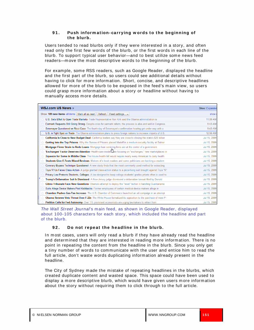
91. Push information-carrying words to the beginning of the blurb.
Users tended to read blurbs only if they were interested in a story, and often read only the first few words of the blurb, or the first words in each line of the blurb. To support typical user behavior—and to best utilize some news feed readers—move the most descriptive words to the beginning of the blurb.
For example, some RSS readers, such as Google Reader, displayed the headline and the first part of the blurb, so users could see additional details without having to click for more information. Short, concise, and descriptive headlines allowed for more of the blurb to be exposed in the feed’s main view, so users could grasp more information about a story or headline without having to manually access more details.
The Wall Street Journal’s main feed, as shown in Google Reader, displayed about 100-105 characters for each story, which included the headline and part of the blurb.
92. Do not repeat the headline in the blurb.
In most cases, users will only read a blurb if they have already read the headline and determined that they are interested in reading more information. There is no point in repeating the content from the headline in the blurb. Since you only get a tiny number of words to communicate with the user and entice him to read the full article, don’t waste words duplicating information already present in the headline.
The City of Sydney made the mistake of repeating headlines in the blurbs, which created duplicate content and wasted space. This space could have been used to display a more descriptive blurb, which would have given users more information about the story without requiring them to click through to the full article.
© NIELSEN NORMAN GROUP WWW.NNGROUP.COM 151
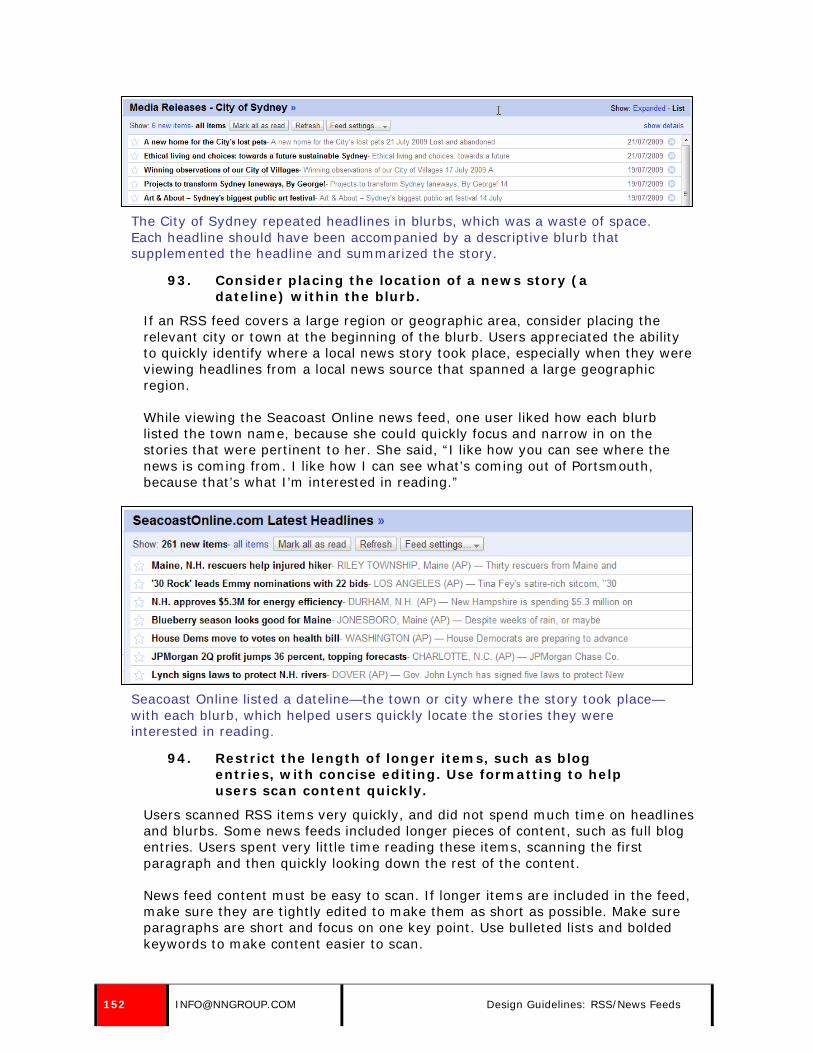
The City of Sydney repeated headlines in blurbs, which was a waste of space. Each headline should have been accompanied by a descriptive blurb that supplemented the headline and summarized the story.
93. Consider placing the location of a news story (a dateline) within the blurb.
If an RSS feed covers a large region or geographic area, consider placing the relevant city or town at the beginning of the blurb. Users appreciated the ability to quickly identify where a local news story took place, especially when they were viewing headlines from a local news source that spanned a large geographic region.
While viewing the Seacoast Online news feed, one user liked how each blurb listed the town name, because she could quickly focus and narrow in on the stories that were pertinent to her. She said, “I like how you can see where the news is coming from. I like how I can see what’s coming out of Portsmouth, because that’s what I’m interested in reading.”
Seacoast Online listed a dateline—the town or city where the story took place—with each blurb, which helped users quickly locate the stories they were interested in reading.
94. Restrict the length of longer items, such as blog entries, with concise editing. Use formatting to help users scan content quickly.
Users scanned RSS items very quickly, and did not spend much time on headlines and blurbs. Some news feeds included longer pieces of content, such as full blog entries. Users spent very little time reading these items, scanning the first paragraph and then quickly looking down the rest of the content.
News feed content must be easy to scan. If longer items are included in the feed, make sure they are tightly edited to make them as short as possible. Make sure paragraphs are short and focus on one key point. Use bulleted lists and bolded keywords to make content easier to scan.
152 [email protected] Design Guidelines: RSS/News Feeds

Each heatmap shows a different user reading a longer news feed from the Church of the Customer Blog (top image) and VentureBlog (bottom image), as seen in Bloglines. Red indicates areas of the screen the users looked at. Users didn’t spend much time on longer entries, reading the first few lines and quickly glancing at the rest of the content.
© NIELSEN NORMAN GROUP WWW.NNGROUP.COM 153
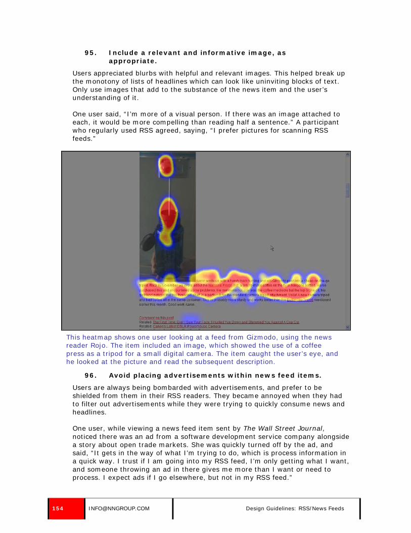
95. Include a relevant and informative image, as appropriate.
Users appreciated blurbs with helpful and relevant images. This helped break up the monotony of lists of headlines which can look like uninviting blocks of text. Only use images that add to the substance of the news item and the user’s understanding of it.
One user said, “I’m more of a visual person. If there was an image attached to each, it would be more compelling than reading half a sentence.” A participant who regularly used RSS agreed, saying, “I prefer pictures for scanning RSS feeds.”
This heatmap shows one user looking at a feed from Gizmodo, using the news reader Rojo. The item included an image, which showed the use of a coffee press as a tripod for a small digital camera. The item caught the user’s eye, and he looked at the picture and read the subsequent description.
96. Avoid placing advertisements within news feed items.
Users are always being bombarded with advertisements, and prefer to be shielded from them in their RSS readers. They became annoyed when they had to filter out advertisements while they were trying to quickly consume news and headlines.
One user, while viewing a news feed item sent by The Wall Street Journal, noticed there was an ad from a software development service company alongside a story about open trade markets. She was quickly turned off by the ad, and said, “It gets in the way of what I’m trying to do, which is process information in a quick way. I trust if I am going into my RSS feed, I’m only getting what I want, and someone throwing an ad in there gives me more than I want or need to process. I expect ads if I go elsewhere, but not in my RSS feed.”
154 [email protected] Design Guidelines: RSS/News Feeds

The ad associated with The Wall Street Journal headline annoyed users.
NEWS FEED FREQUENCY 97. Send news feed items on a regular basis. Base
message frequency on how often you can provide unique, compelling, timely content.
When users subscribed to an RSS feed, they expected new stories, headlines, and information to be sent out regularly. Users wanted to see fresh content frequently and got bored with feeds that didn’t provide new information on a regular basis. Some users accessed their news feed multiple times a day with the hopes of finding new items for review.
Similar to messages sent from companies and organizations through social networks, users expected the frequency of new stories and headlines to differ based on the source sending the information. For example, users expected news outlets, such as The Wall Street Journal and The New York Times, to send updates multiple times per day as headlines and stories developed. Other sources, such as This Week in Education (an education blog) and the United States Consumer Product Safety Commission, were expected to send new information less frequently—on a weekly or daily basis.
Regardless of the exact frequency users expected, most stressed the importance of regular updates and new information. “Stale” feeds didn’t appeal to users. One user had a series of business-related blogs on his RSS reader, and talked about the importance of frequent updates. He said, “If they don’t update five times a week, they’ll lose their readership. It’s tough to build a following and real easy to lose it.”
98. Don’t send too many news feed items at once.
While users expected new information on a frequent basis, they didn’t like to be overloaded or overwhelmed with too much information at once. When they received a lot of new items in their RSS reader at once, especially from one source, other items—including items from the source itself—were pushed further down their list of items. Not only did users feel bombarded, but they often missed items that were pushed to the bottom of their list—or off the list altogether.
One user, who viewed all his feeds in a single view in Google Reader, was overwhelmed by the number of stories that came through his Seacoast Online feed at once. He said, “There’s a boatload of them. They come in bulk. It’s an awful lot. If I’m really busy, I don’t spend a lot of time scrolling. They send way more updates than The Wall Street Journal. It’s way more aggressive.” When he glanced at his main feed, he noticed that there were over 60 items from Seacoast
© NIELSEN NORMAN GROUP WWW.NNGROUP.COM 155

Online and only two from The Wall Street Journal. Seven updates from Seacoast Online came through at the same time: 9:27 AM.
Seven updates from Seacoast Online came through to one user’s feed reader at 9:27 AM, which overwhelmed him.
99. Send updates when readers likely access their feed readers.
Users logged into their RSS readers at various times throughout the day. Some users checked their RSS readers in the morning and evening (or at both times), and some accessed them multiple times throughout the day.
In contrast to social networks, users were more likely to access their RSS readers during working hours; some perceived this as a good use of working time while other subscribed to news feeds that helped them with their job. For example, some users had an RSS reader, such as iGoogle, set as the homepage on their work computer so every time they opened their browser they could see new updates, headlines, and information.
Think about the times when users are likely to access their feed readers (mornings, evenings, and during working hours) and consider sending new updates during these times. When planning a publication schedule, companies and organizations should consider these frequent access times as a basis and should strongly consider their own subscribers and when they are likely to check their RSS readers.
The time of delivery is key since users sometimes didn’t scroll past the first visible page of headlines.
156 [email protected] Design Guidelines: RSS/News Feeds

PROMOTING RSS NEWS FEEDS 100. Place links to RSS content and subscription
information in the main site navigation or at the bottom of each page of the site.
When asked to subscribe to an RSS feed, users navigated to the company or organization’s homepage to locate a call to action. While viewing the homepage, users often looked in the main site navigation or at the bottom of the page for a link to RSS content and subscription information.
One user, while looking for a way to sign up for the Fox News RSS feed, immediately navigated to the bottom of the Fox News homepage to locate a news feed or RSS call to action, and quickly spotted it in the footer navigation.
A link to RSS Feeds was prominently located in the Fox News footer navigation, which is where one user expected the link to be.
If users couldn’t quickly find a link to RSS content or subscription information immediately, they became frustrated and gave up. Some assumed the site didn’t offer a news feed, and others didn’t have the desire to dig through the site for the information.
One user, while looking at the Public Broadcasting Service (PBS) homepage, had trouble locating the RSS feed and eventually gave up. He said, “If they make me work that hard, I won’t look. I’ll just bookmark it and check it periodically versus spending an hour looking for it.”
101. Use the term news feed or feed in links to RSS content.
Users weren’t sure if they knew what RSS was: they were familiar with the concept, but weren’t aware of the terminology. This is a primary problem with RSS. The concept is appealing, but the terminology around it, namely RSS and XML, is unlikely to entice many new users to explore it.
Because many users are unfamiliar with the terms RSS or XML, using those words to link to RSS content will not be helpful. Users are more familiar with the idea of news feeds. This term indicates to users that they will receive regular updates of content from the site.
For some sites, the term news may not be appropriate. For instance, a site offering travel deals may not consider new fares to be news. In these cases, the use of the word feed is appropriate.
In both cases, some supporting text will also help users understand the information that is available. For instance, Orbitz.com, a travel site, accompanied its link to RSS feeds with the description, “Access top Orbitz deals instantly.”
© NIELSEN NORMAN GROUP WWW.NNGROUP.COM 157

102. Link to RSS feeds via a news feed icon ( ), rather than an XML or RSS icon.
As mentioned in the previous guideline, users new to RSS feeds were unfamiliar with the term RSS as well as the term XML, and it was common that sites offering content via RSS used an icon with one of these two terms to indicate that a feed was available. However, there was a third icon, which represented a news feed, and avoided the use of potentially confusing and uninviting terms. This icon used a shape to represent a broadcast or wave of information. This was preferable to the RSS and XML icons.
Some users sought out this icon while looking for a way to sign up to receive RSS updates from a company. One user scoured the PBS.org homepage for the recognizable icon. He said, “I’m looking for the little orange icon with the radio wave.”
The three images above show three icons indicating the availability of RSS feeds. The first icon is preferable, as it represents the feature without relying on unfamiliar terms. The other two icons use the terms RSS and XML, and are not clear or inviting to users unfamiliar with those terms.
However, this news feed icon cannot stand alone, as it will not clearly indicate its meaning to users unfamiliar with RSS. The icon must be accompanied by descriptive text that includes terms such as news feed or feed.
103. Ensure that the page describing your feed(s) appears on top of your site’s search results listings for common queries.
A small number of users might search your site for the page describing available news feeds. Because there is no single standardized terminology, people may search for “RSS,” “feed,” “feeds,” “news feed,” and “news feeds.”
Tweak your site’s internal search engine to ensure that your main feeds page is listed at the top of the search engine results page (SERP) for these queries and any others you may discover while reviewing your search logs.
One user, while trying to subscribe to STA Travel Australia’s RSS feed, used their site search after briefly skimming their homepage. He used the term “RSS” in his search, and the first result on the search results page was the page on the site containing information about the RSS subscription process.
158 [email protected] Design Guidelines: RSS/News Feeds

A user searched for “RSS” on the STA Travel Australia site, and the search engine results page displayed the most relevant hit at the top.
Making sure that your feeds page scores well in your internal search is a lower priority than making sure that the page is easy to find in the site’s navigation. Feeds are not searched for that frequently—users are more likely to be alerted to the feeds by seeing a link to them.
104. Include an explanation of RSS on your site, with information about what it is and how to use it.
Many users are not familiar with RSS, and if they are, they may not realize that that’s what it’s called. Because users are unfamiliar with the terminology, sites that offer feeds must include a description of what RSS is. In our first study, many users were curious about what RSS stood for, and how new it was. One of the RSS readers had information about RSS on one of its main pages, and several users read it to find out what RSS was.
The page offering feeds should define RSS and tell users what they need in order to receive and read the feeds. This should be done in language that is easy for someone unfamiliar with the technology to understand.
SmarterTravel.com included this description of RSS: “RSS is an XML-based syndication format which allows easy access to recent headlines and article summaries from many different sources.” This would likely be off-putting to users new to RSS, simply because of the terms “XML” and “syndication.”
USAToday.com offered simpler information, stating, “RSS, sometimes known as Really Simple Syndication, is a popular means of sharing content (such as news headlines) without requiring readers to constantly visit a Web site to see what’s
© NIELSEN NORMAN GROUP WWW.NNGROUP.COM 159

new. RSS feeds contain headlines and hyperlinks to longer articles or Web pages. USATODAY.com’s feeds are free of charge.”
This explanation was based on what users would care about, and what makes sense to them. Users don’t need to know anything about XML to know whether they’d like headlines delivered to them. USAToday.com went on to explain how users could receive RSS feeds and linked to a list of different aggregators, all in plain language.
The USAToday.com RSS page included an RSS definition written in plain language and a link to a list of aggregators. This was helpful to people new to RSS.
160 [email protected] Design Guidelines: RSS/News Feeds

105. Don’t interrupt users with interstitial advertising if they click through to your RSS page.
USA TODAY offered a link to RSS from its homepage. However, clicking this link sometimes did not take the user directly to the page about the newspaper’s feeds. Instead, users saw a page with nothing but a big advertisement.
Interstitial ads are never popular with users, but may sometimes be appropriate if you can charge the advertisers enough money to compensate for the reduced user loyalty caused by the degraded user experience. However, specifically for the click-through to the RSS information page, there is almost no amount of money that could justify interrupting the user’s flow. The problem is that many users didn’t fully understand RSS and news feeds. Thus, when seeing nothing but a big, irrelevant, piece of information, they assumed that that’s all the site had to offer in the category of news feeds.
There is immense business value in getting users to sign up for your news feed—they’re opting in to give you permission to send them a large number of links in the future. Assuming any decent click-through rate for your feed, users who subscribe will have a large lifetime value. Most likely much more than the fee you can charge for a single interstitial ad that risks losing that user’s subscription.
An interstitial advertisement was shown when a user clicked on the link Sign up for USATODAY.com news feeds from the newspaper’s homepage. To actually see the description of the feeds, the user had to click the Continue Reading button.
© NIELSEN NORMAN GROUP WWW.NNGROUP.COM 161
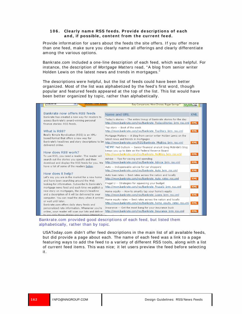
106. Clearly name RSS feeds. Provide descriptions of each and, if possible, content from the current feed.
Provide information for users about the feeds the site offers. If you offer more than one feed, make sure you clearly name all offerings and clearly differentiate among the various options.
Bankrate.com included a one-line description of each feed, which was helpful. For instance, the description of Mortgage Matters read, “A blog from senior writer Holden Lewis on the latest news and trends in mortgages.”
The descriptions were helpful, but the list of feeds could have been better organized. Most of the list was alphabetized by the feed’s first word, though popular and featured feeds appeared at the top of the list. This list would have been better organized by topic, rather than alphabetically.
Bankrate.com provided good descriptions of each feed, but listed them alphabetically, rather than by topic.
USAToday.com didn’t offer feed descriptions in the main list of all available feeds, but did provide a page about each. The name of each feed was a link to a page featuring ways to add the feed to a variety of different RSS tools, along with a list of current feed items. This was nice; it let users preview the feed before selecting it.
162 [email protected] Design Guidelines: RSS/News Feeds

The name of each feed on USAToday.com linked to a page that showed current feed items and explained the different ways to subscribe.
107. Clearly indicate if any feeds require site registration or a paid subscription.
On The New York Times site, users could receive news feeds from the Opinion section. However, some of the editorials provided through this news feed were considered premium content during the time of our first study, and required users to be paid subscribers of TimesSelect. There was no indication of this with the link to receive the feeds. The only indication shown in a news reader was the abbreviation [TS] in the headline of the news item, indicating TimesSelect. (This particular content has since been made free. However, the usability insight remains true: people get confused if they’re given links that they can’t access if this is not clearly explained.)
News feeds which require any type of subscription should be clearly separated from free content on the page describing RSS news feeds on the site. Headlines of news items should also indicate if a subscription is required to view content.
© NIELSEN NORMAN GROUP WWW.NNGROUP.COM 163

The image above shows content from the The New York Times’ Editorial/Op-Ed section as displayed in FeedDemon. Content which required a subscription was indicated by a [TS] in front of the headline, which was not clear. Any non-subscriber who clicked on the link received the page on the right, which promoted an upgrade to TimesSelect.
108. Avoid referencing other methods of communication, such as newsletters and social networks, on the RSS subscription page, and vice versa.
It is not recommended that subscription pages for each subscription process (newsletters, social networks, or news feeds) reference the other available delivery methods. For instance, the social network subscription page should not mention the availability of RSS feeds; the mention of another delivery method could be confusing or distracting to users.
Once people have indicated an interest in signing up for RSS feeds, you should close that “deal” as quickly as possible without risking that the user gets sidetracked and possibly never completes the originally intended task. Minimize confusion by focusing on only one information-delivery method per page.
109. Link to RSS feeds on the unsubscribe confirmation page for email newsletters as an alternate method of information delivery.
While we don’t recommend mentioning RSS feeds during the newsletter subscription process, as it may confuse or distract potential subscribers, the unsubscribe process is a good place to mention the availability of RSS.
164 [email protected] Design Guidelines: RSS/News Feeds

This may cause someone who wanted to unsubscribe to reconsider and instead receive information from your organization via news feeds.
The link to RSS information from the newsletter unsubscribe confirmation page should be quick and to the point. This is not the place to define what the news feeds are or how to use them, but rather just to alert users to their availability and to provide a link to more information.
Some sites offer information about RSS feeds in each email newsletter. Many sites may not want to do this, because they may find it is preferable to have newsletter subscribers over RSS feed subscribers. If the RSS feeds are mentioned in the newsletter, they should only be mentioned in the maintenance links at the bottom of the newsletter. This way, they are not a distraction to the subscriber, who will typically spend little time looking at maintenance links. This placement alerts users who may be thinking of unsubscribing that RSS feeds are available.
The Harvard Business School’s Working Knowledge newsletter mentioned RSS feeds at the bottom of each message, near the unsubscribe link. This was a good place to reference the availability of another method of delivery of information.
Harvard Business School’s Working Knowledge newsletter included a good link to the site’s RSS feed at the bottom of each edition, near the links to unsubscribe or change an email address.
© NIELSEN NORMAN GROUP WWW.NNGROUP.COM 165
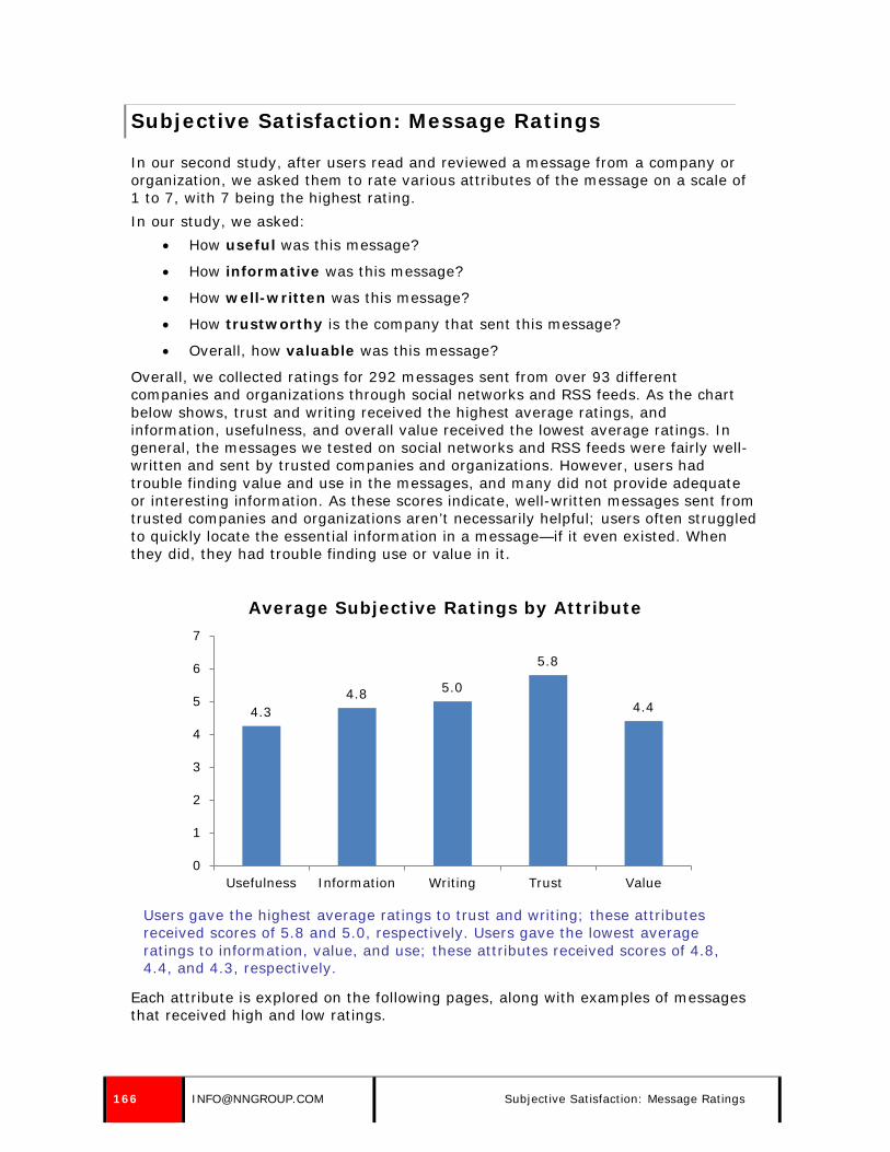
Subjective Satisfaction: Message Ratings
In our second study, after users read and reviewed a message from a company or organization, we asked them to rate various attributes of the message on a scale of 1 to 7, with 7 being the highest rating. In our study, we asked:
• How useful was this message?
• How informative was this message?
• How well-written was this message?
• How trustworthy is the company that sent this message?
• Overall, how valuable was this message?
Overall, we collected ratings for 292 messages sent from over 93 different companies and organizations through social networks and RSS feeds. As the chart below shows, trust and writing received the highest average ratings, and information, usefulness, and overall value received the lowest average ratings. In general, the messages we tested on social networks and RSS feeds were fairly well-written and sent by trusted companies and organizations. However, users had trouble finding value and use in the messages, and many did not provide adequate or interesting information. As these scores indicate, well-written messages sent from trusted companies and organizations aren’t necessarily helpful; users often struggled to quickly locate the essential information in a message—if it even existed. When they did, they had trouble finding use or value in it.
Users gave the highest average ratings to trust and writing; these attributes received scores of 5.8 and 5.0, respectively. Users gave the lowest average ratings to information, value, and use; these attributes received scores of 4.8, 4.4, and 4.3, respectively.
Each attribute is explored on the following pages, along with examples of messages that received high and low ratings.
4.3 4.8 5.0
5.8
4.4
0
1
2
3
4
5
6
7
Usefulness Information Writing Trust Value
Average Subjective Ratings by Attribute
166 [email protected] Subjective Satisfaction: Message Ratings

USEFULNESS The average usefulness rating for all messages in our study was 4.3, which was the lowest average rating across all attributes. In general, users had a hard time determining how to make use of messages sent from companies and organizations through social networks and RSS feeds. Often, messages weren’t interesting to users, didn’t contain any real information or didn’t match their expectations. For example, a Twitter message sent from Fairfax Digital received low usefulness ratings, because it didn’t contain any valuable information, and it didn’t match recipients’ expectations; they expected the organization to provide top news and headlines. Instead, the company sent replies to their followers, unrelated to news and headlines, for all to see. FairFax Digital should have balanced their responses to individuals with postings of news and headlines to prove their usefulness to readers.
User expected messages from Fairfax Digital to contain stories and headlines. When they didn’t, users didn’t find their messages useful.
Another message, sent from CNN, also received low usefulness ratings, because it didn’t contain information users expected to receive from the highly regarded news source. The message focused on President Obama’s fashion choice, and recipients of this message were taken aback. They expected a larger focus on “stories that mattered,” and didn’t appreciate or find use in the trivial nature of the message. CNN should have focused on key headlines and news stories instead of petty issues that users didn’t care about.
A message sent from CNN received low usefulness ratings, because it was shallow and wasn’t what users expected to receive from the news source.
While many messages were considered useless, some received high usefulness ratings. The messages that received the highest usefulness ratings had three things in common: they contained something of substance (as opposed to a random
© NIELSEN NORMAN GROUP WWW.NNGROUP.COM 167

thought or trivial information), were timely, and provided information that users expected—and wanted—to receive from the company or organization sending the message. For example, a message sent from the American Cancer Society through Facebook received high usefulness ratings, because it contained important information users expected and desired to receive from the organization. The message contained a warning about cooking meats at high temperatures, along with a link to a guide to healthy grilling. Users found it helpful, interesting, and timely; the post was sent in mid-July, which is the most popular time of the year for grilling in the United States.
Users gave this Facebook message from the American Cancer Society high usefulness ratings, because it contained helpful and timely information.
Another message, sent from USA TODAY, also received high usefulness ratings, because it provided information users were interested in receiving in a timely manner. The message talked about a government scheme to help people replace old, polluting cars, and provided a link for users to follow to find out if their vehicle qualified for the program. The message was useful to recipients, because it was timely, potentially able to help readers save money, and included information that users expected from a news organization: a headline, a brief summary, and a link to the full story.
A message from USA TODAY received high usefulness ratings, because it contained timely information that users expected and wanted.
168 [email protected] Subjective Satisfaction: Message Ratings

INFORMATION The average information rating for all messages in our study was 4.8 Overall, messages sent from companies and organizations through social networks and RSS feeds didn’t contain enough facts or data. Companies and organizations would send general updates or small nuggets of information—but not nearly enough to satisfy what users wanted. Many users scanned their main feeds or homepage looking for something of substance, and were often disappointed by updates that didn’t contain any valuable information. Messages that contained little to no real data or facts received low information ratings. For example, a MySpace message from the White House was an announcement that they had joined the social network, along with a mood update: they were “good.” Users gave this message low information ratings, because it didn’t contain any substance. The White House could have improved this message by sending something with more information—such as an update on current initiatives or projects—instead of a superficial message.
Users gave this MySpace message from the White House low ratings for the quality of information, because it didn’t contain any substance.
Another message, sent from the City of Portsmouth, NH through Facebook, received low information ratings, because the organization sent “more of a status update” instead of a piece of information. The message from the organization simply stated “TGIF,” which didn’t provide any useful information or data for recipients.
The uninformative message from the City of Portsmouth, NH received low ratings from recipients.
While many messages failed to include the details users wanted, some received high information ratings. The messages that received the highest information ratings were those that included essential details about a story, update, headline, or announcement—with a link to additional information. For example, an RSS item from the United States Consumer Product Safety Commission included information about a Propac hooded sweatshirt recall—along with the reason for the recall—in a single headline. This particular RSS item received high information ratings, because it gave users the information they needed; the brand name, the item, and the recall reason were all pieces of data that made this RSS item particularly informative. Additionally, if users wanted to read more information, they could click on the hyperlinked headline to access more details.
© NIELSEN NORMAN GROUP WWW.NNGROUP.COM 169

An RSS item sent from the United State Consumer Product Safety Commission contained all pertinent details in the headline alone.
Another message, sent through Facebook from the Australian Institute of Sport, received high information ratings, because it provided ample details about a particular event within the message itself—without requiring users to navigate to another source to gather supplemental details. The message detailed the outcome of a basketball game, including where the game took place, the teams involved, and the final score, which were all pieces of information users were interested in. Additionally, the message included a link to further details in case users wanted to learn more about the event.
A message from the Australian Institute of Sport included key details users were interested in.
170 [email protected] Subjective Satisfaction: Message Ratings

WRITING
Writing quality received an average rating of 5.0, which was the second highest average rating across all attributes. Users expected messages sent from companies and organizations to be short, concise, and well-written. An informal tone was accepted, especially on social networks, but unprofessionalism was not. Users gave low writing ratings to messages that were wordy, vague, or unprofessional. A message sent from The Wall Street Journal through an RSS feed received low writing ratings, because users couldn’t quickly grasp what the item was about based on the headline alone. The vague heading and lack of sufficient detail forced users to read the accompanying blurb to get a good understanding of what the news item covered. Users expected a headline to clearly communicate the story’s main point, and didn’t want to spend time dissecting it or reading supplemental information to get the gist. The headline should have been more descriptive, so users could quickly understand the point of the headline without having to read the associated blurb.
An RSS item sent from The Wall Street Journal received low writing ratings, because the headline was vague and didn’t include sufficient details.
Another message, sent from the United States Environmental Protection Agency (EPA) through Twitter, received low writing ratings, because it was too wordy and didn’t have a point. The message was truncated by the social network site, because it was longer than the allotted length. The shortened message made no sense to users because essential information had been removed. The message should have been shorter, and information-carrying words should have been pushed to the front of the message so users could quickly grasp the point without having to click on a hyperlink.
The EPA sent a lengthy message that was cut off by the social network site, making users wonder what the point was.
A third message, sent from WMUR-TV through Facebook, received low writing scores, because it contained “text speak.” The message replaced the word “you” with “u.” Users commented on the unprofessionalism of the message, and preferred to see the word spelled out. The message should have used the full word, not the abbreviation. While users read the message as “thanks to you, local user,” the message actually referred to a site feature called “u local.” The message was thanking a user of u local for the video and pictures, but users read it as an abbreviation for the word “you.”
© NIELSEN NORMAN GROUP WWW.NNGROUP.COM 171

The use of “text speak” resulted in low writing scores from users.
Messages that received high writing ratings were short, concise, and contained essential details about the topic, headline, update, or chunk of information. Well-written messages were frequently accompanied by a link so users access additional details if they were interested. One NPR message sent through Twitter received high writing ratings, because it was short, concise, and to the point. The message contained the headline of a story featured on the site, along with a link to the full article. Users viewing the update quickly got a sense of what the message was trying to convey, and could decide whether or not they wanted to follow the link to the detailed story.
A message sent from NPR through Twitter contained a concise headline that allowed users to quickly grasp what the story was about and where the link would take them.
Another message, sent from the United States Consumer Product Safety Commission through RSS, received high writing ratings, because it contained essentials details in a short, descriptive headline. Recipients could quickly gather the point of the news item, and could decide whether or not they wanted to pursue the article for more details.
An RSS item from the United States Consumer Product Safety Commission contained essential details in a short, well-written headline.
172 [email protected] Subjective Satisfaction: Message Ratings

TRUST
Trust received an average rating of 5.8, which was the highest average rating across all attributes. In general, users trusted the companies and organizations sending messages through social networks and RSS feeds, particularly if they were well-known. However, some users doubted the credibility of messages sent from companies and organizations on social networks, because they believed that “just about anyone” could set up a company profile on a social network and represent a company. Users were also exposed to many unofficial representations of companies and organizations on social networks, which made them aware that fake company profiles existed. Users gave higher trust ratings to companies and organizations sending messages through RSS, because they often signed up to receive updates through the company or organization’s official site—which is something that is difficult to imitate. While most companies and organizations that sent messages through RSS feeds received high trust ratings, some did not. Those that received lower trust ratings were ones that associated advertisements with their RSS items. The use of advertisements within RSS wasn’t expected by users, and companies that used this tactic received lower trust scores. For example, an RSS item sent from The Wall Street Journal contained an advertisement that quickly turned users off and made them doubt the news source’s motives.
The Wall Street Journal received low trust ratings for including advertisements with their RSS items.
Along the same lines, users gave low trust ratings to companies and organizations that solicited users for their ideas or money through messages. For example, a message sent through MySpace from Oxfam America, which solicited users for a donation, was perceived as a sales pitch. The message wasn’t well-received by users and the company’s trust ratings suffered, because users didn’t want a blunt request for money—especially without an explanation of how it would be used.
Oxfam America received low trust ratings for soliciting users for money.
© NIELSEN NORMAN GROUP WWW.NNGROUP.COM 173

Solicitations for thoughts or suggestions were also poorly received by users, especially if the company or organization was an expert in the subject matter they were requesting input on. For example, a Facebook message sent from STA Travel Australia, asked for suggestions on places to visit in the Amazon. Recipients were turned off by this message, because they thought it had a hidden agenda: the company was trying to create buzz around a popular travel destination to pique interest. Users saw through this and gave the company low trust ratings, because it seemed as though they were being sneaky.
STA Travel Australia received low trust ratings for soliciting users for travel suggestions; users quickly identified this as a ploy to generate buzz around the popular travel destination.
Interestingly, users gave high trust ratings to companies and organizations willing to reference outside sources of information—and not just their own site or blog—because it showed users that they were willing to step aside as the “expert” and give credit to someone who covered something better than they could. For example, a message from Microsoft Windows referenced an article on an external site that provided instructions on how to stream movies with Windows Media Player 12. Users appreciated the reference, and gave Microsoft Windows higher trust ratings, because they were willing to point users to some place other than their own site.
Microsoft received high trust ratings, because they referenced an article on another website.
174 [email protected] Subjective Satisfaction: Message Ratings

VALUE On average, overall message value received a score of 4.4, which was the second lowest average rating across all attributes. When evaluating a message’s value, users often considered all attributes: usefulness, information, writing, and trust. Messages that received low value scores often missed the mark completely, because they were poorly written, didn’t contain any useful information, or were wildly different than what users expected to receive from the company or organization sending the message. For example, a message sent through Facebook from Company C received low value ratings, because it was geared towards internal staff and employees, and didn’t provide any information that was relevant to users. Additionally, it contained information users didn’t expect to receive from the company; they expected to hear about new product lines, company initiatives, or promotions. Also, wordy message didn’t appeal to readers. Overall, the message didn’t provide any value to users, and they gave it low ratings across the board.
A message from Company C received low value ratings, because it wasn’t informative, didn’t meet recipient expectations, and was too wordy.
Another message that received a particularly low value rating was one sent from Dell through MySpace. The message appeared in the user’s inbox, but wasn’t geared towards the individual. Instead, it was a generic message that didn’t contain any useful information and didn’t make sense to users. Additionally, it didn’t contain information that users expected to receive from the technology company; they expected to hear about new products, technology updates, or promotions. Instead, they received a short, non-descriptive message about DJs and remixes—which totally missed the mark with users.
© NIELSEN NORMAN GROUP WWW.NNGROUP.COM 175

A message sent from Dell through MySpace didn’t provide any value to recipients.
Messages that received high value ratings were often relevant, timely, met expectations, and were well-written. Not every highly rated message contained all these qualities, but they often contained at least one and usually more than one. Interestingly, users often found value in messages that contained sales or promotional information, especially when they expected to receive these types of messages from a particular company or organization. For example, a Twitter message sent from Philosophy included the details about a current promotion. Recipients of this message gave it high ratings across all attributes, because it was useful, timely, informative, and written concisely.
A promotion sent from Philosophy through Twitter received high value ratings, because it contained helpful information that users expected to receive from the company.
Users also found value in messages that contained information that they may not be able to receive from traditional news sources. For example, news headlines and stories were often well-received by users, but they didn’t receive high value ratings, because users could typically hear about the story or headline on TV, the radio, or the Internet from another news source. However, messages that contained other types of information, such as company announcements, upcoming events, or information that’s not typically provided by news sources were considered valuable. For example, a message sent from Bruce Springsteen through MySpace contained an announcement—and a link to additional information—about his upcoming tour. Recipients found this information valuable, because they normally would not have heard about the upcoming event from traditional news sources. Additionally, the message was concise and clearly written, and included information users expected to receive from the musician.
An announcement about an upcoming tour, sent from Bruce Springsteen through MySpace, was considered valuable by recipients, because they weren’t likely to hear about it through traditional news sources.
176 [email protected] Subjective Satisfaction: Message Ratings

Methodology: First Study (RSS Feeds)
The purpose of our first study was to evaluate the usability of messages sent from companies and organizations through RSS feeds. The study involved two types of data collection: one-on-one usability test sessions that incorporated eyetracking and field studies. It is important to note that the first study involved only a handful of users who were already familiar with RSS. For many users, this was the first time they had used, seen, or been aware of the existence of RSS feeds. This gave us good insight into the needs of first time users. In our second study, all users who looked at RSS items were already users of those feeds. This gave us valuable information about use of feeds over time and users’ expectations once they were already familiar with the format.
ONE-ON-ONE USABILITY TEST SESSIONS To facilitate the use of the eyetracking technology, we conducted the study at a New York City office located in midtown Manhattan. We conducted the study in individual sessions. Each user participated in a session that lasted 75 minutes, which included tasks related to newsletters and RSS. Each session began with the calibration of the eyetracking software to enable tracking of the user’s eye movements. We used Tobii’s eyetracking technology and Clearview software to analyze the results. The facilitator gave users tasks to perform, which included using an RSS reader. We wrote all tasks on individual sheets of paper. We asked users to read the tasks and then summarize them back to the facilitator. We did this to ensure the task was clear to the user. In the study, there were two main tasks focused on RSS. We gave users a brief explanation of RSS under the assumption that it would be a new concept to many of the users, which turned out to be correct. In the first task, participants used the RSS reader to read any items of interest and to acquaint themselves with the tool. In the second task, users were asked to locate a headline from a specific source. We gave users a brief explanation of RSS under the assumption that it would be a new concept to many of the users, which turned out to be correct. We used four different RSS readers in the study: Awasu, Bloglines, FeedDemon, and Rojo. Two were Web-based and two were standalone tools. We provided users with usernames and/or passwords as needed. Each tool was set up in advance of the study to include headlines from a variety of news sources, blogs, and websites. This was a quantitative study, and we didn’t ask users to think out loud during the sessions. This was due in part to the use of the eyetracking technology: we didn’t want discussion of users’ actions to affect what they were looking at on the screen. After each task, users completed a questionnaire. For each task where it was appropriate, users rated their confidence in completing the task, satisfaction in completing the task, and frustration with completing the task. Following each task, we asked users if there was anything they liked or disliked about the task, and received commentary from users in that way. The same facilitator ran all sessions, helping to ensure consistency in how the tests were run. The facilitator sat at the eyetracking observation monitor while users participated on the test monitor. Sessions were recorded via the eyetracking software as well as on videotape, and participants wore a microphone during the
© NIELSEN NORMAN GROUP WWW.NNGROUP.COM 177

session. We informed participants of our recording plans both when we recruited them and at the start of the session.
Participants A total of 42 people participated in the lab studies, which tested both newsletters and RSS. Due to time constraints, 34 users completed RSS tasks. All lived or worked in New York City. Participants ranged in age from 20 to 55, and included 15 men and 27 women.
Our first lab study included 8 participants aged 20–29, 15 aged 30–39, 17 aged 40–49, and 2 aged 50–59. All participants were employed except one, who was a homemaker and mother; another participant was a college student and a part-time drugstore employee. Job titles included:
• Account Executive (2 users)
• Account Manager (2 users)
• Accountant
• Art Director
• Art Gallery Manager
• Assistant
• Case Manager
• Clothing Designer
• Compliance Officer
• Customer Service Representative
• Fashion Industry Worker
• Financial Analyst (2 users)
• Financial Services Representative
• Home Improvement Specialist
8
15
17
2
20-29 30-39 40-49 50-59
Number of Participants by Age
178 [email protected] Methodology: First Study (RSS Feeds)
• Homemaker
• Lawyer
• Medical Assistant
• Medical Biller
• Mental Health Social Worker
• Musician
• Office Manager
• Paralegal
• Personal Assistant
• Postal Worker
• Public Relations Account Executive
• President
• Print Salesperson
• Project Manager
• Real Estate Agent
• Real Estate Broker
• Realtor
• Salesperson
• Sales Associate
• Software Salesperson
• Student/Drugstore Employee
• Studio Manager
• System Administrator
• Teacher/Counselor
• Urban Planner/Teacher
Recruitment and Participation All users included in the study had participated in another Nielsen Norman Group eyetracking study at some time within the previous four months. Normally, we would not reuse participants, particularly within such a short time frame. However, at the time of the study, it was difficult to calibrate some users with the eyetracking technology. Various factors can affect the quality of the eyetracking calibration, including bifocals, long eyelashes, heavy makeup, or hair that covers the users’ eyes.3 Because successful eyetracking was crucial to the study, we gathered a list of participants from a previous eyetracking study that had calibrated well with the
3 For more information, refer to our free report, How to Conduct Eyetracking Studies: www.nngroup.com/reports/how-to-conduct-eyetracking-studies
© NIELSEN NORMAN GROUP WWW.NNGROUP.COM 179

eyetracking tool. We recruited users from this list, looking for a mix of gender, age, and Web experience. This method made recruiting more efficient for several reasons. Users came from a pre-existing list, and had already proven that they’d show up for a usability study. We also had information about the users, and knew if they fit our profile or not. Given this, we determined that the value of reusing participants outweighed any concerns. The previous study they’d participated in was in no way related to RSS feeds. Approximately one user canceled or rescheduled each testing day. We were able to reschedule or replace all but two users, leaving us two users shy of our goal of 44 users in the study (four in the pilot tests, and 40 in the final study).
Pilot Study We ran two pilot studies with two users each. We conducted these studies to ensure that tasks and questionnaires were clear, and that RSS readers, RSS feeds, and the eyetracking technology were functional. We also wanted to determine how many tasks users could complete within the scheduled session. Based on the pilot studies, we made tweaks to how tasks were worded. We also shortened the post-task questionnaires and finalized details so that tests using the eyetracking technology would run smoothly.
Tasks & Questions
Task 1: Explore tool and read items of interest
Task Description: “Many sites offer content through RSS. This means that you can read headlines or information from the website in an RSS reader. RSS readers tell you when new content is available from sites and allow you to read headlines and information from many different websites all in one place, rather than having to go to many different sites to read information. You can choose which information is shown in the reader. There are many different RSS readers, or tools, that allow users to read RSS headlines. Now you will use one of them. When the tool opens, take a few minutes to use the tool and read any items of interest to you.” Users of the Web-based tools began the task on a blank Web page, and we asked them to navigate to the tools via shortcuts in the Favorites menu. For the standalone applications, we asked users to look away from the screen as the tool was loaded and began the task once the tool was loaded on their screen. Each task was completed as a screen stimulus.
Task 2: Locate a headline from a specific source
Task Description: “Now, using this tool, find the latest headlines from CNN. Pick any CNN story that is interesting to you and read it. When you are finished reading the story, you will be asked to write a brief summary of the information, as though you were telling a friend about what you learned.” After completing the task, users answered the following questions:
180 [email protected] Methodology: First Study (RSS Feeds)

• Please summarize the story you read. Pretend you are telling a friend about what you learned.
• How confident are you that you completed the task? (1–7)
• How satisfying was doing this task? (1–7)
• How frustrating was doing this task? (1–7)
• How easy or difficult was it to find information of interest to you? (1–7)
• Before today, were you familiar with RSS?
• Before today, have you ever used an RSS reader?
Test Logistics & Considerations
Using the Eyetracking Technology
At the start of each session, we calibrated the eyetracking tool. A website was open on the monitor, and we asked users to sit at the computer in a comfortable position. We asked them to pull in their desk chairs and put a hand on the mouse, to try to get them in a position that would mimic how they’d be sitting for the length of the study. We then asked users to watch a blue dot as it moved around the screen, growing and shrinking in size. As users watched the dot move, the facilitator’s computer provided information on the calibration quality. If the calibration was not good enough, the process was repeated until an adequate calibration was achieved. To accommodate different users, the facilitator sometimes had to adjust either the monitor’s height or the distance between the monitor and the user. If users moved significantly between tasks or if the system crashed, we sometimes had to recalibrate the users. We therefore told them that they might need to repeat the blue dot exercise later in the session. We told users we were recording where they were looking on the screen. We also explained that, due to the technology used, if they sat back or forward in their chair, or put their hand under their chin, we’d have to ask them to change their position to allow the eyetracking to work. Users completed tasks using the test monitor, and the facilitator sat in the same room at another monitor, which displayed the eyetracking software. Each task began with the facilitator launching a window on the user’s computer; this started the eyetracking and recording of the task. Each task began as either a Web stimulus or a screen stimulus. This was a factor of the eyetracking tool. Using a Web stimulus meant the software could create heatmaps based on unique URLs, and could create cumulative heatmaps across many users. Screen stimuli merely recorded whatever images appeared on the screen, and didn’t automatically create heatmaps. The user’s monitor was an extension of the facilitator’s, so between tasks, control of the keyboard and mouse switched to the facilitator. Also, the user’s monitor didn’t have any taskbar and couldn’t include shortcut links. Because of this, the facilitator set up each task for users and told them when to begin. For tasks using a screen stimulus, the facilitator launched a blank browser or piece of software and started the recording tool. For tasks using a Web stimulus, the software could launch a browser page for the user.
© NIELSEN NORMAN GROUP WWW.NNGROUP.COM 181

Because the facilitator had to launch programs for participants using a screen stimulus, many tasks began with a blank Web page (the homepage set to blank in Internet Explorer). The facilitator then asked users to navigate to the appropriate site via a list of Favorites in the browser. To begin the tasks using the RSS standalone tools, the facilitator had to first open the tool for the users. Because we wanted to capture eyetracking for the users’ initial view of the tool, we asked them to look at a note tacked to a nearby wall while the software loaded. We told them when they could look at the screen, after the tool loaded and the recording began. Approximately once a day, the eyetracker crashed during sessions. This sometimes required reconnecting the eyetracking monitor, and other times required a restart of the whole system. When this happened, we explained to users that there was a problem with the computer and told them it would take a few minutes to correct. In only one case did we have to cancel a user’s session because the technical problem couldn’t be fixed.
Setting up RSS readers
Each tool used in the study (Awasu, Bloglines, FeedDemon, and Rojo) was set up on the testing machine in advance. Each tool included headlines from a variety of news sources, blogs, and websites. The RSS feeds selected for the study were based on the general interests of study participants. This information was collected as part of the recruiting process.
FIELD STUDIES Our first RSS study also included field studies with six participants. We visited users at their offices during their normal workdays. We asked users to receive permission from their supervisors and colleagues, as appropriate. Each 2.5 hour visit included at least 2 hours of observation. Users were asked to do what they would normally do in the course of their workday, as if we were not there. Users were not asked to describe each activity they were doing. We didn’t interrupt users except for quick questions to clarify what they were doing. We sat slightly behind users and observed and took notes during the visit. We focused on how they received and used information throughout the day, with a particular emphasis on their use of email, newsletters, RSS, and personalized Web pages. Two participants used RSS readers and four had personalized Web pages. We ended each session with follow-up questions regarding their activities during the visit as well as additional questions about their use of email, newsletters, RSS, and/or personalized Web pages. If users had not used RSS or their personalized Web page during the visit, we asked them to open the tool or Web page and explain their use of it. We took photographs and video as allowed. Users gave their permission for pictures and videos during the recruiting process, and confirmed their permission at the beginning of the session.
Participants A total of six participants participated in the field studies; all worked within a 1.5 hour drive of New York City. Users worked at offices in the following locations:
• East Hanover, New Jersey
• Rochelle, New Jersey
182 [email protected] Methodology: First Study (RSS Feeds)

• Union, New Jersey
• Fort Greene, New York
• New York, New York
• Port Washington, New York
Participants ranged in age from 20–39, and included three women and three men. All field-study participants were employed, and we tried to recruit users from a variety of position at different-sized companies. Participants had the following occupations:
• Blogger, News Website (one employee in home office)
• Branch Manager, Employment Agency (2–10 employees in work location)
• Business Analyst, Food Production and Distribution (100+ employees in work location)
• Graduate Assistant, University MBA Department (100+ employees in work location)
• Information Technology Manger, Mergers and Acquisitions Firm (41–100 employees in work location)
• Systems Administrator, EKG Analysis (2–10 employees in work location)
This list of occupations includes a larger portion of technology professionals than we usually like to include in our studies. This was necessary in order to meet our requirements for participants who used RSS—a technology that was not widely accepted by mainstream users at the time of the study.
© NIELSEN NORMAN GROUP WWW.NNGROUP.COM 183

Methodology: Second Study (Social Networks and RSS)
The purpose of our second study was to evaluate the usability of messages sent from companies and organizations through social networks, and to re-evaluate and update the existing guidelines (as necessary) for RSS. Our second study involved two types of data collection: one-on-one usability test sessions and a 4-week diary study.
ONE-ON-ONE USABLITY TEST SESSIONS We held the lab studies in informal office settings in two cities: Portsmouth, NH and Sydney, Australia. In total, we conducted lab studies with 19 participants. In Portsmouth, New Hampshire, we tested with 12 users; eight sessions were conducted with people who used social networks and RSS feeds for personal reasons, and each session lasted one hour and 45 minutes. The additional four sessions were conducted with participants who used social networks for business, career, or work purposes, and each session lasted one hour and 30 minutes. In Sydney, we tested with seven people who used social networks and RSS feeds for personal reasons, and each session lasted one hour and 15 minutes. The same facilitator ran all sessions, helping to ensure consistency in how the tests were run. We tested messages from companies and organizations on various social networks and RSS readers. For the studies that were conducted with people who used social networks and/or RSS for personal reasons, we looked at messages from companies and organizations on Facebook, Twitter, and MySpace—as well as the tools people used for RSS, which was mainly Google Reader. For the studies that were conducted with people who used social network for business, career, or work purposes, we looked at messages from companies and organizations on Facebook, Twitter, and LinkedIn. The facilitator gave users tasks to perform, which were written on individual sheets of paper. Users read each task out loud, and the facilitator answered any questions participants had about what they were being asked to do. As users worked through each task, the facilitator asked them to think aloud, or explain what they were doing as they were doing it. In each session, the facilitator sat next to or slightly behind the user, observing and taking notes. As part of the lab study, people who used social networks and/or RSS for personal reasons were asked to sign up to receive information from various companies and organizations through the sites and tools they used. Two weeks prior to the lab studies, we sent participants an email that contained instructions on how to sign up to receive messages from six companies and organizations: three on each of the two social networks and/or RSS reader they used. During each test session, users were asked to log into the two sites or tools they used and comment on the most recent messages they received from those companies. After users reviewed a message from a company or organization they filled out a short questionnaire. Additionally, some participants who used social networks and/or RSS for personal reasons, as well as those that used social networks for business, work, or career reasons, were asked to review the most recent messages they received from companies and organizations they already received information from—not those that they were asked to follow as part of the study. Finally, we asked all participants to think of a company, organization or brand they’d be interested in receiving messages from on the social network or RSS reader they used, and had them find a way to do so.
184 [email protected] Methodology: Second Study (Social Networks and RSS)

At the end of each session, the facilitator asked each user some follow-up questions about their use of social networks and RSS, as well as their use of information sent from companies and organizations through these various sites and tools. An additional 30 minutes was allotted for follow-up questions with participants who used social networks or RSS for personal reasons in the Portsmouth, NH sessions; this allowed the facilitator to gather more general information about how people used social networks and RSS feeds.
Participants A total of 19 people participated in the lab studies; 12 were from United States and seven were from Australia. Participants ranged in age from 24 to 59, and included 11 women and 8 men.
Our second lab study included 5 users aged 20–29 (2 men and 3 women), 4 aged 30–39 (2 men and 2 women), 6 aged 40–49 (3 men and 3 women), and 4 aged 50–59 (1 man and 3 women).
We recruited participants who had a range of experience with social networks and RSS feeds, from novices (less than 3 months) to more experienced users (more than 1 year). Participants evaluated messages from companies and organizations on a variety of social networks and RSS readers. Most participants viewed messages from companies and organizations on two different sites or tools during the test sessions, but three participants viewed messages on one site or tool; 17 participants evaluated messages on Facebook, eight participants evaluated messages on Twitter, five participants evaluated messages on MySpace, one participant evaluated messages on LinkedIn, and four participants evaluated RSS messages using Google Reader.
2 2 3
1
3 2
3
3
20-29 30-39 40-49 50-59
Number of Participants by Age and Gender
Women
Men
© NIELSEN NORMAN GROUP WWW.NNGROUP.COM 185

Participants evaluated messages on various sites and tools; 17 used Facebook, one used LinkedIn, five used MySpace, four used RSS (Google Reader), and eight used Twitter.
All participants were employed, with the exception of one. Job titles included:
• Academic Advisor
• Bank Manager
• Batch Records Specialist
• Company Director
• Database Administrator
• Event Coordinator
• Electrician
• Insurance Broker
• Lawyer
• Operations Manager
• Pharmacist
• Photographer (2 users)
• Project Manager
• Record Label Owner
• Recruiter (2 users)
• Teacher
17
1
5 4
8
Facebook LinkedIn MySpace RSS Twitter
Number of Participants Per Tool
186 [email protected] Methodology: Second Study (Social Networks and RSS)

Recruitment and Participation During recruitment for the lab study with participants who used social networks and/or RSS feeds for personal reasons (15 users), we asked users if they’d be willing to:
1) Sign up to receive messages from six different companies or organizations on two of the various social networks and/or RSS readers they used (three on each site or tool). We explained that they would receive an email with the details for signing up to receive these updates approximately two weeks prior to the study, and that they could unsubscribe from the messages as soon as the study was complete.
2) Log into the various social networks and/or RSS readers they used during their session to review the messages they received from companies and organizations as part of the study. We explained that we were only interested in reviewing messages from companies and organizations—and not any personal messages from friends, relatives, or colleagues. We also told participants that at the end of the session, we’d delete the cookies, cache, and browsing history from the browser with them.
3) Log into the various social networks and/or RSS readers they used during their session to review the messages they already received from companies and organizations—and not those they were asked to receive as part of the study. Again, we explained that we were only interested in reviewing messages from companies and organizations—and not any personal messages from friends, relatives, or colleagues. For a second time, we also told participants that at the end of the session, we’d delete the cookies, cache, and browsing history from the browser with them.
In order to participate in the study, participants that used social networks and/or RSS for personal reasons had to agree to the first two stipulations, but the third stipulation was optional, and depended on whether or not participants already received messages from companies and organizations through social networks or RSS. All users who already received messages from companies and organizations through social networks and/or RSS agreed to review the most recent messages with us during their test session, in addition to those they were asked to sign up for as part of the study. Participants who used social networks for business, career, or work purposes (4 users) had to agree to the third stipulation only. They weren’t asked to sign up to receive messages from companies and organizations as part of the study, so the first two stipulations didn’t apply to them. In total, we had four cancellations. Three Australian participants cancelled on the day of their scheduled session. We did not reschedule the sessions, because these users were required to complete a pre-assignment two weeks prior to the study. Additionally, one user who used social networks for business, work, or career reasons cancelled on the day of her scheduled session. These cancellations left us shy of our goal of 23 total participants: 18 participants who used social networks or RSS for personal reasons, and 5 users who used social networks for business, career, or work reasons.
Tasks and Questions The pre-assignment and first two tasks—message expectations and review messages received as part of the study—were only completed by participants who used social networks and/or RSS for personal reasons (15 users). Participants who used social
© NIELSEN NORMAN GROUP WWW.NNGROUP.COM 187
networks for business purposes (4 users) weren’t given this task, because they weren’t asked to complete the pre-assignment. All users completed the last two tasks: review messages received from companies and organizations (for personal reasons or for business, work, or career reasons) and find a way to receive updates from a company or organization through social networks and/or RSS.
Pre-Assignment
Two weeks prior to the lab study, we sent participants a pre-assignment via email. The pre-assignment required them to sign up to receive messages from six companies and organizations: three on each of the two social networks and/or RSS reader they used. Users were required to complete the assignment within 24 hours. In 24 hours, a follow-up email was sent to confirm the assignment had been completed. Samples of the email messages sent to participants are provided below. Each message closed with the facilitator’s contact information, which is not included here. Sample Email: Pre-Assignment Email subject: July [Session Day] Session Email body: Dear [Participant Name], Thank you for agreeing to be part of Nielsen Norman Group’s study of notifications, messages, alerts, and news sent from companies and organizations through [social network /RSS reader] and [social network/RSS reader]. -----Instructions for your participation--------- As part of the study, you will need to [follow/friend request/subscribe to] specific information sent by companies and organizations through [social network/RSS reader] and [social network/RSS reader]. On [social network/RSS reader], we’d like you to [follow/friend request/subscribe to RSS feeds from] the following companies: Company A: URL of company page on [social network] or RSS information on company site Company B: URL of company page on [social network] or RSS information on company site Company C: URL of company page on [social network] or RSS information on company site To subscribe, follow the links after each company name in this email. This will bring you to the appropriate page on [social network/company site]. On [social network/RSS reader], we’d like you to [follow/friend request/subscribe to RSS feeds from] the following companies: Company A: URL of company page on [social network] or RSS information on company site Company B: URL of company page on [social network] or RSS information on company site Company C: URL of company page on [social network] or RSS information on company site To subscribe, follow the links after each company name. This will bring you to the appropriate page on [social network/company site].
188 [email protected] Methodology: Second Study (Social Networks and RSS)

Please feel free to contact me with any questions or issues as you sign up to receive information from companies and organizations on [social network site/RSS reader] and [social network site/RSS reader]. Please complete this assignment in the next 24 hours. Sample Email: Follow-up Email subject: Follow-up: July [Session Day] Session Email body: Dear [Participant Name], I am following up to ensure you were able to sign up to receive alerts, messages, and notifications from companies and organizations for your schedule session on July [Date]. On [social network/RSS reader], you should have subscribed to receive updates and alerts from: Company A, Company B, and Company C. On [social network /RSS reader], you should have subscribed to receive updates and alerts from: Company A, Company B, and Company C. Please confirm that you have completed the assignment. If you have any questions or problems signing up to receive information on any of the two tools you are using, please feel free to contact me.
Task 1: Message expectations
Before we gave users their first task, we asked them to talk about the types of messages they expected to receive from the companies and organizations they were asked to follow on various social networks or through RSS feeds. We asked them to comment on the types of content they expected to receive, the frequency of messages, and whether or not they thought the information would be useful or helpful. Task description, “A couple weeks ago, you were asked to sign up to receive updates from [company or organization name] on [social network site/RSS reader]. Before you signed up to receive the updates:
• What did you expect to receive from [company or organization name] on [social network site/RSS reader]?
• Did you expect the information sent to you on [social network site/RSS reader] from [company or organization name] to be helpful or useful? Why or why not?
• How often did you expect to receive new information from [company or organization name] on [social network site/RSS reader]?”
Note: We asked these questions about each of the six companies and organizations they were asked to receive information from on social networks or through RSS as part of the study.
Task 2: Review messages received as part of the study
Task description, “Read the latest notification or message you received from [company or organization name] on [social network site/RSS reader]. As you read it, let [facilitator’s name] know what you like or don’t like about it, or if you think anything is confusing or works well.”
© NIELSEN NORMAN GROUP WWW.NNGROUP.COM 189

After reading through and commenting on each message, users were asked to rate the message on a 7-point scale (with 7 as the highest rating) for the following attributes:
• How useful was this message?
• How informative was this message?
• How well-written was this message?
• How trustworthy is the company that sent this message?
• Overall, how valuable was this message?
This task was completed six times by each participant who used social networks for personal reasons (15 users): once for each company and organization they were asked to follow on each of the two sites or tools they used during the study.
Task 3: Review messages received from companies and organizations (for personal or business, work, or career reasons)
Task description, “Check your [social network site/RSS reader] for any recent messages you have received from companies or organizations. As you read each message, let [facilitator’s name] know what you like or don’t like about it, or if you think anything is confusing or works well.” This task was completed by all participants that received messages from companies or organizations through social networks and/or RSS. The number of times it was completed varied by participant, depending on the amount of time left in the session and the number of companies and organizations they already received information from through social networks and/or RSS. However, all participants who followed companies and organizations through social networks for business, work, or career reasons completed this task at least twice.
Task 4: Find a way to receive updates from a company or organization through social networks and/or RSS
Task description, “Choose a brand/company/organization you would be interested in receiving messages from on [social network site/RSS reader], and find a way to do so.” This task was completed twice by all participants: once on each tool they logged into as part of the study.
Test Logistics & Considerations
Selecting Companies and Organizations for the Test
All the messages included in our study were sent from real companies and organizations through social networks and RSS feeds. In total, we selected 41 companies and organizations that utilized social networks and RSS feeds to disseminate information to subscribers. We included companies and organizations across many different industries (government, non-profit, consumer goods, technology, etc.) to get a good mix of messages to test. To ensure users had messages from companies and organizations to evaluate during their scheduled test session, we selected companies and organizations that sent new messages on a regular basis. The exact frequency varied; some companies and organizations sent messages multiple times per day while others sent messages on a
190 [email protected] Methodology: Second Study (Social Networks and RSS)

daily or weekly basis. However, we made sure to select companies that sent messages weekly or more frequently to make certain we had messages to test.
Matching Users’ Interests
In order to receive the best feedback and data from our participants, we tried to select companies and organizations that matched their interests. In our screening process, we asked users to choose the types of companies and organizations they’d be interested in receiving messages from on social networks or through RSS feeds. We selected the appropriate companies and organizations for participants to follow based on their responses.
Sending Pre-Assignment and Follow-up
Two weeks prior to the scheduled sessions, we sent detailed instructions to participants. The instructions were customized for each participant, and included details on how to sign up to receive messages from six companies and organizations on the two sites or tools they used (three per site or tool). In 24 hours, a follow-up email was sent, which asked users to respond and confirm that they completed the assignment.
Keeping Track of Messages
In order to keep track of and reference messages sent from the companies and organizations included in the study, we created accounts on social networks and various RSS readers and signed up to receive messages from them. This allowed us to monitor the content and frequency of messages sent from companies and organizations included in the study. Additionally, it was convenient to be able to quickly reference messages during evaluation and report creation.
Clearing Cache, Cookies, and Browsing History from Browser
At the end of each lab session, we had participants clear the cache, cookies, and browsing history from the browser. This was done to ensure passwords and other personal information was removed from the testing machine. We usually clear this information anyway between test sessions, so that each study participant will start from fresh and not be impacted by the previous user’s browsing history. For this study, we asked the participants themselves to use the browser’s history clearing feature (Tools>Delete Browsing History... in Internet Explorer) such that they would feel confident that their personal information had been erased. We made this change to our normal study procedure because of the more personally-sensitive nature of logging into the users’ private accounts on various social networks.
Unsubscribing from Messages from Companies and Organizations
At the end of each lab session, we allotted time for participants to unsubscribe from the companies and organizations they received messages from as part of the study. Not one user chose to do so during the session, but some mentioned that they may unsubscribe from some at a later date.
DIARY STUDY In addition to one-on-one usability tests, we conducted a four-week diary study with 14 participants in various locations, including: Australia, the United Kingdom, and the United States. Over the course of four weeks, we asked participants to provide
© NIELSEN NORMAN GROUP WWW.NNGROUP.COM 191
feedback on and evaluate messages they received from companies and organizations through Facebook, Twitter, and RSS. They were not asked to sign up to receive messages as part of the study, because we were solely interested in gathering feedback from individuals who already received messages from companies and organizations through social networks and RSS. Each participant was asked to focus on the messages they received from companies and organizations on one site or service, even though they may have used more than one site or service included in the study. This was done to minimize confusion and instructions. Participants received assignments via email three times per week: every Monday, Tuesday, and Thursday. To account for participants in various time zones, we sent assignments out by 8:00 AM Eastern Time, and asked for them to be completed within 24 hours. This allowed everyone a full day to complete each assignment. We included two types of assignments in our diary study. On Mondays and Thursdays, users were asked to provide feedback on and rate the three most recent messages they received from companies and organizations through a social network or RSS, depending on the tool they were asked to use for the study. On Tuesdays, users were sent a questionnaire that focused on their general usage of social networks or RSS, again, depending on the tool they used for the study. In addition to the assignments sent three times per week, we asked users to complete a pre-assignment one week before the start of the study. The goal of the pre-assignment was to collect the names of the companies and organizations users received messages from through social networks and RSS feeds, as well as the URLs to their pages on the social network sites or the RSS subscription pages on their official site. The facilitator used this information to sign up and receive messages from the same companies and organizations that diary participants did, so she could monitor messages throughout the four week study. All assignments were sent via email, and each email included a link to a survey users were asked to complete. Each survey was displayed in a basic online form, which was supported by Google Spreadsheets. When users submitted their feedback and input, the information was stored in a Google Spreadsheet, which was later downloaded for data analysis.
Participants We conducted the study with 14 users. We tried to recruit a geographically diverse group. Participants lived in the following locations:
• Australia
o Concord, New South Wales
o Darlinghurst, New South Wales
o Harrickville, New South Wales
o St. Ives, New South Wales
• United Kingdom
o Basildon, Essex
o Consett, England
o Norwich, Norfolk
o Stanmore, Middlesex
• United States
192 [email protected] Methodology: Second Study (Social Networks and RSS)

o Alexandria, Virginia
o Chicago, Illinois
o Cuyahoga Falls, Ohio
o Farmington Hills, Michigan
o Spring Hill, Tennessee
o Winlock, Washington
Participants ranged in age from 20 to 59, and included 6 women and 8 men.
Our diary study included 3 participants aged 20–29 (2 men and 1 woman), 4 aged 30–39 (2 men and 2 women), 2 aged 40–49 (1 man and 1 woman), and 5 users aged 50–59 (3 men and 2 women).
Participants evaluated messages from companies and organizations on a variety of social networks and RSS readers; seven participants evaluated messages on Facebook, three participants evaluated messages on Twitter, and four participants evaluated RSS messages: three used My Yahoo! and one used Google Reader. All participants were employed, with the exception of one, who was a student. Job titles included:
• Account Processor
• Business Assurance Officer
• Electrical Engineer
• Learning and Development Specialist
• Managing Director
• Office Manager (2 users)
• Personal Assistant
• Private Equities Agent
• Program Analyst
• Small Business Owner
2 2 1
3
1 2
1
2
20-29 30-39 40-49 50-59
Number of Participants by Age and Gender
Women
Men
© NIELSEN NORMAN GROUP WWW.NNGROUP.COM 193
• Teacher
• University Manager
Recruitment and Participation In order to qualify for the study, participants had to already receive messages from at least two companies on one of the following services or tools: Facebook, Twitter, or an RSS reader. During recruitment for the diary study, we made sure participants were available for the entire four week period. The study was conducted in July and August, which are popular months for travel and vacation. We recruited two additional participants in the United States, because we expected at least two participants to drop out of the study at some point. Based on previous experience with diary studies, we knew it was common to have some users drop out of the study or not complete all assignments. However, we were pleasantly surprised. With the exception of one participant that had to be replaced at the beginning of the study due to unresponsiveness and another that dropped out halfway through, a total of 13 participants completed all assignments given over the four week period. We had a very high completion rate, which can be partly attributed to the study facilitator’s frequent contact with participants. If a participant hadn’t completed an assignment within the allotted time (24 hours), the facilitator would send a follow-up email as a reminder. (The email was simply resent, with the word “REMINDER” at the beginning of the subject line.) These reminders were effective, because most participants completed the assignment and sent an email response back to the facilitator.
Pilot Study We ran a pilot study with two users; both participated in the study for two weeks. One participant used Facebook for the pilot study, and the other used an RSS reader (the Windows Vista sidebar widget). We conducted a pilot study to test our study methodology; we wanted to determine if the assignments and questionnaires were clear and understandable, and we also wanted to ensure that the time commitment was reasonable and users didn’t grow tired of assignments. Based on the pilot study, we made some changes to the assignments. We removed some questions from the surveys about general usage of social networks and RSS, and we reworded some of the assignments for clarification purposes.
Assignments & Sample Emails Samples of the email messages and surveys sent to participants are provided below. Each email message closed with the facilitator’s contact information, which is not included here. The last question on each survey was: What is your last name? This was collected in order to keep track of responses and assignment completion.
Pre-Assignment
Participants were sent a pre-assignment approximately one week prior to the start of the diary study. They were given 48 hours to respond. Email subject: Response required for study participation: July 13–August 6
194 [email protected] Methodology: Second Study (Social Networks and RSS)
Email body: Dear [Participant Name], Thank you for agreeing to be part of Nielsen Norman Group’s study of messages sent from companies and organizations through [social network/RSS reader name]. You’re part of a small group of people who will be participating in this study, and we’re looking forward to your participation. If at any time during the study you have any questions, please email me at [email protected] . --------Your participation and schedule-------- I will email you on Monday, Tuesday and Thursday (Eastern Time, US) for four weeks, starting July 13 and ending August 6. On Friday, August 7, I will mail your honorarium as a thank you for your participation. Each of these days, you’ll complete online surveys, which will take only a few minutes of your time. On Mondays and Thursdays, you’ll answer questions specific to messages you’ve received from companies and organizations on [social network/RSS reader]. On Tuesdays, you’ll answer a few additional general survey questions. Each time I contact you, I will include instructions about your tasks for that day. Please keep in mind we’re studying only those messages you receive from groups, organizations, or companies, and not those you receive from friends or family. If you have any questions about whether a message qualifies for the study, please email me at [email protected] . --------Instructions for now-------- IMPORTANT: Your first assignment is to respond to this message with a list of the companies and organizations you receive messages from on [social network/RSS reader name], along with a URL or link to each company or organization’s [RSS subscription] page on [social network/company’s official site]. Please respond with this information within the next 48 hours.
Message Evaluation Assignment: Sent on Mondays and Thursdays
This message was sent every Monday and Thursday; study participants received this assignment eight times over the duration of the four week study. Email subject: Month/Day [social network/RSS] Assignment: Survey Dear [Participant Name], Below is your assignment for [day of the week], [Month/Day]. In the next 24 hours, please complete the following task: Log in to your [social network/RSS reader name] account, and review the latest three messages, alerts, or notifications you’ve received from companies or organizations, not from friends, family or individuals. For each message you’ve received, please answer the questions in this online survey: http://SurveyURL IMPORTANT: You’ll need to complete this survey three times: one completed survey for each message. Feel free to contact me with any questions about this assignment. Survey Questions (accessed via an online survey):
• What company was this message from?
• What did the message say? (Please type the message exactly as it appears.)
© NIELSEN NORMAN GROUP WWW.NNGROUP.COM 195

• Which service did you receive the message on? (Radio Buttons: Facebook, Twitter, MySpace, or RSS reader)
• How did you access the message? (Radio Buttons: Desktop computer/laptop or mobile phone)
• [Included in first assignment only] Do you remember signing up to receive these messages? (Radio Buttons: Yes or No)
• [Included in first assignment only] When did you sign up to receive messages from this organization?
• [Included in first assignment only] Why did you sign up to receive messages from this organization?
• [Included in first assignment only] How did you find out about these messages or that the company offered them?
• Did you follow the link in the message?
• What, if anything, did you like about the message?
• What, if anything, did you dislike about the message?
• Is there anything you would do to improve this message?
• How useful was this message? (On a scale of 1 to 7, 7 being the most positive)
• How informative was this message? (On a scale of 1 to 7, 7 being the most positive)
• How well-written was this message? (On a scale of 1 to 7, 7 being the most positive)
• How trustworthy was this message? (On a scale of 1 to 7, 7 being the most positive)
• Overall, how valuable was this message? (On a scale of 1 to 7, 7 being the most positive)
• What is your last name?
Surveys of General Usage: Sent on Tuesdays
This message (or a slight variation of it) was sent every Tuesday, with the exception of the last Tuesday in the study; study participants received this assignment three times over the duration of the four week study. Email Subject: [Month/Day] Assignment: Survey Email Body: Dear [Participant Name], Today, your assignment is to answer a short questionnaire about how you use [social network/RSS]. This is your only assignment for today. Please answer some questions via an online survey within the next 24 hours: http://SurveyURL If you have any questions, email me at [email protected] . Week 1: Social Network Survey Questions (accessed via an online survey):
196 [email protected] Methodology: Second Study (Social Networks and RSS)

• Which social networks do you belong to? (Checkboxes: Facebook, MySpace, Twitter, Other: open text field)
• How long have you been using social networks?
• Which social network did you join first?
• Which social network did you join last?
• Why did you decide to join the social networks you belong to?
• Which social network do you use the most, and why?
• Which social network do you use the least, and why?
• How often to do access the social networks you belong to?
• What do you normally do when you access social networks? Please be specific.
• What is your last name?
Week 1: RSS Survey Questions (accessed via an online survey): • Which RSS reader do you use? (Radio buttons: Bloglines, Google Reader, My
Yahoo!, NewsGator, RSS Bandit, BlogBridge, AmphetaDesk, FeedDemon for Windows, Firefox’s Live Bookmarks, Google Alerts, Other: open text field)
• How long have you been using RSS feeds?
• How often do you read your RSS feeds? (Radio buttons: several times a day, once a day, several times a week, once a week or less often)
• Why do you read RSS feeds?
• What do you normally do when you read your feeds? Do you look at all your feeds or only some? Do you only read summaries or do you navigate to additional information? Please explain.
• How often do you change the feeds you read by adding or removing feeds?
• What is your last name?
Week 2: Social Network Survey Questions (accessed via an online survey): • How many companies or organizations do you receive messages from on
[Facebook/Twitter]?
• How do you decide which companies and organizations to receive messages from on [Facebook/Twitter]?
• What is the last company or organization you decided to receive message from on [Facebook/Twitter]? Why did you decide to do so?
• What is the last company or organization you decided to stop receiving message from on [Facebook/Twitter]? Why did you decide to do so?
• What is your last name?
Week 2: RSS Survey Questions (accessed via an online survey): • How many different companies or organizations do you read feeds from?
© NIELSEN NORMAN GROUP WWW.NNGROUP.COM 197

• How do you decide which companies or organizations to read feeds from?
• What is the last company or organization feed you subscribed to? Why did you decide to do so?
• What is the last company or organization feed you unsubscribed to? Why did you decide to do so?
• What is your last name?
Week 3 Social Network Survey Questions (accessed via an online survey): • Are there any company or organization messages you always read on
[Facebook/Twitter]? Which ones, and why?
• Are there any company or organization messages you never read on [Facebook/Twitter]? Which ones, and why?
• What are three benefits or receiving messages from companies or organizations on [Facebook/Twitter]?
• What are three things that annoy you about receiving messages from companies or organizations on [Facebook/Twitter]?
• If you could give advice to someone creating these messages for a company or organization, what would you tell them?
• What is your last name?
Week 3: RSS Survey Questions (accessed via an online survey): • Are there any company or organization feeds that you always read? Which
ones, and why?
• Are there any company or organization feeds that you never read? Which ones, and why?
• What are three benefits of receiving feeds from companies and organizations through an RSS reader?
• What are three things that annoy you about receiving feeds from companies and organizations through an RSS reader?
• If you could give advice to someone creating feeds for a company or organization, what would you tell them?
• Why do you receive information in news feeds rather than through an email newsletter or going to the website?
• What is your last name?
Test Logistics & Considerations
Setting up an Email Account
Prior to the first email communication with diary participants, a separate email account was established. This was created so users would have a place to send their questions, comments, or concerns during the duration of the study. The facilitator’s personal email address wasn’t given to participants. Instead, they were provided with another email address, [email protected] .
198 [email protected] Methodology: Second Study (Social Networks and RSS)
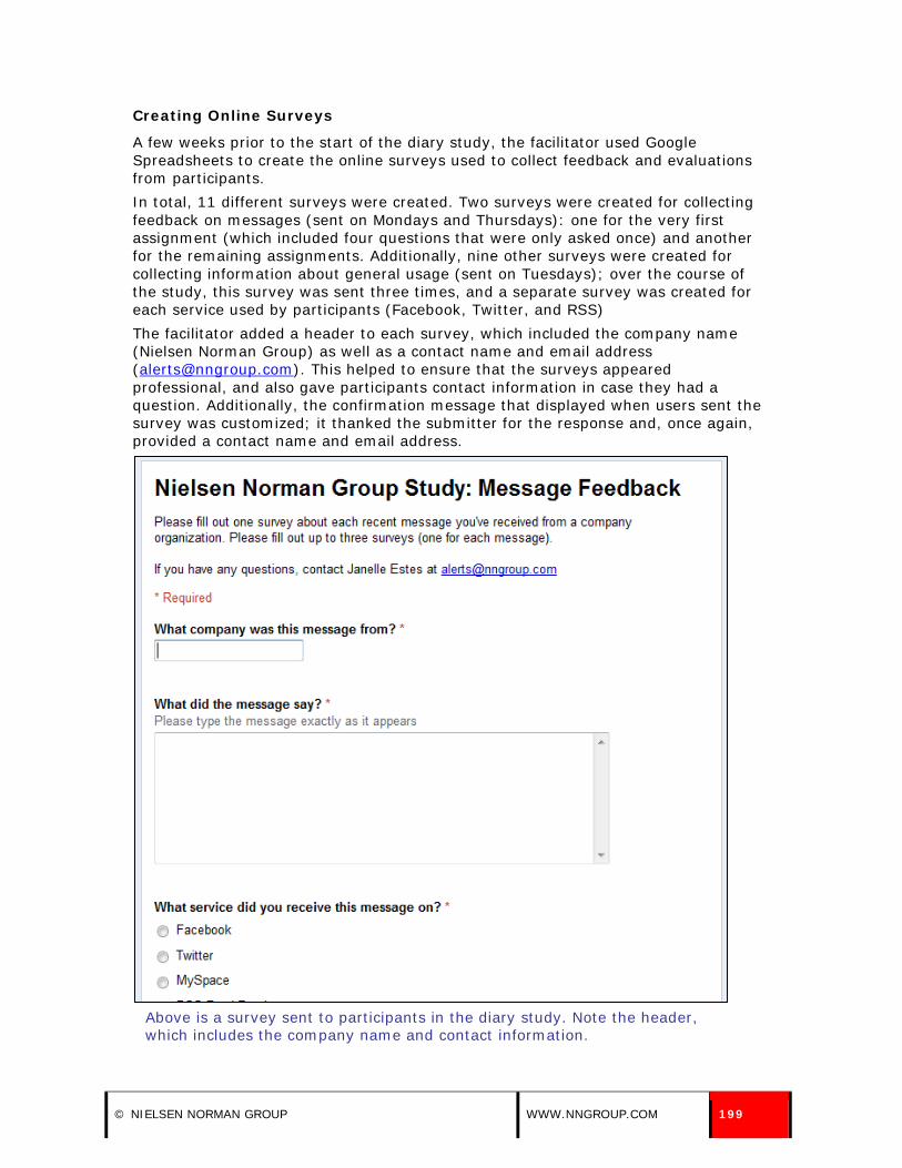
Creating Online Surveys
A few weeks prior to the start of the diary study, the facilitator used Google Spreadsheets to create the online surveys used to collect feedback and evaluations from participants. In total, 11 different surveys were created. Two surveys were created for collecting feedback on messages (sent on Mondays and Thursdays): one for the very first assignment (which included four questions that were only asked once) and another for the remaining assignments. Additionally, nine other surveys were created for collecting information about general usage (sent on Tuesdays); over the course of the study, this survey was sent three times, and a separate survey was created for each service used by participants (Facebook, Twitter, and RSS) The facilitator added a header to each survey, which included the company name (Nielsen Norman Group) as well as a contact name and email address ([email protected]). This helped to ensure that the surveys appeared professional, and also gave participants contact information in case they had a question. Additionally, the confirmation message that displayed when users sent the survey was customized; it thanked the submitter for the response and, once again, provided a contact name and email address.
Above is a survey sent to participants in the diary study. Note the header, which includes the company name and contact information.
© NIELSEN NORMAN GROUP WWW.NNGROUP.COM 199
Signing Up to Receive Messages from Companies and Organizations
In order to follow along with the messages that study participants received from companies and organizations over the course of study, the facilitator created accounts on Facebook, Twitter, and various RSS tools (My Yahoo! and Google Reader). Using these accounts, she signed up to follow the same companies and organizations as participants. This information was collected from participants as part of the recruiting process, and was confirmed by participants in the pre-assignment. The information collected in the pre-assignment (which included exact company and organization names and URLs) helped to ensure the facilitator was signed up to receive messages from the correct companies and organizations. As mentioned in the guidelines, there are many fake representations of companies and organizations on social networks, so it helped to obtain a URL of the company or organization’s page on Facebook or Twitter (sent from participants) for confirmation purposes. Additionally, many companies utilizing RSS have lots of different feeds; receiving the company name, feed name, and a URL to their RSS subscription page on their official site also helped to ensure we were following the same RSS feeds as participants.
Receiving Signed Consent Forms
Prior to the start of the diary study (and before participants could be paid), users had to complete and sign a consent form. In a typical lab setting, this is a paper form that users sign in-person. With the diary study, we emailed the consent form to users with instructions on how to scan and return the completed and signed form (via email). All users sent back the completed and signed form prior to the beginning of the study, with the exception of one user (who joined the study after the official start date).
Sending Assignments & Reminders
Every Monday, Tuesday, and Thursday, assignments were sent to study participants. Since participants were located around the world, the assignments were asked to be completed within 24 hours of receipt. Each assignment was sent by 8:00 AM, Eastern Time, to ensure consistency and to help set participants’ expectations. If a response wasn’t received within 24 hours of receipt, the facilitator sent a short follow-up email. The original email was resent, with the addition of the word “REMINDER” at the beginning of the subject line.
Responding to Participant Emails
It was anticipated that study participants would have questions throughout the course of the study. Each email sent to participants contained a name and contact email address in case they had any questions, concerns, or comments about the assignments or their participation. Most participants didn’t contact the facilitator during the study. However, some sent responses to emails indicating they had completed an assignment. Additionally, one participant sent an email to the facilitator to let her know he couldn’t complete the assignment within the 24 hours, but would do so within 48 hours. Another participant contacted he facilitator to let her know that she hadn’t received any news messages from companies and organizations through Facebook, so she couldn’t complete an assignment. Overall, the study facilitator spent about 4 hours responding to participant emails over the course of the study.
200 [email protected] Methodology: Second Study (Social Networks and RSS)
Sending Incentives
During our lab studies, we typically hand participants their cash incentive at the beginning of the study. When handling incentives for the diary study participants, we collected an appropriate mailing address during the recruitment process, and mailed incentive checks after the study—and all assignments—were complete.
© NIELSEN NORMAN GROUP WWW.NNGROUP.COM 201
Appendix
COMPANIES AND ORGANIZATIONS INCLUDED IN STUDY For our lab study, we asked users to sign up to receive updates from companies and organizations two weeks prior to their session through Facebook, Twitter, MySpace, and RSS. (An asterisk next to the company or organization name indicates that we asked users to sign up to receive information from them through social networks or RSS.) In our lab and diary studies, we also reviewed messages and updates users already received from companies and organizations through social networks and RSS feeds. In total, we reviewed messages from more than 120 companies and organizations through Facebook, Twitter, MySpace, and RSS. Most companies and organizations included in the study are listed below.
(* indicates users were asked to sign up to receive information from the company for the study)
• ABC News*
• American Cancer Society*
• Amnesty International Australia*
• Australian Institute of Sport*
• Baltimore Research
• Barack Obama
• Blissful Beginnings Wedding and Event Design
• Boston Red Sox
• Buzz! The Nation
• Cinespia
• City of Portsmouth, NH*
• Company C
• CNN*
• Discovery Channel
• Elizabeth Glaser Pediatric AIDS Foundation
• Express: A Publication for the Washington Post
• Fieldwork Quantwork
• Gourmet Traveller
• Greater Dover Chamber of Commerce
• iTunes
• Ivan Misner
202 [email protected] Appendix

• Joyful Heart Foundation
• Lowes
• Kate Parker Weddings
• Kylie Minogue
• Mama’s Health
• Microsoft Windows*
• NPR (National Public Radio)
• National Trust for Historic Preservation
• Netflix*
• Pepsi*
• Script Magazine
• Shapiro Library
• Spaghetti Warehouse
• STA Travel Australia*
• Stonyfield Farm
• The Huffington Post
• The New York Times*
• The Rachel Ray Show
• The Rotary Foundation
• The Weather Channel Australia*
• Ticketek*
• TOMS Shoes
• Totalbeauty.com
• TripAdvisor*
• TSURT
• Uncle Eric’s Pet Care Service
• Vocalpoint
• USA TODAY
• Wait, Wait… Don’t Tell Me!
• WebMD
• WMUR-TV*
Twitter (* indicates users were asked to sign up to receive information from the company for the study)
• Amazon.com*
© NIELSEN NORMAN GROUP WWW.NNGROUP.COM 203

• American Cancer Society*
• American Eagle Outfitters
• Apple, Inc.
• Best Companies
• Bentley University
• Charlotte Russe
• Company C
• Comcast
• E! Online
• EMI Music Australia*
• Fairfax Digital*
• Gourmet Traveller
• Greenpeace
• HBO
• InStyle.com
• JetBlue Airways*
• Kevin Rudd (Australian Prime Minister)*
• Kmart
• Mashable
• NPR (National Public Radio)
• Philosophy
• Rainn Wilson
• Rob Thomas
• Rupp Arena
• Sears
• Stonyfield Farm
• Target
• TD Garden
• The Body Shop
• The Kyle and Jackie O Show
• The New York Times
• The Rotary Foundation
• TOMS Shoes
• University of Central Florida Arena
• United States Department of Education*
• United States Environmental Protection Agency*
204 [email protected] Appendix
• WBZ NewsRadio*
• WHDH Boston*
MySpace (* indicates users were asked to sign up to receive information from the company for the study)
• Adidas*
• Bruce Springsteen*
• Continental Airlines*
• Dell*
• NBA*
• Oxfam America*
• Royal Society for the Prevention of Cruelty to Animals (RSPCA) *
• The White House*
RSS (* indicates users were asked to sign up to receive information from the company for the study)
• ABC News
• Art Biz Blog
• Australian Government*
• BBC Sports
• City of Sydney*
• CNET
• Department of Health and Ageing (Australia)*
• Derek Shanks Photography
• ESPN
• Foster’s Daily Democrat
• Guardian World News
• Horoscopes.com
• Joystiq
• Kotaku
• Leon Turnbull Photography
• MSNBC
• News.com.au*
• PC World
• Reuters
© NIELSEN NORMAN GROUP WWW.NNGROUP.COM 205

• Roadside Scholar
• Scott Bulger Photography
• Seacoast Online*
• SkyNews*
• Spool Photography
• The Australian
• The Huffington Post
• The New York Times
• The Wall Street Journal*
• This Week in Education*
• United States Consumer Product Safety Commission*
• Will Michael Photography
• Yahoo! News
Messages and updates from some companies and organizations were evaluated on more than one site or service. Some were evaluated on more than one site or service intentionally, because we were interested in the content and frequency of the messages sent from the same company or organization through two or more different sites or services. Others were evaluated unintentionally; the overlap occurred as we reviewed the messages from companies and organizations users already followed through the sites and services they used.
COMPANIES AND ORGANIZATIONS EVALUATED ON MORE THAN ONE SITE OR SERVICE
Name Facebook Twitter RSS
ABC News x x
American Cancer Society x x
Company C x x
Gourmet Traveller x x
NPR (National Public Radio) x x
Rotary Foundation x x
Stonyfield Farms x x
The Huffington Post x x
The New York Times x x x
TOMS Shoes x x
206 [email protected] Appendix

Acknowledgements
We would like to thank all test participants in each round of testing for their time, participation, and feedback. A special thanks to the users in our diary study for their ongoing participation. Because of confidentiality, we cannot name them. A special thanks to Amy Schade for her assistance throughout all phases of the second round of research.
© NIELSEN NORMAN GROUP WWW.NNGROUP.COM 207

About the Authors
Janelle Estes is a Senior User Experience Specialist with Nielsen Norman Group. She works with clients in a variety of industries and presents regularly about user testing and writing for the Web. She has been the primary researcher on and co-author of NN/g reports on transactional email messages and donation usability for non-profit and charity websites. Estes began her career as a research associate on the Customer Experience team at Forrester Research, where she was involved with many research efforts related to user experience and user centered design. Additionally, Estes has worked as a user experience consultant with companies across many industries, including retail, financial services, healthcare, manufacturing, and telecommunications. Most recently, Estes worked at Chordiant Software as a Human Factors Engineer in an agile development environment. Estes holds a BS in Information Design and Corporate Communication, and an MS in Human Factors in Information Design, both from Bentley University. Amy Schade is a Director at Nielsen Norman Group. She works with clients large and small in a variety of industries, including e-commerce, music, government, banking, publishing and education, including extensive work on corporate intranets. She has conducted user research, including longitudinal studies and eyetracking research, worldwide. She regularly presents tutorials on user testing, intranet usability, writing for the Web and email newsletter usability. She co-authored the NN/g reports on intranet usability, intranet information architecture, email newsletter usability and site map usability as well as conducting much of the research for reports on accessibility and usability for senior citizens. Before joining NN/g, Schade worked as an Information Architect at Arc eConsultancy. She created and revised site architectures for clients ranging from a family-related content site to a transaction-based sponsorship marketplace. She has also worked in a variety of positions in web production and advertising. She holds a Master’s degree from the Interactive Telecommunications Program at New York University and a bachelor’s degree in Communications from the University of Pennsylvania. Jakob Nielsen, Ph.D. is principal of Nielsen Norman Group. He is the founder of the “discount usability engineering” movement, which emphasizes fast and efficient methods for improving the quality of user interfaces. Nielsen, noted as “the world’s leading expert on Web usability” by U.S. News and World Report and “the next best thing to a true time machine” by USA Today, is the author of the best-selling book Designing Web Usability: The Practice of Simplicity (2000), which has sold more than a quarter of a million copies in 22 languages. His other books include: Hypertext and Hypermedia (1990), Usability Engineering (1993), Usability Inspection Methods (1994), International User Interfaces (1996), Homepage Usability: 50 Websites Deconstructed (2001), Prioritizing Web Usability (2006), and Eyetracking Web Usability (2010), and Mobile Usability (2012). Nielsen’s Alertbox column on Web usability has been published on the Internet since 1995 and currently has about 200,000 readers. From 1994 to 1998, Nielsen was a Sun Microsystems Distinguished Engineer. His previous affiliations include Bell Communications Research, the Technical University of Denmark, and the IBM User Interface Institute.
208 [email protected] About the Authors

Evidence-‐Based User Experience Research, Training, and Consulting
Since 1998 Nielsen Norman Group has been a leading voice in the user experience field.
• Conducting groundbreaking research
• Evaluating interfaces of all shapes and sizes
• Guiding critical design decisions to improve the bottom line
We practice what we preach
We don’t just talk about the importance of testing with real users, on real tasks, in real life business situations:
we do it. Every week, somewhere around the globe, NN/g team members are conducting research that informs
the three pillars of our business: training, consulting and research. In that work we have:
• Tested over 2,000 different interfaces
• Observed more than 4,000 users—in person—in 18 countries and on 5 continents
• Analyzed thousands of hours of recorded user observations sessions
• Conducted countless diary studies, focus groups and remote user tests
Our collective experience will save you time… and money
Making technology easier to use is no longer a nice-‐to-‐have. Useful, usable products make money. And our
expertise can help your team achieve their design goals quicker and easier than going it alone. Choosing NN/g
means you benefit directly from our:
• Finely tuned methodology: We have an arsenal of proven tools at our disposal and know how and where
to apply each one, taking the guesswork out of how to achieve the optimal design solution to meet your
business goals.
• Comprehensive body of knowledge: We’ve taken the results of our decades of research and testing and
distilled it down into actionable guidelines, best practices and proven methodologies. Our research
library, containing over 50 published reports, X books and an email newsletter archive dating back to
1995 is unrivaled.
• Practical approach: Our approach is 100% practical, useful and actionable. Whether you attend one of
our Usability Week events or invite us to consult at your place of business, the training you will receive
can be put into action immediately so that you can see the results.

Evidence-Based User Experience Research, Training, and Consulting
Our people are the best in the business
At NN/g there is no “B Team”. When we dispatch consultants to work with you and your team, or when you
attend a Usability Week course, you are learning directly from some of the best-‐educated and most experienced
minds in the business.
• Our principals are considered pioneers in the fields of user research and interface design.
• Our researchers and consultants tackle the most recent and relevant topics in usability, from evergreen
challenges such as information architecture and intranet usability to emerging trends in social media
and mobile usability.
Stay Informed
Jakob Nielsen’s Alertbox Newsletter
Summaries of our latest research and insights published twice per month.
To subscribe: http://www.nngroup.com/articles/subscribe

Evidence-Based User Experience Research, Training, and Consulting
TRAINING
Usability Week Events
Usability Week training events are offered in the U.S., Canada, the U.K., Europe, Asia and Australia.
Each week-‐long event features full-‐day, immersive training courses where attendees learn practical skills directly
from experienced practitioners so they can solve complex UI problems and create better interface designs.
Over 40 courses offered in these categories:
• Agile • Applications • Content Strategy • Credibility & Persuasion • Email • Information Architecture • Interaction Design • Intranets • Mobile & Tablet • Non-‐Profit Websites • Prototyping • Social UX • User Testing • Visual Design • Web Usability • Writing for the Web
Available courses and upcoming locations: www.nngroup.com/training
In-‐house Training
Many of our courses can be taught at your location and customized to fit your unique offerings, methods and
resources.
In-‐house training is ideal for:
• Large teams that want to spread user experience perspective throughout the group • Teams working on large projects that need to kick start the creative process and head in the right
direction In-‐house training information: www.nngroup.com/consulting
Evidence-Based User Experience Research, Training, and Consulting
REPORTS
NN/g has published over 60 reports that detail thousands of evidence-‐based design guidelines derived from our
independent research studies of websites, intranets, application, and mobile interfaces.
Over 60 reports addressing these topics:
• Agile • Applications • Audience Types (e.g., children, college students, seniors, people with disabilities) • B2B Websites • Corporate Websites • Ecommerce • Email • Information Architecture • Intranets • Mobile & Tablet • Non-‐Profit Websites • User Testing • Social UX • Strategy • Web Usability
Shop for reports here: www.nngroup.com/reports

Evidence-Based User Experience Research, Training, and Consulting
CONSULTING
The same experts who conduct our research and teach Usability Week training courses are available for custom
consulting including:
• Evaluating your website, application, intranet or mobile interface (average cost $38,000 USD)
• Usability testing (average cost $35,000 USD)
• Strategic planning (average cost $12,000 USD)
• On-‐site training with your team (average cost $9,000 USD per day)
Consulting details: www.nngroup.com/consulting