shopping cart best practices
TRANSCRIPT

Optimizely 2014 ©
Shopping Cart Best Practices: Four Ideas Great Ideas Presented in 30 Minutes
October 21st, 2014

Optimizely 2014 ©
Today’s Agenda
•Hiding Your Top Level Navigation
•Adding a Progress Bar
•Hiding a Distracting Promo Code Field
•Same Billing & Shipping Checkbox
Optimizely 2014 ©
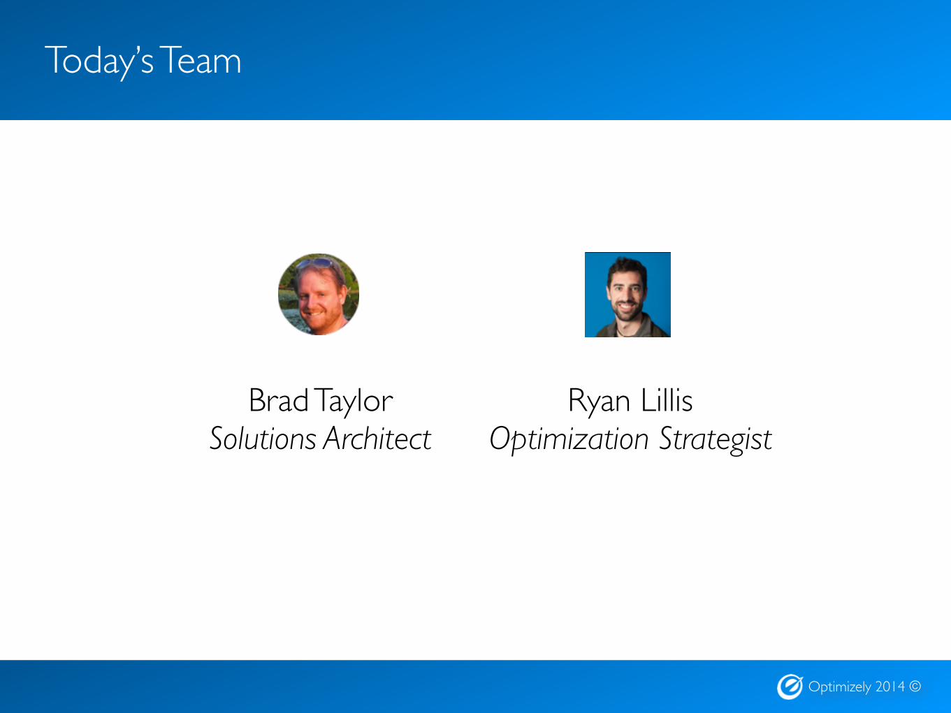
Today’s Team
Ryan LillisOptimization Strategist
Brad TaylorSolutions Architect

Hiding Your Top Level Navigation
Optimizely 2014 ©
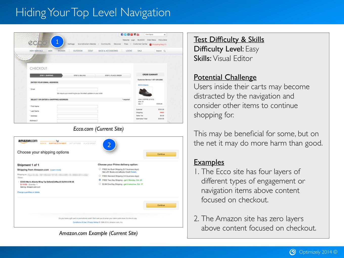
Hiding Your Top Level Navigation
Test Difficulty & SkillsDifficulty Level: EasySkills: Visual Editor
Potential Challenge Users inside their carts may become distracted by the navigation and consider other items to continue shopping for.This may be beneficial for some, but on the net it may do more harm than good.
Examples1. The Ecco site has four layers of
different types of engagement or navigation items above content focused on checkout.
2. The Amazon site has zero layers above content focused on checkout.
Amazon.com Example (Current Site)
Ecco.com (Current Site)
1
2

Adding a Progress Bar

Optimizely 2014 ©
Adding a Progress Bar
Test Difficulty & SkillsDifficulty Level: EasySkills: Visual EditorPotential Challenge Users like to see where they are and how far they have to go - particularly in the checkout experience. Progress bars that don’t exist or aren’t prominent enough can cause users to hit the Back button to confirm they’re in the right spot.
Examples1. This progress “bar” is present, but isn’t
prominent and only exists near the login information which may make many users miss it.
2. This wireframe shows an example of a more prominent progress bar.
WebstaurantStore.com (Current Site)
1
Webstaurant with more prominent progress bar (Example Wireframe)
2
Hiding a Distracting Promo Code Field

Optimizely 2014 ©
Hiding a Distracting Promo Code Field
Test Difficulty & SkillsDifficulty Level: EasySkills: Custom Javascript
Potential Challenge Showing a field for promo codes may prompt users who don’t have one to search online. This is a distraction and can potentially result in losing a conversion for users who forget to complete their purchases or find alternate stores to make their purchases.
Examples1. The field is present on this page with an
“Apply” CTA. Users can enter this information later in the funnel so it could be removed entirely from this page.
2. This wireframed example has the field hidden behind a link. When clicked, the field and CTA would be exposed.
Crate&Barrel Example (Current)
Crate&Barrel with promo code field hidden (Example Wireframe)
1
2
Same Billing & Shipping Checkbox
Optimizely 2014 ©
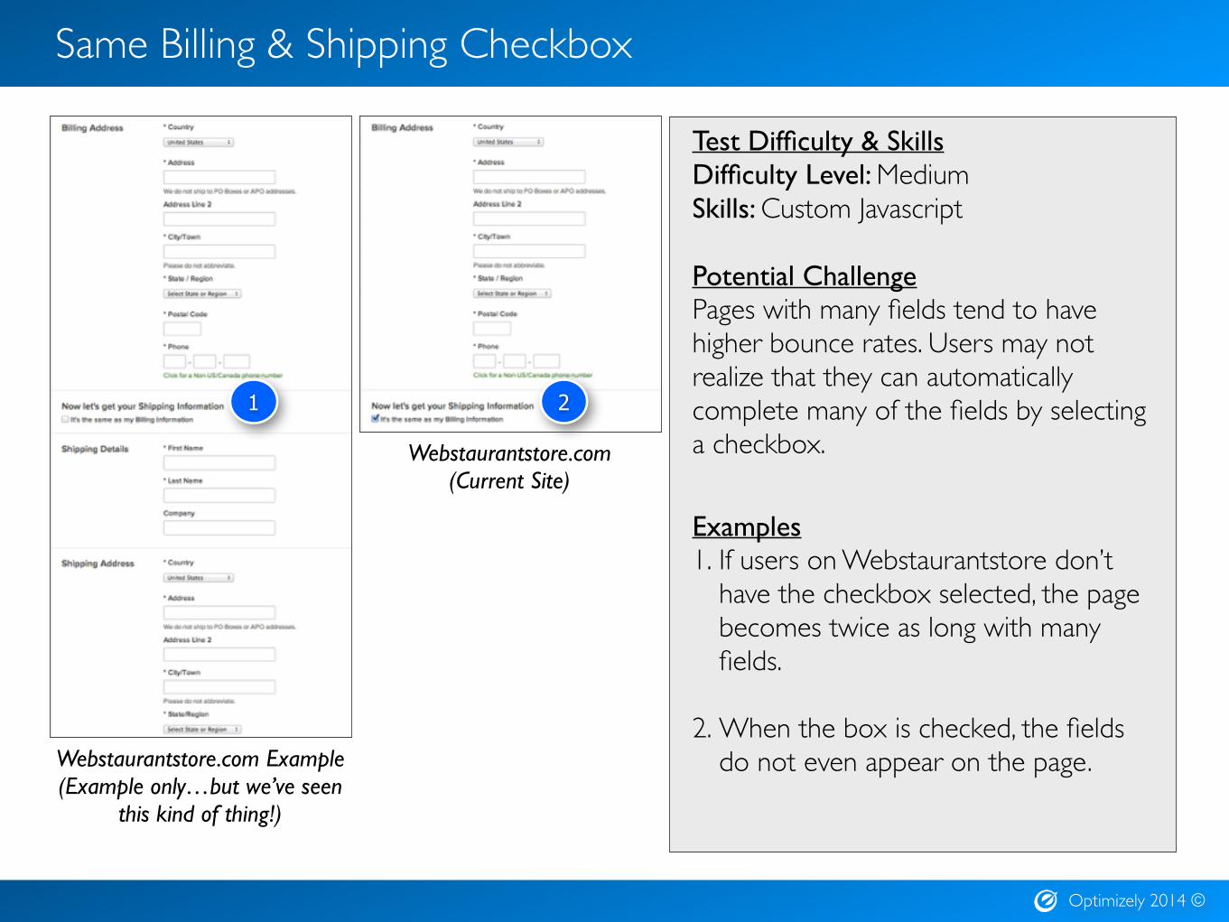
Same Billing & Shipping Checkbox
Test Difficulty & SkillsDifficulty Level: MediumSkills: Custom Javascript
Potential Challenge Pages with many fields tend to have higher bounce rates. Users may not realize that they can automatically complete many of the fields by selecting a checkbox.
Examples1. If users on Webstaurantstore don’t
have the checkbox selected, the page becomes twice as long with many fields.
2. When the box is checked, the fields do not even appear on the page.Webstaurantstore.com Example
(Example only…but we’ve seen this kind of thing!)
1 2
Webstaurantstore.com(Current Site)
Optimizely 2014 ©
Thank You!
Thank you for attending today’s webinar. Tell us if the suggested ideas are winners on your site!