rihanna loud analysis
TRANSCRIPT
Rihanna “Loud” Digi-pak analysis
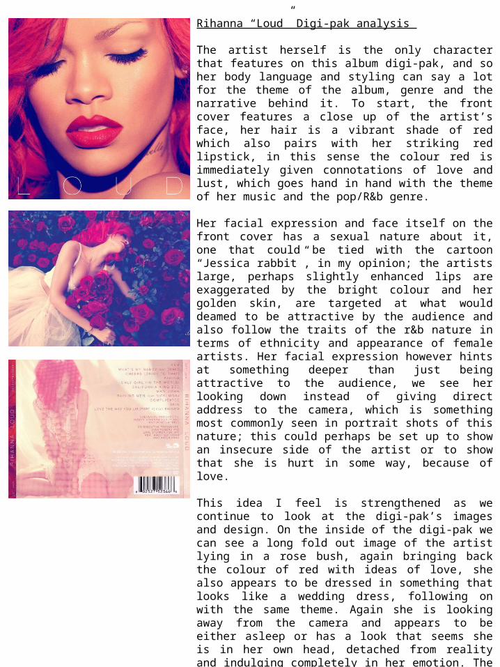
The artist herself is the only character that features on this album digi-pak, and so her body language and styling can say a lot for the theme of the album, genre and the narrative behind it. To start, the front cover features a close up of the artist’s face, her hair is a vibrant shade of red which also pairs with her striking red lipstick, in this sense the colour red is immediately given connotations of love and lust, which goes hand in hand with the theme of her music and the pop/R&b genre.
Her facial expression and face itself on the front cover has a sexual nature about it, one that could be tied with the cartoon “Jessica rabbit”, in my opinion; the artists large, perhaps slightly enhanced lips are exaggerated by the bright colour and her golden skin, are targeted at what would deamed to be attractive by the audience and also follow the traits of the r&b nature in terms of ethnicity and appearance of female artists. Her facial expression however hints at something deeper than just being attractive to the audience, we see her looking down instead of giving direct address to the camera, which is something most commonly seen in portrait shots of this nature; this could perhaps be set up to show an insecure side of the artist or to show that she is hurt in some way, because of love.
This idea I feel is strengthened as we continue to look at the digi-pak’s images and design. On the inside of the digi-pak we can see a long fold out image of the artist lying in a rose bush, again bringing back the colour of red with ideas of love, she also appears to be dressed in something that looks like a wedding dress, following on with the same theme. Again she is looking away from the camera and appears to be either asleep or has a look that seems she is in her own head, detached from reality and indulging completely in her emotion. The roses themselves also have the connotations of love and romance as they are typically given as a gift to a significant other, however the idea of the artist being in pain is brought back as we look deeper, a rose bush, though it may be beautiful is also covered in thorns; the fact she is lay in it would suggest she is in pain but remains to lie in it, looking at this as an enigmatic narrative this could suggest that the artist is in love yet the relationship is unhealthy and is hurting her emotionally, but she stays because of its passion and beauty. Or at another angle, she is heartbroken, but continues to indulge in the memories of her love as it takes her away from the reality of the relationship ending. To confirm, I would describe the narrative as enigmatic, and is created by the imagery of the artist herself.
For the most part the setting of the imagery is most likely in a photography studio, but is designed to appear as though outside. As I mentioned above the rose bush is a fundamental part of the design as it helps form the narrative of the digi-pak and creates a continuous theme throughout. The lighting used in the front cover image gives the artist a glow as if she is under sunlight, and I feel the idea of her being outside and one with nature is important to the natural feel and flow of the digipak aswell as the narrative, almost as if she is frolicking around a rose garden thinking about the one she loves and the heartbreak she is going through. it also bring an idea of natural beauty and innocence, as the images don’t appear to be terribly set up and staged.
The iconography used in this digi-pak would be the colour red, the wedding dress and the roses; all of which create the idea of love to the audience. The dress that appears to be a bridal gown gives the artist a sense of innocence and sub-constiously makes us feel empathy or other emotion towards the artist as we now can see she is a woman in or out of love.
The style of the digi-pak remains in line with that of a the typical R&B/pop genre, the text featured throughout and mainly on the front cover is fashionable and modern, the simple title “loud” is a minimalistic sans serif font, it is a thin font and has as large spaces between the letter heads, this is a simple touch and while also giving the cover a stylistic approach, doesn’t distract too much from the model and imagery. The artists name is featured in the same font at the top of the front cover but in a smaller text size; this frames the face of the artist and front cover nicely and again gives it that modern and professional appearance. The editing of the images seems to have a blue-ish tint, as the shadows appear a navy shade of blue rather than black, this gives the images a softer look and ties back with the natural essence of the images. The blue also contrasts nicely with the rich reds that feature and is a much better artistic decision over the black that would of originally appeared before editing.