responsive web design - what you need to know to get started
DESCRIPTION
TRANSCRIPT
Responsive Web Designwhat you need to know to get started
Jenny BrandonLibrarian / Web DesignerMichigan State University [email protected]

I am not an expert.
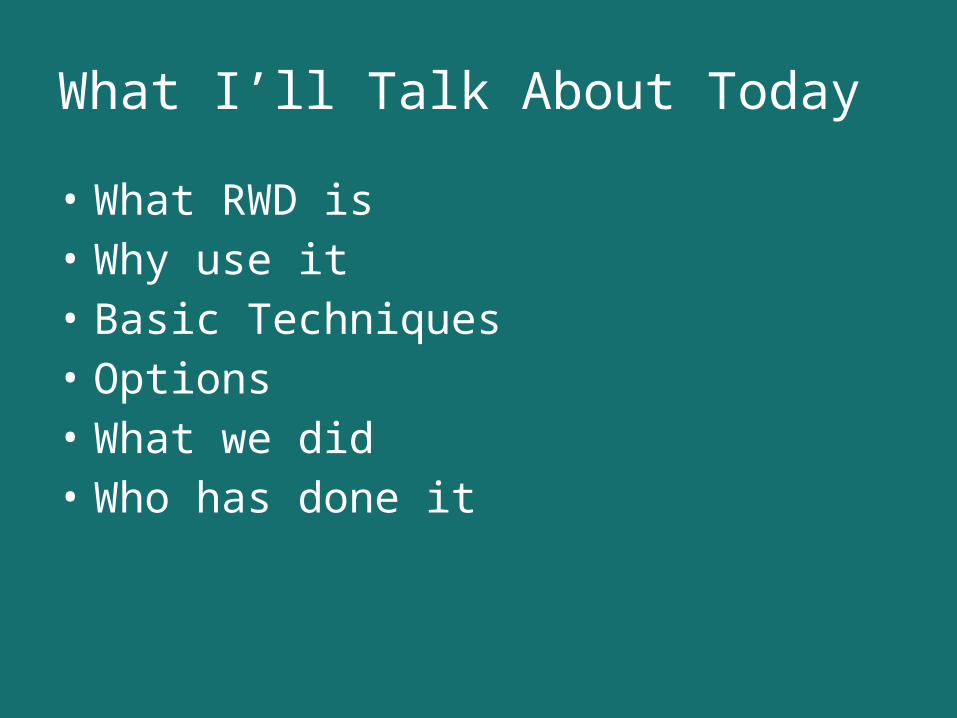
What I’ll Talk About Today
• What RWD is• Why use it• Basic Techniques• Options• What we did• Who has done it
WHAT IS RWD?
(Responsive Web Design)
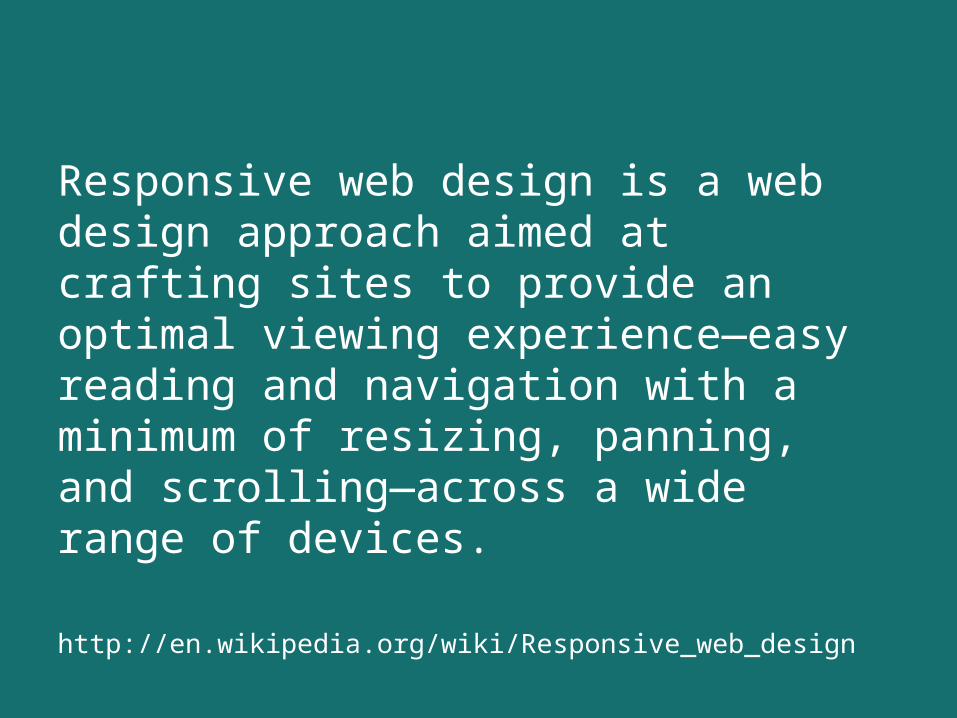
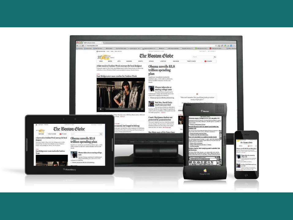
Responsive web design is a web design approach aimed at crafting sites to provide an optimal viewing experience—easy reading and navigation with a minimum of resizing, panning, and scrolling—across a wide range of devices.
http://en.wikipedia.org/wiki/Responsive_web_design
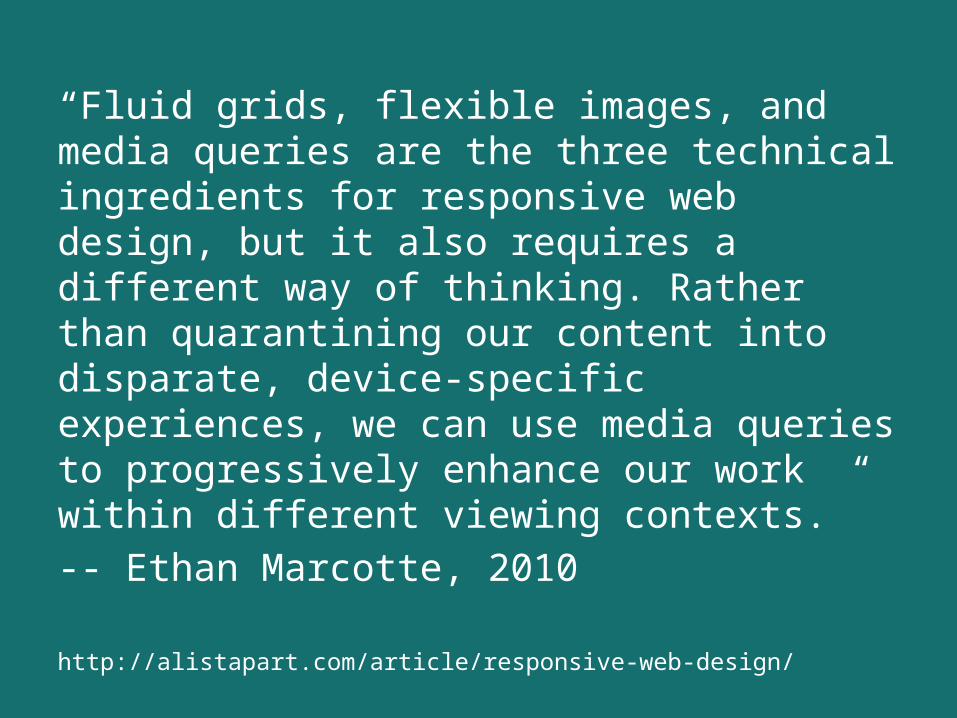
“Fluid grids, flexible images, and media queries are the three technical ingredients for responsive web design, but it also requires a different way of thinking. Rather than quarantining our content into disparate, device-specific experiences, we can use media queries to progressively enhance our work within different viewing contexts.” -- Ethan Marcotte, 2010
http://alistapart.com/article/responsive-web-design/
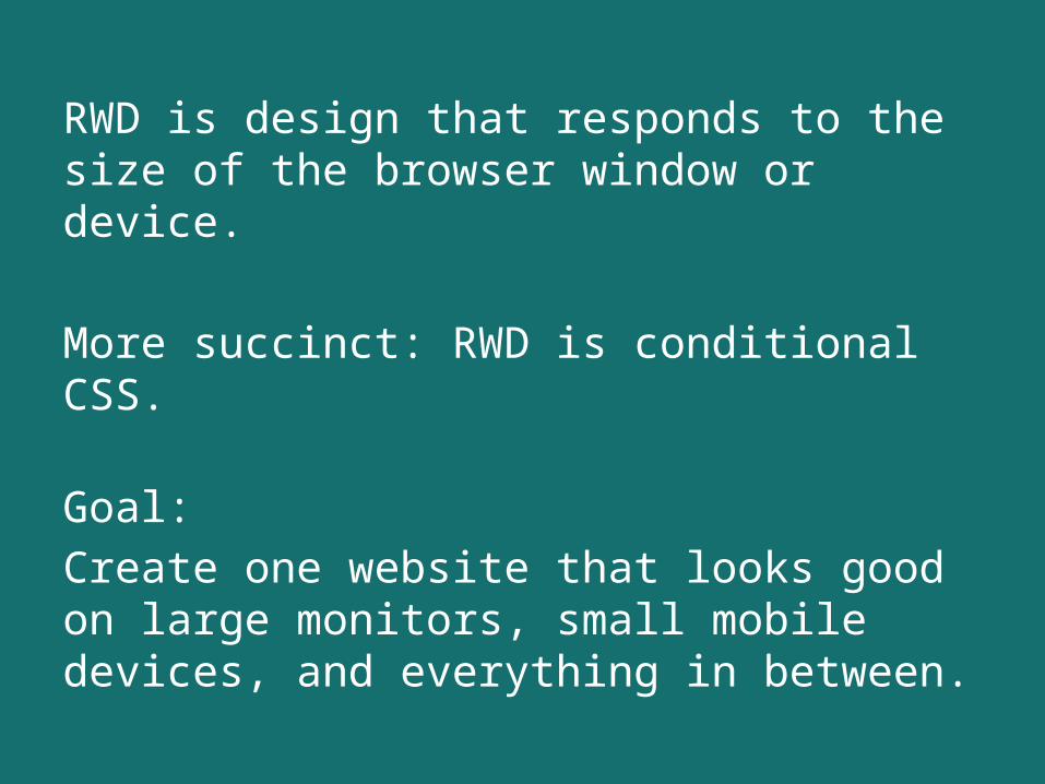
RWD is design that responds to the size of the browser window or device.
More succinct: RWD is conditional CSS.
Goal: Create one website that looks good on large monitors, small mobile devices, and everything in between.
BRWD
(Before Responsive Web Design)
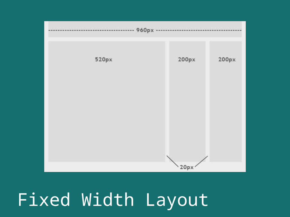
Fixed Width Layout
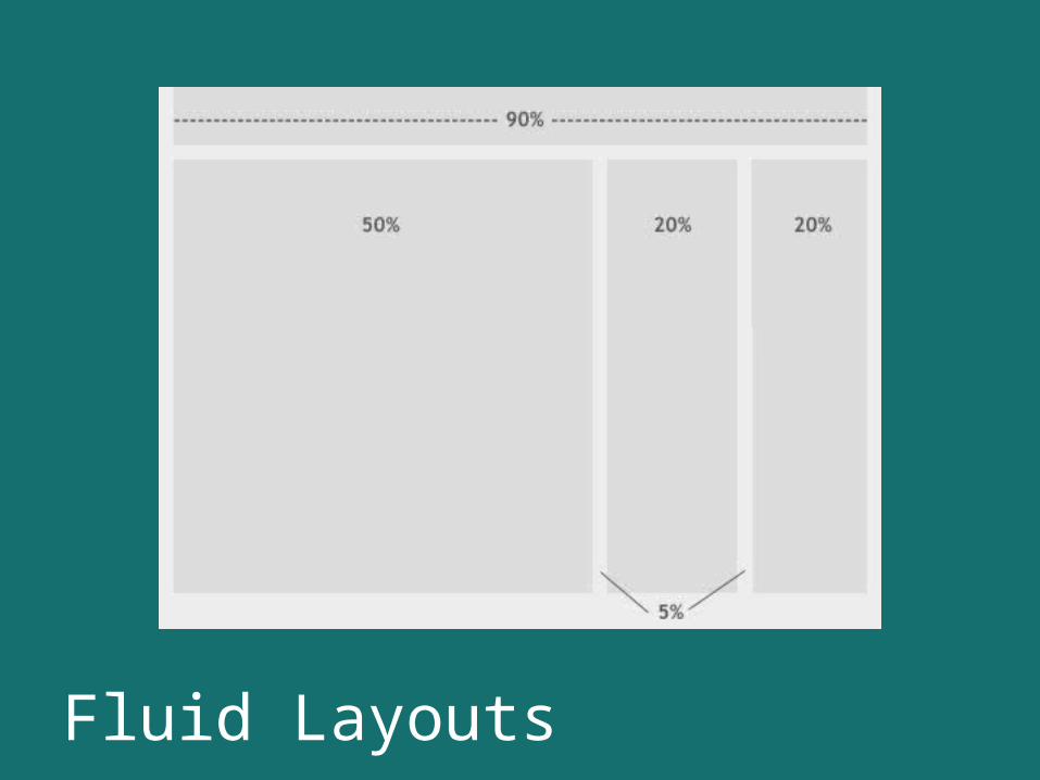
Fluid Layouts
Why do we need RWD?
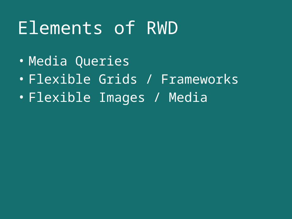
Elements of RWD
• Media Queries• Flexible Grids / Frameworks• Flexible Images / Media
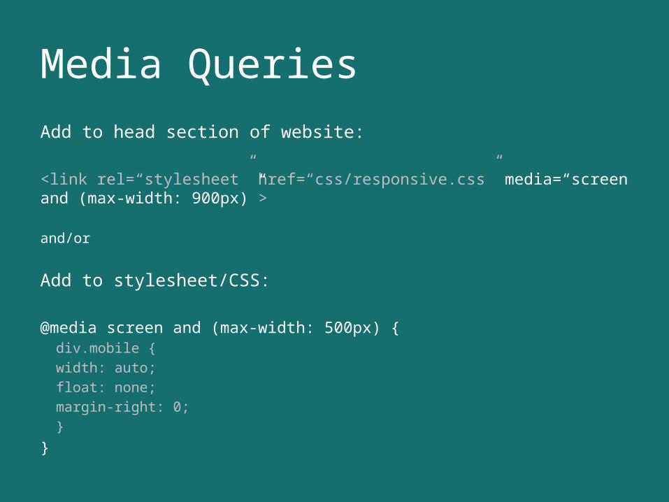
Media QueriesAdd to head section of website:
<link rel=“stylesheet” href=“css/responsive.css” media=“screen and (max-width: 900px)”>
and/or
Add to stylesheet/CSS:
@media screen and (max-width: 500px) {div.mobile {
width: auto;float: none;margin-right: 0;
}
}
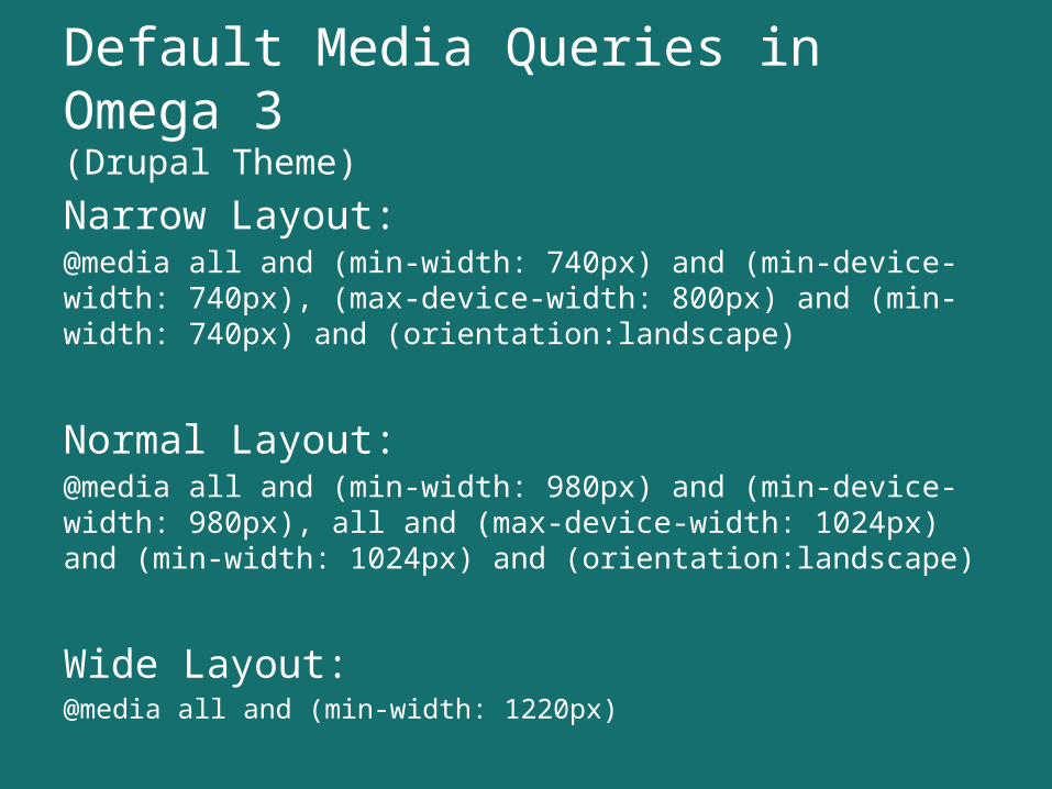
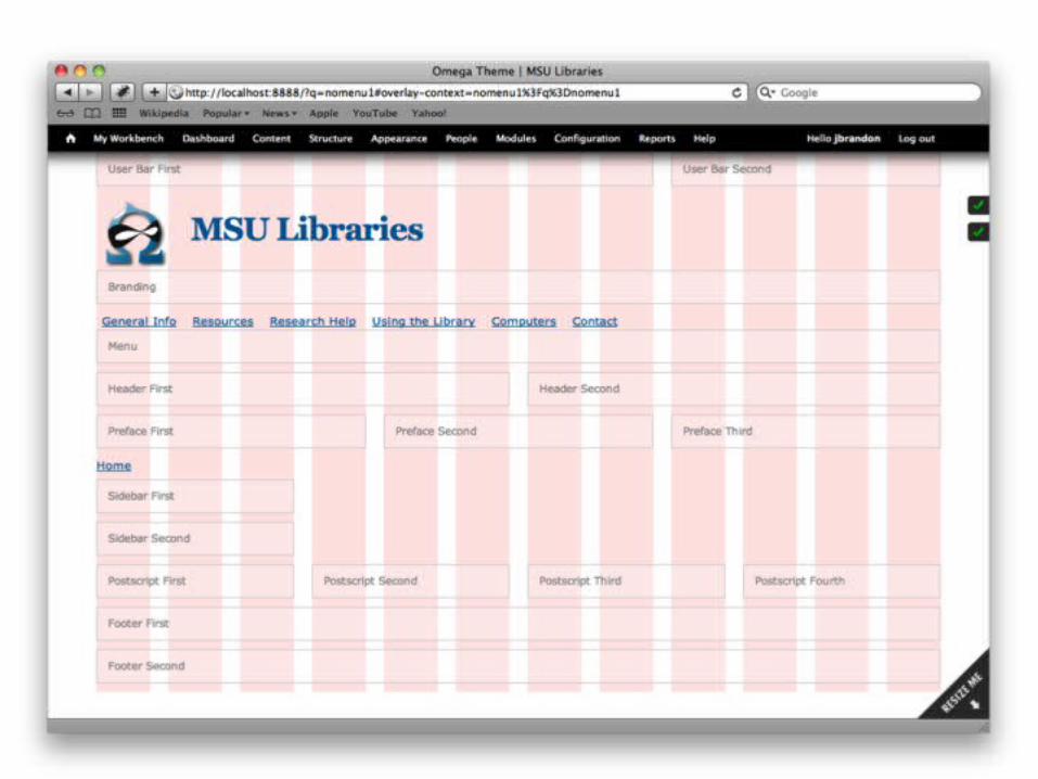
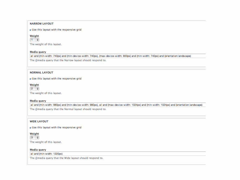
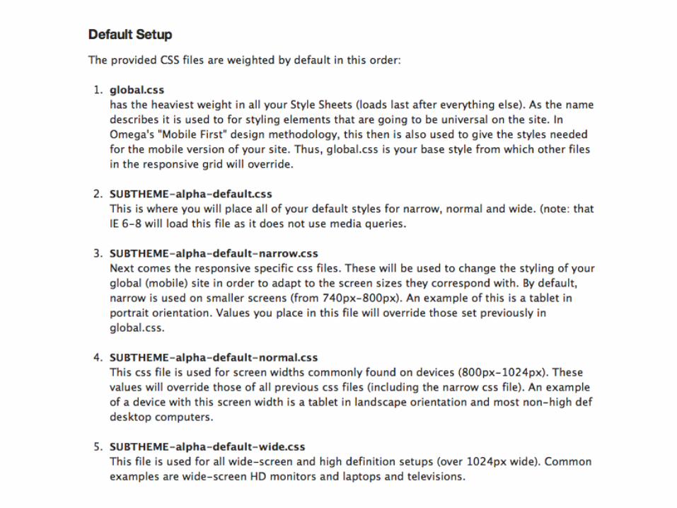
Default Media Queries in Omega 3 (Drupal Theme)
Narrow Layout:@media all and (min-width: 740px) and (min-device-width: 740px), (max-device-width: 800px) and (min-width: 740px) and (orientation:landscape)
Normal Layout:@media all and (min-width: 980px) and (min-device-width: 980px), all and (max-device-width: 1024px) and (min-width: 1024px) and (orientation:landscape)
Wide Layout:@media all and (min-width: 1220px)
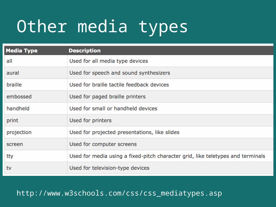
Other media types
http://www.w3schools.com/css/css_mediatypes.asp
Breakpoints(width in media query)
“Every time you see 320px, 480px, 768px, 1024px used as breakpoint values, a kitten gets its head bitten off by an angel…or something like that.”-- Brad Frosthttp://bradfrostweb.com/blog/post/7-habits-of-highly-effective-media-queries/
(Let content determine breakpoints)
Flexible Grids / Frameworks
• Define your own parameters (more control)– Wrapper and column widths in % or ems– Floats (drop content down)
• Premade Grid / Framework (save time)
Frameworks
• 960grid• YAML• The Golden Grid• SimpleGrid• Frameless• Columnal• 1140 CSS Grid• Skeleton
http://www.awwwards.com/grid-based-web-design-resources.html
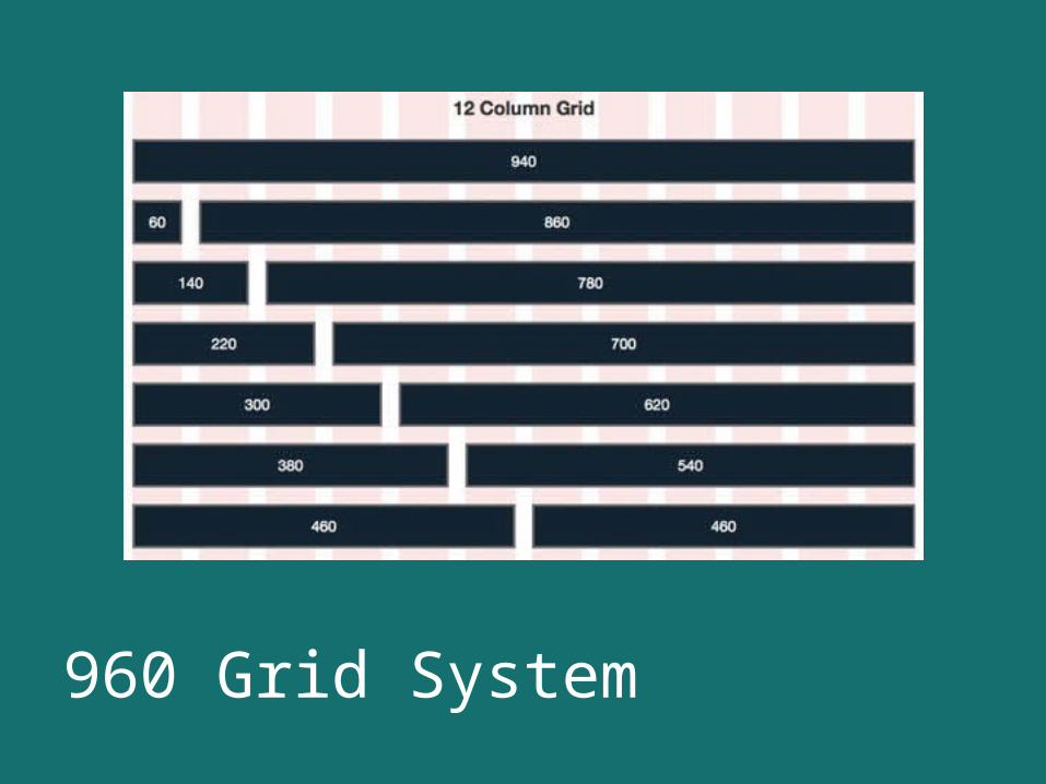
960 Grid System
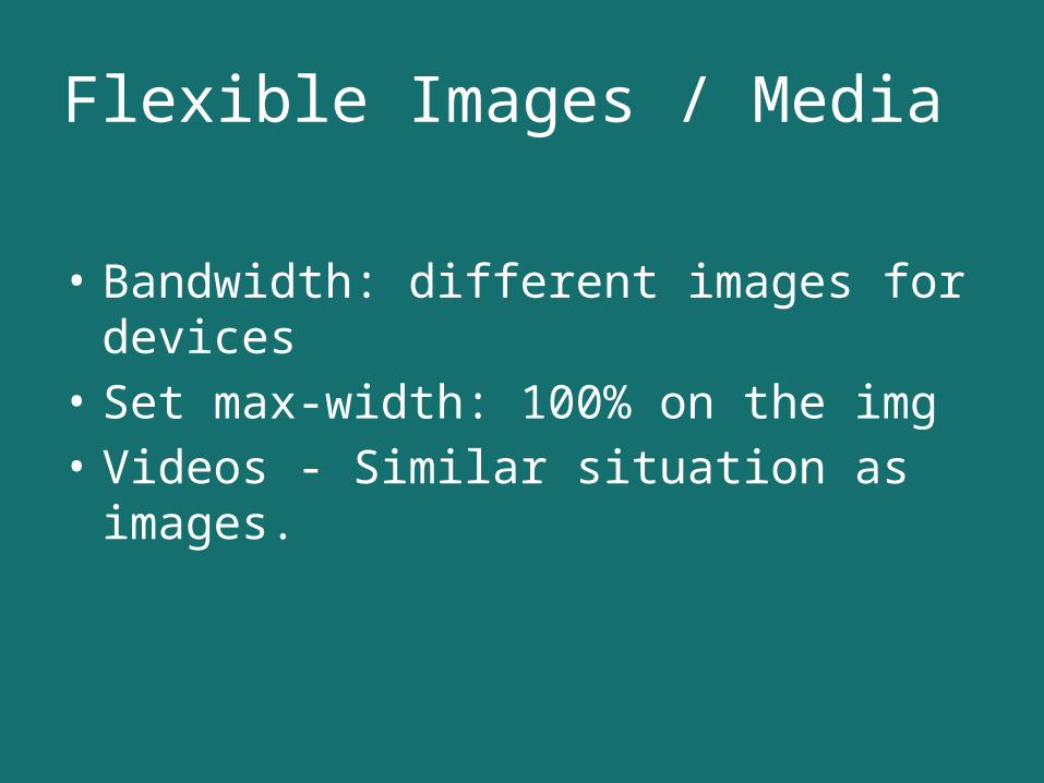
Flexible Images / Media
• Bandwidth: different images for devices• Set max-width: 100% on the img• Videos - Similar situation as images.
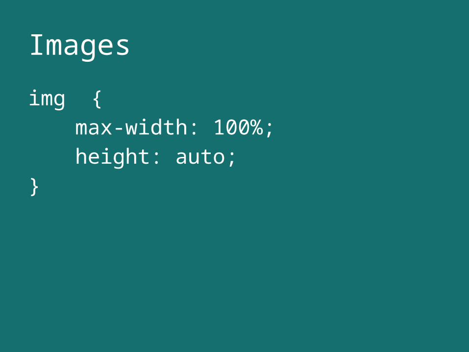
Images
img {max-width: 100%;height: auto;
}
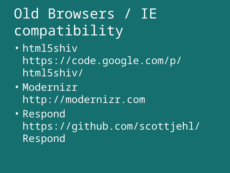
Old Browsers / IE compatibility
• html5shivhttps://code.google.com/p/html5shiv/
• Modernizrhttp://modernizr.com
• Respondhttps://github.com/scottjehl/Respond
LAYOUT PATTERNS
http://www.lukew.com/ff/entry.asp?1514
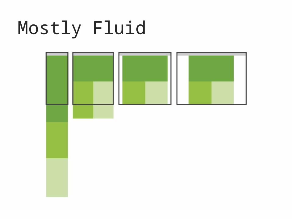
Mostly Fluid
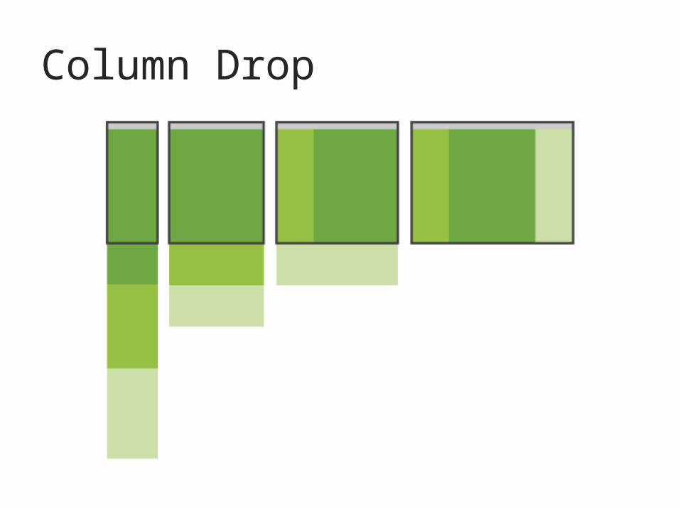
Column Drop
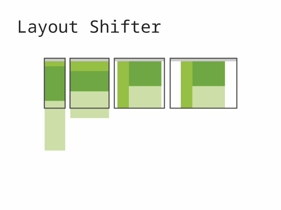
Layout Shifter
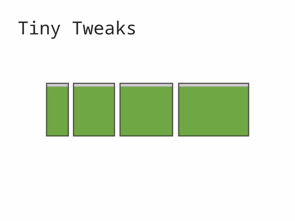
Tiny Tweaks
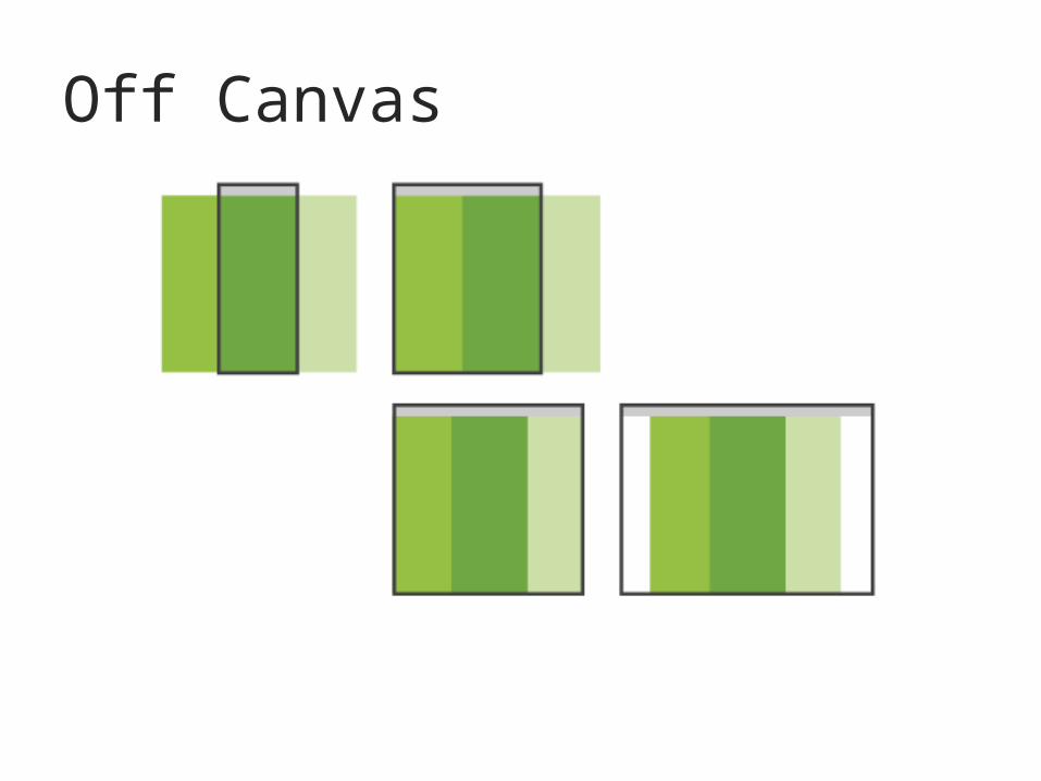
Off Canvas
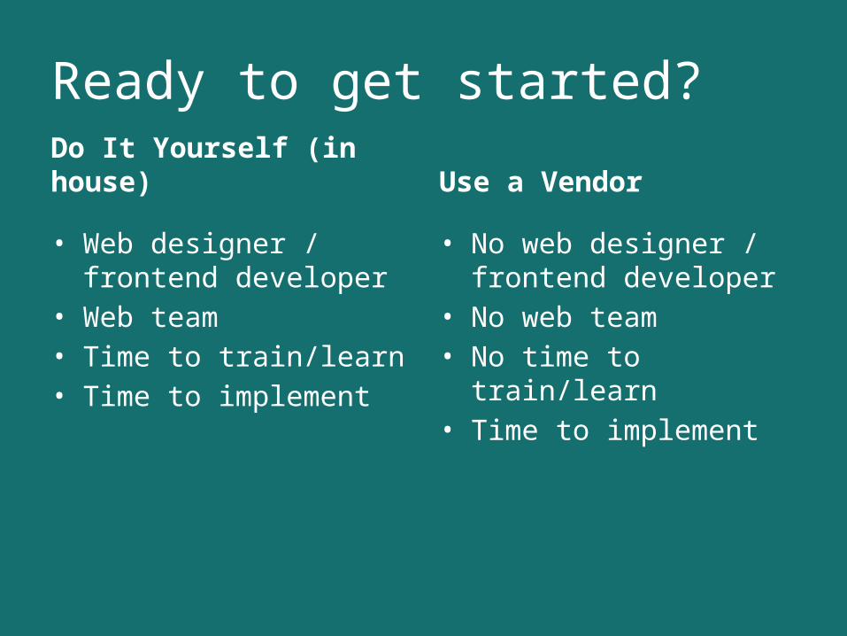
Ready to get started?
Do It Yourself (in house)
• Web designer / frontend developer
• Web team• Time to train/learn• Time to implement
Use a Vendor
• No web designer / frontend developer
• No web team• No time to train/learn• Time to implement
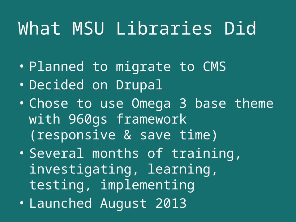
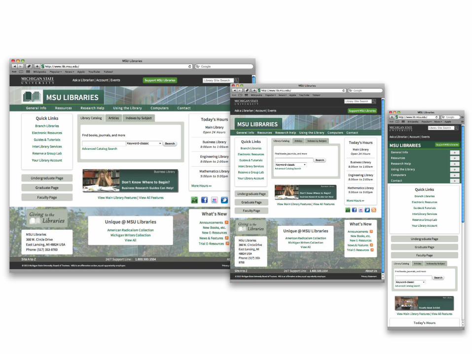
What MSU Libraries Did
• Planned to migrate to CMS• Decided on Drupal• Chose to use Omega 3 base theme with 960gs
framework (responsive & save time)• Several months of training, investigating,
learning, testing, implementing• Launched August 2013
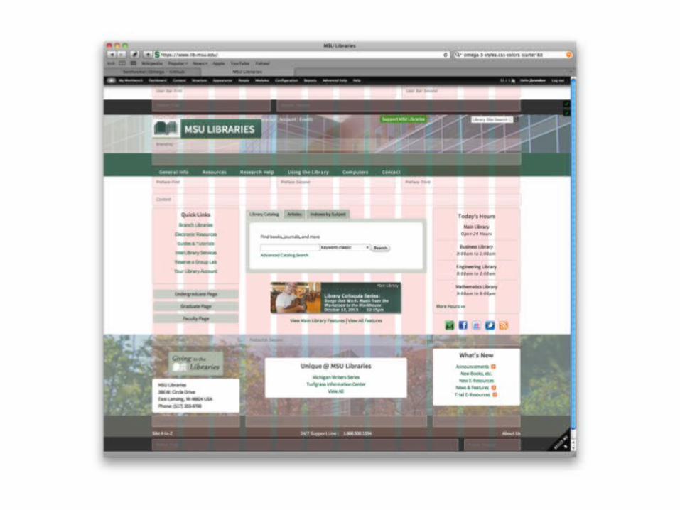

Truly Mobile First
University of Pittsburgh Library Systemhttp://www.library.pitt.edu
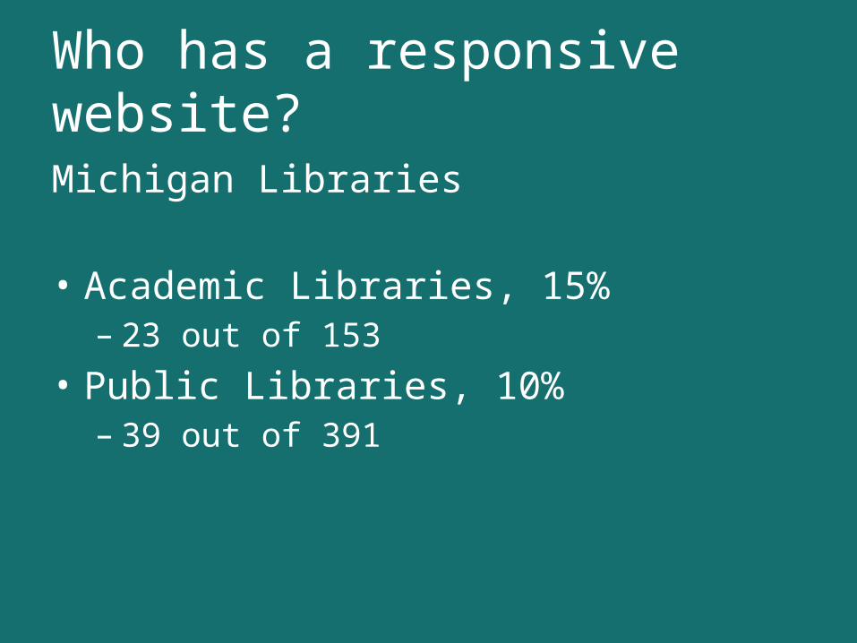
Who has a responsive website?
Michigan Libraries
• Academic Libraries, 15%– 23 out of 153
• Public Libraries, 10%– 39 out of 391
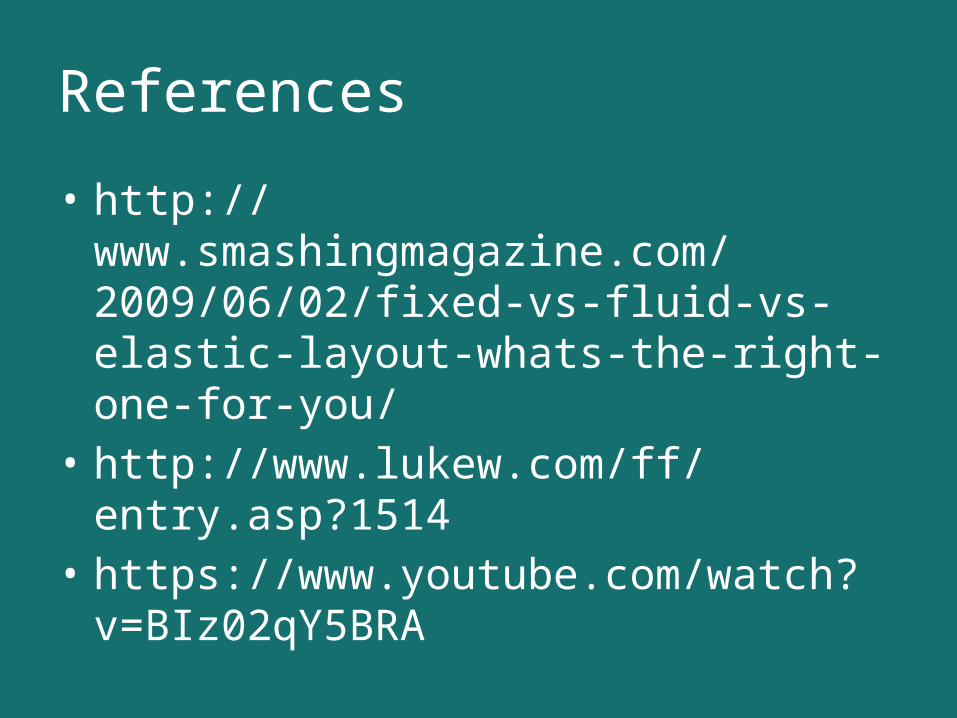
References
• http://www.smashingmagazine.com/2009/06/02/fixed-vs-fluid-vs-elastic-layout-whats-the-right-one-for-you/
• http://www.lukew.com/ff/entry.asp?1514• https://www.youtube.com/watch?
v=BIz02qY5BRA
QUESTIONS?