responsive web design and ecommerce
TRANSCRIPT
Date: May 10, 2013Version: 1.0Company: Virgin America
Responsive Web Design & eCommerce
Friday, May 10, 13
Responsive Web Design
2
Friday, May 10, 13
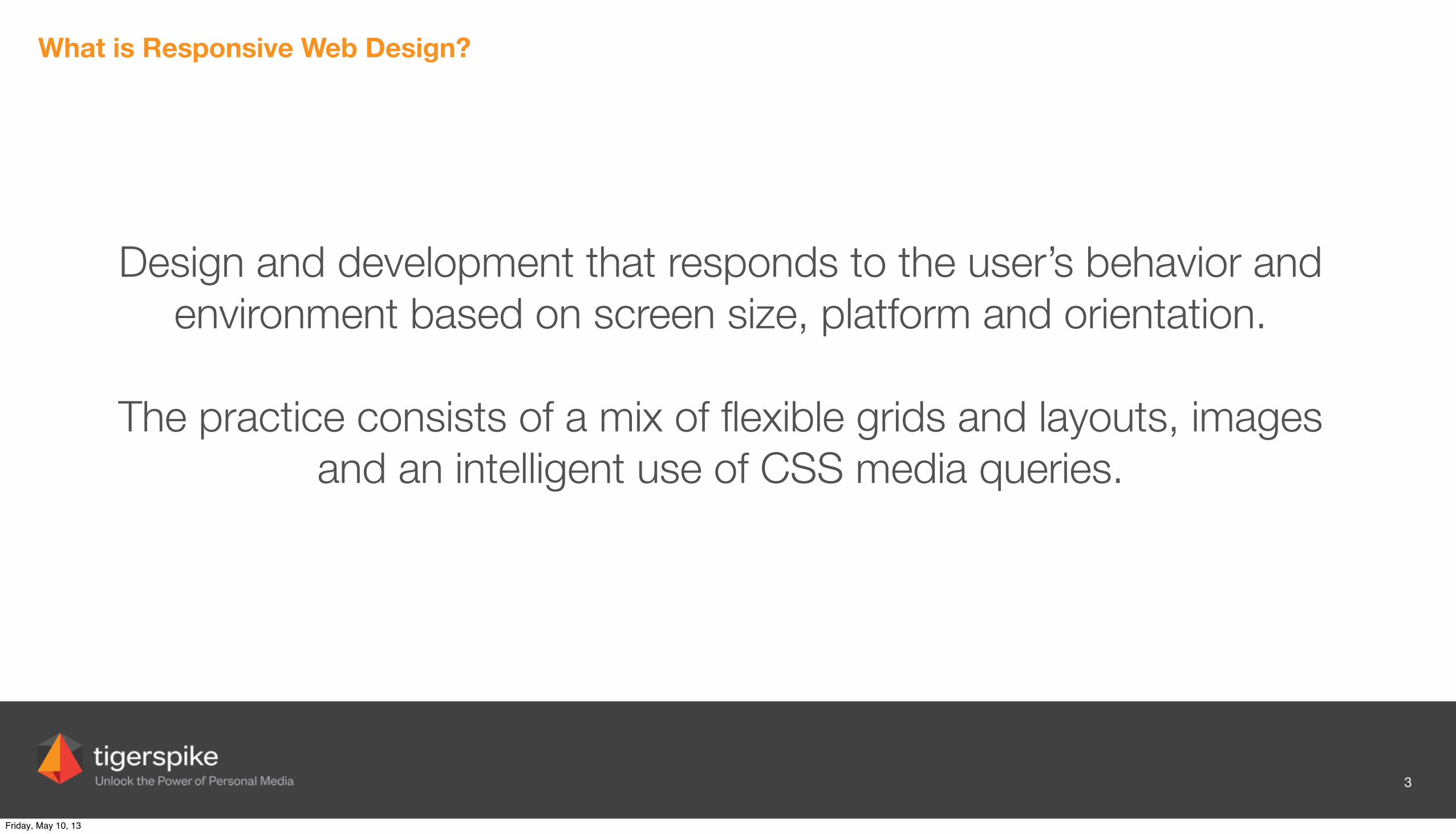
What is Responsive Web Design?
Design and development that responds to the user’s behavior and environment based on screen size, platform and orientation.
The practice consists of a mix of flexible grids and layouts, images and an intelligent use of CSS media queries.
3
Friday, May 10, 13
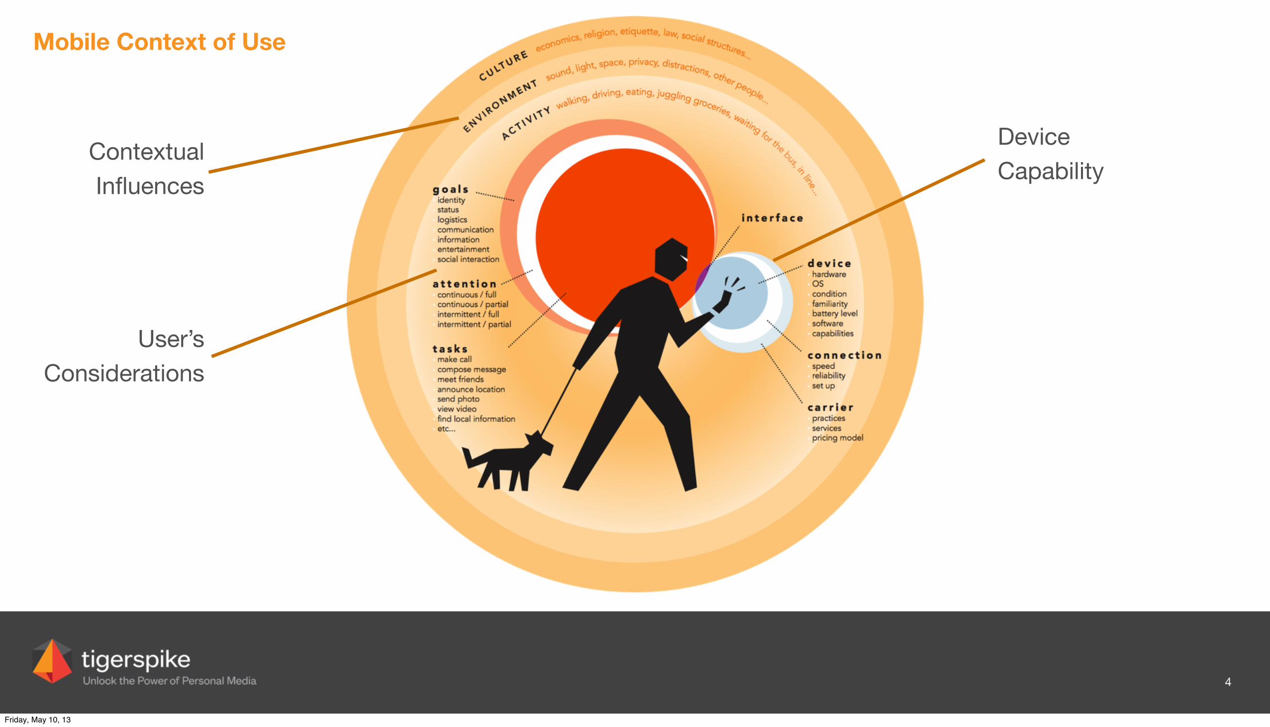
Mobile Context of Use
4
Contextual Influences
User’s Considerations
Device Capability
Friday, May 10, 13
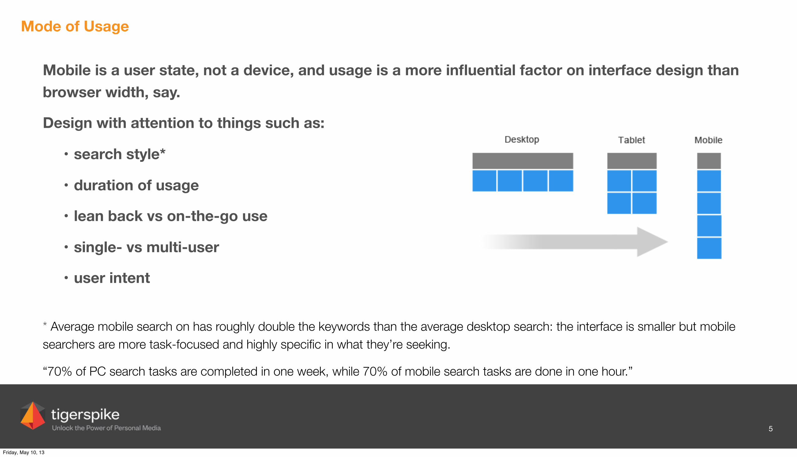
Mode of Usage
Mobile is a user state, not a device, and usage is a more influential factor on interface design than browser width, say.
Design with attention to things such as:
• search style*
• duration of usage
• lean back vs on-the-go use
• single- vs multi-user
• user intent
* Average mobile search on has roughly double the keywords than the average desktop search: the interface is smaller but mobile searchers are more task-focused and highly specific in what they’re seeking.
“70% of PC search tasks are completed in one week, while 70% of mobile search tasks are done in one hour.”
5
Friday, May 10, 13
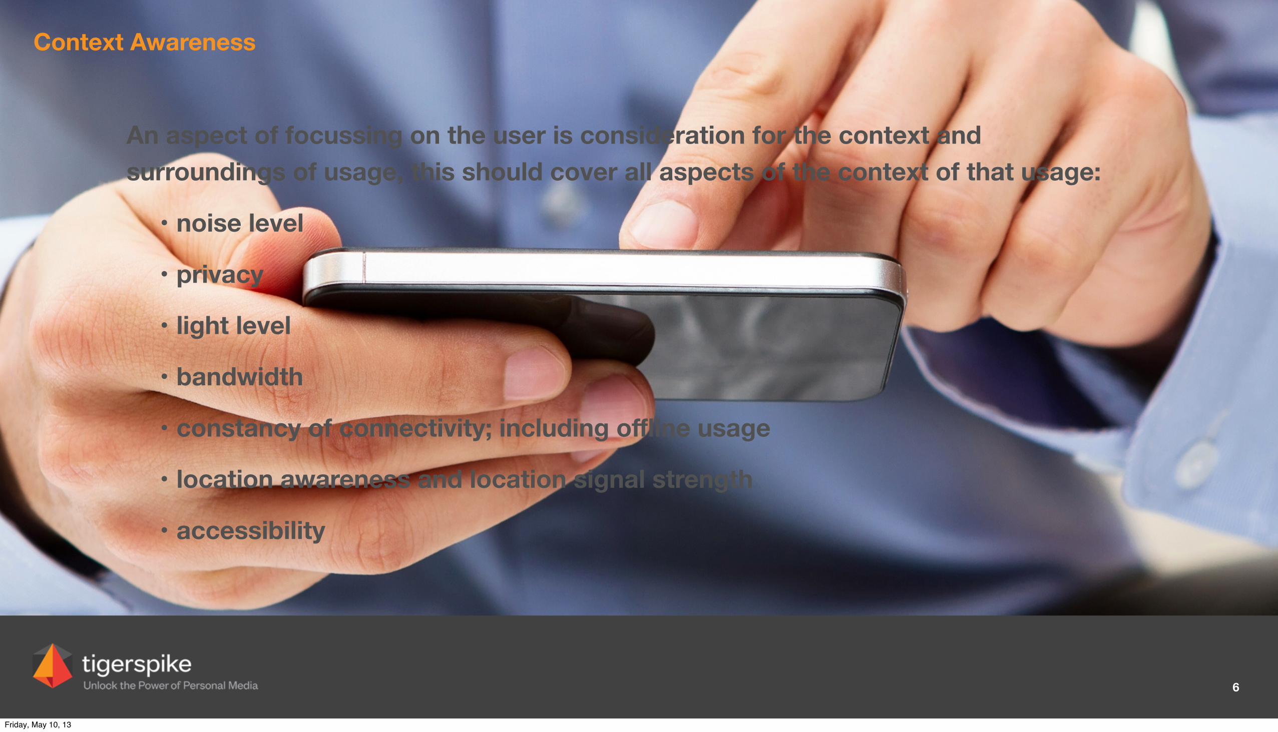
Context Awareness
An aspect of focussing on the user is consideration for the context and surroundings of usage, this should cover all aspects of the context of that usage:
• noise level
• privacy
• light level
• bandwidth
• constancy of connectivity; including offline usage
• location awareness and location signal strength
• accessibility
6
Friday, May 10, 13
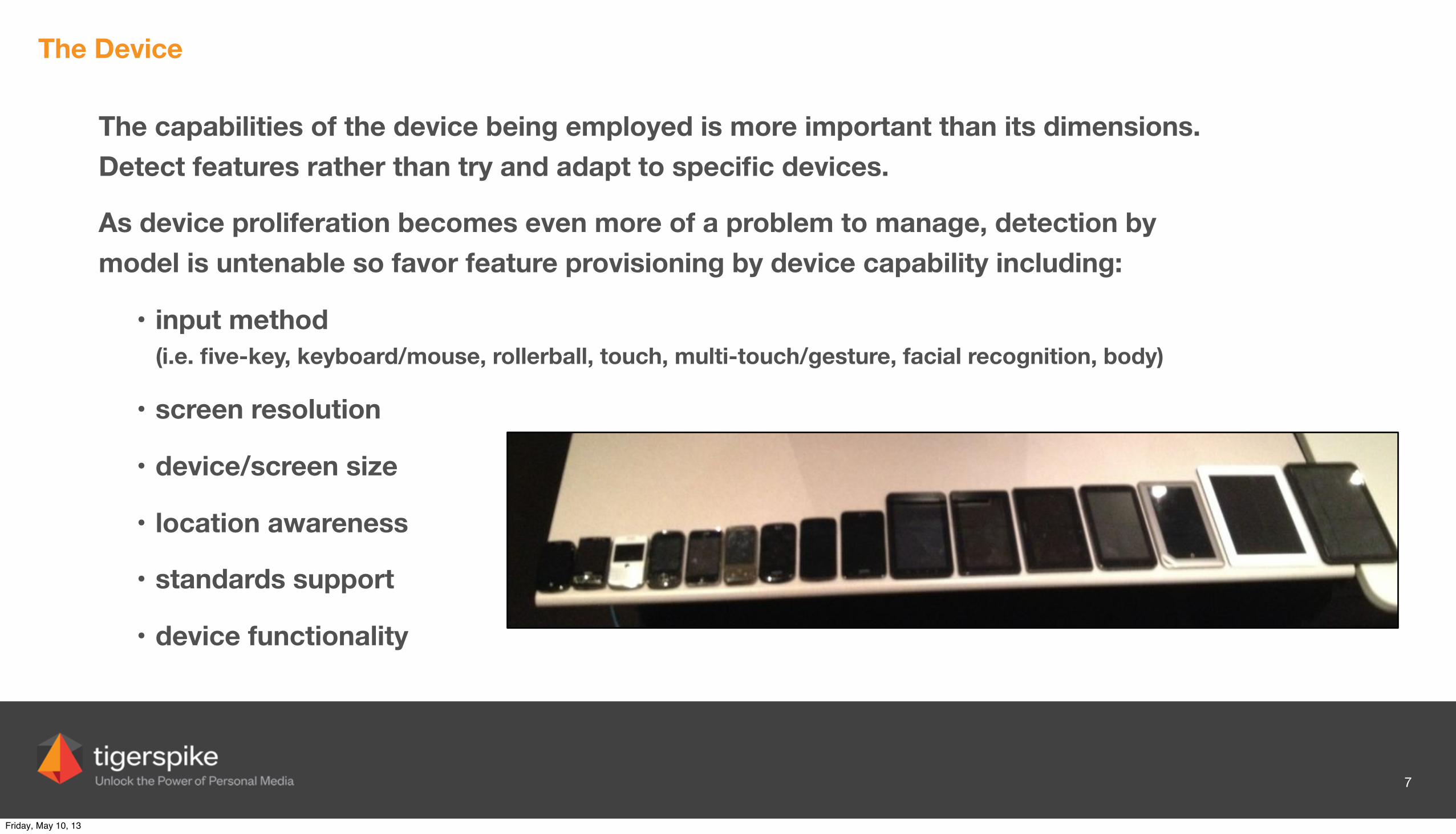
The Device
The capabilities of the device being employed is more important than its dimensions. Detect features rather than try and adapt to specific devices.
As device proliferation becomes even more of a problem to manage, detection by model is untenable so favor feature provisioning by device capability including:
• input method(i.e. five-key, keyboard/mouse, rollerball, touch, multi-touch/gesture, facial recognition, body)
• screen resolution
• device/screen size
• location awareness
• standards support
• device functionality
7
Friday, May 10, 13
Components of Responsive Web Design
8
Friday, May 10, 13
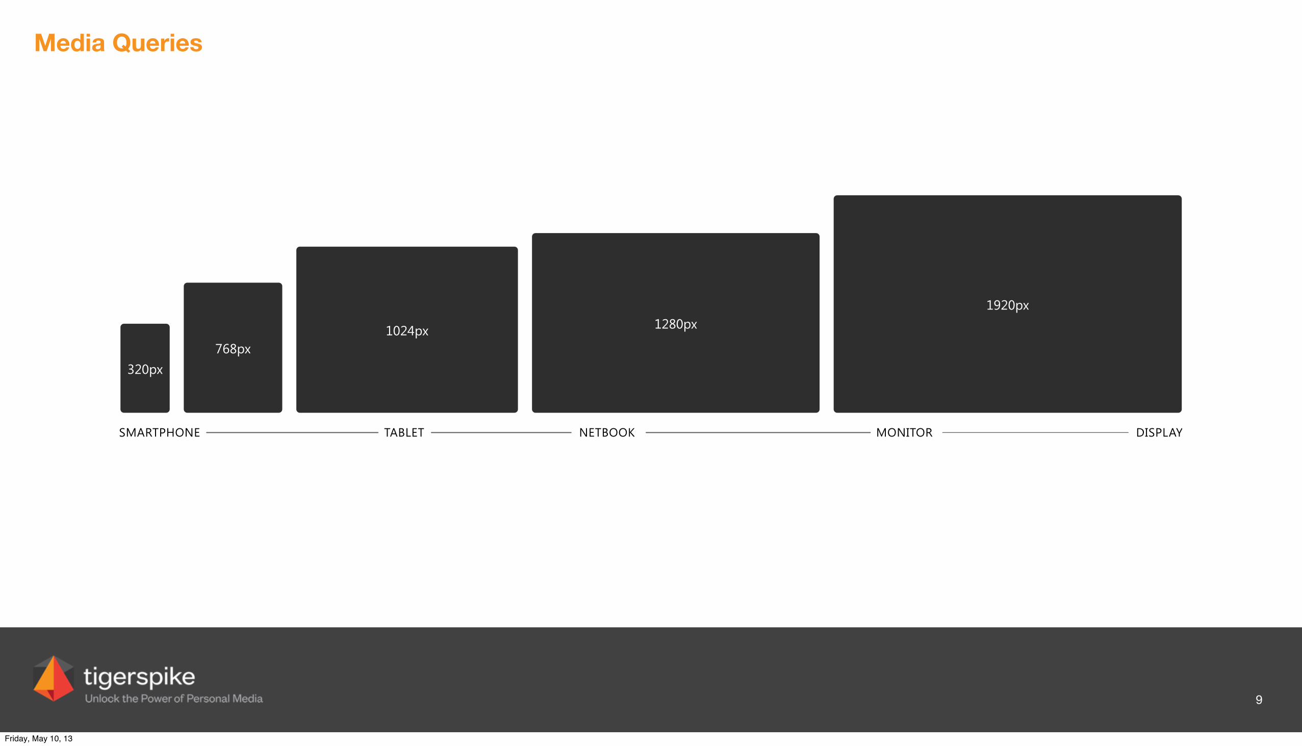
Media Queries
320px768px
1024px 1280px1920px
SMARTPHONE TABLET NETBOOK MONITOR DISPLAY
9
Friday, May 10, 13
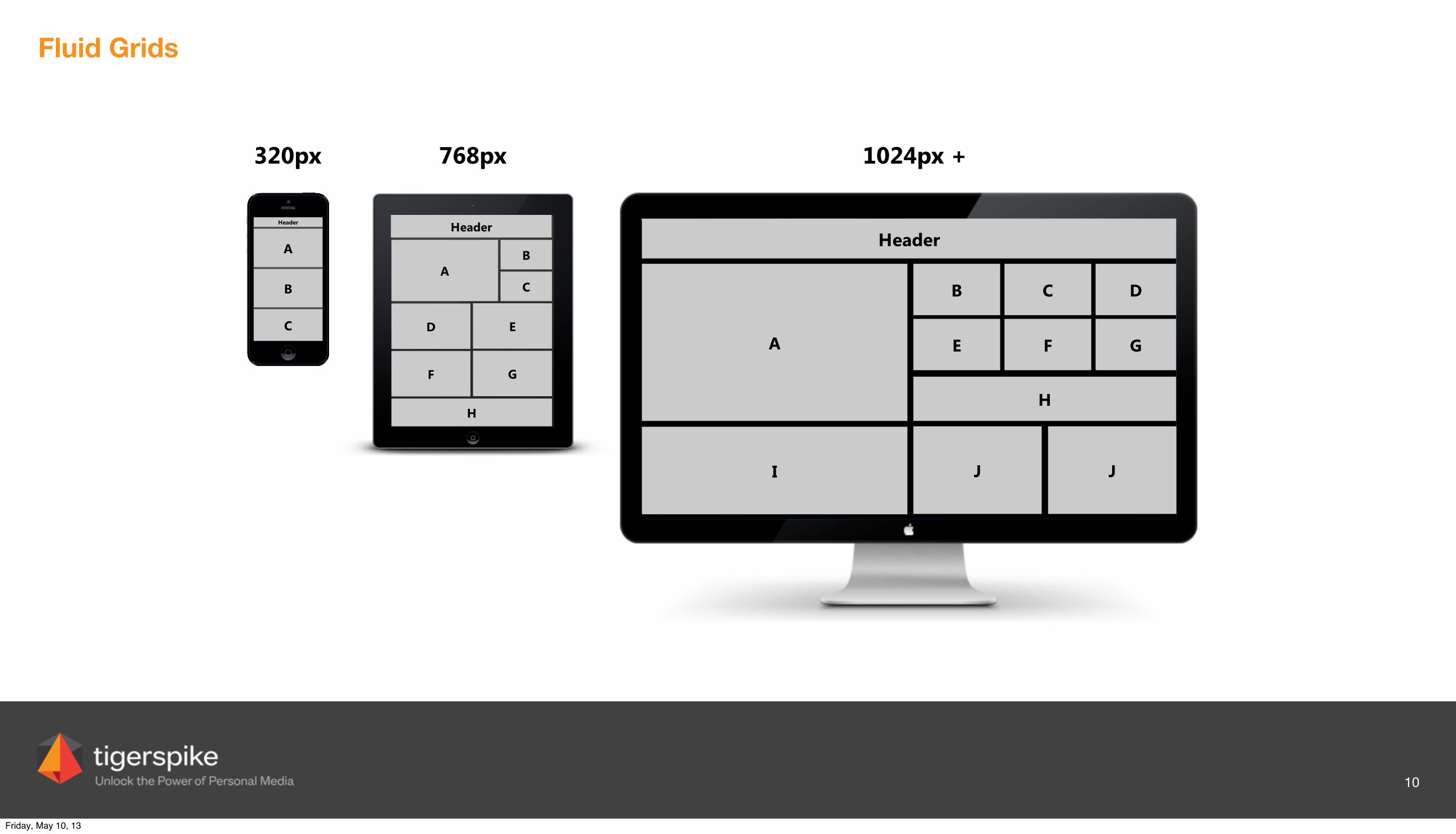
Fluid Grids
Header
A
B
C
Header
A
D
F
B
E
G
C
H
Header
A
I
B
J
E
Header
C
F
H
D
G
J
320px 1024px +768px
10
Friday, May 10, 13
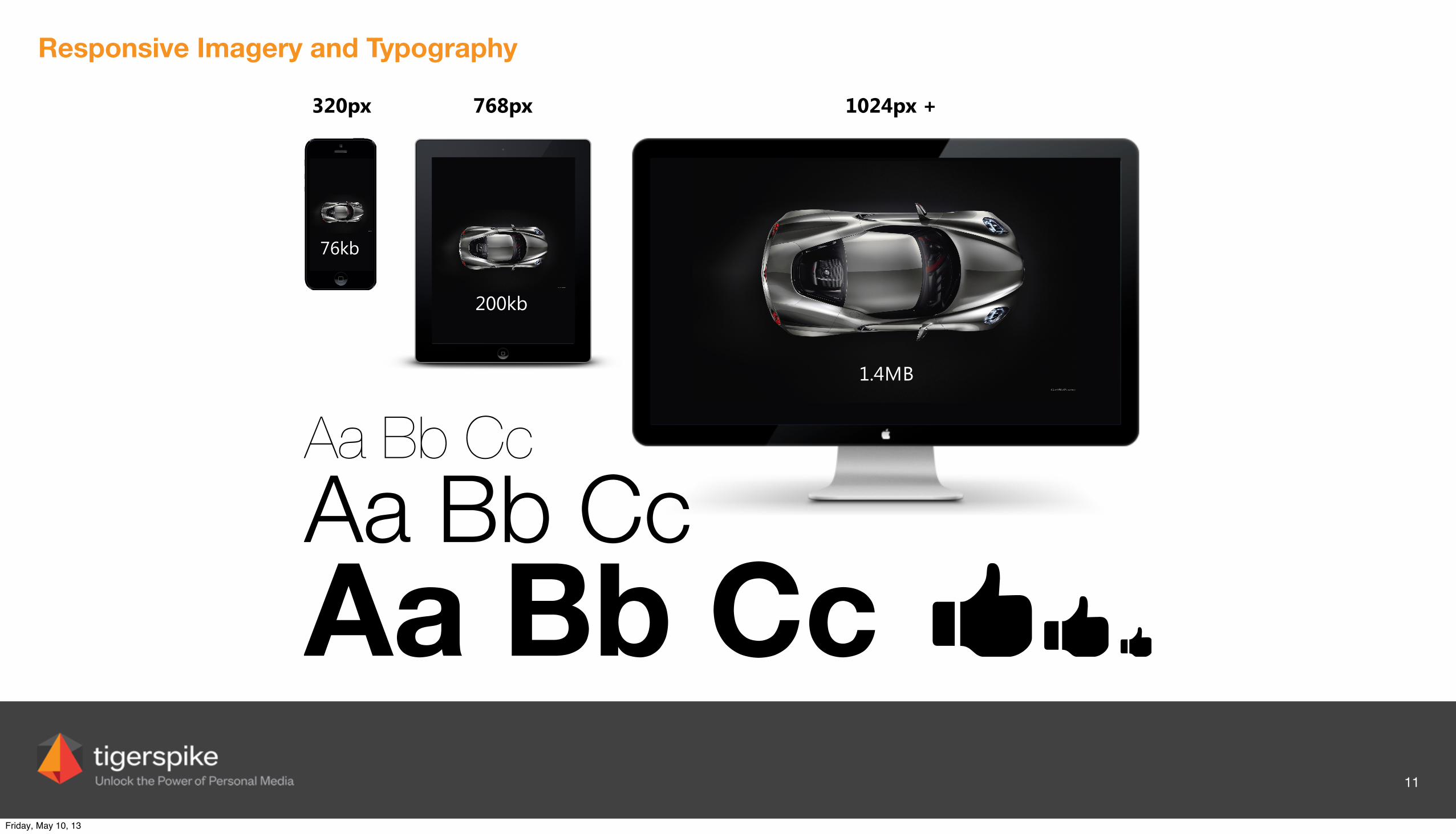
Responsive Imagery and Typography
320px 1024px +768px
Aa Bb CcAa Bb CcAa Bb Cc
76kb
200kb
1.4MB
11
Friday, May 10, 13

Guiding Principles
12
Friday, May 10, 13
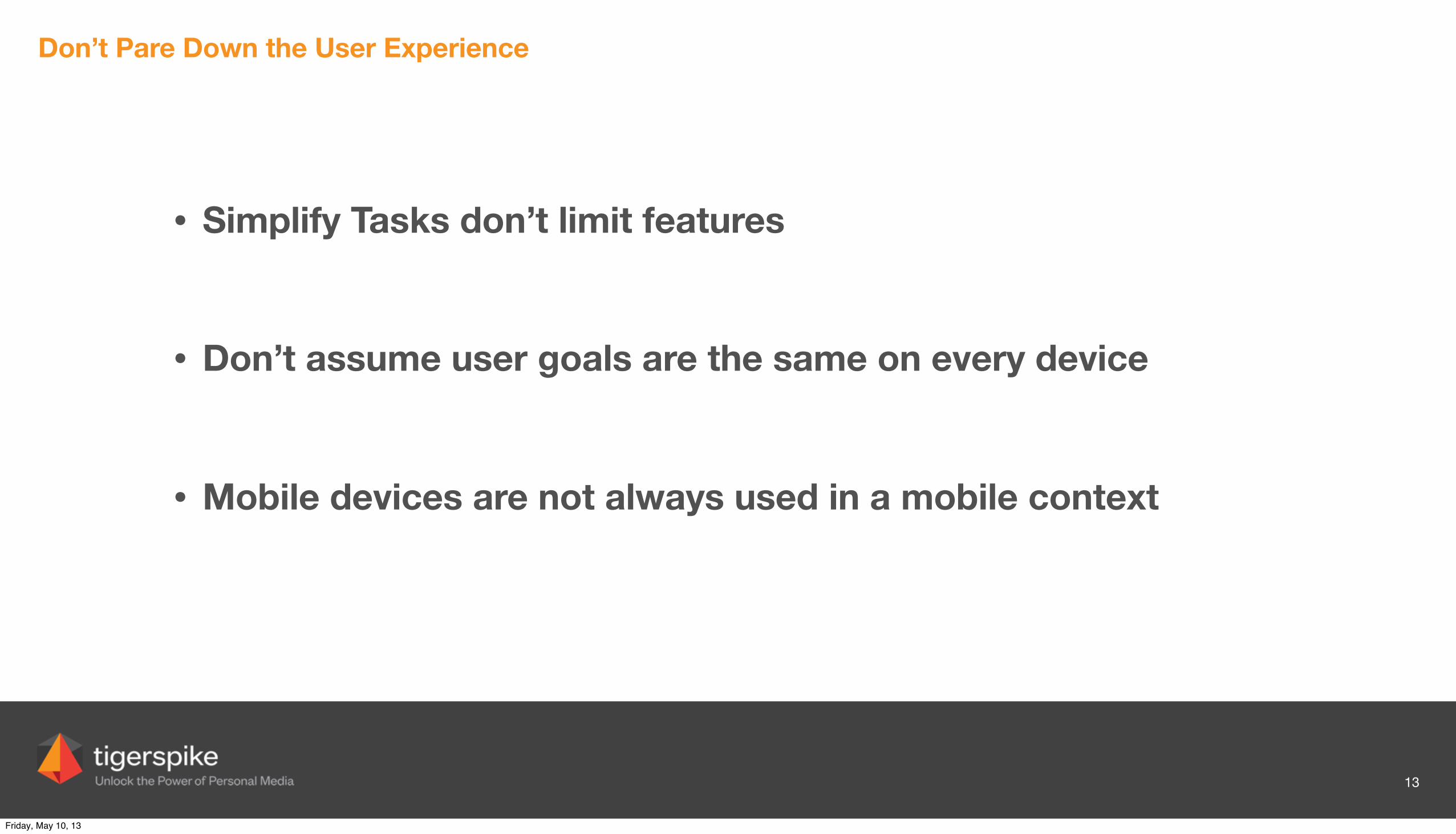
Don’t Pare Down the User Experience
13
Friday, May 10, 13
Don’t Pare Down the User Experience
13
• Simplify Tasks don’t limit features
• Don’t assume user goals are the same on every device
• Mobile devices are not always used in a mobile context
Friday, May 10, 13
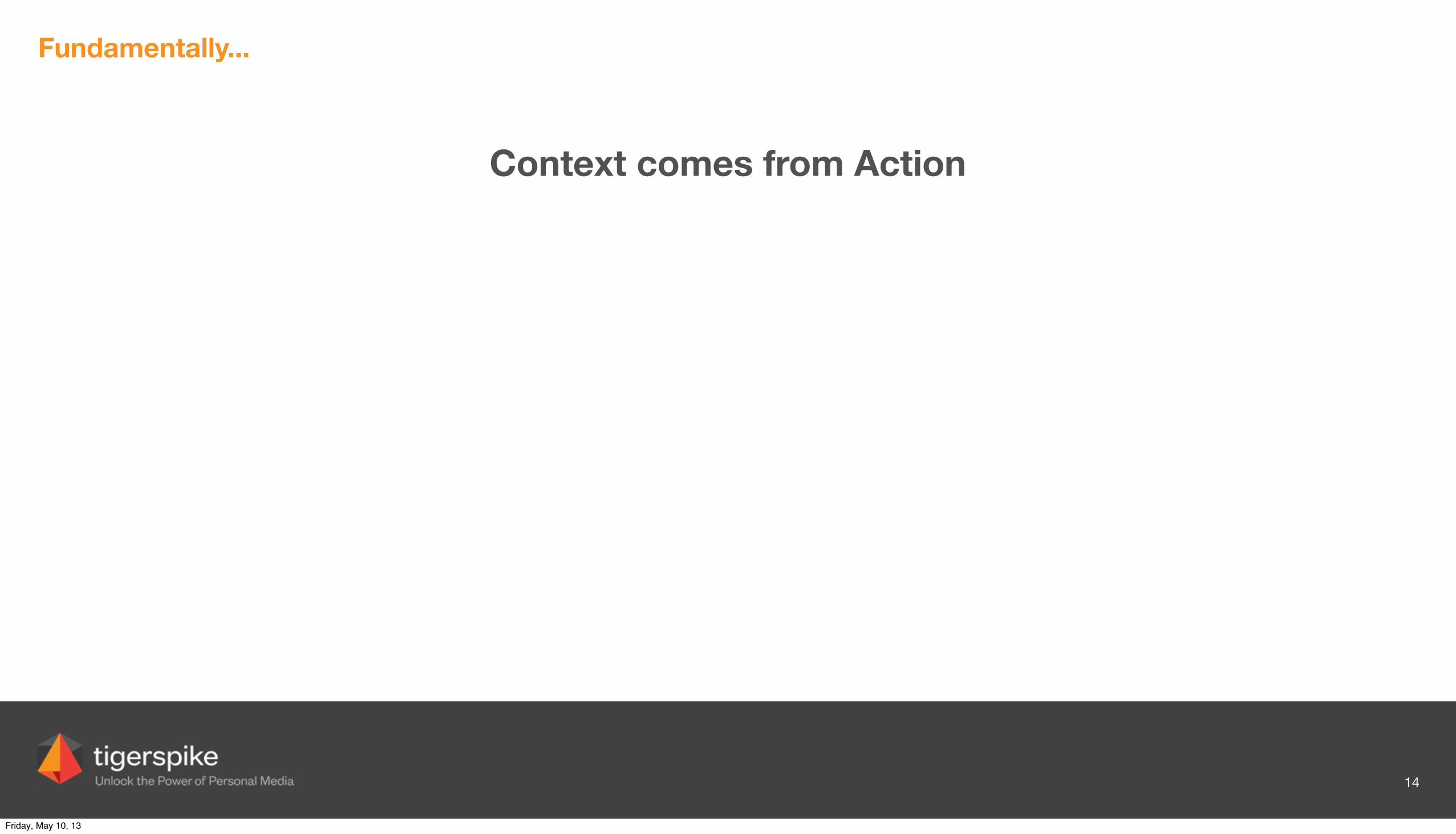
Fundamentally...
Context comes from Action
14
Friday, May 10, 13
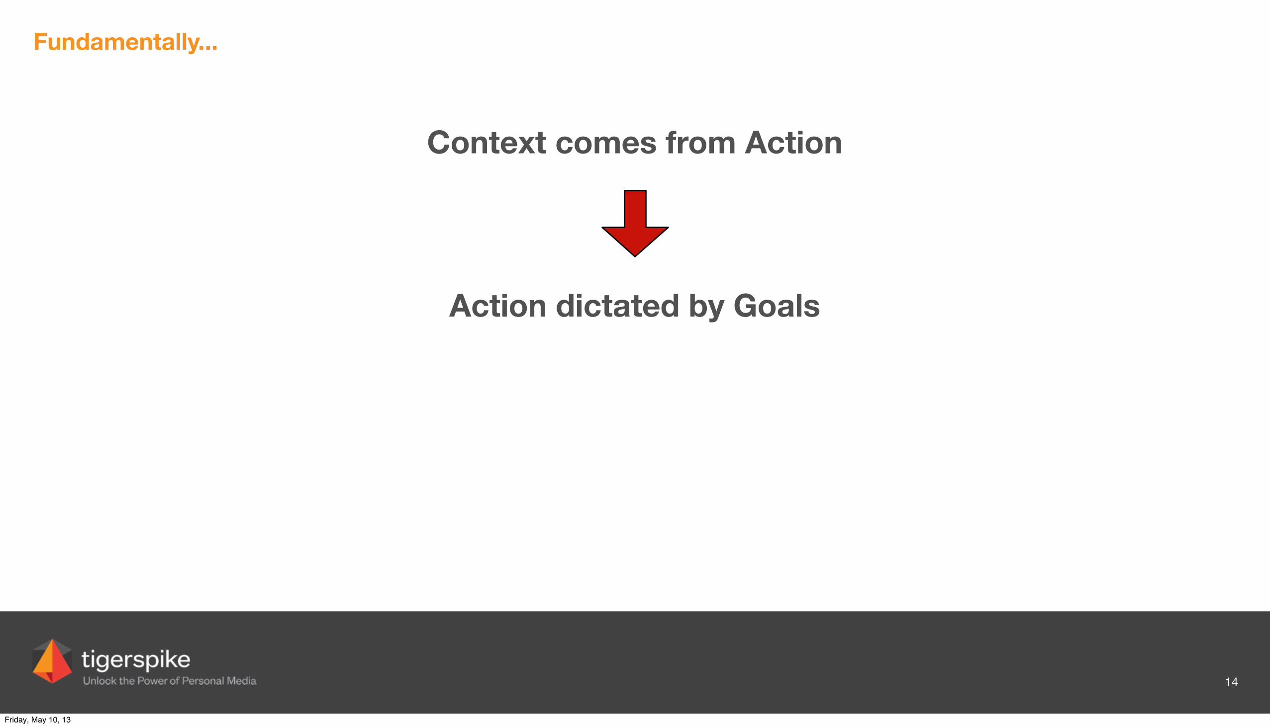
Fundamentally...
Context comes from Action
14
Action dictated by Goals
Friday, May 10, 13
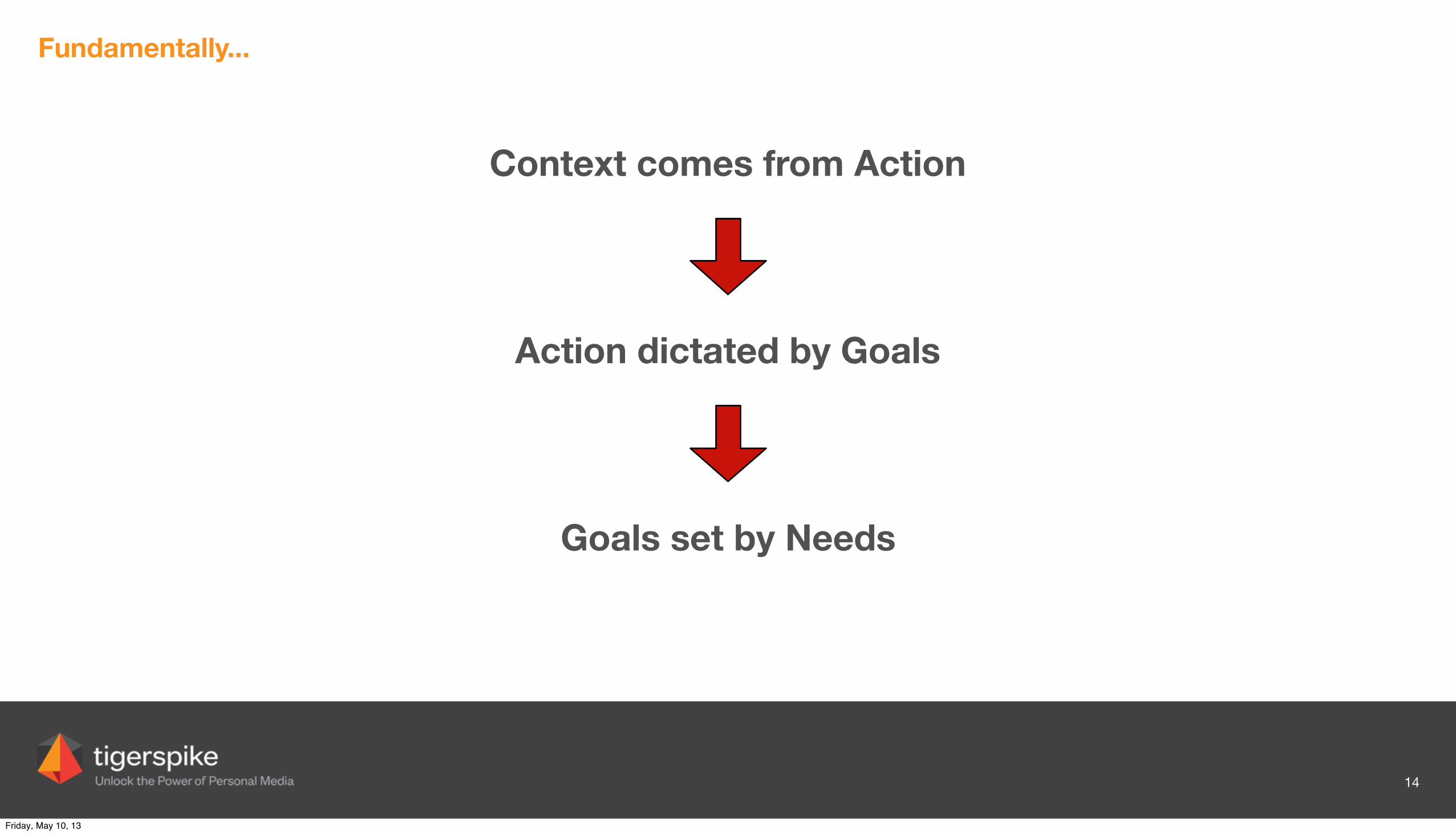
Fundamentally...
Context comes from Action
14
Action dictated by Goals
Goals set by Needs
Friday, May 10, 13

eCommerce Considerations
15
Friday, May 10, 13
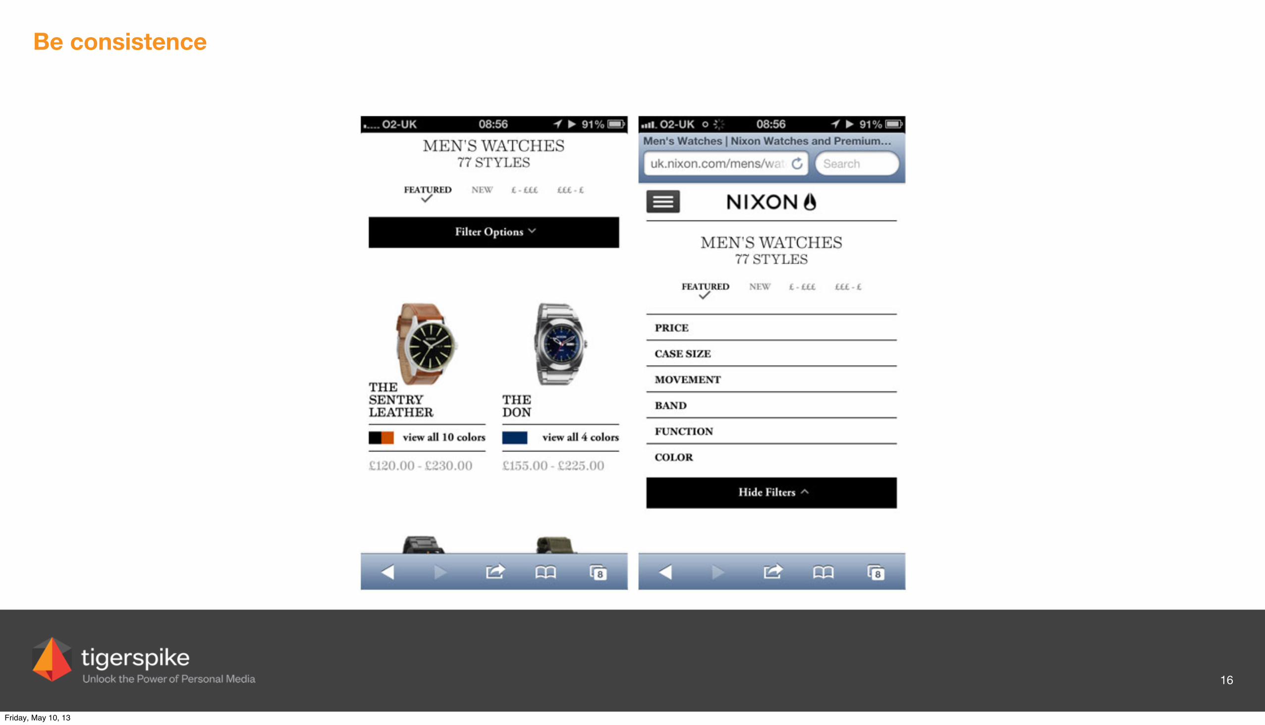
Be consistence
16
Friday, May 10, 13
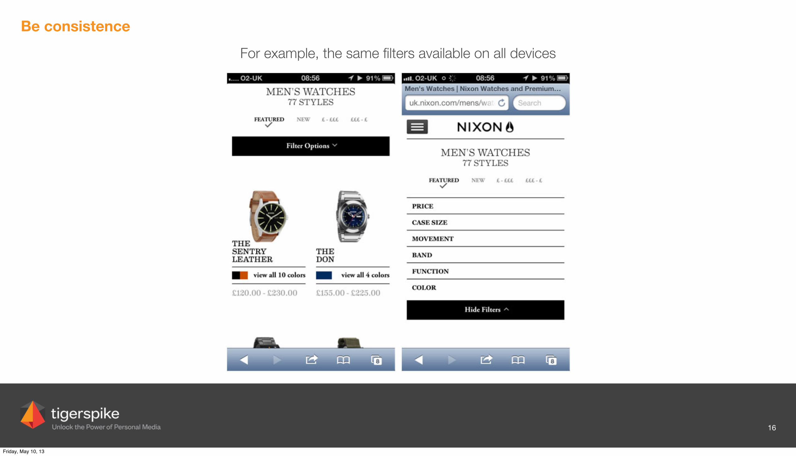
Be consistence
16
For example, the same filters available on all devices
Friday, May 10, 13

Cut content in context
17
Friday, May 10, 13

Cut content in context
17
Compare the desktop version to the mobile Call To Action: skips the detailed content and gets straight to the point – Get Access Now.
Friday, May 10, 13
Scale
18
Friday, May 10, 13

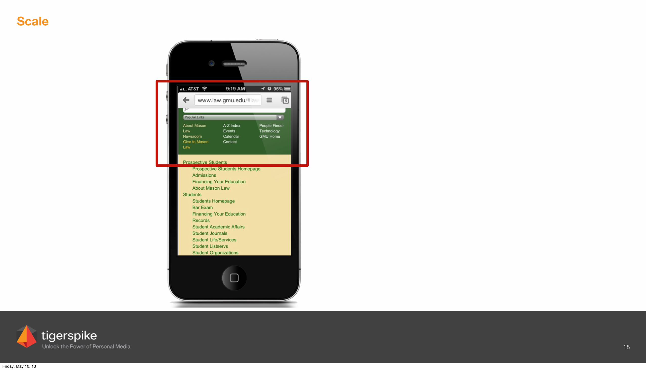
Scale
18
Don’t scale navigation elements until too small to be functional
Friday, May 10, 13
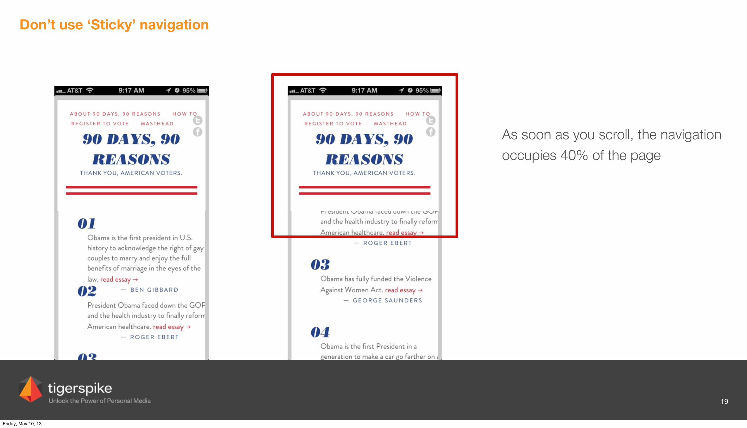
Don’t use ‘Sticky’ navigation
19
Friday, May 10, 13
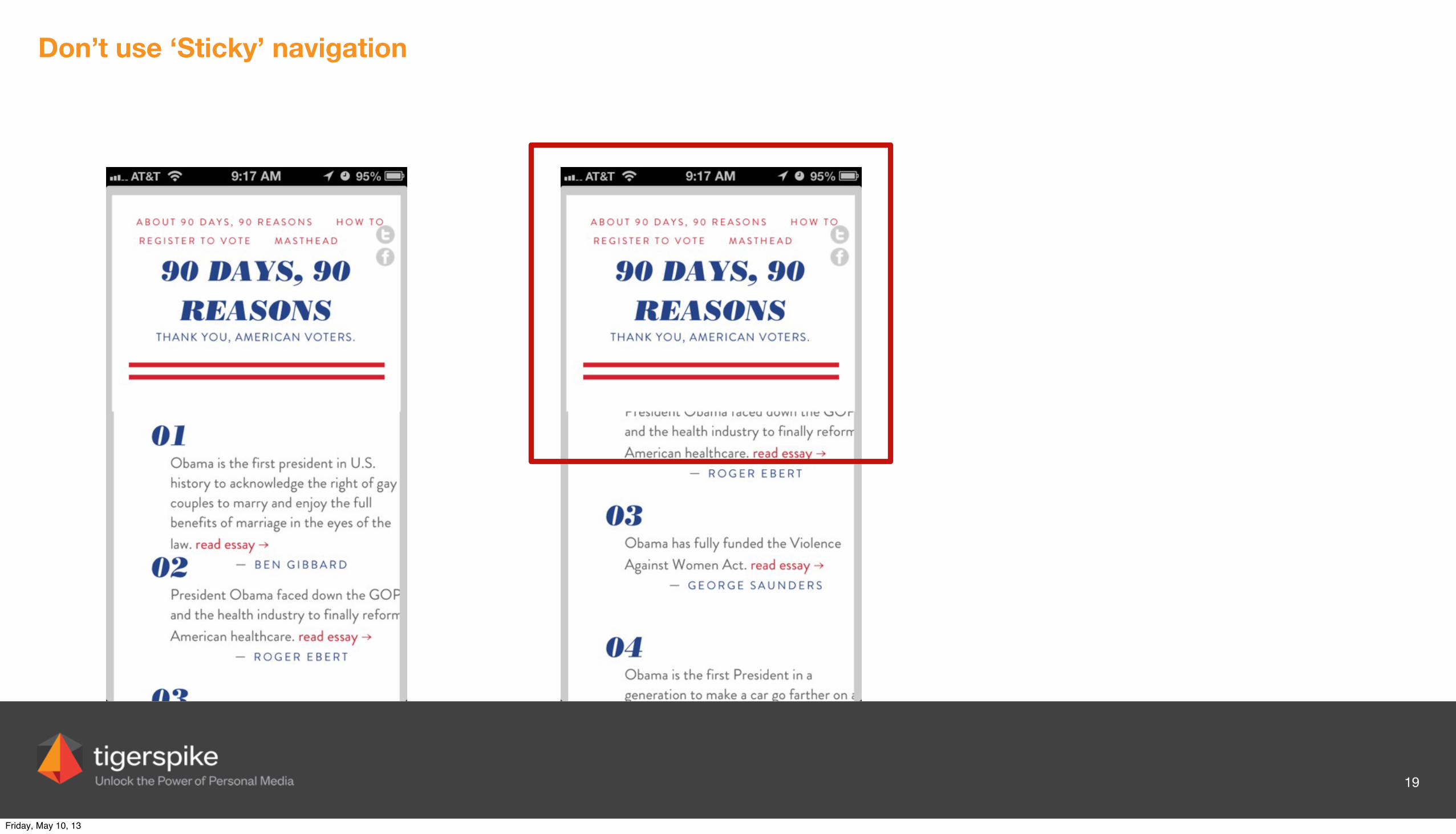
Don’t use ‘Sticky’ navigation
19
As soon as you scroll, the navigation occupies 40% of the page
Friday, May 10, 13
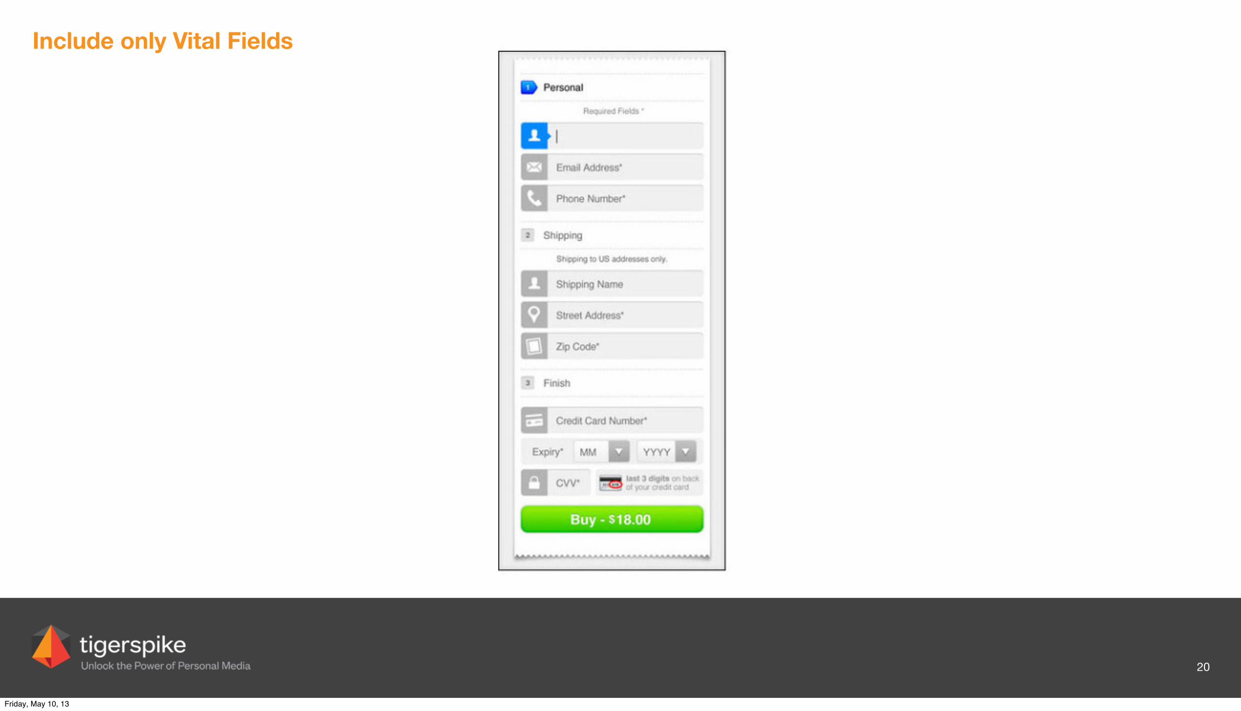
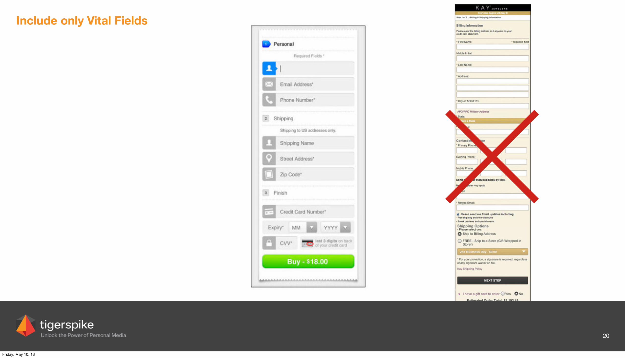
Include only Vital Fields
20
Friday, May 10, 13
Include only Vital Fields
20
Friday, May 10, 13
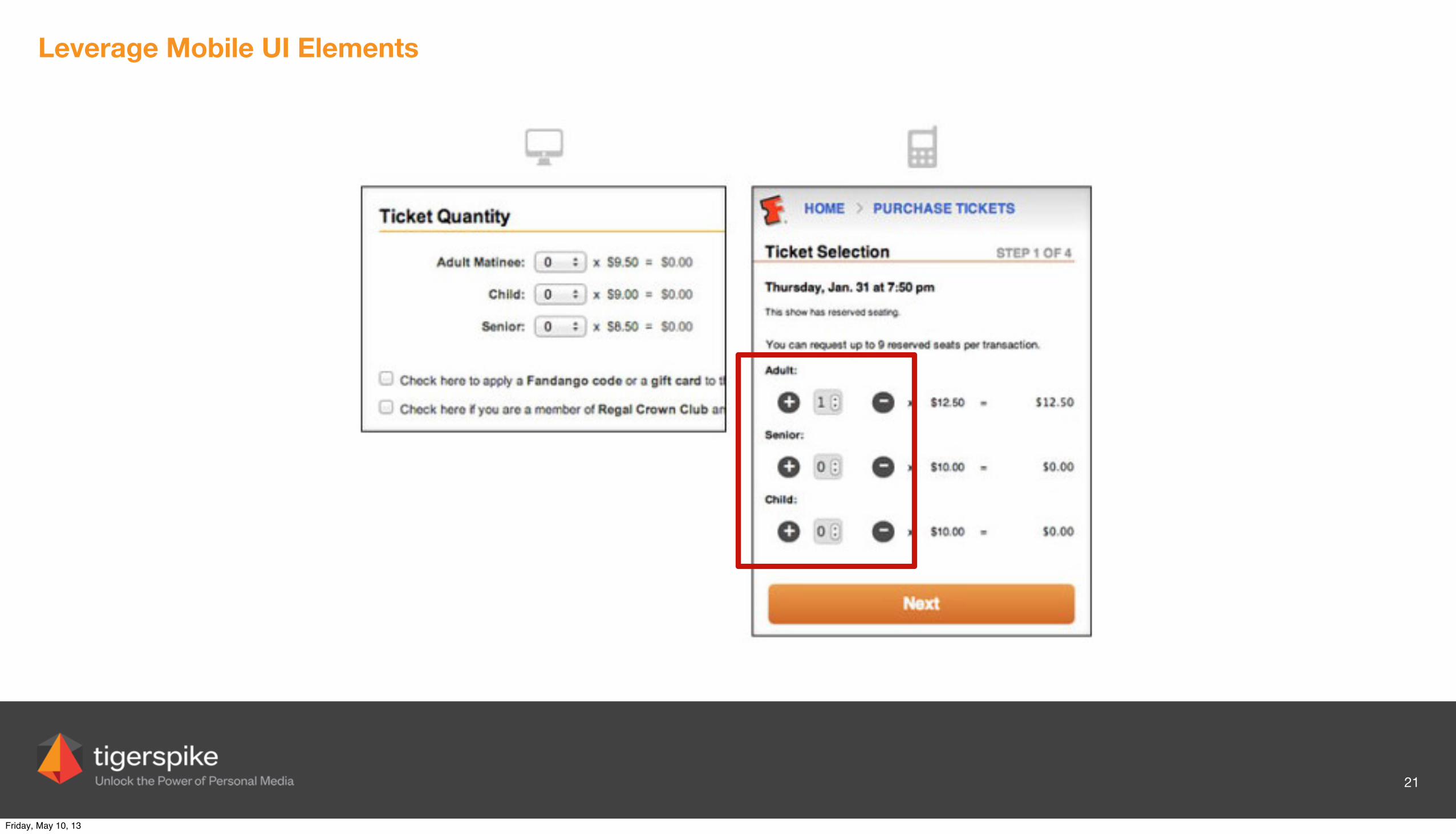
Leverage Mobile UI Elements
21
Friday, May 10, 13

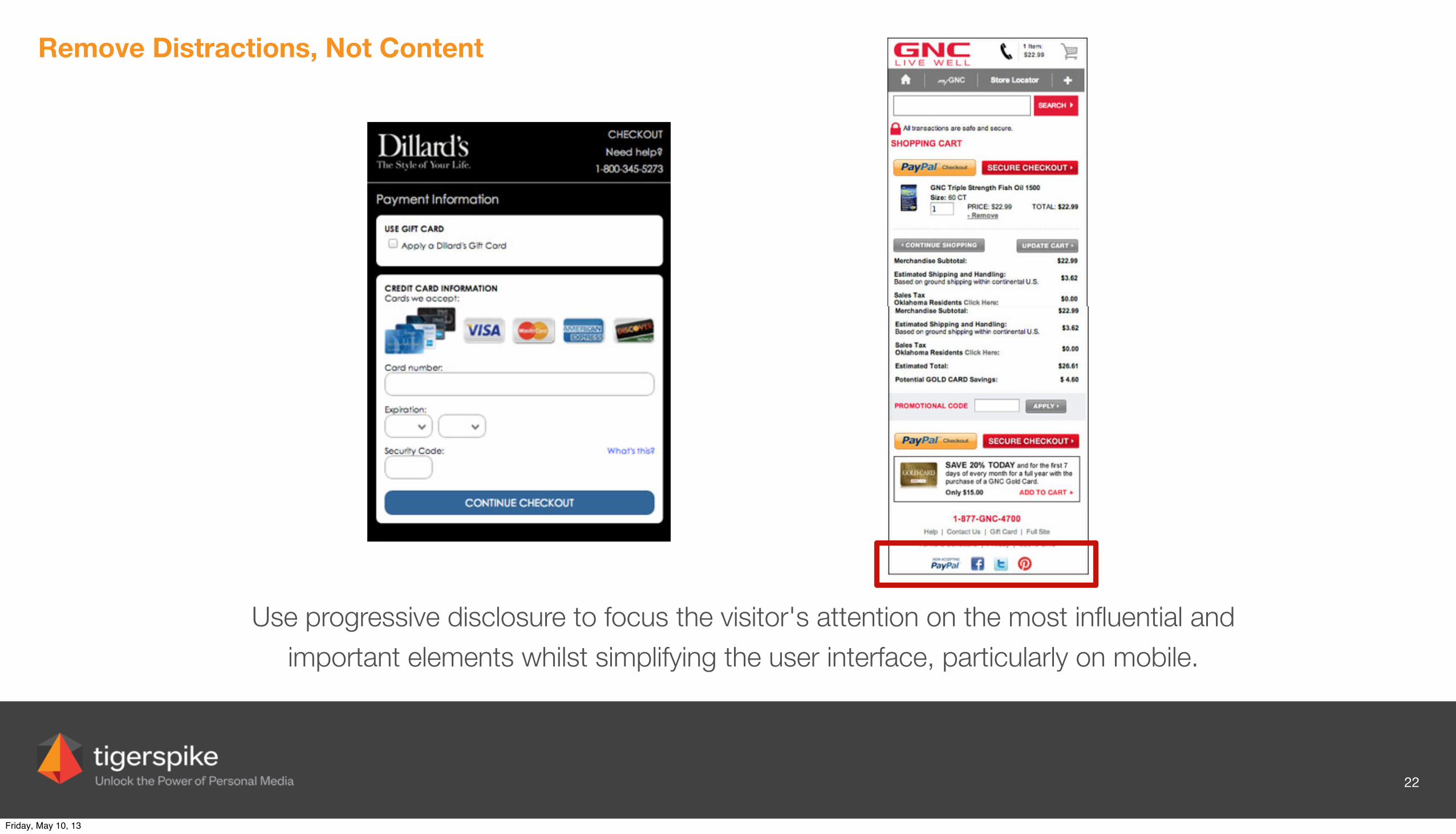
Remove Distractions, Not Content
22
Friday, May 10, 13
Remove Distractions, Not Content
22
Use progressive disclosure to focus the visitor's attention on the most influential and important elements whilst simplifying the user interface, particularly on mobile.
Friday, May 10, 13
eCommerce RWD Examples
23
Friday, May 10, 13
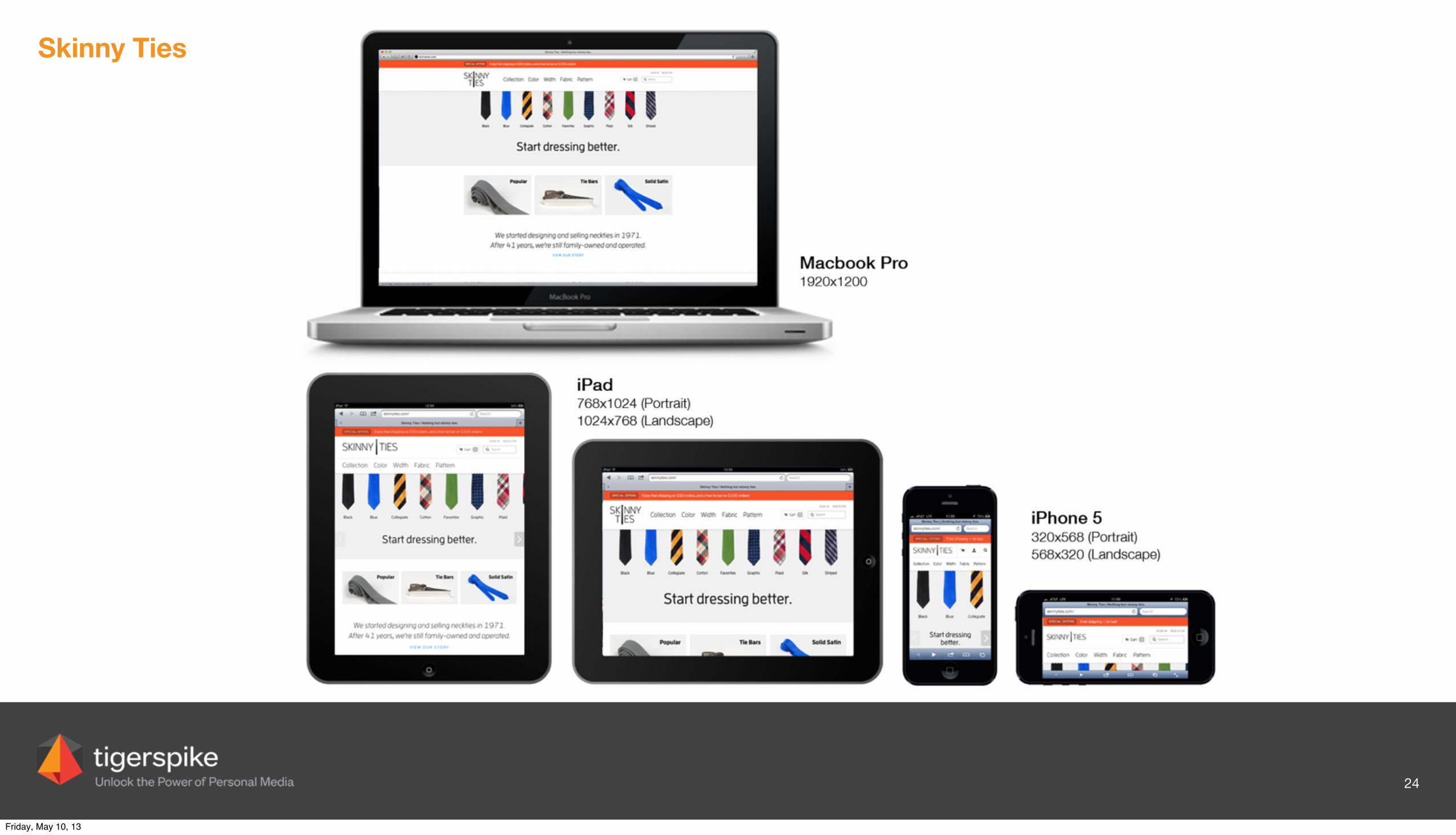
Skinny Ties
24
Friday, May 10, 13
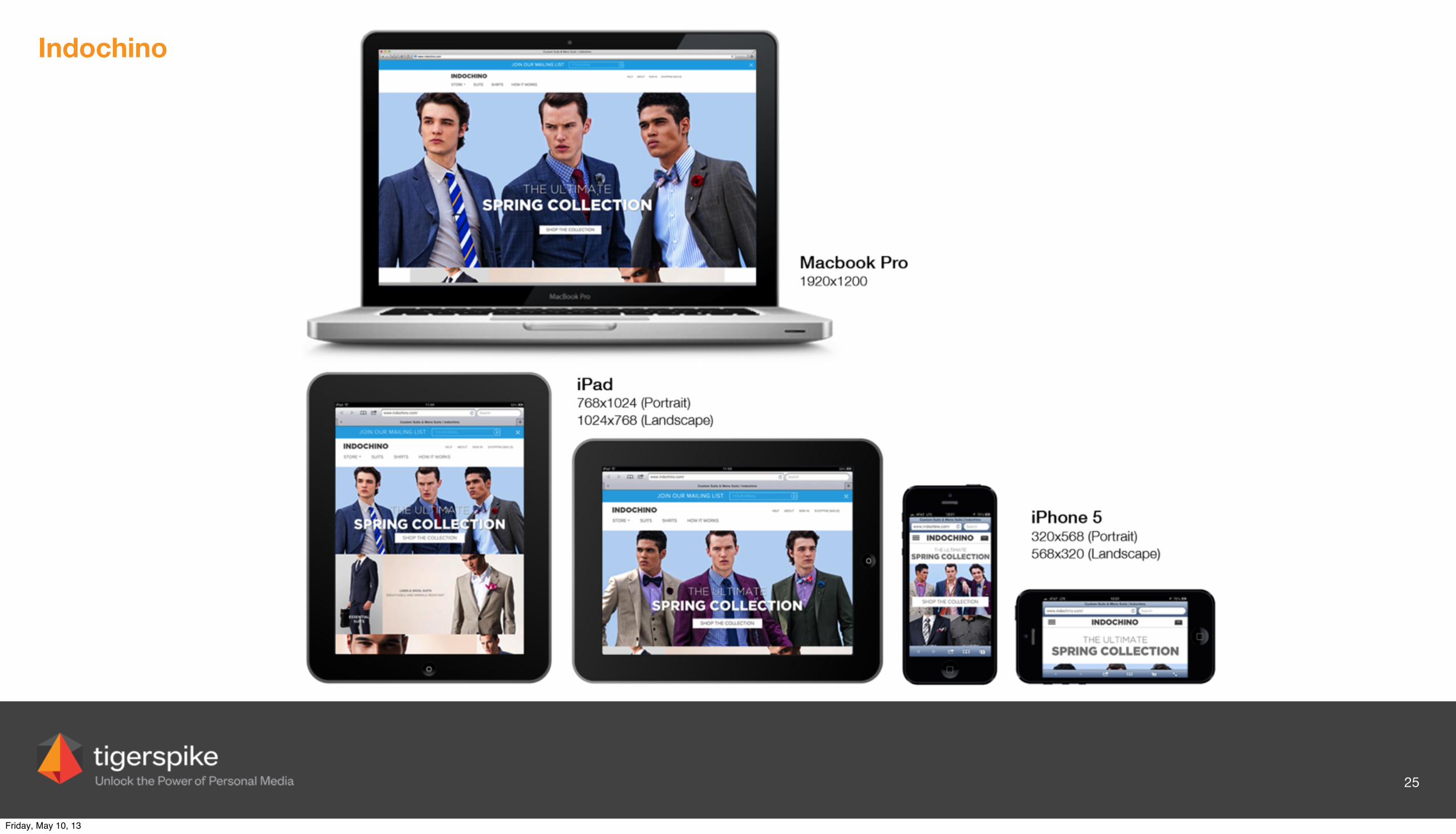
Indochino
25
Friday, May 10, 13
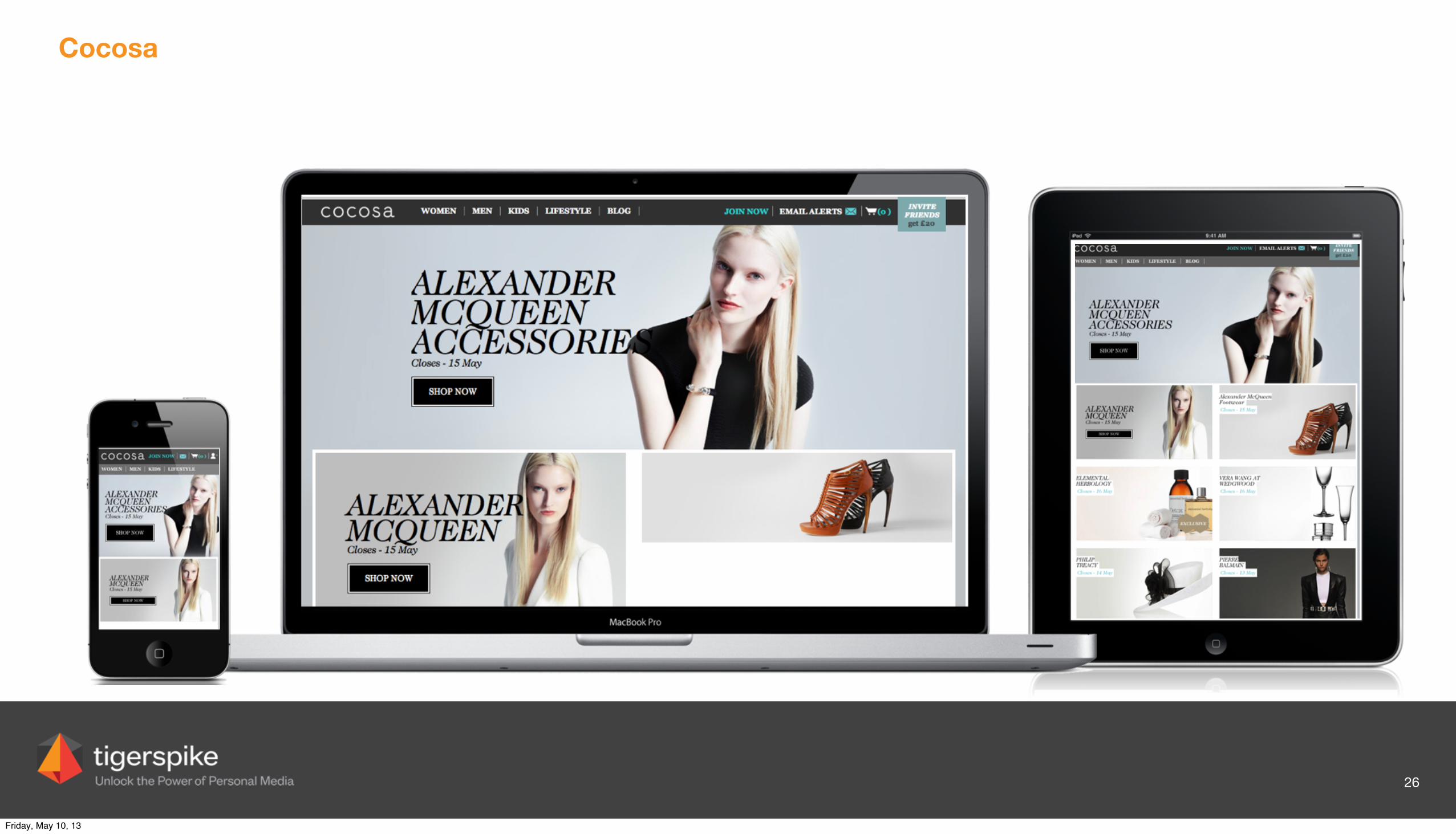
Cocosa
26
Friday, May 10, 13
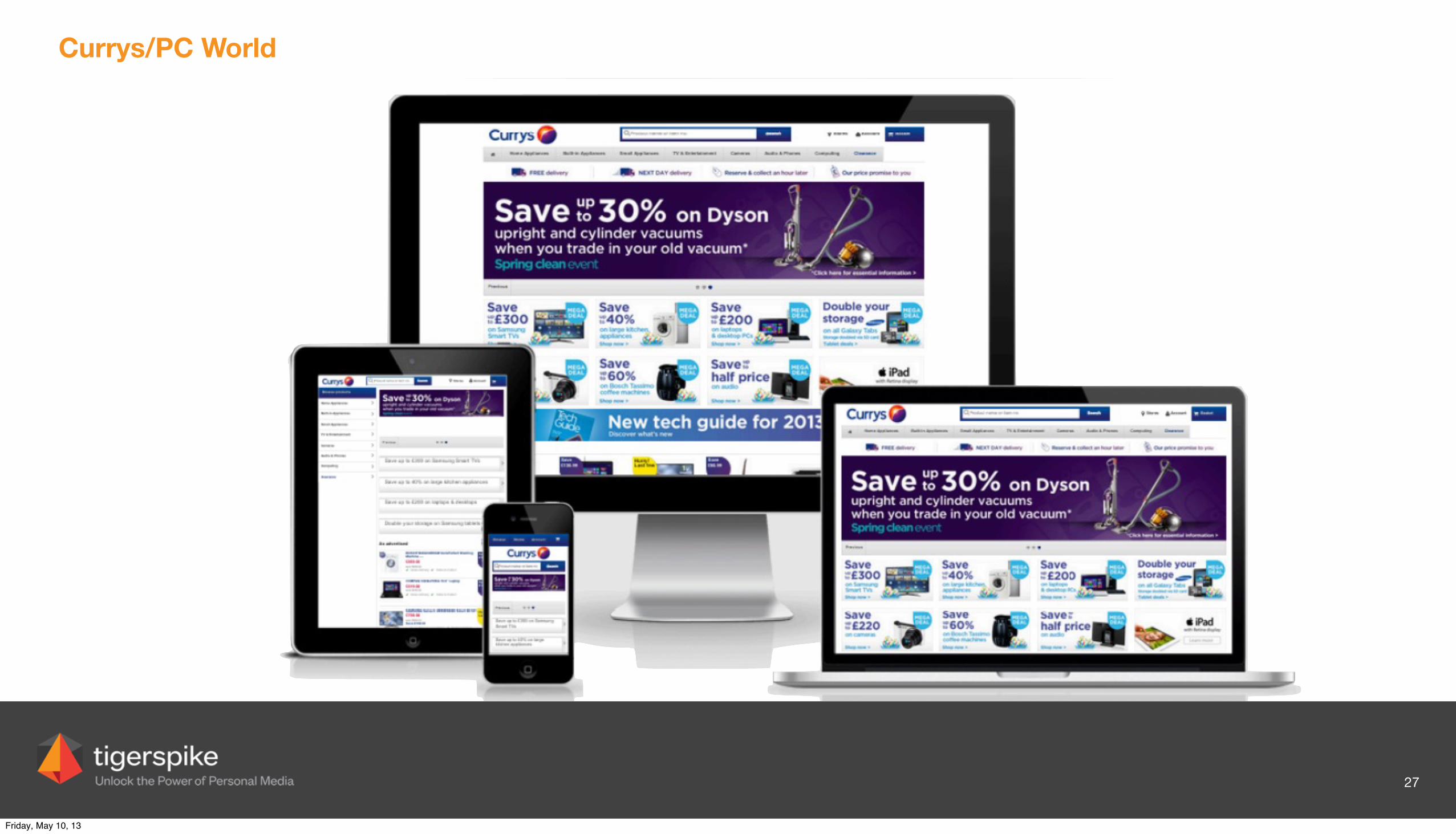
Currys/PC World
27
Friday, May 10, 13
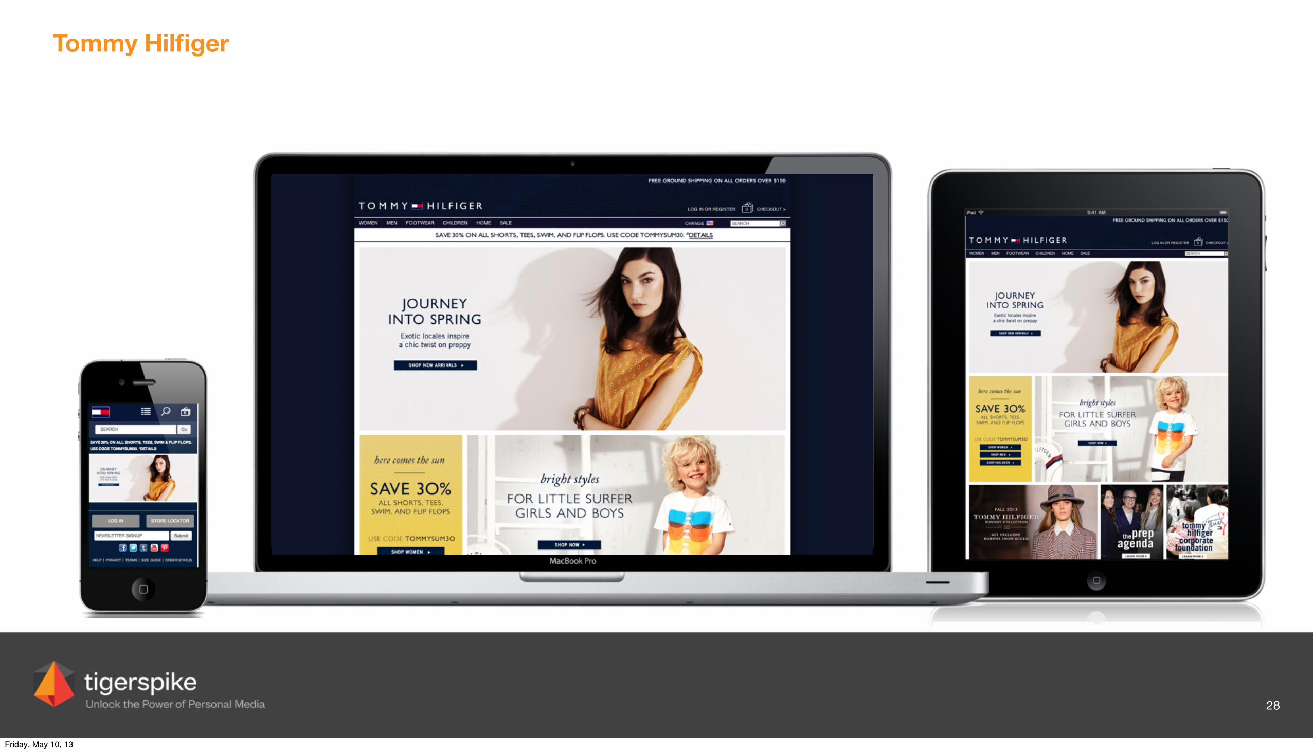
Tommy Hilfiger
28
Friday, May 10, 13
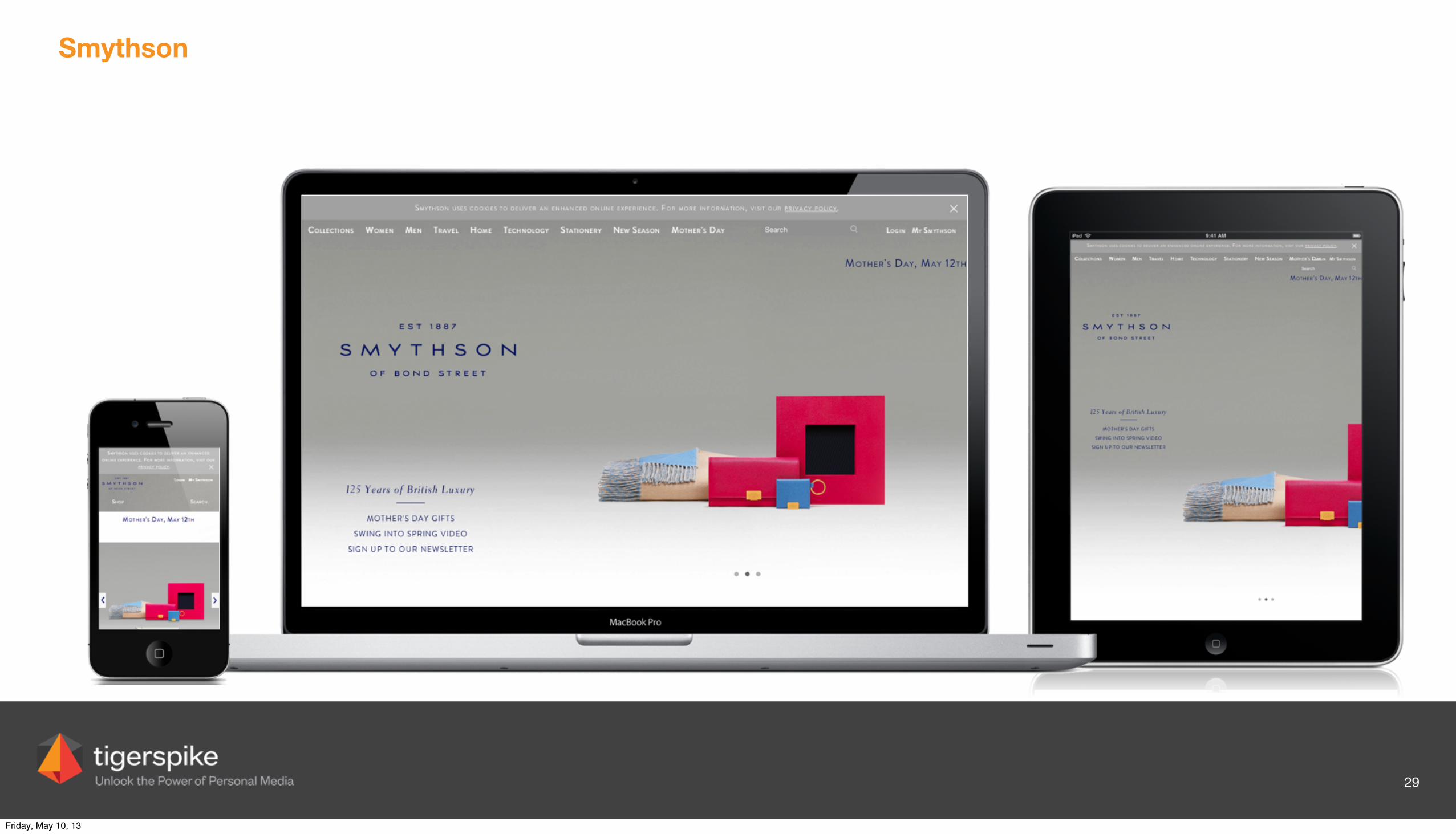
Smythson
29
Friday, May 10, 13
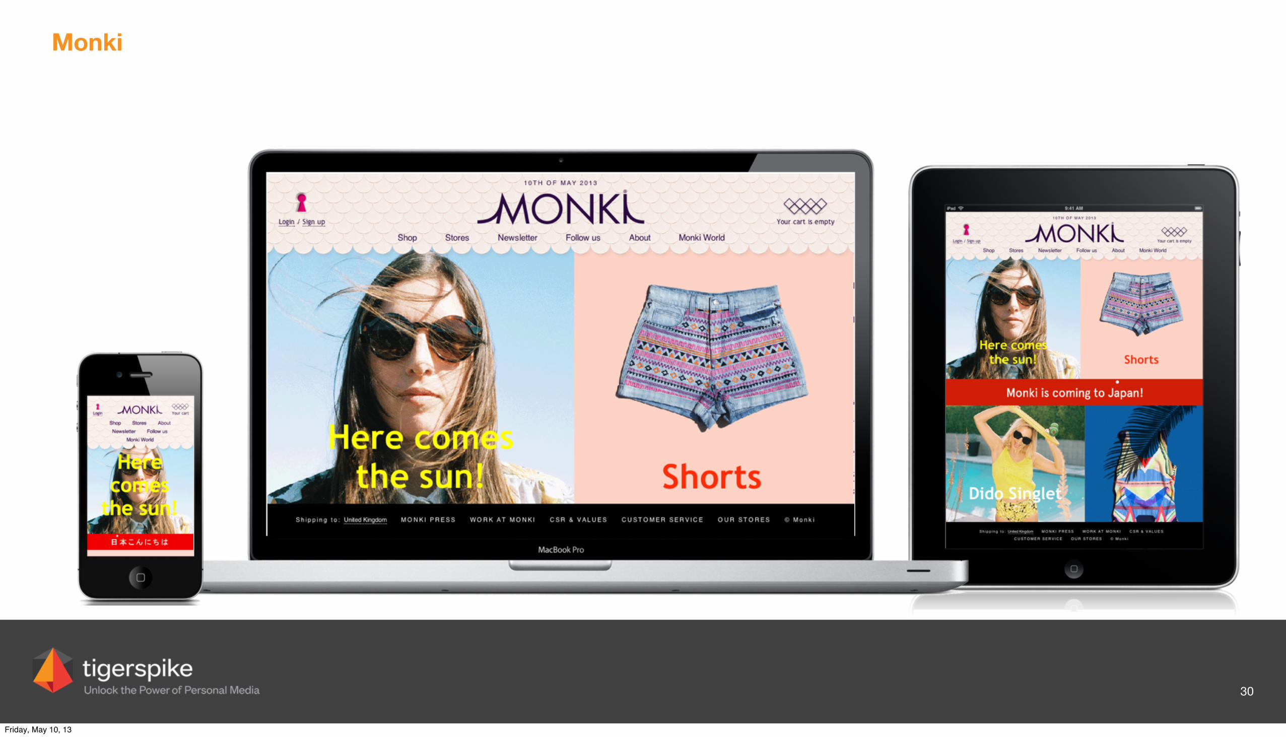
Monki
30
Friday, May 10, 13
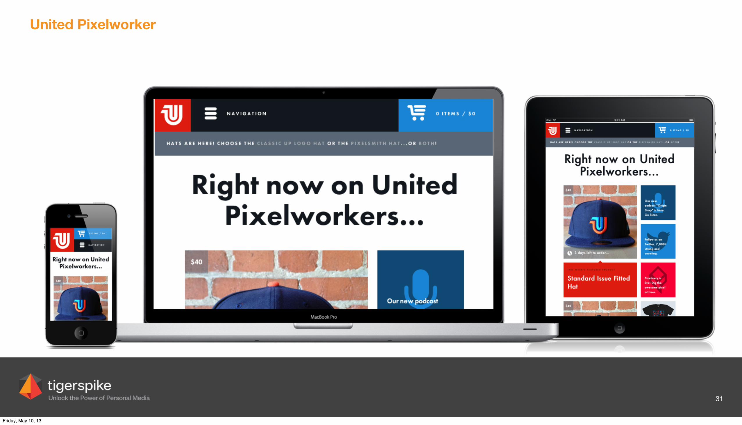
United Pixelworker
31
Friday, May 10, 13