research article evaluating the usability of visualization ... · evaluating the usability of...
TRANSCRIPT

Research Article
Evaluating the usability of visualization methods in an exploratorygeovisualization environment
E. L. KOUA*{, A. MACEACHREN{ and M.-J. KRAAK{{International Institute for Geo-Information Science and Earth Observation (ITC),
PO Box 6, 7500 AA Enschede, The Netherlands
{GeoVISTA Center, Department of Geography, Penn State University, 302 Walker,
University Park, PA 16802, USA
(Received December 2004; in final form October 2005 )
The use of new representation forms and interactive means to visualize geospatial
data requires an understanding of the impact of the visual tools used for data
exploration and knowledge construction. Use and usability assessment of
implemented methods and tools is an important part of our efforts to build
this understanding. Based on an approach to combine visual and computational
methods for knowledge discovery in large geospatial data, an integrated
visualization-geocomputation environment has been developed based on the
Self-Organizing Map (SOM), the map and the parallel coordinate plot. This
environment allows patterns and attribute relationships to be explored. A use
and usability assessment is conducted to evaluate the ability of each of these
visual representations to meet user performance and satisfaction goals. In the
test, different representations are compared while exploring a socio-demographic
dataset.
Keywords: Usability; Geovisualization; Self-organizing map; Visual exploration
1. Introduction
The need to assess the usefulness and usability of geovisualization tools is increasing
as new types of interactions emerge (Muntz et al. 2003). The use of new
representation forms and interactive means to visualize geospatial data requires
an understanding of the impact of the visual tools used for data exploration and
knowledge construction. Use and usability assessment of implemented methods and
tools are an important part of our efforts to build this understanding. Suchassessments focus on the effectiveness, usefulness and performance of a tool. In
geovisualization, this is needed because use and usability testing can provide insight
into how a visual interface can support data-exploration tasks.
Increasing research interest in the usability of geoinformation systems has recently
linked the Human–Computer Intercation (HCI) field, cognitive science, andinformation science in a few applications of approaches that integrate across these
fields (MacEachren and Kraak 2001, Haklay and Tobon 2003, Koua and Kraak
2004b, Fuhrmann et al. 2005). The traditional map-use studies (MacEachren 1995)
conducted in the field of cartography are not necessarily fully applicable in new
*Corresponding author. Email: [email protected]
International Journal of Geographical Information Science
Vol. 20, No. 4, April 2006, 425–448
International Journal of Geographical Information ScienceISSN 1365-8816 print/ISSN 1362-3087 online # 2006 Taylor & Francis
http://www.tandf.co.uk/journalsDOI: 10.1080/13658810600607550

interactive visualizations that involve new representational spaces and advanced
user interfaces. The lack of appropriate evaluation methodology in the geovisualiza-
tion domain and particularly task specifications for user-based testing in
exploratory geovisualization tools (Slocum et al. 2001) has limited the number of
user studies directed at formally assessing geovisualization tools. Since the design of
effective visualization tools will depend upon understanding the way users interact
with and make interpretations of the information spaces used to represent patterns
and relationships in data, the choice of a representation and interaction method is
crucial to the success of a visualization environment. Empirical testing of the
visualization tools can provide insights into the potential of particular visual
displays and interaction paradigms (Fuhrmann et al. 2005).
One of the dominant approaches in geovisualization is the integration of several
representation methods that provide different perspectives of the data in multiple
linked views. Such an integration of views can be more effective if focused on the
potential of the individual representations for specific conceptual visualization goals
that can better support the exploration, evaluation, and interpretation of patterns,
and ultimately support knowledge construction (Roberts 2005). Based on an
approach to combine visual and computational methods for knowledge discovery in
large geospatial data, an integrated visualization-geocomputation environment has
been developed. This incorporates a self-organizing map (SOM) neural network
algorithm for the extraction of patterns and integrates this computational method
with graphical representations used to portray extracted patterns to support the
understanding of the structures and the geographic processes. This integration of
visual representations of the SOM (e.g. views on non-geographic information spaces
or attribute space; Koua and Kraak 2004a) with maps and the parallel coordinate
plot allow (geographic) patterns and attribute relationships to be explored. The tool
is designed to facilitate knowledge construction, using a number of steps provided in
a data mining and knowledge-discovery methodology.
In order to investigate the effectiveness of the design concept, a use and usability
assessment is conducted to evaluate the tool’s ability to meet user performance and
satisfaction goals (Fuhrmann 2005, Tobon 2005). The methodology of the test is
based on an understanding of several knowledge-discovery activities, visualization
operations, and a number of steps in computational analysis used to visualize
patterns in the data. In the test, different representation methods are used to explore
a socio-demographic dataset; these include maps, a parallel coordinate plot, and
interactive visualizations of the SOM output. The study emphasizes the knowledge-
discovery process based on exploratory tasks and a taxonomy of visualization
operations.
The results are organized according to the visual tasks derived from the taxonomy
of conceptual visualization goals and operations, and are compared for the different
visual representations (maps, parallel coordinate plots, and the SOM-based
representations). The taxonomy was used to structure the study. This paper
concentrates on the usability evaluation methodology, the test procedures, and the
results.
2. Exploration and knowledge-discovery tasks in the visualization environment
Judging whether a geovisualization (or other) exploratory environment is effective
requires answering the question: effective for what? We begin, therefore, with a
discussion of exploration and knowledge-discovery tasks to which a geovisualization
426 E. L. Koua et al.

environment can be applied. The model presented in figure 1 emphasizes the
exploratory nature of a visualization environment designed to provide support for
knowledge construction, from hypothesis formulation to the interpretation of
results. This figure focuses on the exploration steps undertaken by users. Some of
these steps may be repeated.
2.1 Defining user tasks for usability evaluation
The main goal of geospatial data analysis is to find patterns and relationships in the
data that can help answer questions about a geographic phenomenon or process.
The geographic analysis process can be viewed as a set of tasks and operations
needed to meet the goals of the data exploration (Fotheringham et al. 2000,
Andrienko and Andrienko 2005). The primary tasks in this process include:
checking the spatial positioning of elements of interest in order to verify spatial
proximity among different elements; verifying their spatial density; and obtaining an
overview of how a target value measured at one particular spatial location, or at
various neighbouring locations, varies for different attributes. These tasks involve a
number of more specific activities and operations that users will perform (Weldon
1996):
N identification of the different clusters in the data, and relationships between
elements (within clusters and between different clusters);
N comparison of values at different spatial locations, distinguishing the range of
value;
N relation of the value, position, and shape of object identified;
N analysis of the relevance of the information extracted.
The above activities are often facilitated by functions that allow selection, scaling,
rotation panning, brushing, browsing, filtering, and querying the database.
The exploration steps described in figure 1 are supported by basic visualization
tasks and operators, as users manipulate the graphical representations and initiate
actions during the different steps. These visualization operations are the basis for the
success of the exploration process.
2.2 Exploration tasks and visualization operators
To complete the tasks described above, the user will have to execute a number of
visualization operations during the exploration process described in figure 1. Several
authors have suggested taxonomies for visualization operations (Keller and Keller
1992, Qian et al. 1997, Zhou and Feiner 1998, Ogao and Kraak 2002). The most
comprehensive list (Keller and Keller 1992, Wehrend and Lewis 2000) includes
identify, locate, distinguish, categorize, cluster, distribution, rank, compare,
associate, and correlate:
N Identify: to establish the collective characteristics by which an object is
distinctly recognizable.
N Locate: to determine the absolute or relative position.
N Distinguish: to recognize as different or distinct.
N Categorize: to place in specifically defined divisions in a classification; this can
be done by colour, position, or type of object (shape).
N Cluster: to join into groups of the same, similar or related type.
Integration of object-based and field-based models 427

428 E. L. Koua et al.

N Distribution: to describe the overall pattern. This is closely related to cluster in
the same way that locate and identify are related. The cluster operation asks
that the groups be detected, whereas the distribution operation requires a
description of the overall clustering.
N Rank: to give an order or position with respect to other objects of like type.
N Compare: to examine so as to notice similarities, differences, order.
N Associate: to link or join in a relationship.
N Correlate: to establish a direct connection (correlation).
A set of representative tasks derived from the steps described in figure 1 and key
visualization operations described above are identified in visualization task
scenarios for the evaluation study. This results from a decomposition of the basic
visualization tasks and is presented in the next section. The rationale behind the use
of scenarios is that they can represent how the system is intended to be used by end
users. Task scenarios provide a task-oriented perspective on the interface and
represent a structure and flow of goals and actions that participants are supposed to
evaluate. Such scenarios ensure that certain interface features are evaluated (Caroll
and Rosson 1992, 2003, Caroll et al. 1998).
2.3 Evaluation tasks model
The conceptual goals and the different steps of the exploration and knowledge-
discovery process described earlier are used as the basis for defining low-level
(operational) tasks that users need to perform to meet the conceptual goals.
Examples of the visual representations used are shown in figure 2. Next to the
map (figure 2(a)) and the Parallel Coordinate Plot (PCP) (figure 2(b)) several SOM
based visualization have been used. These include unified distance matrix
representation (figure 2(c)), 2D/3D surface (figure 2(d )), component plane displays
(figure 2(e)) as well as 2D/3D projection (figure 2(f )). The map was selected because
it provides a visual representation of the real world that participants are used to. The
PCP was selected because it is becoming a prominent tool used in geovisualization.
The background of each of the SOM visualization has been described in Koua and
Kraak (2004a).
The visualizations are based on a dataset that represents the relationship between
geography and macroeconomic growth (Gallup et al. 1999). The dataset contains 48
variables on economy, physical geography, population, and health for 150 countries.
This dataset was separately explored by the test designer as an experiment, and the
conclusions of the exploration were used to validate the test participant’s results.
The test is based on a low-level taxonomy of tasks derived by decomposition of
basic visualization operators that users might perform in a visual environment
(table 1). This decomposition of the basic visualization operators was obtained by
analysing task structures of real-world visualization problems, representing the
Figure 1. Data mining, exploratory visualization, and knowledge discovery processes. Thefirst part of this process consists of the general data mining and knowledge-discovery steps(computational analysis). Each of the steps of the computational analysis can allowvisualization. Patterns extracted as a result of the computational process can be exploredusing graphical representations (geographic and non-geographic information spaces). Thisexploration is guided by a number of steps to support knowledge construction. The stepspresented in this figure correspond to the classification of Gvis and KDD operationspresented by MacEachren (1999).
Integration of object-based and field-based models 429

collection of subtasks, developing related taxonomy or classification as well as a set
of semantic relationships among the concepts, and other entities necessary to
perform the task.
The defined taxonomy mapped on the different representation methods used to
represent each task contains too many tasks. Since each task is executed with three,
Figure 2. Visual representation used in the test: (a) map; (b) parallel coordinate plot;(c) SOM distance matrix representation; (d ) SOM 2D/3D surface; (e) SOM component plans;(f ) SOM projection.
430 E. L. Koua et al.

Table 1. List of operational tasks derived from the taxonomy, and specific example tasks forthe evaluation.
Conceptual goals/visualizationoperators Operational visualization task
Specific task exploredin the study
Tasknumber
Locate Indicate data items of a certainrange of value
Indicate the poorest countries(reference to the 1995 GDPlower than 750)
1
Identify Identify relationships betweenattributes
Identify possible relationshipsbetween the followingattributes: population densityin the coastal region and in theinterior, and GDP per capita 95
2
Distinguish Distinguish how a target valuemeasured at one particularspatial location, or at variousneighbouring locations, variesfor different attributes (e.g.different values of the sameattribute at different spatiallocations, and the value ofdifferent attributes at aspecific spatial location)
How does income (GDP 1995)of the countries vary acrossspace? Define differences andsimilarities between thecountries
3
Categorize Define all the regions on thedisplay, and draw boundaries.Indicate spatial positioning ofelements of interest and spatialproximity among thedifferent elements
Define all the regions on thedisplay, and draw boundaries.Define categories of countriessuch as rich, and poor countrieson the display, and indicate towhich category South Africabelongs. Are there any Africancountries in this category? Listthe countries
4
Cluster Find gaps in the data on thedisplay
Find gaps in the data andindicate the different clusters
5
Distribution Describe the overall pattern(overview)
What are the commoncharacteristics of low-incomecountries (GDP lower than750)?
6
Rank Indicate the best andworst cases in the display for anattribute
Indicate the five lowest GDPcountries and the five highestGDP
7
Compare Compare values at differentspatial locations and the orderof importance of objects (dataitems) accordingly
Compare population density oncoastal regions (within 100 kmof the coastline) and inlandregions (beyond 100 km fromthe coastline)
8
Associate Form relationships between dataitems in the display. Identifyrelationships between data items(within clusters and betweendifferent clusters)
Form relationships betweeneconomic development (GDP1995) of countries in thegeographic tropics as comparedwith other countries
9
Correlate Discern which data items sharesimilar attributes
Examine economicdevelopment (GDP 95) acrossthe countries: landlockedcountries and countries thathave access to the sea
10
Integration of object-based and field-based models 431

four, five, or six different representations, much time is needed to complete the test.
In order to create a test that could be handled by the authors as well as the test
person (a maximum duration of 1 h and a half for each test person), it was necessary
to review the task structure. This was realized based on a visual tasks taxonomy by
Zhou and Feiner (1998) that includes a set of dimensions by which the tasks can be
grouped. The major dimensions of this taxonomy include visual accomplishments
and visual implications. Visual accomplishments refers to the type of presentation
intents that a visual representation might help to achieve while visual implications
specify a particular type of visual action that a visual task may carry out. The
following experimental tasks are derived for the test (tables 1 and 2).
The operational tasks described in table 1 are tested against all three usability
indicators and corresponding measures discussed in the next section. Specific
domain exploration tasks related to the dataset explored are used to illustrate each
operational task as defined in table 2.
3. User-based and task-based usability evaluation of exploratory geovisualization
There are several objectives for the proposed usability evaluation. The evaluation
intends to assess the visualization tool’s ability to meet goals for user performance
and satisfaction with regard to the general task of exploring patterns and
relationships in data. Examples would be the percentage of users that will be able
to complete representative tasks within a certain time or without requiring
assistance, or the percentage of users that will be satisfied with the usability of the
tool. It is realized that evaluations will not lead to absolute answers, and that
exploratory tasks are rather open, but still we are convinced that the evaluation can
result in clear indications.
3.1 Test measures
The proposed assessment methodology includes three criteria (table 3): effectiveness/
user performance, usefulness, and user reactions (attitude):
1. Effectiveness focuses on the tool functionality and examines the user’s
performance of the tasks, and how to manipulate any parameters or controls
available to complete the tasks. Effectiveness can be measured by the time
spent on completing tasks, the percentage of completed tasks (Sweeney et al.
1993, Rubin 1994, Fabricant 2001), the correctness of outcome of task
performance and response, the success and accuracy (error rate and error
types), the amount of time spent for help and questions, the range of functions
used and the level of success in using each, the ease of use or level of difficulty,
and the time spent to access the documentation or for help.
2. Usefulness refers to the appropriateness of the tool’s functionality and relates
to whether the tool meets the needs and requirements of users when carrying
out tasks, the extent to which users view the tools as supportive for their goals
and tasks, and the individual user’s level of understanding and interpretation
of the tool’s results and processes. It includes flexibility and compatibility in
relation to the user’s expectations (finding patterns in data, relating different
attributes, and comparing values of attributes for different spatial locations).
This is gathered through task performance, verbal protocols, post-hoc
comments, and responses on a questionnaire.
432 E. L. Koua et al.

Table 2. Specification of user tasks and visual representation method used to represent task.
Conceptualgoals/visualizationoperators
Operationalvisualization task
Taskno.
Method used in theprototype to represent
taskRepresentation
number
Locate Indicate data items of acertain range of value
1 Maps 1Parallel coordinateplot
2
Component planes 3Identify Identify relationships
between attributes2 Maps 1
Parallel coordinateplot
2
Component planes 3Distinguish Distinguish how a target
value measured at oneparticular spatial location,or at various neighbouringlocations, varies fordifferent attributes (e.g.different values of the sameattribute at differentspatial locations, and thevalue of different attributesat a specific spatiallocation)
3 Maps 1Parallel coordinateplot
2
Component planes 3
Categorize Define all the regions onthe display, and drawboundaries. Indicatespatial positioning ofelements of interest andspatial proximity amongthe different elements
4 Unified distancematrix
4
2D/3D projection 52D/3D surface 6
Cluster Find gaps in the data onthe display
5 Unified distancematrix
4
2D/3D projection 52D/3D surface 6Parallel coordinateplot
2
Distribution Describe the overallpattern (overview)
6 Map 1Parallel coordinateplot
2
Component planes 3Unified distancematrix
4
2D/3D projection 52D/3D surface 6
Rank Indicate the best and worstcases in the display for anattribute
7 Map 1Parallel coordinateplot
2
Component planes 3Compare Compare values at
different spatial locations,and the order ofimportance of objects (dataitems) accordingly
8 Maps 1Parallel coordinateplot
2
Component planes 3
Integration of object-based and field-based models 433

3. User reactions refer to the user’s attitude, opinions, subjective views, and
preferences about the flexibility, compatibility (between the way the tool looks
and works compared with the user’s conventions and expectations). It can be
measured using questionnaires and survey responses, and comments from
interviews and ratings.
Conceptualgoals/visualizationoperators
Operationalvisualization task
Taskno.
Method used in theprototype to represent
taskRepresentation
number
Associate Form relationshipsbetween data items in thedisplay; identifyrelationships between dataitems (within clusters andbetween different clusters)
9 Maps 1Parallel coordinateplot
2
Component planes 3Unified distancematrix
4
2D/3D projection 52D/3D surface 6
Correlate Discern which dataitems share similarattributes
10 Maps 1Parallel coordinateplot
2
Component planes 3
Table 2. Continued.
Table 3. Usability indicators used in the assessment.
Usability indicators used
Effectiveness/userperformance Usefulness User reactions (attitude)
Specificusabilitymeasures
N Correctness of outcomeof task performance andresponse (success,percentage ofcompleted tasks,accuracy or error rate)
N Compatibility andappropriateness inrelation to user’sexpectations andgoals
N Opinions, subjectiveviews on theflexibility,compatibility(between the way thetool looks and worksand the user’sexpectations),functionality, andappropriateness of thetool for the tasks
N Time to complete tasks N User’s level ofunderstanding andinterpretation of thetool’s results andprocesses
N User preferencesN Time spent for help,
documents access,guidance and support
Measuringmethod
N Examines toolfunctionality and theuser’s performance ofthe tasks and responseto specific questions
N Task performance N Questionnaires,interviews and surveyresponses
N Verbal protocols N RatingsN Post-hoc commentsN Responses on
questionnaireN Answers to com
prehensionquestions
434 E. L. Koua et al.

The specific usability measures and measuring methods used for the different tasks
are described in table 3 below.
3.2 Test environment and procedure
The operational tasks described in table 2 were used in the experiment with sample
cases from the dataset explored in the test. This dataset was separately explored by
the test designer as an experiment, and the conclusions of the exploration were used
to validate the test participant’s results.
The test environment consisted of a computer installed with ArcGIS, Matlab
software, and the prototype visualization tool. The test environment has been
selected so that noise levels are at a minimum, in order to avoid disrupting the test.
The test sessions were individual sessions in which the participant worked in the
presence of only the test administrator on the tasks using each of the different
representations. Two first candidate users were used as pilot test subjects to
ascertain any deficiencies in the test procedures, such as tasks descriptions, timing of
each test session, the rating system, and instructions for test tasks. A revision was
made based on the problems detected during pilot testing, particularly of the task
description and timing. Twenty participants, including geographers, cartographers,
and environmental scientists, with experience in data analysis and the use of GIS,
were invited to take part in the test. The dataset used is related to a general
geographic problem, for which all the participants have the knowledge to conduct
the analyses.
The individual SOM-based graphical representations were programmed to be
used separately in a window with interactive features provided in the Matlab
interface (zooming, panning, rotation, and 3D view). ArcGIS was used for tasks
involving maps, and a free and fully functional Java-based interactive parallel
coordinate plot was used, with the basic features needed for the test (brushing,
automatic display of names of countries and values of variables as the mouse moves
over the data records, and adding and removing attributes from the display).
Participants were encouraged to interact with the interface. While completing the
tasks, they were asked to report their preferences and viewpoints about the
representation forms.
To ensure that participants were at ease, were fully informed of any steps, and
inquiries were answered, an introduction to each session was given. The
introduction explained the purpose of the test, and introduced the test environment
and the tools to be used. Participants were informed that the test consists of testing
the design and tools, not their abilities. At the end of the introduction, participants’
questions were answered. The tasks were written on separate sheets and were given
one at a time according to the random numbers assigned. Individual test sessions
were conducted using random numbers for the order of task presentation of the
graphical representations for the 10 tasks, and for the order of the graphical
representations used for each task. The rationale behind the use of random numbers
for the order of task presentation and the graphical representations for each of the
10 tasks (three to four graphical representations were used for each task) was to
reduce the learning effect for the sample size. In the introduction, the participants
were informed about the total number of tasks, but the tasks were given one at a
time according to the random numbers assigned. Participants were assured that they
have the option to abandon any tasks that they were unable to complete. They were
left to work quietly, without any interruption unless necessary. Participants were
Integration of object-based and field-based models 435

asked to report, as they work, any problems they find or things they do not
understand and were allowed to ask questions during the test.
The introduction and all the steps of the test were contained in a script so that all
the participants were treated in the same way during the session and received the
same information. The script describes the steps of the test in detail, and was read to
each participant at the beginning of the session in order to ensure that all
participants receive the same information. To allow the participants to refer back to
the list of tasks as they attempt a task, a written description of the task was handed
to each participant.
A logging sheet for each participant (at each session) was used to record timing,
events, participant actions, concerns, and comments. At the end of the session, a
brief questionnaire was given to the participants to collect other comments they
need to communicate.
Two forms were used to record user task performance and the different ratings.
Task performance was reported by the test administrator. User ratings on usefulness
(compatibility, ease of use, understanding) and user reactions (satisfaction and
preferences) were reported by the participants on the second form for the different
tasks and representations used.
The average time required to complete all the tasks was 90 min. On a logging
sheet, the time for user task performance for each representation was recorded, as
well as participants’ opinions and comments. Participants were allowed to ask
questions during the test.
3.3 Participants
The profile of test participants was a target population that included geographers,
demographers, environmental scientists, and epidemiologists—likely users of such a
geovisualization environment. The selected participants were GIScience domain
specialists, with knowledge of the application domain (of economic development)
and of similar datasets. Twenty participants from an initial list of 25 who met the
profile set for the test agreed to make time for the test. They included geographers,
cartographers, geologists, and environmental scientists, and all had had experience
in data analysis and the use of GIS. They also had both the motivation and the
qualifications to carry out the kinds of analysis being studied. Most of the
participants are pursuing PhD research. The selection of the sample size (20
participants) was based on recommendations from usability engineering literature
(Nielsen 1994) regarding final testing that involves actual use.
The first two candidate users were used as pilot test subjects to ascertain any
deficiencies in the test procedures, such as task descriptions, timing of each test
session, the rating system, and instructions for test tasks. A revision was made based
on the problems detected during pilot testing, particularly of the task description
and timing.
4. Results
The analysis of the test data is organized according to the usability measures
described above: effectiveness/performance, usefulness, and user reactions. A
detailed analysis of the test data was conducted using a pairwise t-test with the
different representations to compare the mean scores for the different measures. The
436 E. L. Koua et al.

results are also presented by experimental tasks and corresponding conceptual
visualization goals. The tasks are grouped into clustering (cluster and categorize)
and exploration (locate, identify, distinguish, compare, rank, distribution, associate,
correlate).
4.1 Analysis of effectiveness
4.1.1 Correctness of response. Correctness of response was used as a measure of
performance. A task completed with the correct response is given 1, and a task not
completed or completed with the wrong response is assigned 0. The analysis of the
correctness of response shows that the parallel coordinate plot performed poorly
compared with maps and SOM component planes. The SOM component plane
display performed well for all tasks. The map performed well generally, except for
task 6 (distribution), task 2 (identify), and task 8 (compare).
The component plane display performed better than maps, and the parallel
coordinate plot for visualization tasks such as ‘identify’, ‘distribution’, ‘correlate’,
‘compare’, and ‘associate’. The maps were as good as component planes for tasks
such as ‘locate’, ‘distinguish’, and ‘rank’. For these tasks (rank, associate, and
distinguish), the parallel coordinate plot performed poorly.
For the tasks ‘cluster’ and ‘categorize’, the SOM-based representations (unified
distance matrix, 2D/3D surface and 2D/3D projection) performed equally well and
far better than the parallel coordinate plot. For revealing the categories, the unified
distance matrix was found to be less effective than the 2D/3D projection and 2D/3D
surface. The 2D/3D projection was found to be more effective for finding the
categories.
Further analysis of the correctness of response measure was conducted using a
pairwise comparison of the mean scores for the different representations for each
conceptual visualization goal examined. Statistics of the paired sample tests are
presented in table 4. The paired sample tests show significant differences (p,0.05) in
the mean scores for the different tasks. For the task ‘locate’, the map and the
component plane display performed equally well (with 100% successful task
completion by users), compared with the parallel coordinate plot (75% successful
task completion by users). For this task, a significant difference was found between
the map and the parallel coordinate plot (p50.021), and between the component
plane display and the parallel coordinate plot (p50.021).
For the task ‘identify’, the map and parallel coordinate plot performed relatively
poorly (60% and 55% successful task completion by users, respectively), compared
with the component plane display (90%). The component plane display shows a
significant difference in performance in comparison with the map (p50.030) as well
as to the parallel coordinate plot (p50.005).
4.1.2 Time to complete tasks. The time to complete the tasks was used as a second
variable for the performance measure. The analysis of the time taken to complete
the tasks reveals some important differences between the different representations
used (figure 3). In general, the component plane display required less time than the
maps and the parallel coordinate plot for the different tasks. The map was faster for
‘distinguish’ but a far slower medium for comparison tasks (figure 3).
For the task ‘locate’, the parallel coordinate plot required double the time needed
by the map and the component plane display for the same task. Thus, a significant
difference was found between the parallel coordinate plot and the map (p 5 0.005)
Integration of object-based and field-based models 437

Table 4. Paired samples test for correctness of responsea.
Conceptualvisualization goal
Representationmethod
Paired differences
t df
p-valuesignificance(two-tailed)M SD SEM
95% confidence interval of thedifference
Lower Upper
Locate Map–Pcp 0.25 0.444 0.099 0.042 0.458 2.517 19 0.021*Pcp–Comp 20.25 0.444 0.099 20.458 20.042 22.517 19 0.021*
Identify Map–Pcp 0.05 0.510 0.114 20.189 0.289 0.438 19 0.666Map–Comp 20.3 0.571 0.128 20.567 20.033 22.349 19 0.030*Pcp–Comp 20.35 0.489 0.109 20.579 20.121 23.199 19 0.005*
Distinguish Map–Pcp 0.65 0.489 0.109 0.421 0.879 5.940 19 0.000*Map–Comp 0.05 0.224 0.050 20.055 0.155 1.000 19 0.330Pcp–Comp 20.6 0.598 0.134 20.880 20.320 24.485 19 0.000*
Categorize Udm–Proj 20.15 0.489 0.109 20.379 0.079 21.371 19 0.186Udm–Surf 20.1 0.308 0.069 20.244 0.044 21.453 19 0.163Proj–Surf 0.05 0.394 0.088 20.134 0.234 0.567 19 0.577
Cluster Udm–Pcp 0.45 0.510 0.114 0.211 0.689 3.943 19 0.001*Proj–Pcp 0.45 0.510 0.114 0.211 0.689 3.943 19 0.001*Surf–Pcp 0.45 0.510 0.114 0.211 0.689 3.943 19 0.001*
Distribution Map–Pcp 20.05 0.759 0.170 20.405 0.305 20.295 19 0.772Map–Comp 20.65 0.489 0.109 20.879 20.421 25.940 19 0.000*Pcp–Comp 20.6 0.503 0.112 20.835 20.365 25.339 19 0.000*
Rank Map–Pcp 0.1 0.308 0.069 20.044 0.244 1.453 19 0.163Pcp–Comp 20.1 0.308 0.069 20.244 0.044 21.453 19 0.163
Compare Map–Pcp 0.15 0.671 0.150 20.164 0.464 1.000 19 0.330Map–Comp 20.3 0.470 0.105 20.520 20.080 22.854 19 0.010*Pcp–Comp 20.45 0.510 0.114 20.689 20.211 23.943 19 0.001*
Associate Map–Pcp 0.25 0.716 0.160 20.085 0.585 1.561 19 0.135Map–Comp 20.2 0.410 0.092 20.392 20.008 22.179 19 0.042*Pcp–Comp 20.45 0.510 0.114 20.689 20.211 23.943 19 0.001*
43
8E
.L
.K
ou
aet
al.

Conceptualvisualization goal
Representationmethod
Paired differences
t df
p-valuesignificance(two-tailed)M SD SEM
95% confidence interval of thedifference
Lower Upper
Correlate Map–Pcp 0.35 0.671 0.150 0.036 0.664 2.333 19 0.031*Map–Comp 20.15 0.366 0.082 20.321 0.021 21.831 19 0.083Pcp–Comp 20.5 0.513 0.115 20.740 20.260 24.359 19 0.000*
*Difference is significant (p,0.05).aUdm: unified distance matrix; Pcp: parallel coordinate plot; Comp: SOM component plane display; Proj: 2D/3D projection; Surf: 2D/3D surface plot.
Table 4. Continued.
Integ
ratio
no
fo
bject-b
ased
an
dfield
-ba
sedm
od
els4
39

and the component plane display (p 5 0.002). Table 5 provides detailed statistics on
the comparison of time spent on the tasks using the different representations.
For the task ‘identify’, the difference is significant between the component plane
display and the parallel coordinate plot (p50.020). The map required much more
time (245 s) than the component plane display (103 s) and the parallel coordinate
plot (129 s) for the task ‘compare’. A significant difference was found between the
map and the component plane display (p50.012).
4.2 Usefulness and user reactions
Usefulness and user reactions were reported using a five-point scale (55very good,
45good, 35fairly good, 25poor, 15very poor). Usefulness includes compatibility,
ease of use/flexibility, and perceived user understanding. User reactions include user
satisfaction and preferences. A combined view of the different measures of
usefulness and user reactions is presented in figure 4 for the tasks.
4.2.1 Compatibility with the user’s expectations for the different tasks. For
compatibility with the user’s expectations of the tool for the tasks, the map was
found to be more suitable (mean54.85 and median55 on the five-point scale) for
the tasks ‘locate’, ‘’distinguish’, and ‘rank’. The component plane display was found
to be more appropriate for the tasks ‘identify’, ‘distribution’, ‘compare’, ‘associate’,
and ‘correlate’. The parallel coordinate plot was rated generally poor (2 on the five-
point scale) or fairly good (3 on the five-point scale) for all the tasks. The best
ratings of the parallel coordinate plot were for the tasks ‘rank’ and ‘locate’, where
the mean score53.75 and the median54 (same result for both tasks). These results
for compatibility confirm the performance analysis presented in section 4.1. for
correctness of response and time taken.
Figure 3. Time to complete tasks for three exploratory tools: map, parallel coordinate plot(PCP), and component plane display.
440 E. L. Koua et al.
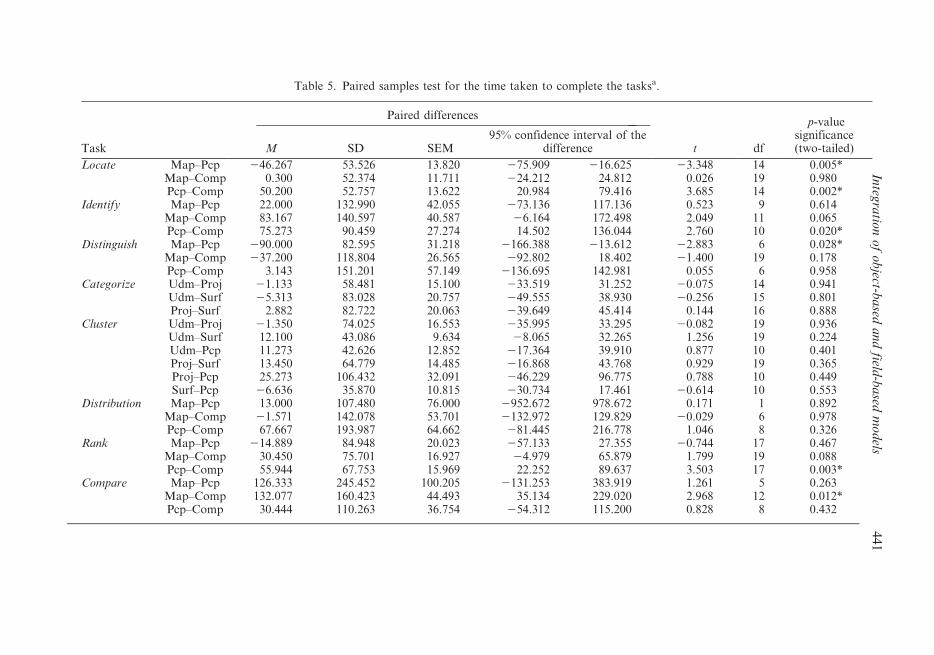
Table 5. Paired samples test for the time taken to complete the tasksa.
Task
Paired differences
t df
p-valuesignificance(two-tailed)M SD SEM
95% confidence interval of thedifference
Locate Map–Pcp 246.267 53.526 13.820 275.909 216.625 23.348 14 0.005*Map–Comp 0.300 52.374 11.711 224.212 24.812 0.026 19 0.980Pcp–Comp 50.200 52.757 13.622 20.984 79.416 3.685 14 0.002*
Identify Map–Pcp 22.000 132.990 42.055 273.136 117.136 0.523 9 0.614Map–Comp 83.167 140.597 40.587 26.164 172.498 2.049 11 0.065Pcp–Comp 75.273 90.459 27.274 14.502 136.044 2.760 10 0.020*
Distinguish Map–Pcp 290.000 82.595 31.218 2166.388 213.612 22.883 6 0.028*Map–Comp 237.200 118.804 26.565 292.802 18.402 21.400 19 0.178Pcp–Comp 3.143 151.201 57.149 2136.695 142.981 0.055 6 0.958
Categorize Udm–Proj 21.133 58.481 15.100 233.519 31.252 20.075 14 0.941Udm–Surf 25.313 83.028 20.757 249.555 38.930 20.256 15 0.801Proj–Surf 2.882 82.722 20.063 239.649 45.414 0.144 16 0.888
Cluster Udm–Proj 21.350 74.025 16.553 235.995 33.295 20.082 19 0.936Udm–Surf 12.100 43.086 9.634 28.065 32.265 1.256 19 0.224Udm–Pcp 11.273 42.626 12.852 217.364 39.910 0.877 10 0.401Proj–Surf 13.450 64.779 14.485 216.868 43.768 0.929 19 0.365Proj–Pcp 25.273 106.432 32.091 246.229 96.775 0.788 10 0.449Surf–Pcp 26.636 35.870 10.815 230.734 17.461 20.614 10 0.553
Distribution Map–Pcp 13.000 107.480 76.000 2952.672 978.672 0.171 1 0.892Map–Comp 21.571 142.078 53.701 2132.972 129.829 20.029 6 0.978Pcp–Comp 67.667 193.987 64.662 281.445 216.778 1.046 8 0.326
Rank Map–Pcp 214.889 84.948 20.023 257.133 27.355 20.744 17 0.467Map–Comp 30.450 75.701 16.927 24.979 65.879 1.799 19 0.088Pcp–Comp 55.944 67.753 15.969 22.252 89.637 3.503 17 0.003*
Compare Map–Pcp 126.333 245.452 100.205 2131.253 383.919 1.261 5 0.263Map–Comp 132.077 160.423 44.493 35.134 229.020 2.968 12 0.012*Pcp–Comp 30.444 110.263 36.754 254.312 115.200 0.828 8 0.432
Integ
ratio
no
fo
bject-b
ased
an
dfield
-ba
sedm
od
els4
41

Task
Paired differences
t df
p-valuesignificance(two-tailed)M SD SEM
95% confidence interval of thedifference
Associate Map–Pcp 40.444 83.539 27.846 223.769 104.658 1.452 8 0.184Map–Comp 66.250 101.841 25.460 11.983 120.517 2.602 15 0.020*Pcp–Comp 32.833 83.512 24.108 220.228 85.895 1.362 11 0.200
Correlate Map–Pcp 25.222 98.776 32.925 250.704 101.148 0.766 8 0.466Map–Comp 54.500 86.186 20.314 11.641 97.359 2.683 17 0.016*Pcp–Comp 54.000 48.360 15.293 19.406 88.594 3.531 9 0.006*
*Difference is significant (p,0.05).aUdm: unified distance matrix; Pcp: parallel coordinate plot; Comp: SOM component plane display; Proj: 2D/3D projection; Surf: 2D/3D surface plot.
Table 5. Continued.
44
2E
.L
.K
ou
aet
al.

Figure 4. Overall ratings of the representations for all the different tasks combined: (a) allrepresentations for all the tasks; (b) tools used for detailed exploration tasks; and (c) toolsused for visual grouping (clustering) tasks. The vertical axis represents the rating scale(55very good; 45good; 35fairly good; 25poor; 15very poor).
Integration of object-based and field-based models 443

4.2.2 Flexibility/ease of use. As with compatibility, the map was found to be easier
for the tasks ‘locate’, ‘distinguish’, and ‘rank’. The component plane display was
found to be easier to use for the tasks ‘identify’ and ‘distribution’. The parallel
coordinate plot was generally found to be difficult to use, especially for the tasks
‘distinguish’, ‘associate’, and ‘compare’, but less difficult to use for the tasks ‘rank’
and ‘locate’.
4.2.3 Perceived user understanding of the representations used. The map and the
component plane display were generally well understood for all the tasks The
parallel coordinate plot was not well understood for some of tasks such as
‘compare’, ‘associate’, ‘distinguish’, ‘distribution’, and ‘correlate’, but relatively well
understood for the task ‘rank’.
4.2.4 User satisfaction. In general, users were satisfied with the component plane
display and the map. The parallel coordinate plot was not satisfactory for the tasks
‘distinguish’, ‘associate’, ‘correlate’, and ‘distribution’.
4.2.5 User preference rating. The overall preference rating of the tools for the
different tasks revealed that the map was preferred for the tasks ‘locate’,
‘distinguish’ and ‘rank’. The component plane display was preferred for the tasks
‘identify’, ‘distribution’, ‘compare’ and ‘correlate’. The map and the component
plane display were generally equally rated with regard to preference for the task
‘associate’. The parallel coordinate plot was not preferred for any of the tasks in the
test.
5. Discussion
The analysis of the test results presented in the previous section reveal some
important differences between the SOM-based representations, the map, and the
parallel coordinate plot as they are applied to the taxonomy of visualization tasks
used for the evaluation. As proposed by Wehrend and Lewis (2000) for visual
representations generally, each of the representation methods by its inherent
structure seems to emphasize particular attributes and support a particular set of
visual tasks or inferences.
Maps were more effective for certain visual tasks such as locate and distinguish,
but less effective for the tasks of comparison and correlation, and for relating many
attributes (figure 3). Although easy to use in general for all the test participants,
since they are used to such visual representation of the world, a major problem was
that the map can show only a limited number of attributes, which is not appropriate
for investigating many attributes for the dataset in a reasonable time. This would
require many maps to complete some of the tasks. For visual comparison, the map
was not as effective as the component plane display. It required more time for tasks
that involve viewing relationships, since differences between classes geographically
are not noticeable despite the colour scheme used for classification.
Component plane displays were more effective for visual perception and were also
found easier to use for finding relationships and understanding the patterns. This
representation was especially effective and suitable for tasks involving visual
composition (Zhou and Feiner 1998), such as associate, correlate, identify, and
compare. Participants reported that the component plane display did not require
much effort to view the patterns and to relate different attributes in a single view.
Relationships between the attributes were found to be very apparent in component
444 E. L. Koua et al.

planes. This ability to permit immediate information extraction at a single glance
with less effort is one of the measures of the quality of a visualization (Bertin 1983).
The component plane display was less effective for the task of ranking among
similar data items because of the clustering. Participants needed some guidance in
using the component planes, but generally found the tool easier to use after a short
introduction.
Parallel coordinate plots required the participants to keep track of a large amount
of information before they could summarize answers for the tasks. This is an
important issue in visual encoding and perception (Cleveland and McGill 1984,
1986, MacEachren 1995), key elements in knowledge construction using visual
representations. This difficulty in keeping track of the information perceived makes
the parallel coordinate plot difficult for the test participants to understand. Some
participants reported that they found the parallel coordinate plots confusing: too
many lines were used, and thus the picture provided was not clear, despite the
brushing feature used. Considerable effort was needed, patterns were difficult to see,
and it required more time to examine a particular variable. This aspect was critical
in the user rating (compatibility, ease of use, understanding, satisfaction, and
preference rating) for the effectiveness of the tool and may explain the poor results.
The visual processing of graphical displays by users (visual recognition and visual
grouping) is an important factor in graphical perception (Cleveland 1993). The
display of the parallel coordinate plot was found to be difficult to understand, but
good for relating multiple variables, with its dynamic, interactive features. It was
particularly inappropriate for tasks such as cluster, distinguish, and locate for
patterns found at different locations, tasks that are related to visual attention (Zhou
and Feiner 1998).
Among the clustering tools, the 2D/3D surface was found to be more
comprehensible for visual grouping (proximity, similarity) and helpful for finding
small differences within clusters, although it was reported that the use of a fuzzy
boundary made it slightly difficult to see cluster borders. The 2D/3D surface is
generally preferred above the unified distance matrix. The 2D/3D projection was
more used for representing proximity among data items. The unified distance matrix
was found to be clear and helpful with the use of the hexagonal grid. These SOM-
based tools for visual clustering were found to be better than the parallel coordinate
plot.
6. Conclusion
In this paper, we have presented an approach for assessing the usability and
usefulness of the visual-computational analysis environment. The evaluation
method emphasizes exploratory tasks and knowledge-discovery support. It is based
on the examination of a taxonomy of conceptual visualization goal and tasks. These
tasks were decomposed into operational visualization tasks and experimental tasks
related to the particular dataset used in the evaluation. New representation forms
used to visualize geospatial data such as the SOM use new techniques to represent
the attribute spaces. An important step in the design of such visualization tools is to
understand the way users make interpretations of the information spaces. The
choice of a proper representation metaphor is crucial to the successful use of the
tools. To investigate the usability of the different representations, it was necessary to
examine the subject’s ability to perform visual tasks such as identifying clusters and
relating the visual features to problems in the data-exploration domain. This was
Integration of object-based and field-based models 445

realized by applying the visual taxonomy-based evaluation methodology in order to
compare the use of SOM-based representations with that of maps and parallel
coordinate plots.
The results of the usability testing provided some insight into the performance,
and usefulness of the SOM-based representations (unified distance matrix, 2D/3D
projection, 2D/3D surface, and component plane display) compared with the map
and the parallel coordinate plot for specific visual tasks. For visual grouping and
clustering, the SOM-based representations performed better than the parallel
coordinate plot. For detailed exploration of attributes of the dataset, correlations,
and relationships, the SOM component plane display was found to be more effective
than the map for visual analysis of the patterns in the data and for revealing
relationships. The map was generally a better representation for tasks that involve
visual attention and sequencing (locate, distinguish, rank).
The results of this test can serve as a guideline for designing geovisualization tools
that integrate different representations such as maps, parallel coordinate plots, and
other information-visualization techniques. The integration of visual tools can for
example use tools such as the SOM component plane display for visual processing of
relationships and correlations in the data. The results of users’ exploration with such
exploratory tools can be presented in maps as the final output of the exploration
process.
It is also obvious from the test that for each task, a particular visual
representation, i.e. SOM visualizations, maps, or even parallel coordinate plots,
performs best. The availability of the combination of the visualization result is the
best possible environment to support exploratory activities.
Acknowledgements
This research was supported, in part, by the US NSF (grant # EIA-9983451) and by
the US National Cancer Institute (grant CA95949).
ReferencesANDRIENKO, N. and ANDRIENKO, G., 2005, Exploratory Analysis of Spatial and Temporal
Data: A Systematic Approach (Berlin: Springer).
BERTIN, J., 1983, Semiology of graphics: diagrams, networks, maps (Madison, WI: University
of Wisconsin Press).
CARROLL, J.M. and ROSSON, M.B., 1992, Getting around the task-artifact cycle: how to make
claims and design scenario. ACM Transactions on Information Systems, 10, pp.
181–212.
CARROLL, J.M. and ROSSON, M.B., 2003, Design rationale as theory. In
Toward a Multidisciplinary Science of Human–Computer Interaction, J.M. Carroll
(Ed.), pp. 431–461 (San Francisco, CA: Morgan-Kaufmann).
CARROLL, J.M., ROSSON, M.B., CHIN, M.B. and KOENEMANN, J., 1998, Requirements
development in scenario-based design. IEEE Transactions on Software Engineering,
24, pp. 1156–1170.
CLEVELAND, W.S., 1993, A Model for Studying Display Methods of Statistical Graphics.
Journal of Computational and Graphical Statistics, 2, pp. 323–364.
CLEVELAND, W.S. and MCGILL, R., 1984, Graphical perception: Theory, experimentation
and application to the development of graphical methods. Journal of the American
Statistical Association, 79, pp. 531–554.
CLEVELAND, W.S. and MCGILL, R., 1986, An experiment in graphical perception.
International Journal of Man–Machine Studies, 25, pp. 491–500.
446 E. L. Koua et al.

FABRICANT, S.I., 2001, Evaluating the usability of the scale metaphor for querying semantic
information spaces. In Spatial Information Theory: Foundations of Geographic
Information Science, D.R. Montello (Ed.), pp. 156–171 (Berlin: Springer).
FOTHERINGHAM, A.S., BRUNSDON, C. and CHARLTON, M., 2000, Quantitative Geography:
Perspectives on Spatial Data Analysis (London: Sage).
FUHRMANN, S., AHONEN-RAINIO, P., EDSALL, R.M., FABRIKANT, S.I., KOUA, E.L.,
TOBON, C., WARE, C. and WILSON, S., 2005, Making useful and useable
Geovisualization: design and evaluation issues. In Exploring Geovisualization, J.
Dykes, A.M. MacEachren and M.J. Kraak (Eds), pp. 553–566 (Amsterdam: Elsevier).
FUHRMANN, S.P., 2005, User-centred design of collaborative geovisualization tools. In
Exploring Geovisualization, J. Dykes, A.M. MacEachren and M.J. Kraak (Eds), pp.
553–576 (Amsterdam: Elsevier).
GALLUP, L.J., SACHS, J.D. and MELLINGER, A.D., 1999, Geography and Economic
Development. Pleskovic, B., Stiglitz, J.E., eds. World Bank Annual Conference on
Development Economics 1998, 127–178 (Washington DC: World Bank).
HAKLAY, M. and TOBON, C., 2003, Usability evaluation and PPGIS: toward a user-centered
design approach. International Journal of Geographical Information Science, 17, pp.
577–592.
KELLER, P. and KELLER, M., 1992, Visual Clues: Practical Data Visualization (Los Alamitos,
CA: IEEE Computer Society Press).
KOUA, E.L. and KRAAK, M.J., 2004a, Alternative visualization of large geospatial datasets.
Cartographic Journal, 41, pp. 217–228.
KOUA, E.L. and KRAAK, M.J., 2004b, Evaluating self-organizing maps for geovisualization.
In Exploring Geovisualization, J. Dykes, A.M. MacEachren and M.J. Kraak (Eds)
(Amsterdam: Elsevier).
MACEACHREN, A.M., 1995, How Maps Work: Representation, Visualization, and Design (New
York: The Guilford Press).
MACHEACHREN A.M., WACHOWICZ, M., EDSALL, R., HAUG, D. and MASTERS, R., 1999,
Constructing knowledge from multivariate spatiotemporal data: integrating geo-
visualization (GVis) with knowledge discovery in databases. International Journal of
Geographical Information Science, 13, pp. 311–334.
MACEACHREN, A.M. and KRAAK, M.J., 2001, Research challenges in geovisualization.
Cartography and Geoinformation Science, 28, pp. 3–12.
MUNTZ, R.R., BARCLAY, T., DOZIER, J., FALOUTSOS, C., MACEACHREN A.M., MARTIN, J.L.,
PANCAKE, C.M. and SATYANARAYANAN, M., 2003, IT Road Map to a Geospatial
Future, Report of the Committee on Intersections Between Geospatial Information and
Information Technology (Washington, DC: National Academics Press).
NIELSEN, J., 1994, Usability Engineering (San Francisco, CA: Morgan Kaufmann).
OGAO, P.J. and KRAAK, M.J., 2002, Defining visualization operations for temporal
cartographic animation design. International Journal of Applied Earth Observation
and Geoinformation, 4, pp. 11–22.
QIAN, L., WACHOWICZ, M., PEUQUET, D.J. and MACEACHREN A.M., 1997, Delineating
Operations for Visualization and Analysis of Space–Time Data in GIS (Cincinnati, OH:
GIS/LIS).
ROBERTS, J.C., 2005, Exploratory visualization with multiple linked views. In Exploring
Geovisualization, M.J. Kraak (Ed.), pp. 159–180 (Amsterdam: Elsevier).
RUBIN, J., 1994, Handbook of Usability Testing: How to Plan, Design, and Conduct Effective
Tests (New York: Wiley).
SLOCUM, T.A., BLOK, C., JIANG, B., KOUSSOULAKOU, A., MONTELLO, D.R., FUHRMANN, S.
and HEDLEY, N.R., 2001, Cognitive and usability issues in geovisualization: a research
agenda. Cartography and Geographic Information Science, 28, pp. 61–76.
SWEENEY, M., MAGUIRE, M. and SHACKEL, B., 1993, Evaluating user–computer interaction: a
framework. International Journal of Man–Machine Studies, 38, pp. 689–711.
Integration of object-based and field-based models 447

TOBON, C., 2005, Evaluating geographic visualization tools and methods: an approach and
experiment based upon user tasks. In Exploring Geovisualization, J. Dykes, A.M.
MacEachren and M.J. Kraak (Eds), pp. 645–666 (Amsterdam: Elsevier).
WEHREND, S. and LEWIS, C., 2000, A Problem-Oriented Classification of Visualization
Techniques. Proceedings of the 1st IEEE Conference on Visualization, 1990, pp. 139–
143, San Francisco, California.
WELDON, J.L., 1996, Data mining and visualization. Database Programming and Design, 9,
pp. 21–24.
ZHOU, M.X. and FEINER, S.K., 1998, Visual Task Characterization for Automated Visual
Discourse Synthesis. Proceedings of ACM Computer Human Interaction 1998, April
18–23, Los Angeles, California.
448 Integration of object-based and field-based models