real-life graphs
DESCRIPTION
Real-life graphs. We often use graphs to illustrate real-life situations. Instead of plotting y -values against x -values, we plot one physical quantity against another physical quantity. The resulting graph shows the rate that one quantity changes with another. - PowerPoint PPT PresentationTRANSCRIPT
© Boardworks Ltd 2010
This icon indicates the slide contains activities created in Flash. These activities are not editable.
For more detailed instructions, see the Getting Started presentation.
This icon indicates an accompanying worksheet.This icon indicates teacher’s notes in the Notes field.
1 of 27
© Boardworks Ltd 20102 of 27
© Boardworks Ltd 20103 of 27
Real-life graphs
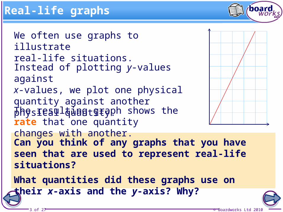
The resulting graph shows the rate that one quantity changes with another.
We often use graphs to illustrate real-life situations.
Instead of plotting y-values against x-values, we plot one physical quantity against another physical quantity.
Can you think of any graphs that you have seen that are used to represent real-life situations?
What quantities did these graphs use on their x-axis and the y-axis? Why?
© Boardworks Ltd 20104 of 27
Pounds and dollars
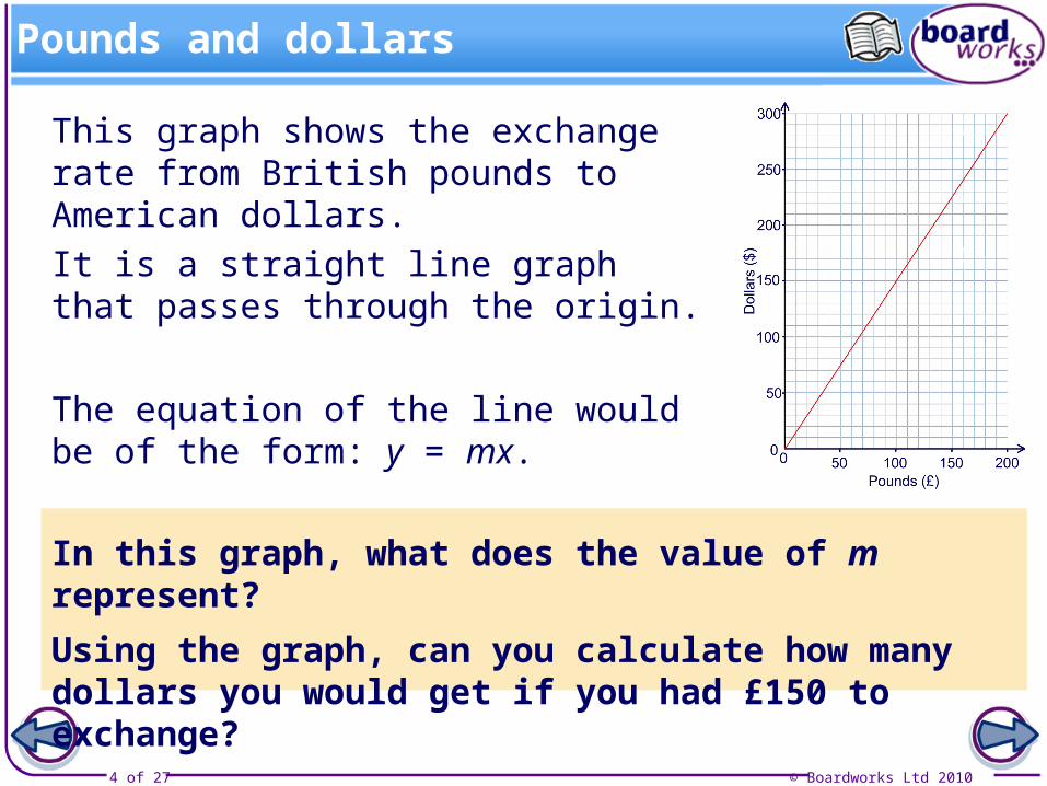
This graph shows the exchange rate from British pounds to American dollars.
It is a straight line graph that passes through the origin.
In this graph, what does the value of m represent?
Using the graph, can you calculate how many dollars you would get if you had £150 to exchange?
The equation of the line would be of the form: y = mx.
© Boardworks Ltd 20105 of 27
Investing in the future
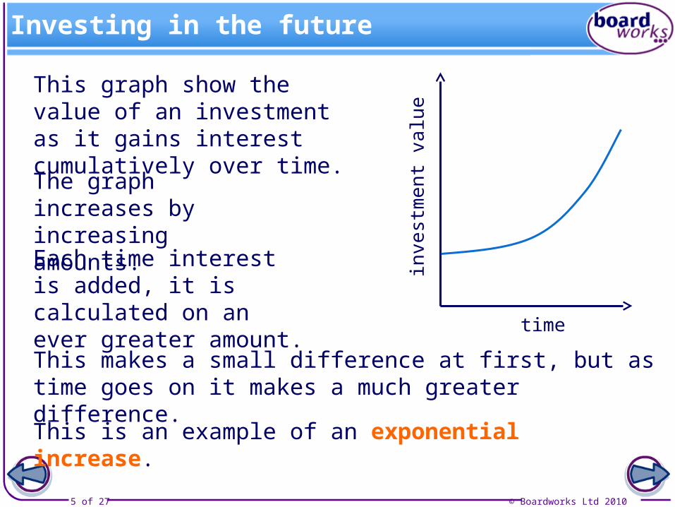
This graph show the value of an investment as it gains interest cumulatively over time.
time
inve
stm
en
t va
lue
The graph increases by increasing amounts.
Each time interest is added, it is calculated on an ever greater amount.
This makes a small difference at first, but as time goes on it makes a much greater difference.
This is an example of an exponential increase.
© Boardworks Ltd 20106 of 27
A growing baby
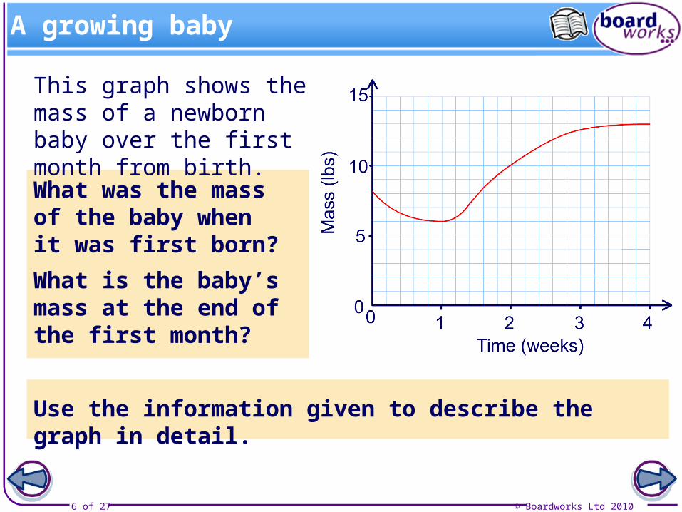
This graph shows the mass of a newborn baby over the first month from birth.
Use the information given to describe the graph in detail.
What was the mass of the baby when it was first born?
What is the baby’s mass at the end of the first month?
© Boardworks Ltd 20107 of 27
Rates of change

© Boardworks Ltd 20108 of 27
Filling flasks
© Boardworks Ltd 20109 of 27
© Boardworks Ltd 201010 of 27
Speed, distance and time
© Boardworks Ltd 201011 of 27
Distance – time graphs
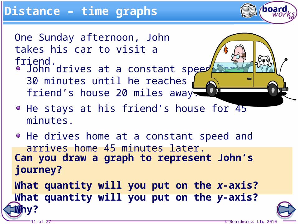
One Sunday afternoon, John takes his car to visit a friend.
John drives at a constant speed for 30 minutes until he reaches his friend’s house 20 miles away.
He stays at his friend’s house for 45 minutes.
He drives home at a constant speed and arrives home 45 minutes later.
Can you draw a graph to represent John’s journey?
What quantity will you put on the x-axis? What quantity will you put on the y-axis? Why?

© Boardworks Ltd 201012 of 27
John’s journey
© Boardworks Ltd 201013 of 27
Finding speed
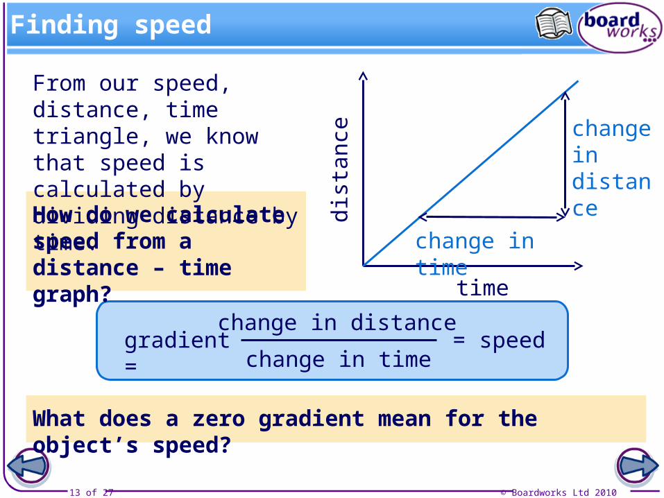
From our speed, distance, time triangle, we know that speed is calculated by dividing distance by time.
How do we calculate speed from a distance – time graph?
time
dist
ance
change in distance
change in time
gradient =change in distance
change in time= speed
What does a zero gradient mean for the object’s speed?
© Boardworks Ltd 201014 of 27
Interpreting distance – time graphs
© Boardworks Ltd 201015 of 27
Distance – time graphs
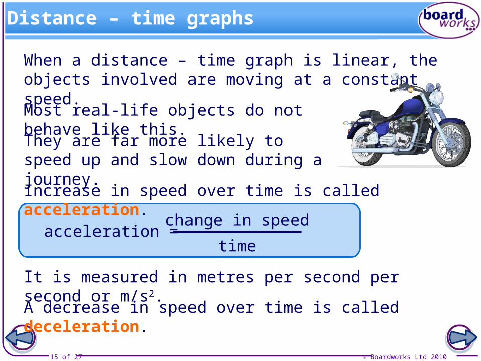
When a distance – time graph is linear, the objects involved are moving at a constant speed.
Most real-life objects do not behave like this.
Increase in speed over time is called acceleration.
acceleration =change in speed
time
It is measured in metres per second per second or m/s2.
A decrease in speed over time is called deceleration.
They are far more likely to speed up and slow down during a journey.
© Boardworks Ltd 201016 of 27
Acceleration and deceleration
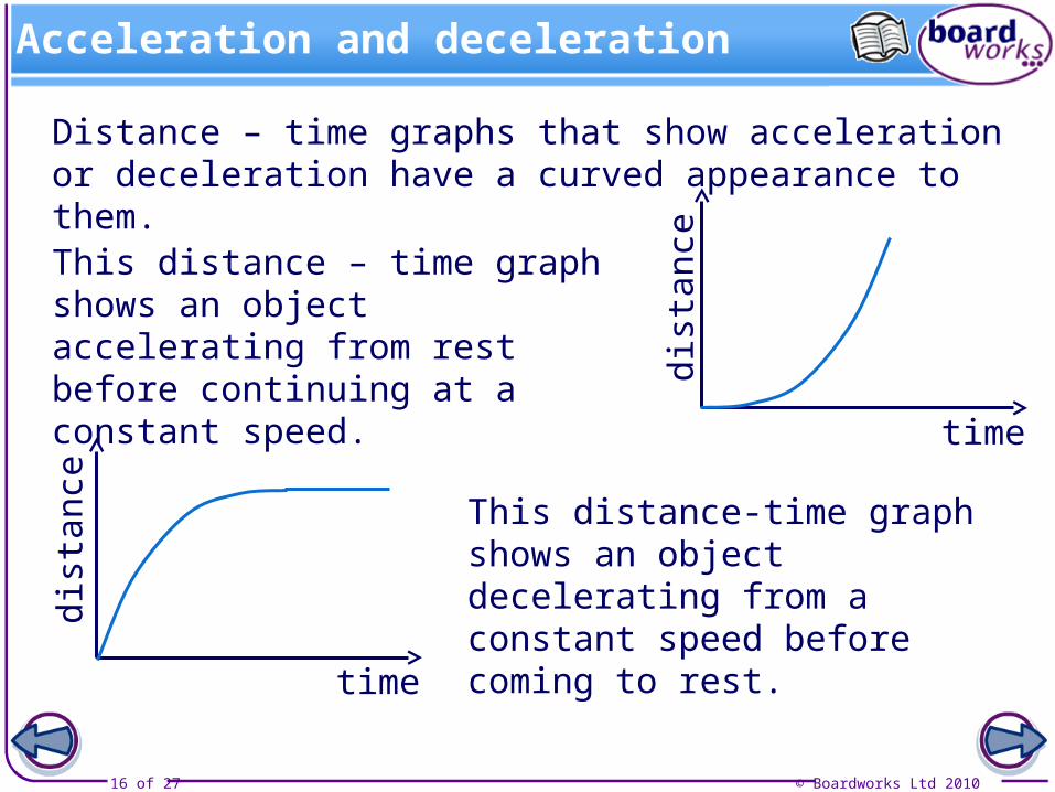
Distance – time graphs that show acceleration or deceleration have a curved appearance to them.
This distance-time graph shows an object decelerating from a constant speed before coming to rest.
time
dist
ance
This distance – time graph shows an object accelerating from rest before continuing at a constant speed.
time
dist
ance
© Boardworks Ltd 201017 of 27
© Boardworks Ltd 201018 of 27
Speed – time graphs
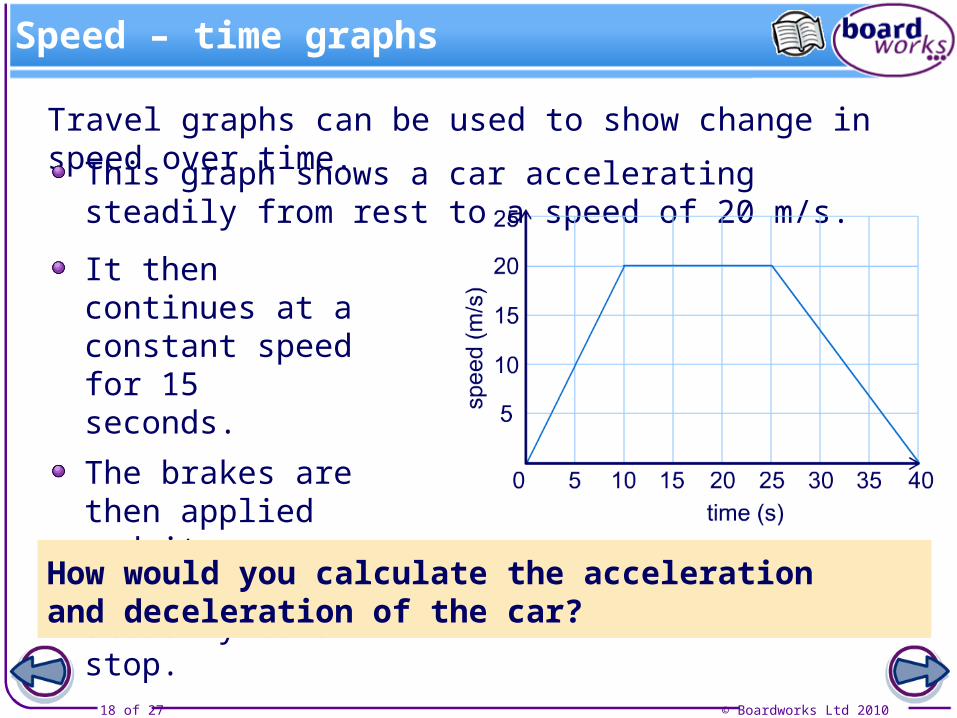
Travel graphs can be used to show change in speed over time.
This graph shows a car accelerating steadily from rest to a speed of 20 m/s.
It then continues at a constant speed for 15 seconds.
The brakes are then applied and it decelerates steadily to a stop.
How would you calculate the acceleration and deceleration of the car?
© Boardworks Ltd 201019 of 27
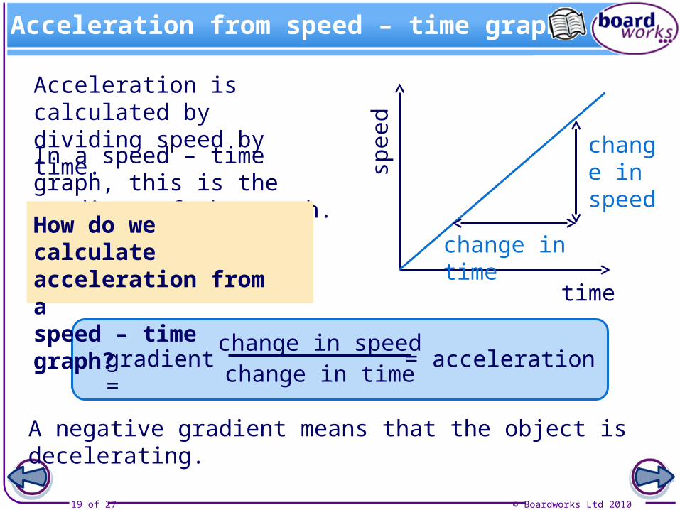
Acceleration from speed – time graphs
Acceleration is calculated by dividing speed by time.
time
spee
d
In a speed – time graph, this is the gradient of the graph.
gradient =change in time
change in speed= acceleration
change in time
change in speed
A negative gradient means that the object is decelerating.
How do we calculate acceleration from a speed – time graph?
© Boardworks Ltd 201020 of 27
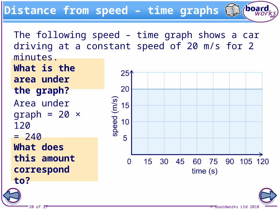
Distance from speed – time graphs
The following speed – time graph shows a car driving at a constant speed of 20 m/s for 2 minutes.
What is the area under the graph?
Area under graph = 20 × 120 = 240
What does this amount correspond to?
© Boardworks Ltd 201021 of 27
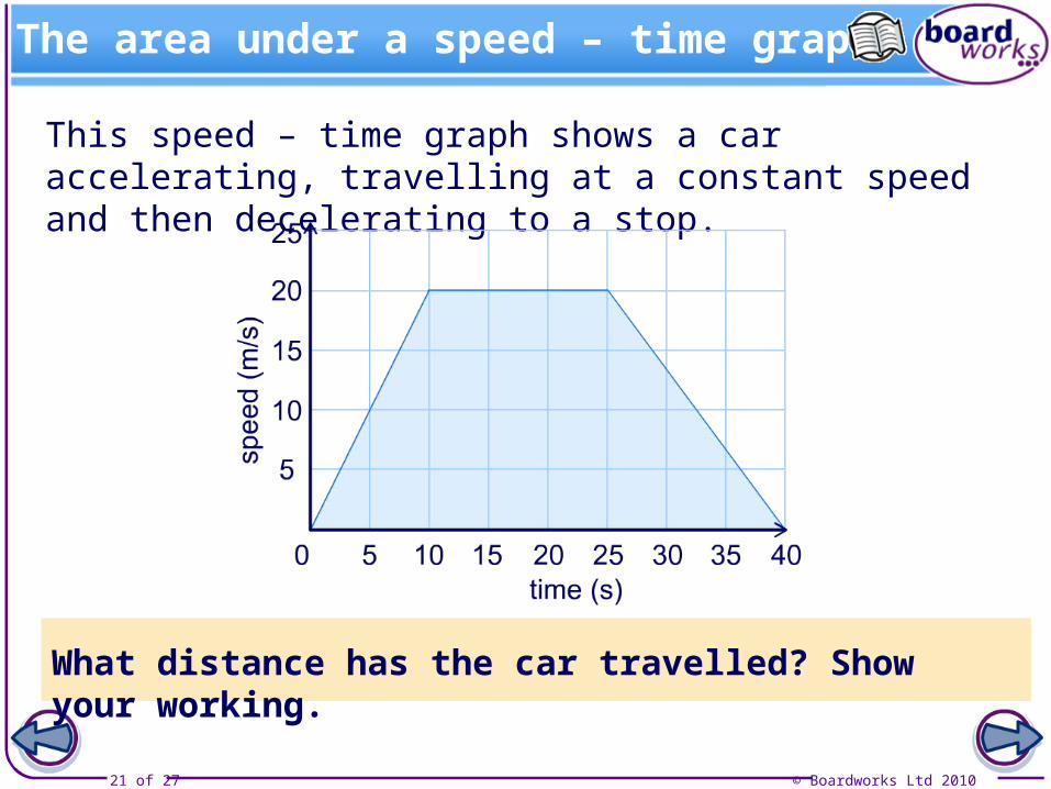
The area under a speed – time graph
This speed – time graph shows a car accelerating, travelling at a constant speed and then decelerating to a stop.
What distance has the car travelled? Show your working.
© Boardworks Ltd 201022 of 27
How far have they gone?
© Boardworks Ltd 201023 of 27
Interpreting speed – time graphs
© Boardworks Ltd 201024 of 27
© Boardworks Ltd 201025 of 27
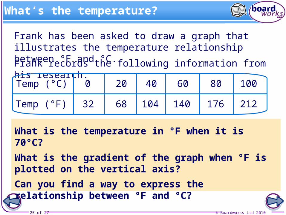
What’s the temperature?
Frank has been asked to draw a graph that illustrates the temperature relationship between °F and °C.
Frank records the following information from his research.
Temp (°C)
Temp (°F)
0
32
100
212
20 40 60 80
68 104 140 176
What is the temperature in °F when it is 70°C?
What is the gradient of the graph when °F is plotted on the vertical axis?
Can you find a way to express the relationship between °F and °C?
© Boardworks Ltd 201026 of 27
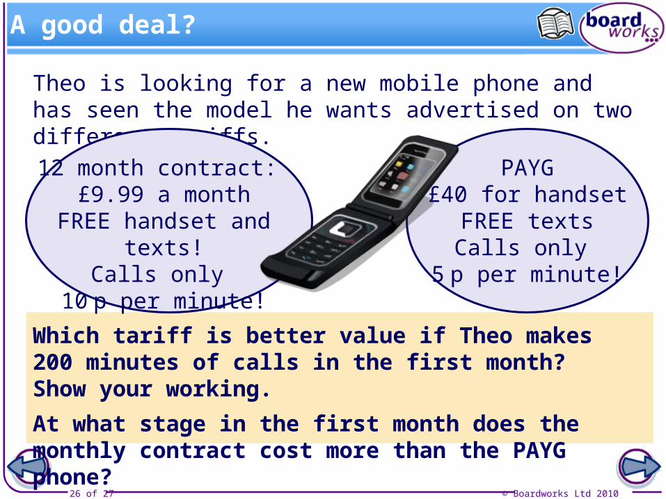
A good deal?
Theo is looking for a new mobile phone and has seen the model he wants advertised on two different tariffs.
12 month contract: £9.99 a month
FREE handset and texts!Calls only
10 p per minute!
PAYG£40 for handset
FREE textsCalls only
5 p per minute!
Which tariff is better value if Theo makes 200 minutes of calls in the first month? Show your working.
At what stage in the first month does the monthly contract cost more than the PAYG phone?
© Boardworks Ltd 201027 of 27
Mobile graph