tms smooth controls pack - tmssoftware.biz smoothcontrols.pdf · tms software tms smooth controls...
TRANSCRIPT
TMS SOFTWARE TMS Smooth Controls
DEVELOPERS GUIDE
1
TMS Smooth Controls
DEVELOPERS GUIDE
March 2017
Copyright © 2017 by tmssoftware.com bvba Web: http://www.tmssoftware.com
Email: [email protected]
TMS SOFTWARE TMS Smooth Controls
DEVELOPERS GUIDE
2
Index
Introduction ............................................................................................................................................. 8
Availability ............................................................................................................................................... 8
List of included components ................................................................................................................... 9
Online references .................................................................................................................................... 9
TGDIPFill class ........................................................................................................................................ 11
GDI+ Picture Container .......................................................................................................................... 15
HTML rendering engine ......................................................................................................................... 16
Component styles and application-wide or form-wide styler components ......................................... 20
TAdvSmoothButton ............................................................................................................................... 23
TAdvSmoothButton description .................................................................................................... 23
TAdvSmoothButton features ......................................................................................................... 23
TAdvSmoothButton use ................................................................................................................ 23
TAdvSmoothCalendar & TAdvSmoothDatepicker ................................................................................. 25
TAdvSmoothCalendar - TAdvSmoothDateDatePicker description ................................................ 25
TAdvSmoothCalendar – TAdvSmoothDatePicker features ........................................................... 25
TAdvSmoothCalendar - TAdvSmoothDatePicker visual organisation ........................................... 26
TAdvSmoothCalendar - TAdvSmoothDatePicker use .................................................................... 26
TAdvSmoothCalendar - TAdvSmoothDatePicker tips & FAQ ........................................................ 28
TAdvSmoothCalendarGroup ................................................................................................................. 30
TAdvSmoothCalendarGroup description ...................................................................................... 30
TAdvSmoothCalendarGroup features ........................................................................................... 30
TAdvSmoothCalendarGroup use ................................................................................................... 30
TAdvSmoothCalendarGroup events .............................................................................................. 32
TadvSmoothCalendarGroup important properties and methods ................................................. 32
TAdvSmoothLabel.................................................................................................................................. 33
TAdvSmoothLabel description ...................................................................................................... 33
TAdvSmoothLabel features ........................................................................................................... 33
TAdvSmoothLabel use ................................................................................................................... 33
TAdvSmoothListBox ............................................................................................................................... 35
TAdvSmoothListBox description .................................................................................................... 35
TAdvSmoothListBox features ........................................................................................................ 35
TMS SOFTWARE TMS Smooth Controls
DEVELOPERS GUIDE
3
TAdvSmoothListBox visual organisation ....................................................................................... 35
TAdvSmoothListBox use ................................................................................................................ 38
TAdvSmoothListBox methods and properties ............................................................................... 39
TAdvSmoothListBox events ........................................................................................................... 44
TAdvSmoothListBox keyboard and mouse support ...................................................................... 46
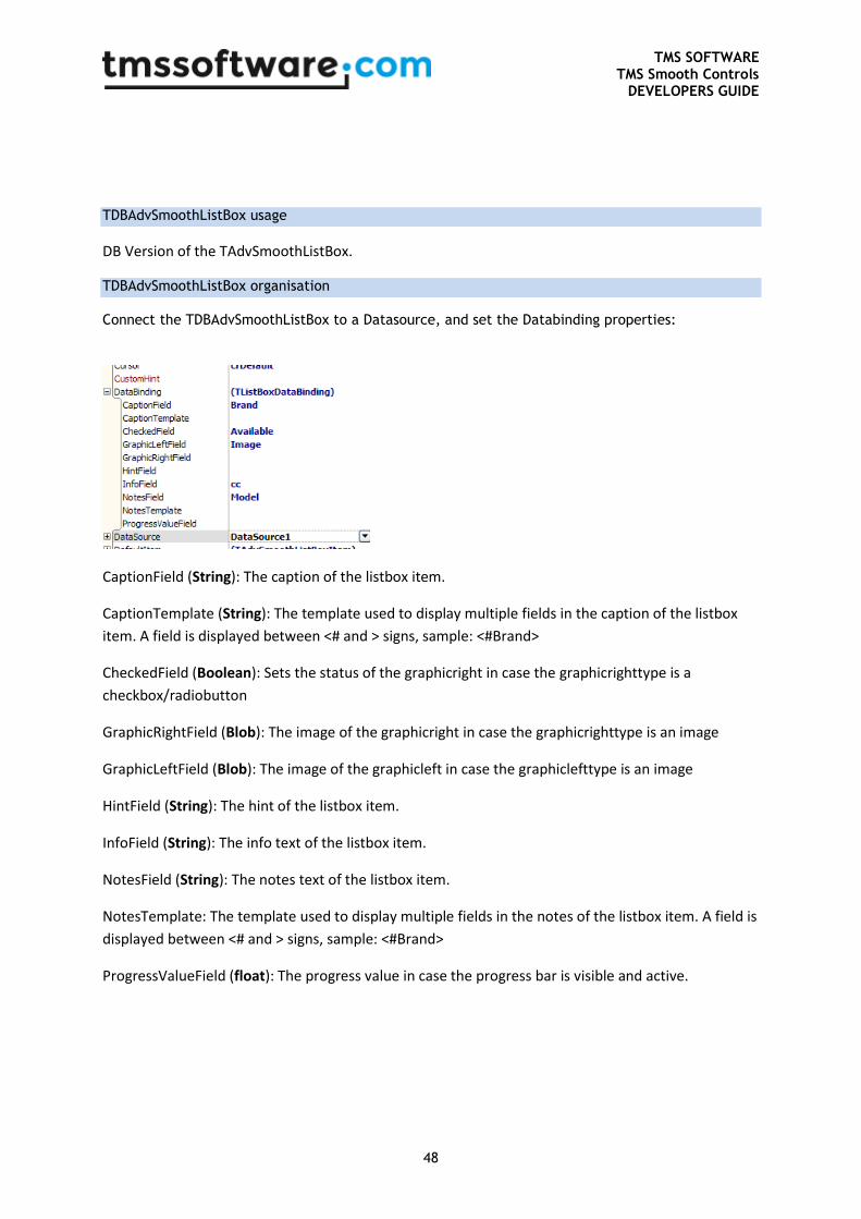
TDBAdvSmoothListBox usage ........................................................................................................ 48
TDBAdvSmoothListBox organisation ............................................................................................. 48
TAdvSmoothImageListBox & TAdvSmoothImageListBoxPicker ............................................................ 49
TAdvSmoothImageListBox & TAdvSmoothListBoxPicker description ........................................... 49
TAdvSmoothImageListBox & TadvSmoothListBoxPicker features ................................................ 49
TAdvSmoothImageListBox visual organisation ............................................................................. 50
TAdvSmoothImageListBox use ...................................................................................................... 52
TAdvSmoothImageListBox properties ........................................................................................... 54
TAdvSmoothImageListBox methods ............................................................................................. 57
TAdvSmoothImageListBox events ................................................................................................. 58
TMS TAdvSmoothImageListBox keyboard and mouse support .................................................... 59
TAdvSmoothImageListBoxPicker ................................................................................................... 59
TDBAdvSmoothImageListBox usage .............................................................................................. 60
TAdvSmoothPanel, TAdvSmoothExpanderPanel, TAdvSmoothExpanderButtonPanel and
TAdvSmoothExpanderGroup ................................................................................................................. 61
TAdvSmoothPanel description ...................................................................................................... 61
TAdvSmoothPanel features ........................................................................................................... 61
TAdvSmoothPanel use ................................................................................................................... 62
TAdvSmoothProgressBar ....................................................................................................................... 64
TAdvSmoothProgressBar description ............................................................................................ 64
TAdvSmoothProgressBar features ................................................................................................ 64
TAdvSmoothProgressBar use ........................................................................................................ 64
TAdvSmoothCircularProgress ................................................................................................................ 65
TAdvSmoothCircularProgress description ..................................................................................... 65
TAdvSmoothCircularProgress features ......................................................................................... 65
TAdvSmoothCircularProgress use ................................................................................................. 65
TAdvSmoothRotaryMenu / TAdvSmoothRotaryMenuDialog ............................................................... 67
TMS SOFTWARE TMS Smooth Controls
DEVELOPERS GUIDE
4
TAdvSmoothRotaryMenu / TAdvSmoothRotaryMenuDialog description .................................... 67
TAdvSmoothRotaryMenu / TAdvSmoothRotaryMenuDialog features ......................................... 67
TAdvSmoothRotaryMenu / TAdvSmoothRotaryMenuDialog use ................................................. 67
TAdvSmoothMenu ................................................................................................................................ 68
TAdvSmoothMenu description ..................................................................................................... 68
TAdvSmoothMenu features .......................................................................................................... 68
TAdvSmoothMenu use .................................................................................................................. 68
TAdvSmoothSpinner .............................................................................................................................. 71
TAdvSmoothSpinner description ................................................................................................... 71
TAdvSmoothSpinner features ....................................................................................................... 71
TAdvSmoothSpinner use ............................................................................................................... 71
TAdvSmoothTrackBar ............................................................................................................................ 76
TAdvSmoothTrackBar description ................................................................................................. 76
TAdvSmoothTrackBar features ...................................................................................................... 76
TAdvSmoothTrackBar use ............................................................................................................. 76
TAdvSmoothTabPager ........................................................................................................................... 77
TAdvSmoothTabPager description ................................................................................................ 77
TAdvSmoothTabPager features ..................................................................................................... 77
TAdvSmoothPager use .................................................................................................................. 77
TAdvSmoothGauge ................................................................................................................................ 79
TAdvSmoothGauge description ..................................................................................................... 79
TAdvSmoothGauge features ......................................................................................................... 79
TAdvSmoothGauge visual organisation ......................................................................................... 79
TAdvSmoothGauge use ................................................................................................................. 80
TAdvSmoothGauge events ............................................................................................................ 81
TAdvSmoothJogWheel .......................................................................................................................... 82
TAdvSmoothJogWheel description ............................................................................................... 82
TAdvSmoothJogWheel features .................................................................................................... 82
TAdvSmoothJogWheel visual organisation ................................................................................... 82
TAdvSmoothJogWheel use ............................................................................................................ 83
TAdvSmoothJogWheel events ....................................................................................................... 83
TAdvSmoothLEDLabel ........................................................................................................................... 84
TMS SOFTWARE TMS Smooth Controls
DEVELOPERS GUIDE
5
TAdvSmoothLEDLabel description ................................................................................................ 84
TAdvSmoothLEDLabel features ..................................................................................................... 84
TAdvSmoothLEDLabel use ............................................................................................................. 84
TAdvSmoothStatusIndicator ................................................................................................................. 85
TAdvSmoothStatusIndicator description ...................................................................................... 85
TAdvSmoothStatusIndicator features ........................................................................................... 85
TAdvSmoothStatusIndicator use ................................................................................................... 85
TAdvSmoothToggleButton .................................................................................................................... 86
TAdvSmoothToggleButton description ......................................................................................... 86
TAdvSmoothToggleButton features .............................................................................................. 86
TAdvSmoothToggleButton use ...................................................................................................... 86
TAdvSmoothComboBox ........................................................................................................................ 87
TAdvSmoothComboBox description ............................................................................................. 87
TAdvSmoothComboBox features .................................................................................................. 87
TAdvSmoothComboBox use .......................................................................................................... 88
TAdvSmoothSplashScreen ..................................................................................................................... 89
TAdvSmoothSplashScreen description .......................................................................................... 89
TAdvSmoothSplashScreen features .............................................................................................. 89
TAdvSmoothSplashScreen use ...................................................................................................... 89
TAdvSmoothMessageDialog .................................................................................................................. 94
TAdvSmoothMessageDialog description ....................................................................................... 94
TAdvSmoothMessagedialog features ............................................................................................ 94
TAdvSmoothMessageDialog use ................................................................................................... 94
TAdvSmoothTimeLine ........................................................................................................................... 99
TAdvSmoothTimeLine description ................................................................................................ 99
TAdvSmoothTimeLine features ..................................................................................................... 99
TAdvSmoothTimeLine use ............................................................................................................. 99
TDBAdvSmoothTimeLine ..................................................................................................................... 104
TDBAdvSmoothTimeLine description .......................................................................................... 104
TDBAdvSmoothTimeLine use ...................................................................................................... 104
TAdvSmoothSlider ............................................................................................................................... 106
TAdvSmoothSlider description .................................................................................................... 106
TMS SOFTWARE TMS Smooth Controls
DEVELOPERS GUIDE
6
TAdvSmoothSlider features ......................................................................................................... 106
TAdvSmoothSlider use ................................................................................................................ 106
TAdvSmoothScrollBar .......................................................................................................................... 108
TAdvSmoothScrollBar description ............................................................................................... 108
TAdvSmoothScrollBar features ................................................................................................... 108
TAdvSmoothScrollBar use ........................................................................................................... 108
TAdvSmoothDock ................................................................................................................................ 110
TAdvSmoothDock description ..................................................................................................... 110
TAdvSmoothDock features .......................................................................................................... 110
TAdvSmoothDock use.................................................................................................................. 110
TAdvSmoothMegaMenu ..................................................................................................................... 116
TAdvSmoothMegaMenu description .......................................................................................... 116
TAdvSmoothMegaMenu features ............................................................................................... 116
TAdvSmoothMegaMenu use ....................................................................................................... 117
TAdvSmoothTouchKeyBoard & TAdvSmoothPopupTouchKeyBoard ................................................. 138
TAdvSmoothTouchKeyBoard description .................................................................................... 138
TAdvSmoothTouchKeyBoard features ........................................................................................ 138
TAdvSmoothTouchKeyBoard use ................................................................................................ 138
TAdvSmoothCalculator & TAdvSmoothCalculatorDropDown ............................................................ 143
TAdvSmoothCalculator description ............................................................................................. 143
TAdvSmoothCalculator features ................................................................................................. 143
TAdvSmoothSlideShow ....................................................................................................................... 144
TAdvSmoothSlideShow description ............................................................................................ 144
TAdvSmoothSlideShow features ................................................................................................. 144
TAdvSmoothSlideShow use ......................................................................................................... 145
TAdvSmoothCapacityBar ..................................................................................................................... 152
TadvSmoothCapacityBar description .......................................................................................... 152
TAdvSmoothCapacityBar features............................................................................................... 152
TAdvSmoothCapacityBar use ...................................................................................................... 152
TAdvSmoothPopup .............................................................................................................................. 154
TAdvSmoothPopup description ................................................................................................... 154
TAdvSmoothPopup features ....................................................................................................... 154
TMS SOFTWARE TMS Smooth Controls
DEVELOPERS GUIDE
7
TAdvSmoothPopup use ............................................................................................................... 155
TAdvSmoothStepControl ..................................................................................................................... 159
TAdvSmoothStepControl description .......................................................................................... 159
TAdvSmoothStepControl features .............................................................................................. 159
TAdvSmoothTileList ............................................................................................................................. 167
TAdvSmoothTileList description .................................................................................................. 167
TAdvSmoothTileList features....................................................................................................... 167
TAdvSmoothTileList use .............................................................................................................. 168
TAdvSmoothPageSlider ....................................................................................................................... 178
TAdvSmoothPageSlider description ............................................................................................ 178
TAdvSmoothPageSlider features ................................................................................................. 178
TAdvSmoothPageSlider use ......................................................................................................... 178
TMS SOFTWARE TMS Smooth Controls
DEVELOPERS GUIDE
8
Introduction
TMS Smooth Controls is a set of smoothly animated VCL components for Delphi & C++Builder with a consistent sophisticated visual appearance. Underlying technologies used are the Microsoft™ GDI+ API that has support for complex gradients, drawing with opacity and opacity gradients, PNG images with alpha transparency, picture & hatch fills and anti-aliasing. Various components also use a lightweight & fast HTML rendering engine for displaying text with HTML formatting capabilities such as specifying color, font, images, hyperlinks specifying. Both technologies are exposed via a class TGDIPFill that is internally reused in the components and that takes care of the drawing. While the look of the components can be fully customized, it is often desirable to make the
application look and feel consistent with Microsoft Office or Microsoft Windows styles.
Therefore, most components in the TMS Smooth Controls have built-in presets for Microsoft Office
2003, Microsoft Office 2007, Microsoft Office 2010 and Microsoft Office 2013 color settings. TMS Smooth Controls Pack components are designed for Windows XP, Windows 2003, Windows Vista, Windows 2008, Windows 7 and Windows8. The components can also be used on Windows 2000 when
the Microsoft GDIPLUS.DLL library is deployed along the application. In this document you will find an overview of the components and their features, code snippets to quickly start using the components and overviews of properties, methods and events. For the more complex components, a more in-depth explanation of the visual design and programmatic use is provided. TMS Smooth Controls components were designed for use with mouse, keyboard and finger on touch screens.
Availability
TMS Smooth Controls are VCL components for Win32/Win64 application development. TMS Smooth
Controls are available for CodeGear Delphi 7, 2007, 2009, 2010, XE, XE2, XE3, XE4, XE5, XE6, XE7,
XE8, 10 Seattle, 10.1 Berlin, 10.2 Tokyo & CodeGear C++Builder 2007, 2009, 2010, XE, XE2, XE3, XE4, XE5, XE6, XE7, XE8, 10 Seattle, 10.1 Berlin, 10.2 Tokyo.
TMS SOFTWARE TMS Smooth Controls
DEVELOPERS GUIDE
9
List of included components
- TAdvSmoothButton
- TAdvSmoothCalendar
- TAdvSmoothCalendarGroup
- TAdvSmoothCalculator
- TAdvSmoothCircularProgress - TAdvSmoothDatePicker
- TAdvSmoothLabel
- TAdvSmoothListBox
- TAdvSmoothImageListBox
- TAdvSmoothImageListBoxPicker
- TAdvSmoothPanel / TAdvSmoothExpanderPanel / TAdvSmoothExpanderButtonPanel / TAdvSmoothExpanderGroup
- TAdvSmoothProgressBar
- TAdvSmoothMenu
- TAdvSmoothSpinner
- TAdvSmoothTrackBar
- TAdvSmoothTabPager
- TAdvSmoothGauge - TAdvSmoothJogWheel
- TAdvSmoothLedLabel
- TAdvSmoothStatusIndicator
- TAdvSmoothToggleButton
- TAdvSmoothComboBox
- TAdvSmoothSplashScreen
- TAdvSmoothMessageDialog - TAdvSmoothTimeLine
- TAdvSmoothSlider
- TAdvSmoothScrollBar
- TAdvSmoothDock
- TAdvFormStyler
- TAdvAppStyler
- TAdvSmoothSlideShow - TAdvSmoothCapacityBar
- TAdvSmoothPopup
- TAdvSmoothStepControl
Online references
TMS software website: http://www.tmssoftware.com TMS Smooth Controls page: http://www.tmssoftware.com/site/advsmoothcontrols.asp TMS HTML rendering engine information: http://www.tmssoftware.com/site/minihtml.asp Article about using the TAdvFormStyler & TAdvAppStyler component: http://www.tmssoftware.com/site/atbdev3.asp

TMS SOFTWARE TMS Smooth Controls
DEVELOPERS GUIDE
10
TMS SOFTWARE TMS Smooth Controls
DEVELOPERS GUIDE
11
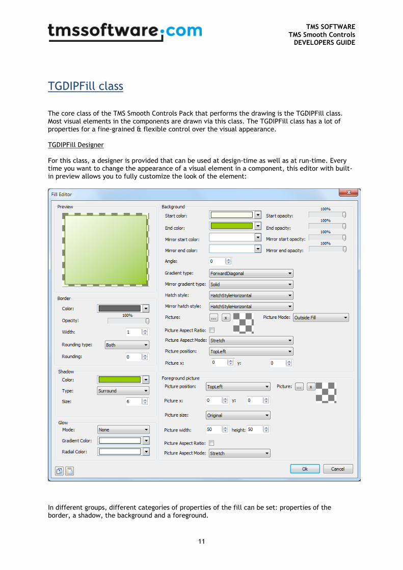
TGDIPFill class
The core class of the TMS Smooth Controls Pack that performs the drawing is the TGDIPFill class. Most visual elements in the components are drawn via this class. The TGDIPFill class has a lot of properties for a fine-grained & flexible control over the visual appearance. TGDIPFill Designer For this class, a designer is provided that can be used at design-time as well as at run-time. Every time you want to change the appearance of a visual element in a component, this editor with built-in preview allows you to fully customize the look of the element:
In different groups, different categories of properties of the fill can be set: properties of the border, a shadow, the background and a foreground.
TMS SOFTWARE TMS Smooth Controls
DEVELOPERS GUIDE
12
TGDIPFill properties
Properties to control the border:
BorderColor: the color of the border of the fill.
BorderOpacity: the opacity of the border of the fill.
BorderWidth: the width of the border of the fill.
Rounding: the rounding of the fill, set Rounding = 0 to have a rectangular shape and a higher value to have more rounded corners.
RoundingType: the type of rounding of the fill. In some cases it can be useful to only set the top corners of the fill to be rounded, only the bottom corners or all 4 corners.
Properties to control the background: A background can be divided in a top and bottom part and each part can have its gradient.
Color: the start color of the top part gradient (if the GradientType is gtSolid, Color is the only property used).
ColorTo: the end color of the top part gradient.
ColorMirror: when ColorMirror is set to a color different from clNone the fill will be split up in 2 parts: the top part and the mirror bottom part. ColorMirror is the start color of the mirror bottom part.
ColorMirrorTo: the end color of the mirror bottom part.
Opacity: the opacity of the start color of the top part.
OpacityTo: the opacity of the end color of the top part.
OpacityMirror: the opacity of the start color of the mirror bottom part.
OpacityMirrorTo: the opacity of the end color of the mirror bottom part.
GradientType: the type of gradient to apply: Horizontal, Vertical, Angle, Hatch... for the top part (or full background if mirror colors are set to clNone)
GradientMirrorType: the type of gradient of the mirror bottom part.
Angle: the angle of the gradient in case GradientType is set to gtAngle.
HatchStyle: the hatchstyle in case GradientType is set to gtHatch for the top part (or full background if mirror colors are set to clNone)
HatchStyleMirror: the hatchstyle of the mirror bottom part.
BackGroundPicture: the background picture in case GradientType gtTexture is chosen. The background picture can be stretched or positioned on the fill.
TMS SOFTWARE TMS Smooth Controls
DEVELOPERS GUIDE
13
BackGroundPicturePosition: the position of the backgroundpicture.
BackGroundPictureLeft: when the position is set to custom the left position can be set with this property
BackGroundPictureTop: the top position of the backgroundpicture when the position is set to custom.
Properties to control the foreground picture:
Picture: you can always set a picture that is not bound to the rectangle of the fill. In other words you can draw a picture which overlaps the fill.
PicturePosition: the position of the foreground picture.
PictureLeft: the left position of the picture in case pictureposition is set to custom.
PictureTop: the top position of the picture in case pictureposition is set to custom.
PictureSize: it can be useful to resize the picture to a different size when it is too large. Set picturesize to custom and use picturewidth and pictureheight to change the size of the picture.
PictureWidth: the width of the picture in case the picturesize is set to custom.
PictureHeight: the height of the picture in case the picturesize is set to custom.
Properties to control the shadow:
ShadowColor: the color of the shadow of the fill.
ShadowOffset: the offset of the shadow of the fill.
ShadowType: the different types of shadow, bottom, bottomright or surround
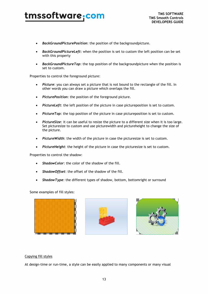
Some examples of fill styles:
Copying fill styles At design-time or run-time, a style can be easily applied to many components or many visual
TMS SOFTWARE TMS Smooth Controls
DEVELOPERS GUIDE
14
elements of components. The 2 speedbuttons in the lower left corner of the fill editor can be used to copy and paste fills. When creating complex fills in a project with many different components that implement the TGDIPFill class, you can copy the TGDIPFill settings on the clipboard and paste from the clipboard for another component or visual element. To do the same in code, a TGDIPFill
class can be assigned to another TGDIPFill class:
Example:
procedure TForm2.Button1Click(Sender: TObject);
begin
Advsmoothlistbox2.Header.Fill.Assign(Advsmoothlistbox1.Header.Fill);
end;
In this code snippet, the fill from one TAdvSmoothListBox header is copied to another TAdvSmoothListBox header. Using the fill editor at runtime It is easy to use the fill editor at runtime. To do this, add the unit AdvSmoothFillEditor to the uses list and add following code: var
filldlg :TAdvSmoothFillEditorDialog;
begin
filldlg := TAdvSmoothFillEditorDialog.Create(self);
filldlg.Fill := AdvSmoothListbox1.Footer.Fill;
filldlg.Execute;
end;
With this code snippet, the TAdvSmoothListBox footer fill will be edited at runtime.
TMS SOFTWARE TMS Smooth Controls
DEVELOPERS GUIDE
15
GDI+ Picture Container
Using the TGDIPPictureContainer component The TGDIPPictureContainer makes it easy to use and embed PNG, JPEG, GIF, ICO, BMP and WMF images in your applications from the IDE without needing to resort to resource files. Note that the TGDIPPictureContainer does not require any additional library or code to handle these image formats. Suppose the images with names SOUNDS, SEARCH, PRINTER and MAIL have been added, then the images can be shown via HTML formatted text with following tags : First image <IMG src="SOUNDS"> , second image <IMG src="PRINTER">, etc ... assuming of course the TGDIPPictureContainer is assigned to the HTML enabled control. When a HTML enabled control cannot find a picture with the name referenced in the PictureContainer it will display no image. It is equally possible to add pictures to the TGDIPPictureContainer at run-time. Below is a code snippet that shows how an image is loaded from file and added to the TGDIPPictureContainer and subsequently used for display in a TAdvSmoothListBox control: with GDIPPictureContainer.Items.Add do
begin
Picture.LoadFromFile('myimage.png’);
Name := 'NEW';
end;
AdvSmoothListBox.Items.Add.Caption := 'This uses the new image : <IMG
src="NEW">';
To remove a picture from the TGDIPPictureContainer later: with GDIPPictureContainer.Items.Items[0].Free;
To control size of the picture displayed, additional tags WIDTH and HEIGHT can be used : New image <IMG src="NEW" width="24" height="24">
TMS SOFTWARE TMS Smooth Controls
DEVELOPERS GUIDE
16
HTML rendering engine
Another core technology used among many components in the TMS Smooth Controls Pack is a small fast & lightweight HTML rendering engine. This engine implements a subset of the HTML standard to display formatted text. It supports following tags : B : Bold tag <B> : start bold text </B> : end bold text Example : This is a <B>test</B> U : Underline tag <U> : start underlined text </U> : end underlined text Example : This is a <U>test</U> I : Italic tag <I> : start italic text </I> : end italic text Example : This is a <I>test</I> S : Strikeout tag <S> : start strike-through text </S> : end strike-through text Example : This is a <S>test</S> A : anchor tag <A href="value"> : text after tag is an anchor. The 'value' after the href identifier is the anchor. This can be an URL (with ftp,http,mailto,file identifier) or any text. If the value is an URL, the shellexecute function is called, otherwise, the anchor value can be found in the OnAnchorClick event </A> : end of anchor Examples : This is a <A href= "mailto:[email protected] ">test</A> This is a <A href="http://www.tmssoftware.com">test</A> This is a <A href="somevalue">test</A> FONT : font specifier tag <FONT face='facevalue' size='sizevalue' color='colorvalue' bgcolor='colorvalue'> : specifies font of text after tag. with
face : name of the font
size : HTML style size if smaller than 5, otherwise pointsize of the font
color : font color with either hexidecimal color specification or Borland style color name, ie clRed,clYellow,clWhite ... etc
bgcolor : background color with either hexidecimal color specification or Borland style color name </FONT> : ends font setting
TMS SOFTWARE TMS Smooth Controls
DEVELOPERS GUIDE
17
Examples : This is a <FONT face="Arial" size="12" color="clred">test</FONT>
This is a <FONT face="Arial" size="12" color="#FF0000">test</FONT>
P : paragraph
<P align="alignvalue" [bgcolor="colorvalue"] [bgcolorto="colorvalue"]> : starts a new paragraph, with
left, right or center alignment. The paragraph background color is set by the optional bgcolor
parameter. If bgcolor and bgcolorto are specified,
a gradient is displayed ranging from begin to end color.
</P> : end of paragraph
Example : <P align="right">This is a test</P>
Example : <P align="center">This is a test</P>
Example : <P align="left" bgcolor="#ff0000">This has a red background</P>
Example : <P align="right" bgcolor="clYellow">This has a yellow background</P>
Example : <P align="right" bgcolor="clYellow" bgcolorto="clred">This has a gradient background</P>*
HR : horizontal line
<HR> : inserts linebreak with horizontal line
BR : linebreak
<BR> : inserts a linebreak
BODY : body color / background specifier
<BODY bgcolor="colorvalue" [bgcolorto="colorvalue"] [dir="v|h"] background="imagefile specifier"> :
sets the background color of the HTML text or the background bitmap file
Example : <BODY bgcolor="clYellow"> : sets background color to yellow
<BODY background="file://c:\test.bmp"> : sets tiled background to file test.bmp
<BODY bgcolor="clYellow" bgcolorto="clWhite" dir="v"> : sets a vertical gradient from yellow to
white
IND : indent tag
This is not part of the standard HTML tags but can be used to easily create multicolumn text
<IND x="indent"> : indents with "indent" pixels
Example :
This will be <IND x="75">indented 75 pixels.
IMG : image tag
<IMG src="specifier:name" [align="specifier"] [width="width"] [height="height"] [alt="specifier:name"]
> : inserts an image at the location
specifier can be : idx : name is the index of the image in the associated imagelist
file : name is the full filename specifier
res : name of a resource bitmap (not visible at design time)
no specifier : name of image in a TGDIPPictureContainer
Optionally, an alignment tag can be included. If no alignment is included, the text alignment with
TMS SOFTWARE TMS Smooth Controls
DEVELOPERS GUIDE
18
respect to the image is bottom. Other possibilities are: align="top" and align="middle"
The width & height to render the image can be specified as well. If the image is embedded in
anchor tags, a different image can be displayed when the mouse is in the image area through the
Alt attribute.
Examples : This is an image <IMG src="idx:1" align="top">
This is an image <IMG src="file://c:\my documents\test.bmp">
This is an image <IMG src="res://BITMAP1">
This is an image <IMG src="name">
SUB : subscript tag
<SUB> : start subscript text
</SUB> : end subscript text
Example : This is <SUP>9</SUP>/<SUB>16</SUB> looks like 9/16
SUP : superscript tag
<SUP> : start superscript text
</SUP> : end superscript text
UL : list tag
<UL> : start unordered list tag
</UL> : end unordered list
Example : <UL>
<LI>List item 1
<LI>List item 2
<UL>
<LI> Sub list item A
<LI> Sub list item B
</UL>
<LI>List item 3
</UL>
LI : list item
<LI [type="specifier"] [color="color"] [name="imagename"]> : new list item
specifier can be "square" or "circle" or "image" bullet color sets the color of the square or circle
bullet imagename sets the PictureContainer image name for image to use as bullet
SHAD : text with shadow
<SHAD> : start text with shadow
</SHAD> : end text with shadow
Z : hidden text
<Z> : start hidden text
</Z> : end hidden text
TMS SOFTWARE TMS Smooth Controls
DEVELOPERS GUIDE
19
Special characters
Following standard HTML special characters are supported :
< : less than : <
> : greater than : >
& : &
" : "
: non breaking space
™ : trademark symbol
€ : euro symbol
§ : section symbol
© : copyright symbol
¶ : paragraph symbol
TMS SOFTWARE TMS Smooth Controls
DEVELOPERS GUIDE
20
Component styles and application-wide or form-wide styler
components
While the appearance of the TMS Smooth Controls pack can be fully customized, it is often desirable
to make the application look and feel consistent with Microsoft Windows or Microsoft Office. To
make it easier and faster, most components of the TMS Smooth Controls pack have built-in presets
for Office 2003, Office 2007, Office 2010 and Office 2013 colors. To access the presets at design-
time, right click the component and choose Styles from the context menu. At run-time, the style
can also be set in code. To do this, add the unit AdvStyleIF to the uses clause and call:
Component.SetComponentStyle(style)
Current available styles are:
Office 2003:
tsOffice2003Blue: Office 2003 style on a blue XP theme
tsOffice2003Silver: Office 2003 style on a silver XP theme
tsOffice2003Olive: Office 2003 style on an olive XP theme
tsOffice2003Classic: Office 2003 style on a non-themed XP or pre-XP operating system
Office 2007:
tsOffice2007Luna: Office 2007 Luna style
tsOffice2007Silver: Office 2007 Silver style
tsOffice2007Obsidian : Office 2007 Obsidian style
Office 2010:
tsOffice2010Blue: Office 2010 Blue style
tsOffice2010Silver: Office 2010 Silver style
tsOffice2010Black: Office 2010 Black style
Office 2013:
tsOffice2013White: Office 2013 White style
tsOffice2013LightGray: Office 2013 Light Gray style
tsOffice2013Gray: Office 2013 Gray style
Windows:
tsWindowsXP: Windows XP / Office XP style
tsWindowsVista: Windows Vista style
tsWindows7: Windows 7 style
tsWindows8: Windows 8 style
tsTerminal: reduced color set for use with terminal servers
tsWhidbey: Visual Studio 2005 style
Custom:
tsCustom: do not force style
TMS SOFTWARE TMS Smooth Controls
DEVELOPERS GUIDE
21
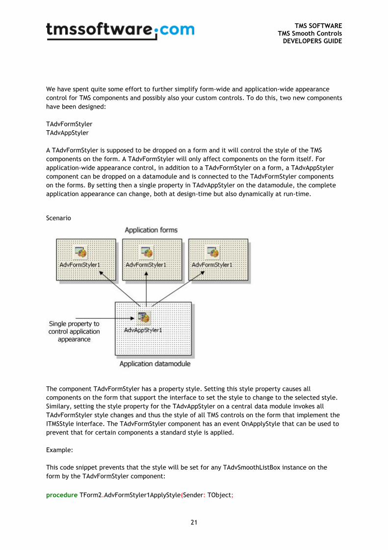
We have spent quite some effort to further simplify form-wide and application-wide appearance
control for TMS components and possibly also your custom controls. To do this, two new components
have been designed:
TAdvFormStyler
TAdvAppStyler
A TAdvFormStyler is supposed to be dropped on a form and it will control the style of the TMS
components on the form. A TAdvFormStyler will only affect components on the form itself. For
application-wide appearance control, in addition to a TAdvFormStyler on a form, a TAdvAppStyler
component can be dropped on a datamodule and is connected to the TAdvFormStyler components
on the forms. By setting then a single property in TAdvAppStyler on the datamodule, the complete
application appearance can change, both at design-time but also dynamically at run-time.
Scenario
The component TAdvFormStyler has a property style. Setting this style property causes all
components on the form that support the interface to set the style to change to the selected style.
Similary, setting the style property for the TAdvAppStyler on a central data module invokes all
TAdvFormStyler style changes and thus the style of all TMS controls on the form that implement the
ITMSStyle interface. The TAdvFormStyler component has an event OnApplyStyle that can be used to
prevent that for certain components a standard style is applied.
Example:
This code snippet prevents that the style will be set for any TAdvSmoothListBox instance on the
form by the TAdvFormStyler component:
procedure TForm2.AdvFormStyler1ApplyStyle(Sender: TObject;
TMS SOFTWARE TMS Smooth Controls
DEVELOPERS GUIDE
22
AComponent: TComponent; var Allow: Boolean);
begin
Allow := not (AComponent is TAdvSmoothListBox);
end;
You can make your own controls also easily TAdvFormStyler, TAdvAppStyler aware so that your
controls also automatically change their appearance when the application and/or form style
changes. To do this, it is sufficient to add and implement the ITMSStyle interface to your control.
This code snippet shows a sample custom control that was made TMS style aware:
interface
uses
Classes, AdvStyleIF;
type
TMyCustomControl = class(TCustomControl, ITMSStyle)
public
procedure SetComponentStyle(AStyle: TTMSStyle);
end;
{ TMyCustomControl }
procedure TMyCustomControl.SetComponentStyle(AStyle: TTMSStyle);
begin
case AStyle of
tsOffice2003Blue: // set properties correct here for the selected style
tsOffice2003Silver:
tsOffice2003Olive:
tsOffice2003Classic:
tsOffice2007Luna:
tsOffice2007Obsidian:
tsOffice2007Silver:
tsWindowsXP:
tsCustom:
end;
end;
TMS SOFTWARE TMS Smooth Controls
DEVELOPERS GUIDE
23
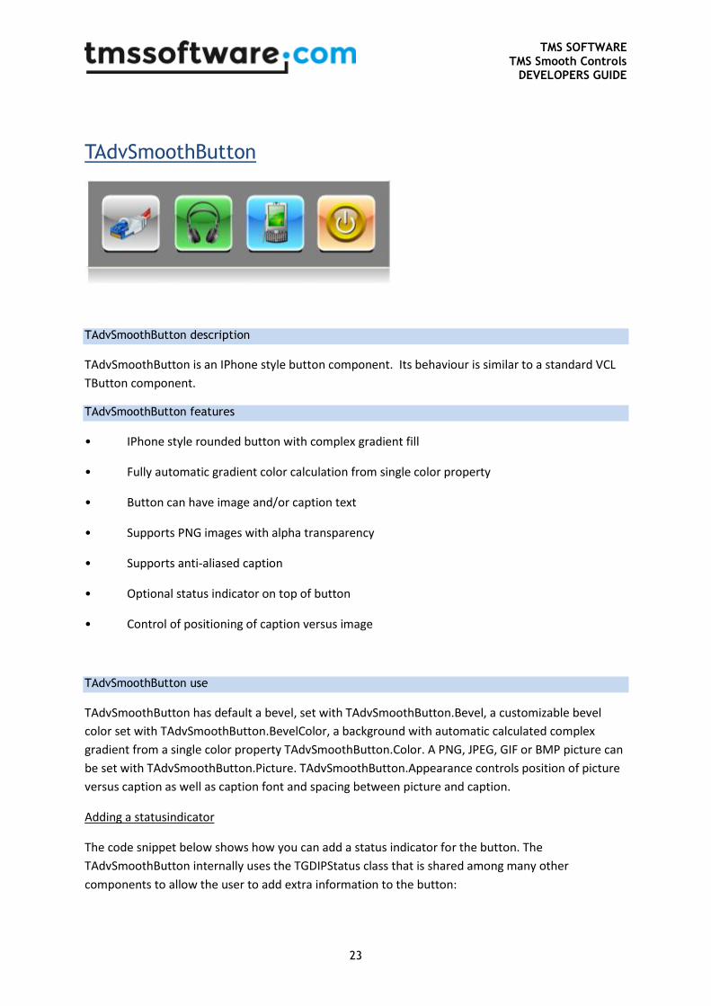
TAdvSmoothButton
TAdvSmoothButton description
TAdvSmoothButton is an IPhone style button component. Its behaviour is similar to a standard VCL
TButton component.
TAdvSmoothButton features
• IPhone style rounded button with complex gradient fill
• Fully automatic gradient color calculation from single color property
• Button can have image and/or caption text
• Supports PNG images with alpha transparency
• Supports anti-aliased caption
• Optional status indicator on top of button
• Control of positioning of caption versus image
TAdvSmoothButton use
TAdvSmoothButton has default a bevel, set with TAdvSmoothButton.Bevel, a customizable bevel
color set with TAdvSmoothButton.BevelColor, a background with automatic calculated complex
gradient from a single color property TAdvSmoothButton.Color. A PNG, JPEG, GIF or BMP picture can
be set with TAdvSmoothButton.Picture. TAdvSmoothButton.Appearance controls position of picture
versus caption as well as caption font and spacing between picture and caption.
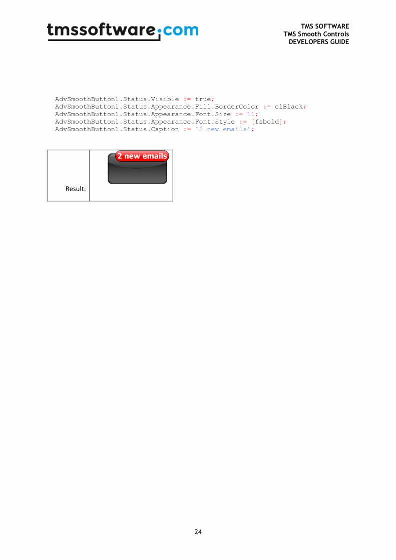
Adding a statusindicator
The code snippet below shows how you can add a status indicator for the button. The
TAdvSmoothButton internally uses the TGDIPStatus class that is shared among many other
components to allow the user to add extra information to the button:
TMS SOFTWARE TMS Smooth Controls
DEVELOPERS GUIDE
24
AdvSmoothButton1.Status.Visible := true;
AdvSmoothButton1.Status.Appearance.Fill.BorderColor := clBlack;
AdvSmoothButton1.Status.Appearance.Font.Size := 11;
AdvSmoothButton1.Status.Appearance.Font.Style := [fsbold];
AdvSmoothButton1.Status.Caption := '2 new emails';
Result:
TMS SOFTWARE TMS Smooth Controls
DEVELOPERS GUIDE
25
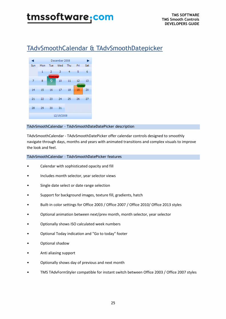
TAdvSmoothCalendar & TAdvSmoothDatepicker
TAdvSmoothCalendar - TAdvSmoothDateDatePicker description
TAdvSmoothCalendar - TAdvSmoothDatePicker offer calendar controls designed to smoothly
navigate through days, months and years with animated transitions and complex visuals to improve
the look and feel.
TAdvSmoothCalendar – TAdvSmoothDatePicker features
• Calendar with sophisticated opacity and fill
• Includes month selector, year selector views
• Single date select or date range selection
• Support for background images, texture fill, gradients, hatch
• Built-in color settings for Office 2003 / Office 2007 / Office 2010/ Office 2013 styles
• Optional animation between next/prev month, month selector, year selector
• Optionally shows ISO calculated week numbers
• Optional Today indication and "Go to today" footer
• Optional shadow
• Anti aliasing support
• Optionally shows day of previous and next month
• TMS TAdvFormStyler compatible for instant switch between Office 2003 / Office 2007 styles
TMS SOFTWARE TMS Smooth Controls
DEVELOPERS GUIDE
26
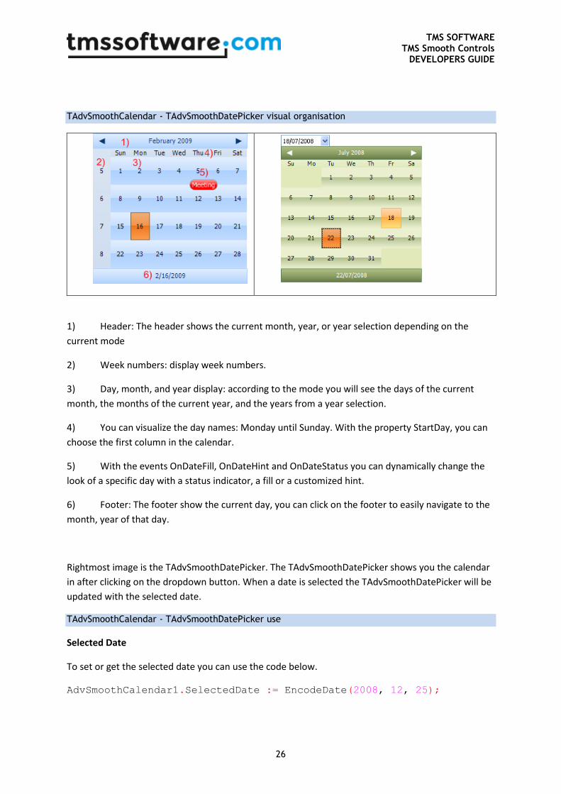
TAdvSmoothCalendar - TAdvSmoothDatePicker visual organisation
1) Header: The header shows the current month, year, or year selection depending on the
current mode
2) Week numbers: display week numbers.
3) Day, month, and year display: according to the mode you will see the days of the current
month, the months of the current year, and the years from a year selection.
4) You can visualize the day names: Monday until Sunday. With the property StartDay, you can
choose the first column in the calendar.
5) With the events OnDateFill, OnDateHint and OnDateStatus you can dynamically change the
look of a specific day with a status indicator, a fill or a customized hint.
6) Footer: The footer show the current day, you can click on the footer to easily navigate to the
month, year of that day.
Rightmost image is the TAdvSmoothDatePicker. The TAdvSmoothDatePicker shows you the calendar
in after clicking on the dropdown button. When a date is selected the TAdvSmoothDatePicker will be
updated with the selected date.
TAdvSmoothCalendar - TAdvSmoothDatePicker use
Selected Date
To set or get the selected date you can use the code below.
AdvSmoothCalendar1.SelectedDate := EncodeDate(2008, 12, 25);
TMS SOFTWARE TMS Smooth Controls
DEVELOPERS GUIDE
27
Select multiple dates
To allow selection a range of dates, set the property MultiSelect to true. Click the first day of the
range and shift-click to select the last day. To set or get the start date and end date of a range of
selected days, following code can be used:
AdvSmoothCalendar1.StartDate := EncodeDate(2008, 12, 20);
AdvSmoothCalendar1.EndDate := EncodeDate(2008, 12, 25);
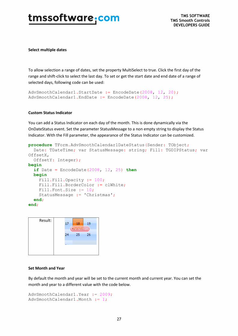
Custom Status Indicator
You can add a Status Indicator on each day of the month. This is done dynamically via the
OnDateStatus event. Set the parameter StatusMessage to a non empty string to display the Status
Indicator. With the Fill parameter, the appearance of the Status Indicator can be customized.
procedure TForm.AdvSmoothCalendar1DateStatus(Sender: TObject;
Date: TDateTime; var StatusMessage: string; Fill: TGDIPStatus; var
OffsetX,
OffsetY: Integer);
begin
if Date = EncodeDate(2008, 12, 25) then
begin
Fill.Fill.Opacity := 100;
Fill.Fill.BorderColor := clWhite;
Fill.Font.Size := 10;
StatusMessage := 'Christmas';
end;
end;
Result:
Set Month and Year
By default the month and year will be set to the current month and current year. You can set the
month and year to a different value with the code below.
AdvSmoothCalendar1.Year := 2009;
AdvSmoothCalendar1.Month := 1;
TMS SOFTWARE TMS Smooth Controls
DEVELOPERS GUIDE
28
Choose a different color for arbitrary days
With the event OnDateFill that is triggered for each day of the displayed month, the appearance of a
single day can be dynamically changed. In the code snippet below, the holidays December 25 and
January 1st are displayed in a different color:
procedure TForm2.AdvSmoothCalendar1DateFill(Sender: TObject; AFill:
TGDIPFill;
AFont: TFont; Date: TDateTime; DateKind: TAdvSmoothCalendarDateKind);
begin
if (Date = EncodeDate(2009,12,25)) or (Date = EncodeDate(2010,1,1)) then
begin
AFill.Color := clRed;
AFill.ColorTo := clWhite;
AFill.GradientType := gtVertical;
AFill.ColorMirror := clNone;
AFill.ColorMirrorTo := clNone;
AFill.BorderColor := clWhite;
end;
end;
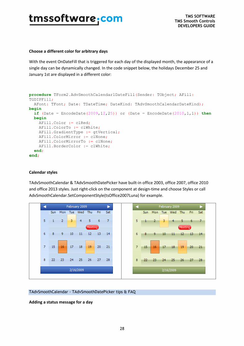
Calendar styles
TAdvSmoothCalendar & TAdvSmoothDatePicker have built-in office 2003, office 2007, office 2010
and office 2013 styles. Just right-click on the component at design-time and choose Styles or call
AdvSmoothCalendar.SetComponentStyle(tsOffice2007Luna) for example.
TAdvSmoothCalendar - TAdvSmoothDatePicker tips & FAQ
Adding a status message for a day
TMS SOFTWARE TMS Smooth Controls
DEVELOPERS GUIDE
29
Adding a status message is done by using the event OnDateStatus. In this event, the text can be set
for a status message for each day with the parameter StatusMessage. A parameter of this event is Fill
and this allows to choose a different appearance from the default status message appearance set by
TAdvSmoothCalendar.StatusAppearance.
This code snippet shows how to add a status message for today in the default color and for the 15th
of the month in green color:
procedure TForm1.AdvSmoothCalendar1DateStatus(Sender: TObject; Date:
TDateTime;
var StatusMessage: string; Fill: TGDIPStatus; var OffsetX,
OffsetY: Integer);
var
da,mo,ye: word;
begin
if date = int(now) then
begin
statusmessage := 'Now';
fill.Assign(AdvSmoothCalendar1.StatusAppearance);
end;
decodedate(date, ye, mo, da);
if da = 15 then
begin
statusmessage := 'halfway';
fill.Fill.Color := clLime;
fill.Fill.ColorTo := clGreen;
fill.Fill.ColorMirror := clNone;
fill.Fill.ColorMirrorTo := clNone;
end;
end;
TMS SOFTWARE TMS Smooth Controls
DEVELOPERS GUIDE
30
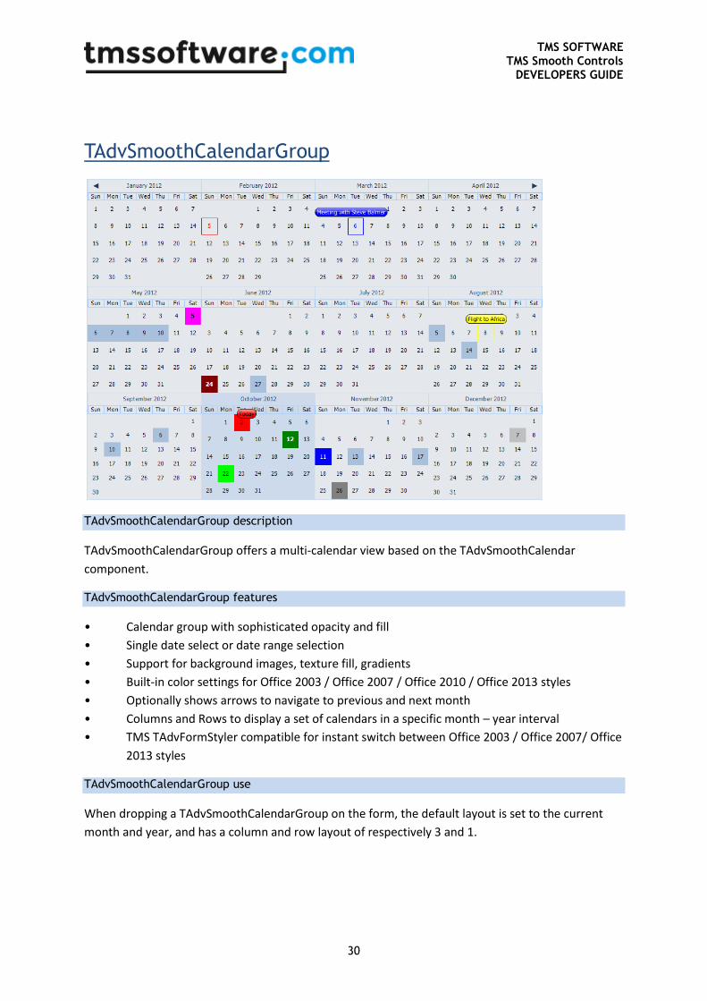
TAdvSmoothCalendarGroup
TAdvSmoothCalendarGroup description
TAdvSmoothCalendarGroup offers a multi-calendar view based on the TAdvSmoothCalendar
component.
TAdvSmoothCalendarGroup features
• Calendar group with sophisticated opacity and fill
• Single date select or date range selection
• Support for background images, texture fill, gradients
• Built-in color settings for Office 2003 / Office 2007 / Office 2010 / Office 2013 styles
• Optionally shows arrows to navigate to previous and next month
• Columns and Rows to display a set of calendars in a specific month – year interval
• TMS TAdvFormStyler compatible for instant switch between Office 2003 / Office 2007/ Office
2013 styles
TAdvSmoothCalendarGroup use
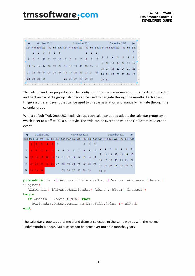
When dropping a TAdvSmoothCalendarGroup on the form, the default layout is set to the current
month and year, and has a column and row layout of respectively 3 and 1.
TMS SOFTWARE TMS Smooth Controls
DEVELOPERS GUIDE
31
The column and row properties can be configured to show less or more months. By default, the left
and right arrow of the group calendar can be used to navigate through the months. Each arrow
triggers a different event that can be used to disable navigation and manually navigate through the
calendar group.
With a default TAdvSmoothCalendarGroup, each calendar added adopts the calendar group style,
which is set to a office 2010 blue style. The style can be overriden with the OnCustomizeCalendar
event.
procedure TForm1.AdvSmoothCalendarGroup1CustomizeCalendar(Sender:
TObject;
ACalendar: TAdvSmoothCalendar; AMonth, AYear: Integer);
begin
if AMonth = MonthOf(Now) then
ACalendar.DateAppearance.DateFill.Color := clRed;
end;
The calendar group supports multi and disjunct selection in the same way as with the normal
TAdvSmoothCalendar. Multi select can be done over multiple months, years.
TMS SOFTWARE TMS Smooth Controls
DEVELOPERS GUIDE
32
TAdvSmoothCalendarGroup events
OnArrowLeftClick: Event called when clicking on the left arrow, can optionally disable interaction
with the Allow parameter.
OnArrowRightClick: Event called when clicking on the right arrow, can optionally disable interaction
with the Allow parameter.
OnCustomizeCalendar: Event called for each calendar in the group, can be used to customize per
calendar.
OnDateFill: Event called for each calendar and each Date in the group. The OnDateFill event can be
used to customize the appearance of a single or multiple dates.
OnDateHint: Event called for each calendar and each Date in the group. The OnDateHint event can
be used to show a hint text on a specific day on the calendar.
OnDateStatus: Event called for each calendar and each Date in the group. The OnDateStatus event
can be used to show a status indicator on a specific day on the calendar.
OnDateStatusClick: Event called when clicking on a status indicator added in the OnDateStatus event.
OnGetDateText: Event called the text of the date is retrieved, can be used to alter the default text.
OnGetFooterText: Event called when the footer text is drawn.
OnGetHeaderText: Event called when the header text is drawn.
OnSelectDate: Event called when selecting a date.
OnSelectDisjunctDate: Event called when selecting several disjunct dates with the Ctrl key.
OnSelectMultiDate: Event called when selecting multiple dates with the Shift key.
TadvSmoothCalendarGroup important properties and methods
property Calendars: TObjectList: The list of calendars used in the calendar group.
procedure NextMonth; : Navigates to the next month.
procedure PreviousMonth; : Navigates to the previous month.
procedure NextYear; : Navigates to the next year.
procedure PreviousYear; : Navigates to the previous year.
procedure WholeYear(AYear: Integer = - 1); : Displays a complete year (alters Columns / Rows /
Month and Year properties).
property DisjunctDates: TDisjunctDateTimeArray; : The list of selected dates when multiselect and
disjunctdayselect are enabled.
procedure SelectDisjunctDates(ADisjunctDates: array of TDateTime); : Procedure to select multiple
disjunct dates.
property Date: TDateTime; : Gets or sets the selected date.
property ArrowLeft: Boolean; : Enables / Disables the left arrow.
property ArrowRight: Boolean; : Enables / Disables the right arrow.
property Month: Integer; : The current starting month of the calendar group.
property StartDate: TDateTime; : The start date of the selection when performing multiselect with
the shift key.
TMS SOFTWARE TMS Smooth Controls
DEVELOPERS GUIDE
33
property EndDate: TDateTime; : The end date of the selection when performing multiselect with the
shift key.
property Year: Integer; : The current starting year of the calendar.
property Columns: Integer; : The amount of horizontally aligned calendars starting from the Month
property and incrementing with one month.
property Rows: Integer; The amount of vertically aligned calendars starting from the Month property
and incrementing with the columns amount of months.
property MultiSelect: Boolean; : Enables multi select on the calendar group.
property DisjunctDaySelect: Boolean; : Enables disjunct day selection on the calendar group. The
MultiSelect property must be enabled.
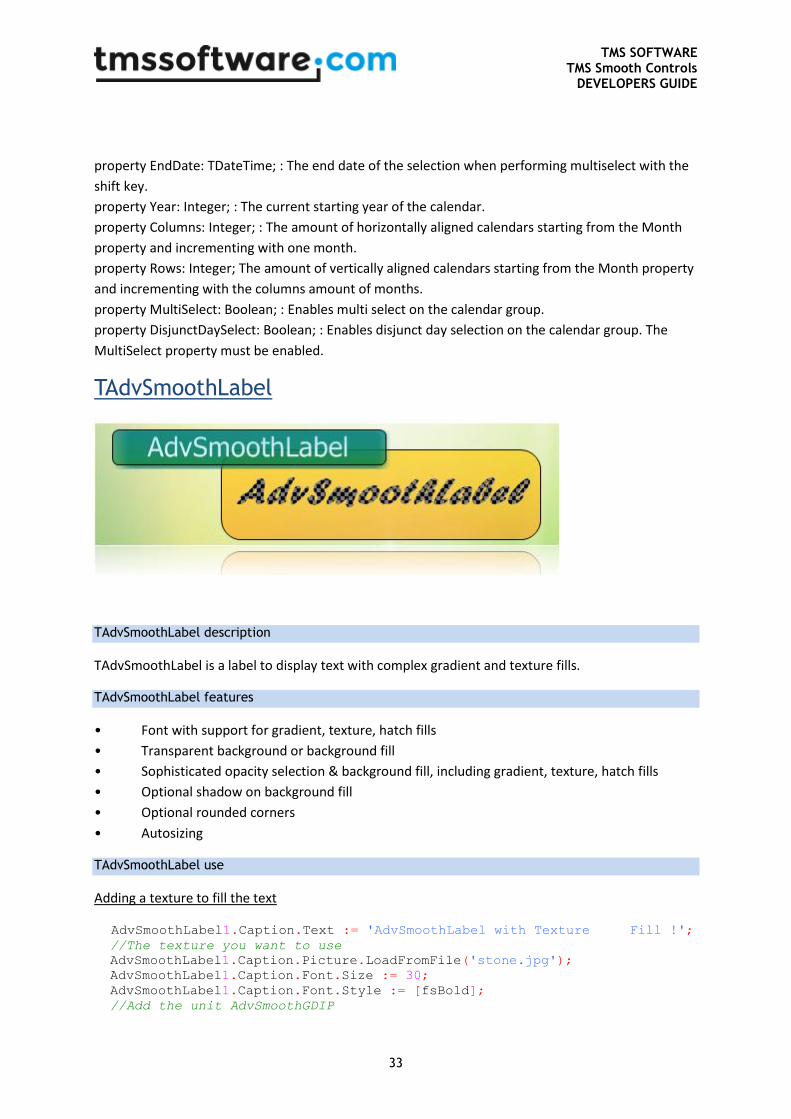
TAdvSmoothLabel
TAdvSmoothLabel description
TAdvSmoothLabel is a label to display text with complex gradient and texture fills.
TAdvSmoothLabel features
• Font with support for gradient, texture, hatch fills
• Transparent background or background fill
• Sophisticated opacity selection & background fill, including gradient, texture, hatch fills
• Optional shadow on background fill
• Optional rounded corners
• Autosizing
TAdvSmoothLabel use
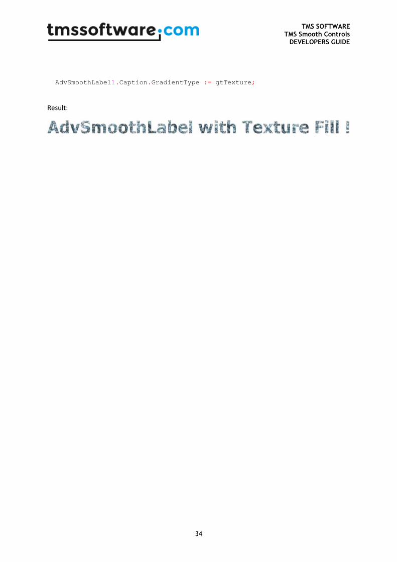
Adding a texture to fill the text
AdvSmoothLabel1.Caption.Text := 'AdvSmoothLabel with Texture Fill !';
//The texture you want to use
AdvSmoothLabel1.Caption.Picture.LoadFromFile('stone.jpg');
AdvSmoothLabel1.Caption.Font.Size := 30;
AdvSmoothLabel1.Caption.Font.Style := [fsBold];
//Add the unit AdvSmoothGDIP
TMS SOFTWARE TMS Smooth Controls
DEVELOPERS GUIDE
34
AdvSmoothLabel1.Caption.GradientType := gtTexture;
Result:
TMS SOFTWARE TMS Smooth Controls
DEVELOPERS GUIDE
35
TAdvSmoothListBox
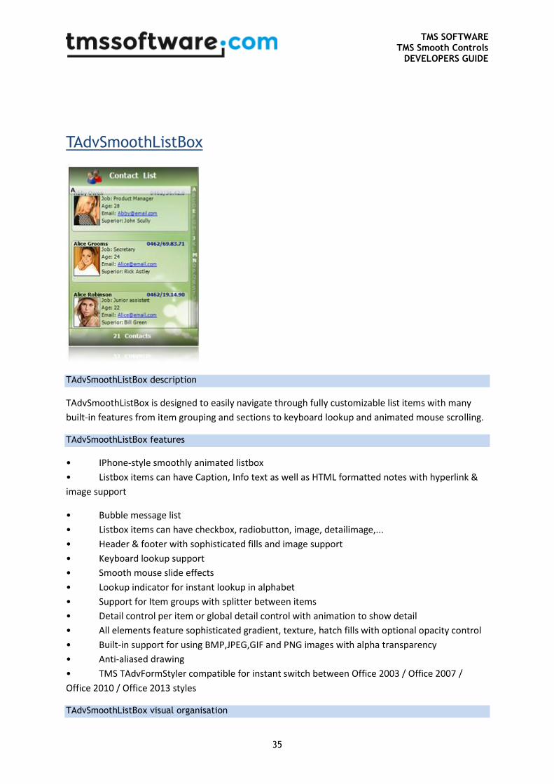
TAdvSmoothListBox description
TAdvSmoothListBox is designed to easily navigate through fully customizable list items with many
built-in features from item grouping and sections to keyboard lookup and animated mouse scrolling.
TAdvSmoothListBox features
• IPhone-style smoothly animated listbox
• Listbox items can have Caption, Info text as well as HTML formatted notes with hyperlink &
image support
• Bubble message list
• Listbox items can have checkbox, radiobutton, image, detailimage,...
• Header & footer with sophisticated fills and image support
• Keyboard lookup support
• Smooth mouse slide effects
• Lookup indicator for instant lookup in alphabet
• Support for Item groups with splitter between items
• Detail control per item or global detail control with animation to show detail
• All elements feature sophisticated gradient, texture, hatch fills with optional opacity control
• Built-in support for using BMP,JPEG,GIF and PNG images with alpha transparency
• Anti-aliased drawing
• TMS TAdvFormStyler compatible for instant switch between Office 2003 / Office 2007 /
Office 2010 / Office 2013 styles
TAdvSmoothListBox visual organisation
TMS SOFTWARE TMS Smooth Controls
DEVELOPERS GUIDE
36
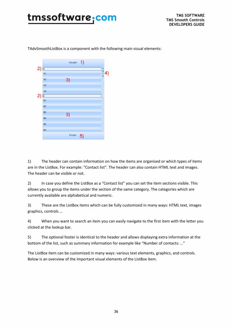
TAdvSmoothListBox is a component with the following main visual elements:
1) The header can contain information on how the items are organised or which types of items
are in the ListBox. For example: “Contact list”. The header can also contain HTML text and images.
The header can be visible or not.
2) In case you define the ListBox as a “Contact list” you can set the item sections visible. This
allows you to group the items under the section of the same category. The categories which are
currently available are alphabetical and numeric.
3) These are the ListBox items which can be fully customized in many ways: HTML text, images
graphics, controls …
4) When you want to search an item you can easily navigate to the first item with the letter you
clicked at the lookup bar.
5) The optional footer is identical to the header and allows displaying extra information at the
bottom of the list, such as summary information for example like “Number of contacts: …”
The ListBox item can be customized in many ways: various text elements, graphics, and controls.
Below is an overview of the important visual elements of the ListBox item.
TMS SOFTWARE TMS Smooth Controls
DEVELOPERS GUIDE
37
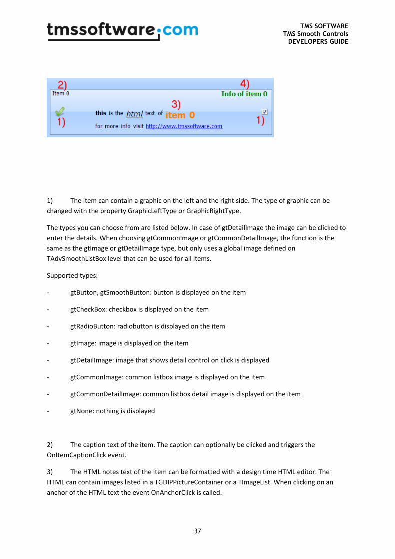
1) The item can contain a graphic on the left and the right side. The type of graphic can be
changed with the property GraphicLeftType or GraphicRightType.
The types you can choose from are listed below. In case of gtDetailImage the image can be clicked to
enter the details. When choosing gtCommonImage or gtCommonDetailImage, the function is the
same as the gtImage or gtDetailImage type, but only uses a global image defined on
TAdvSmoothListBox level that can be used for all items.
Supported types:
- gtButton, gtSmoothButton: button is displayed on the item
- gtCheckBox: checkbox is displayed on the item
- gtRadioButton: radiobutton is displayed on the item
- gtImage: image is displayed on the item
- gtDetailImage: image that shows detail control on click is displayed
- gtCommonImage: common listbox image is displayed on the item
- gtCommonDetailImage: common listbox detail image is displayed on the item
- gtNone: nothing is displayed
2) The caption text of the item. The caption can optionally be clicked and triggers the
OnItemCaptionClick event.
3) The HTML notes text of the item can be formatted with a design time HTML editor. The
HTML can contain images listed in a TGDIPPictureContainer or a TImageList. When clicking on an
anchor of the HTML text the event OnAnchorClick is called.
TMS SOFTWARE TMS Smooth Controls
DEVELOPERS GUIDE
38
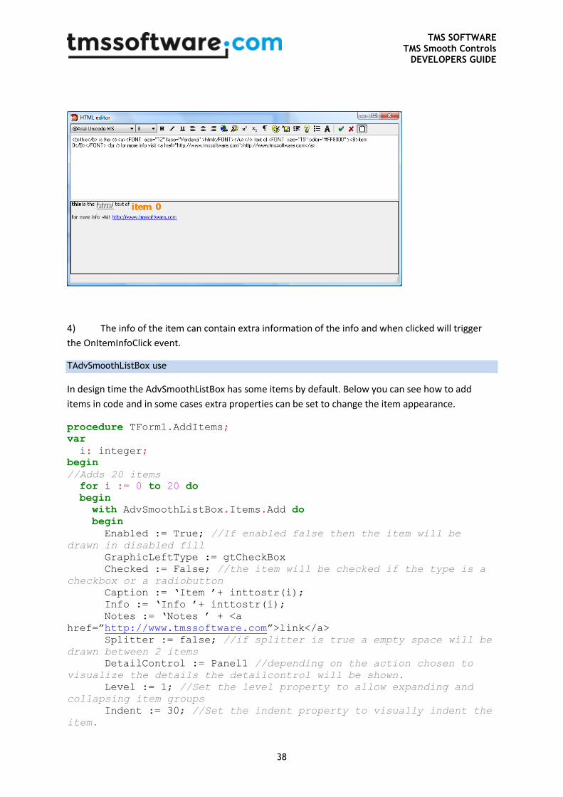
4) The info of the item can contain extra information of the info and when clicked will trigger
the OnItemInfoClick event.
TAdvSmoothListBox use
In design time the AdvSmoothListBox has some items by default. Below you can see how to add
items in code and in some cases extra properties can be set to change the item appearance.
procedure TForm1.AddItems;
var
i: integer;
begin
//Adds 20 items
for i := 0 to 20 do
begin
with AdvSmoothListBox.Items.Add do
begin
Enabled := True; //If enabled false then the item will be
drawn in disabled fill
GraphicLeftType := gtCheckBox
Checked := False; //the item will be checked if the type is a
checkbox or a radiobutton
Caption := ‘Item ’+ inttostr(i);
Info := ‘Info ’+ inttostr(i);
Notes := ‘Notes ’ + <a
href=”http://www.tmssoftware.com”>link</a>
Splitter := false; //if splitter is true a empty space will be
drawn between 2 items
DetailControl := Panel1 //depending on the action chosen to
visualize the details the detailcontrol will be shown.
Level := 1; //Set the level property to allow expanding and
collapsing item groups
Indent := 30; //Set the indent property to visually indent the
item.
TMS SOFTWARE TMS Smooth Controls
DEVELOPERS GUIDE
39
end;
end;
end;
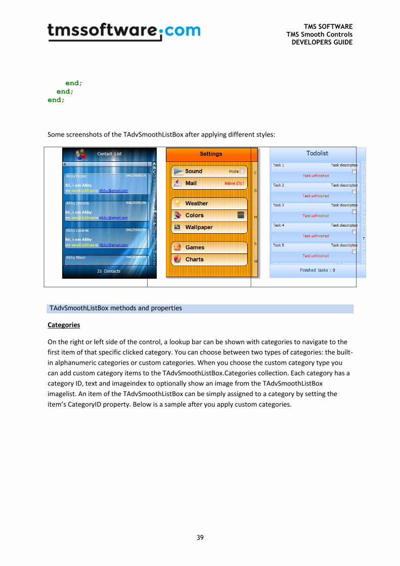
Some screenshots of the TAdvSmoothListBox after applying different styles:
TAdvSmoothListBox methods and properties
Categories
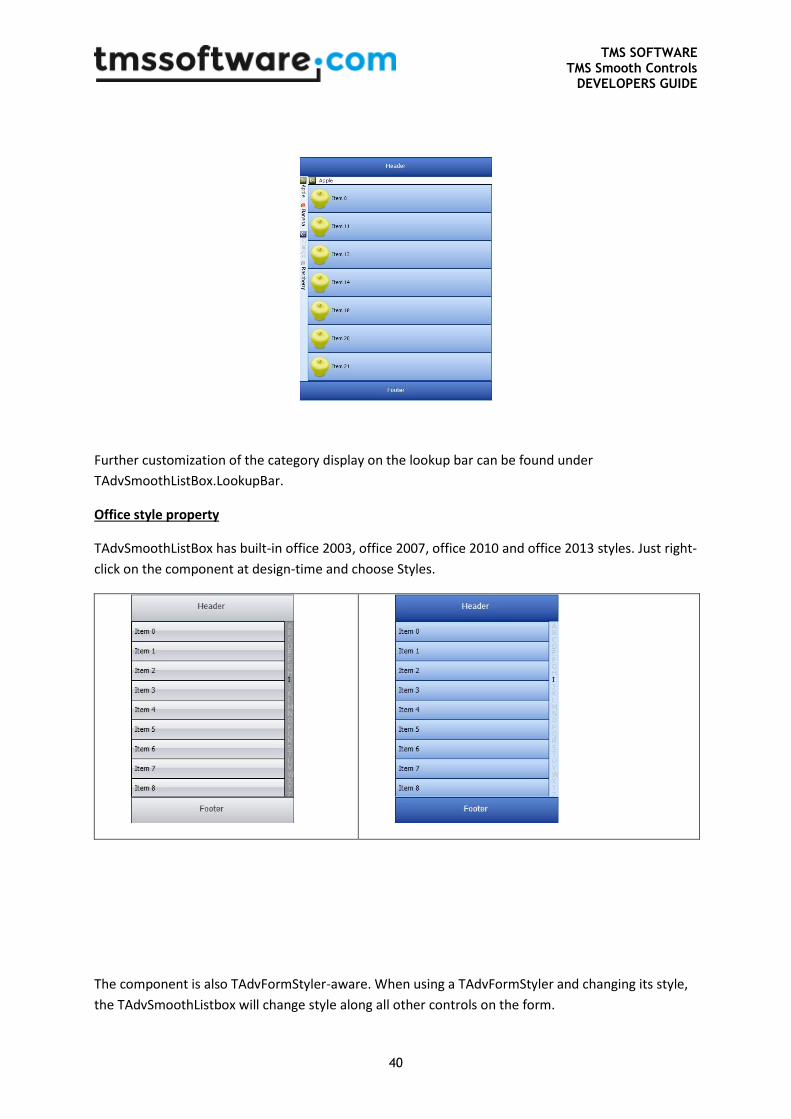
On the right or left side of the control, a lookup bar can be shown with categories to navigate to the
first item of that specific clicked category. You can choose between two types of categories: the built-
in alphanumeric categories or custom categories. When you choose the custom category type you
can add custom category items to the TAdvSmoothListBox.Categories collection. Each category has a
category ID, text and imageindex to optionally show an image from the TAdvSmoothListBox
imagelist. An item of the TAdvSmoothListBox can be simply assigned to a category by setting the
item’s CategoryID property. Below is a sample after you apply custom categories.
TMS SOFTWARE TMS Smooth Controls
DEVELOPERS GUIDE
40
Further customization of the category display on the lookup bar can be found under
TAdvSmoothListBox.LookupBar.
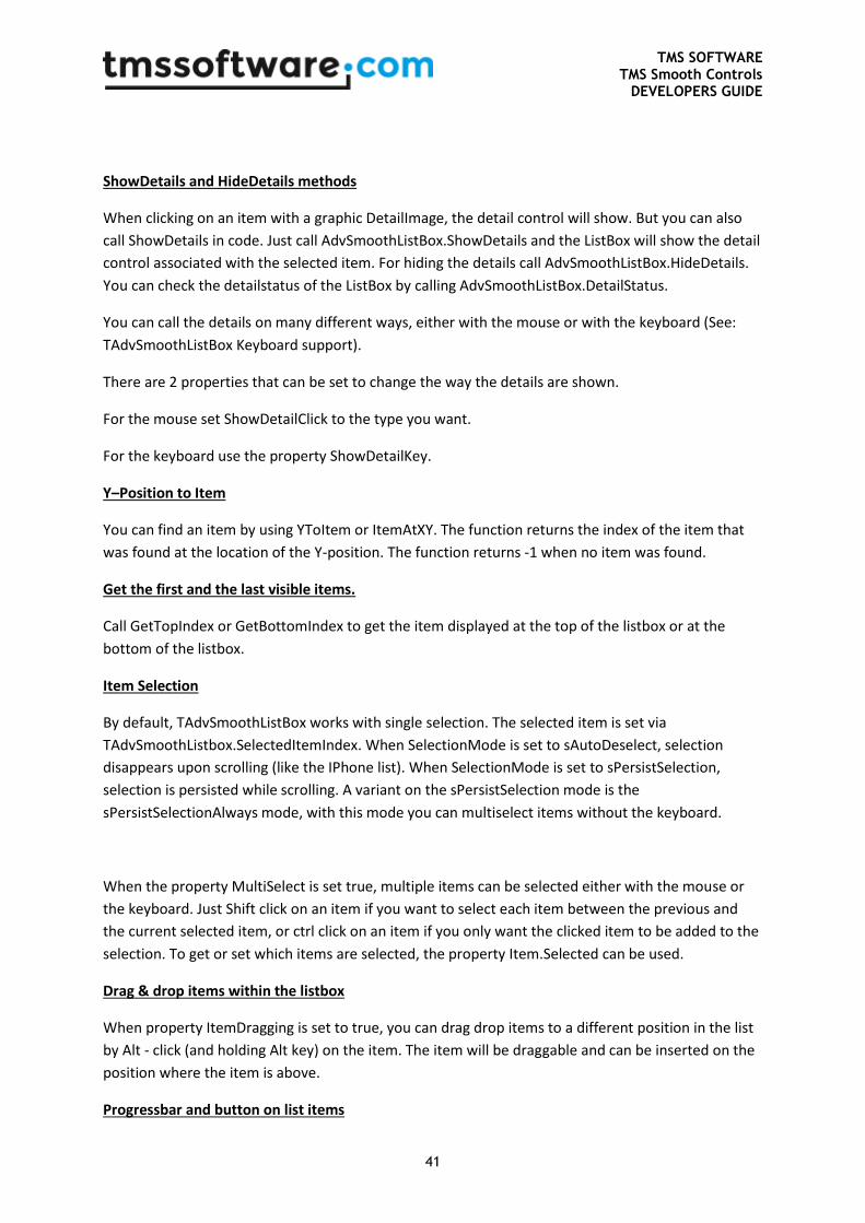
Office style property
TAdvSmoothListBox has built-in office 2003, office 2007, office 2010 and office 2013 styles. Just right-
click on the component at design-time and choose Styles.
The component is also TAdvFormStyler-aware. When using a TAdvFormStyler and changing its style,
the TAdvSmoothListbox will change style along all other controls on the form.
TMS SOFTWARE TMS Smooth Controls
DEVELOPERS GUIDE
41
ShowDetails and HideDetails methods
When clicking on an item with a graphic DetailImage, the detail control will show. But you can also
call ShowDetails in code. Just call AdvSmoothListBox.ShowDetails and the ListBox will show the detail
control associated with the selected item. For hiding the details call AdvSmoothListBox.HideDetails.
You can check the detailstatus of the ListBox by calling AdvSmoothListBox.DetailStatus.
You can call the details on many different ways, either with the mouse or with the keyboard (See:
TAdvSmoothListBox Keyboard support).
There are 2 properties that can be set to change the way the details are shown.
For the mouse set ShowDetailClick to the type you want.
For the keyboard use the property ShowDetailKey.
Y–Position to Item
You can find an item by using YToItem or ItemAtXY. The function returns the index of the item that
was found at the location of the Y-position. The function returns -1 when no item was found.
Get the first and the last visible items.
Call GetTopIndex or GetBottomIndex to get the item displayed at the top of the listbox or at the
bottom of the listbox.
Item Selection
By default, TAdvSmoothListBox works with single selection. The selected item is set via
TAdvSmoothListbox.SelectedItemIndex. When SelectionMode is set to sAutoDeselect, selection
disappears upon scrolling (like the IPhone list). When SelectionMode is set to sPersistSelection,
selection is persisted while scrolling. A variant on the sPersistSelection mode is the
sPersistSelectionAlways mode, with this mode you can multiselect items without the keyboard.
When the property MultiSelect is set true, multiple items can be selected either with the mouse or
the keyboard. Just Shift click on an item if you want to select each item between the previous and
the current selected item, or ctrl click on an item if you only want the clicked item to be added to the
selection. To get or set which items are selected, the property Item.Selected can be used.
Drag & drop items within the listbox
When property ItemDragging is set to true, you can drag drop items to a different position in the list
by Alt - click (and holding Alt key) on the item. The item will be draggable and can be inserted on the
position where the item is above.
Progressbar and button on list items
TMS SOFTWARE TMS Smooth Controls
DEVELOPERS GUIDE
42
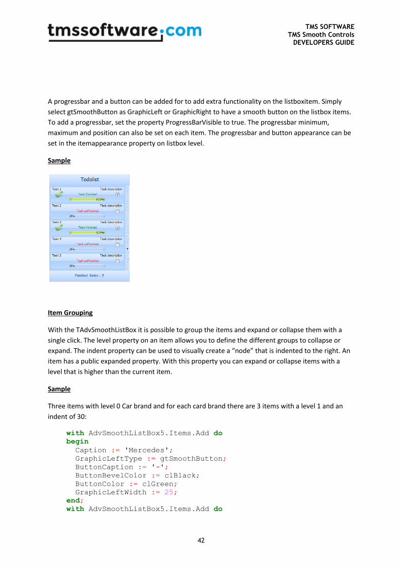
A progressbar and a button can be added for to add extra functionality on the listboxitem. Simply
select gtSmoothButton as GraphicLeft or GraphicRight to have a smooth button on the listbox items.
To add a progressbar, set the property ProgressBarVisible to true. The progressbar minimum,
maximum and position can also be set on each item. The progressbar and button appearance can be
set in the itemappearance property on listbox level.
Sample
Item Grouping
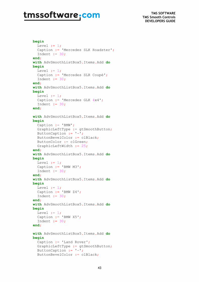
With the TAdvSmoothListBox it is possible to group the items and expand or collapse them with a
single click. The level property on an item allows you to define the different groups to collapse or
expand. The indent property can be used to visually create a “node” that is indented to the right. An
item has a public expanded property. With this property you can expand or collapse items with a
level that is higher than the current item.
Sample
Three items with level 0 Car brand and for each card brand there are 3 items with a level 1 and an
indent of 30:
with AdvSmoothListBox5.Items.Add do
begin
Caption := 'Mercedes';
GraphicLeftType := gtSmoothButton;
ButtonCaption := '-';
ButtonBevelColor := clBlack;
ButtonColor := clGreen;
GraphicLeftWidth := 25;
end;
with AdvSmoothListBox5.Items.Add do
TMS SOFTWARE TMS Smooth Controls
DEVELOPERS GUIDE
43
begin
Level := 1;
Caption := 'Mercedes SLK Roadster';
Indent := 30;
end;
with AdvSmoothListBox5.Items.Add do
begin
Level := 1;
Caption := 'Mercedes SLR Coupé';
Indent := 30;
end;
with AdvSmoothListBox5.Items.Add do
begin
Level := 1;
Caption := 'Mercedes GLK 4x4';
Indent := 30;
end;
with AdvSmoothListBox5.Items.Add do
begin
Caption := 'BMW';
GraphicLeftType := gtSmoothButton;
ButtonCaption := '-';
ButtonBevelColor := clBlack;
ButtonColor := clGreen;
GraphicLeftWidth := 25;
end;
with AdvSmoothListBox5.Items.Add do
begin
Level := 1;
Caption := 'BMW M3';
Indent := 30;
end;
with AdvSmoothListBox5.Items.Add do
begin
Level := 1;
Caption := 'BMW Z4';
Indent := 30;
end;
with AdvSmoothListBox5.Items.Add do
begin
Level := 1;
Caption := 'BMW X5';
Indent := 30;
end;
with AdvSmoothListBox5.Items.Add do
begin
Caption := 'Land Rover';
GraphicLeftType := gtSmoothButton;
ButtonCaption := '-';
ButtonBevelColor := clBlack;
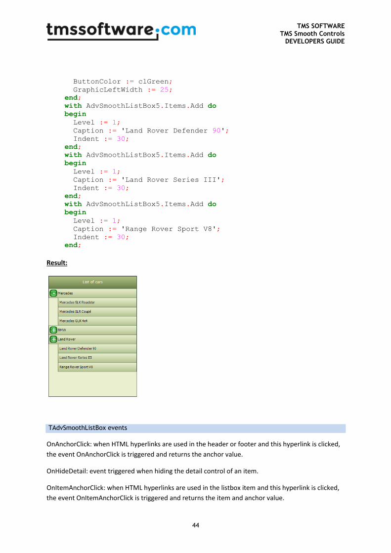
TMS SOFTWARE TMS Smooth Controls
DEVELOPERS GUIDE
44
ButtonColor := clGreen;
GraphicLeftWidth := 25;
end;
with AdvSmoothListBox5.Items.Add do
begin
Level := 1;
Caption := 'Land Rover Defender 90';
Indent := 30;
end;
with AdvSmoothListBox5.Items.Add do
begin
Level := 1;
Caption := 'Land Rover Series III';
Indent := 30;
end;
with AdvSmoothListBox5.Items.Add do
begin
Level := 1;
Caption := 'Range Rover Sport V8';
Indent := 30;
end;
Result:
TAdvSmoothListBox events
OnAnchorClick: when HTML hyperlinks are used in the header or footer and this hyperlink is clicked,
the event OnAnchorClick is triggered and returns the anchor value.
OnHideDetail: event triggered when hiding the detail control of an item.
OnItemAnchorClick: when HTML hyperlinks are used in the listbox item and this hyperlink is clicked,
the event OnItemAnchorClick is triggered and returns the item and anchor value.
TMS SOFTWARE TMS Smooth Controls
DEVELOPERS GUIDE
45
OnItemBkgDraw: event triggered when drawing the background of the item. Set parameter
DefaultDraw = true if you want that default drawing is also done by the TAdvSmoothListBox itself.
OnItemCaptionClick: event triggered when clicking on the caption of an item.
OnItemButtonClick: event triggered when clicking on the button of an item.
OnItemCheckClick: when adding checkboxes to the items this event will be triggered when clicking on
a checkbox.
OnItemClick: event triggered when clicking on the item.
OnItemDblClick: event triggered when double-clicking on the item.
OnItemDraw: event triggered when drawing the item. This event can be used to customize the item
appearance. Set parameter DefaultDraw = true if you want that default drawing is also done by the
TAdvSmoothListBox itself.
OnItemImageClick: when adding an image as a left or right graphic in the item, this event will be
triggered if you click on the image.
OnItemInfoClick: event triggered when clicking on the info.
OnItemRadioClick: when adding radio buttons this event will be triggered if you click on the radio
button.
OnItemText: event called when drawing text on the item. The text can be changed dynamically
through this event.
OnShowDetail: event called when showing the detail control of an item.
OnItemMouseLeave / OnItemMouseEnter: event called when entering or leaving an item.
OnItemHint: event called when hovering an item and the showHint property is true. A hint can be set
on every item with the item.Hint property.
OnHeaderClick / OnFooterClick: Event called when clicking on the footer or the header.
OnLookUpClick: Event called when clicking on the lookupbar.
OnSelectionChanged: Event called when item selection changes.
OnItemDragOver: Event called when an item is dragged over another item.
OnItemDragEnd: Event called when dropping an item outside of the area of the items.
OnItemDragDrop: Event called when dropping an item inside of the area of the items.
TMS SOFTWARE TMS Smooth Controls
DEVELOPERS GUIDE
46
OnItemDragStart: Event called when alt-clicking on an item and moving the mouse up or down.
TAdvSmoothListBox keyboard and mouse support
Keyboard
When tabstop is set to true, full keyboard support is enabled for listbox. Below is a list of keys that
will allow you to navigate through the listbox without using the mouse.
First of all you can show and hide the detail control of an item by pushing the key set in the
ShowDetailKey property of the TAdvSmoothListBox.
Keys which can be used to show or hide the details:
- Space
- F2
- Return
- None (no detailkey)
The keys below are used to navigate through the AdvSmoothListBox.
- Arrow key down : Scroll one item down
- Arrow key up: Scroll one item up
- Home key: Scroll to the first item
- End key: Scroll to the last item
- Page down key: scroll down in steps of 5 items
- Page up key scroll up in steps of 5 items
- Ctrl – space : toggle selection of the item in multi selection mode
Mouse
A drag-release mouse move allows you to scroll up or down through the items. Like the keyboard you
can use the mouse to enter the details of the item. With the ShowDetailClick property you can set
the way you have to click before the detail of the item is showing.
These are the values you can set:
TMS SOFTWARE TMS Smooth Controls
DEVELOPERS GUIDE
47
- sdOnClick: detail control is shown upon click in the entire item rectangle
- sdOnDblClick: detail control is shown upon double click in the entire item rectangle
- sdOnDetailImageClick: detail control is shown upon click on the detail image (left or right)
- sdOnDetailImageDblClick: detail control is shown upon double click on the detail image (left or
right)
TMS SOFTWARE TMS Smooth Controls
DEVELOPERS GUIDE
48
TDBAdvSmoothListBox usage
DB Version of the TAdvSmoothListBox.
TDBAdvSmoothListBox organisation
Connect the TDBAdvSmoothListBox to a Datasource, and set the Databinding properties:
CaptionField (String): The caption of the listbox item.
CaptionTemplate (String): The template used to display multiple fields in the caption of the listbox
item. A field is displayed between <# and > signs, sample: <#Brand>
CheckedField (Boolean): Sets the status of the graphicright in case the graphicrighttype is a
checkbox/radiobutton
GraphicRightField (Blob): The image of the graphicright in case the graphicrighttype is an image
GraphicLeftField (Blob): The image of the graphicleft in case the graphiclefttype is an image
HintField (String): The hint of the listbox item.
InfoField (String): The info text of the listbox item.
NotesField (String): The notes text of the listbox item.
NotesTemplate: The template used to display multiple fields in the notes of the listbox item. A field is
displayed between <# and > signs, sample: <#Brand>
ProgressValueField (float): The progress value in case the progress bar is visible and active.

TMS SOFTWARE TMS Smooth Controls
DEVELOPERS GUIDE
49
TAdvSmoothImageListBox & TAdvSmoothImageListBoxPicker
TAdvSmoothImageListBox & TAdvSmoothListBoxPicker description
TAdvSmoothImageListBox is designed to easily navigate through large folders with many images
(JPEG, BMP, GIF, PNG, TIFF, ICO). The listbox has several features such as keyboard navigation,
header, footer, lookup, vertical or horizontal scrolling, fully customizable top layer items which
enhance the look and feel of the component and much more. The component can perform threaded
fast loading of image thumbnails for high speed & low memory usage.
TAdvSmoothImageListBoxPicker is derived from TAdvSmoothImageListBox and provides selection of
items with images and text via a dropdown.
TAdvSmoothImageListBox & TadvSmoothListBoxPicker features
• Smoothly animated image thumbnail list & picker
• Automatic background thread loading for high performance
• Automatic thumbnail creation for minimal memory usage
• Listbox items can have HTML formatted Caption text with hyperlink & image support
• Listbox items can have images with zooming capability.
• Listbox items can be arranged in columns or in rows with keyboard & mouse animated
scrolling
• Default image can be used to be displayed in case of unloaded images.
• Fully customizable item appearance with text and image properties.
• Header & footer with sophisticated fills and image support.
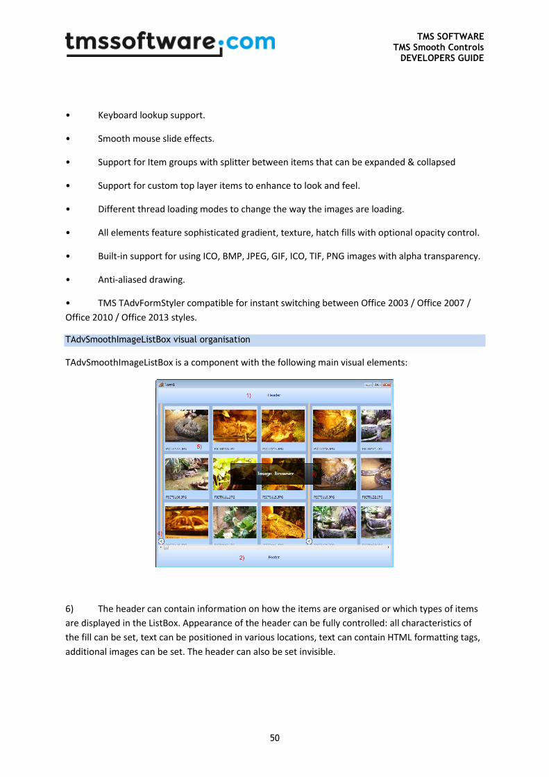
TMS SOFTWARE TMS Smooth Controls
DEVELOPERS GUIDE
50
• Keyboard lookup support.
• Smooth mouse slide effects.
• Support for Item groups with splitter between items that can be expanded & collapsed
• Support for custom top layer items to enhance to look and feel.
• Different thread loading modes to change the way the images are loading.
• All elements feature sophisticated gradient, texture, hatch fills with optional opacity control.
• Built-in support for using ICO, BMP, JPEG, GIF, ICO, TIF, PNG images with alpha transparency.
• Anti-aliased drawing.
• TMS TAdvFormStyler compatible for instant switching between Office 2003 / Office 2007 /
Office 2010 / Office 2013 styles.
TAdvSmoothImageListBox visual organisation
TAdvSmoothImageListBox is a component with the following main visual elements:
6) The header can contain information on how the items are organised or which types of items
are displayed in the ListBox. Appearance of the header can be fully controlled: all characteristics of
the fill can be set, text can be positioned in various locations, text can contain HTML formatting tags,
additional images can be set. The header can also be set invisible.
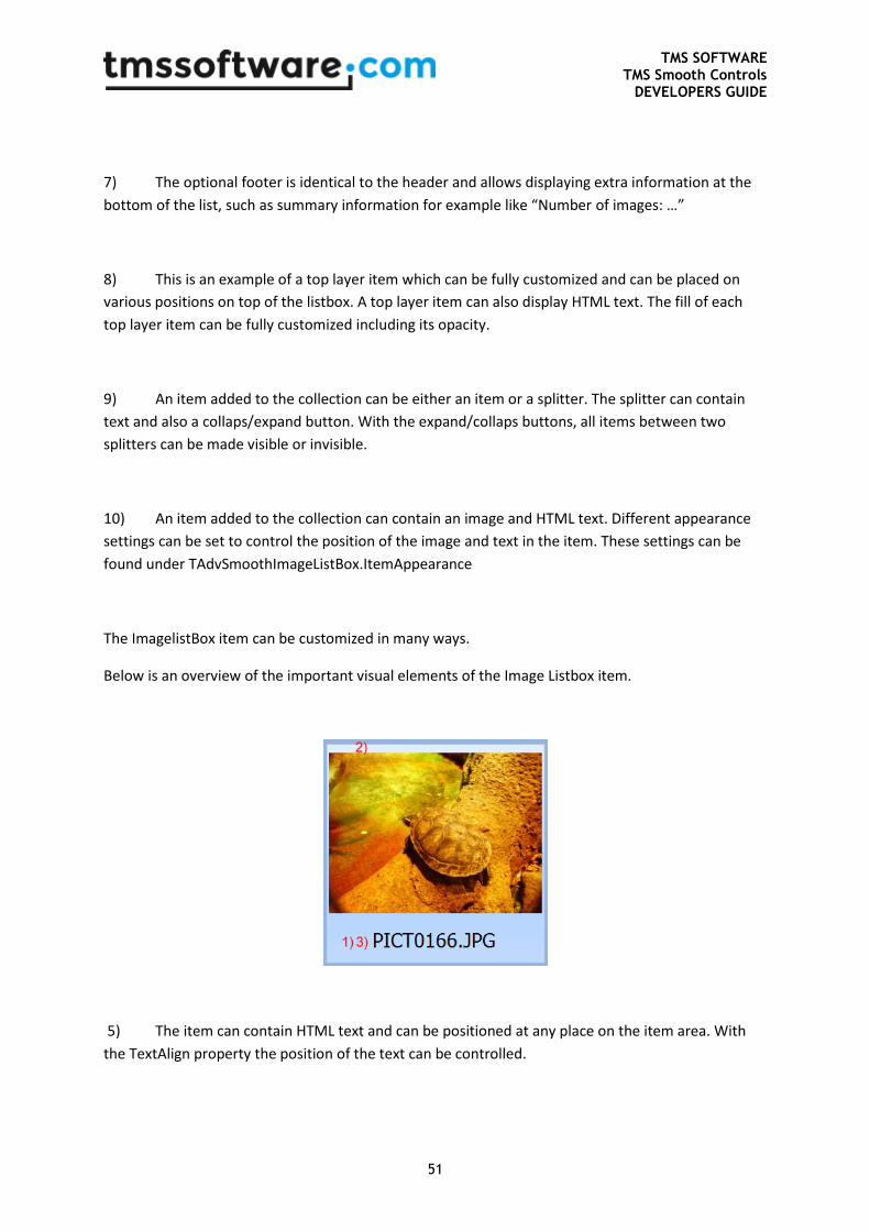
TMS SOFTWARE TMS Smooth Controls
DEVELOPERS GUIDE
51
7) The optional footer is identical to the header and allows displaying extra information at the
bottom of the list, such as summary information for example like “Number of images: …”
8) This is an example of a top layer item which can be fully customized and can be placed on
various positions on top of the listbox. A top layer item can also display HTML text. The fill of each
top layer item can be fully customized including its opacity.
9) An item added to the collection can be either an item or a splitter. The splitter can contain
text and also a collaps/expand button. With the expand/collaps buttons, all items between two
splitters can be made visible or invisible.
10) An item added to the collection can contain an image and HTML text. Different appearance
settings can be set to control the position of the image and text in the item. These settings can be
found under TAdvSmoothImageListBox.ItemAppearance
The ImagelistBox item can be customized in many ways.
Below is an overview of the important visual elements of the Image Listbox item.
5) The item can contain HTML text and can be positioned at any place on the item area. With
the TextAlign property the position of the text can be controlled.
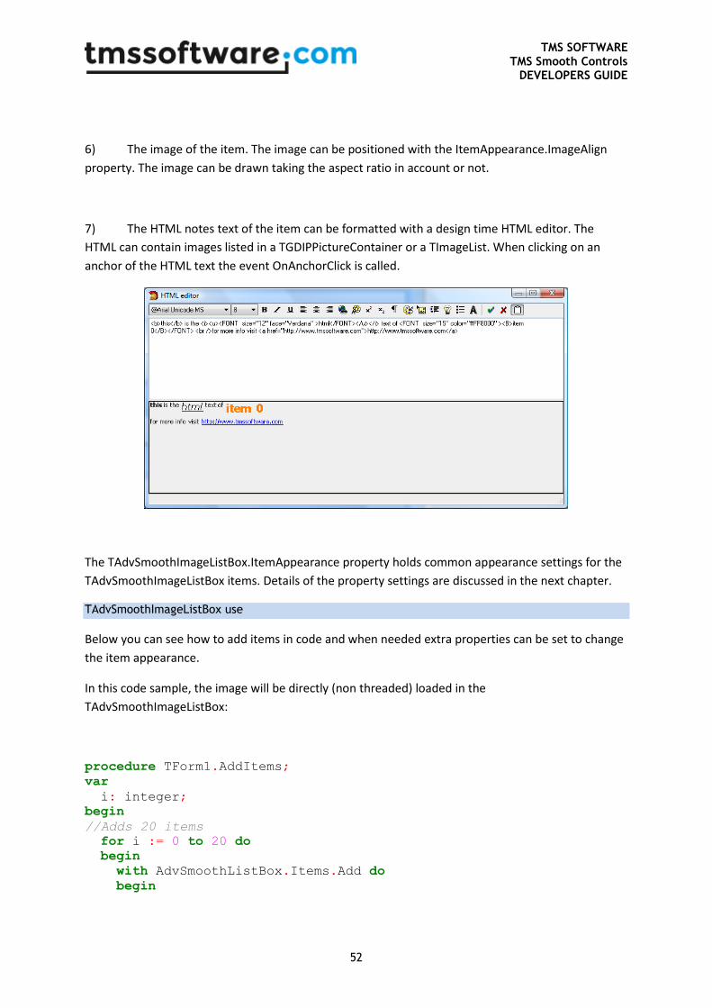
TMS SOFTWARE TMS Smooth Controls
DEVELOPERS GUIDE
52
6) The image of the item. The image can be positioned with the ItemAppearance.ImageAlign
property. The image can be drawn taking the aspect ratio in account or not.
7) The HTML notes text of the item can be formatted with a design time HTML editor. The
HTML can contain images listed in a TGDIPPictureContainer or a TImageList. When clicking on an
anchor of the HTML text the event OnAnchorClick is called.
The TAdvSmoothImageListBox.ItemAppearance property holds common appearance settings for the
TAdvSmoothImageListBox items. Details of the property settings are discussed in the next chapter.
TAdvSmoothImageListBox use
Below you can see how to add items in code and when needed extra properties can be set to change
the item appearance.
In this code sample, the image will be directly (non threaded) loaded in the
TAdvSmoothImageListBox:
procedure TForm1.AddItems;
var
i: integer;
begin
//Adds 20 items
for i := 0 to 20 do
begin
with AdvSmoothListBox.Items.Add do
begin
TMS SOFTWARE TMS Smooth Controls
DEVELOPERS GUIDE
53
Enabled := True; //If enabled false then the item will be
drawn in disabled fill
Visible := false; //the item will be invisible
Image.LoadFromFile(‘image1.jpg’); //the image will be loaded
on the item
Caption.Text := ‘Item ’+ inttostr(i);
Splitter := false; //if splitter is true a splitter will be
drawn between the items
…
end;
end;
end;
To have the listbox background thread load the images for higher responsiveness of the application,
following code can be used:
procedure TForm1.AddItems;
var
i: integer;
begin
//Adds 20 items
for i := 0 to 20 do
begin
with AdvSmoothListBox.Items.Add do
begin
Enabled := True; //If enabled false then the item will be
drawn in disabled fill
Visible := false; //the item will be invisible
Location := ‘image1.jpg’; //the image will be loaded by thread
Caption.Text := ‘Item ’+ inttostr(i);
Splitter := false; //if splitter is true a splitter will be
drawn between the items
…
end;
end;
end;
You can also add a complete directory of images either threaded or not threaded. When the
threaded method is choosen, the images are loaded via a separate thread. This separate thread loads
only the visible images for efficiency. As the list is scrolled, new visible item’s images will be loaded
by this thread.
Not threaded:
TMS SOFTWARE TMS Smooth Controls
DEVELOPERS GUIDE
54
AdvSmoothImageListBox.AddImagesFromFolder(‘C:\directory\*.jpg’);
Threaded:
AdvSmoothImageListBox.AddImageLocationsFromFolder(‘C:\directory\*.jpg’);
Image types supported are: JPG, JPEG, BMP, PNG, GIF, TIFF and ICO.
TAdvSmoothImageListBox properties
ItemAppearance property
This holds the common appearance settings for items in the list.
• AspectRatio: when true, images are drawn respecting aspect ratio
• AutoSize : when true, size of items is reduced to fill the listbox area when too large
• DisabledFill: sets the fill of disabled list items
• Fill: sets the fill of items in normal state
• HoverFill: sets the fill of items when the mouse is over the item
• HoverSize: sets the increment of the item size when the mouse hovers the item. Setting
this to 10 for example will increase the item size by 10 pixels on mouse hovering
• ImageAlign: sets the alignment of the image within the item rectangle
• ImageHeight: sets the height of the image within the item rectangle
• ImageLeft: sets the left position in pixels of the image within the item rectangle
• ImageMargin: sets the margin of the image from the item outer rectangle
• ImageTop: sets the top position in pixels of the image within the item rectangle
• ImageVisible: when false, the image is not visible
• ImageWidth: sets the width of the image within the item rectangle
• ItemHeight: sets the item height
• ItemHorizontalSpacing: sets the horizontal spacing between two items
TMS SOFTWARE TMS Smooth Controls
DEVELOPERS GUIDE
55
• ItemVerticalSpacing: sets the vertical spacing between two items
• ItemWidth: sets the item width
• SelectedFill: sets the fill of the item in selected state
• Splitter: sets the appearance of a splitter item
• Stretch: With this property it can be controlled whether only shrinking is applied to images
larger than item width and item height or whether images are always either stretched or shrinked
to fit the item size. Often, it is not desirable that small images are stretched to a large item width /
height and for this purpose this controlling of the stretch mechanism is available.
Stretch modes:
isShrinkOnly: the images smaller than item size will not be stretched to the item width and height ,
only larger images will be shrinked.
isAlways: Always stretches or shrinks the images to the item width and height.
• TextAlign: sets the alignment of the text area of an item within the item rectangle
• TextHeight: sets the height of the text area
• TextLeft: sets the left position of the text area within the item rectangle
• TextMargin: sets the margin of the text area within the item rectangle
• TextTop: sets the top position of the text area within the item rectangle
• TextVisible: when false, the text is not visible
Columns and Rows
There are two ways of displaying items in the TAdvSmoothImagelistBox. Either with fixed columns
(Number of required Rows will be automatically calculated and vertical scrolling), or with fixed rows
(Number of columns is automatically calculated and horizontal scrolling). When columns are set you
must scroll up down with the mouse to navigate through the items and the splitters will be drawn
horizontally. When Rows are set you must scroll left right with the mouse and the splitters will be
drawn vertically.
Default Image
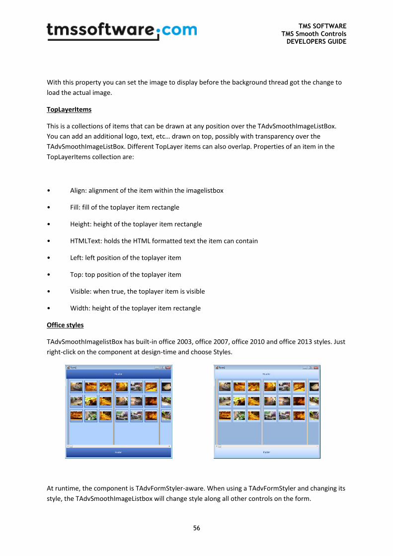
TMS SOFTWARE TMS Smooth Controls
DEVELOPERS GUIDE
56
With this property you can set the image to display before the background thread got the change to
load the actual image.
TopLayerItems
This is a collections of items that can be drawn at any position over the TAdvSmoothImageListBox.
You can add an additional logo, text, etc… drawn on top, possibly with transparency over the
TAdvSmoothImageListBox. Different TopLayer items can also overlap. Properties of an item in the
TopLayerItems collection are:
• Align: alignment of the item within the imagelistbox
• Fill: fill of the toplayer item rectangle
• Height: height of the toplayer item rectangle
• HTMLText: holds the HTML formatted text the item can contain
• Left: left position of the toplayer item
• Top: top position of the toplayer item
• Visible: when true, the toplayer item is visible
• Width: height of the toplayer item rectangle
Office styles
TAdvSmoothImagelistBox has built-in office 2003, office 2007, office 2010 and office 2013 styles. Just
right-click on the component at design-time and choose Styles.
At runtime, the component is TAdvFormStyler-aware. When using a TAdvFormStyler and changing its
style, the TAdvSmoothImageListbox will change style along all other controls on the form.
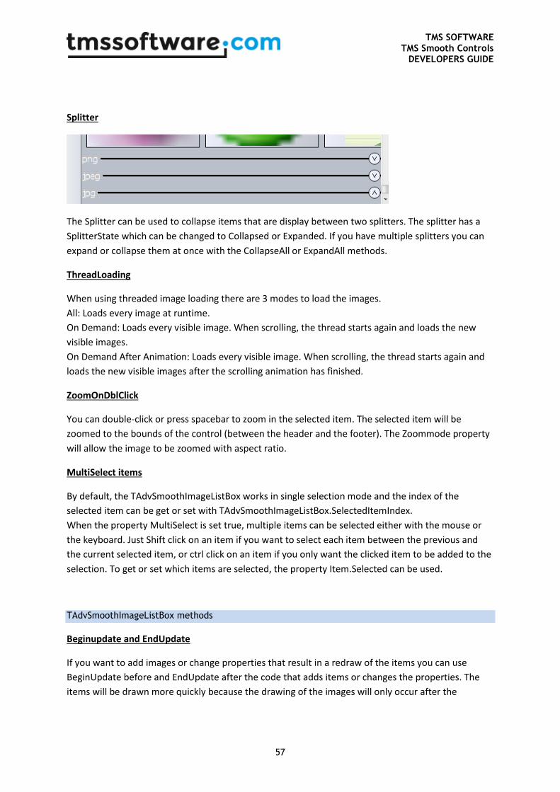
TMS SOFTWARE TMS Smooth Controls
DEVELOPERS GUIDE
57
Splitter
The Splitter can be used to collapse items that are display between two splitters. The splitter has a
SplitterState which can be changed to Collapsed or Expanded. If you have multiple splitters you can
expand or collapse them at once with the CollapseAll or ExpandAll methods.
ThreadLoading
When using threaded image loading there are 3 modes to load the images.
All: Loads every image at runtime.
On Demand: Loads every visible image. When scrolling, the thread starts again and loads the new
visible images.
On Demand After Animation: Loads every visible image. When scrolling, the thread starts again and
loads the new visible images after the scrolling animation has finished.
ZoomOnDblClick
You can double-click or press spacebar to zoom in the selected item. The selected item will be
zoomed to the bounds of the control (between the header and the footer). The Zoommode property
will allow the image to be zoomed with aspect ratio.
MultiSelect items
By default, the TAdvSmoothImageListBox works in single selection mode and the index of the
selected item can be get or set with TAdvSmoothImageListBox.SelectedItemIndex.
When the property MultiSelect is set true, multiple items can be selected either with the mouse or
the keyboard. Just Shift click on an item if you want to select each item between the previous and
the current selected item, or ctrl click on an item if you only want the clicked item to be added to the
selection. To get or set which items are selected, the property Item.Selected can be used.
TAdvSmoothImageListBox methods
Beginupdate and EndUpdate
If you want to add images or change properties that result in a redraw of the items you can use
BeginUpdate before and EndUpdate after the code that adds items or changes the properties. The
items will be drawn more quickly because the drawing of the images will only occur after the
TMS SOFTWARE TMS Smooth Controls
DEVELOPERS GUIDE
58
endupdate. When you do not use BeginUpdate and EndUpdate the drawing will also update but will
be slower, because the items will be updated for every changed property.
Recommended:
AdvSmoothImageListBox.Items.BeginUpdate;
// add many items here or changes several properties
AdvSmoothImageListBox.Items.EndUpdate;
StopThread and StartThread
When using threading to load the images you can interrupt the thread by calling StopThread. When
you want the thread to start loading the images you can call StartThread.
Items.FirstItem, Items.NextItem and Items.FirstSplitter, Items.NextSplitter
FirstItem allows you to lookup the first item that is not a splitter. NextItem will give you the next item
that is not a splitter. The parameter that must be given is the item index from where the next item is
looked up for.
FirstSplitter gives you the first splitter. NextSplitter looks up the next splitter starting from the item
index parameter.
Items.Find
With the function find, you can find an item that matches the given string as parameter. The function
then returns the ItemIndex of the item.
Items.ScrolltoItem
ScrollToItem allows you to scroll to the item at a certain position in the list. ScrolltoItem has only one
parameter: the ItemIndex of the item you want to scroll to.
TAdvSmoothImageListBox events
OnItemSelect: Event occurs when item is selected.
OnItemDblClick: Event occurs when item is double-clicked.
OnItemZoomIn: Event occurs when item is starting to zoom in.
OnItemZoomedIn: Event occurs when item is zoomed in.
OnItemZoomOut: Event occurs when item is starting to zoom out.
OnItemZoomedOut: Event occurs when item is zoomed out.
OnItemHint: Event occurs when item is hovered and the hint property is set.
TMS SOFTWARE TMS Smooth Controls
DEVELOPERS GUIDE
59
OnItemGetDisplayText: Event occurs when item caption is drawn.
OnNavigate: Event occurs when one of the navigator buttons in header or footer is clicked
OnScroll: Event occurs when scrolling through the list of items.
TMS TAdvSmoothImageListBox keyboard and mouse support
Keyboard
When tabstop is set to true, full keyboard support is enabled for the ImagelistBox. Below is a list of
keys that will allow you to navigate through the TAdvSmoothImageListBox without using the mouse.
Keys which can be used to zoom:
- Space
The keys below are used to navigate through the TAdvSmoothImageListBox.
- Arrow key down : Scroll one item down
- Arrow key up: Scroll one item up
- Home key: Scroll to the first item
- End key: Scroll to the last item
- Page down key: scroll to the next page of items
- Page up key scroll to the previous page of items
Mouse
The mouse can be used to scroll through the items (up/down or left/right depending on the settings
for Columns & Rows). Drag with the mouse and release to start the scrolling. The amount of scrolling
is proportional to the drag length and drag time. Items can be selected with a single mouse click. Like
the keyboard you can use the mouse to zoom the image (double-click). The mouse wheel can also be
used to scroll.
TAdvSmoothImageListBoxPicker
The TAdvSmoothImageListBoxPicker component is an edit control with dropdown that displays the
TAdvSmoothImageListBox. This TAdvSmoothImageListBox is fully accessible with all properties,
methods & events as described in the previous chapters via the property
TAdvSmoothImageListBox.ListBox. When an image is selected the text of the selected item will be set
in the text area of the edit control.
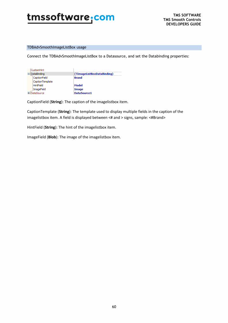
TMS SOFTWARE TMS Smooth Controls
DEVELOPERS GUIDE
60
TDBAdvSmoothImageListBox usage
Connect the TDBAdvSmoothImageListBox to a Datasource, and set the Databinding properties:
CaptionField (String): The caption of the imagelistbox item.
CaptionTemplate (String): The template used to display multiple fields in the caption of the
imagelistbox item. A field is displayed between <# and > signs, sample: <#Brand>
HintField (String): The hint of the imagelistbox item.
ImageField (Blob): The image of the imagelistbox item.
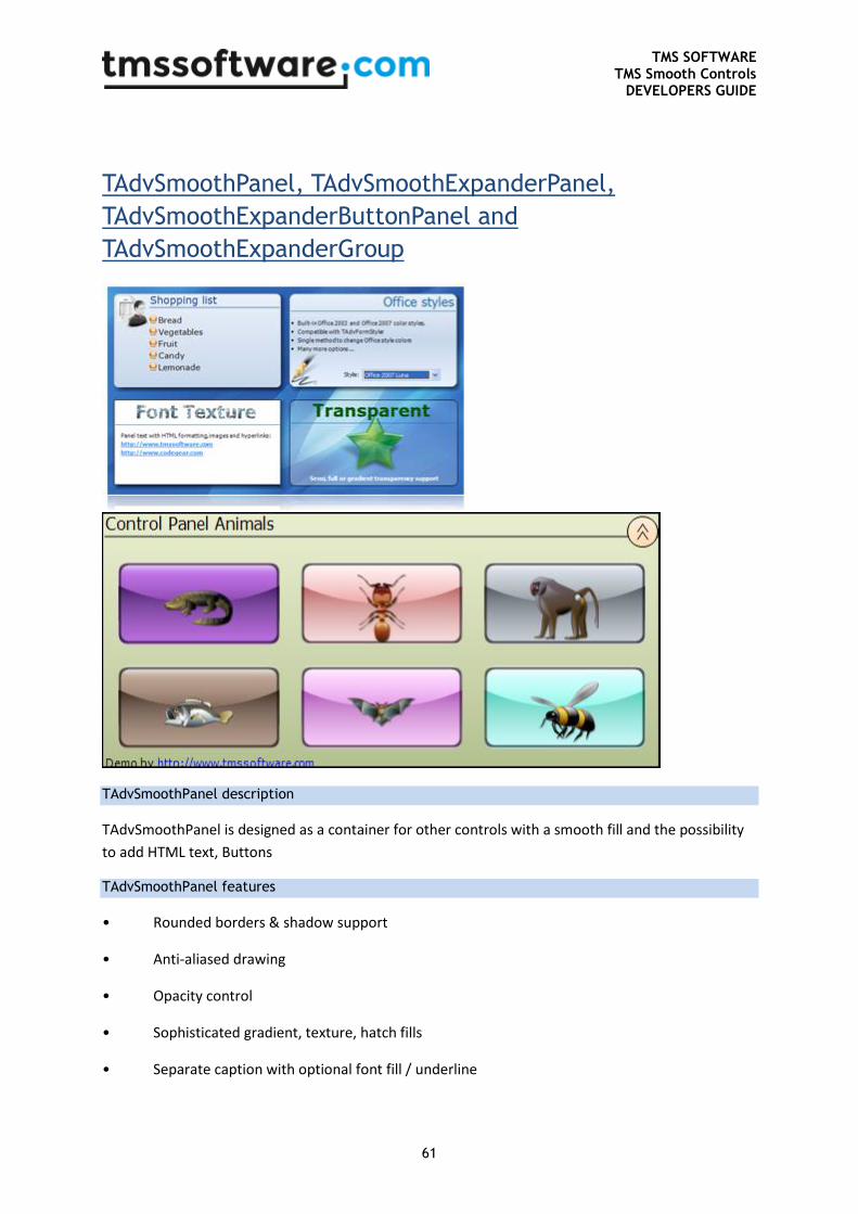
TMS SOFTWARE TMS Smooth Controls
DEVELOPERS GUIDE
61
TAdvSmoothPanel, TAdvSmoothExpanderPanel,
TAdvSmoothExpanderButtonPanel and
TAdvSmoothExpanderGroup
TAdvSmoothPanel description
TAdvSmoothPanel is designed as a container for other controls with a smooth fill and the possibility
to add HTML text, Buttons
TAdvSmoothPanel features
• Rounded borders & shadow support
• Anti-aliased drawing
• Opacity control
• Sophisticated gradient, texture, hatch fills
• Separate caption with optional font fill / underline
TMS SOFTWARE TMS Smooth Controls
DEVELOPERS GUIDE
62
• Background & foreground image at various positions with BMP, JPEG, GIF and full PNG alpha
transparency support
• HTML formatted panel content with optional hyperlinks, HTML specified images, ...
• TMS TAdvFormStyler compatible for instant switch between Office 2003 / Office 2007 /
Office 2010 / Office 2013 styles
• Supports TGDIPPictureContainer for sharing / reusing BMP,JPEG,GIF,PNG images
• TGDIPButton container
• Expandable collapsable panel
• Support for grouping TAdvSmoothExpanderButtonPanel with TAdvSmoothExpanderGroup
TAdvSmoothPanel use
Add a HTML list with groceries
In this sample the TGDIPPictureContainer component is used. Drop a TGDIPPictureContainer
component on the form and assign the TGDIPPictureContainer to the TAdvSmoothPanel.
This sample is based on the MiniHTML reference
AdvSmoothPanel1.Caption.Text := 'Grocery List'; AdvSmoothPanel1.Caption.HTMLLocation := plCustom;
AdvSmoothPanel1.Caption.HTMLLeft := 10;
AdvSmoothPanel1.Caption.HTMLTop := 10;
AdvSmoothPanel1.Caption.HTMLText := '<ul>'+
'<li><img src="0"/> Carrots'+
'<li><IMG src="0"> Bacon'+
'<li><IMG src="0"> Tomatoes'+
'<li><IMG src="0"> Bread'+
'<li><IMG src="0"> Garlic'+
'<li><IMG src="0"> Oranges</ul>';
AdvSmoothPanel1.Fill.Picture.LoadFromFile('shopping_cart.png');
AdvSmoothPanel1.Fill.PicturePosition := ppBottomRight;
Result:
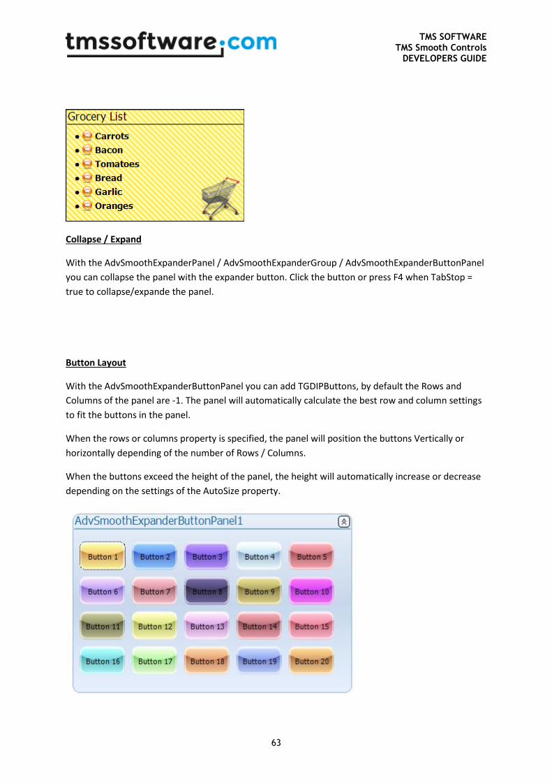
TMS SOFTWARE TMS Smooth Controls
DEVELOPERS GUIDE
63
Collapse / Expand
With the AdvSmoothExpanderPanel / AdvSmoothExpanderGroup / AdvSmoothExpanderButtonPanel
you can collapse the panel with the expander button. Click the button or press F4 when TabStop =
true to collapse/expande the panel.
Button Layout
With the AdvSmoothExpanderButtonPanel you can add TGDIPButtons, by default the Rows and
Columns of the panel are -1. The panel will automatically calculate the best row and column settings
to fit the buttons in the panel.
When the rows or columns property is specified, the panel will position the buttons Vertically or
horizontally depending of the number of Rows / Columns.
When the buttons exceed the height of the panel, the height will automatically increase or decrease
depending on the settings of the AutoSize property.
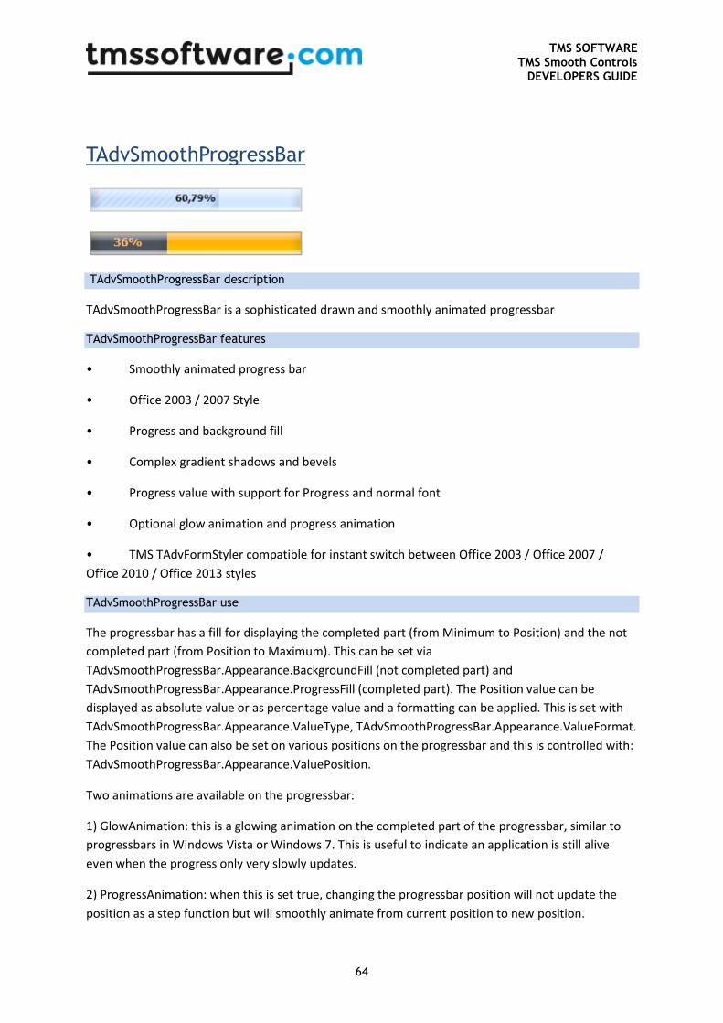
TMS SOFTWARE TMS Smooth Controls
DEVELOPERS GUIDE
64
TAdvSmoothProgressBar
TAdvSmoothProgressBar description
TAdvSmoothProgressBar is a sophisticated drawn and smoothly animated progressbar
TAdvSmoothProgressBar features
• Smoothly animated progress bar
• Office 2003 / 2007 Style
• Progress and background fill
• Complex gradient shadows and bevels
• Progress value with support for Progress and normal font
• Optional glow animation and progress animation
• TMS TAdvFormStyler compatible for instant switch between Office 2003 / Office 2007 /
Office 2010 / Office 2013 styles
TAdvSmoothProgressBar use
The progressbar has a fill for displaying the completed part (from Minimum to Position) and the not
completed part (from Position to Maximum). This can be set via
TAdvSmoothProgressBar.Appearance.BackgroundFill (not completed part) and
TAdvSmoothProgressBar.Appearance.ProgressFill (completed part). The Position value can be
displayed as absolute value or as percentage value and a formatting can be applied. This is set with
TAdvSmoothProgressBar.Appearance.ValueType, TAdvSmoothProgressBar.Appearance.ValueFormat.
The Position value can also be set on various positions on the progressbar and this is controlled with:
TAdvSmoothProgressBar.Appearance.ValuePosition.
Two animations are available on the progressbar:
1) GlowAnimation: this is a glowing animation on the completed part of the progressbar, similar to
progressbars in Windows Vista or Windows 7. This is useful to indicate an application is still alive
even when the progress only very slowly updates.
2) ProgressAnimation: when this is set true, changing the progressbar position will not update the
position as a step function but will smoothly animate from current position to new position.
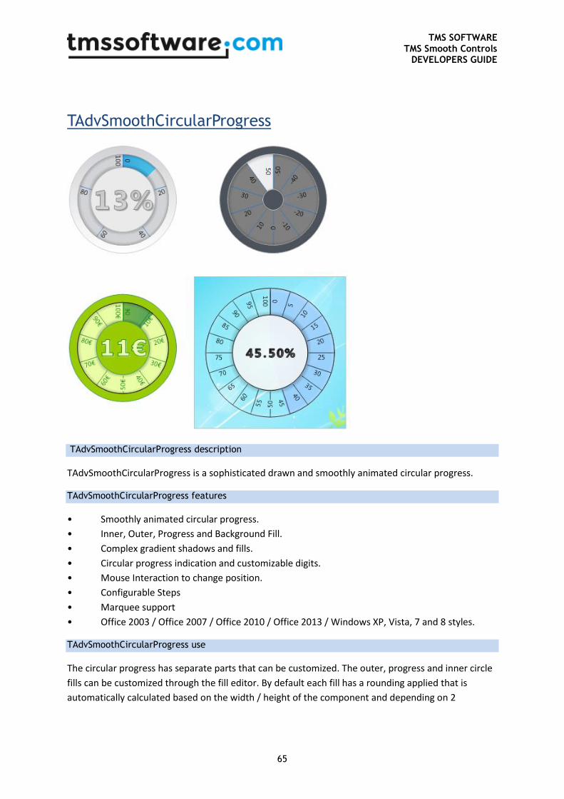
TMS SOFTWARE TMS Smooth Controls
DEVELOPERS GUIDE
65
TAdvSmoothCircularProgress
TAdvSmoothCircularProgress description
TAdvSmoothCircularProgress is a sophisticated drawn and smoothly animated circular progress.
TAdvSmoothCircularProgress features
• Smoothly animated circular progress.
• Inner, Outer, Progress and Background Fill.
• Complex gradient shadows and fills.
• Circular progress indication and customizable digits.
• Mouse Interaction to change position.
• Configurable Steps
• Marquee support
• Office 2003 / Office 2007 / Office 2010 / Office 2013 / Windows XP, Vista, 7 and 8 styles.
TAdvSmoothCircularProgress use
The circular progress has separate parts that can be customized. The outer, progress and inner circle
fills can be customized through the fill editor. By default each fill has a rounding applied that is
automatically calculated based on the width / height of the component and depending on 2
TMS SOFTWARE TMS Smooth Controls
DEVELOPERS GUIDE
66
properties. The properties AutoRounding and AspectRatio control this behavior. Turning off these
properties allows more customization in appearance.
The circular progress supports 2 animation styles: normal and marquee progress style. The marquee
speed can be modified with the MarqueeInterval property. When using the normal style, the min,
max and position properties are used to determine the position and drawing of the progress fill
indication.
On the progress fill indication, the progress is divided in segments determined by the Step property.
The circular progress supports negative and floating point values for the Minimum and Maximum
properties. Each segment has a value that is formatted with the StepFormat property. In the center
area, the actual value of the position is displayed. This value can also be formatted with the Format
property.
The circular progress also supports interaction with the mouse. When clicking on the circle, the
position is automatically calculated and modified. This behavior can be turned off with the
Interaction property.
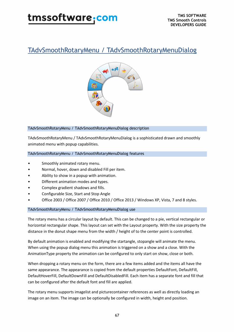
TMS SOFTWARE TMS Smooth Controls
DEVELOPERS GUIDE
67
TAdvSmoothRotaryMenu / TAdvSmoothRotaryMenuDialog
TAdvSmoothRotaryMenu / TAdvSmoothRotaryMenuDialog description
TAdvSmoothRotaryMenu / TAdvSmoothRotaryMenuDialog is a sophisticated drawn and smoothly
animated menu with popup capabilities.
TAdvSmoothRotaryMenu / TAdvSmoothRotaryMenuDialog features
• Smoothly animated rotary menu.
• Normal, hover, down and disabled Fill per item.
• Ability to show in a popup with animation.
• Different animation modes and types.
• Complex gradient shadows and fills.
• Configurable Size, Start and Stop Angle
• Office 2003 / Office 2007 / Office 2010 / Office 2013 / Windows XP, Vista, 7 and 8 styles.
TAdvSmoothRotaryMenu / TAdvSmoothRotaryMenuDialog use
The rotary menu has a circular layout by default. This can be changed to a pie, vertical rectangular or
horizontal rectangular shape. This layout can set with the Layout property. With the size property the
distance in the donut shape menu from the width / height of to the center point is controlled.
By default animation is enabled and modifying the startangle, stopangle will animate the menu.
When using the popup dialog menu this animation is triggered on a show and a close. With the
AnimationType property the animation can be configured to only start on show, close or both.
When dropping a rotary menu on the form, there are a few items added and the items all have the
same appearance. The appearance is copied from the default properties DefaultFont, DefaultFill,
DefaultHoverFill, DefaultDownFill and DefaultDisabledFill. Each item has a separate font and fill that
can be configured after the default font and fill are applied.
The rotary menu supports imagelist and picturecontainer references as well as directly loading an
image on an item. The image can be optionally be configured in width, height and position.
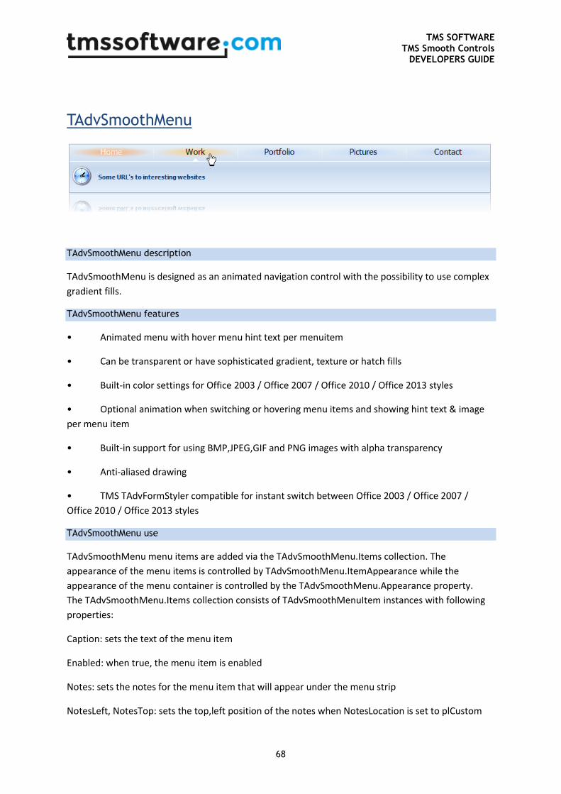
TMS SOFTWARE TMS Smooth Controls
DEVELOPERS GUIDE
68
TAdvSmoothMenu
TAdvSmoothMenu description
TAdvSmoothMenu is designed as an animated navigation control with the possibility to use complex
gradient fills.
TAdvSmoothMenu features
• Animated menu with hover menu hint text per menuitem
• Can be transparent or have sophisticated gradient, texture or hatch fills
• Built-in color settings for Office 2003 / Office 2007 / Office 2010 / Office 2013 styles
• Optional animation when switching or hovering menu items and showing hint text & image
per menu item
• Built-in support for using BMP,JPEG,GIF and PNG images with alpha transparency
• Anti-aliased drawing
• TMS TAdvFormStyler compatible for instant switch between Office 2003 / Office 2007 /
Office 2010 / Office 2013 styles
TAdvSmoothMenu use
TAdvSmoothMenu menu items are added via the TAdvSmoothMenu.Items collection. The
appearance of the menu items is controlled by TAdvSmoothMenu.ItemAppearance while the
appearance of the menu container is controlled by the TAdvSmoothMenu.Appearance property.
The TAdvSmoothMenu.Items collection consists of TAdvSmoothMenuItem instances with following
properties:
Caption: sets the text of the menu item
Enabled: when true, the menu item is enabled
Notes: sets the notes for the menu item that will appear under the menu strip
NotesLeft, NotesTop: sets the top,left position of the notes when NotesLocation is set to plCustom
TMS SOFTWARE TMS Smooth Controls
DEVELOPERS GUIDE
69
NotesLocation: sets the location of the notes on area under the menu strip
Picture: sets the picture for the menu item that is displayed under the menu strip
PictureLeft, PictureTop: sets the top,left position of the picture when PictureLocation is set to
plCustom
PictureLocation: sets the location of the picture on area under the menu strip
PictureSize: sets the size of the picture, ie. either the original size or custom specified size
PictureWidth, PictureHeight: sets the size of the pictuere when PictureSize is set to psCustom
This code snippet creates a menu consisting of 4 items:
begin
with AdvSmoothMenu1.Items.Add do
begin
Caption := 'BMW';
Notes := 'Freude am fahren';
Picture.LoadFromFile('bmwlogo.png');
end;
with AdvSmoothMenu1.Items.Add do
begin
Caption := 'Mercedes';
Notes := 'Perfektion wird wieder neu definiert';
Picture.LoadFromFile('mblogo.png');
end;
with AdvSmoothMenu1.Items.Add do
begin
Caption := 'Porsche';
Notes := 'Sicherheit und Dynamik. Vereint mit innerer Stärke';
Picture.LoadFromFile('porschelogo.png');
end;
with AdvSmoothMenu1.Items.Add do
begin
Caption := 'Aston Martin';
Notes := 'Defining Personality';
Picture.LoadFromFile('amlogo.png');
end;
end;
Handling of a click on a menu item is done with the OnItemClick event. In this sample, the Notes for
the menu item clicked it shown:

TMS SOFTWARE TMS Smooth Controls
DEVELOPERS GUIDE
70
procedure TForm2.AdvSmoothMenu1ItemClick(Sender: TObject; ItemIndex:
Integer);
begin
ShowMessage(AdvSmoothMenu1.Items[ItemIndex].Notes);
end;
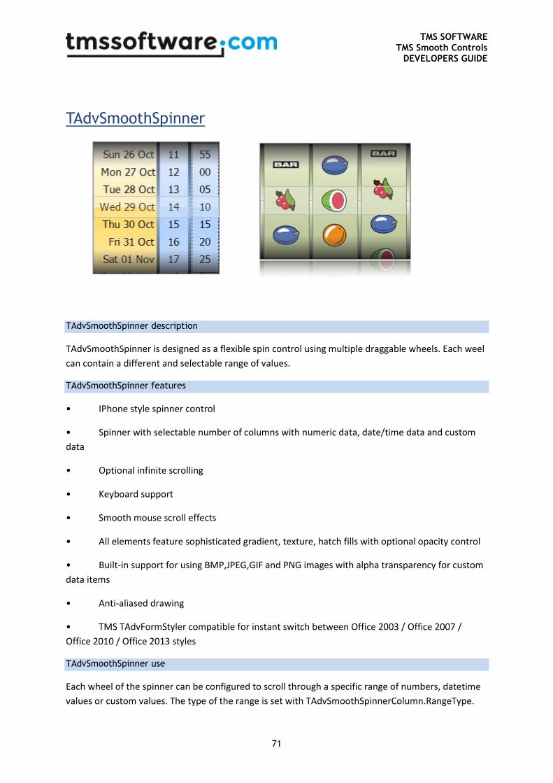
TMS SOFTWARE TMS Smooth Controls
DEVELOPERS GUIDE
71
TAdvSmoothSpinner
TAdvSmoothSpinner description
TAdvSmoothSpinner is designed as a flexible spin control using multiple draggable wheels. Each weel
can contain a different and selectable range of values.
TAdvSmoothSpinner features
• IPhone style spinner control
• Spinner with selectable number of columns with numeric data, date/time data and custom
data
• Optional infinite scrolling
• Keyboard support
• Smooth mouse scroll effects
• All elements feature sophisticated gradient, texture, hatch fills with optional opacity control
• Built-in support for using BMP,JPEG,GIF and PNG images with alpha transparency for custom
data items
• Anti-aliased drawing
• TMS TAdvFormStyler compatible for instant switch between Office 2003 / Office 2007 /
Office 2010 / Office 2013 styles
TAdvSmoothSpinner use
Each wheel of the spinner can be configured to scroll through a specific range of numbers, datetime
values or custom values. The type of the range is set with TAdvSmoothSpinnerColumn.RangeType.
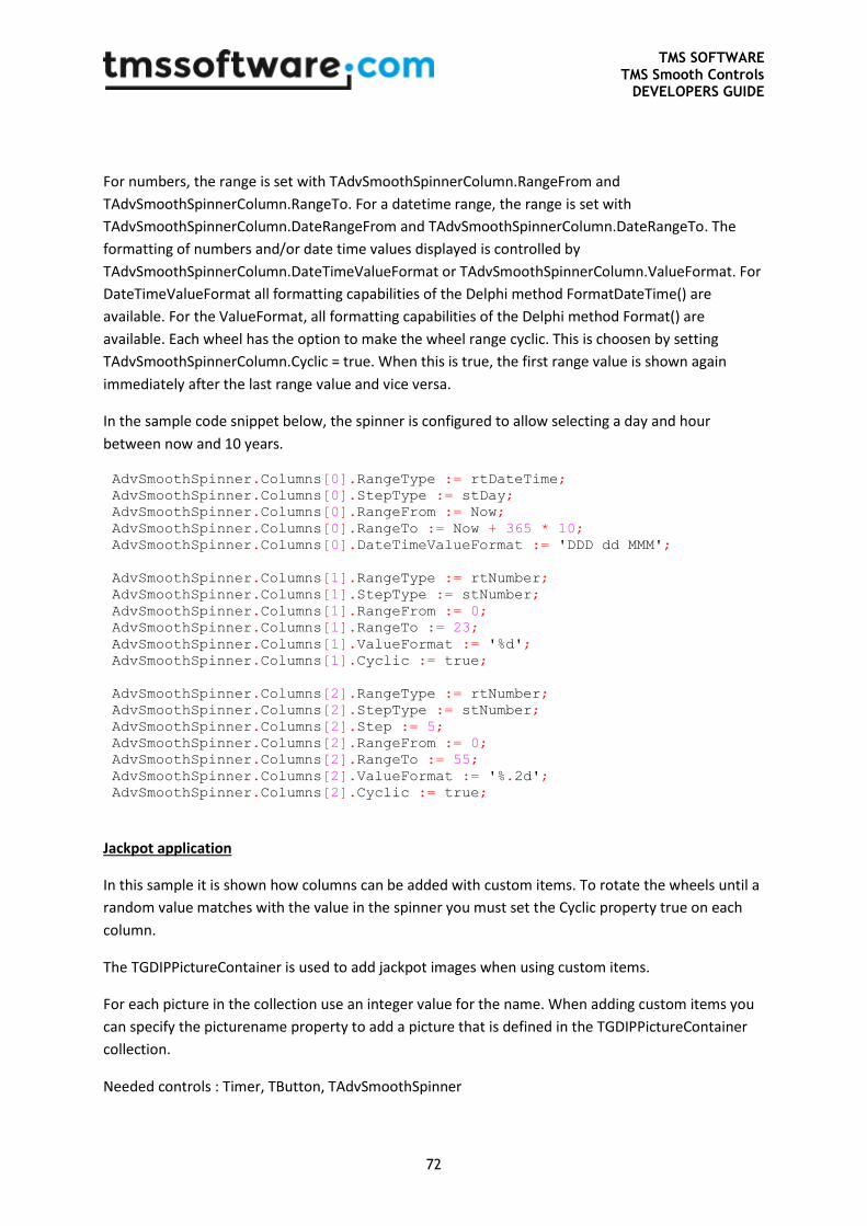
TMS SOFTWARE TMS Smooth Controls
DEVELOPERS GUIDE
72
For numbers, the range is set with TAdvSmoothSpinnerColumn.RangeFrom and
TAdvSmoothSpinnerColumn.RangeTo. For a datetime range, the range is set with
TAdvSmoothSpinnerColumn.DateRangeFrom and TAdvSmoothSpinnerColumn.DateRangeTo. The
formatting of numbers and/or date time values displayed is controlled by
TAdvSmoothSpinnerColumn.DateTimeValueFormat or TAdvSmoothSpinnerColumn.ValueFormat. For
DateTimeValueFormat all formatting capabilities of the Delphi method FormatDateTime() are
available. For the ValueFormat, all formatting capabilities of the Delphi method Format() are
available. Each wheel has the option to make the wheel range cyclic. This is choosen by setting
TAdvSmoothSpinnerColumn.Cyclic = true. When this is true, the first range value is shown again
immediately after the last range value and vice versa.
In the sample code snippet below, the spinner is configured to allow selecting a day and hour
between now and 10 years.
AdvSmoothSpinner.Columns[0].RangeType := rtDateTime;
AdvSmoothSpinner.Columns[0].StepType := stDay;
AdvSmoothSpinner.Columns[0].RangeFrom := Now;
AdvSmoothSpinner.Columns[0].RangeTo := Now + 365 * 10;
AdvSmoothSpinner.Columns[0].DateTimeValueFormat := 'DDD dd MMM';
AdvSmoothSpinner.Columns[1].RangeType := rtNumber;
AdvSmoothSpinner.Columns[1].StepType := stNumber;
AdvSmoothSpinner.Columns[1].RangeFrom := 0;
AdvSmoothSpinner.Columns[1].RangeTo := 23;
AdvSmoothSpinner.Columns[1].ValueFormat := '%d';
AdvSmoothSpinner.Columns[1].Cyclic := true;
AdvSmoothSpinner.Columns[2].RangeType := rtNumber;
AdvSmoothSpinner.Columns[2].StepType := stNumber;
AdvSmoothSpinner.Columns[2].Step := 5;
AdvSmoothSpinner.Columns[2].RangeFrom := 0;
AdvSmoothSpinner.Columns[2].RangeTo := 55;
AdvSmoothSpinner.Columns[2].ValueFormat := '%.2d';
AdvSmoothSpinner.Columns[2].Cyclic := true;
Jackpot application
In this sample it is shown how columns can be added with custom items. To rotate the wheels until a
random value matches with the value in the spinner you must set the Cyclic property true on each
column.
The TGDIPPictureContainer is used to add jackpot images when using custom items.
For each picture in the collection use an integer value for the name. When adding custom items you
can specify the picturename property to add a picture that is defined in the TGDIPPictureContainer
collection.
Needed controls : Timer, TButton, TAdvSmoothSpinner
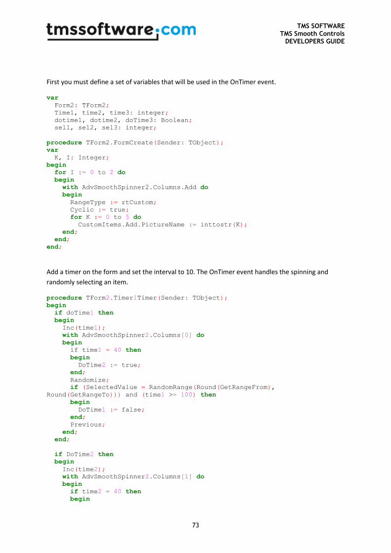
TMS SOFTWARE TMS Smooth Controls
DEVELOPERS GUIDE
73
First you must define a set of variables that will be used in the OnTimer event.
var Form2: TForm2;
Time1, time2, time3: integer;
dotime1, dotime2, doTime3: Boolean;
sel1, sel2, sel3: integer;
procedure TForm2.FormCreate(Sender: TObject);
var
K, I: Integer;
begin
for I := 0 to 2 do
begin
with AdvSmoothSpinner2.Columns.Add do
begin
RangeType := rtCustom;
Cyclic := true;
for K := 0 to 5 do
CustomItems.Add.PictureName := inttostr(K);
end;
end;
end;
Add a timer on the form and set the interval to 10. The OnTimer event handles the spinning and
randomly selecting an item.
procedure TForm2.Timer1Timer(Sender: TObject);
begin
if doTime1 then
begin
Inc(time1);
with AdvSmoothSpinner2.Columns[0] do
begin
if time1 = 40 then
begin
DoTime2 := true;
end;
Randomize;
if (SelectedValue = RandomRange(Round(GetRangeFrom),
Round(GetRangeTo))) and (time1 >= 100) then
begin
DoTime1 := false;
end;
Previous;
end;
end;
if DoTime2 then
begin
Inc(time2);
with AdvSmoothSpinner2.Columns[1] do
begin
if time2 = 40 then
begin
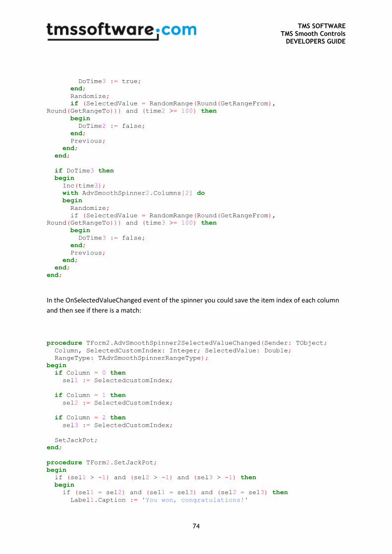
TMS SOFTWARE TMS Smooth Controls
DEVELOPERS GUIDE
74
DoTime3 := true;
end;
Randomize;
if (SelectedValue = RandomRange(Round(GetRangeFrom),
Round(GetRangeTo))) and (time2 >= 100) then
begin
DoTime2 := false;
end;
Previous;
end;
end;
if DoTime3 then
begin
Inc(time3);
with AdvSmoothSpinner2.Columns[2] do
begin
Randomize;
if (SelectedValue = RandomRange(Round(GetRangeFrom),
Round(GetRangeTo))) and (time3 >= 100) then
begin
DoTime3 := false;
end;
Previous;
end;
end;
end;
In the OnSelectedValueChanged event of the spinner you could save the item index of each column
and then see if there is a match:
procedure TForm2.AdvSmoothSpinner2SelectedValueChanged(Sender: TObject;
Column, SelectedCustomIndex: Integer; SelectedValue: Double;
RangeType: TAdvSmoothSpinnerRangeType);
begin
if Column = 0 then
sel1 := SelectedcustomIndex;
if Column = 1 then
sel2 := SelectedCustomIndex;
if Column = 2 then
sel3 := SelectedCustomIndex;
SetJackPot;
end;
procedure TForm2.SetJackPot;
begin
if (sel1 > -1) and (sel2 > -1) and (sel3 > -1) then
begin
if (sel1 = sel2) and (sel1 = sel3) and (sel2 = sel3) then
Label1.Caption := 'You won, congratulations!'
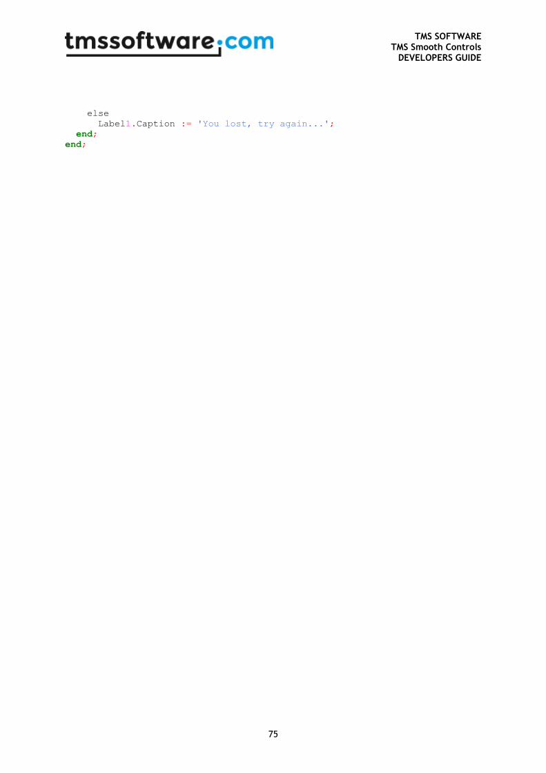
TMS SOFTWARE TMS Smooth Controls
DEVELOPERS GUIDE
75
else
Label1.Caption := 'You lost, try again...';
end;
end;
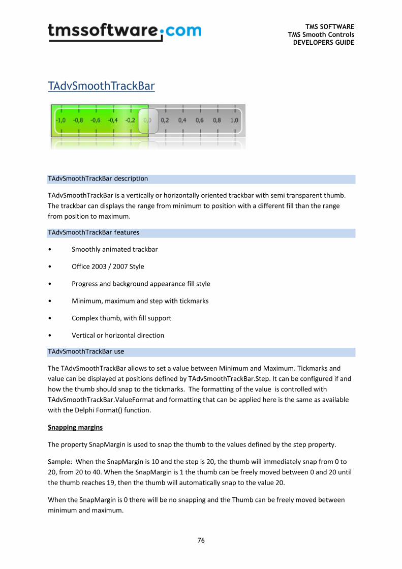
TMS SOFTWARE TMS Smooth Controls
DEVELOPERS GUIDE
76
TAdvSmoothTrackBar
TAdvSmoothTrackBar description
TAdvSmoothTrackBar is a vertically or horizontally oriented trackbar with semi transparent thumb.
The trackbar can displays the range from minimum to position with a different fill than the range
from position to maximum.
TAdvSmoothTrackBar features
• Smoothly animated trackbar
• Office 2003 / 2007 Style
• Progress and background appearance fill style
• Minimum, maximum and step with tickmarks
• Complex thumb, with fill support
• Vertical or horizontal direction
TAdvSmoothTrackBar use
The TAdvSmoothTrackBar allows to set a value between Minimum and Maximum. Tickmarks and
value can be displayed at positions defined by TAdvSmoothTrackBar.Step. It can be configured if and
how the thumb should snap to the tickmarks. The formatting of the value is controlled with
TAdvSmoothTrackBar.ValueFormat and formatting that can be applied here is the same as available
with the Delphi Format() function.
Snapping margins
The property SnapMargin is used to snap the thumb to the values defined by the step property.
Sample: When the SnapMargin is 10 and the step is 20, the thumb will immediately snap from 0 to
20, from 20 to 40. When the SnapMargin is 1 the thumb can be freely moved between 0 and 20 until
the thumb reaches 19, then the thumb will automatically snap to the value 20.
When the SnapMargin is 0 there will be no snapping and the Thumb can be freely moved between
minimum and maximum.
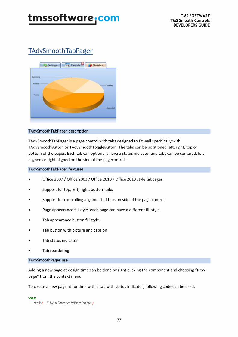
TMS SOFTWARE TMS Smooth Controls
DEVELOPERS GUIDE
77
TAdvSmoothTabPager
TAdvSmoothTabPager description
TAdvSmoothTabPager is a page control with tabs designed to fit well specifically with
TAdvSmoothButton or TAdvSmoothToggleButton. The tabs can be positioned left, right, top or
bottom of the pages. Each tab can optionally have a status indicator and tabs can be centered, left
aligned or right aligned on the side of the pagecontrol.
TAdvSmoothTabPager features
• Office 2007 / Office 2003 / Office 2010 / Office 2013 style tabpager
• Support for top, left, right, bottom tabs
• Support for controlling alignment of tabs on side of the page control
• Page appearance fill style, each page can have a different fill style
• Tab appearance button fill style
• Tab button with picture and caption
• Tab status indicator
• Tab reordering
TAdvSmoothPager use
Adding a new page at design time can be done by right-clicking the component and choosing “New
page” from the context menu.
To create a new page at runtime with a tab with status indicator, following code can be used:
var
stb: TAdvSmoothTabPage;
TMS SOFTWARE TMS Smooth Controls
DEVELOPERS GUIDE
78
begin
stb := TAdvSmoothTabPage.Create(AdvSmoothTabPager1);
stb.AdvSmoothTabPager := AdvSmoothTabPager1;
stb.Caption := 'Runtime created page';
stb.TabAppearance.Status.Caption := 'Warning!';
stb.TabAppearance.Status.Visible := true;
end;
To remove a tab page at runtime, simply destroy the page:
AdvSmoothTabPage.Free;
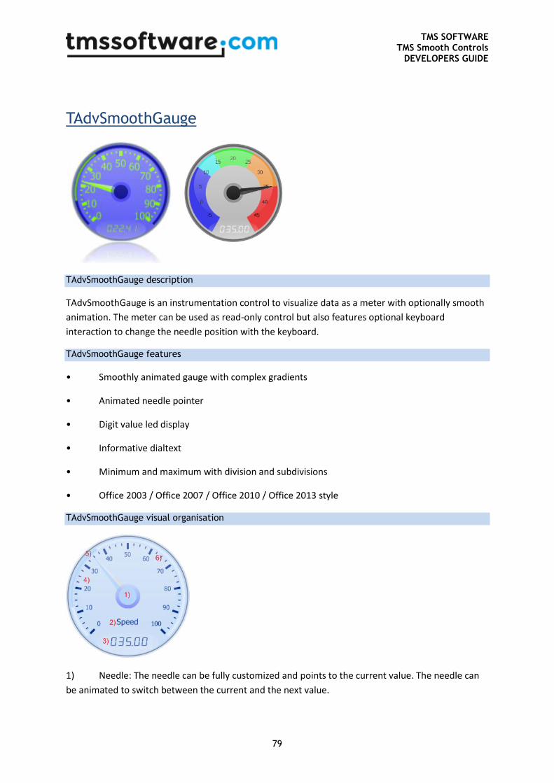
TMS SOFTWARE TMS Smooth Controls
DEVELOPERS GUIDE
79
TAdvSmoothGauge
TAdvSmoothGauge description
TAdvSmoothGauge is an instrumentation control to visualize data as a meter with optionally smooth
animation. The meter can be used as read-only control but also features optional keyboard
interaction to change the needle position with the keyboard.
TAdvSmoothGauge features
• Smoothly animated gauge with complex gradients
• Animated needle pointer
• Digit value led display
• Informative dialtext
• Minimum and maximum with division and subdivisions
• Office 2003 / Office 2007 / Office 2010 / Office 2013 style
TAdvSmoothGauge visual organisation
1) Needle: The needle can be fully customized and points to the current value. The needle can
be animated to switch between the current and the next value.
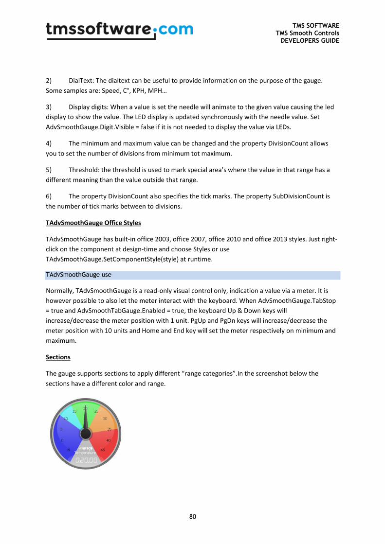
TMS SOFTWARE TMS Smooth Controls
DEVELOPERS GUIDE
80
2) DialText: The dialtext can be useful to provide information on the purpose of the gauge.
Some samples are: Speed, C°, KPH, MPH…
3) Display digits: When a value is set the needle will animate to the given value causing the led
display to show the value. The LED display is updated synchronously with the needle value. Set
AdvSmoothGauge.Digit.Visible = false if it is not needed to display the value via LEDs.
4) The minimum and maximum value can be changed and the property DivisionCount allows
you to set the number of divisions from minimum tot maximum.
5) Threshold: the threshold is used to mark special area’s where the value in that range has a
different meaning than the value outside that range.
6) The property DivisionCount also specifies the tick marks. The property SubDivisionCount is
the number of tick marks between to divisions.
TAdvSmoothGauge Office Styles
TAdvSmoothGauge has built-in office 2003, office 2007, office 2010 and office 2013 styles. Just right-
click on the component at design-time and choose Styles or use
TAdvSmoothGauge.SetComponentStyle(style) at runtime.
TAdvSmoothGauge use
Normally, TAdvSmoothGauge is a read-only visual control only, indication a value via a meter. It is
however possible to also let the meter interact with the keyboard. When AdvSmoothGauge.TabStop
= true and AdvSmoothTabGauge.Enabled = true, the keyboard Up & Down keys will
increase/decrease the meter position with 1 unit. PgUp and PgDn keys will increase/decrease the
meter position with 10 units and Home and End key will set the meter respectively on minimum and
maximum.
Sections
The gauge supports sections to apply different “range categories”.In the screenshot below the
sections have a different color and range.
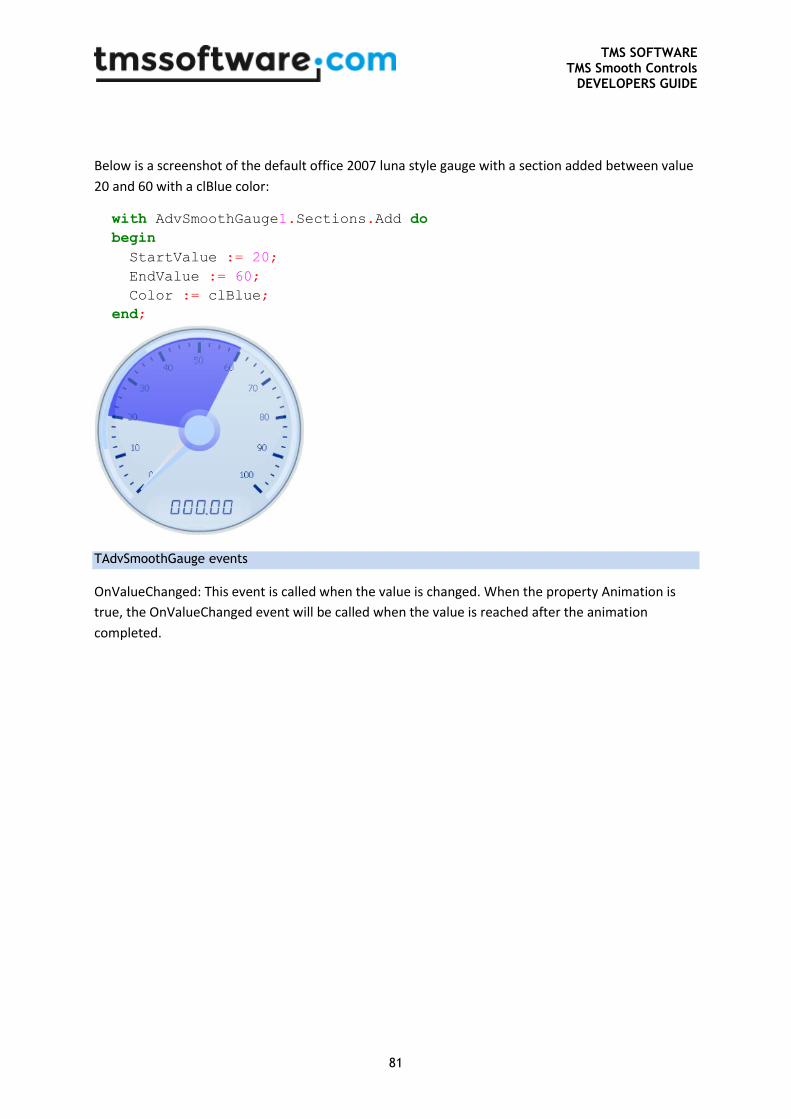
TMS SOFTWARE TMS Smooth Controls
DEVELOPERS GUIDE
81
Below is a screenshot of the default office 2007 luna style gauge with a section added between value
20 and 60 with a clBlue color:
with AdvSmoothGauge1.Sections.Add do
begin
StartValue := 20;
EndValue := 60;
Color := clBlue;
end;
TAdvSmoothGauge events
OnValueChanged: This event is called when the value is changed. When the property Animation is
true, the OnValueChanged event will be called when the value is reached after the animation
completed.
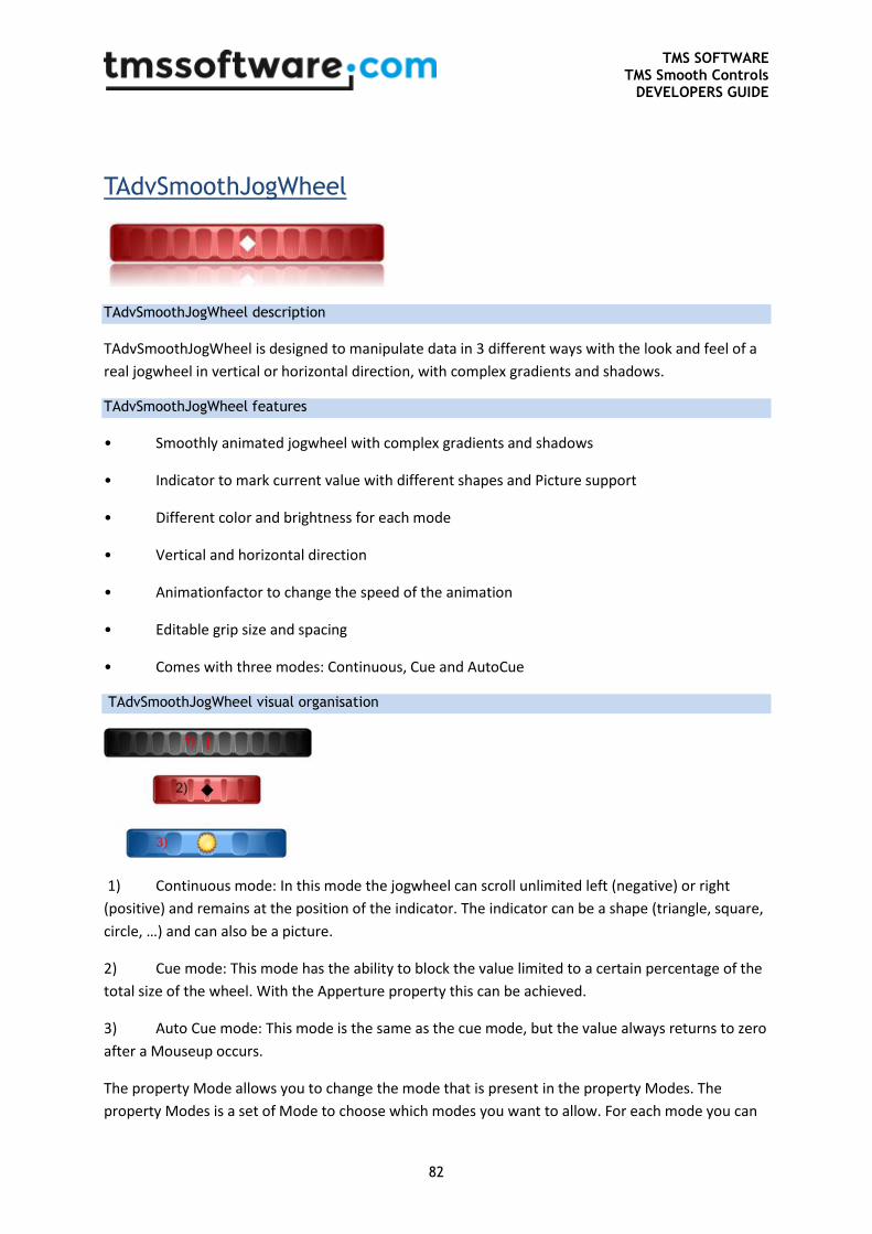
TMS SOFTWARE TMS Smooth Controls
DEVELOPERS GUIDE
82
TAdvSmoothJogWheel
TAdvSmoothJogWheel description
TAdvSmoothJogWheel is designed to manipulate data in 3 different ways with the look and feel of a
real jogwheel in vertical or horizontal direction, with complex gradients and shadows.
TAdvSmoothJogWheel features
• Smoothly animated jogwheel with complex gradients and shadows
• Indicator to mark current value with different shapes and Picture support
• Different color and brightness for each mode
• Vertical and horizontal direction
• Animationfactor to change the speed of the animation
• Editable grip size and spacing
• Comes with three modes: Continuous, Cue and AutoCue
TAdvSmoothJogWheel visual organisation
1) Continuous mode: In this mode the jogwheel can scroll unlimited left (negative) or right
(positive) and remains at the position of the indicator. The indicator can be a shape (triangle, square,
circle, …) and can also be a picture.
2) Cue mode: This mode has the ability to block the value limited to a certain percentage of the
total size of the wheel. With the Apperture property this can be achieved.
3) Auto Cue mode: This mode is the same as the cue mode, but the value always returns to zero
after a Mouseup occurs.
The property Mode allows you to change the mode that is present in the property Modes. The
property Modes is a set of Mode to choose which modes you want to allow. For each mode you can
TMS SOFTWARE TMS Smooth Controls
DEVELOPERS GUIDE
83
change the color, brightness and indicator. To change the mode, hold the left mouse button for 2
seconds (default). Upon release of the left mouse button the mode changes. The amount of seconds
before the mode changes can be set with the property ModeChangeDelay.
You can change the size of the grips and the spacing between the grips with the properties GripSize
and GripSpacing.
The speed of which the value changes can be set with the AnimationFactor. when the
AnimationFactor is lower the value will change faster.
TAdvSmoothJogWheel use
Change mode
To change the mode simply use the code below:
AdvSmoothJogWheel1.Mode := wmAutoCue;
Change allowed modes
To change the set of modes that are allow use the following code:
Add mode
AdvSmoothJogWheel1.Modes := AdvSmoothJogWheel1.Modes +
[wmContinuous];
Remove mode
AdvSmoothJogWheel1.Modes := AdvSmoothJogWheel1.Modes -
[wmContinuous];
TAdvSmoothJogWheel events
OnValueChanged: This event is called when the value changes.
OnModeChanged: This event is called when the mode changes.
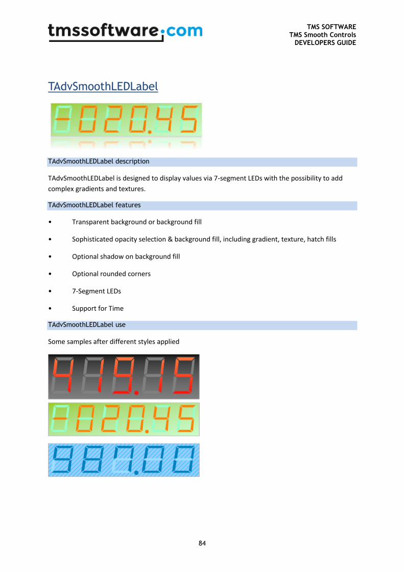
TMS SOFTWARE TMS Smooth Controls
DEVELOPERS GUIDE
84
TAdvSmoothLEDLabel
TAdvSmoothLEDLabel description
TAdvSmoothLEDLabel is designed to display values via 7-segment LEDs with the possibility to add
complex gradients and textures.
TAdvSmoothLEDLabel features
• Transparent background or background fill
• Sophisticated opacity selection & background fill, including gradient, texture, hatch fills
• Optional shadow on background fill
• Optional rounded corners
• 7-Segment LEDs
• Support for Time
TAdvSmoothLEDLabel use
Some samples after different styles applied
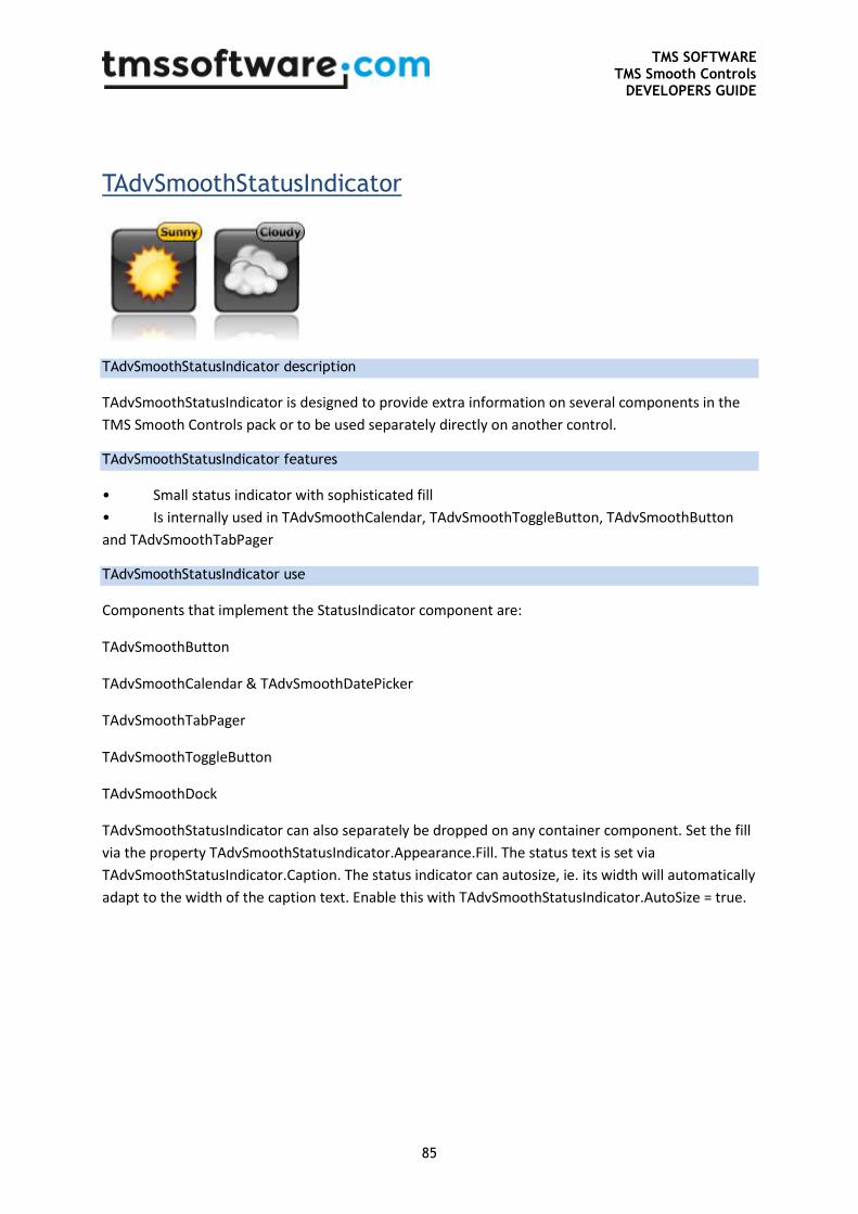
TMS SOFTWARE TMS Smooth Controls
DEVELOPERS GUIDE
85
TAdvSmoothStatusIndicator
TAdvSmoothStatusIndicator description
TAdvSmoothStatusIndicator is designed to provide extra information on several components in the
TMS Smooth Controls pack or to be used separately directly on another control.
TAdvSmoothStatusIndicator features
• Small status indicator with sophisticated fill
• Is internally used in TAdvSmoothCalendar, TAdvSmoothToggleButton, TAdvSmoothButton
and TAdvSmoothTabPager
TAdvSmoothStatusIndicator use
Components that implement the StatusIndicator component are:
TAdvSmoothButton
TAdvSmoothCalendar & TAdvSmoothDatePicker
TAdvSmoothTabPager
TAdvSmoothToggleButton
TAdvSmoothDock
TAdvSmoothStatusIndicator can also separately be dropped on any container component. Set the fill
via the property TAdvSmoothStatusIndicator.Appearance.Fill. The status text is set via
TAdvSmoothStatusIndicator.Caption. The status indicator can autosize, ie. its width will automatically
adapt to the width of the caption text. Enable this with TAdvSmoothStatusIndicator.AutoSize = true.
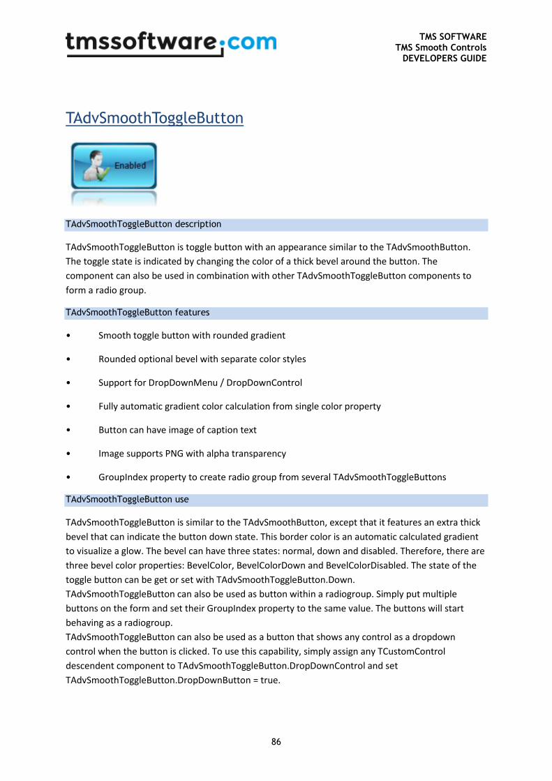
TMS SOFTWARE TMS Smooth Controls
DEVELOPERS GUIDE
86
TAdvSmoothToggleButton
TAdvSmoothToggleButton description
TAdvSmoothToggleButton is toggle button with an appearance similar to the TAdvSmoothButton.
The toggle state is indicated by changing the color of a thick bevel around the button. The
component can also be used in combination with other TAdvSmoothToggleButton components to
form a radio group.
TAdvSmoothToggleButton features
• Smooth toggle button with rounded gradient
• Rounded optional bevel with separate color styles
• Support for DropDownMenu / DropDownControl
• Fully automatic gradient color calculation from single color property
• Button can have image of caption text
• Image supports PNG with alpha transparency
• GroupIndex property to create radio group from several TAdvSmoothToggleButtons
TAdvSmoothToggleButton use
TAdvSmoothToggleButton is similar to the TAdvSmoothButton, except that it features an extra thick
bevel that can indicate the button down state. This border color is an automatic calculated gradient
to visualize a glow. The bevel can have three states: normal, down and disabled. Therefore, there are
three bevel color properties: BevelColor, BevelColorDown and BevelColorDisabled. The state of the
toggle button can be get or set with TAdvSmoothToggleButton.Down.
TAdvSmoothToggleButton can also be used as button within a radiogroup. Simply put multiple
buttons on the form and set their GroupIndex property to the same value. The buttons will start
behaving as a radiogroup.
TAdvSmoothToggleButton can also be used as a button that shows any control as a dropdown
control when the button is clicked. To use this capability, simply assign any TCustomControl
descendent component to TAdvSmoothToggleButton.DropDownControl and set
TAdvSmoothToggleButton.DropDownButton = true.
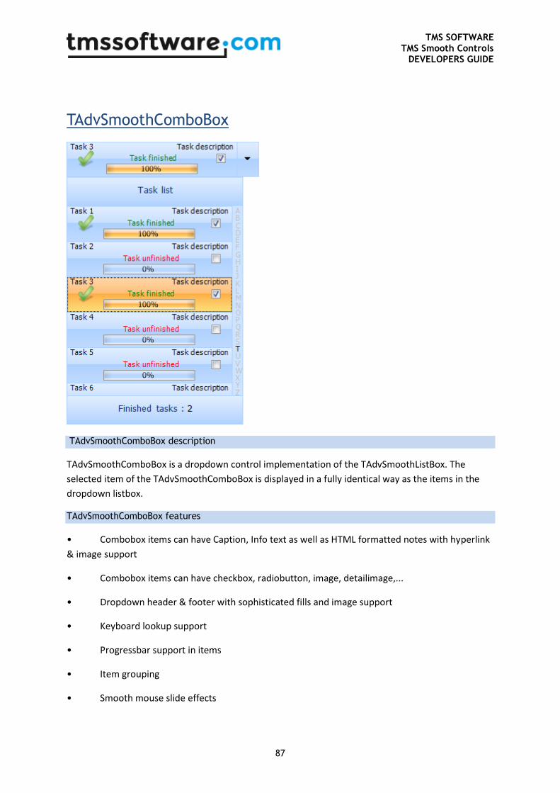
TMS SOFTWARE TMS Smooth Controls
DEVELOPERS GUIDE
87
TAdvSmoothComboBox
TAdvSmoothComboBox description
TAdvSmoothComboBox is a dropdown control implementation of the TAdvSmoothListBox. The
selected item of the TAdvSmoothComboBox is displayed in a fully identical way as the items in the
dropdown listbox.
TAdvSmoothComboBox features
• Combobox items can have Caption, Info text as well as HTML formatted notes with hyperlink
& image support
• Combobox items can have checkbox, radiobutton, image, detailimage,...
• Dropdown header & footer with sophisticated fills and image support
• Keyboard lookup support
• Progressbar support in items
• Item grouping
• Smooth mouse slide effects
TMS SOFTWARE TMS Smooth Controls
DEVELOPERS GUIDE
88
• Lookup indicator for instant lookup in alphabet
• Support for Item groups with splitter between items
• Detail control per item or global detail control with animation to show detail
• All elements feature sophisticated gradient, texture, hatch fills with optional opacity control
• Built-in support for using BMP,JPEG,GIF and PNG images with alpha transparency
• Anti-aliased drawing
TAdvSmoothComboBox use
As TAdvSmoothComboBox is basically a TAdvSmoothListBox but used as dropdown control, it can be
used in an identical way as TAdvSmoothListBox. The items within the dropdown have the same
capabilities as in the TAdvSmoothListBox and can as such be handled in the same way.
Different from the TAdvSmoothListBox is that the combobox always shows one selected item. The
index of this selected item is set with TAdvSmoothComboBox.SelectedItemIndex. Set this to -1 if no
item should be selected.
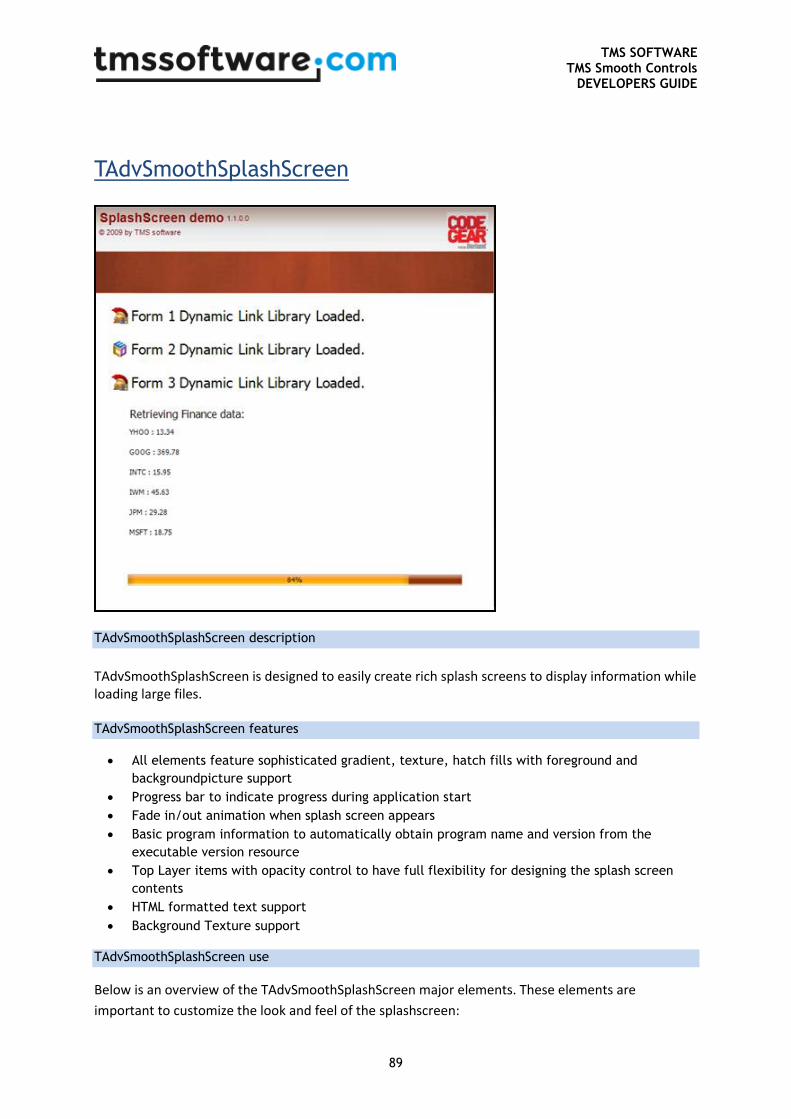
TMS SOFTWARE TMS Smooth Controls
DEVELOPERS GUIDE
89
TAdvSmoothSplashScreen
TAdvSmoothSplashScreen description
TAdvSmoothSplashScreen is designed to easily create rich splash screens to display information while loading large files.
TAdvSmoothSplashScreen features
All elements feature sophisticated gradient, texture, hatch fills with foreground and
backgroundpicture support
Progress bar to indicate progress during application start
Fade in/out animation when splash screen appears
Basic program information to automatically obtain program name and version from the
executable version resource
Top Layer items with opacity control to have full flexibility for designing the splash screen
contents
HTML formatted text support
Background Texture support
TAdvSmoothSplashScreen use
Below is an overview of the TAdvSmoothSplashScreen major elements. These elements are
important to customize the look and feel of the splashscreen:
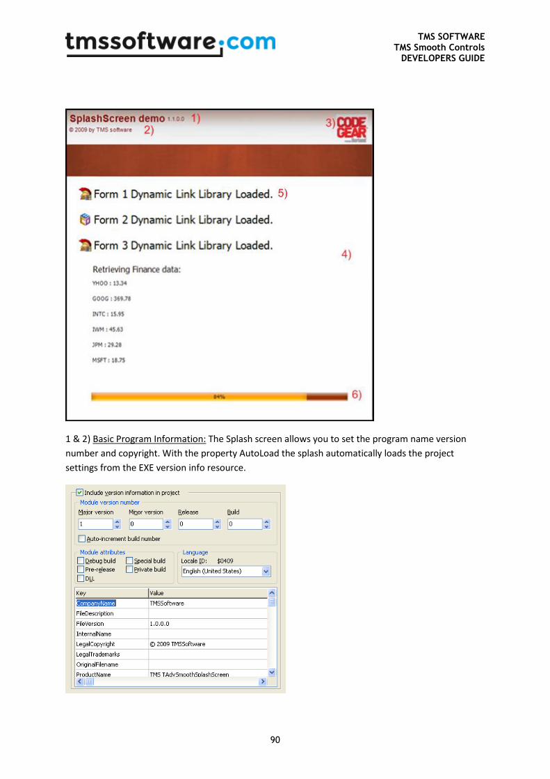
TMS SOFTWARE TMS Smooth Controls
DEVELOPERS GUIDE
90
1 & 2) Basic Program Information: The Splash screen allows you to set the program name version
number and copyright. With the property AutoLoad the splash automatically loads the project
settings from the EXE version info resource.
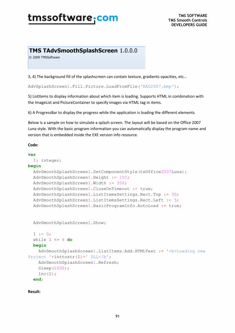
TMS SOFTWARE TMS Smooth Controls
DEVELOPERS GUIDE
91
3, 4) The background fill of the splashscreen can contain texture, gradients opacities, etc…
AdvSplashScreen1.Fill.Picture.LoadFromFile('RAD2007.bmp');
5) ListItems to display information about which item is loading. Supports HTML in combination with
the ImageList and PictureContainer to specify images via HTML tag in items.
6) A ProgressBar to display the progress while the application is loading the different elements.
Below is a sample on how to simulate a splash screen. The layout will be based on the Office 2007
Luna style. With the basic program information you can automatically display the program name and
version that is embedded inside the EXE version info resource.
Code:
var
I: integer;
begin
AdvSmoothSplashScreen1.SetComponentStyle(tsOffice2007Luna);
AdvSmoothSplashScreen1.Height := 150;
AdvSmoothSplashScreen1.Width := 350;
AdvSmoothSplashScreen1.CloseOnTimeout := true;
AdvSmoothSplashScreen1.ListItemsSettings.Rect.Top := 30;
AdvSmoothSplashScreen1.ListItemsSettings.Rect.Left := 5;
AdvSmoothSplashScreen1.BasicProgramInfo.AutoLoad := true;
AdvSmoothSplashScreen1.Show;
I := 0;
while I <= 4 do
begin
AdvSmoothSplashScreen1.ListItems.Add.HTMLText := '<b>Loading new
Project '+inttostr(I)+' DLL</b';
AdvSmoothSplashScreen1.Refresh;
Sleep(1000);
Inc(I);
end;
Result:
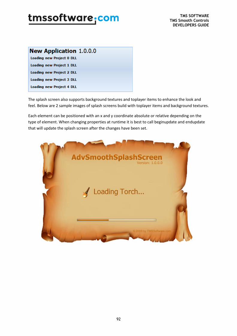
TMS SOFTWARE TMS Smooth Controls
DEVELOPERS GUIDE
92
The splash screen also supports background textures and toplayer items to enhance the look and
feel. Below are 2 sample images of splash screens build with toplayer items and background textures.
Each element can be positioned with an x and y coordinate absolute or relative depending on the
type of element. When changing properties at runtime it is best to call beginupdate and endupdate
that will update the splash screen after the changes have been set.
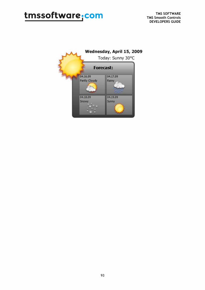
TMS SOFTWARE TMS Smooth Controls
DEVELOPERS GUIDE
93
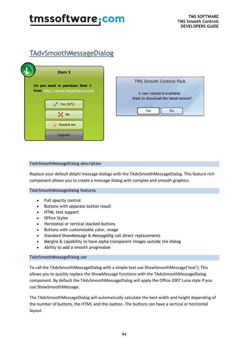
TMS SOFTWARE TMS Smooth Controls
DEVELOPERS GUIDE
94
TAdvSmoothMessageDialog
TAdvSmoothMessageDialog description
Replace your default delphi message dialogs with the TAdvSmoothMessageDialog. This feature rich
component allows you to create a message dialog with complex and smooth graphics.
TAdvSmoothMessagedialog features
Full opacity control
Buttons with separate button result
HTML text support
Office Styles
Horizontal or vertical stacked buttons
Buttons with customizable color, image
Standard ShowMessage & MessageDlg call direct replacements
Margins & capability to have alpha transparent images outside the dialog
Ability to add a smooth progressbar
TAdvSmoothMessageDialog use
To call the TAdvSmoothMessageDialog with a simple text use ShowSmoothMessage(‘text’); This
allows you to quickly replace the ShowMessage functions with the TAdvSmoothMessageDialog
component. By default the TAdvSmoothMessageDialog will apply the Office 2007 Luna style if you
use ShowSmoothMessage.
The TAdvSmoothMessageDialog will automatically calculate the best width and height depending of
the number of buttons, the HTML and the caption. The buttons can have a vertical or horizontal
layout.
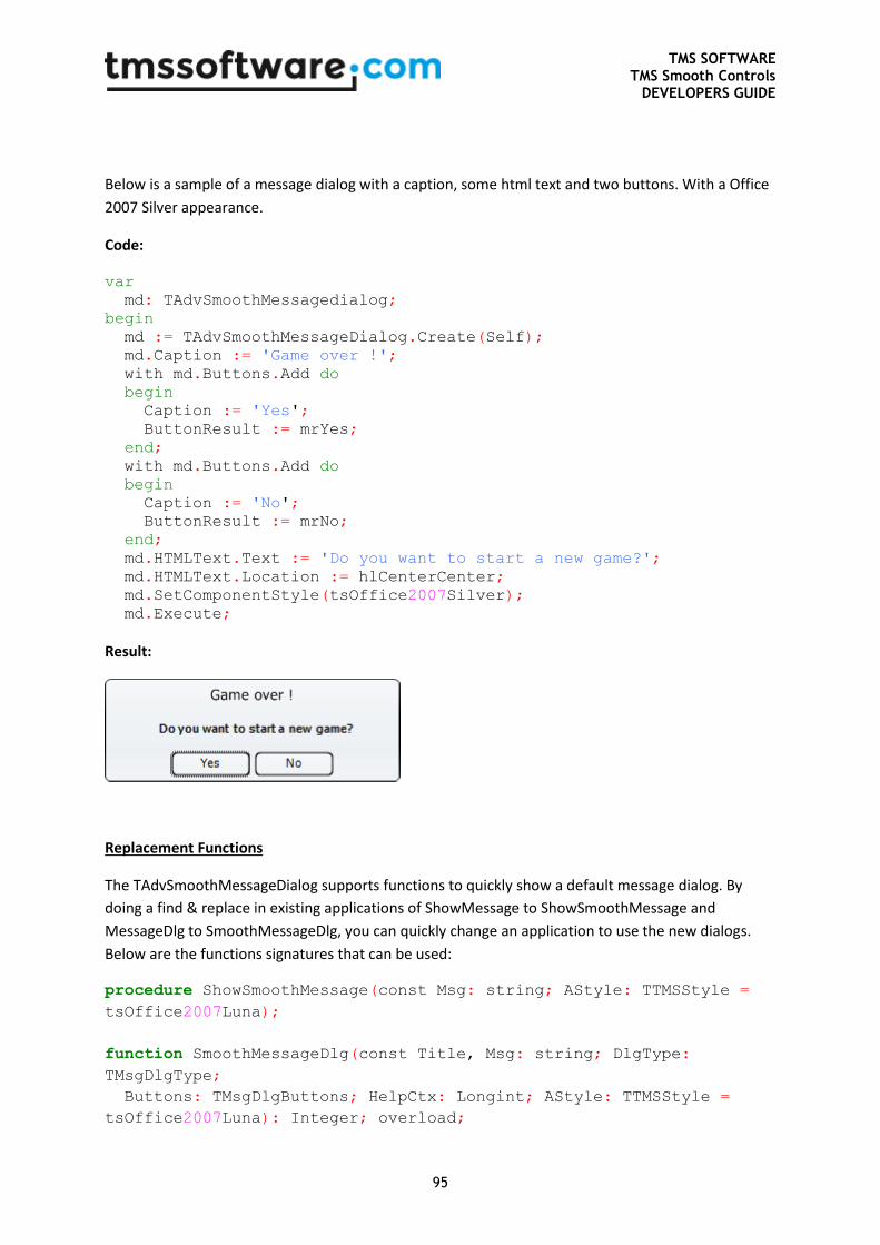
TMS SOFTWARE TMS Smooth Controls
DEVELOPERS GUIDE
95
Below is a sample of a message dialog with a caption, some html text and two buttons. With a Office
2007 Silver appearance.
Code:
var
md: TAdvSmoothMessagedialog;
begin
md := TAdvSmoothMessageDialog.Create(Self);
md.Caption := 'Game over !';
with md.Buttons.Add do
begin
Caption := 'Yes';
ButtonResult := mrYes;
end;
with md.Buttons.Add do
begin
Caption := 'No';
ButtonResult := mrNo;
end;
md.HTMLText.Text := 'Do you want to start a new game?';
md.HTMLText.Location := hlCenterCenter;
md.SetComponentStyle(tsOffice2007Silver);
md.Execute;
Result:
Replacement Functions
The TAdvSmoothMessageDialog supports functions to quickly show a default message dialog. By
doing a find & replace in existing applications of ShowMessage to ShowSmoothMessage and
MessageDlg to SmoothMessageDlg, you can quickly change an application to use the new dialogs.
Below are the functions signatures that can be used:
procedure ShowSmoothMessage(const Msg: string; AStyle: TTMSStyle =
tsOffice2007Luna);
function SmoothMessageDlg(const Title, Msg: string; DlgType:
TMsgDlgType;
Buttons: TMsgDlgButtons; HelpCtx: Longint; AStyle: TTMSStyle =
tsOffice2007Luna): Integer; overload;
TMS SOFTWARE TMS Smooth Controls
DEVELOPERS GUIDE
96
function SmoothMessageDlg(const Title, Msg: string; DlgType:
TMsgDlgType;
Buttons: TMsgDlgButtons; HelpCtx: Longint; DefaultButton:
TMsgDlgBtn; AStyle: TTMSStyle = tsOffice2007Luna): Integer;
overload;
function SmoothMessageDlgPos(const Title, Msg: string; DlgType:
TMsgDlgType;
Buttons: TMsgDlgButtons; HelpCtx: Longint; X, Y: Integer; AStyle:
TTMSStyle = tsOffice2007Luna): Integer; overload;
function SmoothMessageDlgPos(const Title, Msg: string; DlgType:
TMsgDlgType;
Buttons: TMsgDlgButtons; HelpCtx: Longint; X, Y: Integer;
DefaultButton: TMsgDlgBtn; AStyle: TTMSStyle = tsOffice2007Luna):
Integer; overload;
Execute and ExecuteDialog
The TAdvSmoothMessageDialog has an Execute and ExecuteDialog function. The ExecuteDialog
function returns a TModalResult. The Execute function returns a Boolean and this Boolean is only
true when the ModalResult is mrOk or mrYes. When adding buttons and using the Execute function,
make sure that there is a button with the ButtonResult mrOk or mrYes.
AdvSmoothMessageDialog1.Buttons.Clear;
AdvSmoothMessageDialog1.Position := poScreenCenter;
with AdvSmoothMessageDialog1.Buttons.Add do
begin
ButtonResult := mrOk;
Caption := 'Ok';
end;
with AdvSmoothMessageDialog1.Buttons.Add do
begin
ButtonResult := mrCancel;
Caption := 'Cancel';
end;
if AdvSmoothMessageDialog1.Execute then
Label1.Caption := 'Ok Button clicked';
Appearance
When the default message dialog functions are no longer suitable, the message dialog can be fully
customized for its 4 different elements:
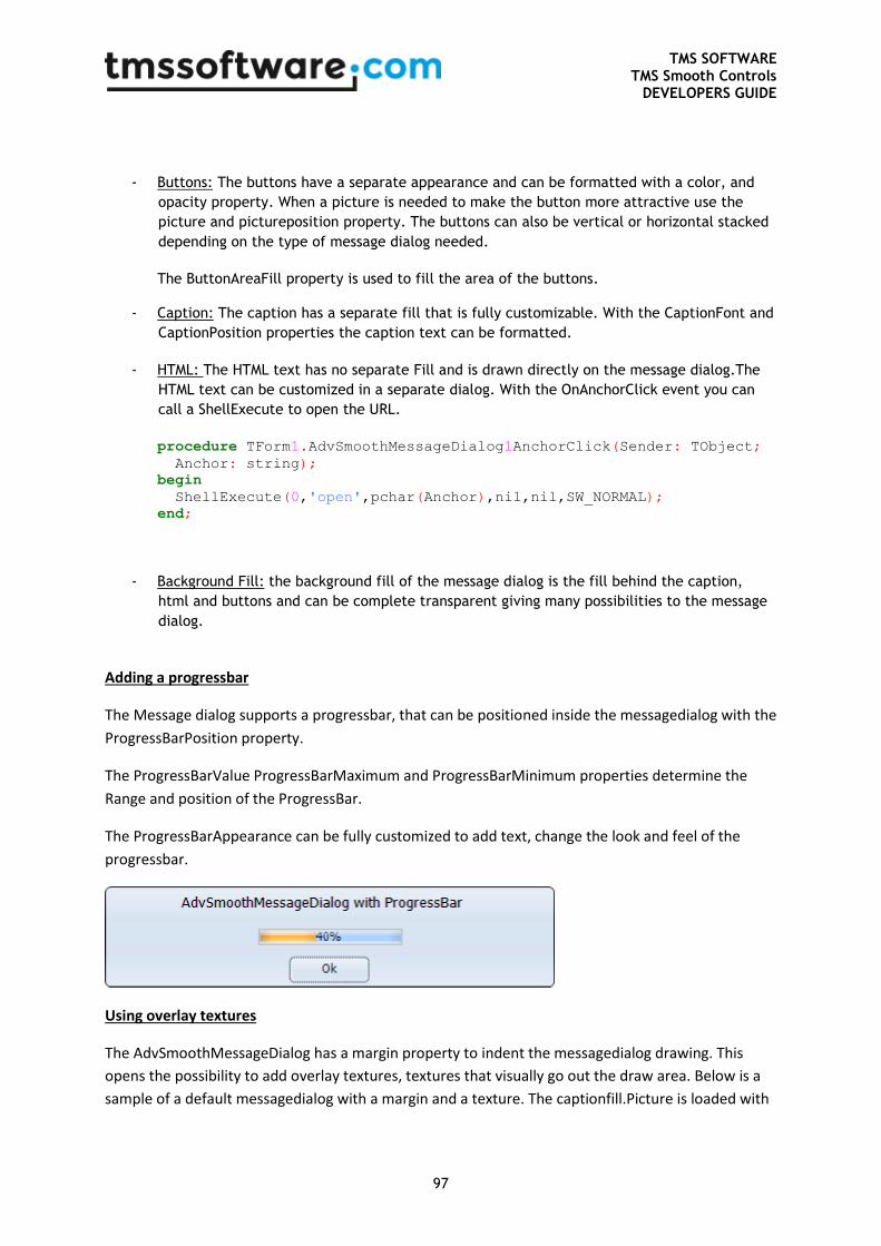
TMS SOFTWARE TMS Smooth Controls
DEVELOPERS GUIDE
97
- Buttons: The buttons have a separate appearance and can be formatted with a color, and
opacity property. When a picture is needed to make the button more attractive use the
picture and pictureposition property. The buttons can also be vertical or horizontal stacked
depending on the type of message dialog needed.
The ButtonAreaFill property is used to fill the area of the buttons.
- Caption: The caption has a separate fill that is fully customizable. With the CaptionFont and
CaptionPosition properties the caption text can be formatted.
- HTML: The HTML text has no separate Fill and is drawn directly on the message dialog.The
HTML text can be customized in a separate dialog. With the OnAnchorClick event you can
call a ShellExecute to open the URL.
procedure TForm1.AdvSmoothMessageDialog1AnchorClick(Sender: TObject;
Anchor: string);
begin
ShellExecute(0,'open',pchar(Anchor),nil,nil,SW_NORMAL);
end;
- Background Fill: the background fill of the message dialog is the fill behind the caption,
html and buttons and can be complete transparent giving many possibilities to the message
dialog.
Adding a progressbar
The Message dialog supports a progressbar, that can be positioned inside the messagedialog with the
ProgressBarPosition property.
The ProgressBarValue ProgressBarMaximum and ProgressBarMinimum properties determine the
Range and position of the ProgressBar.
The ProgressBarAppearance can be fully customized to add text, change the look and feel of the
progressbar.
Using overlay textures
The AdvSmoothMessageDialog has a margin property to indent the messagedialog drawing. This
opens the possibility to add overlay textures, textures that visually go out the draw area. Below is a
sample of a default messagedialog with a margin and a texture. The captionfill.Picture is loaded with
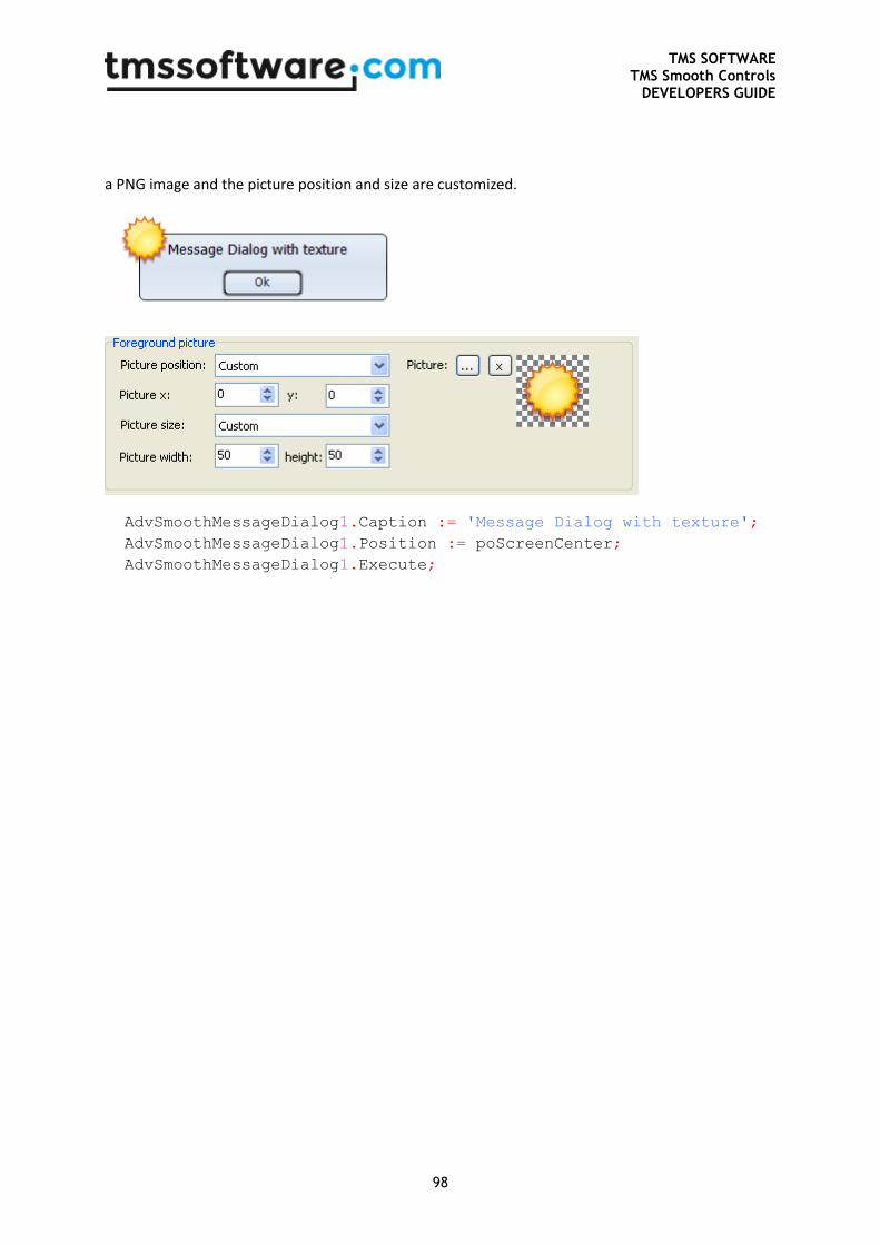
TMS SOFTWARE TMS Smooth Controls
DEVELOPERS GUIDE
98
a PNG image and the picture position and size are customized.
AdvSmoothMessageDialog1.Caption := 'Message Dialog with texture';
AdvSmoothMessageDialog1.Position := poScreenCenter;
AdvSmoothMessageDialog1.Execute;
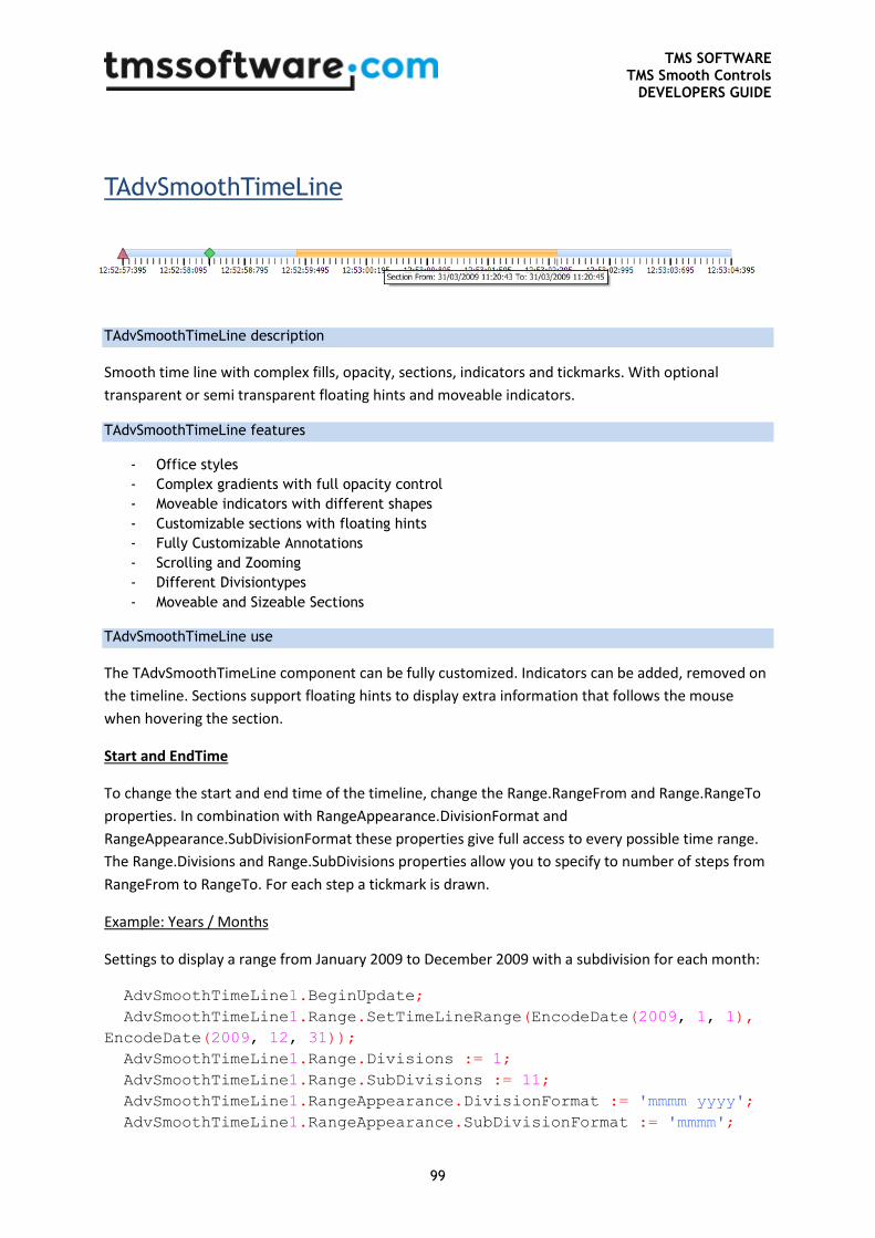
TMS SOFTWARE TMS Smooth Controls
DEVELOPERS GUIDE
99
TAdvSmoothTimeLine
TAdvSmoothTimeLine description
Smooth time line with complex fills, opacity, sections, indicators and tickmarks. With optional
transparent or semi transparent floating hints and moveable indicators.
TAdvSmoothTimeLine features
- Office styles
- Complex gradients with full opacity control
- Moveable indicators with different shapes
- Customizable sections with floating hints
- Fully Customizable Annotations
- Scrolling and Zooming
- Different Divisiontypes
- Moveable and Sizeable Sections
TAdvSmoothTimeLine use
The TAdvSmoothTimeLine component can be fully customized. Indicators can be added, removed on
the timeline. Sections support floating hints to display extra information that follows the mouse
when hovering the section.
Start and EndTime
To change the start and end time of the timeline, change the Range.RangeFrom and Range.RangeTo
properties. In combination with RangeAppearance.DivisionFormat and
RangeAppearance.SubDivisionFormat these properties give full access to every possible time range.
The Range.Divisions and Range.SubDivisions properties allow you to specify to number of steps from
RangeFrom to RangeTo. For each step a tickmark is drawn.
Example: Years / Months
Settings to display a range from January 2009 to December 2009 with a subdivision for each month:
AdvSmoothTimeLine1.BeginUpdate;
AdvSmoothTimeLine1.Range.SetTimeLineRange(EncodeDate(2009, 1, 1),
EncodeDate(2009, 12, 31));
AdvSmoothTimeLine1.Range.Divisions := 1;
AdvSmoothTimeLine1.Range.SubDivisions := 11;
AdvSmoothTimeLine1.RangeAppearance.DivisionFormat := 'mmmm yyyy';
AdvSmoothTimeLine1.RangeAppearance.SubDivisionFormat := 'mmmm';
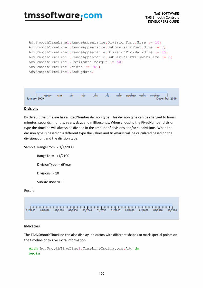
TMS SOFTWARE TMS Smooth Controls
DEVELOPERS GUIDE
100
AdvSmoothTimeLine1.RangeAppearance.DivisionFont.Size := 10;
AdvSmoothTimeLine1.RangeAppearance.SubDivisionFont.Size := 7;
AdvSmoothTimeLine1.RangeAppearance.DivisionTickMarkSize := 15;
AdvSmoothTimeLine1.RangeAppearance.SubDivisionTickMarkSize := 5;
AdvSmoothTimeLine1.HorizontalMargin := 50;
AdvSmoothTimeLine1.Width := 700;
AdvSmoothTimeLine1.EndUpdate;
Divisions
By default the timeline has a FixedNumber division type. This division type can be changed to hours,
minutes, seconds, months, years, days and milliseconds. When choosing the FixedNumber division
type the timeline will always be divided in the amount of divisions and/or subdivisions. When the
division type is based on a different type the values and tickmarks will be calculated based on the
divisioncount and the division type.
Sample: RangeFrom := 1/1/2000
RangeTo := 1/1/2100
DivisionType := dtYear
Divisions := 10
SubDivisions := 1
Result:
Indicators
The TAdvSmoothTimeLine can also display indicators with different shapes to mark special points on
the timeline or to give extra information.
with AdvSmoothTimeLine1.TimeLineIndicators.Add do
begin
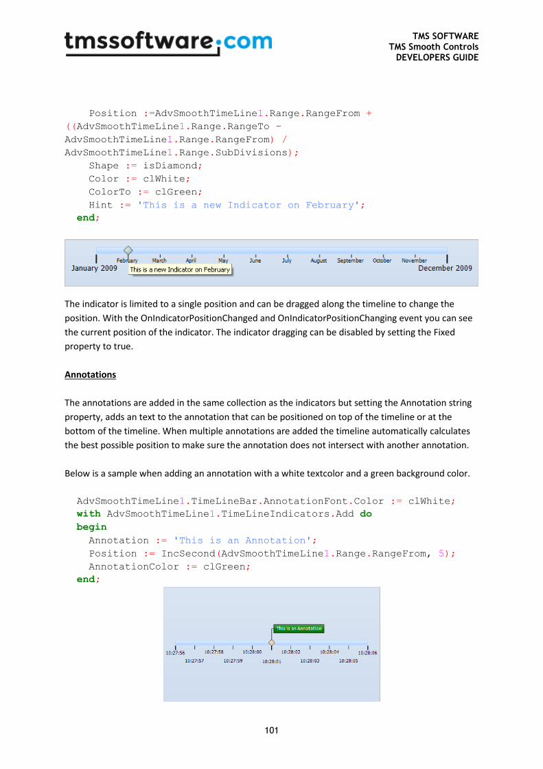
TMS SOFTWARE TMS Smooth Controls
DEVELOPERS GUIDE
101
Position :=AdvSmoothTimeLine1.Range.RangeFrom +
((AdvSmoothTimeLine1.Range.RangeTo -
AdvSmoothTimeLine1.Range.RangeFrom) /
AdvSmoothTimeLine1.Range.SubDivisions);
Shape := isDiamond;
Color := clWhite;
ColorTo := clGreen;
Hint := 'This is a new Indicator on February';
end;
The indicator is limited to a single position and can be dragged along the timeline to change the
position. With the OnIndicatorPositionChanged and OnIndicatorPositionChanging event you can see
the current position of the indicator. The indicator dragging can be disabled by setting the Fixed
property to true.
Annotations
The annotations are added in the same collection as the indicators but setting the Annotation string
property, adds an text to the annotation that can be positioned on top of the timeline or at the
bottom of the timeline. When multiple annotations are added the timeline automatically calculates
the best possible position to make sure the annotation does not intersect with another annotation.
Below is a sample when adding an annotation with a white textcolor and a green background color.
AdvSmoothTimeLine1.TimeLineBar.AnnotationFont.Color := clWhite;
with AdvSmoothTimeLine1.TimeLineIndicators.Add do
begin
Annotation := 'This is an Annotation';
Position := IncSecond(AdvSmoothTimeLine1.Range.RangeFrom, 5);
AnnotationColor := clGreen;
end;
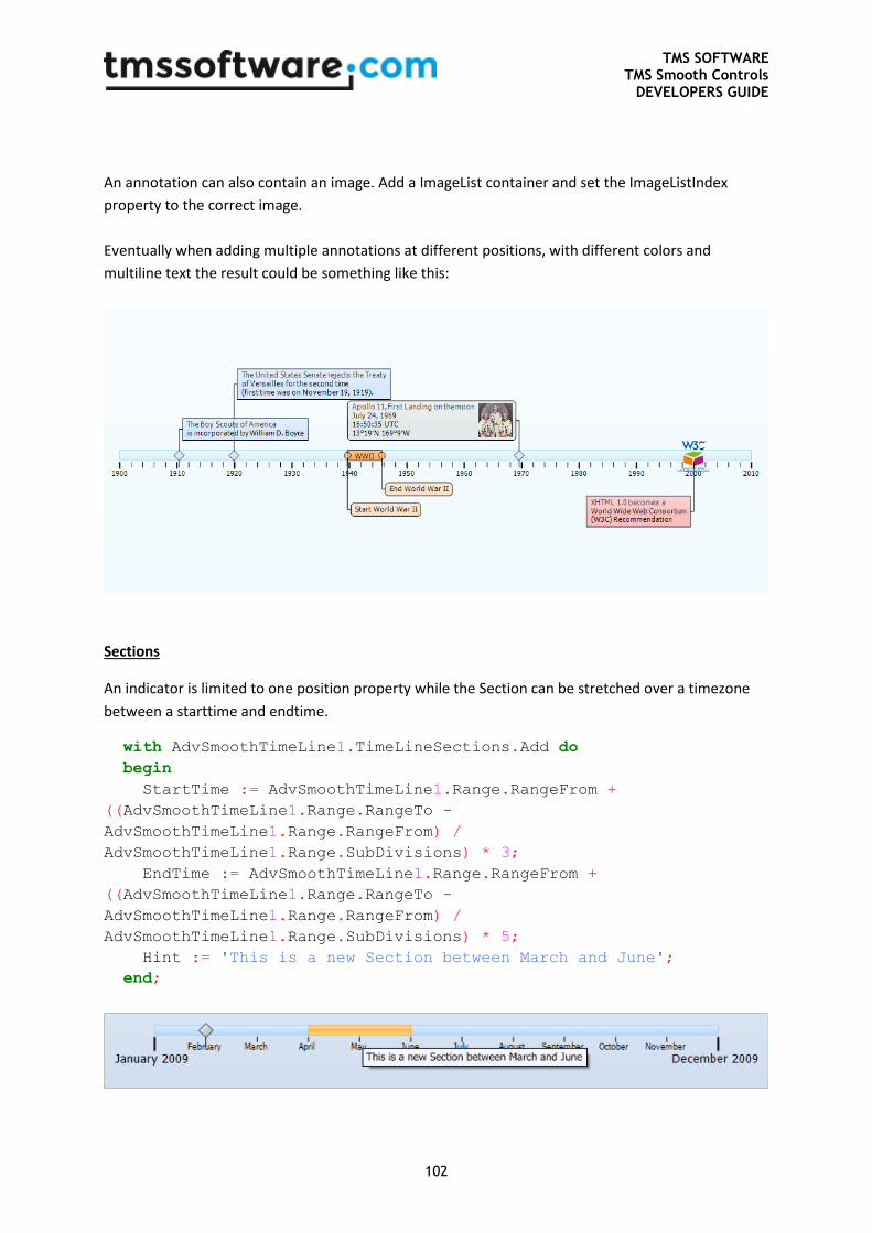
TMS SOFTWARE TMS Smooth Controls
DEVELOPERS GUIDE
102
An annotation can also contain an image. Add a ImageList container and set the ImageListIndex
property to the correct image.
Eventually when adding multiple annotations at different positions, with different colors and
multiline text the result could be something like this:
Sections
An indicator is limited to one position property while the Section can be stretched over a timezone
between a starttime and endtime.
with AdvSmoothTimeLine1.TimeLineSections.Add do
begin
StartTime := AdvSmoothTimeLine1.Range.RangeFrom +
((AdvSmoothTimeLine1.Range.RangeTo -
AdvSmoothTimeLine1.Range.RangeFrom) /
AdvSmoothTimeLine1.Range.SubDivisions) * 3;
EndTime := AdvSmoothTimeLine1.Range.RangeFrom +
((AdvSmoothTimeLine1.Range.RangeTo -
AdvSmoothTimeLine1.Range.RangeFrom) /
AdvSmoothTimeLine1.Range.SubDivisions) * 5;
Hint := 'This is a new Section between March and June';
end;
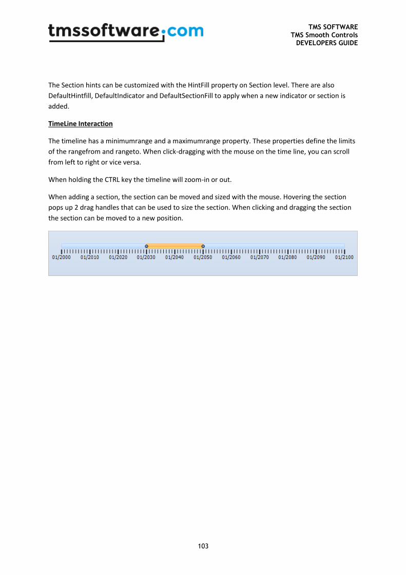
TMS SOFTWARE TMS Smooth Controls
DEVELOPERS GUIDE
103
The Section hints can be customized with the HintFill property on Section level. There are also
DefaultHintfill, DefaultIndicator and DefaultSectionFill to apply when a new indicator or section is
added.
TimeLine Interaction
The timeline has a minimumrange and a maximumrange property. These properties define the limits
of the rangefrom and rangeto. When click-dragging with the mouse on the time line, you can scroll
from left to right or vice versa.
When holding the CTRL key the timeline will zoom-in or out.
When adding a section, the section can be moved and sized with the mouse. Hovering the section
pops up 2 drag handles that can be used to size the section. When clicking and dragging the section
the section can be moved to a new position.
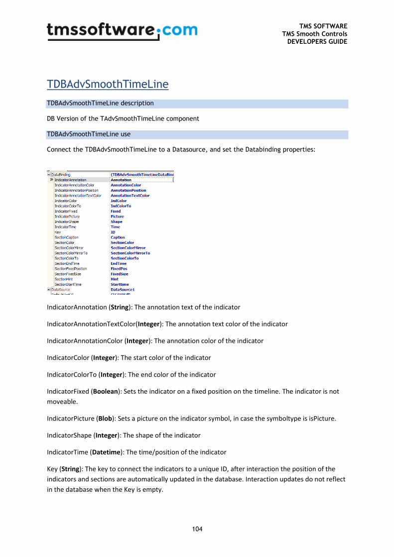
TMS SOFTWARE TMS Smooth Controls
DEVELOPERS GUIDE
104
TDBAdvSmoothTimeLine
TDBAdvSmoothTimeLine description
DB Version of the TAdvSmoothTimeLine component
TDBAdvSmoothTimeLine use
Connect the TDBAdvSmoothTimeLine to a Datasource, and set the Databinding properties:
IndicatorAnnotation (String): The annotation text of the indicator
IndicatorAnnotationTextColor(Integer): The annotation text color of the indicator
IndicatorAnnotationColor (Integer): The annotation color of the indicator
IndicatorColor (Integer): The start color of the indicator
IndicatorColorTo (Integer): The end color of the indicator
IndicatorFixed (Boolean): Sets the indicator on a fixed position on the timeline. The indicator is not
moveable.
IndicatorPicture (Blob): Sets a picture on the indicator symbol, in case the symboltype is isPicture.
IndicatorShape (Integer): The shape of the indicator
IndicatorTime (Datetime): The time/position of the indicator
Key (String): The key to connect the indicators to a unique ID, after interaction the position of the
indicators and sections are automatically updated in the database. Interaction updates do not reflect
in the database when the Key is empty.
TMS SOFTWARE TMS Smooth Controls
DEVELOPERS GUIDE
105
SectionCaption (String): The caption of the section.
SectionColor/ColorTo/ColorMirror/ColorMirrorTo (Integer): The appearance of the section
SectionEndTime (Datetime): The end time of the section.
SectionStartTime (Datetime): The start time of the section.
SectionFixedPosition (Boolean): Enables / disables interaction with the section position.
SectionFixedSize (Boolean): Enables / disables interaction with the section size.
SectionHint (String): The hint of the section.
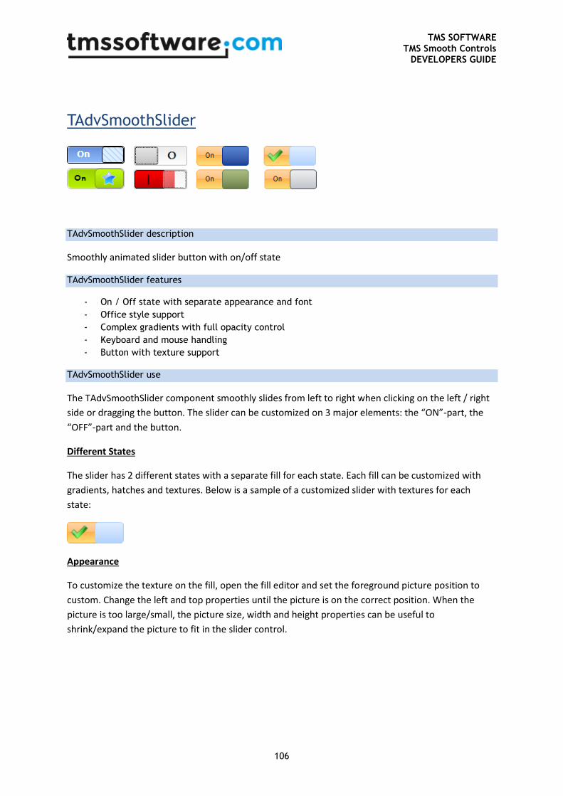
TMS SOFTWARE TMS Smooth Controls
DEVELOPERS GUIDE
106
TAdvSmoothSlider
TAdvSmoothSlider description
Smoothly animated slider button with on/off state
TAdvSmoothSlider features
- On / Off state with separate appearance and font
- Office style support
- Complex gradients with full opacity control
- Keyboard and mouse handling
- Button with texture support
TAdvSmoothSlider use
The TAdvSmoothSlider component smoothly slides from left to right when clicking on the left / right
side or dragging the button. The slider can be customized on 3 major elements: the “ON”-part, the
“OFF”-part and the button.
Different States
The slider has 2 different states with a separate fill for each state. Each fill can be customized with
gradients, hatches and textures. Below is a sample of a customized slider with textures for each
state:
Appearance
To customize the texture on the fill, open the fill editor and set the foreground picture position to
custom. Change the left and top properties until the picture is on the correct position. When the
picture is too large/small, the picture size, width and height properties can be useful to
shrink/expand the picture to fit in the slider control.
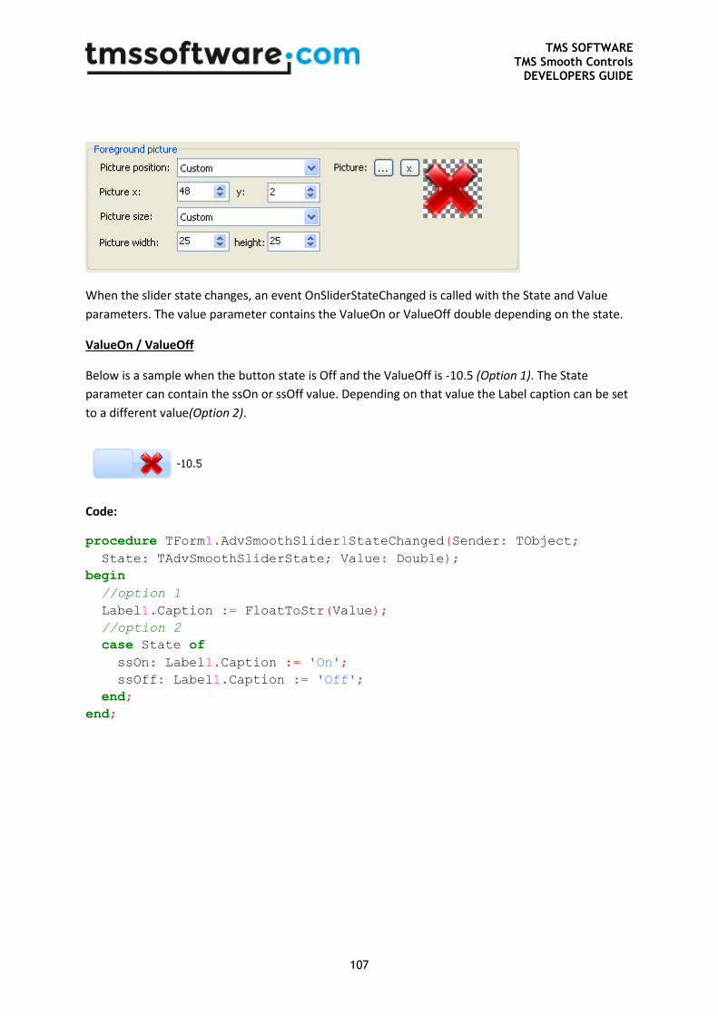
TMS SOFTWARE TMS Smooth Controls
DEVELOPERS GUIDE
107
When the slider state changes, an event OnSliderStateChanged is called with the State and Value
parameters. The value parameter contains the ValueOn or ValueOff double depending on the state.
ValueOn / ValueOff
Below is a sample when the button state is Off and the ValueOff is -10.5 (Option 1). The State
parameter can contain the ssOn or ssOff value. Depending on that value the Label caption can be set
to a different value(Option 2).
Code:
procedure TForm1.AdvSmoothSlider1StateChanged(Sender: TObject;
State: TAdvSmoothSliderState; Value: Double);
begin
//option 1
Label1.Caption := FloatToStr(Value);
//option 2
case State of
ssOn: Label1.Caption := 'On';
ssOff: Label1.Caption := 'Off';
end;
end;
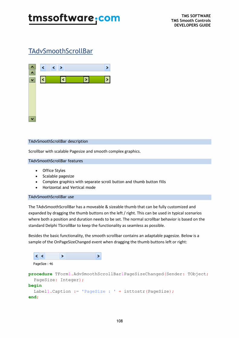
TMS SOFTWARE TMS Smooth Controls
DEVELOPERS GUIDE
108
TAdvSmoothScrollBar
TAdvSmoothScrollBar description
Scrollbar with scalable Pagesize and smooth complex graphics.
TAdvSmoothScrollBar features
Office Styles
Scalable pagesize
Complex graphics with separate scroll button and thumb button fills
Horizontal and Vertical mode
TAdvSmoothScrollBar use
The TAdvSmoothScrollBar has a moveable & sizeable thumb that can be fully customized and
expanded by dragging the thumb buttons on the left / right. This can be used in typical scenarios
where both a position and duration needs to be set. The normal scrollbar behavior is based on the
standard Delphi TScrollBar to keep the functionality as seamless as possible.
Besides the basic functionality, the smooth scrollbar contains an adaptable pagesize. Below is a
sample of the OnPageSizeChanged event when dragging the thumb buttons left or right:
procedure TForm1.AdvSmoothScrollBar1PageSizeChanged(Sender: TObject;
PageSize: Integer);
begin
Label1.Caption := 'PageSize : ' + inttostr(PageSize);
end;

TMS SOFTWARE TMS Smooth Controls
DEVELOPERS GUIDE
109
The PageSize can be programmatically changed by using
AdvSmoothScrollBar1.PageSize := 50;
This property can be used to change the height / width of the scrollable area.
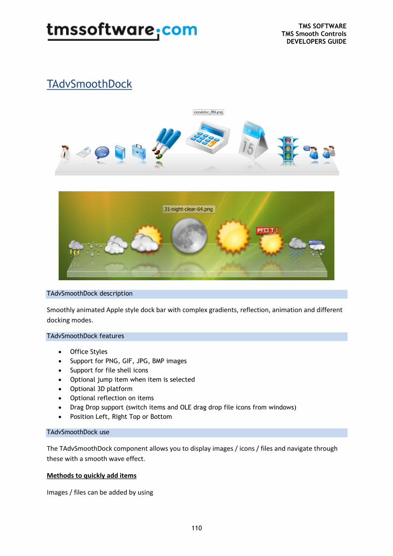
TMS SOFTWARE TMS Smooth Controls
DEVELOPERS GUIDE
110
TAdvSmoothDock
TAdvSmoothDock description
Smoothly animated Apple style dock bar with complex gradients, reflection, animation and different
docking modes.
TAdvSmoothDock features
Office Styles
Support for PNG, GIF, JPG, BMP images
Support for file shell icons
Optional jump item when item is selected
Optional 3D platform
Optional reflection on items
Drag Drop support (switch items and OLE drag drop file icons from windows)
Position Left, Right Top or Bottom
TAdvSmoothDock use
The TAdvSmoothDock component allows you to display images / icons / files and navigate through
these with a smooth wave effect.
Methods to quickly add items
Images / files can be added by using
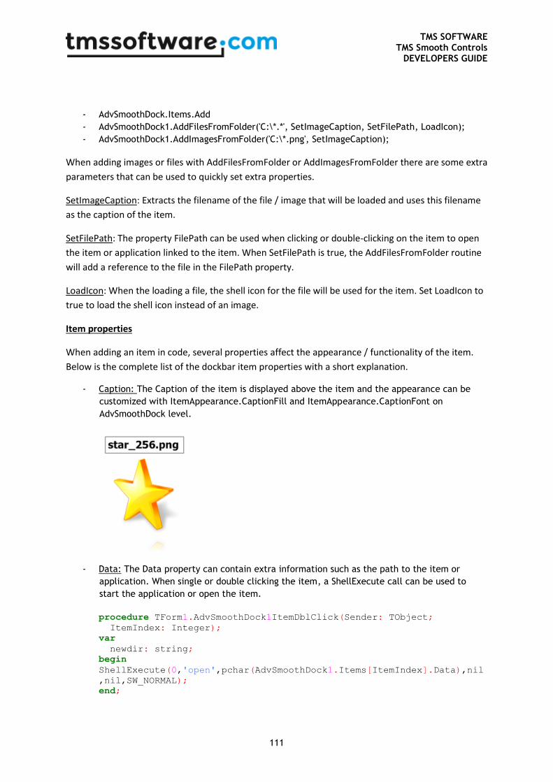
TMS SOFTWARE TMS Smooth Controls
DEVELOPERS GUIDE
111
- AdvSmoothDock.Items.Add
- AdvSmoothDock1.AddFilesFromFolder('C:\*.*', SetImageCaption, SetFilePath, LoadIcon);
- AdvSmoothDock1.AddImagesFromFolder('C:\*.png', SetImageCaption);
When adding images or files with AddFilesFromFolder or AddImagesFromFolder there are some extra
parameters that can be used to quickly set extra properties.
SetImageCaption: Extracts the filename of the file / image that will be loaded and uses this filename
as the caption of the item.
SetFilePath: The property FilePath can be used when clicking or double-clicking on the item to open
the item or application linked to the item. When SetFilePath is true, the AddFilesFromFolder routine
will add a reference to the file in the FilePath property.
LoadIcon: When the loading a file, the shell icon for the file will be used for the item. Set LoadIcon to
true to load the shell icon instead of an image.
Item properties
When adding an item in code, several properties affect the appearance / functionality of the item.
Below is the complete list of the dockbar item properties with a short explanation.
- Caption: The Caption of the item is displayed above the item and the appearance can be
customized with ItemAppearance.CaptionFill and ItemAppearance.CaptionFont on
AdvSmoothDock level.
- Data: The Data property can contain extra information such as the path to the item or
application. When single or double clicking the item, a ShellExecute call can be used to
start the application or open the item.
procedure TForm1.AdvSmoothDock1ItemDblClick(Sender: TObject;
ItemIndex: Integer);
var
newdir: string;
begin
ShellExecute(0,'open',pchar(AdvSmoothDock1.Items[ItemIndex].Data),nil
,nil,SW_NORMAL);
end;
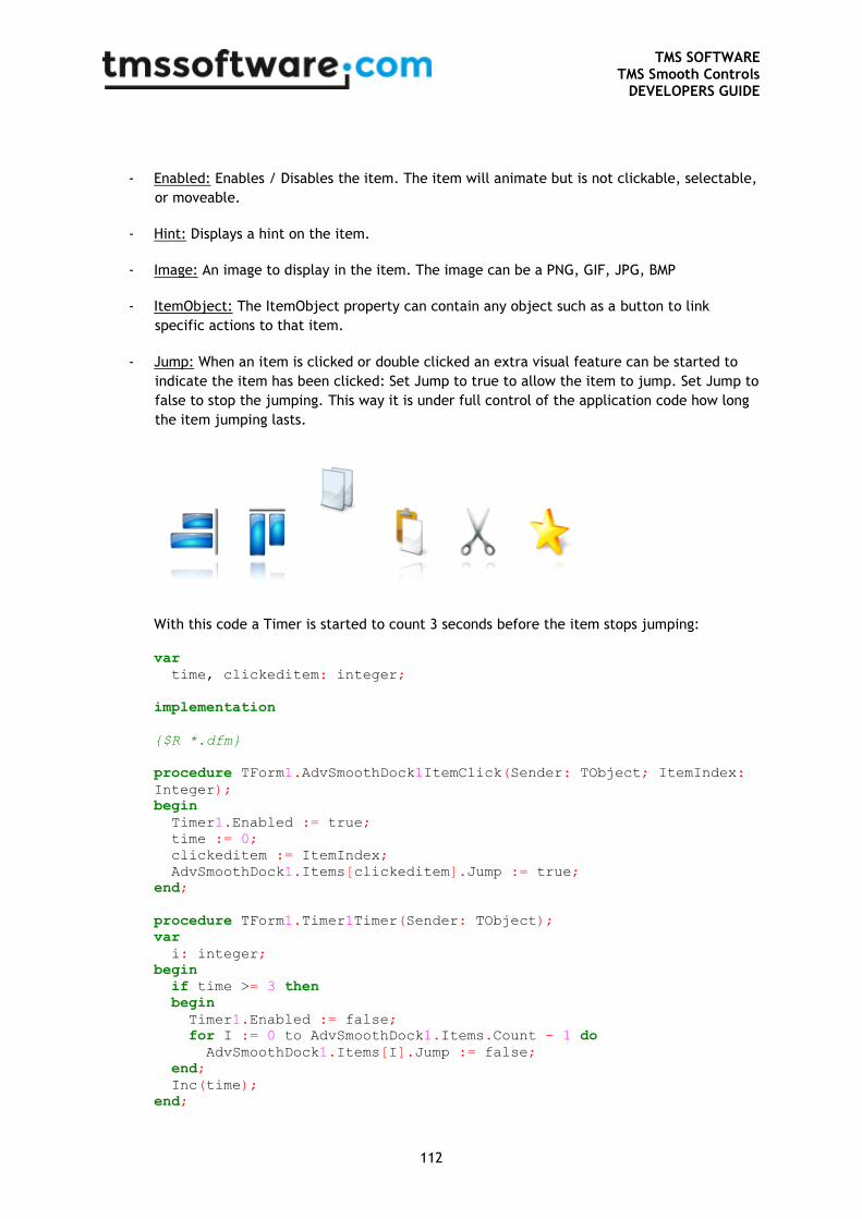
TMS SOFTWARE TMS Smooth Controls
DEVELOPERS GUIDE
112
- Enabled: Enables / Disables the item. The item will animate but is not clickable, selectable,
or moveable.
- Hint: Displays a hint on the item.
- Image: An image to display in the item. The image can be a PNG, GIF, JPG, BMP
- ItemObject: The ItemObject property can contain any object such as a button to link
specific actions to that item.
- Jump: When an item is clicked or double clicked an extra visual feature can be started to
indicate the item has been clicked: Set Jump to true to allow the item to jump. Set Jump to
false to stop the jumping. This way it is under full control of the application code how long
the item jumping lasts.
With this code a Timer is started to count 3 seconds before the item stops jumping: var
time, clickeditem: integer;
implementation
{$R *.dfm}
procedure TForm1.AdvSmoothDock1ItemClick(Sender: TObject; ItemIndex:
Integer);
begin
Timer1.Enabled := true;
time := 0;
clickeditem := ItemIndex;
AdvSmoothDock1.Items[clickeditem].Jump := true;
end;
procedure TForm1.Timer1Timer(Sender: TObject);
var
i: integer;
begin
if time >= 3 then
begin
Timer1.Enabled := false;
for I := 0 to AdvSmoothDock1.Items.Count - 1 do
AdvSmoothDock1.Items[I].Jump := false;
end;
Inc(time);
end;
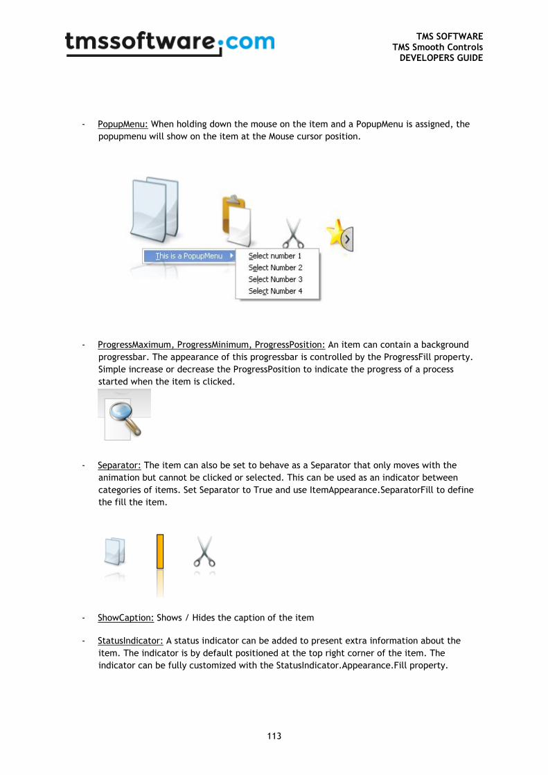
TMS SOFTWARE TMS Smooth Controls
DEVELOPERS GUIDE
113
- PopupMenu: When holding down the mouse on the item and a PopupMenu is assigned, the
popupmenu will show on the item at the Mouse cursor position.
- ProgressMaximum, ProgressMinimum, ProgressPosition: An item can contain a background
progressbar. The appearance of this progressbar is controlled by the ProgressFill property.
Simple increase or decrease the ProgressPosition to indicate the progress of a process
started when the item is clicked.
- Separator: The item can also be set to behave as a Separator that only moves with the
animation but cannot be clicked or selected. This can be used as an indicator between
categories of items. Set Separator to True and use ItemAppearance.SeparatorFill to define
the fill the item.
- ShowCaption: Shows / Hides the caption of the item
- StatusIndicator: A status indicator can be added to present extra information about the
item. The indicator is by default positioned at the top right corner of the item. The
indicator can be fully customized with the StatusIndicator.Appearance.Fill property.
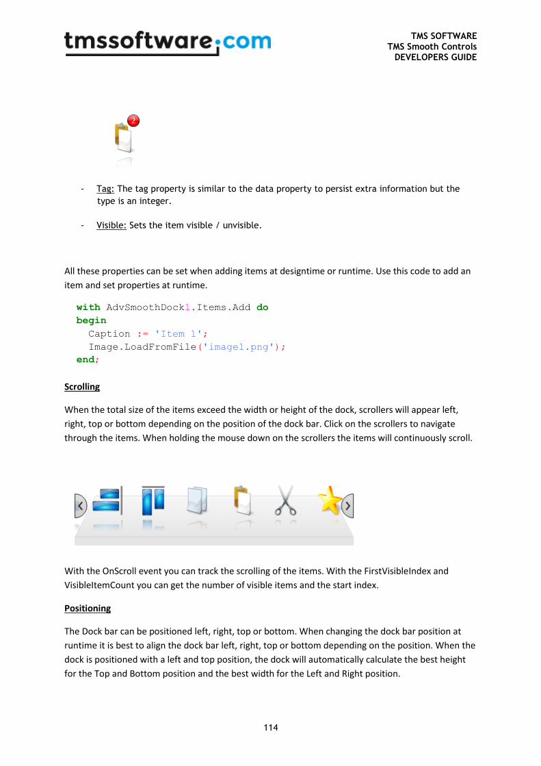
TMS SOFTWARE TMS Smooth Controls
DEVELOPERS GUIDE
114
- Tag: The tag property is similar to the data property to persist extra information but the
type is an integer.
- Visible: Sets the item visible / unvisible.
All these properties can be set when adding items at designtime or runtime. Use this code to add an
item and set properties at runtime.
with AdvSmoothDock1.Items.Add do
begin
Caption := 'Item 1';
Image.LoadFromFile('image1.png');
end;
Scrolling
When the total size of the items exceed the width or height of the dock, scrollers will appear left,
right, top or bottom depending on the position of the dock bar. Click on the scrollers to navigate
through the items. When holding the mouse down on the scrollers the items will continuously scroll.
With the OnScroll event you can track the scrolling of the items. With the FirstVisibleIndex and
VisibleItemCount you can get the number of visible items and the start index.
Positioning
The Dock bar can be positioned left, right, top or bottom. When changing the dock bar position at
runtime it is best to align the dock bar left, right, top or bottom depending on the position. When the
dock is positioned with a left and top position, the dock will automatically calculate the best height
for the Top and Bottom position and the best width for the Left and Right position.
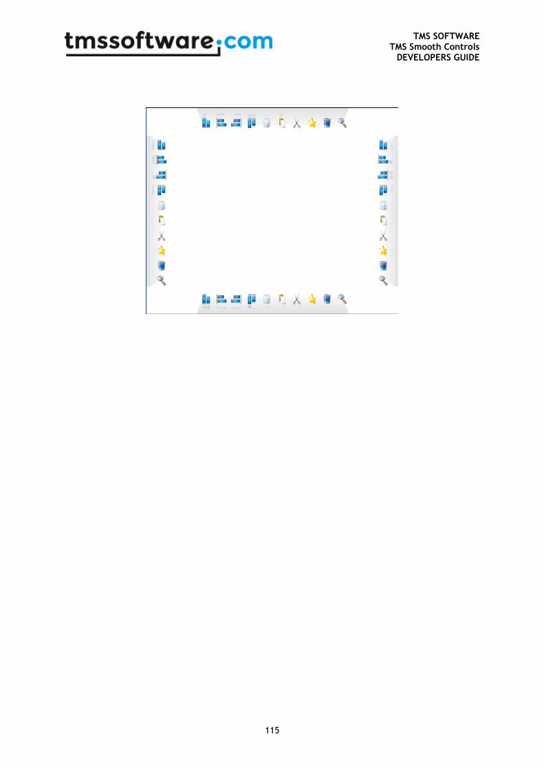
TMS SOFTWARE TMS Smooth Controls
DEVELOPERS GUIDE
115
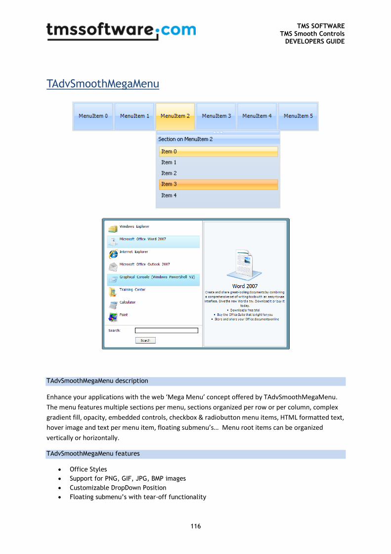
TMS SOFTWARE TMS Smooth Controls
DEVELOPERS GUIDE
116
TAdvSmoothMegaMenu
TAdvSmoothMegaMenu description
Enhance your applications with the web ‘Mega Menu’ concept offered by TAdvSmoothMegaMenu.
The menu features multiple sections per menu, sections organized per row or per column, complex
gradient fill, opacity, embedded controls, checkbox & radiobutton menu items, HTML formatted text,
hover image and text per menu item, floating submenu’s… Menu root items can be organized
vertically or horizontally.
TAdvSmoothMegaMenu features
Office Styles
Support for PNG, GIF, JPG, BMP images
Customizable DropDown Position
Floating submenu’s with tear-off functionality
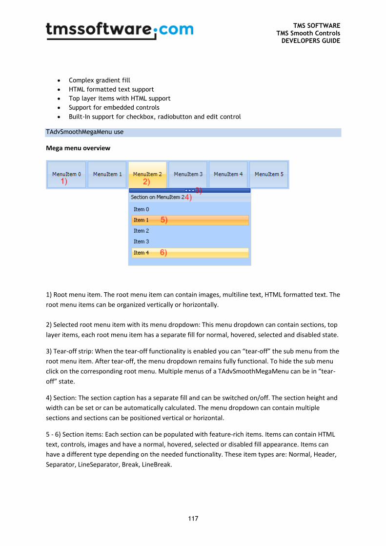
TMS SOFTWARE TMS Smooth Controls
DEVELOPERS GUIDE
117
Complex gradient fill
HTML formatted text support
Top layer items with HTML support
Support for embedded controls
Built-In support for checkbox, radiobutton and edit control
TAdvSmoothMegaMenu use
Mega menu overview
1) Root menu item. The root menu item can contain images, multiline text, HTML formatted text. The
root menu items can be organized vertically or horizontally.
2) Selected root menu item with its menu dropdown: This menu dropdown can contain sections, top
layer items, each root menu item has a separate fill for normal, hovered, selected and disabled state.
3) Tear-off strip: When the tear-off functionality is enabled you can “tear-off” the sub menu from the
root menu item. After tear-off, the menu dropdown remains fully functional. To hide the sub menu
click on the corresponding root menu. Multiple menus of a TAdvSmoothMegaMenu can be in “tear-
off” state.
4) Section: The section caption has a separate fill and can be switched on/off. The section height and
width can be set or can be automatically calculated. The menu dropdown can contain multiple
sections and sections can be positioned vertical or horizontal.
5 - 6) Section items: Each section can be populated with feature-rich items. Items can contain HTML
text, controls, images and have a normal, hovered, selected or disabled fill appearance. Items can
have a different type depending on the needed functionality. These item types are: Normal, Header,
Separator, LineSeparator, Break, LineBreak.
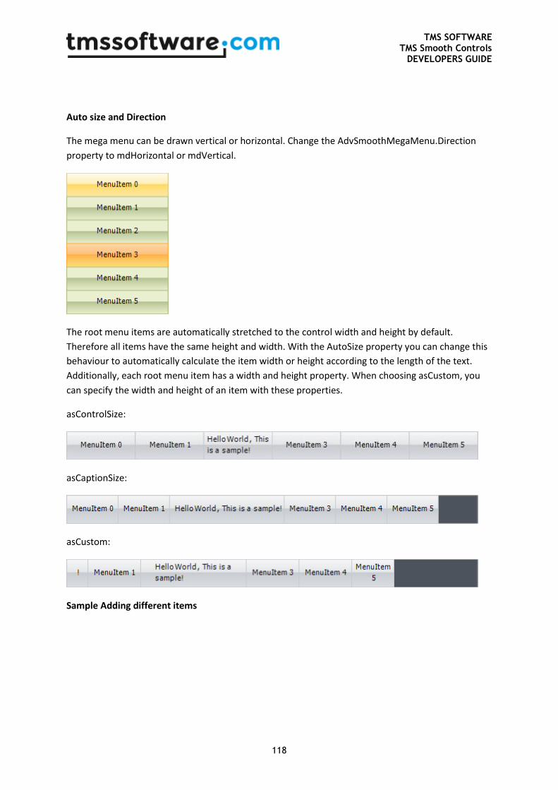
TMS SOFTWARE TMS Smooth Controls
DEVELOPERS GUIDE
118
Auto size and Direction
The mega menu can be drawn vertical or horizontal. Change the AdvSmoothMegaMenu.Direction
property to mdHorizontal or mdVertical.
The root menu items are automatically stretched to the control width and height by default.
Therefore all items have the same height and width. With the AutoSize property you can change this
behaviour to automatically calculate the item width or height according to the length of the text.
Additionally, each root menu item has a width and height property. When choosing asCustom, you
can specify the width and height of an item with these properties.
asControlSize:
asCaptionSize:
asCustom:
Sample Adding different items
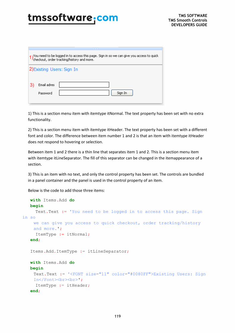
TMS SOFTWARE TMS Smooth Controls
DEVELOPERS GUIDE
119
1) This is a section menu item with itemtype itNormal. The text property has been set with no extra
functionality.
2) This is a section menu item with itemtype itHeader. The text property has been set with a different
font and color. The difference between item number 1 and 2 is that an item with itemtype itHeader
does not respond to hovering or selection.
Between item 1 and 2 there is a thin line that separates item 1 and 2. This is a section menu item
with itemtype itLineSeparator. The fill of this separator can be changed in the itemappearance of a
section.
3) This is an item with no text, and only the control property has been set. The controls are bundled
in a panel container and the panel is used in the control property of an item.
Below is the code to add those three items:
with Items.Add do
begin
Text.Text := 'You need to be logged in to access this page. Sign
in so
we can give you access to quick checkout, order tracking/history
and more.';
ItemType := itNormal;
end;
Items.Add.ItemType := itLineSeparator;
with Items.Add do
begin
Text.Text := '<FONT size="11" color="#0080FF">Existing Users: Sign
In</Font><br><br>';
ItemType := itHeader;
end;
TMS SOFTWARE TMS Smooth Controls
DEVELOPERS GUIDE
120
with Items.Add do
begin
ControlType := ctControl;
Control := Panel1;
end;
Multiple Section Item Columns / Rows
As seen in the above image, the section item can have different types. There is a possibility to split
the section into different columns by changing the itemtype to itBreak or itLineBreak. The section will
be divided by the number of breaks that are added to the section. These item breaks are not visible.
To visualize a section column use the itLineBreak item type and change the BreakFill on
ItemAppearance level.
Below is a sample with 3 columns and 2 Breaks, one normal and a visual line break.
with AdvSmoothMegaMenu1.MenuItems[0].Menu do
begin
with Sections.Add do
begin
Width := 500;
ItemSpacing := 15;
Items.Add.Text := 'Item 1 on column 1';
Items.Add.Text := 'Item 2 on column 1';
Items.Add.Text := 'Item 3 on column 1';
Items.Add.ItemType := itBreak;
Items.Add.Text := 'Item 1 on column 2';
Items.Add.Text := 'Item 2 on column 2';
Items.Add.Text := 'Item 3 on column 2';
Items.Add.ItemType := itLineBreak;
Items.Add.Text := 'Item 1 on column 3';
Items.Add.Text := 'Item 2 on column 3';
Items.Add.Text := 'Item 3 on column 3';
end;
end;
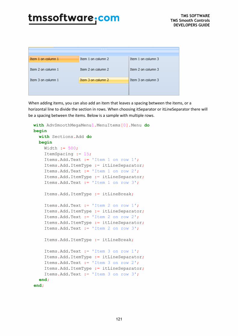
TMS SOFTWARE TMS Smooth Controls
DEVELOPERS GUIDE
121
When adding items, you can also add an item that leaves a spacing between the items, or a
horizontal line to divide the section in rows. When choosing itSeparator or itLineSeparator there will
be a spacing between the items. Below is a sample with multiple rows.
with AdvSmoothMegaMenu1.MenuItems[0].Menu do
begin
with Sections.Add do
begin
Width := 500;
ItemSpacing := 15;
Items.Add.Text := 'Item 1 on row 1';
Items.Add.ItemType := itLineSeparator;
Items.Add.Text := 'Item 1 on row 2';
Items.Add.ItemType := itLineSeparator;
Items.Add.Text := 'Item 1 on row 3';
Items.Add.ItemType := itLineBreak;
Items.Add.Text := 'Item 2 on row 1';
Items.Add.ItemType := itLineSeparator;
Items.Add.Text := 'Item 2 on row 2';
Items.Add.ItemType := itLineSeparator;
Items.Add.Text := 'Item 2 on row 3';
Items.Add.ItemType := itLineBreak;
Items.Add.Text := 'Item 3 on row 1';
Items.Add.ItemType := itLineSeparator;
Items.Add.Text := 'Item 3 on row 2';
Items.Add.ItemType := itLineSeparator;
Items.Add.Text := 'Item 3 on row 3';
end;
end;
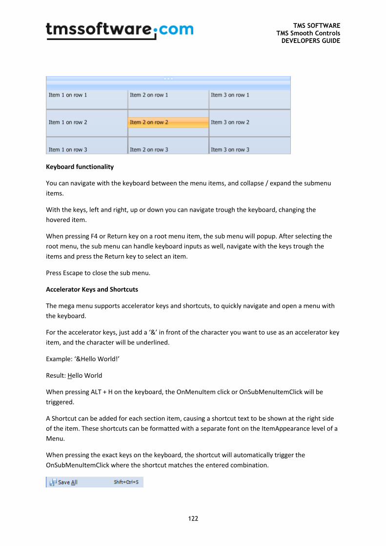
TMS SOFTWARE TMS Smooth Controls
DEVELOPERS GUIDE
122
Keyboard functionality
You can navigate with the keyboard between the menu items, and collapse / expand the submenu
items.
With the keys, left and right, up or down you can navigate trough the keyboard, changing the
hovered item.
When pressing F4 or Return key on a root menu item, the sub menu will popup. After selecting the
root menu, the sub menu can handle keyboard inputs as well, navigate with the keys trough the
items and press the Return key to select an item.
Press Escape to close the sub menu.
Accelerator Keys and Shortcuts
The mega menu supports accelerator keys and shortcuts, to quickly navigate and open a menu with
the keyboard.
For the accelerator keys, just add a ‘&’ in front of the character you want to use as an accelerator key
item, and the character will be underlined.
Example: ‘&Hello World!’
Result: Hello World
When pressing ALT + H on the keyboard, the OnMenuItem click or OnSubMenuItemClick will be
triggered.
A Shortcut can be added for each section item, causing a shortcut text to be shown at the right side
of the item. These shortcuts can be formatted with a separate font on the ItemAppearance level of a
Menu.
When pressing the exact keys on the keyboard, the shortcut will automatically trigger the
OnSubMenuItemClick where the shortcut matches the entered combination.
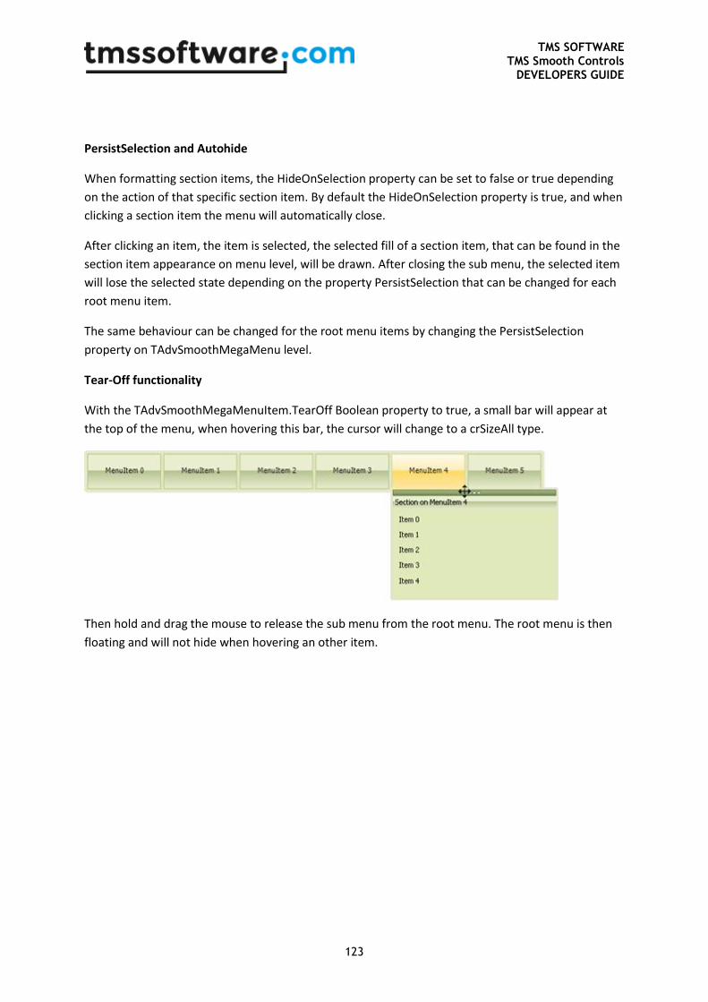
TMS SOFTWARE TMS Smooth Controls
DEVELOPERS GUIDE
123
PersistSelection and Autohide
When formatting section items, the HideOnSelection property can be set to false or true depending
on the action of that specific section item. By default the HideOnSelection property is true, and when
clicking a section item the menu will automatically close.
After clicking an item, the item is selected, the selected fill of a section item, that can be found in the
section item appearance on menu level, will be drawn. After closing the sub menu, the selected item
will lose the selected state depending on the property PersistSelection that can be changed for each
root menu item.
The same behaviour can be changed for the root menu items by changing the PersistSelection
property on TAdvSmoothMegaMenu level.
Tear-Off functionality
With the TAdvSmoothMegaMenuItem.TearOff Boolean property to true, a small bar will appear at
the top of the menu, when hovering this bar, the cursor will change to a crSizeAll type.
Then hold and drag the mouse to release the sub menu from the root menu. The root menu is then
floating and will not hide when hovering an other item.
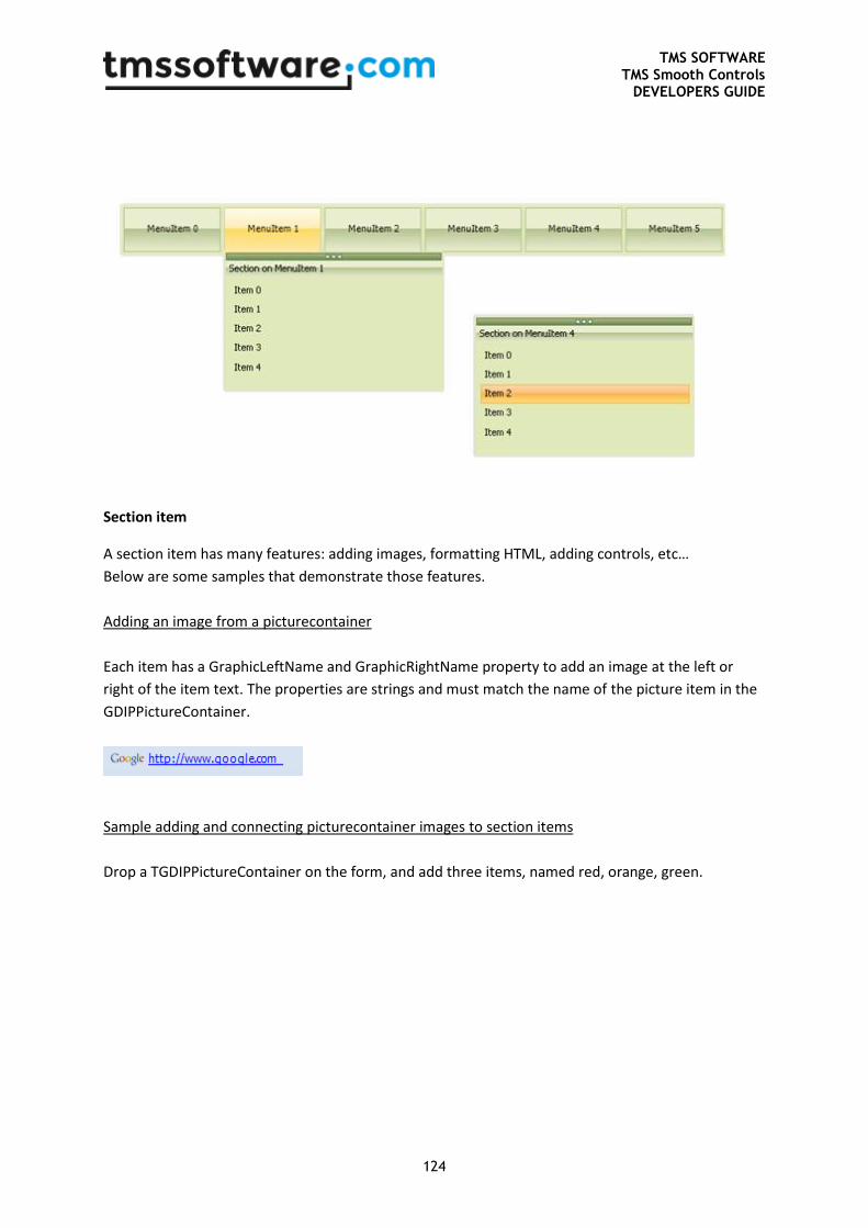
TMS SOFTWARE TMS Smooth Controls
DEVELOPERS GUIDE
124
Section item
A section item has many features: adding images, formatting HTML, adding controls, etc…
Below are some samples that demonstrate those features.
Adding an image from a picturecontainer
Each item has a GraphicLeftName and GraphicRightName property to add an image at the left or
right of the item text. The properties are strings and must match the name of the picture item in the
GDIPPictureContainer.
Sample adding and connecting picturecontainer images to section items
Drop a TGDIPPictureContainer on the form, and add three items, named red, orange, green.
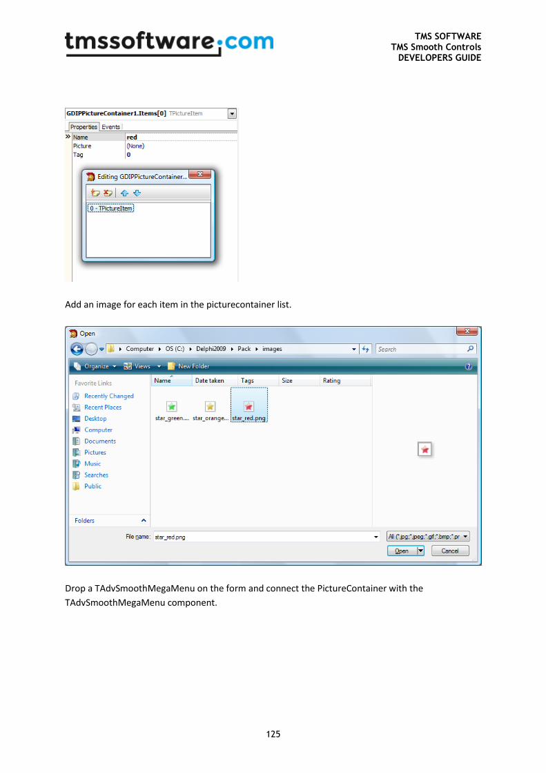
TMS SOFTWARE TMS Smooth Controls
DEVELOPERS GUIDE
125
Add an image for each item in the picturecontainer list.
Drop a TAdvSmoothMegaMenu on the form and connect the PictureContainer with the
TAdvSmoothMegaMenu component.
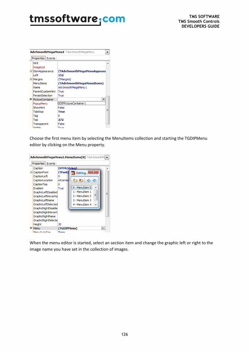
TMS SOFTWARE TMS Smooth Controls
DEVELOPERS GUIDE
126
Choose the first menu item by selecting the MenuItems collection and starting the TGDIPMenu
editor by clicking on the Menu property.
When the menu editor is started, select an section item and change the graphic left or right to the
image name you have set in the collection of images.
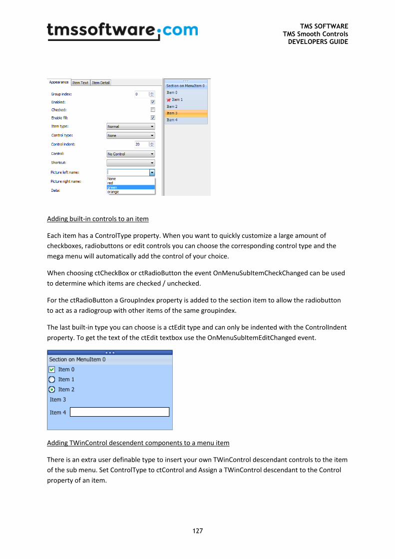
TMS SOFTWARE TMS Smooth Controls
DEVELOPERS GUIDE
127
Adding built-in controls to an item
Each item has a ControlType property. When you want to quickly customize a large amount of
checkboxes, radiobuttons or edit controls you can choose the corresponding control type and the
mega menu will automatically add the control of your choice.
When choosing ctCheckBox or ctRadioButton the event OnMenuSubItemCheckChanged can be used
to determine which items are checked / unchecked.
For the ctRadioButton a GroupIndex property is added to the section item to allow the radiobutton
to act as a radiogroup with other items of the same groupindex.
The last built-in type you can choose is a ctEdit type and can only be indented with the ControlIndent
property. To get the text of the ctEdit textbox use the OnMenuSubItemEditChanged event.
Adding TWinControl descendent components to a menu item
There is an extra user definable type to insert your own TWinControl descendant controls to the item
of the sub menu. Set ControlType to ctControl and Assign a TWinControl descendant to the Control
property of an item.
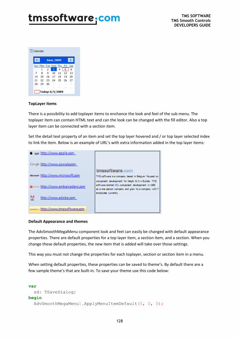
TMS SOFTWARE TMS Smooth Controls
DEVELOPERS GUIDE
128
TopLayer items
There is a possibility to add toplayer items to enchance the look and feel of the sub menu. The
toplayer item can contain HTML text and can the look can be changed with the fill editor. Also a top
layer item can be connected with a section item.
Set the detail text property of an item and set the top layer hovered and / or top layer selected index
to link the item. Below is an example of URL’s with extra information added in the top layer items:
Default Appearance and themes
The AdvSmoothMegaMenu component look and feel can easily be changed with default appearance
properties. There are default properties for a top layer item, a section item, and a section. When you
change these default properties, the new item that is added will take over those settings.
This way you must not change the properties for each toplayer, section or section item in a menu.
When setting default properties, these properties can be saved to theme’s. By default there are a
few sample theme’s that are built-in. To save your theme use this code below:
var
sd: TSaveDialog;
begin
AdvSmoothMegaMenu1.ApplyMenuItemDefault(0, 0, 0);
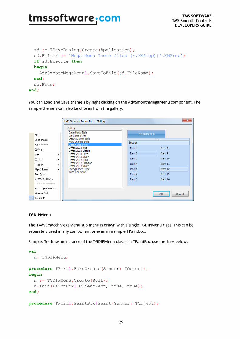
TMS SOFTWARE TMS Smooth Controls
DEVELOPERS GUIDE
129
sd := TSaveDialog.Create(Application);
sd.Filter := 'Mega Menu Theme files (*.MMProp)|*.MMProp';
if sd.Execute then
begin
AdvSmoothMegaMenu1.SaveToFile(sd.FileName);
end;
sd.Free;
end;
You can Load and Save theme’s by right clicking on the AdvSmoothMegaMenu component. The
sample theme’s can also be chosen from the gallery.
TGDIPMenu
The TAdvSmoothMegaMenu sub menu is drawn with a single TGDIPMenu class. This can be
separately used in any component or even in a simple TPaintBox.
Sample: To draw an instance of the TGDIPMenu class in a TPaintBox use the lines below:
var
m: TGDIPMenu;
procedure TForm1.FormCreate(Sender: TObject);
begin
m := TGDIPMenu.Create(Self);
m.Init(PaintBox1.ClientRect, true, true);
end;
procedure TForm1.PaintBox1Paint(Sender: TObject);
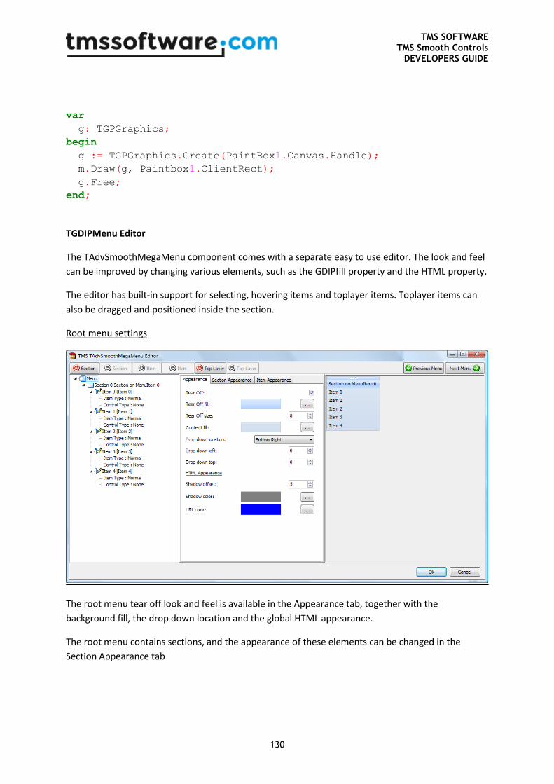
TMS SOFTWARE TMS Smooth Controls
DEVELOPERS GUIDE
130
var
g: TGPGraphics;
begin
g := TGPGraphics.Create(PaintBox1.Canvas.Handle);
m.Draw(g, Paintbox1.ClientRect);
g.Free;
end;
TGDIPMenu Editor
The TAdvSmoothMegaMenu component comes with a separate easy to use editor. The look and feel
can be improved by changing various elements, such as the GDIPfill property and the HTML property.
The editor has built-in support for selecting, hovering items and toplayer items. Toplayer items can
also be dragged and positioned inside the section.
Root menu settings
The root menu tear off look and feel is available in the Appearance tab, together with the
background fill, the drop down location and the global HTML appearance.
The root menu contains sections, and the appearance of these elements can be changed in the
Section Appearance tab
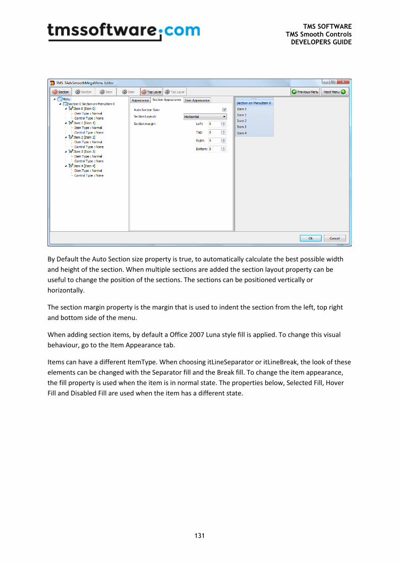
TMS SOFTWARE TMS Smooth Controls
DEVELOPERS GUIDE
131
By Default the Auto Section size property is true, to automatically calculate the best possible width
and height of the section. When multiple sections are added the section layout property can be
useful to change the position of the sections. The sections can be positioned vertically or
horizontally.
The section margin property is the margin that is used to indent the section from the left, top right
and bottom side of the menu.
When adding section items, by default a Office 2007 Luna style fill is applied. To change this visual
behaviour, go to the Item Appearance tab.
Items can have a different ItemType. When choosing itLineSeparator or itLineBreak, the look of these
elements can be changed with the Separator fill and the Break fill. To change the item appearance,
the fill property is used when the item is in normal state. The properties below, Selected Fill, Hover
Fill and Disabled Fill are used when the item has a different state.
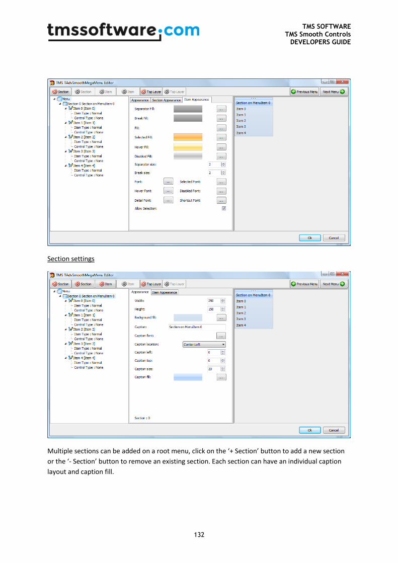
TMS SOFTWARE TMS Smooth Controls
DEVELOPERS GUIDE
132
Section settings
Multiple sections can be added on a root menu, click on the ‘+ Section’ button to add a new section
or the ‘- Section’ button to remove an existing section. Each section can have an individual caption
layout and caption fill.
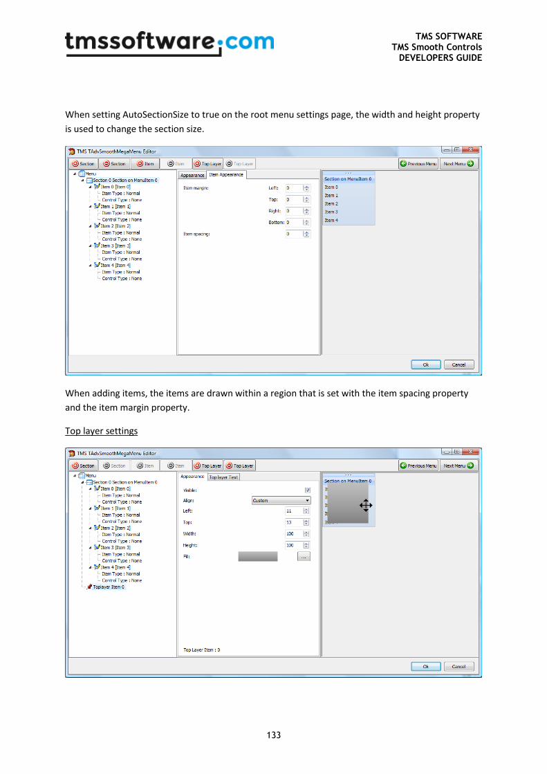
TMS SOFTWARE TMS Smooth Controls
DEVELOPERS GUIDE
133
When setting AutoSectionSize to true on the root menu settings page, the width and height property
is used to change the section size.
When adding items, the items are drawn within a region that is set with the item spacing property
and the item margin property.
Top layer settings
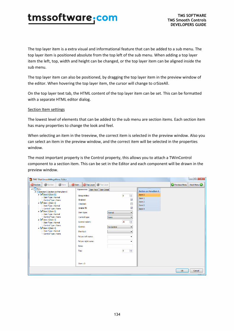
TMS SOFTWARE TMS Smooth Controls
DEVELOPERS GUIDE
134
The top layer item is a extra visual and informational feature that can be added to a sub menu. The
top layer item is positioned absolute from the top left of the sub menu. When adding a top layer
item the left, top, width and height can be changed, or the top layer item can be aligned inside the
sub menu.
The top layer item can also be positioned, by dragging the top layer item in the preview window of
the editor. When hovering the top layer item, the cursor will change to crSizeAll.
On the top layer text tab, the HTML content of the top layer item can be set. This can be formatted
with a separate HTML editor dialog.
Section Item settings
The lowest level of elements that can be added to the sub menu are section items. Each section item
has many properties to change the look and feel.
When selecting an item in the treeview, the correct item is selected in the preview window. Also you
can select an item in the preview window, and the correct item will be selected in the properties
window.
The most important property is the Control property, this allows you to attach a TWinControl
component to a section item. This can be set in the Editor and each component will be drawn in the
preview window.
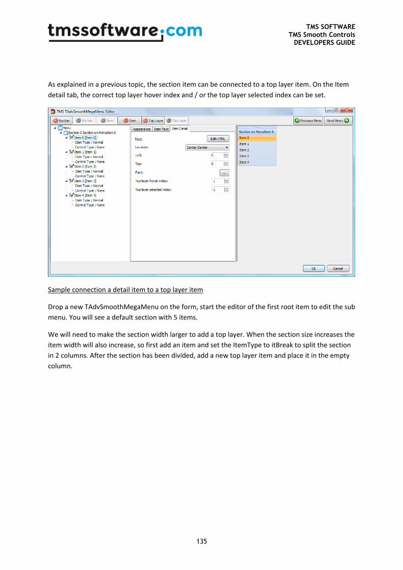
TMS SOFTWARE TMS Smooth Controls
DEVELOPERS GUIDE
135
As explained in a previous topic, the section item can be connected to a top layer item. On the Item
detail tab, the correct top layer hover index and / or the top layer selected index can be set.
Sample connection a detail item to a top layer item
Drop a new TAdvSmoothMegaMenu on the form, start the editor of the first root item to edit the sub
menu. You will see a default section with 5 items.
We will need to make the section width larger to add a top layer. When the section size increases the
item width will also increase, so first add an item and set the ItemType to itBreak to split the section
in 2 columns. After the section has been divided, add a new top layer item and place it in the empty
column.
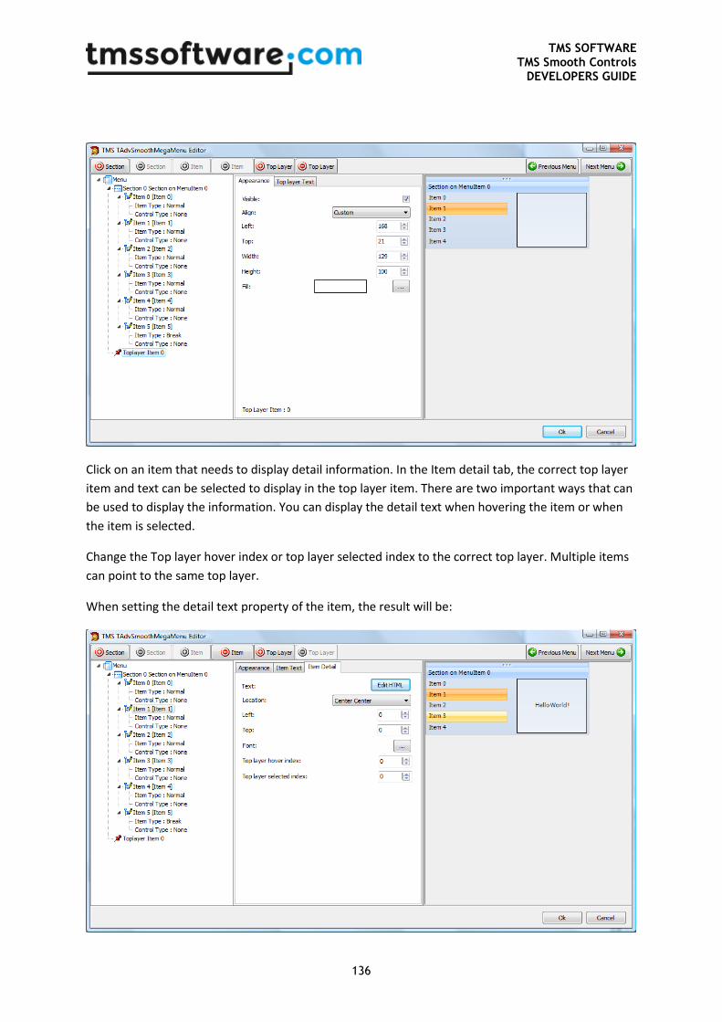
TMS SOFTWARE TMS Smooth Controls
DEVELOPERS GUIDE
136
Click on an item that needs to display detail information. In the Item detail tab, the correct top layer
item and text can be selected to display in the top layer item. There are two important ways that can
be used to display the information. You can display the detail text when hovering the item or when
the item is selected.
Change the Top layer hover index or top layer selected index to the correct top layer. Multiple items
can point to the same top layer.
When setting the detail text property of the item, the result will be:
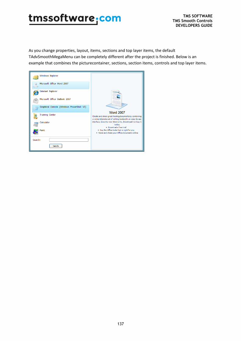
TMS SOFTWARE TMS Smooth Controls
DEVELOPERS GUIDE
137
As you change properties, layout, items, sections and top layer items, the default
TAdvSmoothMegaMenu can be completely different after the project is finished. Below is an
example that combines the picturecontainer, sections, section items, controls and top layer items.
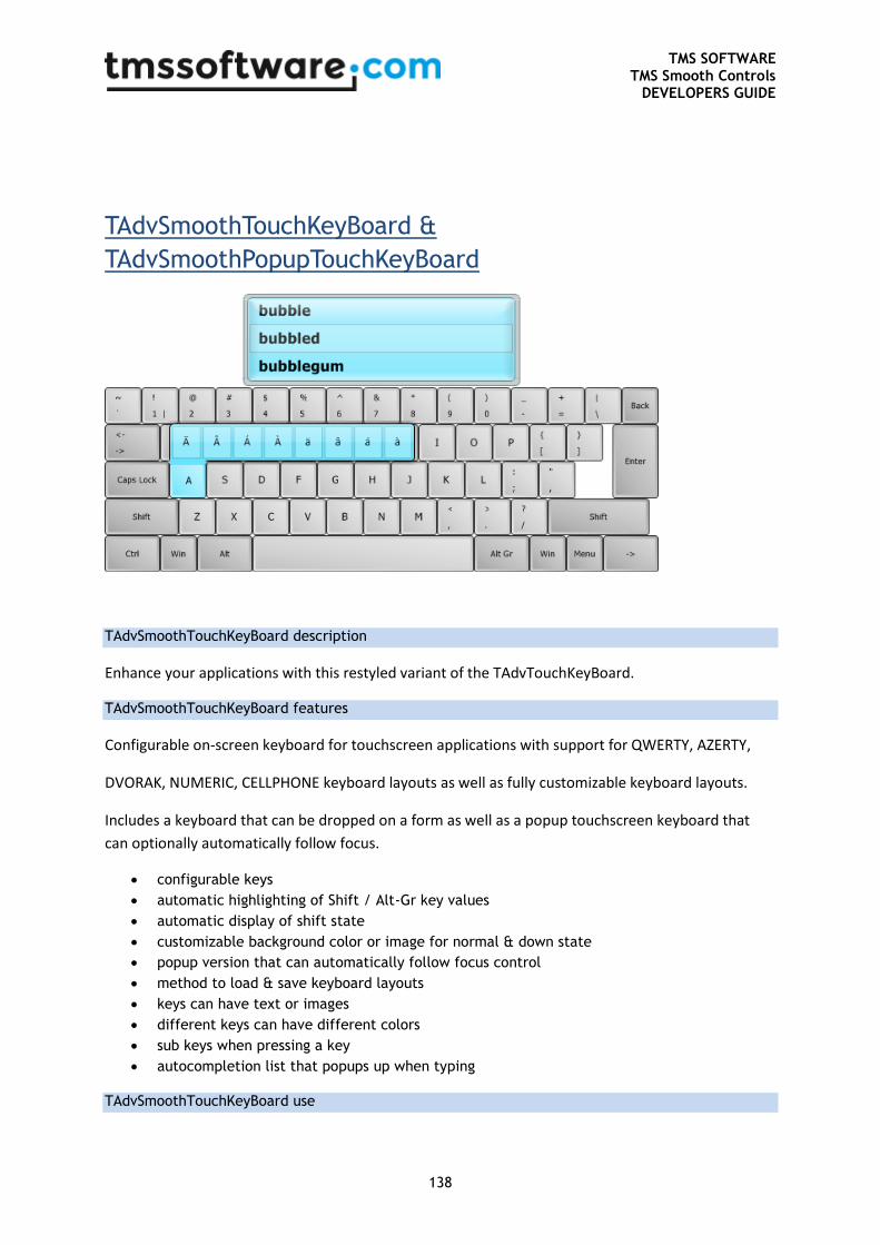
TMS SOFTWARE TMS Smooth Controls
DEVELOPERS GUIDE
138
TAdvSmoothTouchKeyBoard &
TAdvSmoothPopupTouchKeyBoard
TAdvSmoothTouchKeyBoard description
Enhance your applications with this restyled variant of the TAdvTouchKeyBoard.
TAdvSmoothTouchKeyBoard features
Configurable on-screen keyboard for touchscreen applications with support for QWERTY, AZERTY,
DVORAK, NUMERIC, CELLPHONE keyboard layouts as well as fully customizable keyboard layouts.
Includes a keyboard that can be dropped on a form as well as a popup touchscreen keyboard that
can optionally automatically follow focus.
configurable keys
automatic highlighting of Shift / Alt-Gr key values
automatic display of shift state
customizable background color or image for normal & down state
popup version that can automatically follow focus control
method to load & save keyboard layouts
keys can have text or images
different keys can have different colors
sub keys when pressing a key
autocompletion list that popups up when typing
TAdvSmoothTouchKeyBoard use
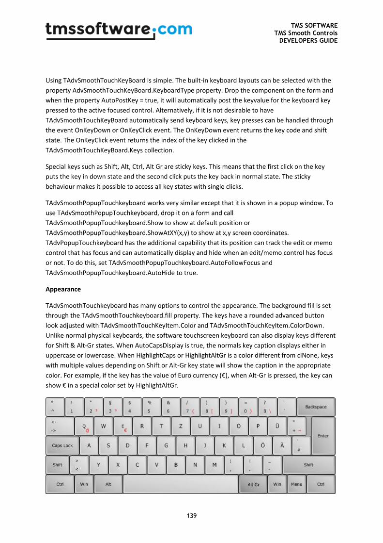
TMS SOFTWARE TMS Smooth Controls
DEVELOPERS GUIDE
139
Using TAdvSmoothTouchKeyBoard is simple. The built-in keyboard layouts can be selected with the
property AdvSmoothTouchKeyBoard.KeyboardType property. Drop the component on the form and
when the property AutoPostKey = true, it will automatically post the keyvalue for the keyboard key
pressed to the active focused control. Alternatively, if it is not desirable to have
TAdvSmoothTouchKeyBoard automatically send keyboard keys, key presses can be handled through
the event OnKeyDown or OnKeyClick event. The OnKeyDown event returns the key code and shift
state. The OnKeyClick event returns the index of the key clicked in the
TAdvSmoothTouchKeyBoard.Keys collection.
Special keys such as Shift, Alt, Ctrl, Alt Gr are sticky keys. This means that the first click on the key
puts the key in down state and the second click puts the key back in normal state. The sticky
behaviour makes it possible to access all key states with single clicks.
TAdvSmoothPopupTouchkeyboard works very similar except that it is shown in a popup window. To
use TAdvSmoothPopupTouchkeyboard, drop it on a form and call
TAdvSmoothPopupTouchkeyboard.Show to show at default position or
TAdvSmoothPopupTouchkeyboard.ShowAtXY(x,y) to show at x,y screen coordinates.
TAdvPopupTouchkeyboard has the additional capability that its position can track the edit or memo
control that has focus and can automatically display and hide when an edit/memo control has focus
or not. To do this, set TAdvSmoothPopupTouchkeyboard.AutoFollowFocus and
TAdvSmoothPopupTouchkeyboard.AutoHide to true.
Appearance
TAdvSmoothTouchkeyboard has many options to control the appearance. The background fill is set
through the TAdvSmoothTouchkeyboard.fill property. The keys have a rounded advanced button
look adjusted with TAdvSmoothTouchKeyItem.Color and TAdvSmoothTouchKeyItem.ColorDown.
Unlike normal physical keyboards, the software touchscreen keyboard can also display keys different
for Shift & Alt-Gr states. When AutoCapsDisplay is true, the normals key caption displays either in
uppercase or lowercase. When HighlightCaps or HighlightAltGr is a color different from clNone, keys
with multiple values depending on Shift or Alt-Gr key state will show the caption in the appropriate
color. For example, if the key has the value of Euro currency (€), when Alt-Gr is pressed, the key can
show € in a special color set by HighlightAltGr.
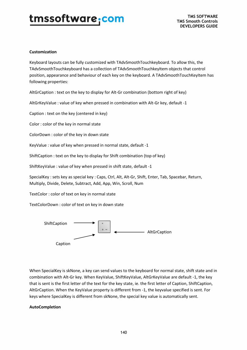
TMS SOFTWARE TMS Smooth Controls
DEVELOPERS GUIDE
140
Customization
Keyboard layouts can be fully customized with TAdvSmoothTouchkeyboard. To allow this, the
TAdvSmoothTouchkeyboard has a collection of TAdvSmoothTouchkeyItem objects that control
position, appearance and behaviour of each key on the keyboard. A TAdvSmoothTouchKeyItem has
following properties:
AltGrCaption : text on the key to display for Alt-Gr combination (bottom right of key)
AltGrKeyValue : value of key when pressed in combination with Alt-Gr key, default -1
Caption : text on the key (centered in key)
Color : color of the key in normal state
ColorDown : color of the key in down state
KeyValue : value of key when pressed in normal state, default -1
ShiftCaption : text on the key to display for Shift combination (top of key)
ShiftKeyValue : value of key when pressed in shift state, default -1
SpecialKey : sets key as special key : Caps, Ctrl, Alt, Alt-Gr, Shift, Enter, Tab, Spacebar, Return,
Multiply, Divide, Delete, Subtract, Add, App, Win, Scroll, Num
TextColor : color of text on key in normal state
TextColorDown : color of text on key in down state
When SpecialKey is skNone, a key can send values to the keyboard for normal state, shift state and in
combination with Alt-Gr key. When KeyValue, ShiftKeyValue, AltGrKeyValue are default -1, the key
that is sent is the first letter of the text for the key state, ie. the first letter of Caption, ShiftCaption,
AltGrCaption. When the KeyValue property is different from -1, the keyvalue specified is sent. For
keys where SpecialKey is different from skNone, the special key value is automatically sent.
AutoCompletion
Caption
AltGrCaption
ShiftCaption
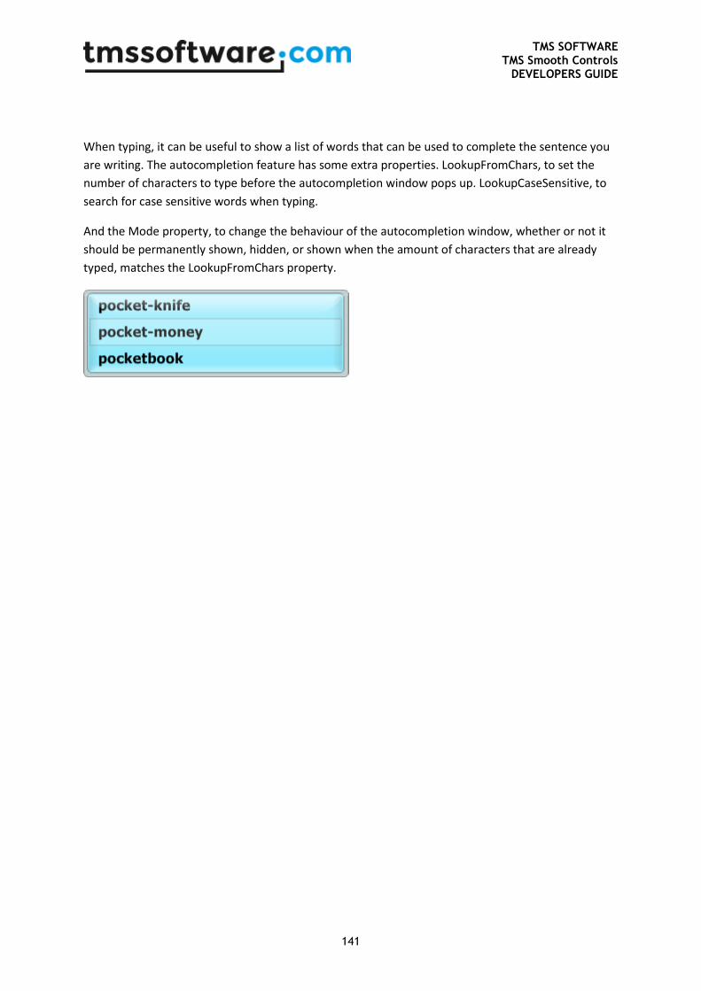
TMS SOFTWARE TMS Smooth Controls
DEVELOPERS GUIDE
141
When typing, it can be useful to show a list of words that can be used to complete the sentence you
are writing. The autocompletion feature has some extra properties. LookupFromChars, to set the
number of characters to type before the autocompletion window pops up. LookupCaseSensitive, to
search for case sensitive words when typing.
And the Mode property, to change the behaviour of the autocompletion window, whether or not it
should be permanently shown, hidden, or shown when the amount of characters that are already
typed, matches the LookupFromChars property.
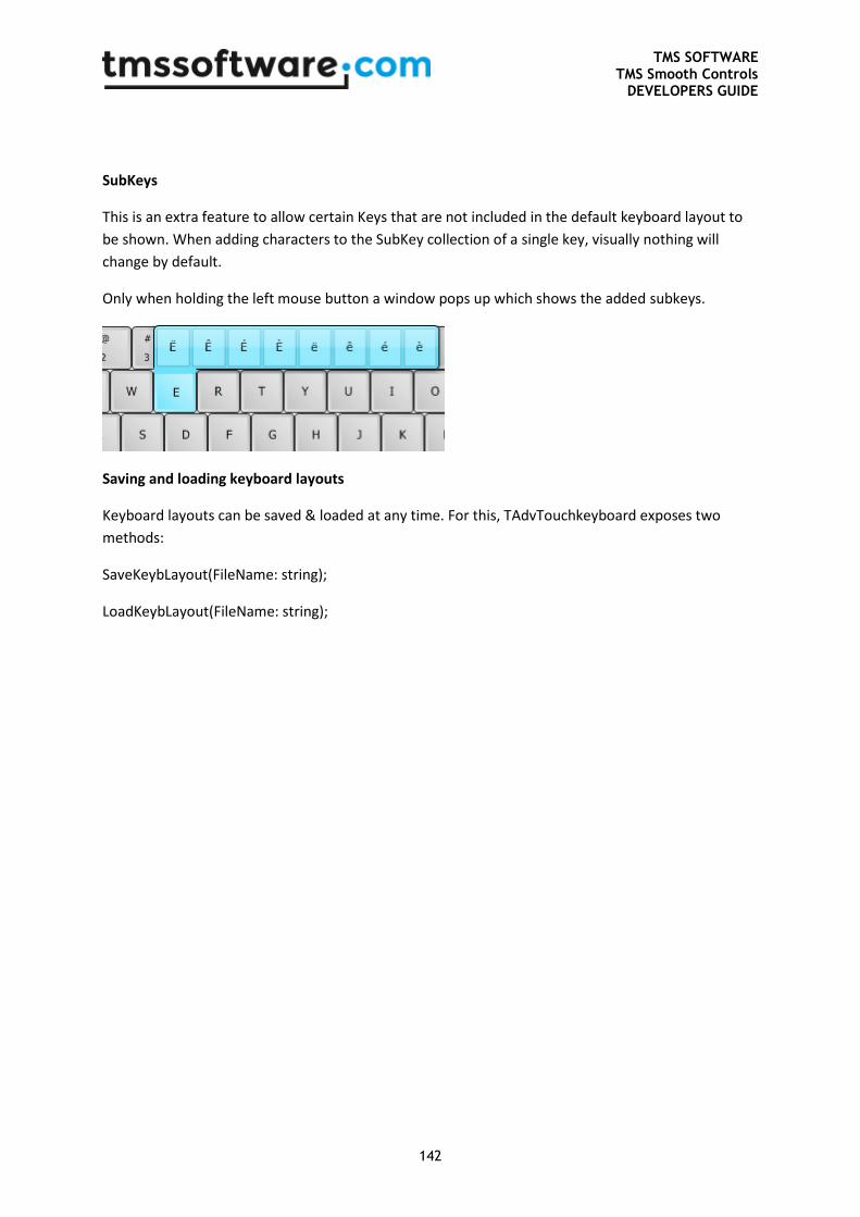
TMS SOFTWARE TMS Smooth Controls
DEVELOPERS GUIDE
142
SubKeys
This is an extra feature to allow certain Keys that are not included in the default keyboard layout to
be shown. When adding characters to the SubKey collection of a single key, visually nothing will
change by default.
Only when holding the left mouse button a window pops up which shows the added subkeys.
Saving and loading keyboard layouts
Keyboard layouts can be saved & loaded at any time. For this, TAdvTouchkeyboard exposes two
methods:
SaveKeybLayout(FileName: string);
LoadKeybLayout(FileName: string);
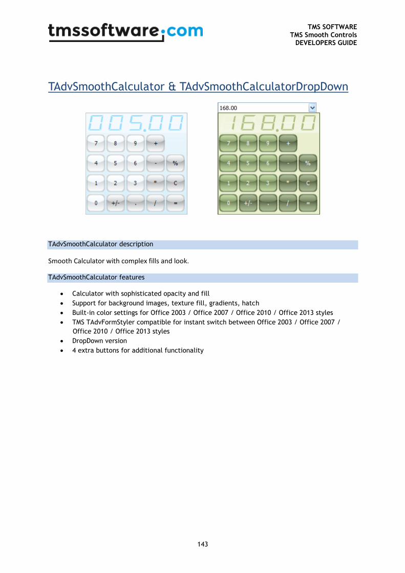
TMS SOFTWARE TMS Smooth Controls
DEVELOPERS GUIDE
143
TAdvSmoothCalculator & TAdvSmoothCalculatorDropDown
TAdvSmoothCalculator description
Smooth Calculator with complex fills and look.
TAdvSmoothCalculator features
Calculator with sophisticated opacity and fill
Support for background images, texture fill, gradients, hatch
Built-in color settings for Office 2003 / Office 2007 / Office 2010 / Office 2013 styles
TMS TAdvFormStyler compatible for instant switch between Office 2003 / Office 2007 /
Office 2010 / Office 2013 styles
DropDown version
4 extra buttons for additional functionality
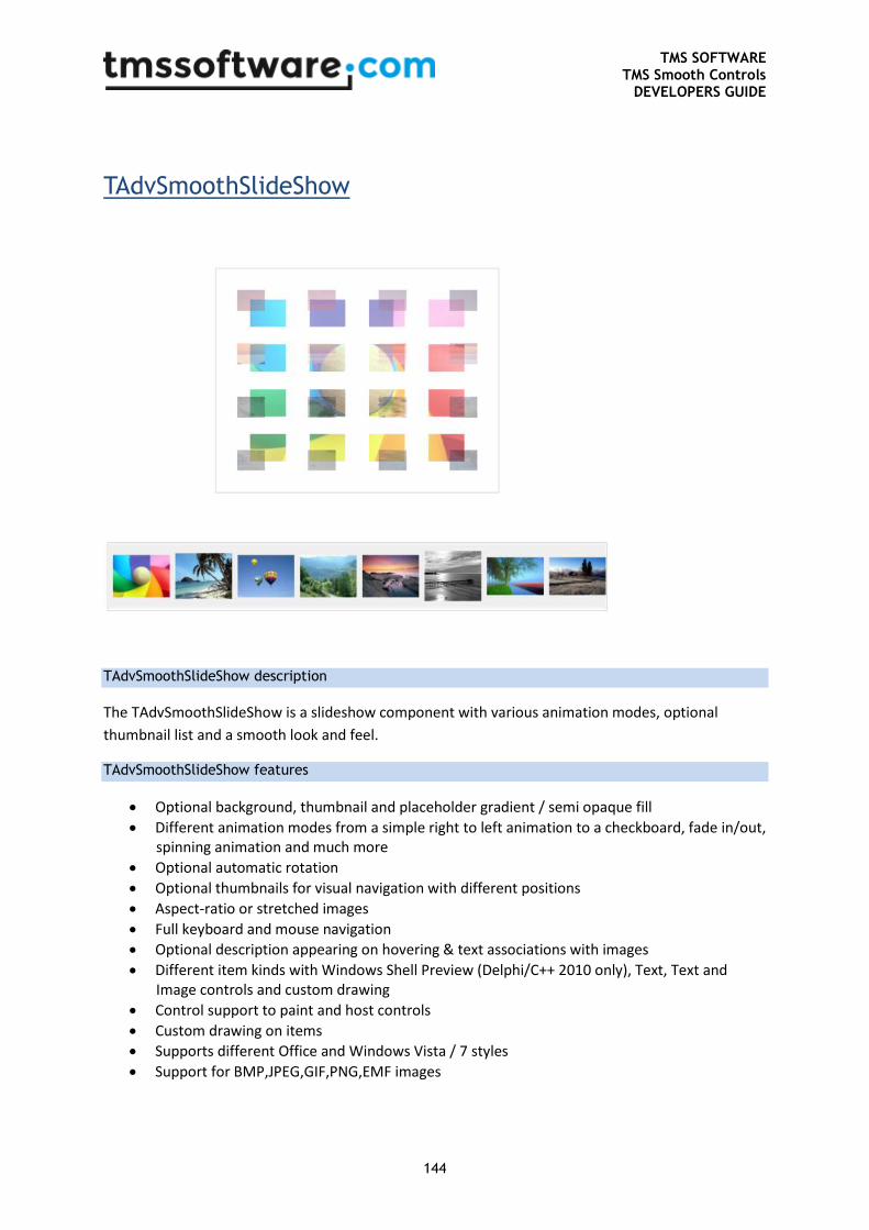
TMS SOFTWARE TMS Smooth Controls
DEVELOPERS GUIDE
144
TAdvSmoothSlideShow
TAdvSmoothSlideShow description
The TAdvSmoothSlideShow is a slideshow component with various animation modes, optional
thumbnail list and a smooth look and feel.
TAdvSmoothSlideShow features
Optional background, thumbnail and placeholder gradient / semi opaque fill
Different animation modes from a simple right to left animation to a checkboard, fade in/out, spinning animation and much more
Optional automatic rotation
Optional thumbnails for visual navigation with different positions
Aspect-ratio or stretched images
Full keyboard and mouse navigation
Optional description appearing on hovering & text associations with images
Different item kinds with Windows Shell Preview (Delphi/C++ 2010 only), Text, Text and Image controls and custom drawing
Control support to paint and host controls
Custom drawing on items
Supports different Office and Windows Vista / 7 styles
Support for BMP,JPEG,GIF,PNG,EMF images
TMS SOFTWARE TMS Smooth Controls
DEVELOPERS GUIDE
145
TAdvSmoothSlideShow use
Adding Items
Items can be added at designtime or at runtime. The slideshow has a built-in function to quickly add
images from a folder.
AdvSmoothSlideShow1.AddItemsFromFolder(‘\Sample photos\*.jpg',
ikImage);
The first parameter is the location of the images. The second parameter controls the kind of items.
Items can also be added separately to provide extra details. Different combinations are possible:
with AdvSmoothSlideShow1.Items.Add do
begin
Image.LoadFromFile('image1.jpg');
Location := 'image1.jpg';
Kind := ikImage;
Control := Button1;
...
end;
Item Kinds
Different kinds of items can be added to the slideshow. Each item type will be displayed in its specific
way in the slideshow. Of course, all displayed items will be animated.
ikImage: Default: a normal image
ikControl: A Control. The Control must support a PaintTo method which will be called to paint the
control inside the area. When animating, the image is used. After animation the control is shown
which can be be used as active control on the form. When the control is modified, the new state is
saved in the image and further used in animations.
ikPreview (Delphi/C++ 2010 Only): Only file types that have a registered preview handler on
Operating System level can be shown as preview. The application that is linked to the file (ex. ‘.ppt’
PowerPoint) must have a preview handler that is registered in the operating system. In a default
Windows Vista or Windows 7 operating system installation, there are some built-in preview handlers
for known file types such as ‘wmv’, ‘mp3’, and all image types. When using the preview kind, the
image that is generated for the item is used & animated.
ikText: Text that can be altered with Font, Color, position and formatting properties.
ikImageText: The combination of the image and text type.
ikCustom: Customized drawing through the event OnCustomDraw
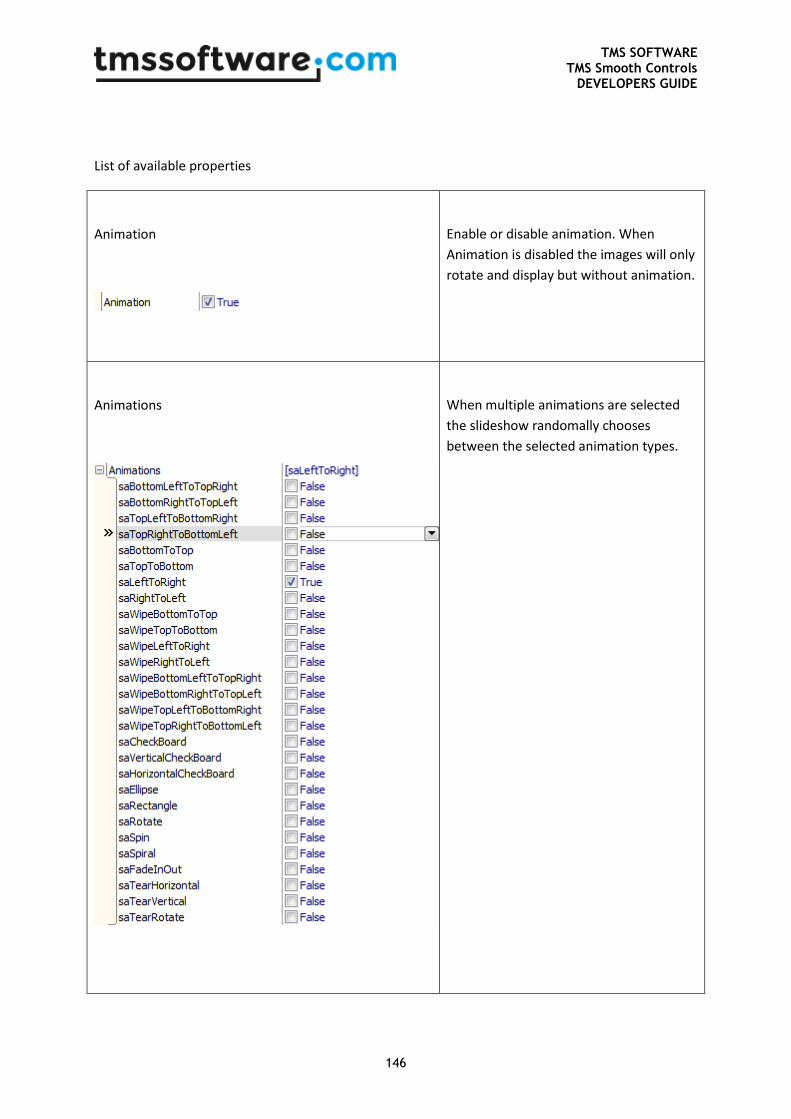
TMS SOFTWARE TMS Smooth Controls
DEVELOPERS GUIDE
146
List of available properties
Animation
Enable or disable animation. When
Animation is disabled the images will only
rotate and display but without animation.
Animations
When multiple animations are selected
the slideshow randomally chooses
between the selected animation types.
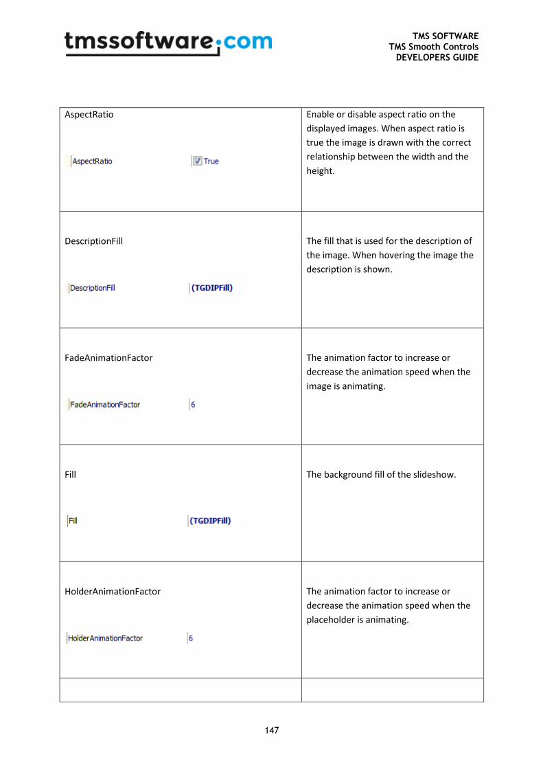
TMS SOFTWARE TMS Smooth Controls
DEVELOPERS GUIDE
147
AspectRatio
Enable or disable aspect ratio on the
displayed images. When aspect ratio is
true the image is drawn with the correct
relationship between the width and the
height.
DescriptionFill
The fill that is used for the description of
the image. When hovering the image the
description is shown.
FadeAnimationFactor
The animation factor to increase or
decrease the animation speed when the
image is animating.
Fill
The background fill of the slideshow.
HolderAnimationFactor
The animation factor to increase or
decrease the animation speed when the
placeholder is animating.
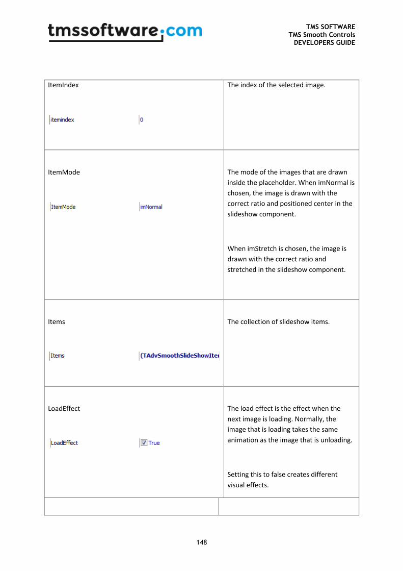
TMS SOFTWARE TMS Smooth Controls
DEVELOPERS GUIDE
148
ItemIndex
The index of the selected image.
ItemMode
The mode of the images that are drawn
inside the placeholder. When imNormal is
chosen, the image is drawn with the
correct ratio and positioned center in the
slideshow component.
When imStretch is chosen, the image is
drawn with the correct ratio and
stretched in the slideshow component.
Items
The collection of slideshow items.
LoadEffect
The load effect is the effect when the
next image is loading. Normally, the
image that is loading takes the same
animation as the image that is unloading.
Setting this to false creates different
visual effects.
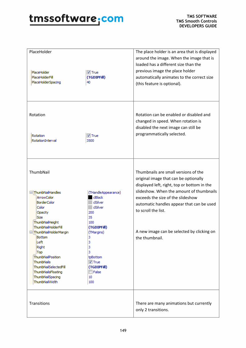
TMS SOFTWARE TMS Smooth Controls
DEVELOPERS GUIDE
149
PlaceHolder
The place holder is an area that is displayed
around the image. When the image that is
loaded has a different size than the
previous image the place holder
automatically animates to the correct size
(this feature is optional).
Rotation
Rotation can be enabled or disabled and
changed in speed. When rotation is
disabled the next image can still be
programmatically selected.
ThumbNail
Thumbnails are small versions of the
original image that can be optionally
displayed left, right, top or bottom in the
slideshow. When the amount of thumbnails
exceeds the size of the slideshow
automatic handles appear that can be used
to scroll the list.
A new image can be selected by clicking on
the thumbnail.
Transitions
There are many animations but currently
only 2 transitions.
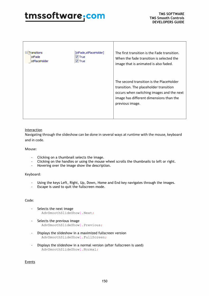
TMS SOFTWARE TMS Smooth Controls
DEVELOPERS GUIDE
150
The first transition is the Fade transition.
When the fade transition is selected the
image that is animated is also faded.
The second transition is the PlaceHolder
transition. The placeholder transition
occurs when switching images and the next
image has different dimensions than the
previous image.
Interaction
Navigating through the slideshow can be done in several ways at runtime with the mouse, keyboard
and in code.
Mouse:
- Clicking on a thumbnail selects the image. - Clicking on the handles or using the mouse wheel scrolls the thumbnails to left or right. - Hovering over the image show the description.
Keyboard:
- Using the keys Left, Right, Up, Down, Home and End key navigates through the images. - Escape is used to quit the fullscreen mode.
Code:
- Selects the next image AdvSmoothSlideShow1.Next;
- Selects the previous image
AdvSmoothSlideShow1.Previous;
- Displays the slideshow in a maximized fullscreen version
AdvSmoothSlideShow1.FullScreen;
- Displays the slideshow in a normal version (after fullscreen is used)
AdvSmoothSlideShow1.Normal;
Events
TMS SOFTWARE TMS Smooth Controls
DEVELOPERS GUIDE
151
OnCustomDraw: Event used when adding items
for custom drawing.
OnImageLoaded: Event called when the image is
completely loaded.
OnThumbClick: Event called when clicking on a
thumb.
OnThumbDblClick: Event called when double-
clicking on a thumb.
OnThumbHint: Event called when hovering over
a thumb and showing the hint.
OnThumbLoaded: Event called when the image
thumbnail is completely loaded.
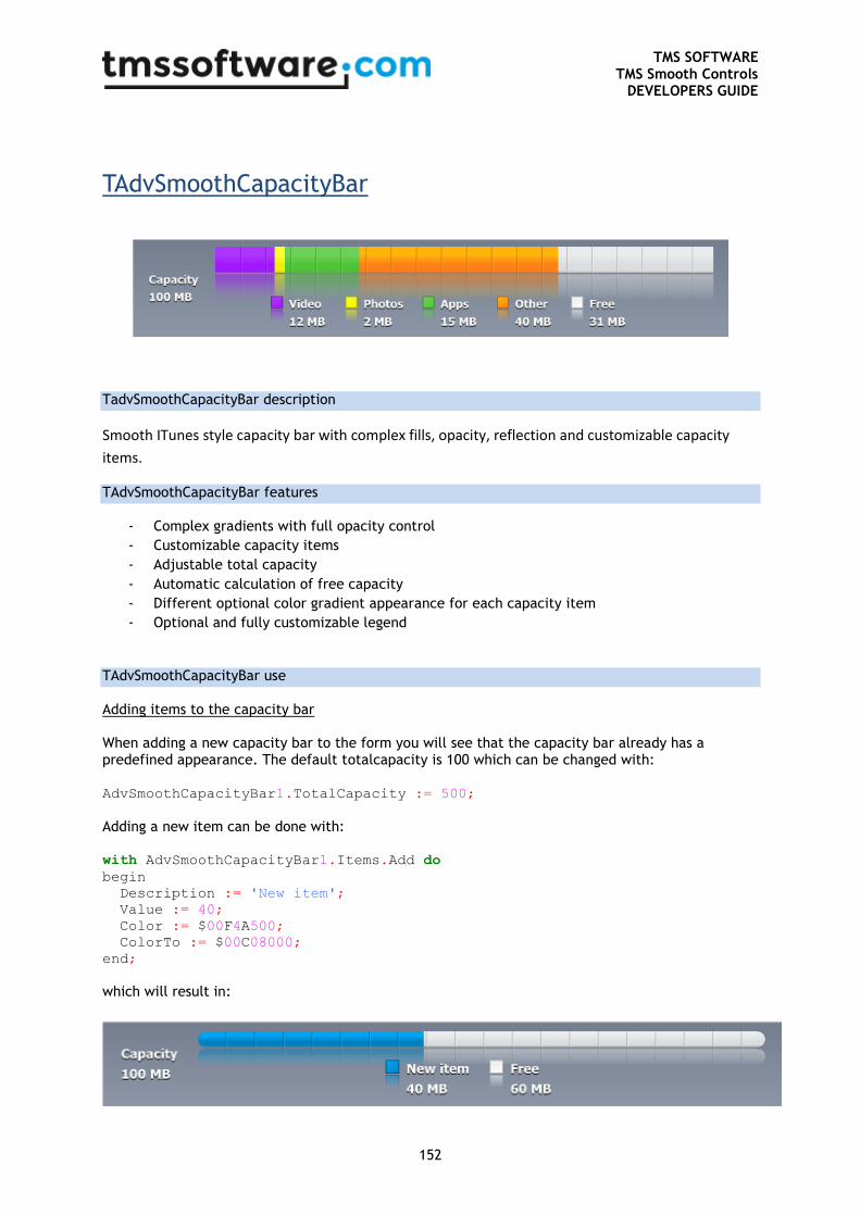
TMS SOFTWARE TMS Smooth Controls
DEVELOPERS GUIDE
152
TAdvSmoothCapacityBar
TadvSmoothCapacityBar description
Smooth ITunes style capacity bar with complex fills, opacity, reflection and customizable capacity
items.
TAdvSmoothCapacityBar features
- Complex gradients with full opacity control
- Customizable capacity items
- Adjustable total capacity
- Automatic calculation of free capacity
- Different optional color gradient appearance for each capacity item
- Optional and fully customizable legend
TAdvSmoothCapacityBar use
Adding items to the capacity bar
When adding a new capacity bar to the form you will see that the capacity bar already has a predefined appearance. The default totalcapacity is 100 which can be changed with:
AdvSmoothCapacityBar1.TotalCapacity := 500;
Adding a new item can be done with:
with AdvSmoothCapacityBar1.Items.Add do
begin
Description := 'New item';
Value := 40;
Color := $00F4A500;
ColorTo := $00C08000;
end;
which will result in:
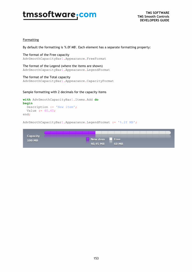
TMS SOFTWARE TMS Smooth Controls
DEVELOPERS GUIDE
153
Formatting
By default the formatting is '%.0f MB'. Each element has a separate formatting property:
The format of the Free capacity AdvSmoothCapacityBar1.Appearance.FreeFormat
The format of the Legend (where the items are shown) AdvSmoothCapacityBar1.Appearance.LegendFormat
The format of the Total capacity AdvSmoothCapacityBar1.Appearance.CapacityFormat
Sample formatting with 2 decimals for the capacity items
with AdvSmoothCapacityBar1.Items.Add do
begin
Description := 'New item';
Value := 40.45;
end;
AdvSmoothCapacityBar1.Appearance.LegendFormat := '%.2f MB';
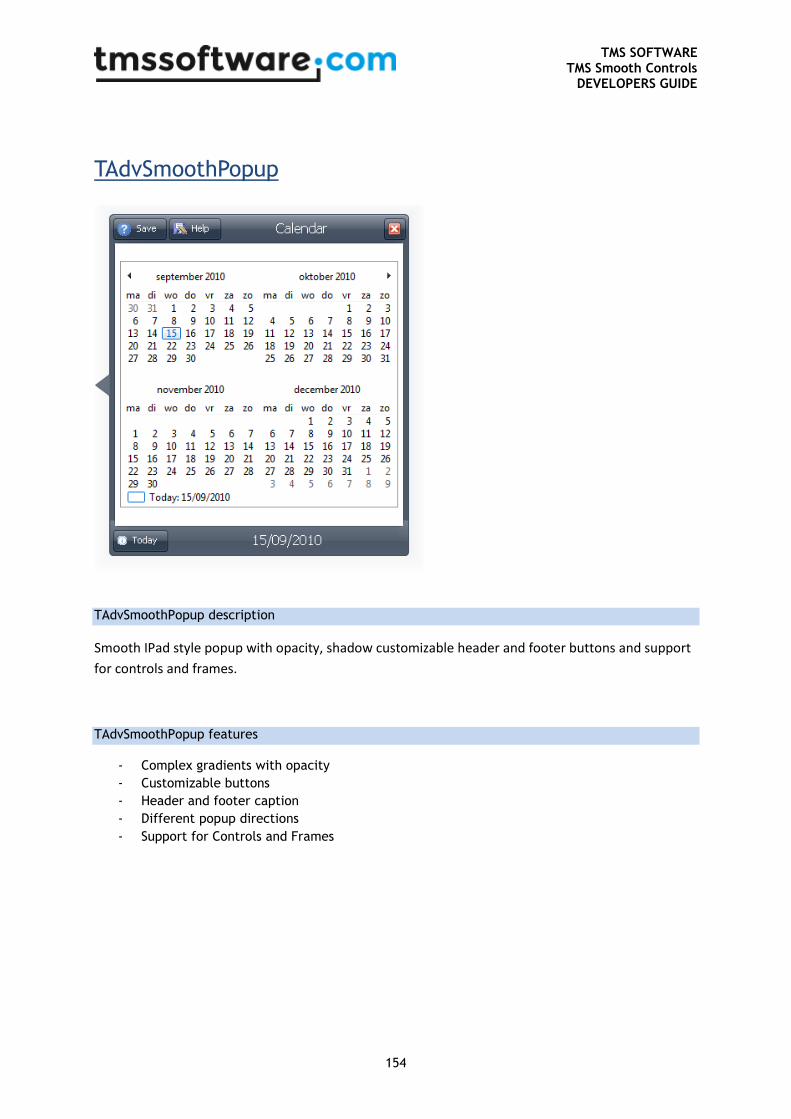
TMS SOFTWARE TMS Smooth Controls
DEVELOPERS GUIDE
154
TAdvSmoothPopup
TAdvSmoothPopup description
Smooth IPad style popup with opacity, shadow customizable header and footer buttons and support
for controls and frames.
TAdvSmoothPopup features
- Complex gradients with opacity
- Customizable buttons
- Header and footer caption
- Different popup directions
- Support for Controls and Frames
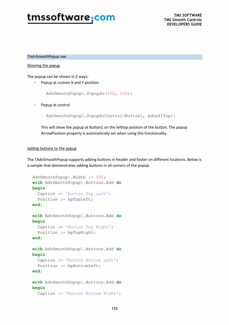
TMS SOFTWARE TMS Smooth Controls
DEVELOPERS GUIDE
155
TAdvSmoothPopup use
Showing the popup
The popup can be shown in 2 ways:
- Popup at custom X and Y position
AdvSmoothPopup1.PopupAt(100, 100);
- Popup at control
AdvSmoothPopup1.PopupAtControl(Button1, pdLeftTop);
This will show the popup at Button1 on the lefttop position of the button. The popup
ArrowPosition property is automatically set when using this functionality.
Adding buttons to the popup
The TAdvSmoothPopup supports adding buttons in header and footer on different locations. Below is
a sample that demonstrates adding buttons in all corners of the popup.
AdvSmoothPopup1.Width := 400;
with AdvSmoothPopup1.Buttons.Add do
begin
Caption := 'Button Top Left';
Position := bpTopLeft;
end;
with AdvSmoothPopup1.Buttons.Add do
begin
Caption := 'Button Top Right';
Position := bpTopRight;
end;
with AdvSmoothPopup1.Buttons.Add do
begin
Caption := 'Button Bottom Left';
Position := bpBottomLeft;
end;
with AdvSmoothPopup1.Buttons.Add do
begin
Caption := 'Button Bottom Right';
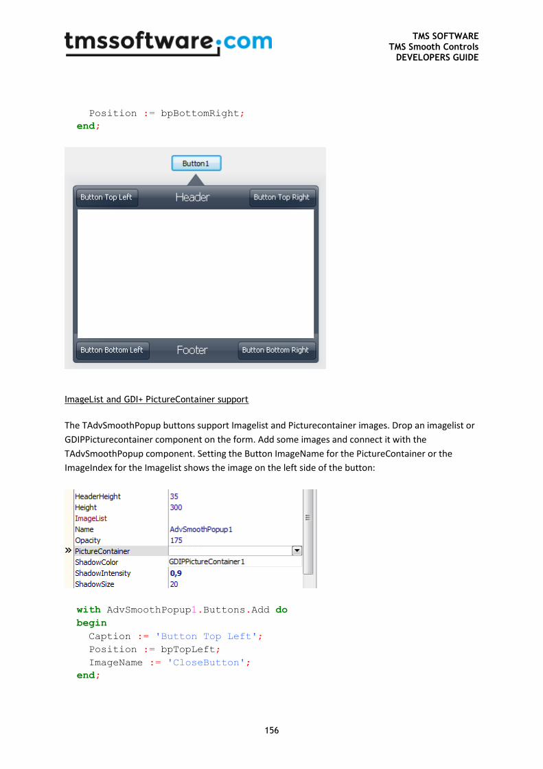
TMS SOFTWARE TMS Smooth Controls
DEVELOPERS GUIDE
156
Position := bpBottomRight;
end;
ImageList and GDI+ PictureContainer support
The TAdvSmoothPopup buttons support Imagelist and Picturecontainer images. Drop an imagelist or
GDIPPicturecontainer component on the form. Add some images and connect it with the
TAdvSmoothPopup component. Setting the Button ImageName for the PictureContainer or the
ImageIndex for the Imagelist shows the image on the left side of the button:
with AdvSmoothPopup1.Buttons.Add do
begin
Caption := 'Button Top Left';
Position := bpTopLeft;
ImageName := 'CloseButton';
end;
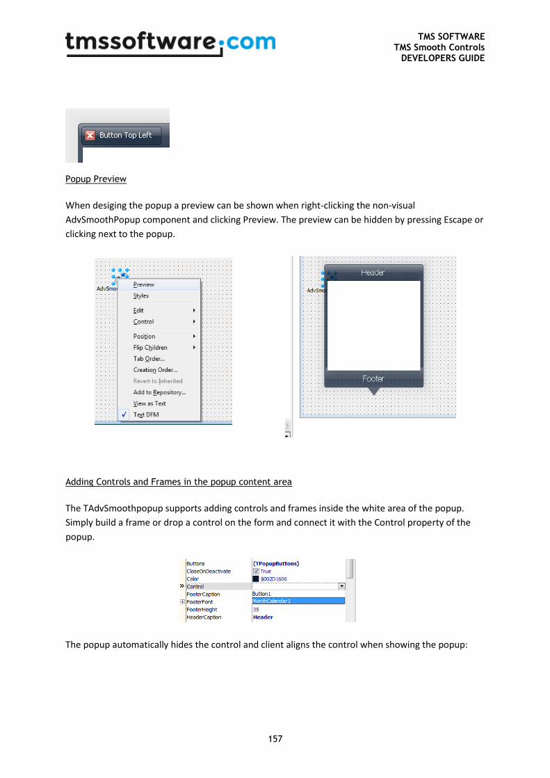
TMS SOFTWARE TMS Smooth Controls
DEVELOPERS GUIDE
157
Popup Preview
When desiging the popup a preview can be shown when right-clicking the non-visual
AdvSmoothPopup component and clicking Preview. The preview can be hidden by pressing Escape or
clicking next to the popup.
Adding Controls and Frames in the popup content area
The TAdvSmoothpopup supports adding controls and frames inside the white area of the popup.
Simply build a frame or drop a control on the form and connect it with the Control property of the
popup.
The popup automatically hides the control and client aligns the control when showing the popup:
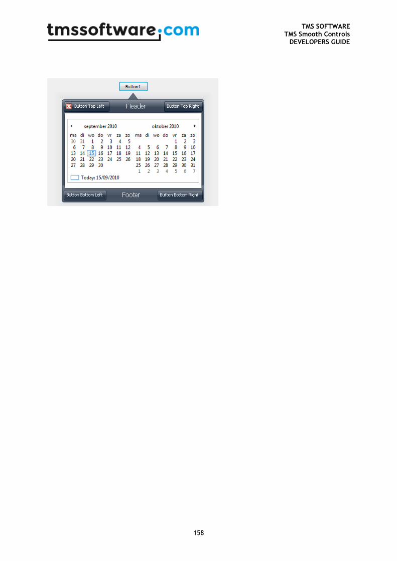
TMS SOFTWARE TMS Smooth Controls
DEVELOPERS GUIDE
158
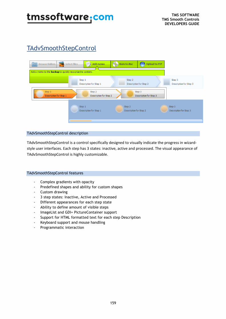
TMS SOFTWARE TMS Smooth Controls
DEVELOPERS GUIDE
159
TAdvSmoothStepControl
TAdvSmoothStepControl description
TAdvSmoothStepControl is a control specifically designed to visually indicate the progress in wizard-
style user interfaces. Each step has 3 states: inactive, active and processed. The visual appearance of
TAdvSmoothStepControl is highly customizable.
TAdvSmoothStepControl features
- Complex gradients with opacity
- Predefined shapes and ability for custom shapes
- Custom drawing
- 3 step states: Inactive, Active and Processed
- Different appearances for each step state
- Ability to define amount of visible steps
- ImageList and GDI+ PictureContainer support
- Support for HTML formatted text for each step Description
- Keyboard support and mouse handling
- Programmatic interaction
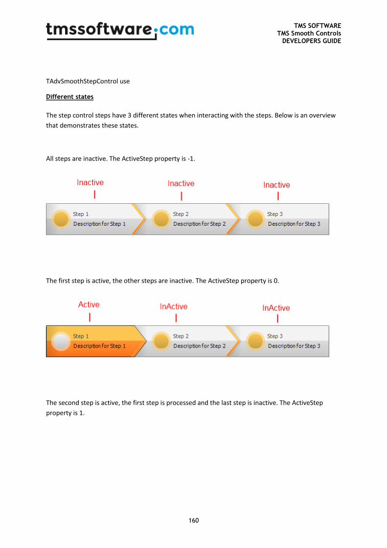
TMS SOFTWARE TMS Smooth Controls
DEVELOPERS GUIDE
160
TAdvSmoothStepControl use
Different states
The step control steps have 3 different states when interacting with the steps. Below is an overview
that demonstrates these states.
All steps are inactive. The ActiveStep property is -1.
The first step is active, the other steps are inactive. The ActiveStep property is 0.
The second step is active, the first step is processed and the last step is inactive. The ActiveStep
property is 1.
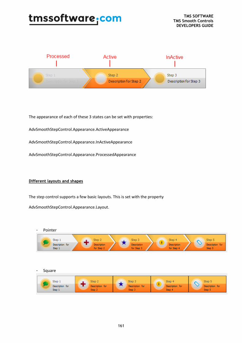
TMS SOFTWARE TMS Smooth Controls
DEVELOPERS GUIDE
161
The appearance of each of these 3 states can be set with properties:
AdvSmoothStepControl.Appearance.ActiveAppearance
AdvSmoothStepControl.Appearance.InActiveAppearance
AdvSmoothStepControl.Appearance.ProcessedAppearance
Different layouts and shapes
The step control supports a few basic layouts. This is set with the property
AdvSmoothStepControl.Appearance.Layout.
- Pointer
- Square
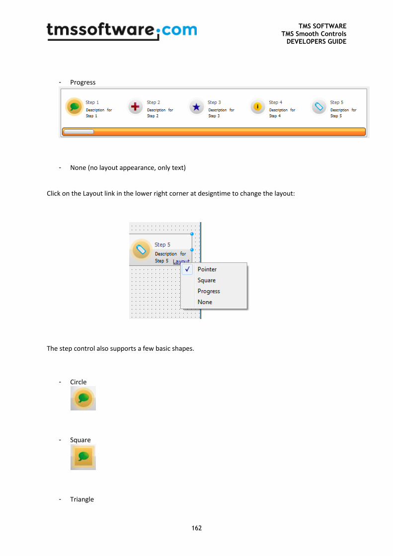
TMS SOFTWARE TMS Smooth Controls
DEVELOPERS GUIDE
162
- Progress
- None (no layout appearance, only text)
Click on the Layout link in the lower right corner at designtime to change the layout:
The step control also supports a few basic shapes.
- Circle
- Square
- Triangle
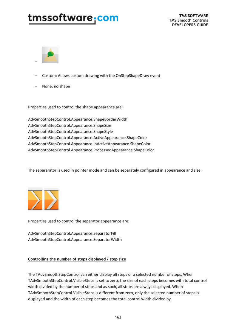
TMS SOFTWARE TMS Smooth Controls
DEVELOPERS GUIDE
163
-
- Custom: Allows custom drawing with the OnStepShapeDraw event
- None: no shape
Properties used to control the shape appearance are:
AdvSmoothStepControl.Appearance.ShapeBorderWidth
AdvSmoothStepControl.Appearance.ShapeSize
AdvSmoothStepControl.Appearance.ShapeStyle
AdvSmoothStepControl.Appearance.ActiveAppearance.ShapeColor
AdvSmoothStepControl.Appearance.InActiveAppearance.ShapeColor
AdvSmoothStepControl.Appearance.ProcessedAppearance.ShapeColor
The separarator is used in pointer mode and can be separately configured in appearance and size:
Properties used to control the separator appearance are:
AdvSmoothStepControl.Appearance.SeparatorFill
AdvSmoothStepControl.Appearance.SeparatorWidth
Controlling the number of steps displayed / step size
The TAdvSmoothStepControl can either display all steps or a selected number of steps. When
TAdvSmoothStepControl.VisibleSteps is set to zero, the size of each steps becomes with total control
width divided by the number of steps and as such, all steps are always displayed. When
TAdvSmoothStepControl.VisibleSteps is different from zero, only the selected number of steps is
displayed and the width of each step becomes the total control width divided by
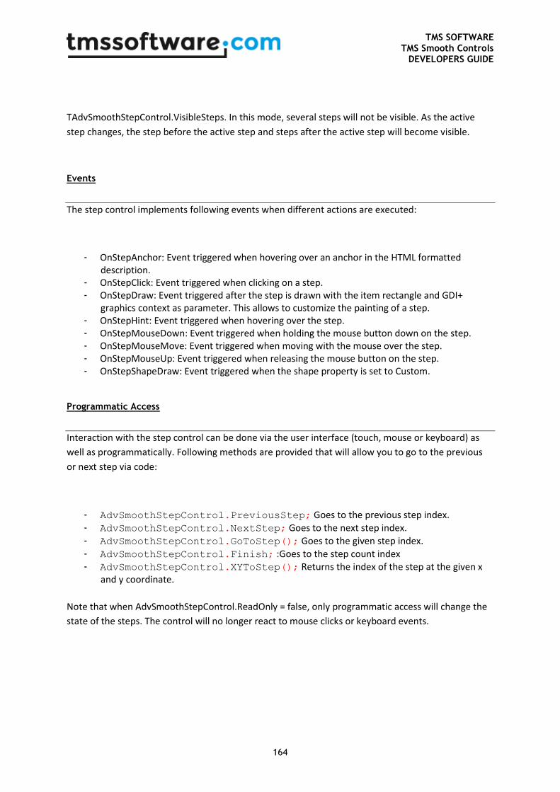
TMS SOFTWARE TMS Smooth Controls
DEVELOPERS GUIDE
164
TAdvSmoothStepControl.VisibleSteps. In this mode, several steps will not be visible. As the active
step changes, the step before the active step and steps after the active step will become visible.
Events
The step control implements following events when different actions are executed:
- OnStepAnchor: Event triggered when hovering over an anchor in the HTML formatted description.
- OnStepClick: Event triggered when clicking on a step. - OnStepDraw: Event triggered after the step is drawn with the item rectangle and GDI+
graphics context as parameter. This allows to customize the painting of a step. - OnStepHint: Event triggered when hovering over the step. - OnStepMouseDown: Event triggered when holding the mouse button down on the step. - OnStepMouseMove: Event triggered when moving with the mouse over the step. - OnStepMouseUp: Event triggered when releasing the mouse button on the step. - OnStepShapeDraw: Event triggered when the shape property is set to Custom.
Programmatic Access
Interaction with the step control can be done via the user interface (touch, mouse or keyboard) as
well as programmatically. Following methods are provided that will allow you to go to the previous
or next step via code:
- AdvSmoothStepControl.PreviousStep; Goes to the previous step index.
- AdvSmoothStepControl.NextStep; Goes to the next step index.
- AdvSmoothStepControl.GoToStep(); Goes to the given step index.
- AdvSmoothStepControl.Finish; :Goes to the step count index - AdvSmoothStepControl.XYToStep(); Returns the index of the step at the given x
and y coordinate.
Note that when AdvSmoothStepControl.ReadOnly = false, only programmatic access will change the
state of the steps. The control will no longer react to mouse clicks or keyboard events.
TMS SOFTWARE TMS Smooth Controls
DEVELOPERS GUIDE
165
Property overview
- ActiveStep: The active step index of step actions collection. All steps before this index are
“processed”. All steps after this index are inactive. - Appearance: All different appearance fill-, font-, shape- and layout-settings.
o ActiveAppearance: The appearance of the active step. BackGroundFill: The fill of the background of the step. CaptionColor: The color of the caption. DescriptionColor: The color of the description. ShapeColor: The color of the shape.
o ActiveCaptionFont: The font for the caption text of the active step. o ActiveDescriptionFont: The font for the description text of the active step. o DescriptionFill: The fill for the description section when DescriptionLayout is
dlBottom. o DescriptionLayout: The layout of the description. With dlNormal the description is
inside the step rectangle. If the value is dlBottom the description is placed under the step and is only visible for the active step.
o DescriptionSize: The size of the description rectangle if the DescriptionLayout is dlBottom.
o InActiveAppearance: Same as ActiveAppearance but for the steps that are in front of the active step.
o InActiveCaptionFont: Same as the ActiveCaptionFont but for the steps that are in front of the active step.
o InActiveDescriptionFont: Same as the ActiveDescriptionFont but for the steps that are in front of the active step.
o Layout: The different layouts explained at the beginning of this guide are set with this property.
o LayoutRounding: In the Square layout the corners can be rounded with this property. o LayoutSpacingHorizontal: The horizontal spacing between steps. o LayoutSpacingVertical: The vertical spacing between steps. o ProcessedAppearance: Same as ActiveAppearance but for the steps that are behind
the active step. o ProcessedCaptionFont: Same as ActiveCaptionFont but for the steps that are behind
the active step. o ProcessedDescriptionFont: Same as ActiveDescriptionFont but for the steps that are
behind the active step. o Progress: The fill of the progress bar in case the Layout property is set to salProgress. o ProgressBackGround: The fill of the background of the progressbar in case the
Layout property is set to salProgress. o ProgressSize: The size of the progressbar when the Layout property is set to
salProgress. o SeparatorFill: The fill of the separator if the Pointer layout is active. o SeparatorWidth: The width of the separator if the Pointer layout is active. o ShapeBorderWidth: The width of the shape border. o ShapeSize: The size of the shape. o ShapeStyle: The style of the shape explained at the beginning of this guide.

TMS SOFTWARE TMS Smooth Controls
DEVELOPERS GUIDE
166
- Fill: The background fill of the step control. By default the background is not visible due to the active Transparent property.
- ImageList, PictureContainer: Containers used for adding images to the control. - ReadOnly: Enables / Disables all interaction with the component. Programmatic interaction is
not affected by this property. - StepActions: The collection of steps. - Transparent: The property that shows / hides the background of the component. - VisibleSteps: The amount of visible steps in the control. The control automatically shifts steps
when the Active step is located in the middle of the control.
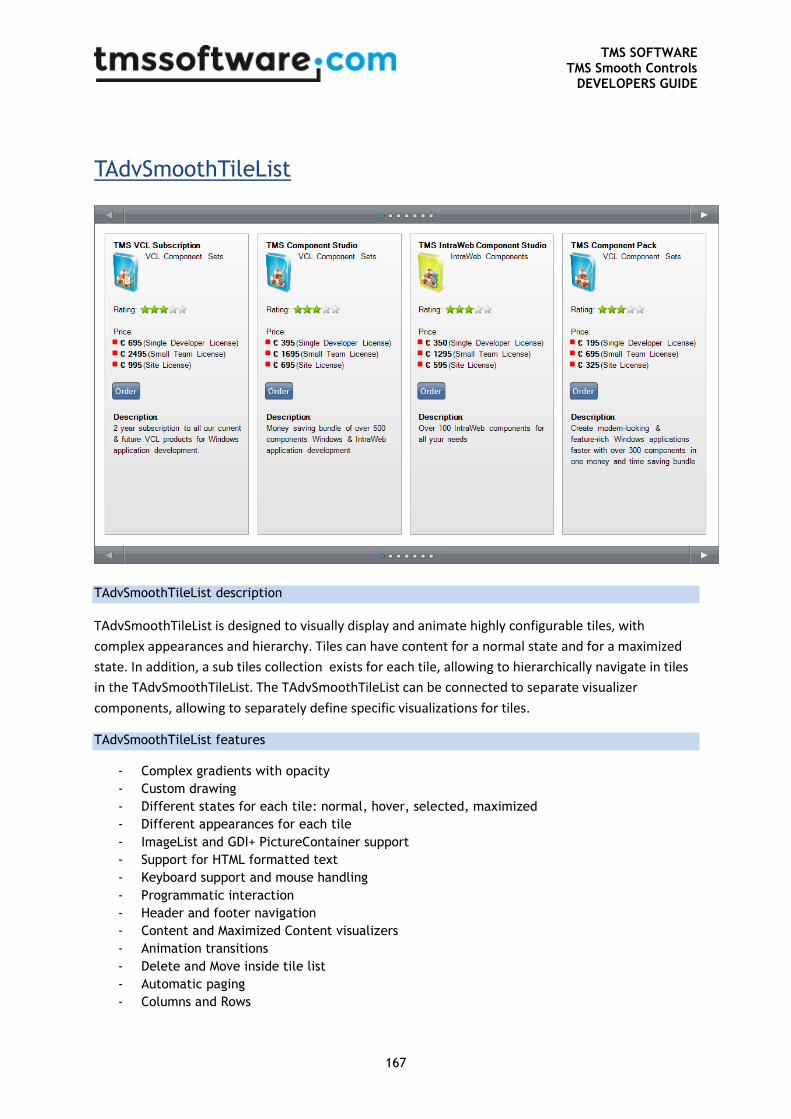
TMS SOFTWARE TMS Smooth Controls
DEVELOPERS GUIDE
167
TAdvSmoothTileList
TAdvSmoothTileList description
TAdvSmoothTileList is designed to visually display and animate highly configurable tiles, with
complex appearances and hierarchy. Tiles can have content for a normal state and for a maximized
state. In addition, a sub tiles collection exists for each tile, allowing to hierarchically navigate in tiles
in the TAdvSmoothTileList. The TAdvSmoothTileList can be connected to separate visualizer
components, allowing to separately define specific visualizations for tiles.
TAdvSmoothTileList features
- Complex gradients with opacity
- Custom drawing
- Different states for each tile: normal, hover, selected, maximized
- Different appearances for each tile
- ImageList and GDI+ PictureContainer support
- Support for HTML formatted text
- Keyboard support and mouse handling
- Programmatic interaction
- Header and footer navigation
- Content and Maximized Content visualizers
- Animation transitions
- Delete and Move inside tile list
- Automatic paging
- Columns and Rows
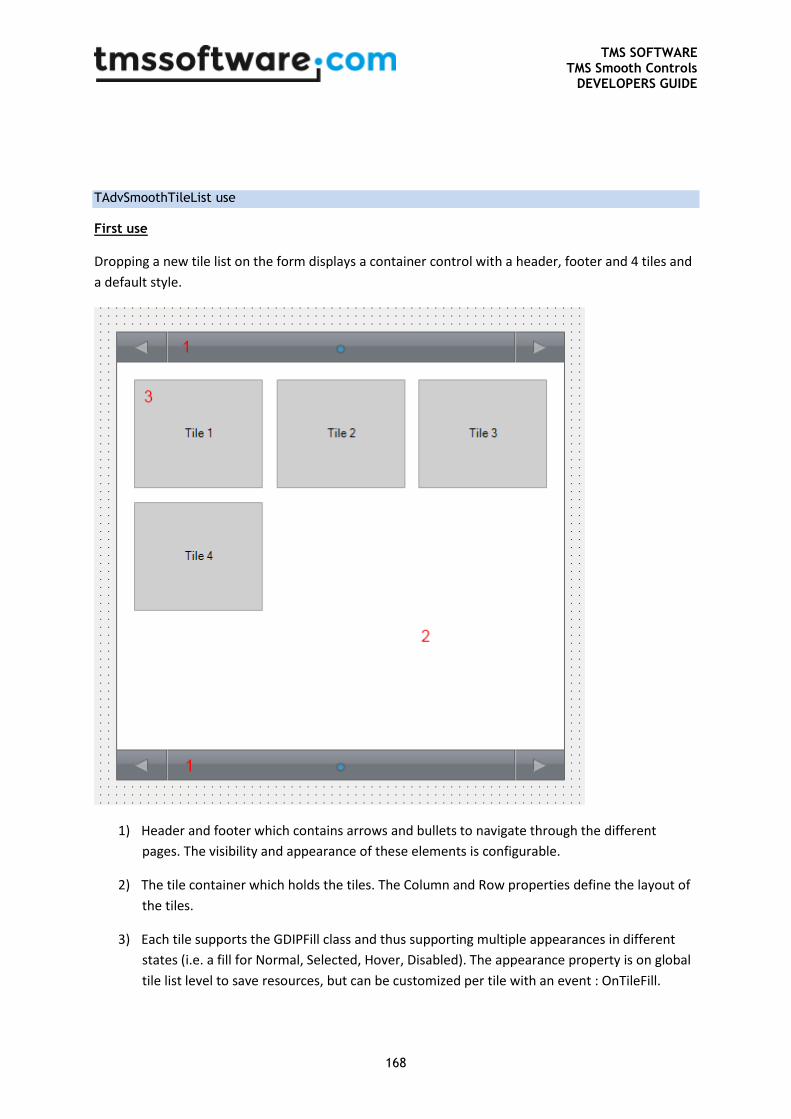
TMS SOFTWARE TMS Smooth Controls
DEVELOPERS GUIDE
168
TAdvSmoothTileList use
First use
Dropping a new tile list on the form displays a container control with a header, footer and 4 tiles and
a default style.
1) Header and footer which contains arrows and bullets to navigate through the different
pages. The visibility and appearance of these elements is configurable.
2) The tile container which holds the tiles. The Column and Row properties define the layout of
the tiles.
3) Each tile supports the GDIPFill class and thus supporting multiple appearances in different
states (i.e. a fill for Normal, Selected, Hover, Disabled). The appearance property is on global
tile list level to save resources, but can be customized per tile with an event : OnTileFill.
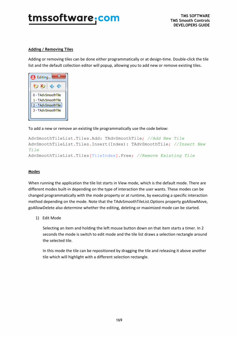
TMS SOFTWARE TMS Smooth Controls
DEVELOPERS GUIDE
169
Adding / Removing Tiles
Adding or removing tiles can be done either programmatically or at design-time. Double-click the tile
list and the default collection editor will popup, allowing you to add new or remove existing tiles.
To add a new or remove an existing tile programmatically use the code below:
AdvSmoothTileList.Tiles.Add: TAdvSmoothTile; //Add New Tile
AdvSmoothTileList.Tiles.Insert(Index): TAdvSmoothTile; //Insert New
Tile
AdvSmoothTileList.Tiles[TileIndex].Free; //Remove Existing Tile
Modes
When running the application the tile list starts in View mode, which is the default mode. There are
different modes built-in depending on the type of interaction the user wants. These modes can be
changed programmatically with the mode property or at runtime, by executing a specific interaction
method depending on the mode. Note that the TAdvSmoothTileList.Options property goAllowMove,
goAllowDelete also determine whether the editing, deleting or maximized mode can be started.
1) Edit Mode
Selecting an item and holding the left mouse button down on that item starts a timer. In 2
seconds the mode is switch to edit mode and the tile list draws a selection rectangle around
the selected tile.
In this mode the tile can be repositioned by dragging the tile and releasing it above another
tile which will highlight with a different selection rectangle.
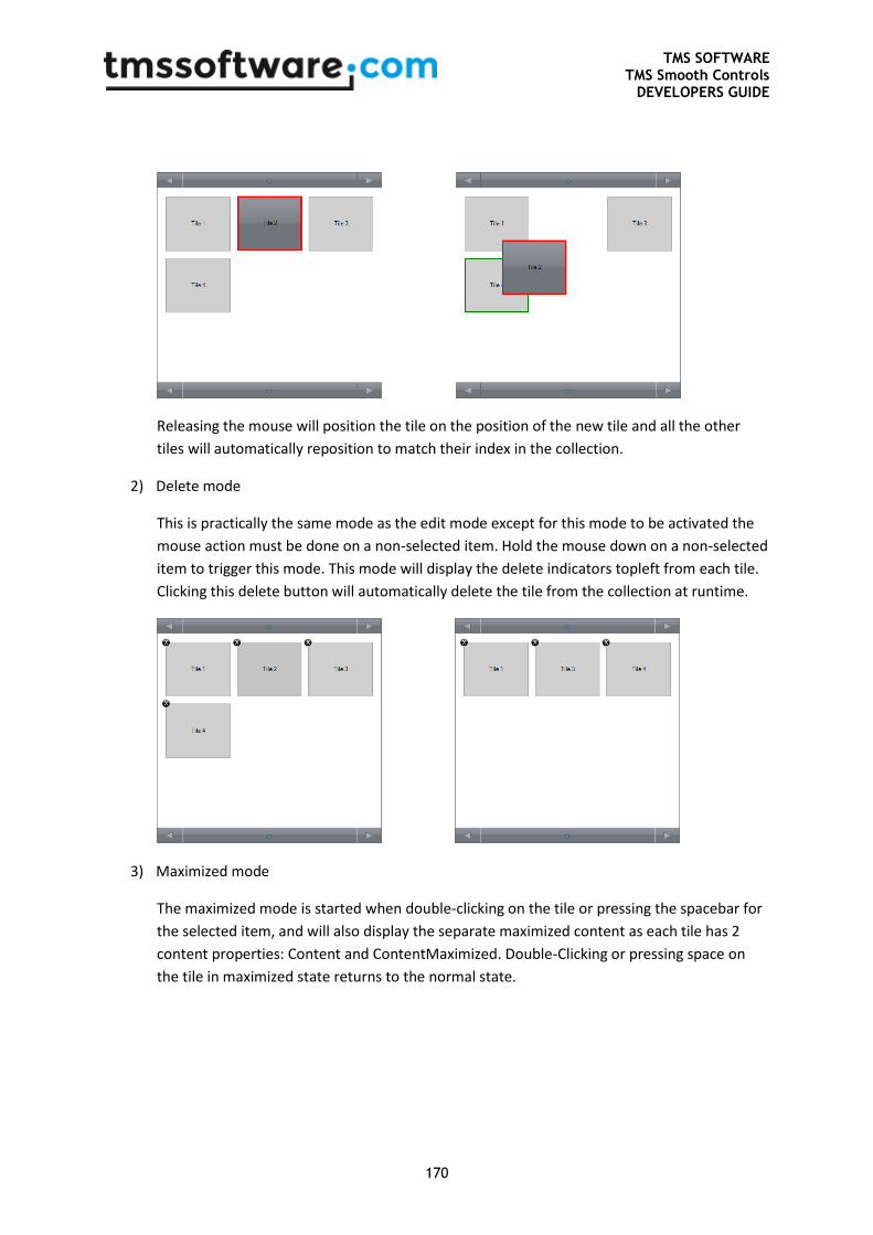
TMS SOFTWARE TMS Smooth Controls
DEVELOPERS GUIDE
170
Releasing the mouse will position the tile on the position of the new tile and all the other
tiles will automatically reposition to match their index in the collection.
2) Delete mode
This is practically the same mode as the edit mode except for this mode to be activated the
mouse action must be done on a non-selected item. Hold the mouse down on a non-selected
item to trigger this mode. This mode will display the delete indicators topleft from each tile.
Clicking this delete button will automatically delete the tile from the collection at runtime.
3) Maximized mode
The maximized mode is started when double-clicking on the tile or pressing the spacebar for
the selected item, and will also display the separate maximized content as each tile has 2
content properties: Content and ContentMaximized. Double-Clicking or pressing space on
the tile in maximized state returns to the normal state.
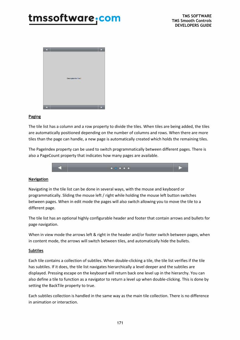
TMS SOFTWARE TMS Smooth Controls
DEVELOPERS GUIDE
171
Paging
The tile list has a column and a row property to divide the tiles. When tiles are being added, the tiles
are automatically positioned depending on the number of columns and rows. When there are more
tiles than the page can handle, a new page is automatically created which holds the remaining tiles.
The PageIndex property can be used to switch programmatically between different pages. There is
also a PageCount property that indicates how many pages are available.
Navigation
Navigating in the tile list can be done in several ways, with the mouse and keyboard or
programmatically. Sliding the mouse left / right while holding the mouse left button switches
between pages. When in edit mode the pages will also switch allowing you to move the tile to a
different page.
The tile list has an optional highly configurable header and footer that contain arrows and bullets for
page navigation.
When in view mode the arrows left & right in the header and/or footer switch between pages, when
in content mode, the arrows will switch between tiles, and automatically hide the bullets.
Subtiles
Each tile contains a collection of subtiles. When double-clicking a tile, the tile list verifies if the tile
has subtiles. If it does, the tile list navigates hierarchically a level deeper and the subtiles are
displayed. Pressing escape on the keyboard will return back one level up in the hierarchy. You can
also define a tile to function as a navigator to return a level up when double-clicking. This is done by
setting the BackTile property to true.
Each subtiles collection is handled in the same way as the main tile collection. There is no difference
in animation or interaction.
TMS SOFTWARE TMS Smooth Controls
DEVELOPERS GUIDE
172
Visualizers
The tile list is designed with an extensible and abstract way of drawing tiles. This is achieved by an
external component that can be chosen that is responsible for drawing the tile. By default, a normal
text visualizer is used to draw the tiles in its different states. Currently there are 2 extra visualizers
that are supported in the tile list.
- TAdvSmoothTileListImageVisualizer : Extends the default visualizer with support for images.
- TAdvSmoothTileListHTMLVisualizer : Extends the Image Visualizer and adds support for
drawing HTML text with the mini-html engine.
Custom visualizers
The AdvSmoothTileList unit defines a base visualizer class from where other custom visualizer classes
can derive to create new visualizers which draw the tiles in the tile list. To do this, the base tile list
visualizer class virtualizes some methods that can be overridden:
TAdvSmoothTileListVisualizer = class(TComponent)
public
function DoMouseDown(Tile: TAdvSmoothTile; Button: TMouseButton;
Shift: TShiftState; X, Y: Integer): Boolean; virtual;
function DoMouseMove(Tile: TAdvSmoothTile; Shift: TShiftState;
X, Y: Integer): Boolean; virtual;
function DoMouseUp(Tile: TAdvSmoothTile; Button: TMouseButton;
Shift: TShiftState; X, Y: Integer): Boolean; virtual;
function DrawText(g: TGPGraphics; R: TGPRectF; Tile:
TAdvSmoothTile; Text: String): TGPRectF; virtual;
function DrawTile(g: TGPGraphics; R: TGPRectF; Tile:
TAdvSmoothTile): TGPRectF; virtual;
end;
DrawTile draws the tile background and takes care of empty tiles and different tile states.
DrawText simply draws the text coming from the content parameter depending on the content state.
The different DoMouseDown, DoMouseMove and DoMouseUp functions are called from within the
component. New events, properties and methods need to be declared on the TAdvSmoothTileList /
TAdvSmoothTile level or general properties can be defined on the Visualizer itself before
implementing them.
The interaction functions with the mouse returns a Boolean value when a condition is met. For
example if the mouse is inside an element that is custom drawn the function needs to return False
for the other default interaction to stop responding (hovering tiles, selecting tiles, etc…)
Below is a small sample of a custom visualizer that draws an ellipse which changes color when
hovering the tile:
TMS SOFTWARE TMS Smooth Controls
DEVELOPERS GUIDE
173
unit AdvSmoothTileListCustomVisualizer;
interface
uses
Classes, Graphics, AdvGDIP, AdvSmoothTileList, GDIPFill;
type
TAdvSmoothTileListCustomVisualizer =
class(TAdvSmoothTileListVisualizer)
public
function DrawTile(g: TGPGraphics; R: TGPRectF; Tile:
TAdvSmoothTile): TGPRectF; override;
end;
procedure Register;
implementation
procedure Register;
begin
RegisterComponents('TMS Smooth',
[TAdvSmoothTileListCustomVisualizer]);
end;
{ TAdvSmoothTileListCustomVisualizer }
function TAdvSmoothTileListCustomVisualizer.DrawTile(g: TGPGraphics;
R: TGPRectF; Tile: TAdvSmoothTile): TGPRectF;
var
b: TGPSolidBrush;
c: TColor;
begin
Result := inherited DrawTile(g, R, Tile);
if Tile.TileList.HoverTile = Tile then
c := clGreen
else
c := clRed;
b := TGPSolidBrush.Create(MakeColor(255, c));
g.FillEllipse(b, MakeRect(r.X + 40, r.Y + 40, r.Width - 80,
r.Height - 80));
b.Free;
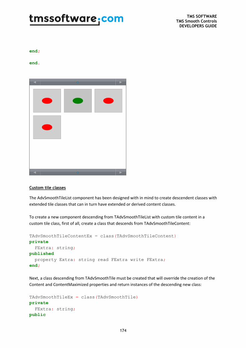
TMS SOFTWARE TMS Smooth Controls
DEVELOPERS GUIDE
174
end;
end.
Custom tile classes
The AdvSmoothTileList component has been designed with in mind to create descendent classes with
extended tile classes that can in turn have extended or derived content classes.
To create a new component descending from TAdvSmoothTileList with custom tile content in a
custom tile class, first of all, create a class that descends from TAdvSmoothTileContent:
TAdvSmoothTileContentEx = class(TAdvSmoothTileContent)
private
FExtra: string;
published
property Extra: string read FExtra write FExtra;
end;
Next, a class descending from TAdvSmoothTile must be created that will override the creation of the
Content and ContentMaximized properties and return instances of the descending new class:
TAdvSmoothTileEx = class(TAdvSmoothTile)
private
FExtra: string;
public
TMS SOFTWARE TMS Smooth Controls
DEVELOPERS GUIDE
175
procedure Assign(Source: TPersistent); override;
function CreateContent: TAdvSmoothTileContent; override;
function CreateContentMaximized: TAdvSmoothTileContent; override;
published
property Extra: string read FExtra write FExtra;
end;
At the same time, the TAdvSmoothTileEx class, descending from TAdvSmoothTile can introduce new
properties, methods, events.
The overrides of the virtual functions CreateContent and CreateContentMaximized should return
instances of the classes descending from TAdvSmoothTileContent:
function TAdvSmoothTileEx.CreateContent: TAdvSmoothTileContent;
begin
Result := TAdvSmoothTileContentEx.Create(Self);
end;
Next in the hierarchy is the tiles collection: TAdvSmoothTiles. For this collection, it is needed to
override the function CreateItemClass and return the new class descending from TAdvSmoothTile:
TAdvSmoothTilesEx = class(TAdvSmoothTiles)
public
function CreateItemClass: TCollectionItemClass; override;
end;
function TAdvSmoothTilesEx.CreateItemClass: TCollectionItemClass;
begin
Result := TAdvSmoothTileEx;
end;
Finally, on the highest level, the class descending from TAdvSmoothTileList should override the
virtual function CreateTiles and return an instance of the new collection class descending from
TAdvSmoothTiles:
TAdvSmoothTileListEx = class(TAdvSmoothTileList)
public
function CreateTiles: TAdvSmoothTiles; override;
end;
function TAdvSmoothTileListEx.CreateTiles: TAdvSmoothTiles;
begin
Result := TAdvSmoothTilesEx.Create(Self);
end;
TMS SOFTWARE TMS Smooth Controls
DEVELOPERS GUIDE
176
With this code in place, a new TAdvSmoothTileListEx class is designed that introduces a tile collection
that can be an extension of the default TAdvSmoothTile collection and that can have extended
Content and ContentMaximized classes. The full sample source code can be found in
AdvSmoothTilesEx.pas and shows how easy it is to extend the component.
List of important properties for TAdvSmoothTileList component
- AnimationFactor: The factor used for internal calculation of the animation. The lower the
factor the faster the animation.
- Columns: The amount of columns to divide the tiles.
- Fill: The background fill of the tile list.
- Header / Footer: The navigation Header / Footer used in the tile list.
o ArrowColor: The color of the navigation arrows left and right.
o ArrowNavigation: Turns the arrow navigation on / off.
o ArrowRectangleSize: The size of the rectangles which hold the arrows.
o ArrowSize: The size of the arrows.
o BulletColor: The color of the navigation bullets.
o BulletSelectedColor: The color of the bullet which index matches the PageIndex.
o BulletSize: The size of the bullets.
o Caption: In case the bullets are invisible the caption is displayed.
o Fill: The fill of the Header/footer background.
o Float: Sets the Header / Footer floating. The tiles are calculated without the height of
the Header/Footer.
o Font: The font of the Caption.
o Height: The height of the Header / Footer.
o Navigation: Completely disables navigation via Header / Footer.
o NextHint, PreviousHint: The hints shown on the arrows when hovering.
o ShowPages: Shows / Hides the paging bullets.
o Visible: Completely hides the Header / Footer.
- OfficeHint: Support for Office hint appearance and display.
- Options: Different options for enabling/disabling interaction
o toAllowMove: Allows / Disallows moving of tiles in edit mode.
o toAllowDelete: Allows / Disallows deleting of tiles in delete mode.
o toAllowMaximize: Allows / Disallows maximizing tiles.
- PageIndex: The index of the current page.
- Rows: The amount of rows to divide the tiles.
- TextRendering: The smoothness of the gdi+ text rendering.
- TileAppereance: The appearance of the tiles.
o BackGround: Completely hides the background of the tile.
TMS SOFTWARE TMS Smooth Controls
DEVELOPERS GUIDE
177
o DeleteIndicatorAppearance / StatusIndicatorAppearance: The appearance of the 2
status indicators that can be used on a tile.
o HorizontalSpacing / VerticalSpacing: The spacing between the tiles.
o LargeViewFill / LargeViewFont: The appearance of the maximized state of the tile.
o SmallViewFill / SmallViewFont: The appearance of the normal state of the tile.
Use separate Fill / Font for different states (Selected, Hover, Disabled)
o MovingTileColor: The color of the moving rectangle when moving a tile in edit mode.
o TargetTileColor: The color of the target rectangle when moving a tile in edit mode.
o TileMargins: The margins used for spacing the tile container.
o Tiles: The collection of tiles.
o Visualizer / VisualizerMaximized: The visualizers for the 2 content states of the tile.
List of important properties for TAdvSmoothTile class
- BackTile: The tile can be used as a return option when the count of subtiles is greater than
zero and the list is navigated inside the subtiles collection. The tile will return one level.
- CanDelete: Allows / DisAllows tile deletion in delete mode.
- Content / ContentMaximized: The different settings for each tile in the 2 different content
states.
o Hint: Displays a hint on the tile when hovering.
o Image: Displays an image in combination with the correct visualizer.
o ImageAspectRatio: Draws the image with / without aspect ratio.
o ImageIndex: The index of the image in combination with an imagelist.
o ImageName: The name of the image in combination with a GDI+ Picturecontainer.
o ImageStretch: Stretches the image in the given rectangle.
o OfficeHint: Support for Office hint appearance and display.
o Text: the text drawn on the tile.
o TextLeft / TextTop: The positions of the text in case TextPosition is tpCustom.
o TextPosition: The position of the text inside the tile rectangle.
- Data / Tag / ItemObject: Extra properties.
- DeleteIndicator / StatusIndicator : The indicator text used for the different indicators for
each tile.
- DeleteIndicatorLeft / DeleteIndicatorTop / StatusIndicatorLeft / StatusIndicatorTop: Extra
positioning of the indicators for each tile.
- Empty: Sets the tile empty. Empty tiles can be used to define a new page. Empty tiles can
also be used for moving tiles in to a new position.
- Enabled: Sets the tile enabled / disabled.
- Visualizer / VisualizerMaximized: A possibility to specify a visualizer per tile. To mix different
contents in one component.
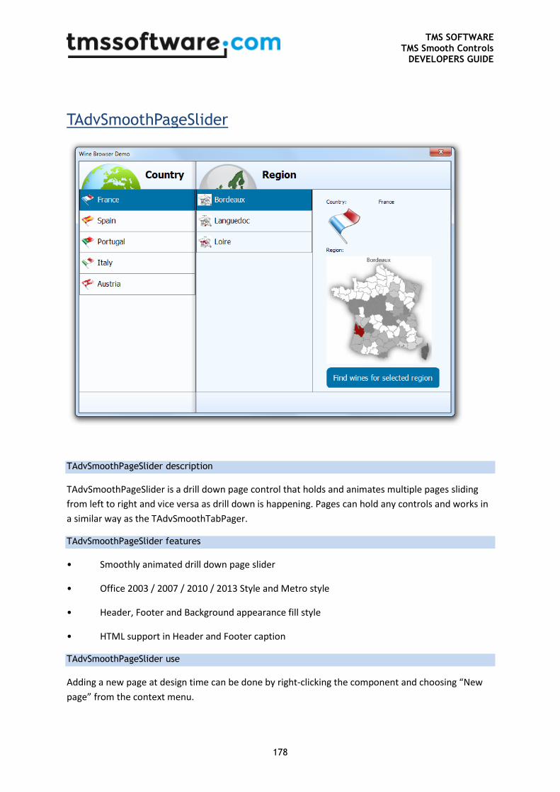
TMS SOFTWARE TMS Smooth Controls
DEVELOPERS GUIDE
178
TAdvSmoothPageSlider
TAdvSmoothPageSlider description
TAdvSmoothPageSlider is a drill down page control that holds and animates multiple pages sliding
from left to right and vice versa as drill down is happening. Pages can hold any controls and works in
a similar way as the TAdvSmoothTabPager.
TAdvSmoothPageSlider features
• Smoothly animated drill down page slider
• Office 2003 / 2007 / 2010 / 2013 Style and Metro style
• Header, Footer and Background appearance fill style
• HTML support in Header and Footer caption
TAdvSmoothPageSlider use
Adding a new page at design time can be done by right-clicking the component and choosing “New
page” from the context menu.
TMS SOFTWARE TMS Smooth Controls
DEVELOPERS GUIDE
179
To create a new page at runtime the following code can be used:
var
sp: TAdvSmoothPage;
begin
sp:= TAdvSmoothPage.Create(AdvSmoothPageSlider1);
sp.PageSlider := AdvSmoothPageSlider1;
sp.Header := 'Runtime created page';
end;
To remove a page at runtime, simply destroy the page:
AdvSmoothPage.Free;
Pages slide in from the right and are animated. To change a page simply set the ActivePageIndex to
the correct page. You will notice that pages with a PageIndex that occur before the ActivePageIndex
will automatically slide along the Active Page.
Navigation through pages can also be done with the keyboard and the mouse. Click on a page and
slide it from right to left to increase the ActivePageIndex or vice versa to decrease. This all happens
with animation that can optionally be set faster or slower or be turned off with the AnimationFactor
property.
When a page is active, you will notice that the page leaves a minimum amount of width to the left,
this is necessary to interact with and show the previous page. This is set with the MinimumWidth
property.
List of important properties and events
- ActivePage: The page that is currently active.
- ActivePageIndex: The index of the page that is currently active. This property is used to
switch between pages at designtime and runtime.
- AnimationFactor: The speed of the animation, the higher the factor the slower the
animation.
- Fill: The fill of the background of the page.
- Footer / Header: The caption of the footer / header which support HTML.
- FooterFill / HeaderFill: The fill of the footer / header.
- FooterFont / HeaderFont: The font of the footer / header.
- FooterHeight / HeaderHeight: The height of the footer / header.
- FooterHorizontalAlignment / HeaderHorizontalAlignment: Horizontal caption alignment of
the footer / header.
- FooterVerticalAlignment / HeaderVerticalAlignment: Vertical caption alignment of the
footer / header.
- ImageList: ImageList used in the Header and Footer to display images with HTML.
- MinimumWidth: The width that is left visible of the page when the page is inactive.
TMS SOFTWARE TMS Smooth Controls
DEVELOPERS GUIDE
180
- PageIndex: The page index of the page.
- PictureContainer: container of images used in the Header and Footer to display images with
HTML.
- ShadowColor: The color of the shadow (clNone hides the shadow)
- ShowFooter / ShowHeader: Hides / Shows the Footer / Header on the page.
- OnPageChange: Event called when a page has changed
- OnPageChanging: Event called when a page is about to change. With this event page
changing can be blocked with the AllowChange parameter.
- OnPageMoved: Event called when a page is moved to another PageIndex