digital humanities workshop -...
TRANSCRIPT

Digital Humanities Workshop University of Rijeka 17-18 March, 2016
Introduction to Data Visualization:
Networks and Gephi
Rocio Chongtay
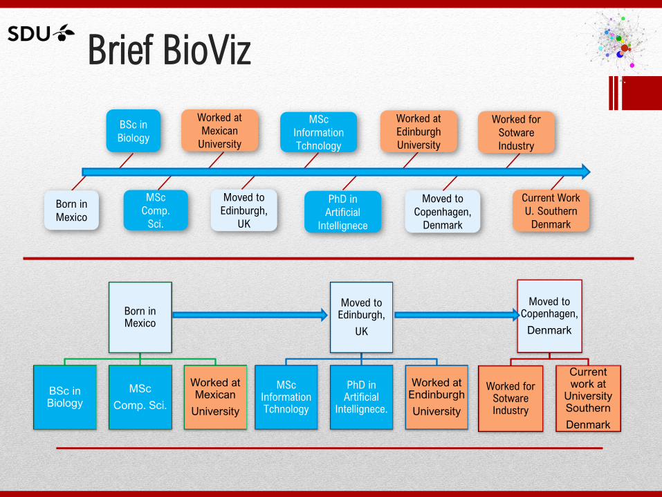
Brief BioViz
Born in Mexico
BSc in Biology
MSc
Comp. Sci.
Worked at Mexican
University
Moved to Edinburgh,
UK
MSc Information Tchnology
PhD in Artificial
Intellignece.
Worked at Endinburgh
University
Moved to Copenhagen,
Denmark
Worked for Sotware Industry
Current work at
University Southern
Denmark
Born in
Mexico
BSc in
Biology
MSc
Comp.
Sci.
MSc
Information
Tchnology
Moved to
Edinburgh,
UK
PhD in
Artificial
Intellignece
Moved to
Copenhagen,
Denmark
Worked for
Sotware
Industry
Current Work
U. Southern
Denmark
Worked at
Mexican
University
Worked at
Edinburgh
University
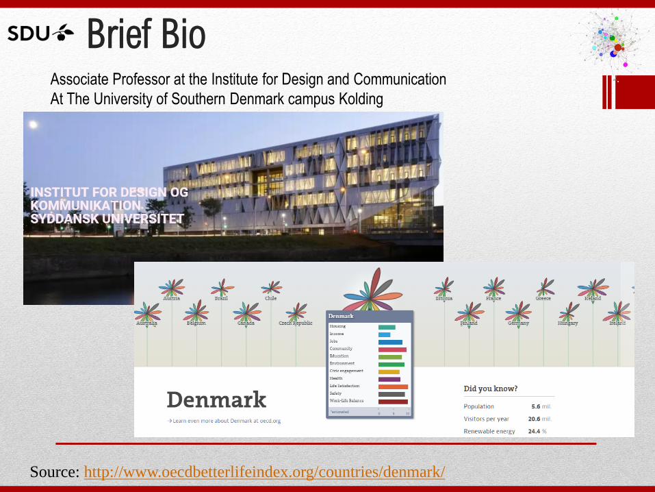
Brief Bio
Source: http://www.oecdbetterlifeindex.org/countries/denmark/
Associate Professor at the Institute for Design and Communication
At The University of Southern Denmark campus Kolding
Agenda
• Helicopter overview to network
visualization
• Introduction to Gephi
• Hands on Gephi: a step by step tutorial
Helicopter overview of
Network Visualization
Network Visualization
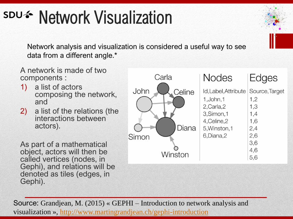
A network is made of two components :
1) a list of actors composing the network, and
2) a list of the relations (the interactions between actors).
As part of a mathematical object, actors will then be called vertices (nodes, in Gephi), and relations will be denoted as tiles (edges, in Gephi).
Network analysis and visualization is considered a useful way to see
data from a different angle.*
Source: Grandjean, M. (2015) « GEPHI – Introduction to network analysis and
visualization », http://www.martingrandjean.ch/gephi-introduction
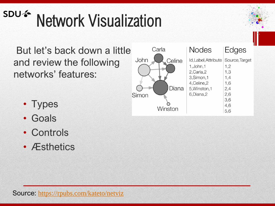
Network Visualization
But let’s back down a little
and review the following
networks’ features:
• Types
• Goals
• Controls
• Æsthetics
Source: https://rpubs.com/kateto/netviz
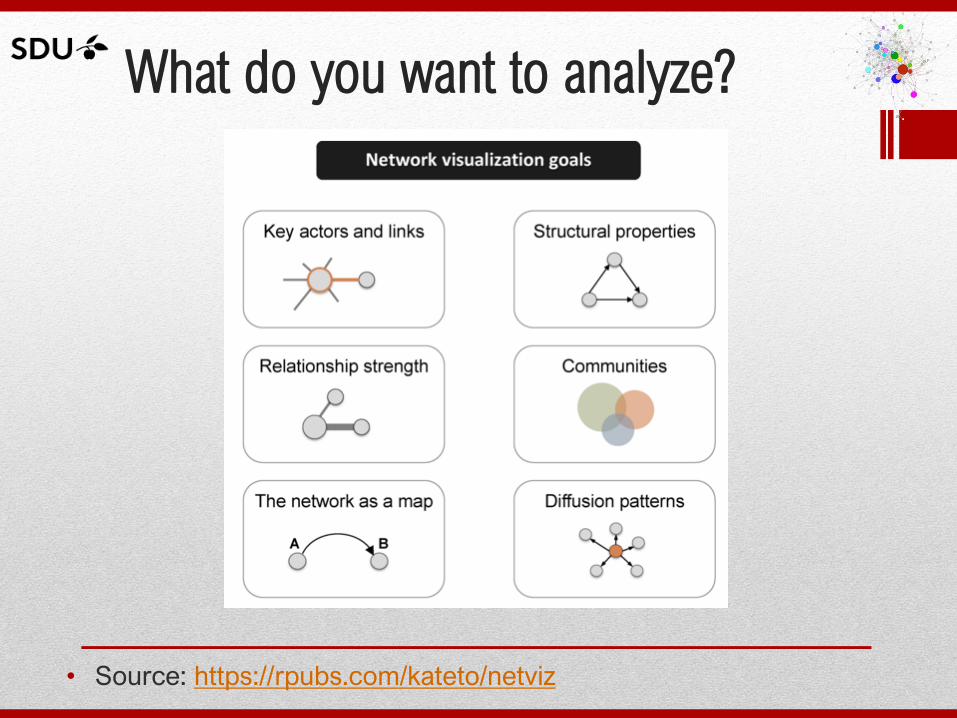
What do you want to analyze?
• Source: https://rpubs.com/kateto/netviz
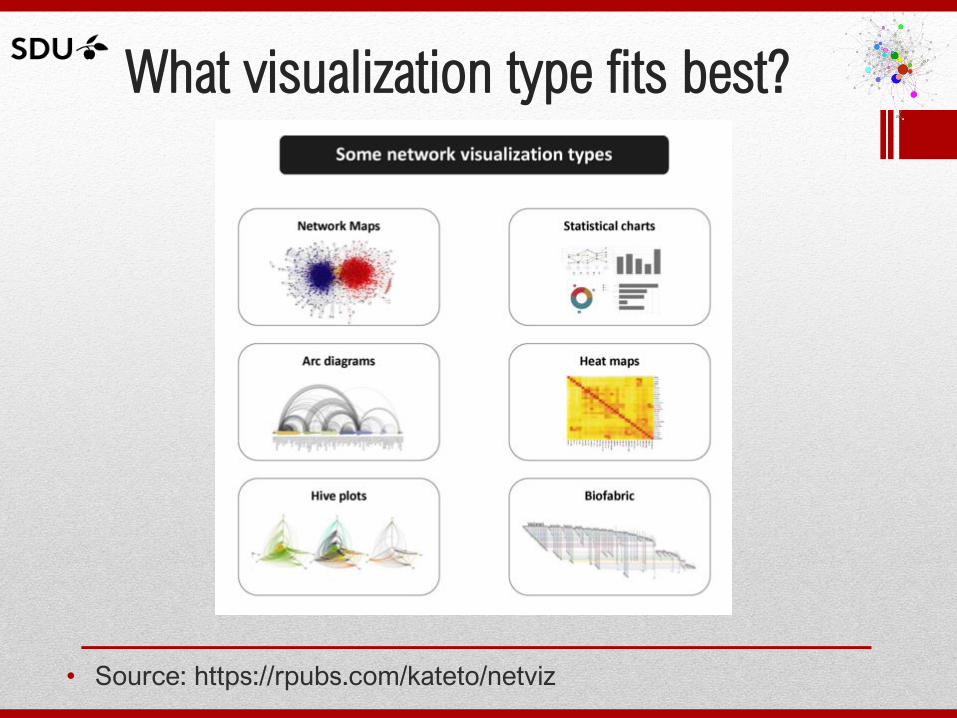
What visualization type fits best?
• Source: https://rpubs.com/kateto/netviz
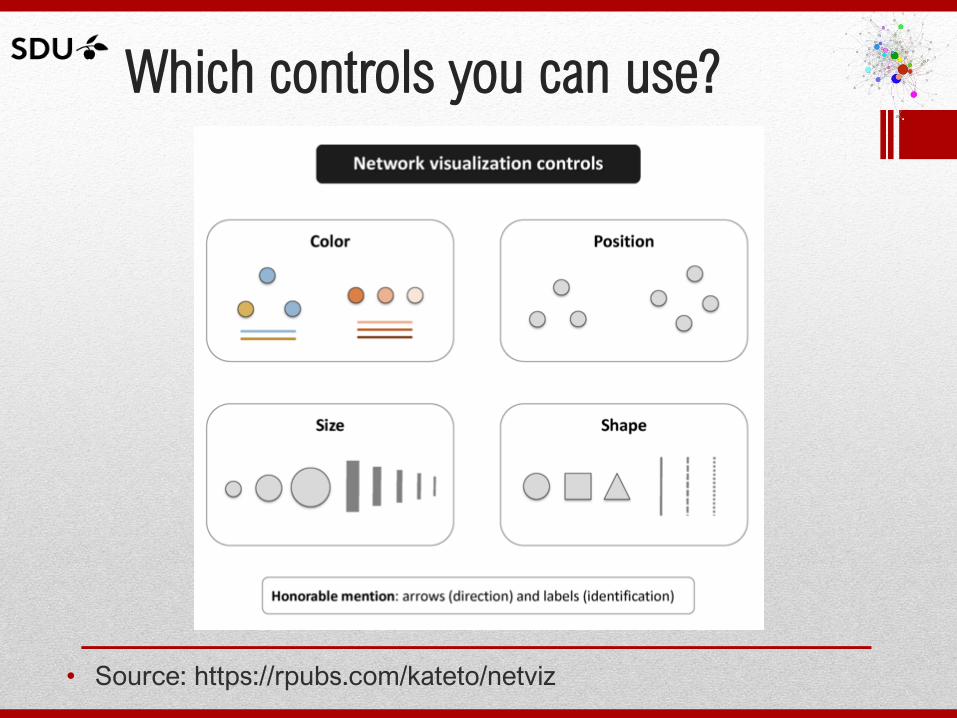
Which controls you can use?
• Source: https://rpubs.com/kateto/netviz
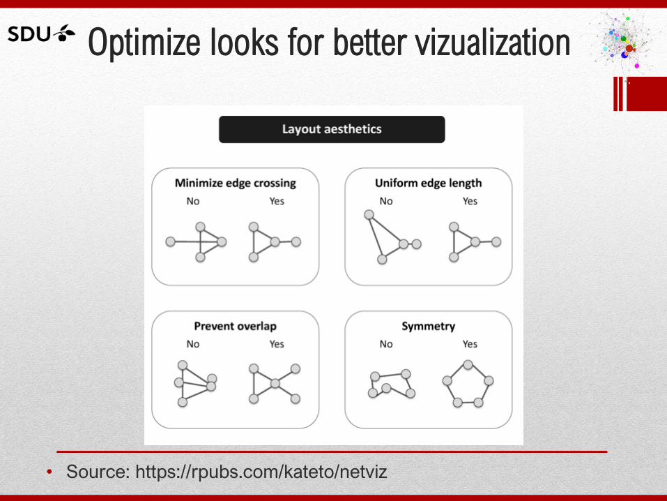
Optimize looks for better vizualization
• Source: https://rpubs.com/kateto/netviz
Introduction to Gephi
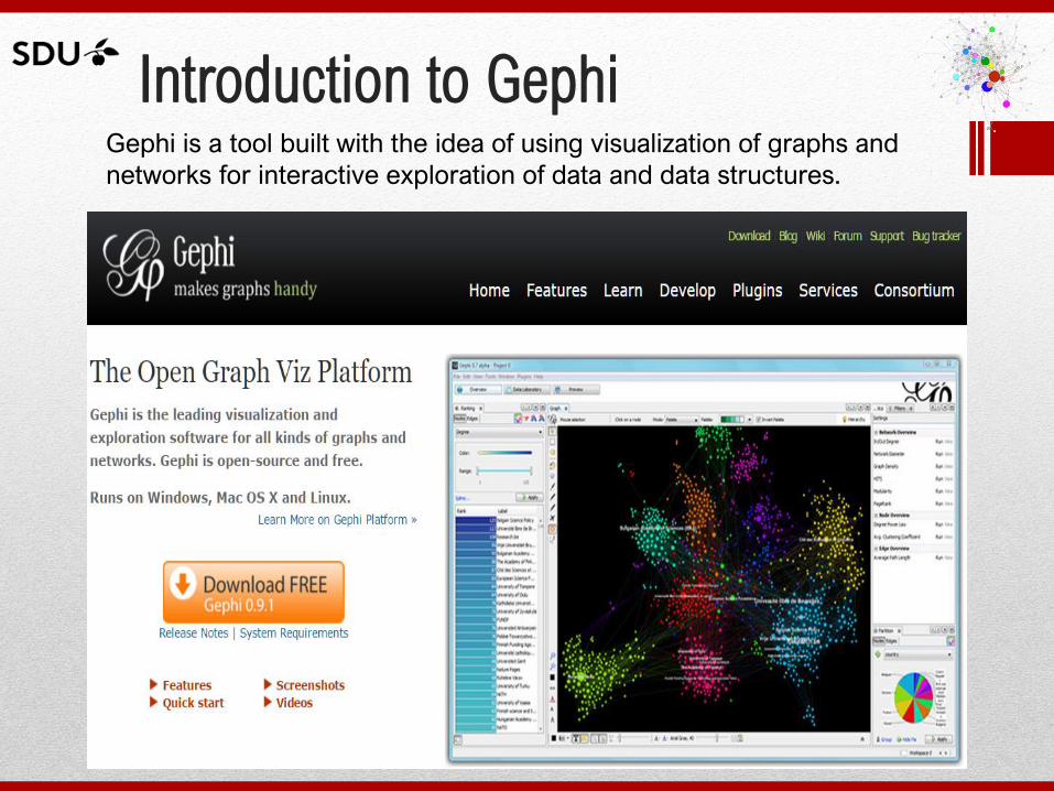
Introduction to Gephi Gephi is a tool built with the idea of using visualization of graphs and
networks for interactive exploration of data and data structures.
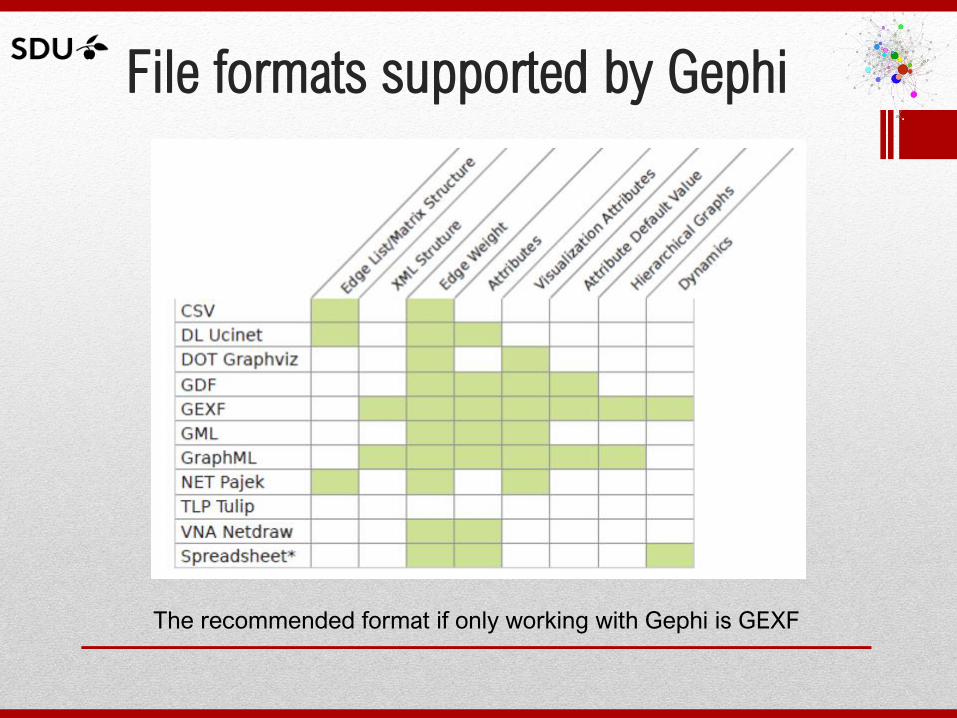
File formats supported by Gephi
The recommended format if only working with Gephi is GEXF
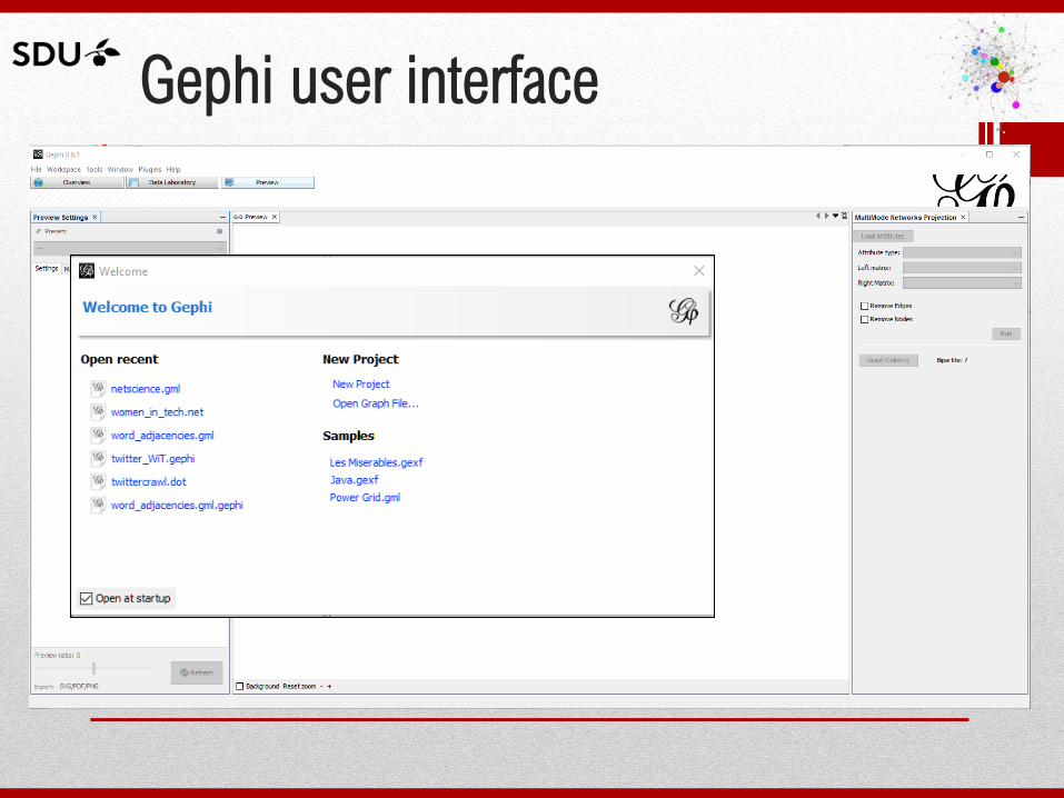
Gephi user interface
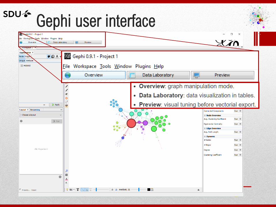
Gephi user interface
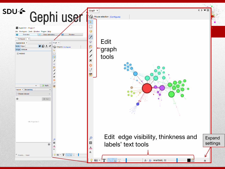
Gephi user interface
Edit
graph
tools
Edit edge visibility, thinkness and
labels’ text tools Expand
settings
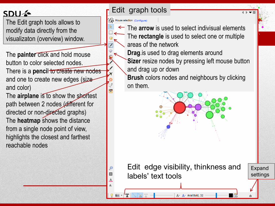
Edit graph tools
Edit edge visibility, thinkness and
labels’ text tools Expand
settings
The painter click and hold mouse
button to color selected nodes.
There is a pencil to create new nodes
and one to create new edges (size
and color)
The airplane is to show the shortest
path between 2 nodes (different for
directed or non-directed graphs)
The heatmap shows the distance
from a single node point of view,
highlights the closest and farthest
reachable nodes
The Edit graph tools allows to
modify data directly from the
visualizaton (overview) window.
The arrow is used to select indivisual elements
The rectangle is used to select one or multiple
areas of the network
Drag.is used to drag elements around
Sizer resize nodes by pressing left mouse button
and drag up or down
Brush colors nodes and neighbours by clicking
on them.
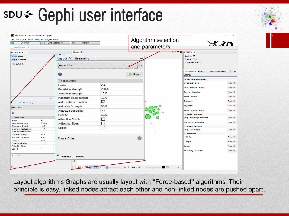
Gephi user interface
Algorithm selection
and parameters
Layout algorithms Graphs are usually layout with “Force-based” algorithms. Their
principle is easy, linked nodes attract each other and non-linked nodes are pushed apart.
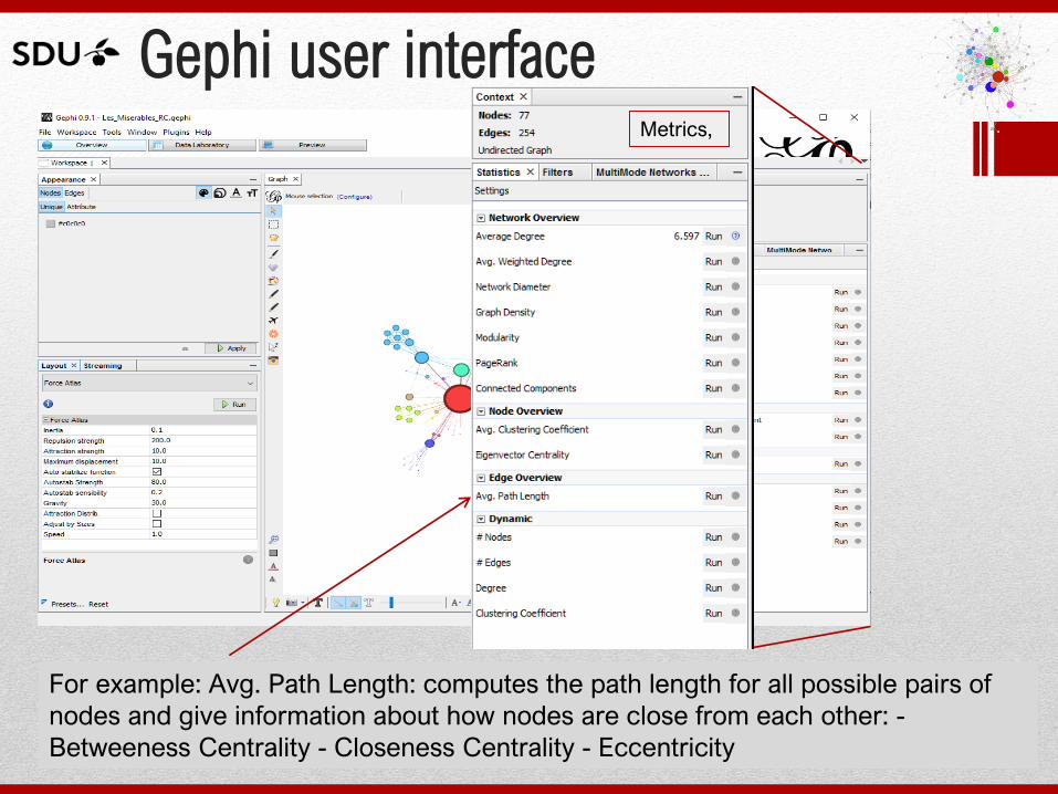
Gephi user interface
For example: Avg. Path Length: computes the path length for all possible pairs of
nodes and give information about how nodes are close from each other: -
Betweeness Centrality - Closeness Centrality - Eccentricity
Metrics,
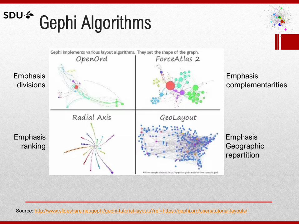
Gephi Algorithms
Source: http://www.slideshare.net/gephi/gephi-tutorial-layouts?ref=https://gephi.org/users/tutorial-layouts/
Emphasis
divisions
Emphasis
ranking
Emphasis
Geographic
repartition
Emphasis
complementarities
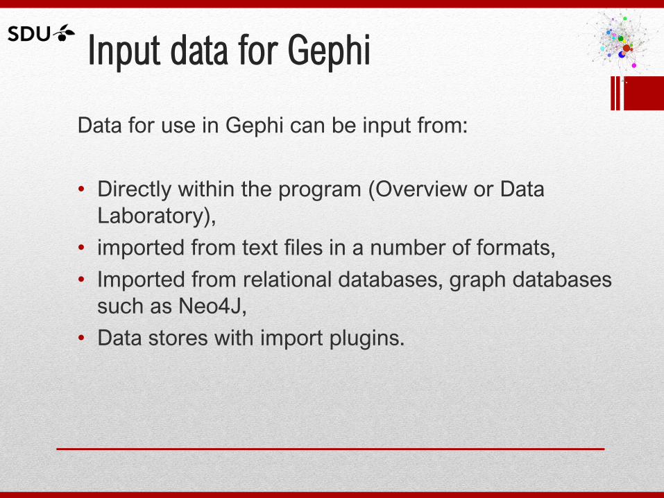
Input data for Gephi
Data for use in Gephi can be input from:
• Directly within the program (Overview or Data
Laboratory),
• imported from text files in a number of formats,
• Imported from relational databases, graph databases
such as Neo4J,
• Data stores with import plugins.
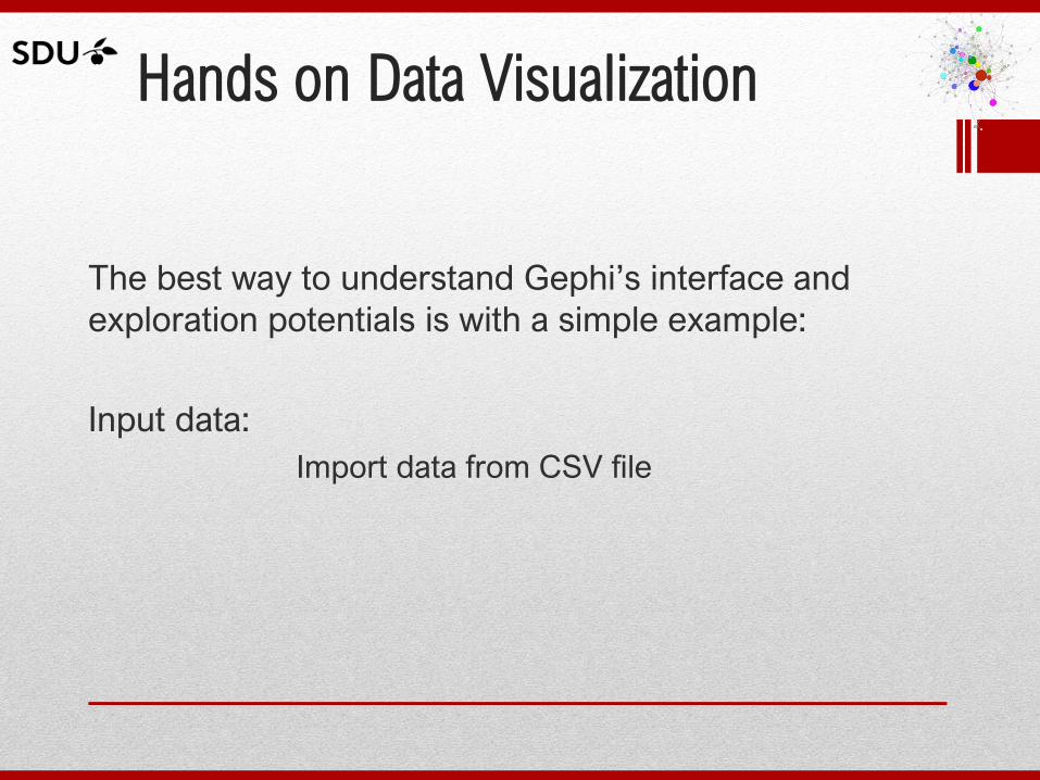
Hands on Data Visualization
The best way to understand Gephi’s interface and
exploration potentials is with a simple example:
Input data:
Import data from CSV file
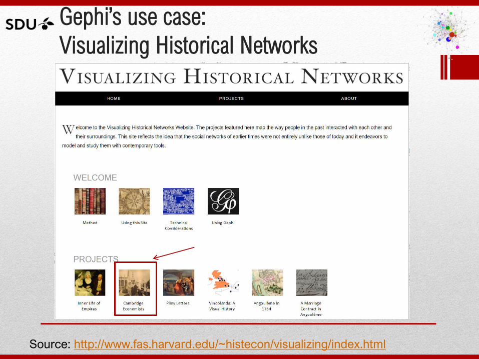
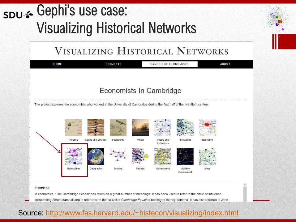
Gephi’s use case:
Visualizing Historical Networks
Source: http://www.fas.harvard.edu/~histecon/visualizing/index.html
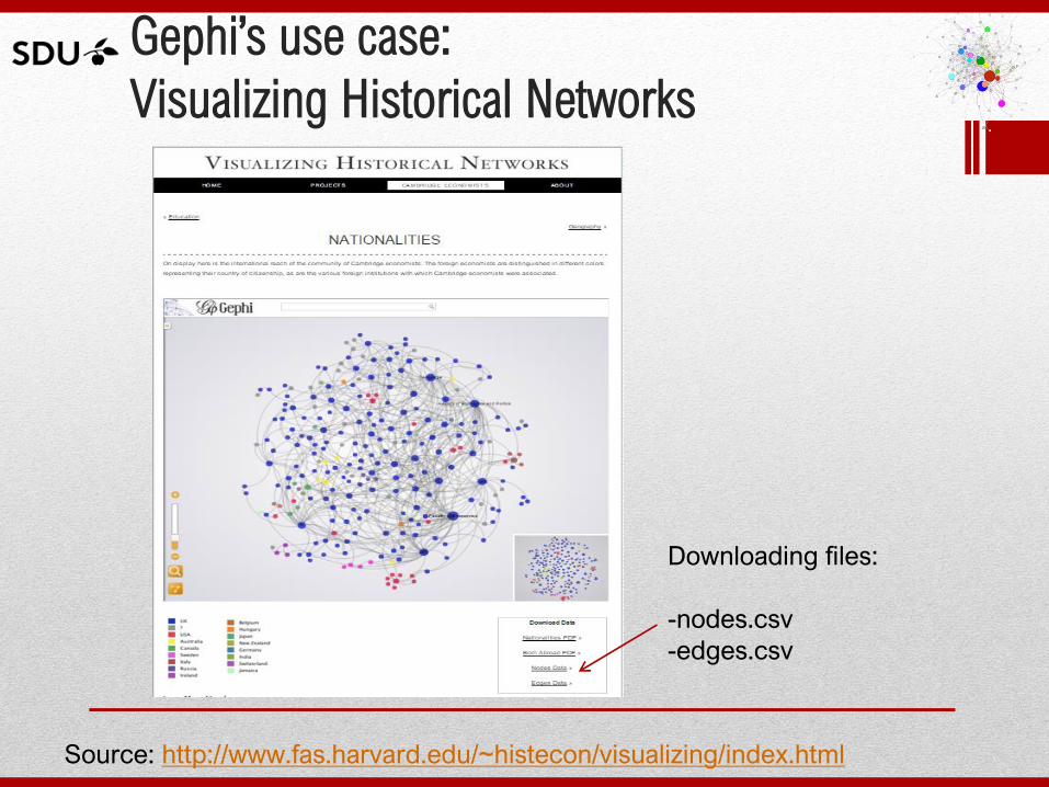
Gephi’s use case:
Visualizing Historical Networks
Source: http://www.fas.harvard.edu/~histecon/visualizing/index.html
Gephi’s use case:
Visualizing Historical Networks
Source: http://www.fas.harvard.edu/~histecon/visualizing/index.html
Downloading files:
-nodes.csv
-edges.csv
Gephi’s use case:
Visualizing Historical Networks
Source: http://www.fas.harvard.edu/~histecon/visualizing/index.html
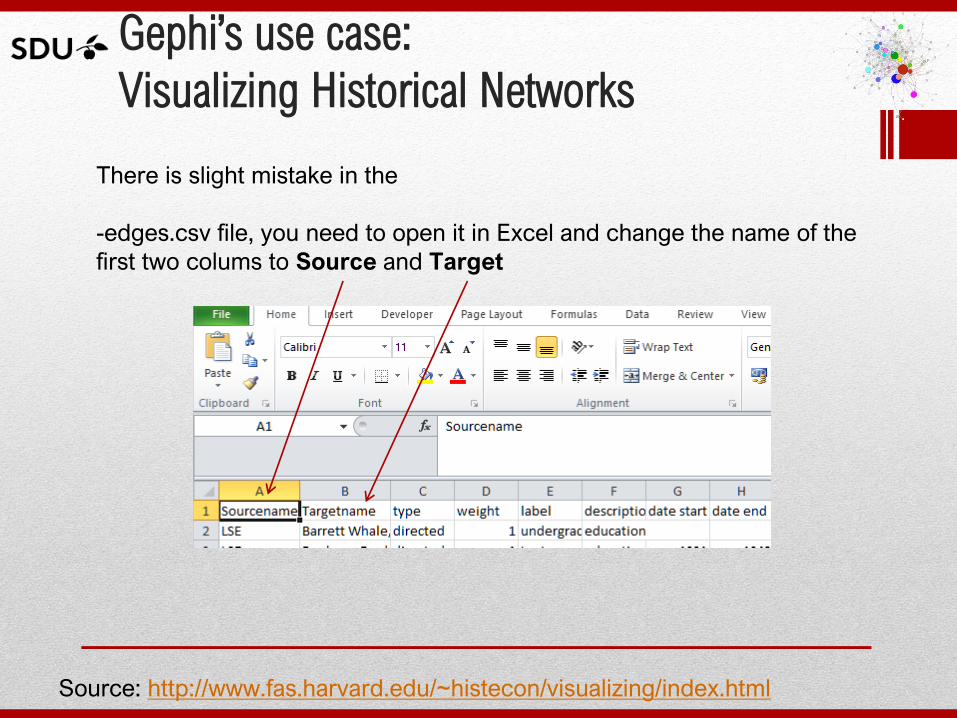
There is slight mistake in the
-edges.csv file, you need to open it in Excel and change the name of the
first two colums to Source and Target
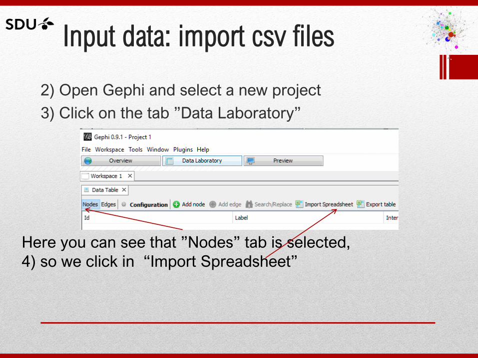
Input data: import csv files
2) Open Gephi and select a new project
3) Click on the tab ”Data Laboratory”
Here you can see that ”Nodes” tab is selected,
4) so we click in “Import Spreadsheet”
Input data: import csv files
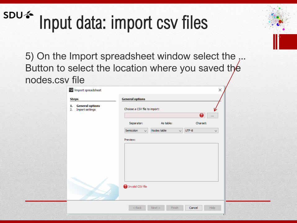
5) On the Import spreadsheet window select the ...
Button to select the location where you saved the
nodes.csv file
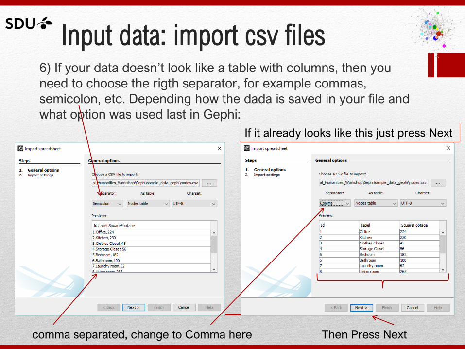
Input data: import csv files 6) If your data doesn’t look like a table with columns, then you
need to choose the rigth separator, for example commas,
semicolon, etc. Depending how the dada is saved in your file and
what option was used last in Gephi:
comma separated, change to Comma here Then Press Next
If it already looks like this just press Next
Input data: import csv files
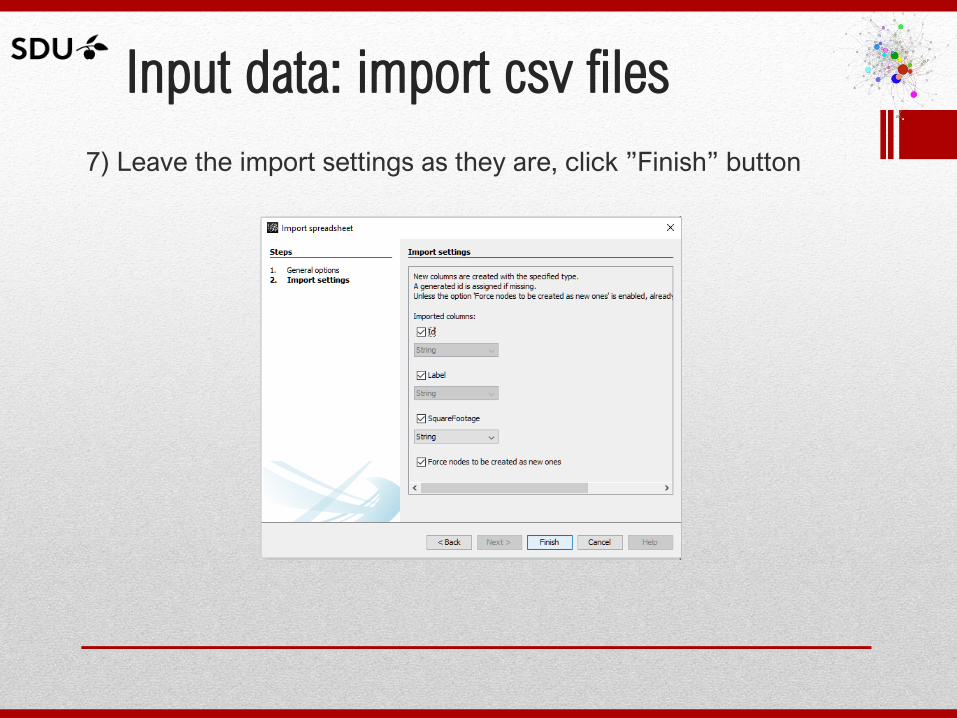
7) Leave the import settings as they are, click ”Finish” button
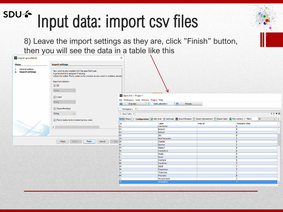
Input data: import csv files 8) Leave the import settings as they are, click ”Finish” button,
then you will see the data in a table like this
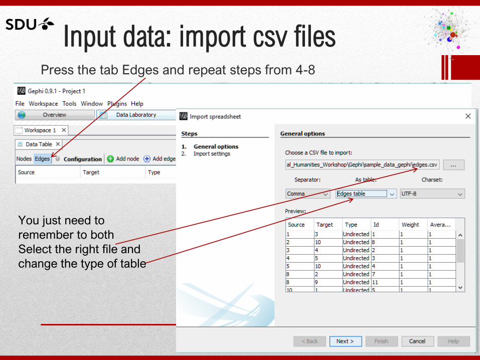
Input data: import csv files Press the tab Edges and repeat steps from 4-8
You just need to
remember to both
Select the right file and
change the type of table
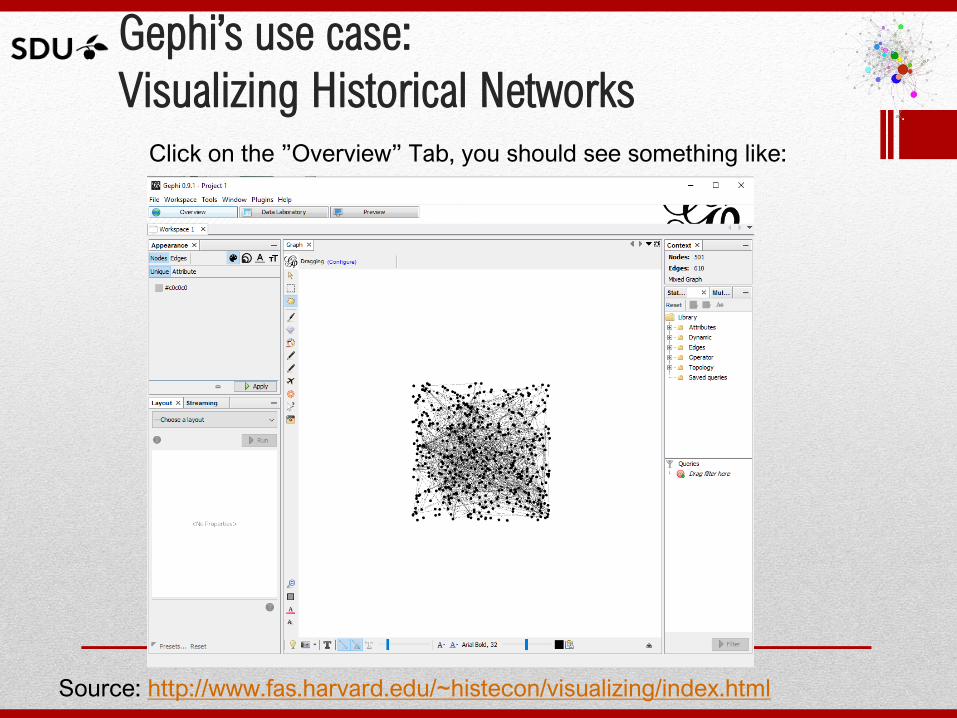
Gephi’s use case:
Visualizing Historical Networks
Source: http://www.fas.harvard.edu/~histecon/visualizing/index.html
Click on the ”Overview” Tab, you should see something like:
Gephi’s use case:
Visualizing Historical Networks
Source: http://www.fas.harvard.edu/~histecon/visualizing/index.html
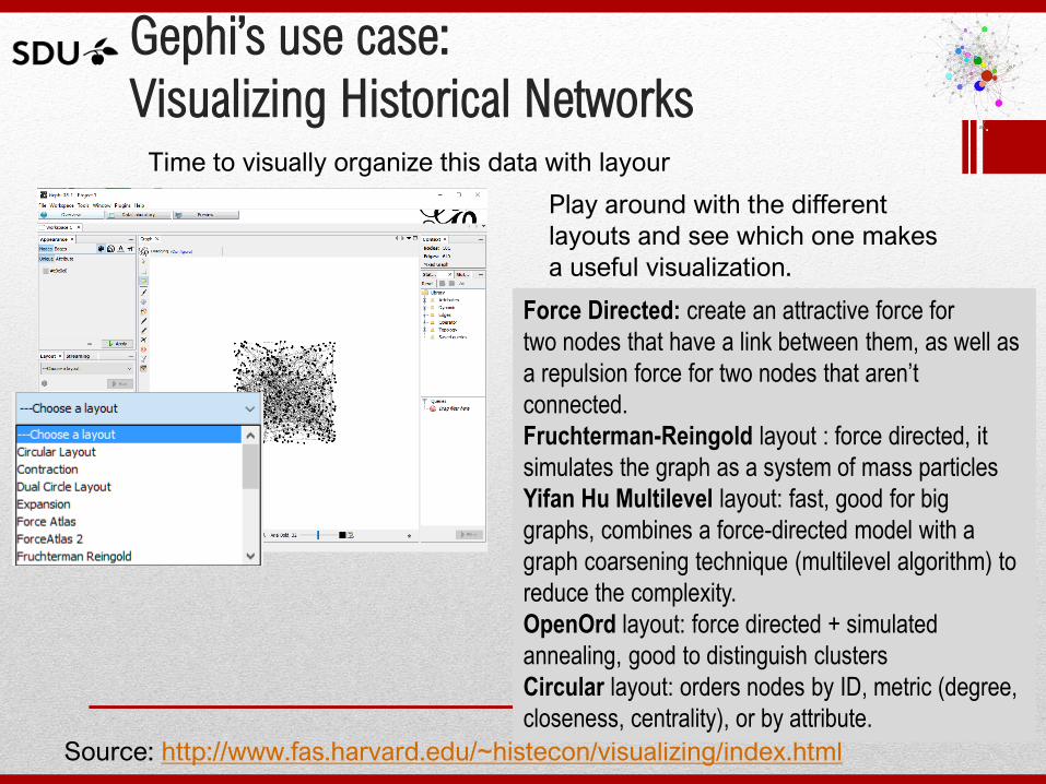
Time to visually organize this data with layour
Play around with the different
layouts and see which one makes
a useful visualization.
Force Directed: create an attractive force for
two nodes that have a link between them, as well as
a repulsion force for two nodes that aren’t
connected.
Fruchterman-Reingold layout : force directed, it
simulates the graph as a system of mass particles
Yifan Hu Multilevel layout: fast, good for big
graphs, combines a force-directed model with a
graph coarsening technique (multilevel algorithm) to
reduce the complexity.
OpenOrd layout: force directed + simulated
annealing, good to distinguish clusters
Circular layout: orders nodes by ID, metric (degree,
closeness, centrality), or by attribute.
Gephi’s datasets
• As we found out with public data sets, they could
have problems, like wrong labels or characters that
do not allow a clean importation of for example CSV
files.
• A list of datasets can be found here
https://github.com/gephi/gephi/wiki/Datasets
• Lets download the zip file for the jazz musicians
jazz.net.zip unzip the file and simply open it in
Gephi, (.net are Pajek files and supported by Gephi)

Gephi’s examples: Jazz musicians
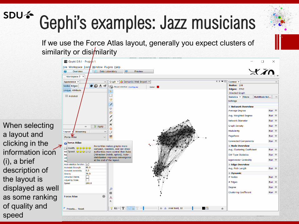
Gephi’s examples: Jazz musicians If we use the Force Atlas layout, generally you expect clusters of
similarity or disimilarity
When selecting
a layout and
clicking in the
information icon
(i), a brief
description of
the layout is
displayed as well
as some ranking
of quality and
speed
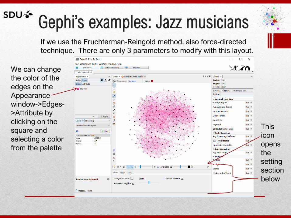
Gephi’s examples: Jazz musicians If we use the Fruchterman-Reingold method, also force-directed
technique. There are only 3 parameters to modify with this layout.
We can change
the color of the
edges on the
Appearance
window->Edges-
>Attribute by
clicking on the
square and
selecting a color
from the palette
This
icon
opens
the
setting
section
below
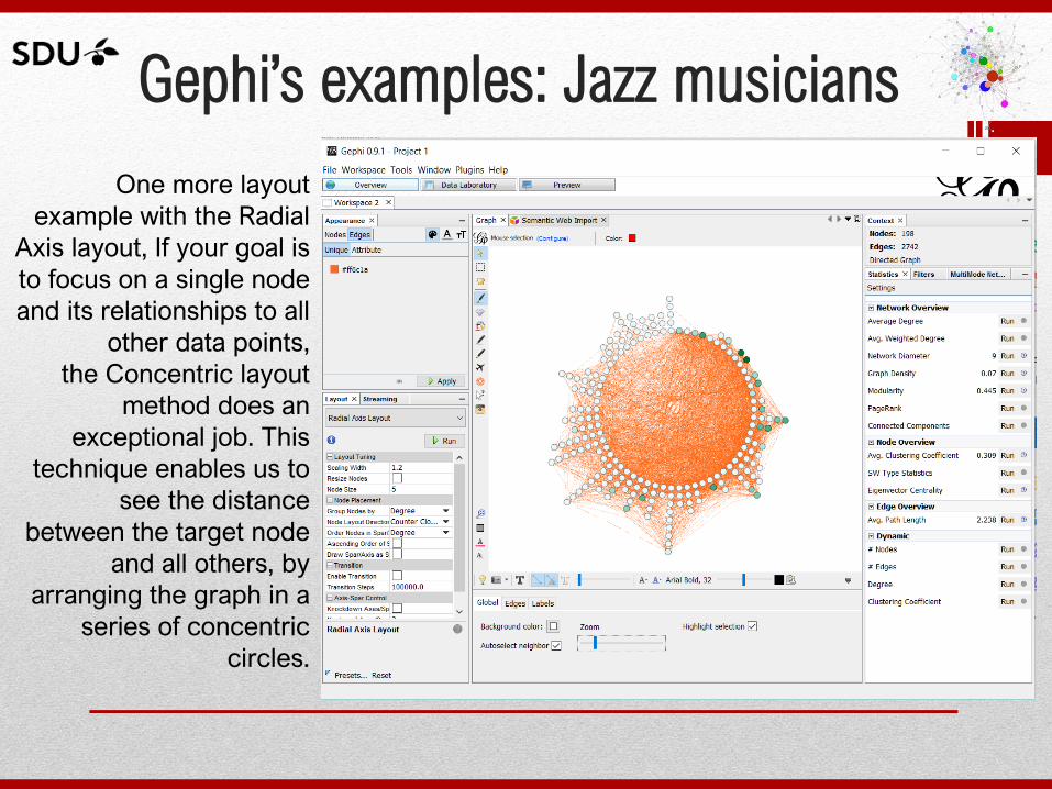
Gephi’s examples: Jazz musicians
One more layout
example with the Radial
Axis layout, If your goal is
to focus on a single node
and its relationships to all
other data points,
the Concentric layout
method does an
exceptional job. This
technique enables us to
see the distance
between the target node
and all others, by
arranging the graph in a
series of concentric
circles.
Layouts selection
• As mentioned before the selection of the layout is
depending on how the graph should be displayed, to
find more information about the different layout an
how to use them you can find more detailed
information both at the Gephi website as well as in
the book:
Cherven K. (2013) Network Graph Analysis and
Visualization with Gephi. Pack Publishing, Chapters 2 &
3.
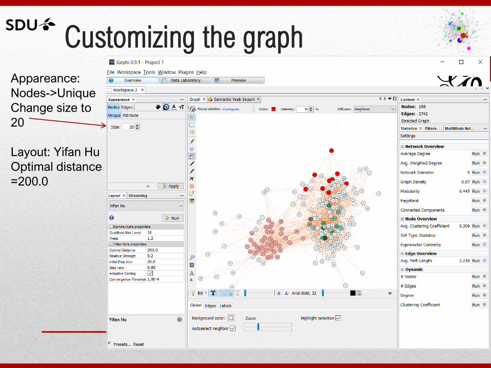
Customizing the graph
Appareance:
Nodes->Unique
Change size to
20
Layout: Yifan Hu
Optimal distance
=200.0
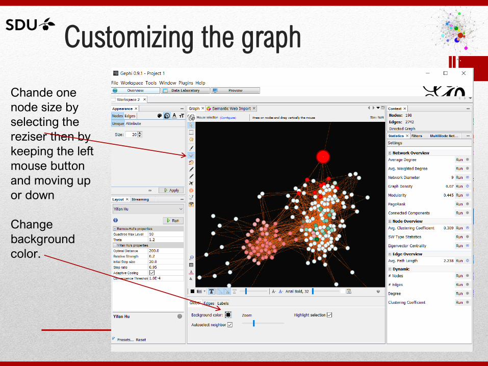
Customizing the graph
Chande one
node size by
selecting the
reziser then by
keeping the left
mouse button
and moving up
or down
Change
background
color.
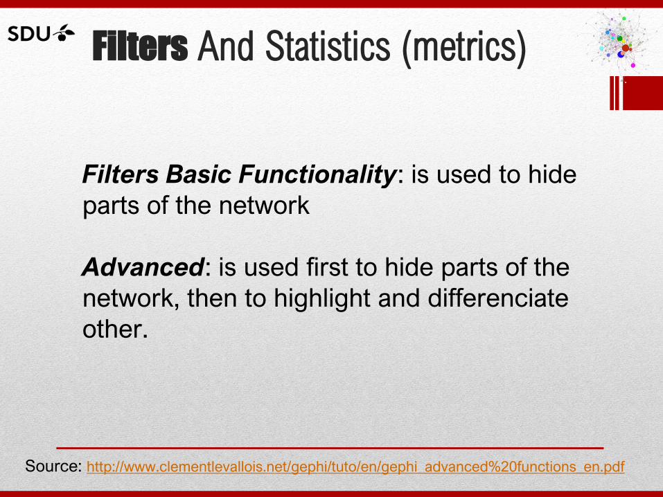
Filters And Statistics (metrics)
Filters Basic Functionality: is used to hide
parts of the network
Advanced: is used first to hide parts of the
network, then to highlight and differenciate
other.
Source: http://www.clementlevallois.net/gephi/tuto/en/gephi_advanced%20functions_en.pdf
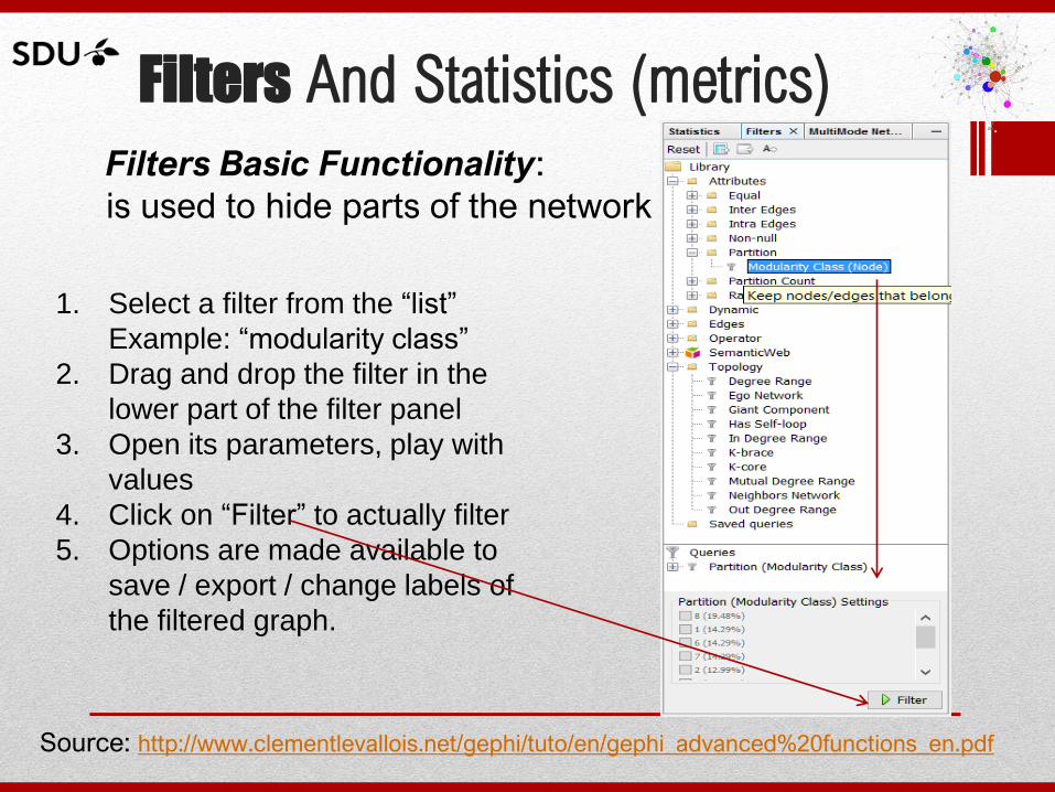
Filters And Statistics (metrics) Filters Basic Functionality:
is used to hide parts of the network
Source: http://www.clementlevallois.net/gephi/tuto/en/gephi_advanced%20functions_en.pdf
1. Select a filter from the “list”
Example: “modularity class”
2. Drag and drop the filter in the
lower part of the filter panel
3. Open its parameters, play with
values
4. Click on “Filter” to actually filter
5. Options are made available to
save / export / change labels of
the filtered graph.
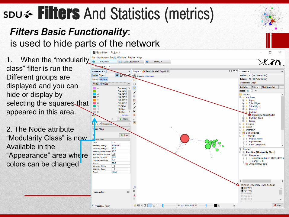
Filters And Statistics (metrics) Filters Basic Functionality:
is used to hide parts of the network
1. When the “modularity
class” filter is run the
Different groups are
displayed and you can
hide or display by
selecting the squares that
appeared in this area.
2. The Node attribute
“Modularity Class” is now
Available in the
“Appearance” area where
colors can be changed
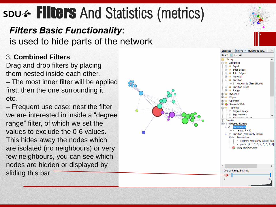
Filters And Statistics (metrics) Filters Basic Functionality:
is used to hide parts of the network
3. Combined Filters
Drag and drop filters by placing
them nested inside each other.
– The most inner filter will be applied
first, then the one surrounding it,
etc.
– Frequent use case: nest the filter
we are interested in inside a “degree
range” filter, of which we set the
values to exclude the 0-6 values.
This hides away the nodes which
are isolated (no neighbours) or very
few neighbours, you can see which
nodes are hidden or displayed by
sliding this bar
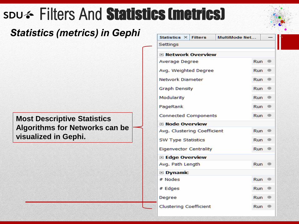
Filters And Statistics (metrics) Statistics (metrics) in Gephi
Most Descriptive Statistics
Algorithms for Networks can be
visualized in Gephi.
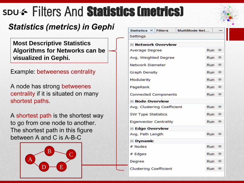
Filters And Statistics (metrics) Statistics (metrics) in Gephi
Most Descriptive Statistics
Algorithms for Networks can be
visualized in Gephi.
Example: betweeness centrality
A node has strong betweenes
centrality if it is situated on many
shortest paths.
A shortest path is the shortest way
to go from one node to another.
The shortest path in this figure
between A and C is A-B-C
A
B C
D E
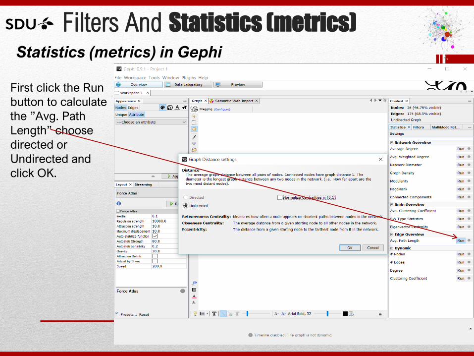
Filters And Statistics (metrics) Statistics (metrics) in Gephi
First click the Run
button to calculate
the ”Avg. Path
Length” choose
directed or
Undirected and
click OK.
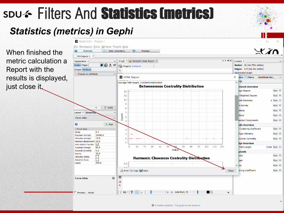
Filters And Statistics (metrics) Statistics (metrics) in Gephi
When finished the
metric calculation a
Report with the
results is displayed,
just close it.
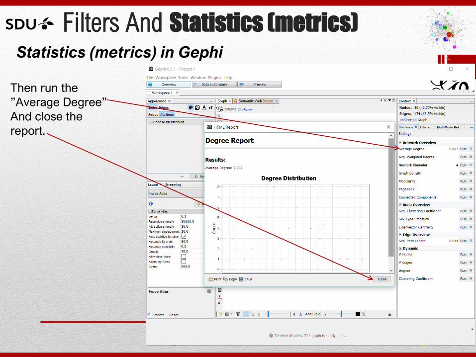
Filters And Statistics (metrics) Statistics (metrics) in Gephi
Then run the
”Average Degree”
And close the
report.
Filters And Statistics (metrics) Statistics (metrics) in Gephi
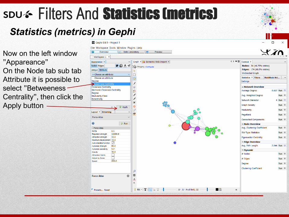
Now on the left window
”Appareance”
On the Node tab sub tab
Attribute it is possible to
select ”Betweeness
Centrality”, then click the
Apply button
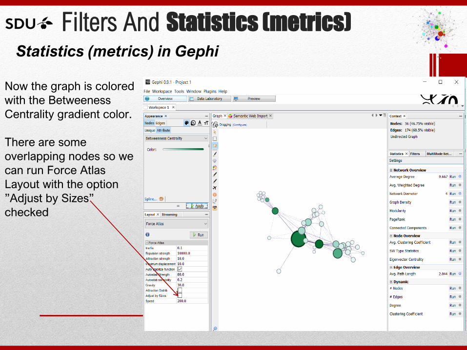
Filters And Statistics (metrics) Statistics (metrics) in Gephi
Now the graph is colored
with the Betweeness
Centrality gradient color.
There are some
overlapping nodes so we
can run Force Atlas
Layout with the option
”Adjust by Sizes”
checked
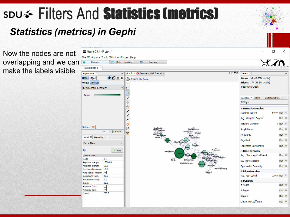
Filters And Statistics (metrics) Statistics (metrics) in Gephi
Now the nodes are not
overlapping and we can
make the labels visible
Filters And Statistics (metrics) Statistics (metrics) in Gephi
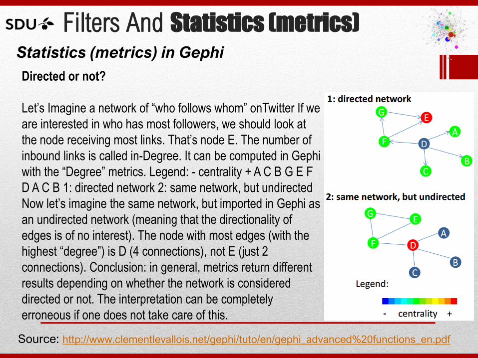
Directed or not?
Let’s Imagine a network of “who follows whom” onTwitter If we
are interested in who has most followers, we should look at
the node receiving most links. That’s node E. The number of
inbound links is called in-Degree. It can be computed in Gephi
with the “Degree” metrics. Legend: - centrality + A C B G E F
D A C B 1: directed network 2: same network, but undirected
Now let’s imagine the same network, but imported in Gephi as
an undirected network (meaning that the directionality of
edges is of no interest). The node with most edges (with the
highest “degree”) is D (4 connections), not E (just 2
connections). Conclusion: in general, metrics return different
results depending on whether the network is considered
directed or not. The interpretation can be completely
erroneous if one does not take care of this.
Source: http://www.clementlevallois.net/gephi/tuto/en/gephi_advanced%20functions_en.pdf
Hands on Gephi:
a step by step tutorial
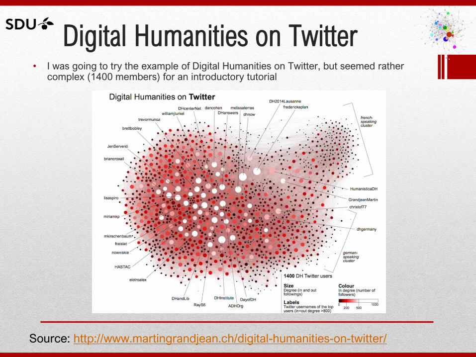
Digital Humanities on Twitter • I was going to try the example of Digital Humanities on Twitter, but seemed rather
complex (1400 members) for an introductory tutorial
Source: http://www.martingrandjean.ch/digital-humanities-on-twitter/
Hands on: a step by step tutorial
• This tutorial is based on a tutorial in the book * Lanum, C.L., (2016) Visualizing Graph Data, Manning Editors*
• It uses an auxiliary tool Netlytic.org to retrieve a dataset from a Twitter search (free version of their product
which allows you to have 3 datasets with up to 1000 records each).
• The example is designed to analyze the Twitter social media tweets (messages) that contain the hashtags #dataviz and #datavisualization
* Lanum, C.L., (2016) Visualizing Graph Data, Manning Editors (note this is a
Manning Early Access Publication and is planned to be published in june 2016)
https://www.manning.com/books/visualizing-graph-data
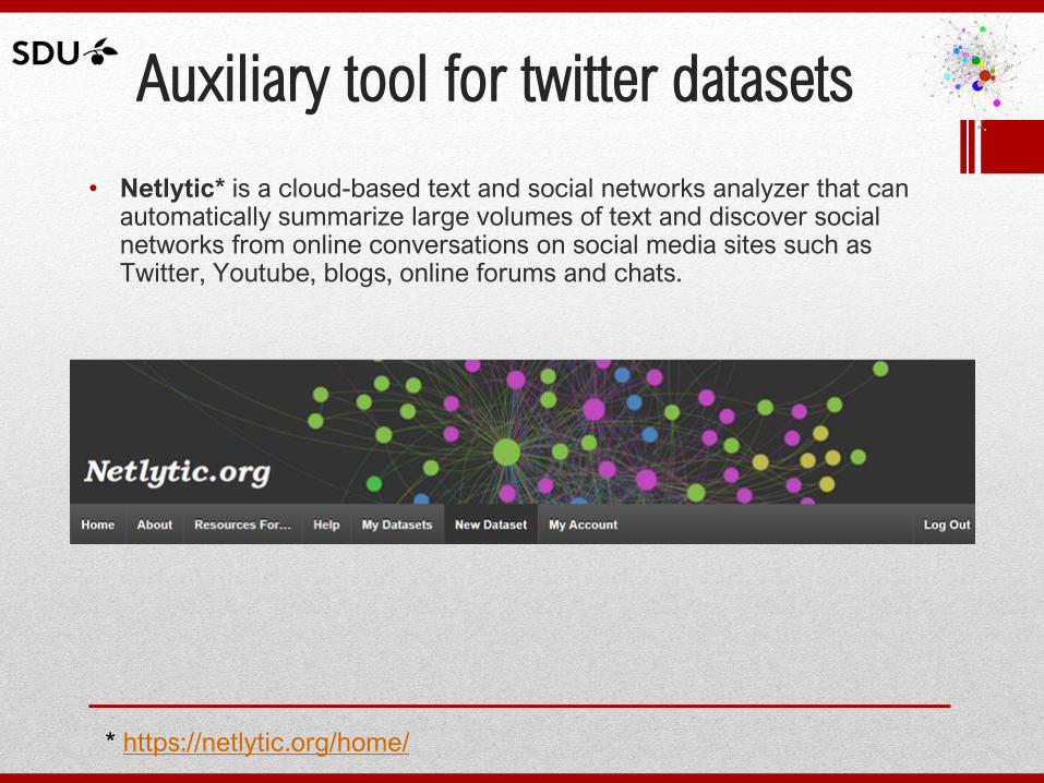
Auxiliary tool for twitter datasets
• Netlytic* is a cloud-based text and social networks analyzer that can automatically summarize large volumes of text and discover social networks from online conversations on social media sites such as Twitter, Youtube, blogs, online forums and chats.
* https://netlytic.org/home/
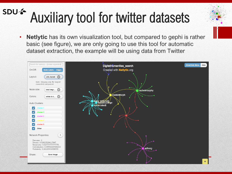
Auxiliary tool for twitter datasets
• Netlytic has its own visualization tool, but compared to gephi is rather
basic (see figure), we are only going to use this tool for automatic
dataset extraction, the example will be using data from Twitter
Auxiliary tool for twitter datasets
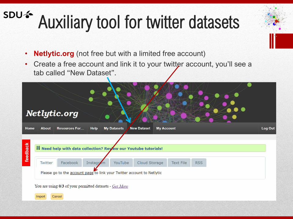
• Netlytic.org (not free but with a limited free account)
• Create a free account and link it to your twitter account, you’ll see a
tab called “New Dataset”.
Auxiliary tool for twitter datasets
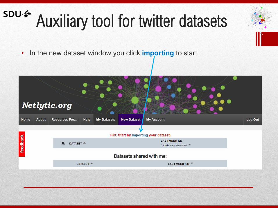
• In the new dataset window you click importing to start
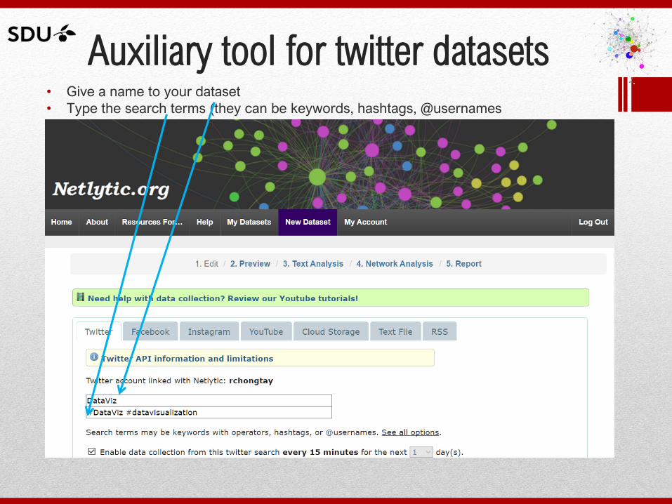
Auxiliary tool for twitter datasets • Give a name to your dataset
• Type the search terms (they can be keywords, hashtags, @usernames
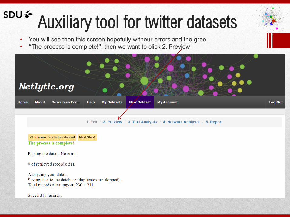
Auxiliary tool for twitter datasets • You will see then this screen hopefully withour errors and the gree
• “The process is complete!”, then we want to click 2. Preview
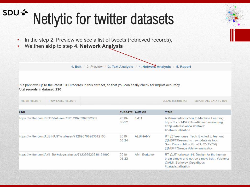
Netlytic for twitter datasets • In the step 2. Preview we see a list of tweets (retrieved records),
• We then skip to step 4. Network Analysis
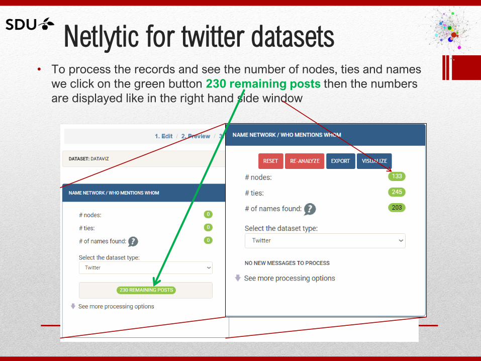
Netlytic for twitter datasets • To process the records and see the number of nodes, ties and names
we click on the green button 230 remaining posts then the numbers
are displayed like in the right hand side window
Netlytic for twitter datasets
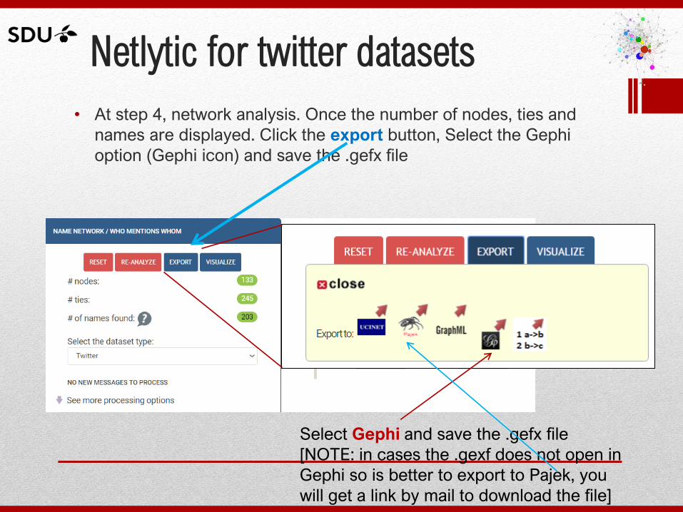
• At step 4, network analysis. Once the number of nodes, ties and
names are displayed. Click the export button, Select the Gephi
option (Gephi icon) and save the .gefx file
Select Gephi and save the .gefx file
[NOTE: in cases the .gexf does not open in
Gephi so is better to export to Pajek, you
will get a link by mail to download the file]
Netlytic for twitter datasets
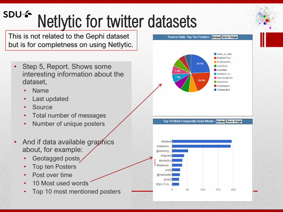
• Step 5, Report. Shows some interesting information about the dataset,
• Name
• Last updated
• Source
• Total number of messages
• Number of unique posters
• And if data available graphics about, for example:
• Geotagged posts
• Top ten Posters
• Post over time
• 10 Most used words
• Top 10 most mentioned posters
This is not related to the Gephi dataset
but is for completness on using Netlytic.
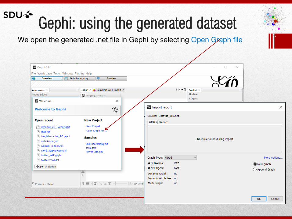
Gephi: using the generated dataset We open the generated .net file in Gephi by selecting Open Graph file
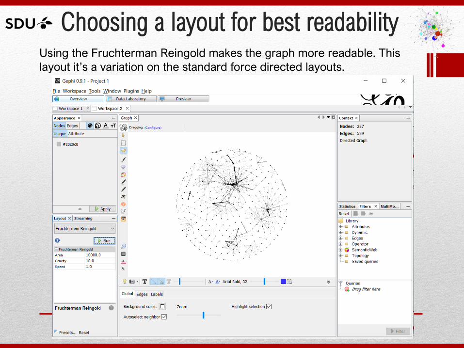
Choosing a layout for best readability Using the Fruchterman Reingold makes the graph more readable. This
layout it’s a variation on the standard force directed layouts.
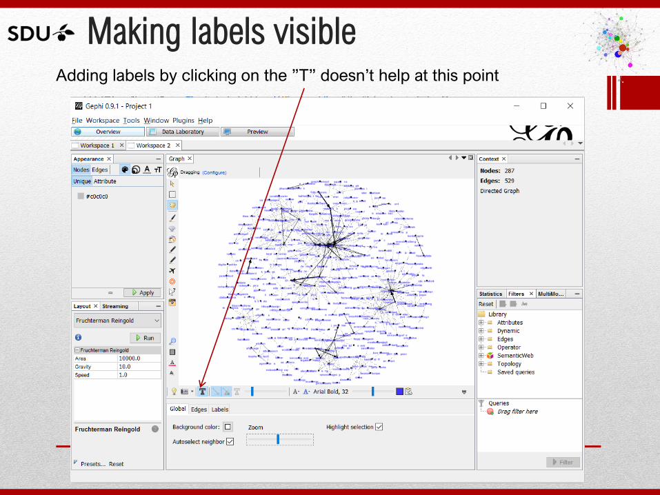
Making labels visible Adding labels by clicking on the ”T” doesn’t help at this point
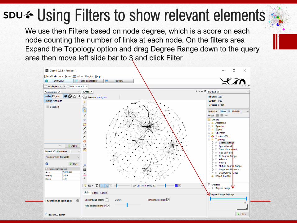
Using Filters to show relevant elements We use then Filters based on node degree, which is a score on each
node counting the number of links at each node. On the filters area
Expand the Topology option and drag Degree Range down to the query
area then move left slide bar to 3 and click Filter
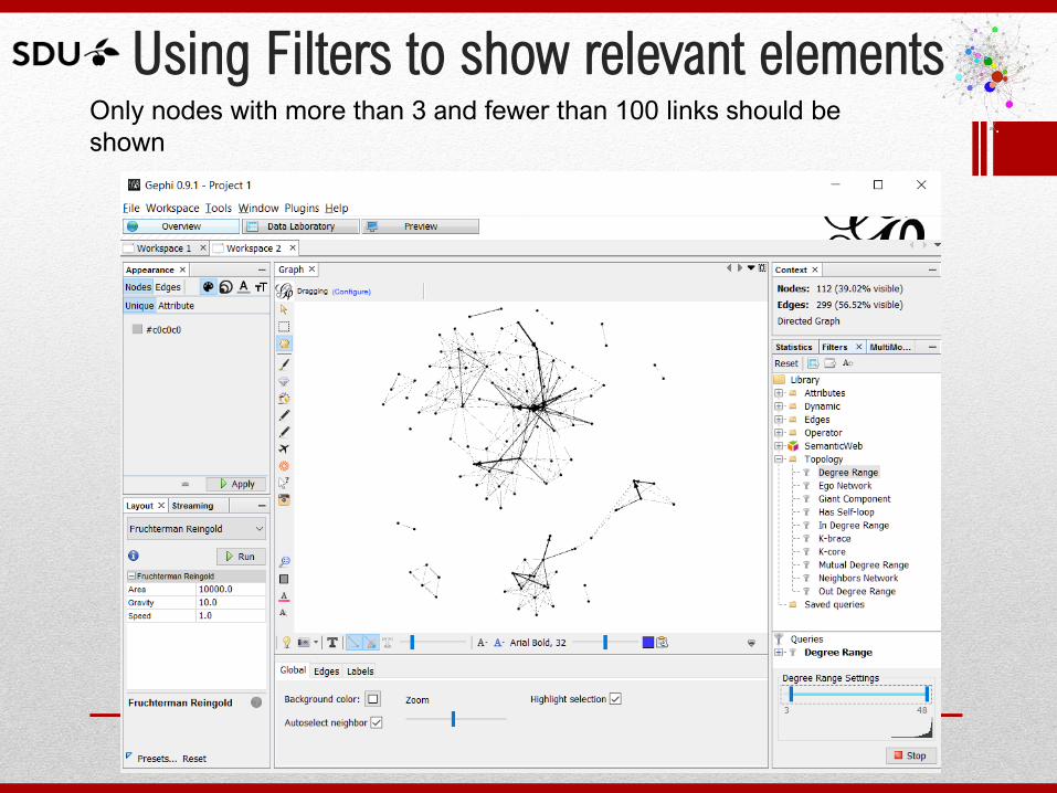
Only nodes with more than 3 and fewer than 100 links should be
shown
Using Filters to show relevant elements
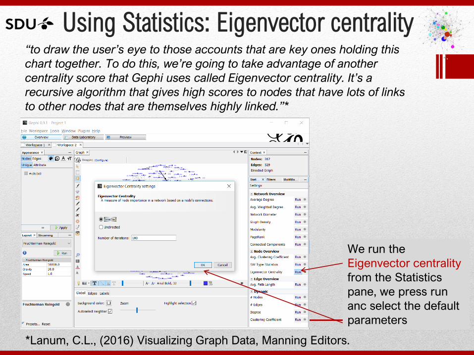
Using Statistics: Eigenvector centrality “to draw the user’s eye to those accounts that are key ones holding this
chart together. To do this, we’re going to take advantage of another
centrality score that Gephi uses called Eigenvector centrality. It’s a
recursive algorithm that gives high scores to nodes that have lots of links
to other nodes that are themselves highly linked.”*
We run the
Eigenvector centrality
from the Statistics
pane, we press run
anc select the default
parameters
*Lanum, C.L., (2016) Visualizing Graph Data, Manning Editors.
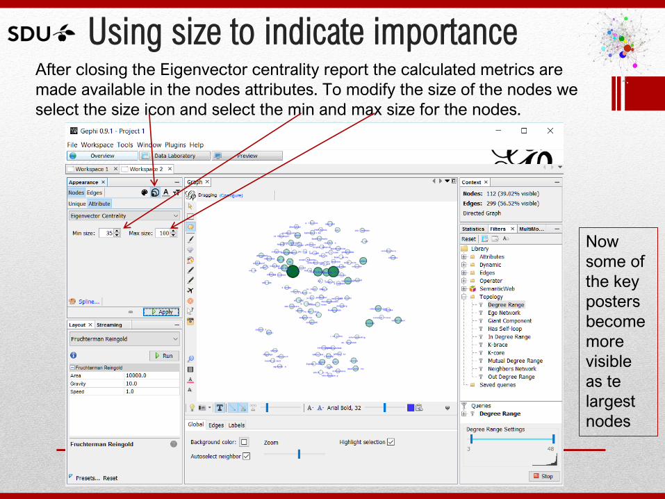
Using size to indicate importance After closing the Eigenvector centrality report the calculated metrics are
made available in the nodes attributes. To modify the size of the nodes we
select the size icon and select the min and max size for the nodes.
Now
some of
the key
posters
become
more
visible
as te
largest
nodes
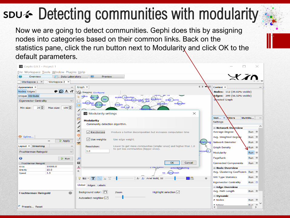
Detecting communities with modularity Now we are going to detect communities. Gephi does this by assigning
nodes into categories based on their common links. Back on the
statistics pane, click the run button next to Modularity and click OK to the
default parameters.
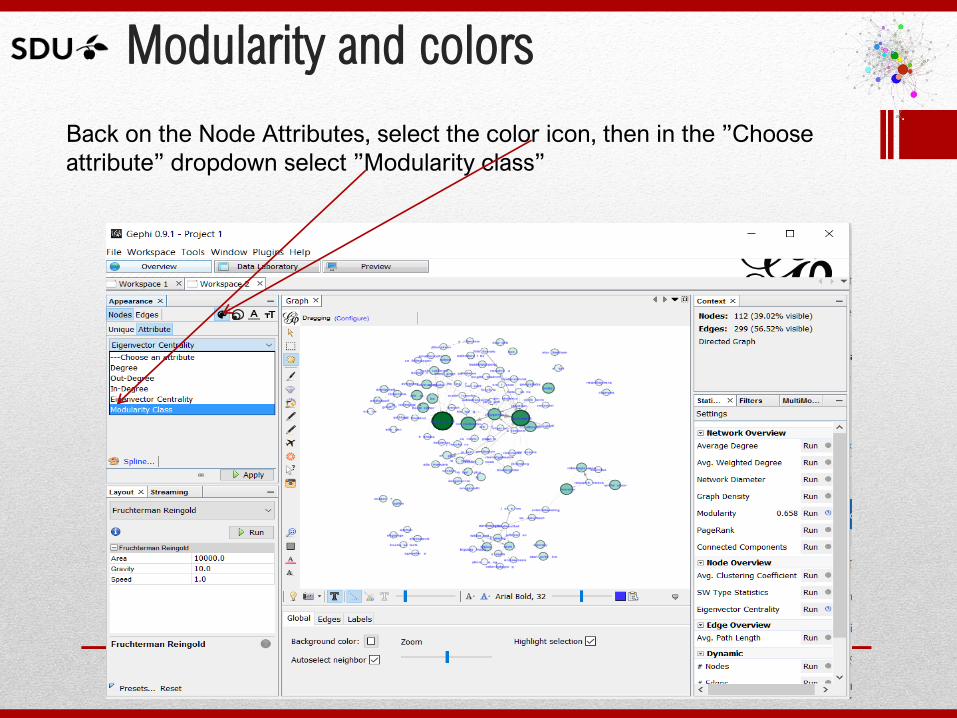
Modularity and colors
Back on the Node Attributes, select the color icon, then in the ”Choose
attribute” dropdown select ”Modularity class”
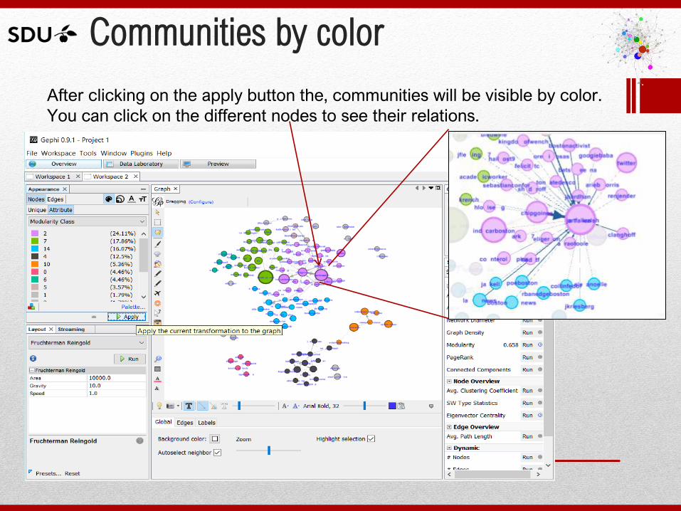
Communities by color
After clicking on the apply button the, communities will be visible by color.
You can click on the different nodes to see their relations.
Gephi: using the generated dataset
Final remarks on the hand on step by step example:
• The result, after layouts, sizing, filtering, and coloring, is a usable
graph visualization showing the communities on Twitter surrounding
the search terms used to retrieve the dataset.
• I have only use a few hundred records, but I suggest to let Netlytic
run for a day to collect as close as the max. number of records, this
is 1000.
• The example only uses one filter and a couple of statistical
calculation, for a better understanding of these and the other
options available you need more about network theory or as a
minimum an advanced Gephi book such as:
• Cherven, K. (2015). Mastering Gephi Network Visualization.
Packt Publishing. pp. 149-216.
Dynamic Networks
• Dynamic networks is an advanced feature of
visualization and outside the scope of this
presentation, but if you wan to follow a basic tutorial
you can do so at:
http://www.clementlevallois.net/gephi/tuto/gephi_tutori
al_dynamics.pdf
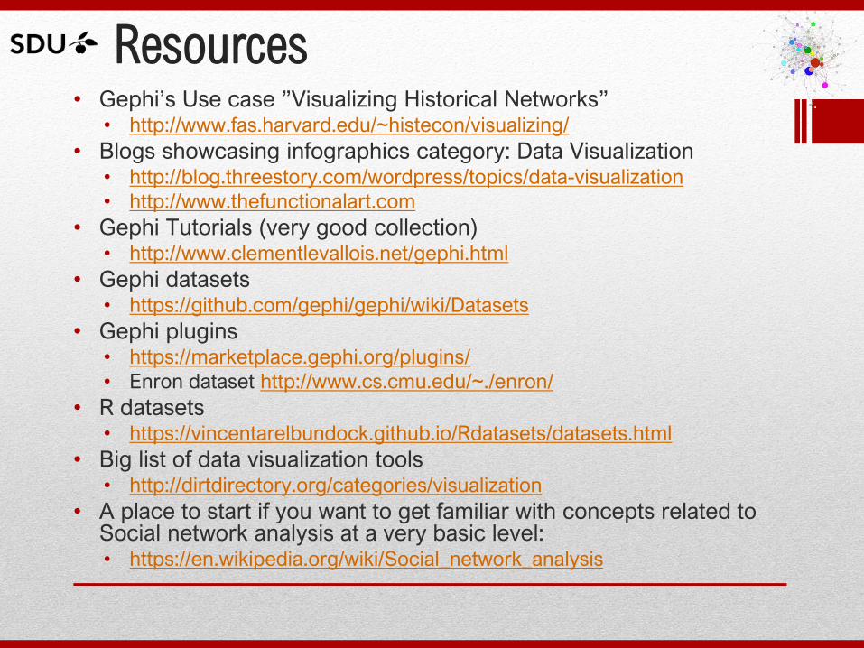
Resources • Gephi’s Use case ”Visualizing Historical Networks”
• http://www.fas.harvard.edu/~histecon/visualizing/
• Blogs showcasing infographics category: Data Visualization • http://blog.threestory.com/wordpress/topics/data-visualization
• http://www.thefunctionalart.com
• Gephi Tutorials (very good collection) • http://www.clementlevallois.net/gephi.html
• Gephi datasets • https://github.com/gephi/gephi/wiki/Datasets
• Gephi plugins • https://marketplace.gephi.org/plugins/
• Enron dataset http://www.cs.cmu.edu/~./enron/
• R datasets • https://vincentarelbundock.github.io/Rdatasets/datasets.html
• Big list of data visualization tools • http://dirtdirectory.org/categories/visualization
• A place to start if you want to get familiar with concepts related to Social network analysis at a very basic level: • https://en.wikipedia.org/wiki/Social_network_analysis
References
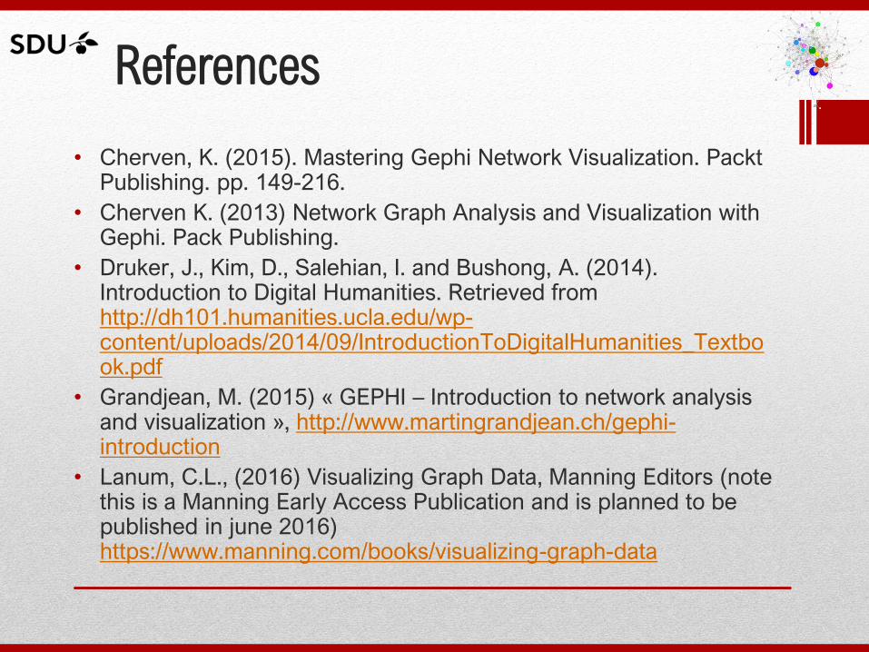
• Cherven, K. (2015). Mastering Gephi Network Visualization. Packt Publishing. pp. 149-216.
• Cherven K. (2013) Network Graph Analysis and Visualization with Gephi. Pack Publishing.
• Druker, J., Kim, D., Salehian, I. and Bushong, A. (2014). Introduction to Digital Humanities. Retrieved from http://dh101.humanities.ucla.edu/wp-content/uploads/2014/09/IntroductionToDigitalHumanities_Textbook.pdf
• Grandjean, M. (2015) « GEPHI – Introduction to network analysis and visualization », http://www.martingrandjean.ch/gephi-introduction
• Lanum, C.L., (2016) Visualizing Graph Data, Manning Editors (note this is a Manning Early Access Publication and is planned to be published in june 2016) https://www.manning.com/books/visualizing-graph-data
Thanks!
DH DataViz
Introduction to Data Visualization: trends, tools and practice by Rocio Chongtay
Delivered as part of the:
Digital Humanities Workshop University of Rijeka 17-18 March, 2016
http://infotechinno.sdu.dk/dhdataviz/