production companies and their logos
TRANSCRIPT
Film Production Companies and their logosSHANIA STEELE
A2 MEDIA STUDIES
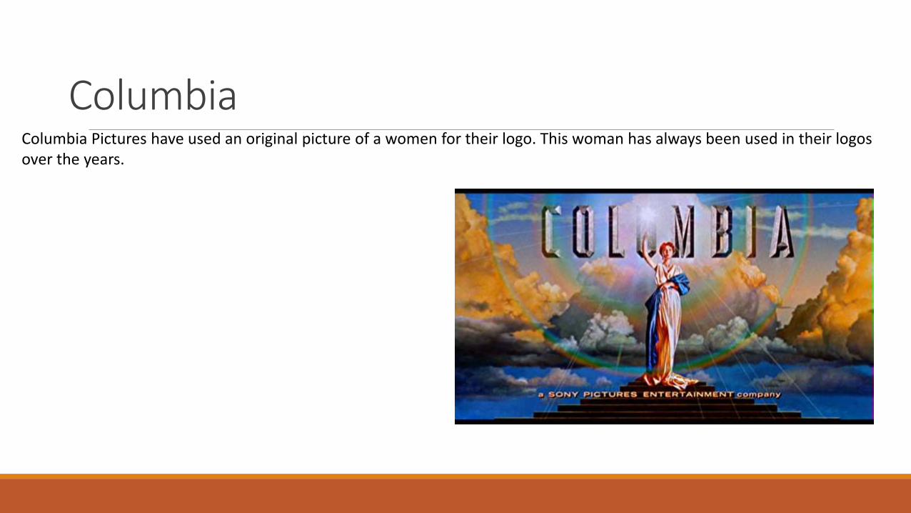
ColumbiaColumbia Pictures have used an original picture of a women for their logo. This woman has always been used in their logos over the years.
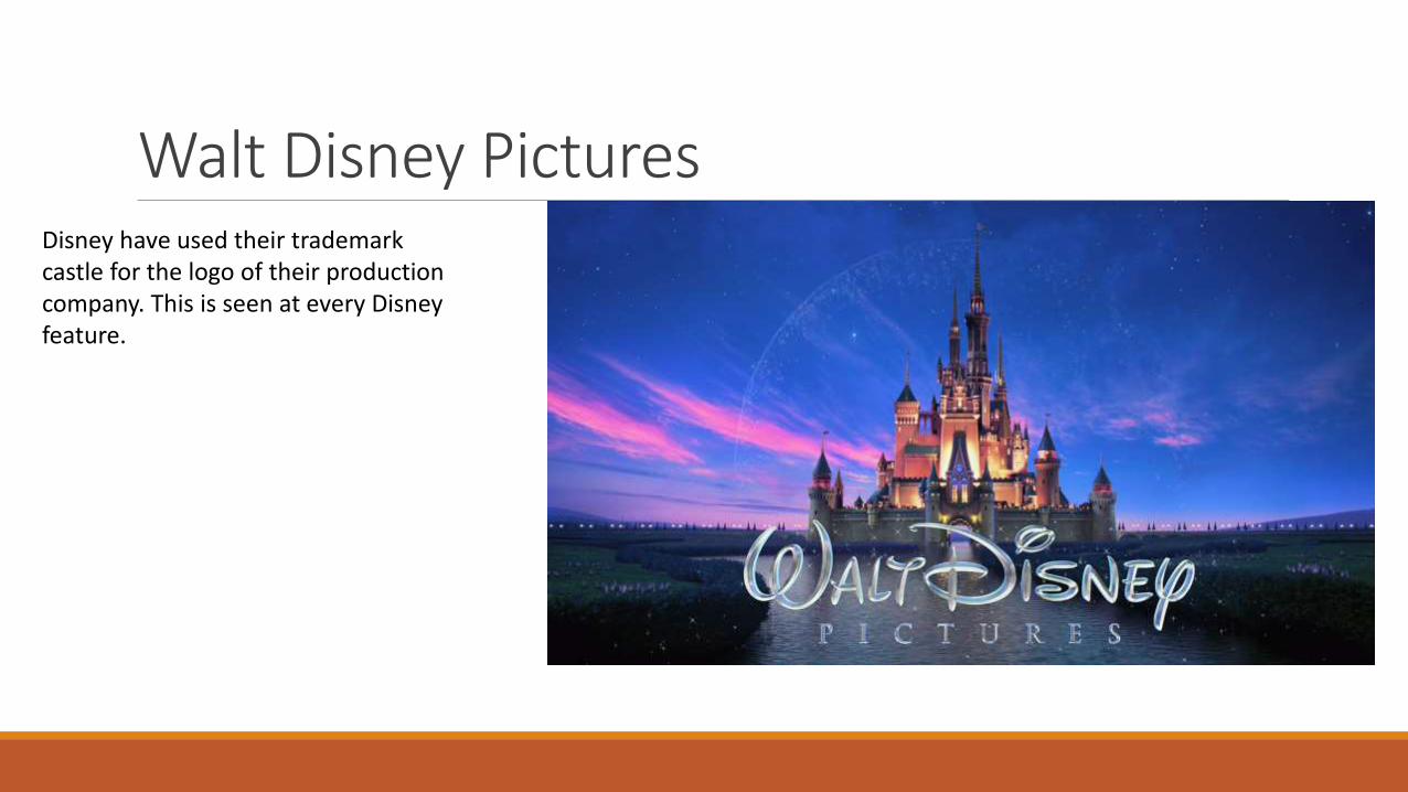
Walt Disney PicturesDisney have used their trademark castle for the logo of their production company. This is seen at every Disney feature.
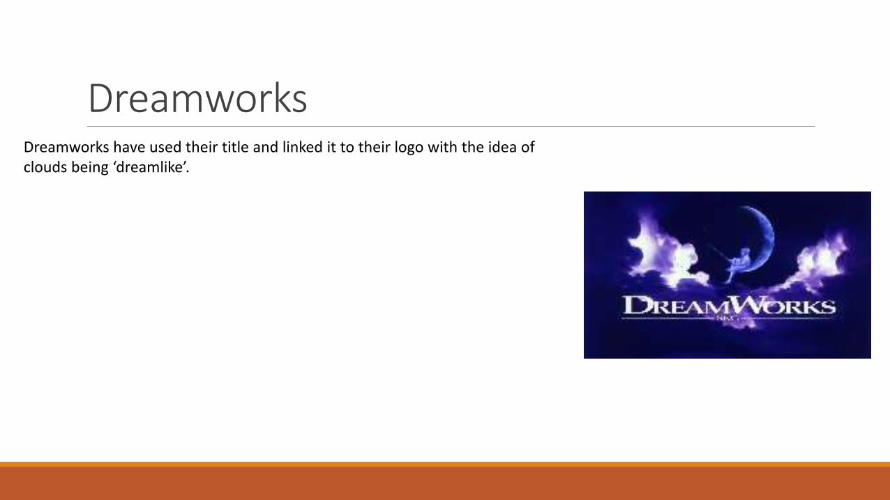
DreamworksDreamworks have used their title and linked it to their logo with the idea of clouds being ‘dreamlike’.
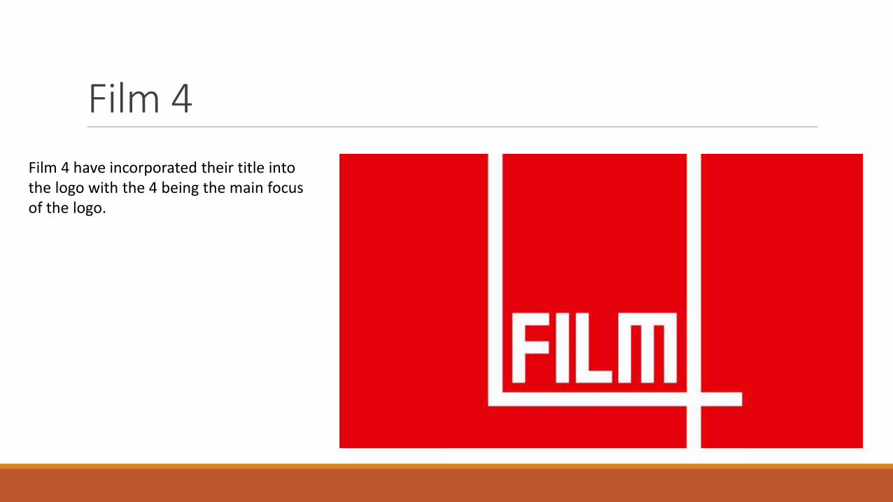
Film 4
Film 4 have incorporated their title into the logo with the 4 being the main focus of the logo.
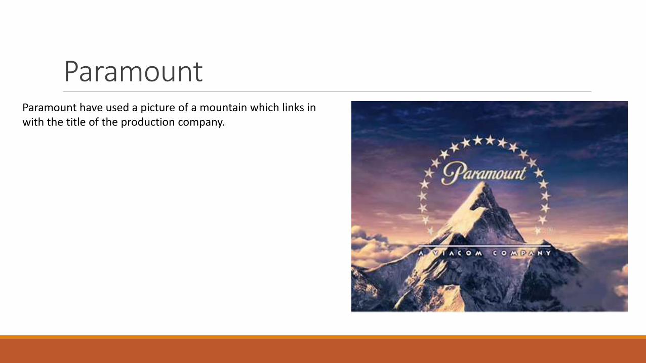
ParamountParamount have used a picture of a mountain which links in with the title of the production company.
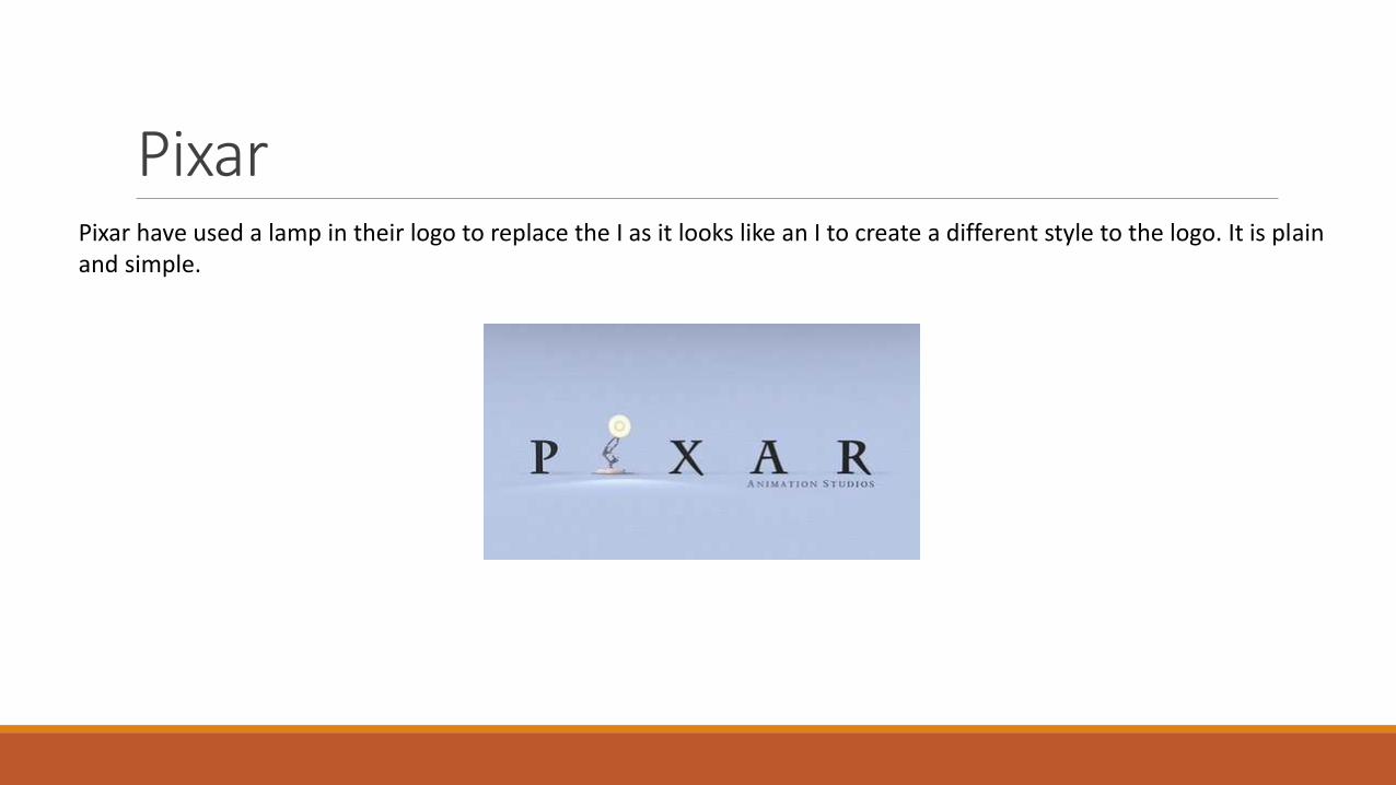
PixarPixar have used a lamp in their logo to replace the I as it looks like an I to create a different style to the logo. It is plainand simple.
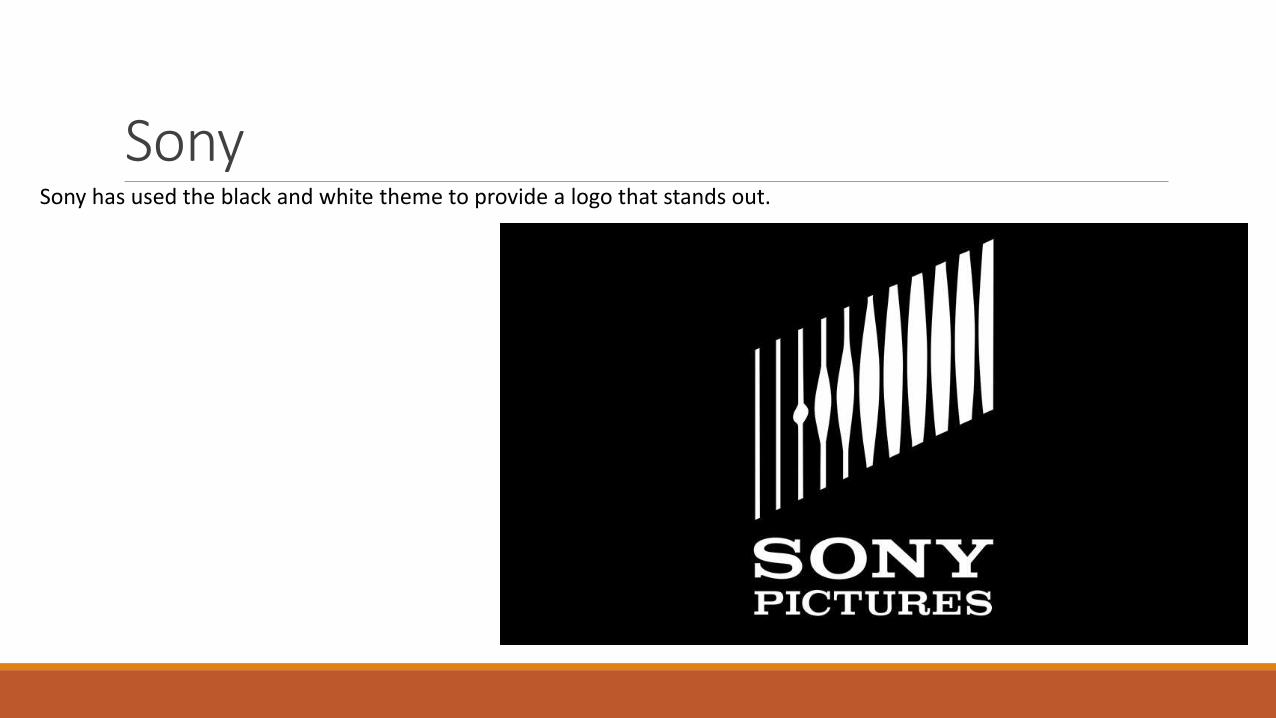
SonySony has used the black and white theme to provide a logo that stands out.
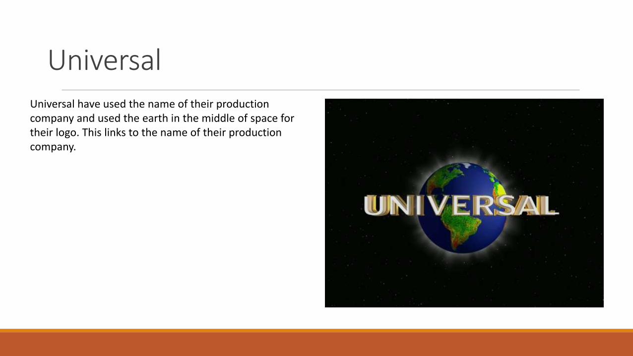
UniversalUniversal have used the name of their production company and used the earth in the middle of space for their logo. This links to the name of their production company.
Warner
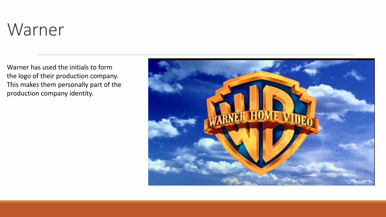
Warner has used the initials to form the logo of their production company. This makes them personally part of the production company identity.
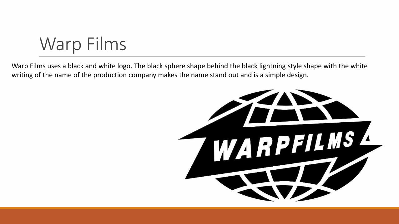
Warp FilmsWarp Films uses a black and white logo. The black sphere shape behind the black lightning style shape with the white writing of the name of the production company makes the name stand out and is a simple design.
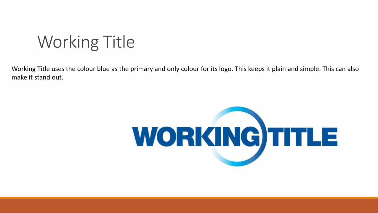
Working TitleWorking Title uses the colour blue as the primary and only colour for its logo. This keeps it plain and simple. This can alsomake it stand out.