principles of design - digital ecommerce agency for ... · pdf filethe principles of design...
TRANSCRIPT
principles of design01.28.15
starting off, There are no rules. There are no rules. There are no rules.
Well, there are rules, but they were made to be broken.
PRINCIPLES OF DESIGN01.28.15
“They’re more what you’d call guidelines ”
–Captain Barbossa, Designer
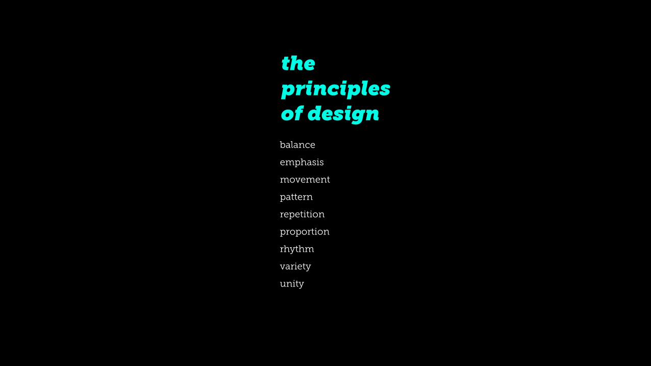
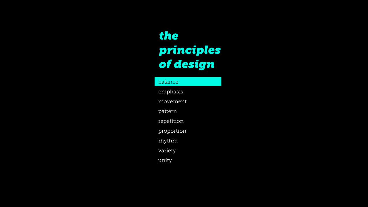
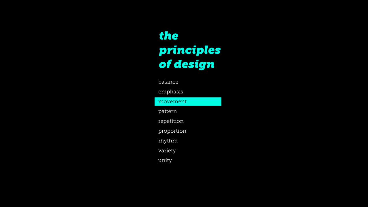
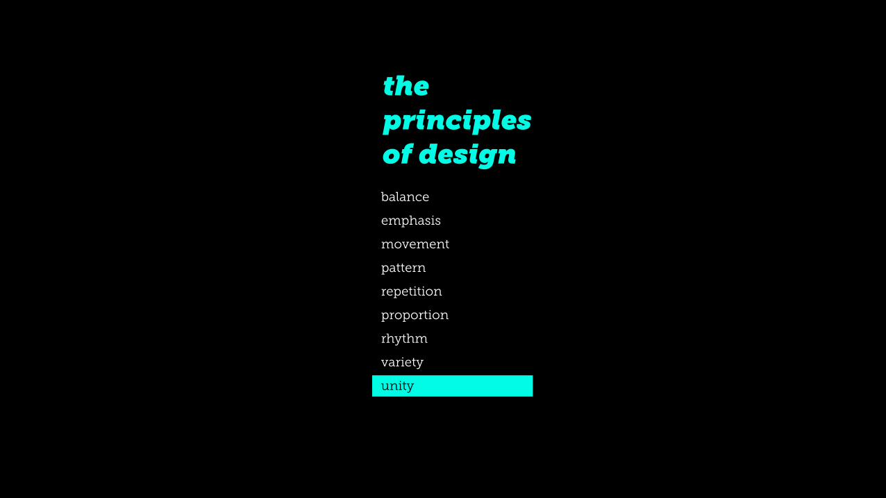
the principles of design balance
emphasis
movement
pattern
repetition
proportion
rhythm
variety
unity
the principles of design balance
emphasis
movement
pattern
repetition
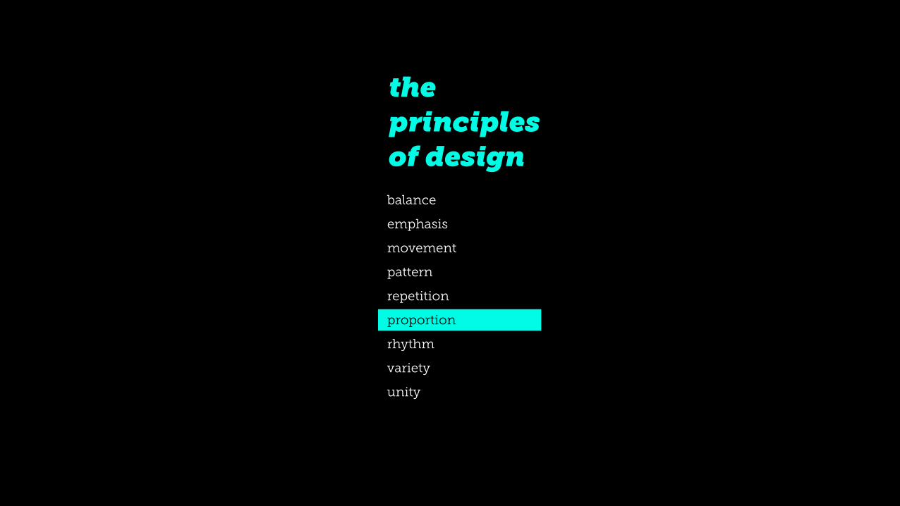
proportion
rhythm
variety
unity
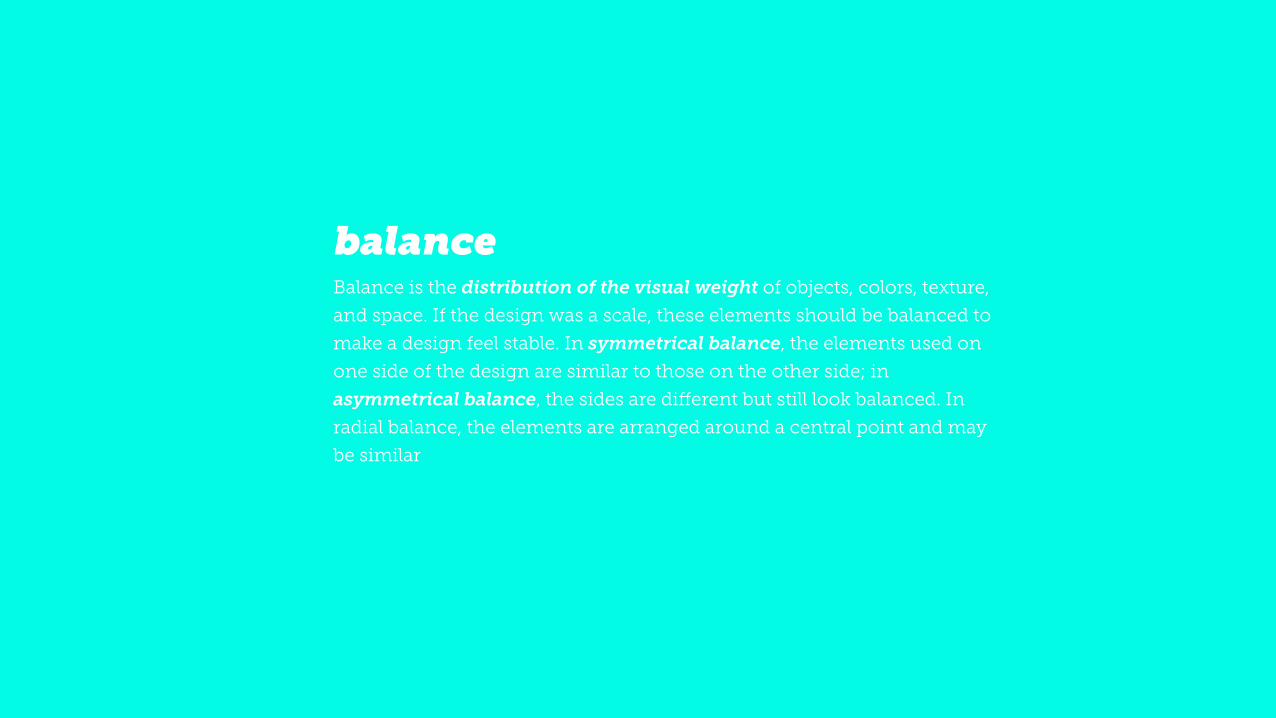
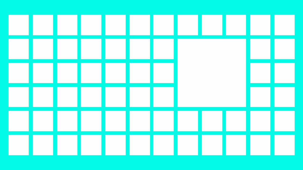
!Balance is the distribution of the visual weight of objects, colors, texture,
and space. If the design was a scale, these elements should be balanced to
make a design feel stable. In symmetrical balance, the elements used on
one side of the design are similar to those on the other side; in
asymmetrical balance, the sides are different but still look balanced. In
radial balance, the elements are arranged around a central point and may
be similar
balance


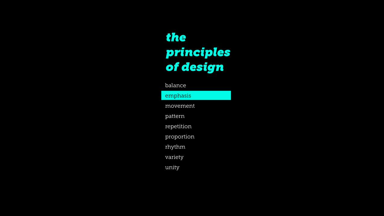
the principles of design balance
emphasis
movement
pattern
repetition
proportion
rhythm
variety
unity
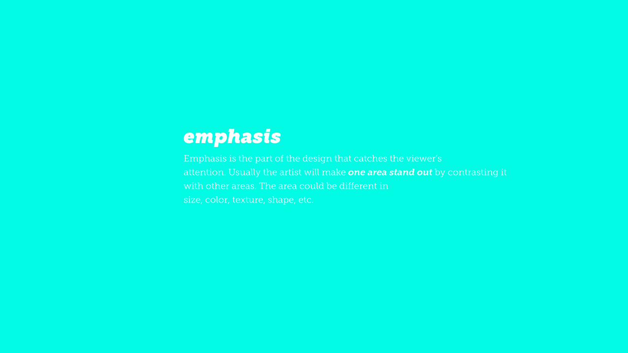
!Emphasis is the part of the design that catches the viewer’s attention. Usually the artist will make one area stand out by contrasting it
with other areas. The area could be different in size, color, texture, shape, etc.
emphasis
the principles of design balance
emphasis
movement
pattern
repetition
proportion
rhythm
variety
unity
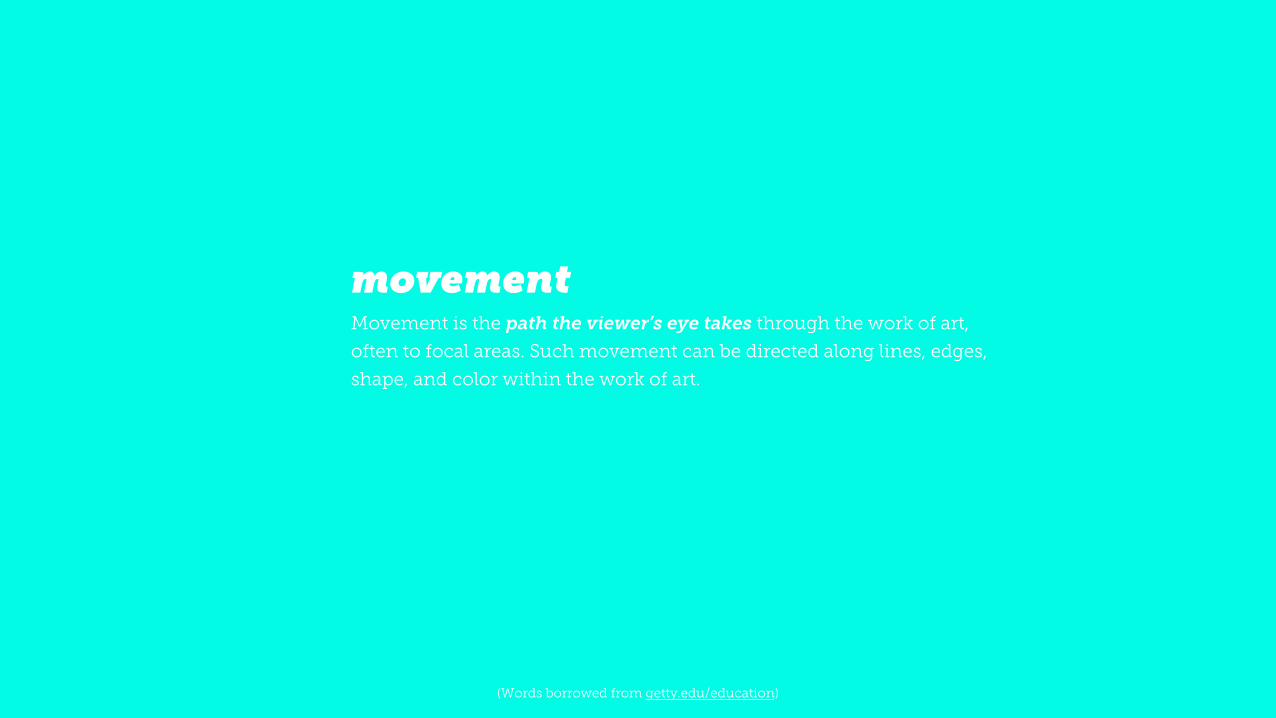
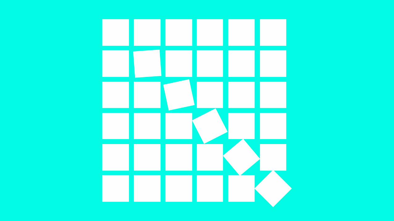
!Movement is the path the viewer’s eye takes through the work of art,
often to focal areas. Such movement can be directed along lines, edges,
shape, and color within the work of art.
movement
!(Words borrowed from getty.edu/education)
the principles of design balance
emphasis
movement
pattern
repetition
proportion
rhythm
variety
unity
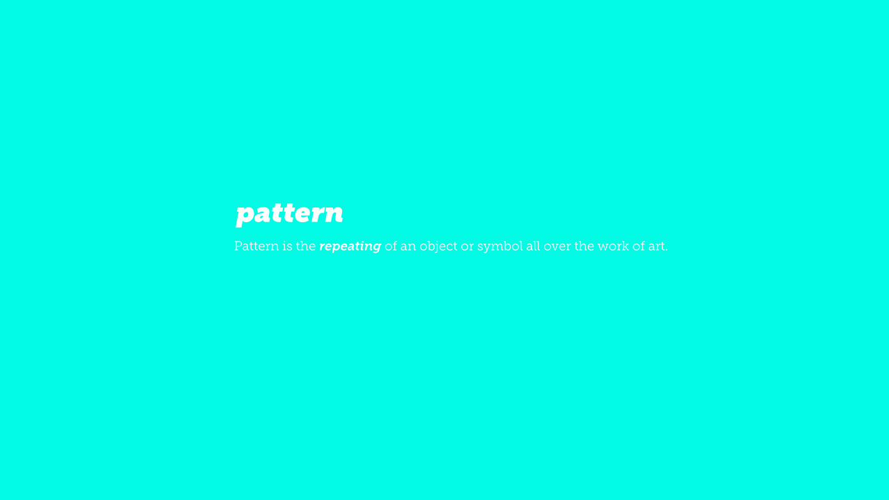
!Pattern is the repeating of an object or symbol all over the work of art.
pattern

the principles of design balance
emphasis
movement
pattern
repetition
proportion
rhythm
variety
unity

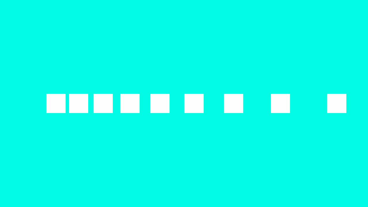
!Repetition works with pattern to make the work of art seem active. The repetition of elements of design creates unity within the work of art.
repetition
the principles of design balance
emphasis
movement
pattern
repetition
proportion
rhythm
variety
unity
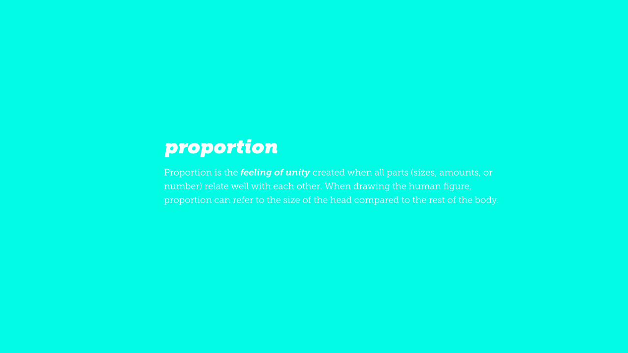
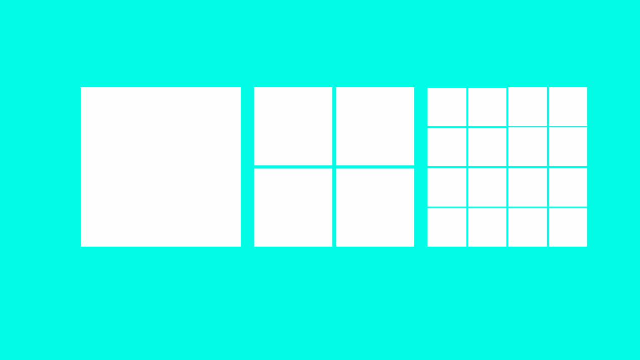
!Proportion is the feeling of unity created when all parts (sizes, amounts, or
number) relate well with each other. When drawing the human figure,
proportion can refer to the size of the head compared to the rest of the body.
proportion
the principles of design balance
emphasis
movement
pattern
repetition
proportion
rhythm
variety
unity
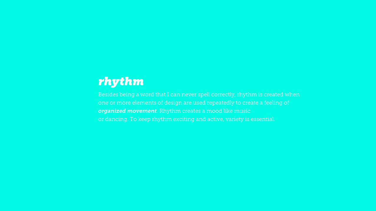
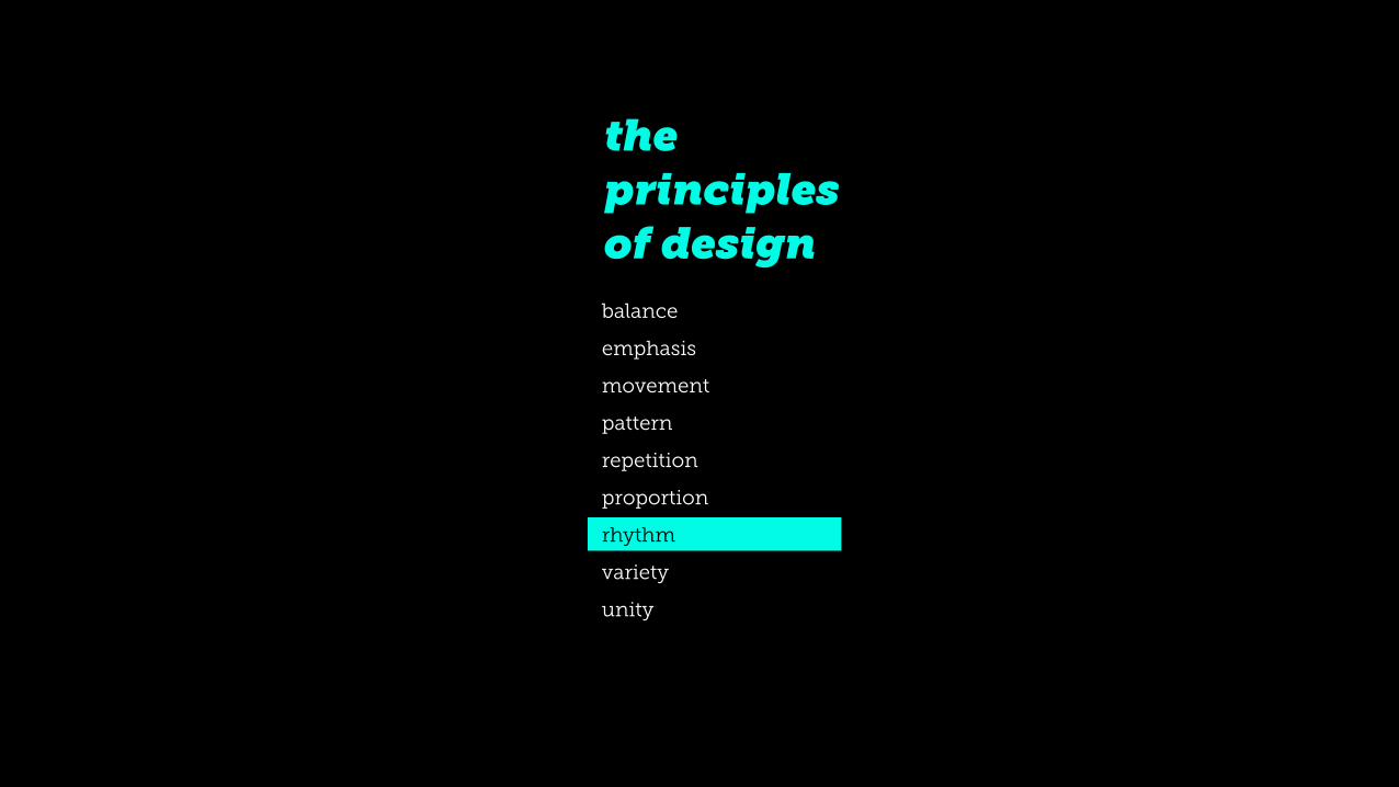
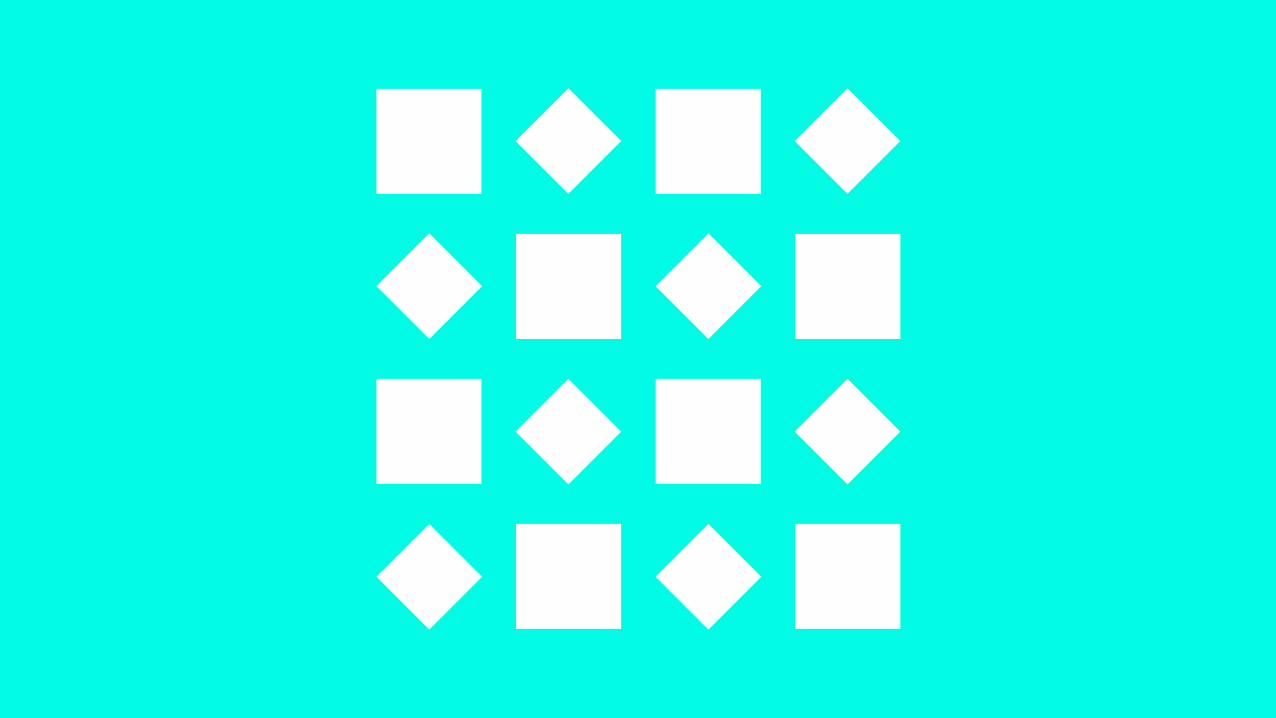
!Besides being a word that I can never spell correctly, rhythm is created when
one or more elements of design are used repeatedly to create a feeling of
organized movement. Rhythm creates a mood like music or dancing. To keep rhythm exciting and active, variety is essential.
rhythm
the principles of design balance
emphasis
movement
pattern
repetition
proportion
rhythm
variety
unity
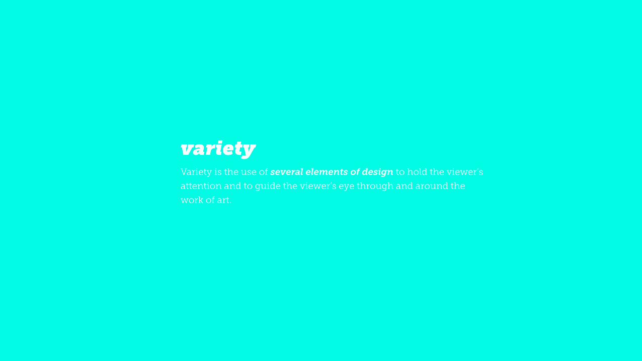
!Variety is the use of several elements of design to hold the viewer’s
attention and to guide the viewer’s eye through and around the
work of art.
variety

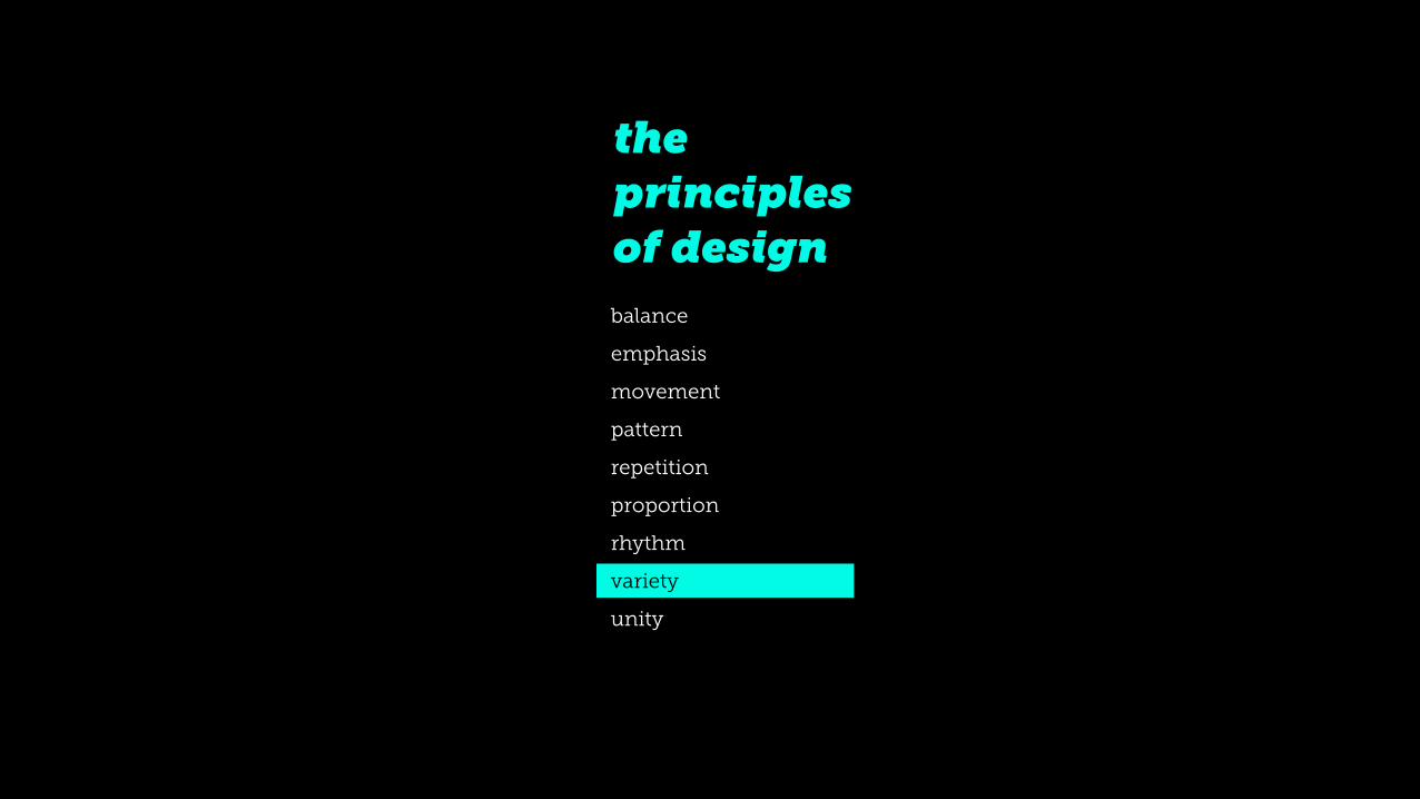
the principles of design balance
emphasis
movement
pattern
repetition
proportion
rhythm
variety
unity
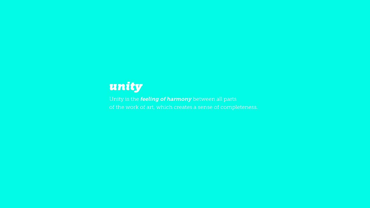
!Unity is the feeling of harmony between all parts of the work of art, which creates a sense of completeness.
unity

try to avoid
bad design
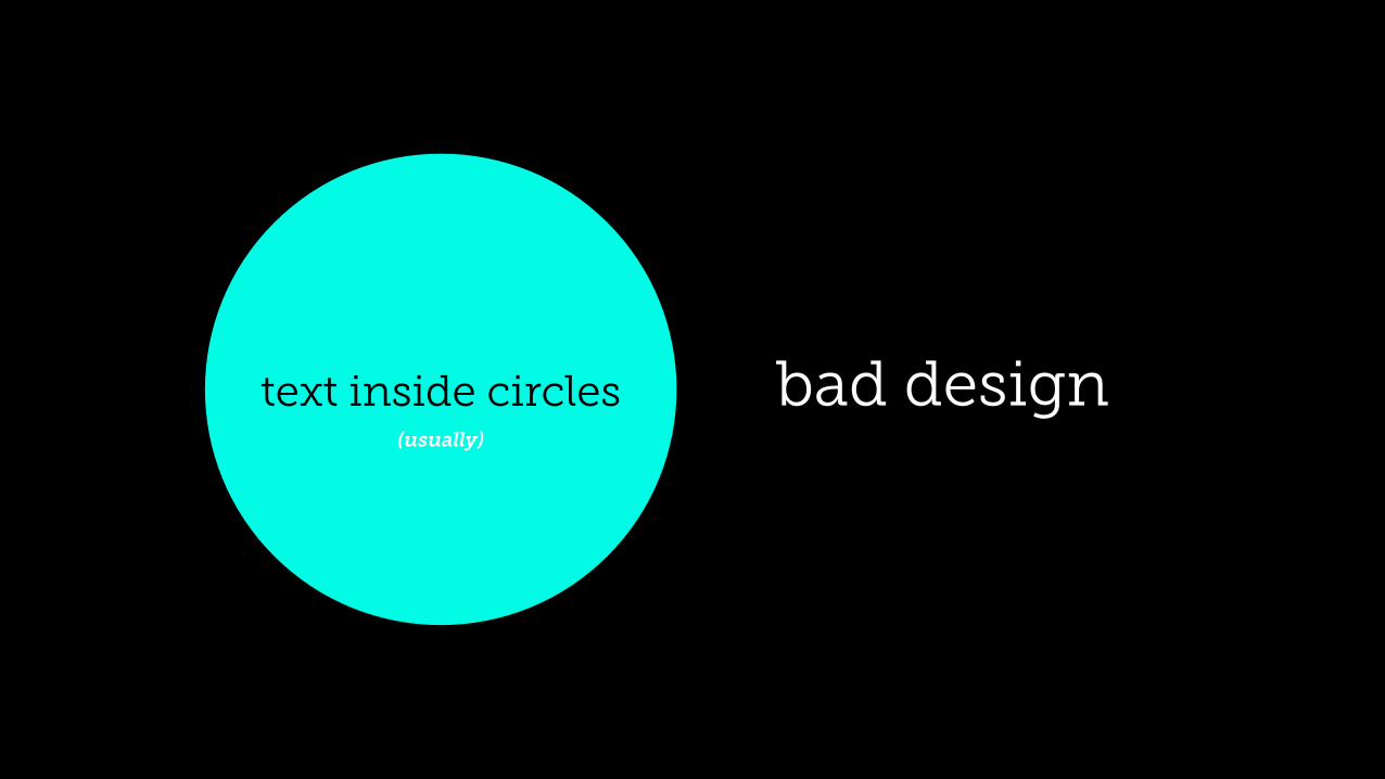
bad designtext inside circles(usually)

bad design
text near the edges of anything
doesn’t this make you feel uncomfortable? yes
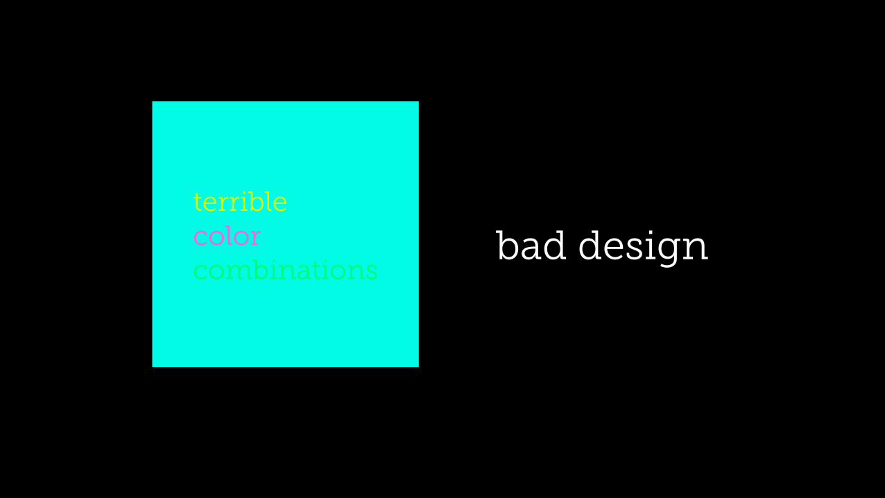
bad designterrible color combinations
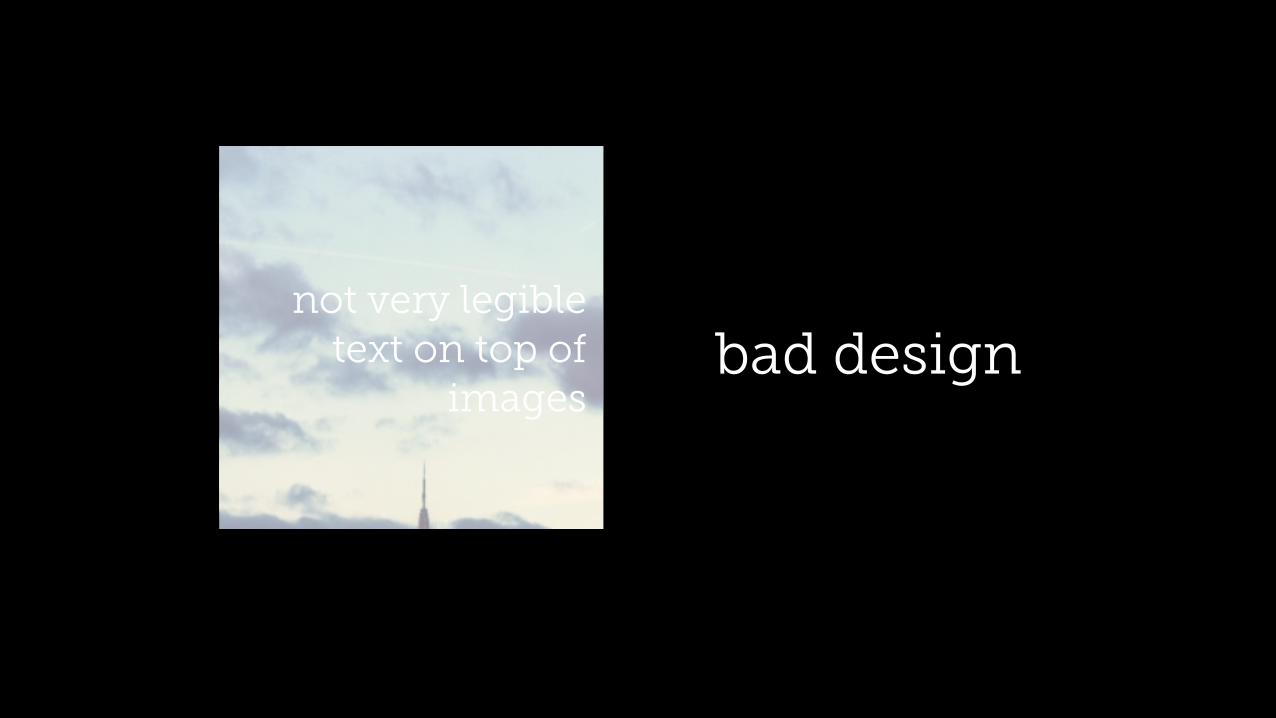
bad designnot very legible
text on top of images
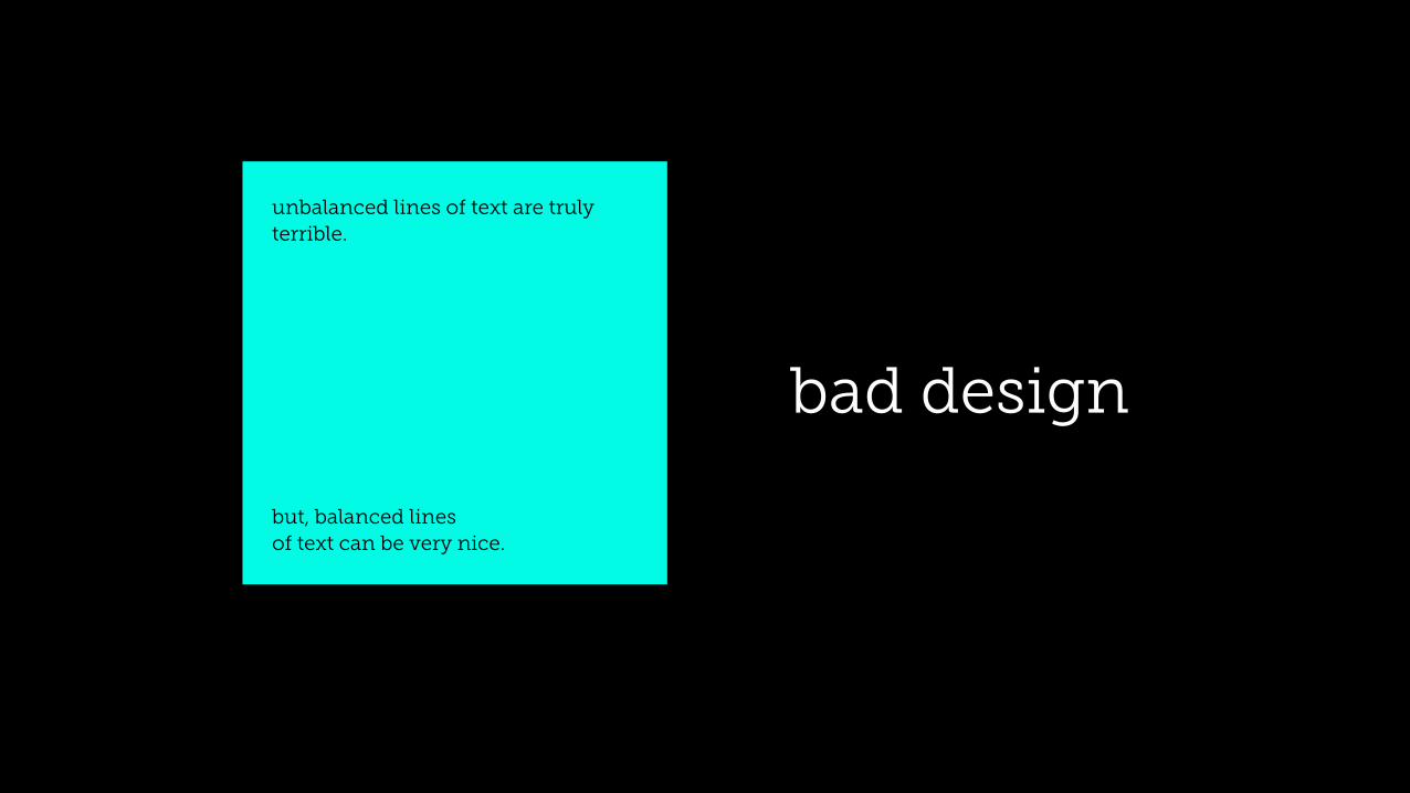
bad design
unbalanced lines of text are truly terrible.
but, balanced lines of text can be very nice.
bad design is things that suck
!Pair contrasting fonts. This essentially narrows
down, in most cases, to using a sans-serif font
for headlines, and a serif font for body copy.
tips for the uninitiated #1
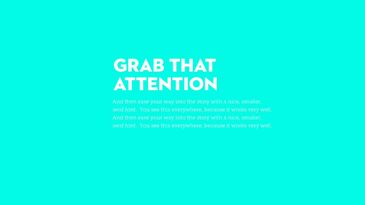
GRAB THAT ATTENTIONAnd then ease your way into the story with a nice, smaller,
serif font. You see this everywhere, because it works very well.
And then ease your way into the story with a nice, smaller,
serif font. You see this everywhere, because it works very well.
!If you’re going to have text on top of an image
(and the image doesn’t naturally give a nice
contrast between text and picture), try using an
overlay! We do this on most of our websites. I’ve
done it all throughout this presentation, you’ve
probably noticed.
tips for the uninitiated #2
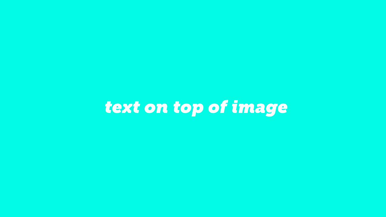
text on top of image
Good design is generally based off of a grid system. On the web,
that translates to designing within a 960 or 1280 grid. In layman's
presentation terms, it means keep your titles, photos, body copy,
etc consistently in the same place, or at least follow the same
concept. For this presentation, that meant centered blocks of
left-aligned text for copy heavy slides, and centered blocks of
center-aligned texts on top of images for title-heavy slides.
tips for the uninitiated #3
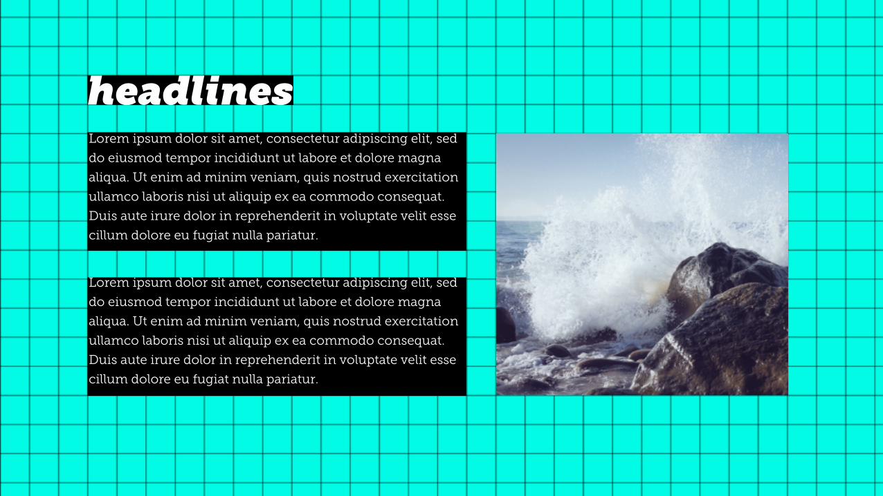
Lorem ipsum dolor sit amet, consectetur adipiscing elit, sed
do eiusmod tempor incididunt ut labore et dolore magna
aliqua. Ut enim ad minim veniam, quis nostrud exercitation
ullamco laboris nisi ut aliquip ex ea commodo consequat.
Duis aute irure dolor in reprehenderit in voluptate velit esse
cillum dolore eu fugiat nulla pariatur.
headlinesLorem ipsum dolor sit amet, consectetur adipiscing elit, sed
do eiusmod tempor incididunt ut labore et dolore magna
aliqua. Ut enim ad minim veniam, quis nostrud exercitation
ullamco laboris nisi ut aliquip ex ea commodo consequat.
Duis aute irure dolor in reprehenderit in voluptate velit esse
cillum dolore eu fugiat nulla pariatur.
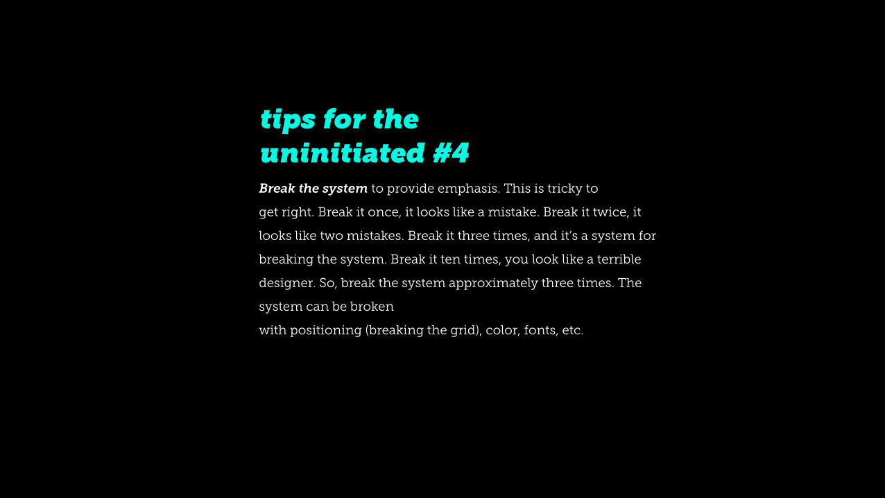
Break the system to provide emphasis. This is tricky to
get right. Break it once, it looks like a mistake. Break it twice, it
looks like two mistakes. Break it three times, and it’s a system for
breaking the system. Break it ten times, you look like a terrible
designer. So, break the system approximately three times. The
system can be broken
with positioning (breaking the grid), color, fonts, etc.
tips for the uninitiated #4
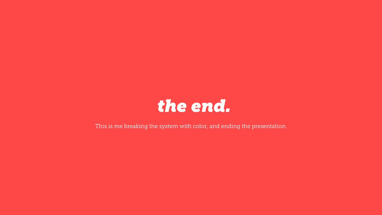
the end.This is me breaking the system with color, and ending the presentation.