presenting health care data in visual displays — employer ... · pdf filepresenting...
TRANSCRIPT

Page 1Optum www.optum.com
Presenting Health Care Data in Visual DisplaysEmployer Consulting Services
White Paper
Page 2Optum www.optum.com
OverviewThe manner in which data is translated into visual images for improved interpretation by the reader is called data visualization. Using charts, graphs and pictures to communicate ideas and trends is based on our understanding that the human brain can more accurately interpret an image or picture rather than rows and columns of numbers, data or words.1 The adage that a picture is worth a thousand words is a great guiding principle for this topic.
Clearly communicating ideas and trends is necessary in today’s business world to justify budgets, create new strategies and business models, as well as to guide initiatives toward achieving objectives. The use of data visualization tools is particularly important for health care executives, who often need to convey complex concepts across a wide range of stakeholders that may include representatives from finance, operations, wellness, human resources, clinical staff, and more. The use of visualization instruments such as charts, graphs, and pictures help simplify the interpretation of the data by the audience or reader. The instrument or visual tool can allow for more efficient organization of various views, descriptive items such as a legend, and other controls to change views.2
This white paper examines the science and research that constitutes our current knowledge of the cognitive process involved in this translation of data images. The evidence presented here is gathered from peer-reviewed scientific journals, pertinent chapters in expert authored texts, practical experience obtained through field tested data presentations, and browser-based data presentation through a commercial data warehouse application, such as Optum’s Parallax product suite.
Common TermsThe presentation of data, and the analysis of data, are two distinct functions that – although intertwined – are separate work processes.3
Data presentation often leads to a discussion and subsequent analysis as an •immediate outcome of the presentation.
Data analysis is the iterative process of examining data for patterns, trends, and •comparisons.
Data presentation may include a narrative supplement that is combined with data visualization, which is often referred to as a reporting function. For the purposes of this white paper, the terms reporting and presentation will be considered synonymous.
Data Interpretation ProcessData visualization is most commonly experienced as a static display, such as a bar graph, bubble chart or other type of graphic. The analytical process of how the data is transformed into a visualization, presented to an audience, and perceived by an audience is dynamic, as described below:
1. Numbers or raw data is extracted and produced in a tabular form
2. Data is converted to a visual instrument, such as a chart
3. A sequence of instruments is assembled to allow for an efficient cognitive journey
4. The data report or presentation is delivered to an audience
Presenting Health Care Data in Visual Displays White Paper
Page 3Optum www.optum.com
5. A variety of interactions occur during the presentation:
a. Data is interpreted or misinterpreted
b. Narrative reporting is decoded by the audience
c. Clarifying questions are raised
d. New areas of data exploration are proposed
e. Analysis of the data by the audience occurs
6. Conclusions are suspended until issues are clarified or explored
7. Conclusions are reached based on the data report
8. Further analysis during or after the presentation occurs
9. Follow up reports are prepared and delivered to the audience
The presentation of data may occur as a physical meeting in a conference room, a virtual meeting with a phone conference and web-based sharing of the report, or as an individual interacting with a data presentation interface through a software application. The visual analytic process can be considered a continuous loop of iterative steps rather than a single report. This iterative process allows for data exploration, interpretation and data manipulation that leads to insightful conclusions.4
Design Considerations for Visual Devices (Charts, Graphs, Displays)The science of data interpretation and the associated cognitive processes have been analyzed from available literature and summarized in the sections below. These evidence-based recommendations can serve as a checklist when developing any report or presentation.
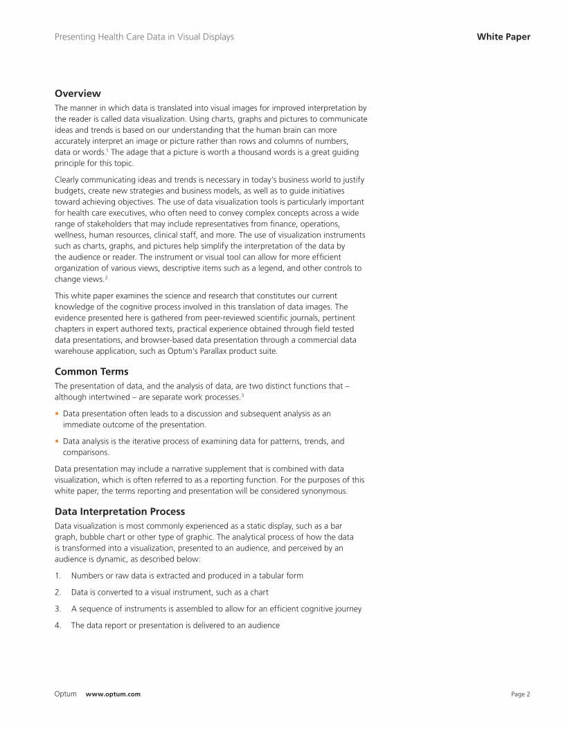
SimplicityA simple clean display is better than something cluttered.5 Think of the question you intend to answer with the data, then create the simple display to deliver the information. Your audience can interpret two bar graphs easier than a pie chart. Furthermore, three-dimensional pie charts are even more likely to be misinterpreted by the audience.6 Keeping the rule of simplicity in mind, it’s generally best to avoid the use of three-dimensional displays,7 as the angles created in a three-dimensional display may make it more challenging to correctly interpret the intended meaning of the visual. The visual’s meaning must be obvious. If the audience is required to study the visual tool, the design is too complex.
Other considerations include avoiding the use of extraneous “graph scrap” that may be distracting, such as grid lines, backgrounds or shading, unnecessary legends, etc. Also, numbers can be presented in “millions” or ‘000s to increase clarity, unless specificity is important (e.g., 35.2M, versus 35,231,987).
Display AttributesDuring the creation of a display, the attributes of the data and the object being created are key factors to consider.8 The proper selection of shapes, position, size and color can help the audience more easily identify data differences and patterns.4 For example, the length of an object is easy for your audience to interpret, such as the tallest bar in a bar graph. To create an effective visualization, use points, lines and bars integrated with length and position to display data.6 Additionally, the lines and bars used in graphs should be proportional to assist with interpretation (e.g., if a bar in a chart has a value
Presenting Health Care Data in Visual Displays White Paper
A simple bar graph can communicate the meaning of the data more effectively than a three-dimensional pie graph.
A three-dimensional pie graph may cause confusion interpreting results.
Also notice the display attributes in the bar graph above. It’s easy to identify the tallest bar in the graph. In addition, all bars and lines are proportional to assist with interpretation.
Page 4Optum www.optum.com
used in graphs should be proportional to assist with interpretation (e.g., if a bar in a chart has a value of 50, it should be half as long as bar with a value of 100).
Smaller or finer differences in visualizations are more challenging to interpret by the audience. Colors, line width, tints, markers or icon sizes may require multiple comparisons for the audience to accurately interpret the data display. In these situations, carefully consider the real estate on the page or slide and seek to create efficient use of space. The visual solution should integrate spatial relationships, the temporal aspect of the data timeframe, and the structure of the data as well.9
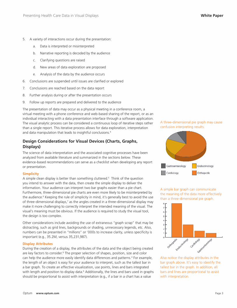
Patterns or DetailsWhen data is detailed, or when patterns in the data are apparent, the use of several charts is the preferred way to show correlation. In these situations, the use of heat maps10 or bubble plots7 are useful, as they are interpreted in a straight-forward manner by the audience. These two devices allow for an easy comparison of macro relationships. If more detailed information is appropriate, the use of tools that include length and position are useful.6
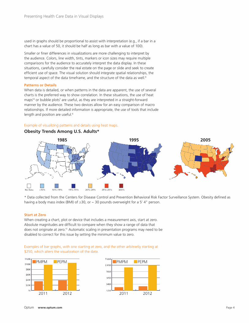
Start at ZeroWhen creating a chart, plot or device that includes a measurement axis, start at zero. Absolute magnitudes are difficult to compare when they show a range of data that does not originate at zero.11 Automatic scaling in presentation programs may need to be disabled to correct for this issue by setting the minimum value to zero.
Presenting Health Care Data in Visual Displays
Example of visualizing patterns and details using heat maps.
Obesity Trends Among U.S. Adults*
1985 1995 2005
* Data collected from the Centers for Disease Control and Prevention Behavioral Risk Factor Surveillance System. Obesity defined as having a body mass index (BMI) of ≥30, or ~ 30 pounds overweight for a 5’ 4” person.
Examples of bar graphs, with one starting at zero, and the other arbitrarily starting at $250, which alters the visualization of the data.
Page 5Optum www.optum.com
Presenting Health Care Data in Visual Displays
Use Comparable RangesWhen using multiple visualizations, keep the range of the data the same between variables. Starting at zero has been recommended. Variables with small differences can be highlighted as a subplot, which should be displayed adjacent to the zero-based axis visualization. This two-step method helps the audience maintain perspective and compare variables in the subplot with the smaller highlighted differences.3 Using a collection of visual tools adjacent to each other on the same page allows the audience to rapidly compare data dimensions and time periods.5
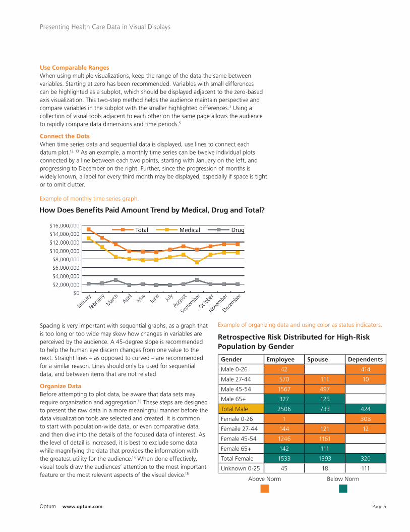
Connect the DotsWhen time series data and sequential data is displayed, use lines to connect each datum plot.12, 13 As an example, a monthly time series can be twelve individual plots connected by a line between each two points, starting with January on the left, and progressing to December on the right. Further, since the progression of months is widely known, a label for every third month may be displayed, especially if space is tight or to omit clutter.
Spacing is very important with sequential graphs, as a graph that is too long or too wide may skew how changes in variables are perceived by the audience. A 45-degree slope is recommended to help the human eye discern changes from one value to the next. Straight lines – as opposed to curved – are recommended for a similar reason. Lines should only be used for sequential data, and between items that are not related
Organize DataBefore attempting to plot data, be aware that data sets may require organization and aggregation.13 These steps are designed to present the raw data in a more meaningful manner before the data visualization tools are selected and created. It is common to start with population-wide data, or even comparative data, and then dive into the details of the focused data of interest. As the level of detail is increased, it is best to exclude some data while magnifying the data that provides the information with the greatest utility for the audience.14 When done effectively, visual tools draw the audiences’ attention to the most important feature or the most relevant aspects of the visual device.15
Example of monthly time series graph.
How Does Benefits Paid Amount Trend by Medical, Drug and Total?
Gender Employee Spouse Dependents
Male 0-26 42 414
Male 27-44 570 111 10
Male 45-54 1567 497
Male 65+ 327 125
Total Male 2506 733 424
Female 0-26 1 308
Femaile 27-44 144 121 12
Female 45-54 1246 1161
Female 65+ 142 111
Total Female 1533 1393 320
Unknown 0-25 45 18 111
Example of organizing data and using color as status indicators.
Retrospective Risk Distributed for High-Risk Population by Gender
Above Norm Below Norm
Page 6Optum www.optum.com
Presenting Health Care Data in Visual Displays
Data organization can start by grouping rows of data into meaningful categories with labels, such as “health condition.” When more than 15 rows of data are present, breaking them up into meaningful groups can help with data organization and understanding. Additionally, data should be sorted by the attribute that is being highlighted. Examples include sorting data by dollar value when comparing business unit costs, instead of sorting categories alphabetically.
When multiple data sets are compared to each other, separate visual devices that are adjacent and on the same page are preferred. This strategy allows for an efficient comparison of the data by the reader.5
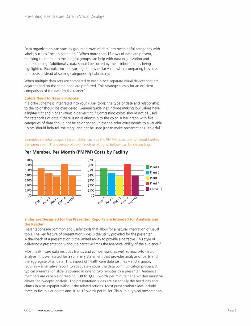
Colors Need to Have a PurposeIf a color scheme is integrated into your visual tools, the type of data and relationship to the color should be considered. General guidelines include making low values have a lighter tint and higher values a darker tint.16 Contrasting colors should not be used for categories of data if there is no relationship to the color. A bar graph with five categories of data should not be color coded unless the color corresponds to a variable. Colors should help tell the story, and not be used just to make presentations “colorful.”
Slides are Designed for the Presenter, Reports are Intended for Analysis and the ReaderPresentations are common and useful tools that allow for a natural integration of visual tools. The key feature of presentation slides is the utility provided for the presenter. A drawback of a presentation is the limited ability to provide a narrative. This style of delivering a presentation without a narrative limits the analytical ability of the audience.5
Most health care data includes trends and comparisons, as well as macro-to-micro analysis. It is well suited for a summary statement that provides analysis of parts and the aggregate of all data. This aspect of health care data justifies – and arguably requires – a narrative report to adequately cover the data communication process. A typical presentation slide is covered in one to two minutes by a presenter. Audience members are capable of reading 300 to 1,000 words per minute.5 The written narrative allows for in-depth analysis. The presentation slides are essentially the headlines and charts in a newspaper without the related articles. Most presentation slides include three to five bullet points and 10 to 15 words per bullet. Thus, in a typical presentation,
Examples of color usage. Like variables (such as the PMPM costs below) should utilize the same color. The overuse of color (such as at right, below) can be distracting.
Per Member, Per Month (PMPM) Costs by Facility
Page 7Optum www.optum.com
White PaperPresenting Health Care Data in Visual Displays
30 to 75 words are available to read, and potentially another 100 to 150 words are delivered by the presenter verbally. This comparison contradicts the common notion that presentations are more efficient than reports. Assembling an audience and asking for a report to be read simultaneously is not as stimulating as the presentation, yet a combination of a narrative and a presentation may be the best use of resources for health care data.
Presenting and Interpreting Analytical Information with Health-Related DataHealth care data provides some unique issues to address when designing visual tools. Health care data is extremely dynamic. The time period of the data can provide valuable insight or disrupt and corrupt analysis or conclusions drawn from the data. The utilization of health care services varies between seasons and from month to month in the United States. For example, July and August experience lower utilization due to summer vacations. Additionally, variations in timing or severity of the influenza season can make year-over-year comparisons inaccurate.
The age of the group included in any data, as well as the gender mix, influences almost every aspect of health care data. Insured status, health plan benefit design, payer type, and deductible amount are examples of health care payment mechanisms that can disrupt the accuracy of data comparisons that must be considered for any visual device.
A common, if not universal, aspect of health care data is the time series or temporal relationship of any aspect of interest. Comparisons of two time periods, or a series of data points across months, quarters or years, will dictate the visual tool that adheres to the previous evidence-based techniques. Consistent treatment of data as the story is presented is a key element for success. When data type is random or is alternated, the audience will become confused and may misinterpret the data, unbeknownst to the presenter or author. The requirement for a consistent storyline that is efficient and moves from macro to micro is emphasized for health care data.
Putting Data Visualization into PracticeSuccessfully using data visualization to communicate the intended message and concepts to an audience takes practice, as it does with any form of communication. However, the effort is worthwhile, as an improved ability to communicate and illustrate key points will result in a better connection with the audience, and an increased ability to influence options.
About the AuthorPhilip A. Smeltzer, is currently a team member of the Optum Employer Consulting Services Group. Dr. Smeltzer serves as a Managing Consultant in the Health Promotion and Wellness topic area. In his current position, Dr. Smeltzer capitalizes on more than 20 years of experience in the health promotion communications field. He has focused on worksite health promotion activities and evaluation throughout his career. His experience includes program design, implementation, operation and evaluations.
Dr. Smeltzer holds a BS in Physical Education and Communications from Oregon State University, a MS in Human Performance from Canisius College, and a PhD from the University of Louisville School of Public Health and Information Science in Health Promotion and Behavioral Science.
Page 8Optum www.optum.com
13625 Technology Drive, Eden Prairie, MN 55344
All Optum trademarks and logos are owned by Optum, Inc. All other brand or product names are trademarks or registered marks of their respective owners. Because we are continuously improving our products and services, Optum reserves the right to change specifications without prior notice. Optum is an equal opportunity employer.
11/12 © 2012 Optum, Inc. All Rights Reserved.
www.optum.com
Presenting Health Care Data in Visual Displays
References1. Cukier, K., A special report on managing information. The Economist, 2010. 394(8671): p. 16.2. Heer, J., F.B. Viegas, and M. Wattenberg, Voyagers and Voyeurs: Supporting Asynchronous Collaborative Information Visualization. ACM Human Factors in Computing Systems (CHI), 2007: p. 10.3. Kelleher, C. and T. Wagener, Ten guidelines for effective data visualization in scientific publications. Environmental modeling and software, 2011. 26: p. 6.4. Heer, J. and B. Shneiderman, Interactive dynamics for visual analysis. Communications of the ACM, 2012. 55(4): p. 10.5. Tufte, E.R., Beautiful Evidence. 2006, Cheshire, CT: Graphics Press.6. Cleveland, W.S., P. Diaconis, and R. McGill, Graphical perception: the visual decoding of quantitative information on graphical displays of data. Journal and Review of American Statistical Social Services, 1984. 79(387): p. 34.7. Few, S., Now You See It. 2009, Oakland, CA: Analytics Press.8. Chambers, J.M., et al., Graphical Methods for Data Analysis. 1983, Boston, MA: Duxbury Press.9. Hadlak, S., et al., Visualization of attributed hierarchical structures in a spatiotemporal context. International Journal of Geographical Information Science, 2010. 24(10): p. 17.10. Wilkinson, L. and M. Friendly, The history of the cluster heat map. American Statistics, 2009. 63(2): p. 6.11. Robbins, N., Crating More Effictive Graphs. 2005, Hoboken, NJ: Wiley-Interscience.12. Strange, N., Smoke & Mirrors: How to Bend Facts & Figures to Your Advantage. 2007, London, UK: A & C Black Publishers.13. Cleveland, W.S. and S.J. Devlin, Calendar effcts in monthly time series: detection by specrum analysis and graphical methods. Journal of American Statistical Association, 1980. 75(371): p. 10.14. Shneiderman, B., Dynamic queries for visual information seeking. IEEE Software, 1994. 11(6): p. 8.15. Janicke, H. and M. Chen, A salience-based quality metric for visualization. Eurographics, 2010. 29(3): p. 10.16. Harrower, M. and C. Brewer, ColorBrewer.org: an online tool for selecting colour schemes for maps. Cartography Journal, 2003. 40(1): p. 11.
Learn more about how OptumHealth can help your organization use analytical tools that incorporate visual displays. Contact us at 1.866.386.3409 or email us at [email protected].