postal annex+, inc. style guide - annex brands, inc. · * the following booklet contains the style...
TRANSCRIPT
* The following booklet contains the style guide for the PostalAnnex+ brand only. If you have questions regarding style guides for the Handle With Care Packaging Store, Navis Pack & Ship or Sunshine Pack & Ship brands or use of the Annex Brands, Inc. logo, please refer to the appropriate section of the
Annex Brands Style Guide.Postal Annex+, Inc. Style Guide
PostalAnnex+Style Guide

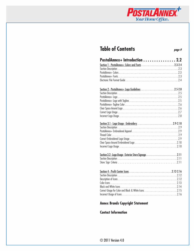
Table of Contents page #
PostalAnnex+ Introduction . . . . . . . . . . . . . . . 2.2Section 1 - PostalAnnex+ Colors and Fonts . . . . . . . . . . . . . . . . . . . . . . . . . 2.3-2.4Section Description . . . . . . . . . . . . . . . . . . . . . . . . . . . . . . . . . . . . . . . . . . . . . .2.3PostalAnnex+ Colors . . . . . . . . . . . . . . . . . . . . . . . . . . . . . . . . . . . . . . . . . . . . .2.3PostalAnnex+ Fonts . . . . . . . . . . . . . . . . . . . . . . . . . . . . . . . . . . . . . . . . . . . . . 2.3Electronic File Format Guide . . . . . . . . . . . . . . . . . . . . . . . . . . . . . . . . . . . . . . . .2.4
Section 2 - PostalAnnex+ Logo Guidelines . . . . . . . . . . . . . . . . . . . . . . . . . .2.5-2.8Section Description . . . . . . . . . . . . . . . . . . . . . . . . . . . . . . . . . . . . . . . . . . . . . .2.5PostalAnnex+ Logo . . . . . . . . . . . . . . . . . . . . . . . . . . . . . . . . . . . . . . . . . . . . . .2.5PostalAnnex+ Logo with Tagline . . . . . . . . . . . . . . . . . . . . . . . . . . . . . . . . . . . . . 2.5PostalAnnex+ Tagline Color . . . . . . . . . . . . . . . . . . . . . . . . . . . . . . . . . . . . . . . . 2.6Clear Space Around Logo . . . . . . . . . . . . . . . . . . . . . . . . . . . . . . . . . . . . . . . . . .2.6Correct Logo Usage . . . . . . . . . . . . . . . . . . . . . . . . . . . . . . . . . . . . . . . . . . . . . .2.7Incorrect Logo Usage . . . . . . . . . . . . . . . . . . . . . . . . . . . . . . . . . . . . . . . . . . . . .2.8
Section 3.1 - Logo Usage - Embroidery . . . . . . . . . . . . . . . . . . . . . . . . . . . . .2.9-2.10Section Description . . . . . . . . . . . . . . . . . . . . . . . . . . . . . . . . . . . . . . . . . . . . . .2.9 PostalAnnex+ Embroidered Apparel . . . . . . . . . . . . . . . . . . . . . . . . . . . . . . . . . . .2.9Thread Color . . . . . . . . . . . . . . . . . . . . . . . . . . . . . . . . . . . . . . . . . . . . . . . . . . 2.9Correct Embroidered Logo Usage . . . . . . . . . . . . . . . . . . . . . . . . . . . . . . . . . . . . .2.9Clear Space Around Embroidered Logo . . . . . . . . . . . . . . . . . . . . . . . . . . . . . . . .2.10Incorrect Logo Usage . . . . . . . . . . . . . . . . . . . . . . . . . . . . . . . . . . . . . . . . . . . .2.10
Section 3.2 - Logo Usage - Exterior Store Signage . . . . . . . . . . . . . . . . . . . . . . . . . . . . .2.11Section Description . . . . . . . . . . . . . . . . . . . . . . . . . . . . . . . . . . . . . . . . . . . . . .2.11 Store Sign Criteria . . . . . . . . . . . . . . . . . . . . . . . . . . . . . . . . . . .2.11
Section 4 - Profit Center Icons . . . . . . . . . . . . . . . . . . . . . . . . . . . . . . . . .2.12-2.16Section Description . . . . . . . . . . . . . . . . . . . . . . . . . . . . . . . . . . . . . . . . . . . . .2.12Description of Icons . . . . . . . . . . . . . . . . . . . . . . . . . . . . . . . . . . . . . . . . . . . . .2.12Color Icons . . . . . . . . . . . . . . . . . . . . . . . . . . . . . . . . . . . . . . . . . . . . . . . . . . 2.13Black and White Icons . . . . . . . . . . . . . . . . . . . . . . . . . . . . . . . . . . . . . . . . . . .2.14Correct Usage for Color and Black & White Icons . . . . . . . . . . . . . . . . . . . . . . . . .2.15Incorrect Usage of Icons . . . . . . . . . . . . . . . . . . . . . . . . . . . . . . . . . . . . . . . . . .2.16
Annex Brands Copyright Statement
Contact Information
© 2011 Version 4.0
Introduction
One of the benefits of being a member of the Annex Brands’ franchise system is having access to award-winning marketing materials. Having served customers since 1985, PostalAnnex+ has become known not only for expert, friendly customer service, but also for eye-catching posters, flyers, direct-mail pieces, newspaper inserts and television and radio commercials. A common element in all our marketing materials, whether in electronic or print form, is the use of our logo, tagline, icons, and related artwork.
Correct usage of this artwork increases its value each time it is used correctly. Incorrect usage adversely affects its value and jeopardizes or weakens its trademark protection and the legal right to keep people from altering or copying our trademarks for their own use. Through proper use of our materials, the PostalAnnex+ brand is strengthened, resulting in credibility to our customers, vendors, and the public at-large.
We have created this manual to be a guide in establishing a consistent brand image throughout the PostalAnnex+ system. Its purpose is to provide clear, concise guidelines for proper use of our copyrighted and trademarked materials. In the event you encounter a situation not covered in this manual, please contact the Annex Brands’ Marketing Communications Department to discuss your project before proceeding. The Department has authority and responsibility for the maintenance and control of the PostalAnnex+ trademarks and is your resource for guidance and clarification in applying proper use.
This PostalAnnex+ Style Guide is available in Adobe Acrobat® Portable Document Format (PDF) on the PASSPORT system in the Library> Marketing>Corporate Style Guide folder. When viewing the .pdf file, please note some images and colors may be subject to distortion due to differences in computer monitor displays using Red/Green/Blue (RGB) technology versus print materials that use either Cyan/Magenta/Yellow/Black (CMYK or 4-color) or Pantone Matching System (PMS) ink processing.
2.2
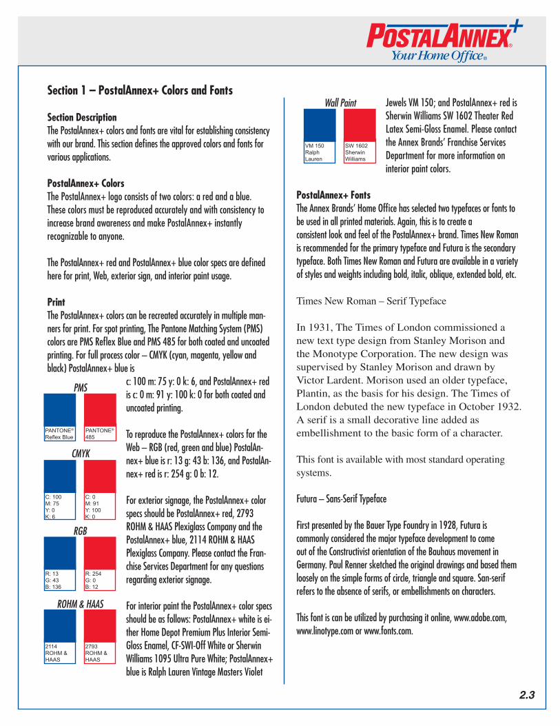
Section 1 – PostalAnnex+ Colors and Fonts
Section DescriptionThe PostalAnnex+ colors and fonts are vital for establishing consistency with our brand. This section defines the approved colors and fonts for various applications.
PostalAnnex+ ColorsThe PostalAnnex+ logo consists of two colors: a red and a blue. These colors must be reproduced accurately and with consistency to increase brand awareness and make PostalAnnex+ instantly recognizable to anyone.
The PostalAnnex+ red and PostalAnnex+ blue color specs are defined here for print, Web, exterior sign, and interior paint usage.
PrintThe PostalAnnex+ colors can be recreated accurately in multiple man-ners for print. For spot printing, The Pantone Matching System (PMS) colors are PMS Reflex Blue and PMS 485 for both coated and uncoated printing. For full process color – CMYK (cyan, magenta, yellow and black) PostalAnnex+ blue is
c: 100 m: 75 y: 0 k: 6, and PostalAnnex+ red is c: 0 m: 91 y: 100 k: 0 for both coated and uncoated printing.
To reproduce the PostalAnnex+ colors for the Web – RGB (red, green and blue) PostalAn-nex+ blue is r: 13 g: 43 b: 136, and PostalAn-nex+ red is r: 254 g: 0 b: 12.
For exterior signage, the PostalAnnex+ color specs should be PostalAnnex+ red, 2793 ROHM & HAAS Plexiglass Company and the PostalAnnex+ blue, 2114 ROHM & HAAS Plexiglass Company. Please contact the Fran-chise Services Department for any questions regarding exterior signage.
For interior paint the PostalAnnex+ color specs should be as follows: PostalAnnex+ white is ei-ther Home Depot Premium Plus Interior Semi-Gloss Enamel, CF-SWI-Off White or Sherwin Williams 1095 Ultra Pure White; PostalAnnex+ blue is Ralph Lauren Vintage Masters Violet
Jewels VM 150; and PostalAnnex+ red is Sherwin Williams SW 1602 Theater Red Latex Semi-Gloss Enamel. Please contact the Annex Brands’ Franchise Services Department for more information on interior paint colors.
PostalAnnex+ FontsThe Annex Brands’ Home Office has selected two typefaces or fonts to be used in all printed materials. Again, this is to create a consistent look and feel of the PostalAnnex+ brand. Times New Roman is recommended for the primary typeface and Futura is the secondary typeface. Both Times New Roman and Futura are available in a variety of styles and weights including bold, italic, oblique, extended bold, etc.
Times New Roman – Serif Typeface
In 1931, The Times of London commissioned a new text type design from Stanley Morison and the Monotype Corporation. The new design was supervised by Stanley Morison and drawn by Victor Lardent. Morison used an older typeface, Plantin, as the basis for his design. The Times of London debuted the new typeface in October 1932. A serif is a small decorative line added as embellishment to the basic form of a character.
This font is available with most standard operating systems.
Futura – Sans-Serif Typeface
First presented by the Bauer Type Foundry in 1928, Futura is commonly considered the major typeface development to come out of the Constructivist orientation of the Bauhaus movement in Germany. Paul Renner sketched the original drawings and based them loosely on the simple forms of circle, triangle and square. San-serif refers to the absence of serifs, or embellishments on characters.
This font is can be utilized by purchasing it online, www.adobe.com, www.linotype.com or www.fonts.com.
2.3
PANTONE®
Reflex BluePANTONE®
485
C: 100M: 75Y: 0K: 6
C: 0M: 91Y: 100K: 0
R: 13G: 43B: 136
R: 254G: 0B: 12
2114 ROHM & HAAS
2793 ROHM & HAAS
RGB
CMYK
ROHM&HAAS
PMS
VM 150Ralph Lauren
SW 1602Sherwin Williams
WallPaint
Electronic File Format GuideThis section is a guide on file formats and the different file types appropriate for various programs.
Some of the most common file types are Encapsulated Post Script (.eps), Joint Photographic Experts Group (.jpg) and Graphic Interchange Format (.gif).
.eps – This file format works best for print, and for such programs used for high end graphics such as Adobe Photoshop, Adobe Illustrator and Adobe InDesign. Sometimes this is referred to as a “vectored format”, meaning it can be enlarged or reduced without changing the resolution or clarity.
.jpg – This file format is a rastered graphic and is best if used with Web sites, and such programs as Microsoft Word and Microsoft PowerPoint.
.gif – This file format is a rastered graphic and is best if used with Web sites.
Neither .gif’s nor .jpg’s should be used in printed materials because they are usually lower-resolution. Lower-resolution images usually are smaller in file size then higher-resolution images, making them preferred for use on the web. The problem with low-resolution files in printed materials is they often appear “grainy” or pixilated and thus don’t help create a finished high-quality printed piece.
Many of the file types for the PostalAnnex+ logo, icons and vendor logos mentioned in this manual are available for download from the PASSPORT system. You can find them in the Marketing section of the Library. If you have questions on file types not covered in this document, please contact the Annex Brands’ Marketing Communications Department.
To download PostalAnnex+ logos, go online to www.postalannex.com/logos; the current password is “p0st@l” (the 0 is zero and the l is a lower case L) but is subject to change without notice. Contact the Marketing Communications Department if you are having difficulty downloading logos. On that page you can download the PostalAnnex+ logo color or black & white, in .eps or .jpg format. The UPS, FedEx and USPS approved logos are also available to download.
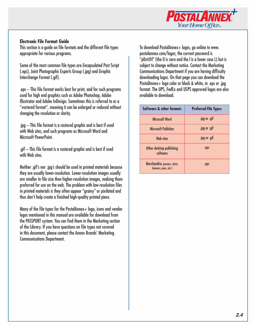
Software & other formats Preferred File Types
Microsoft Word .jpg or .gif
Microsoft Publisher .jpg or .gif
Web sites .jpg or .gif
Other desktop publishing software
.eps
Merchandise (posters,shirts,banners,pens,etc.)
.eps
2.4
Section 2 - PostalAnnex+ Logo Guidelines
Section DescriptionOne of the main benefits of being an Annex Brands franchisee is the strength of the PostalAnnex+ logo. Part of that strength lies in the hands of all of us. The Home Office, your staff and vendors all take part in working together to make the PostalAnnex+ brand strong. To keep our logo looking its best, we here at the Home Office have created the following requirements for use of the logo. Samples of these specifications are provided along with as samples of correct and incorrect usages.
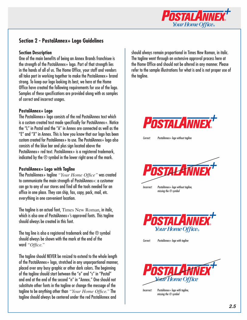
PostalAnnex+ LogoThe PostalAnnex+ logo consists of the red PostalAnnex text which is a custom created text made specifically for PostalAnnex+. Notice the “L” in Postal and the “A” in Annex are connected as well as the “E” and “X” in Annex. This is how you know that our logo has been custom created for PostalAnnex+ to use. The PostalAnnex+ logo also consists of the blue bar and plus sign located above the PostalAnnex+ red text. PostalAnnex+ is a registered trademark, indicated by the ® symbol in the lower right area of the mark.
PostalAnnex+ Logo with TaglineThe PostalAnnex+ tagline “Your Home Office” was created to communicate the main strength of PostalAnnex+: a customer can go to any of our stores and find all the tools needed for an office in one place. They can ship, fax, copy, pack, mail, etc. everything in one convenient location.
The tagline is an actual font, Times New Roman, in italic, which is also one of PostalAnnex+’s approved fonts. This tagline should always be created in this font.
The tag line is also a registered trademark and the ® symbol should always be shown with the mark at the end of the word “Office.”
The tagline should NEVER be resized to extend to the whole length of the PostalAnnex+ logo, stretched in any unporportional manner, placed over any busy graphic or other dark colors. The beginning of the tagline should start between the “o” and “s” in “Postal” and end at the end of the second “n” in “Annex.” One should not substitute other fonts in the tagline or change the message of the tagline to be anything other than “Your Home Office.” The tagline should always be centered under the red PostalAnnex and
Correct: PostalAnnex+logowithouttagline
Correct: PostalAnnex+logowithtagline
should always remain proportional in Times New Roman, in italic. The tagline went through an extensive approval process here at the Home Office and should not be altered in any manner. Please refer to the sample illustrations for what is and is not proper use of the tagline.
Incorrect: PostalAnnex+logowithouttagline, missingthe®symbol
Incorrect: PostalAnnex+logowithtagline, missingthe®symbol
2.5
PostalAnnex+ Tagline ColorThe approved color for the tagline is the same as the approved color for the stripe and plus of the PostalAnnex+ logo and should always be the same when used together. Again, that color is PMS Reflex Blue. Please refer to page 3 for a detailed description of the approved blue color. If the PostalAnnex+ logo is in black and white, the tagline should also be in black and white.
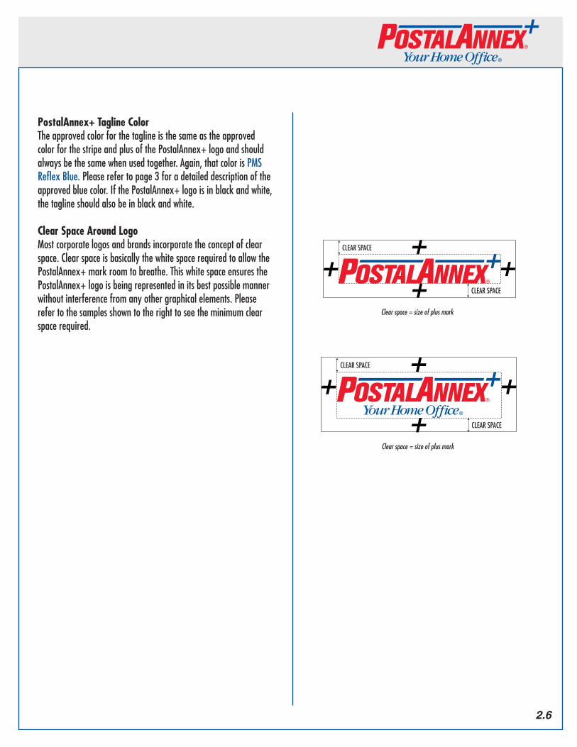
Clear Space Around LogoMost corporate logos and brands incorporate the concept of clear space. Clear space is basically the white space required to allow the PostalAnnex+ mark room to breathe. This white space ensures the PostalAnnex+ logo is being represented in its best possible manner without interference from any other graphical elements. Please refer to the samples shown to the right to see the minimum clear space required.
Clear Space = size of plus mark
CLEAR SPACE
CLEAR SPACE
Clear Space = size of plus mark
CLEAR SPACE
CLEAR SPACEClear Space = size of plus mark
CLEAR SPACE
CLEAR SPACE
Clear Space = size of plus mark
CLEAR SPACE
CLEAR SPACE
Clearspace=sizeofplusmark
Clearspace=sizeofplusmark
2.6
Correct Logo UsageWhen using PostalAnnex+ in text, notice there are no breaks in the word. It is one word with the “A” capitalized and the “+” symbol at the end.
Correct: PostalAnnex+
Incorrect: Postal Annex
Incorrect: Postal Annex+
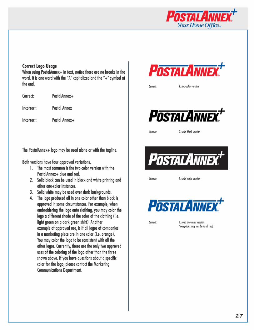
The PostalAnnex+ logo may be used alone or with the tagline.
Both versions have four approved variations.1. The most common is the two-color version with the
PostalAnnex+ blue and red.2. Solid black can be used in black and white printing and
other one-color instances. 3. Solid white may be used over dark backgrounds.4. The logo produced all in one color other than black is
approved in some circumstances. For example, when embroidering the logo onto clothing, you may color the logo a different shade of the color of the clothing (i.e. light green on a dark green shirt). Another example of approved use, is if all logos of companies in a marketing piece are in one color (i.e. orange). You may color the logo to be consistent with all the other logos. Currently, these are the only two approved uses of the coloring of the logo other than the three shown above. If you have questions about a specific color for the logo, please contact the Marketing Communications Department.
Correct: 1.two-colorversion
Correct: 2.solidblackversion
Correct: 3.solidwhiteversion
Correct: 4.solidone-colorversion (exception:maynotbeinallred)
2.7
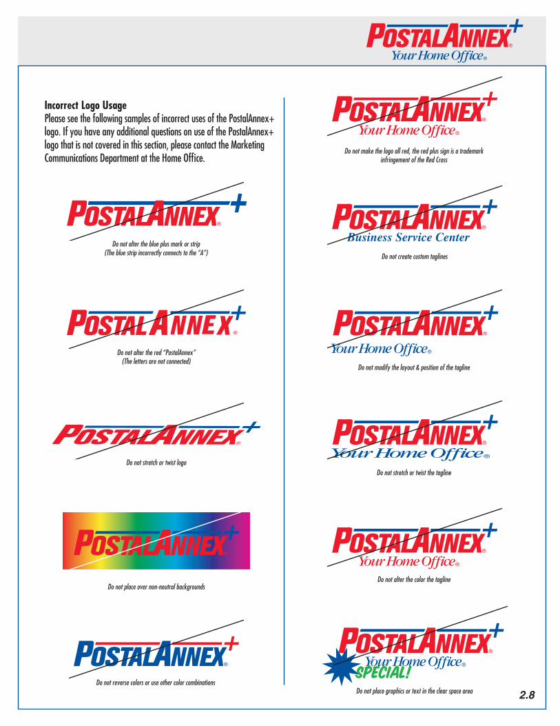
Incorrect Logo UsagePlease see the following samples of incorrect uses of the PostalAnnex+ logo. If you have any additional questions on use of the PostalAnnex+ logo that is not covered in this section, please contact the Marketing Communications Department at the Home Office.
Business Service Center
Special!
Business Service Center
Special!
Donotaltertheblueplusmarkorstrip(Thebluestripincorrectlyconnectstothe“A”)
Donotalterthered“PostalAnnex”(Thelettersarenotconnected)
Donotstretchortwistlogo
Donotplaceovernon-neutralbackgrounds
Donotreversecolorsoruseothercolorcombinations
Donotcreatecustomtaglines
Donotmodifythelayout&positionofthetagline
Donotstretchortwistthetagline
Donotalterthecolorthetagline
Donotplacegraphicsortextintheclearspacearea
Donotmakethelogoallred,theredplussignisatrademarkinfringementoftheRedCross
2.8
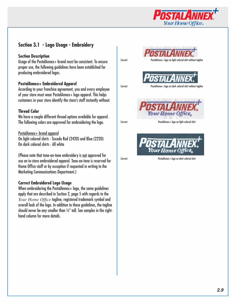
Section 3.1 - Logo Usage - Embroidery
Section DescriptionUsage of the PostalAnnex+ brand must be consistent. To ensure proper use, the following guidelines have been established for producing embroidered logos.
PostalAnnex+ Embroidered ApparelAccording to your franchise agreement, you and every employee of your store must wear PostalAnnex+ logo apparel. This helps customers in your store identify the store’s staff instantly without.
Thread ColorWe have a couple different thread options available for apparel. The following colors are approved for embroidering the logo.
PostalAnnex+ brand apparelOn light colored shirts - Tuxedo Red (2420) and Blue (2220)On dark colored shirts - All white
(Please note that tone-on-tone embroidery is not approved for use on in-store embroidered apparel. Tone-on-tone is reserved for Home Office staff or by exception if requested in writing to the Marketing Communications Department.)
Correct Embroidered Logo UsageWhen embroidering the PostalAnnex+ logo, the same guidelines apply that are described in Section 2, page 5 with regards to the Your Home Office tagline, registered trademark symbol and overall look of the logo. In addition to these guidelines, the tagline should never be any smaller than ¼” tall. See samples in the right-hand column for more details.
Correct: PostalAnnex+logoonlightcoloredshirt
Correct: PostalAnnex+logoondarkcoloredshirt
Correct: PostalAnnex+logoonlightcoloredshirtwithouttagline
Correct: PostalAnnex+logoondarkcoloredshirtwithouttagline
2.9
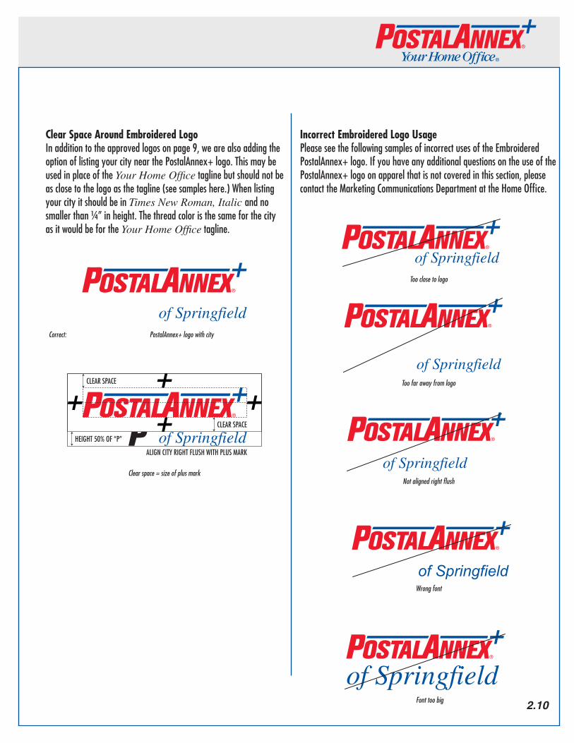
Clear Space Around Embroidered LogoIn addition to the approved logos on page 9, we are also adding the option of listing your city near the PostalAnnex+ logo. This may be used in place of the Your Home Office tagline but should not be as close to the logo as the tagline (see samples here.) When listing your city it should be in Times New Roman, Italic and no smaller than ¼” in height. The thread color is the same for the city as it would be for the Your Home Office tagline.
Incorrect Embroidered Logo UsagePlease see the following samples of incorrect uses of the Embroidered PostalAnnex+ logo. If you have any additional questions on the use of the PostalAnnex+ logo on apparel that is not covered in this section, please contact the Marketing Communications Department at the Home Office.
CLEAR SPACE
CLEAR SPACE
HEIGHT 50% OF “P”
ALIGN CITY RIGHT FLUSH WITH PLUS MARK
of Springfield
of Springfield
Clearspace=sizeofplusmark
CLEAR SPACE
CLEAR SPACE
HEIGHT 50% OF “P”
ALIGN CITY RIGHT FLUSH WITH PLUS MARK
of Springfield
of SpringfieldCorrect: PostalAnnex+logowithcity
of Springfield
of Springfield
of Springfield
of Springfield
of Springfield
Tooclosetologo
Toofarawayfromlogo
Notalignedrightflush
Wrongfont
Fonttoobig 2.10

2.11
Section 3.2 - Logo Usage - Exterior Store Signage
Section DescriptionExterior store signage is the first thing a customer sees when they drive by or walk by your location. The following guidelines are in place so that every PostalAnnex+ location is equally identifiable to customers.
Store Sign Criteria1. Individual metal channel letters. Standard length: 13 ft; 2” Standard height: 2 ft Size may vary depending on individual shopping center criteria.
2. Logo type: EPS. file provided by Annex Brands. Two letters are linked. Contact the Franchise Services Department to obtain the file.
3. Exterior sign colors: Red - 2793 ROHM & HAAS Plexiglass Company Blue - 2114 ROHM & HAAS Plexiglass Company (additional information on the PostalAnnex+ colors available in Section 1 of this guide.)
4. All logos have to have the registered trademark symbol on it. (see sample)
5. A color proof from the sign shop must be submitted to the Franchise Services Department for approval prior to production of the sign.
PostalAnnex+signlogowithregisteredtrademarkinsidethe“x”.
Sampleofsignontypicalstorefront.
FAX NOTARYPACKAGING
SHIPPING
COPY CENTERMAILBOXES
PRINTING
Section 4 - Profit Center Icons
Section DescriptionSince PostalAnnex+ is “Your Home Office” we have all the tools available for the office and, as a result, we have many services available to our customers. We offer so many services that the Marketing Communications Department has come up with 15 profit center icons to correlate with each of the different services. These icons are available for downloading in full-color and black and white from the PASSPORT system. This section goes into more detail about these icons and how you can use them to market your business.
Description of the Icons1. Shipping - This icon represents one of PostalAnnex+’s
main services. It can be used to represent all general forms of shipping from overnight to international.
2. Packaging - This icon can be used for packing supplies, packaging services, custom packing, etc.3. Notary - Includes both in-store notary and traveling or mobile notary.4. Mailbox Rentals – This icon can be used to represent
all the different aspects of mailbox rentals, from the size of the box to the different personal services your store offers your customers (e.g. call-in mail check, mail forwarding, 24-hour access, etc.).
5. Copying – The copying icon can be used for black and white photocopying and black and white printing. You may also use this icon for color laser copying and printing when there is not room for the color copying icon.
6. Color Copying – The color copying icon can be used for color laser copying and printing.7. Office Supplies – Paper, pens, pencils, envelopes,
highlighters, staples, paper clips, or folders – this icon represents them all.
8. Faxing Services - Domestic, international and fax sending and receiving.9. Greeting Cards - For everyday greeting cards to birthdays and special Holiday cards.10. Binding – This icon represents all the various binding
services you may offer includes Unibind, comb binding, velo binding, spiral binding, bookletizing and tape binding.
11. Laminating – The laminating icon can be used for all pouch laminating as well as any oversized laminating you may outsource.
12. Jumbo Shipping - This icon was created to focus on large, oversized shipping and crate shipping.13. Passport Photos - For use with passport photos, student id’s, work id’s, immigration photos, passport processing, etc.14. Key Cutting – From double-sided, single-sided, car
and truck keys, and designer keys – this icon covers them all.
15. E-Business – This icon is for Internet access and any other Web-based business you offer your customers.
*Please note:Additionaliconsareavailableforservicesnotmentionedhere.PleasecontactthegraphicdesignerintheMarketingCommunicationsDepartmentattheAnnexBrands’HomeOfficetorequestthefiles.
2.12
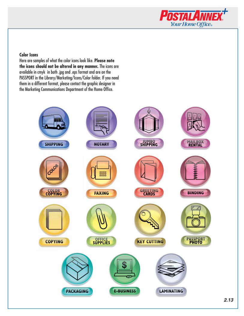
Color IconsHere are samples of what the color icons look like. Please note the icons should not be altered in any manner. The icons are available in cmyk in both .jpg and .eps format and are on the PASSPORT in the Library/Marketing/Icons/Color folder. If you need them in a different format, please contact the graphic designer in the Marketing Communications Department of the Home Office.Samples of Color Icons
2.13
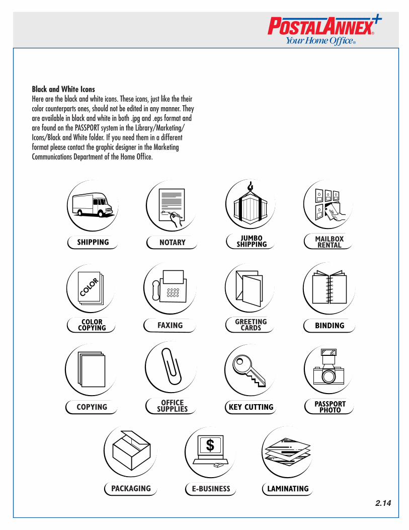
Black and White IconsHere are the black and white icons. These icons, just like the their color counterparts ones, should not be edited in any manner. They are available in black and white in both .jpg and .eps format and are found on the PASSPORT system in the Library/Marketing/Icons/Black and White folder. If you need them in a different format please contact the graphic designer in the Marketing Communications Department of the Home Office.
Samples of BW Path Icons
2.14
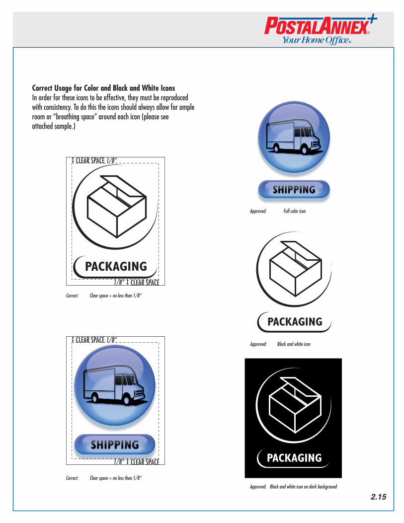
Correct Usage for Color and Black and White IconsIn order for these icons to be effective, they must be reproduced with consistency. To do this the icons should always allow for ample room or “breathing space” around each icon (please see attached sample.)
CLEAR SPACE
Clear Space = no less than 1/8”
CLEAR SPACE
1/8”
1/8”
CLEAR SPACE
Clear Space = no less than 1/8”
CLEAR SPACE
1/8”
1/8”
Black and white icon
Black and white icon on dark background
Full Color Icon
Correct: Clearspace=nolessthan1/8”
Correct: Clearspace=nolessthan1/8”
Approved:Blackandwhiteiconondarkbackground
Approved: Blackandwhiteicon
Approved: Fullcoloricon
2.15
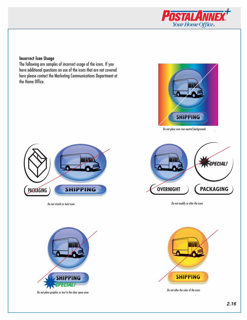
Do not stretch or twist icons
Do not place over non neutral backgrounds
Do not alter the color of the iconsDo not place graphics or text in the clear space area
Special!
Do not modify or alter the icons
Special!
OVERNIGHT
Donotplaceovernon-neutralbackgrounds
Donotmodifyoraltertheicons
DonotalterthecoloroftheiconsDonotplacegraphicsortextintheclearspacearea
Donotstretchortwisticons
2.16
Incorrect Icon UsageThe following are samples of incorrect usage of the icons. If you have additional questions on use of the icons that are not covered here please contact the Marketing Communications Department at the Home Office.
PMS 425 Outlined
PMS 730 box
Berthold Akzidenz Grotesk
Annex - Light Extended
Brands - Extended
Annex Brands Copyright Statement© 2011 Annex Brands, Inc. All rights reserved. All company names, products, registered and/or unregistered trademarks and copyrights belong to their respective companies. All materials contained in this document are confidential and for internal use only.
Contact InformationMarketing Communications DepartmentAnnex Brands, Inc.7580 Metropolitan Dr.Suite 200San Diego, CA 92108
Ph: 619.563.4800 (Toll-Free: 1.800.456.1525)Fx: 619.563.9850 (Toll-Free: 1.800.846.8644)
© 2011 Version 4.0
