pop images
TRANSCRIPT
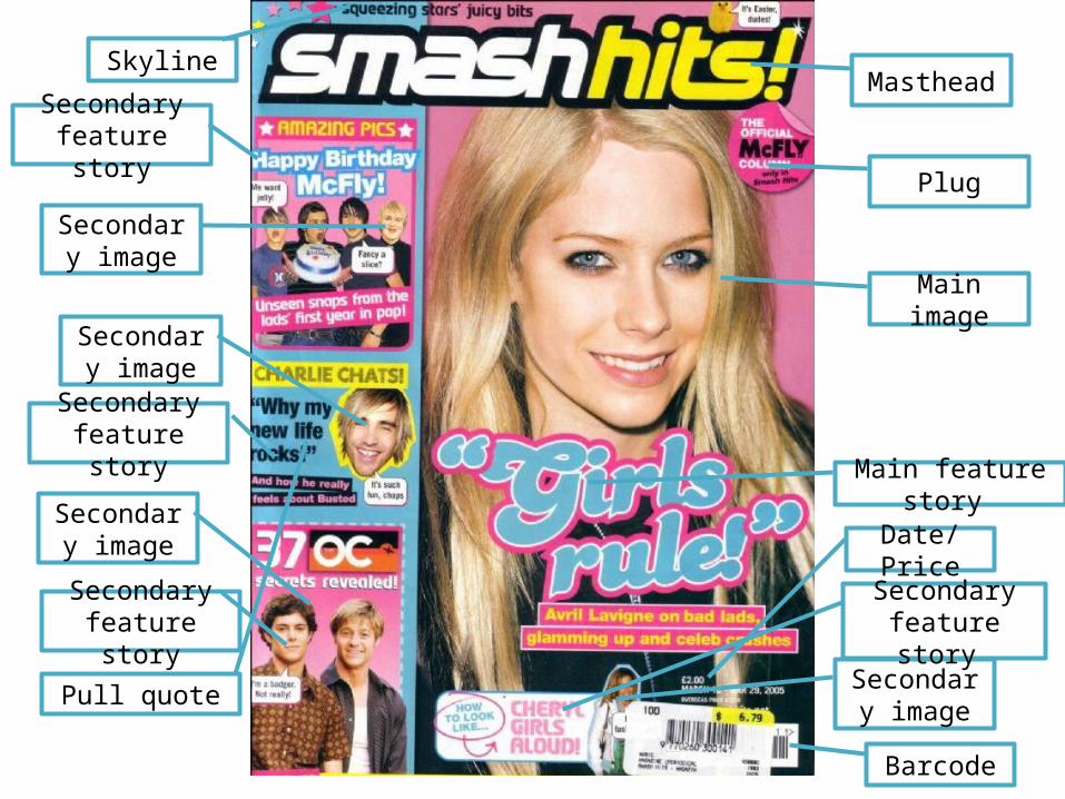
Masthead
Plug
Main image
Main feature story
Secondary image
Secondary feature story
Date/Price
Barcode
Skyline
Secondary feature story
Secondary feature story
Secondary feature story
Secondary image
Secondary image
Secondary image
Pull quote
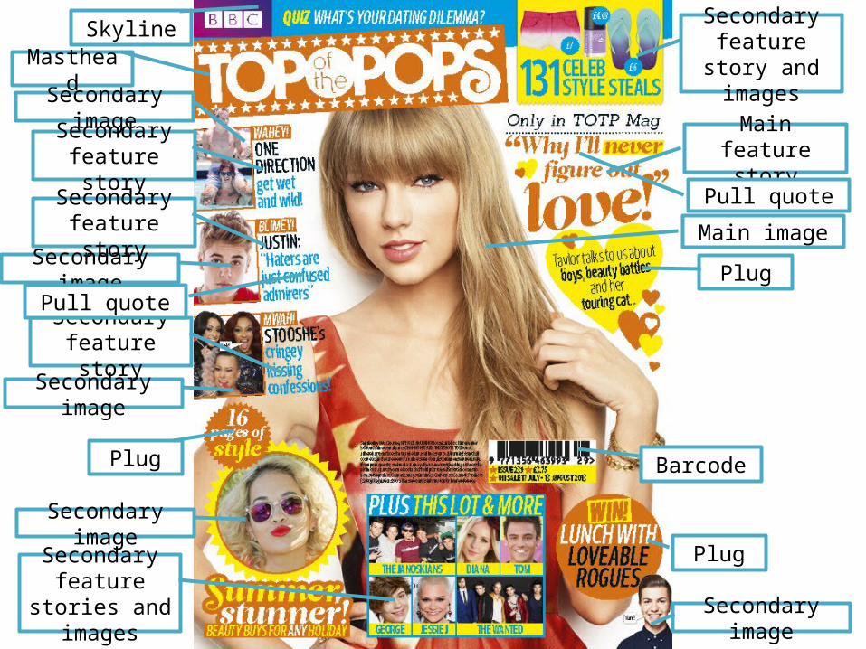
Skyline
Plug
Plug
Plug
Secondary feature story
Secondary image
Secondary feature story
Secondary image
Masthead
Secondary image
Secondary feature story
Secondary image
Secondary feature stories
and images Secondary image
Barcode
Secondary feature story and images
Main feature story
Main image
Pull quote
Pull quote
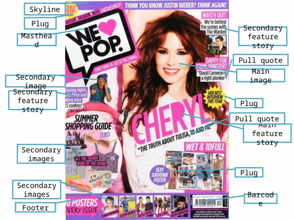
Skyline
Plug
Masthead
Secondary image
Secondary images
Footer
Plug
Plug
Barcode
Secondary images
Secondary feature story
Secondary feature story
Main feature story
Main image
Pull quote
Pull quote
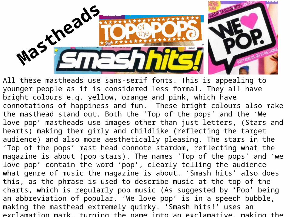
Mastheads
All these mastheads use sans-serif fonts. This is appealing to younger people as it is considered less formal. They all have bright colours e.g. yellow, orange and pink, which have connotations of happiness and fun. These bright colours also make the masthead stand out. Both the ‘Top of the pops’ and the ‘We love pop’ mastheads use images other than just letters, (Stars and hearts) making them girly and childlike (reflecting the target audience) and also more aesthetically pleasing. The stars in the ‘Top of the pops’ mast head connote stardom, reflecting what the magazine is about (pop stars). The names ‘Top of the pops’ and ‘we love pop’ contain the word ‘pop’, clearly telling the audience what genre of music the magazine is about. ‘Smash hits’ also does this, as the phrase is used to describe music at the top of the charts, which is regularly pop music (As suggested by ‘Pop’ being an abbreviation of popular. ‘We love pop’ is in a speech bubble, making the masthead extremely quirky. ‘Smash hits!’ uses an exclamation mark, turning the name into an exclamative, making the masthead seem more exciting to the reader. ‘Smash hits’ is a modern phrase, used by young people, making the masthead relate to the target audience. In the ‘Top of the Pops’ masthead the words ‘Top’ and ‘Pop’ are written larger than ‘of’ and ‘the’. Making them stand out as they are the most important words (the sole purpose of ‘of’ and ‘the’ is to make the name make sense. ‘Top of the Pops’ also rhymes, making the name more catchy.
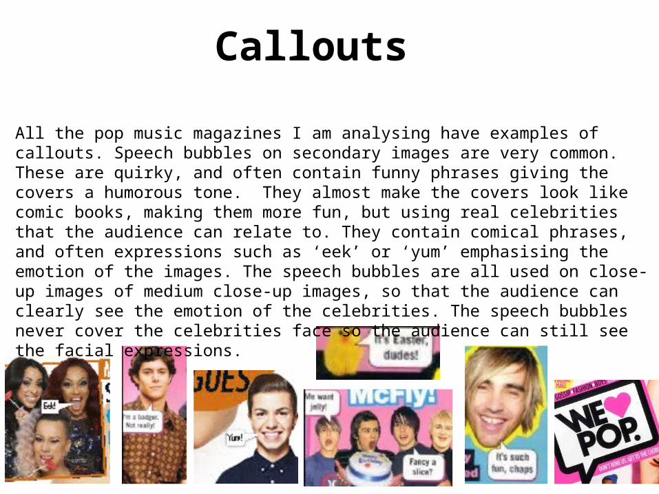
Callouts
All the pop music magazines I am analysing have examples of callouts. Speech bubbles on secondary images are very common. These are quirky, and often contain funny phrases giving the covers a humorous tone. They almost make the covers look like comic books, making them more fun, but using real celebrities that the audience can relate to. They contain comical phrases, and often expressions such as ‘eek’ or ‘yum’ emphasising the emotion of the images. The speech bubbles are all used on close-up images of medium close-up images, so that the audience can clearly see the emotion of the celebrities. The speech bubbles never cover the celebrities face so the audience can still see the facial expressions.
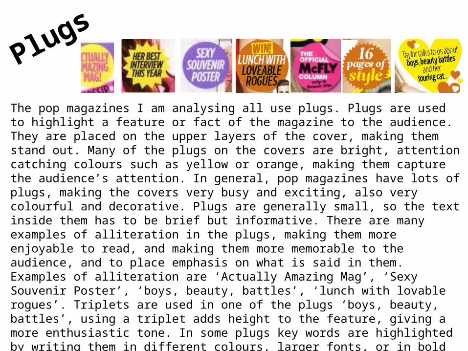
Plugs
The pop magazines I am analysing all use plugs. Plugs are used to highlight a feature or fact of the magazine to the audience. They are placed on the upper layers of the cover, making them stand out. Many of the plugs on the covers are bright, attention catching colours such as yellow or orange, making them capture the audience’s attention. In general, pop magazines have lots of plugs, making the covers very busy and exciting, also very colourful and decorative. Plugs are generally small, so the text inside them has to be brief but informative. There are many examples of alliteration in the plugs, making them more enjoyable to read, and making them more memorable to the audience, and to place emphasis on what is said in them. Examples of alliteration are ‘Actually Amazing Mag’, ‘Sexy Souvenir Poster’, ‘boys, beauty, battles’, ‘lunch with lovable rogues’. Triplets are used in one of the plugs ‘boys, beauty, battles’, using a triplet adds height to the feature, giving a more enthusiastic tone. In some plugs key words are highlighted by writing them in different colours, larger fonts, or in bold writing. The most common shape of plugs is circles, followed by star shapes, there is one example of a heart plug. The McFly plug looks like a sticker, that has been stuck on and is peeling off, giving the cover a casual tone, and targeting the target audience as stickers are popular amongst young people and teenagers.
POP