natalie bennett comm 130 portfolio
TRANSCRIPT
Natalie BennettPortfolio
Natalie BennettEmail: [email protected]: 208.419.2427
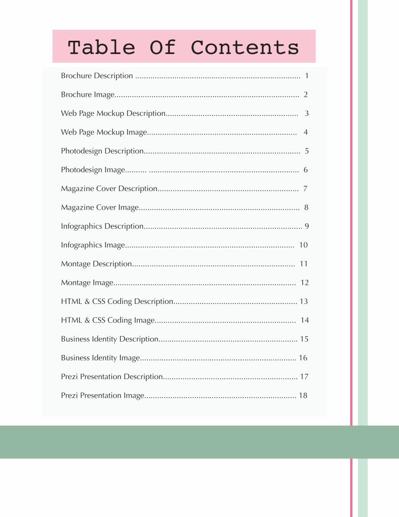
Brochure Description ............................................................................ 1
Brochure Image..................................................................................... 2
Web Page Mockup Description............................................................. 3
Web Page Mockup Image..................................................................... 4 Photodesign Description........................................................................ 5
Photodesign Image.......... ..................................................................... 6
Magazine Cover Description................................................................. 7
Magazine Cover Image.......................................................................... 8
Infographics Description......................................................................... 9
Infographics Image.............................................................................. 10
Montage Description........................................................................... 11
Montage Image.................................................................................... 12
HTML & CSS Coding Description......................................................... 13
HTML & CSS Coding Image................................................................. 14
Business Identity Description................................................................ 15
Business Identity Image........................................................................ 16
Prezi Presentation Description.............................................................. 17
Prezi Presentation Image...................................................................... 18
Table Of Contents
1
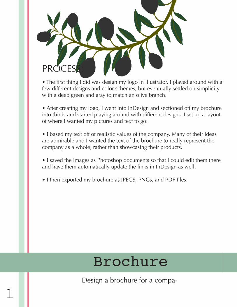
Brochure
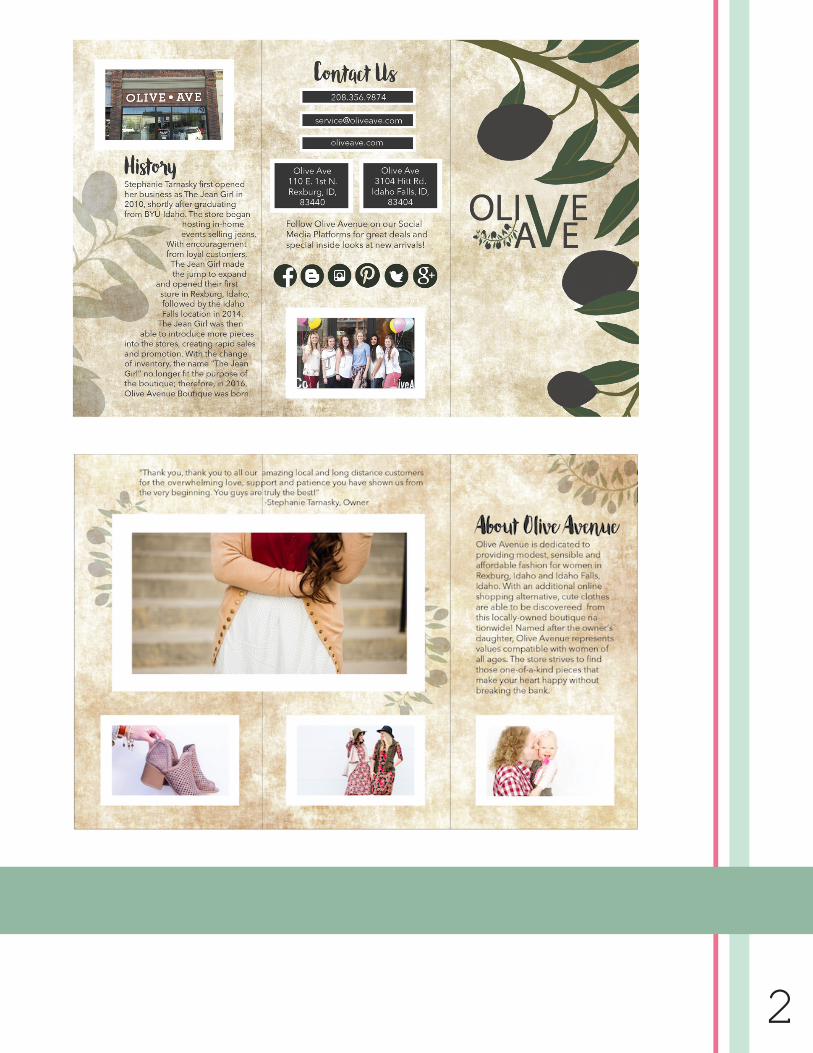
PROCESS:• The first thing I did was design my logo in Illustrator. I played around with a few different designs and color schemes, but eventually settled on simplicity with a deep green and gray to match an olive branch.
• After creating my logo, I went into InDesign and sectioned off my brochure into thirds and started playing around with different designs. I set up a layout of where I wanted my pictures and text to go.
• I based my text off of realistic values of the company. Many of their ideas are admirable and I wanted the text of the brochure to really represent the company as a whole, rather than showcasing their products.
• I saved the images as Photoshop documents so that I could edit them there and have them automatically update the links in InDesign as well.
• I then exported my brochure as JPEGS, PNGs, and PDF files.
Design a brochure for a compa-
2
3
Web Page MockupDesign a website homepage using a grid.
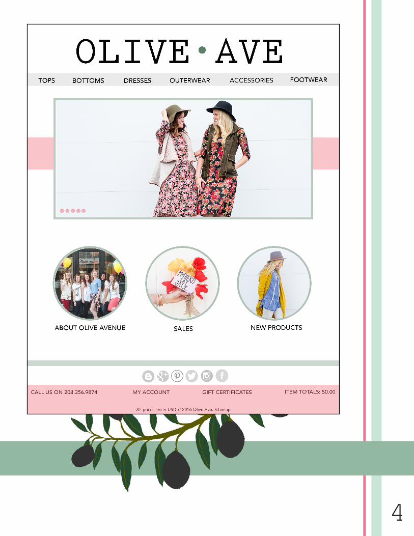
PROCESS:• In my other class, we are working on promoting the company Olive Ave-nue. I thought designing a new, fresh website would be a great addition to the Public Relations aspect of the company, so I ultimately chose to make the focus of my website design all about this local boutique.
• I then started sketching out how I wanted the layout to look. I knew it was important to have a frame that changed images so that the viewer could get a quick look at some of the products in a short amount of time. I also wanted to make navigation simple and efficient.
• After sketching multiple times on paper, I went into Photoshop using the 16-column grid and got to work. The wireframe really simplified things for me.
• After I made the wireframe, I replaced most of my work with actual content and made some adjustments to get a better balance on my image.
• My final design ended being really similar to my shapeup, but a bit dif-ferent than my original sketch. I made the circles larger so that the images would be more clear and I rearranged which order I wanted the content to come in.
4
5
PhotodesignBy using photography skills, create a project that encom-
passes a consistent color scheme from the image.
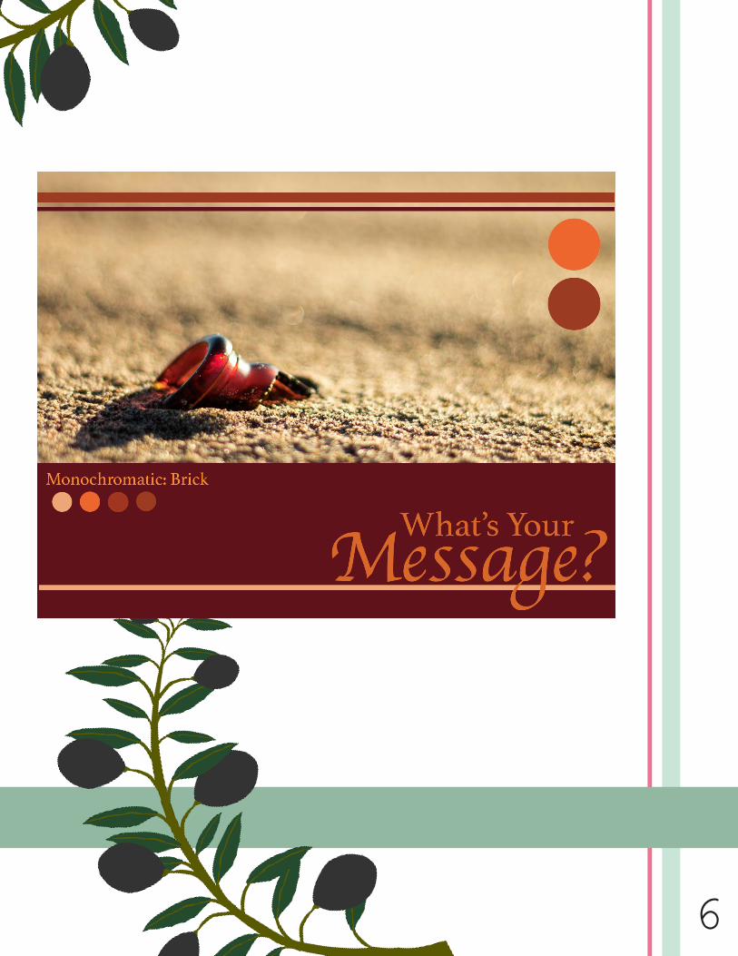
PROCESS:• I first just went out and started shooting. I knew I wanted something with red in it, so my initial goal was to find some really pretty fall leaves to take advantage of. I drove out to Egin and walked out to the lake, which I noticed was cluttered with a glass bottle. Before cleaning it up, I tried to capture a picture of the reddish-brown bottle buried in the sand. With each edit, I cop-ied a layer so that I could go back and make changes if needed.
• I didn’t have to make too many edits, but I adjust some levels to get the tones I wanted. I also lessened the saturation, enhanced the vibrance, adjust-ed some colors and sharpened the focus on the glass bottle.
• I watched some tutorial videos on how to create a design in Photoshop and followed along, starting with creating a new 8.5×11 inch document.
• I pulled my photo onto the new document and started playing around with ideas.
• My first idea was to make the focus of the top 2/3 my actual image, and underneath place a solid rectangle that fit my color scheme. I like the idea of balance within a picture, so I added some circles on the bottom left de-scribing my color scheme. I wanted to add a similar element of design in the top right corner as well, so I added the same size circles and resized them to be larger a little bit later on in the project. It took me a while to find a type-
6
7
Magazine CoverDesign a magazine cover that showcases a self-portrait as
well as articles about yourself.
PROCESS:• I really enjoyed learning about how different magazines looked. It was interesting to see which strategies were the same and which were different within each magazine. I wanted to make my own original magazine cover, but I followed guidelines similar to that in many other magazines.
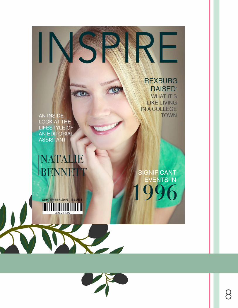
• The topics of the articles I chose to include were ones that I thought best described my hobbies and interests. I was born in the year 1996, which is obviously why I chose to include that year in my article. I’ve recently taken on two new jobs this semester: a Teaching Assistant in the Communication Department, and an Editorial Assistant at the Molecular Evidence Develop-ment Consortium. Many people know what the life of a TA might be like, but not many people know about MED-C as a personalized medicine company or what it takes to be an Editorial Assistant. I also wanted to include my roots, which were here in Rexburg, Idaho.
• The process of creating my magazine cover went as follows: To begin, I sketched out possible ideas of how I wanted my cover to look. I knew that I didn’t want to include too many articles for fear of cluttering the simple de-sign, so I sketched a few different arrangements of four articles. After that, I developed a shape map based on which of the four sketches I liked the most. Thirdly, I found a self-portrait that I wanted to use and inserted it into InDe-sign on an 8.5 x 11 inch page. From there I added my title and four articles that were created with text boxes. After exporting my JPEG in 150 ppi, my project was complete!
8
9
InfographicsCreate an Infographic that organizes data in a visually pleasing
way.
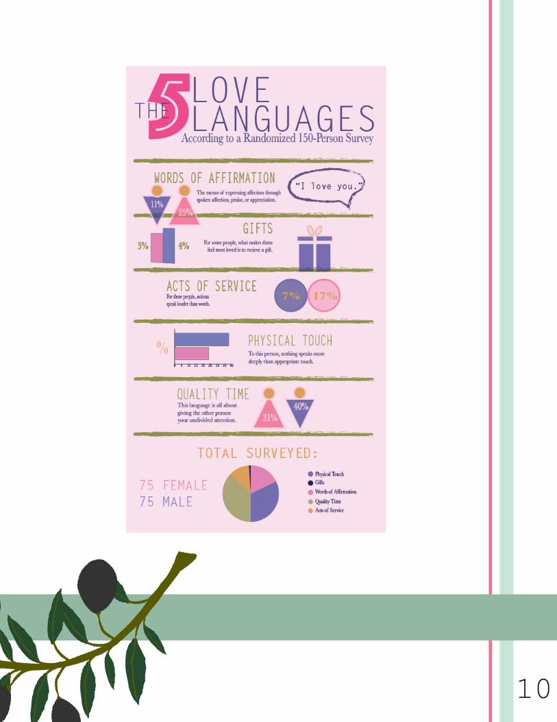
PROCESS:• I went through a couple of different ideas and solidified this one when I discussed topic ideas with my roommates.
• I conducted a survey of 150 people (75 men and 75 women) asking each of them what their top love language was. For those who didn’t know off the top of their head, I provided a link and had each of them take a quiz that pro-vided information about their top love languages.
• I conducted some research on my own and came across a book called “The 5 Love Languages: the Secret to Love that Lasts” written by Gary Chap-man. It was my main source of research and information.
• I then sketched two different layouts of ideas that I liked and worked on putting together a working color scheme.
• I got straight to work in Illustrator to transfer my ideas from paper to the screen.
• All the graphs I made came from the surveys I conducted on my own. I tried to make each graph different for visual appeal.
• For part of my two-hour project I went in and simplified my design. I cleaned up the things that were hard to understand and adjust some of the color scheme so that everything flowed together.
10
11
MontageDesign a spiritual poster montage using the blend of images and
type.
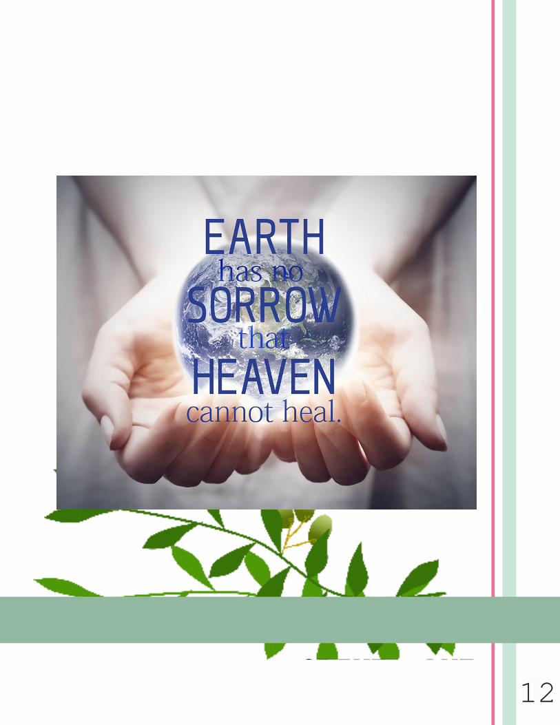
PROCESS:• I struggled trying to come up with a design. I knew I wanted some “glow” fea-tures in my image, so at first I decided to use a light bulb and find a quote to ac-company that design, but eventually I came across this quote and formed this idea instead.
• In Photoshop, I combined the picture of the cupped hands and a lifelike picture of the earth. Luckily the photo of the hands already had light emitting from the palms, so I didn’t have to edit too much. I used a variety of layer masks to put the earth inside the hands and get the glow I wanted. The idea behind this was for it to represent the healing power of Heaven. I used the lasso tool to get the earth proba-bly shaped and softened the edges to make it look more natural. I played around a lot with the saturation in the photo and decided that I wanted a soft, subtle background with similar text coloring.
• Selecting a typeface was difficult. I wanted it to be clean and professional with-out it looking too bland.
• I liked the center alignment principle so I made sure my text represented that well.
• For part of my two-hour project, I went in and tried to adjust the coloring of the font so that it would stand out a bit more. I also tried to lighten around the earth a bit more.
OLIVE AVE212
OLIVE AVE113
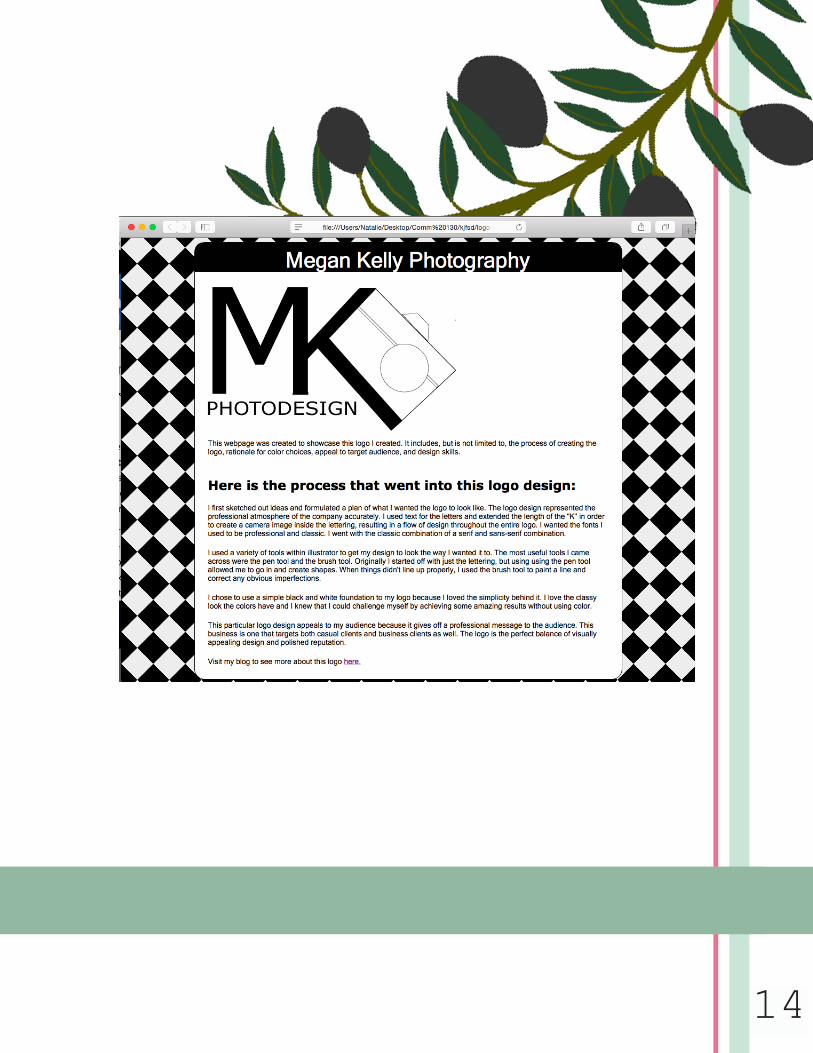
HTML & CSS CodingCode a custom webpage with HTML and CSS.
PROCESS:• For this project, I used the logo I created for my sister Megan’s photography business, which I created in Illustrator.
• I resized my logo to be no longer than 500 px length-wise.
• I created my HTML file and started adding content and tags, making sure to cover each detail thoroughly.
• My CSS file was linked to the HTML code. I liked the simplicity of the black and white pattern, but wanted to give it an extra flare. I looked into background patterns I could use and decided to go with the checkerboard style.
• I changed the fonts to be the same ones I had used in the original logo.
• I then validated both my HTML and CSS pages, which took some time as I corrected each mistake and made sure it was completely valid.
214
OLIVE AVE115
Business IdentityCode a custom webpage with HTML and CSS.
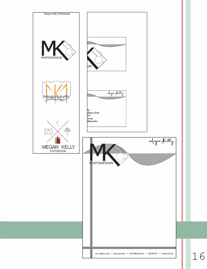
PROCESS:• I first sketched out ideas of what I wanted the logo to look like on paper. I had a lot of cool ideas that I really liked, but I was able to narrow it dow to my top three choices.
• After sketching, I opened up Illustrator and starting building the logos. Two of them had color, and one was done using blacks and whites. One was more of a type logo, one was a symbol logo, and the last one was an illustra-tion logo.
• I got lots of different opinions about which logo to use for my letterhead and business cards. The top two were the ones that were the most popular, but the black and white logo was the favorite. It was my favorite as well, and I think it represented the professional atmosphere of the company as well.
• I then got to work created my letterhead and business card.
• I tried to follow the rule of alignment and repetition throughout my cre-ation.
OLIVE AVE216
17
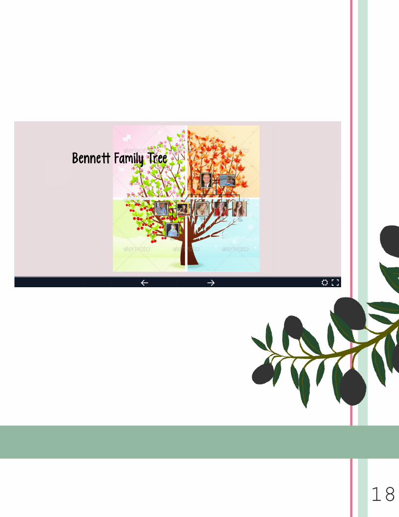
Prezi PresentationCreate an instructional presentation using the Prezie software
to demonstrate it’s feature and capabilities.
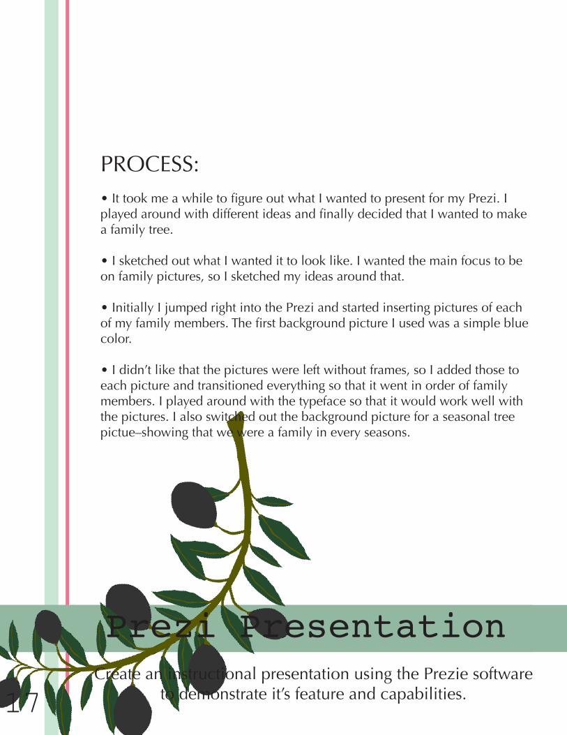
PROCESS:• It took me a while to figure out what I wanted to present for my Prezi. I played around with different ideas and finally decided that I wanted to make a family tree.
• I sketched out what I wanted it to look like. I wanted the main focus to be on family pictures, so I sketched my ideas around that.
• Initially I jumped right into the Prezi and started inserting pictures of each of my family members. The first background picture I used was a simple blue color.
• I didn’t like that the pictures were left without frames, so I added those to each picture and transitioned everything so that it went in order of family members. I played around with the typeface so that it would work well with the pictures. I also switched out the background picture for a seasonal tree pictue–showing that we were a family in every seasons.
18
