my ux portfolio
TRANSCRIPT
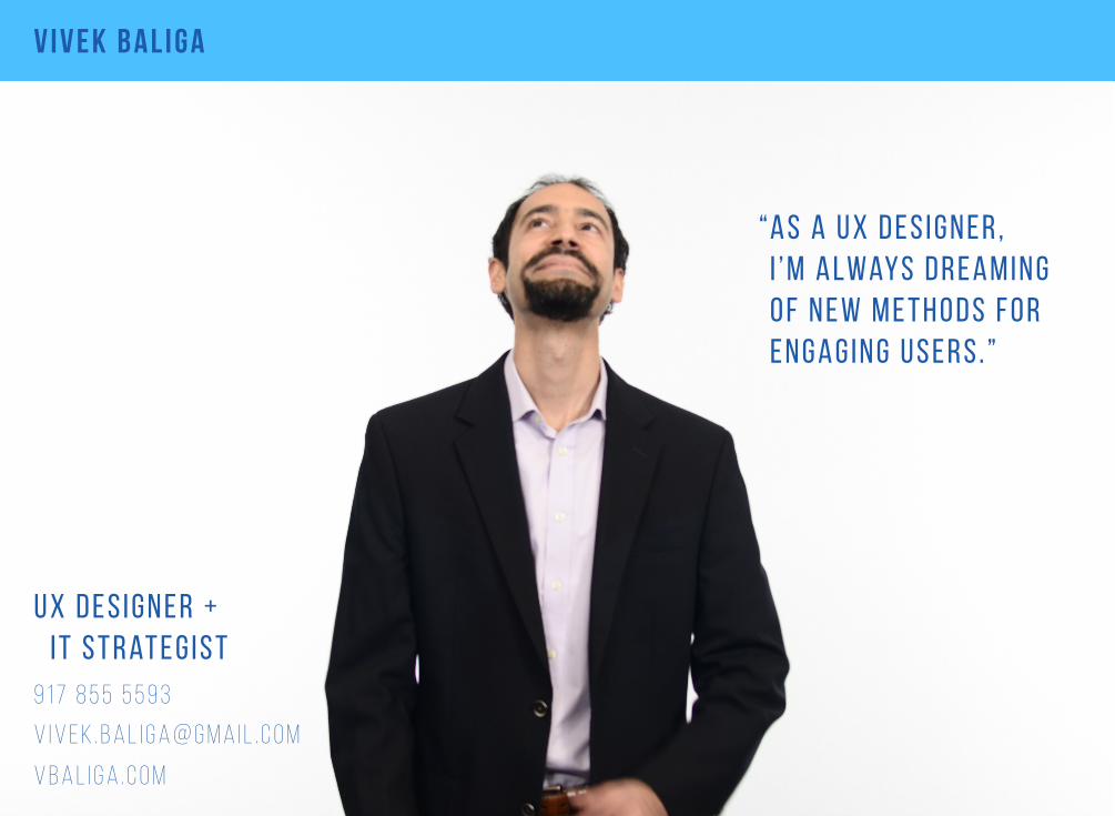
v i v e k b a l i g a
v i v e k . b a l i g a @ g m a i l . c o m
9 1 7 8 5 5 5 5 9 3
u x d e s i g n e r + i t s t r at e g i s t
v b a l i g a . c o m
a s a u x d e s i g n e r ,I ’ m a lway s d r e a m i n g o f n e w m e t h o d s f o r e n g a g i n g u s e r s . ”
“

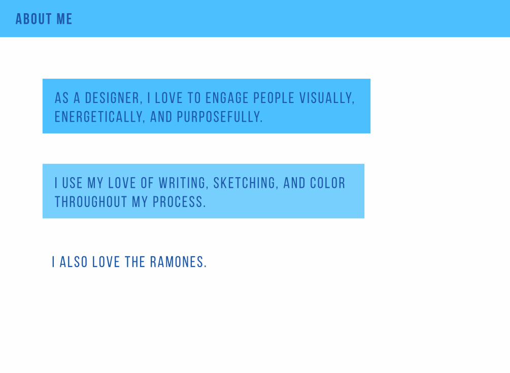
a b o u t m e
a s a 1 0 -y e a r f i n a n c i a l i n d u s t ry v e t e r a n , i ’ v e w o r k e d at b i g b a n k s , h e d g e f u n d s , a n d c o n s u lt e d w i t h m a n y m o r e .
I a l s o o n c e m e t i z z y e n g l a n d e r w h i l e d r e s s e d u p a s e lv i s .
d u r i n g t h at e n t i r e s pa n a s a d e v e l o p e r , i l e a r n e d h o w t o w o r k w e l l w i t h t h e t e c h s i d e a n d t h e b u s i n e s s s i d e .
a b o u t m e
a s a d e s i g n e r , I l o v e t o e n g a g e p e o p l e v i s u a l ly, e n e r g e t i c a l ly, a n d p u r p o s e f u l ly.
I a l s o l o v e t h e r a m o n e s .
I u s e m y l o v e o f w r i t i n g, s k e t c h i n g, a n d c o l o r t h r o u g h o u t m y p r o c e s s .

u x p r o c e s s
t h i s i s w h e r e m y u x p r o c e s s b e g i n s .
t h e i n t e r m e d i a ry s t e p s c a n b e r e p e at e d o n a n a s - n e e d e d b a s i s .
t h i s i s t h e f i n a l d e s i g n b a s e d o n t h e c l i e n t c o n s i d e r at i o n s , i n c l u d i n g t i m e , r e s o u r c e s , a n d b u s i n e s s n e e d s .
I d e at i o n
R e s e a r c h
A n a ly s i s
D e s i g n
P r o t o t y p i n g
T e s t i n g
I t e r at i o n
r e s o l u t i o n
D i s c o v e ry
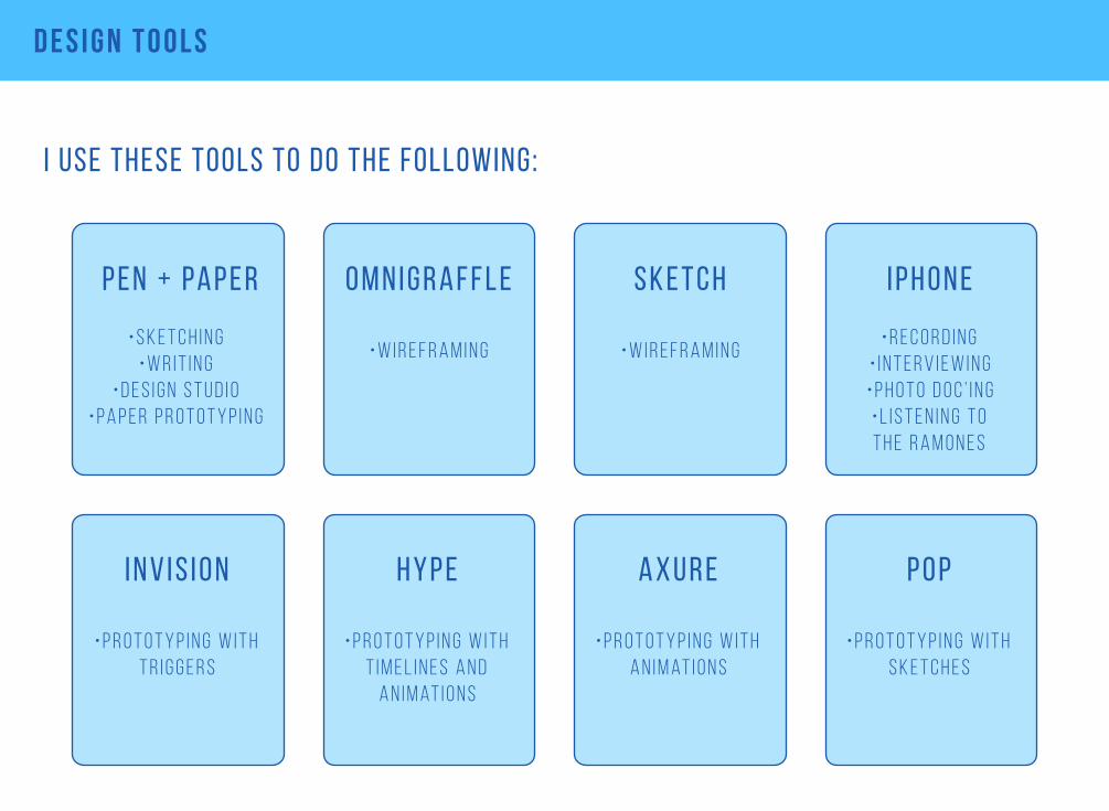
d e s i g n T o o l s
I use these tools to do the following:
i p h o n e
• r e c o r d i n g • i n t e r v i e w i n g• p h o t o d o c ’ i n g• l i s t e n i n g t o t h e r a m o n e s
h y p e
• p r o t o t y p i n g w i t h t i m e l i n e s a n d
a n i m at i o n s
a x u r e
• p r o t o t y p i n g w i t h a n i m at i o n s
p e n + pa p e r
• s k e t c h i n g• w r i t i n g
• d e s i g n s t u d i o• p a p e r p r o t o t y p i n g
o m n i g r a f f l e
• w i r e f r a m i n g
s k e t c h
• w i r e f r a m i n g
p o p
• p r o t o t y p i n g w i t h s k e t c h e s
i n v i s i o n
• p r o t o t y p i n g w i t h t r i g g e r s
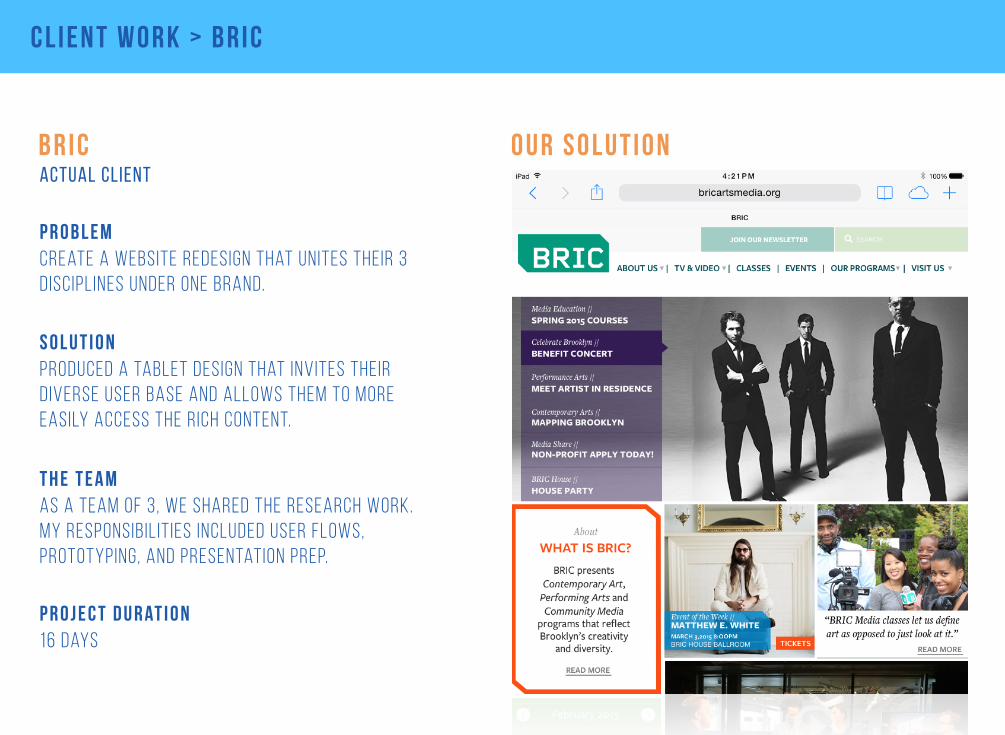
c l i e n t w o r k > b r i c
o u r s o l u t i o nb r i c
create a website redesign that unites their 3 disciplines under one brand.
p r o b l e m
produced a tablet design that invites their diverse user base and allows them to more easily access the rich content.
s o l u t i o n
as a team of 3, we shared the research work. my responsibil it ies included user flows, prototyping, and presentation prep.
t h e t e a m
actual client
16 daysp r o j e c t d u r at i o n
RESEARCH
SURVEY
COMPETITIVE &COMPARATIVE ANALYSIS
BRIC WEBANALYSIS
USERINTERVIEWS
STAKEHOLDERSINTERVIEWS
TECHNICALRESEARCH
PERSONAS
USERFLOWS
PROTOTYPE
USER TESTING
ITERATIONS
WIREFRAMES
SITE MAP
MINIMUMVIABLEPRODUCT
FEATURE PRIORITIZATION
DESIGN VALIDATE FINALDESIGN
OUR PROCESS
c l i e n t w o r k > b r i c
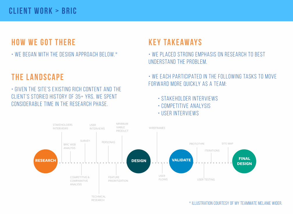
h o w w e g o t t h e r e• we began with the design approach below.*
k e y ta k e away s• we placed strong emphasis on research to best understand the problem.
• we each participated in the following tasks to move forward more quickly as a team:
• stakeholder interviews • competitive analysis • user interviews
t h e l a n d s c a p e• given the site’s existing rich content and the client’s storied history of 35+ yrs, we spent considerable time in the research phase.
* illustration courtesy of my teammate melanie wider.
c l i e n t w o r k > b r i c
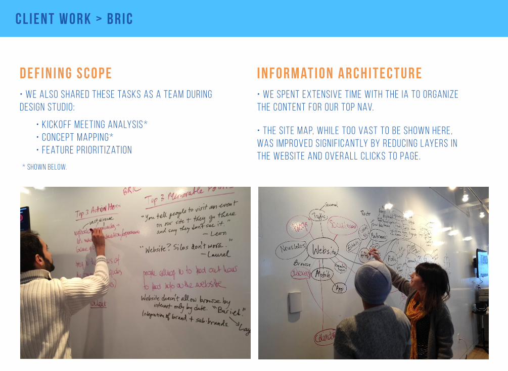
d e f i n i n g s c o p e• we also shared these tasks as a team during design studio:
* shown below.
• kickoff meeting analysis* • concept mapping* • feature prioritization
i n f o r m at i o n a r c h i t e c t u r e• we spent extensive time with the ia to organize the content for our top nav.
• the site map, while too vast to be shown here, was improved signif icantly by reducing layers in the website and overall clicks to page.
c l i e n t w o r k > b r i c
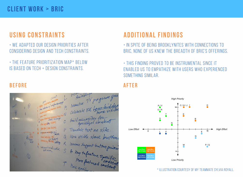
u s i n g c o n s t r a i n t s• we adapted our design priorities after considering design and tech constraints.
0 10
10
0
A / U C / H / J D
EF
G
I
K
L
M
N
O / R
P / Q
S
T
High Priority
Low Effort High Effort
Low Priority
B
Low EffortHigh Priority
High EffortHigh Priority
Low EffortHigh Priority
High EffortLow Priority
More Visible Social Media Integration A Visual Calendar Accessible from HomepageB Highlight Education and ClassesCBetter Search FunctionalityDCentralized Ticket Purchasing ✻EImprove Ticket Purchasing Call to Action FBetter Suggestions Feature / “You Might Also Like" ✻G
Better Categorization and Filter for Events and ClassesHMore Flexible Visual TemplateIEasier/Simplified NavigationJInteractivity for Desktop and TabletK
Website Log-In Available for Members ✻M Dynamic Media / TV Program Guide That Links to Videos ✻N
L Sub-Brand Social Media Distinction
Make Celebrate Brooklyn More VisibleOBuild Microsites for Specialized Content ✻POption to Translate Site Content ✻QMore prominent Share ButtonsRHighlight Call to Action for SupportSMore Easily accessible Pre-recorded Content ✻TClearer Newsletter Signup Call to ActionU
✻ Additional technical research needed
b e f o r e a f t e r
• the feature prioritization map* below is based on tech + design constraints.
a d d i t i o n a l f i n d i n g s• in spite of being brooklynites with connections to bric, none of us knew the breadth of bric’s offerings.
• this f inding proved to be instrumental since it enabled us to empathize with users who experienced something similar.
* illustration courtesy of my teammate sylvia royall.
c l i e n t w o r k > b r i c
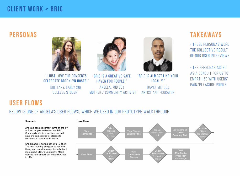
p e r s o n a s
u s e r f l o w sbelow is one of angela’s user flows, which we used in our prototype walkthrough.
angela, m id 30smother / community act iv ist
“Bric is a creative safe haven for people .”
“ I just love the concerts celebrate brooklyn hosts.”
br ittany, early 20scollege student
david, m id 50sartist and educator
“bric is almost l ike your local y.”
• these personas were the collective result of our user interviews.
• the personas acted as a conduit for us to empathize with users’ pain/pleasure po ints.
ta k e away s
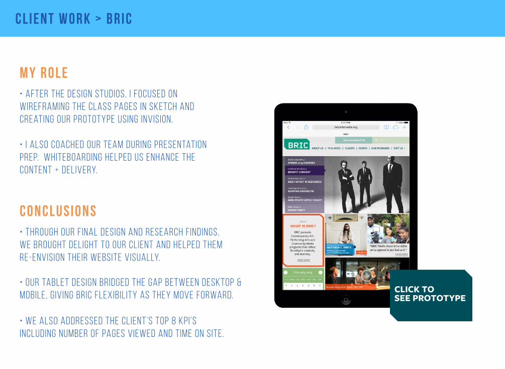
CLICK TOSEE PROTOTYPE
c l i e n t w o r k > b r i c
m y r o l e• after the design studios, i focused on wireframing the class pages in sketch and creating our prototype using invision.
• i also coached our team during presentation prep. whiteboarding helped us enhance the content + delivery.
c o n c l u s i o n s• through our final design and research findings, we brought delight to our client and helped them re-envision their website visually.
• we also addressed the client’s top 8 kpi ’s including number of pages viewed and time on site.
• our tablet design bridged the gap between desktop & mobile, g iving bric flexibil ity as they move forward.
p r o j e c t w o r k > a u d i
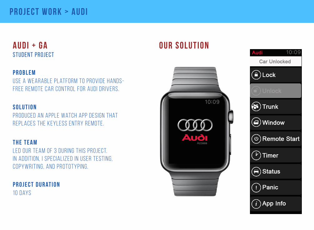
o u r s o l u t i o nA u d i + G A
produced an apple watch app design that replaces the keyless entry remote.
s o l u t i o n
led our team of 3 during this project. in addition, i specialized in user testing, copywriting, and prototyping.
t h e t e a m
student project
10 daysp r o j e c t d u r at i o n
use a wearable platform to provide hands-free remote car control for audi drivers.
p r o b l e m
p r o j e c t w o r k > a u d i
t h e b r a n d• in selecting a wearable platform, we wanted to pair the audi brand with an appropriate tech brand.
• we chose apple for its high-end products + visual appeal, as a natural match for the audi luxury brand.
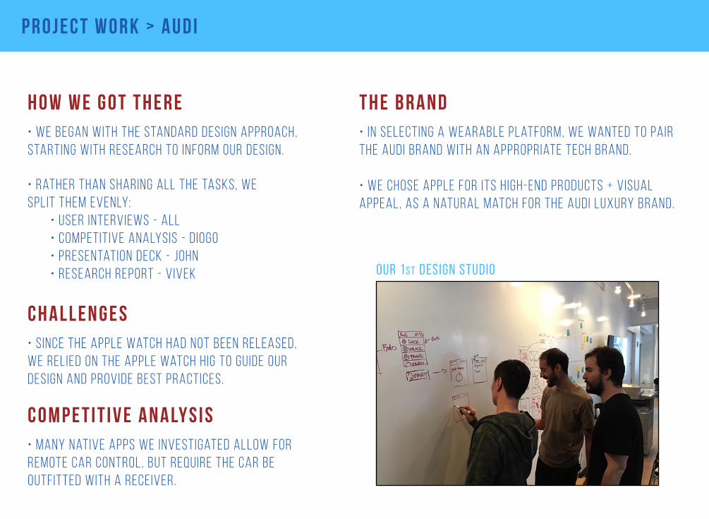
our 1s t design studio
h o w w e g o t t h e r e• we began with the standard design approach, starting with research to inform our design.
c h a l l e n g e s• s ince the apple watch had not been released, we relied on the apple watch hig to guide our design and provide best practices.
c o m p e t i t i v e a n a ly s i s
• rather than sharing all the tasks, we split them evenly: • user interviews - all • competitive analysis - diogo • presentation deck - john • research report - vivek
• many native apps we investigated allow for remote car control, but require the car be outfitted with a receiver.
p r o j e c t w o r k > a u d i
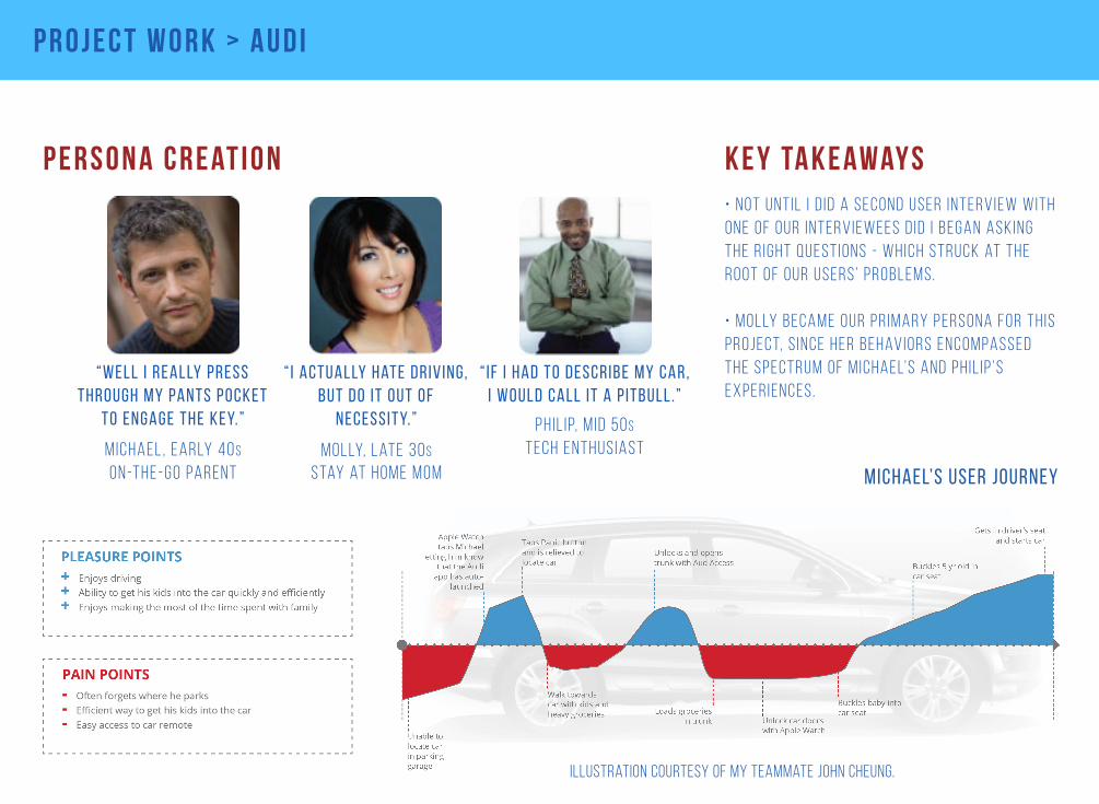
p e r s o n a c r e at i o n• n o t u n t i l i d i d a s e c o n d u s e r i n t e rv i e w w i t h o n e o f o u r i n t e rv i e w e e s d i d i b e ga n a s k i n g t h e r i g h t q u e s t i o n s - w h i c h s t r u c k at t h e r o o t o f o u r u s e r s’ p r o b l e m s.
• m o l ly b e c a m e o u r p r i m a ry p e r s o n a f o r t h i s p r o j e c t, s i n c e h e r b e h av i o r s e n c o m pa s s e d t h e s p e c t r u m o f m i c h a e l’s a n d p h i l i p ’s e x p e r i e n c e s.
k e y ta k e away s
Michael’s user journey
illustration courtesy of my teammate john cheung.
“ i actually hate driv ing, but do it out of
necessity.”
molly, late 30sstay at home mom
phil ip, m id 50stech enthus iast
“ if i had to describe my car,i would call it a p itbull .”
michael , early 40son-the-go parent
“well i really press through my pants pocket
to engage the key.”

p r o j e c t w o r k > a u d i
d e s i g n s t u d i o k e y ta k e away s• t o m a n ag e t h e a p p l e wat c h s i z e c o n s t r a i n t s, w e p r i n t e d s h e e t s o f l i f e - s i z e wat c h fac e s f o r s k e t c h i n g.
• s k e t c h i n g i n d e s i g n s t u d i o l e d u s t o pa p e r p r o t o t y p i n g a n d t h e f i r s t s e t o f h i - f i w i r e f r a m e s.
• t h e s e w e r e t h e b a s i s f o r o u r s k e t c h e d w i r e f r a m e s.
• w e t r i e d a va r i e t y o f i c o n a n d b u t t o n pat t e r n s t o c l e a r ly c o m m u n i c at e t o u s e r s.
p r o j e c t w o r k > a u d i
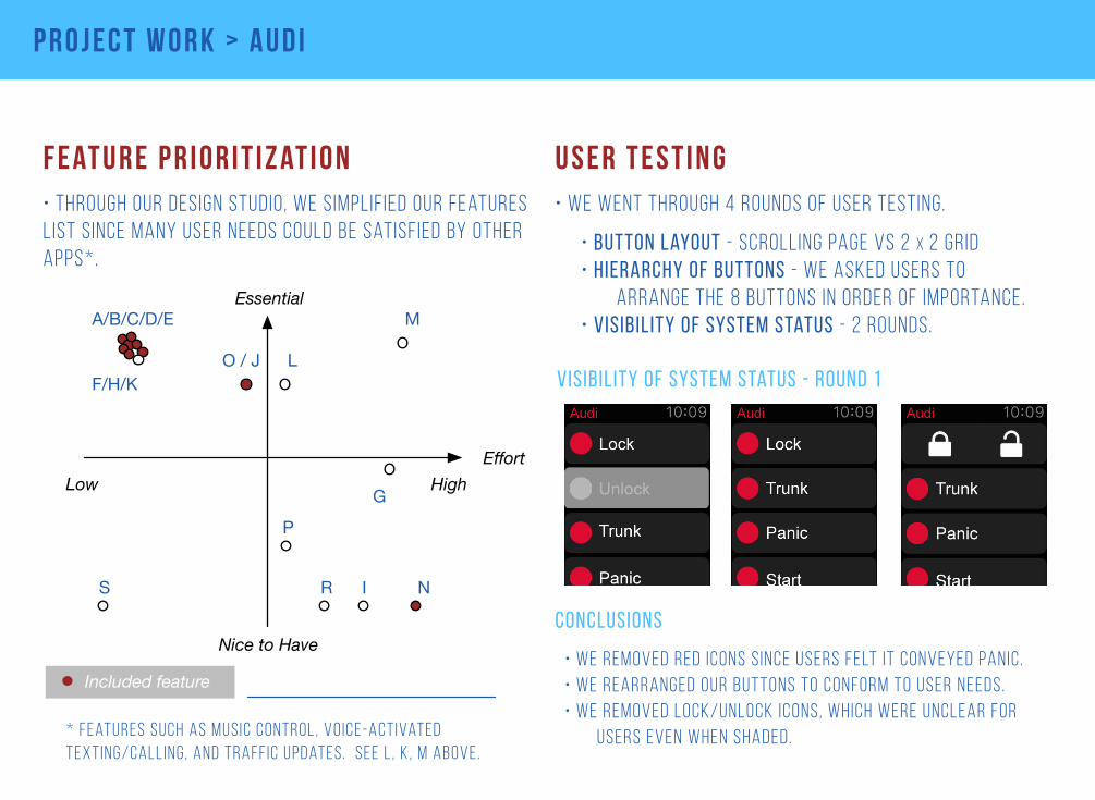
f e at u r e p r i o r i t i z at i o n u s e r t e s t i n g• we went through 4 rounds of user testing.
• button layout - scrolling page vs 2 x 2 grid• hierarchy of buttons - we asked users to arrange the 8 buttons in order of importance.• visibility of system status - 2 rounds.
visibility of system status - round 1
conclusionsNice to Have
EffortHighLow
Essential
O / J L
MA/B/C/D/E
F/H/K
G
R I NS
P
• through our design studio, we simplif ied our features list since many user needs could be satisfied by other apps*.
* features such as mus ic control , vo ice-act ivated text ing/call ing, and traff ic updates. see l , k , m above .
Included feature• we removed red icons s ince users felt it conveyed panic.• we rearranged our buttons to conform to user needs.• we removed lock/unlock icons, which were unclear for users even when shaded.
p r o j e c t w o r k > a u d i
m y r o l e• i b e g a n p r o t o t y p i n g o u r s k e t c h e d w i r e f r a m e s i n h y p e . I t h e n m a d e o u r h i - f i p r o t o t y p e i n h y p e , b y a d d i n g t i m e l i n e s a n d t r i g g e r s .
• M y r e s p o n s i b i l i t i e s a l s o i n c l u d e d w r i t i n g t h e m a j o r i t y o f o u r r e s e a r c h r e p o r t, w h o s e c o n t e n t j o h n u s e d t o c r a f t i n t o o u r p r e s e n tat i o n d e c k .
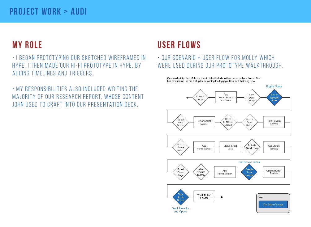
u s e r f l o w s• o u r s c e n a r i o + u s e r f l o w f o r m o l ly w h i c h w e r e u s e d d u r i n g o u r p r o t o t y p e w a l k t h r o u g h .
p r o j e c t w o r k > a u d i
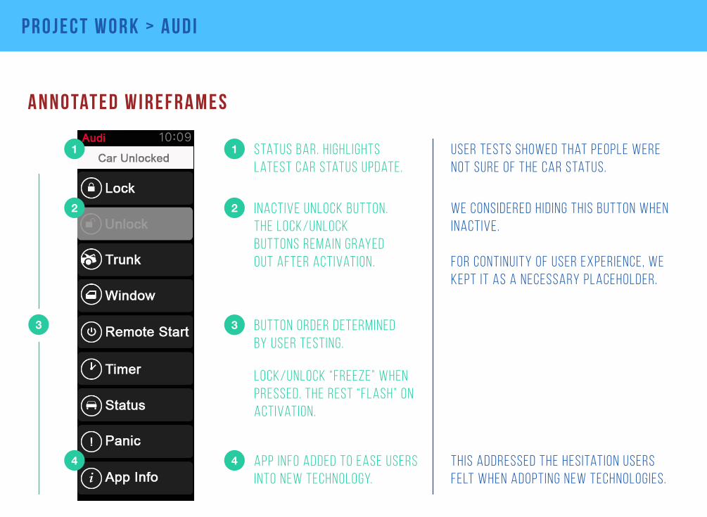
a n n o tat e d w i r e f r a m e s
user tests showed that people were not sure of the car status.
we considered hiding this button when inactive.
for continuity of user experience, we kept it as a necessary placeholder.
this addressed the hesitation users felt when adopting new technologies.
1
2
3
4
1 status bar. highlights latest car status update.
2 inactive unlock button. the lock/unlock buttons remain grayed out after activation.
4 app info added to ease users into new technology.
3 button order determined by user testing.
lock/unlock “freeze” when pressed. the rest “flash” on activation.
p r o j e c t w o r k > a u d i
n e x t s t e p s• for our design to be fully effective, it would require leveraging the voice recognition feature**.
• in addition, we would want to design customizable button layouts to tailor to the large range of our users’ needs.
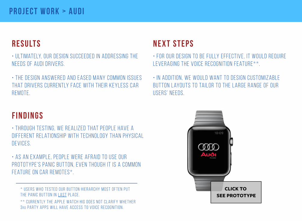
CLICK TO SEE PROTOTYPE
r e s u lt s• ultimately, our design succeeded in addressing the needs of audi drivers.
* * c u r r e n t ly t h e a p p l e wat c h h i g d o e s n o t c l a r i f y w h e t h e r 3rd pa r t y a p p s w i l l h av e a c c e s s t o v o i c e r e c o g n i t i o n .
• the design answered and eased many common issues that drivers currently face with their keyless car remote.
• through testing, we realized that people have a different relationship with technology than physical devices.
• as an example, people were afraid to use our prototype’s panic button, even though it is a common feature on car remotes*.
f i n d i n g s
* u s e r s w h o t e s t e d o u r b u t t o n h i e r a r c h y m o s t o f t e n p u t t h e pa n i c b u t t o n i n l a s t p l a c e .

f i n a l t h o u g h t s
“ S o w h at e l s e d o yo u b r i n g t o t h e ta b l e ? ”
A l s o , i m a k e a m e a n p a n e e r b h u r j i c u r r y. *
through frequent interaction with business teams, i have developed an understanding of how to work well with tech and business stakeholders.
from my years in tech and finance, I bring strong analytical skills and an abil ity to decipher problems.
a s t r o n g t e c h n i c a l b a c k g r o u n d
* fact. you can ask me for the recipe.
t h e a b i l i t y t o w o r k w i t h b u s i n e s s s ta k e h o l d e r s
this is one of those intangibles which i exhibit naturally that makes working together easier.
a p r e t t y p o s i t i v e at t i t u d e

t h a n k yo u
t h a n k yo u f o r l o o k i n g t h r o u g h m y p o r t f o l i o .
p l e a s e r e a c h o u t f o r a n y o f yo u r d e s i g n n e e d s .
v i v e k . b a l i g a @ g m a i l . c o m
9 1 7 8 5 5 5 5 9 3
u x d e s i g n e r + i t s t r at e g i s t
v b a l i g a . c o m