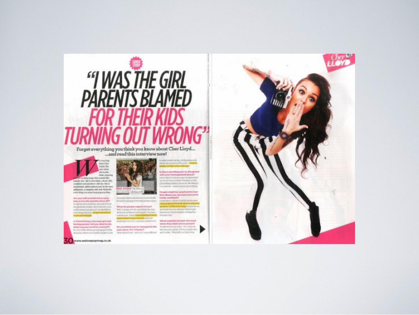
music mag q mag
TRANSCRIPT
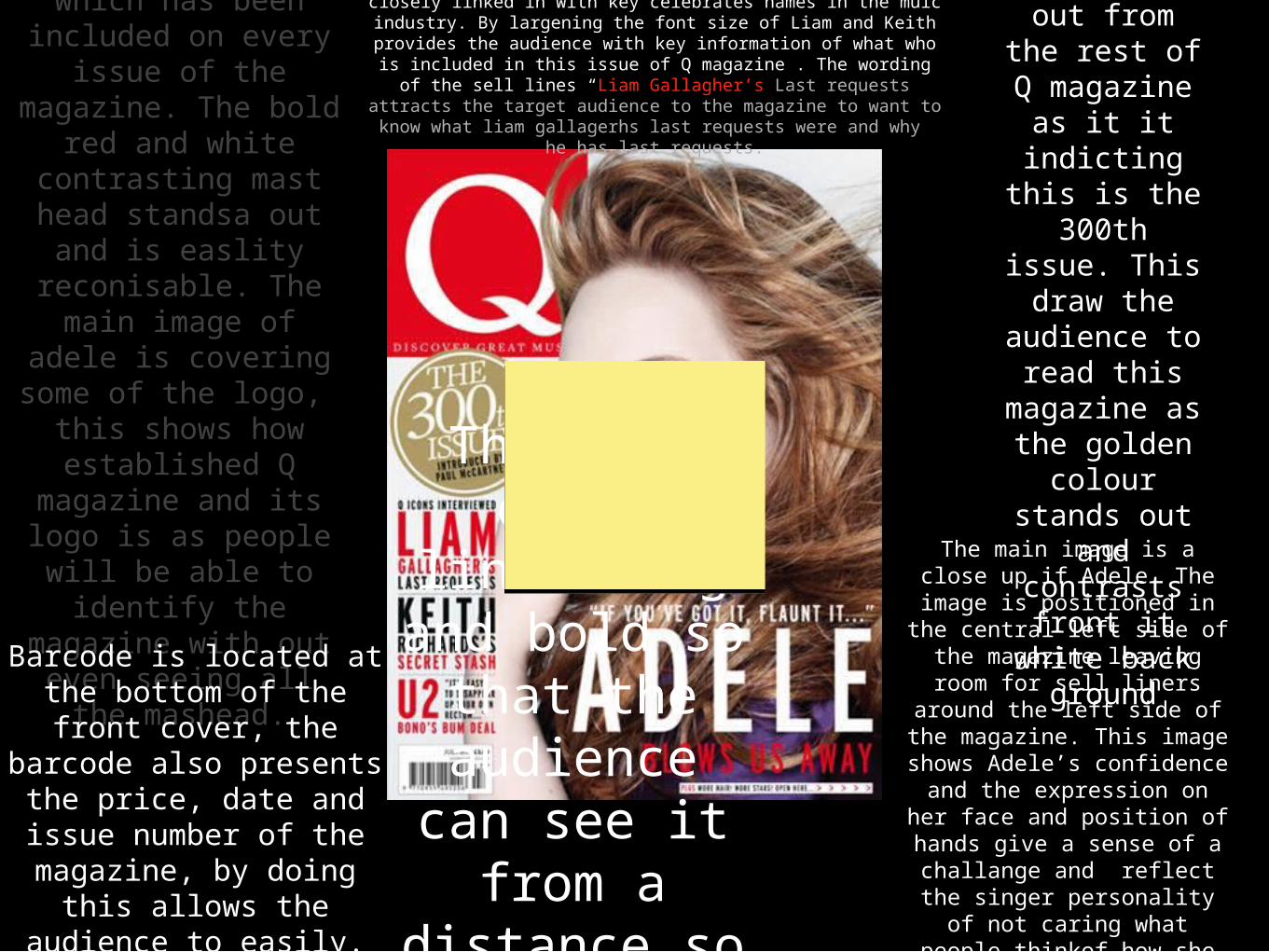
The Q logo is A trademark logo which has been
included on every issue of the
magazine. The bold red and white
contrasting mast head standsa out
and is easlity reconisable. The
main image of adele is covering some of the logo, this shows how established Q magazine and its
logo is as people will be able to identify the magazine with out even seeing all
the mashead.
The use of the plug
makes this issue stand out from the
rest of Q magazine as it it indicting
this is the 300th issue.
This draw the audience to
read this magazine as the golden
colour stands out and
contrasts front it white back ground
Barcode is located at the bottom of the front cover, the barcode also presents the price, date and issue number of the magazine, by doing this allows the
audience to easily.
The use of sell lines on the front page have been closely linked in with key celebrates names in the muic industry. By largening the
font size of Liam and Keith provides the audience with key information of what who is included in this issue of Q magazine .
The wording of the sell lines “Liam Gallagher’s Last requests attracts the target audience to the magazine to want to know what liam gallagerhs last requests were and why he has last
requests.
The main image is a close up if Adele. The image is
positioned in the central left side of the magazine
leaving room for sell liners around the left side of the
magazine. This image shows Adele’s confidence and the expression on her face and
position of hands give a sense of a challange and
reflect the singer personality of not caring what people thinkof how
she looks
The main cover lineis big and bold so that the
audience can see it from a distance so it
can distinguish itself form
other magazines.
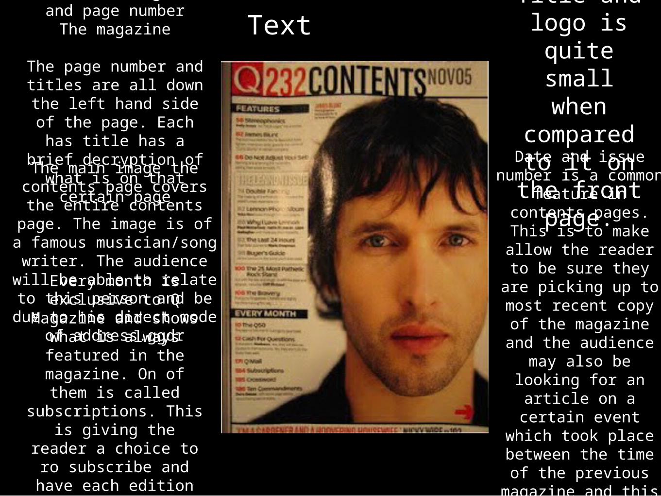
Contents of magazine and page number
The magazine
The page number and titles are all down the left hand side of the
page. Each has title has a brief decryption of
what is on that certain page
The main image the contents page covers the entire contents page. The
image is of a famous musician/song writer. The audience will be able to relate to this person and be due to his direct mode
of address.ggdr
Title and logo is
quite small when
compared to it on the front page.Date and issue
number is a common feature in contents
pages. This is to make allow the
reader to be sure they are picking up to most recent copy of
the magazine and the audience may also be looking for an article on a certain event which took place
between the time of the previous
magazine and this one.
Every month is exclusive to Q
Magazine and shows what is always featured in the
magazine. On of them is called subscriptions.
This is giving the reader a choice to ro subscribe and have
each edition of q magazine to be sent to
Text
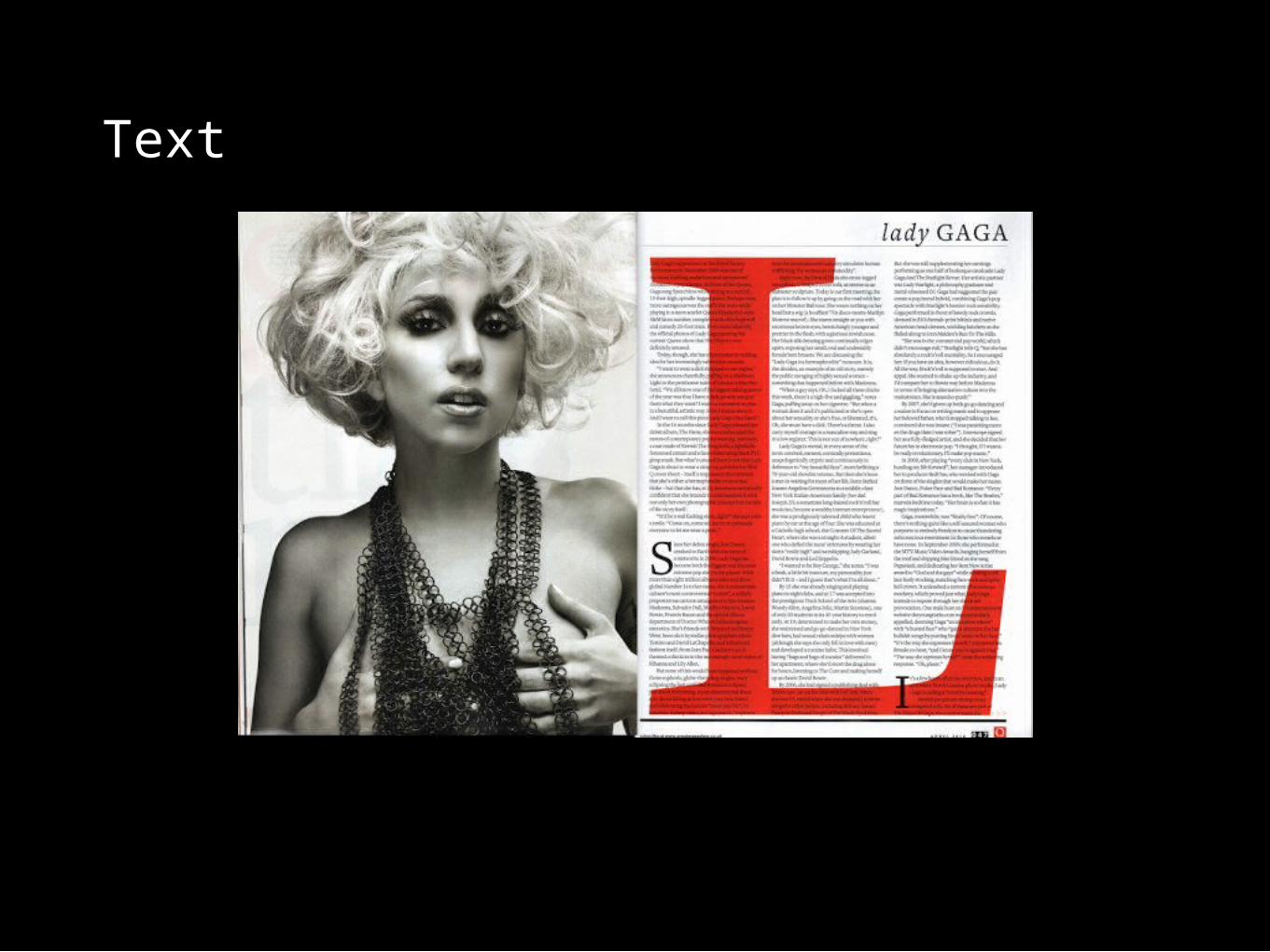
Text
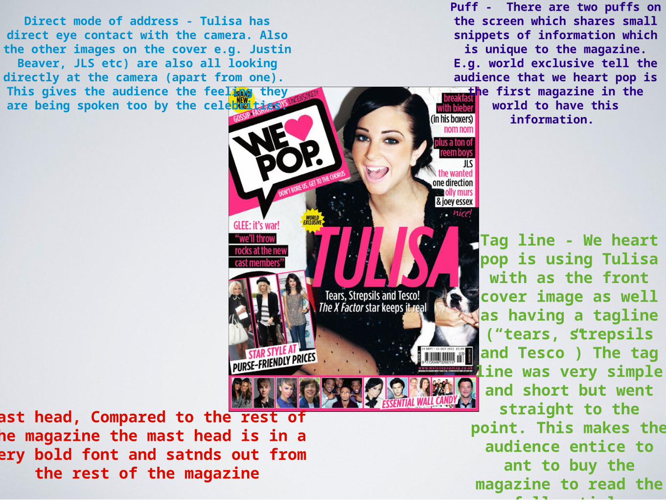
Mast head, Compared to the rest of the magazine the mast head is in a very bold font and satnds out from
the rest of the magazine
Direct mode of address - Tulisa has direct eye contact with the camera. Also the other images on the cover e.g. Justin Beaver, JLS
etc) are also all looking directly at the camera (apart from one). This gives the
audience the feeling they are being spoken too by the celebrities.
Tag line - We heart pop is using Tulisa
with as the front cover image as well as having a tagline
(“tears, strepsils and Tesco”) The tag line was very simple and
short but went straight to the point.
This makes the audience entice to ant to buy the magazine
to read the full article
Puff - There are two puffs on the screen which shares small snippets of information which is unique to the magazine. E.g.
world exclusive tell the audience that we heart pop is the first magazine in the world
to have this information.
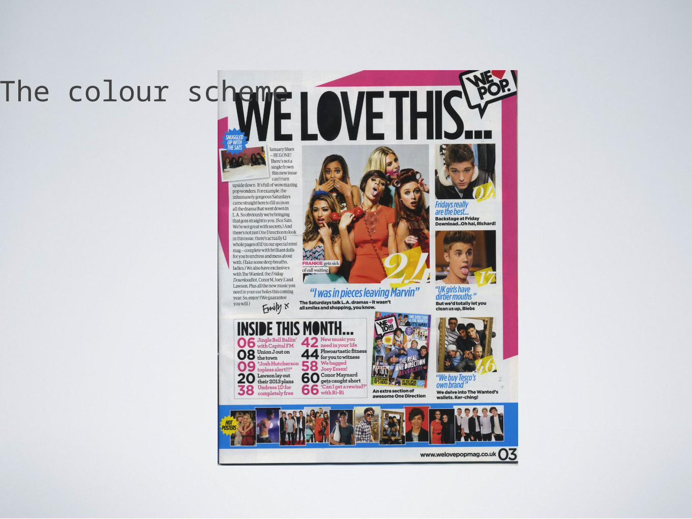
The colour scheme