master thesis project interactive multiscale...
TRANSCRIPT
Author: Kay KÜHNE
Supervisor 1: Prof. Dr. Andreas KERREN
Supervisor 2: Dr. Rafael M. MARTINS
Examiner: Prof. Dr. Welf LÖWE
Semester: VT2018Course code: 4DV50ESubject: Computer Science
Master Thesis Project
Interactive Multiscale Visualizationof Large, Multi-dimensionalDatasets

Abstract
This thesis project set out to find and implement a comfortable way to explore vast, multi-dimensional datasets using interactive multiscale visualizations to combat the ever-growinginformation overload that the digitized world is generating. Starting at the realization thateven for people not working in the fields of information visualization and data sciencethe size of interesting datasets often outgrows the capabilities of standard spreadsheetapplications such as Microsoft Excel. This project established requirements for a system toovercome this problem. In this thesis report, we describe existing solutions, related work,and in the end designs and implementation of a working tool for initial data explorationthat utilizes novel multiscale visualizations to make complex coherences comprehensibleand has proven successful in a practical evaluation with two case studies.
Keywords: Data Exploration, Visual Analytics, Multiscale Visualization, Focus+Context,Overview+Detail

Acknowledgements
I would like to thank my two supervisors, Prof. Dr. Andreas Kerren and Dr. Rafael M.Martins, for providing this fascinating topic, and their help and guidance along the wholeproject. I also would like to thank all attendees of my expert interview for sharing someof their precious time with me and helping me in drawing a conclusion for this project.Last but not least I want to thank my two opponents for giving me valuable feedback toimprove my thesis report and my examiner for taking the time to evaluate it.
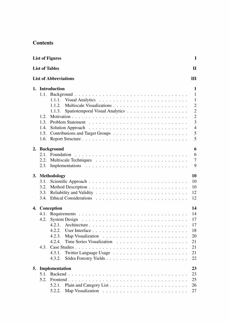
Contents
List of Figures I
List of Tables II
List of Abbreviations III
1. Introduction 11.1. Background . . . . . . . . . . . . . . . . . . . . . . . . . . . . . . . . . 1
1.1.1. Visual Analytics . . . . . . . . . . . . . . . . . . . . . . . . . . 11.1.2. Multiscale Visualizations . . . . . . . . . . . . . . . . . . . . . . 21.1.3. Spatiotemporal Visual Analytics . . . . . . . . . . . . . . . . . . 2
1.2. Motivation . . . . . . . . . . . . . . . . . . . . . . . . . . . . . . . . . . 21.3. Problem Statement . . . . . . . . . . . . . . . . . . . . . . . . . . . . . 31.4. Solution Approach . . . . . . . . . . . . . . . . . . . . . . . . . . . . . 41.5. Contributions and Target Groups . . . . . . . . . . . . . . . . . . . . . . 51.6. Report Structure . . . . . . . . . . . . . . . . . . . . . . . . . . . . . . . 5
2. Background 62.1. Foundation . . . . . . . . . . . . . . . . . . . . . . . . . . . . . . . . . 62.2. Multiscale Techniques . . . . . . . . . . . . . . . . . . . . . . . . . . . 72.3. Implementations . . . . . . . . . . . . . . . . . . . . . . . . . . . . . . 9
3. Methodology 103.1. Scientific Approach . . . . . . . . . . . . . . . . . . . . . . . . . . . . . 103.2. Method Description . . . . . . . . . . . . . . . . . . . . . . . . . . . . . 103.3. Reliability and Validity . . . . . . . . . . . . . . . . . . . . . . . . . . . 123.4. Ethical Considerations . . . . . . . . . . . . . . . . . . . . . . . . . . . 12
4. Conception 144.1. Requirements . . . . . . . . . . . . . . . . . . . . . . . . . . . . . . . . 144.2. System Design . . . . . . . . . . . . . . . . . . . . . . . . . . . . . . . 17
4.2.1. Architecture . . . . . . . . . . . . . . . . . . . . . . . . . . . . . 174.2.2. User Interface . . . . . . . . . . . . . . . . . . . . . . . . . . . . 184.2.3. Map Visualization . . . . . . . . . . . . . . . . . . . . . . . . . 204.2.4. Time Series Visualization . . . . . . . . . . . . . . . . . . . . . 21
4.3. Case Studies . . . . . . . . . . . . . . . . . . . . . . . . . . . . . . . . . 214.3.1. Twitter Language Usage . . . . . . . . . . . . . . . . . . . . . . 214.3.2. Södra Forestry Yields . . . . . . . . . . . . . . . . . . . . . . . . 22
5. Implementation 235.1. Backend . . . . . . . . . . . . . . . . . . . . . . . . . . . . . . . . . . . 235.2. Frontend . . . . . . . . . . . . . . . . . . . . . . . . . . . . . . . . . . . 25
5.2.1. Plain and Category List . . . . . . . . . . . . . . . . . . . . . . . 265.2.2. Map Visualization . . . . . . . . . . . . . . . . . . . . . . . . . 27
5.2.3. Time Series Visualization . . . . . . . . . . . . . . . . . . . . . 285.3. Connectors . . . . . . . . . . . . . . . . . . . . . . . . . . . . . . . . . 30
5.3.1. Twitter Language Usage . . . . . . . . . . . . . . . . . . . . . . 305.3.2. Södra Forestry Yields . . . . . . . . . . . . . . . . . . . . . . . . 32
6. Evaluation 336.1. Design . . . . . . . . . . . . . . . . . . . . . . . . . . . . . . . . . . . . 33
6.1.1. Experimental Setup . . . . . . . . . . . . . . . . . . . . . . . . . 336.1.2. Expert Interview . . . . . . . . . . . . . . . . . . . . . . . . . . 35
6.2. Findings . . . . . . . . . . . . . . . . . . . . . . . . . . . . . . . . . . . 366.2.1. Performance Measurements . . . . . . . . . . . . . . . . . . . . 366.2.2. User Experience Questionnaire (UEQ) . . . . . . . . . . . . . . . 376.2.3. Expert Interview . . . . . . . . . . . . . . . . . . . . . . . . . . 38
6.3. Results . . . . . . . . . . . . . . . . . . . . . . . . . . . . . . . . . . . . 38
7. Conclusion 417.1. Discussion . . . . . . . . . . . . . . . . . . . . . . . . . . . . . . . . . . 417.2. Outlook . . . . . . . . . . . . . . . . . . . . . . . . . . . . . . . . . . . 41
References 43
A. Configuration Twitter Language Usage A
B. Configuration Södra Forestry Yields C
C. Full Requirement List D
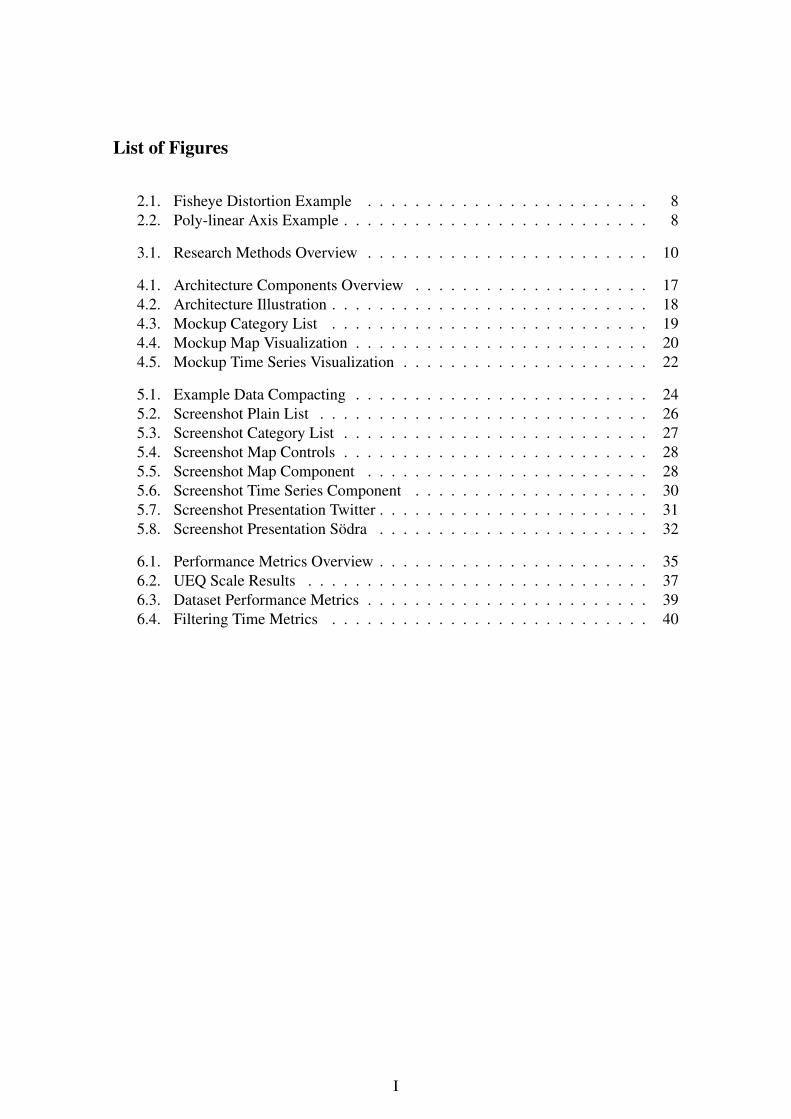
List of Figures
2.1. Fisheye Distortion Example . . . . . . . . . . . . . . . . . . . . . . . . 82.2. Poly-linear Axis Example . . . . . . . . . . . . . . . . . . . . . . . . . . 8
3.1. Research Methods Overview . . . . . . . . . . . . . . . . . . . . . . . . 10
4.1. Architecture Components Overview . . . . . . . . . . . . . . . . . . . . 174.2. Architecture Illustration . . . . . . . . . . . . . . . . . . . . . . . . . . . 184.3. Mockup Category List . . . . . . . . . . . . . . . . . . . . . . . . . . . 194.4. Mockup Map Visualization . . . . . . . . . . . . . . . . . . . . . . . . . 204.5. Mockup Time Series Visualization . . . . . . . . . . . . . . . . . . . . . 22
5.1. Example Data Compacting . . . . . . . . . . . . . . . . . . . . . . . . . 245.2. Screenshot Plain List . . . . . . . . . . . . . . . . . . . . . . . . . . . . 265.3. Screenshot Category List . . . . . . . . . . . . . . . . . . . . . . . . . . 275.4. Screenshot Map Controls . . . . . . . . . . . . . . . . . . . . . . . . . . 285.5. Screenshot Map Component . . . . . . . . . . . . . . . . . . . . . . . . 285.6. Screenshot Time Series Component . . . . . . . . . . . . . . . . . . . . 305.7. Screenshot Presentation Twitter . . . . . . . . . . . . . . . . . . . . . . . 315.8. Screenshot Presentation Södra . . . . . . . . . . . . . . . . . . . . . . . 32
6.1. Performance Metrics Overview . . . . . . . . . . . . . . . . . . . . . . . 356.2. UEQ Scale Results . . . . . . . . . . . . . . . . . . . . . . . . . . . . . 376.3. Dataset Performance Metrics . . . . . . . . . . . . . . . . . . . . . . . . 396.4. Filtering Time Metrics . . . . . . . . . . . . . . . . . . . . . . . . . . . 40
I

List of Tables
6.1. Experiment Client Specifications . . . . . . . . . . . . . . . . . . . . . . 336.2. Experiment Server Specifications . . . . . . . . . . . . . . . . . . . . . . 346.3. Think-aloud Session Questions . . . . . . . . . . . . . . . . . . . . . . . 366.4. Experiment Findings . . . . . . . . . . . . . . . . . . . . . . . . . . . . 37
II
List of Abbreviations
API Application Programming InterfaceBI Business IntelligenceHASC Hierarchical Administrative Subdivision CodesJSON JavaScript Object NotationNTS Nordic Tweet StreamRQ Research QuestionTTI Time-To-InteractiveUEQ User Experience QuestionnaireURL Uniform Resource LocatorUX User eXperienceVA Visual Analytics
III
1. Introduction
The overall goal of this thesis project was to find a comfortable way to explore vast, multi-dimensional datasets. The target was not to provide a tool exclusively for data scientists,but a system that can also be used by people unfamiliar with information visualization anddata exploration to conduct initial data exploration. To make the complex coherences in thedatasets comprehensible, the system was required to apply novel multiscale visualizationtechniques and a concept to effortlessly filter through different dimensions of a dataset.
The following sections give an introduction to the background of this project, andexplain the motivation behind the project in more detail. The initial problem is stated indepth and formulated into a research question. The approach to solving this problem andthe expected results are laid out together with the target groups and the overall structure ofthis report.
1.1. Background
To understand the targeted problem, one needs to understand the field of visualization. Itis defined as "the activity of forming a mental model of something" by R. Spence [1]. Thefield is split into three main areas: (i) Information Visualization, (ii) Scientific Visualization,and (iii) Visual Analytics.
1.1.1. Visual Analytics
Information Visualization is the visualization of abstract data to reinforce human cogni-tion, or "the design of visual data representations and interaction techniques that supporthuman activities where the spatial layout of the visual representation is not a direct mappingof spatial relationships in the data."1
Scientific Visualization is mainly about the "visualization of three-dimensional phe-nomena" [2]. As of its nature, it is considered a subset of computer graphics and has, forexample, a large impact in medical research [3].
Visual Analytics (VA) is the science of coupling interactive visual representationswith their underlying analytical processes [4]. The target is to provide technologies tounderstand not only the information itself, but also the underlying process that derivedit from the raw data and therefore, to combine the strengths of human cognition andelectronic data processing for the most effective results. This is crucial as the users do nothave to trust the output of a machine blindly; VA enables them to understand the reasoningbehind information and makes it easier to base heavy weighting real-life decisions on it.To achieve this, VA relies on highly interactive visual interfaces which pose in itself animportant scientific challenge [4, 5]. Due to its interdisciplinary nature, VA also requires ascientific background in "statistics, mathematics, knowledge representation, managementand discovery technologies, cognitive and perceptual sciences, decision sciences, and
1IEEE, IEEE InfoVis 2017 – Topics and Paper Types, 2017. [Online]. Available:http://ieeevis.org/year/2017/info/call-participation/infovis-paper-types. [Accessed: 28-Oct-2017]
1
more."2 The whole area is a rather new one [1] and has some overlap with the othermentioned areas of visualization. In conclusion, VA is turning information overload intoan opportunity and this is precisely the main goal of this project.
1.1.2. Multiscale Visualizations
The centerpiece of the frontend is a collection of interconnected and, when appropriate,multiscale visualizations. Multiscale visualization is a relatively new research topic,and the term is not unambiguously defined yet. Related work uses the term mostly forthree different classes of techniques (and often applies more than one of those to thesame visualization): multiresolution, literal multiscale, and non-linear scale. In general,multiscale visualizations are beneficial for the user experience, because they enable usersto get an overview and, at the same time, gradually focus their view.
The multiresolution approach changes resolution inside a graphic [6]. This requireshierarchical data to group together in order to lower the resolution, allowing a focused areato be shown in finer detail without extracting it from its surrounding area. For example,a stacked area chart would change its granularity for a focused segment and show itssubgroups instead of the overlying category, transitioning back into the category once thesegment selection is over.
A literal multiscale visualization is more common and consists of applying the mul-tiresolution approach but utilizing multiple graphics. For instance, for a stacked area charton a time series scale this would mean having an overview graphic, visualizing the wholetimeframe, and a second graphic visualizing a selected subset of this timeframe in moredetail. A less complex example would be the displaying of different granularities for thesame selection [7]. This technique is also called a multiresolution visualization with anOverview+Detail approach in related literature [8].
More seldom referenced as multiscale visualization is the approach of using a non-linear scale. In this approach, the scale changes inside the visualization to display asegment in more detail by providing it more physical space. One example of this is atime series graph displaying the means of some measured value for all months per yearfor the previous years, and then changing to a direct monthly aggregation for the currentyear, avoiding to break the visual flow of the chart by transforming the scale. One wayto achieve this effect dynamically upon user interaction is the so-called Focus+Contextapproach [9].
1.1.3. Spatiotemporal Visual Analytics
Spatiotemporal visual analytics is a subset of VA that focuses on the visual analysis ofspatiotemporal data [10], i.e., time-based data with a location dimension. For example,weather data or movement tracking qualify as spatiotemporal data. Spatiotemporal data isan interesting use case for multiscale visualization as the location offers a flexible and (forthe user) obvious dimension to group data into different resolutions.
1.2. Motivation
With the rise of the Internet and the digitization of ever more areas, the amount of collecteddata is enormous and continually expanding [11]. While the storage capacities kept
2IEEE, VAST Papers, 2016. [Online]. Available: http://ieeevis.org/year/2016/info/call- participation/vast-papers. [Accessed: 28-Oct-2017]
2
growing with the data generation, the ability to use it could not keep up, leaving us withvast amounts of raw data with no value on its own [4]. The growing gap between the storeddata and the ability to analyze it is broadly known under the term "information overload"[12]. As companies discover the value of their aggregated datasets, the economic fieldaround data science is growing massively. However, there is a high hurdle for initial dataexploration for people who are not proficient in this field. As soon as datasets outgrowMicrosoft Excel’s capacity, they also outgrow the capabilities of most users. Therefore,from a practical standpoint, there is a significant need for appropriate visualization andexploration tools by non-data-science users.
From a scientific standpoint, the proposed visualizations and the interconnected filteringbetween the different visualizations and dimensions provide novelty as they build uponcurrent research work and drive the scientific field further. As for the field of multiscalevisualizations, recent publications on the subject, such as an interactive multiscale visual-ization for streamgraphs by Cuenca et al. [13], show its novelty. As for the system as awhole, it will provide a stepping stone for further projects that involve large datasets, andis an integral part to support the visualizations of this project.
The state of the art in the industry regarding data exploration and visualization expandingover basic Microsoft Excel usage is that companies who have the necessary funding eitherkeep in-house data-science employees or have custom-tailored solutions developed for theirspecific needs. There are multiple companies who specialize in providing such developmentand initial exploration to solvent customers. An example of that would be anacision3 andEXXETA4. Other than that, there are highly specific solutions to problems that are thesame across an industry. A good example here would be the Business Intelligence (BI)market which utilizes standardized data from so-called Data Warehouses. Data Warehousesstore data that has been standardized by an underlying Integration Layer to provide itsBI software with a solid and already enriched dataset. For the end user, the possiblybest-known tool exceeding the abilities of Microsoft Excel is Tableau5. Tableau is anaward-winning data analytics software with a focus on BI. Especially interesting for endusers is the ability to import data quickly from sources like spreadsheets or relationaldatabases.
The current state of research regarding multiscale visualization shows some promisingresults in the last years. In the mentioned paper from Cuenca et al. [13], the authorspresented a solution to multiscale visualization for streamgraphs (advanced stacked timeseries) which uses multiple resolutions to split up the time series into subseries for a limitedtime series [13]. Interestingly, the visualization utilized all three techniques labeled underthe term multiscale visualization, but only explicitly mentioned multiresolution in theassociated poster [6]. Further related work is listed and analyzed in Chapter 2.
1.3. Problem Statement
The frontend is supposed to display various interconnected visualizations that adapt tothe dataset, and—if fitting for the visualization—present the data in a multiscale way.Multiscale visualizations offer the opportunity to enhance the experience for the usersignificantly but are harder to develop as they are more complicated than their single-scaleversions. They not only hold more complexity to visualize but also depend on specificqueries and data aggregation in the backend. There already exist specific solutions for
3https://www.anacision.de. [Accessed: 23-Apr-2018]4https://www.exxeta.com. [Accessed: 23-Apr-2018]5https://www.tableau.com. [Accessed: 23-Apr-2018]
3
particular types of visualizations, but it is not clear if it is possible to adapt these to integrateseamlessly into an environment where each visual component influences the data displayedon the others.
Before the frontend is able to display even the most basic information, there needs to bea data-providing backend in place. There are three requirements concerning the backend:(i) the ability to adapt to different datasets, (ii) the ability to handle extensive and complexdatasets, and (iii) to provide all that with a performance that does not break the focus ofthe user upon interactions.
To be able to adapt to different datasets, the backend has to be generic enough to dealwith different problems and provide a protocol to communicate with the frontend in amanner that works with a wide range of different data types. With this ability, the backendas a whole will qualify as a framework for further projects.
The whole system needs to be able to handle extensive and complex datasets witha performance that does not interrupt the user. However, not only the large datasetsthemselves present a challenge; with the large sets and the high complexity, there is also ahigh possible variety of different filters. As it is desirable to provide most of this flexibilityto the user, the system needs to be able to cope with a significant workload. Otherwise,the user would experience slow response time upon interacting with the frontend whichdirectly leads to context disruptions that make it harder for the user to understand theprocess and the visualized information.
The user is supposed to understand and be part of the information finding process, butnot to feel the workload the system has to handle. Therefore, the efficiency of the backendhas a direct influence on the effectiveness of the whole system.
From these problem statements, we can derive the following central research question:
RQ How can we explore large, multi-dimensional datasets using interactive multi-scale visualization both efficiently and effectively?
To clearly understand the question, we have to define the terms efficiency and effective-ness for this context. As a guideline we can look at the definition for both terms in the ISOstandard 9241 [14].
Effectiveness can be defined as the act of providing a truly insightful experience to theuser through interactive visualization. This means enabling the user to explore the dataseton a level not reasonably achievable before.
Efficiency can be defined as the act of providing the needed performance to adapt to newfilters and react to interactions. The lesser time the tool needs to provide the user with therequested view, the higher its efficiency. This performance definition can be quantifiablymeasured not only objectively with reaction times, but also as a direct influence on theeffectiveness of the system as an unefficient system causes a unpleasant experience for theuser.
1.4. Solution Approach
To find a solution to the stated problems and answer the research question, the projectstarted based on the findings from research into related work and a collection of require-ments, coupled with two proposed case studies. A system was designed following therequirements, implemented, and used to realize the case study. An experiment, a surveyand expert interviews with think-aloud sessions were conducted to secure verification andvalidation of the system. As the scope of this project differs from the related projects, a
4
full comparison was not possible, but concluding this report the differences in scope andresulting divergence were explained in detail.
1.5. Contributions and Target Groups
The main novelty and contribution of this project is the resulting system to explore vast,multi-dimensional datasets using interactive multiscale visualization. The system can beused for further projects and the technology and technique trade-off considerations andevaluation in this report can help to improve following versions and other tools. The systemwas designed to be quickly adaptable to new data sources and viewing angles, makingit predestined for further usage. Possible target groups for the system are organizationsinterested in a more comfortable exploration of large and complex datasets without dedi-cated data scientists. Such organizations can span from research institutes to medium-sizedcompanies. Due to the nature of the software structure and the encapsulated components,these can be plugged into different systems without any code changes to the component.This makes the project interesting for developers and software engineers already workingwith VA or planning to include VA in a project.
The multiscale visualizations in the frontend also provide scientific novelty. They werebuilt to improve upon recent publications in this field introduced in Chapter 2 Background.The combined concept, together with the implementation and the integration into a wholeframework, differentiates this work from previous publications which stand more as a proof-of-concept. The evaluation provides insight into the human acceptance of the conceptsand offers suggestions for improvements and new concepts. This part is more targeted atresearchers in the field of VA, but also interesting for developers and software engineerslooking to include more complex visualizations into an already existing system.
1.6. Report Structure
The remainder of this report is divided into six chapters. First, related work is listed andanalyzed in Chapter 2 Background. Afterwards, the utilized research methods are explained,and possible reliability, validity, and ethical considerations are discussed in Chapter 3Methodology. In Chapter 4 Conception, the requirements of the system, the systemdesign and the concept of the design behind the case studies are layed out. In Chapter 5Implementation, the implementation of the system and the case studies are describedand illustrated. The evaluation of the system is described in Chapter 6 Evaluation andconclusions are discussed in Chapter 7 Conclusion, together with an outlook for possiblefuture work.
5
2. Background
In this chapter, related work to the topic of this report is listed and analyzed. First, somenecessary foundations are looked into, which are later going to be used and applied.Then, the field of multiscale visualization is analyzed. Known techniques for multiscalevisualizations are introduced and described and referencing literature is investigated.Finally, specific implementations are analyzed and their benefits and shortcomings laidout, which can later be used to improve on them.
2.1. Foundation
A time series is a collection of data points with a temporal dimension [15]. Single timeseries often are visualized in line charts, area charts, and scatterplots. Multiple time seriesthat span an overlapping interval are the topic of various visualization techniques as theyare common in many domains such as medicine, finance, and manufacturing, where theyare used for analytical purposes. Stacked area graphs are a common approach to visualizesuch multiple time series [16]. Starting from a straight baseline axis (representing thetime dimension), the time series are stacked on top of each other forming layers. Eachlayer is colored representing the series, and the thickness of the layer represents the valueof the time series at each time step (also called tick). The resulting graph presents theevolution of the time series over time and makes it easy to read both the individual timeseries and the aggregated sum at the ticks. ThemeRiver is a technique that builds uponstacked area graphs but does not use a straight baseline axis [17]. Instead, the time seriesare stacked around a central baseline that lays in parallel to the temporal axis which allowsthe graph to have smoother transitions between the ticks. The name originates from thesetransitions resembling the flow of a river. Streamgraphs are built upon ThemeRiver andtry to improve legibility [18]. Streamgraphs change the transition between ticks and thedisplacement of layers to minimize the change in slope thereby providing a more realisticpresentation. The original paper provides graphical examples and detailed explanationsabout the difference between ThemeRiver and Streamgraphs [18].
When presenting geospatial data the goal of an intelligible visualization is to bring thedata in relation to its geographic context [19]. Maps that use geographical and politicalfeatures only as points of reference in the real world are called thematic maps [20]. Thesepoints have the purpose of making it easier for the spectator to connect the meaning of thedisplayed data to locations and regions in the real world. So-called choropleth maps arethematic maps that overlay the geographical or political map by coloring areas dependenton the statistical data connected to it [21]. The areas are defined by the map and not by thedata that is attached [22]. The selection and application of color schemes together withthe interval selection in these kinds of visualizations is housing complexity and a field ofresearch [23, 24].
When building multiresolution maps based on geographical and political features, it isnecessary to depict the given hierarchy in a uniform and structured way. The ISO publishedstandard 3166 defining codes for countries and partially subdivisions [25]. This standardbears the problem that it only provides full code coverage on the country level. Expandingthe standard, the Hierarchical Administrative Subdivision Codes (HASC) were published
6
[26]. HASC codes provide full coverage down to the second subdivision level (e.g., inSweden this would be municipalities) and are kept up to date by the original publisher. Thecodes are uniform with a length of two characters and can be chained together forming aglobally unique identifier. This is important as it enables natural grouping and combiningof areas based solely on their identifier. For example, all areas with an identifier startingwith the code of Sweden (SE) together form the country of Sweden, and all areas withan identifier starting with the identifier for Kronoberg (SE.KR) together form the countyof Kronoberg. For the municipality of Växjö this would form the identifier SE.KR.VA(Sweden, Kronoberg, Växjö).
2.2. Multiscale Techniques
In the field of multiscale visualization, different approaches and techniques arer esulting insubstantially different visualizations as outlined in Section 1.1.2 Multiscale Visualizations.This section looks at different techniques relevant to this project. As the focus of this projectis on techniques that work well for interactive visualizations, the selection is limited toonly interactive techniques. Cockburn et al. published an excellent overview of widespreadinteractive multiscale techniques describing differentiations and usage examples [8].
The starting point for the following techniques is the concept of zooming [27]. Thisinteraction technique is widespread and an easy utility to explore data. The idea is to allowthe user to magnify (zoom in), demagnify (zoom out), and pan (moving the view) thedataset in place. In a geospatial context, an example would be Google Maps which lets theuser start from an overview perspective of his area and then allows to zoom in and move themap. This concept is very versatile as it can be applied to most visualizations, for instance,most PDF-readers enable users to zoom into pages. From a multiscale perspective, thistechnique is not sufficient as the different scales or views are temporally separated and notdisplayed simultaneously, forcing the user to make the connection mentally. This puts loadon the short-term memory of the user and limits the possible complexity the user is able toassimilate. The following techniques try to overcome this problem.
The first technique that improves on zooming is called Overview+Detail [8]. The ideais to provide the user with an overview of the data and, at the same time, a more detailedview into a subset by displaying two spatially-separated visualizations. One of the mostcommonly known examples is the usage of thumbnails. Microsoft PowerPoint, for example,shows a small list of thumbnails of the slides on the left side of the window, giving theuser an overview of both the content of the slides and his position in the presentation. Atthe same time, the central part of the window shows a single slide in full-size giving theuser a detailed view. Providing a clear connection between the overview and detail views,together with intuitive interaction possibilities, pose the main difficulty in this technique.
The next technique is called Focus+Context [9]. It is a multiresolution approach thatcombines focused and contextual information in a single visualization. This technique is incontrast to the previously presented spatial or temporal separation and has the potential toreduce the short-term memory load to a minimum. At the same time, such visualizationsencapsulate high complexity making it harder to comprehend initially. This concept evenbears high complexity in non-interactive visualizations, since uneven distortions, such asnon-linear scales, are perceived as unnatural [28]. In the following paragraph, selectedtechniques for Focus+Context visualizations are introduced based on the review by Leungand Apperley [29].
For geospatial visualizations, so-called fisheye distortions [30, 31, 32] are sometimesused to show certain parts of a map in more detail while keeping the rest of the map un-
7
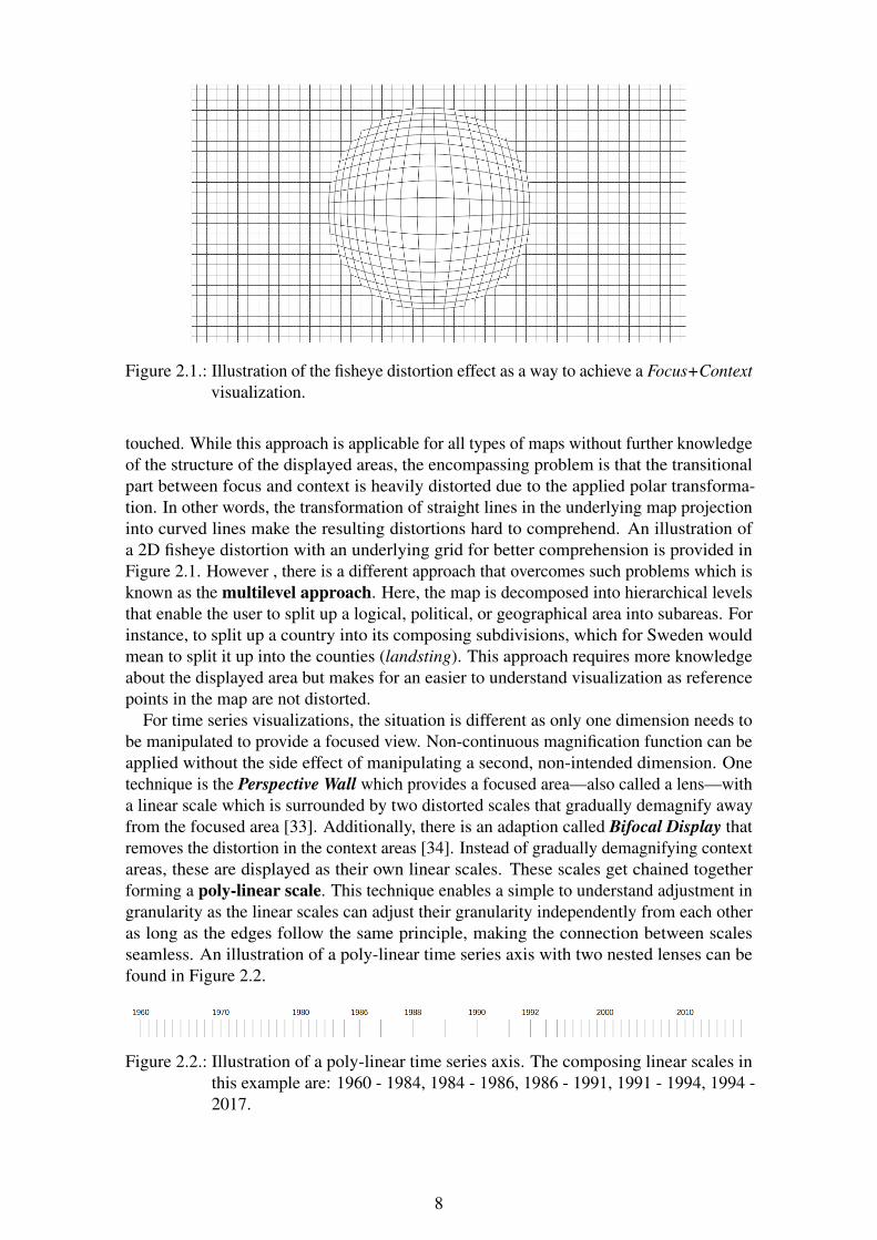
Figure 2.1.: Illustration of the fisheye distortion effect as a way to achieve a Focus+Contextvisualization.
touched. While this approach is applicable for all types of maps without further knowledgeof the structure of the displayed areas, the encompassing problem is that the transitionalpart between focus and context is heavily distorted due to the applied polar transforma-tion. In other words, the transformation of straight lines in the underlying map projectioninto curved lines make the resulting distortions hard to comprehend. An illustration ofa 2D fisheye distortion with an underlying grid for better comprehension is provided inFigure 2.1. However , there is a different approach that overcomes such problems which isknown as the multilevel approach. Here, the map is decomposed into hierarchical levelsthat enable the user to split up a logical, political, or geographical area into subareas. Forinstance, to split up a country into its composing subdivisions, which for Sweden wouldmean to split it up into the counties (landsting). This approach requires more knowledgeabout the displayed area but makes for an easier to understand visualization as referencepoints in the map are not distorted.
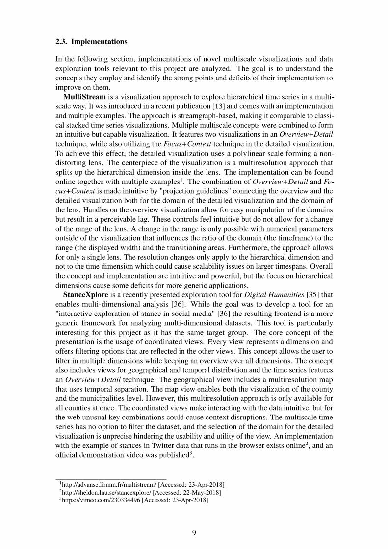
For time series visualizations, the situation is different as only one dimension needs tobe manipulated to provide a focused view. Non-continuous magnification function can beapplied without the side effect of manipulating a second, non-intended dimension. Onetechnique is the Perspective Wall which provides a focused area—also called a lens—witha linear scale which is surrounded by two distorted scales that gradually demagnify awayfrom the focused area [33]. Additionally, there is an adaption called Bifocal Display thatremoves the distortion in the context areas [34]. Instead of gradually demagnifying contextareas, these are displayed as their own linear scales. These scales get chained togetherforming a poly-linear scale. This technique enables a simple to understand adjustment ingranularity as the linear scales can adjust their granularity independently from each otheras long as the edges follow the same principle, making the connection between scalesseamless. An illustration of a poly-linear time series axis with two nested lenses can befound in Figure 2.2.
Figure 2.2.: Illustration of a poly-linear time series axis. The composing linear scales inthis example are: 1960 - 1984, 1984 - 1986, 1986 - 1991, 1991 - 1994, 1994 -2017.
8
2.3. Implementations
In the following section, implementations of novel multiscale visualizations and dataexploration tools relevant to this project are analyzed. The goal is to understand theconcepts they employ and identify the strong points and deficits of their implementation toimprove on them.
MultiStream is a visualization approach to explore hierarchical time series in a multi-scale way. It was introduced in a recent publication [13] and comes with an implementationand multiple examples. The approach is streamgraph-based, making it comparable to classi-cal stacked time series visualizations. Multiple multiscale concepts were combined to forman intuitive but capable visualization. It features two visualizations in an Overview+Detailtechnique, while also utilizing the Focus+Context technique in the detailed visualization.To achieve this effect, the detailed visualization uses a polylinear scale forming a non-distorting lens. The centerpiece of the visualization is a multiresolution approach thatsplits up the hierarchical dimension inside the lens. The implementation can be foundonline together with multiple examples1. The combination of Overview+Detail and Fo-cus+Context is made intuitive by "projection guidelines" connecting the overview and thedetailed visualization both for the domain of the detailed visualization and the domain ofthe lens. Handles on the overview visualization allow for easy manipulation of the domainsbut result in a perceivable lag. These controls feel intuitive but do not allow for a changeof the range of the lens. A change in the range is only possible with numerical parametersoutside of the visualization that influences the ratio of the domain (the timeframe) to therange (the displayed width) and the transitioning areas. Furthermore, the approach allowsfor only a single lens. The resolution changes only apply to the hierarchical dimension andnot to the time dimension which could cause scalability issues on larger timespans. Overallthe concept and implementation are intuitive and powerful, but the focus on hierarchicaldimensions cause some deficits for more generic applications.
StanceXplore is a recently presented exploration tool for Digital Humanities [35] thatenables multi-dimensional analysis [36]. While the goal was to develop a tool for an"interactive exploration of stance in social media" [36] the resulting frontend is a moregeneric framework for analyzing multi-dimensional datasets. This tool is particularlyinteresting for this project as it has the same target group. The core concept of thepresentation is the usage of coordinated views. Every view represents a dimension andoffers filtering options that are reflected in the other views. This concept allows the user tofilter in multiple dimensions while keeping an overview over all dimensions. The conceptalso includes views for geographical and temporal distribution and the time series featuresan Overview+Detail technique. The geographical view includes a multiresolution mapthat uses temporal separation. The map view enables both the visualization of the countyand the municipalities level. However, this multiresolution approach is only available forall counties at once. The coordinated views make interacting with the data intuitive, but forthe web unusual key combinations could cause context disruptions. The multiscale timeseries has no option to filter the dataset, and the selection of the domain for the detailedvisualization is unprecise hindering the usability and utility of the view. An implementationwith the example of stances in Twitter data that runs in the browser exists online2, and anofficial demonstration video was published3.
1http://advanse.lirmm.fr/multistream/ [Accessed: 23-Apr-2018]2http://sheldon.lnu.se/stancexplore/ [Accessed: 22-May-2018]3https://vimeo.com/230334496 [Accessed: 23-Apr-2018]
9
3. Methodology
This chapter describes the research methods used to find answers to the research question.First, the used methods are listed and introduced. Then, the reliability and validity of boththe methods and the project as a whole are discussed, and finally, ethical considerationsare laid out.
3.1. Scientific Approach
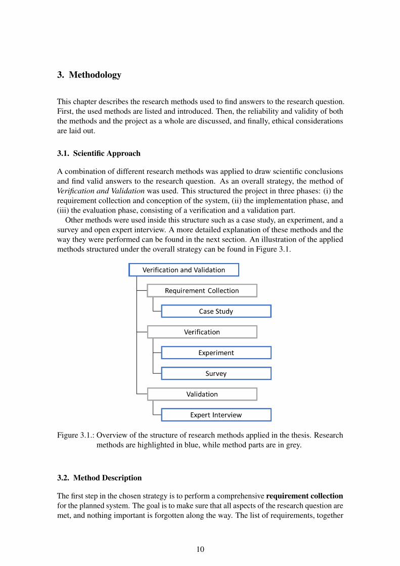
A combination of different research methods was applied to draw scientific conclusionsand find valid answers to the research question. As an overall strategy, the method ofVerification and Validation was used. This structured the project in three phases: (i) therequirement collection and conception of the system, (ii) the implementation phase, and(iii) the evaluation phase, consisting of a verification and a validation part.
Other methods were used inside this structure such as a case study, an experiment, and asurvey and open expert interview. A more detailed explanation of these methods and theway they were performed can be found in the next section. An illustration of the appliedmethods structured under the overall strategy can be found in Figure 3.1.
Figure 3.1.: Overview of the structure of research methods applied in the thesis. Researchmethods are highlighted in blue, while method parts are in grey.
3.2. Method Description
The first step in the chosen strategy is to perform a comprehensive requirement collectionfor the planned system. The goal is to make sure that all aspects of the research question aremet, and nothing important is forgotten along the way. The list of requirements, together
10
with justifications and clarifications for every requirement, can be found in Section 4.1.In the evaluation phase, the Section 6.3 ties everything together by going over everyrequirement again and making sure they were fulfilled.
To be able to evaluate the work and to conduct the following research methods, thesystem had to be implemented in specific scenarios. For this reason, two case studies wereconducted.
The first case study was designed with the purpose of showing the extent of the workwithin a realistic scenario, based on an existing system, and was therefore used for allevaluation processes and presentations. This scenario was built on top of a collection ofScandinavian Tweets. A tweet is a public message on the short messaging platform Twitter.This dataset can provide insights into the usage of language in Tweets from a timespan ofover a year which could be of interest to humanity researchers. A detailed description ofthe scenario can be found in Section 4.3.1, and the work necessary for the implementationwithin the system is described in Section 5.3.1.
The second case study was designed with the purpose of highlighting the ease withwhich new datasets and scenarios can be plugged into the system. Therefore, a datasetfrom Södra–one of the largest forestry companies in the south of Sweden–was chosenwhich has the potential to provide insight into forestry yields of different woodlands theycultivate. The full description of the case study can be found in Section 4.3.2, and theimplementation in Section 5.3.2.
In the evaluation phase, at first, the results were verified to check if the requirementswere met. To come to a scientific conclusion, two different quantitative research methodswere used in the verification part: an experiment and a survey.
An experiment was conducted to measure the performance of the system in differentaspects and for different data sizes and tasks. The target was to check if the system canhandle high loads and how it performs with generic tasks. The setup of the experiment isdescribed in Section 6.1.1, and the findings are reported in Section 6.2.1. The measuredmetrics include, among others, the Time-to-Interactive, transmitted dataset size, andthe memory usage in the browser. Additionally, the performance of StanceXplore wasmeasured for specific tasks, and a rough comparison was drawn between the performanceof both systems. Together with a feature comparison in regards to the scope of the system,this allowed for an overall comparison between the systems.
A survey was conducted with all attendees of the later on described expert interviewsand consisted of a single questionnaire, the User Experience Questionnaire (UEQ). It is awidely used questionnaire to measure user experience (UX) that was initially created in2005 by researchers at the SAP AG [37]. Today the UEQ is available in multiple languagesand comes with prepared analysis tools, and a large comparison dataset. The consistency ofthe scales and their validity was confirmed in multiple studies and the comparison datasetcontains reference values from over 160 studies with over 4800 polled individuals [38].
In 26 contrastive pairs, the survey tries to measure the general impression of a userregarding his interactions with an interactive product [37]. The 26 items are seven-stageLikert scales between semantic differentials which can be grouped up to the six scales:(i) attractiveness, (ii) perspicuity, (iii) efficiency, (iv) dependability, (v) stimulation, and(vi) novelty. Perspicuity, efficiency, and dependability describe pragmatic qualities, whilestimulation and novelty describe hedonic qualities. Attractiveness exists independentlyas a pure valence dimension. The structure of the questionnaire makes it easy to spotinconsistent and suspicious answers while showing strengths and weaknesses of the systemthanks to the reference values.
The second part of the evaluation phase is the validation, where the overall concept and
11
the chosen solutions were checked against the expectations of possible users and peoplewith domain knowledge. To get this qualitative feedback, an open expert interview wasconducted with five experts in the field of data visualization and data exploration. In thisprocess, the interviewee was given a short introduction to the system and its usage, andthen he was asked to perform a few tasks with the system in a recorded think-aloud session.At this point, the user was asked to fill out the previous mentioned UEQ. After that, anopen interview was conducted to get feedback on the used concepts, the usability andunderstandability, and generic improvement possibilities. The exact procedure and itsresults can be found in Chapter 6.
3.3. Reliability and Validity
Some aspects of the project make it necessary to discuss validity and reliability. Regardingreliability, the measured metrics in the experiment relied heavily on many factors of thetest environment, from operating system to clock speed, both on the client and on the server.These factors were locked down and documented, which made the experiment reproducible.Another less-important factor was the fragmentation of the dataset concerning specificfilters and test set sizes. This influence was smoothed out by the newly-shuffled testset in every iteration. All details regarding the setup of the experiment are explained inSection 6.1.1.
In the aspect of validity, there were the results of the experiment, survey, and the expertinterview to consider. The experiment results should be considered valid since they onlycompared own measurements from the same system and do not draw any conclusion basedon outside measurements, and only support observations made from the interview andsurvey. The survey and the expert interview might be prone to problems with internal andexternal validity. Internal validity is about drawing the right conclusions from the collecteddata and external validity is about the extent to which a result can be generalized to moregeneric conclusions. The survey and the expert interview were conducted with only fiveparticipants of which none were in any way connected to the project, but all of them camefrom (or are very familiar with) the field of visualization. To overcome these problemsChapter 7 makes extensive efforts to clarify that the results from these two methods are notuniversal, only providing initial and implementation-specific insights and feedback.
3.4. Ethical Considerations
It is important to keep ethical considerations in mind when dealing with human subjects inany project. In this project, the only ethical considerations come from privacy and dataprotection originating from the datasets used in the case studies and the recorded data fromthe expert interviews.
While the dataset from Södra does not contain any personal information, the datasetfrom Twitter does contain public data from users, and the pseudonymized usernames andthe contents of the tweets themselves may possibly contain personal data. In their privacyregulations and developer guidelines1, Twitter specifies that the data associated with tweetsare free to use as long as the guidelines are followed. The end user has the possibilityto opt-out of this data sharing, and has to opt-in for location sharing as a unique form ofpersonal data sharing.
1https://developer.twitter.com/en/developer-terms
12

For the interviews, the participants were informed that no private personal informationwas recorded and all of the findings would only be published independently from theirperson, and on an aggregated basis. With the agreement of the interviewees, the wholeprocess of software trial and the interview itself was recorded to ensure that nothingimportant was lost in the process. These recordings were only stored for this process andwithout any personal pieces of information attached (although a connection could be madethrough the interviewer because of the small sample size). After the evaluation processended, all recordings and raw notes on specific interviews were destroyed.
13
4. Conception
In this chapter, the concept of the system is described. First, the requirements collected forthe system are detailed and discussed. Building upon these requirements, the design of thesystem is described and, finally, two case studies are conceived and explained.
4.1. Requirements
The first step in the Verification and Validation method is to compile a list of both functionaland non-functional requirements as explained in Section 3.1. The following requirementsare built around the idea of a hierarchical organization, beginning with a few high-levelnon-functional requirements that dictate how we want the final system to behave. Underthese main requirements are the sub-requirements that, when fulfilled, should satisfytheir parent requirement. This way, low-level sub-requirements can be formulated moretechnically, making them clearer to implement, while we still maintain the high-level viewof the main requirements.
To make the system practically usable, we wanted to make it as accessible as possible.This required: (i) keeping the initial setup for new users as easy as possible, (ii) decouplingthe presentation from the dataset, and (iii) making the presentation accessible with toolsthat most users are expected to be familiar with.
Requirement 1 (Accessibility)The system has to enable multiple users/researchers to look into the same dataset at thesame time, without having to set up the system multiple times.
Requirement 1.1The presentation has to be accessible across different devices without unnecessary over-head.
Requirement 1.2The presentation has to be decoupled from the data source.
One of the key features of the system was defined to be the adaptability to differentdatasets, providing an added benefit that exceeds its usage in a single installation. Toachieve this, we had to require adaptability both in regards to data sources, data structures,and viewing angles, while keeping the effort to set these up to a minimum.
Requirement 2 (Adaptability)The system has to be easily adaptable to different datasets regarding structure, data source,and viewing angle.
Requirement 2.1The presentation has to be easily configurable to provide different views into a dataset.
Requirement 2.2The system has to be easily adaptable to handle new data sources and data structures.
14
Requirement 2.3The user has to be able to quickly swap between different setups.
When providing different viewing angles into a dataset, it is important to bind themtogether to make a single, conform presentation. Therefore all viewing angles wererequired to be filterable while keeping them connected and making the connection apparentto the user.
Requirement 3 (Filterability)The user must be able to filter the dataset from a selected viewing angle in the presentation,according to the view’s unique presentation features.
Requirement 3.1A filter applied in one viewing angle must be broadcasted directly to all other viewingangles.
Requirement 3.2The user has to be able to filter the dataset down to a single event.
One key research focus of this project was to bootstrap the underlying framework for thecreation of meaningful multiscale visualizations in multiple views of a multi-dimensionaldataset, and embed them seamlessly in a presentation.
Requirement 4 (Multiscale)The presentation has to provide the possibility of visually exploring datasets in multiplescales in every viewing angle that would benefit from it.
Requirement 4.1The presentation has to provide a map view that employes multiscale techniques.
Requirement 4.2The presentation has to provide a stacked time series view that employes multiscaletechniques.
ISO 9421 Ergonomics of Human System Interaction [39] in its 2018 revision split uppart 11 which previously defined specifications and measurements of usability. As thisproject and the requirement collection began before the publishing of the 2018 revision,the requirements were designed along the previous versions part 11, Guidance on usability[14]. Research suggests that creating requirements along the guidelines and definitions ofthis standard is effective, but very hard to do if the requirements are applied in details [40].Therefore, the derived requirements only take the standards as guidelines, and not as strictrules. Although most previously described requirements can be factored into the usabilityof the system, some additional requirements were needed.
Requirement 5 (Usability)The system has to follow general guidelines for usability.
ISO 9421-11 defines three guiding criteria for the usability of software: the effectivenessof task completion, the efficiency of usage, and the satisfaction of the users. The standarddefines efficiency as "the resources expended in relation to the accuracy and completenesswith which users achieve goals." [14] This means that the user has to be able to solve a task
15
with a system with as little effort as possible. To achieve this, the user interface should bekept as straightforward as possible to keep the focus on the data and its expressed meaning.
Requirement 5.1The presentation shall not include any unnecessary information or possibilities of interac-tion.
Additionally, it is important to keep the user focused on his tasks without breakinghis “train of thoughts”. To achieve a context-disruption-free presentation, an importantrequirement is to keep the amount of data showed in the presentation itself to a minimum.
Requirement 5.2The presentation shall avoid context disruption on interactions as much as possible.
Requirement 5.3The amount of transfered data from the data source to the presentation shall be kept aslight as possible.
Effectiveness is defined as "the accuracy and completeness with which users achievespecified goals" by the ISO standard, which means that the system should provide thepossibility to solve tasks as completely and correctly as possible [14]. Effectiveness islinked to the satisfiability of the previous requirement. Lastly, satisfaction is defined as the"freedom from discomfort and positive attitude to the use of the product." It is the mostcomprehensive criteria and includes points such as learnability, perspicuity, and generalattractiveness. The target was to project on the user a coherent, pleasant overall impressionthat illustrates the utility and added benefit of the system.
Requirement 5.4The presentation shall employ different, clear to understand colorschemes.
Requirement 5.5The added value of the system as a whole for the data exploration shall be clear to users.
Requirement 5.6The added value of the employed multiscale techniques shall be clear to users.
To guarantee an apparent learning curve and perspicuity of the users’ own actions, someadditional requirements were necessary.
Requirement 5.7The basics of interacting with the data through the presentation shall be easy to learn.
Requirement 5.8Every possible action by the user shall be reproduceable for him.
Requirement 5.9The user shall be enabled to solve possible tasks with the system after a short introductioninto the presentation.
A full list of all requirements can be found in Appendix C.
16

4.2. System Design
In this section, the design of the system itself is described (not its implementation, whichis described in Chapter 5). It incorporates the requirements into an overall structuregeared towards their realization. At first, the architecture is described with all of itscomponents and their connections and couplings. Next, the user interface and in particularthe visualizations are looked into in more detail as the emphasis of this project is on themultiscale data visualization.
4.2.1. Architecture
To make the system conform to the accessibility requirements (Req. 1) a classical client-server architecture was chosen. The server-side handles the datasets, configurations, anddata preparations, while the client takes care of the presentation (Req. 1.2). To make thepresentation accessible on most devices without any further installations the browser waschosen as a client (Req. 1.1).
The adaptability requirements also heavily influenced the overall architecture. To makenew datasets and viewing angles easy to set up without setting up the whole service theserver-side had to be split up into the main backend service and connectors querying thedata source representing use cases.
Figure 4.1.: High-level overview of the components of the system.
This leaves the system split up into (i) the frontend, (ii) the main backend service, and(iii) connectors as visualized in Figure 4.1.
The backend service (Figure 4.2, middle) is designed to function as a server for thefrontend and as an application programming interface (API) gateway between presentationand data source. The central component has to be the configuration controller that handlesthe configuration of every view into the corresponding dataset. When a request reaches thebackend service, it shall resolve the origin of the request and look up the correspondingconfiguration file. If there is a valid configuration for that host, the request itself is lookedat. If it a request to serve a presentation the static frontend is served. If it is a configurationrequest from a presentation, the configuration is pulled from the internal configurationstore and served. If it is a request for data, the service queries the connector and thenaggregates and compresses the data to transmit as little to the presentation as possible(Req. 5.3).
The frontend (Figure 4.2, left) is providing the presentation, and the design is describedin detail in the following subsection. The frontend was designed to be completely static,meaning that the same frontend is used for all presentations regardless of dataset andviewing angles. Only after the frontend is served, it shall request its configuration andadapt the presentation accordingly. Not having to adapt the frontend also helps with theadaptability requirements.
By having a single backend service and a static frontend utilized in all use cases, theuser is able to switch between already set up presentations by simply navigating to theUniform Resource Locator (URL) that hosts the desired presentation (Req. 2.3).
17
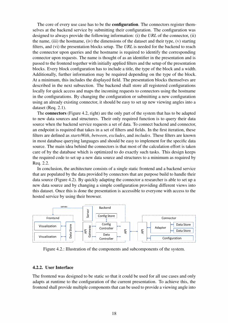
The core of every use case has to be the configuration. The connectors register them-selves at the backend service by submitting their configuration. The configuration wasdesigned to always provide the following information: (i) the URL of the connector, (ii)the name, (iii) the hostname, (iv) the dimensions of the dataset and their type, (v) startingfilters, and (vi) the presentation blocks setup. The URL is needed for the backend to reachthe connector upon queries and the hostname is required to identify the correspondingconnector upon requests. The name is thought of as an identifier in the presentation and ispassed to the frontend together with initially applied filters and the setup of the presentationblocks. Every block configuration has to include a title, the type of the block and a width.Additionally, further information may be required depending on the type of the block.At a minimum, this includes the displayed field. The presentation blocks themselves aredescribed in the next subsection. The backend shall store all registered configurationslocally for quick access and maps the incoming requests to connectors using the hostnamein the configurations. By changing the configuration or submitting a new configurationusing an already existing connector, it should be easy to set up new viewing angles into adataset (Req. 2.1).
The connectors (Figure 4.2, right) are the only part of the system that has to be adaptedto new data sources and structures. Their only required function is to query their datasource when the backend service requests a set of data. To connect backend and connector,an endpoint is required that takes in a set of filters and fields. In the first iteration, thesefilters are defined as startsWith, between, excludes, and includes. These filters are knownin most database querying languages and should be easy to implement for the specific datasource. The main idea behind the connectors is that most of the calculation effort is takencare of by the database which is optimized to do exactly such tasks. This design keepsthe required code to set up a new data source and structures to a minimum as required byReq. 2.2.
In conclusion, the architecture consists of a single static frontend and a backend servicethat are populated by the data provided by connectors that are purpose build to handle theirdata source (Figure 4.2). By quickly adapting the connector a researcher is able to set up anew data source and by changing a simple configuration providing different views intothis dataset. Once this is done the presentation is accessible to everyone with access to thehosted service by using their browser.
Figure 4.2.: Illustration of the components and subcomponents of the system.
4.2.2. User Interface
The frontend was designed to be static so that it could be used for all use cases and onlyadapts at runtime to the configuration of the current presentation. To achieve this, thefrontend shall provide multiple components that can be used to provide a viewing angle into
18
the data. The components shall be easily adaptable in order, size and of course displayeddimension of the dataset by the configuration of the presentation.
For the prototype, the following components were conceived: (i) a plain list, (ii) acategory list, (iii) a time series, and (iv) a map.
The plain list was thought of as the simplest component that only takes a dimensionof the dataset and asynchronously loads a configured amount of entries to display. Filtersshall be applied, but the component itself shall not provide any mean to filter.
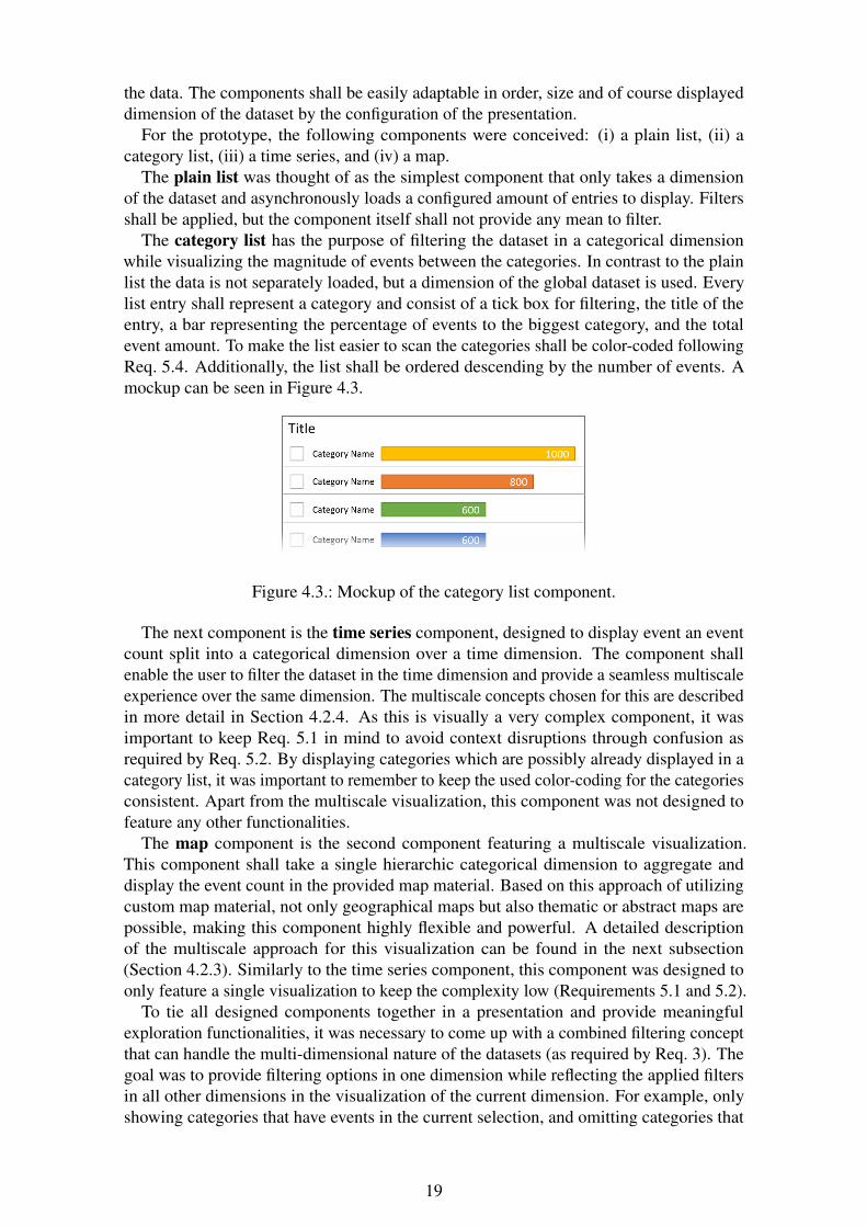
The category list has the purpose of filtering the dataset in a categorical dimensionwhile visualizing the magnitude of events between the categories. In contrast to the plainlist the data is not separately loaded, but a dimension of the global dataset is used. Everylist entry shall represent a category and consist of a tick box for filtering, the title of theentry, a bar representing the percentage of events to the biggest category, and the totalevent amount. To make the list easier to scan the categories shall be color-coded followingReq. 5.4. Additionally, the list shall be ordered descending by the number of events. Amockup can be seen in Figure 4.3.
Figure 4.3.: Mockup of the category list component.
The next component is the time series component, designed to display event an eventcount split into a categorical dimension over a time dimension. The component shallenable the user to filter the dataset in the time dimension and provide a seamless multiscaleexperience over the same dimension. The multiscale concepts chosen for this are describedin more detail in Section 4.2.4. As this is visually a very complex component, it wasimportant to keep Req. 5.1 in mind to avoid context disruptions through confusion asrequired by Req. 5.2. By displaying categories which are possibly already displayed in acategory list, it was important to remember to keep the used color-coding for the categoriesconsistent. Apart from the multiscale visualization, this component was not designed tofeature any other functionalities.
The map component is the second component featuring a multiscale visualization.This component shall take a single hierarchic categorical dimension to aggregate anddisplay the event count in the provided map material. Based on this approach of utilizingcustom map material, not only geographical maps but also thematic or abstract maps arepossible, making this component highly flexible and powerful. A detailed descriptionof the multiscale approach for this visualization can be found in the next subsection(Section 4.2.3). Similarly to the time series component, this component was designed toonly feature a single visualization to keep the complexity low (Requirements 5.1 and 5.2).
To tie all designed components together in a presentation and provide meaningfulexploration functionalities, it was necessary to come up with a combined filtering conceptthat can handle the multi-dimensional nature of the datasets (as required by Req. 3). Thegoal was to provide filtering options in one dimension while reflecting the applied filtersin all other dimensions in the visualization of the current dimension. For example, onlyshowing categories that have events in the current selection, and omitting categories that
19
have no events, since filtering on these would have no impact on the other dimensions. Toachieve this, all filtering components shall propagate filtering events to the central datastore which then shall apply the filter (and fracture the dataset) to all other dimensions. Thisis necessary because we also want to show the excluded values in our filtering dimension.This approach ensures that a filter applied in one viewing angle is directly propagatedto all other viewing angles as required in Req. 3.1. Moreover, the overlapping filteringacross dimensions, enables the user to filter down to a single event if it is unique in itscombination of used dimensions (Req. 3.2).
4.2.3. Map Visualization
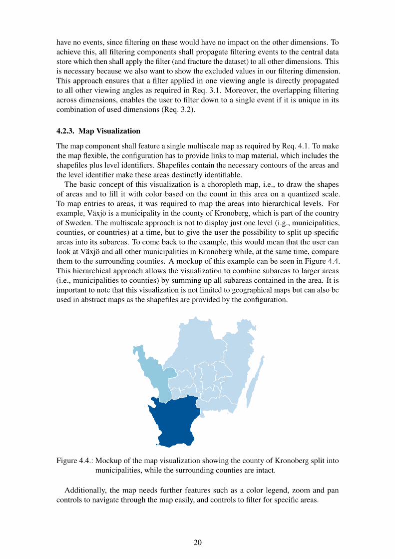
The map component shall feature a single multiscale map as required by Req. 4.1. To makethe map flexible, the configuration has to provide links to map material, which includes theshapefiles plus level identifiers. Shapefiles contain the necessary contours of the areas andthe level identifier make these areas destinctly identifiable.
The basic concept of this visualization is a choropleth map, i.e., to draw the shapesof areas and to fill it with color based on the count in this area on a quantized scale.To map entries to areas, it was required to map the areas into hierarchical levels. Forexample, Växjö is a municipality in the county of Kronoberg, which is part of the countryof Sweden. The multiscale approach is not to display just one level (i.g., municipalities,counties, or countries) at a time, but to give the user the possibility to split up specificareas into its subareas. To come back to the example, this would mean that the user canlook at Växjö and all other municipalities in Kronoberg while, at the same time, comparethem to the surrounding counties. A mockup of this example can be seen in Figure 4.4.This hierarchical approach allows the visualization to combine subareas to larger areas(i.e., municipalities to counties) by summing up all subareas contained in the area. It isimportant to note that this visualization is not limited to geographical maps but can also beused in abstract maps as the shapefiles are provided by the configuration.
Figure 4.4.: Mockup of the map visualization showing the county of Kronoberg split intomunicipalities, while the surrounding counties are intact.
Additionally, the map needs further features such as a color legend, zoom and pancontrols to navigate through the map easily, and controls to filter for specific areas.
20
In conclusion, the map visualization was designed to be a choropleth map that allowsthe user to split up areas into subareas and thus change the granularity of specific regionswhile keeping the rest unmodified at an overview level.
4.2.4. Time Series Visualization
The time series component shall feature a stacked time series visualization as required byReq. 4.2. To accomplish that, the visualization shall consist of three parts: (i) an overviewtime series, (ii) a detailed time series, and (iii) a control layer connecting the two timeseries.
The overview time series shall be a small stacked area chart over the full timespanof the targeted time dimension. The purpose was, as the name suggests, to provide anoverview over the whole timespan and enable the selection of the domain of the timespanof the detail view. As the y-Axis stacks counts of categorical data, it is important to keepcolor-coding consistent not only with the detailed time series but also to possible otherrepresentations of this dimension in the current overall presentation. Because the purposeof this time series is only to provide an overview, the granularity in the time dimension isonly of little importance and can be as fine as the data is compacted, to keep calculationoverhead low.
The detailed time series shall visualize the selected domain in more detail. This shall beachieved by stretching the domain (the timespan) over the full width of the visualizationgiving it a wider range (the displayed width). Additionally, a Focus+Context approachshall be embedded, allowing the user to go into even more detail without losing the contextof the rest of the detailed domain. Furthermore, the user shall be able to add lenses withboth a variable domain and range. This enables the user to dynamically focus on a specifictimespan and stretching it to a width that allows the granularity he desires. As this approachmakes the horizontal axis polylinear, without any restrictions on how far a timespan willbe stretched or squeezed, the granularity of every stretch of the axis has to dynamicallyadapt based on its range.
The control layer shall connect the two time series and give the user the handles to selectthe detailed domain, add lenses, and manipulate their domain and range. To achieve this,the control layer shall add handles to both time series which are visually connected to theircounterpart on the other time series. The handles on the detailed time series shall enablethe user to adjust the range of a lens and the handles on the overview time series to adjustthe domain.
In conclusion, the time series visualization is a combination of the Overview+Detailand the Focus+Context technique with a dynamic selection and focus, as illustrated inFigure 4.5. This concept was influenced by the MultiStream visualization introducedin Chapter 2 Background while introducing more intuitive and dynamic controls and achanging granularity not in the category dimension but the time dimension.
4.3. Case Studies
For the evaluation, the system was implemented for specific scenarios. Hence, these twoscenarios are explained and discussed.
4.3.1. Twitter Language Usage
The scope of the first case study was to embed the system in a realistic scenario. For thatpurpose, the following scenario was chosen: As a researcher, I want to investigate the
21
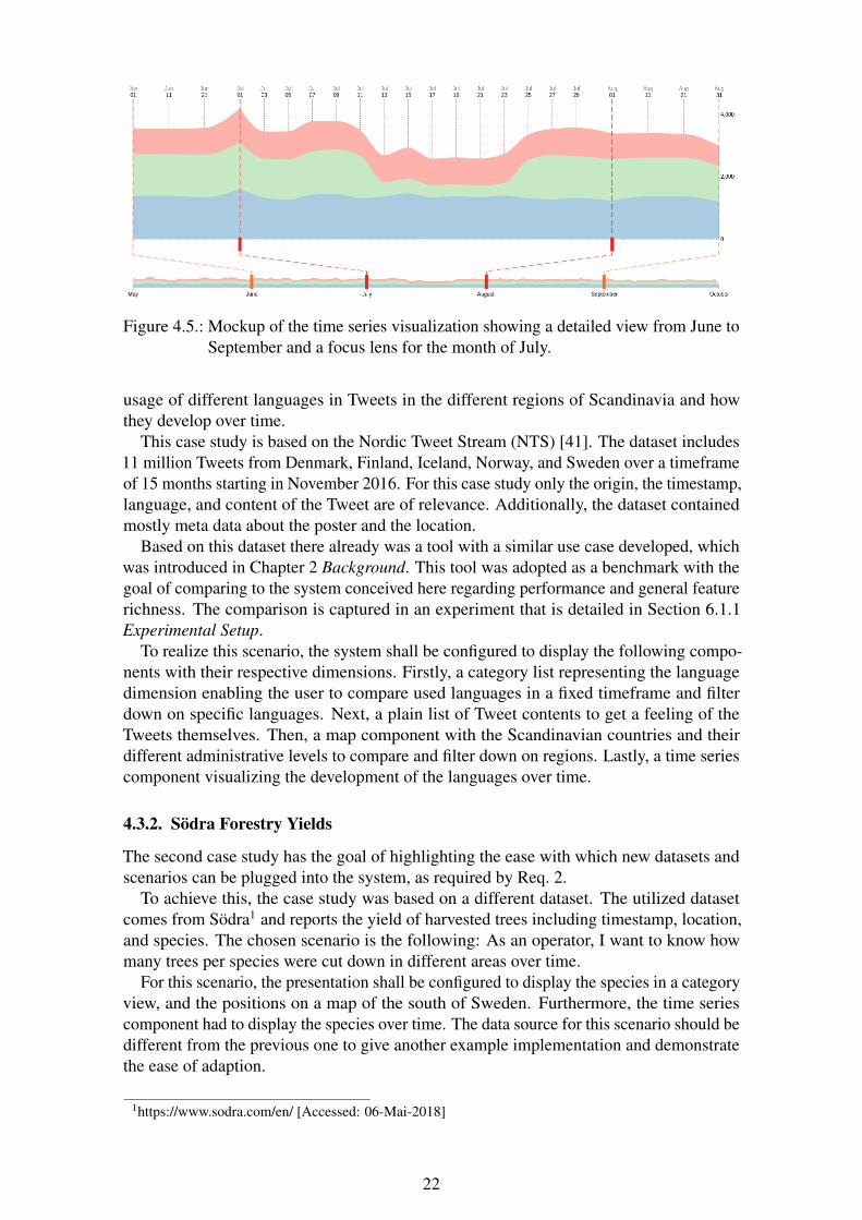
Figure 4.5.: Mockup of the time series visualization showing a detailed view from June toSeptember and a focus lens for the month of July.
usage of different languages in Tweets in the different regions of Scandinavia and howthey develop over time.
This case study is based on the Nordic Tweet Stream (NTS) [41]. The dataset includes11 million Tweets from Denmark, Finland, Iceland, Norway, and Sweden over a timeframeof 15 months starting in November 2016. For this case study only the origin, the timestamp,language, and content of the Tweet are of relevance. Additionally, the dataset containedmostly meta data about the poster and the location.
Based on this dataset there already was a tool with a similar use case developed, whichwas introduced in Chapter 2 Background. This tool was adopted as a benchmark with thegoal of comparing to the system conceived here regarding performance and general featurerichness. The comparison is captured in an experiment that is detailed in Section 6.1.1Experimental Setup.
To realize this scenario, the system shall be configured to display the following compo-nents with their respective dimensions. Firstly, a category list representing the languagedimension enabling the user to compare used languages in a fixed timeframe and filterdown on specific languages. Next, a plain list of Tweet contents to get a feeling of theTweets themselves. Then, a map component with the Scandinavian countries and theirdifferent administrative levels to compare and filter down on regions. Lastly, a time seriescomponent visualizing the development of the languages over time.
4.3.2. Södra Forestry Yields
The second case study has the goal of highlighting the ease with which new datasets andscenarios can be plugged into the system, as required by Req. 2.
To achieve this, the case study was based on a different dataset. The utilized datasetcomes from Södra1 and reports the yield of harvested trees including timestamp, location,and species. The chosen scenario is the following: As an operator, I want to know howmany trees per species were cut down in different areas over time.
For this scenario, the presentation shall be configured to display the species in a categoryview, and the positions on a map of the south of Sweden. Furthermore, the time seriescomponent had to display the species over time. The data source for this scenario should bedifferent from the previous one to give another example implementation and demonstratethe ease of adaption.
1https://www.sodra.com/en/ [Accessed: 06-Mai-2018]
22
5. Implementation
After the conception phase, the concept had to be implemented to prove its viability andenable the testing of the case studies and further evaluations. In the following sections, theimplementation of the backend service, the frontend, the visualizations, and finally the con-nectors for the two case studies are briefly described, and problems during implementationare laid out. The source code of all components can be found online in their correspondingrepositories 1.
5.1. Backend
The backend service was implemented in JavaScript utilizing the node.js2 runtime, whichis powered by Google’s V8 engine3 that also powers the Google Chrome browser. Node.jsis available for all major server operating systems and enables researchers to painlesslyset up their own instance locally or on a server. By using JavaScript in all components ofthe system, it was possible to share code between the components and lower the hurdlefor further development. The backend service utilizes the lightweight express framework4
to provide a server and handle requests. Node.js is a JavaScript runtime that elevates thelanguage from a purely browser based one to a language that is able to produce standaloneapplications and webservers. The express framework is a wrapper around the node.jswebserver protocols that aides in routing and request handling. All used technologies andtools are open-source and freely available.
The backend service requires three controllers: (i) a server controller, (ii) a configurationcontroller, and (iii) a data controller.
The server controller serves the files of the static frontend in production mode orfunctions as a proxy in development mode. With only 12 lines of code, this is by far thesmallest controller.
The configuration controller takes care of registering and unregistering use cases andtheir connectors. To do this, it provides two endpoints: (i) a registration endpoint and(ii) an unregistration endpoint. The former takes the submitted configuration and looksup if the use case is already registered by checking the hostname, and either updates theentry or adds a new one. The latter does exactly what the name says and discards thematching entry in the local store. Furthermore, this controller provides functionalities tothe other controllers by providing wrappers around finding and listing stored configurations.The configurations themselves are JavaScript Object Notation (JSON [42]) objects thatimplement the schemata introduced in Section 4.2.1 Architecture. An example of aconfiguration can be found in Appendix A.
The data controller takes care of data requests from the frontend. To achieve this,it looks up the configuration file for the requested hostname and then queries the corre-sponding connector with the required fields, filters, and limit. The returned events arethen compacted and compressed before they are sent back to the requesting client. The
1https://gitlab.com/isovis/stancexplore2https://nodejs.org/ [Accessed: 06-Mai-2018]3https://developers.google.com/v8/ [Accessed: 06-Mai-2018]4https://expressjs.com/ [Accessed: 06-Mai-2018]
23
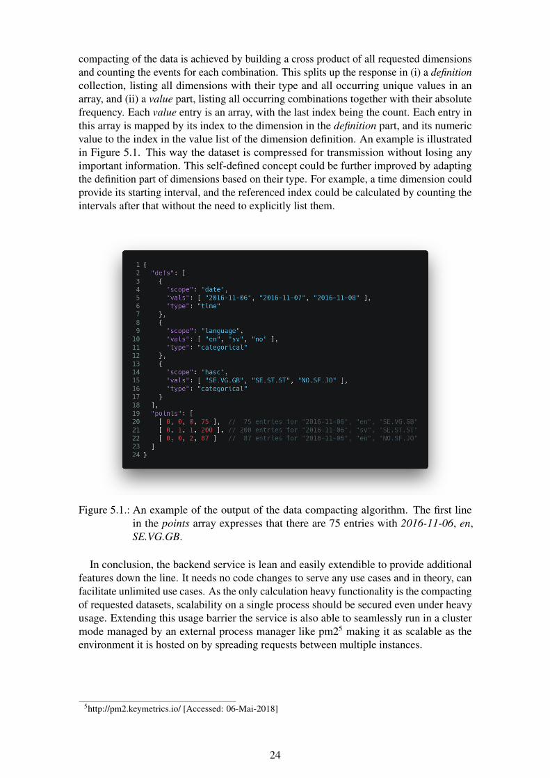
compacting of the data is achieved by building a cross product of all requested dimensionsand counting the events for each combination. This splits up the response in (i) a definitioncollection, listing all dimensions with their type and all occurring unique values in anarray, and (ii) a value part, listing all occurring combinations together with their absolutefrequency. Each value entry is an array, with the last index being the count. Each entry inthis array is mapped by its index to the dimension in the definition part, and its numericvalue to the index in the value list of the dimension definition. An example is illustratedin Figure 5.1. This way the dataset is compressed for transmission without losing anyimportant information. This self-defined concept could be further improved by adaptingthe definition part of dimensions based on their type. For example, a time dimension couldprovide its starting interval, and the referenced index could be calculated by counting theintervals after that without the need to explicitly list them.
Figure 5.1.: An example of the output of the data compacting algorithm. The first linein the points array expresses that there are 75 entries with 2016-11-06, en,SE.VG.GB.
In conclusion, the backend service is lean and easily extendible to provide additionalfeatures down the line. It needs no code changes to serve any use cases and in theory, canfacilitate unlimited use cases. As the only calculation heavy functionality is the compactingof requested datasets, scalability on a single process should be secured even under heavyusage. Extending this usage barrier the service is also able to seamlessly run in a clustermode managed by an external process manager like pm25 making it as scalable as theenvironment it is hosted on by spreading requests between multiple instances.
5http://pm2.keymetrics.io/ [Accessed: 06-Mai-2018]
24
5.2. Frontend
The frontend is also a JavaScript project that relies heavily on build tools to provide thebest cross-browser compatibility and smallest file size while using the newest languagefeatures. Babel6 and webpack7 are used in the build process while the bundled outputonly packs six external libraries. Vue.js8 is used as a reactivity and display frameworkwith Vuetify9 as component and styling framework on top. This makes clean, encapsulatedcomponents possible helping with code sanity, extendability, and maintainability. Axios10
is used as an HTTP client for asynchronous requests and lodash11 as a high performantutility library. Additionally, the visualizations are built upon D3[43] and TopoJSON12
which enable building powerful visualizations from scratch. Again all used technologiesand tools are open-source and freely available.
The structure of the frontend is straightforward. The core takes care of the configurationand data fetching and storing while all other functionalities are encapsulated in separatefiles. Apart from the different components, there is a parser taking care of all data crunchingand a profiler for evaluation reasons.
Upon loading, the core requests the configuration and initial dataset from the backendservice. Once the configuration is loaded, the presentation is built by appending the definedcomponents to the component list. The components are provided with their configurationand the linked data collection. Additionally, the title of the presentation is inserted and theinitial filters are set. When the dataset is loaded, the parser builds a full collection out ofthe compacted data and defines the colors of every category across all dimensions. Afterthe data is loaded and transformed, the collection is split up into its dimensions and filteredaccording to the set filters. The filtered collections are then fed to their linked componentswhich update their visualization.
To set up the components, the order in the definition is used to sort them and the providedwidth is projected on a grid of 12 units. The list is wrapped, forcing components in anew row once all 12 units of a row are filled, resulting in a distribution of the componentsacross the screen that is easy to define and understand.
When a component registers a filter change by the user, the new filter is propagatedto the core which applies the new filter to all other filtered collections, resulting in theirdisplaying components to dynamically update their visualization.
The components are split and encapsulated in their own directories and files, makingthem easily modifiable and extendable without influencing any other component. Whilethe data transformation is taken care of in the parser, minor adjustments that are notgeneralizable are housed in their component, keeping the parser clean. All componentstake their title, linked field, filtered collection, and applied filter as properties, making themfully reactive to changes applied by the core.
In conclusion, the structure of the frontend is highly abstracted and encapsulated,making it easily extendable with additional components and making the componentsflexible to handle different datasets. With the configuration file, the presentation is easilyconfigurable by chaining components together and binding them to their data dimension.The whole frontend project is static and can be used for all presentations as it adapts to the
6https://babeljs.io/ [Accessed: 06-Mai-2018]7https://webpack.js.org/ [Accessed: 06-Mai-2018]8https://vuejs.org/ [Accessed: 06-Mai-2018]9https://vuetifyjs.com/ [Accessed: 06-Mai-2018]
10https://github.com/axios/axios/ [Accessed: 06-Mai-2018]11https://lodash.com/ [Accessed: 06-Mai-2018]12https://github.com/topojson/topojson/ [Accessed: 06-Mai-2018]
25
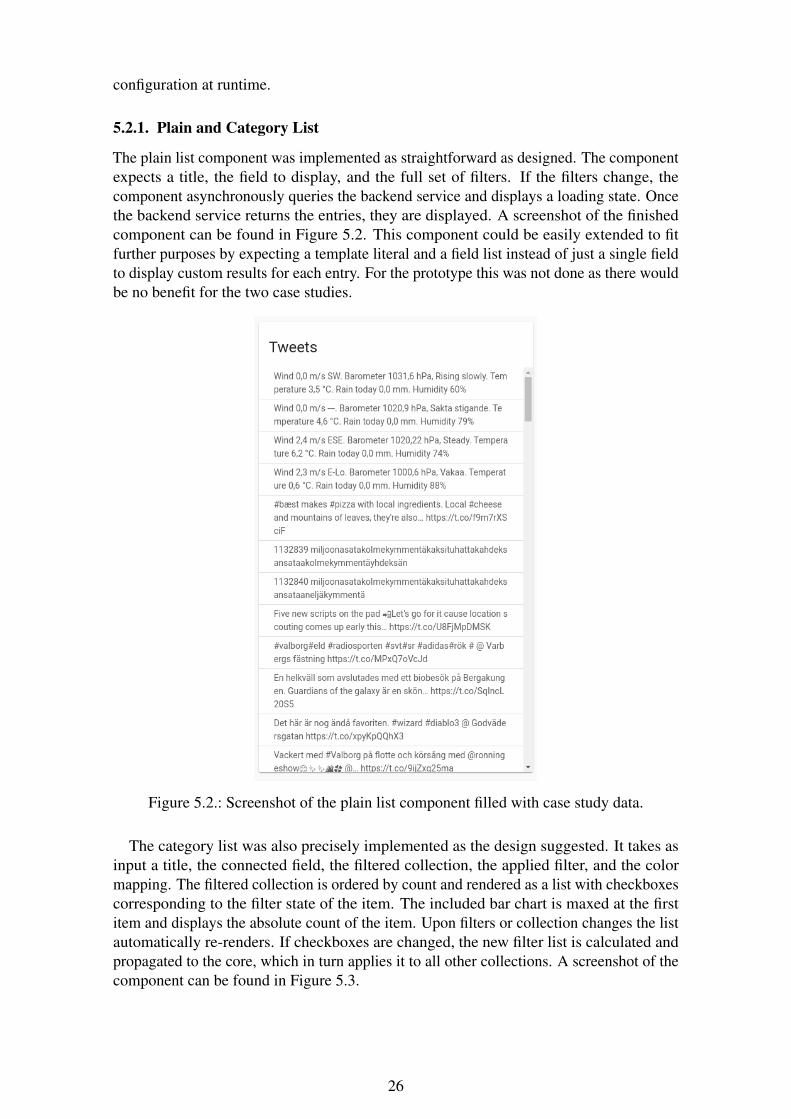
configuration at runtime.
5.2.1. Plain and Category List
The plain list component was implemented as straightforward as designed. The componentexpects a title, the field to display, and the full set of filters. If the filters change, thecomponent asynchronously queries the backend service and displays a loading state. Oncethe backend service returns the entries, they are displayed. A screenshot of the finishedcomponent can be found in Figure 5.2. This component could be easily extended to fitfurther purposes by expecting a template literal and a field list instead of just a single fieldto display custom results for each entry. For the prototype this was not done as there wouldbe no benefit for the two case studies.
Figure 5.2.: Screenshot of the plain list component filled with case study data.
The category list was also precisely implemented as the design suggested. It takes asinput a title, the connected field, the filtered collection, the applied filter, and the colormapping. The filtered collection is ordered by count and rendered as a list with checkboxescorresponding to the filter state of the item. The included bar chart is maxed at the firstitem and displays the absolute count of the item. Upon filters or collection changes the listautomatically re-renders. If checkboxes are changed, the new filter list is calculated andpropagated to the core, which in turn applies it to all other collections. A screenshot of thecomponent can be found in Figure 5.3.
26
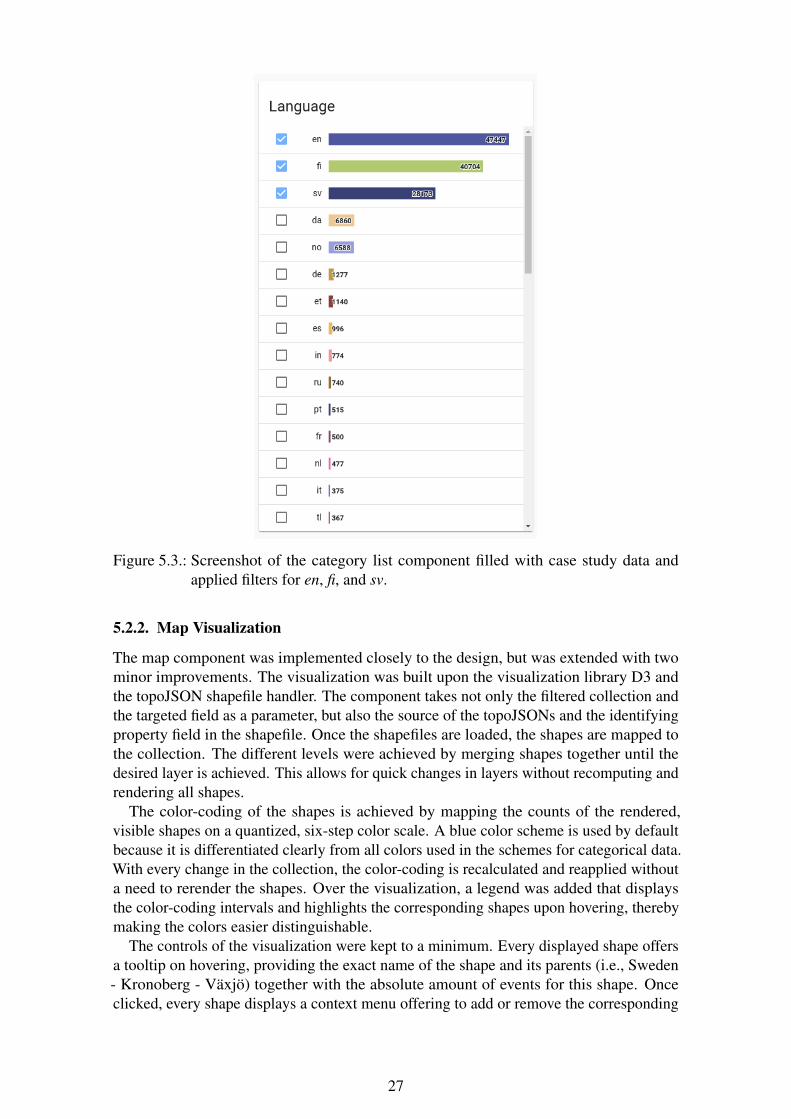
Figure 5.3.: Screenshot of the category list component filled with case study data andapplied filters for en, fi, and sv.
5.2.2. Map Visualization
The map component was implemented closely to the design, but was extended with twominor improvements. The visualization was built upon the visualization library D3 andthe topoJSON shapefile handler. The component takes not only the filtered collection andthe targeted field as a parameter, but also the source of the topoJSONs and the identifyingproperty field in the shapefile. Once the shapefiles are loaded, the shapes are mapped tothe collection. The different levels were achieved by merging shapes together until thedesired layer is achieved. This allows for quick changes in layers without recomputing andrendering all shapes.
The color-coding of the shapes is achieved by mapping the counts of the rendered,visible shapes on a quantized, six-step color scale. A blue color scheme is used by defaultbecause it is differentiated clearly from all colors used in the schemes for categorical data.With every change in the collection, the color-coding is recalculated and reapplied withouta need to rerender the shapes. Over the visualization, a legend was added that displaysthe color-coding intervals and highlights the corresponding shapes upon hovering, therebymaking the colors easier distinguishable.
The controls of the visualization were kept to a minimum. Every displayed shape offersa tooltip on hovering, providing the exact name of the shape and its parents (i.e., Sweden- Kronoberg - Växjö) together with the absolute amount of events for this shape. Onceclicked, every shape displays a context menu offering to add or remove the corresponding
27
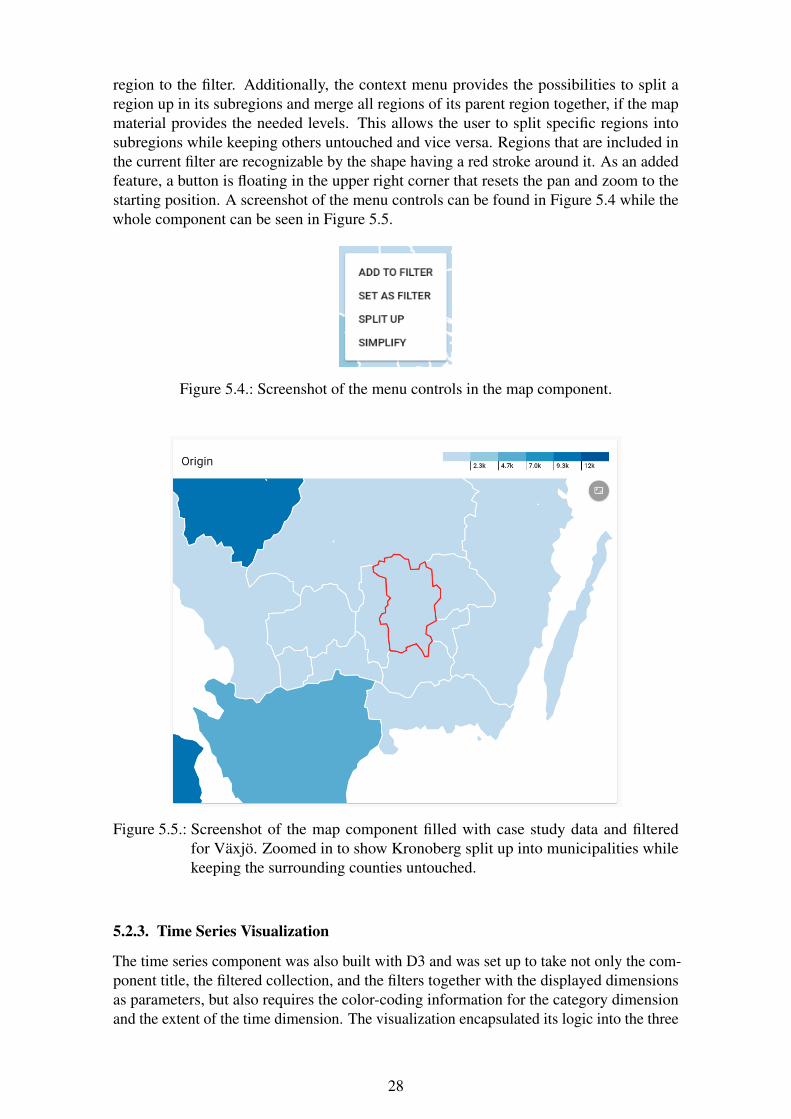
region to the filter. Additionally, the context menu provides the possibilities to split aregion up in its subregions and merge all regions of its parent region together, if the mapmaterial provides the needed levels. This allows the user to split specific regions intosubregions while keeping others untouched and vice versa. Regions that are included inthe current filter are recognizable by the shape having a red stroke around it. As an addedfeature, a button is floating in the upper right corner that resets the pan and zoom to thestarting position. A screenshot of the menu controls can be found in Figure 5.4 while thewhole component can be seen in Figure 5.5.
Figure 5.4.: Screenshot of the menu controls in the map component.
Figure 5.5.: Screenshot of the map component filled with case study data and filteredfor Växjö. Zoomed in to show Kronoberg split up into municipalities whilekeeping the surrounding counties untouched.
5.2.3. Time Series Visualization
The time series component was also built with D3 and was set up to take not only the com-ponent title, the filtered collection, and the filters together with the displayed dimensionsas parameters, but also requires the color-coding information for the category dimensionand the extent of the time dimension. The visualization encapsulated its logic into the three
28
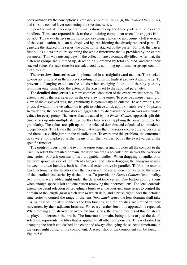
parts outlined by the conception: (i) the overview time series, (ii) the detailed time series,and (iii) the control layer connecting the two time series.
Upon the initial rendering, the visualization sets up the three parts and binds eventhandlers. These are reported back to the containing component to enable triggers fromoutside. This way, changes in the collection or changed filters do not require a full re-renderof the visualization, but can be displayed by transitioning the already rendered parts. Togenerate the stacked time series, the collection is stacked by the parser. For that, the parserfirst builds a data structure spanning the whole timeframe that is provided by the extentparameter. This way missing days in the collection are automatically filled. After that, thedifferent groups are summed up, descendingly ordered by total counted, and then theirstacked values for each timeslot are calculated by summing up all smaller groups count inthat timeslot.
The overview time series was implemented in a straightforward manner. The stackedgroups are rendered in their corresponding color in the highest provided granularity. Toprevent a changing extent on the x-axis when changing filters, and thereby possiblyremoving outer timeslots, the extent of the axis is set to the supplied parameter.
The detailed time series is a more complex adaptation of the overview time series. Theextent is set by the user selection in the overview time series. To provide a more meaningfulview of the displayed data, the granularity is dynamically calculated. To achieve this, thephysical width of the visualization is split to achieve a tick approximately every 50 pixels.In every tick, the nearest timeslots are aggregated by displaying the mean over all includedvalues for every group. The lenses that are added by the Focus+Context approach split thistime series up into multiple strung-together time series, applying the same principle forgranularity. The values are split up into the selected domains and calculated and renderedindependently. This leaves the problem that where the time series connect the values differand there is a visible jump in the visualization. To overcome this problem, the outermostticks were not displayed as the means of all their values, but as the exact values at thespecific timeslot.
The control layer binds the two time series together and provides all the controls to theuser. To select the detailed domain, the user can drag a so-called brush over the overviewtime series. A brush consists of two draggable handles. When dragging a handle, onlythe corresponding side of the extent changes, and when dragging the transparent areabetween the two handles, both handles and extent move in parallel. To hint the user atthis functionality, the handles over the overview time series were connected to the edgesof the detailed time series by dashed lines. To provide the Focus+Context functionality,two buttons were added right under the detailed time series. One button adding a lenswhen enough space is left and one button removing the innermost lens. The lens’ controlsextend the detail selection by providing a brush over the overview time series to control thedomain of the length (from which date to which date) and a brush right under the detailedtime series to control the range of the lens (how much space the lens domain shall takeup). A dashed line also connects the two brushes, and the brushes are limited in theirmovement by their adjacent brushes. For every further lens, this approach is repeated.When moving a brush over the overview time series, the exact timeslots of this brush aredisplayed underneath the brush. The innermost domain, being a lens or just the detailselection, represents the filter that is applied to all other components. This is clarified bychanging the brush and dashed line color and always displaying the selected timeframe inthe upper right corner of the component. A screenshot of the component can be found inFigure 5.6.
29
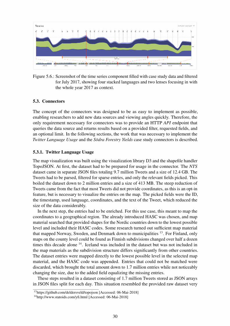
Figure 5.6.: Screenshot of the time series component filled with case study data and filteredfor July 2017, showing four stacked languages and two lenses focusing in withthe whole year 2017 as context.
5.3. Connectors
The concept of the connectors was designed to be as easy to implement as possible,enabling researchers to add new data sources and viewing angles quickly. Therefore, theonly requirement necessary for connectors was to provide an HTTP API endpoint thatqueries the data source and returns results based on a provided filter, requested fields, andan optional limit. In the following sections, the work that was necessary to implement theTwitter Language Usage and the Södra Forestry Yields case study connectors is described.
5.3.1. Twitter Language Usage
The map visualization was built using the visualization library D3 and the shapefile handlerTopoJSON. At first, the dataset had to be prepared for usage in the connector. The NTSdataset came in separate JSON files totaling 9.7 million Tweets and a size of 12.4 GB. TheTweets had to be parsed, filtered for sparse entries, and only the relevant fields picked. Thisboiled the dataset down to 2 million entries and a size of 413 MB. The steep reduction ofTweets came from the fact that most Tweets did not provide coordinates, as this is an opt-infeature, but is necessary to visualize the entries on the map. The picked fields were the ID,the timestamp, used language, coordinates, and the text of the Tweet, which reduced thesize of the data considerably.
In the next step, the entries had to be enriched. For this use case, this meant to map thecoordinates to a geographical region. The already introduced HASC was chosen, and mapmaterial searched that provided shapes for the Nordic countries down to the lowest possiblelevel and included their HASC codes. Some research turned out sufficient map materialthat mapped Norway, Sweden, and Denmark down to municipalities 13. For Finland, onlymaps on the county level could be found as Finnish subdivisions changed over half a dozentimes this decade alone 14. Iceland was included in the dataset but was not included inthe map materials as the subdivision structure differs significantly from other countries.The dataset entries were mapped directly to the lowest possible level in the selected mapmaterial, and the HASC code was appended. Entries that could not be matched werediscarded, which brought the total amount down to 1.7 million entries while not noticeablychanging the size, due to the added field equalizing the missing entries.
These steps resulted in a dataset consisting of 1.7 million Tweets stored as JSON arraysin JSON files split for each day. This situation resembled the provided raw dataset very13https://github.com/deldersveld/topojson [Accessed: 06-Mai-2018]14http://www.statoids.com/yfi.html [Accessed: 06-Mai-2018]
30

closely, and was not optimized with a real database to keep the use case simple andhighlight what the system is capable of achieving even without an optimized data source.
The implementation of the connector was also kept as simple as possible and resulted ina node.js script adapting the filter implementation of the frontend to work on the JSONfiles and provide the server endpoint via express. Additionally, the connector providedan endpoint that takes the URL of a backend service and takes care of registering itself atthe provided backend service. As the most common request scenario is the default filterset that is defined in the configuration, the connector was built to precalculate and cachethe answer to this query, which greatly improved initial loading time for the frontend.The whole connector consisted of less than 100 lines of code, and the performance wasanalyzed in Chapter 6 Evaluation.
The configuration that was registered to the backend service defines the URL on thelocalhost, since the connector is deployed to the same machine as the backend serviceand defines the fields date (type: time), language (type: categorical) and hasc2 (type:categorical). Additionally, the starting filters were defined with a preset for language anddate. For the frontend, the configuration defined a category list for the field language, amap for the field hasc2 with the selected maps, and a plain list for the field text in the firstrow. The second row was defined to only include a time series with the field language overthe field date filling the whole row. The full configuration can be found in Appendix A.
The complete resulting frontend is displayed in Figure 5.7 and was used for the experi-ment and the expert interviews described in Chapter 6. A working instance of the systemwith the presentation of this case study can be found online 15.
Figure 5.7.: Screenshot of the complete frontend with the configuration and dataset of theTwitter Language Usage case study.
15https://twitter.multiscale-explorer.de/
31
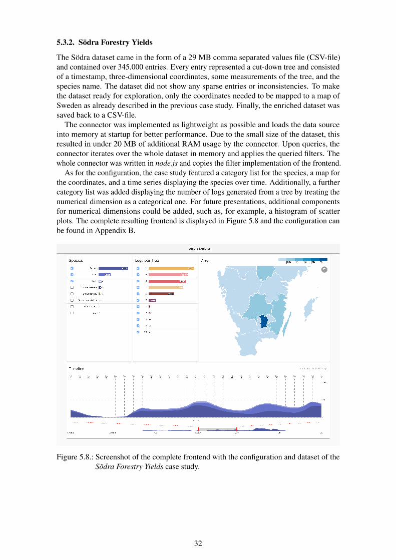
5.3.2. Södra Forestry Yields
The Södra dataset came in the form of a 29 MB comma separated values file (CSV-file)and contained over 345.000 entries. Every entry represented a cut-down tree and consistedof a timestamp, three-dimensional coordinates, some measurements of the tree, and thespecies name. The dataset did not show any sparse entries or inconsistencies. To makethe dataset ready for exploration, only the coordinates needed to be mapped to a map ofSweden as already described in the previous case study. Finally, the enriched dataset wassaved back to a CSV-file.
The connector was implemented as lightweight as possible and loads the data sourceinto memory at startup for better performance. Due to the small size of the dataset, thisresulted in under 20 MB of additional RAM usage by the connector. Upon queries, theconnector iterates over the whole dataset in memory and applies the queried filters. Thewhole connector was written in node.js and copies the filter implementation of the frontend.
As for the configuration, the case study featured a category list for the species, a map forthe coordinates, and a time series displaying the species over time. Additionally, a furthercategory list was added displaying the number of logs generated from a tree by treating thenumerical dimension as a categorical one. For future presentations, additional componentsfor numerical dimensions could be added, such as, for example, a histogram of scatterplots. The complete resulting frontend is displayed in Figure 5.8 and the configuration canbe found in Appendix B.
Figure 5.8.: Screenshot of the complete frontend with the configuration and dataset of theSödra Forestry Yields case study.
32
6. Evaluation
The evaluation phase was the final phase of the project. In this chapter, first, the designof the experiment and the expert interview are described. After that, the findings of theexperiment, the questionnaire, and the interviews are reported and explained. Lastly, theyare interpreted and put into the context of the requirements.
6.1. Design
This section describes the setup of the experiment and the expert interview sessions tomake them reproducible and help to make the concluding findings intelligible.
6.1.1. Experimental Setup
The goal of the experiment was to capture reproducible, quantitative metrics of the perfor-mance of the system under a realistic deployment situation and expected load and tasks.As the performance of such a data-intensive distributed system relies heavily on the manyfactors of the used environment, these variables have to be locked down and documentedto make sure the experiments with the system are reproducible.
On the client-side, the target was to simulate a consumer laptop. The experiment setupwas running an up-to-date Ubuntu 16.10 LTS operating system and featured a singleCPU core of an Intel(R) Core(TM) i7-6500U at 2.50GHz. The system also included aGM108GLM Quadro K620M GPU and 8 GB of DDR3 RAM. The amount of RAM washigh enough that no swap needed to be used, leaving the HDD as a non-factor. The browserChromium 66 was used which comes bundled with v8 6.6. The connection between serverand client was throttled to a symmetric 10mbps connection. A full specification list for theclient setup can be found in Table 6.1.
OS Ubuntu 16.10 LTSCPU single 500MHz coreGPU NVIDIA Quadro K620MRuntime Chromium 66.0.3359.139JS engine v8 6.6.346.26Connection 10mbps symmetric
Table 6.1.: The specifications of the client used in the experiment.
On the server-side, an expectable virtual machine instance on a data center cluster wasremodeled. It was also running an up-to-date Ubuntu 16.10 LTS operating system and washousing both the connector and the backend service, as intended by design. Hardware-wise,the experimental setup included two cores of an Intel(R) Xeon(R) CPU E3-1245 V2 @3.40GHz, 32 GB DDR3 RAM and a SSD capable of a mean sequential read speed ofaround 500M/B. Again, the RAM capacity was large enough for both services and no swapusage was needed. As a runtime environment for the services, the current node.js LTSversion was used, which packs node v8 6.0. A full list of all specifications of the serverenvironment used in the system can be found in Table 6.2.
33
OS Ubuntu 16.10CPU 2x cores @ 3.40GHzSSD ca 500M/B sequential readRuntime node.js v8.4.0JS engine v8 6.0.286.52
Table 6.2.: The specifications of the server used in the experiment.
The experiment consisted of two parts: (i) a basic performance testing for an instanceof StanceXplore, and (ii) an in-depth performance testing of the first case study. Theperformance test of StanceXplore consisted of measuring the resources needed to loadthe frontend, memory usage, and the necessary scripting time to render the presentation.The dataset used had the same source as the case study but only included Tweets fromMay 2016 in Sweden. The restriction on the collected metrics was because replicatingStanceXplore in the same environment as the case study and filling it with the same datasetwas not feasible. The metrics were supposed to give a rough comparison to the new systemwhile keeping the differences in functionality in mind.
The performance measurements on the Twitter Language Usage case study includedmore metrics and was conducted on different samples of the dataset. All measurementswere taken for different sample sizes of the dataset defined by the number of entries:100k, 500k, 1m, and 1.5m samples were selected. For every sample size, there were 100iterations conducted with each shuffling the dataset and randomly picking its entries beforeinjecting the subset into the connector.
The first set of metrics was the resources needed to be loaded by the frontend. This in-cluded the dataset with the defined amount of entries and the resulting size, plus the loadeddependencies. These dependencies include the HTML, CSS, and JS files necessary forthe presentation. They can be categorized in one-time downloads, which are subsequentlyloaded from cache, and recurring downloads.
The second set of metrics captured were centered on timing. The loading times ofthe configuration and the topoJSONs for the map component were measured as dataset-size-independent metrics. In all cases, the loading times include not only the theoreticaltransmission time, but also the connection overhead, the lookup time on the server, and thebrowser internal parsing to an object. Depending on the size and sample of the dataset,the Time-to-Interactive (TTI), the loading, and the parsing of the dataset itself were alsomeasured. TTI describes the time a website needs from the initial call until the user canmake the first meaningful interaction. In the case of the frontend, this means until allvisualizations and components are rendered, and the loading state is removed.
Additionally, the memory usage of the presentation was measured. This was done afterthe initial dataset has been loaded and the presentation was waiting for user interactions.At this point, the dataset was already parsed, filtered, and the filtered collections passedand rendered in all components. It is important to measure this metric as the RAM usagetakes a toll on power usage and, in combination with other tools running on the clientenvironment, clock up the system, forcing the use of swap storage and thereby slowing thewhole environment down.
Lastly, the time needed to interact with the system depending on the size of the datasethad to be measured. To achieve this, three different filtering times were captured. Theseresults would rely heavily on the picked sample because, for example, whole categoriescould be missing from a dimension. As in every iteration the sample entries were chosenrandomly, possible outliers were balanced out. The first measurement was the addition of
34

Sweden to the map filter. The second measurement was filtering the time series for themonth July 2017. And lastly, the toggling of the largest category in the language categorylist was measured. All these filter changes were made independently of each other and onthe preset default filters. An overview of the collected metrics for the case study and theprocess can be found in Figure 6.1.
Figure 6.1.: Overview of the collection process and the collected metrics for the experi-ment.
6.1.2. Expert Interview
The expert interview consisted of five parts and was conducted with five experts in the fieldof data visualization and data exploration. All experts were male and ranged from Ph.D.students to senior researchers and lecturers from the Department of Computer Science andMedia Technology of Linnaeus University. The selection and invitation were organized bythe supervisors of this thesis project to ensure a level of independence.
At first, the interviewee was given an introduction to the system. The creation of the toolwas shortly motivated, and the case study data and scope was explained. A quick privacynotice was given, and the interviewee was asked if he consents to a temporary recording ofthe following conversations to record all findings. At this point, the functionalities of thesystem were explained and presented. All of these steps were performed in-person by theinterviewer with the help of the demonstration system. Next, the interviewee was givenfive minutes of trial time to play around with the tool to get a grip and feel comfortableutilizing the different components. After that, the interviewee was asked to answer fivequestions with the tool in a think-aloud session. These questions were designed to revealif the interviewee understood the concept behind the connected filters and the multiscalevisualizations. The full set of questions is listed in Table 6.3.
Q1 was designed to set the basis for the following questions. The interviewee had toadjust the detail timeframe on the time series view and navigate through the map to reachthe municipality of Stockholm. The answer could then be found in the tooltip of the shape.Q2 checked the understanding of the connected filters and the handling of the category list.The interviewee had to set Stockholm as a filter in the map visualization and then simplyread the displayed number of the Swedish entry in the category list. Q3 was designed toagain check the understanding of the category list component. The answer could be givenby simply comparing the displayed bars visualizing the amount of Tweets without any
35
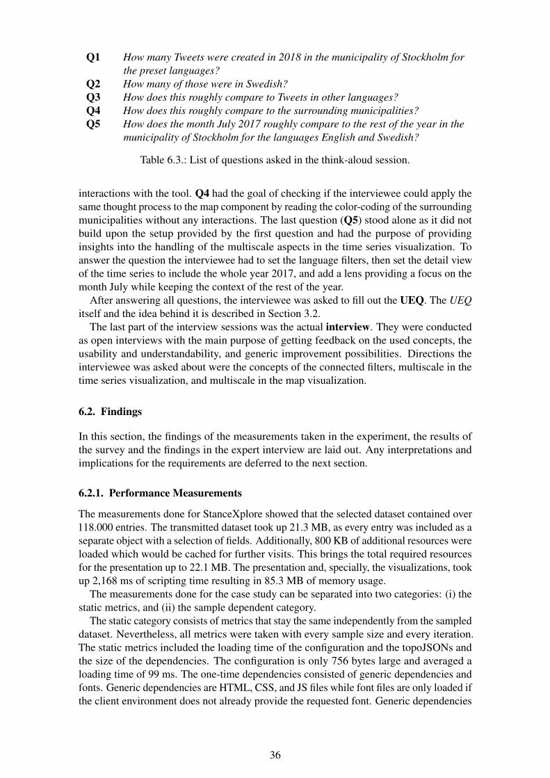
Q1 How many Tweets were created in 2018 in the municipality of Stockholm forthe preset languages?
Q2 How many of those were in Swedish?Q3 How does this roughly compare to Tweets in other languages?Q4 How does this roughly compare to the surrounding municipalities?Q5 How does the month July 2017 roughly compare to the rest of the year in the
municipality of Stockholm for the languages English and Swedish?
Table 6.3.: List of questions asked in the think-aloud session.
interactions with the tool. Q4 had the goal of checking if the interviewee could apply thesame thought process to the map component by reading the color-coding of the surroundingmunicipalities without any interactions. The last question (Q5) stood alone as it did notbuild upon the setup provided by the first question and had the purpose of providinginsights into the handling of the multiscale aspects in the time series visualization. Toanswer the question the interviewee had to set the language filters, then set the detail viewof the time series to include the whole year 2017, and add a lens providing a focus on themonth July while keeping the context of the rest of the year.
After answering all questions, the interviewee was asked to fill out the UEQ. The UEQitself and the idea behind it is described in Section 3.2.
The last part of the interview sessions was the actual interview. They were conductedas open interviews with the main purpose of getting feedback on the used concepts, theusability and understandability, and generic improvement possibilities. Directions theinterviewee was asked about were the concepts of the connected filters, multiscale in thetime series visualization, and multiscale in the map visualization.
6.2. Findings
In this section, the findings of the measurements taken in the experiment, the results ofthe survey and the findings in the expert interview are laid out. Any interpretations andimplications for the requirements are deferred to the next section.
6.2.1. Performance Measurements
The measurements done for StanceXplore showed that the selected dataset contained over118.000 entries. The transmitted dataset took up 21.3 MB, as every entry was included as aseparate object with a selection of fields. Additionally, 800 KB of additional resources wereloaded which would be cached for further visits. This brings the total required resourcesfor the presentation up to 22.1 MB. The presentation and, specially, the visualizations, tookup 2,168 ms of scripting time resulting in 85.3 MB of memory usage.
The measurements done for the case study can be separated into two categories: (i) thestatic metrics, and (ii) the sample dependent category.
The static category consists of metrics that stay the same independently from the sampleddataset. Nevertheless, all metrics were taken with every sample size and every iteration.The static metrics included the loading time of the configuration and the topoJSONs andthe size of the dependencies. The configuration is only 756 bytes large and averaged aloading time of 99 ms. The one-time dependencies consisted of generic dependencies andfonts. Generic dependencies are HTML, CSS, and JS files while font files are only loaded ifthe client environment does not already provide the requested font. Generic dependencies
36
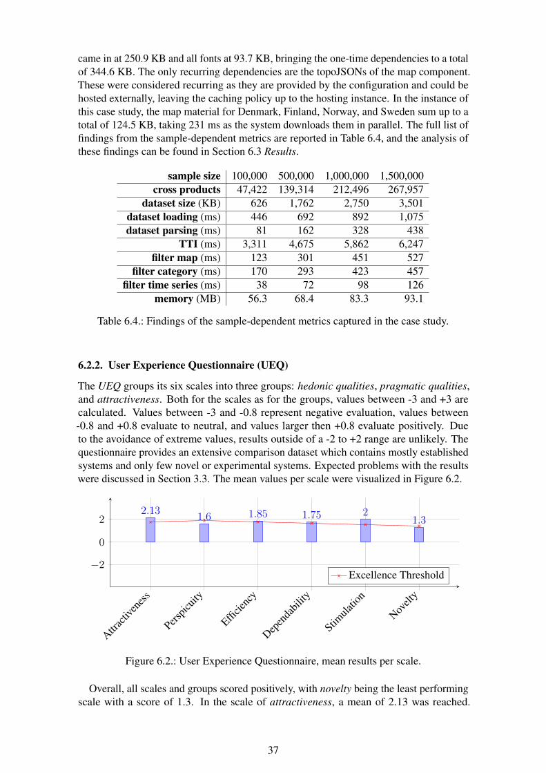
came in at 250.9 KB and all fonts at 93.7 KB, bringing the one-time dependencies to a totalof 344.6 KB. The only recurring dependencies are the topoJSONs of the map component.These were considered recurring as they are provided by the configuration and could behosted externally, leaving the caching policy up to the hosting instance. In the instance ofthis case study, the map material for Denmark, Finland, Norway, and Sweden sum up to atotal of 124.5 KB, taking 231 ms as the system downloads them in parallel. The full list offindings from the sample-dependent metrics are reported in Table 6.4, and the analysis ofthese findings can be found in Section 6.3 Results.
sample size 100,000 500,000 1,000,000 1,500,000cross products 47,422 139,314 212,496 267,957
dataset size (KB) 626 1,762 2,750 3,501dataset loading (ms) 446 692 892 1,075dataset parsing (ms) 81 162 328 438
TTI (ms) 3,311 4,675 5,862 6,247filter map (ms) 123 301 451 527
filter category (ms) 170 293 423 457filter time series (ms) 38 72 98 126
memory (MB) 56.3 68.4 83.3 93.1
Table 6.4.: Findings of the sample-dependent metrics captured in the case study.
6.2.2. User Experience Questionnaire (UEQ)
The UEQ groups its six scales into three groups: hedonic qualities, pragmatic qualities,and attractiveness. Both for the scales as for the groups, values between -3 and +3 arecalculated. Values between -3 and -0.8 represent negative evaluation, values between-0.8 and +0.8 evaluate to neutral, and values larger then +0.8 evaluate positively. Dueto the avoidance of extreme values, results outside of a -2 to +2 range are unlikely. Thequestionnaire provides an extensive comparison dataset which contains mostly establishedsystems and only few novel or experimental systems. Expected problems with the resultswere discussed in Section 3.3. The mean values per scale were visualized in Figure 6.2.
Attrac
tiven
ess
Perspic
uity
Efficie
ncy
Depen
dabil
ity
Stimula
tion
Novelt
y
−2
0
22.13
1.6 1.85 1.75 21.3
Excellence Threshold
Figure 6.2.: User Experience Questionnaire, mean results per scale.
Overall, all scales and groups scored positively, with novelty being the least performingscale with a score of 1.3. In the scale of attractiveness, a mean of 2.13 was reached.
37
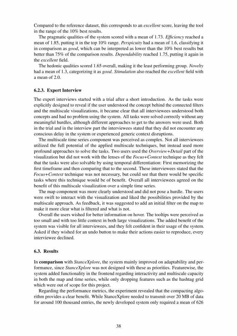
Compared to the reference dataset, this corresponds to an excellent score, leaving the toolin the range of the 10% best results.
The pragmatic qualities of the system scored with a mean of 1.73. Efficiency reached amean of 1.85, putting it in the top 10% range. Perspicuity had a mean of 1.6, classifying itin comparison as good, which can be interpreted as lower than the 10% best results butbetter than 75% of the comparison results. Dependability reached 1.75, putting it again inthe excellent field.
The hedonic qualities scored 1.65 overall, making it the least performing group. Noveltyhad a mean of 1.3, categorizing it as good. Stimulation also reached the excellent field witha mean of 2.0.
6.2.3. Expert Interview
The expert interviews started with a trial after a short introduction. As the tasks wereexplicitly designed to reveal if the user understood the concept behind the connected filtersand the multiscale visualizations, it became clear that all interviewees understood bothconcepts and had no problem using the system. All tasks were solved correctly without anymeaningful hurdles, although different approaches to get to the answers were used. Bothin the trial and in the interview part the interviewees stated that they did not encounter anyconscious delay in the system or experienced generic context disruptions.
The multiscale time series component was perceived as complex. Not all intervieweesutilized the full potential of the applied multiscale techniques, but instead used moreprofound approaches to solve the tasks. Two users used the Overview+Detail part of thevisualization but did not work with the lenses of the Focus+Context technique as they feltthat the tasks were also solvable by using temporal differentiation: First memorizing thefirst timeframe and then comparing that to the second. These interviewees stated that theFocus+Context technique was not necessary, but could see that there would be specifictasks where this technique would be of benefit. Overall all interviewees agreed on thebenefit of this multiscale visualization over a simple time series.
The map component was more clearly understood and did not pose a hurdle. The userswere swift to interact with the visualization and liked the possibilities provided by themultiscale approach. As feedback, it was suggested to add an initial filter on the map tomake it more clear what is filtered and what is not.
Overall the users wished for better information on hover. The tooltips were perceived astoo small and with too little context in both large visualizations. The added benefit of thesystem was visible for all interviewees, and they felt confident in their usage of the system.Asked if they wished for an undo button to make their actions easier to reproduce, everyinterviewee declined.
6.3. Results
In comparison with StanceXplore, the system mainly improved on adaptability and per-formance, since StanceXplore was not designed with these as priorities. Featurewise, thesystem added functionality in the frontend regarding interactivity and multiscale capacityin both the map and time series, while only dropping features such as the hashtag gridwhich were out of scope for this project.
Regarding the performance metrics, the experiment revealed that the compacting algo-rithm provides a clear benefit. While StanceXplore needed to transmit over 20 MB of datafor around 100 thousand entries, the newly developed system only required a mean of 626
38
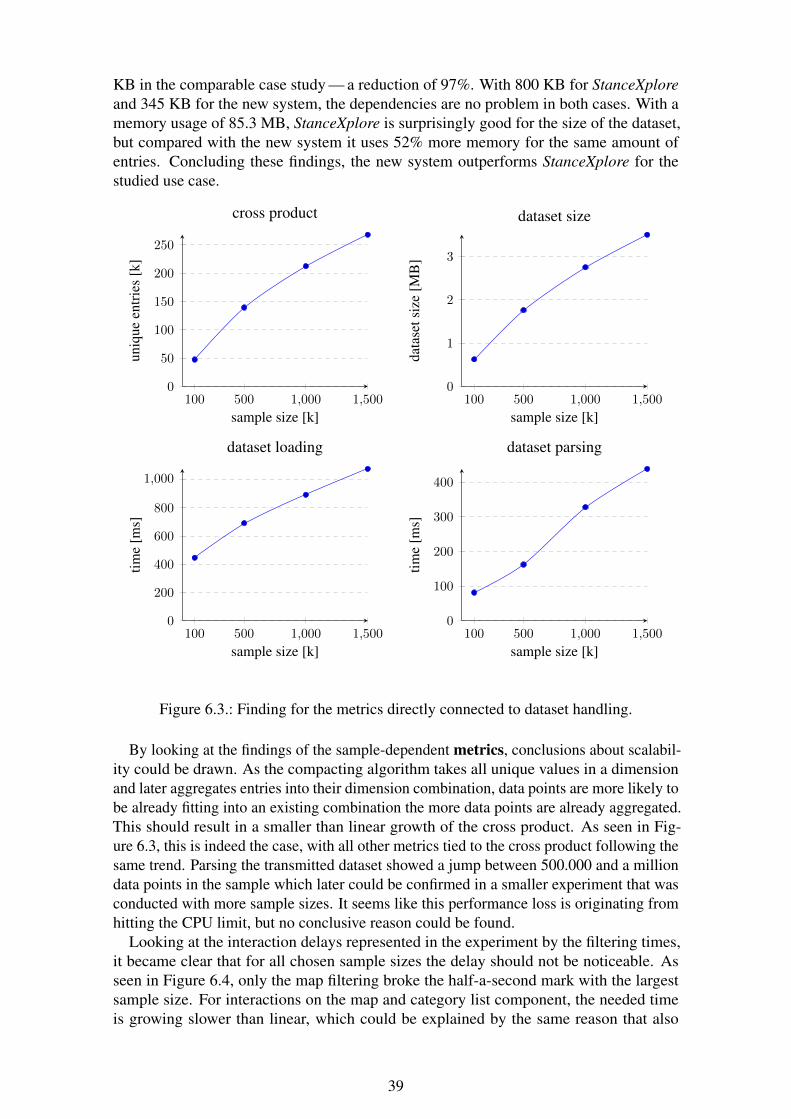
KB in the comparable case study — a reduction of 97%. With 800 KB for StanceXploreand 345 KB for the new system, the dependencies are no problem in both cases. With amemory usage of 85.3 MB, StanceXplore is surprisingly good for the size of the dataset,but compared with the new system it uses 52% more memory for the same amount ofentries. Concluding these findings, the new system outperforms StanceXplore for thestudied use case.
100 500 1,000 1,5000
50
100
150
200
250
sample size [k]
uniq
ueen
trie
s[k
]
cross product
100 500 1,000 1,5000
1
2
3
sample size [k]da
tase
tsiz
e[M
B]
dataset size
100 500 1,000 1,5000
200
400
600
800
1,000
sample size [k]
time
[ms]
dataset loading
100 500 1,000 1,5000
100
200
300
400
sample size [k]
time
[ms]
dataset parsing
Figure 6.3.: Finding for the metrics directly connected to dataset handling.
By looking at the findings of the sample-dependent metrics, conclusions about scalabil-ity could be drawn. As the compacting algorithm takes all unique values in a dimensionand later aggregates entries into their dimension combination, data points are more likely tobe already fitting into an existing combination the more data points are already aggregated.This should result in a smaller than linear growth of the cross product. As seen in Fig-ure 6.3, this is indeed the case, with all other metrics tied to the cross product following thesame trend. Parsing the transmitted dataset showed a jump between 500.000 and a milliondata points in the sample which later could be confirmed in a smaller experiment that wasconducted with more sample sizes. It seems like this performance loss is originating fromhitting the CPU limit, but no conclusive reason could be found.
Looking at the interaction delays represented in the experiment by the filtering times,it became clear that for all chosen sample sizes the delay should not be noticeable. Asseen in Figure 6.4, only the map filtering broke the half-a-second mark with the largestsample size. For interactions on the map and category list component, the needed timeis growing slower than linear, which could be explained by the same reason that also
39
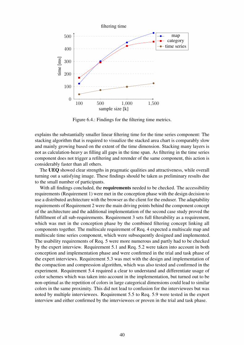
100 500 1,000 1,5000
100
200
300
400
500
sample size [k]
time
[ms]
filtering time
mapcategory
time series
Figure 6.4.: Findings for the filtering time metrics.
explains the substantially smaller linear filtering time for the time series component: Thestacking algorithm that is required to visualize the stacked area chart is comparably slowand mainly growing based on the extent of the time dimension. Stacking many layers isnot as calculation-heavy as filling all gaps in the time span. As filtering in the time seriescomponent does not trigger a refiltering and rerender of the same component, this action isconsiderably faster than all others.
The UEQ showed clear strengths in pragmatic qualities and attractiveness, while overallturning out a satisfying image. These findings should be taken as preliminary results dueto the small number of participants.
With all findings concluded, the requirements needed to be checked. The accessibilityrequirements (Requirement 1) were met in the conception phase with the design decision touse a distributed architecture with the browser as the client for the enduser. The adaptabilityrequirements of Requirement 2 were the main driving points behind the component conceptof the architecture and the additional implementation of the second case study proved thefulfillment of all sub-requirements. Requirement 3 sets full filterability as a requirement,which was met in the conception phase by the combined filtering concept linking allcomponents together. The multiscale requirement of Req. 4 expected a multiscale map andmultiscale time series component, which were subsequently designed and implemented.The usability requirements of Req. 5 were more numerous and partly had to be checkedby the expert interview. Requirement 5.1 and Req. 5.2 were taken into account in bothconception and implementation phase and were confirmed in the trial and task phase ofthe expert interviews. Requirement 5.3 was met with the design and implementation ofthe compaction and compression algorithm, which was also tested and confirmed in theexperiment. Requirement 5.4 required a clear to understand and differentiate usage ofcolor schemes which was taken into account in the implementation, but turned out to benon-optimal as the repetition of colors in large categorical dimensions could lead to similarcolors in the same proximity. This did not lead to confusion for the interviewees but wasnoted by multiple interviewees. Requirement 5.5 to Req. 5.9 were tested in the expertinterview and either confirmed by the interviewees or proven in the trial and task phase.
40
7. Conclusion
This chapter discusses the results of the project, draws conclusions from the findings,and analyzes if the designed system answered the initial research question. At the endof the chapter, an outlook is provided by looking into possible future work and furtheropportunities for the evolution and usage of the system.
7.1. Discussion
The project turned out a working system for effective and efficient exploration of largemulti-dimensional datasets. Additionally, two new multiscale visualizations were con-ceived, implemented, and evaluated for a map and a time series view. The evaluation of thesystem showed that all set requirements were met and the practical usability was provenby two case studies. The performance of the system turned out to be sufficient and scaledwell, but not only regarding the compacting algorithm small improvement possibilitiescame up during the project. All improvement possibilities and ideas were documentedboth in this report and the source code of the tool itself, so that they may be addressedin future iterations. From this standpoint, it was shown that the design conceived in theconception phase provided a sufficient answer to the research question.
In comparison to previous work, the system improved in many points but left somefeatures behind that were out of scope for this project. In comparison with StanceXplore,the system featured significantly-improved performance and scalability. Additionally, thefunctionality of the presentation was enhanced, and the focus moved to support higheradaptability. This focus change resulted in small missing features that are highly specificlike the hashtag grid StanceXplore provided. However, the component structure of the newsystem allows for easy additions of new components and the inclusion of such in new orexisting presentations. The time series visualization was influenced by the MultiStreamconcept, but differs in significant points. While the MultiStream concept used steamgraphsto visualize time series, the new system utilized less-complex stacked area graphs. One ofthe reasons for this move was that the focus of this visualization was not on the visualizationof hierarchical time series, but instead on providing a more complete interactive multiscaleexperience. This focus also lead to the absence of granularity changes in the categoricaldimension. Instead, the system improved on the concept with a flexible granularity in thetime dimension providing better scalability for vast time spans. Additionally, the systemprovides improved controls over the detailed domain and full control over flexible lensesproviding a focus into the data. One final big step is the integration of the visualizationinto a full system which is moving the implementation away from a pure proof-of-conceptlike MultiStream.
7.2. Outlook
For the future, there are two topics covered in this project. The first one is the resultingsystem and its further development and usage, and the second one is the research done inthe field of multiscale visualizations.
41
The system was designed to be used for initial data exploration by non-data scientistsand easy adaption to new data sources and viewing angles. The implementation of thecase studies and the evaluation showed that the system is capable of fulfilling this job.StanceXplore was developed to answer a very similar question as the first case study triedto answer. For further projects like this, no new system would need to be developed, butinstead, only a connector would need to be set up. If particular visualizations would berequired, these could be included in the frontend, and all further projects could also benefitfrom it. Regarding further development, there are many options for additional componentsthat would add more benefit to the system. For example, handling of numerical dimensionswith visualizations for histograms or scatterplots. Also, the steps taken by the first casestudy connector implementation could be improved: a caching of the already compactedand compressed default filter result could be held at the backend service, greatly improvingthe initial performance of presentations of static datasets.
As for the research into multiscale visualizations in this project, a few conceptualimprovements and further research possibilities emerged. Firstly, the Focus+Contextapproach inside an Overview+Detail approach showed promising results as already shownin previous work. But the addition of dynamic focusing lenses went one step further andimproved the usability and possibilities of the visualization. In the evaluation and duringimplementation, it became clear that further conceptual improvements could yield greatbenefits. For example, better handling of granularity changes and interaction with the lenshandles. Secondly, the evaluation showed that some users did not use the functionalitiesprovided by the Focus+Context approach, but instead preferred to build an image in theirmind by comparing temporally-separated visualizations using a zooming approach. Todetermine a use case for the Focus+Context approach and differentiation from use casesfor other similar approaches like the one used by these users would be interesting.
In summary, there are promising possibilities for both the system and the research donethat hopefully will be picked up in the future.
42
Bibliography
[1] R. Spence, Information visualization: An introduction, 3rd ed. Springer PublishingCompany, Inc., 2014.
[2] M. Friendly and D. J. Denis, Milestones in the history of thematic cartography,statistical graphics, and data visualization: An illustrated chronology of innovations.Statistical Consulting Service, York University, 2008.
[3] K. W. Brodlie, L. A. Carpenter, R. A. Earnshaw, J. R. Gallop, R. J. Hubbold, A. M.Mumford, C. D. Osland, and P. Quarendon, Scientific visualization: Techniques andapplications. Springer Science & Business Media, 2012.
[4] D. Keim, G. Andrienko, J.-D. Fekete, C. Görg, J. Kohlhammer, and G. Melançon,“Visual analytics: Definition, process, and challenges,” Lecture Notes in ComputerScience, vol. 4950, pp. 154–176, 2008.
[5] A. Kerren and F. Schreiber, “Toward the role of interaction in visual analytics,” inSimulation Conference (WSC), Proceedings of the 2012 Winter. IEEE, 2012, pp.1–13.
[6] E. Cuenca, A. Sallaberry, F. Wang, and P. Poncelet, “Visualizing hierarchical timeseries with a focus+context approach,” in IEEE VIS–Posters, 2017.
[7] A. Kerren, I. Jusufi, and J. Liu, “Multi-scale trend visualization of long-term tempera-ture data sets,” in Proceedings of SIGRAD 2014, Visual Computing, June 12-13, 2014,Göteborg, Sweden, no. 106. Linköping University Electronic Press, Linköpingsuniversitet, 2014, pp. 91–94.
[8] A. Cockburn, A. Karlson, and B. B. Bederson, “A review of overview+detail, zoom-ing, and focus+context interfaces,” ACM Computing Surveys, vol. 41, no. 1, pp.2:1–2:31, 2009.
[9] M. Hasan, F. F. Samavati, and C. Jacob, “Interactive multilevel focus+context visual-ization framework,” The Visual Computer, vol. 32, no. 3, pp. 323–334, 2016.
[10] E. Hadjidemetriou, M. D. Grossberg, and S. K. Nayar, “Spatial information in mul-tiresolution histograms,” in Computer Vision and Pattern Recognition. Proceedingsof the 2001 IEEE Computer Society Conference on, vol. 1. IEEE, 2001, pp. I–I.
[11] L. Heide, Punched-card systems and the early information explosion, 1880–1945.JHU Press, 2009.
[12] D. A. Keim, F. Mansmann, J. Schneidewind, J. Thomas, and H. Ziegler, “Visualanalytics: Scope and challenges,” in Visual data mining. Springer, 2008, pp. 76–90.
[13] E. Cuenca, A. Sallaberry, F. Y. Wang, and P. Poncelet, “MultiStream: A multiresolu-tion streamgraph approach to explore hierarchical time series,” IEEE Transactions onVisualization and Computer Graphics, pp. 1–1, 2018.
43
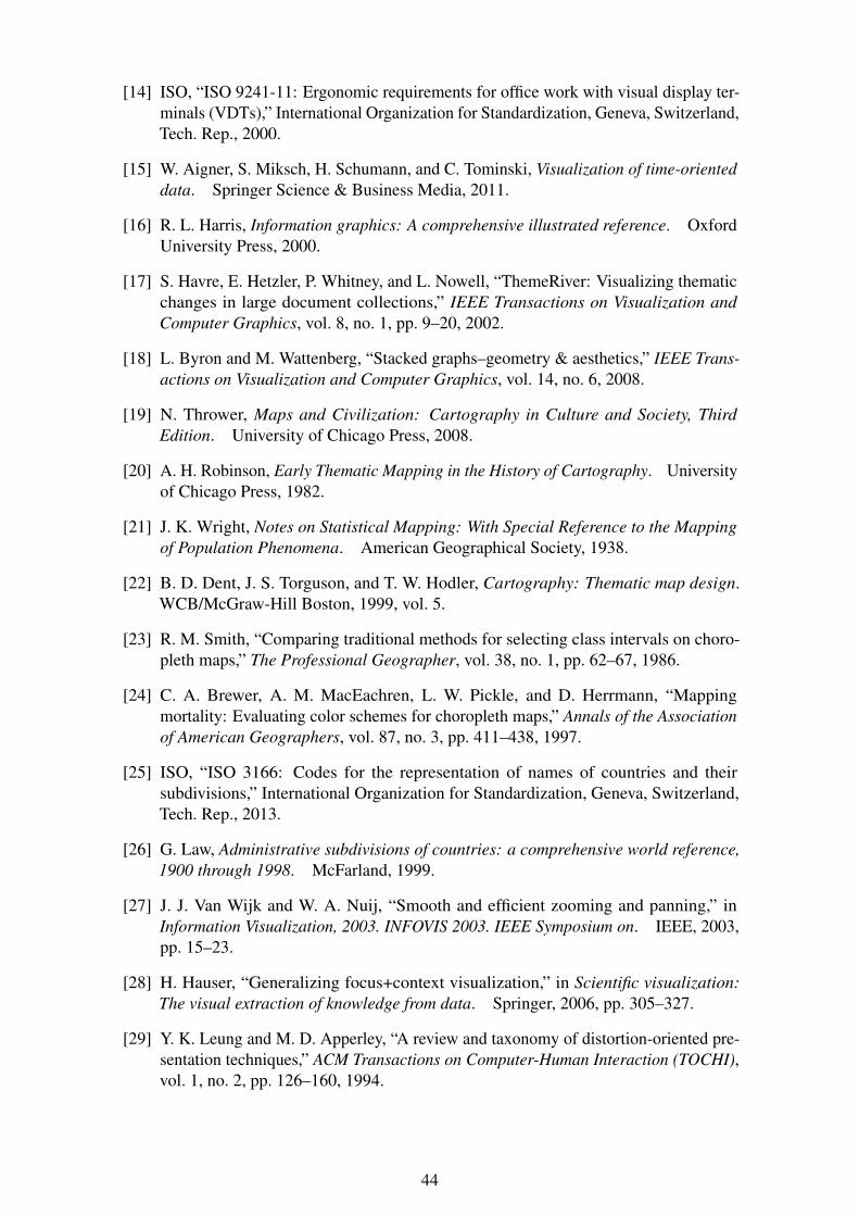
[14] ISO, “ISO 9241-11: Ergonomic requirements for office work with visual display ter-minals (VDTs),” International Organization for Standardization, Geneva, Switzerland,Tech. Rep., 2000.
[15] W. Aigner, S. Miksch, H. Schumann, and C. Tominski, Visualization of time-orienteddata. Springer Science & Business Media, 2011.
[16] R. L. Harris, Information graphics: A comprehensive illustrated reference. OxfordUniversity Press, 2000.
[17] S. Havre, E. Hetzler, P. Whitney, and L. Nowell, “ThemeRiver: Visualizing thematicchanges in large document collections,” IEEE Transactions on Visualization andComputer Graphics, vol. 8, no. 1, pp. 9–20, 2002.
[18] L. Byron and M. Wattenberg, “Stacked graphs–geometry & aesthetics,” IEEE Trans-actions on Visualization and Computer Graphics, vol. 14, no. 6, 2008.
[19] N. Thrower, Maps and Civilization: Cartography in Culture and Society, ThirdEdition. University of Chicago Press, 2008.
[20] A. H. Robinson, Early Thematic Mapping in the History of Cartography. Universityof Chicago Press, 1982.
[21] J. K. Wright, Notes on Statistical Mapping: With Special Reference to the Mappingof Population Phenomena. American Geographical Society, 1938.
[22] B. D. Dent, J. S. Torguson, and T. W. Hodler, Cartography: Thematic map design.WCB/McGraw-Hill Boston, 1999, vol. 5.
[23] R. M. Smith, “Comparing traditional methods for selecting class intervals on choro-pleth maps,” The Professional Geographer, vol. 38, no. 1, pp. 62–67, 1986.
[24] C. A. Brewer, A. M. MacEachren, L. W. Pickle, and D. Herrmann, “Mappingmortality: Evaluating color schemes for choropleth maps,” Annals of the Associationof American Geographers, vol. 87, no. 3, pp. 411–438, 1997.
[25] ISO, “ISO 3166: Codes for the representation of names of countries and theirsubdivisions,” International Organization for Standardization, Geneva, Switzerland,Tech. Rep., 2013.
[26] G. Law, Administrative subdivisions of countries: a comprehensive world reference,1900 through 1998. McFarland, 1999.
[27] J. J. Van Wijk and W. A. Nuij, “Smooth and efficient zooming and panning,” inInformation Visualization, 2003. INFOVIS 2003. IEEE Symposium on. IEEE, 2003,pp. 15–23.
[28] H. Hauser, “Generalizing focus+context visualization,” in Scientific visualization:The visual extraction of knowledge from data. Springer, 2006, pp. 305–327.
[29] Y. K. Leung and M. D. Apperley, “A review and taxonomy of distortion-oriented pre-sentation techniques,” ACM Transactions on Computer-Human Interaction (TOCHI),vol. 1, no. 2, pp. 126–160, 1994.
44
[30] G. W. Furnas, “The fisheye view: A new look at structured files,” Citeseer, Tech.Rep., 1981.
[31] M. Sarkar and M. H. Brown, “Graphical fisheye views,” Communications of the ACM,vol. 37, no. 12, pp. 73–83, 1994.
[32] G. W. Furnas, Generalized fisheye views. ACM, 1986, vol. 17, no. 4.
[33] S. K. Card, G. G. Robertson, and J. D. Mackinlay, “The information visualizer, aninformation workspace,” in Proceedings of the SIGCHI Conference on Human factorsin computing systems. ACM, 1991, pp. 181–186.
[34] R. Spence and M. Apperley, “Data base navigation: an office environment for theprofessional,” Behaviour & Information Technology, vol. 1, no. 1, pp. 43–54, 1982.
[35] S. Schreibman, R. Siemens, and J. Unsworth, A companion to digital humanities.John Wiley & Sons, 2008.
[36] R. M. Martins, V. Simaki, K. Kucher, C. Paradis, and A. Kerren, “StanceXplore: Vi-sualization for the interactive exploration of stance in social media,” in 2nd Workshopon Visualization for the Digital Humanities (VIS4DH’17), October 2017, Phoenix,Arizona, USA, 2017.
[37] M. Kleppmann, Designing Data-Intensive Applications: The Big Ideas BehindReliable, Scalable, and Maintainable Systems. O’Reilly Media Inc., 2017.
[38] B. Laugwitz, T. Held, and M. Schrepp, Construction and evaluation of a userexperience questionnaire. Springer, 2008.
[39] ISO, “ISO 9241: Ergonomics of Human System Interaction,” International Organiza-tion for Standardization, Geneva, Switzerland, Tech. Rep., 2018.
[40] T. Jokela, N. Iivari, and V. Tornberg, “Using the ISO 9241-11 definition of usabilityin requirements determination: Case study,” in HCI, 2004, pp. 155–156.
[41] M. Laitinen, J. Lundberg, M. Levin, and R. M. Martins, “The nordic tweet stream:A dynamic real-time monitor corpus of big and rich language data,” in DigitalHumanities in the Nordic Countries (DHN 2018), 3rd Conference, 2018.
[42] “The JavaScript Object Notation (JSON) data interchange format,” RFC 7159, 2015.[Online]. Available: https://rfc-editor.org/rfc/rfc7159.txt
[43] M. Bostock, V. Ogievetsky, and J. Heer, “D3 data-driven documents,” IEEE trans-actions on visualization and computer graphics, vol. 17, no. 12, pp. 2301–2309,2011.
45
A. Configuration Twitter Language Usage
1 {2 url: ’localhost:11219’,3 name: ’Twitter Explorer’,4 host: ’twitter.multiscale-explorer.de’,5 fields: [6 { name: ’date’, type: ’time’ },7 { name: ’language’, type: ’categorical’ },8 { name: ’hasc2’, type: ’categorical’ }9 ],
10 filter: {11 hasc2: { type: ’startsWith’, domain: [] },12 language: { type: ’includes’, domain: [’en’, ’sv’, ’no’, ’fi’] },13 date: { type: ’between’, domain: [+new Date(2017, 0, 1), +new Date
(2017, 11, 31)] }14 },15 frontend: [16 {17 title: ’Language’,18 widget: ’categories’,19 width: 3,20 field: ’language’21 },22 {23 title: ’Origin’,24 widget: ’map’,25 topos: [26 ’https://glcdn.githack.com/KRKnetwork/maps-scandinavia/raw/
master/sweden-municipalities.json’,27 ’https://raw.githubusercontent.com/deldersveld/topojson/master/
countries/norway/norway-municipalities.json’,28 ’https://glcdn.githack.com/KRKnetwork/maps-scandinavia/raw/
master/denmark-municipalities.json’,29 ’https://glcdn.githack.com/KRKnetwork/maps-scandinavia/raw/
master/finland-regions.json’30 ],31 levels: [],32 width: 6,33 field: ’hasc2’34 },35 {36 title: ’Tweets’,37 widget: ’list’,38 width: 3,39 field: ’text’40 },41 {42 title: ’Timeline’,43 widget: ’timeline’,44 width: 12,45 field: ’language’,46 over: ’date’,47 extent: [+new Date(2016, 10, 06), +new Date(2018, 1, 1)]
A

48 }49 ]50 }
B
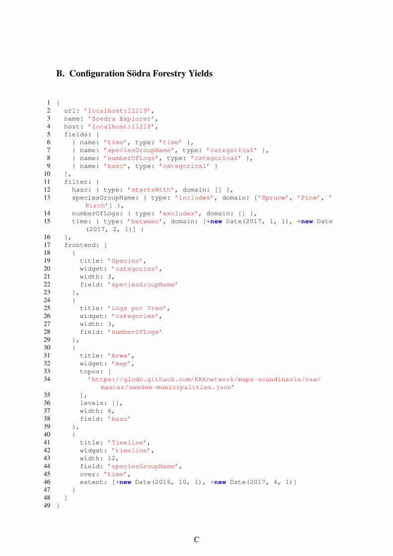
B. Configuration Södra Forestry Yields
1 {2 url: ’localhost:11219’,3 name: ’Soedra Explorer’,4 host: ’localhost:11218’,5 fields: [6 { name: ’time’, type: ’time’ },7 { name: ’speciesGroupName’, type: ’categorical’ },8 { name: ’numberOfLogs’, type: ’categorical’ },9 { name: ’hasc’, type: ’categorical’ }
10 ],11 filter: {12 hasc: { type: ’startsWith’, domain: [] },13 speciesGroupName: { type: ’includes’, domain: [’Spruce’, ’Pine’, ’
Birch’] },14 numberOfLogs: { type: ’excludes’, domain: [] },15 time: { type: ’between’, domain: [+new Date(2017, 1, 1), +new Date
(2017, 2, 1)] }16 },17 frontend: [18 {19 title: ’Species’,20 widget: ’categories’,21 width: 3,22 field: ’speciesGroupName’23 },24 {25 title: ’Logs per Tree’,26 widget: ’categories’,27 width: 3,28 field: ’numberOfLogs’29 },30 {31 title: ’Area’,32 widget: ’map’,33 topos: [34 ’https://glcdn.githack.com/KRKnetwork/maps-scandinavia/raw/
master/sweden-municipalities.json’35 ],36 levels: [],37 width: 6,38 field: ’hasc’39 },40 {41 title: ’Timeline’,42 widget: ’timeline’,43 width: 12,44 field: ’speciesGroupName’,45 over: ’time’,46 extent: [+new Date(2016, 10, 1), +new Date(2017, 4, 1)]47 }48 ]49 }
C
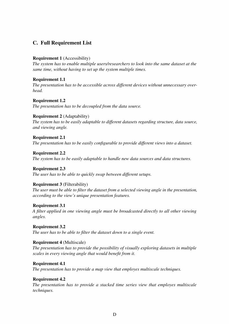
C. Full Requirement List
Requirement 1 (Accessibility)The system has to enable multiple users/researchers to look into the same dataset at thesame time, without having to set up the system multiple times.
Requirement 1.1The presentation has to be accessible across different devices without unnecessary over-head.
Requirement 1.2The presentation has to be decoupled from the data source.
Requirement 2 (Adaptability)The system has to be easily adaptable to different datasets regarding structure, data source,and viewing angle.
Requirement 2.1The presentation has to be easily configurable to provide different views into a dataset.
Requirement 2.2The system has to be easily adaptable to handle new data sources and data structures.
Requirement 2.3The user has to be able to quickly swap between different setups.
Requirement 3 (Filterability)The user must be able to filter the dataset from a selected viewing angle in the presentation,according to the view’s unique presentation features.
Requirement 3.1A filter applied in one viewing angle must be broadcasted directly to all other viewingangles.
Requirement 3.2The user has to be able to filter the dataset down to a single event.
Requirement 4 (Multiscale)The presentation has to provide the possibility of visually exploring datasets in multiplescales in every viewing angle that would benefit from it.
Requirement 4.1The presentation has to provide a map view that employes multiscale techniques.
Requirement 4.2The presentation has to provide a stacked time series view that employes multiscaletechniques.
D
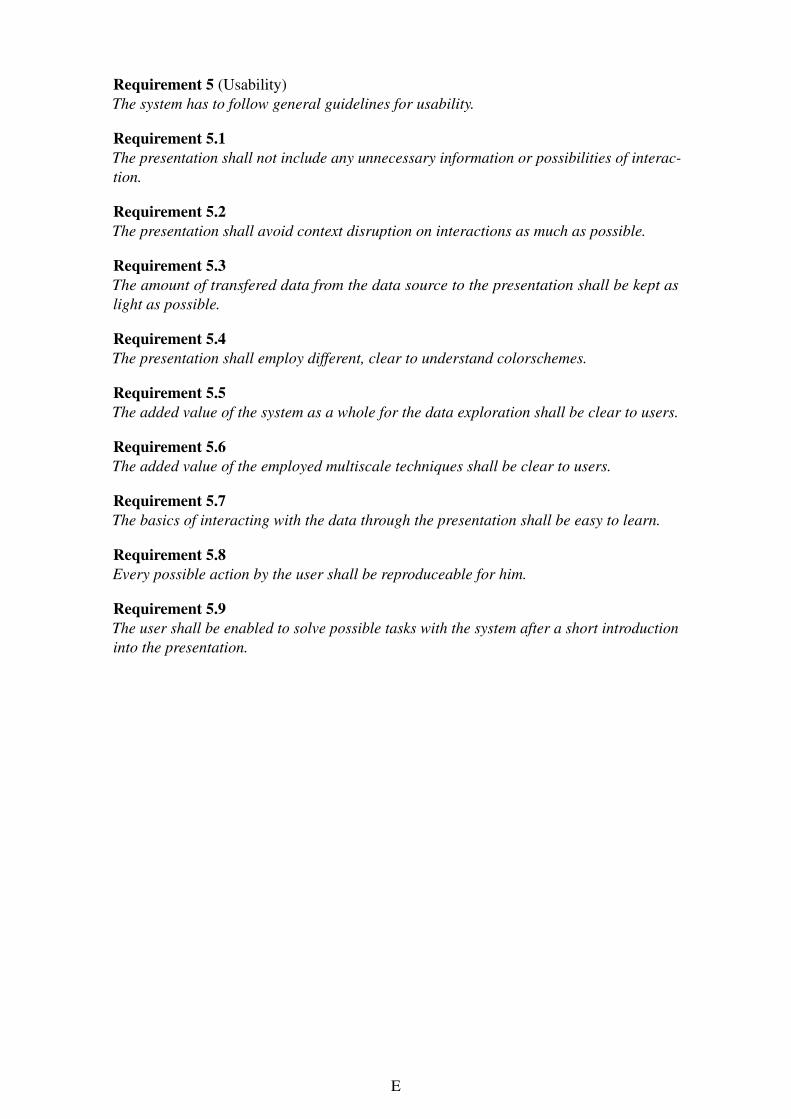
Requirement 5 (Usability)The system has to follow general guidelines for usability.
Requirement 5.1The presentation shall not include any unnecessary information or possibilities of interac-tion.
Requirement 5.2The presentation shall avoid context disruption on interactions as much as possible.
Requirement 5.3The amount of transfered data from the data source to the presentation shall be kept aslight as possible.
Requirement 5.4The presentation shall employ different, clear to understand colorschemes.
Requirement 5.5The added value of the system as a whole for the data exploration shall be clear to users.
Requirement 5.6The added value of the employed multiscale techniques shall be clear to users.
Requirement 5.7The basics of interacting with the data through the presentation shall be easy to learn.
Requirement 5.8Every possible action by the user shall be reproduceable for him.
Requirement 5.9The user shall be enabled to solve possible tasks with the system after a short introductioninto the presentation.
E