issue#1 // - welsh athletics - · pdf file · 2014-02-03our logotype our typefaces...
TRANSCRIPT
Issue#1 // Great creative in the bleating heart of Cardiff Bay. Nothing woolly about that!
Autumn 08
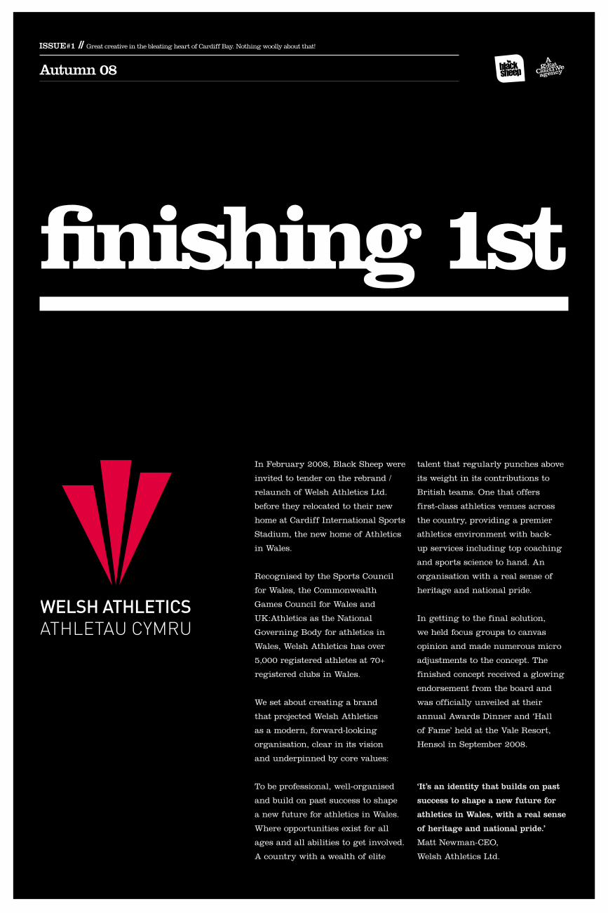
finishing 1st
In February 2008, Black Sheep were
invited to tender on the rebrand /
relaunch of Welsh Athletics Ltd.
before they relocated to their new
home at Cardiff International Sports
Stadium, the new home of Athletics
in Wales.
Recognised by the Sports Council
for Wales, the Commonwealth
Games Council for Wales and
UK:Athletics as the National
Governing Body for athletics in
Wales, Welsh Athletics has over
5,000 registered athletes at 70+
registered clubs in Wales.
We set about creating a brand
that projected Welsh Athletics
as a modern, forward-looking
organisation, clear in its vision
and underpinned by core values:
To be professional, well-organised
and build on past success to shape
a new future for athletics in Wales.
Where opportunities exist for all
ages and all abilities to get involved.
A country with a wealth of elite
talent that regularly punches above
its weight in its contributions to
British teams. One that offers
first-class athletics venues across
the country, providing a premier
athletics environment with back-
up services including top coaching
and sports science to hand. An
organisation with a real sense of
heritage and national pride.
In getting to the final solution,
we held focus groups to canvas
opinion and made numerous micro
adjustments to the concept. The
finished concept received a glowing
endorsement from the board and
was officially unveiled at their
annual Awards Dinner and ‘Hall
of Fame’ held at the Vale Resort,
Hensol in September 2008.
‘It’s an identity that builds on past
success to shape a new future for
athletics in Wales, with a real sense
of heritage and national pride.’
Matt Newman-CEO,
Welsh Athletics Ltd.
4 5
Only by carefully following these guidelines can we ensure that our communications are distinctive, instantly recognisable, consistent and memorable.
Our brand identity consists of several integral elements:
Our logotypeOur typefacesOur colour paletteOur photographic style
The way these elements are applied and their relationship to each other are critical in building the new Welsh Athletics brand.
Our logotype is the single most important element of our visual identity. It represents our name and what we stand for.
.epsIllustrator eps is a vector file format and as such is infinitely scaleable without loss of quality. Eps should be used wherever possible and should always be supplied to designers and printers.
.tifTif is a pixel based file format so will suffer loss of quality if it is enlarged. It should be used at the size it is supplied or smaller. This file format is useful for PC users.
.jpgJpeg is also pixel based but is designed to use on screen. Use on PCs for powerpoint presentations and websites. Jpeg should not be used for printed materials.
The key to successful communication Our logotype
The primary mark (shown here) is the preferred logotype. It is always bilingual and consists of two elements; the modern three feathers and the typography.
Which file format?
10 11
False start!
ImageryWhen the logotype is placed over a photograph, the typography must be clearly legible. Changing the positioning of the image may be necessary.
Tint matrixLegibility is paramount when deciding which version of the logotype to use. An example is given in the tint matrix below.
Logo use with colour
Use the primary mark on paler images. Use the all white mark on darker images where contrast is not sufficient to support the red/white mark.
Use the red feathers/white type version on darker images where the colour contrasts sufficiently with the red to maintain legibility. This version should be selected in preference to the all white mark.
Placing the logotype over areas of high contrast or heavy pattern should be avoided.
Logo use with imagery
Red/white markThis version of the logotype should be used in preference to the all white mark but only where the background colour contrasts sufficiently with the red.
Winner!Winner!
20 Internally produced documents
A number of templates have been provided. The principles shown here should be applied every time a document is produced.
For use when the Welsh Athletics address needs to be included.
21
For use when only the Welsh Athletics logo is required
Document content should never extend below the 15mm margin at the bottom of each page
For use when a partner logo needs to be included
Word templates (provided on CD)A number of templates have been created:
For use when an address is necessary:Document template_CISS address.docxDocument template_NIAC address.docx
This document leaves space for a partner logo:Document template_WA logo and partner.docx
For use when only the WA logo is required leaving maximum space for content:Document template_WA logo only.docx
Placement of logotype on printed material
The logotype should always be placed on the right of printed materials. It can be placed at the top or the bottom as appropriate.
12 13
�
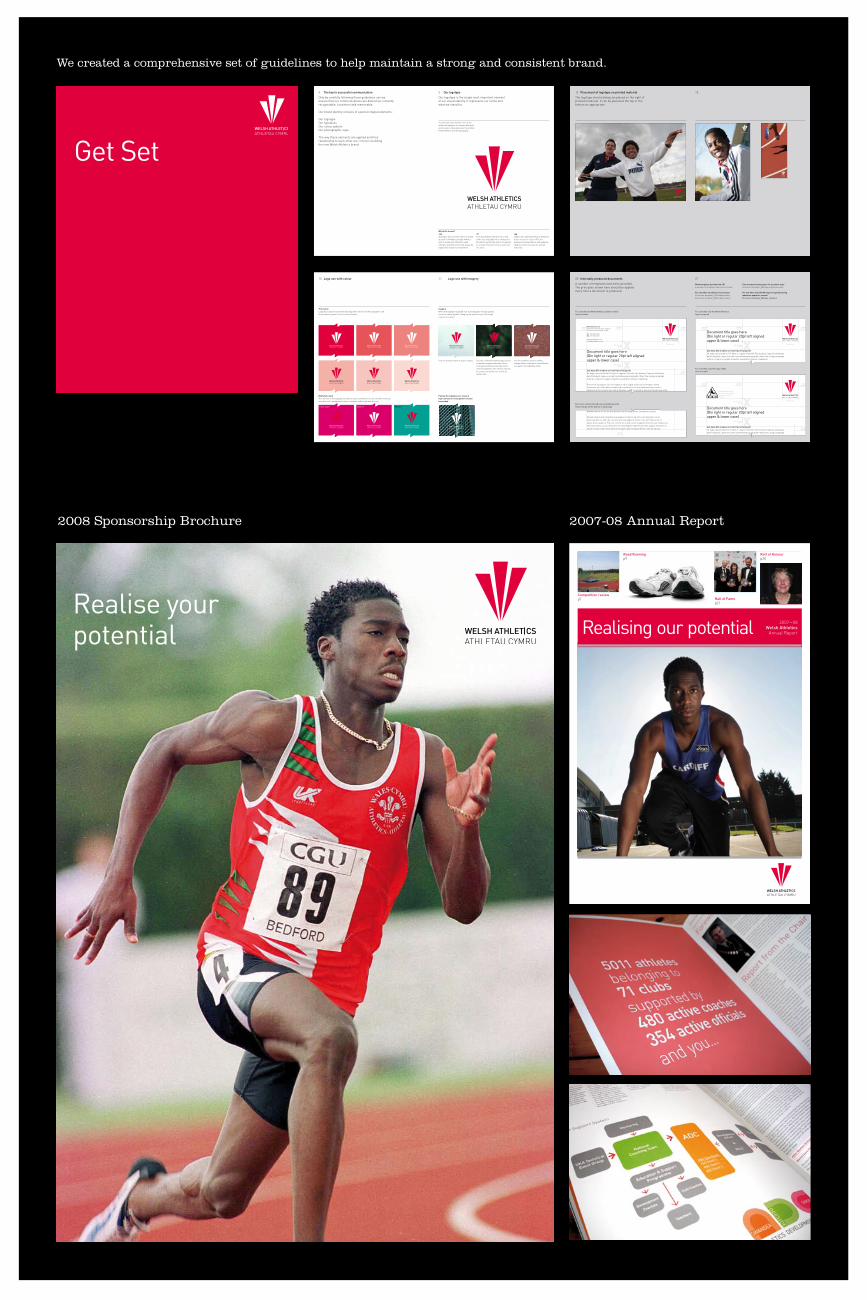
Get Set
We created a comprehensive set of guidelines to help maintain a strong and consistent brand.
2007—08Welsh Athletics
Annual ReportRealising our potential
Road Runningp9
Roll of Honourp20
Hall of Famep21
Competition reviewp7
6082 WA AR 07-08 AW2.indd 1 10/10/08 11:01:11
2007-08 Annual Report
Realise your potential
2008 Sponsorship Brochure