intro to painting with gouache...intro to painting with gouache with myriam tillson • brushes:...
TRANSCRIPT

Lesson 3: Landscape Painting Demo
OUTLINE In this 3rd video, we will be exploring gouache as a quick painting medium, that can be used to sketch out scenes and capture images fast and efficiently. We will be working from a landscape photo taken by Dominik Inmanm (source : free to use picture from Unsplash.com).
SUPPLY LIST
• Paper: Strathmore 500 Series Ready Cut Cold Press Watercolor Paper 8x10” sheet, 300 gms (140lb), taped to a board
INTRO TO PAINTING WITH GOUACHE with Myriam Tillson

• Brushes: Princeton Velvetouch Flat Shader size 4 Princeton Umbria Flat size 6 ½” Princeton Velvetouch Angle Shader size 3/8” Princeton Velvetouch Angle Shader size 1/4” Princeton Umbria Angular Bright size 4 3/8” Princeton Velvetouch Round size 2
• Paint :
Daler Rowney Aquafine Gouache Ivory Black, Raw Umber, Raw Sienna, Burnt Umber, Ultramarine Blue Dark, Phthalo Blue, Titanium White, Payne's Grey, Cadmium Yellow Hue, Lemon Yellow. [All colors are from the basic kit we put together in video one. We will be using all the colors, except for Alizarin Crimson Hue and Cadmium Red Hue.]
• Mixing palette [Can be plastic or ceramic, a plate, a paper palette, a glass sheet...]
• Tape
[Any low-tack works. This is to prevent the paper from buckling, and also creates a clean white border around the piece once finished.]
• 2 jars of water
[ One jar to wash our brushes, and one jar for clean mixing water.]
• Paper towel

PALETTE SET-UP
I poured my Titanium White in two different spots so that I could have one spot to use for mixing, and one spot that will stay clean and pure for highlights.

REFERENCE ANALYSIS
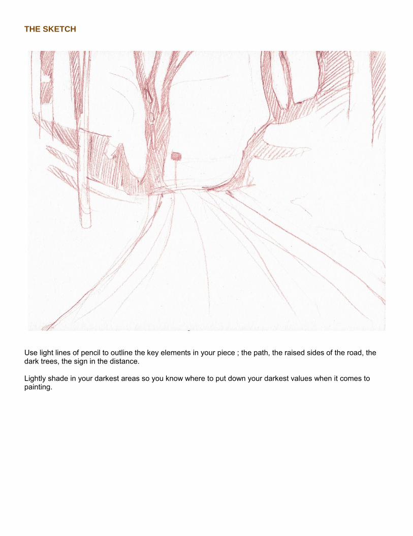
THE SKETCH
Use light lines of pencil to outline the key elements in your piece ; the path, the raised sides of the road, the dark trees, the sign in the distance. Lightly shade in your darkest areas so you know where to put down your darkest values when it comes to painting.

THE PAINTING PROCESS
• THE YELLOW UNDERLAYER Start with a light, very diluted wash of Cadmium Yellow Hue over most of the sketch, except for the background and areas we singled out as being our brightest highlights.
A note about paper white : We want to leave those areas free of paint so that the white of the paper shines through, and acts as our highlight. No paint will be as bright as bare paper, so leave your paper unpainted wherever you want very bright highlights.

• THE DARKEST DARKS Next, paint in your darkest darks using a mix of Payne's Grey and Raw Umber, with a hint of Burnt Sienna to warm the mix up a little.
A note about black : Try to avoid using Black, especially this early on in the painting process. It is best kept as a last resort color, in case we feel our darks aren't dark enough at the end of our piece. A note about mixing lighter colors into darker colors : If you want to change the color of a dark mix, be careful with what color you mix into it, as even slightly lighter colors can affect the value of your mix. This is particularly important with gouache that contains a white additive or chalk, as the chalk content will often heavily influence the value of your mix. A note about color matching with gouache : If you want to cover a large area with one color, and you want it to look even, make sure you mix enough of your color to cover the whole area. Matching a dried gouache color can be difficult, as dark colors tend to dry lighter, and light colors tend to dry darker. If you run out of paint and are struggling to mix a new batch of the same color, have a sample paper on the side that you can test your paint on, or rewet a portion of your dried color to see if your new mix matches.

MIXING GREENS Next, mix a good amount of green. This will be our base for all our foliage and bushes. We want this green to be fairly dark and earthy, so use a mix of Raw Umber and Phthalo Blue as a base, and, if you want to brighten it or warm it up so it looks less murky, you can add a little Burnt Sienna, and Cadmium Yellow. We are going to use this green as base color for all the leaves and plants in our painting, starting with the tree leaves against the background. On the right of the picture, the leaves have a lot of light shining through them, so we only need a light green. Don't dilute your green with water, instead, mix in some Cadmium Yellow to brighten it and echo the color of the light.
Occasionally add some spots of darker green where the foliage would be thicker and more in shadow, and go back in once your paints are dry and add some dots of opaque yellow-green as highlights where the light would be shining all the way through. The leaves on the left of the image are a lot lighter and airier, so you can use a mix that is almost yellow to add some light dabs of color, adding darker spots on top of them wherever you want the foliage to look thicker.

A note about mixing greens : When working with a dark green base such as the one we just mixed, which is a good starting point when painting nature elements, use Yellow to lighten your mix and give it a brighter color, reminiscent of young leaves or leaves with sunlight shining through them. Don't use White unless you want a pastel green, White will only dull your color. To darken your mix, you can use either Raw Umber to make your leaves look older, or browner, or if you simply want your green to be richer and juicier, like leaves in their prime, add some Blue to your mix.

The background, although very bright, does have some detail in it, and this is a good opportunity to use our gouache like a watercolor wash. Using very, very diluted washes of burnt sienna and the occasional green tint, lightly paint some details to mimic trees and bushes far away in the light of the background.

• THE SIDES OF THE ROAD
Moving on to the sides of the road. These areas are covered in brown leaves, and are infused with sunlight, making them almost bright orange. Using a light wash of diluted Burnt Umber (not quite as light as our Cadmium Yellow under-layer, but still fairly diluted), brush those areas with your color, essentially creating a second under-layer on top of your yellow one. Using a slightly dry brush can help add texture, and varying your brush strokes to match the direction and perspective of the different elements in the image can add some dynamism to the composition.
• THE BUSHES ON THE RIGHT
Our next step will be to start painting the foliage on the right side of the road. Those bushes are in shadow, and are dark green, with no very bright highlights, so we are going to work light on dark. Starting off with a dark Raw Umber mix, lay down some dark areas to create a background on which our foliage can be applied and stand out. Next, use a dark green opaque mix to apply dark leaves with quick, small strokes. To add more depth and volume to the bush, and vary our values a little, mix a little white into your green and apply another layer of leaves after your dark green ones have dried. Use white instead of yellow to

lighten your mix, to help your lighter green layer more opaquely on top of your dark colors. The leaves in that spot are not lighter because of bright light shining on them, so they don't need to be, and shouldn't be, as light and bright as the leaves in the sun are. To add more texture and contrast, occasionally go in with a very dark green again and add some shadows on the bushes, preferably next to any lighter colored leaves, to emphasize them. You can use some more yellow into your mix to create some branches and leaves closer to the viewer, to make them stand out more against the dark bushes behind.


A note about mixing colors : When working light on dark, it can be easy to underestimate how light your colors will look once applied to the paper on top of some existing darker tones. Mixing in a white palette can often skew our perception of our mixes, making darker colors look somewhat lighter, and lighter colors look darker. Usually, a color only needs to be very slightly lightened to stand out once applied to a darker color.
• THE PATH
Let's start working on the path. The road may seem like it is grey, since we understand it to be asphalt or something similar, but in reality, it is a mix of yellows, blues, purples, and greens. Plus, when painting a landscape, we want to capture the mood of the scene, not just the composition. Making sure we mix in some of the colors that make up the rest of the elements in our painting will help the whole image look more cohesive, and will lend a general atmosphere to the piece. Mix a batch of brownish-blueish grey, using some of your dark green as a base, and adding some Payne's Grey, Phthalo Blue, White, Raw Umber and Burnt Sienna. You'll want that mix to be fairly opaque, although a little more fluid than our “ideal” gouache thickness. Use a medium sized brush to paint in horizontal strokes over your path, extending some of the color on the sides of the road, where the shadows would be. Make sure to leave the patches of sunlight on the road free of your grey mix, as those areas are very bright on the reference, and are borderline yellow.
Because our under-layers were applied very diluted, there is little risk of them reactivating so you can use a little more water in your grey mix, than would usually be OK when layering. Leaving your grey mix slightly transparent also means that your under-layer colors will peak through, and give the painting some depth and warmth.

If you ever feel like your road texture is too pronounced or harsh, you can use a lightly damp brush to go over your lines and smooth them over.

The road is the darkest in the distance, and becomes lighter the closer it is to the viewer, so you can lighten your grey mix with water, to make more and more of your under-layer shine through. Using a dry brush, paint a few rough strokes vertically over your path to create more texture and add dynamism. Using a dry brush means your paint is streaky and helps add more texture.
Once your road color base is dry, you can start adding more detail and highlights to the road surface. Adding some white to your grey mix will make a good subtle highlight color that is good to use in the distance, and adding a little burnt sienna can help extend the color and light pouring from the sides of the road we painted with our Burnt Sienna earlier on.

• THE LEFT SIDE OF THE PATH
Let's move on to the left side of the road. That side is more dappled with light than the right side was, so we will need to alternate more between light, bright greens, and darker greens and browns. Because we are layering over existing paint, make sure you add a little white to your mixes so that they become more opaque and layer better. Make sure you also add some yellow to your brighter greens, as some of the grass and leaves are lit with sunlight. When you are working in tiny, short strokes, and if your mix is very opaque, with very little water in it, there is not necessarily a need to wait for your strokes to be fully dry to layer on top of them, but it is important to work in quick, brief strokes, that are not worked into the paper.

As we are nearing the end of the painting, it is time to start adding our highlights and final details. White gouache layered on top of an existing color will never be as bright as the pure white of the paper, so you can go in with pure white without having to worry about undermining the brightness of your background. Add a few dabs of white to the left side of the road, as well as on top of your leaves in the background. The light coming from the opening of the trees at the end of the road is so bright, that it will be eating away at the contours of any element overlapping it, and adding little spots of white over the leaves and branches can help emphasize that feeling.


You can also add some yellow and ochre to the ground to warm it up and add brightness to it, and painting in some darker spots on the path will add texture and can help mimic debris and fallen leaves.
Finally, using a small pointed brush, let's add tiny branches coming off of the trees in the background, and we are done!
