interview with charles bigelow
TRANSCRIPT

136 TUGboat, Volume 34 (2013), No. 2
Interview with Charles Bigelow
Yue Wang
Abstract
Interview of Charles Bigelow by Yue Wang,conducted in 2012.
Y: In this interview we are very lucky to have CharlesBigelow with us. Professor Bigelow is a type histo-rian, educator, and designer. With his design part-ner, Kris Holmes, he created the Lucida family offonts used in the human-computer interfaces of Ap-ple Macintosh OS X, Microsoft Windows, Bell LabsPlan 9, the Java Developer Kit, and other systems,bringing historical and technical understanding oftype to hundreds of millions of computer users. In2012, Bigelow retired from the Melbert B. Cary Dis-tinguished Professorship at Rochester Institute ofTechnology’s School of Print Media. He is now theRIT Scholar in Residence at the Cary Collection, RIT’srare book Library.
C: Thank you for your visit.
1 Entering the digital type era —the birth of Lucida
Y: Let’s get started. Can you briefly introduce thedesign goal of Lucida?
C: In the early 1980s, we saw that computers wouldbecome more widely used and that digital typogra-phy would be possible for more people. At that time,digital printers and computer screens had low reso-lutions. The goal of Lucida was to create a new, orig-inal family of fonts for medium and low-resolutiondigital printers and displays.
Y: Is this the reason why that’s called Lucida?
C: Exactly. We wanted to give it a name that couldsuggest it was made of light and was clear despitethe low resolutions. “Lucida” comes from the Latinword “lux” for light and clarity. It turned out thatLucida was the first original typeface designed forboth digital printers and computer screens.
Y: Wow, really?
C: Yes. There had been previous digital typefacesdesigned for high-resolution typesetting machinesin the late 1970s and early 1980s; a few were orig-inal types like Hermann Zapf’s Edison, but nonewere new and original for laser printing and displayscreens (mainly CRTs in that era). Adobe developedtheir own font format called “PostScript Type 1” anddigitized 35 typefaces for Apple’s LaserWriter Plus
This interview was made possible with support from Program-mer Magazine in China, http://www.programmer.com.cn.
Lucida was the first new, original family of types designed for digital laser printersand screens. This is the first Lucida specimen, printed on a 300 dot per inchdigital printer by the Imagen Corporation in California. Distributed at the ATypIconference in London, September 1984.
Figure 1: Lucida was the first new, original family of typesdesigned for digital laser printers and screens. This is thefirst Lucida specimen, printed on a 300 dot per inch digitalprinter by the Imagen Corporation in California. Distributedat the ATypI conference in London, September 1984.
printer. These fonts, including Helvetica, Times Ro-man, Palatino, etc., had originally been designed asmetal type, and some like Zapf Chancery for photo-typesetting. Designed before the digital era, thosefaces were not created for low-resolution digital ren-dering. When the first commercial font of Lucidawas shown in 1984, it surprised Adobe. They knewof it; they had even digitized a test version, but theyhadn’t thought anyone would take the risk of makingnew designs for the new technology of laser printing.Instead, a Silicon Valley digital printer firm, Ima-gen, founded by Stanford researchers and graduates,some of whom had worked with or been studentsof Donald Knuth, brought out Lucida first. Imagen’stype director, Mike Sheridan, wanted to produce anew design for the new technology and chose Lucida.Now, 30 years later, it appears he was right, but atthe time, he took a risk. Adobe licensed Lucida fontssome years later and still distributes them.
C: Here (fig. 1) is the first Lucida (seriffed) specimen,printed on a 300 dot per inch digital printer by theImagen Corporation in California. It was distributedat the ATypI conference in London, September 1984.
Y: Cool. The specimen only included Lucida (ser-iffed).
C: Yes. The seriffed family was first shown in 1984,and the sans-serif family was released in 1985.
Y: What makes Lucida look great even in low resolu-tions?
C: We first did experiments, making bitmap lettersby hand and comparing them to what we thoughtwould be the outlines that could produce them. Wefound out several factors (see fig. 2). First, a bigx-height packs more pixels into the most visuallyimportant portions of text, the x-height parts ofletters. A big x-height is an advantage for texts readmostly on screens. That’s one reason Apple has beenusing Lucida Grande as the standard user interfacetypeface on Mac OS X.
Yue Wang

TUGboat, Volume 34 (2013), No. 2 137
Early studies for Lucida, comparing brush and pen written lettersto bit map redesigns for low-resolution printers and computerscreen displays.Figure 2: Early studies for Lucida, comparing brush and penwritten letters to bitmap redesigns for low-resolution printersand computer screen displays.
Y: That’s why Lucida’s x-height is bigger than mostfonts, such as Times Roman or Baskerville, whencomposed at the same point size.
C: Exactly. There are still questions today about theimportance of x-height for legibility in Latin alpha-betic fonts. A vision scientist, Gordon Legge, and Irecently wrote an article on the importance of typesize for legibility, and we argued that x-height is themain factor that affects perception of type size [6].The measure of x-height applies only to typographywith upper and lower-cases: Latin, Greek, Cyrillic,and Armenian. For case-less writing systems, variousother factors affect the impression of size.
Secondly, Kris Holmes and I observed that tech-nical publications make frequent use of words in allcapitals, such as acronyms, emphasized expressions,keywords, and the like. Therefore, we made the Lu-cida capital height a little shorter than the ascenderheight (e.g. the height of a lower-case ‘h’ or ‘l’), to re-duce the distracting look of words set in all capitals.This was not a new idea in typography; in 1495, thefamous Venetian printer Aldus Manutius introduceda roman type with slightly shortened capitals cut byFrancesco Griffo.
Third, the weight of Lucida is darker than tradi-tional book typefaces. We noticed that on screenswith black text on white backgrounds, the letterswere slightly eroded, seeming too light, so we dark-ened the Lucida stem weights a little bit. The stemweight is 1/5.5 of the x-height, and a little bit lessthan 1/10 of the body size. Its overall gray tone isroughly 22% when the text is set solid (no extra linespacing).
Fourth, at low resolutions, a single pixel is oftenthe only space between letters rendered at text sizes(8 point to 16 point). If letterspacing is tight, whichwas fashionable in advertising typography in the
Scan image from book printed by Nicholas Jenson in Venice, 1478.These early typographic letters are rather dark and widely spaced.
Figure 3: Scanned image from a book printed by NicholasJenson in Venice, 1478. These early typographic letters arerather dark and widely spaced.
Page 1 of 1
Fletibus.rtf 11/5/07 10:10 PM
Fletibus & busto idecore
: Marte sub aetholum do
Aemachiae cladem truxs
ec Alceus in Philippi uitu
The same text from Jenson composed in original Lucida font. Lucida is also somewhat dark and widely spaced, for earlydigital printing technology and display, but it is not a copyof Jenson.
Figure 4: The same text from Jenson composed in theoriginal Lucida font. Lucida is also somewhat dark and widelyspaced, for early digital printing technology and display, butit is not a copy of Jenson.
1970s and 1980s, it can cause letters to touch. Somedesigners called this “sexy spacing”, but it turns outto impair legibility. There are still debates aboutwhether legibility is based on recognizing wholewords or individual letters. Lucida is on the sideof letter recognition. Computer screens were readfrom greater distances than print, which visuallyreduced letterspacing and caused crowding of theshapes, so we gave Lucida slightly loose spacing tocounteract these tendencies.
Also, we created letter forms with large opencounters — the internal open spaces like in ‘a’ and‘e’ — to keep the interiors from collapsing and reduc-ing legibility. Another small detail, which almostnobody notices, is that we lowered the joins of thearches in letters like ‘n’, ‘m’, ‘h’, ‘r’, and ‘u’, to givethem more definition.
Y: So it won’t clog up :).
C: Yes. For instance, we didn’t want the top of an‘n’ to clog up and look like a smeared ‘o’. In fact,most of the ideas behind Lucida were not new. Somewe borrowed from very early typography. Here’s ascanned image from a book printed by Nicholas Jen-son in Venice, 1478, when printing technology didn’thave as high a quality as in later eras (fig. 3). Theseearly typographic letters are rather dark and widelyspaced, too. The forms are somewhat distorted bythe technology of early printing. Rough paper, softmetal type that wears quickly, uneven pressure and
Interview with Charles Bigelow

138 TUGboat, Volume 34 (2013), No. 2
ink squash, and so on. We borrowed some of Jen-son’s design ideas and believe we were the first to trythem in the low-resolution digital era. Here (fig. 4) isthe same text composed in the original Lucida font.It is not a copy of Jenson but shares similar goals —to make legible letters for a noisy medium. Jenson’stype was around 15 point, but Lucida is more oftenused at smaller sizes — 10 to 14 point on screens —so we made its spacing even a little looser.
Y: Amazing!C: Lucida, by showing some successful solutionsto resolution-restricted text, also encouraged otherdesigners to innovate. An interesting question iswhether designers should try to compensate for lim-itations of new technology or design ideal shapes.Lucida is a design to compensate for limitationsof resolution and imaging, but, in contrast, exuber-ant digital cursives like Zapfino or Apple Chanceryare designs that take advantage of technological ad-vances in character substitution.
Ten and twenty years after the first Lucida fonts,other designers created their own solutions to theproblem of creating new faces for low resolutions.This is Lucida in 1985–87. In 1996, Microsoft re-leased Verdana and Georgia by Matthew Carter, forthe Windows operating system and Internet Explorer.Ten years after that, Microsoft released the ClearTypefont collection, including Calibri, Cambria, Candara,Consolas, Constantia, Corbel, and Cariadings (seefig. 5) by several designers, among them my formerstudent, Gary Munch (Candara). These fonts takeadvantage of advanced screen display technology byMicrosoft.
Y: They look similar to Lucida. Corbel and LucidaSans are almost the same.C: Well, but they are not copies of Lucida. Theselater designs show similar adaptations to the prob-lem of design for screens: large x-heights, looseletter spacing, open counter-forms, and simplifiedletter shapes. In the alphabet samples at the bottom,the types are scaled to equal x-heights, to show sim-ilarities more clearly. Our emphasis on open coun-ters and Renaissance forms for Lucida came fromthe calligraphic instruction Kris Holmes and I hadwith Lloyd Reynolds, calligrapher laureate of Oregon.Our idea of applying Renaissance forms to sans-serifcame from Hans Meier’s Syntax design, a sans-serifbook typeface based on Renaissance humanist typesand handwriting. It came out as metal type in 1968and influenced not only us, but later generationsof designers. The ideas of Syntax are now commonin so-called “humanist” sans-serifs, but Syntax re-mains a splendid design, a great improvement on itssuccessors.
A: Body sizes the same, x-heights vary
1984 Lucida, 1985 Lucida Sans, 1987 Lucida Bright
A quick brown fox jumps over the lazy dog.A quick brown fox jumps over the lazy dog.A quick brown fox jumps over the lazy dog.
1996, Verdana, Georgia
A quick brown fox jumps over the lazy dog.A quick brown fox jumps over the lazy dog.
2006 Calibri, Candara, Corbel, Cambria, Constantia
A quick brown fox jumps over the lazy dog. A quick brown fox jumps over the lazy dog.A quick brown fox jumps over the lazy dog.A quick brown fox jumps over the lazy dog.A quick brown fox jumps over the lazy dog.
B: x-heights equal, body sizes vary
Lucida Sans [12 point]
A quick brown fox jumps over the lazy dog.Verdana [11.7 point]
A quick brown fox jumps over the lazy dog.Corbel [13.7 point]
A quick brown fox jumps over the lazy dog.
Lucida Bright [12 point]
A quick brown fox jumps over the lazy dog.Georgia [13.2 point]
A quick brown fox jumps over the lazy dog.Cambria [13.6 point]
A quick brown fox jumps over the lazy dog.Figure 5: Examples of original typefaces designed for digitalprinting and screens, showing convergent evolution. Lucidawas the first original family for screens and laser printers.Later designs show similar adaptations to the problem ofdesign for screens: large x-heights, loose spacing, opencounter-forms, simplified letter shapes. In the alphabetsamples at bottom, the types are scaled to equal x-heights toshow relationships more clearly.
Y: I see. Why did Lucida Sans come out later thanLucida (serif).
C: We released the seriffed family first, as a kindof proof-of-concept, and then worked on the sans-serif. After the seriffed design came out, there wasinterest in the sans-serif version, which we releasedwithin the next year. Historically, because of the ef-fort involved, large typeface families were not oftenreleased all at once. For a seriffed family, maybe onlyroman and italic would be released, and later oneor more bold weights. If a typeface became popular,then a firm might release more variants (like morebold weights) or companion typefaces (like sans-serif, or fancy characters). In the mid-1930s, Jan vanKrimpen in Holland was the first designer to createa family that included serif and sans-serif, and also
Yue Wang
TUGboat, Volume 34 (2013), No. 2 139
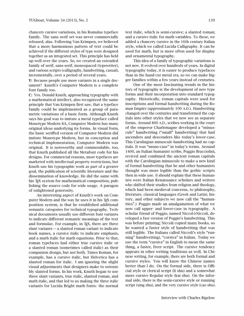
chancery cursive variations, in his Romulus typefacefamily. The sans serif set was never commerciallyreleased, alas. Following Van Krimpen, we believedthat a more harmonious pattern of text could beachieved if the different styles of type were designedtogether as an integrated set. This principle has heldup well over the years. So, we created an extendedfamily of serif, sans-serif, monospaced (typewriter),and various scripts (calligraphy, handwriting, casual),incrementally, over a period of several years.
Y: Because people use more variants in a single doc-ument? Knuth’s Computer Modern is a completefont family too.C: Yes. Donald Knuth, approaching typography witha mathematical intellect, also recognized the sameprinciple that Van Krimpen first saw, that a typefacefamily could be implemented as a group of para-metric variations of a basic form. Although Knuthsays his goal was to imitate a metal typeface calledMonotype Modern 8A, Computer Modern has manyoriginal ideas underlying its forms. In visual form,the basic seriffed version of Computer Modern didimitate Monotype Modern, but in conception andtechnical implementation, Computer Modern wasoriginal. It is noteworthy and commendable, too,that Knuth published all the Metafont code for hisdesigns. For commercial reasons, most typefaces aremarketed with intellectual property restrictions, butKnuth saw his typographic work as part of a greatergoal, the publication of scientific literature and thedissemination of knowledge. He did the same withhis TEX system for mathematical composition, pub-lishing the source code for wide usage. A paragonof enlightened generosity.
An interesting aspect of Knuth’s work on Com-puter Modern and the way he uses it in his TEX com-position system, is that he established additionalsemantic categories for technical typography. Tech-nical documents usually use different font variantsto indicate different semantic meanings of the textand formulae. For example, in TEX, there are threeslant variants — a slanted roman variant to indicatebook names, a cursive italic to indicate emphasis,and a math italic for math equations. Prior to that,roman typefaces had either true cursive italic ora slanted roman (sometimes called italic) as theircompanion design, but not both. Times Roman, forexample, has a cursive italic, but Helvetica has aslanted roman for italic. I am ignoring the slightvisual adjustments that designers make to ostensi-bly slanted forms. In his work, Knuth began to usethree slant variants, true italic, slanted roman, andmath italic, and that led to us making the three italicvariants for Lucida Bright math fonts: the normal
text italic, which is semi-cursive; a slanted roman;and a cursive italic for math variables. To these, weadded a chancery cursive in the 16th century Italianstyle, which we called Lucida Calligraphy. It can beused for math, but is more often used for displayand ornamental typography.
This idea of a family of typographic variations isnot new. It evolved over hundreds of years. In digitaltypography today, it is easier to produce typefacesthan in the hand-cut metal era, so we can make big-ger families within a few years instead of centuries.
One of the most fascinating trends in the his-tory of typography is the development of new typeforms and their incorporation into standard typog-raphy. Historically, roman capitals were used forinscriptions and formal handwriting during the Ro-man Empire (approximately 100 A.D.). Handwritingchanged over the centuries and transformed the cap-itals into other styles that we now see as separateforms. Around 800 A.D., scribes working in the courtof the emperor Charlemagne developed a “minus-cule” handwriting (“small” handwriting) that hadascenders and descenders like today’s lower-case.This Carolingian minuscule handwriting had no cap-itals. It was “mono-case” in today’s terms. Around1400, an Italian humanist scribe, Poggio Bracciolini,revived and combined the ancient roman capitalswith the Carolingian minuscule to make a new kindof formal handwriting that he and other humaniststhought was more legible than the gothic scriptsthen in wide use. (I should explain that these human-ists were Italian Renaissance scholars and writerswho shifted their studies from religion and theology,which had been medieval concerns, to philosophy,literature, classical languages (Greek and Latin), his-tory, and other subjects we now call the “human-ities”.) Poggio made an amalgamation of what wenow call upper- and lower-case in typography. Ascholar friend of Poggio, named Niccolò Niccoli, de-veloped a fast version of Poggio’s handwriting. Thiswas before printing; Niccoli copied many books, sohe wanted a faster style of handwriting that wasstill legible. The Italians called Niccoli’s style “run-ning” hand(writing), “corsiva” in Italian. Today weuse the term “cursive” in English to mean the samething, a faster, freer script. The cursive tendencyappears in other writing traditions as well. In Chi-nese writing, for example, there are both formal andcursive styles. You will know the Chinese namesbetter than I do. On the formal side, there is Offi-cial style or clerical script (li shu) and a somewhatmore cursive Regular style (kai shu). On the infor-mal side, there is the semi-cursive style or runningscript (xing shu), and the very cursive style (cao shu).
Interview with Charles Bigelow

140 TUGboat, Volume 34 (2013), No. 2
To make a very rough comparison, Niccoli’s cursivehandwriting might be the equivalent of “xing shu”.Some of Hermann Zapf’s writing, like Zapfino, mightbe closer to “cao shu”.
The first humanist roman types were cut around1467, and the ancestor of most modern romans wascut in 1470 by Jenson in Venice. The first humanistcursive (italic) was not cut until 1501, and interest-ingly, it was cut in lower-case only. Its capitals wereupright roman capitals. This shows that in thosedays, 500 years ago, capitals were not as tightlybound to lower-case as today. Also, cursiveness wasnot defined by slant alone, but by an ensemble offeatures, of which slant was only one. At first, italictype was an alternative to roman and whole bookswere composed in italic only. Italian calligraphersand type designers created many variations of italic,and later, in France, Robert Granjon cut many varia-tions of cursive types. Around 1570, italic became asubordinate, complementary companion to romaninstead of a stand-alone alternative to roman. Today,italic is an important component of a typeface fam-ily, but of secondary rank. In the 1700s, the Frenchtype designer Pierre-Simon Fournier expanded theconcept of a typeface family to include variationswith different widths and x-heights. In the 1800s, En-glish typographers developed bold typefaces, whichat first were separate from standard roman and italic,but by the early 20th century, especially in the de-signs of Morris Fuller Benton, some typeface familiesincluded bold weights as integrated members of thefamily. Thus, we see a pattern of incorporation ofvariations within a family. Sans-serif types were in-vented in the early 19th century but didn’t becomewidely used for text until the 20th century. Lookingat the pattern of type family evolution at the end ofthe 20th century, it seemed to us that incorporationof sans-serif into type families was a trend we shouldfollow, and indeed, today in the 21st century, thereare now several type families that include seriffedand sans-serif variations.
Adrian Frutiger is one of the most prominentfigures in this movement to extend the visual rangeof type families. It is difficult to describe weight andstyle variations in words. We have to use cumber-some names like light, extra light, semibold, extrabold, ultra bold, light condensed, and so on, andthe words are different in each language, so thereare international communication confusions. For hislarge Univers family designed in the 1950s, Frutigerdeveloped a two digit system to differentiate theweights, widths, and slants of the variations. Thebase of the system was 55, a normal weight roman,upright font. The first digit of the classification ex-
From left: Lucida Bright, Lucida Casual, Lucida Handwriting comparison of letter ‘a’.All three designs have the same x-height.
Figure 6: From left: Lucida Bright, Lucida Casual,Lucida Handwriting; comparison of letter ‘a’. All threedesigns have the same x-height.
Lucida Serif
Lucida Sans
Comparison of original Lucida (seriffed) and Lucida Sans,showing close similarities of forms.
Figure 7: Comparison of original Lucida (seriffed) andLucida Sans, showing close similarities of forms.
pressed the thickness of the weights, for example,4 is light, 5 is regular, 6 is semi-bold, and 7 is bold.The second digit describes the style, for example, 6is italic, 7 is condensed. So, 56 means normal weight,slanted, whereas 65 means roman, semi-bold, andso on.
Y: It looks like a periodic table!C: It sure does. So after Univers, designers wereable to use many variants in a single document.Emil Ruder, a famous Swiss teacher of typography,demonstrated this in his book “Typography” [9].Ruder’s students continued this design approach.Thus nowadays we need large families of fonts forthe most expressive kinds of modern typography.
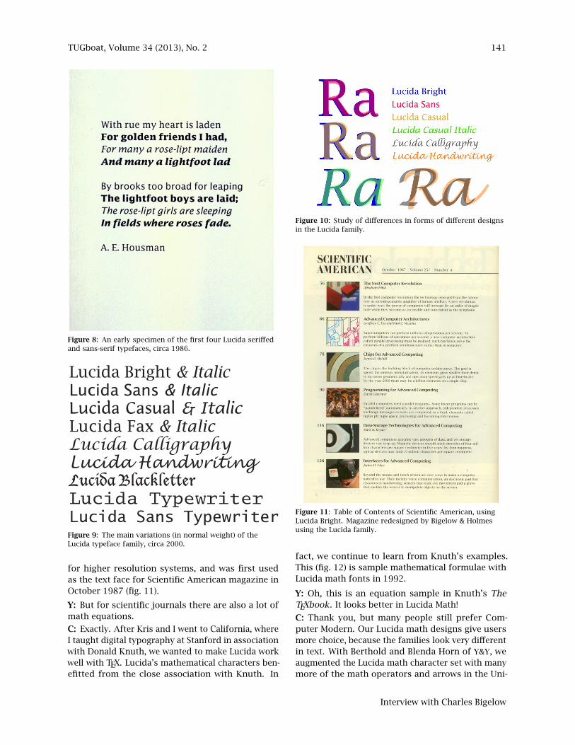
Y: What are the common features among the bigvariations within the Lucida family?C: In technical perspective, all the Lucida fonts havethe same x-height, capital height, and similar seriesof stem weights, which helps give a harmonious lookto a page that uses different font styles. Here (fig. 6)is a comparison of the letter ‘a’ in Lucida Bright,Lucida Casual, Lucida Handwriting. All three designshave the same x-height.
Y: I see.C: But there are a lot of similarities among differentfont styles as well. For example, this (fig. 7) is theoriginal Lucida Serif and Lucida Sans. The design isreally harmonized. This (fig. 8) is an early specimenof the first four Lucida seriffed and sans-serif type-faces around 1986. But we didn’t stop. We createdan extended font family that included seriffed, sans-serif, and fixed-pitch (typewriter) designs. Around2000, we had almost all the main variations of theLucida typeface family of today. Here (fig. 9) is a listof them in normal form. As you can see (fig. 10),the typeface family is still highly unified and har-monized. The Lucida Bright family was developed
Yue Wang
TUGboat, Volume 34 (2013), No. 2 141
An early specimen of the first four Lucida seriffed and sans-serif typefaces,circa 1986. Figure 8: An early specimen of the first four Lucida seriffed
and sans-serif typefaces, circa 1986.
Lucida Bright & ItalicLucida Sans & ItalicLucida Casual & ItalicLucida Fax & ItalicLucida CalligraphyLucida HandwritingLucida BlackletterLucida TypewriterLucida Sans TypewriterFigure 9: The main variations (in normal weight) of theLucida typeface family, circa 2000.
for higher resolution systems, and was first usedas the text face for Scientific American magazine inOctober 1987 (fig. 11).
Y: But for scientific journals there are also a lot ofmath equations.
C: Exactly. After Kris and I went to California, whereI taught digital typography at Stanford in associationwith Donald Knuth, we wanted to make Lucida workwell with TEX. Lucida’s mathematical characters ben-efitted from the close association with Knuth. In
Study of differences in forms of different designs in the Lucida family.
Figure 10: Study of differences in forms of different designsin the Lucida family.
Table of Contents of Scientific American, using Lucida Bright.Magazine redesigned by Bigelow & Holmes, using Lucida family.Figure 11: Table of Contents of Scientific American, using
Lucida Bright. Magazine redesigned by Bigelow & Holmesusing the Lucida family.
fact, we continue to learn from Knuth’s examples.This (fig. 12) is sample mathematical formulae withLucida math fonts in 1992.
Y: Oh, this is an equation sample in Knuth’s TheTEXbook. It looks better in Lucida Math!
C: Thank you, but many people still prefer Com-puter Modern. Our Lucida math designs give usersmore choice, because the families look very differentin text. With Berthold and Blenda Horn of Y&Y, weaugmented the Lucida math character set with manymore of the math operators and arrows in the Uni-
Interview with Charles Bigelow

142 TUGboat, Volume 34 (2013), No. 2
Sample mathematical formulae with original Lucida math fonts, 1992.Figure 12: Sample mathematical formulae with originalLucida math fonts, 1992.
Lucida Bright and Lucida New Math in design ofbook Non-commutative Geometry by Alain Connes.Figure 13: Lucida Bright and Lucida New Math in the designof the book Non-commutative Geometry by Alain Connes.
code character standard. Y&Y also developed manycareful adjustments to ensure that the Lucida mathfonts worked well with TEX. It was not an easy task.Here (fig. 13) is a book called Non-commutative Ge-ometry by Alain Connes, which uses Lucida Brightand Lucida New Math. The book was designed byPeter Renz. Recently (2012) we upgraded the Lucidamath fonts in cooperation with TUG, the TEX UsersGroup. We expanded the character set to include thelatest Unicode math character blocks, including anew math script face by Kris, and the fonts were pro-duced in OpenType format with the indispensablehelp of Khaled Hosny and others in TUG.
Y: So even without TEX, we can access these symbolsusing Unicode values?
C: Right. Because of Unicode encoding, computer
fonts can finally contain a wide range of characters,letters, digits, glyphs, symbols, ideograms, logo-grams, and many others. You can include glyphsfrom various languages into the font. So we de-signed a lot of glyphs from various languages forLucida Sans. This gave birth to Lucida Sans Unicode.We made Lucida Sans Unicode for Microsoft to showthe possibility of what a Unicode font can do. KrisHolmes and I wrote a paper about this in 1993, whichcan be found on the web, “The Design of a UnicodeFont” [2].
Y: Why make Lucida Sans Unicode? I rememberLucida Bright came out before Lucida Sans.C: Lucida Sans was chosen to do this because ofits popularity. For some typeface families that in-clude both serif and sans-serif faces, one or theother is more popular. For Frutiger, the originalsans-serif family is more popular than the FrutigerSerif, which is Frutiger’s classic Meridien seriffeddesign re-worked and given additional weights andcondensed italics by Frutiger and Akira Kobayashiand released in 2008. In contrast, with Palatino, theoriginal seriffed design remains more popular thanthe very new and interesting Palatino Sans, by Zapfwith Kobayashi, released in 2007. For text faces,it takes time for new designs to become widely ac-cepted, so the balance of popularity between serifand sans could change in those families or ours. Ev-ery new, original type design is a risk because youdon’t know how well it will be accepted, and if youcare only for acceptance, you don’t give your designthe fresh but risky insight that can make it popu-lar. I like to quote the eminent physicist Niels Bohr:“Prediction is difficult, especially about the future.”
Y: Also true for Erik Spiekermann’s ITC Officina Sansand ITC Officina Serif which both came out in 1990.C: Yes. A preference for sans-serif may be becausesans-serif fonts are somewhat better for display onscreens, probably because the sans-serif fonts aresimpler in design, with fewer details, and thereforerender slightly better at low to moderate resolutions.A vision study by Robert Morris, Kathy Aquilante,Dean Yager, and me [7] found nearly no differencebetween the legibility of seriffed and sans-serif type-faces when all the parameters (x-height, weight, spac-ing, etc.) are controlled — except that at small sizeson screens, sans-serif is slightly more legible. How-ever, we did that study ten years ago, and althoughwe controlled for resolution, today’s new, higher res-olution and higher contrast screen displays couldperhaps alter our findings. I believe that serif typesbenefit from higher resolutions.
To cover more of the Unicode range for LucidaSans, we designed characters for Unicode Extended
Yue Wang
TUGboat, Volume 34 (2013), No. 2 143
Lucida Sans (=Lucida Grande) non-Latin designs.
Figure 14: Lucida Sans (= Lucida Grande) non-Latin designs.
10/31/2007 10:02 AMHerodotus, The Histories
Page 1 of 3http://www.perseus.tufts.edu/cgi-bin/ptext?doc=Perseus%3Atext%3A1999.01.0125;layout=;loc=1.1.0
Perseus ! TuftsCollections: Classics ! Papyri ! Renaissance ! London ! California ! Upper Midwest !Chesapeake ! Boyle ! Tufts History
Configure display ! Help ! Tools ! Copyright ! FAQ ! Publications !Collaborations ! Support Perseus Search
Classics:Classicscollectioncontents About theClassicscollection
Greek Hist.OverviewArt & Arch.
Catalogs
Greek Tools:Grammar
OverviewDictionariesMorphologyWord Search
Vocabulary inthis document
Other Tools &Lexica
Display textchunked by: book chapter (default)section
Contents:Book 1Book 2Book 3Book 4Book 5Book 6Book 7Book 8
Book 9
Herodotus, The Histories
Editions and translations: Greek | English (ed. A. D. Godley) Your current position in the text is marked in red. Click anywhere on the line to jump toanother position.
Table of Contents Go to 1.1.0
Click on the asterisks (*) for commentary notes, the crosses (+) forreferences from other works.
I.[0] "#$%&'$( )*+,-#./001$2 30'$#4/2 56&%78+2 9%7, :2 ;<'7 '=>7.&;7.- ?8 5.@#A6B. 'C D#&.E ?84'/*- >1./'-+, ;<'7 F#>- ;7>G*-'7 ,-H @B;-0'G, '= ;I. J**/0+ '= %I K-#KG#$+0+ 56$%7D@1.'-, 5,*7L>1./'-+, 'G '7 M**- ,-H %+' N. -O'4/. ?6$*1;/0-. 5**<*$+0+.
P7#01B. ;1. .(. $3 *&>+$+* Q$4.+,-2* -O'4$(2 R-04 >7.10@-+ 'S2%+-R$#S2. '$T'$(2 >=# 56& 'S2 U#(@#S2* ,-*7$;1./2 @-*G00/2*
56+,$;1.$(2 ?6H '<.%7 'V. @G*-00-., ,-H $O,<0-.'-2 '$W'$. 'X.DY#$. 'X. ,-H .W. $O,1$(0+, -Z'4,- .-('+*4[0+ ;-,#\0+ ?6+@10@-+,56->+.1$.'-2 %I R$#'4- ]O>T6'+G '7 ,-H ^00T#+- '\ '7 M**[?0-6+,.170@-+ ,-H %V ,-H ?2 _#>$2. [2] 'X %I _#>$2 '$W'$. 'X.D#&.$. 6#$7`D7 a6-0+ 'Y. ?. '\ .W. b**G%+ ,-*7$;1.[ DB#\.56+,$;1.$(2 %I '$T2 Q$4.+,-2 ?2 %V 'X _#>$2 '$W'$ %+-'4@70@-+ 'X.R&#'$.*. [3] 61;6'[ %I c d,'[ e;1#[ 56' f2 564,$.'$,
?87;6$*/;1.B.+ 0R+ 0D7%&. 6G.'B., ?*@7`. ?6H 'V. @G*-00-.>(.-`,-2 M**-2 '7 6$**G2 ,-H %V ,-H '$W K-0+*1$2 @(>-'1#-: 'X %1 $3$g.$;- 7h.-+, ,-'= 'i('X 'X ,-H J**/.12 *1>$(0+, j$W. 'V. j.GD$(:[4] '-T'-2 0'G0-2 ,-'G 6#T;./. 'S2 .7X2 i.170@-+ 'Y. R$#'4B.'Y. 0R+ k. @(;&2 ;G*+0'-: ,-H '$l2 Q$4.+,-2 %+-,7*7(0-;1.$(2m#;S0-+ ?6' -Z'G2. '=2 ;I. %V 6*7W.-2 'Y. >(.-+,Y. 56$R(>7`., 'V.%I j$W. 0l. M**[0+ n#[email protected]+. ?0K-*$;1.$(2 %I ?2 'V. .1-$oD70@-+ 56$6*1$.'-2 ?6' ]O>T6'$(.
There are a total of 24 comments on and cross references to this page.
Herodotus text on-line (Perseus Digital Library): Greek text in Lucida Grande.
Figure 15: Herodotus text on-line (Perseus Digital Library):Greek text in Lucida Grande.
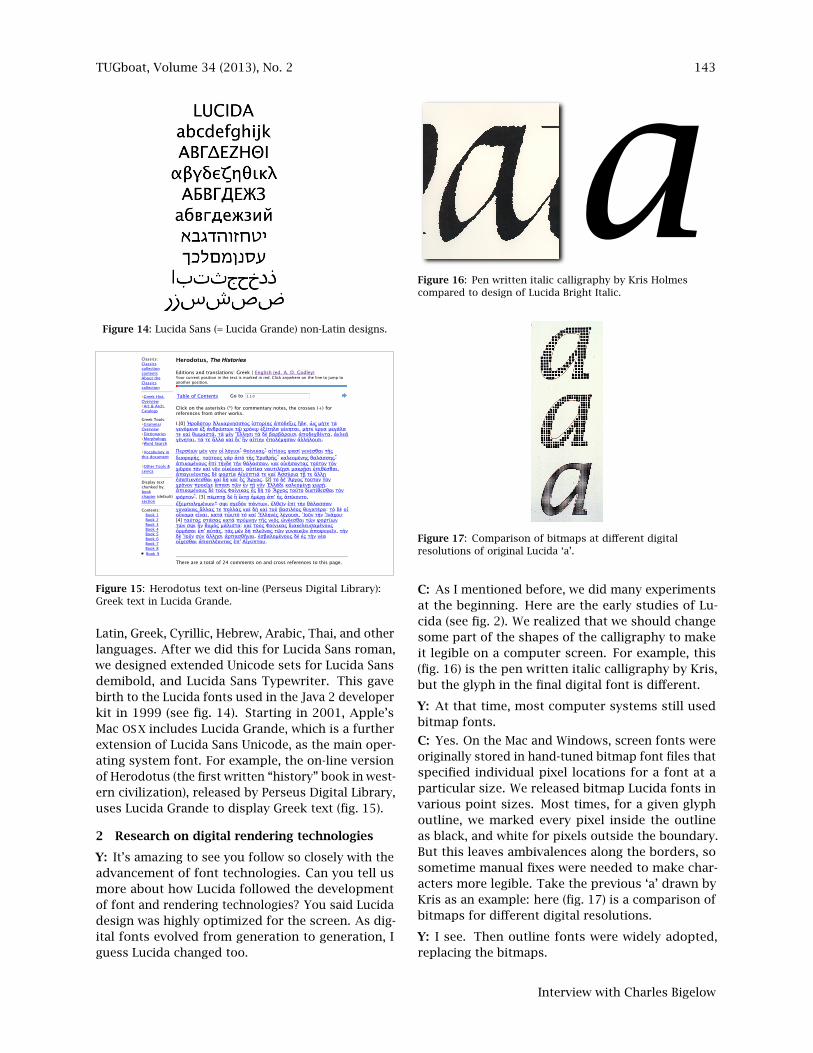
Latin, Greek, Cyrillic, Hebrew, Arabic, Thai, and otherlanguages. After we did this for Lucida Sans roman,we designed extended Unicode sets for Lucida Sansdemibold, and Lucida Sans Typewriter. This gavebirth to the Lucida fonts used in the Java 2 developerkit in 1999 (see fig. 14). Starting in 2001, Apple’sMac OS X includes Lucida Grande, which is a furtherextension of Lucida Sans Unicode, as the main oper-ating system font. For example, the on-line versionof Herodotus (the first written “history” book in west-ern civilization), released by Perseus Digital Library,uses Lucida Grande to display Greek text (fig. 15).
2 Research on digital rendering technologies
Y: It’s amazing to see you follow so closely with theadvancement of font technologies. Can you tell usmore about how Lucida followed the developmentof font and rendering technologies? You said Lucidadesign was highly optimized for the screen. As dig-ital fonts evolved from generation to generation, Iguess Lucida changed too.
Pen written italic calligraphy by Kris Holmes compared todesign of Lucida Bright Italic.
Figure 16: Pen written italic calligraphy by Kris Holmescompared to design of Lucida Bright Italic.
Comparison of bitmaps different digital resolutions oforiginal Lucida ‘a’. Figure 17: Comparison of bitmaps at different digitalresolutions of original Lucida ‘a’.
C: As I mentioned before, we did many experimentsat the beginning. Here are the early studies of Lu-cida (see fig. 2). We realized that we should changesome part of the shapes of the calligraphy to makeit legible on a computer screen. For example, this(fig. 16) is the pen written italic calligraphy by Kris,but the glyph in the final digital font is different.
Y: At that time, most computer systems still usedbitmap fonts.
C: Yes. On the Mac and Windows, screen fonts wereoriginally stored in hand-tuned bitmap font files thatspecified individual pixel locations for a font at aparticular size. We released bitmap Lucida fonts invarious point sizes. Most times, for a given glyphoutline, we marked every pixel inside the outlineas black, and white for pixels outside the boundary.But this leaves ambivalences along the borders, sosometime manual fixes were needed to make char-acters more legible. Take the previous ‘a’ drawn byKris as an example: here (fig. 17) is a comparison ofbitmaps for different digital resolutions.
Y: I see. Then outline fonts were widely adopted,replacing the bitmaps.
Interview with Charles Bigelow

144 TUGboat, Volume 34 (2013), No. 2
C: Adobe was the pioneering digital publishing com-pany at that time. They invented the PostScript lan-guage as their document format together with thePostScript outline font formats. Soon the PostScriptlanguage was widely adopted and PostScript’s dom-inance seemed assured, and computer companiesmoved to adopt outline font technologies.
Y: So Adobe wanted to control PostScript to earnmore money.
C: Yes, because they are a business. Adobe was incomplete control of the PostScript technology at thispoint, and published an open PostScript languagefont format, called Type 3, but it didn’t rasterize aswell or as fast as Adobe’s proprietary format, Type 1.A company had to license Adobe’s PostScript to getType 1 font technology, but major system softwarevendors like Apple and Microsoft didn’t want a keyfont technology controlled by another company anddidn’t want to pay royalties for its use.
Y: So Apple developed their own scalable font tech-nology.
C: Exactly. The code name was Royal, and later be-came called TrueType in 1991. The major technicaldifferences between a PostScript font and a True-Type font, however, is that TrueType uses quadraticB-splines to represent the outlines, whereas cubicBézier curves are used by PostScript. (See RobertBringhurst, The Elements of Typographic Style, witha nice illustration on p. 183 in the third edition.)
Y: TrueType was a new technology. Why did it use asimpler representation (quadratic versus cubic)?
C: Some background. Several outline font formatswere known then. Polygonal outlines — in whichcurves were approximated by a series of straightlines — were easiest to rasterize and been used forsome successful digital typesetting machines, butneeded too many points and were aesthetically in-ferior at larger sizes and higher resolutions, wherethe polygonal approximations of curves could bedetected. Outlines composed of vectors and circu-lar arcs needed fewer points and were fairly fast toprocess, but the radii of shallow arcs would be verylong in comparison to the very short radii of smallarcs. This problem was called numerical instability.Also, at high resolutions, there were noticeable dis-continuities at tangents where a circular arc joineda straight line and curvature fell to zero.
When the outline description went beyond circu-lar arcs and vectors, computer scientists tended tochoose representations more on mathematical aes-thetics than visual aesthetics. Peter Karow’s Ikarus,the first commercially successful digital outline fontdevelopment system, used cubic splines in Hermite
form as a master format but for practical graphicaloutput converted the Hermite cubics to circular arcs.Knuth preferred cubic splines and based Metafont onthe mathematics of parametric cubics by Sergei Bern-stein — also spelled Bernshtein — a Russian mathe-matician. Adobe chose cubic Bézier splines, devel-oped for computer graphics by Pierre Bézier, alsobased on Bernstein’s work.
Apple chose quadratic B-spline outlines in partbecause they already used them in MacDraw, a draw-ing program for Macintosh, so Apple had a propri-etary outline technology in-house. Apple planned touse TrueType technology for the Macintosh user in-terface, so they wanted fast processing and believedthat quadratic B-splines could be rendered fasterthan cubic splines.
A very interesting outline technology was de-veloped by Vaughan Pratt, a computer scientist atStanford, and used by Sun in a font format called F3.It was based on generalized conic curves [8]. Pratt’sinspiration went all the way back to an ancient trea-tise on conics by a Greek mathematician, Apolloniusof Perga.
I personally liked Pratt’s approach best becauseit was a nice compromise between computationalelegance, processing speed, and intuitive geometricunderstanding by designers. Sun did not push toestablish their conic technology as a standard, soit was eventually overwhelmed by TrueType andType 1. I tried to persuade some Sun executives tomake it an open format and the standard in Solarisand Unix, but they apparently preferred to let it diethan to let it out. Later, the Java language was savedfrom nearly the same fate.
With such a wealth of varied mathematical rep-resentations of fonts, it was difficult to tell which, ifany, were artistically superior. Visually, the quadraticand cubic forms seemed more or less equally goodat representing known type forms, so different firmschose font outline representations for engineering orcommercial reasons or for non-visual mathematicalaesthetics.
Y: So you created the TrueType version of Lucidausing quadratic splines.C: Yes. At this stage, Apple asked us to help themexplore how to make things as simple as possible.We conducted a lot of experiments using Lucida.We went with Apple’s font manager and chief fontengineer to URW in Hamburg, Germany, where PeterKarow at URW had invented Ikarus in the 1970s.URW had over time developed a big library of digitaloutline fonts. To make TrueType successful, Appleneeded a good supply of high-quality digital fontdata, and URW had the best and the most. They also
Yue Wang
TUGboat, Volume 34 (2013), No. 2 145
had the technical ability to write accurate conversionprograms from their format to TrueType. Most ofthe early TrueType fonts were produced from Ikarusformat data, including the Lucida fonts, becausewe used the Ikarus system to digitize our designs.One of the most important experiments was, howto use as few points as possible to represent a fontoutline. If we had fewer points, font file sizes weresmaller and, importantly, computers could renderfonts faster.
Y: This is also true today. Today most of the graph-ics and animations are offloaded and processed us-ing special hardware in the computer. So ironicallytext rendering is even slower than graphics display.C: That’s interesting. Text has some advantagesover general graphics, at least for alphabetic fonts,because there are relatively few characters, so oncethey are rasterized for a given size and resolution,the rasters can be cached and fetched very quickly,so the pages are essentially tilings of a small num-ber of stored and repeated graphical elements. ForChinese fonts, however, the characters are morecomplex and many more of them are needed, so pro-cessing was still a problem until recently. In thoseearly days, in addition to limited processing capa-bility, we also had other problems. Computers hadlimited memory, and most people were still usingfloppy disk. Though quadratic splines use fewer pa-rameters than cubic splines, we needed more pointsto represent the shape well. To save memory, it wasimportant to use as few points as possible, but youcannot use too few of them or the glyph outlines willbe distorted. Kris and I did a lot of experiments toshow Apple how many points to use when creatinga font outline.
There is a particularly interesting problem withTrueType splines when the number of points repre-senting a curved quadrant is reduced below somethreshold. The shape of the curve bulges out at thecorner, and a quadrant of a circle or ellipse becomeshyper-elliptical, to use a term by Piet Hein. This isa subset of a general question about mathematicalrepresentations of shapes that were created by mo-tions of the human hand. When Donald Knuth wasworking on Metafont at Stanford, he would meetwith interested students and colleagues at lunch todiscuss a wide range of questions and problems thatcame out of his research. He called it the “Metafontfor lunch bunch”. We discussed how the mathemat-ics of the equations affected the forms of the curvesin typefaces, and we wondered what kinds of curveswere sufficient for representing the aesthetics of tra-ditional typefaces. I am not a mathematician, but Ifound those discussions fascinating because Knuth
was leading all of us into a barely explored realmwhere mathematics and aesthetics met.
Today, a quarter century later, most computer-aided drawing programs and type design programsuses Bézier cubics, and sometimes I see a tendencyfor recent typefaces designed directly on the com-puter to seem similar in the modeling of forms. Ibelieve that this is the result of interaction betweenvision, user interfaces, and mathematics. Béziersplines can behave in surprising and anti-intuitiveways, at least for artists accustomed to drawing andwriting on paper, and they don’t necessarily resem-ble the motions of the human hand. When designingon screens and using a mouse instead of a pen orbrush, type artists tend to be conservative, using asmall number of points on the curves and adjust-ing the off-curve control points carefully to makesmooth shapes that are easier to understand andcontrol. The curves are usually pleasant, but theyare more limited than the shapes that result fromthe living hand moving a traditional tool through acomplex path. The motions of the tip of a Chinesecalligraphy brush are especially complex and subtle,for example.
Y: So, Apple asked you to help them solve very prac-tical problems.C: Right. Apple, Adobe, Microsoft, and a firm calledImagen, founded by two Stanford computer scien-tists, asked us for advice and consultation on vari-ous font technology and aesthetic issues. In the late1980s, Apple invited us to do some new experiments.As I said, naive algorithms for rasterization causevarious aesthetic problems on computer screens andlow resolution printers, like irregular stem thick-nesses and spacing, irregular letter heights, loss ofserifs, broken hairlines, and so on. So when Adobedeveloped the PostScript font format, and later whenApple developed the TrueType font format in 1989–1991, font hinting was introduced to solve thoseproblem.
I should explain that “font hinting” is the use ofcomputer program instructions to adjust the displayof an outline font so that it lines up with a rasterizedgrid. At low screen resolutions, hinting is criticalfor producing a clear, legible text. Hinting can begeneric for all sizes, but TrueType hinting also hasthe capability of adjusting hints for specific resolu-tions. This localized or hand-tuned hinting has tobe done by people, who can test and view differentapproaches. It has become a special skill practicedby a small number of experts. A typical kind of hint-ing problem is to make all the vertical stems of afont have the same pixel thickness, so the text looksregular in tone and rhythm. At a given size, the
Interview with Charles Bigelow
146 TUGboat, Volume 34 (2013), No. 2
mathematical thickness of a stem might be, let’s say,2.5 pixels. So, depending on how a letter falls on theraster grid, a stem might be 2 pixels or it might be3 pixels thick. This makes for a splotchy, irregularimage. With hinting, all the stems can be forced tobe 2 pixels, or 3 pixels, to enforce regularity. Theactual outlines are being distorted, but the resultslook better to readers.
Y: So Lucida has hinting instructions inside the fontfile?
C: Right! In fact Lucida Sans roman was the firstfully hinted TrueType font in history. Apple devel-oped the format but didn’t completely hint a font. Atthat time there weren’t mature tools for hinting, andApple didn’t have type designers on staff, so theyasked us to test the format by hinting a font, usinglow-level tools developed for programmers to writehinting code. Kris Holmes hinted a whole font thatway. It was a lot like writing macro-instruction code.Kris showed that TrueType hinting worked in a prac-tical design context, but the experience also made usrealize that hinting was a separate kind of task fromdesigning. We decided to stick to designing forms,not hinting them.
Y: Amazing! But I heard that hinting is not used inApple’s system any more.
C: Yes. Increasing resolution screens and new fontrendering technologies, often called “anti-aliasing”or “smoothing”, eventually made hinting unneces-sary on later generations of screens and printers.That took more than a decade of progress, becausedisplay and printing technologies improve muchmore slowly than the rate of Moore’s law. By the late-1990s, grayscale and color display screens gainedenough market dominance that rendering algorithmscould take advantage of the range of gray tones avail-able on screens.
Y: Is this related to using anti-aliasing techniquesfrom computer graphics?
C: Yes, the term and technique come from computergraphics. For a given glyph outline, the edge of a con-tour usually does not fall exactly on a pixel bound-ary. An edge pixel might be partly inside the contour(black) and partly outside the contour (white). Anti-aliasing adjusts the gray tonal value of that edgepixel in proportion to how much of the pixel is in-side the contour or black area. The resulting edgelooks smoother because the intermediate gray toneis not as noticeable as an all-black pixel. This methodworks better at higher resolutions. Below 100 pixelsper inch, viewed at a normal reading distance, theresult looks fuzzy or blurry. Above 200 pixels perinch, the result usually looks smooth without objec-
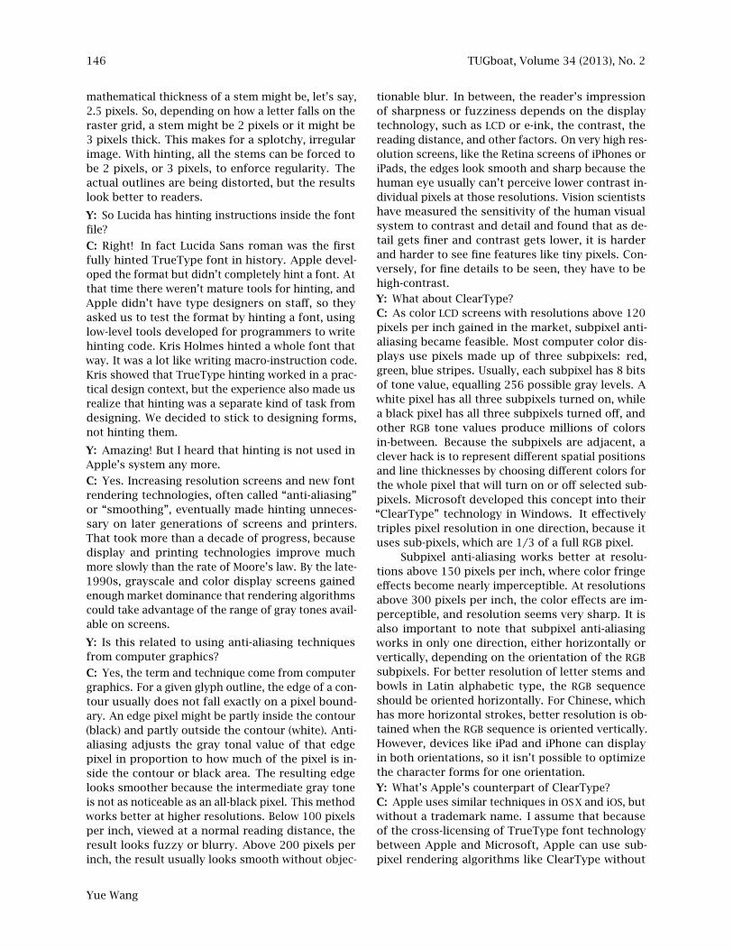
tionable blur. In between, the reader’s impressionof sharpness or fuzziness depends on the displaytechnology, such as LCD or e-ink, the contrast, thereading distance, and other factors. On very high res-olution screens, like the Retina screens of iPhones oriPads, the edges look smooth and sharp because thehuman eye usually can’t perceive lower contrast in-dividual pixels at those resolutions. Vision scientistshave measured the sensitivity of the human visualsystem to contrast and detail and found that as de-tail gets finer and contrast gets lower, it is harderand harder to see fine features like tiny pixels. Con-versely, for fine details to be seen, they have to behigh-contrast.
Y: What about ClearType?C: As color LCD screens with resolutions above 120pixels per inch gained in the market, subpixel anti-aliasing became feasible. Most computer color dis-plays use pixels made up of three subpixels: red,green, blue stripes. Usually, each subpixel has 8 bitsof tone value, equalling 256 possible gray levels. Awhite pixel has all three subpixels turned on, whilea black pixel has all three subpixels turned off, andother RGB tone values produce millions of colorsin-between. Because the subpixels are adjacent, aclever hack is to represent different spatial positionsand line thicknesses by choosing different colors forthe whole pixel that will turn on or off selected sub-pixels. Microsoft developed this concept into their“ClearType” technology in Windows. It effectivelytriples pixel resolution in one direction, because ituses sub-pixels, which are 1/3 of a full RGB pixel.
Subpixel anti-aliasing works better at resolu-tions above 150 pixels per inch, where color fringeeffects become nearly imperceptible. At resolutionsabove 300 pixels per inch, the color effects are im-perceptible, and resolution seems very sharp. It isalso important to note that subpixel anti-aliasingworks in only one direction, either horizontally orvertically, depending on the orientation of the RGB
subpixels. For better resolution of letter stems andbowls in Latin alphabetic type, the RGB sequenceshould be oriented horizontally. For Chinese, whichhas more horizontal strokes, better resolution is ob-tained when the RGB sequence is oriented vertically.However, devices like iPad and iPhone can displayin both orientations, so it isn’t possible to optimizethe character forms for one orientation.
Y: What’s Apple’s counterpart of ClearType?C: Apple uses similar techniques in OS X and iOS, butwithout a trademark name. I assume that becauseof the cross-licensing of TrueType font technologybetween Apple and Microsoft, Apple can use sub-pixel rendering algorithms like ClearType without
Yue Wang
TUGboat, Volume 34 (2013), No. 2 147
infringing Microsoft’s methods or patents, but that’sjust my guess. However, ClearType is Microsoft’strademark, so that is presumably why Apple doesn’tuse that name. Apple’s Retina displays use both highresolution and anti-aliasing.
Y: So you also need to think about how subpixelrendering affects the display of Lucida.C: We can think about it, but it is hard for designersto do much about it. Subpixel rasterizing of largertype sizes on high resolution screens, which nowhave a major share of the market, needs no spe-cial efforts by designers because the edge artifactsfrom rasterization, including jagged staircase pat-terns, fuzzy contours, and color fringing, are smallin comparison to the size of the letters and do notappreciably degrade the quality of the text image.Below 14 point, and at lower resolutions, type size issmall relative to the sizes of pixels, so the rasteriza-tion artifacts are big in comparison to letter detailslike serifs, hairlines, and stems. The artifacts arenoise that obscures the signal of character shape. Inextended texts, there may be thousands of charac-ters on a screen, so en masse, the artifacts can maketext visually “uncongenial”. Readers may not like thelook of the text, though they may be able to read itnevertheless. Vision scientists have shown that low-resolution or fuzzy text can often be read as quicklyand accurately as sharply rendered high-resolutiontype. The care that designers put into the shapes ofcharacters, and the ingenuity that engineers put intorendering technology, contribute more to aestheticsthan to legibility. Type is both aesthetic and informa-tive. Well-formed and well-rendered text contributesto the pleasure of reading a text.
Recognizing the importance of designing forsubpixel anti-aliasing of text types at text sizes,Microsoft commissioned several new, original fontfamilies to work especially with ClearType technol-ogy. Several were for Western scripts — Latin, Greek,and Cyrillic — and one was for Japanese Kanji, Kana,and Romaji. We tested them in my course on newstypography at RIT a few years, and they all lookedgood. I was happy to see such strong support ofartistic creativity for a new technology, from a majortechnology company. I should say that one of theClearType font designers was a former student ofmine, and others were friends, and that Microsoftalso licenses Lucida fonts, though not as part of theClearType set.
I think the next big challenge for designers oftext type will not be pure legibility, although that isthe worthy goal of most text face designers and isachievable with existing designs in current render-ing technology on high-res screens. Instead, I expect
to see more emphasis and experimentation with ex-pressiveness in design, coupled with congenialityfor the reader. In the past five centuries of develop-ment, Latin alphabetic typefaces have become highlyrefined in their forms, weights, patterns, and vari-ations, and many have proved to be legible overcenturies. More than half of the new novels pub-lished in the US in the past decade were composedwith “Old Style” type designs based on typefaces firstcut more than 250 years ago. Some of the designs,like various faces based on those by Garamond andhis contemporaries, were first cut more than 450years ago. So, at least for print book readers, thegreat old seriffed fonts of the past are still the greatnew fonts of today, in digital format.
Digital design tools and rendering enable greaterprecision and regularity in type forms, but the riskis that the designs look boring — too regulated, toorepetitive, too rigid, too homogenized. Randomlyadding irregularity doesn’t improve the appearance —the designs then look boring but awkward. Somegraphic and interface designers want neutrality intypography, but I don’t believe that any type designis truly neutral. Every typeface carries some degreeof expressiveness, even those intended to be plain,simple, and neutral. For example, a user-interfacein Helvetica expresses a different feeling than onein Lucida, but the two designs are similar in weightand x-height. Helvetica is more modernist, Lucidamore humanist. Helvetica more carved, Lucida, morehandwritten. Helvetica more tightly spaced, Lucidamore open. A Swiss poet made a memorable compar-ison of the feeling of Helvetica compared to SyntaxAntiqua, a very readable sans-serif typeface by HansE. Meier, which is even more closely based on human-ist handwriting and early Renaissance typographythan Lucida. The poet said, when he reads a pagein Syntax, it is like walking through a field of flow-ers, but when reading a page in Helvetica, it is likewalking through a field of stones.
So, a problem for future designers will be: howmuch expressiveness to put into a type. What ex-pression does the design convey to the reader? Forthe reader, highly expressive typefaces are lively butcan look too complex for long texts. Free scripts canlook graceful but may seem too undisciplined formodern readers accustomed to rigidly regular fonts.
When technology changes, there are opportuni-ties for new designs. We can find many historical ex-amples. More than 50 years ago, typography shiftedfrom metal to photographic technology. HermannZapf’s Optima, first created for metal typography,became wildly popular in photo typography becauseit gave greater expressiveness to the sans-serif genre.
Interview with Charles Bigelow
148 TUGboat, Volume 34 (2013), No. 2
Optima’s subtly flaring terminals and classical let-ter structures brought a hint of Renaissance pro-portions and humanist handwriting into a modernidiom, through a new technology that crisply repro-duced designs photographically and lithographically,without the usual wear and ink squash of metal type.Yet, the subtle qualities that made Optima so suc-cessful in photo technology were difficult to renderin early digital typography because of low resolu-tions on screens and printers, so Optima lost pop-ularity in laser printing. Instead, Zapf’s Palatinogained popularity in desktop laser printing becauseit conveyed some of the handwritten vigor of Ren-aissance typography and calligraphy even in lowresolution of 300 dots per inch. Today, as digitalresolutions increase, Optima is regaining popularityfor a new generation of graphic designers. We maysee new type designs for screens that enjoy simi-lar popularity in the new media of e-books, smartphones, and pad computers.
I believe that expressiveness is also an inter-esting challenge for East Asian scripts. Chinesetype styles derived from woodblock printing, likethe Song/Sung styles, were adapted to metal typog-raphy and are now widely used in many variationsin a large range of sizes in digital typography Thesame is true of the related Mincho styles in Japanesetypography. The rectilinear structure of this typegenre, which may have made it easier to cut in wood,makes it seem stiff and rigid but functional. It maybe that Song style was easier to cut and cast in smallsizes of type, which would have made the style moreeconomical because small type sizes use less paper,and are thus more widely used.
Typefaces based on brush-written Chinesescripts have more handwritten grace but historicallywere more difficult to adapt to metal typography,and probably that is why they are less popular thanSong or Mincho styles. Digital typography relaxesthe technical limitations on producing and printingfonts, and makes it easier to “draw” digital charac-ters, so we are beginning to see more expressivestyles in Chinese and Japanese typography, butmostly for “display” in advertising, headlines, andother contexts, at relatively large sizes. Many ofthe recent fonts are not in traditional calligraphicstyles, but are fanciful designs, like clouds, fat fish,childish writing, blurred writing, and so on. Perhapssome of these were already known in hand-paintedsigns and banners, and now can be made into type.If “folk” styles are getting made into type, that isfascinating. In American music, folk styles wentmainstream because of the recording industry andwe got jazz, rock ‘n’ roll, and country and western
musical genres, which have since gained worldwidepopularity. However, America has not produced a“breakthrough” folk typography, probably becauselettering art, calligraphy, and typography have notbeen folk cultures, but the practice of literate elites.The ancient literate traditions of China, Japan, andKorea may, however, include styles of writing thatcould become newly popular in digital form. And,of course, young designers do not always want tofollow old traditions, and instead invent new styles.
I think this is an exciting challenge for designersin China, Japan, and Korea — to capture the expres-siveness of classical styles and adapt them to newertechnology, without seeming quaint, old-fashioned,or reactionary, and to find interesting historicalstyles worthy of revival, but also to invent new styles.These trends are already happening in display types,used in large sizes, but the big challenge is, how toproduce those kinds of expressiveness in text typesthat can be read at small sizes.
In English language book publishing, sans-seriffonts are very rare in literature of any kind, whetherimportant literature or popular genres like crime,romance, and science fiction. Fiction is generallyseriffed. Books about graphic design, photography,and modern art, however, use sans-serif types fairlyoften, so the choice of type style depends on thecontent and on the reader. I wonder if similar dis-tinctions occur in East Asian publishing.
The recent popularity of Japanese “cell phonenovels”, which are usually about the lives of youngpeople and often written by young women, are saidto use more hiragana characters than traditionalJapanese literature. I wonder if this increases inter-est in expressive hiragana fonts, when cell phonenovels are published in print. There are alreadymany expressive kana designs, which can be com-bined with appropriate weights and forms of Kanjito achieve subtly different text effects. When thereis a shift in literary taste, there can also be a shift intypographic taste. Another interesting mixed writingsystem is the Korean, which uses Hanja charactersbased on Chinese, along with the unique Hangul al-phabet. Compared to the Latin alphabets, Hangulmore accurately represents the significant sounds ofspeech. So, I wonder whether literary expression thatfavors Hangul motivates trends in the graphical de-sign or usage of Hangul fonts. Do font styles reflectliterature? Are Korean pop novels and cell-phonenovels using more Hangul than Hanja characters?The Korean Hangul writing system was sans-serifin early examples, but late styles became similar tobrush-written characters.
Y: What about different weights in Lucida?
Yue Wang

TUGboat, Volume 34 (2013), No. 2 149
Spectrum of possible weights for Lucida Sans. Green group = “light” weights;red group = “normal” weights; light blue group = semi-bold weights; dark blue group = “bold” weights.Figure 18: Spectrum of possible weights for Lucida Sans.Top group = “light” weights; second = “normal” weights;third = semi-bold weights; bottom = “bold” weights.
C: Here (fig. 18) is a series of experimental weightsfor Lucida Sans. The top group is for light weights,the second group for normal weights, the third forsemi-bold weights, and the bottom group for boldweights. In the first generation of Lucida fonts, thelow screen and printer resolutions could not sup-port such fine gradations of weights, so we madeonly a few weights: normal, demibold, and bold.Now, higher-resolution display technologies and anti-aliasing techniques can render finer weight grada-tions, so we have designed additional weights ofLucida Sans, to be released next year. By studyingthe weights of popular text typefaces today, andalso going back hundreds of years, we concludedthat there is no single ideal weight, but a range ofpreferred weights, depending on printing quality,reading conditions, and, in digital displays, screentechnologies.
At RIT, I did a study of “just noticeable differ-ences” in the weight of a sans-serif face. For a givenweight, how much darker must a slightly bolderweight be for a reader to notice that it is darker?The results appear to follow the Weber-Fechner lawin psychophysics, which says that perception of dif-ference is proportional to stimulus. I found that fora “normal” font of a certain weight, a just-noticeablydarker font needs to be approximately 2.5% bolderthan the normal weight. The same is true for a boldweight: the next perceptibly darker weight must be2.5% darker than the bold, so perception of weightdifference follows a geometric progression.
Y: The weight spectrum reminds me of the Frutigernumbering system!
C: Yes, Frutiger was a pioneer in the numbering oftypeface weight systems with his Univers family andlater with his Frutiger family and others. He saw
Current weights of Lucida Sans. Assuming stem weight of “normal” = 1.0,then ‘light” weight = 0.75 x normal; “demibold” = 1.5 x normal; “bold” = 2.0 x normal.
Figure 19: Current weights of Lucida Sans. Assuming stemweight of “normal” = 1.0, then “light” weight = 0.75 x normal;“demibold” = 1.5 x normal; “bold” = 2.0 x normal.
that typographic weight nomenclature was a confus-ing mess. Different designers, type foundries, andfont vendors used different and incommensuratenames. Frutiger rationalized weights within Universand designated them with two-digit numbers. I al-ways liked that. Recently, a three-digit numberingsystem has been developed for Univers, to incorpo-rate additional weights and widths. It is useful butdoesn’t exactly match the original two-digit system,which makes it confusing for me because I remem-ber the older, simpler system. Around 20 years ago,Peter Karow, developer of the Ikarus software fortype digitization, made an interesting study of thestatistics of typeface weights, using a large digitalfont database. He made a reasonable proposal forrationalizing typeface weights in an 11-step systembut it was not adopted. Today, W3C recommends aset of font-weight names and associated numericalvalues in a 9-step system, but it is, to my mind, in-consistent with existing progressions, arbitrary, andtoo limited, so I don’t see it as an effective solution.I’m afraid, it is a muddle that won’t be cleared upsoon, if ever.
Y: What’s the current weight of Lucida then?C: For Lucida Sans normal, the stem thickness is18% of the x-height. Lucida Sans demibold is 1.5times the normal stem, and the bold stem is 2.0times the normal. (See fig. 19.) This approximates aprogression based on the square root of 2. However,weight measured by ratio of stem to x-height, whichdesigners like, is not the same as weight measuredby percentage of black pixels in total text area, whichan engineer might prefer. Using pixel area weightmeasure, Lucida Sans normal is roughly a 22% graytone. Lucida Sans demibold is approximately 29%gray, and Lucida Sans bold is 36% gray, which is1.6 times the normal weight. Thus, the gray tone
Interview with Charles Bigelow

150 TUGboat, Volume 34 (2013), No. 2
progression does not increase as much as the stem-weight to x-height ratio, because of the way weight isdistributed in a Latin typeface — more of the weightis in the x-height region, less in the ascender anddescender region.
Text typefaces appear to cluster into weightgroupings. The normal weights of seriffed romantext faces tend to have light gray tones, ranging fromaround 14% to 18% gray. Seriffed types designed forscreen display tend to be somewhat darker, around18% to 22% gray tone. Sans-serif fonts for print andscreen also tend to be darker, ranging from 19% to23%. Of course, there are lighter and darker weightsin many typeface families; I’m talking about whatare called “normal” or “regular” roman text weights.
As a side note, Chinese fonts also cluster intotonal groups, but to measure the average gray tonesis challenging, because the number of strokes in acharacter and therefore its density varies much morethan in Latin typefaces, and the frequency distribu-tion of characters can vary according to content andusage. In my very rough estimates, Song style faceshave average gray tones that cluster like traditionalseriffed Western fonts, but slightly darker, rangingfrom 15% to 20%. Sans-serif Chinese fonts tend tobe darker yet, ranging from roughly 22% to 35% graytone. However, I guess that weights darker than30% are not often used in running texts. Kanji fontscluster into similar tonal groups. I hope that typescholars in Asia will explore some of these patternsof usage.
Back to Lucida — to make Lucida Grande workwell in Apple’s OS X font menu, Apple preferred thedesignation “bold” to “demibold”, so Lucida GrandeBold in OS X is the same weight as Lucida Sans Demi-bold in Windows. I regret the confusion — anotherdifference between operating systems and platforms.Weight measurements, names and numerical valuesremain an unsolved problem of lack of standard-ization, in part because of the technical needs ofvarious systems, and in part because designers sim-ply make weights the way they think looks best.
3 State of the art — smart fonts
Y: Interesting. What other new technologies are youinvolved in when designing typefaces?
C: Apart from computer graphics techniques andhigher resolutions, an important font technology isthe glyph substitution technique used in OpenType.
Glyph substitution makes math fonts less cum-bersome because different forms and sizes of glyphscan be substituted according to context. In Ara-bic typography, smart fonts are aesthetically func-tional. They enable easy use of context-sensitive
Lucida Handwriting
Kolibri
Demonstrations of the joining structure of Lucida Handwritingcompared to Kolibri, a script design by Kris Holmes for URW,developers of the Ikarus font software used by Bigelow & Holmes.
Figure 20: Demonstrations of the joining structure ofLucida Handwriting compared to Kolibri, a script design byKris Holmes for URW, developers of the Ikarus font softwareused by Bigelow & Holmes.
shape variations that are aesthetically necessary inArabic scripts. This encourages artistic expressionand experimentation, both in capturing traditionalstyles and in imagining new styes. In terms of glyphvariations, Latin alphabet fonts were simplified dur-ing the first hundred years of typography, with mostligatures, abbreviations, and alternate forms elim-inated for economic reasons. So, smart fonts arenot crucial for Latin alphabet typography, but dohave artistic and ornamental value. Hermann Zapf’sZapfino, a graceful yet free script with glyph substitu-tion, has become very popular. Some of Kris Holmes’scripts like Apple Chancery, which has many glyphvariants, and Kolibri, which has intricate joining,also show the aesthetic possibilities of smart fonts.Jim Wasco’s Elegy script also shows elegant use ofOpenType.
Before OpenType, Apple invented a similar tech-nology called TrueType GX, later called AAT. Thesoftware that renders text parses the strings forcertain combinations and contexts of letters, and,when they are found, the software substitutes alter-nates from the font if the substitutions have beenprogrammed into the font. A common example inEnglish and European languages is the f-ligatures.To keep the dot of the letter ‘i’ or the top of the letter‘l’ from bumping into the upper arm and terminal ofthe ‘f’, typefounders used to cast special combina-tions of ‘fi’, ‘fl’, ‘ffi’, and ‘ffl’, and more rarely, ‘fj’, forwords like “fjord”. A few like ‘fi’ and ‘fl’ are commonin most fonts today. When we were designing Lucida,glyph substitution wasn’t available so we designedthe ‘f’ with a short top arm that didn’t collide withthe ‘i’ or ‘l’. In Lucida Grande, several f-ligatures areavailable, like ‘fi’, ‘fl’, ‘ff’, ‘ffi’, and ‘ffl’.
Kris continued to experiment with more com-plex character sets. We designed Lucida Casual withthree alternative styles, though two of them have notbeen released because we were experimenting to see
Yue Wang
TUGboat, Volume 34 (2013), No. 2 151
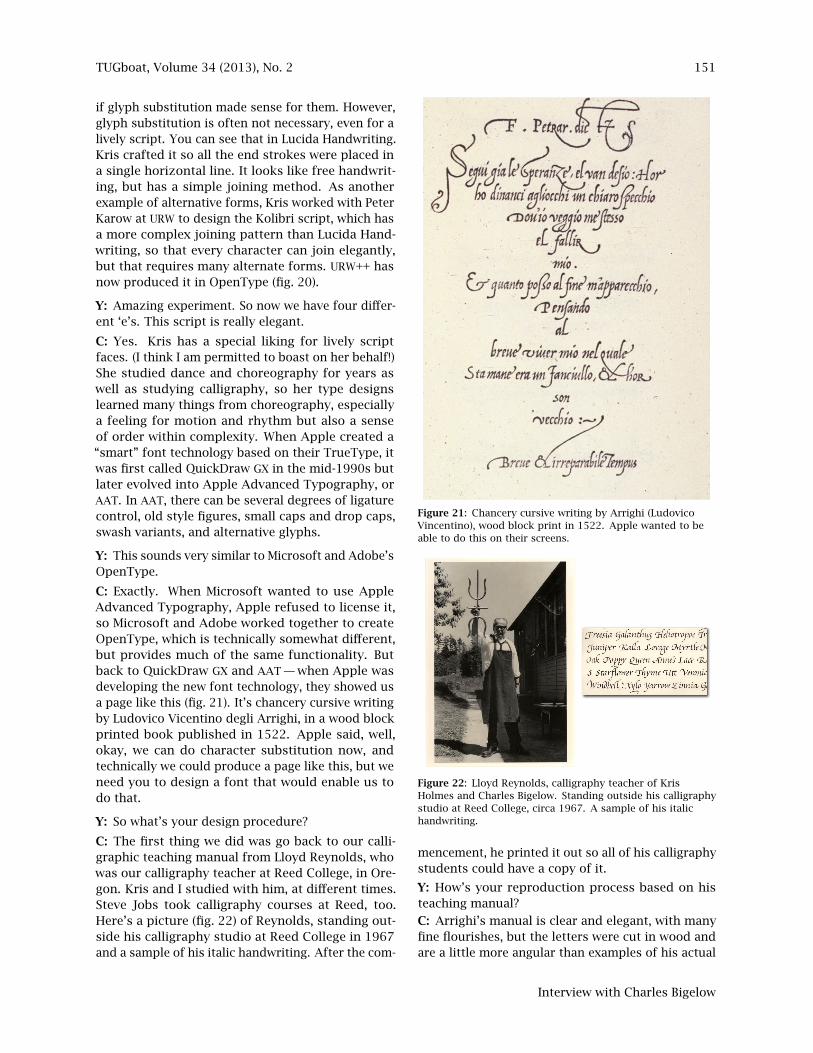
if glyph substitution made sense for them. However,glyph substitution is often not necessary, even for alively script. You can see that in Lucida Handwriting.Kris crafted it so all the end strokes were placed ina single horizontal line. It looks like free handwrit-ing, but has a simple joining method. As anotherexample of alternative forms, Kris worked with PeterKarow at URW to design the Kolibri script, which hasa more complex joining pattern than Lucida Hand-writing, so that every character can join elegantly,but that requires many alternate forms. URW++ hasnow produced it in OpenType (fig. 20).
Y: Amazing experiment. So now we have four differ-ent ‘e’s. This script is really elegant.
C: Yes. Kris has a special liking for lively scriptfaces. (I think I am permitted to boast on her behalf!)She studied dance and choreography for years aswell as studying calligraphy, so her type designslearned many things from choreography, especiallya feeling for motion and rhythm but also a senseof order within complexity. When Apple created a“smart” font technology based on their TrueType, itwas first called QuickDraw GX in the mid-1990s butlater evolved into Apple Advanced Typography, orAAT. In AAT, there can be several degrees of ligaturecontrol, old style figures, small caps and drop caps,swash variants, and alternative glyphs.
Y: This sounds very similar to Microsoft and Adobe’sOpenType.
C: Exactly. When Microsoft wanted to use AppleAdvanced Typography, Apple refused to license it,so Microsoft and Adobe worked together to createOpenType, which is technically somewhat different,but provides much of the same functionality. Butback to QuickDraw GX and AAT — when Apple wasdeveloping the new font technology, they showed usa page like this (fig. 21). It’s chancery cursive writingby Ludovico Vicentino degli Arrighi, in a wood blockprinted book published in 1522. Apple said, well,okay, we can do character substitution now, andtechnically we could produce a page like this, but weneed you to design a font that would enable us todo that.
Y: So what’s your design procedure?
C: The first thing we did was go back to our calli-graphic teaching manual from Lloyd Reynolds, whowas our calligraphy teacher at Reed College, in Ore-gon. Kris and I studied with him, at different times.Steve Jobs took calligraphy courses at Reed, too.Here’s a picture (fig. 22) of Reynolds, standing out-side his calligraphy studio at Reed College in 1967and a sample of his italic handwriting. After the com-
Chancery cursive writing by Arrighi (Ludovico Vincentino), wood bloock print in 1522.Apple computer wanted to be able to do this on their screen.Figure 21: Chancery cursive writing by Arrighi (Ludovico
Vincentino), wood block print in 1522. Apple wanted to beable to do this on their screens.
Lloyd Reynolds, calligraphy teacher of Kris Holmes and Charles Bigelow.Standing outside his calligraphy studio at Reed College, circa 1967.A sample of his italic handwriting.
Figure 22: Lloyd Reynolds, calligraphy teacher of KrisHolmes and Charles Bigelow. Standing outside his calligraphystudio at Reed College, circa 1967. A sample of his italichandwriting.
mencement, he printed it out so all of his calligraphystudents could have a copy of it.
Y: How’s your reproduction process based on histeaching manual?
C: Arrighi’s manual is clear and elegant, with manyfine flourishes, but the letters were cut in wood andare a little more angular than examples of his actual
Interview with Charles Bigelow
152 TUGboat, Volume 34 (2013), No. 2
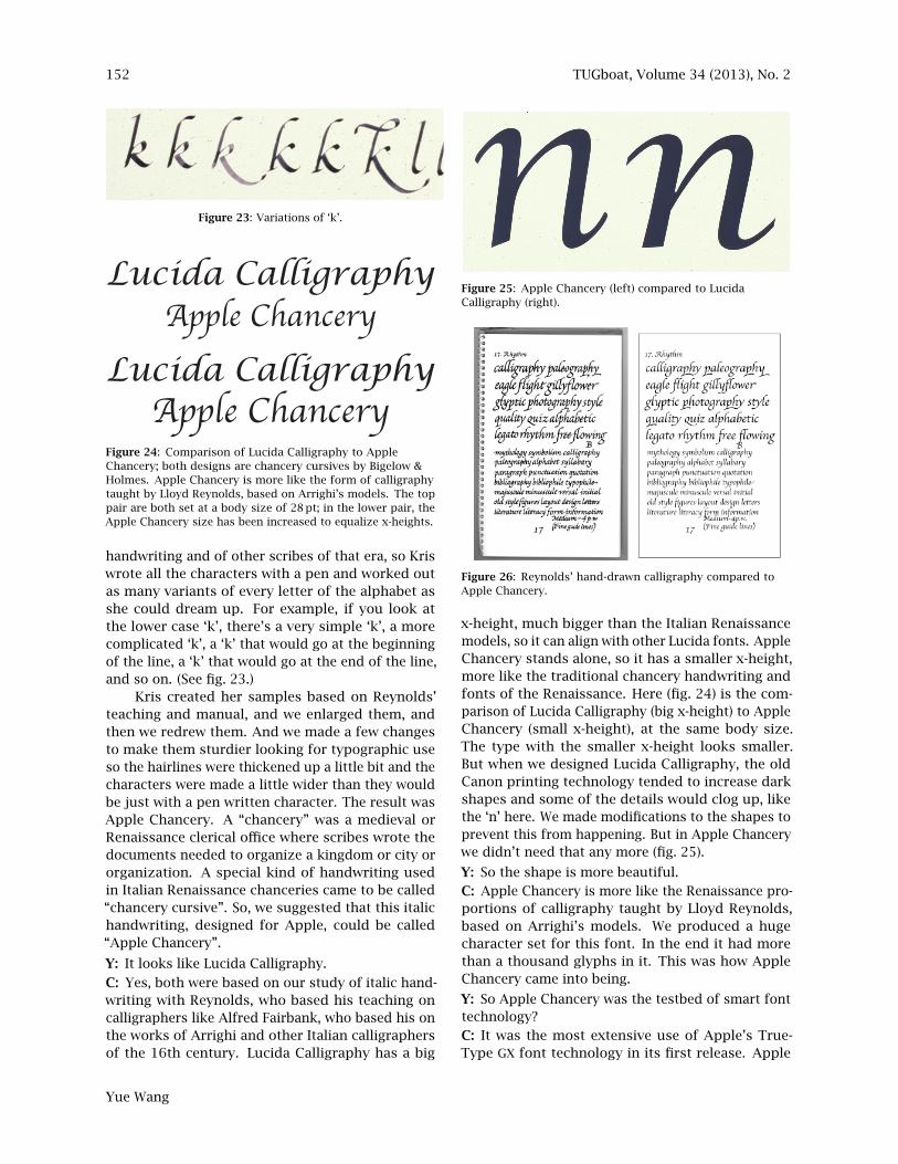
Figure 23: Variations of ‘k’.
Lucida CalligraphyApple Chancery
Lucida CalligraphyApple Chancery
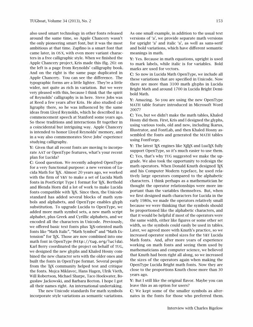
Figure 24: Comparison of Lucida Calligraphy to AppleChancery; both designs are chancery cursives by Bigelow &Holmes. Apple Chancery is more like the form of calligraphytaught by Lloyd Reynolds, based on Arrighi’s models. The toppair are both set at a body size of 28 pt; in the lower pair, theApple Chancery size has been increased to equalize x-heights.
handwriting and of other scribes of that era, so Kriswrote all the characters with a pen and worked outas many variants of every letter of the alphabet asshe could dream up. For example, if you look atthe lower case ‘k’, there’s a very simple ‘k’, a morecomplicated ‘k’, a ‘k’ that would go at the beginningof the line, a ‘k’ that would go at the end of the line,and so on. (See fig. 23.)
Kris created her samples based on Reynolds’teaching and manual, and we enlarged them, andthen we redrew them. And we made a few changesto make them sturdier looking for typographic useso the hairlines were thickened up a little bit and thecharacters were made a little wider than they wouldbe just with a pen written character. The result wasApple Chancery. A “chancery” was a medieval orRenaissance clerical office where scribes wrote thedocuments needed to organize a kingdom or city ororganization. A special kind of handwriting usedin Italian Renaissance chanceries came to be called“chancery cursive”. So, we suggested that this italichandwriting, designed for Apple, could be called“Apple Chancery”.
Y: It looks like Lucida Calligraphy.
C: Yes, both were based on our study of italic hand-writing with Reynolds, who based his teaching oncalligraphers like Alfred Fairbank, who based his onthe works of Arrighi and other Italian calligraphersof the 16th century. Lucida Calligraphy has a big
Apple Chancery (left) compared to Lucida Calligraphy (right).
Figure 25: Apple Chancery (left) compared to LucidaCalligraphy (right).
Figure 26: Reynolds’ hand-drawn calligraphy compared toApple Chancery.
x-height, much bigger than the Italian Renaissancemodels, so it can align with other Lucida fonts. AppleChancery stands alone, so it has a smaller x-height,more like the traditional chancery handwriting andfonts of the Renaissance. Here (fig. 24) is the com-parison of Lucida Calligraphy (big x-height) to AppleChancery (small x-height), at the same body size.The type with the smaller x-height looks smaller.But when we designed Lucida Calligraphy, the oldCanon printing technology tended to increase darkshapes and some of the details would clog up, likethe ‘n’ here. We made modifications to the shapes toprevent this from happening. But in Apple Chancerywe didn’t need that any more (fig. 25).
Y: So the shape is more beautiful.C: Apple Chancery is more like the Renaissance pro-portions of calligraphy taught by Lloyd Reynolds,based on Arrighi’s models. We produced a hugecharacter set for this font. In the end it had morethan a thousand glyphs in it. This was how AppleChancery came into being.
Y: So Apple Chancery was the testbed of smart fonttechnology?C: It was the most extensive use of Apple’s True-Type GX font technology in its first release. Apple
Yue Wang
TUGboat, Volume 34 (2013), No. 2 153
also used smart technology in other fonts releasedaround the same time, so Apple Chancery wasn’tthe only pioneering smart font, but it was the mostambitious at that time. Zapfino is a smart font thatcame later, in OS X, with even more variant charac-ters in a free calligraphic style. When we finished theApple Chancery project, Kris made this (fig. 26): onthe left is a page from Reynolds’ calligraphy book.And on the right is the same page duplicated inApple Chancery. You can see the difference. Thetypographic forms are a little lighter. They’re a littlewider, not quite as rich in variation. But we werevery pleased with this, because I think that the spiritof Reynolds’ calligraphy is in here. Steve Jobs wasat Reed a few years after Kris. He also studied cal-ligraphy there, so he was influenced by the sameideas from Lloyd Reynolds, which he described in acommencement speech at Stanford some years ago.So these traditions and interactions fit together ina coincidental but intriguing way. Apple Chanceryis intended to honor Lloyd Reynolds’ memory, andin a way also commemorates Steve Jobs’ experiencestudying calligraphy.
Y: Given that all recent fonts are moving to incorpo-rate AAT or OpenType features, what’s your recentplan for Lucida?C: Good question. We recently adopted OpenTypefor a very functional purpose: a new version of Lu-cida Math for TEX. Almost 20 years ago, we workedwith the firm of Y&Y to make a set of Lucida Mathfonts in PostScript Type 1 format for TEX. Bertholdand Blenda Horn did a lot of work to make Lucidafonts compatible with TEX. Since then, the Unicodestandard has added several blocks of math sym-bols and alphabets, and OpenType enables glyphsubstitution. To upgrade Lucida to OpenType, weadded more math symbol sets, a new math scriptalphabet, plus Greek and Cyrillic alphabets, and weencoded all the characters in Unicode. Previously,we offered basic text fonts plus TEX-oriented mathfonts like “Math Italic”, “Math Symbol” and “Math Ex-tension” for TEX. Those are now combined into onemath font in OpenType (http://tug.org/lucida).Karl Berry coordinated the project on behalf of TUG,we designed the new glyphs and Khaled Hosny com-bined the new character sets with the older ones andbuilt the fonts in OpenType format. Several peoplefrom the TEX community helped test and critiquethe fonts. Mojca Miklavec, Hans Hagen, Ulrik Vieth,Will Robertson, Michael Sharpe, Taco Hoekwater, Bo-gusław Jackowski, and Barbara Beeton. I hope I gotall their names right. An international undertaking.
The new Unicode standards for math symbolsincorporate style variations as semantic variations.
As one small example, in addition to the usual textversions of ‘a’, we provide separate math versionsfor upright ‘a’ and italic ‘a’, as well as sans-serifand bold variations, which have different semanticmeanings in math.
Y: Yes. Because in math equations, upright is usedto mark labels, while italic is for variables. Boldmarks are used for vectors.
C: So now in Lucida Math OpenType, we include allthese variations that are specified in Unicode. Nowthere are more than 3100 math glyphs in LucidaBright Math and around 1700 in Lucida Bright Demi-bold Math.
Y: Amazing. So you are using the new OpenTypeMATH table feature introduced in Microsoft Word2007?
C: Yes, but we didn’t make the math tables, KhaledHosny did them. First, Kris and I designed the glyphs,using various tools, old and new, including Ikarus,Illustrator, and FontLab, and then Khaled Hosny as-sembled the fonts and generated the MATH tablesusing FontForge.
Y: The latest TEX engines like X ETEX and LuaTEX fullysupport OpenType, so it’s much easier to use them.
C: Yes, that’s why TUG suggested we make the up-grade. We also took the opportunity to redesign themath operators. When Donald Knuth designed TEXand his Computer Modern typeface, he used rela-tively large operators compared to the alphabeticcharacters. I think perhaps as a mathematician hethought the operator relationships were more im-portant than the variables themselves. But, whenwe first designed math characters for Lucida in theearly 1980s, we made the operators relatively smallbecause we were thinking that the symbols shouldbe proportioned like the alphabetic characters, andthat it would be helpful if most of the operators werethe same width, either like figures or some other setwidth, so the symbols could easily be used in tables.Later, we agreed more with Knuth’s practice, so weincreased operator symbol sizes for the Y&Y LucidaMath fonts. And, after more years of experienceworking on math fonts and seeing them used bymathematicians and computer science, we believedthat Knuth had been right all along, so we increasedthe sizes of the operators again when making theOpenType Lucida Bright math fonts. Now they areclose to the proportions Knuth chose more than 30years ago.
Y: But I still like the original flavor. Maybe you canleave this as an option for users?
C: We kept some of the smaller symbols as alter-nates in the fonts for those who preferred them.
Interview with Charles Bigelow

154 TUGboat, Volume 34 (2013), No. 2
The older operator designs are also in the PostScriptType 1 Lucida math fonts, which are still availablefrom TUG, so they aren’t lost.
Y: You mentioned that there is a demibold versionof Lucida Bright math.C: Yes, when we were working with Y&Y years ago,we added bold operators because Y&Y and some oftheir customers said, “We need bold for the symbolsas well!” because bold is a semantic category formath variables; logically, bold could apply to opera-tors, too, though currently, not all operators have asemantically bold form. So, for Lucida Math Open-Type, we made a whole math font in Demibold. Notonly because bold characters have semantic mean-ings, but because mathematicians and technical au-thors are logical — they think, if we have bold letters,bold greek, bold scripts, and so on, why don’t wehave bold symbols? Because mathematicians keepthinking of new ideas and need new symbols to rep-resent them, they keep making little bits of new workfor type designers. We try to keep up, but math fontsare never really finished, because mathematics keepsexpanding. It isn’t clear which math characters re-ally need to be bold, so Lucida Bright Demibold Mathdoesn’t offer bold versions of all the characters inthe normal weight. We added a bold typewriter tothe Lucida Demibold Math font, because there is aMath Typewriter alphabet in the normal weight Lu-cida Math, and the same for a bold script, in twostyles, chancery and English roundhand, and boldarrows as well as bold operators. I expect we will getrequests for more bold characters.
Y: Do you make the symbols bold by hand or byusing software to automatically make it bolder?C: Design by hand. We use software to input shapesand edit contours, but not to make automatic bolds.Some math symbols are easy to embolden becausetheir geometry is simple and clear, but some take alittle more work, though most are not as difficult asemboldening alphabetic characters. Generally, youget a sharper, crisper, better design by emboldeningby hand because you see what you are doing. Foroutline font formats, there is no single algorithm tomake good bold weights, though I have seen thatthe algorithms are getting better at making pseudo-bold weights. Early methods made a smeary messof the shapes. In Metafont, however, there is aneasy way to embolden shapes, because Metafont canuse a pen metaphor: a nib of a certain size, shape,and orientation follows a path and the image of thecharacter is the trace swept out by the nib. Youcan keep the same path but make the nib biggerto make the shape bolder. More subtle methodschange the size, shape, and orientation of the nib.
An outline format like TrueType does not use thatmetaphor. Because of its pen metaphor, Metafont iscloser to traditional writing than to traditional metaltypography, which used carved outlines.
For bold characters, a design challenge is, howto prevent acute angled joins, like where the hairlineof the arch meets the stem in an ‘n’, from cloggingup when printed with heavy ink or toner? In thefirst versions of Lucida for 300 dot-per-inch print-ers, we opened up more white space in those areas,but as printers improved, we removed the cut-outs.On screen, there can be the opposite problem — thebacklighted background can make characters looklighter. Digital technology keeps presenting newchallenges for designers.
Y: Can the Lucida Math characters be used withoutTEX?C: Yes, the characters are encoded in the fonts withUnicode. Applications that let users find charactersby Unicode code point or that show the whole glyphset let users access the characters. Equations maynot look quite the same when Lucida fonts are usedwith Microsoft Word’s math engine, because the Lu-cida Bright Math fonts don’t have exactly the samemetrics nor all the same characters, as Microsoft’sCambria Math font. Our goal was to augment theTEX-friendly Lucida Math fonts for OpenType, notemulate Microsoft’s font, but we always enjoy de-signing new characters, so if user feedback tells usthat we should include the Cambria math set as asubset of Lucida Bright Math, I expect we will even-tually include those characters.
Y: You mentioned chancery script and roundhandscript. Are both included, and what is the difference?C: Originally, Y&Y used our chancery script, LucidaCalligraphy for the default math script. A chanceryscript for math is found also in Herman Zapf’s scriptcapitals in the Euler fonts. A chancery script is “cur-sive”, which means a fast, “running” style, but theletters usually don’t join. Some TEX users asked forthe English style of roundhand script, which is morecommon in math composition than the chancerystyle. In English roundhand, the lower-case lettersjoin, and there is a strong difference between thickstem and thin hairline strokes. Kris designed a trueEnglish roundhand face, based on her studies ofEnglish writing masters. That is now the defaultin the Lucida Bright OT math fonts, but the Lucidachancery characters are still in the font as alternatesfor those who prefer them. Both the chancery androundhand scripts have normal and bold weights. Avery different set of capitals in Lucida Math is theBlackboard Bold set, in which the forms are basedmore on geometry than handwriting, but they are
Yue Wang
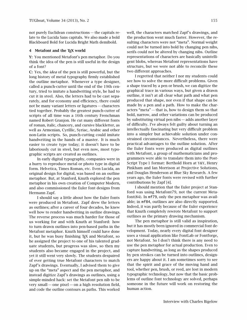
TUGboat, Volume 34 (2013), No. 2 155
not purely Euclidean constructions — the capitals re-late to the Lucida Sans capitals. We also made a boldBlackboard Bold for Lucida Bright Math demibold.
4 Metafont and the TEX world
Y: You mentioned Metafont’s pen metaphor. Do youthink the idea of the pen is still useful in the designof a font?
C: Yes, the idea of the pen is still powerful, but thelong history of metal typography firmly establishedthe outline metaphor. Whenever a type designer,called a punch-cutter until the end of the 19th cen-tury, tried to imitate a handwriting style, he had tocut it in steel. Also, the letters had to be cast sepa-rately, and for economy and efficiency, there couldnot be many variant letters or ligatures — characterstied together. Probably the greatest punch-cutter ofscripts of all time was a 16th century Frenchmannamed Robert Granjon. He cut many different fontsof roman, italic, chancery, and cursive blackletter, aswell as Armenian, Cyrillic, Syriac, Arabic and othernon-Latin scripts. So, punch-cutting could imitatehandwriting in the hands of a master. It is mucheasier to create type today; it doesn’t have to belaboriously cut in steel, but even now, most typo-graphic scripts are created as outlines.
In early digital typography, companies were ina hurry to reproduce metal or photo type in digitalform. Helvetica, Times Roman, etc. Even Lucida, anoriginal design for digital, was based on an outlinemetaphor. But, at Stanford, Knuth explored the penmetaphor in his own creation of Computer Modern,and also commissioned the Euler font designs fromHermann Zapf.
I should say a little about how the Euler fontswere produced in Metafont. Zapf drew the lettersas outlines; after a career of four decades, he knewwell how to render handwriting in outline drawings.The reverse process was much harder for those ofus working for and with Knuth at Stanford: howto turn drawn outlines into pen-based paths in theMetafont metaphor. Knuth himself could have doneit, but he was busy finishing TEX and Metafont, sohe assigned the project to one of his talented grad-uate students, but progress was slow, so then mystudents also became engaged in the project, andyet it still went very slowly. The students despairedof ever getting true Metafont characters to matchZapf’s drawings. Eventually, I advised them to giveup on the “meta” aspect and the pen metaphor, andinstead digitize Zapf’s drawings as outlines, using asimple-minded hack: set the Metafont pen nib to bevery small — one pixel — on a high resolution field,and code the outline contours as paths. This worked
well, the characters matched Zapf’s drawings, andthe production went much faster. However, the re-sulting characters were not “meta”. Normal weightcould not be turned into bold by changing pen nibs,serifs could not be altered by changing nibs. Outlinerepresentations of characters are basically unintelli-gent blobs, whereas Metafont representations havestructure, but we were not able to reconcile thesetwo different approaches.
I regretted that neither I nor my students couldsee how to solve the more difficult problems. Givena shape traced by a pen or brush, we can digitize thegraphical trace in various ways, but given a drawnoutline, it isn’t at all clear what path and what penproduced that shape, nor even if that shape can bemade by a pen and a path. How to make the char-acters “meta” — that is, how to design them so thatbold, narrow, and other variations can be producedby substituting virtual pen nibs — adds another layerof difficulty. I’ve always felt guilty about turning anintellectually fascinating but very difficult probleminto a simpler but achievable solution under con-strained circumstances. Nevertheless, there werepractical advantages to the outline solution. Afterthe Euler fonts were produced as digital outlineswith Metafont, a group of mathematicians and pro-grammers were able to translate them into the Post-Script Type 1 format: Berthold Horn at Y&Y, HenryPinkham and Ian Morrison at Projective Solutions,and Douglas Henderson at Blue Sky Research. A fewyears ago, the Euler fonts were revised with furthercontributions by Zapf [4].
I should mention that the Euler project at Stan-ford was using Metafont79, not the current Meta-font(84). In mf79, only the pen metaphor was avail-able; in mf84, outlines are also directly supported.Indeed, it was partly because of the Euler experiencethat Knuth completely rewrote Metafont to supportoutlines as the primary drawing mechanism.
The pen metaphor is still valid as inspiration,but it has mostly been ignored in commercial font de-velopment. Today, nearly every digital font designeruses a visual application like FontLab or Fontforge,not Metafont. So I don’t think there is any need touse the pen metaphor for actual production. Even tocapture handwriting, as long as the shapes producedby pen strokes can be turned into outlines, design-ers are happy about it. I am sometimes sorry to seethat the spirit and grace of the moving hand andtool, whether pen, brush, or reed, are lost in moderntypographic technology, but now that the basic prob-lems of outline font technology are solved, perhapssomeone in the future will work on restoring thehuman action.
Interview with Charles Bigelow

156 TUGboat, Volume 34 (2013), No. 2
Y: So you think Metafont is too hard for designers.C: Yes, at least for visually oriented designers. Meta-font is mathematically based, whereas most design-ers rely on their visual intuition and avoid math-ematics. Metafont uses an abstruse programminglanguage to describe characters, which must be writ-ten and tested like computer code, and which makesit nearly impossible for visually trained designersto learn to use it. The intersection of ProgrammingExperts and Design Experts is nearly the Empty Set,though some younger designers both write code andcreate typefaces, but in the outline metaphor. IfKnuth had developed a more user-friendly interfaceto Metafont, or if someone else had successfullyworked on a project to automatically record a realpen or brush movement and determine the virtualpen that produced the resulting shape, I think thepen metaphor would have been more widely adopted.Remember, too, that at the output end, all the fontengines for screens and printers were biased towardoutlines, beginning with PostScript, and followedby TrueType. Nevertheless, a fair number of fontshave been produced with Metafont, especially fornon-Latin alphabets and character sets, symbol sets,and others.
Y: I think the same for TEX too.C: TEX fits in with a technical, logical intellect. Forvisual designers who prefer WYSIWYG interfaces, TEXis difficult. Very few graphic designers or typogra-phers appreciate it. However, that is not true for thethousands of mathematicians, physicists, computerscientists, and others who use TEX to write scientificand engineering papers.
A personal anecdote to support that claim: Myneighbor is a retired mathematician, Norman Alling.He wrote a book on real elliptic curves and taughthimself TEX in his 50s, so he could compose his bookand papers himself, and he still uses TEX now, inhis 80s. He says TEX liberated math journals andauthors from dependence on commercial math type-setting, which was slow, expensive, and fraught withtypographical errors needing proofreading and cor-rection. When I told him that some people suggestedthat Knuth could have better spent his time finishingthe Art of Computer Programming books instead ofspending a decade developing TEX, he replied: Oh no,TEX liberated so many mathematicians and scientistsfrom the bottleneck of typesetting that it was a greatboon to all of math and science, more importantfor the world-wide science and technical professionsthan Knuth’s unpublished books on computing, how-ever excellent they might be. That’s just one opinion,of course, but it suggests how liberating TEX was andstill is. And, of course, Don Knuth is still working
on his books, and many people hope for his successin finishing them.
As a side note, did you know that Knuth’s workon typography was anticipated by the Italian math-ematician Giuseppe Peano, a founder of mathemat-ical logic? Peano was concerned with the preciseforms of mathematical notation in print, and wasfrustrated by the difficulties of getting mathematicstypeset and printed, so to further his grand ambitionto publish an encyclopedia of mathematical formu-lae, he purchased his own printing shop and tookclasses in composition and printing. Typography isthe graphic art that seems to appeal most to math-ematicians (apart, perhaps, from the prints of M. C.Escher). Do you know the mathematician who devel-oped the Unicode TEX fork for non-Latin scripts? Healso wrote the book Fonts & Encodings [5].
Y: Oh, you mean Yannis Haralambous’s Omega?C: Yes. His book is a massive volume of informa-tion. It touches on nearly every subject in digitaltypography, often in great detail. His Omega systemdeals with non-Latin typography, which Kris Holmesand I also find fascinating, but we look at it fromthe character design aspect, not the programmingaspect. Haralambous developed an actual system.It’s really an impressive body of work.
Y: Yes. And the source code has been merged intothe future version of TEX called LuaTEX.C: It’s wonderful how many dedicated people con-tinue to contribute to the expansion of TEX.
Among computer scientists who showed earlyinterest in digital typography were the developersof Unix at Bell Labs. In 1979, Ken Thompson, BrianKernighan, Joe Condon, and perhaps others, wrotesoftware for Unix systems to drive the Linotron 202,a new digital typesetter that Bell Labs had bought.They found that the Linotron 202’s factory-installedsoftware was buggy and that the font encryptionprevented them from inputting their own graphics.In a brilliant summer project, amusingly and suc-cinctly described in an internal Bell Labs report, theydisassembled the typesetter’s own operating systemand replaced it with their own software. They alsodecrypted the typesetter’s font encryption schemeso they could input their own graphics. As well asbeing less buggy, their new software was faster atprocessing mathematical texts, although slower atprocessing newspaper texts — the Labs publishedtechnical papers, not newspapers. They also devel-oped software to input digital graphics like diagrams,chess pieces, logos, and so on. The Labs’ internalreport was a nice description of problem-solving byintelligence. They didn’t use big brute force number-crunching to decrypt the machine’s software, but
Yue Wang
TUGboat, Volume 34 (2013), No. 2 157
simply studied and analyzed its workings, then ex-perimented with their own code. Looking back, itis clear that they were seeing the future, six yearsbefore PostScript printers and imagesetters revolu-tionized digital text and graphics imaging. Theirapproach could have been more widely exploited,but I believe the paper was not published and theirsoftware not distributed with Unix because of legalissues with reverse-engineering. However, their pa-per has finally been scanned and released for itshistorical interest; it’s on Brian Kernighan’s pageon the Bell Labs site: http://www.cs.bell-labs.com/cm/cs/who/bwk/202.pdf. A modern revivalis being reprogrammed by David Brailsford for theDocument Engineering 2013 conference.
5 Beyond Latin alphabets
Y: The Lucida Grande fonts in Mac OS X have sev-eral non-Latin alphabets, like Greek, Cyrillic, Hebrew,Thai, and Arabic. Do they use advanced typographyas well?
C: Yes, to some extent, but not a lot. Modern Latin,Cyrillic, and Greek fonts don’t really need advancedtypography like Apple’s AAT or OpenType. Latinfonts may benefit from the aesthetic possibilities ofglyph substitution, but they don’t need it for legibletext. In metal typography, simplification of charactersets made typesetting and printing more economi-cal, because fewer characters needed to be cut, cast,stored, and composed. Hence, by the middle of the16th century, most abbreviations, ligatures, and vari-ant forms of characters had been eliminated fromstandard roman and italic fonts. For Cyrillic type,a similar simplification took place in the early 18thcentury under the direction of Czar Peter the Greatof Russia. Greek fonts, which could be very com-plex because of many ligatured forms and complexsets of accented vowels, were gradually simplifiedover the centuries by elimination of ligatures andvariants. In the late 20th century Greek “monotonic”standard, ligatures are eliminated and the numberof accented letters greatly reduced.
Typefaces based on cursive handwriting, how-ever, tend to have more joining forms and context-sensitive complexity. Apple Chancery has more than1,000 characters, with hundreds of variants and liga-tures. Herman Zapf’s Zapfino has more than 1400glyphs, including letter variants and ligatured formsusing advanced typographic features.
However, the Arabic writing system really needsadvanced typographic support in order to make tra-ditional styles practical in typesetting. The first re-lease of Lucida Grande Arabic in 2001, a sans-serifdesign but in the Arabic Naskh style, definitely made
use of advanced typography, in the form of Apple’sAAT system. Most Arabic typefaces today use Open-Type, and many interesting and elegant Arabic type-faces have been designed in the past decade, becauseof the new freedoms of advanced typography andglyph substitution.
The Devanagari writing system used for mod-ern Hindi and some other languages of India, andalso for classical Sanskrit, also benefits greatly fromadvanced typography. For Sun Microsystems wedesigned a Lucida Sans Devanagari face that usesOpenType, but it was not included in Lucida Grande.
Y: How did you expand Lucida from Latin to otheralphabets?C: Our teacher of calligraphy, Lloyd Reynolds, em-phasized that written forms must have life and ac-tion. He liked to quote an ancient Chinese art philoso-pher, Xie He, whose first principle of painting was,“qiyun shengdong”, spirit breath rhythm life move-ment. Nearly all typographic forms were originallyimitations of handwriting, though the subsequentevolution of typefaces takes different routes. Be-cause Lucida was based to a large extent on Ital-ian Renaissance handwriting, we tried to base theLucida Greek alphabet on older Greek handwriting.Kris practiced writing medieval styles of Greek, andthen we modernized them into sans-serif styles. Ofcourse, many Greek capital letters are shared withRoman forms, but by starting with handwriting forthe lower-case, we tried to give it more life and ac-tion. We used similar principles for Cyrillic, thoughits modern forms are more directly derived fromtypefaces, not traditional handwriting.
Again, for Hebrew and Arabic, we first studiedtraditional calligraphy. Arabic writing has a longtradition of elegant calligraphy, but it is difficult todistill that to fonts that are legible in small sizes oncomputer screens. Apple asked that Lucida GrandeArabic look almost as big as Latin at small screensizes, to be legible in menus, captions on icons, andso on, so we designed it as a sans-serif design inthe Naskh style, based on a design we had also donefor Sun Microsystems’ Java Developer Kit. LucidaGrande looked very legible at small sizes, and wasshown in a book about Arabic typography by HudaSmitshuijzen AbiFares [1]. Later, however, somepeople told Apple it looked too big when printed,so Apple replaced it with a more traditional lookingArabic font as default. However, after Lucida SansArabic for Java and Lucida Grande Arabic, severalnew sans-serif Arabics have been designed with big“looks”, so the design idea has become popular.
Our first international font was Lucida Sans Uni-code for Microsoft, in 1993. It was one of the first
Interview with Charles Bigelow

158 TUGboat, Volume 34 (2013), No. 2
TrueType fonts to incorporate several different al-phabets — Latin, Greek, Cyrillic, and Hebrew, plusmathematical and technical symbol sets. We wrotean academic paper about how and why we did it [2].
Apple asked to include that kind of interna-tional Lucida in an operating system that never cameout. It only had a code name but was never released.
Y: It’s called Copland.
C: Yes, Copland. So Apple acquired a license forLucida Sans. At that time it was not called “LucidaGrande”, but when we included more glyphs forLatin-based orthographies, including Turkish, Czech,Slovak, and many others, plus Greek, Cyrillic, Arabic,Thai, and other international languages, it becamemuch grander, so Apple thought it should be called“Grande” to emphasize its larger, more grandiosecharacter repertoire.
Y: So in 1999 if Apple wanted to use something new,why use Lucida? It was already 15 years old. Whynot ask you to create something new for the 21stcentury?
C: Great question. I think it would have been a goodidea to do something totally new. We love to donew designs, but Apple didn’t have time for thedevelopment and testing of a totally new font. Afact about text fonts is that it takes most of themyears to prove themselves. Ornamental faces canbecome quick “hits”, but text fonts are usually slowto become popular. Continuous reading is a subtleprocess and preference for fonts emerges slowly.Adobe considered Lucida in the very early days ofPostScript, 1983–84, but Lucida had not yet beenreleased and Adobe was unsure about whether itwould be popular on the Apple LaserWriter, so theychose well known existing fonts. By 1999, Lucidawas well known and proven in practice, so Applewasn’t taking a risk by making it the system font forOS X. It was already well liked by computer users.
Y: Speaking of Mac OS X, why there is no italic variantin the Lucida Grande typeface?
C: Oh, interesting question. There are true italicsfor Lucida Grande, but Apple did not release themwith OS X. Next year (2013), we plan to release themourselves. Lucida Sans Italic is a cursive design,based on the same Arrighi chancery handwriting ofthe 16th century that inspired Lucida Calligraphyand Apple Chancery, but we simplified it greatlyfor the sans-serif style. Eric Gill first did this withhis Gill Sans Italic in 1928, and Hans Meier’s Syntaxitalic of 1968 is also a cursive design, though hekept the humanist form of lower-case ‘a’ and ‘g’.Lucida Sans Italic was first released in 1985. In thedecades since then, sans-serif italics have become a
0 Ò Ó Ø × ò zero zero-slash zero-dot capital O-slash empty set circle-slash math
O Õ Ö ó ö õ capital O theta capital Theta circle-dot math circle-minus math circle-minus math alt
Figure 27: Variations on zero, and related forms.
style popular with several designers. For example,in Frutiger Next, released in the year 2000, a truecursive italic replaced the original slanted roman of1976. I think it is a sign that sans-serif is continuingto mature and evolve.
On the computer screens of 10 to 12 years ago,simple forms usually looked better than complexones, and some designers preferred the simplicityof slanted roman to the more complex cursive oftrue italic. In a different way, Donald Knuth usedboth true italic and oblique styles in TEX, for differ-ent semantics. Oblique designs are not a new idea,because sloped roman for italic was proposed byStanley Morison in 1926, and most sans-serifs usedslanted romans, not cursive italics. In our LucidaMath fonts, we provide both true italics and obliques.
Y: Here’s a question from a friend. Why in LucidaGrande is the en dash actually shorter than the hy-phen?C: Your friend has spotted an interesting problem.In Lucida Grande, the default hyphen is not a truehyphen but a hybrid between hyphen and minussign from the ASCII standard. It is longer than atrue hyphen but shorter than a true minus, becausepeople use it for both functions. The en dash is bydefinition one-half of an em square wide, includinga little space on each side. The minus is wider thanan en dash, because Lucida math symbols are fairlywide. So, when we made the hybrid hyphen-minus, itturned out wider than the en dash. I hope to adjustthe disparity in the next version of Lucida Grandewhen we release it ourselves. Currently, it is onlydistributed by Apple. (Has your friend spotted anyother anomalies that need fixing? Now is a goodtime to ask about them.)
Another interesting problem that affects tech-nical users is the design of the zero (fig. 27). If youpeek into the unencoded glyphs of Lucida Grande,you can find alternate forms of zero. The encodedform is the standard open or empty zero, nothinginside. It’s a nice iconic symbol, like an empty set.However, in computing, the problem of confusionbetween zero and capital ‘O’ has been debated since
Yue Wang

TUGboat, Volume 34 (2013), No. 2 159
the 1960s, e.g., in the journal of the ACM (Associa-tion for Computing Machinery). So, some computerfonts have a zero with a slash. OK in English, but inDanish and Norwegian, there is a slashed capital ‘O’and a slashed lower-case ‘o’, which can be confusedwith the slashed zero. Other people prefer a zerowith a dot in the center, but that can be confusedwith Greek capital Theta, and programmer friendsof mine say it is aesthetically displeasing and call itthe “fly-speck zero”. For Apple, in Lucida Grande,we provided all three variants, and recommendedthat Apple could use whichever one seemed correctfor any given localization. The open zero is the de-fault. When Apple asked us to redesign Monaco forTrueType and System 7, we made the zero with aslash because programmers were using the font. Wealso differentiated the capital ‘I’, lower-case ‘l’, andfigure ‘1’, for programmers. But, some people stilldon’t like the slashed zero. In Lucida Console. weused the open zero because there it is less likely thatzero and capital ‘O’ will be confused, because the ‘O’is shorter than the zero. But, in the next version ofLucida Console, we will use a slashed zero.
The more characters in a font, the more designpuzzles and potential conflicts between design, cul-ture, and technology we encounter. Here’s anotherlittle example, but it takes a while to explain. Whenwe made Lucida Console for Microsoft, we wereasked to include the Unicode character 010F, calledthe “dcaron” or “Latin small letter d with caron” (d’),which is used in Czech and Slovak, two related Slaviclanguages of Central Europe. The d-caron marks aphonetic variant of the sound represented by theletter ‘d’. In early Czech orthography, it was a littledot above the letter, and that eventually became aninverted circumflex, called a “hacek” or “caron” inEnglish. The capital form is a ‘D’ with hacek above it,but in printing, the lower-case became a ‘d’ followedby an apostrophe, probably because that was easierto make in metal type. It is difficult to fit a hacekabove the ascender of the ‘d’ in metal type. In afixed-pitch font like Lucida Console, the apostrophevariant is difficult to design because the apostro-phe takes up space to the right of the letter. Adesigner can squash the width of the ‘d’ and cramin the apostrophe, which I don’t like, or fit a caronover the bowl of the ‘d’ but not above it, but someCzech readers don’t like that. For Lucida Console,we couldn’t hang or kern the apostrophe beyond theright edge of the fixed-width cell, nor put it abovethe ascender, because those violated a screen displayrule in Windows NT, and in any case could overlapa neighboring letter. So, we made three differentversions and put them in the font we delivered to
����������������cdcdcdcdbabababa{|{|{|{|{ehfgehfghegfhegf����������������éëíïðïíëéÏÐÑÒÓÒÑÐÏFigure 28: Wingdings fleurons (originally for Lucida). Fromtop, the rosebud fleurons have four symmetry variants innormal and bold weights. The eglantines (wild rose flowers)have outline and filled variants. The vine tendrils have foursymmetry variants in normal and bold. The stars have arange of points and the Xs have a range of weights.
Microsoft, suggesting that Microsoft ask their Czechlocalization experts which one is best, and use thatin the standard Unicode encoding. The font got re-leased with the caron positioned above the bowl ofthe ‘d’, and no one complained, until several yearslater, Microsoft told us that some Czech users, prob-ably programmers, because they are the main usersof Lucida Console, didn’t like that default version.Microsoft asked us to fix it, and we said, sure, it’seasy. Just replace it with the alternate characterfrom the original font we delivered. That was maybe10 years ago, but I don’t think it has been replacedyet. We will release a new version next year, with thepreferred version, now that we know it is preferred.
6 From the present to the future
Y: I also have a question related to Microsoft. Whatwas in your mind when designing the Wingdingstypeface? Is there any connection between the sym-bols and their letter representation?
C: No. It is a complicated but instructive story. Thecharacters in the Wingdings font originally camefrom three fonts of non-alphabetic characters calledLucida Symbols, Lucida Stars, Lucida Arrows, andLucida Icons. We designed them to work with Lucida,
Interview with Charles Bigelow
160 TUGboat, Volume 34 (2013), No. 2
and to be useful or decorative, or both. There areseveral pretty ornamental “fleurons” or flowers inWingdings, in addition to more functional designs(see fig. 28). Microsoft licensed and distributed themin a beta-test release with Windows 3.1 in 1991. ThenMicrosoft bought outright the icons, arrows, andstars fonts, to make a new, exclusive symbol font forWindows. The other Lucida fonts were licensed, soB&H still owns them. Back then, Microsoft Windowswas distributed on floppy disks, and Microsoft foundif they included all three symbol fonts, they wouldneed an extra floppy to hold the files, so they decidedto merge only their favorite symbols from the threefonts into one font.
Y: But floppies are cheap.
C: Yes, but since there would be tens of millionsof copies of Windows sold, it would have cost Mi-crosoft a lot more money. Another issue in thosedays was that symbol fonts had to be mapped tothe keyboard for characters to be accessed. Onesymbol was mapped to capital ‘A’, another to ‘B’,and so on. Some Microsoft managers and font ad-visers chose their favorite symbols from the threefonts and had them merged them into one font. Thismerging meant that all the original mappings fromthe B&H fonts were changed by Microsoft. This fontbecame Wingdings.
Y: But then users found interesting sequences.
C: Yes. The first discovery was that the charactersequence “NYC” in Wingdings was rendered as askull and crossbones, a Star of David, and a thumbsup gesture. This was interpreted as an anti-semiticmessage, in an article in the New York Post newspa-per, but the popular magician, Penn Jillette, wrotea column for a computer magazine debunking thePost’s story, pointing out that the assignment ofsymbols to letters on a keyboard inevitably resultsin sequences that can be interpreted as meaningful,even when no meaning was intended. The problemwas that Microsoft hadn’t sent the newly encodedWingdings font out for beta-testing. From a technicalengineering view, the font worked perfectly. It wasin user psychology that the problem arose. This iswhy software should be tested outside a firm. Later,we were told about many other messages suppos-edly found in Wingdings. One was that the symbolsassigned to the sequence “LBJ JFK” proved that Lyn-don Johnson was complicit in the assassination ofJohn F. Kennedy.
Y: And when 9/11 happened, you became the mostreported type designer in history.
C: Yes. An email went viral on the Internet, claim-ing that in Wingdings, typing ‘Q33 NY’, supposedly
the flight number of the first plane to hit the TwinTowers, would show an icon sequence of a planeflying into two towers, followed by the skull andcrossbones symbol and the Star of David. But, thereal flight number wasn’t Q33 NY. Somebody justmade it up. In the Wingdings design, the rectangleswere icons for documents with text, not buildings.And the font was made 10 years before 9/11. Butnone of that mattered to gullible journalists whodidn’t check the supposed “facts” they read on thenet, and asked me after September 11, 2001, “Whyis Wingdings associated with the terrorists?” Thiswas back when some naive journalists still believedwhat they read on the web.
Y: [Laugh.]
C: I also heard that people were typing the names oftheir husbands and wives in Wingdings, to find cluesto whether their spouses were “cheating” on them.People like to find hidden messages, even when themessages are noise, not signal. There is a whole fieldof study about why people like to believe in hiddenmessages and conspiracy theories.
Y: So Wingdings became a hot topic at that time.Many people talked about it. Has there been anincrease of public awareness and interest in typogra-phy in general over the years?
C: Yes, very much. People talk and write much moreabout these issues now. About legibility. Aboutwhether some typefaces make a text more believable,some less believable. 30 or 40 years ago such discus-sion only appeared in design journals. But now I seediscussions of fonts every week in newspapers likethe NY Times or magazines, and of course on theInternet. I recently saw a book of Guatemalan poetryentitled ‘Times New Roman Punto Doce” (Times NewRoman 12 point).
People also react strongly to typefaces used inmovies. In the movie “Avatar”, the font Papyruswas used in subtitles for the Na’vi language of thealien people, probably because it has a charming,rough, hand-made look, but the movie-makers didn’tthink about the reactions of font-familiar viewers.Instead of enhancing the experience, it distractedviewers from the story: young people felt cheatedbecause they recognized Papyrus as an Earthly type-face bundled with millions of personal computers.My students made complaints like, “This is not anew font from outer space! We’ve already seen it inMac OS X!” It caused a lot of comments on the web,most of them negative.
Y: Haha, interesting.
C: What’s interesting to me is not the specific opin-ions, which on the Internet are often either love or
Yue Wang
TUGboat, Volume 34 (2013), No. 2 161
hate, but that so many people voiced their opinions.Here, I should make an appeal, as some of the com-menters on the web also did, for the type designprofession. James Cameron spent $300 million dol-lars making “Avatar”. He even hired a linguist toinvent the spoken language of the alien people, theNa’vi. So, instead of using a common font foundon millions of computers, he should have commis-sioned a young, or old, type designer to create atotally new, unique typeface for those subtitles.
Speaking of subtitles, I enjoy watching Chinesemovies but have to read English subtitles to un-derstand the dialogue. I understand that in China,movies are also subtitled, so speakers of differentdialects of Chinese can understand what is beingspoken. In the American release of “Crouching Tiger,Hidden Dragon”, the English subtitles used LucidaSans Italic. An exciting HK-crime movie was “Infer-nal Affairs”. The Chinese poster is typographicallyintriguing because the design of the characters islike a maze and suggests the complexity of the story,and the title means “Endless Path”; a nice integrationof visual form and symbolic meaning. Because “dou”is “tao”, the movie is a Buddhist and Taoist lesson :-).
Y: Yes. And at the same time, movies promote type-faces too. I really love the 2007 film “Helvetica”directed by Gary Hustwit. Maybe sometime in thefuture we can make a film about Lucida.
C: Yes, Helvetica is a good movie that reveals a lotabout why people like type. And since you mentionthe idea, I should say that a movie is now being madeabout Kris Holmes and her work. It will includeLucida, and other things. So, we can hope that willsomeday be shown on the big screen, too.
Ah. Another example of types and personalitiesis in the presidential elections of 2008 and 2012;both sides cared very much about the typefaces theyused.
Y: In 2008, Obama used Gotham, which is also usedin Batman.
C: Yes, Gotham is an urban sans-serif, while Optima,a more delicate semi-sans-serif was used by the 2008John McCain campaign. The public analyzes the type-face to tell the personality of the candidates. The In-ternational Herald Tribune praised the Obama choicefor its “potent, if unspoken, combination of contem-porary sophistication with nostalgia for America’spast and a sense of duty.” Wow! In the 2012 elec-tion, many of the Romney signs used Trajan, whichis a modern revival of lettering used on imperialRoman inscriptions. I wonder if the public got theidea that Romney’s ideas were 2,000 years old, orthat he wanted to be an Emperor. Certainly, the
visual impression of Trajan is formal and stiff, likeRomney.
Y: In the election happening just now in Taiwan,this is also true. The Democratic Progressive Partyin Taiwan cares about campaign design very much.I really love all the posters, photos and clips theymade. It reflects the novelty and neutrality of TsaiIng-wen, the candidate. In my view, the DemocraticProgressive Party does a much better job than theNationalist Party of China. But it’s a pity that ty-pography does not mean everything. Today, thismorning they lost the election. But it’s interesting tosee that Asians are following closely.
C: Yes. I don’t think typefaces can influence elec-tions much, unless the candidates are otherwise in-distinguishable and one uses Comic Sans and theother, Times Roman. But speaking of elections inTaiwan, digital typography has made it much easierto develop and use expressive typefaces for Chinese.My student, and your friend, Xuan Zhang and I dida study of the expressiveness of Chinese typefaces,but, alas, we didn’t finish the study before he gradu-ated. Nevertheless, I was intrigued to study the widevariations in Chinese type designs available today.
Back to your question about public awarenessof typography, there are numerous blogs about type-faces now, and discussion groups like Typophile.People write how they love or hate certain typefaces.There is a site that express how much the bloggerhates Comic Sans (Ban Comic Sans). It’s amusingand not too serious, more fun than nasty.
Y: The same for Arial too!
C: I haven’t seen the anti-Arial sites, but I confess,I disapprove of Arial for ethical reasons. I feel it isa too-close imitation of Helvetica, a nearly identicalstyle with the same width metrics, x-height, capitalheight, stem weights, and proportions so it can re-place Helvetica but be just different enough in littledetails to not be an obvious rip-off or plagiarism. Itwas said that Monotype offered Arial to Microsoftmuch less expensively than what Linotype wantedto license Helvetica, so Arial is a font made for busi-ness reasons, not for artistic integrity, and as such,it doesn’t advance the art of type design.
Y: Oh, I have another question related to Helvetica.As you know, Apple switched to a Helvetica flavoredtypeface on the iOS platform and many professionalMac apps as well instead of continuing to use LucidaGrande. What’s the motivation behind that?
C: I don’t know the answer. I guess that Steve Jobssaw the Helvetica movie and decided he wanted toswitch to that instead of Lucida. Did you know thatSteve Jobs and Kris Holmes studied with the same
Interview with Charles Bigelow
162 TUGboat, Volume 34 (2013), No. 2
calligraphy teacher, Robert Palladino, a former monkwho taught at Reed College in Oregon? But not atthe same time. Typefaces have a lifetime. Textfaces get adopted slowly, sometimes over decades,and slowly become old-fashioned, also over decades,though some older designs get revived. Lucida tookseveral years to become widely used in the main-stream computer world, but by the 1990s, it hadbeen adopted by Microsoft and Sun Microsystems,and was licensed by Adobe as well. Apple licensed itfor System 7, but then postponed release until theCopland system, and when that was never released,Lucida was postponed again until it became the userinterface font for Mac OS X.
Y: Then Apple’s Mac OS X has been using Lucida formore than ten years.
C: Exactly. Designers of operating systems some-times change fonts, just as magazine designers do.Helvetica, in my opinion, was not very legible at lowresolutions and small sizes on screens. It is tootightly fitted and the letter shapes are too similar.That’s one of the reasons we designed Lucida, withmore humanistic letter forms and looser spacing forbetter legibility on screens. But, as screen resolu-tions increase, and anti-aliasing techniques improve,we see better and better displays (like Apple’s Retinadisplays), so Helvetica’s subtleties can now be ren-dered more clearly.
Y: And what’s your opinion on that?
C: Well, we designed Lucida in the 1980s to be analternative to Helvetica, so that reveals my opinion.Though the designs have roughly the same x-heightand stem weights, the letter spaces between Lucidaletters are proportionally greater than in Helvetica,and the Lucida letters are more differentiated inshape. Thus when rendering on a computer screenyou will find it much easier to read Lucida thanHelvetica. It’s easy to demonstrate — see, now youare reading questions in your Mail application whichuses Helvetica, so you have to move your head (andeyes) much closer to the computer screen.
Y: Oh! Yes, I never think about that. And there is noway to switch back to Lucida in the Mail application.
C: If you keep that posture for too long, maybe yourneck will hurt. No typeface is perfect for every sizeand reading distance. Digital technology makes iteasy to scale type to any size, but human vision putsdifferent constraints on type designs. Among otherfactors, there is a visual phenomenon called “crowd-ing”, which limits how closely objects can be spaced.When objects such as letters are too close to eachother, you have trouble recognizing them unless youbring the text closer to your eyes, thus making the
images, and their spaces, bigger on the retinas ofyour eyes. In a practical way, type designers haveknown this for five hundred years and have adjustedsmaller fonts to have more space between letters. Ifyou enlarge a photo of a 6 point font cut in 1550 tothe same size as a 12 point font cut at the same timeby the same punch-cutter, the 6 point font will bewider and more widely spaced. So, types intendedfor small sizes on screens should be spaced morewidely than types intended for large sizes.
Y: Similar question. You and Kris are also two of theauthors of Monaco. Monaco was originally the mainconsole font for Terminal application, as well as thefont to display code in their Xcode development tool.But they are migrating away from Monaco.
C: Yes, Actually Monaco is one of the Apple cityfonts that were originally bitmaps in the first Macin-tosh. The bitmap fonts with “city” names were cre-ated by Susan Kare, an artist and graphic designerwho created many of the interface elements for theApple Macintosh in the 1980s. Later, she left Apple.
Y: Yes. She came to NeXT with Steve Jobs and servedas Creative Director at NeXT.
C: OK, and she still designs icons and other digitalimages. In 1989, Apple asked Kris and me to makenew versions of the bitmap city fonts — New York,Monaco, Geneva, and Chicago — to vectorized formin the TrueType font format that Apple invented.So we did. The new fonts began with Susan Kare’sdesigns, but it was impossible to make them exactlythe same in vector format, so we had to changeseveral features and proportions. In Monaco, wehad legibility in mind, along with the need to dif-ferentiate certain letters for better recognition byprogrammers and technicians. Characters are dis-tinct, and it is difficult to confuse 0 (figure zero) andO (uppercase O), or 1 (figure one), | (vertical bar),I (uppercase i), and l (lowercase l). We tried to main-tain the hint of cursive that was seen in the original‘a’ in the bitmap Monaco, but we innovated severalother features. We wrote a short paper about theproject [3].
Y: But now Apple is switching from Monaco to Menlo.What’s the main reason behind this move?
C: I don’t know, but I guess that one reason mightbe that Menlo has a full set of italic and bold weights,whereas Monaco has only roman. Years ago, we of-fered to expand the Monaco family with bold weightsand italics, but Apple never chose to do so. I assumeMenlo was named after the Menlo Park city in Cal-ifornia. Menlo is also free and open source. It’s arevision of open source Bitstream Vera and the opensource Deja Vu font family based on Vera. Thus I’m
Yue Wang

TUGboat, Volume 34 (2013), No. 2 163
not astonished to see Apple adopt it. It’s free andthey can modify it as they wish.
Y: And I guess because Menlo came from an opensource font, most Linux or other open source oper-ating system programmers are familiar with it. So itmakes them happy to switch to develop applicationsfor Mac.
C: Yes, that sounds reasonable.
Y: You just mentioned screen resolution got muchhigher over these years. Do you think more peoplewill switch to screen reading?
C: Yes. In 2009, less than 3 percent of publishers’book sales were e-books, but today, around 20 per-cent are e-books. Based on the current adoptionrate, I guess that screen publications will outnumberpaper ones in 10 years or sooner, including books,magazines, and newspapers. Of course, predictionis difficult, especially about the future. Maybe it willbe sooner, and maybe later. In the 1980s, screenresolution was not high enough to render type well,so most people still read newspapers. However, bythe 1990s, computer screens got better and better.While for older people, newspapers are still theirmain reading media by habit and preference, manyyoung people spend more time reading computerscreens than reading print newspapers. Now, on thisgraph, you can see that the readership trend line forprint newspapers is dropping quickly as screen reso-lutions increase. Now that we have very high resolu-tion displays, for example Apple’s Retina displays, Iexpect that in the future more people will read fromscreens than paper. The trend is accelerating withthe iPads from Apple, the Android tablets from var-ious firms, and the Kindles from Amazon. For 500years, printing on paper was the dominant informa-tion technology for Europe and most of the world.Now, digital media are the information technologyof the 21st century, but for humans to receive theinformation, it must be read, and reading requirestypefaces and fonts. Happily, most fonts have madethe leap from analog to digital. Not all of them workas well in digital, but that provides opportunities fordesigners to create new typefaces, and to revive andrevise older ones for new technology. Print might bedying, but typography is living better than ever.
Y: In the era of LCD screens at max 500 DPI, mustthe design of a font be influenced by the screen res-olution, which is still low compared with the 600 DPI
of a common laser desk printer, so that it can beused also in a tablet/ebook reader without manyproblems?
C: Good question. With high resolution screens,finer details of a typeface can be shown. Hinting
has already been abandoned on Apple’s Retina dis-plays. Steve Jobs claimed the Retina display has sohigh a resolution that the human eye cannot seesingle pixels any more. This is not always true, ac-cording to some scientific study, but yes, you canexpect that screens and prints will look much moresimilar these days.
Y: So there is a trend of convergence between digitaland print type, as the quality of display improves?
C: Yes. I think so. But there’s still something oneshould care about — for display fonts, a larger x-height and more letterspacing will make the fonteasier to read on a display. Also, as I have mentioned,the same glyph looks thinner on display than onprints so a font with a little bit of darkness will bebetter. You should care about these things whendesigning a typeface.
Y: Even without background illumination, most E-ink readers also choose dark fonts.
C: Yes. This is because the screen’s resolution is stillnot high enough. And moreover there are two otherreasons to make the problem worse. First, E-inkhas a far coarser gray scale than modern computerscreens and doesn’t have RGB subpixels. Thus, sub-pixel rendering doesn’t work on those devices, andnormal font anti-aliasing works more poorly than ona computer screen. Also, the background color of anE-ink display is already gray. A darker font is morelegible.
Y: You just said people will read more and more ona screen. I have a related question. What do youthink of the recent hype over web fonts?
C: Oh, yes this is a good thing: web fonts enablereaders to read web pages just as books — previouslyonly a limited collection was available for designersto use.
Y: Yes, with the release of the WOFF (Web Open FontFormat) specification as an open standard, more andmore browsers support it. So designers can usewhatever font they like.
C: And moreover, hobbyists are able to create theirown fonts and release them to the public to getwider adoption, while previously all of these canonly be done by professionals. Web fonts lower thebarrier of typographic design and you will see moretypefaces appear in the near future.
Y: Then what about the downsides?
C: Well, a web font is much easier to get pirated, andit’s harder for type designers to make money fromit. That’s why TypeKit or similar businesses wereborn. We should explore this market more to find areasonable business model for the type designers tomake a living.
Interview with Charles Bigelow

164 TUGboat, Volume 34 (2013), No. 2
7 Ancient type digitizations
Y: You said that nowadays hobbyists create theirown typefaces, and release them to the public. Lastmonth, font designers in China had a heated argu-ment on one font created by a hobbyist. His name isDigidea. He bought a Kangxi Dictionary which wasthe standard Chinese dictionary during the 18th and19th centuries. The dictionary contains 47,037 char-acters including obscure, variant, rare, and archaiccharacters. Then he scanned all the characters intothe computer, and use auto-tracing tools to trace theoutlines of those characters. Finally he released thefont called KangXiZiDianTi (see fig. 29).
C: This looks amazing!
Y: Yes, but when you scale the font, you see prob-lems And even if you don’t scale the font largeenough, you will see uneven thickness among glyphs,even in a single stroke as well.
C: Ah. I see that now. But first of all I should say,if he did not use auto-tracing, this font wouldn’t bepossible.
Y: Right. It’s a huge amount of work — manual fontcreation would take one person years to do fiftythousand characters.
C: But in most situations you have to. This typefaceis lucky, because it’s a reproduction of a typeface ina dictionary, where almost all glyphs are presented.The “reviver” of the typeface is lucky to have sucha wealth of characters to start with. But in mostcases, type designers are not lucky. What if we wanta typeface in Xizhi Wang’s style? Or Mengfu Zhao’s?
Y: We should ask someone who is really good atthose styles to write them, or at least we should askexperts to analyze these styles and figure out the un-derlying logic of the handwriting to provide guidancefor the type designers to make glyphs according tothese rules.
C: Yes. This is a wonderful challenge involving art,practice, and logic. You write the Slender Gold styledevised by Emperor Huizong of Sung. Perhaps youcould write a large set of characters at a big sizeand scan those! And being a computer scientist, youcould think about the logic of artistically combin-ing the strokes to make new characters that aren’tin any extant examples of Slender Gold. A goodhobby for a computer scientist! There was a callig-rapher in Japan, Yanagida Taiun, who studied XizhiWang’s style very well. He practiced Xizhi Wang’sLantingji Xu so well that he could create very goodcopies, at least, I am not able to distinguish them.I have read that none of Xizhi Wang’s original writ-ing survives, only copies, so modern calligraphersmake copies of copies. In western calligraphy, there
昌黎先生全集錄卷二
鄆州谿堂詩
憲宗之十四年始定東平三分其地以華州刺史禮部尙書兼御
史大夫扶風馬公爲鄆曹濮節度觀察等使鎮其地卽一年褒其
軍號曰天平軍上卽位之二年召公入且將用之以其人之安公
也復歸之鎮上之三年公爲政於鄆曹濮也適四年矣治成制定
衆志大固惡絕於心仁形於色竱心一力以供國家之職于時沂
密始分而殘其帥其後幽鎮魏不悅於政相扇繼變復歸於舊徐
昌黎先生全集錄卷二
一
TypeLand
康煕字典體樣張
Figure 29: The KangXiZiDianTi font, (re)created byDigidea Lee, 09-26-2010, http://blog.typeland.com.
are similar traditions. Many 20th century calligra-phers learned the chancery cursive style from a bookby Ludovico degli Arrighi, published in 1522. But,the calligraphy was cut in wood blocks, so whatsome people today are really copying are the woodcuts, not the original handwriting, though some ac-tual samples of Arrighi’s handwriting do survive.What Kris Holmes and I and many others learnedof chancery cursive was based on modern calligra-phers — our teachers — who had reinterpreted howto write chancery from the early printing. We weretaught handwriting, not woodblock graphics. ForApple, Kris Holmes designed Apple Chancery, whichis an interpretation in digital type of our calligra-phy teacher, Lloyd Reynolds, whose handwriting wasbased on Arrighi’s manual and on manuals by En-glish calligraphers who reinterpreted Arrighi.
Y: But in the previous case, if all the glyphs, or per-haps most of the glyphs are available, or those notavailable can be derived from available parts, do youthink ancient type can be made by auto-tracing, orthey must be fine tuned by a human?
C: This is a very important question: what is thebest way to “revive” a script or typeface from oldtimes? Calligraphers do it by learning to write sotheir results resemble scripts in surviving old man-uscripts. It is like choreography for the hand. Youlearn a dance of the pen or brush and the traces of
Yue Wang

TUGboat, Volume 34 (2013), No. 2 165
your moves are the graphic image of the script. KrisHolmes studied dance, and that is why her scriptsare so lively with implied motion. (Lucida Hand-writing, Kolibri, Isadora.) We can understand whysome of the old calligraphers especially in China andJapan, saw a mystical aspect of calligraphy, influ-enced by Taoism or Buddhism. Movement, whichinvolves rhythm, breathing, discipline, relaxation,and so on, creates the graphical forms, which are2-dimensional intersections of 3-dimensional pathsin time, so 4 dimensions total. There is an amaz-ing movie by a mathematician (Thomas Banchoff)showing a 4-dimensional cube, a tesseract, movingthrough 3-space, and of course projected into 2-space on a screen. At one screening years ago, theaudience cheered as they understood what was hap-pening. I think this is analogous to the mystical as-pects of calligraphy — those two higher dimensionsin 3- and 4-space, that we can infer from the 2-Dgraphical forms. Of course, there are good callig-raphers and type designers who don’t believe inthe mystical aspects, who care only about the 2-Dimages, but the higher dimensions can enrich ourappreciation.
For typography, the problem of revival is morelike signal processing: how to distinguish signalfrom noise? The hand motions of the punch cutterare not important because the fonts are a kind ofshallow sculpture, bas-relief. The engraved contoursare the important things. For some typefaces, likesome 16th century cuts by Garamond and Granjon,and 18th century cuts by John Handy, who cut typefor Baskerville, we can get a very good idea of thesignal because their hand-cut steel punches survive,and sometimes their matrices, the impressions thatthe punches make when driven into a blank of cop-per. But, reproducing the face of the punch is nota perfect solution for today, because the old punch-cutters compensated a little bit for subsequent pro-cesses, especially ink-squash of type on the paper.The problem is much harder for typefaces for whichno punches, matrices, or old type survives, like thetypes of Jenson, Aldus, and Fournier. There are twoways of doing things. First, let’s preserve the origi-nal printed form as much as possible. This includessome noise along with the signal.
Y: Then you will get very ugly fonts.
C: Yes, I think so, but people who like this approachdon’t think it’s ugly; rather, they say these imperfec-tions preserve the feeling of ancient typography.
Y: Just like metal type typesetting was dead yearsago, but now Apple makes letterpress cards for cus-tomers. Sometimes old-fashioned things get revived.
C: Exactly. We like the imperfections of the oldmethods because they have more personality thanour modern methods, which often seem to lack soul,despite their advantages. The second approach isto re-interpret the type by trying to understand theintentions of the original type artist, and the limi-tations of the medium, and then reinterpret thoseintentions in modern media. A vision scientist whostudies reading once told me that he doesn’t reallycare how a typeface is made or printed — what hecares about is the image on the retina of the eye;that is what is communicated to the brain.
Y: Why not make the revival as authentic as theoriginal one?C: Sometime you can’t. Between the old days of earlytype and digital type now, technology has changed,from wood block to metal type to mechanical type tophototype to digital type, from paper to CRT screensto LCD screens, to e-ink. And aesthetics and tastehave also changed. In Europe, from old-style type-faces like Garamond, to modern styles like Bodoni,to sans-serifs like Helvetica. After high resolutiondigital typography made well-rendered classical de-signs cheap and easy, young designers in the 1990srebelled against perfection and used “grunge” typesand “distressed” types, full of dirt, errors, jaggies,and other noise.
In the KangXiZiDianTi you mentioned, the ear-liest printed editions were cut in wood blocks, Iassume. Is that correct? First, some calligraphershad to write every character in the dictionary onpaper, as models for the wood-cutter. Second, prob-ably many wood-cutters cut the characters in woodblocks for printing. I don’t know if individual char-acters were cut in wood, small individual pieces ofwooden type, or a whole page on a single block. Ithink the latter, a whole block per page. After thecalligraphers have died and their original handwrit-ten examples transferred to wood and lost in historywithout a trace, there’s no chance you can find them.Today, you cannot find the earliest wood blocks ei-ther. Third, after the wood cutting, there was theprinting process — which slightly deforms the glyphshape as the ink is squeezed onto paper. And, aftermany impressions, the characters on wood becomeworn and less distinct. The same is true for metaltype. The paper that early printers used, the inkthey made, all have effects on the image in the finalbook. There may be more “signal” information lostin these processes. Fourth, the book preserved tothis day may not look the same as it was hundreds ofyears ago. The humidity and temperature of the en-vironment may change the glyph shape as well, notto mention disasters like insects eating the paper.
Interview with Charles Bigelow

166 TUGboat, Volume 34 (2013), No. 2
Fifth, during the photocopy and scanning processconducted today, there might also be other informa-tion losses. I believe that scanning at 600 pixels perinch is not enough to capture all the artistic infor-mation in text sizes of type. 1200 pixels per inch ismuch better, but it takes more time, and thus costsmore. Even at 1200 ppi, the image is not perfect,because of noise. Then, if you scan with some levelof gray depth, later you may have to threshold downto bi-level pixels for fitting curves around contours,although there are also methods of fitting contoursto gray-scaled images.
Y: So it’s not possible to trace down the originalshape any more.
C: Exactly. In the western world we have alreadyknown that since the late 19th century, when Englishtypographers began to revive old types by enlargingphotographs of old books from the so-called “cradle”of printing, the years before 1501. Well before thedigital era, it was recognized that data about theimage was being lost in analog restorations. So mostdesigners did a kind of creative renovation insteadof trying to just remove noise from enlargements ofthe original form.
Y: I see.
C: Take the Jenson text as an example. I showed youa page typeset in Jenson earlier (fig. 3). Jenson wasthe first great creator of the “humanist” roman typesthat became the model for all subsequent printingin the Latin alphabet, but all his original punches,matrices, and types have been lost. A great pity. Soall Jenson reproductions are redesigns from the im-ages in books that Jenson printed from 1470 to 1480.There is a wide variation of weights and shapes ofmodern types modeled on Jenson.
Bruce Rogers’ Centaur, created in 1914–15, iscrisp and sharp, designed by reworking photographicenlargements with a pen. It was re-cut by Monotypein 1929 in a range of sizes. Morris Fuller Benton’sCloister of 1913 is darker and sturdier, made by engi-neering-style drawings based on enlargements, withattention to mechanical letterpress printing of theearly 20th century. Robert Slimbach’s Adobe Jensonof 1996 is a careful reconstruction for digital typog-raphy. Their variations show the visual senses, goals,and artistic or technical limitations facing moderndesigners.
Y: I know this typeface [Centaur], it was created forthe Metropolitan Museum of Art.
C: Yes, that’s true, so you know. Centaur has alighter, sharper quality than Adobe Jenson, perhapsreflecting Rogers’ pen-inscribed approach. It is ratherlight in digital imaging today because it was designed
A: Body sizes the sameCentaur (Rogers 1915) [14 point]ABCDEFGHIJKLMNOPQRSTUVWXYZabcdefghijklmnopqrstuvwxyz&1234567890
Adobe Jenson (Slimbach 1996) [14 point]ABCDEFGHIJKLMNOPQRSTUVWXYZabcdefghijklmnopqrstuvwxyz&1234567890
Breughel (Frutiger 1981) [14 point]ABCDEFGHIJKLMNOPQRSTUVWXYZabcdefghijklmnopqrstuvwxyz&1234567890
B: x-heights the same
Centaur [17.45 point]
ABCDEFGHIJKLMNOPQRSTUVWXYZabcdefghijklmnopqrstuvwxyz&1234567890
Adobe Jenson [16.45 point]
ABCDEFGHIJKLMNOPQRSTUVWXYZabcdefghijklmnopqrstuvwxyz&1234567890Breughel [14 point]ABCDEFGHIJKLMNOPQRSTUVWXYZabcdefghijklmnopqrstuvwxyz&1234567890
Figure 30: Comparison of Jenson revivals.
for letterpress printing, which added weight becauseof ink-squash. Ron Arnholm’s Legacy of 1993 is Jen-son modernized to late 20th century taste, with alarger x-height than the original. George Abrams’Venetian, circa 1999, is another careful and notewor-thy Jenson revival. Also there is Hermann Zapf’sAurelia of 1983, for digital typesetting, which hassome of the calligraphic accents of Palatino.
I include among Jenson revivals Adrian Fruti-ger’s most intriguing Breughel design of 1981. (Seefig. 30 and also http://odaddyo.com/typography/type_class/FrenchOldstyle.pdf.) It is not con-cerned with imitating superficial aspects of Jenson’stypes, but is a deep attempt to render the philosoph-ical spirit of Jenson’s era, when handwriting wasreduced to sculpture and mechanical reproduction.Breughel was released by Linotype 501 years afterthe death of Jenson. I think typographers weren’tready for such an innovative design in 1981. Maybefifteen years later, in the era of punk and grungetypography, Breughel might have become more pop-ular — unusual, a bit irregular, but legible. The Swisstypographer, Bruno Pfaffli, who was Frutiger’s studiopartner for many years, used it very well in catalogsand posters for French museums.
Y: No two of them look exactly identical.
Yue Wang
TUGboat, Volume 34 (2013), No. 2 167
C: And this is good in some sense — rather than re-stricting modern type designers to historical details,the new digital reproduction processes give themthe freedom to create something new. So such adiscussion in China, regarding the Kangxi dictionarycharacters, is wonderful. I am really happy to hearof such a discussion if it turns out to generate newthoughts and ideas.
Y: Thank you very much, Prof. Bigelow, for takingthe time to do this interview. I have learned a num-ber of things I didn’t know. And many thanks alsofor your great contribution in digital type design andresearch, especially the work of the Lucida typefacefamily.
C: Because of its high legibility, I’m happy to seeLucida on computer platforms like Apple’s Mac OS X,Sun’s Java platform, Bell Labs’ Plan 9 and MicrosoftWindows. We’re working on a web site for B&H
at http://www.lucidafonts.com which will have(even) more information. For now, let’s close bymentioning a very different example of Lucida inuse — in a Colorado corn field in 2002 on the Fritzlerfarm; the corn plants are used as “pixels” to renderLucida Handwriting: http://www.fritzlermaze.com/mazes.html.
Acknowledgments
Many thanks to Prof. Charles Bigelow for doing thisinterview. Many parts of this talk have Prof. KrisHolmes’ contributions as well. Without their helpthis interview would not be possible. Thanks toXuan Zhang for introducing me to Prof. Bigelow.Jiang Liu provided the funding and invested a lotof resources to edit and publish this interview. Afew questions in this interview were collected fromJiang Jiang, Rex Chen, Karl Berry, Luigi Scarso, andShiang-Ing Ji.
References
[1] Huda Smitshuijzen AbiFares, ArabicTypography, Saagi Books, London, 2001.
[2] Charles Bigelow and Kris Holmes, “Thedesign of a Unicode font”, ElectronicPublishing, 6:3 (1993), 289–305. http://cajun.cs.nott.ac.uk/compsci/epo/papers/volume6/issue3/bigelow.pdf
[3] Charles Bigelow and Kris Holmes, “Noteson Apple 4 Fonts”, Electronic Publishing, 4:3(1991), 171–181. http://cajun.cs.nott.ac.uk/compsci/epo/papers/volume4/issue3/ep050cb.pdf
[4] Hans Hagen, Taco Hoekwater, Volker RWSchaa, “Reshaping Euler: A collaborationwith Hermann Zapf”, TUGboat, 29:2 (2008),283–287. http://tug.org/TUGboat/tb29-2/tb92hagen-euler.pdf
[5] Yannis Haralambous, Fonts & Encodings,O’Reilly, Sebastopol, CA, 2007.
[6] Gordon E. Legge and Charles A. Bigelow,“Does print size matter for reading?A review of findings from vision scienceand typography”, J. Vis., 11:5 (2011) 8.http://www.journalofvision.org/cgi/content/abstract/11/5/8
[7] Robert A. Morris, Kathy Aquilante, CharlesBigelow, and Dean Yager, “Serifs slow RSVP
reading at very small sizes, but don’t matterat larger sizes”, Submission to Symposiumsession “Legibility and Usability Issues forText Displays”. SID Symposium Digest ofTechnical Papers, 33:1, pp. 244–247, May 2002.http://www.cs.umb.edu/~ram/rsvp/publications/SerifsSubmittedV2.doc
[8] Vaughan Pratt, “Techniques for Conic Splines”,ACM SIGGRAPH Computer Graphics, 19:3,July 1985, pp. 151–160. http://dl.acm.org/citation.cfm?id=325225
[9] Emil Ruder, Typographie, Verlag ArthurNiggli, Sulgen, Switzerland, 1967.http://www.designers-books.com/typography-emil-ruder-1967/
� Yue Wangyuleopen (at) gmail dot com
Interview with Charles Bigelow