how to create retail store interiors
TRANSCRIPT

HOW TO CREATE RETAIL STORE INTERIORS THAT GET PEOPLE TO PURCHASE YOUR PRODUCTS…
• Retail has been around for a mighty long time and one thing we know is that there are a lot of different approaches when it comes to designing the interior layout of your store. However, there are also some common design strategies that all retailers can employ that lead to generating more sales for your business.
• Designing your retail store's interior is a topic that we've been looking at recently in an effort to help boutique merchants be more successful and thrive in today's digital era. From telling your brand's story and creating immersive experiences, to putting together head-turning window displays and signage essentials, when it comes to retail, the devil really is in the details, and we want you to get the basics down pat.
• Which is why in this post, I'll be looking at some of the basics when it comes to creating effective retail interiors that attract more customers to your store, get them browsing more products, and get them heading towards the checkout. It's vital to keep in mind that from the moment someone steps into your store to the time they decide to checkout (or not checkout), smart design decisions make a significant difference in regards to whether you make a sale or not.
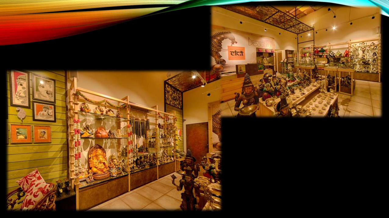
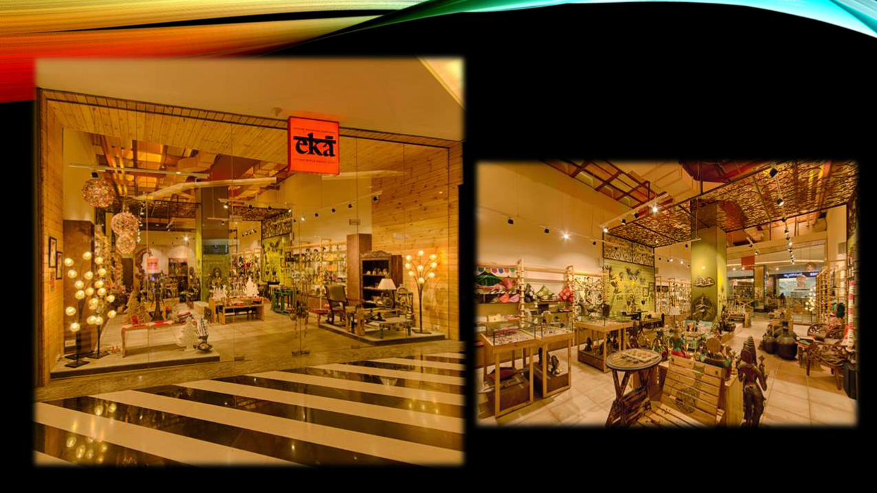
EKA CONCEPT STORE BY FRDC, BANGALORE – INDIA
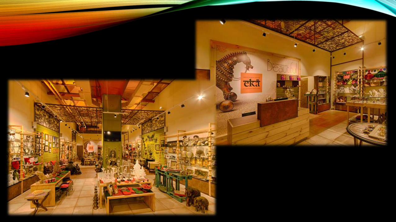
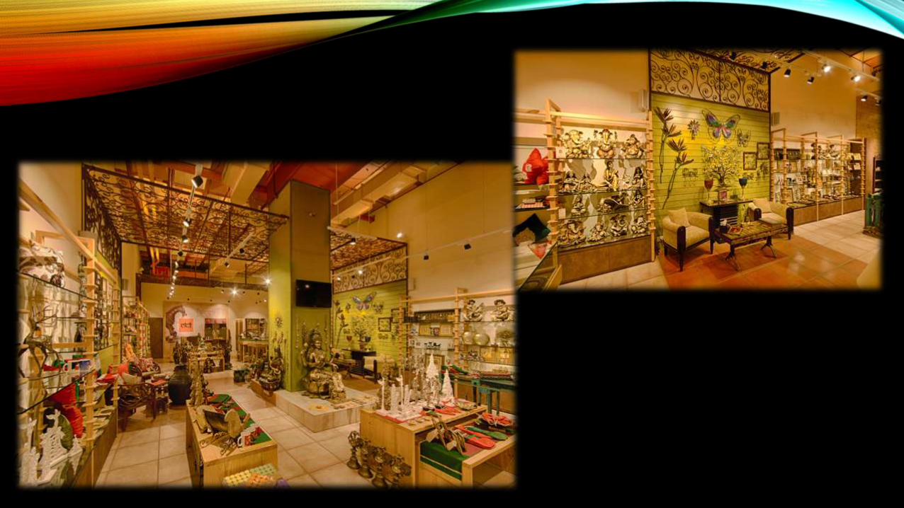
• Designed by FRDC, Bangalore, ‘Eka’- means singular and unique, which is only one and uno!! A store dedicated to crafts, art, artisan and Indian lifestyle with a modern and eclectic approach, Eka is a brand synonym with ‘Indian’ and Indian living. From Divinity to Fashion and from artefacts to Lifestyle. The store design has been conceptualized on Indian art and craft, Indian minimalism, Indian soil- colour of soils found from North to South and East to West and Indian layout- courtyard. Each of these elements are depicted in the space through- Layout, Flooring, Ceiling colours and Magnificient grills forming spaces within space. a large volumetric space is scaled down in different spaces through use of Floating grills and a canvas of ‘soil’ colours on concrete waffles. The fixtures are derived from ‘Indian hand’ craft technique and thus minimising use of metal/hardware
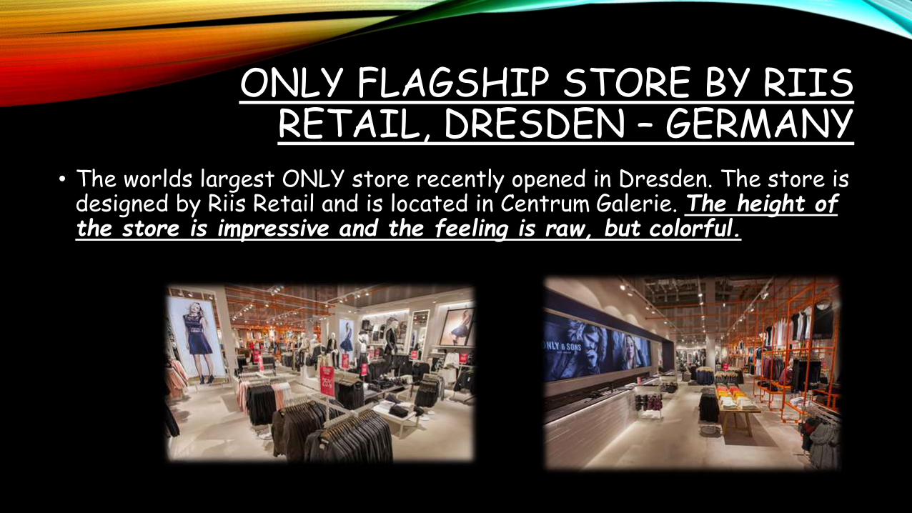
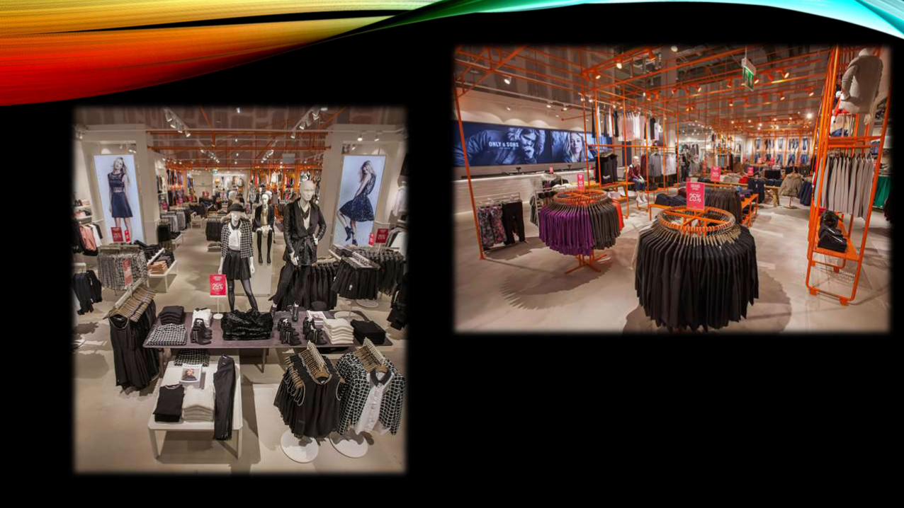
ONLY FLAGSHIP STORE BY RIIS RETAIL, DRESDEN – GERMANY
• The worlds largest ONLY store recently opened in Dresden. The store is designed by Riis Retail and is located in Centrum Galerie. The height of the store is impressive and the feeling is raw, but colorful.
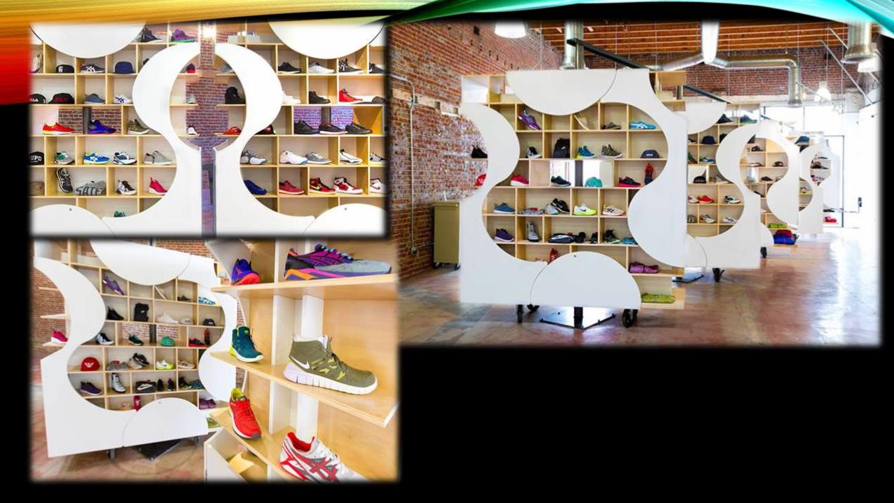
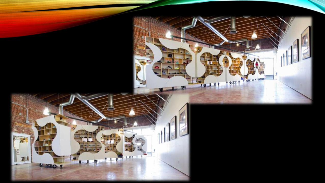
AUTHENTIX SNEAKER BOUTIQUE BY UP STUDIO, POMONA –
CALIFORNIA• Authentix, located in Pomona CA, is a custom sneaker boutique designed
to create flexibility while accommodating the client’s budget and timeframe. The display of product was centralized and broken down into five 8′ x 8′ units. Each unit rotates 360 degrees allowing the space to be easily customized.
• Each unit is skinned to allow for storage while maintaining display areas in the optimum shopping zone. With the display being centralized, the perimeter walls are free for local artists to display their work. The skin is based on the Golden Section. The custom, modern cabinets are juxtaposed against the raw, historic space.

DIOR STORE BY PETER MARINO, NEW YORK CITY – US
• New York City’s retail scene is undergoing a big shake-up, and we have yet to see the very last of it. Contrary to previous decades when only store locations north of 57th street were deemed respectable by luxury brands’ major league, they’re now increasingly migrating downtown to open up shop. Generally considered catalysts of this trend is a prestigious supermall replete with high-end brands, and which currently is in the making at the southern tip of Manhattan, while a renowned high-end department store headquartered in Texas has generated huge anticipation with the announcement to open a flagship outpost in hudson yards. Dior pitches in with a downtown shop opening of its own. In fact, it’s the second time it has done so.
• It’s on swanky 57th street where the french fashion house initially opened its flagship store in the big apple, combined with a Dior hommestore. During a lengthy renovation the men’s store temporarily set up shop in Soho, home to a large part of its fanbase. Not surprisingly, it became a permanent fixture in the area’s retail scene. And now Dior has followed the trail downtown, setting up a full-fledged women’s boutique on greene street. Situated on the ground floor of a late 19th-century building, the new dior store features an interior design by leading architect Peter Marino. The retail setting may take glamorous cues from the brand’s iconic mothership on avenue Montaigne in Paris, but retains much of the buildings original elements, albeit luxed up and adapted to Marino’s highly modern design scheme.
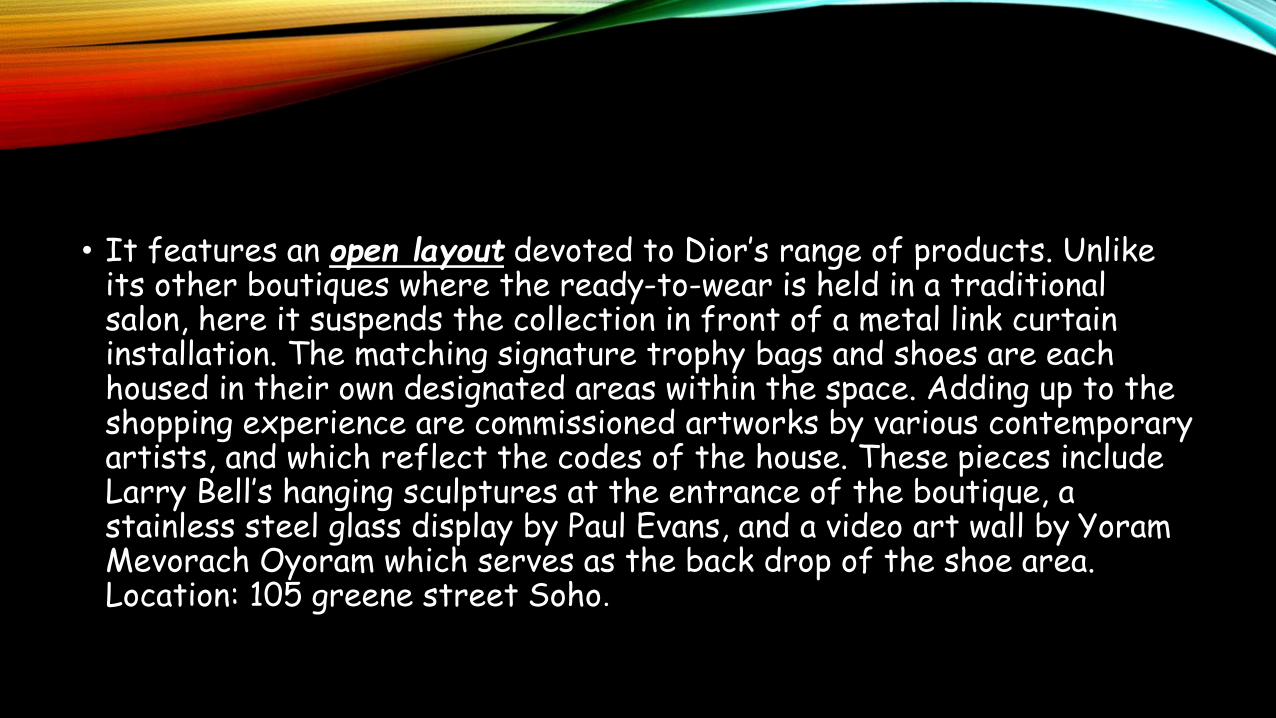
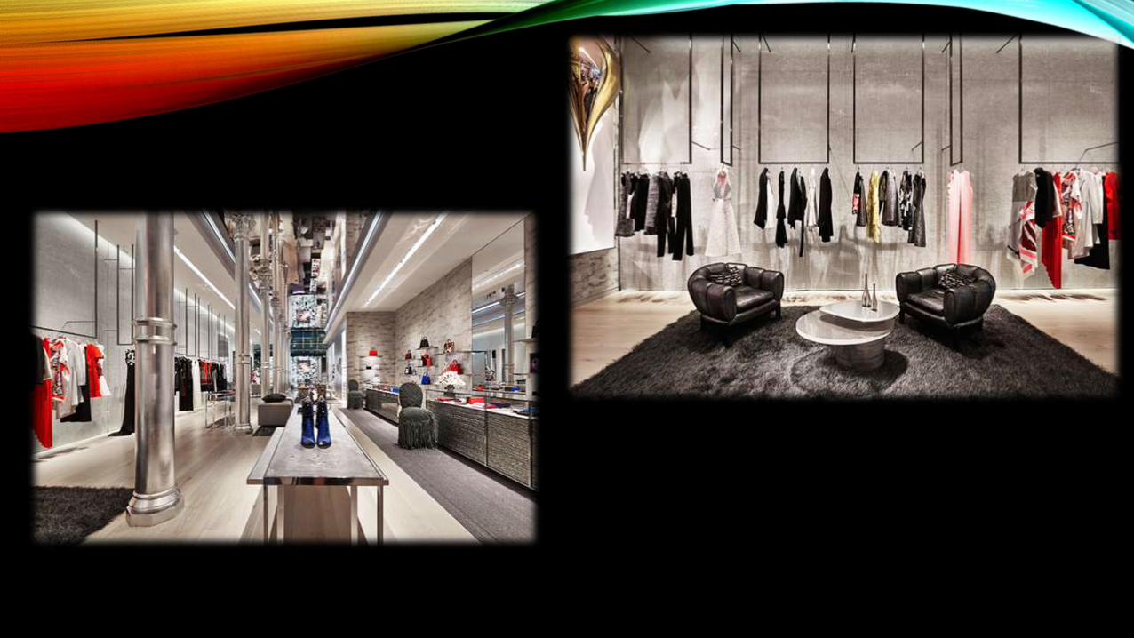
• It features an open layout devoted to Dior’s range of products. Unlike its other boutiques where the ready-to-wear is held in a traditional salon, here it suspends the collection in front of a metal link curtain installation. The matching signature trophy bags and shoes are each housed in their own designated areas within the space. Adding up to the shopping experience are commissioned artworks by various contemporary artists, and which reflect the codes of the house. These pieces include Larry Bell’s hanging sculptures at the entrance of the boutique, a stainless steel glass display by Paul Evans, and a video art wall by YoramMevorach Oyoram which serves as the back drop of the shoe area. Location: 105 greene street Soho.

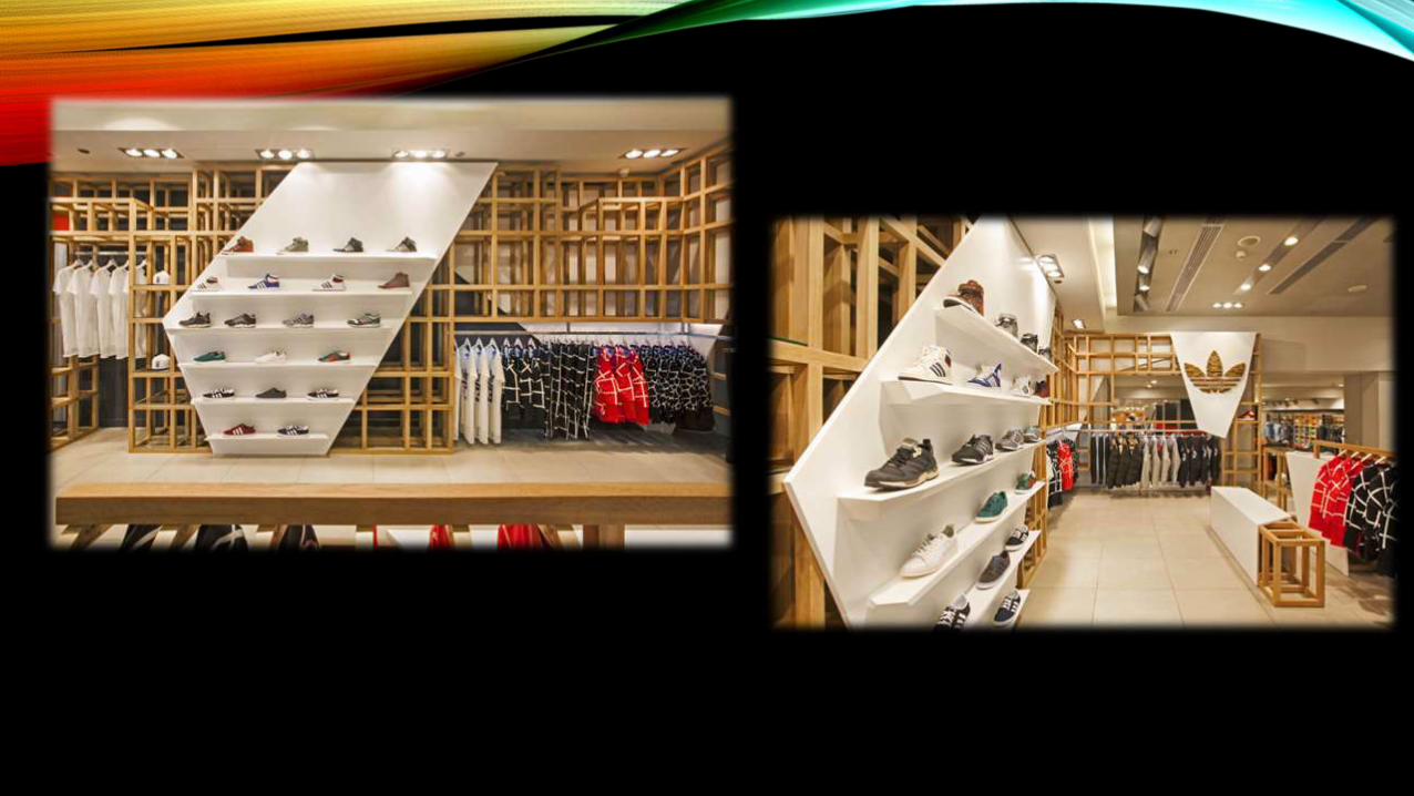
ADIDAS ORIGINALS FASHION STORE BY ONOMA ARCHITECTS, ATHENS –
GREECE
• 26 sq.m. of retail space in a department store in Athens, had to be transformed into a unique branded environment showcasing client’s top-fashion collaboration collections and offering an alternative retail experience to the consumers. adidas has entrusted this special project to Onoma Architects, an award winning architectural design and visual communication agency.
• The inspiration for the design of adidas Originals fashion space was derived from adidas Originals’ philosophy of modern, comfortable and design-focused forms. Oak wood is the only construction material used to create an abstractive shell, which will welcome adidas Originals’ special collections. The wooden shell, free from artificial elements, offers the ultimate platform for sneakers, apparel and accessories of distinguishable design. The authenticity of the space is redefined and bows to the products’ originality.

• Intentionally the only logo placement assigned in the drawings, is a wooden sculpture resembling a mosaic art-piece, representing the diversity of the collections. Top collaborations, beloved collections and signature items from the brand will be placed in the new destination, which will attract those in the know and those who seek creativity ¬– in their sneakers, in their clothes and in their accessories. More specifically, the adidas Originals fashion space will host to the statement collection – adidas Originals Blue, as well as a number of adidas Originals’ collaborations including Jeremy Scott – who brings his eccentric character to the most imaginative adidas Originals products, KazukiKuraishi ¬– who creates for adidas Originals 84-Lab, Nigo – a true streetwearpioneer and new collaborator with adidas Originals, and Neighborhood – a globally-recognised, subversive Japanese brand.
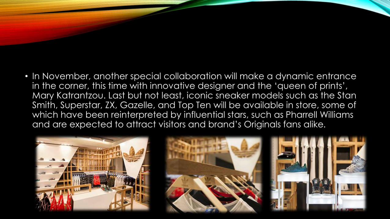
• In November, another special collaboration will make a dynamic entrance in the corner, this time with innovative designer and the ‘queen of prints’, Mary Katrantzou. Last but not least, iconic sneaker models such as the Stan Smith, Superstar, ZX, Gazelle, and Top Τen will be available in store, some of which have been reinterpreted by influential stars, such as Pharrell Williams and are expected to attract visitors and brand’s Originals fans alike.
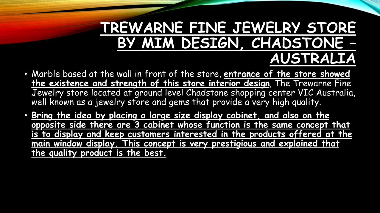
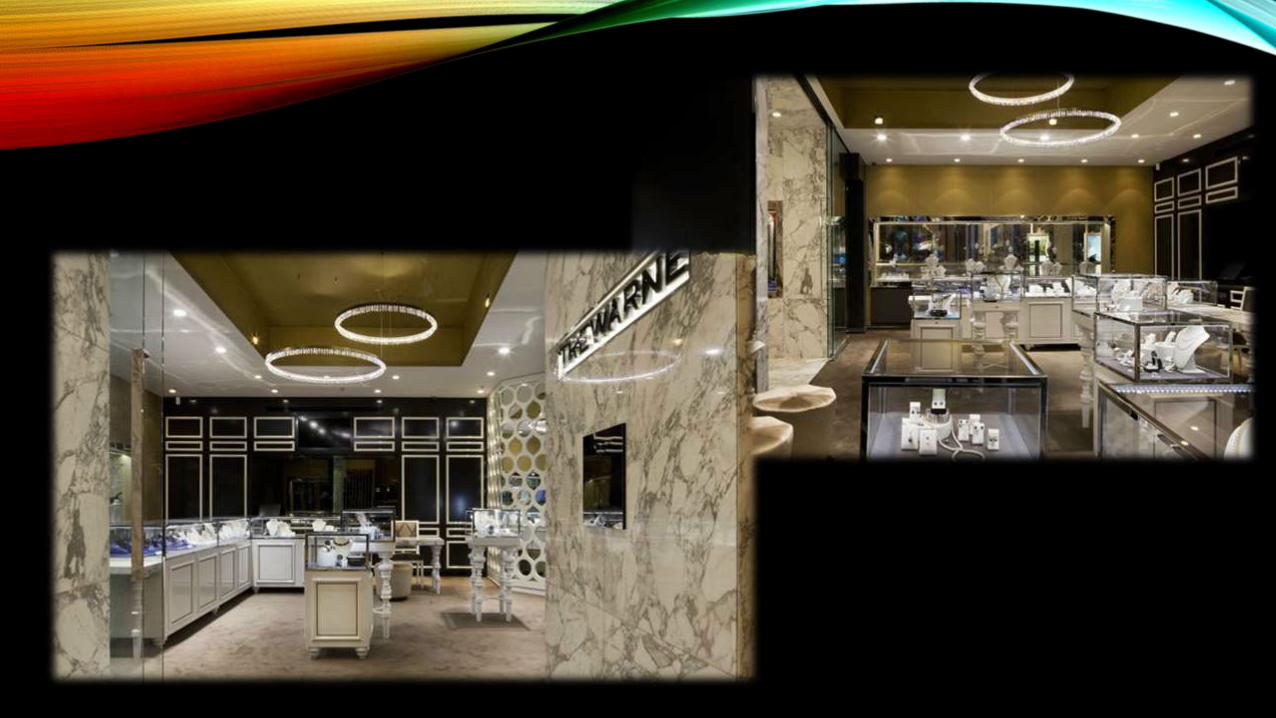
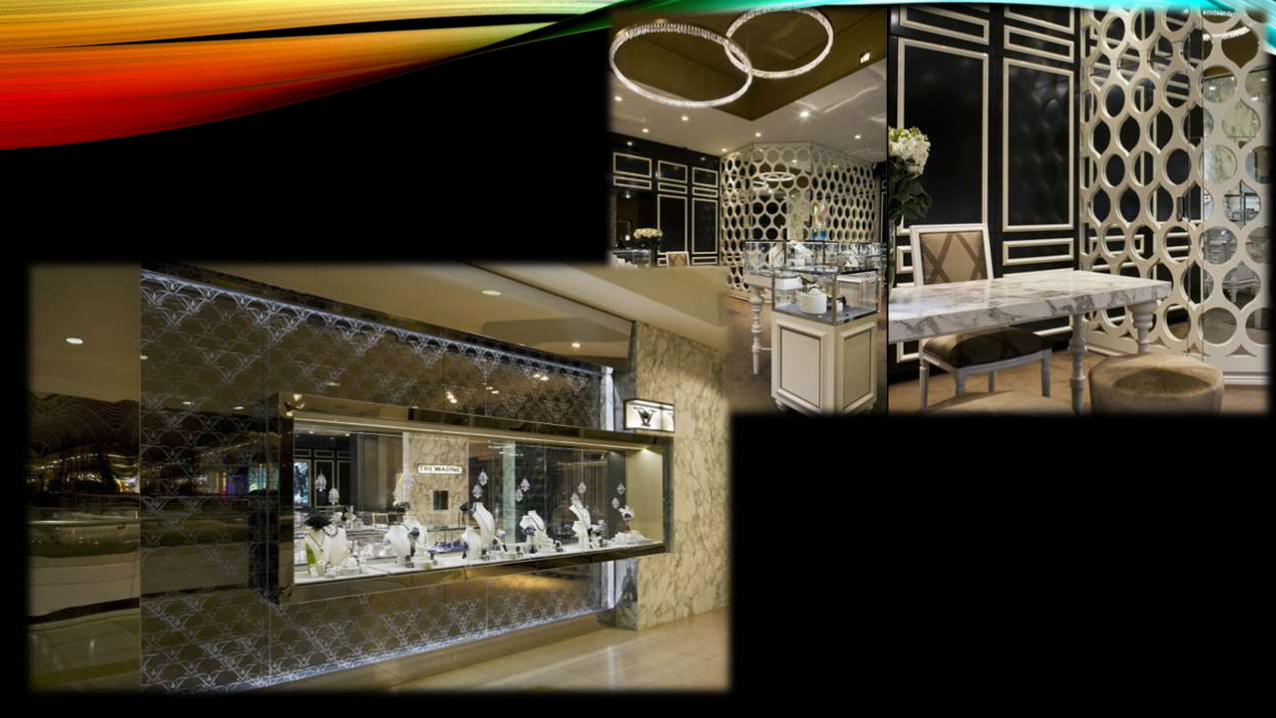
TREWARNE FINE JEWELRY STORE BY MIM DESIGN, CHADSTONE –
AUSTRALIA• Marble based at the wall in front of the store, entrance of the store showed the existence and strength of this store interior design, The Trewarne Fine Jewelry store located at ground level Chadstone shopping center VIC Australia, well known as a jewelry store and gems that provide a very high quality.
• Bring the idea by placing a large size display cabinet, and also on the opposite side there are 3 cabinet whose function is the same concept that is to display and keep customers interested in the products offered at the main window display. This concept is very prestigious and explained that the quality product is the best.
• Using sliding glass doors, retains the concept of wide-open doors so there’s not much space is wasted to provide flexibility for stores to be creative in their stores. The combination of marble and stainless gate, combined with the look of patterned glass is very precise and gives an exclusive impression on the overall concept of the store facade. Placement and arrangement of freestand with custom structure in the middle area of the store, together with lamp’s crystal motif provides luxurious atmosphere of the stores that are selling these high-priced products.

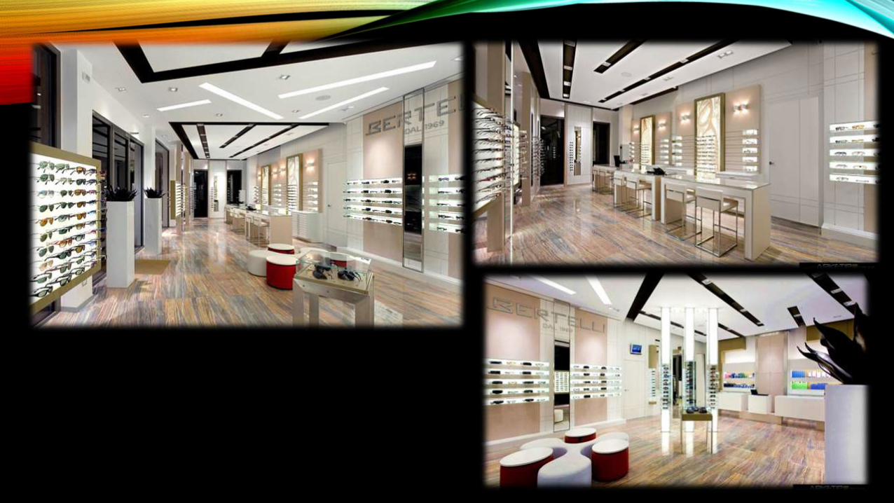
OTTICA BERTELLI BY ARKETIPO DESIGN, MILAN – ITALY
• Rich of glamour, strong emotional impact achievement immediately perceptible by the imposing external front view. Functionally, characterised to accommodate simultaneously different customers without losing the “boutique” connotation because of the uniqueness and personalisation of the concept and the furnishings, the formal cleanliness and the delicate contaminations of materials and colours played all tone on tone.
• The exhibition is well calibrated and it captures easily attention, while the lighting effects succeed to enhance the product by transforming it from a useful object to a desirable object.
• Materials used: Whitened oak wood effect, matt lacquers, Extra-clear glass, sandblasted, painted, Satin-finished stainless steel, Opal Plexiglas,
WEST ELM HOME FURNISHINGS STORE BY MBH ARCHITECTS,
ALAMEDA – CALIFORNIA
• When the team at Williams Sonoma decided that it was time to open a new West Elm store in California, the home furnishings brand called on Alameda, California based MBH Architects to be the architect of record and do the job. The new 10,000 square foot retail space is part of Marin County’s shopping haven, Strawberry Village.
• Having collaborated with MBH Architects on several projects before (Williams Sonoma and Pottery Barn locations in New York City to name a few), the firm was tapped again, this time, to work closely with several teams including West Elm’s internal design team and external design consultant as well as with the building’s landlord and the Strawberry Village Design Review Board. The goal was to ensure that the design would blend seamlessly with West Elm’s neighboring stores.
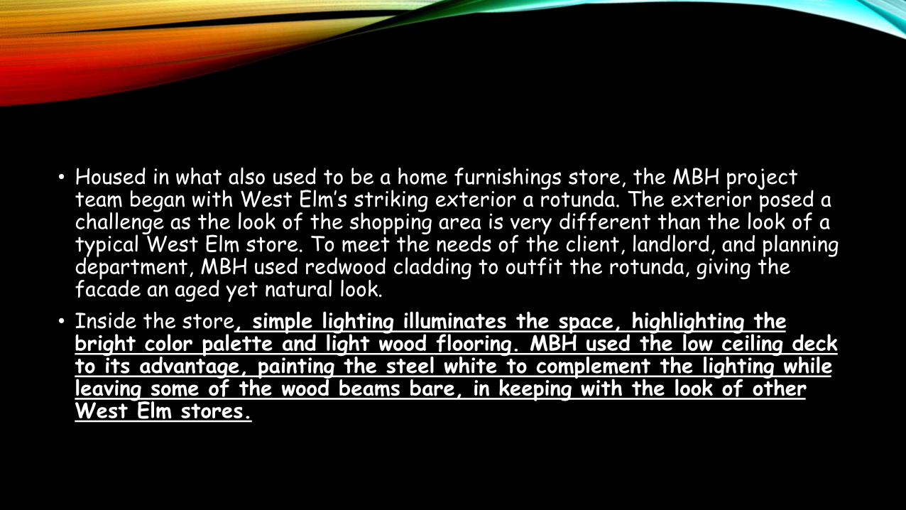
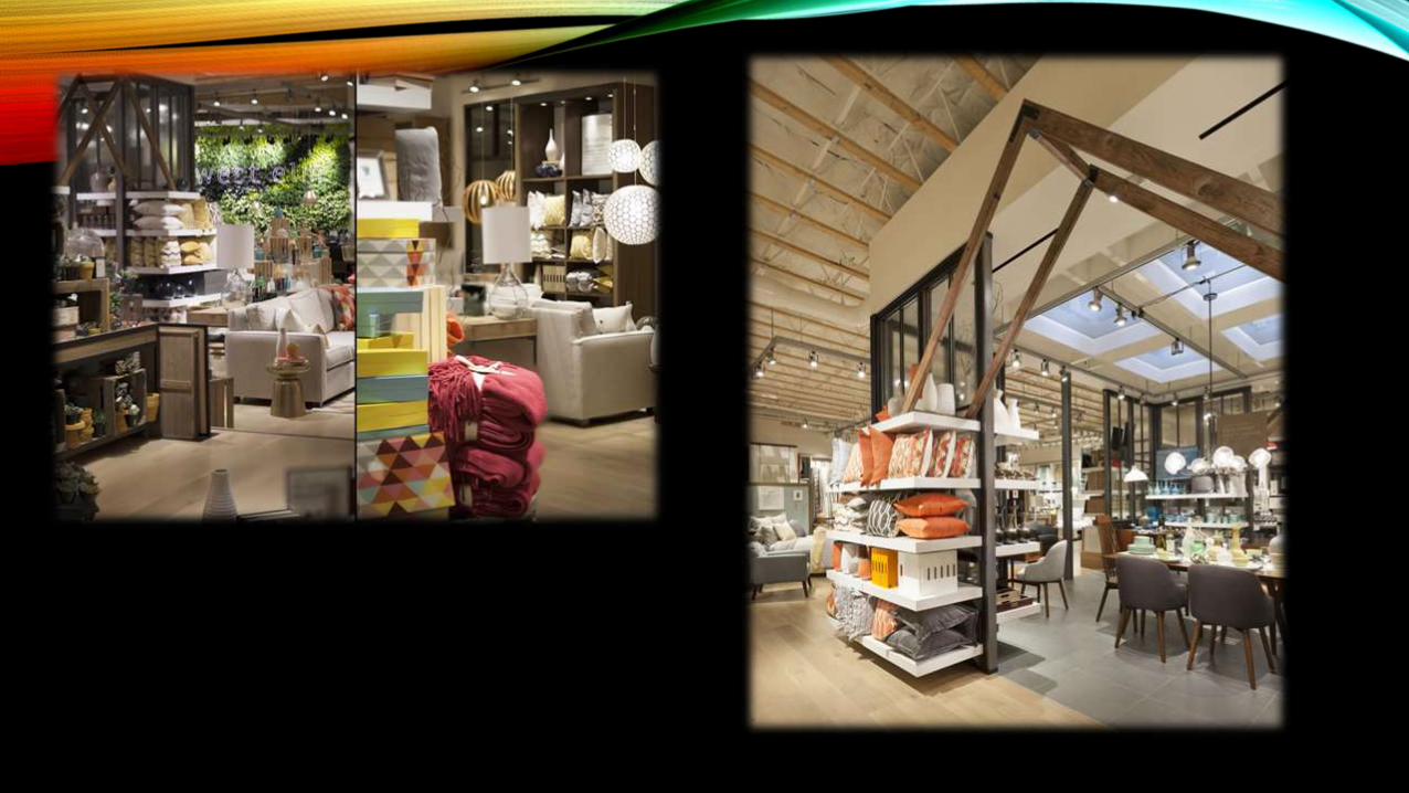
• Housed in what also used to be a home furnishings store, the MBH project team began with West Elm’s striking exterior a rotunda. The exterior posed a challenge as the look of the shopping area is very different than the look of a typical West Elm store. To meet the needs of the client, landlord, and planning department, MBH used redwood cladding to outfit the rotunda, giving the facade an aged yet natural look.
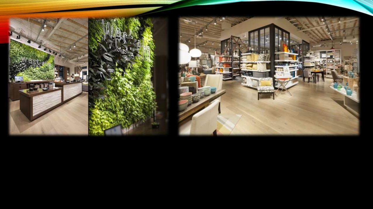
• Inside the store, simple lighting illuminates the space, highlighting the bright color palette and light wood flooring. MBH used the low ceiling deck to its advantage, painting the steel white to complement the lighting while leaving some of the wood beams bare, in keeping with the look of other West Elm stores.
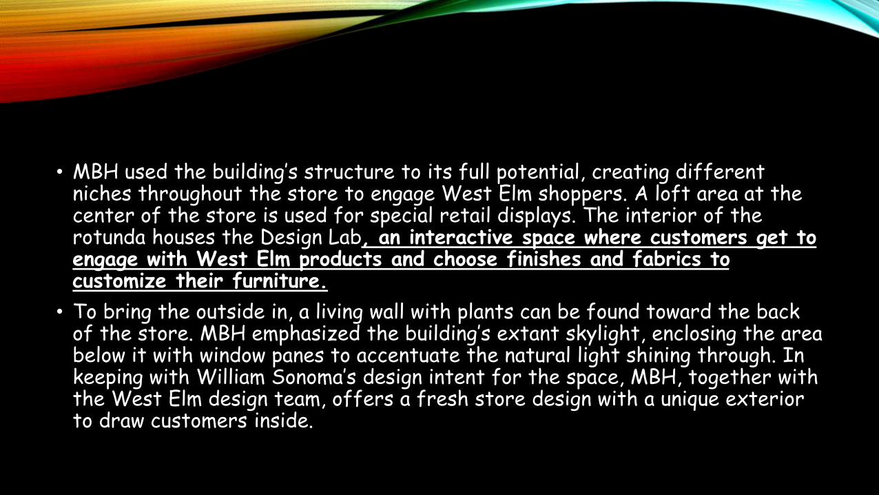
• MBH used the building’s structure to its full potential, creating different niches throughout the store to engage West Elm shoppers. A loft area at the center of the store is used for special retail displays. The interior of the rotunda houses the Design Lab, an interactive space where customers get to engage with West Elm products and choose finishes and fabrics to customize their furniture.
• To bring the outside in, a living wall with plants can be found toward the back of the store. MBH emphasized the building’s extant skylight, enclosing the area below it with window panes to accentuate the natural light shining through. In keeping with William Sonoma’s design intent for the space, MBH, together with the West Elm design team, offers a fresh store design with a unique exterior to draw customers inside.
ENTER THE THRESHOLD
• The threshold area, also known as the "decompression zone", is the very first space that prospective customers step into when they enter your store and typically consists of the first five to fifteen feet worth of space, depending on how big your store is. It's also the space where your customers make the transition from the outside world and first experience what you have to offer. They also make critical judgements like how cheap or expensive your store is likely to be and how well coordinated your lighting, fixtures, displays, and colors are. Since they're in a transition mode, customers are more likely to miss any product, signage, or carts you place there.
THEN, OFF TO THE RIGHT
• It's a well known fact in the retail community that in North America, 90 percent of consumers upon entering a store will turn right unconsciously. The first wall they see is often referred to as a "power wall", and acts as a high-impact first impression vehicle your merchandise, so be sure to give it extra special attention in terms of what you choose to display and how you display it.
• You'll want to make sure you entice and arouse your customer's attention with the products you put on display, whether it's your new or seasonal items, high profit or high demand products, or a place you design to tell your product's stories and create vignettes.
HAVE THEM WALK A PATH
• This will vary greatly depending on the size and general layout of your store, but knowing that your customers want to turn right, your next job is to make sure that as they do that, they also continue walking throughout your store to gain the maximum exposure to your products. This not only increases the chances of them making a purchase, but a well thought-out path can be a great way to strategically control the ebb and flow of the traffic in your store.
• Most stores use a circular path to the right to get customers to walk through to the back of the store and come to the front again. Some will make it even easier by covering the path with a different texture or look from the general flooring, paying homage to the old saying "where the eyes go, the feet will follow."
• Another thing to keep in mind is that you want to use the path to lead your customers somewhere, which often means putting a eye-catching and attention-grabbing display at the end of an aisle for example.
ALSO, MAKE SURE THEY'RE COMFORTABLE
• You can also make your store comfortable by incorporating some type of waiting area with comfy seats and benches which will encourage customers to spend more time in your store. Especially, if a shopper is accompanied by someone not interested in making a purchase or kids for that matter. A small tip to keep in mind is to keep the seats or benches facing the merchandise, so that they're still top of mind for those lounging around in your store
• You'll also want to keep in mind that if you're a one-person show or don't have staff wondering the store, it'll be important to be able to keep an eye and see everything from where you'll be set-up from a loss-prevention perspective. Other tips to keep in mind when designing your checkout counter are:
• Have a counter that's big enough for shoppers to place their bags and/or personal belongings
• Take advantage of the wall behind the counter to create interesting and engaging displays
• Encourage impulse or "last-minute" purchases by stocking items customers crave or commonly need close-by
• Be polite in person by asking questions like "Were you able to find everything you were looking for?" and in signage regarding your exchange or refund policies
• Designing your retail interior is a never ending process, where you can always be switching up, tweaking, adding, or taking away to create a resonating customer journey and experience. At the end of the day though, that's exactly what you want to focus on, the customer journey, which you'll want to to test out and optimize for constantly. Have a walk-through yourself and see where the visual cues guide you, or get your staff, friends, or family to do the same and give you honest feedback. Lastly, observe your customers and see what they're drawn to, what they avoid, and how they move, then match that with your intended design. If you keep resilient and keep your eyes and ears open, you'll be sure to create a retail environment that is a win-win for both you and your customers.