how make presentation_mir_2014
TRANSCRIPT
1
How to give a scientific
presentation
October 1, 2014
Prepared by: Pablo Valdés Solís
TABLE OF CONTENTS
2
123
456
Before beginning
Prepare the presentation
Design the slides
How to prepare for the talk
How to deliver a great talk
References
Pages 3-23
Pages 24-34
Pages 35-76
Pages 77-82
Pages 83-103
Pages 104-110
1Before beginning
Use the right tool
The slidedocs
How to use slidedocs
Nancy Duarte’s talk
Tell a story
The big idea
How to persuade
The S.T.A.R. moment
Tell a story
The big idea
Value brevity
Slide content reduction
BEFORE BEGINNING
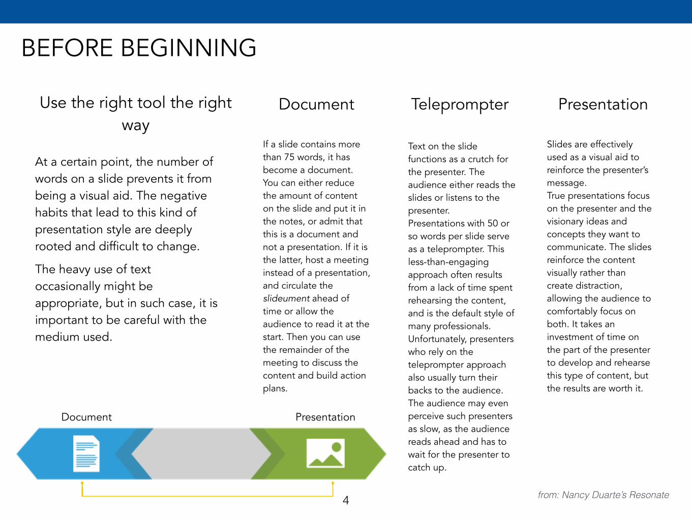
Use the right tool the right way
Document
At a certain point, the number of words on a slide prevents it from being a visual aid. The negative habits that lead to this kind of presentation style are deeply rooted and difficult to change.
The heavy use of text occasionally might be appropriate, but in such case, it is important to be careful with the medium used.
If a slide contains more than 75 words, it has become a document. You can either reduce the amount of content on the slide and put it in the notes, or admit that this is a document and not a presentation. If it is the latter, host a meeting instead of a presentation, and circulate the slideument ahead of time or allow the audience to read it at the start. Then you can use the remainder of the meeting to discuss the content and build action plans.
Teleprompter
Text on the slide functions as a crutch for the presenter. The audience either reads the slides or listens to the presenter.Presentations with 50 or so words per slide serve as a teleprompter. This less-than-engaging approach often results from a lack of time spent rehearsing the content, and is the default style of many professionals. Unfortunately, presenters who rely on the teleprompter approach also usually turn their backs to the audience. The audience may even perceive such presenters as slow, as the audience reads ahead and has to wait for the presenter to catch up.
Presentation
Slides are effectively used as a visual aid to reinforce the presenter’s message.True presentations focus on the presenter and the visionary ideas and concepts they want to communicate. The slides reinforce the content visually rather than create distraction, allowing the audience to comfortably focus on both. It takes an investment of time on the part of the presenter to develop and rehearse this type of content, but the results are worth it.
Document Presentation
from: Nancy Duarte’s Resonate4
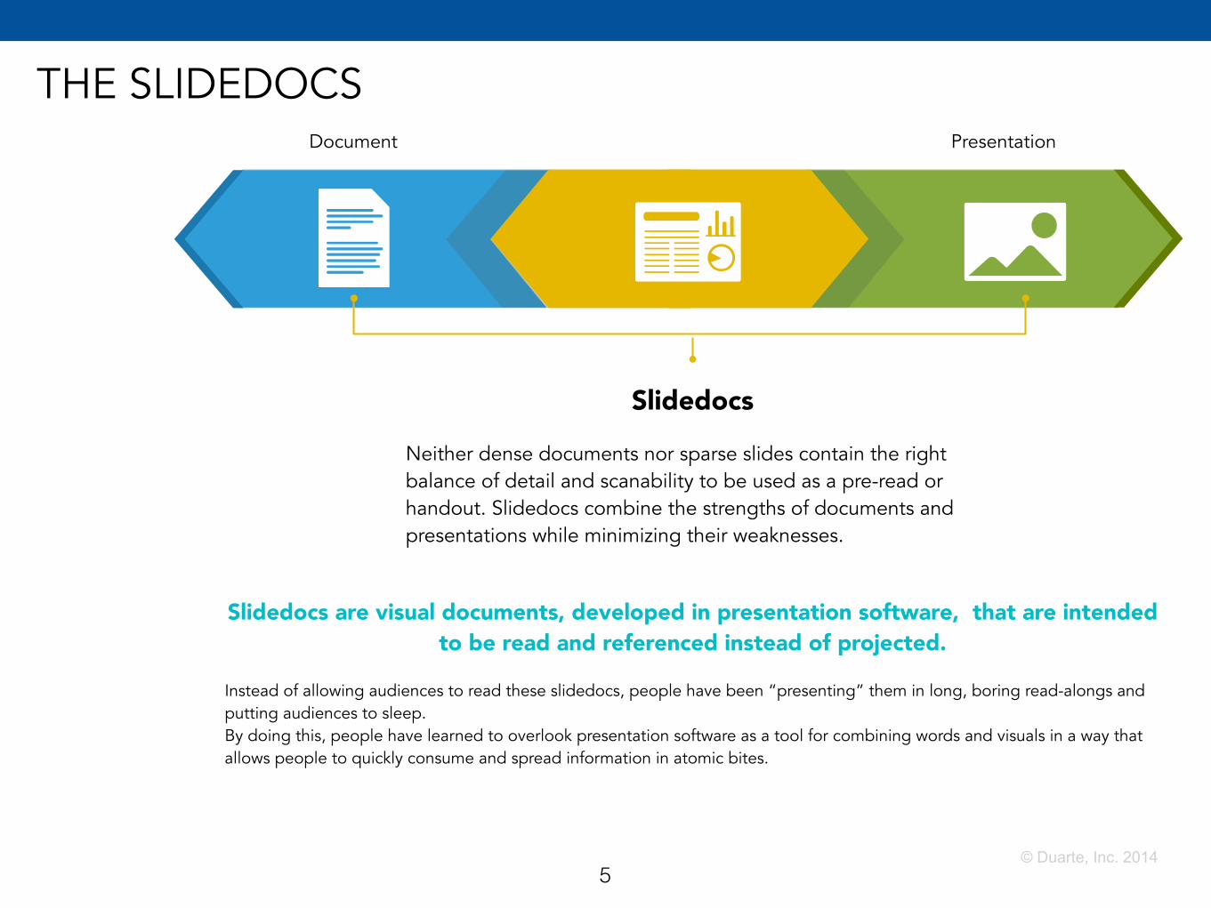
THE SLIDEDOCSDocument Presentation
5
Slidedocs
Neither dense documents nor sparse slides contain the right balance of detail and scanability to be used as a pre-read or handout. Slidedocs combine the strengths of documents and presentations while minimizing their weaknesses.
© Duarte, Inc. 2014
Slidedocs are visual documents, developed in presentation software, that are intended to be read and referenced instead of projected.
Instead of allowing audiences to read these slidedocs, people have been “presenting” them in long, boring read-alongs and putting audiences to sleep. By doing this, people have learned to overlook presentation software as a tool for combining words and visuals in a way that allows people to quickly consume and spread information in atomic bites.
6
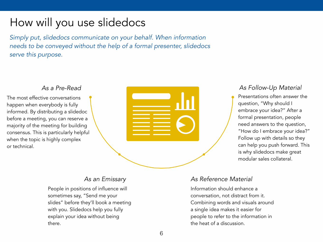
How will you use slidedocsSimply put, slidedocs communicate on your behalf. When information needs to be conveyed without the help of a formal presenter, slidedocs serve this purpose.
The most effective conversations happen when everybody is fully informed. By distributing a slidedoc before a meeting, you can reserve a majority of the meeting for building consensus. This is particularly helpful when the topic is highly complex or technical.
People in positions of influence will sometimes say, “Send me your slides” before they’ll book a meeting with you. Slidedocs help you fully explain your idea without being there.
Information should enhance a conversation, not distract from it. Combining words and visuals around a single idea makes it easier for people to refer to the information in the heat of a discussion.
Presentations often answer the question, “Why should I embrace your idea?” After a formal presentation, people need answers to the question, “How do I embrace your idea?” Follow up with details so they can help you push forward. This is why slidedocs make great modular sales collateral.
As a Pre-Read
As an Emissary As Reference Material
As Follow-Up Material
7
http://www.ted.com/talks/nancy_duarte_the_secret_structure_of_great_talks
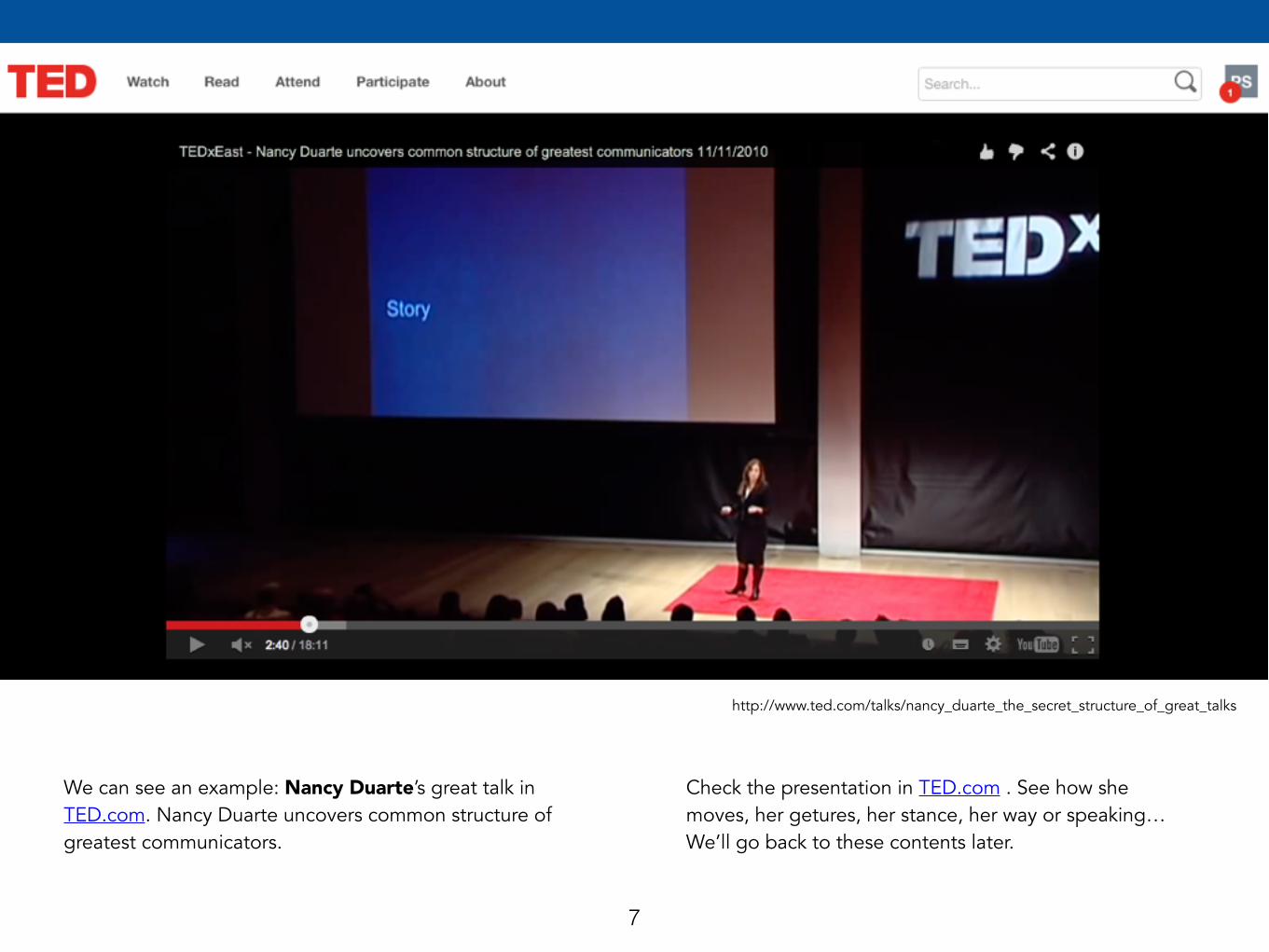
We can see an example: Nancy Duarte’s great talk in TED.com. Nancy Duarte uncovers common structure of greatest communicators.
Check the presentation in TED.com . See how she moves, her getures, her stance, her way or speaking…We’ll go back to these contents later.
8
http://www.ted.com/talks/nancy_duarte_the_secret_structure_of_great_talks
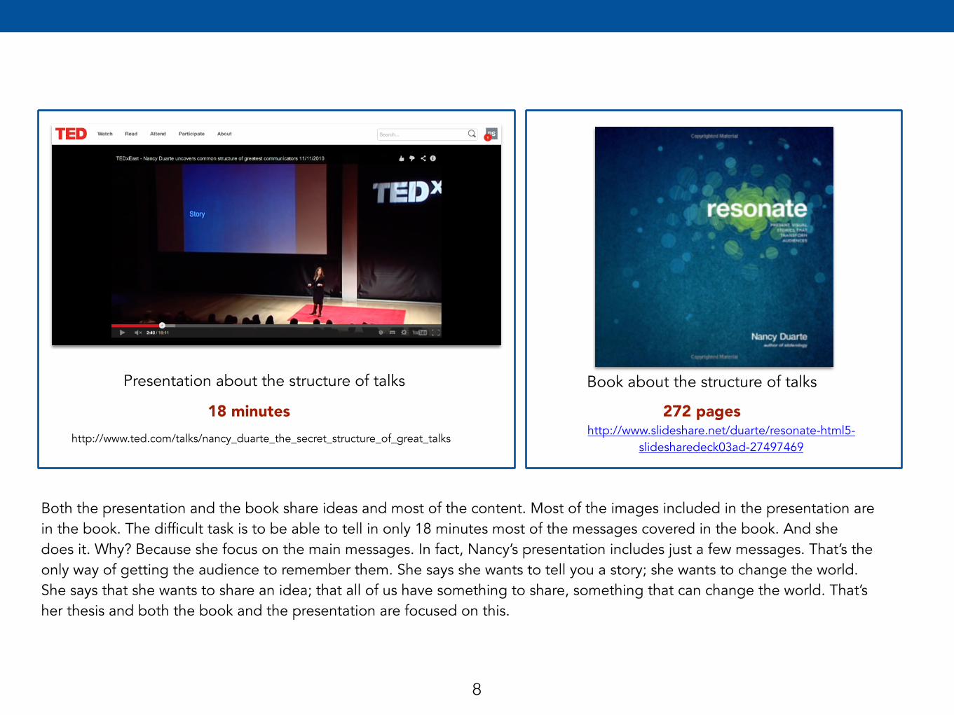
Presentation about the structure of talks
Both the presentation and the book share ideas and most of the content. Most of the images included in the presentation are in the book. The difficult task is to be able to tell in only 18 minutes most of the messages covered in the book. And she does it. Why? Because she focus on the main messages. In fact, Nancy’s presentation includes just a few messages. That’s the only way of getting the audience to remember them. She says she wants to tell you a story; she wants to change the world. She says that she wants to share an idea; that all of us have something to share, something that can change the world. That’s her thesis and both the book and the presentation are focused on this.
Book about the structure of talks
18 minutes 272 pageshttp://www.slideshare.net/duarte/resonate-html5-
slidesharedeck03ad-27497469
9
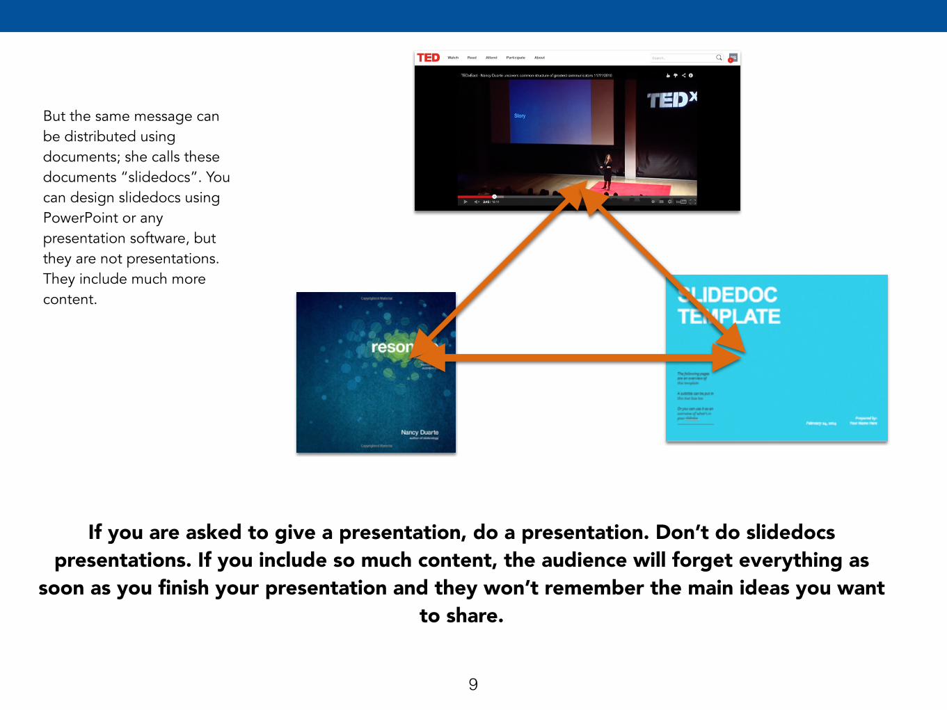
But the same message can be distributed using documents; she calls these documents “slidedocs”. You can design slidedocs using PowerPoint or any presentation software, but they are not presentations. They include much more content.
If you are asked to give a presentation, do a presentation. Don’t do slidedocs presentations. If you include so much content, the audience will forget everything as
soon as you finish your presentation and they won’t remember the main ideas you want to share.
TELL A STORY
Incorporate story
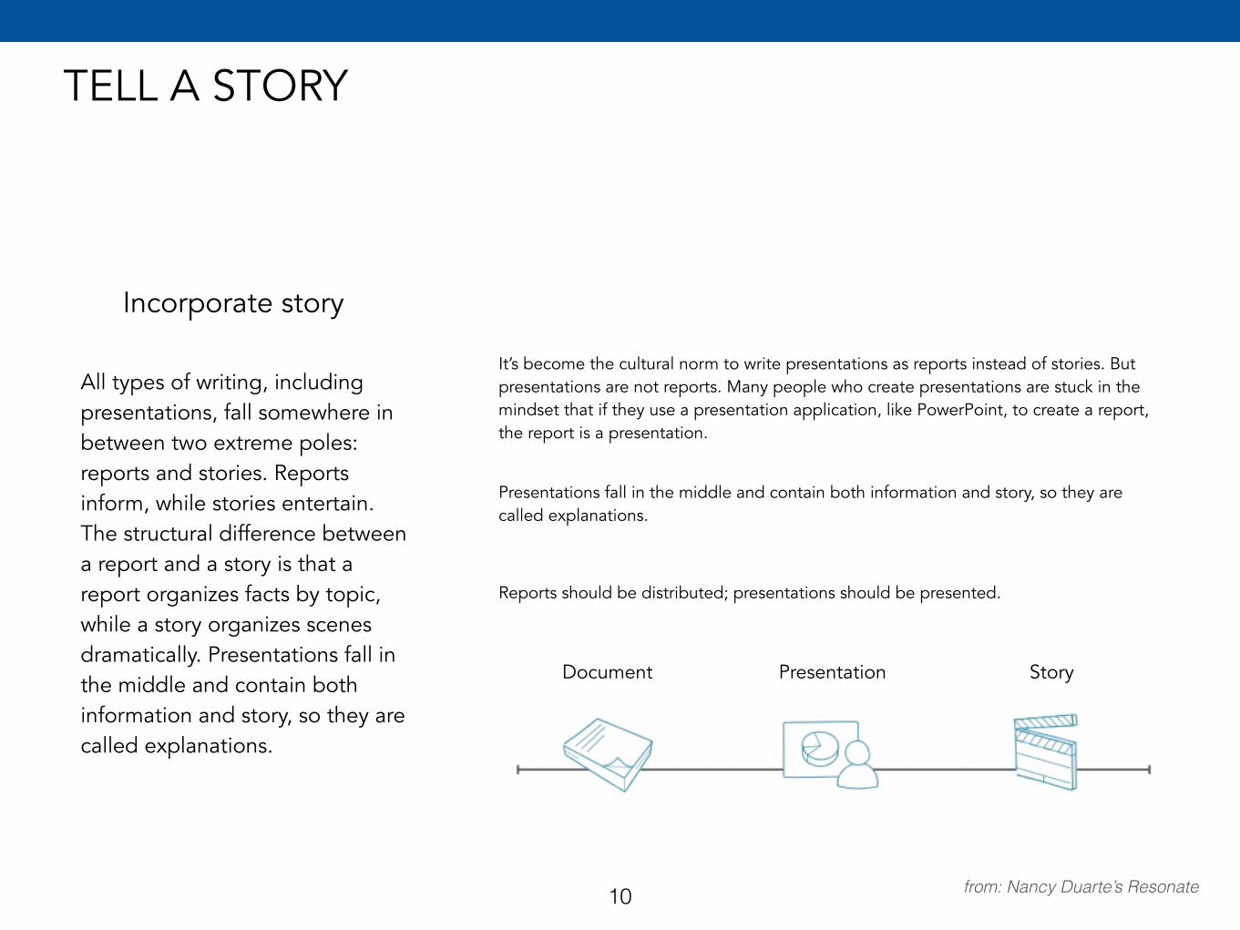
All types of writing, including presentations, fall somewhere in between two extreme poles: reports and stories. Reports inform, while stories entertain. The structural difference between a report and a story is that a report organizes facts by topic, while a story organizes scenes dramatically. Presentations fall in the middle and contain both information and story, so they are called explanations.
It’s become the cultural norm to write presentations as reports instead of stories. But presentations are not reports. Many people who create presentations are stuck in the mindset that if they use a presentation application, like PowerPoint, to create a report, the report is a presentation.
Document Presentation Story
Presentations fall in the middle and contain both information and story, so they are called explanations.
Reports should be distributed; presentations should be presented.
from: Nancy Duarte’s Resonate10
THE CONTOUR OF PRESENTATION
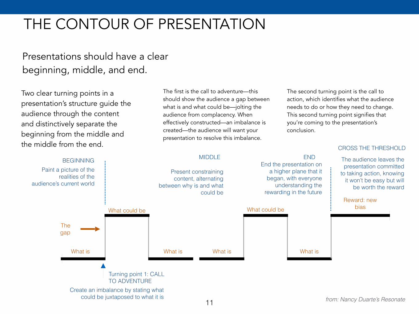
Presentations should have a clear beginning, middle, and end.
Two clear turning points in a presentation’s structure guide the audience through the content and distinctively separate the beginning from the middle and the middle from the end.
The first is the call to adventure—this should show the audience a gap between what is and what could be—jolting the audience from complacency. When effectively constructed—an imbalance is created—the audience will want your presentation to resolve this imbalance.
The second turning point is the call to action, which identifies what the audience needs to do or how they need to change. This second turning point signifies that you’re coming to the presentation’s conclusion.
BEGINNINGPaint a picture of the
realities of the audience’s current world
Turning point 1: CALL TO ADVENTURE
Create an imbalance by stating what could be juxtaposed to what it is
What is
The gap
What could be
What is What is
What could be
What is
MIDDLE
Present constraining content, alternating
between why is and what could be
Reward: new bias
from: Nancy Duarte’s Resonate
ENDEnd the presentation on
a higher plane that it began, with everyone
understanding the rewarding in the future
CROSS THE THRESHOLD
The audience leaves the presentation committed
to taking action, knowing it won’t be easy but will
be worth the reward
11
12
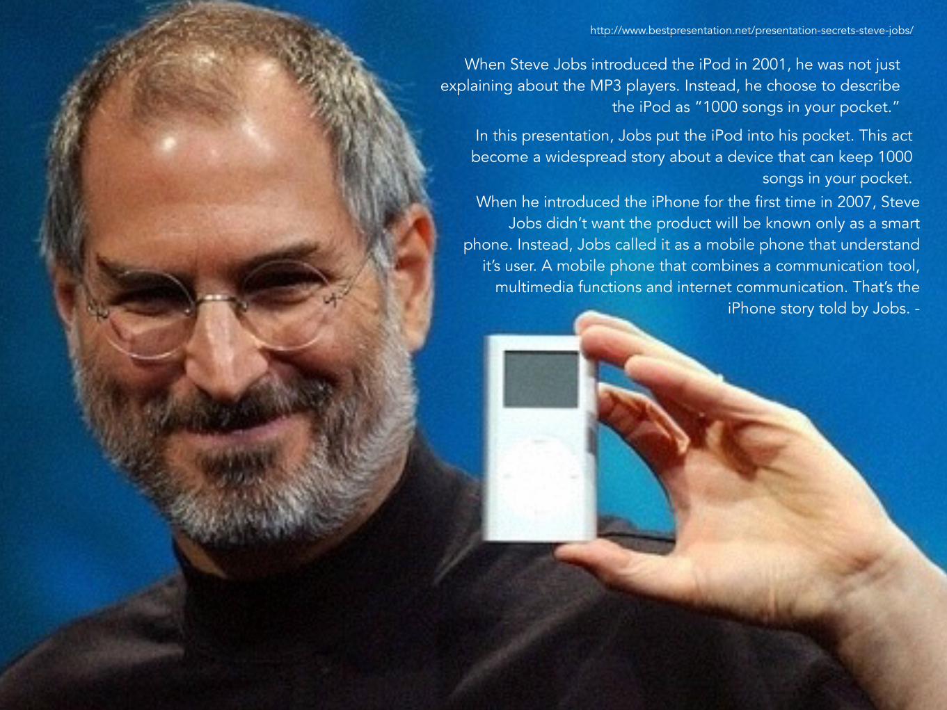
When Steve Jobs introduced the iPod in 2001, he was not just explaining about the MP3 players. Instead, he choose to describe
the iPod as “1000 songs in your pocket.”
http://www.bestpresentation.net/presentation-secrets-steve-jobs/
In this presentation, Jobs put the iPod into his pocket. This act become a widespread story about a device that can keep 1000
songs in your pocket.When he introduced the iPhone for the first time in 2007, Steve
Jobs didn’t want the product will be known only as a smart phone. Instead, Jobs called it as a mobile phone that understand
it’s user. A mobile phone that combines a communication tool, multimedia functions and internet communication. That’s the
iPhone story told by Jobs. -
THE BIG IDEA
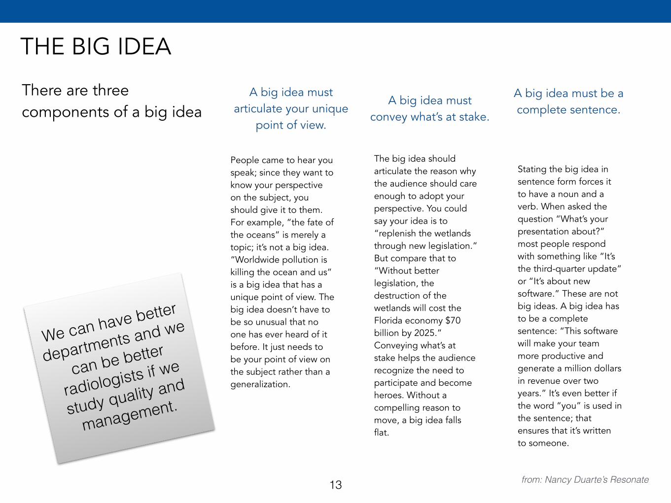
There are three components of a big idea
A big idea must articulate your unique
point of view.
People came to hear you speak; since they want to know your perspective on the subject, you should give it to them. For example, “the fate of the oceans” is merely a topic; it’s not a big idea. “Worldwide pollution is killing the ocean and us” is a big idea that has a unique point of view. The big idea doesn’t have to be so unusual that no one has ever heard of it before. It just needs to be your point of view on the subject rather than a generalization.
from: Nancy Duarte’s Resonate
A big idea must convey what’s at stake.
The big idea should articulate the reason why the audience should care enough to adopt your perspective. You could say your idea is to “replenish the wetlands through new legislation.” But compare that to “Without better legislation, the destruction of the wetlands will cost the Florida economy $70 billion by 2025.” Conveying what’s at stake helps the audience recognize the need to participate and become heroes. Without a compelling reason to move, a big idea falls flat.
A big idea must be a complete sentence.
Stating the big idea in sentence form forces it to have a noun and a verb. When asked the question “What’s your presentation about?” most people respond with something like “It’s the third-quarter update” or “It’s about new software.” These are not big ideas. A big idea has to be a complete sentence: “This software will make your team more productive and generate a million dollars in revenue over two years.” It’s even better if the word “you” is used in the sentence; that ensures that it’s written to someone.
We can have better
departments and we
can be better
radiologists if we
study quality and
management.
13
14
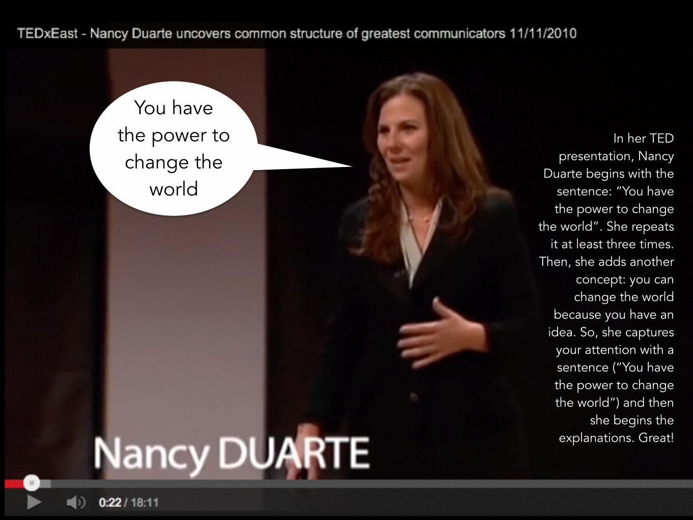
You have the power to change the
world
In her TED presentation, Nancy
Duarte begins with the sentence: “You have the power to change
the world”. She repeats it at least three times.
Then, she adds another concept: you can change the world
because you have an idea. So, she captures
your attention with a sentence (“You have the power to change the world”) and then
she begins the explanations. Great!
HOW TO PERSUADE: MORE THAN JUST FACTS
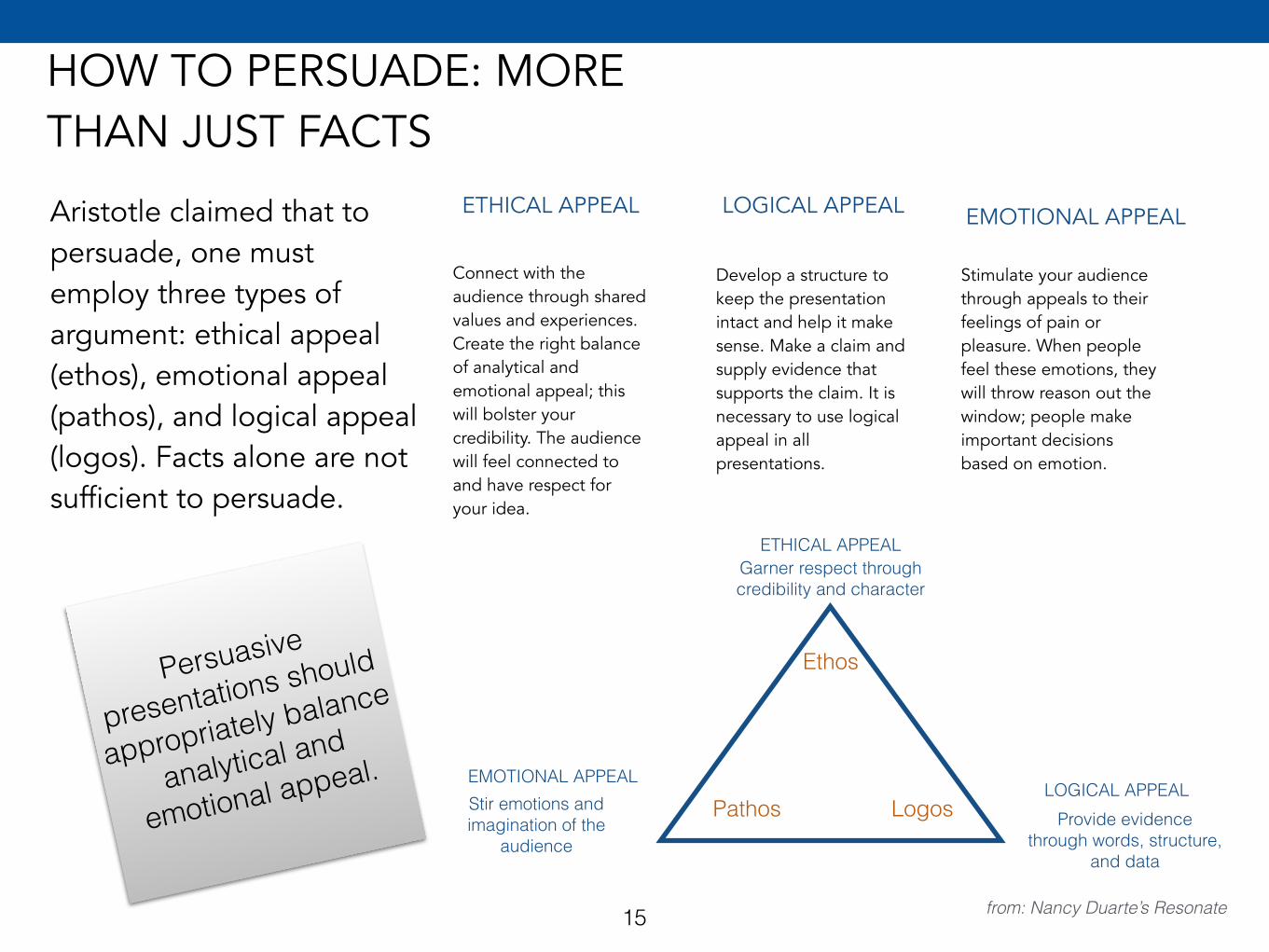
Aristotle claimed that to persuade, one must employ three types of argument: ethical appeal (ethos), emotional appeal (pathos), and logical appeal (logos). Facts alone are not sufficient to persuade.
ETHICAL APPEAL
Connect with the audience through shared values and experiences. Create the right balance of analytical and emotional appeal; this will bolster your credibility. The audience will feel connected to and have respect for your idea.
from: Nancy Duarte’s Resonate
LOGICAL APPEAL
Develop a structure to keep the presentation intact and help it make sense. Make a claim and supply evidence that supports the claim. It is necessary to use logical appeal in all presentations.
EMOTIONAL APPEAL
Stimulate your audience through appeals to their feelings of pain or pleasure. When people feel these emotions, they will throw reason out the window; people make important decisions based on emotion.
ETHICAL APPEALGarner respect through credibility and character
Ethos
EMOTIONAL APPEALStir emotions and imagination of the
audience
LOGICAL APPEALProvide evidence
through words, structure, and data
Pathos Logos
Persuasive
presentations should
appropriately balance
analytical and
emotional appeal.
15
STRUCTURE: MAKE SENSE
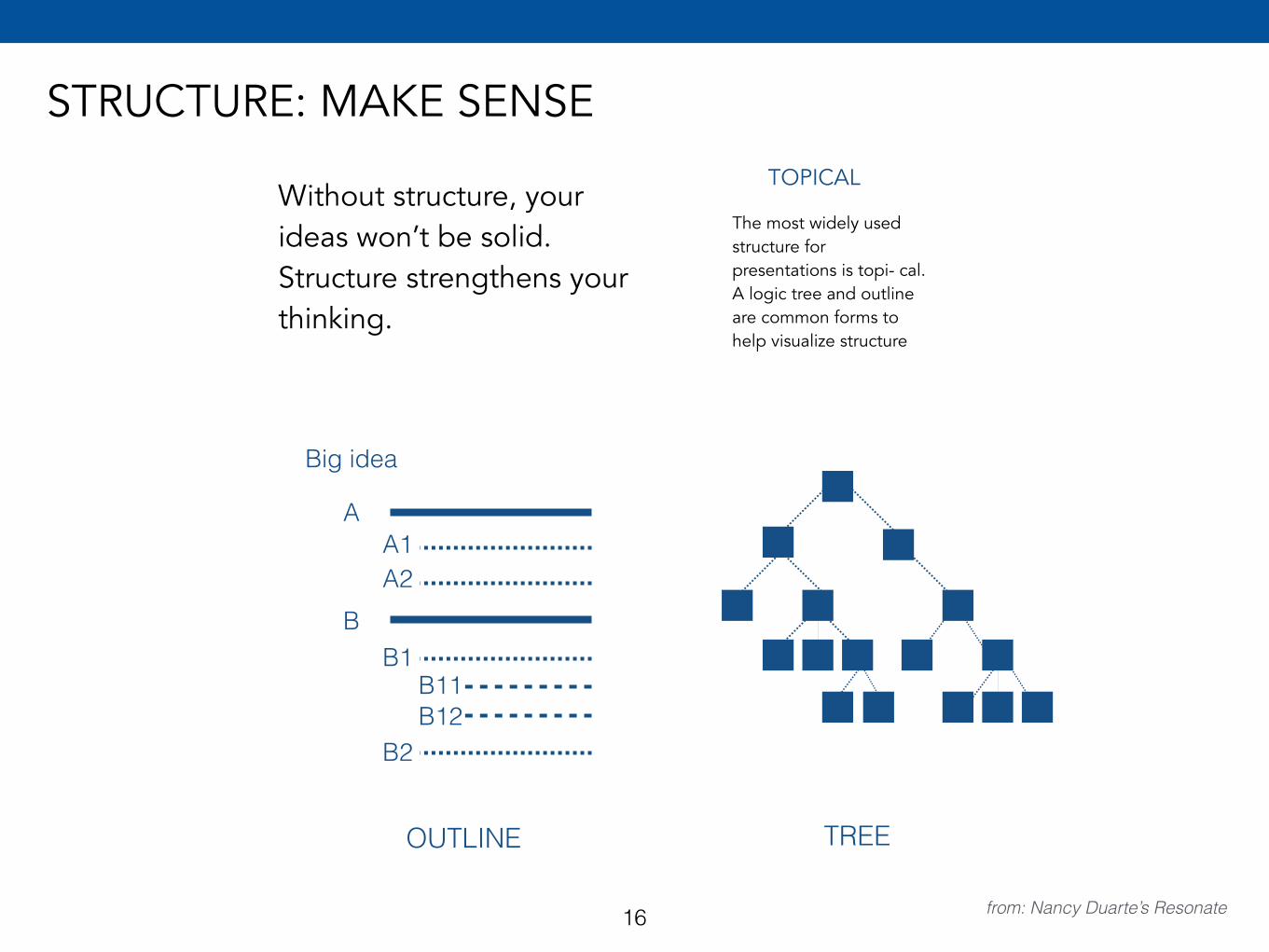
Without structure, your ideas won’t be solid. Structure strengthens your thinking.
from: Nancy Duarte’s Resonate
TREE
The most widely used structure for presentations is topi- cal. A logic tree and outline are common forms to help visualize structure
TOPICAL
OUTLINE
Big idea
A
B
A1A2
B1
B2
B11B12
16
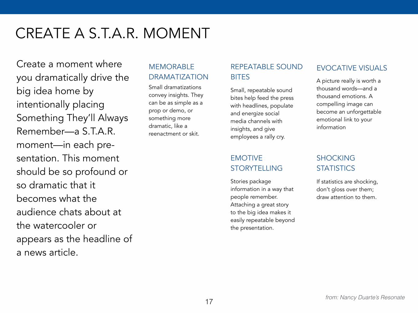
CREATE A S.T.A.R. MOMENT
Create a moment where you dramatically drive the big idea home by intentionally placing Something They’ll Always Remember—a S.T.A.R. moment—in each pre- sentation. This moment should be so profound or so dramatic that it becomes what the audience chats about at the watercooler or appears as the headline of a news article.
MEMORABLE DRAMATIZATIONSmall dramatizations convey insights. They can be as simple as a prop or demo, or something more dramatic, like a reenactment or skit.
from: Nancy Duarte’s Resonate
REPEATABLE SOUND BITES
Small, repeatable sound bites help feed the press with headlines, populate and energize social media channels with insights, and give employees a rally cry.
EVOCATIVE VISUALS
A picture really is worth a thousand words—and a thousand emotions. A compelling image can become an unforgettable emotional link to your information
EMOTIVE STORYTELLING
Stories package information in a way that people remember. Attaching a great story to the big idea makes it easily repeatable beyond the presentation.
SHOCKING STATISTICS
If statistics are shocking, don’t gloss over them; draw attention to them.
17
18
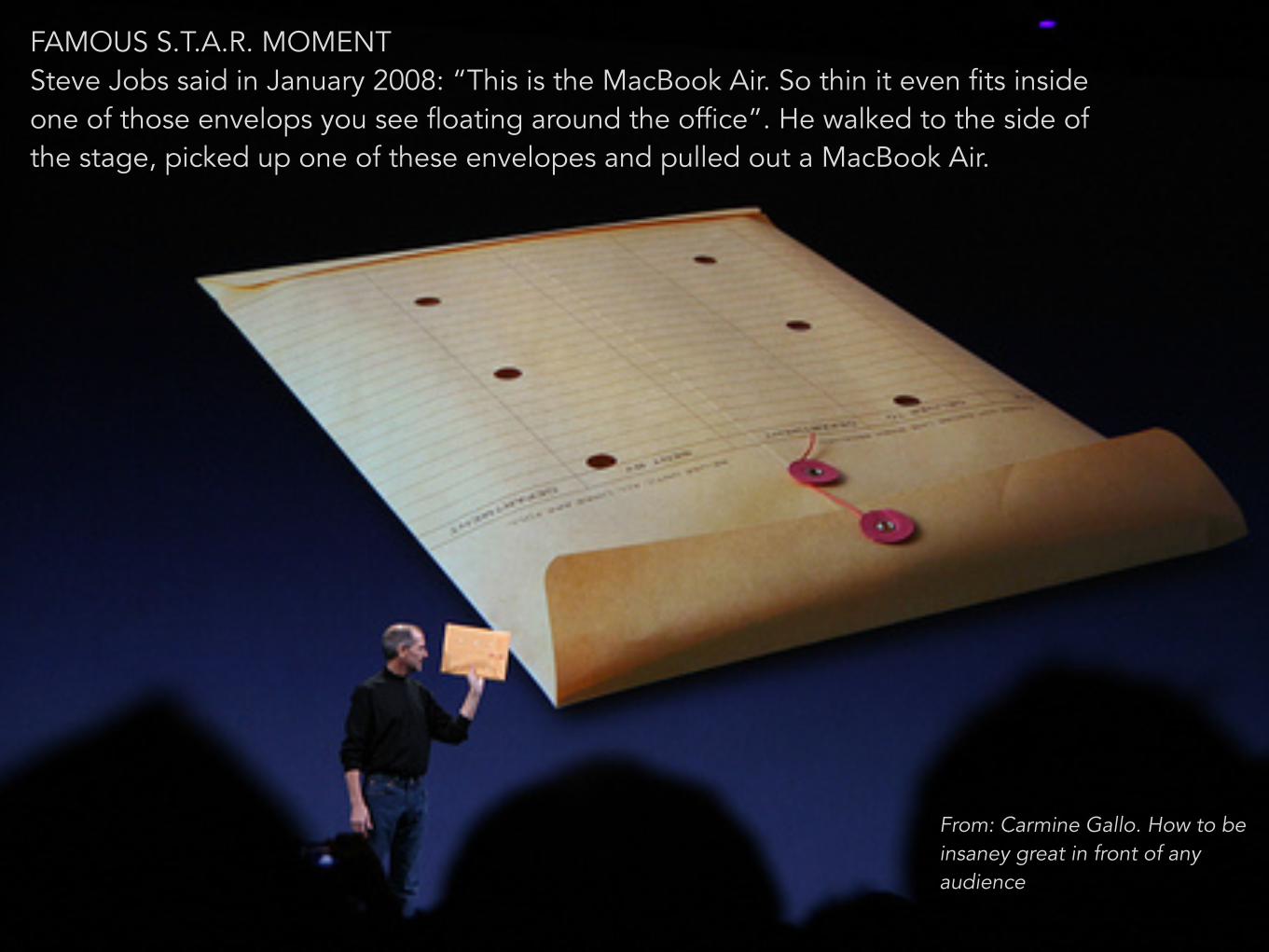
FAMOUS S.T.A.R. MOMENT Steve Jobs said in January 2008: “This is the MacBook Air. So thin it even fits inside one of those envelops you see floating around the office”. He walked to the side of the stage, picked up one of these envelopes and pulled out a MacBook Air.
From: Carmine Gallo. How to be insaney great in front of any audience
19
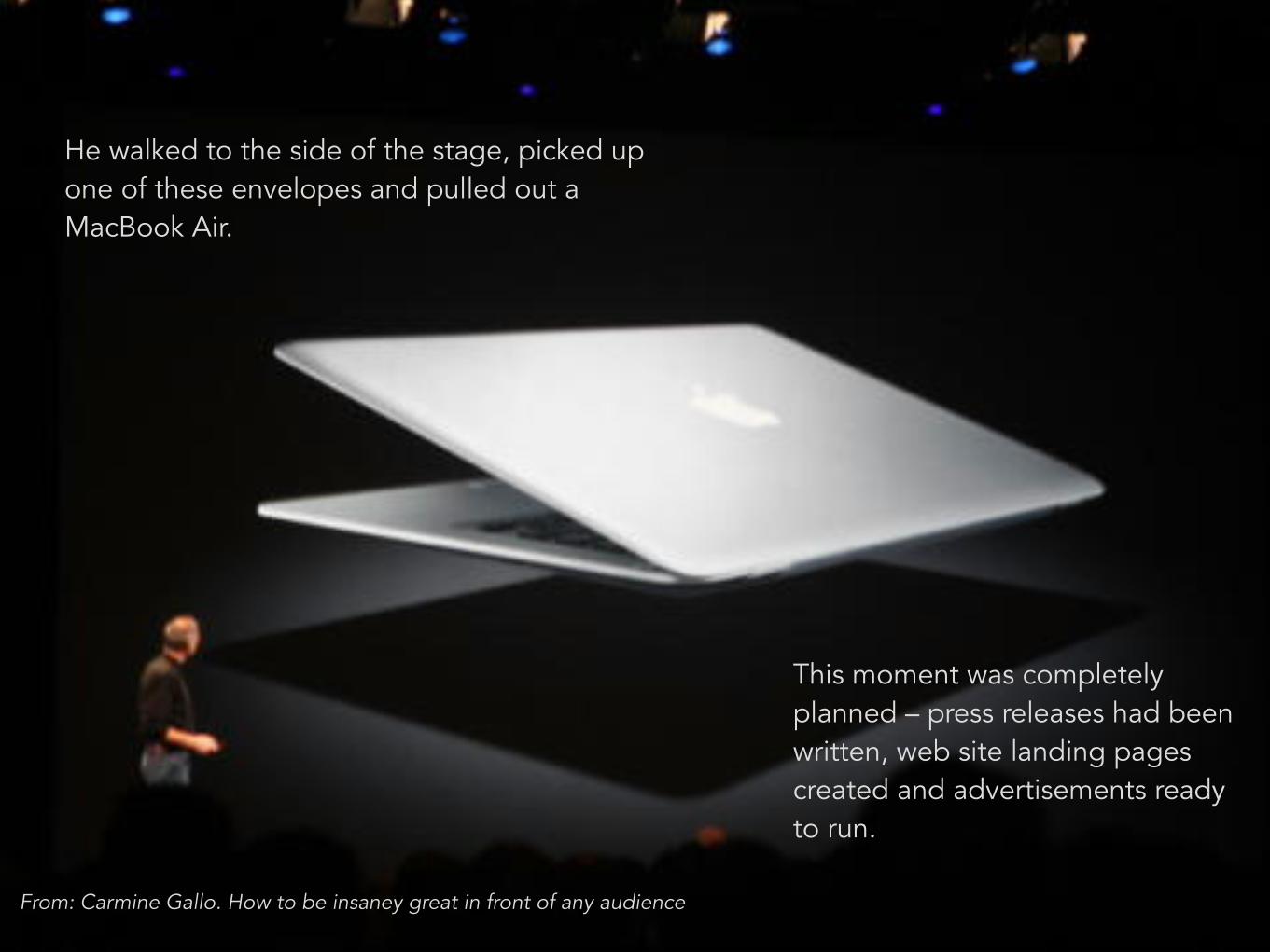
He walked to the side of the stage, picked up one of these envelopes and pulled out a MacBook Air.
This moment was completely planned – press releases had been written, web site landing pages created and advertisements ready to run.
From: Carmine Gallo. How to be insaney great in front of any audience
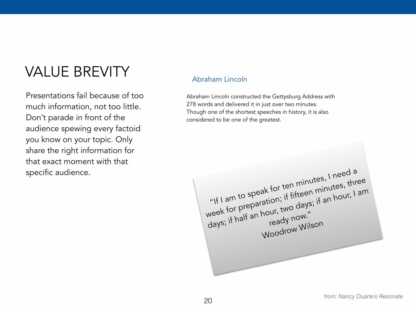
VALUE BREVITYPresentations fail because of too much information, not too little. Don’t parade in front of the audience spewing every factoid you know on your topic. Only share the right information for that exact moment with that specific audience.
from: Nancy Duarte’s Resonate
Abraham Lincoln
Abraham Lincoln constructed the Gettysburg Address with 278 words and delivered it in just over two minutes. Though one of the shortest speeches in history, it is also considered to be one of the greatest.
“If I am to speak for ten minutes, I need a
week for preparation; if fifteen minutes, three
days; if half an hour, two days; if an hour, I am
ready now.”
Woodrow Wilson
20
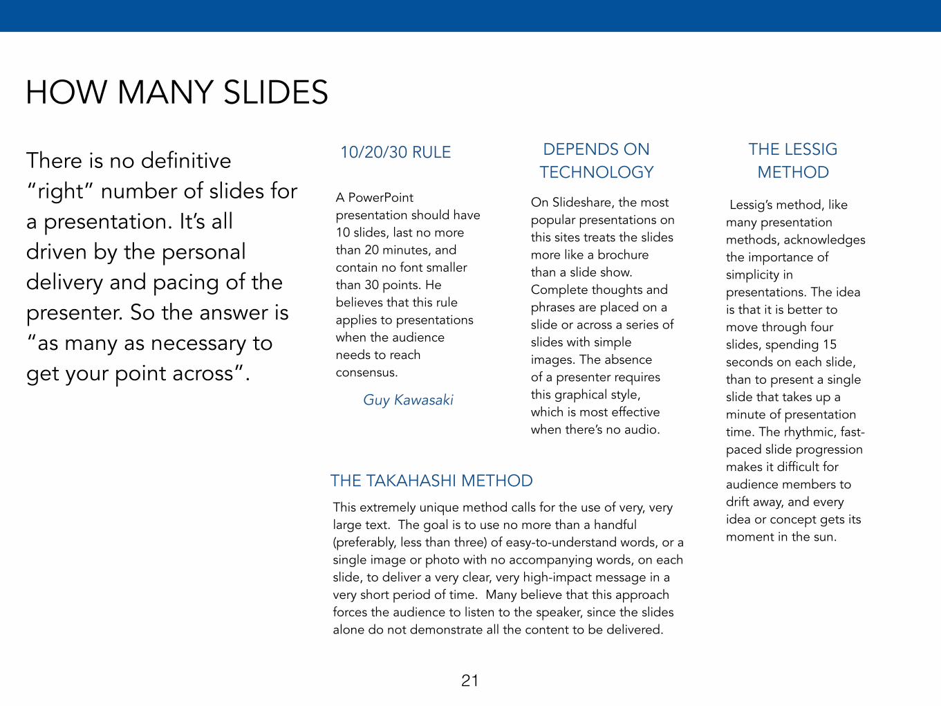
HOW MANY SLIDES
There is no definitive “right” number of slides for a presentation. It’s all driven by the personal delivery and pacing of the presenter. So the answer is “as many as necessary to get your point across”.
10/20/30 RULE
A PowerPoint presentation should have 10 slides, last no more than 20 minutes, and contain no font smaller than 30 points. He believes that this rule applies to presentations when the audience needs to reach consensus.
DEPENDS ON TECHNOLOGY
On Slideshare, the most popular presentations on this sites treats the slides more like a brochure than a slide show. Complete thoughts and phrases are placed on a slide or across a series of slides with simple images. The absence of a presenter requires this graphical style, which is most effective when there’s no audio.
THE LESSIG METHOD
Lessig’s method, like many presentation methods, acknowledges the importance of simplicity in presentations. The idea is that it is better to move through four slides, spending 15 seconds on each slide, than to present a single slide that takes up a minute of presentation time. The rhythmic, fast-paced slide progression makes it difficult for audience members to drift away, and every idea or concept gets its moment in the sun.
Guy Kawasaki
THE TAKAHASHI METHODThis extremely unique method calls for the use of very, very large text. The goal is to use no more than a handful (preferably, less than three) of easy-to-understand words, or a single image or photo with no accompanying words, on each slide, to deliver a very clear, very high-impact message in a very short period of time. Many believe that this approach forces the audience to listen to the speaker, since the slides alone do not demonstrate all the content to be delivered.
21
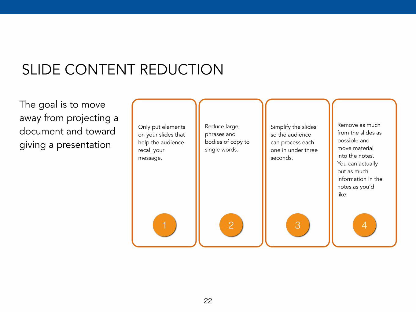
SLIDE CONTENT REDUCTION
The goal is to move away from projecting a document and toward giving a presentation
Only put elements on your slides that help the audience recall your message.
Reduce large phrases and bodies of copy to single words.
Simplify the slides so the audience can process each one in under three seconds.
Remove as much from the slides as possible and move material into the notes. You can actually put as much information in the notes as you’d like.
1 2 3 4
22
23
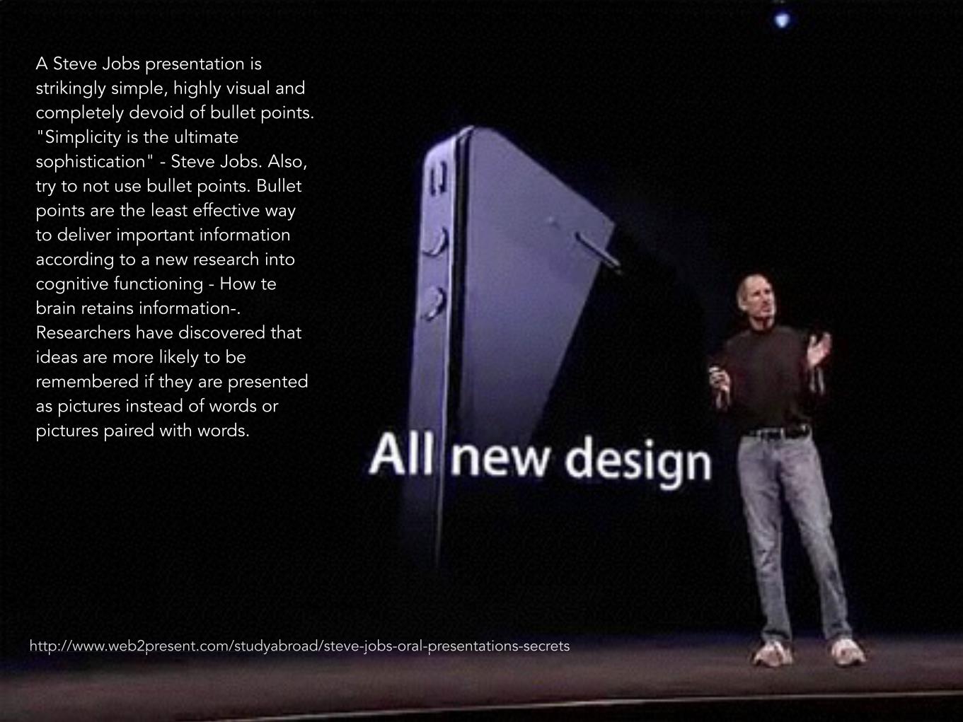
A Steve Jobs presentation is strikingly simple, highly visual and completely devoid of bullet points. "Simplicity is the ultimate sophistication" - Steve Jobs. Also, try to not use bullet points. Bullet points are the least effective way to deliver important information according to a new research into cognitive functioning - How te brain retains information-. Researchers have discovered that ideas are more likely to be remembered if they are presented as pictures instead of words or pictures paired with words.
http://www.web2present.com/studyabroad/steve-jobs-oral-presentations-secrets
2Prepare the presentation
Time
Know your audience
Creating ideas
Sticky notes
Decker’s presentation grid
Cliff Atkinsons’
PREPARE THE PRESENTATION
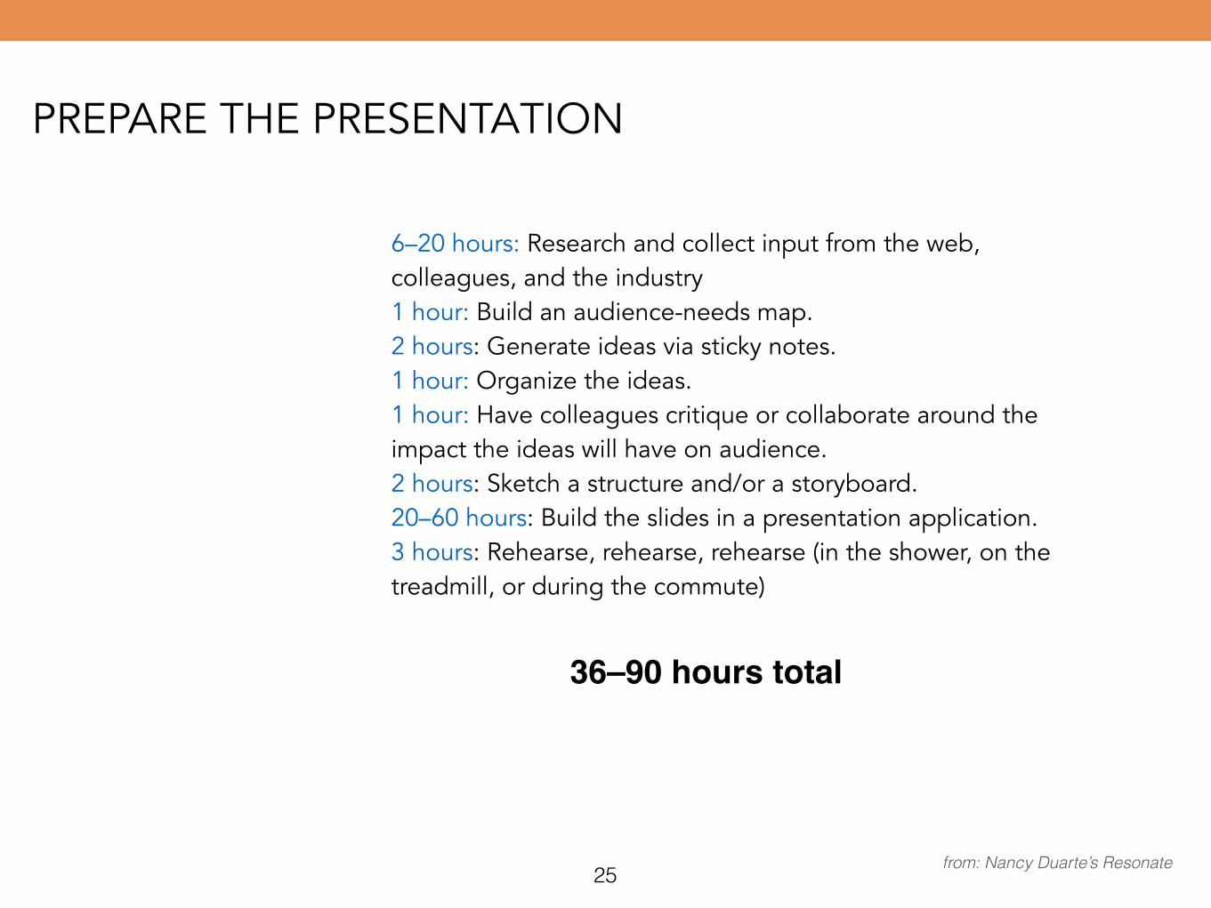
6–20 hours: Research and collect input from the web, colleagues, and the industry 1 hour: Build an audience-needs map. 2 hours: Generate ideas via sticky notes. 1 hour: Organize the ideas. 1 hour: Have colleagues critique or collaborate around the impact the ideas will have on audience. 2 hours: Sketch a structure and/or a storyboard. 20–60 hours: Build the slides in a presentation application. 3 hours: Rehearse, rehearse, rehearse (in the shower, on the treadmill, or during the commute)
25 from: Nancy Duarte’s Resonate
36–90 hours total
KNOW OUR AUDIENCE
26 from: The Open University
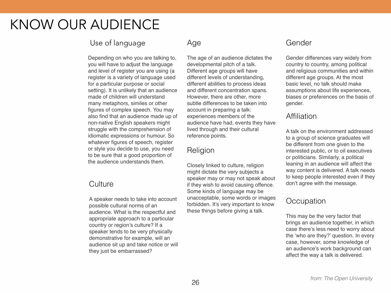
Use of language
Depending on who you are talking to, you will have to adjust the language and level of register you are using (a register is a variety of language used for a particular purpose or social setting). It is unlikely that an audience made of children will understand many metaphors, similes or other figures of complex speech. You may also find that an audience made up of non-native English speakers might struggle with the comprehension of idiomatic expressions or humour. So whatever figures of speech, register or style you decide to use, you need to be sure that a good proportion of the audience understands them.
Age
The age of an audience dictates the developmental pitch of a talk. Different age groups will have different levels of understanding, different abilities to process ideas and different concentration spans. However, there are other, more subtle differences to be taken into account in preparing a talk: experiences members of the audience have had, events they have lived through and their cultural reference points.
Gender
Gender differences vary widely from country to country, among political and religious communities and within different age groups. At the most basic level, no talk should make assumptions about life experiences, biases or preferences on the basis of gender.
Culture
A speaker needs to take into account possible cultural norms of an audience. What is the respectful and appropriate approach to a particular country or region’s culture? If a speaker tends to be very physically demonstrative for example, will an audience sit up and take notice or will they just be embarrassed?
Religion
Closely linked to culture, religion might dictate the very subjects a speaker may or may not speak about if they wish to avoid causing offence. Some kinds of language may be unacceptable, some words or images forbidden. It’s very important to know these things before giving a talk.
Affiliation
A talk on the environment addressed to a group of science graduates will be different from one given to the interested public, or to oil executives or politicians. Similarly, a political leaning in an audience will affect the way content is delivered. A talk needs to keep people interested even if they don’t agree with the message.
Occupation
This may be the very factor that brings an audience together, in which case there’s less need to worry about the ‘who are they?’ question. In every case, however, some knowledge of an audience’s work background can affect the way a talk is delivered.
CREATING IDEAS, NOT SLICES
27
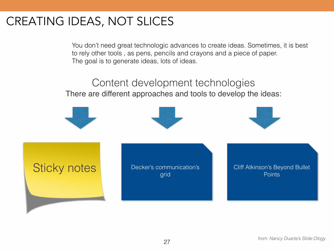
You don’t need great technologic advances to create ideas. Sometimes, it is best to rely other tools , as pens, pencils and crayons and a piece of paper. The goal is to generate ideas, lots of ideas.
Content development technologies There are different approaches and tools to develop the ideas:
Sticky notes Decker’s communication’s grid
Cliff Atkinson’s Beyond Bullet Points
from: Nancy Duarte’s Slide:Ology
STICKY NOTES
Create ideas Tell storiesPrepare and arrange your presentation
Basic concepts of graphic
design
1 2
3
4 5 6Prepare the talk Tips for
delivering
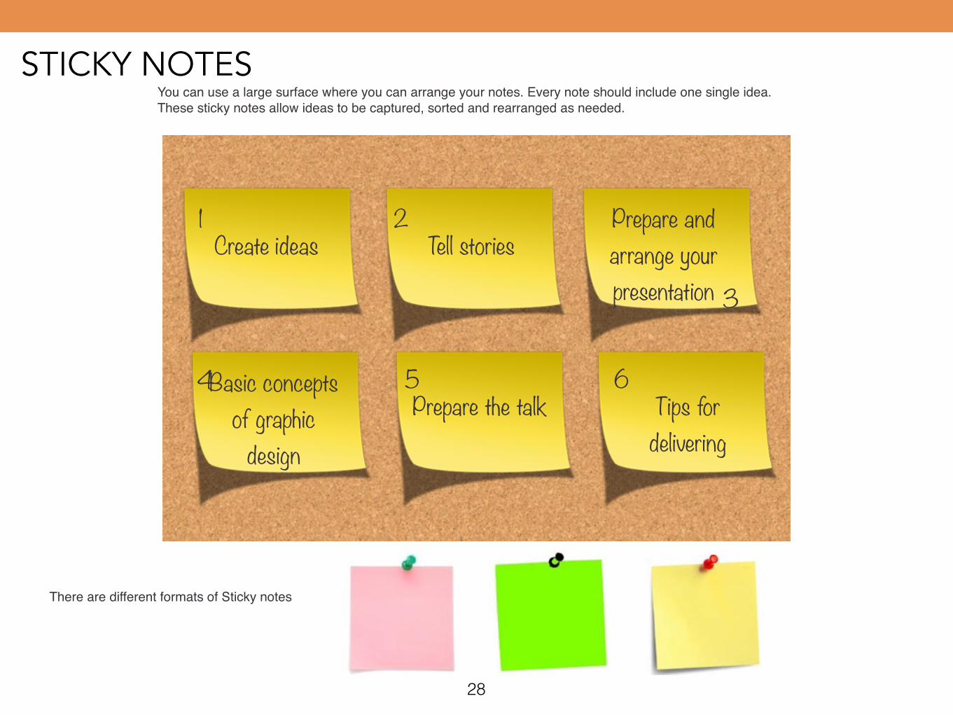
You can use a large surface where you can arrange your notes. Every note should include one single idea. These sticky notes allow ideas to be captured, sorted and rearranged as needed.
There are different formats of Sticky notes
28
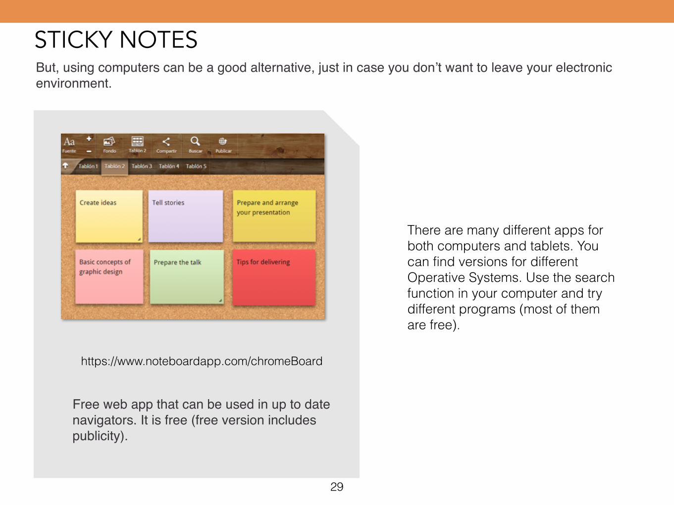
STICKY NOTESBut, using computers can be a good alternative, just in case you don’t want to leave your electronic environment.
https://www.noteboardapp.com/chromeBoard
Free web app that can be used in up to date navigators. It is free (free version includes publicity).
There are many different apps for both computers and tablets. You can find versions for different Operative Systems. Use the search function in your computer and try different programs (most of them are free).
29
STICKY NOTES
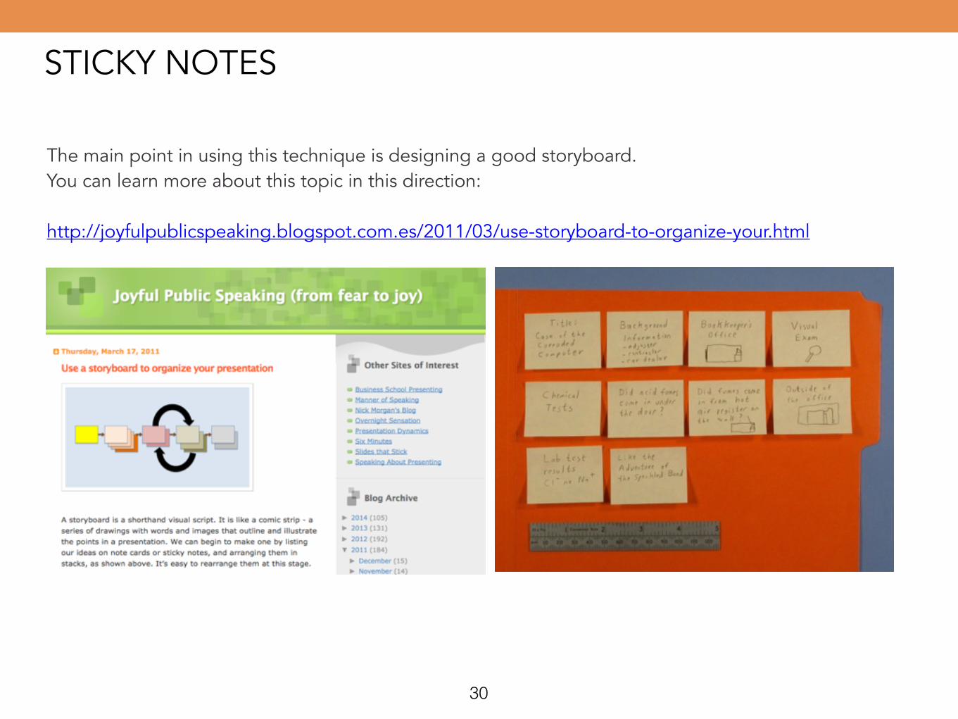
The main point in using this technique is designing a good storyboard. You can learn more about this topic in this direction: !http://joyfulpublicspeaking.blogspot.com.es/2011/03/use-storyboard-to-organize-your.html
30
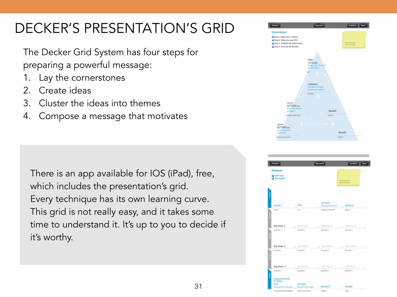
DECKER’S PRESENTATION’S GRID!The Decker Grid System has four steps for preparing a powerful message: 1. Lay the cornerstones 2. Create ideas 3. Cluster the ideas into themes 4. Compose a message that motivates
!There is an app available for IOS (iPad), free, which includes the presentation’s grid. Every technique has its own learning curve. This grid is not really easy, and it takes some time to understand it. It’s up to you to decide if it’s worthy.
31
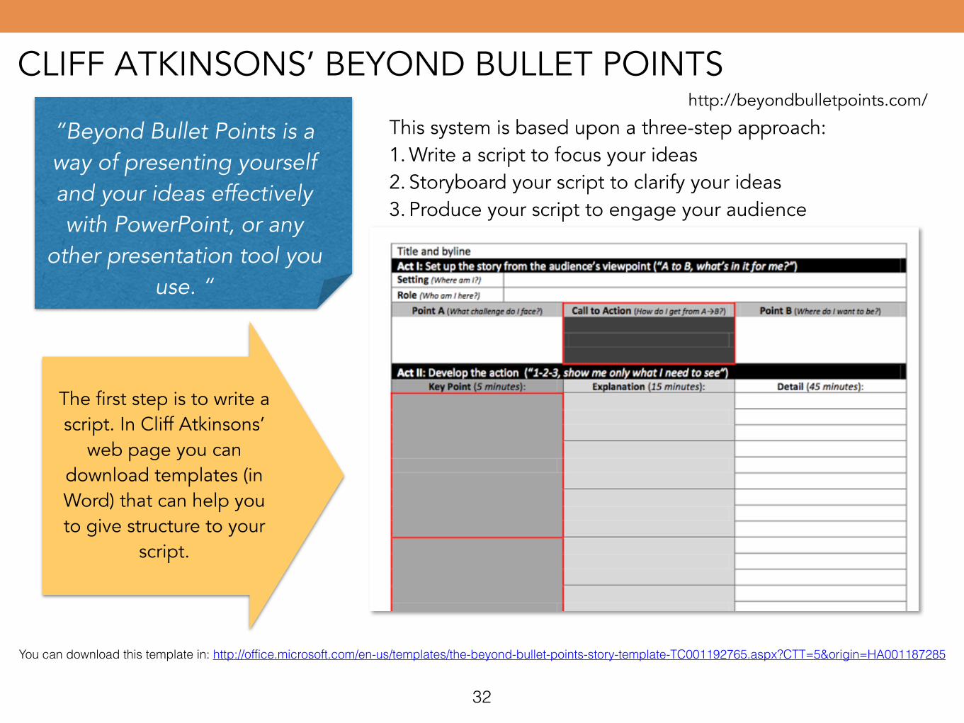
CLIFF ATKINSONS’ BEYOND BULLET POINTShttp://beyondbulletpoints.com/
“Beyond Bullet Points is a way of presenting yourself and your ideas effectively with PowerPoint, or any
other presentation tool you use. “
This system is based upon a three-step approach: 1. Write a script to focus your ideas 2. Storyboard your script to clarify your ideas 3. Produce your script to engage your audience
The first step is to write a script. In Cliff Atkinsons’
web page you can download templates (in Word) that can help you to give structure to your
script.
You can download this template in: http://office.microsoft.com/en-us/templates/the-beyond-bullet-points-story-template-TC001192765.aspx?CTT=5&origin=HA001187285
32
CLIFF ATKINSONS’ BEYOND BULLET POINTShttp://beyondbulletpoints.com/
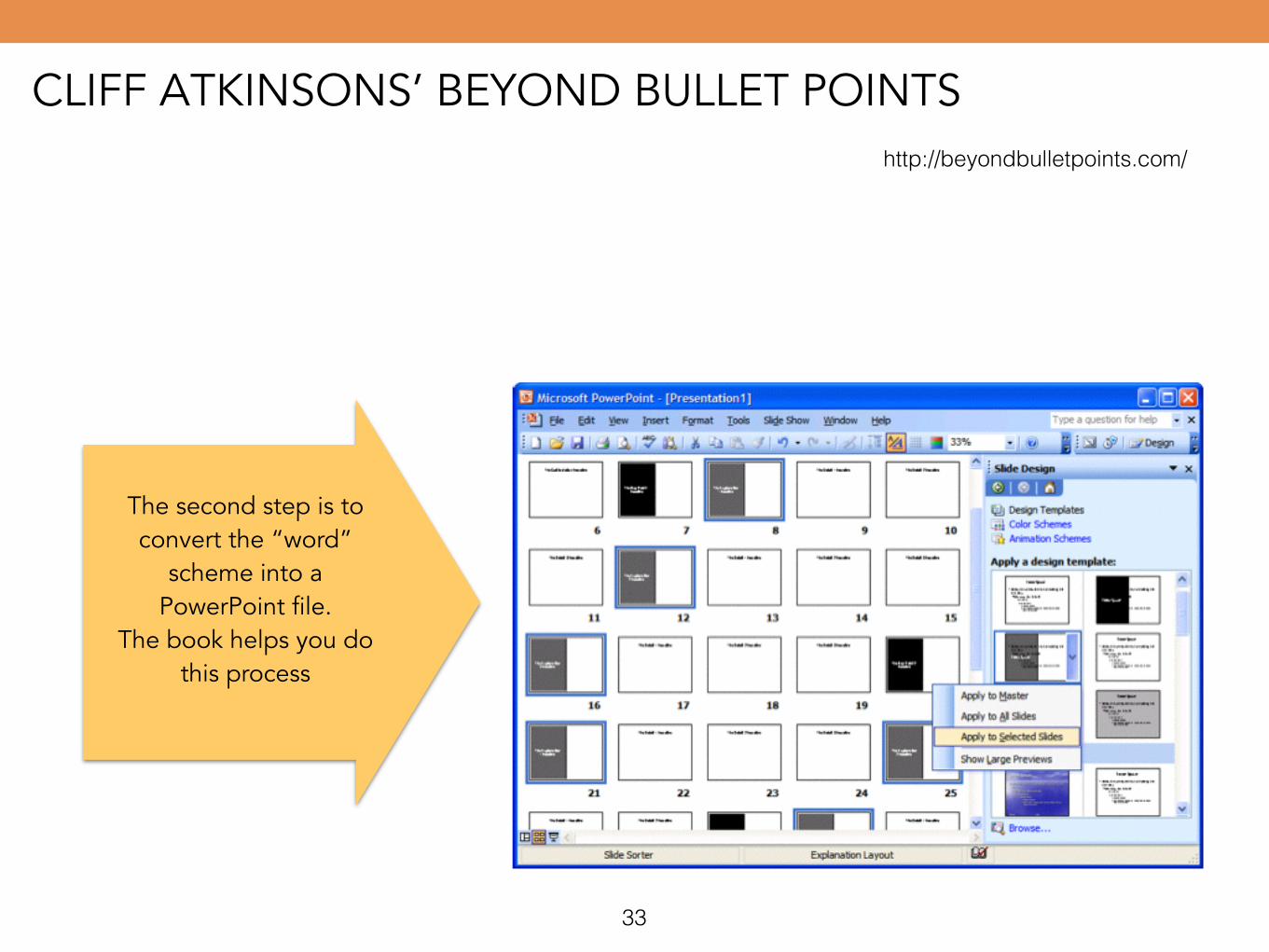
The second step is to convert the “word”
scheme into a PowerPoint file.
The book helps you do this process
33
CLIFF ATKINSONS’ BEYOND BULLET POINTShttp://beyondbulletpoints.com/
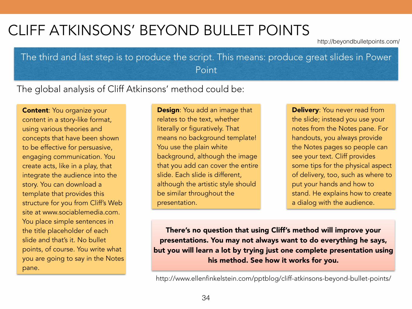
The third and last step is to produce the script. This means: produce great slides in Power Point
The global analysis of Cliff Atkinsons’ method could be:
Content: You organize your content in a story-like format, using various theories and concepts that have been shown to be effective for persuasive, engaging communication. You create acts, like in a play, that integrate the audience into the story. You can download a template that provides this structure for you from Cliff’s Web site at www.sociablemedia.com. You place simple sentences in the title placeholder of each slide and that’s it. No bullet points, of course. You write what you are going to say in the Notes pane.
Design: You add an image that relates to the text, whether literally or figuratively. That means no background template! You use the plain white background, although the image that you add can cover the entire slide. Each slide is different, although the artistic style should be similar throughout the presentation.
Delivery: You never read from the slide; instead you use your notes from the Notes pane. For handouts, you always provide the Notes pages so people can see your text. Cliff provides some tips for the physical aspect of delivery, too, such as where to put your hands and how to stand. He explains how to create a dialog with the audience.
There’s no question that using Cliff’s method will improve your presentations. You may not always want to do everything he says,
but you will learn a lot by trying just one complete presentation using his method. See how it works for you.
http://www.ellenfinkelstein.com/pptblog/cliff-atkinsons-beyond-bullet-points/
34
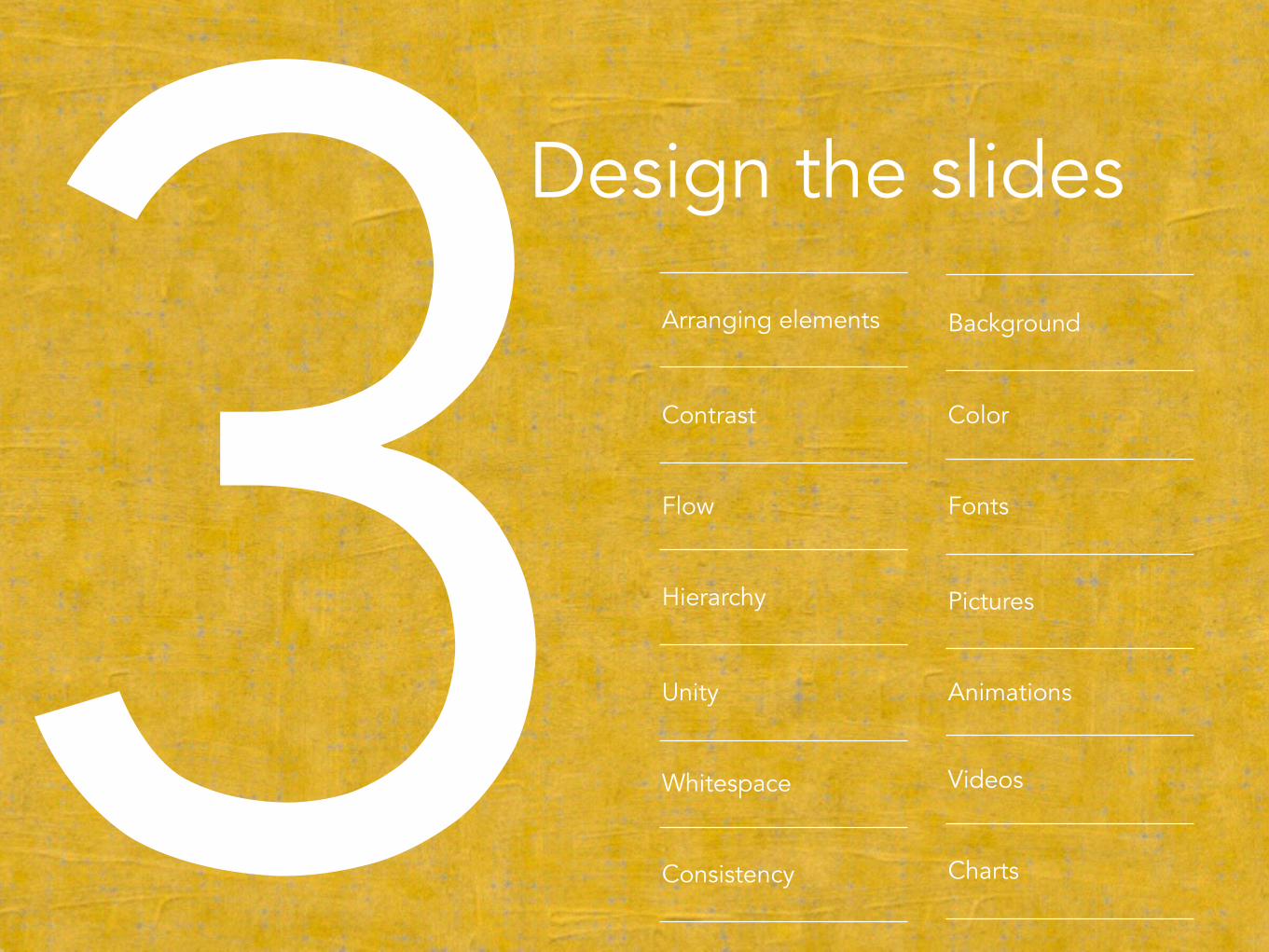
353Design the slides
Arranging elements
Contrast
Flow
Hierarchy
Unity
Whitespace
Consistency
Background
Color
Fonts
Pictures
Animations
Videos
Charts
36
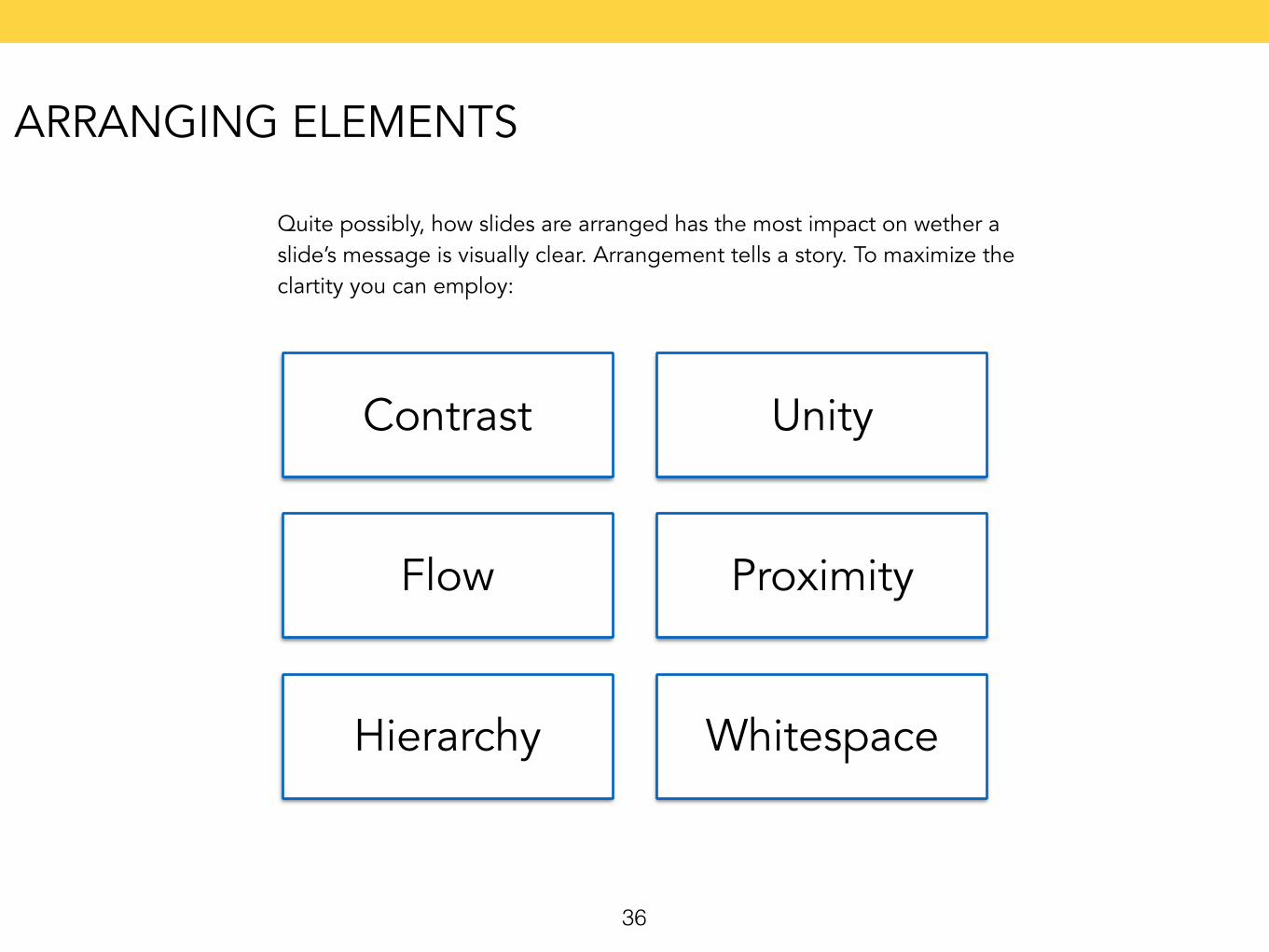
Contrast
Flow
Hierarchy
Unity
Proximity
Whitespace
Quite possibly, how slides are arranged has the most impact on wether a slide’s message is visually clear. Arrangement tells a story. To maximize the clartity you can employ:
ARRANGING ELEMENTS

37
When audience see the difference between the attributes of two or more things, they focus their attention. There are many ways to create contrast on a slide; some examples:
Size Shape Shade Color Proximity
The idea is to use just notable differences, visual elements that make a clear difference but no more—contrasts that are definitive,
effective and minimal.
Edward R. Tufte
CONTRAST
38
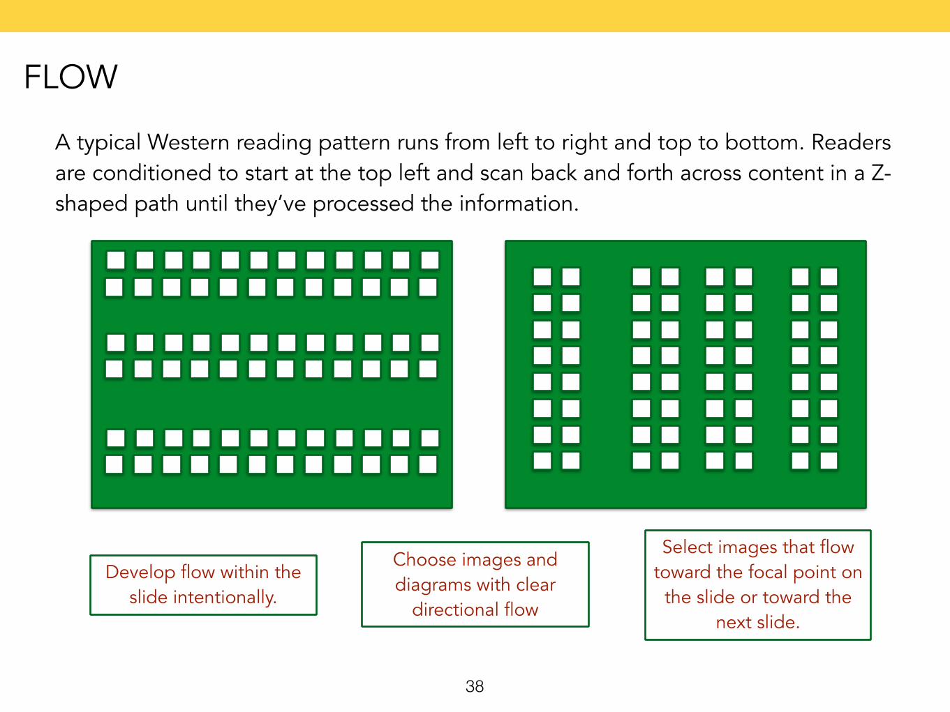
A typical Western reading pattern runs from left to right and top to bottom. Readers are conditioned to start at the top left and scan back and forth across content in a Z-shaped path until they’ve processed the information.
Develop flow within the slide intentionally.
Choose images and diagrams with clear
directional flow
Select images that flow toward the focal point on
the slide or toward the next slide.
FLOW
39
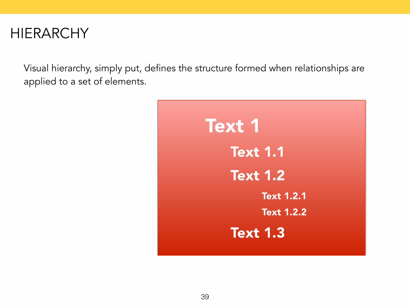
Visual hierarchy, simply put, defines the structure formed when relationships are applied to a set of elements.
Text 1Text 1.1Text 1.2
Text 1.2.1Text 1.2.2
Text 1.3
HIERARCHY
40
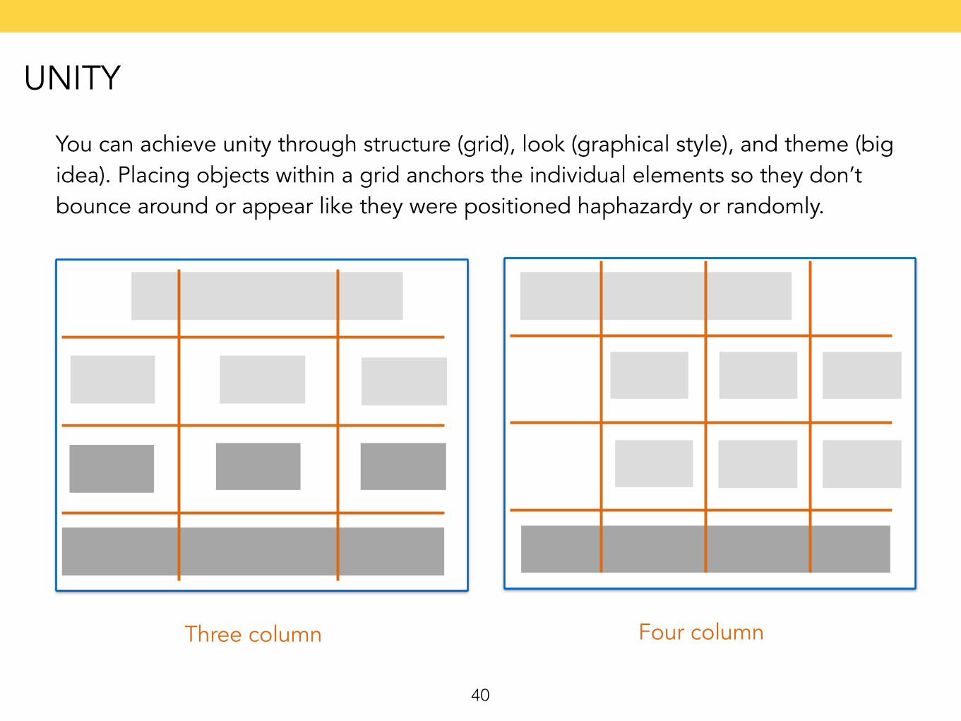
You can achieve unity through structure (grid), look (graphical style), and theme (big idea). Placing objects within a grid anchors the individual elements so they don’t bounce around or appear like they were positioned haphazardy or randomly.
Three column Four column
UNITY
41
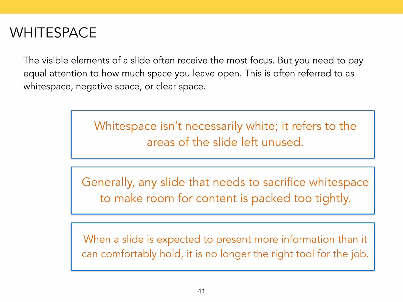
The visible elements of a slide often receive the most focus. But you need to pay equal attention to how much space you leave open. This is often referred to as whitespace, negative space, or clear space.
Whitespace isn’t necessarily white; it refers to the areas of the slide left unused.
Generally, any slide that needs to sacrifice whitespace to make room for content is packed too tightly.
When a slide is expected to present more information than it can comfortably hold, it is no longer the right tool for the job.
WHITESPACE
42
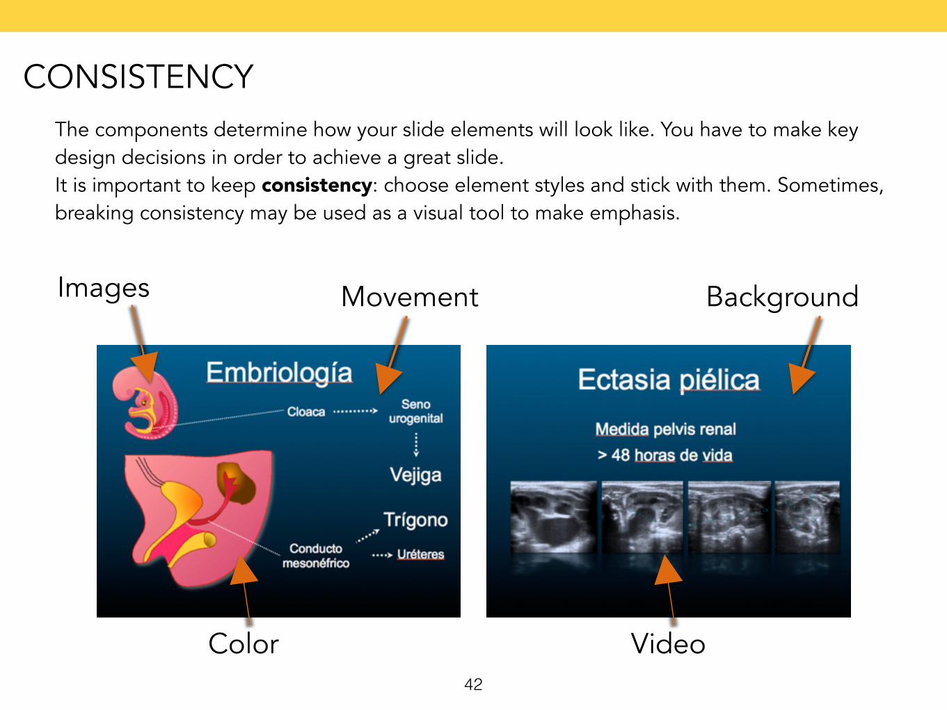
The components determine how your slide elements will look like. You have to make key design decisions in order to achieve a great slide. It is important to keep consistency: choose element styles and stick with them. Sometimes, breaking consistency may be used as a visual tool to make emphasis.
Background
Color
Images
Video
Movement
CONSISTENCY
43
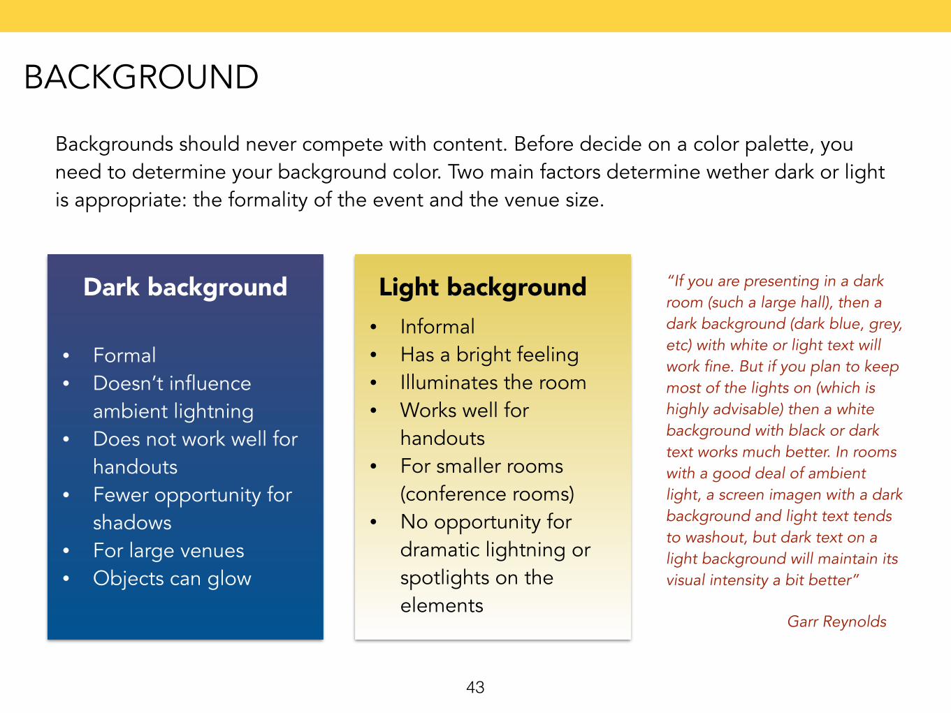
Backgrounds should never compete with content. Before decide on a color palette, you need to determine your background color. Two main factors determine wether dark or light is appropriate: the formality of the event and the venue size.
Dark background Light background
• Formal • Doesn’t influence
ambient lightning • Does not work well for
handouts • Fewer opportunity for
shadows • For large venues • Objects can glow
• Informal • Has a bright feeling • Illuminates the room • Works well for
handouts • For smaller rooms
(conference rooms) • No opportunity for
dramatic lightning or spotlights on the elements
“If you are presenting in a dark room (such a large hall), then a dark background (dark blue, grey, etc) with white or light text will work fine. But if you plan to keep most of the lights on (which is highly advisable) then a white background with black or dark text works much better. In rooms with a good deal of ambient light, a screen imagen with a dark background and light text tends to washout, but dark text on a light background will maintain its visual intensity a bit better”
Garr Reynolds
BACKGROUND
44
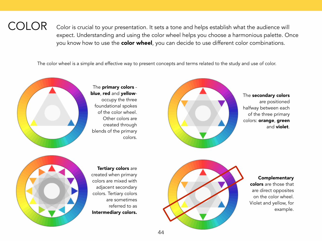
Color is crucial to your presentation. It sets a tone and helps establish what the audience will expect. Understanding and using the color wheel helps you choose a harmonious palette. Once you know how to use the color wheel, you can decide to use different color combinations.
The color wheel is a simple and effective way to present concepts and terms related to the study and use of color.
The primary colors - blue, red and yellow-
occupy the three foundational spokes
of the color wheel. Other colors are created through
blends of the primary colors.
The secondary colors are positioned
halfway between each of the three primary
colors: orange, green and violet.
Tertiary colors are created when primary colors are mixed with
adjacent secondary colors. Tertiary colors
are sometimes referred to as
Intermediary colors.
Complementary colors are those that are direct opposites on the color wheel.
Violet and yellow, for example.
COLOR
45
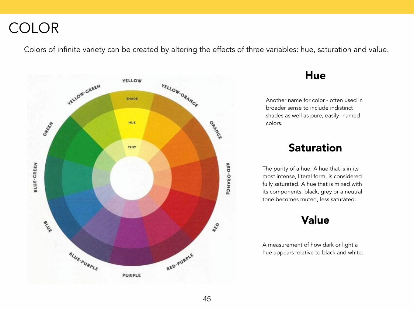
Colors of infinite variety can be created by altering the effects of three variables: hue, saturation and value.
Another name for color - often used in broader sense to include indistinct shades as well as pure, easily- named colors.
Hue
The purity of a hue. A hue that is in its most intense, literal form, is considered fully saturated. A hue that is mixed with its components, black, grey or a neutral tone becomes muted, less saturated.
Saturation
A measurement of how dark or light a hue appears relative to black and white.
Value
COLOR
46
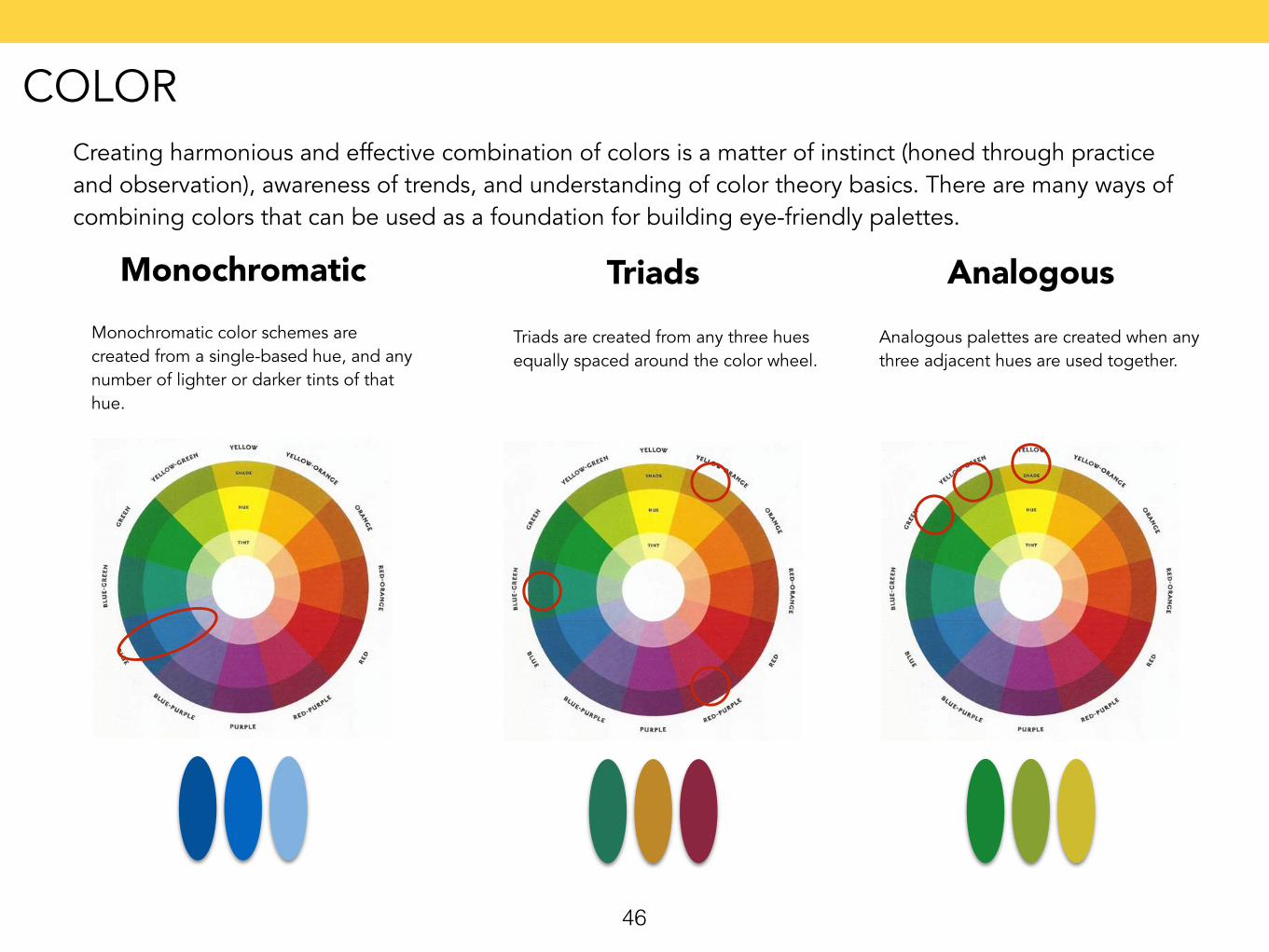
Creating harmonious and effective combination of colors is a matter of instinct (honed through practice and observation), awareness of trends, and understanding of color theory basics. There are many ways of combining colors that can be used as a foundation for building eye-friendly palettes.
Monochromatic color schemes are created from a single-based hue, and any number of lighter or darker tints of that hue.
Monochromatic
Triads are created from any three hues equally spaced around the color wheel.
TriadsAnalogous palettes are created when any three adjacent hues are used together.
Analogous
COLOR
47
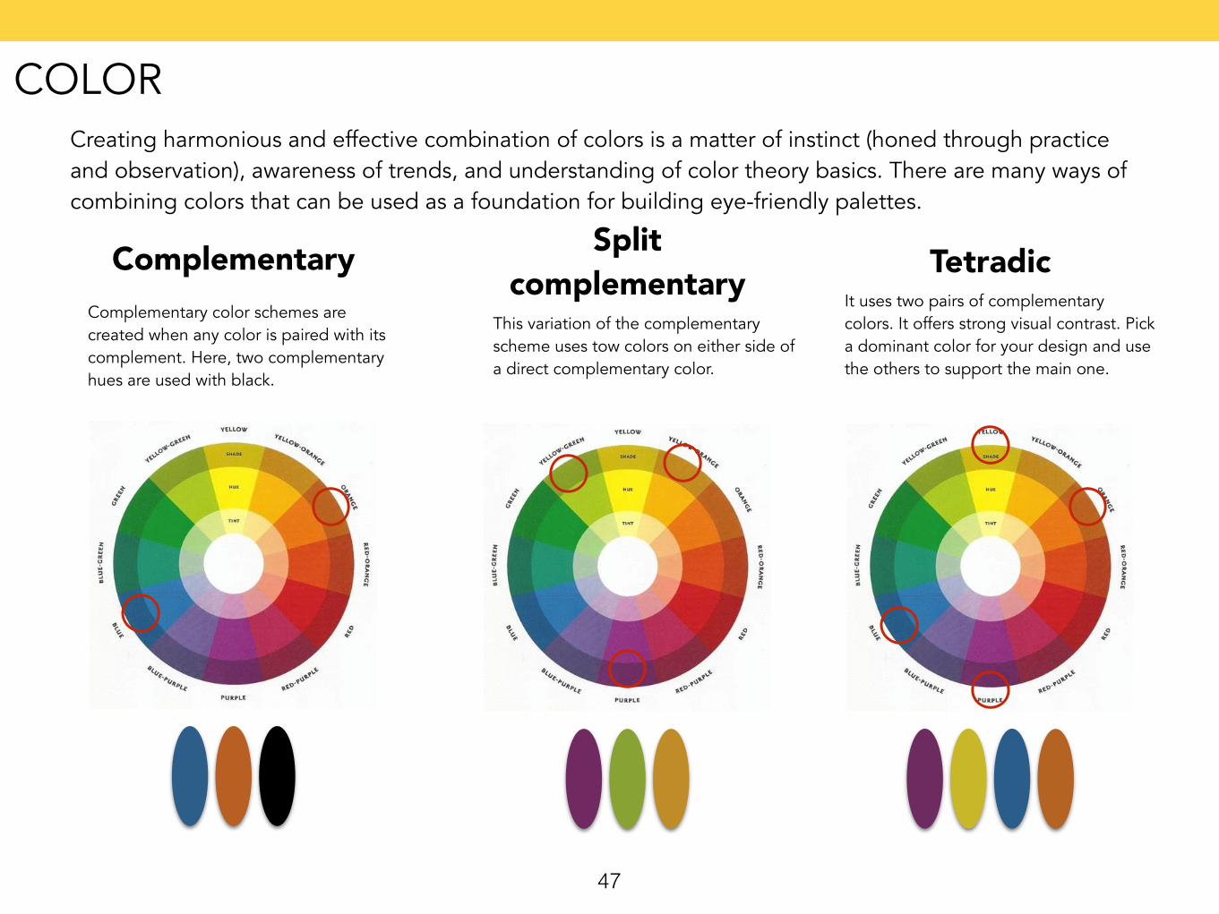
Creating harmonious and effective combination of colors is a matter of instinct (honed through practice and observation), awareness of trends, and understanding of color theory basics. There are many ways of combining colors that can be used as a foundation for building eye-friendly palettes.
Complementary color schemes are created when any color is paired with its complement. Here, two complementary hues are used with black.
Complementary
This variation of the complementary scheme uses tow colors on either side of a direct complementary color.
Split complementary
It uses two pairs of complementary colors. It offers strong visual contrast. Pick a dominant color for your design and use the others to support the main one.
Tetradic
COLOR
48
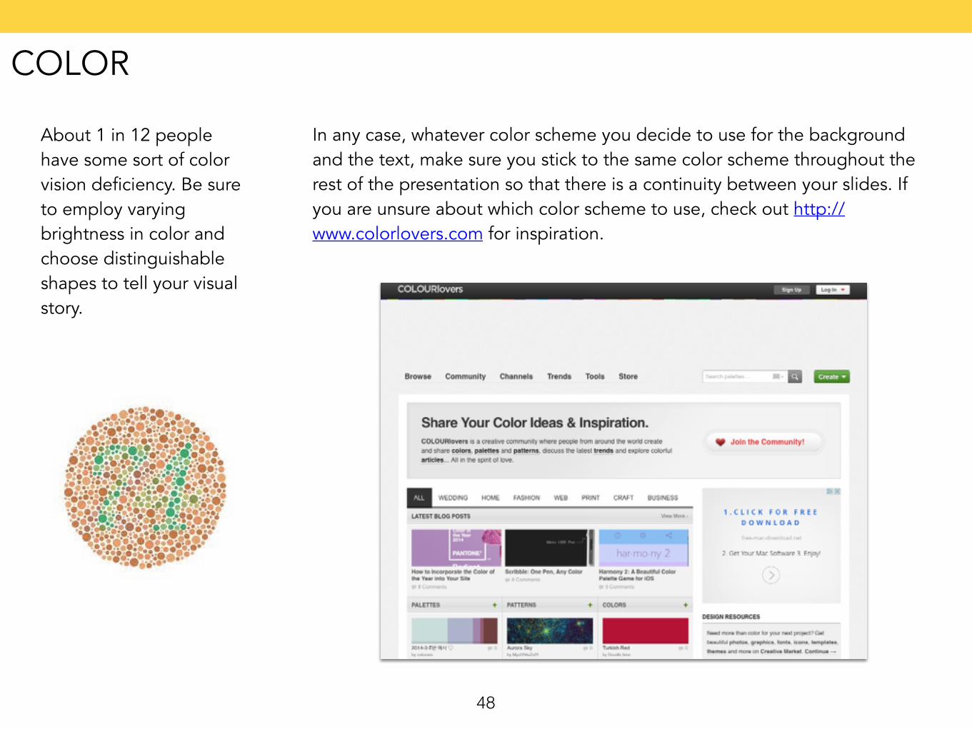
About 1 in 12 people have some sort of color vision deficiency. Be sure to employ varying brightness in color and choose distinguishable shapes to tell your visual story.
In any case, whatever color scheme you decide to use for the background and the text, make sure you stick to the same color scheme throughout the rest of the presentation so that there is a continuity between your slides. If you are unsure about which color scheme to use, check out http://www.colorlovers.com for inspiration.
COLOR
49
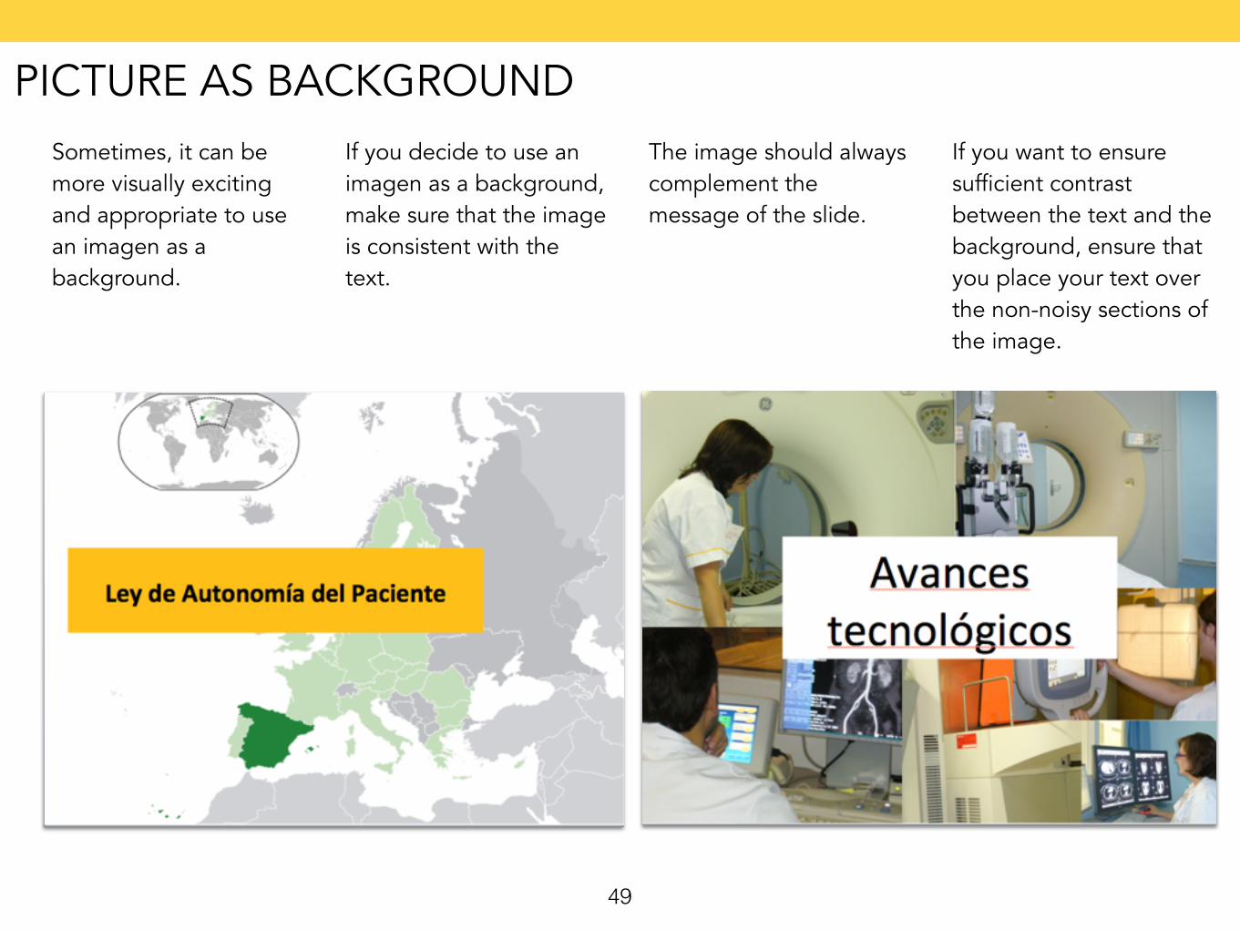
Sometimes, it can be more visually exciting and appropriate to use an imagen as a background.
If you decide to use an imagen as a background, make sure that the image is consistent with the text.
The image should always complement the message of the slide.
If you want to ensure sufficient contrast between the text and the background, ensure that you place your text over the non-noisy sections of the image.
PICTURE AS BACKGROUND
50
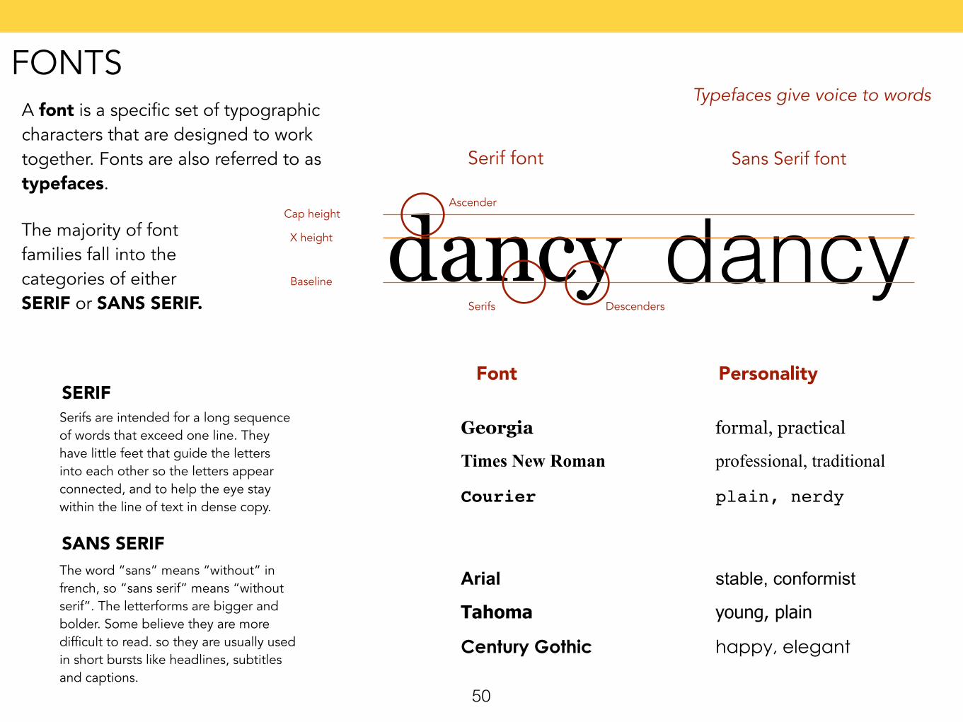
A font is a specific set of typographic characters that are designed to work together. Fonts are also referred to as typefaces.
Typefaces give voice to words
The majority of font families fall into the categories of either SERIF or SANS SERIF.
dancydancySerif font Sans Serif font
Cap height
X height
Baseline
Serifs Descenders
Ascender
SERIFSerifs are intended for a long sequence of words that exceed one line. They have little feet that guide the letters into each other so the letters appear connected, and to help the eye stay within the line of text in dense copy.
Font Personality
Georgia formal, practical
Times New Roman professional, traditional
Courier plain, nerdy
SANS SERIFThe word “sans” means “without” in french, so “sans serif” means “without serif”. The letterforms are bigger and bolder. Some believe they are more difficult to read. so they are usually used in short bursts like headlines, subtitles and captions.
Arial stable, conformist
Tahoma young, plain
Century Gothic happy, elegant
FONTS
51
The debates still rage about which type is most suited for legibility. The results of many studies remain inconclusive.
Type that is presented in upper and lower case is generally considered the easiest to read.
A serif font, upper and lower case, is said to be the pinnacle of legibility, especially for extended passages of text.
ALL CAPS ARE FINE IN SHORT BUSTS (SUCH AS A HEADLINE OR A BRIEF CAPTION) BUT RAISE READABILITY ISSUES WHEN USED FOR LONGER PASSAGES.
TOO MUCH OR TOO LITTLE LETTERSPACING CAN INTERFERE WITH LEGIBILITY. THE DESIGNER MUST DECIDE WHAT IS ACCEPTABLE FOR A GIVEN PURPOSE.
Novelty fonts do well in conveying certain themes, though sometimes at the expenses of legibility.
Color also affects legibility. The eyesight and expectations of the audience are critical factors in determining what,s okay.
FONTS
52
Stick to two font types. Simplicity and consistency are the keys to a good presentation. Thus, don’t use too many fonts.
Use one font for extra-large text to draw attention and another for smaller-sized texts.
When pairing different fonts together, make sure that you choose fonts that have similar personalities.
Try to use fonts that contain a large family (condensed, regular, bold, italic, etc).
It is important that you embed all new fonts into your presentations software, otherwise they won’t display properly or other computers. Another option would be to save your presentation as a PDF.
When designing your presentation, design it for the person sitting at the back of the room. This means that your font size should be large enough for the person sitting furthest away from you to read clearly.
FONTS
53
54
Comic Sans MS, commonly referred to as Comic Sans, is a sans-serif casual script typeface. The modern Comic Sans was designed by Vincent Connare and released in 1994 by Microsoft Corporation. It is classified as a casual, non-connecting script, and was designed to imitate the historical look of comic book lettering, for use in informal documents. The typeface has been supplied with Microsoft Windows since the introduction of Windows 95, initially as a supplemental font in the Windows Plus Pack and later in Microsoft Comic Chat. The typeface's widespread use, often in situations for which it was not intended, has been criticized.
Read more about this in: http://www.comicsanscriminal.com
http://en.wikipedia.org/wiki/Comic_Sans
WHAT ABOUT COMICS SANS?
55
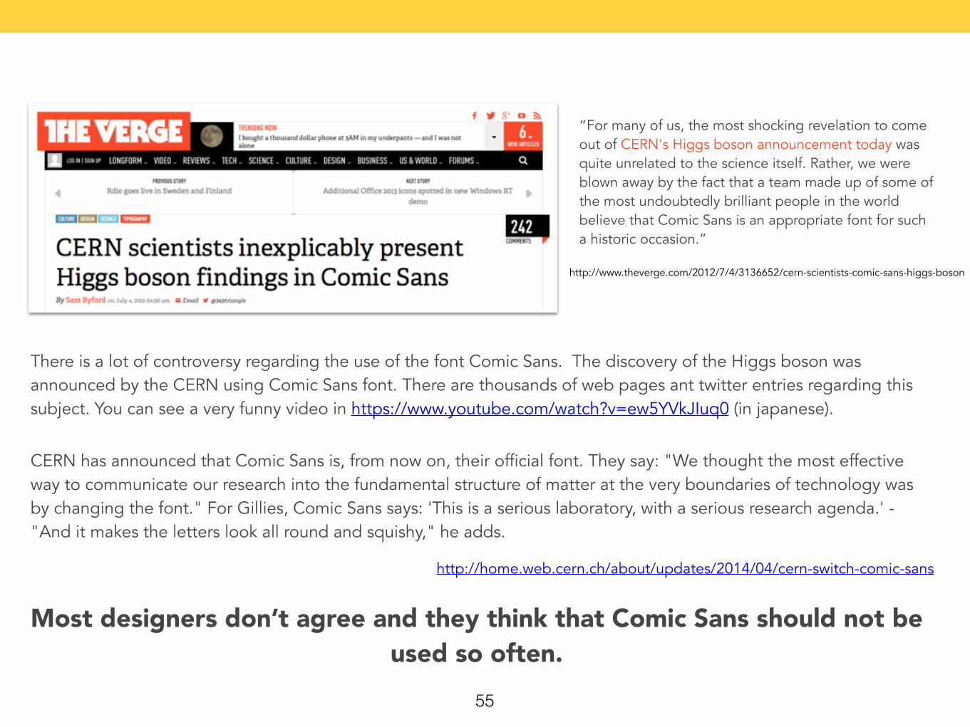
“For many of us, the most shocking revelation to come out of CERN's Higgs boson announcement today was quite unrelated to the science itself. Rather, we were blown away by the fact that a team made up of some of the most undoubtedly brilliant people in the world believe that Comic Sans is an appropriate font for such a historic occasion.”
http://www.theverge.com/2012/7/4/3136652/cern-scientists-comic-sans-higgs-boson
There is a lot of controversy regarding the use of the font Comic Sans. The discovery of the Higgs boson was announced by the CERN using Comic Sans font. There are thousands of web pages ant twitter entries regarding this subject. You can see a very funny video in https://www.youtube.com/watch?v=ew5YVkJIuq0 (in japanese).
http://home.web.cern.ch/about/updates/2014/04/cern-switch-comic-sans
CERN has announced that Comic Sans is, from now on, their official font. They say: "We thought the most effective way to communicate our research into the fundamental structure of matter at the very boundaries of technology was by changing the font." For Gillies, Comic Sans says: 'This is a serious laboratory, with a serious research agenda.' - "And it makes the letters look all round and squishy," he adds.
Most designers don’t agree and they think that Comic Sans should not be used so often.
56
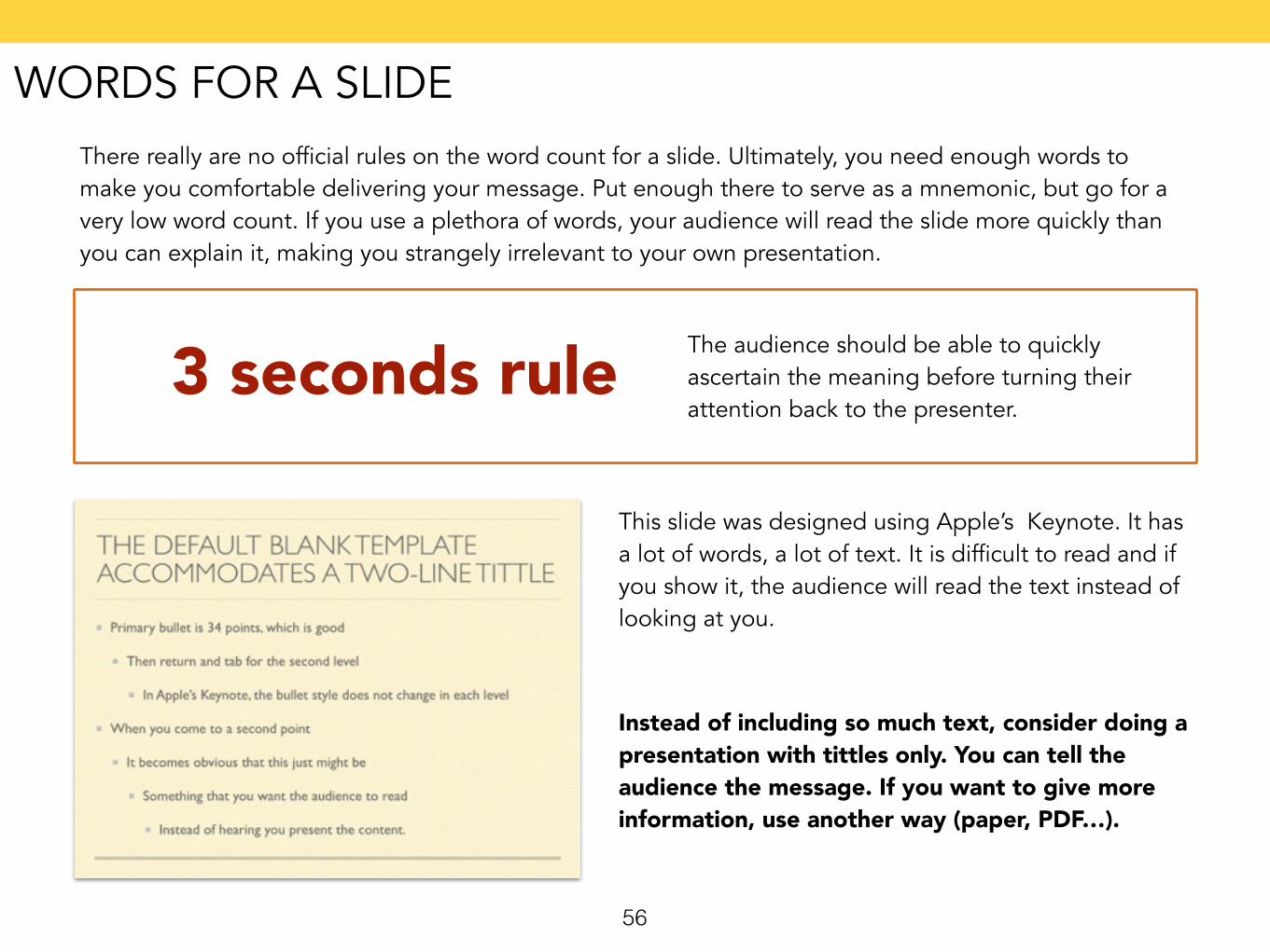
There really are no official rules on the word count for a slide. Ultimately, you need enough words to make you comfortable delivering your message. Put enough there to serve as a mnemonic, but go for a very low word count. If you use a plethora of words, your audience will read the slide more quickly than you can explain it, making you strangely irrelevant to your own presentation.
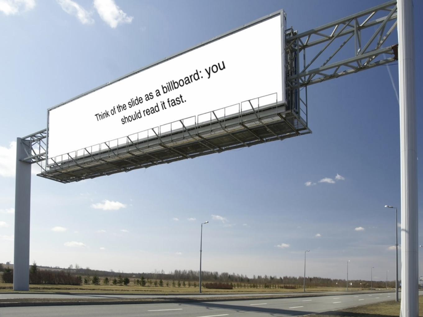
3 seconds rule The audience should be able to quickly ascertain the meaning before turning their attention back to the presenter.
This slide was designed using Apple’s Keynote. It has a lot of words, a lot of text. It is difficult to read and if you show it, the audience will read the text instead of looking at you.
Instead of including so much text, consider doing a presentation with tittles only. You can tell the audience the message. If you want to give more information, use another way (paper, PDF…).
WORDS FOR A SLIDE
57
1. Measure the diagonal length of your computer screen. Let’s say it’s a 21 inch monitor. Using a tape measure, place a piece of tape 21 feet from your screen. If your screen is 17 inches, place the tape 17 feet away, etc. Then, launch a slide on your screen into slide show mode. Whatever you cannot see from behind the piece of tape probably can’t be seen by the back of the room.
2. Put your file into slide sorter view. Look at the slides at 66 percent size. If you can still read them, so can your audience.
3. Stand in the back of the room at your venue and click through all the slides so you know what people in the back row will see.
4. Follow the advice of Guy Kawasaki, author and former Apple Fellow: “A good rule of thumb for font size is to divide the oldest investor’s age by two, and use that font size.”
VALIDATING YOUR FONT SIZE
58
It is important to use images as an aid to enhance your message. You should take your time to select a family of images that works well together. Consider also the content of your photography.
Photos are easy to find and use. • They work well to support ideas. • A simple photo is always best. • Landscape and still-life photos are great for evoking the mood.
There are many web services that include free images. Take care: some of them are announced as free, but you have to pay if you want to download the image. Before using a photo, read the image license.
http://www.freeimages.com/
http://www.morguefile.com/
http://pixabay.com/
http://www.freegreatpicture.com/
PICTURES
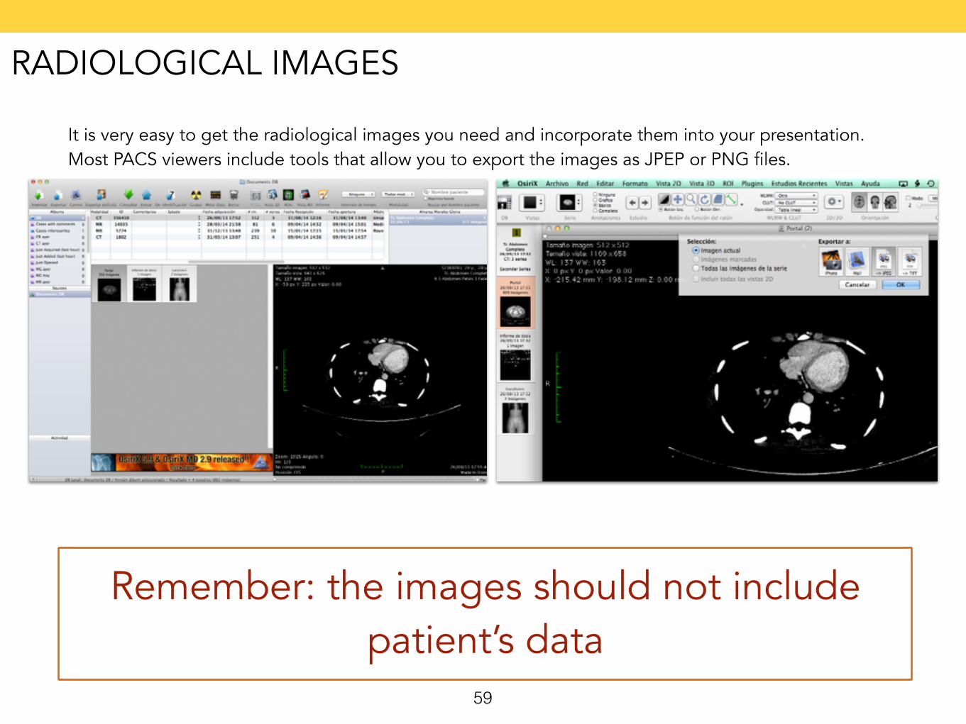
It is very easy to get the radiological images you need and incorporate them into your presentation. Most PACS viewers include tools that allow you to export the images as JPEP or PNG files.
Remember: the images should not include patient’s data
59
RADIOLOGICAL IMAGES
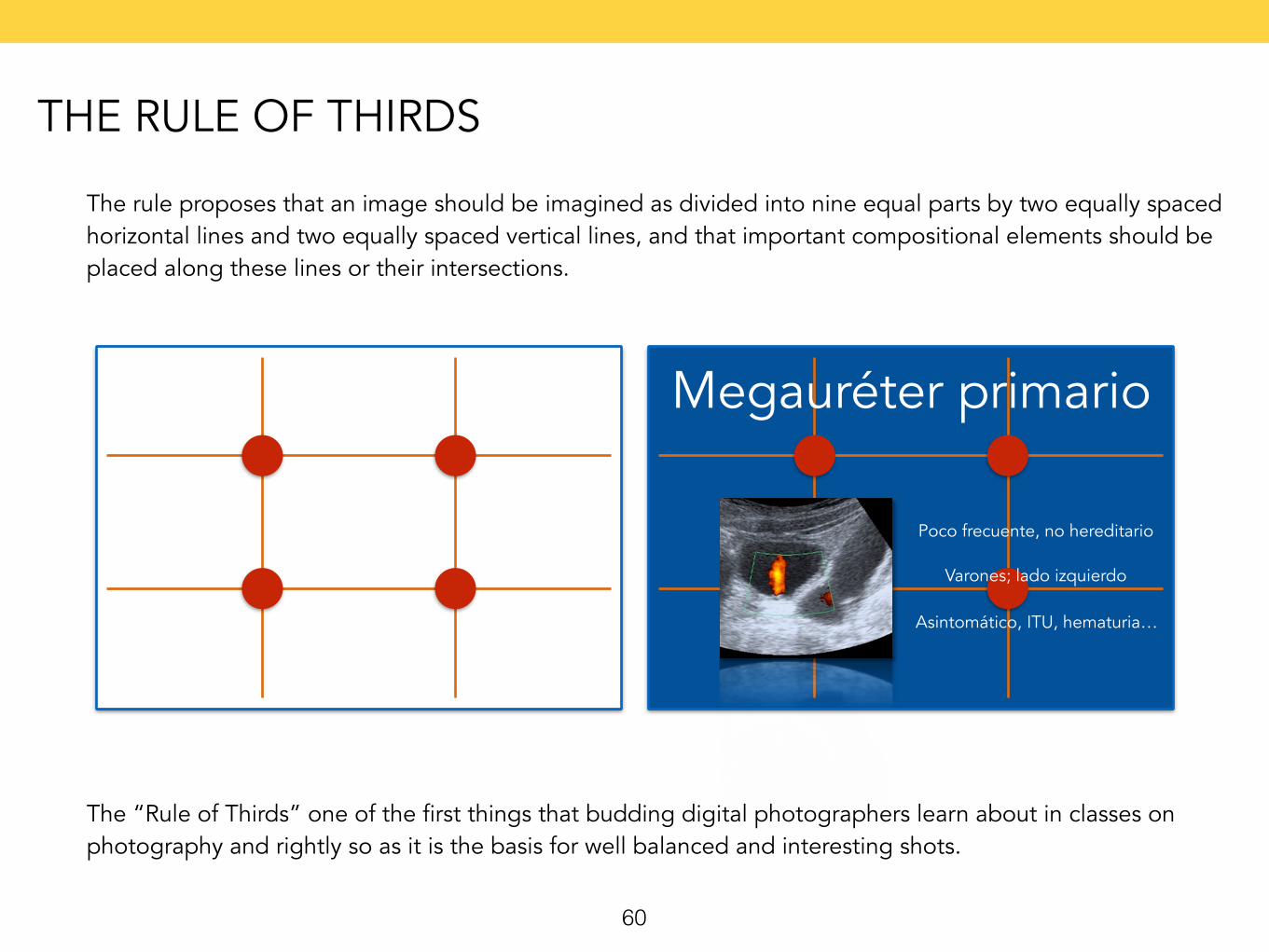
The rule proposes that an image should be imagined as divided into nine equal parts by two equally spaced horizontal lines and two equally spaced vertical lines, and that important compositional elements should be placed along these lines or their intersections.
Megauréter primario
Poco frecuente, no hereditario
Varones; lado izquierdo
Asintomático, ITU, hematuria…
The “Rule of Thirds” one of the first things that budding digital photographers learn about in classes on photography and rightly so as it is the basis for well balanced and interesting shots.
60
THE RULE OF THIRDS
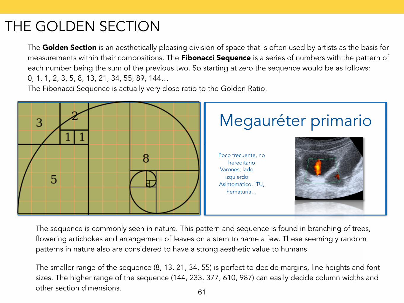
The Golden Section is an aesthetically pleasing division of space that is often used by artists as the basis for measurements within their compositions. The Fibonacci Sequence is a series of numbers with the pattern of each number being the sum of the previous two. So starting at zero the sequence would be as follows: 0, 1, 1, 2, 3, 5, 8, 13, 21, 34, 55, 89, 144… The Fibonacci Sequence is actually very close ratio to the Golden Ratio.
The sequence is commonly seen in nature. This pattern and sequence is found in branching of trees, flowering artichokes and arrangement of leaves on a stem to name a few. These seemingly random patterns in nature also are considered to have a strong aesthetic value to humans
Megauréter primario
Poco frecuente, no hereditario
Varones; lado izquierdo
Asintomático, ITU, hematuria…
The smaller range of the sequence (8, 13, 21, 34, 55) is perfect to decide margins, line heights and font sizes. The higher range of the sequence (144, 233, 377, 610, 987) can easily decide column widths and other section dimensions. 61
THE GOLDEN SECTION
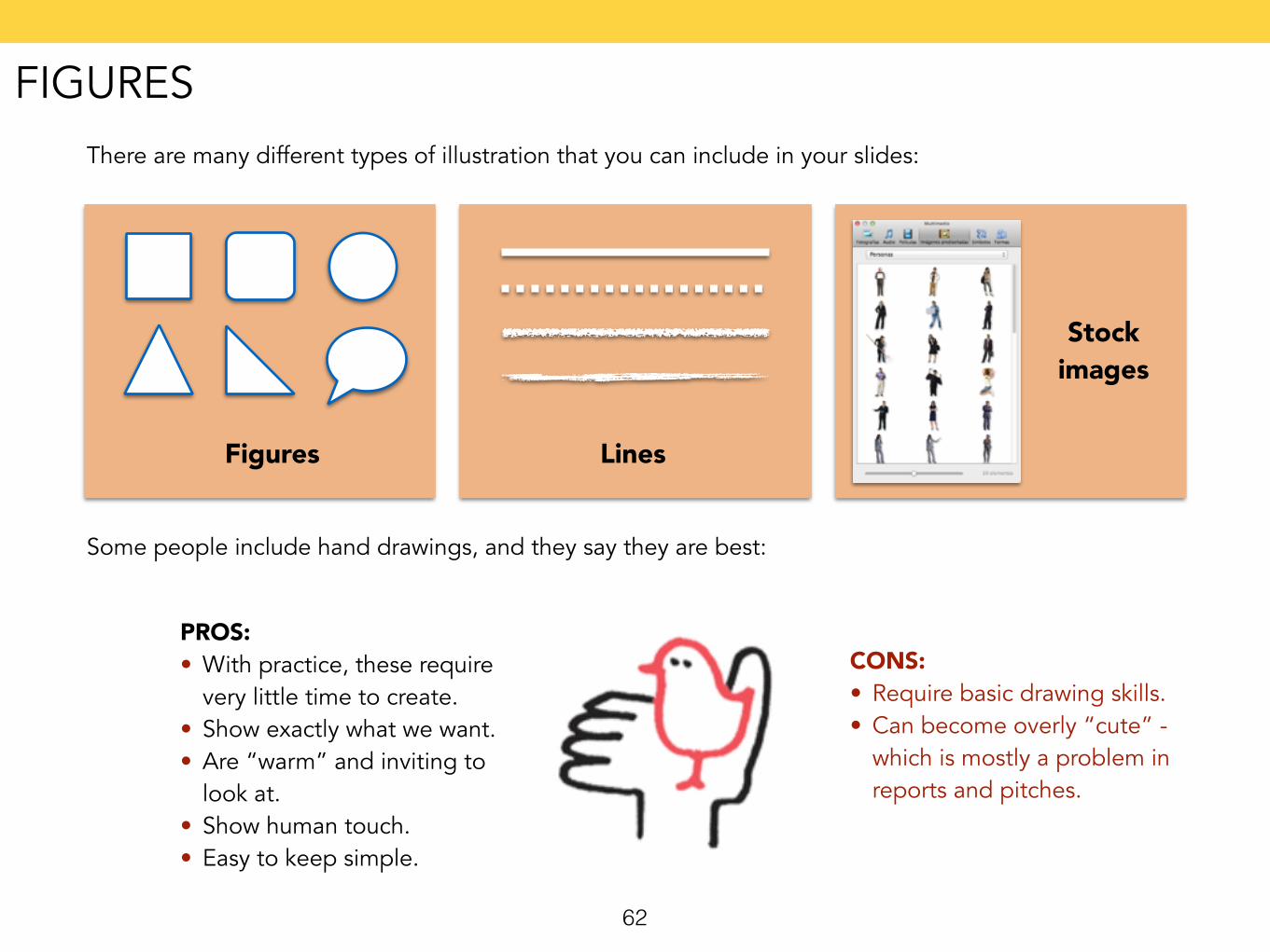
There are many different types of illustration that you can include in your slides:
Figures Lines
Stock images
Some people include hand drawings, and they say they are best:
PROS: • With practice, these require
very little time to create. • Show exactly what we want. • Are “warm” and inviting to
look at. • Show human touch. • Easy to keep simple.
CONS: • Require basic drawing skills. • Can become overly “cute” -
which is mostly a problem in reports and pitches.
62
FIGURES
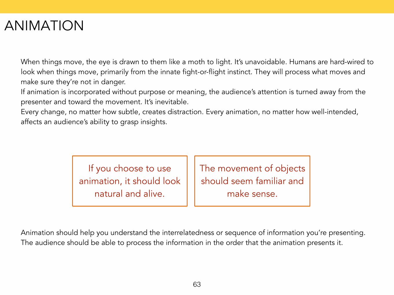
When things move, the eye is drawn to them like a moth to light. It’s unavoidable. Humans are hard-wired to look when things move, primarily from the innate fight-or-flight instinct. They will process what moves and make sure they’re not in danger.If animation is incorporated without purpose or meaning, the audience’s attention is turned away from the presenter and toward the movement. It’s inevitable. Every change, no matter how subtle, creates distraction. Every animation, no matter how well-intended, affects an audience’s ability to grasp insights.
If you choose to use animation, it should look
natural and alive.
The movement of objects should seem familiar and
make sense.
Animation should help you understand the interrelatedness or sequence of information you’re presenting. The audience should be able to process the information in the order that the animation presents it.
63
ANIMATION
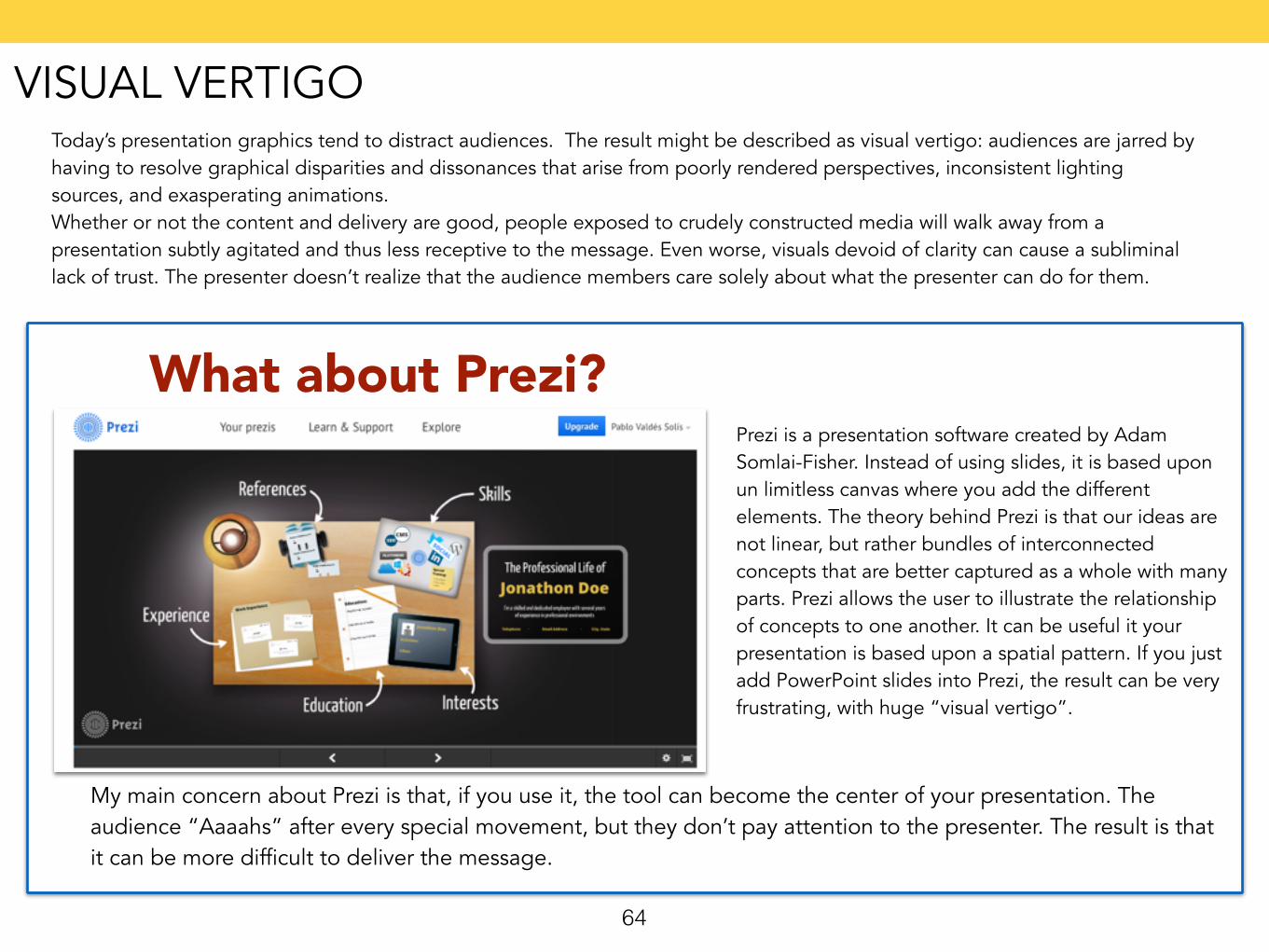
Today’s presentation graphics tend to distract audiences. The result might be described as visual vertigo: audiences are jarred by having to resolve graphical disparities and dissonances that arise from poorly rendered perspectives, inconsistent lighting sources, and exasperating animations. Whether or not the content and delivery are good, people exposed to crudely constructed media will walk away from a presentation subtly agitated and thus less receptive to the message. Even worse, visuals devoid of clarity can cause a subliminal lack of trust. The presenter doesn’t realize that the audience members care solely about what the presenter can do for them.
What about Prezi?Prezi is a presentation software created by Adam Somlai-Fisher. Instead of using slides, it is based upon un limitless canvas where you add the different elements. The theory behind Prezi is that our ideas are not linear, but rather bundles of interconnected concepts that are better captured as a whole with many parts. Prezi allows the user to illustrate the relationship of concepts to one another. It can be useful it your presentation is based upon a spatial pattern. If you just add PowerPoint slides into Prezi, the result can be very frustrating, with huge “visual vertigo”.
My main concern about Prezi is that, if you use it, the tool can become the center of your presentation. The audience “Aaaahs” after every special movement, but they don’t pay attention to the presenter. The result is that it can be more difficult to deliver the message.
64
VISUAL VERTIGO
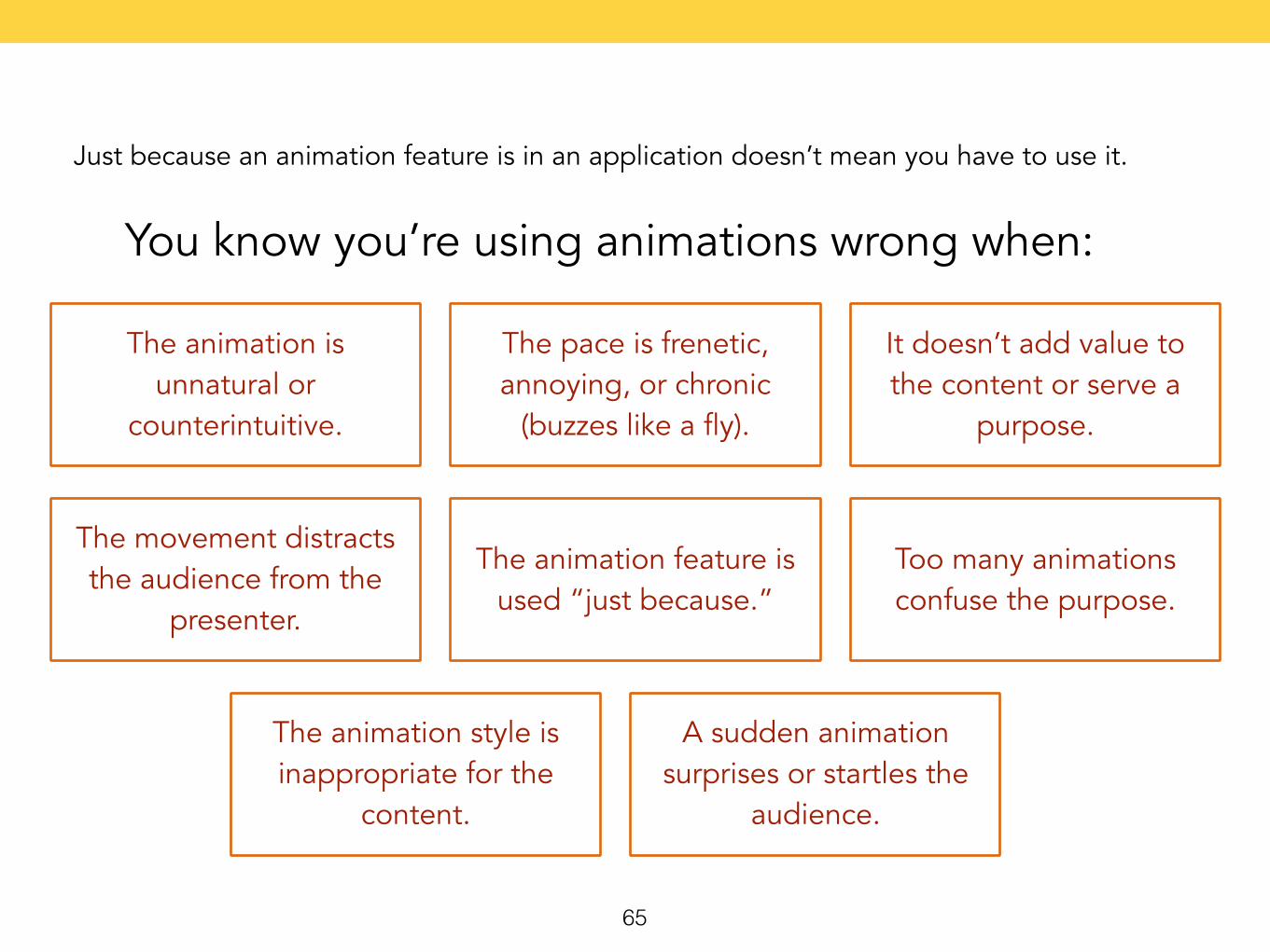
Just because an animation feature is in an application doesn’t mean you have to use it.
You know you’re using animations wrong when:
The animation is unnatural or
counterintuitive.
The pace is frenetic, annoying, or chronic
(buzzes like a fly).
It doesn’t add value to the content or serve a
purpose.
The movement distracts the audience from the
presenter.
The animation feature is used “just because.”
Too many animations confuse the purpose.
The animation style is inappropriate for the
content.
A sudden animation surprises or startles the
audience.
65
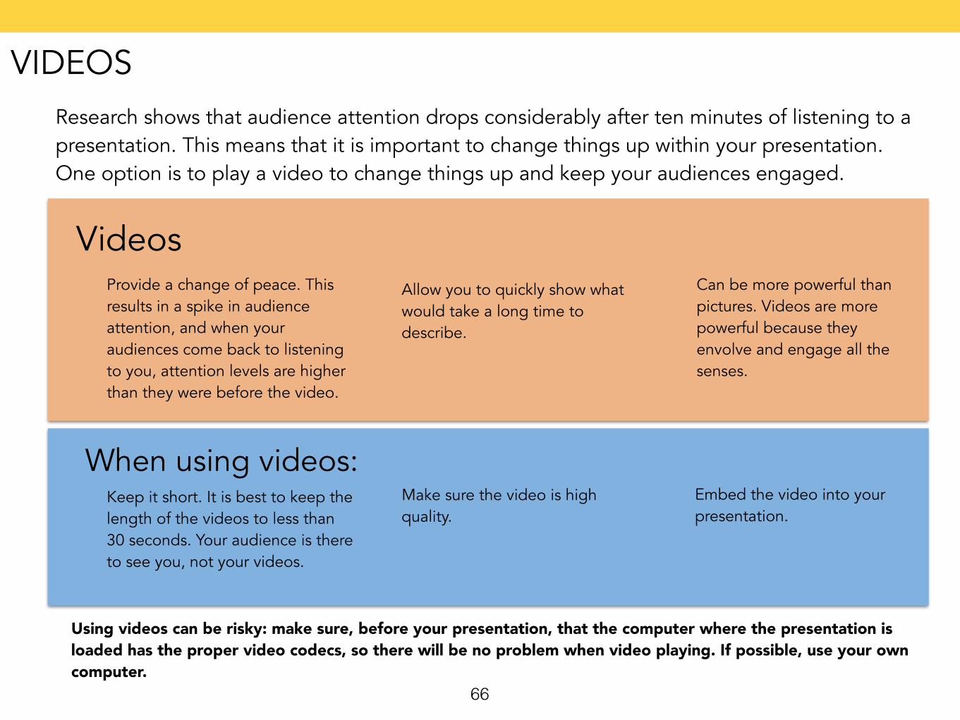
Research shows that audience attention drops considerably after ten minutes of listening to a presentation. This means that it is important to change things up within your presentation. One option is to play a video to change things up and keep your audiences engaged.
66
VideosProvide a change of peace. This results in a spike in audience attention, and when your audiences come back to listening to you, attention levels are higher than they were before the video.
Allow you to quickly show what would take a long time to describe.
Can be more powerful than pictures. Videos are more powerful because they envolve and engage all the senses.
Keep it short. It is best to keep the length of the videos to less than 30 seconds. Your audience is there to see you, not your videos.
Make sure the video is high quality.
Embed the video into your presentation.
When using videos:
Using videos can be risky: make sure, before your presentation, that the computer where the presentation is loaded has the proper video codecs, so there will be no problem when video playing. If possible, use your own computer.
VIDEOS
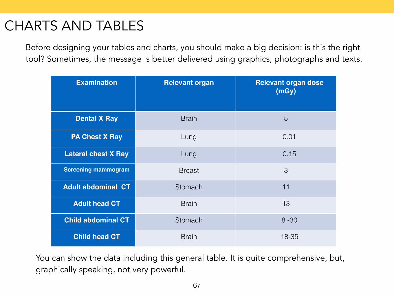
Before designing your tables and charts, you should make a big decision: is this the right tool? Sometimes, the message is better delivered using graphics, photographs and texts.
67
Examination Relevant organ Relevant organ dose (mGy)
Dental X Ray Brain 5
PA Chest X Ray Lung 0.01
Lateral chest X Ray Lung 0.15
Screening mammogram Breast 3
Adult abdominal CT Stomach 11
Adult head CT Brain 13
Child abdominal CT Stomach 8 -30
Child head CT Brain 18-35
You can show the data including this general table. It is quite comprehensive, but, graphically speaking, not very powerful.
CHARTS AND TABLES
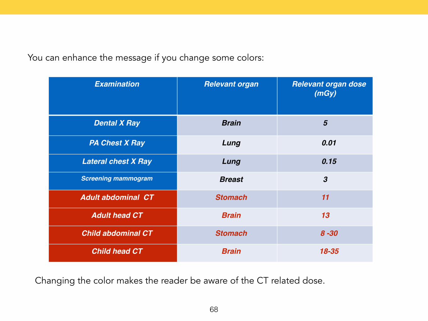
You can enhance the message if you change some colors:
68
Examination Relevant organ Relevant organ dose (mGy)
Dental X Ray Brain 5
PA Chest X Ray Lung 0.01
Lateral chest X Ray Lung 0.15
Screening mammogram Breast 3
Adult abdominal CT Stomach 11
Adult head CT Brain 13
Child abdominal CT Stomach 8 -30
Child head CT Brain 18-35
Changing the color makes the reader be aware of the CT related dose.
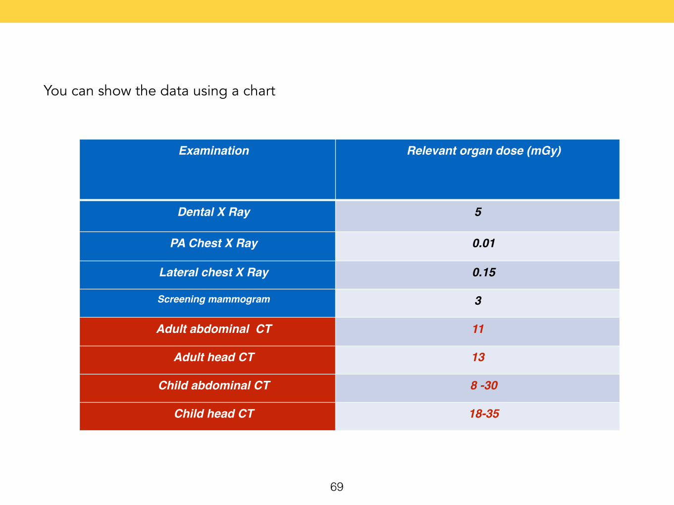
You can show the data using a chart
69
Examination Relevant organ dose (mGy)
Dental X Ray 5
PA Chest X Ray 0.01
Lateral chest X Ray 0.15
Screening mammogram 3
Adult abdominal CT 11
Adult head CT 13
Child abdominal CT 8 -30
Child head CT 18-35
70
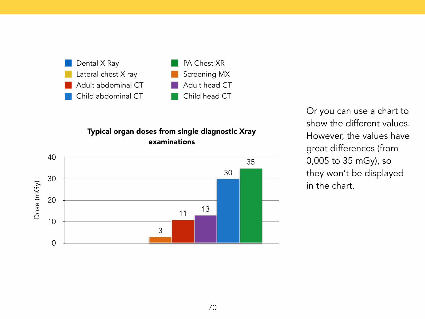
Typical organ doses from single diagnostic Xray examinations
Dos
e (m
Gy)
0
10
20
30
4035
30
1311
3
Dental X Ray PA Chest XRLateral chest X ray Screening MXAdult abdominal CT Adult head CTChild abdominal CT Child head CT
Or you can use a chart to show the different values. However, the values have great differences (from 0,005 to 35 mGy), so they won’t be displayed in the chart.
71
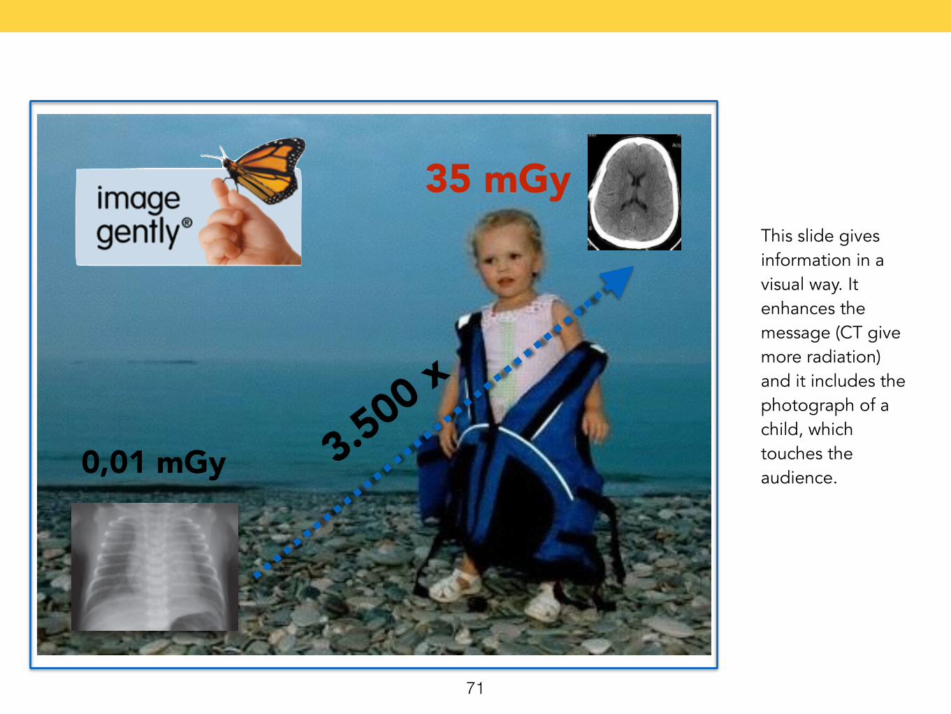
0,01 mGy
35 mGyThis slide gives information in a visual way. It enhances the message (CT give more radiation) and it includes the photograph of a child, which touches the audience.
3.500 x
72
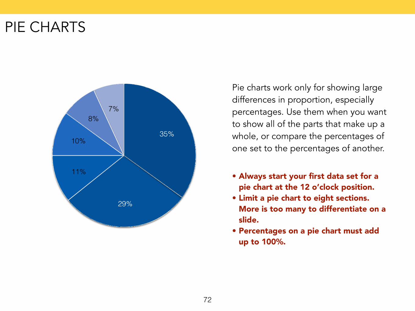
Pie charts work only for showing large differences in proportion, especially percentages. Use them when you want to show all of the parts that make up a whole, or compare the percentages of one set to the percentages of another.
7%8%
10%
11%
29%
35%
• Always start your first data set for a pie chart at the 12 o’clock position.
• Limit a pie chart to eight sections. More is too many to differentiate on a slide.
• Percentages on a pie chart must add up to 100%.
PIE CHARTS
73
0
25
50
75
100
April May June July
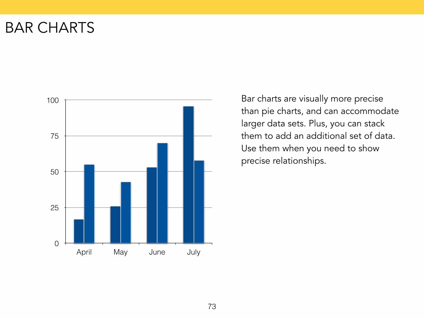
Bar charts are visually more precise than pie charts, and can accommodate larger data sets. Plus, you can stack them to add an additional set of data. Use them when you need to show precise relationships.
BAR CHARTS
74
0
25
50
75
100
2010 2011 2012 2013
58
70
43
55
96
53
2617
15
36,25
57,5
78,75
100
2010 2011 2012 2013
58
70
43
55
96
53
2617
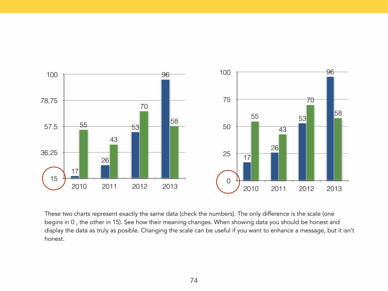
These two charts represent exactly the same data (check the numbers). The only difference is the scale (one begins in 0 , the other in 15). See how their meaning changes. When showing data you should be honest and display the data as truly as posible. Changing the scale can be useful if you want to enhance a message, but it isn’t honest.
75
0
25
50
75
100
April May June July
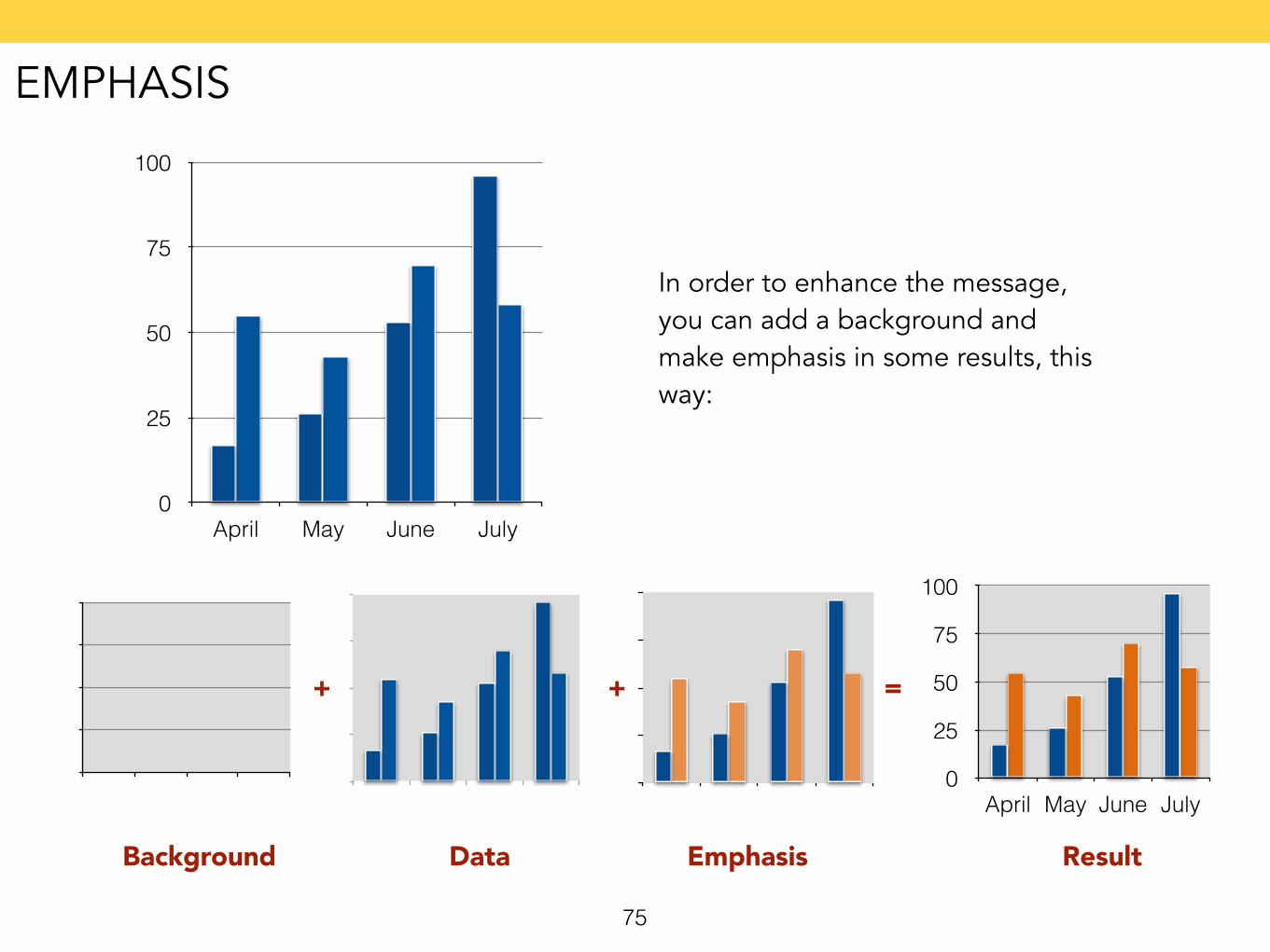
In order to enhance the message, you can add a background and make emphasis in some results, this way:
0
25
50
75
100
April May June July
Background Data Emphasis Result
+ + =
EMPHASIS
76
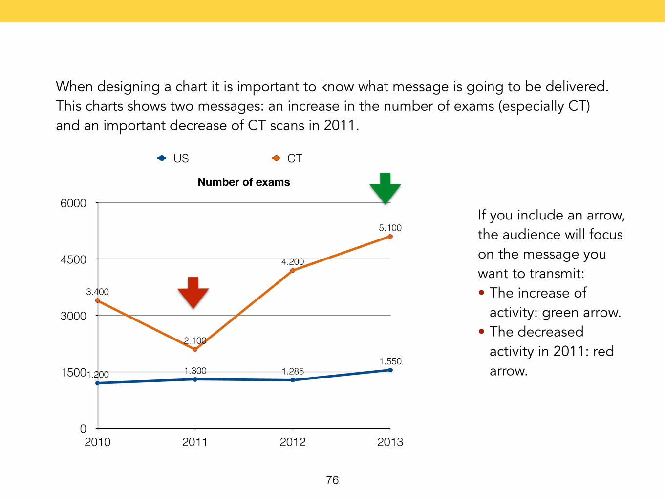
When designing a chart it is important to know what message is going to be delivered. This charts shows two messages: an increase in the number of exams (especially CT) and an important decrease of CT scans in 2011.
Number of exams
0
1500
3000
4500
6000
2010 2011 2012 2013
3.400
2.100
4.200
5.100
1.200 1.300 1.2851.550
US CT
If you include an arrow, the audience will focus on the message you want to transmit: • The increase of
activity: green arrow. • The decreased
activity in 2011: red arrow.
77
4How to prepare for the talk
Rehearse
Places
78
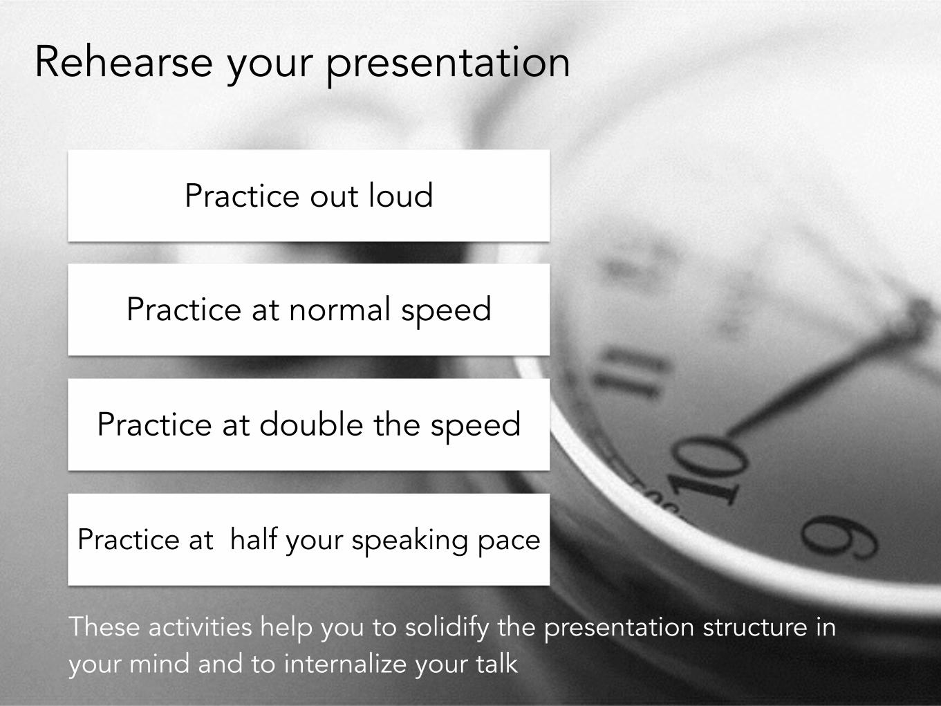
Rehearse your presentation
Practice out loud
Practice at normal speed
Practice at double the speed
Practice at half your speaking pace
These activities help you to solidify the presentation structure in your mind and to internalize your talk
79
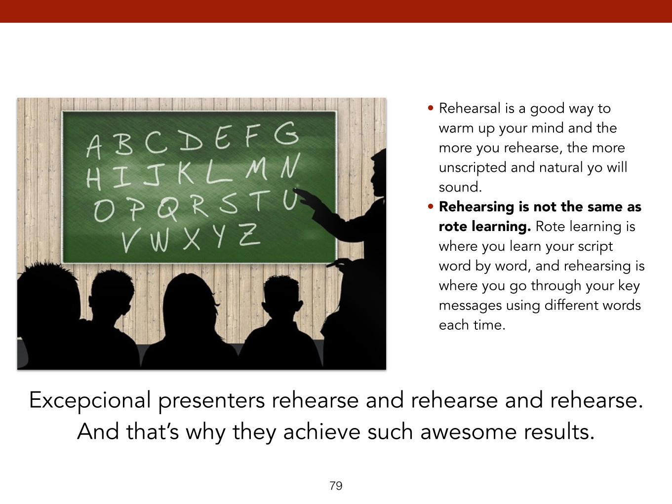
• Rehearsal is a good way to warm up your mind and the more you rehearse, the more unscripted and natural yo will sound.
• Rehearsing is not the same as rote learning. Rote learning is where you learn your script word by word, and rehearsing is where you go through your key messages using different words each time.
Excepcional presenters rehearse and rehearse and rehearse. And that’s why they achieve such awesome results.
80
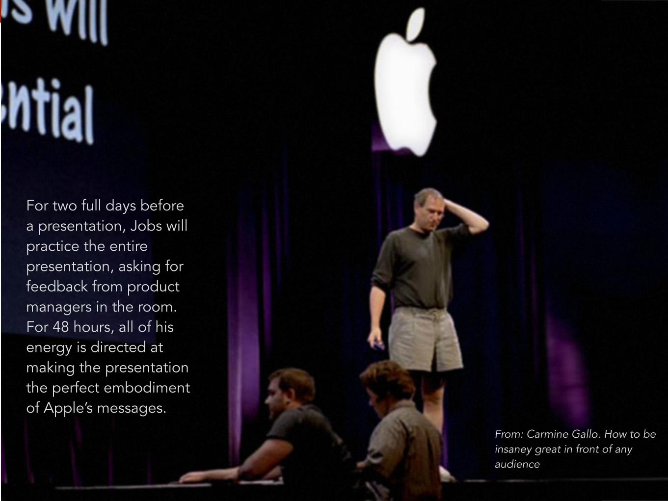
For two full days before a presentation, Jobs will practice the entire presentation, asking for feedback from product managers in the room. For 48 hours, all of his energy is directed at making the presentation the perfect embodiment of Apple’s messages.
From: Carmine Gallo. How to be insaney great in front of any audience
81
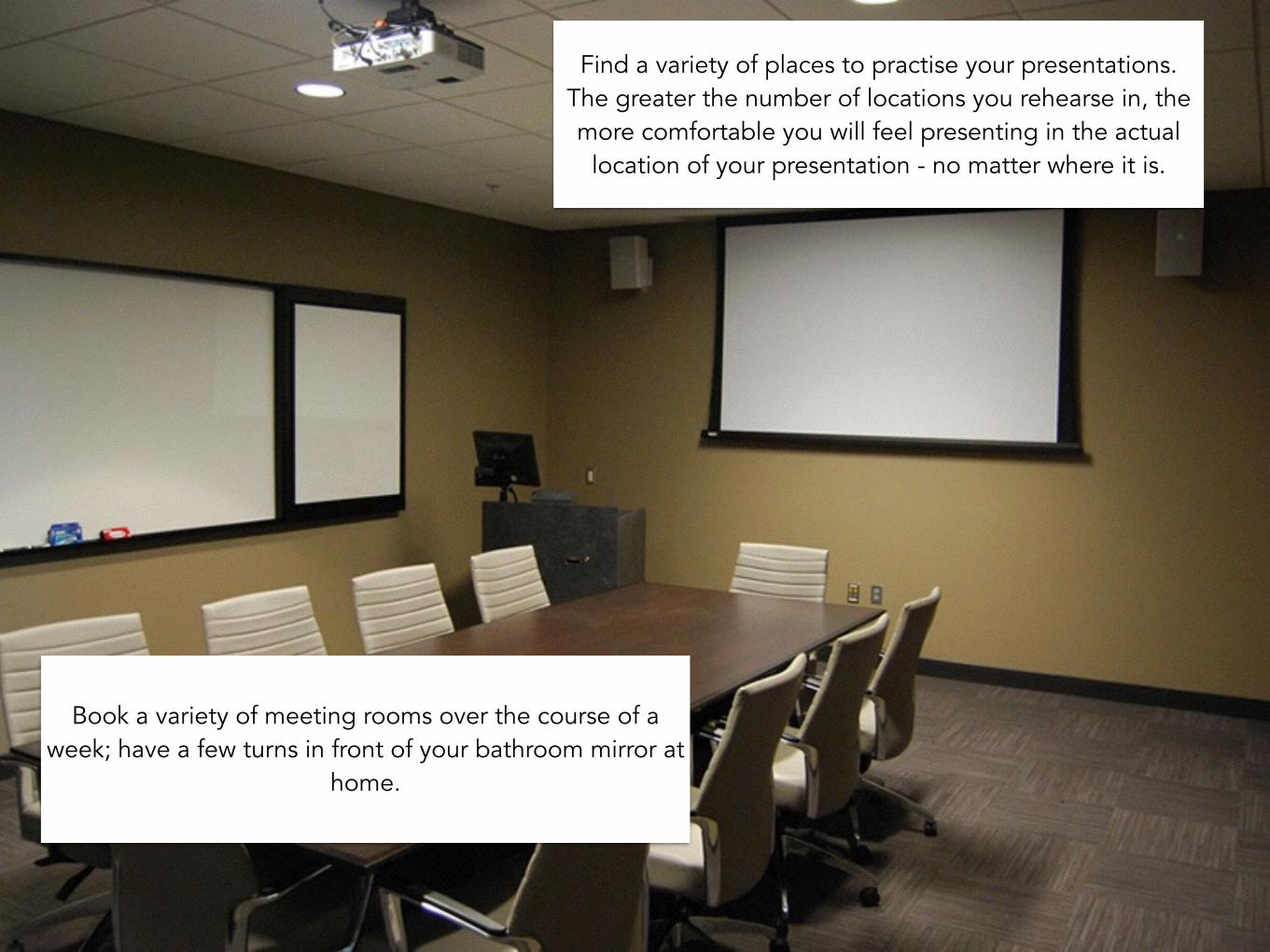
Find a variety of places to practise your presentations. The greater the number of locations you rehearse in, the more comfortable you will feel presenting in the actual
location of your presentation - no matter where it is.
Book a variety of meeting rooms over the course of a week; have a few turns in front of your bathroom mirror at
home.
82
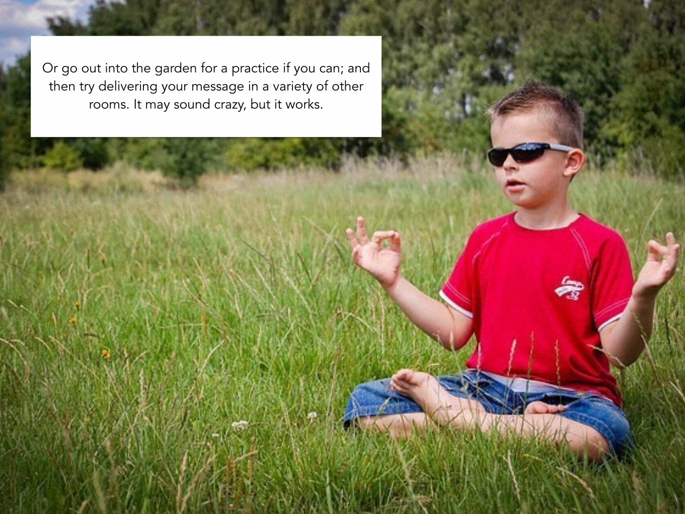
Or go out into the garden for a practice if you can; and then try delivering your message in a variety of other
rooms. It may sound crazy, but it works.
83
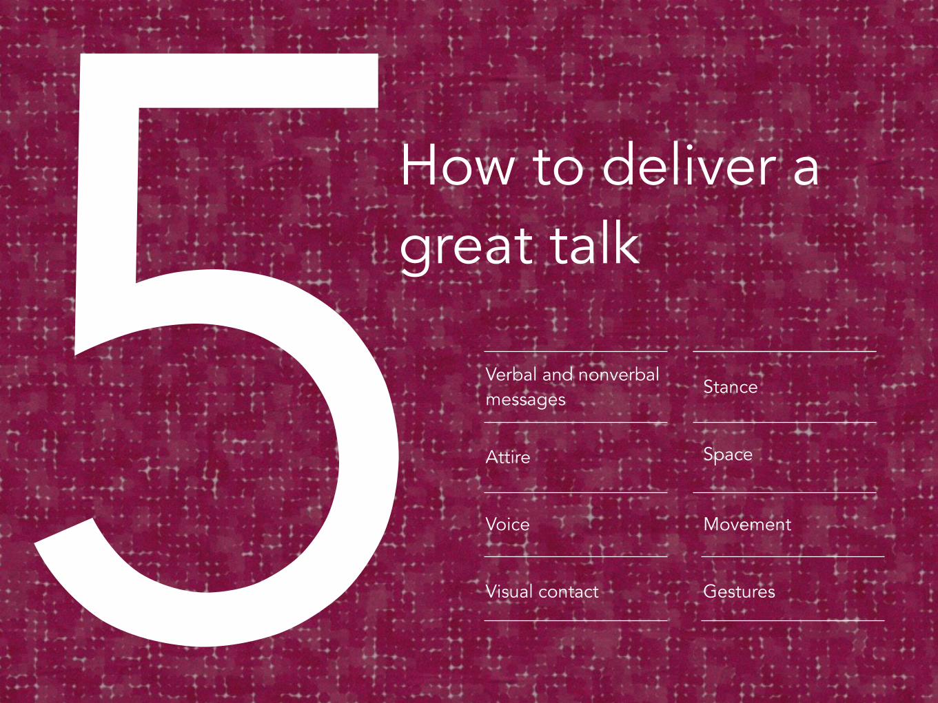
5How to deliver a great talk
Verbal and nonverbal messages
Attire
Voice
Visual contact
Stance
Space
Movement
Gestures
84
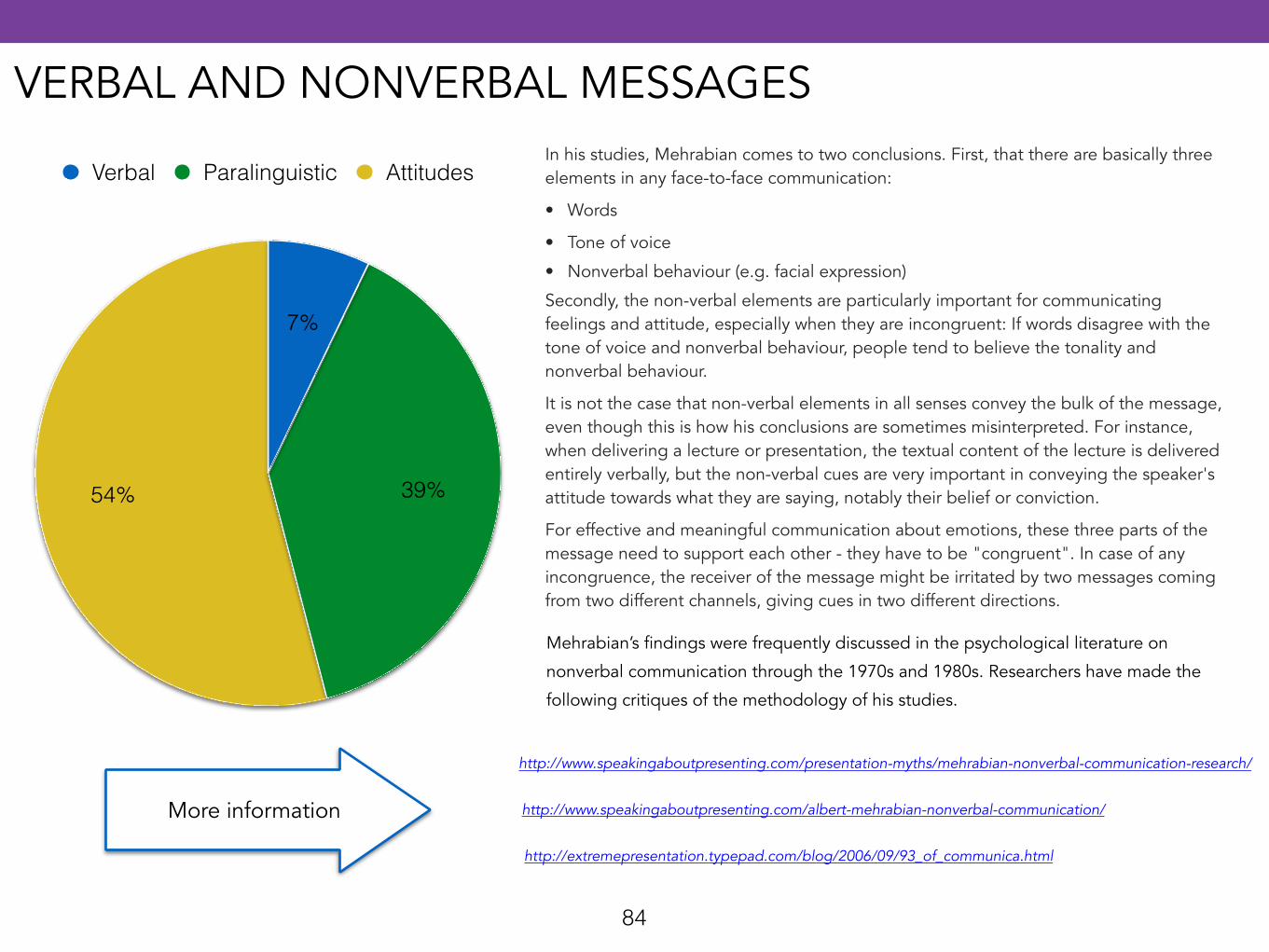
54% 39%
7%
Verbal Paralinguistic AttitudesIn his studies, Mehrabian comes to two conclusions. First, that there are basically three elements in any face-to-face communication:
• Words
• Tone of voice
• Nonverbal behaviour (e.g. facial expression)
Secondly, the non-verbal elements are particularly important for communicating feelings and attitude, especially when they are incongruent: If words disagree with the tone of voice and nonverbal behaviour, people tend to believe the tonality and nonverbal behaviour.
It is not the case that non-verbal elements in all senses convey the bulk of the message, even though this is how his conclusions are sometimes misinterpreted. For instance, when delivering a lecture or presentation, the textual content of the lecture is delivered entirely verbally, but the non-verbal cues are very important in conveying the speaker's attitude towards what they are saying, notably their belief or conviction.
For effective and meaningful communication about emotions, these three parts of the message need to support each other - they have to be "congruent". In case of any incongruence, the receiver of the message might be irritated by two messages coming from two different channels, giving cues in two different directions.
Mehrabian’s findings were frequently discussed in the psychological literature on
nonverbal communication through the 1970s and 1980s. Researchers have made the
following critiques of the methodology of his studies.
http://www.speakingaboutpresenting.com/presentation-myths/mehrabian-nonverbal-communication-research/
http://www.speakingaboutpresenting.com/albert-mehrabian-nonverbal-communication/
http://extremepresentation.typepad.com/blog/2006/09/93_of_communica.html
More information
VERBAL AND NONVERBAL MESSAGES
85
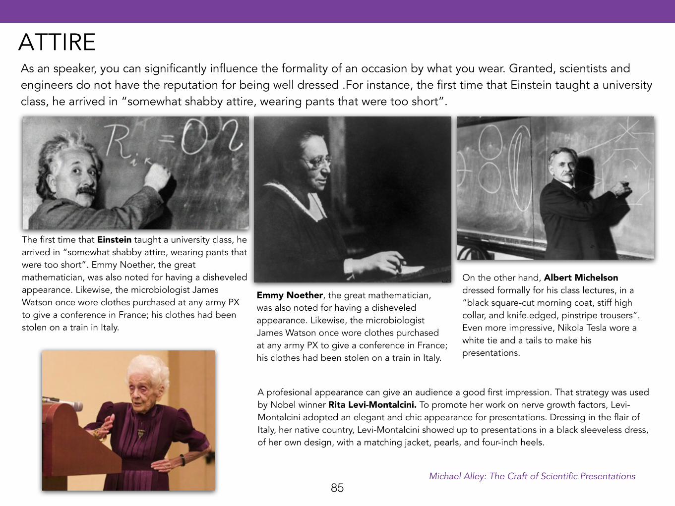
On the other hand, Albert Michelson dressed formally for his class lectures, in a “black square-cut morning coat, stiff high collar, and knife.edged, pinstripe trousers”. Even more impressive, Nikola Tesla wore a white tie and a tails to make his presentations.
The first time that Einstein taught a university class, he arrived in “somewhat shabby attire, wearing pants that were too short”. Emmy Noether, the great mathematician, was also noted for having a disheveled appearance. Likewise, the microbiologist James Watson once wore clothes purchased at any army PX to give a conference in France; his clothes had been stolen on a train in Italy.
Emmy Noether, the great mathematician, was also noted for having a disheveled appearance. Likewise, the microbiologist James Watson once wore clothes purchased at any army PX to give a conference in France; his clothes had been stolen on a train in Italy.
As an speaker, you can significantly influence the formality of an occasion by what you wear. Granted, scientists and engineers do not have the reputation for being well dressed .For instance, the first time that Einstein taught a university class, he arrived in “somewhat shabby attire, wearing pants that were too short”.
A profesional appearance can give an audience a good first impression. That strategy was used by Nobel winner Rita Levi-Montalcini. To promote her work on nerve growth factors, Levi-Montalcini adopted an elegant and chic appearance for presentations. Dressing in the flair of Italy, her native country, Levi-Montalcini showed up to presentations in a black sleeveless dress, of her own design, with a matching jacket, pearls, and four-inch heels.
Michael Alley: The Craft of Scientific Presentations
ATTIRE
86
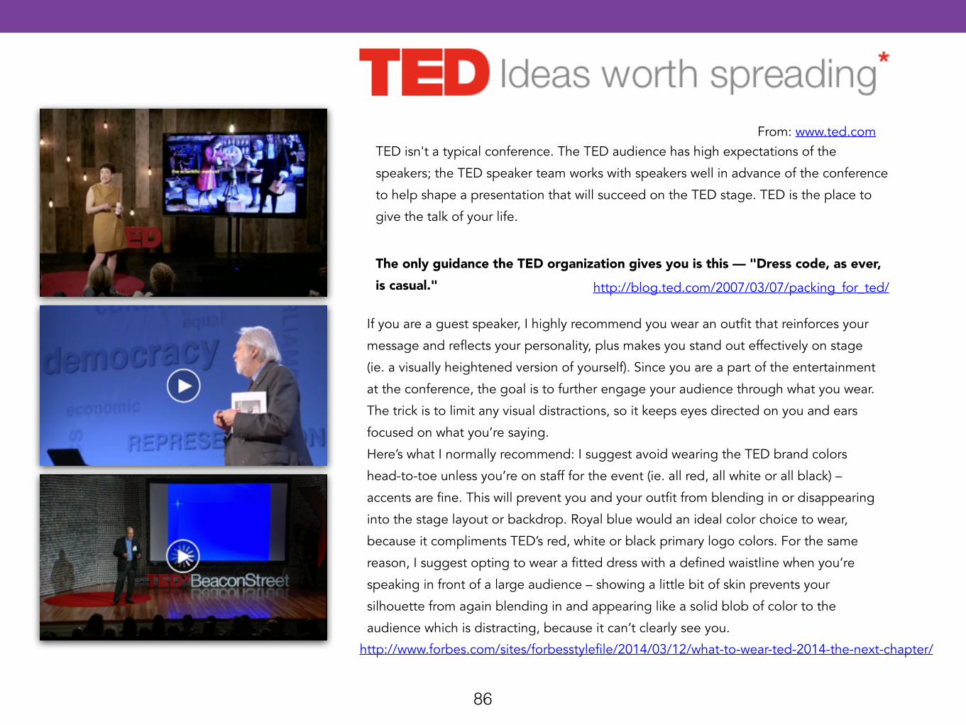
TED isn't a typical conference. The TED audience has high expectations of the
speakers; the TED speaker team works with speakers well in advance of the conference
to help shape a presentation that will succeed on the TED stage. TED is the place to
give the talk of your life.
From: www.ted.com
The only guidance the TED organization gives you is this — "Dress code, as ever, is casual." http://blog.ted.com/2007/03/07/packing_for_ted/
If you are a guest speaker, I highly recommend you wear an outfit that reinforces your
message and reflects your personality, plus makes you stand out effectively on stage
(ie. a visually heightened version of yourself). Since you are a part of the entertainment
at the conference, the goal is to further engage your audience through what you wear.
The trick is to limit any visual distractions, so it keeps eyes directed on you and ears
focused on what you’re saying.
Here’s what I normally recommend: I suggest avoid wearing the TED brand colors
head-to-toe unless you’re on staff for the event (ie. all red, all white or all black) –
accents are fine. This will prevent you and your outfit from blending in or disappearing
into the stage layout or backdrop. Royal blue would an ideal color choice to wear,
because it compliments TED’s red, white or black primary logo colors. For the same
reason, I suggest opting to wear a fitted dress with a defined waistline when you’re
speaking in front of a large audience – showing a little bit of skin prevents your
silhouette from again blending in and appearing like a solid blob of color to the
audience which is distracting, because it can’t clearly see you.
http://www.forbes.com/sites/forbesstylefile/2014/03/12/what-to-wear-ted-2014-the-next-chapter/
87
From: www.ted.com
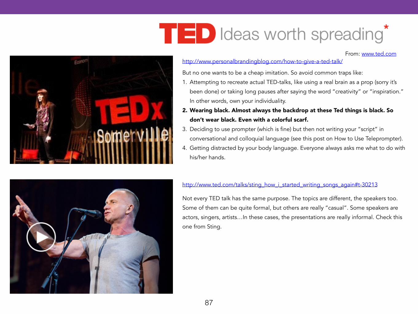
But no one wants to be a cheap imitation. So avoid common traps like:
1. Attempting to recreate actual TED-talks, like using a real brain as a prop (sorry it’s
been done) or taking long pauses after saying the word “creativity” or “inspiration.”
In other words, own your individuality.
2. Wearing black. Almost always the backdrop at these Ted things is black. So don’t wear black. Even with a colorful scarf.
3. Deciding to use prompter (which is fine) but then not writing your “script” in
conversational and colloquial language (see this post on How to Use Teleprompter).
4. Getting distracted by your body language. Everyone always asks me what to do with
his/her hands.
http://www.personalbrandingblog.com/how-to-give-a-ted-talk/
Not every TED talk has the same purpose. The topics are different, the speakers too.
Some of them can be quite formal, but others are really “casual”. Some speakers are
actors, singers, artists…In these cases, the presentations are really informal. Check this
one from Sting.
http://www.ted.com/talks/sting_how_i_started_writing_songs_again#t-30213
88
What about Steve Jobs?
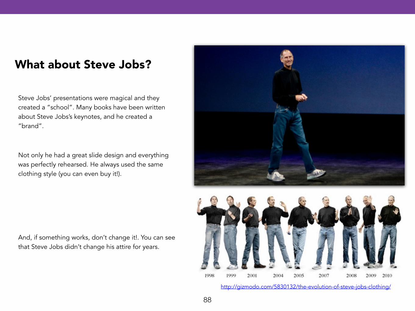
Steve Jobs’ presentations were magical and they created a “school”. Many books have been written about Steve Jobs’s keynotes, and he created a “brand”.
http://gizmodo.com/5830132/the-evolution-of-steve-jobs-clothing/
Not only he had a great slide design and everything was perfectly rehearsed. He always used the same clothing style (you can even buy it!).
And, if something works, don’t change it!. You can see that Steve Jobs didn’t change his attire for years.
89
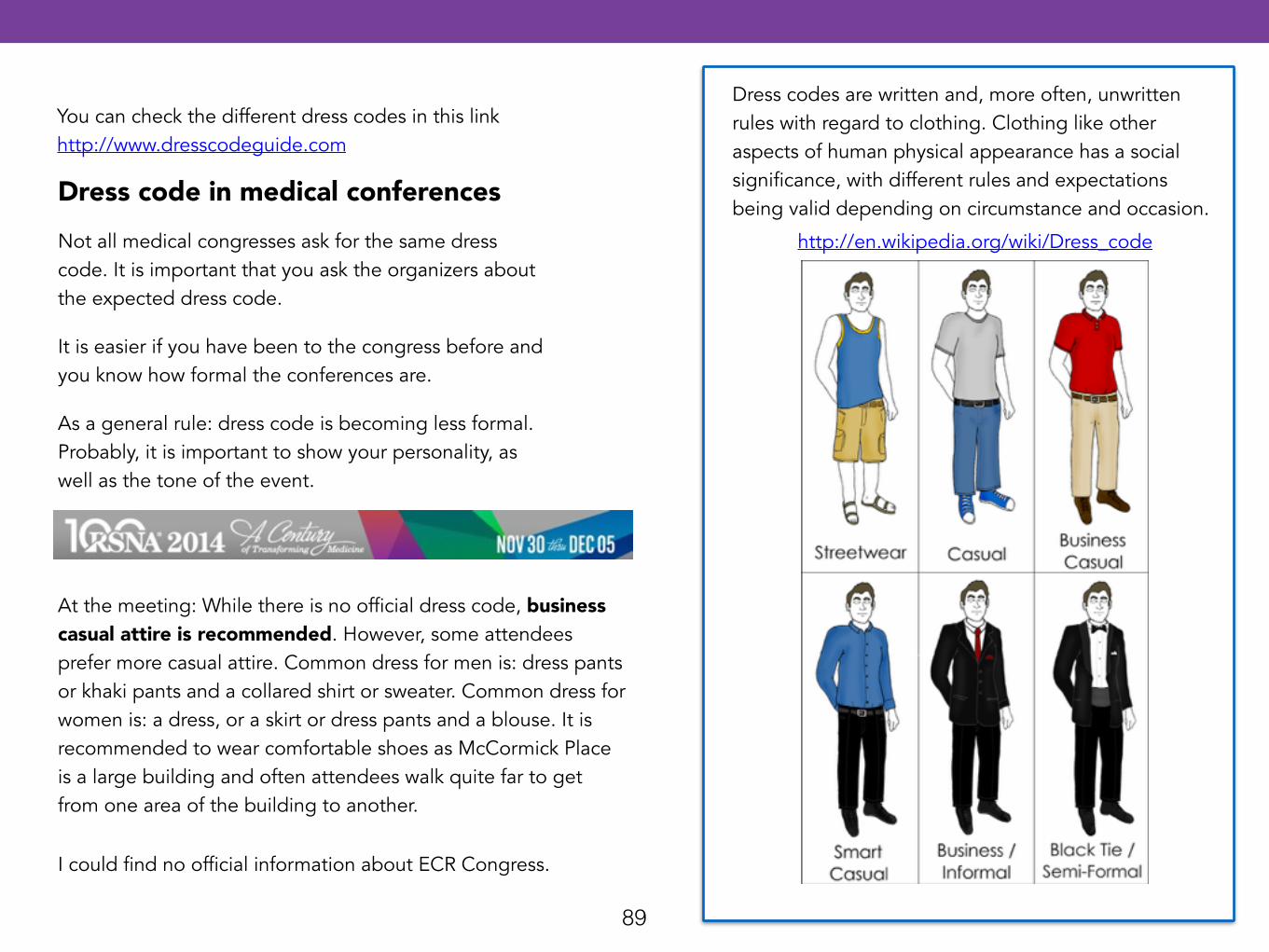
Dress codes are written and, more often, unwritten rules with regard to clothing. Clothing like other aspects of human physical appearance has a social significance, with different rules and expectations being valid depending on circumstance and occasion.
http://en.wikipedia.org/wiki/Dress_code
You can check the different dress codes in this link http://www.dresscodeguide.com
Dress code in medical conferencesNot all medical congresses ask for the same dress code. It is important that you ask the organizers about the expected dress code.
It is easier if you have been to the congress before and you know how formal the conferences are.
As a general rule: dress code is becoming less formal. Probably, it is important to show your personality, as well as the tone of the event.
At the meeting: While there is no official dress code, business casual attire is recommended. However, some attendees prefer more casual attire. Common dress for men is: dress pants or khaki pants and a collared shirt or sweater. Common dress for women is: a dress, or a skirt or dress pants and a blouse. It is recommended to wear comfortable shoes as McCormick Place is a large building and often attendees walk quite far to get from one area of the building to another.
I could find no official information about ECR Congress.
90
Icon made by: www.flaticon.com. Licensed under Creative Commons BY 3.0
Besides paying attention to dress, you should also think about your voice. Voice is a distinctive feature of the presenter. Ernest Rotherford, for instance, had a booming voice that was recognizable from the next room. Marie Curie had a soft but steady voice. Nikola Tesla had a “high-pitched, almost falsetto voice”. Einstein had an equally distinctive voice with a German accent. Although you cannot do so much with your pitch or accent of your voice, you can control the infection and loudness. If your voice has no change in loudness or speed, you will quickly tire an audience. Heinrich Hertz, for instance, disliked meeting with Hermann Helmholtz because Helmholtz spoke so slowly and deliberately that Hertz found it “impossible” for him to listen attentively. James Watson also complained about the presentations at one international biomedical conference because there was “so much droning” that he found it difficult to “stay alert for the new facts”.
Changing the speed and loudness not only prevents the speaker from hypnotizing the audience, but it helps the speaker emphasize key details. The best speakers, Feynman and Pauling, changed their loudness and speed dramatically during a presentation. Such changes, though, should occur naturally; otherwise, the audience senses that the speaker is acting. In other words, the speaker should have the same voice inflections in loudness and speed that the speaker naturally has in conversation.
Michael Alley: The Craft of Scientific Presentations
VOICE
91
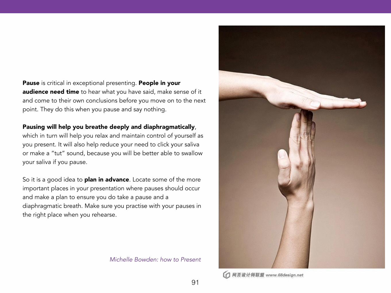
Pause is critical in exceptional presenting. People in your audience need time to hear what you have said, make sense of it and come to their own conclusions before you move on to the next point. They do this when you pause and say nothing. !Pausing will help you breathe deeply and diaphragmatically, which in turn will help you relax and maintain control of yourself as you present. It will also help reduce your need to click your saliva or make a “tut” sound, because you will be better able to swallow your saliva if you pause. !So it is a good idea to plan in advance. Locate some of the more important places in your presentation where pauses should occur and make a plan to ensure you do take a pause and a diaphragmatic breath. Make sure you practise with your pauses in the right place when you rehearse.
Michelle Bowden: how to Present
92
As we saw in “Non Verbal Communication”, your body plays a fundamental role in the believability of your message. The body language can be divided into: • Eye contact • Stance • Gestures
Icon made by: www.flaticon.com. Licensed under Creative Commons BY 3.0
93
When you are nervous it is frequent that you focus only on one person. This is something you shouldn’t do, as he or she can feel uncomfortable. !Presenters who are too shy can feel unable to focus on the audience’s eyes, and they look at the floor or the ceiling…This makes the audience feel uncomfortable as they think that you are not confident. !Here are some tips that may help: • The audience takes about nine seconds to make an initial assessment of you. They look at superficial things like your hair, make -up, spectacles,
accessories, clothes and shoes, and judge you in that moment. • Once they have made their initial assessment, they take about 25 seconds to validate their original thoughts and feelings about you. This involves
listening to your voice, and watching your body movements, facial expressions and energy. • Then they go back to thinking about themselves. In other words, the audience is there for themselves, not for you. They are going to assess you in those first seconds and then, provided everything is okay, they go back to working out how your message can help them in their life. They are not really looking at you at all! !Don’t think of your presentation as a presentation to a group - which is scary thought for many. Instead, focus on the whites of the eyes of one person at a time.
It is a good idea to focus on the different members of your audience as much as possible and, importantly, as much as they need you to. Some people don’t like you to give them too much eye contact, so take their lead and don’t look at them as much as some of the other people. Others in your audience require a lot of eye contact, so it’s a great idea to look at them more!. As a general rule, it’s a good idea to give individually appropriate eye contact to all of the different people in your audience. In addition, it is important to look into the eyes of the people in your audience because it: • helps you connect with your audience • stops the audience switching off and doing something else • reduces your nerves If you have a large audience, or it’s dark and you have spotlights in your eyes, the key is to really look at as many people as possible. Mix this up with looking into the other sections of your audience so it looks and feels like you really can see in their eyes. Make sure this is as genuine as possible.
Michelle Bowden: how to Present
Gonzalo Álvarez Marañón. El arte de presentar
VISUAL CONTACT
94Icon made by: www.flaticon.com. Licensed under Creative Commons BY 3.0
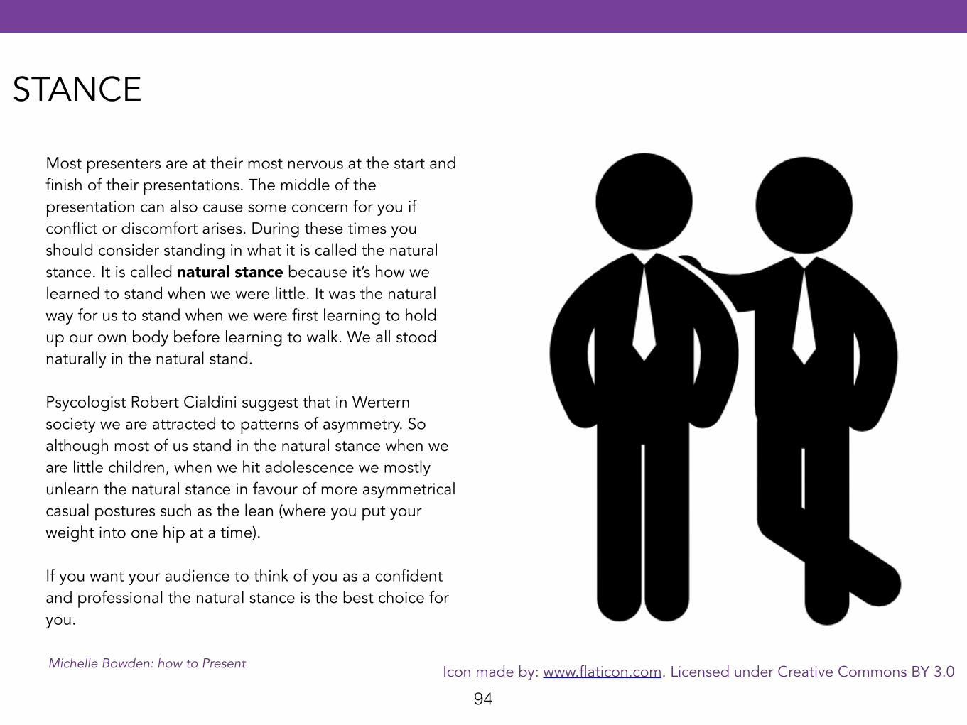
Most presenters are at their most nervous at the start and finish of their presentations. The middle of the presentation can also cause some concern for you if conflict or discomfort arises. During these times you should consider standing in what it is called the natural stance. It is called natural stance because it’s how we learned to stand when we were little. It was the natural way for us to stand when we were first learning to hold up our own body before learning to walk. We all stood naturally in the natural stand. !Psycologist Robert Cialdini suggest that in Wertern society we are attracted to patterns of asymmetry. So although most of us stand in the natural stance when we are little children, when we hit adolescence we mostly unlearn the natural stance in favour of more asymmetrical casual postures such as the lean (where you put your weight into one hip at a time). !If you want your audience to think of you as a confident and professional the natural stance is the best choice for you.
Michelle Bowden: how to Present
STANCE
95http://www.dailymail.co.uk/news/article-2350630/Kate-Middleton-goes-
labour-Duchess-Cambridge-Royal-baby-progressing-well.html
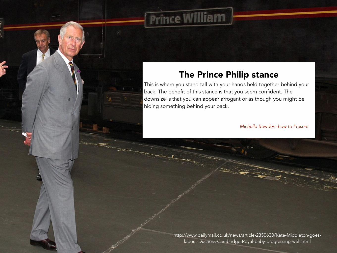
The Prince Philip stance This is where you stand tall with your hands held together behind your back. The benefit of this stance is that you seem confident. The downsize is that you can appear arrogant or as though you might be hiding something behind your back. !!
Michelle Bowden: how to Present
96
Cover Credit: PLATON
http://content.time.com/time/covers/0,16641,20071210,00.html
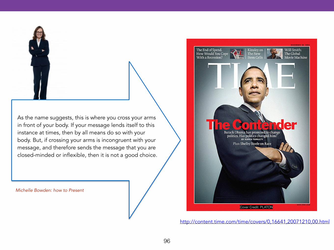
As the name suggests, this is where you cross your arms in front of your body. If your message lends itself to this instance at times, then by all means do so with your body. But, if crossing your arms is incongruent with your message, and therefore sends the message that you are closed-minded or inflexible, then it is not a good choice.
Michelle Bowden: how to Present
97
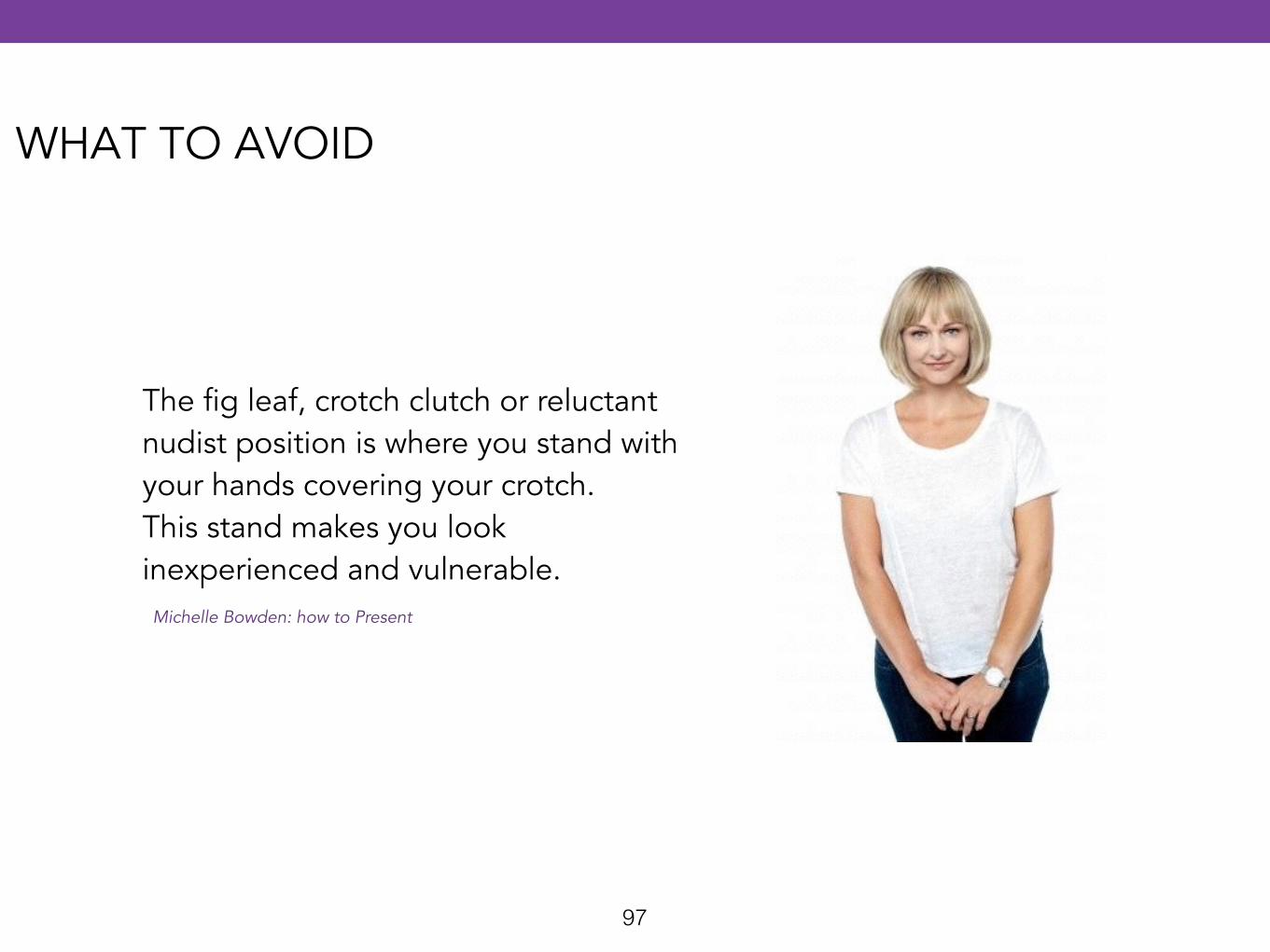
The fig leaf, crotch clutch or reluctant nudist position is where you stand with your hands covering your crotch. This stand makes you look inexperienced and vulnerable.
Michelle Bowden: how to Present
WHAT TO AVOID
98
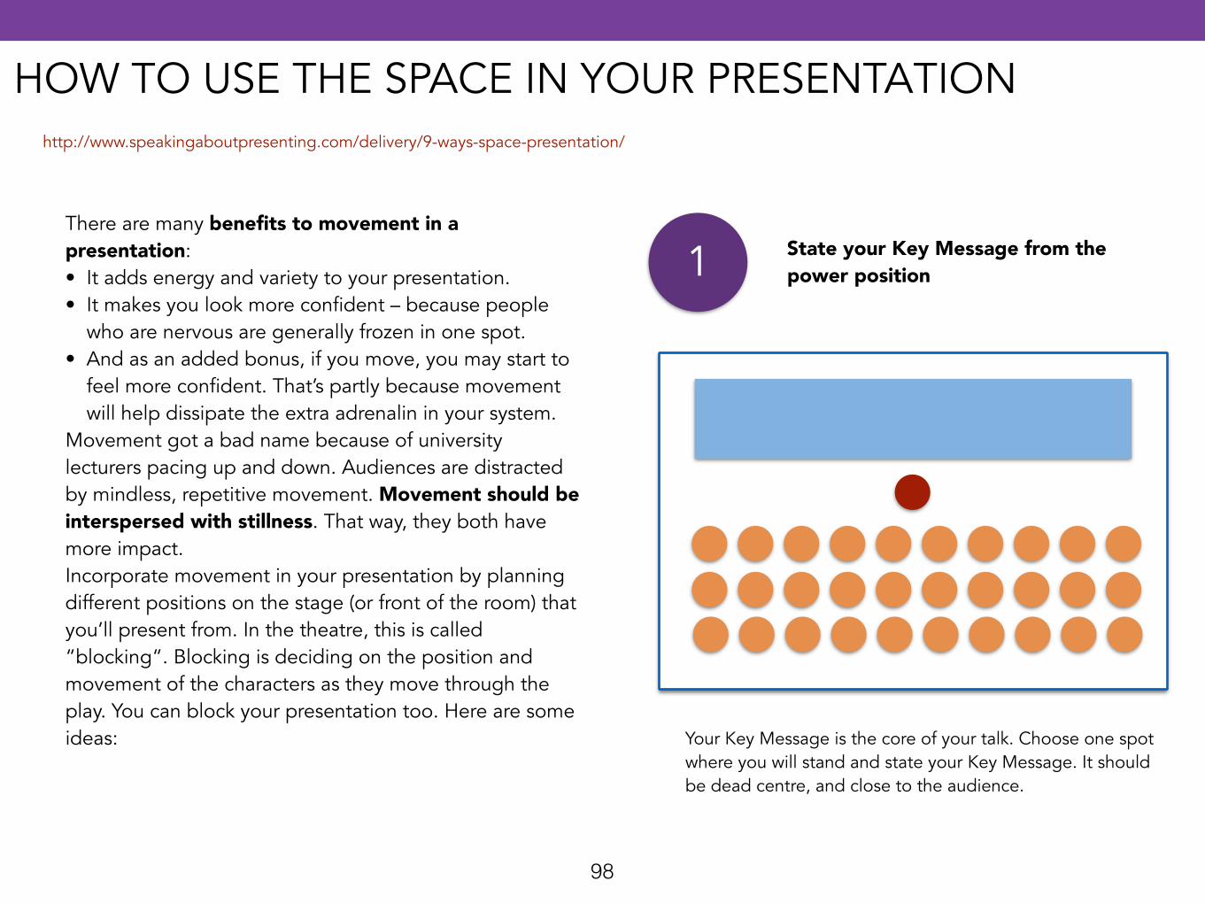
There are many benefits to movement in a presentation: • It adds energy and variety to your presentation. • It makes you look more confident – because people
who are nervous are generally frozen in one spot. • And as an added bonus, if you move, you may start to
feel more confident. That’s partly because movement will help dissipate the extra adrenalin in your system.
Movement got a bad name because of university lecturers pacing up and down. Audiences are distracted by mindless, repetitive movement. Movement should be interspersed with stillness. That way, they both have more impact. Incorporate movement in your presentation by planning different positions on the stage (or front of the room) that you’ll present from. In the theatre, this is called “blocking“. Blocking is deciding on the position and movement of the characters as they move through the play. You can block your presentation too. Here are some ideas:
1 State your Key Message from the power position
Your Key Message is the core of your talk. Choose one spot where you will stand and state your Key Message. It should be dead centre, and close to the audience.
http://www.speakingaboutpresenting.com/delivery/9-ways-space-presentation/
HOW TO USE THE SPACE IN YOUR PRESENTATION
99
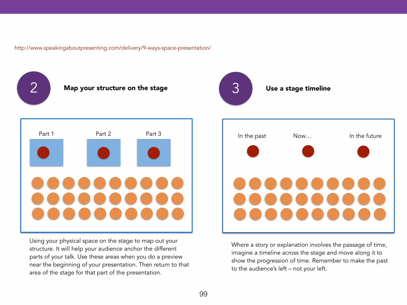
3 Use a stage timeline
Where a story or explanation involves the passage of time, imagine a timeline across the stage and move along it to show the progression of time. Remember to make the past to the audience’s left – not your left.
2 Map your structure on the stage
Using your physical space on the stage to map out your structure. It will help your audience anchor the different parts of your talk. Use these areas when you do a preview near the beginning of your presentation. Then return to that area of the stage for that part of the presentation.
Part 1 Part 2 Part 3 In the past Now… In the future
http://www.speakingaboutpresenting.com/delivery/9-ways-space-presentation/
100
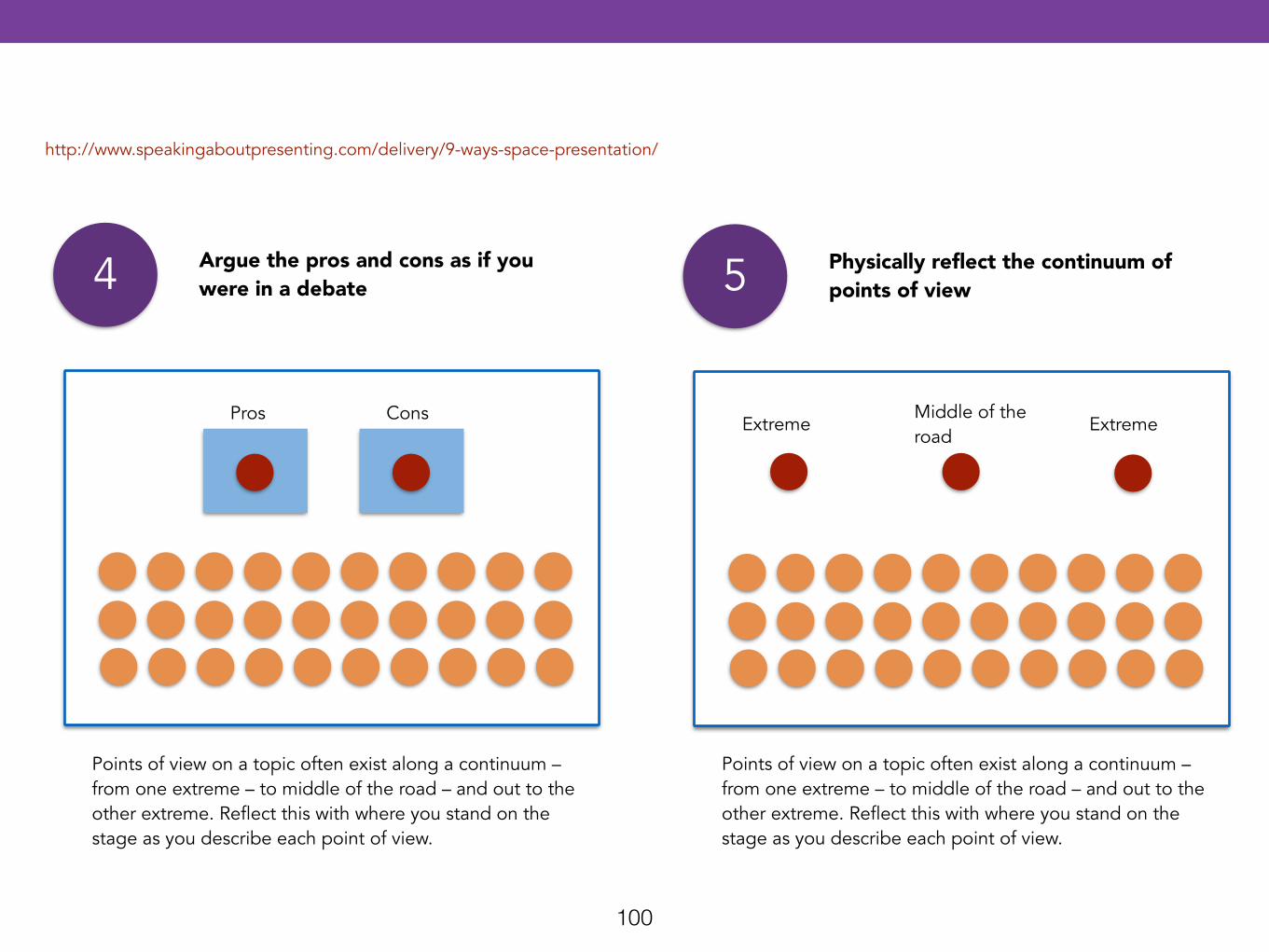
5 Physically reflect the continuum of points of view
Points of view on a topic often exist along a continuum – from one extreme – to middle of the road – and out to the other extreme. Reflect this with where you stand on the stage as you describe each point of view.
4 Argue the pros and cons as if you were in a debate
Points of view on a topic often exist along a continuum – from one extreme – to middle of the road – and out to the other extreme. Reflect this with where you stand on the stage as you describe each point of view.
Pros Cons ExtremeMiddle of the road
Extreme
http://www.speakingaboutpresenting.com/delivery/9-ways-space-presentation/
101
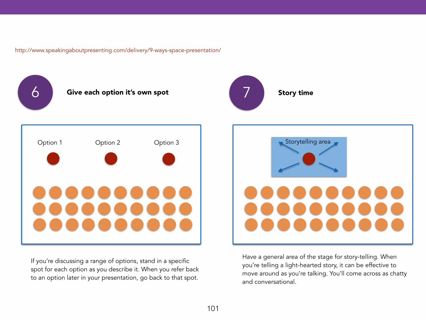
7 Story time
Have a general area of the stage for story-telling. When you’re telling a light-hearted story, it can be effective to move around as you’re talking. You’ll come across as chatty and conversational.
6 Give each option it’s own spot
If you’re discussing a range of options, stand in a specific spot for each option as you describe it. When you refer back to an option later in your presentation, go back to that spot.
Storytelling area
http://www.speakingaboutpresenting.com/delivery/9-ways-space-presentation/
Option 1 Option 2 Option 3
102
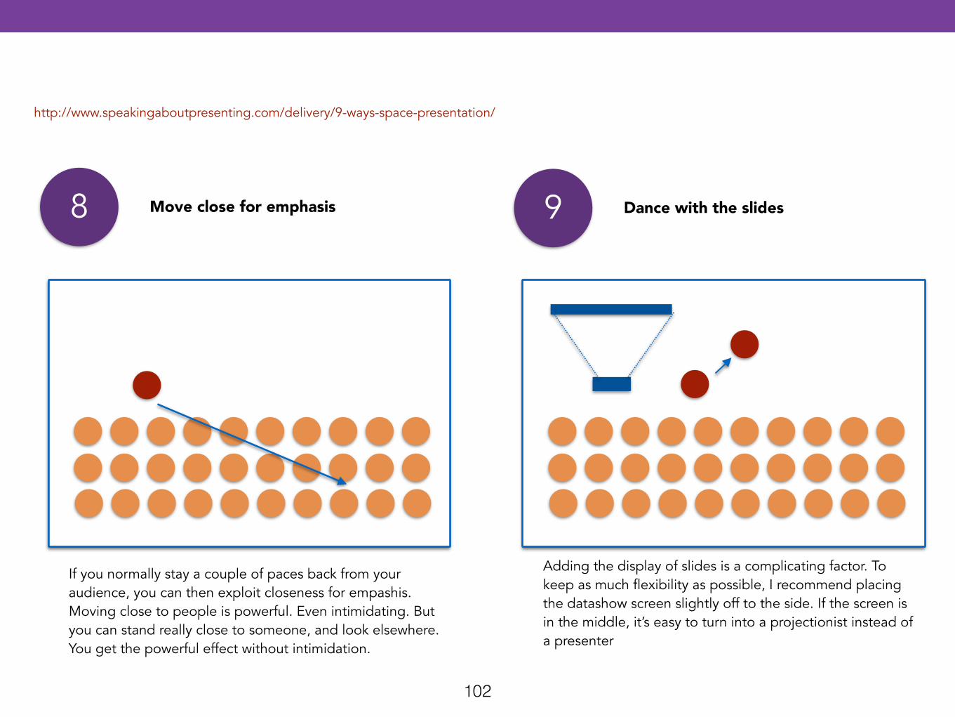
9 Dance with the slides
Adding the display of slides is a complicating factor. To keep as much flexibility as possible, I recommend placing the datashow screen slightly off to the side. If the screen is in the middle, it’s easy to turn into a projectionist instead of a presenter
8 Move close for emphasis
If you normally stay a couple of paces back from your audience, you can then exploit closeness for empashis. Moving close to people is powerful. Even intimidating. But you can stand really close to someone, and look elsewhere. You get the powerful effect without intimidation.
http://www.speakingaboutpresenting.com/delivery/9-ways-space-presentation/
103
People will be estimated by you as a presenter, and will understand your message more fully, if you use your hands cleverly. It is important to use your hands reinforce your message. You can use your hands to maximize the likelihood of changing your audience’s behavior. It is possible to move your hands so much that your audience becomes distracted by your movement or entranced by your activity, to the detriment of their ability to listen. Remember to put your hands down by your sides (which is called “cleaning the slate”) between gestures to give your audience a break every now and then. !Informal and formal gestures Informal gestures is often referred to as talking with your hands. These gestures are unrehearsed. Formal gestures are rehearsed, often in front of a mirror. The purpose of a formal gesture is to emphasize a point that is important. Well-delivered gestures can replace the need for some of your PowerPoint slides. An example of a formal gesture is when you count something with your fingers; “1, 2, 3”. When you gesture formally there are two things to remember: • Practise in front to the mirror to refine the gesture and ensure that it
is strong and congruent with the message you want to send. • Make your gestures big enough for people to get to the point.
Michelle Bowden: how to Present
GESTURES
104
6References
Books
Web pages
Online presentations
105
• Alley M. The Craft of Scientific Presentations: Critical Steps to Succeed and Critical Errors to Avoid. Edición: 2. Springer New York; 2013.
• Atkinson C. Beyond Bullet Points, 3rd Edition: Using Microsoft PowerPoint to Create Presentations That Inform, Motivate, and Inspire. Edición: 3. Microsoft Press; 2011.
• Duarte N. Slide:Ology: The Art and Science of Presentation Design. Edición: 1. O’Reilly Media; 2011.
• Duarte N. Resonate: Present Visual Stories that Transform Audiences. Edición: 1. Wiley; 2013.
• Frommer F. How PowerPoint Makes You Stupid: The Faulty Causality, Sloppy Logic, Decontextualized Data, and Seductive Showmanship That Have Taken Over Our Thinking. New York: New Press, The; 2012. 288 p.
• Karia A. How to Design TED Worthy Presentation Slides: Presentation Design Principles from the Best TED Talks. AkashKaria.com; 2014.
• Mayer RE. Multimedia Learning. Edición: 2. Cambridge University Press; 2012.
• Tufte ER. The Cognitive Style of Power Point. Cheshire, Conn.: Graphics Pr; 2003.
• Weissman J. Presenting to Win: The Art of Telling Your Story, Updated and Expanded Edition. Edición: 1. FT Press; 2008.
Books
106
Deliver Engaging Presentations Like Steve Jobs. http://business.tutsplus.com/articles/deliver-engaging-presentations-like-steve-jobs--cms-19410
How to Use Mind Maps to Unleash Your Brain’s Creativity and Potential http://lifehacker.com/how-to-use-mind-maps-to-unleash-your-brains-creativity-1348869811
Nine things everyone should know how to do with a presentation app http://www.macworld.com/article/2452947/nine-things-everyone-should-know-how-to-do-with-a-presentation-app.html
10 Tricks That Can Make Anyone A Powerpoint Expert http://www.lifehack.org/articles/technology/10-tricks-that-can-make-anyone-powerpoint-expert.html
8 Fatal Body Language Mistakes To Avoid During Presentations http://www.lifehack.org/articles/productivity/8-fatal-body-language-mistakes-avoid-during-presentations.html
In Case You Think Powerpoint Is The Only Presentation Tool, These Alternatives Are What You Should Know http://www.lifehack.org/articles/technology/capture-the-audiences-attention-4-alternative-presentation-platforms.html
web pages
107
7 Habits You Should Take Up To Be A Successful Speaker http://www.lifehack.org/articles/productivity/7-habits-you-should-take-successful-speaker.html
Absolute PowerpointCan a software package edit our thoughts? http://www.newyorker.com/magazine/2001/05/28/absolute-powerpoint
PowerPoint Does Rocket Science—and Better Techniques for Technical Reports http://www.edwardtufte.com/bboard/q-and-a-fetch-msg?msg_id=0001yB
PowerPoint Is Evil http://archive.wired.com/wired/archive/11.09/ppt2.html
PowerPoint at 20: Back to Basics http://www.robertgaskins.com/pages/gaskins-powerpoint-at-20-cacm-vol50-no12-dec-2007-p15-p17.htm
How to change the world. http://blog.guykawasaki.com
11 Presentation Lessons You Can Still Learn From Steve Jobs http://www.forbes.com/sites/carminegallo/2012/10/04/11-presentation-lessons-you-can-still-learn-from-steve-jobs/
web pages
108
Learning to Love PowerPoint. http://archive.wired.com/wired/archive/11.09/ppt1.html
Make a Presentation Like Al Gore http://howto.wired.com/wiki/Make_a_Presentation_Like_Al_Gore
PowerPoint Makes You Dumb http://www.nytimes.com/2003/12/14/magazine/14POWER.html
Point Counterpoint: How to Use (and Avoid Misusing) PowerPoint http://learning.blogs.nytimes.com/2010/05/03/point-counter-point-how-to-use-and-avoid-misusing-powerpoint/comment-page-1/?_php=true&_type=blogs&_r=0
Creating great PowerPoints and not Bad PowerPoints http://www.slideshare.net/lutroo/creating-great-powerpoints-and-not-bad-powerpoints?related=1
25 Useful Expressions you can use to make your Presentations in English flow http://englishwithatwist.com/2014/08/14/presentation-skills-25-useful-expressions-you-can-use-to-make-your-presentations-in-english-flow/
web pages
109
How to prepare a 20-minute TED-like talk http://publicwords.com/how-to-prepare-a-20-minute-ted-like-talk/
Use a Brainstorm Before You Open PowerPoint! http://www.duarte.com/blog/use-a-brainstorm-or-quickstorm-before-you-open-powerpoint/
How to give more persuasive presentations: A Q&A with Nancy Duarte . http://blog.ted.com/2012/10/31/how-to-give-more-persuasive-presentations-a-qa-with-nancy-duarte/
What are the best Prezi Alternatives? http://www.powtoon.com/blog/5-best-prezi-alternatives/
20 World-Class Presentation Experts Share Their Top Tips http://www.forbes.com/sites/markfidelman/2014/08/15/20-world-class-presentation-experts-share-their-top-tips/
web pages
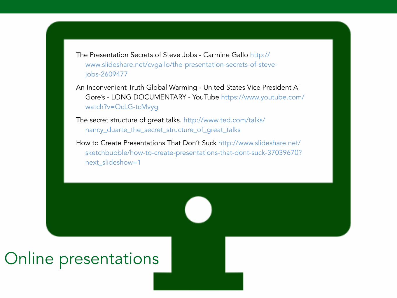
110
Online presentations
The Presentation Secrets of Steve Jobs - Carmine Gallo http://www.slideshare.net/cvgallo/the-presentation-secrets-of-steve-jobs-2609477
An Inconvenient Truth Global Warming - United States Vice President Al Gore’s - LONG DOCUMENTARY - YouTube https://www.youtube.com/watch?v=OcLG-tcMvyg
The secret structure of great talks. http://www.ted.com/talks/nancy_duarte_the_secret_structure_of_great_talks
How to Create Presentations That Don’t Suck http://www.slideshare.net/sketchbubble/how-to-create-presentations-that-dont-suck-37039670?next_slideshow=1