harvard business review
TRANSCRIPT
Copyright © President & Fellows of Harvard College.
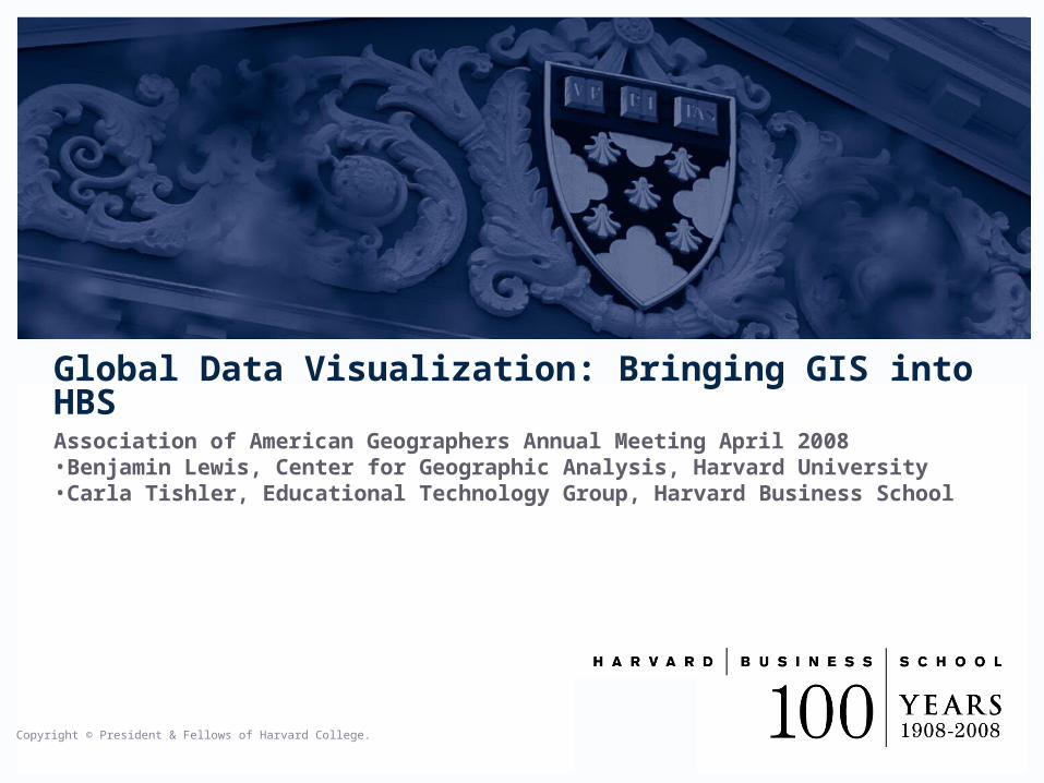
Association of American Geographers Annual Meeting April 2008•Benjamin Lewis, Center for Geographic Analysis, Harvard University•Carla Tishler, Educational Technology Group, Harvard Business School
Global Data Visualization: Bringing GIS into HBS
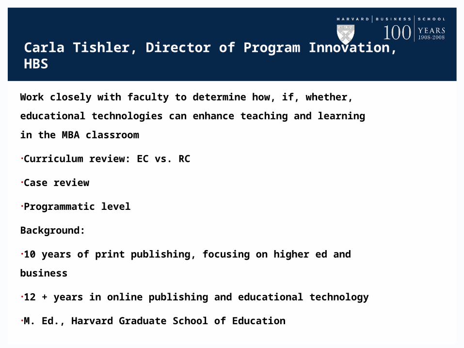
Carla Tishler, Director of Program Innovation, HBS
Work closely with faculty to determine how, if, whether, educational
technologies can enhance teaching and learning in the MBA
classroom
•Curriculum review: EC vs. RC
•Case review
•Programmatic level
Background:
•10 years of print publishing, focusing on higher ed and business
•12 + years in online publishing and educational technology
•M. Ed., Harvard Graduate School of Education
Ben Lewis, Center for Geographic Analysis, Harvard
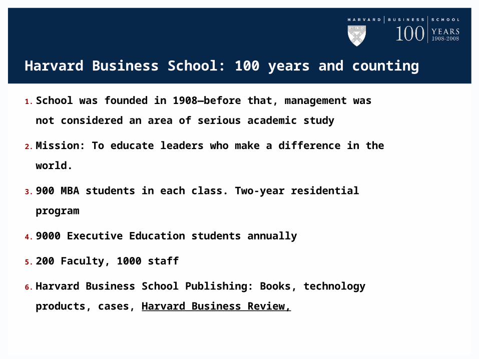
Harvard Business School: 100 years and counting
1. School was founded in 1908—before that, management was not
considered an area of serious academic study
2. Mission: To educate leaders who make a difference in the world.
3. 900 MBA students in each class. Two-year residential program
4. 9000 Executive Education students annually
5. 200 Faculty, 1000 staff
6. Harvard Business School Publishing: Books, technology
products, cases, Harvard Business Review,
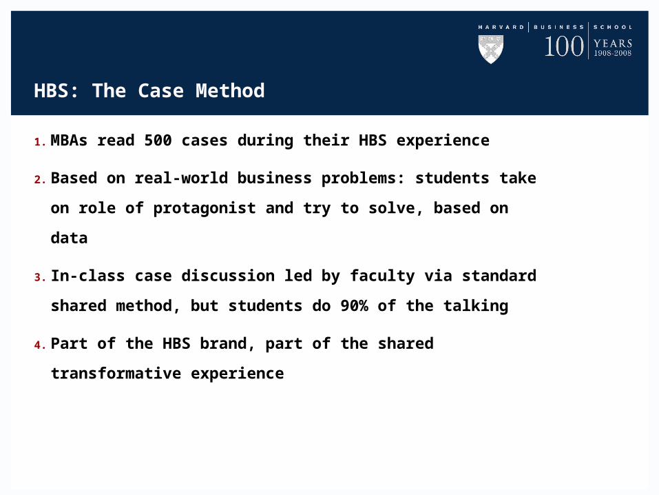
HBS: The Case Method
1. MBAs read 500 cases during their HBS experience
2. Based on real-world business problems: students take on role of
protagonist and try to solve, based on data
3. In-class case discussion led by faculty via standard shared
method, but students do 90% of the talking
4. Part of the HBS brand, part of the shared transformative
experience
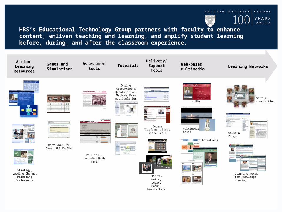
Tutorials Web-basedmultimedia
Games and Simulations
Assessment tools
Learning Networks
Action Learning
Resources
Online Accounting & Quantitative Methods Pre-matriculation
Delivery/Support
Tools
Multimediacases
Animations
Video
Learning Nexus for knowledge sharing
Wikis & Blogs
Virtual communities
Beer Game, VC Game, PLD CapSim
GMP re-entry,Legacy Books,
Newsletters
Strategy, Leading Change, Marketing
Performance
HBS’s Educational Technology Group partners with faculty to enhance content, enliven teaching and learning, and amplify student learning before, during, and after the classroom experience.
Course Platform ,iSites,Video Tools
Poll tool,Learning Path Tool
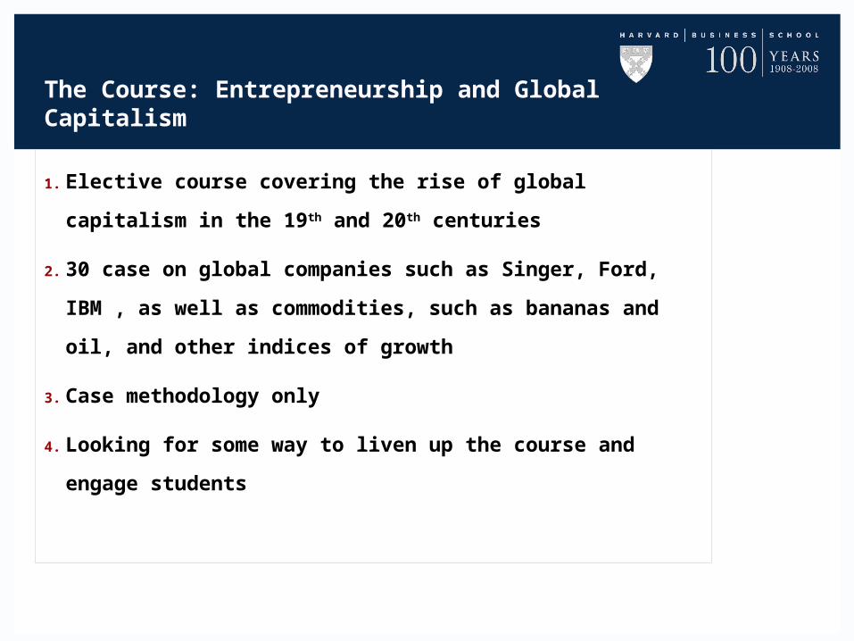
The Course: Entrepreneurship and Global Capitalism
1. Elective course covering the rise of global capitalism in the 19th
and 20th centuries
2. 30 case on global companies such as Singer, Ford, IBM , as well
as commodities, such as bananas and oil, and other indices of
growth
3. Case methodology only
4. Looking for some way to liven up the course and engage students
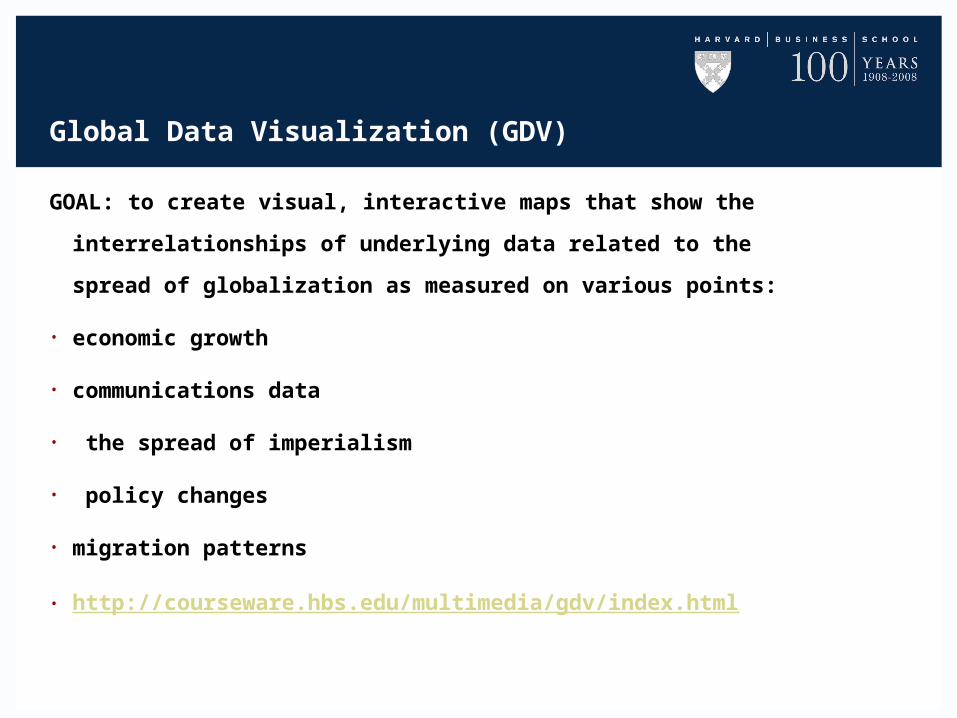
Global Data Visualization (GDV)
GOAL: to create visual, interactive maps that show the
interrelationships of underlying data related to the spread of
globalization as measured on various points:
• economic growth
• communications data
• the spread of imperialism
• policy changes
• migration patterns
• http://courseware.hbs.edu/multimedia/gdv/index.html
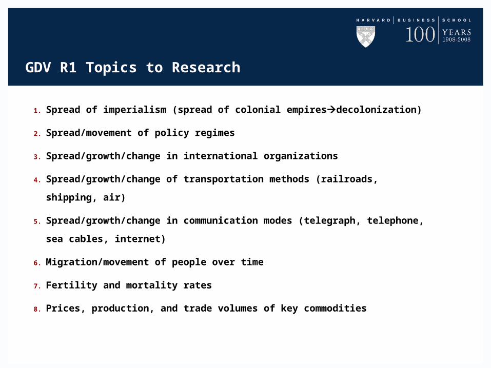
GDV R1 Topics to Research
1. Spread of imperialism (spread of colonial empiresdecolonization)
2. Spread/movement of policy regimes
3. Spread/growth/change in international organizations
4. Spread/growth/change of transportation methods (railroads, shipping, air)
5. Spread/growth/change in communication modes (telegraph, telephone, sea cables,
internet)
6. Migration/movement of people over time
7. Fertility and mortality rates
8. Prices, production, and trade volumes of key commodities
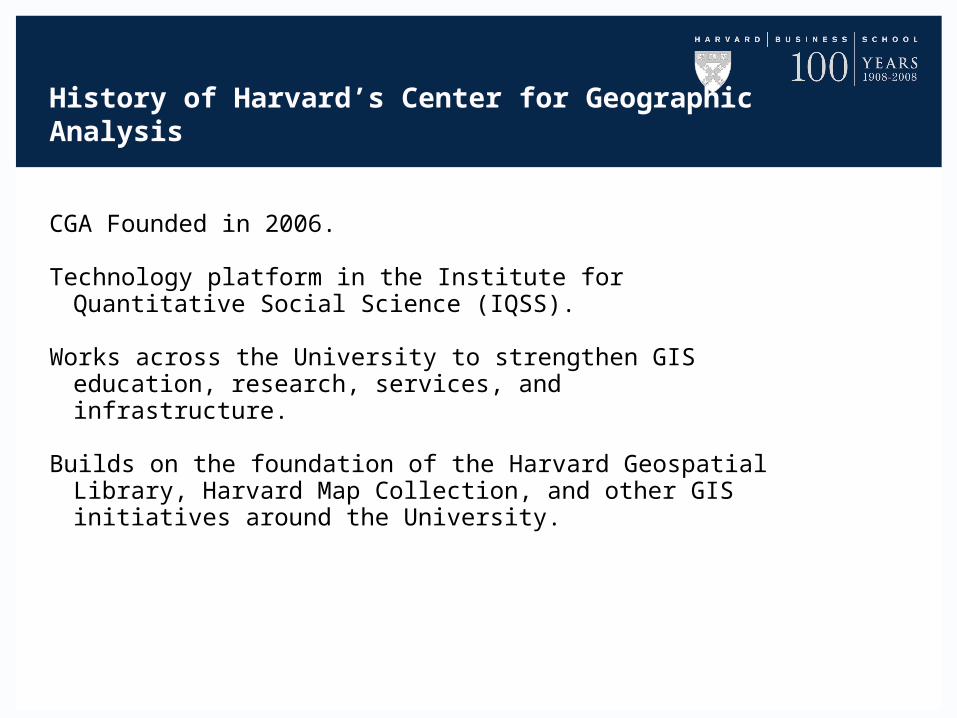
History of Harvard’s Center for Geographic Analysis
CGA Founded in 2006.
Technology platform in the Institute for Quantitative Social Science (IQSS).
Works across the University to strengthen GIS education, research, services, and infrastructure.
Builds on the foundation of the Harvard Geospatial Library, Harvard Map Collection, and other GIS initiatives around the University.
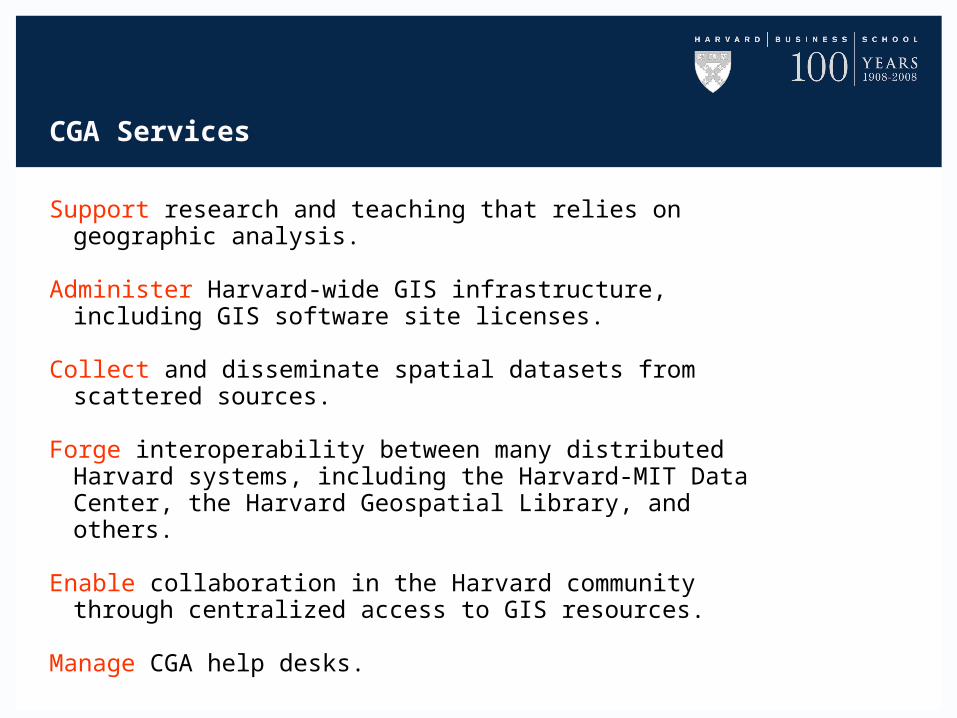
CGA Services
Support research and teaching that relies on geographic analysis.
Administer Harvard-wide GIS infrastructure, including GIS software site licenses.
Collect and disseminate spatial datasets from scattered sources.
Forge interoperability between many distributed Harvard systems, including the Harvard-MIT Data Center, the Harvard Geospatial Library, and others.
Enable collaboration in the Harvard community through centralized access to GIS resources.
Manage CGA help desks.
Other Large Scale GIS Projects at CGA
China Historical GIS http://www.fas.harvard.edu/~chgis/
Digitizing the Roman Empire and Medieval Europehttp://gis.harvard.edu/icb/icb.do?keyword=k235&tabgroupid=icb.tabgroup7706
AfricaMap http://africamap.harvard.edu
The Challenge of Global Data Visualization Project
Challenge: Provide tool to allow professors to present global historic
patterns and flows visually.
Approach: Develop simple methodology for creating various types of
time animated maps. Create animations in video format and use slider to control time. Deploy animations via the web.
Types of Data
Two categories must be handled:
1) Continuous Time with Boolean Values ex. “Rise of Communism”
2) Regular Interval Time with Numeric Values ex: “Coffee Exports”
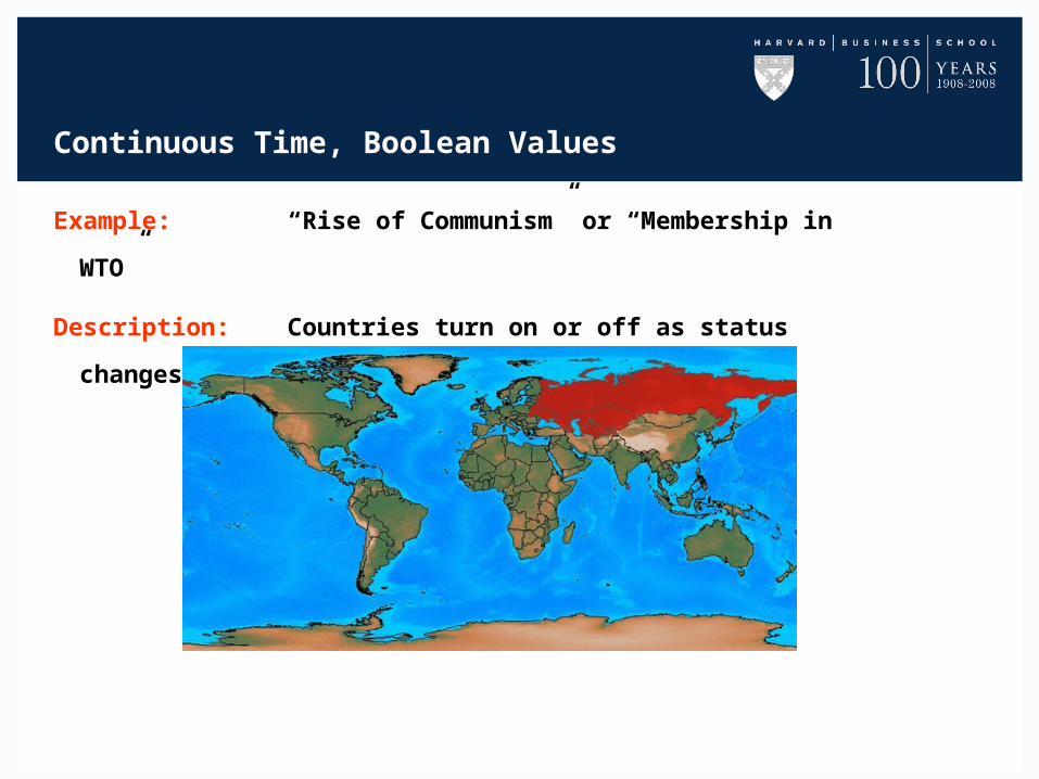
Continuous Time, Boolean Values
Example: “Rise of Communism” or “Membership in WTO”
Description: Countries turn on or off as status changes.
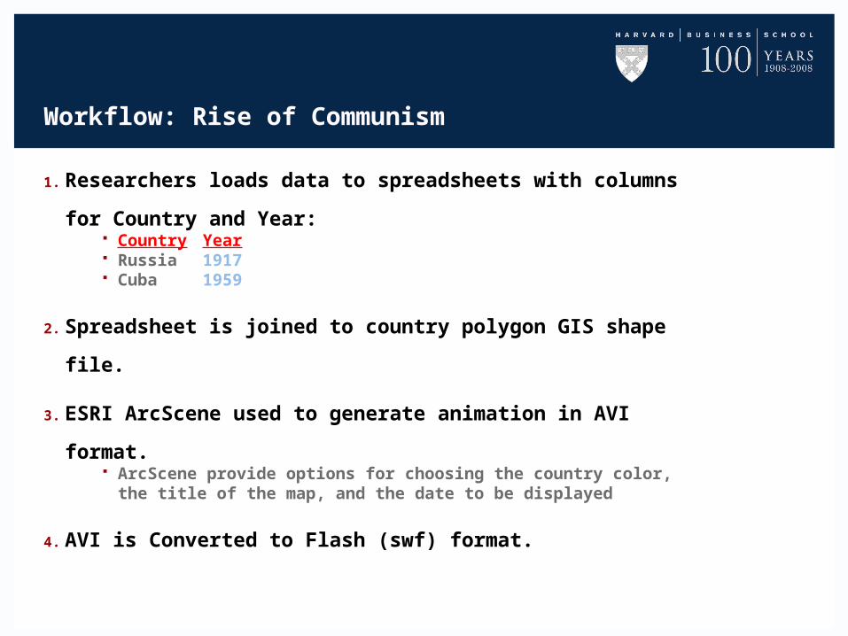
Workflow: Rise of Communism
1. Researchers loads data to spreadsheets with columns for Country
and Year: Country Year Russia 1917 Cuba 1959
2. Spreadsheet is joined to country polygon GIS shape file.
3. ESRI ArcScene used to generate animation in AVI format. ArcScene provide options for choosing the country color, the title of the
map, and the date to be displayed
4. AVI is Converted to Flash (swf) format.
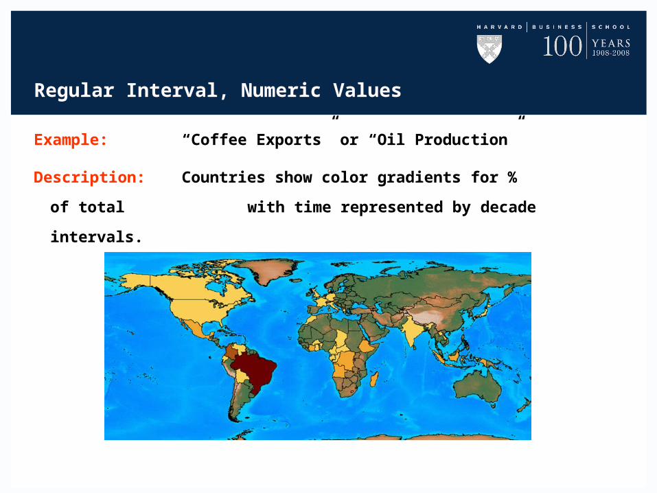
Regular Interval, Numeric Values
Example: “Coffee Exports” or “Oil Production”
Description: Countries show color gradients for % of total
with time represented by decade intervals.
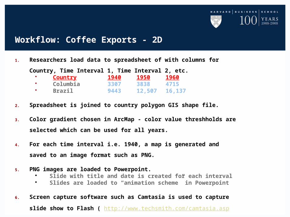
Workflow: Coffee Exports - 2D
1. Researchers load data to spreadsheet of with columns for Country, Time
Interval 1, Time Interval 2, etc. Country 1940 1950 1960 Columbia 3307 3838 4715 Brazil 9443 12,507 16,137
2. Spreadsheet is joined to country polygon GIS shape file.
3. Color gradient chosen in ArcMap - color value threshholds are selected
which can be used for all years.
4. For each time interval i.e. 1940, a map is generated and saved to an image
format such as PNG.
5. PNG images are loaded to Powerpoint. Slide with title and date is created for each interval Slides are loaded to “animation scheme” in Powerpoint
6. Screen capture software such as Camtasia is used to capture slide show to
Flash ( http://www.techsmith.com/camtasia.asp ).
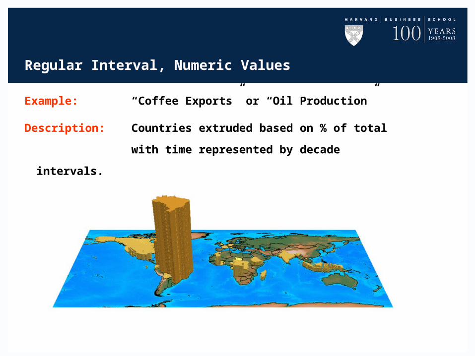
Regular Interval, Numeric Values
Example: “Coffee Exports” or “Oil Production”
Description: Countries extruded based on % of total
with time represented by decade intervals.
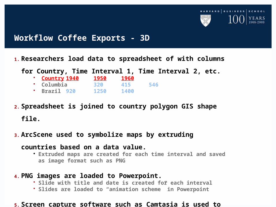
Workflow Coffee Exports - 3D
1. Researchers load data to spreadsheet of with columns for
Country, Time Interval 1, Time Interval 2, etc. Country 1940 1950 1960 Columbia 320 415 546 Brazil 920 1250 1400
2. Spreadsheet is joined to country polygon GIS shape file.
3. ArcScene used to symbolize maps by extruding countries based
on a data value. Extruded maps are created for each time interval and saved as image
format such as PNG
4. PNG images are loaded to Powerpoint. Slide with title and date is created for each interval Slides are loaded to “animation scheme” in Powerpoint
5. Screen capture software such as Camtasia is used to capture the
slide show to Flash ( http://www.techsmith.com/camtasia.asp ).
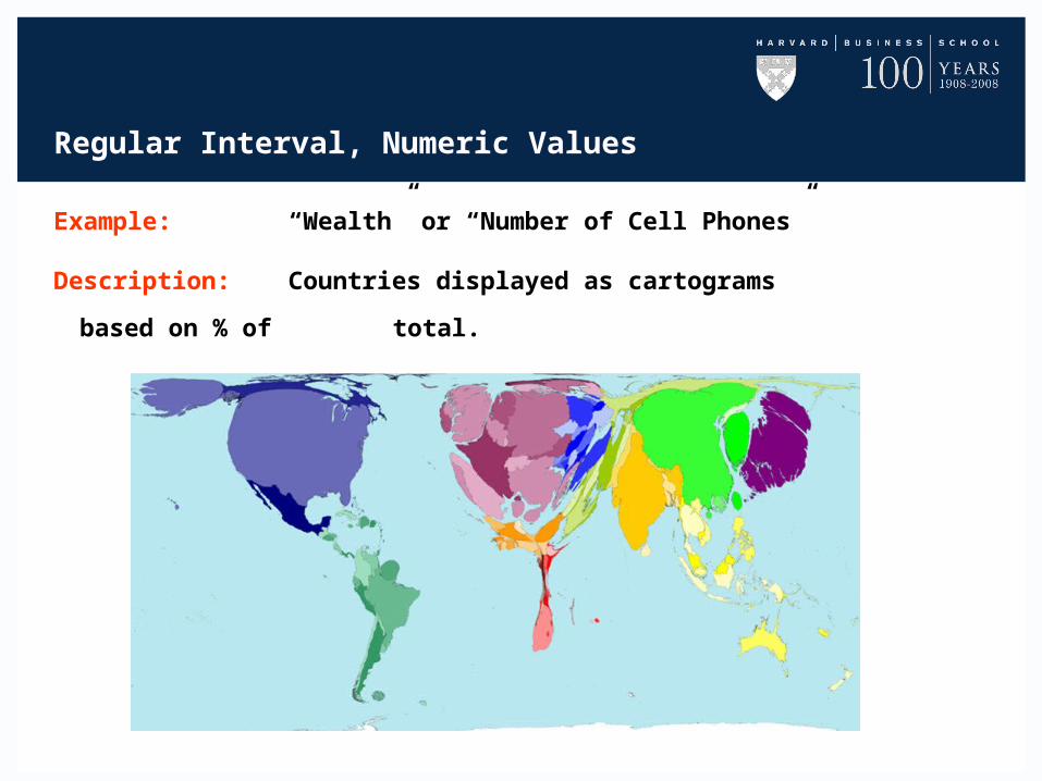
Regular Interval, Numeric Values
Example: “Wealth” or “Number of Cell Phones”
Description: Countries displayed as cartograms based on %
of total.
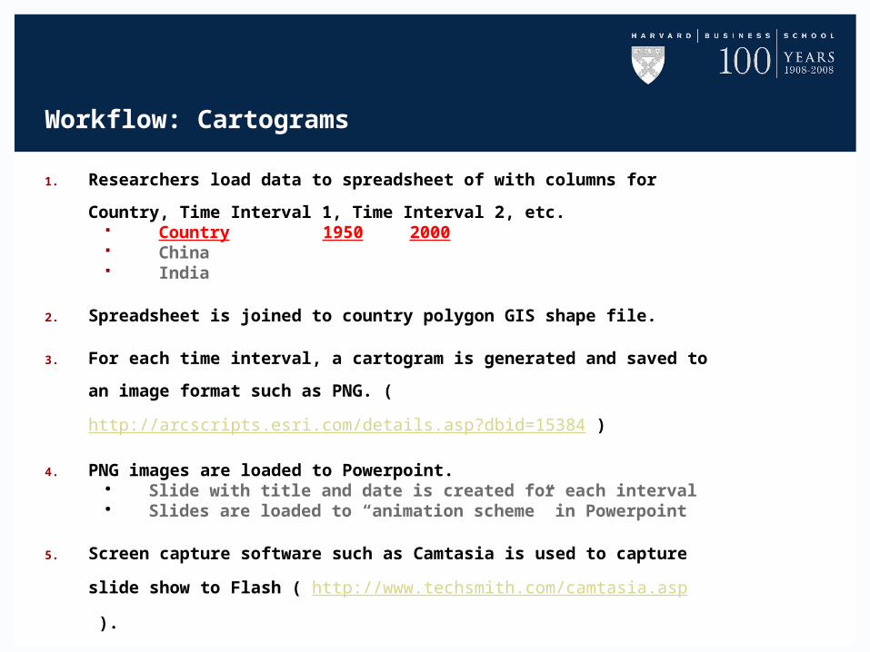
Workflow: Cartograms
1. Researchers load data to spreadsheet of with columns for Country, Time
Interval 1, Time Interval 2, etc. Country 1950 2000 China India
2. Spreadsheet is joined to country polygon GIS shape file.
3. For each time interval, a cartogram is generated and saved to an image
format such as PNG. (http://arcscripts.esri.com/details.asp?dbid=15384 )
4. PNG images are loaded to Powerpoint. Slide with title and date is created for each interval Slides are loaded to “animation scheme” in Powerpoint
5. Screen capture software such as Camtasia is used to capture slide show to
Flash ( http://www.techsmith.com/camtasia.asp ).
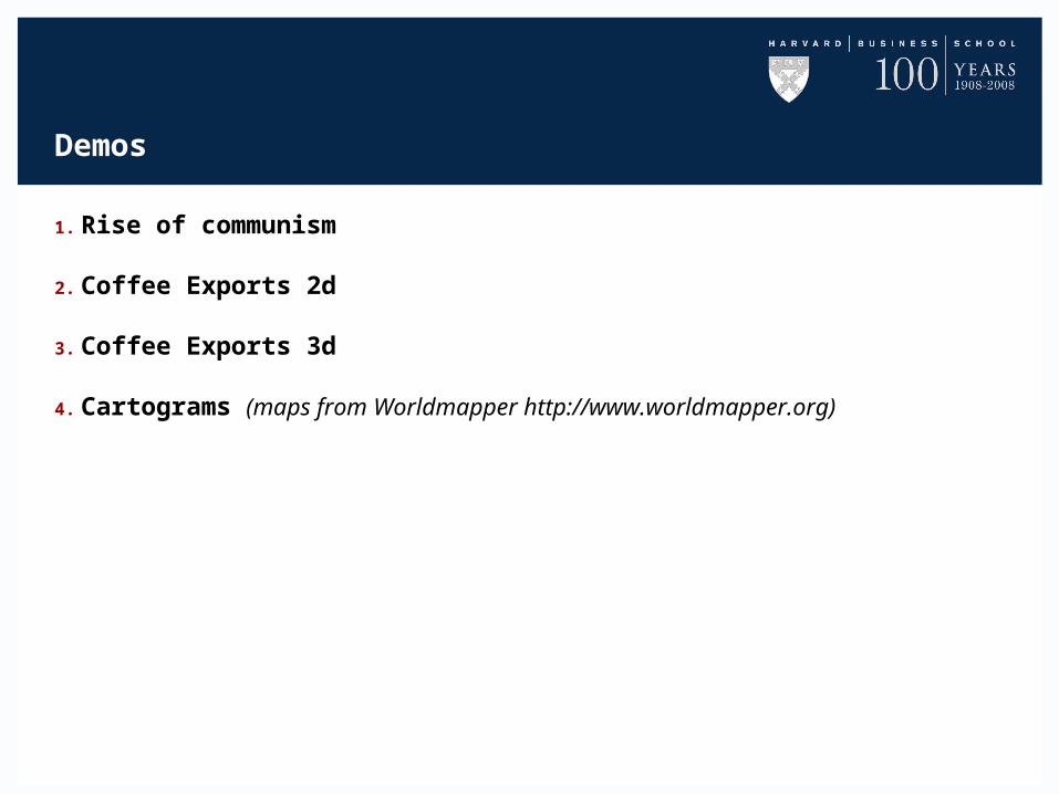
Demos
1. Rise of communism
2. Coffee Exports 2d
3. Coffee Exports 3d
4. Cartograms (maps from Worldmapper http://www.worldmapper.org)