graphic presentation using excel chart axes and axis tricks – adding a line – adding arbitrary...
TRANSCRIPT

Graphic Presentation Using Excel
• Chart axes and axis tricks– Adding a line– Adding arbitrary gridlines(dummy axis)
• Examples– Interaction effect– Stacked charts with vertical separation– Bar chart with broken axis
• Most of materials covered here are from the following websitehttp://peltiertech.com/Excel/Charts/
ChartIndex.html
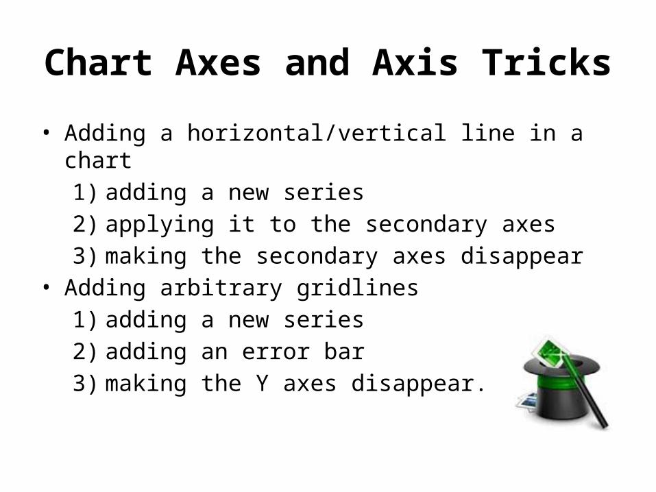
Chart Axes and Axis Tricks
• Adding a horizontal/vertical line in a chart1) adding a new series2) applying it to the secondary axes3) making the secondary axes disappear
• Adding arbitrary gridlines1) adding a new series2) adding an error bar3) making the Y axes disappear.
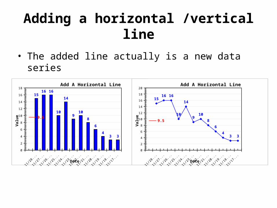
Adding a horizontal /vertical line
• The added line actually is a new data series
12/30
11/02
09/02
07/02
05/02
03/02
01/02
11/02
09/02
07/02
05/02
03/02
01/02
11/02
09/02
07/02
05/02
03/02
01/02
11/02
09/02
07/02
05/02
03/02
0
2
4
6
8
10
12
14
16
18
1516
10
14
910
8
6
43
9.5
Add A Horizontal Line
Date
Valu
e
12/30
11/02
09/02
07/02
05/02
03/02
01/02
11/02
09/02
07/02
05/02
03/02
01/02
11/02
09/02
07/02
05/02
03/02
01/02
11/02
09/02
07/02
05/02
03/02
0
2
4
6
8
10
12
14
16
18
20
34
6
8
109
14
10
1615
9.5
Add A Horizontal Line
Date
Valu
e
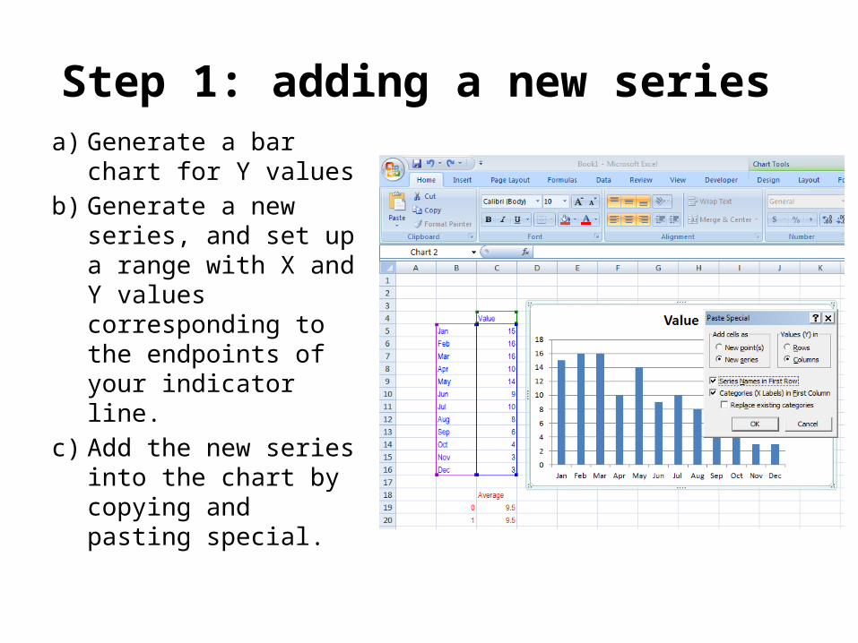
Step 1: adding a new series a) Generate a bar
chart for Y valuesb) Generate a new
series, and set up a range with X and Y values corresponding to the endpoints of your indicator line.
c) Add the new series into the chart by copying and pasting special.
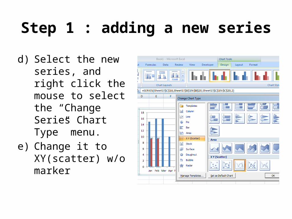
Step 1 : adding a new series
d) Select the new series, and right click the mouse to select the “Change Series Chart Type” menu.
e) Change it to XY(scatter) w/o marker
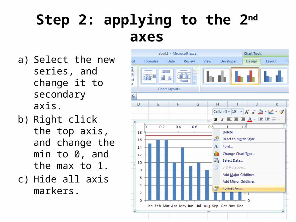
Step 2: applying to the 2nd axes
a) Select the new series, and change it to secondary axis.
b) Right click the top axis, and change the min to 0, and the max to 1.
c) Hide all axis markers.
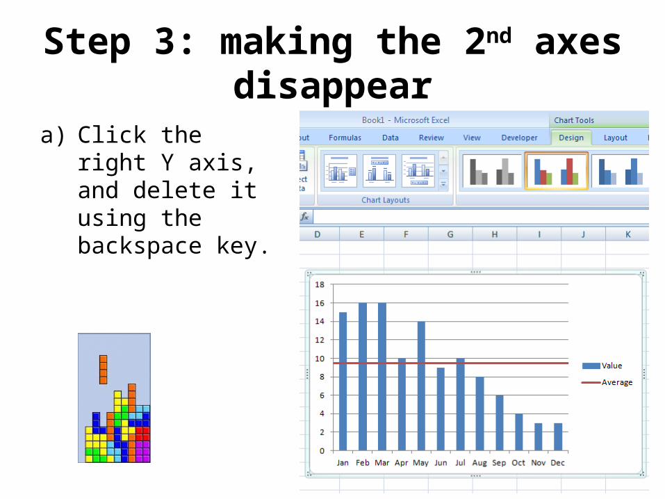
Step 3: making the 2nd axes disappear
a) Click the right Y axis, and delete it using the backspace key.
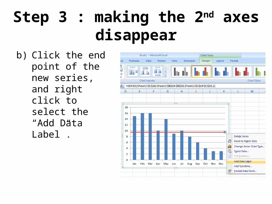
Step 3 : making the 2nd axes disappear
b) Click the end point of the new series, and right click to select the “Add Data Label”.
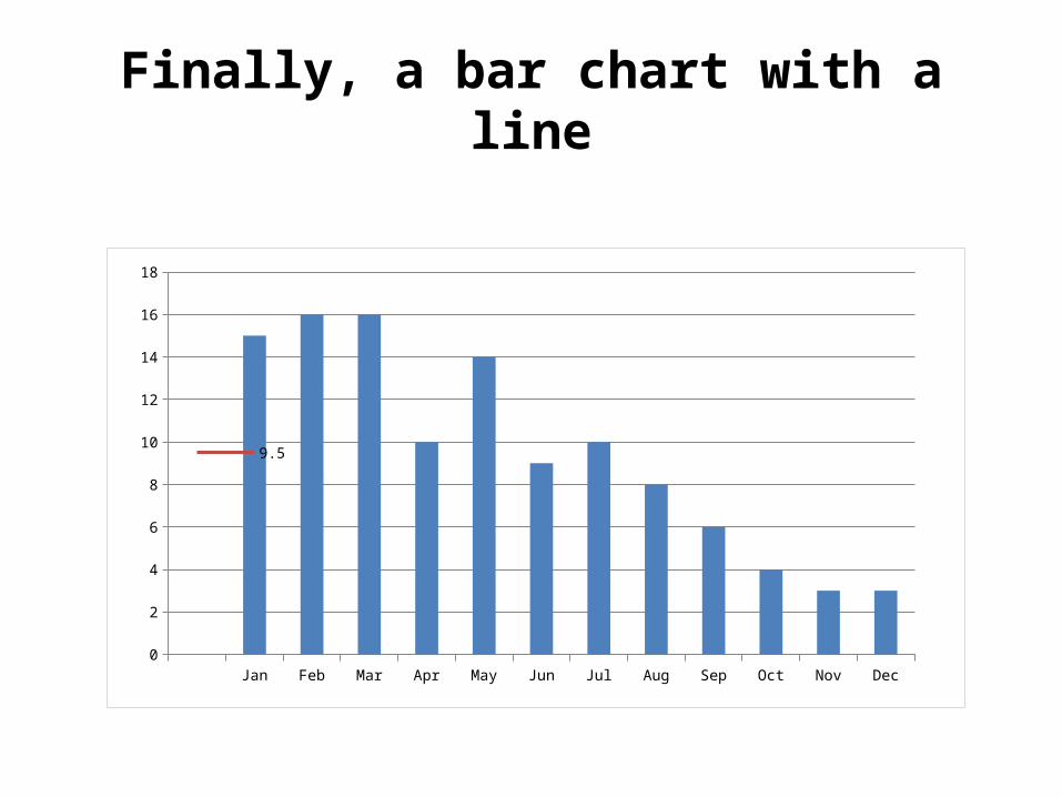
Finally, a bar chart with a line
Jan Feb Mar Apr May Jun Jul Aug Sep Oct Nov Dec0
2
4
6
8
10
12
14
16
18
9.5
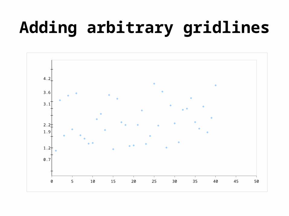
Adding arbitrary gridlines
0 5 10 15 20 25 30 35 40 45 50
0.7
1.2
1.9
2.2
3.1
3.6
4.2
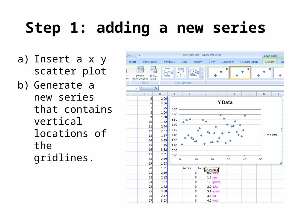
Step 1: adding a new series
a) Insert a x y scatter plot
b) Generate a new series that contains vertical locations of the gridlines.
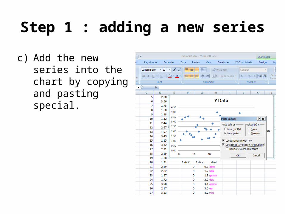
Step 1 : adding a new series
c) Add the new series into the chart by copying and pasting special.
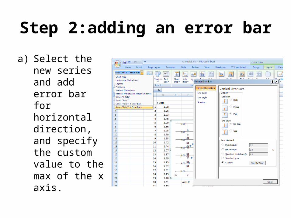
Step 2:adding an error bar
a) Select the new series and add error bar for horizontal direction, and specify the custom value to the max of the x axis.
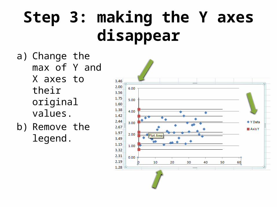
Step 3: making the Y axes disappear
a) Change the max of Y and X axes to their original values.
b) Remove the legend.
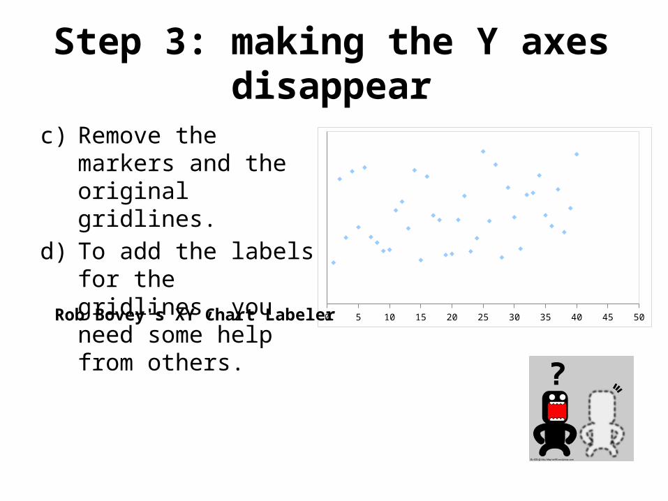
Step 3: making the Y axes disappear
c) Remove the markers and the original gridlines.
d) To add the labels for the gridlines, you need some help from others.
0 5 10 15 20 25 30 35 40 45 50Rob Bovey's XY Chart Labeler
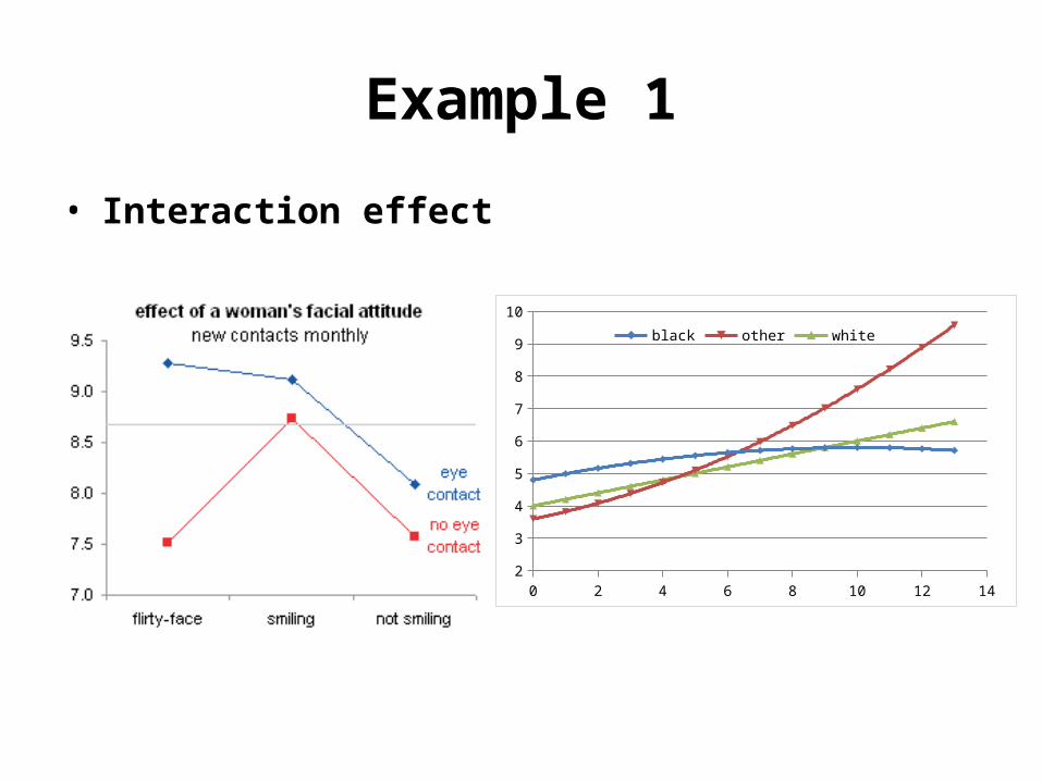
Example 1
• Interaction effect
0 2 4 6 8 10 12 142
3
4
5
6
7
8
9
10
black other white
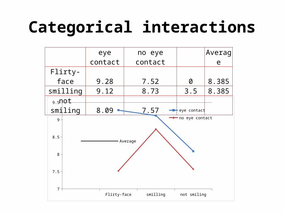
Categorical interactionseye
contact no eye contactAverag
e
Flirty-face 9.28 7.52 0 8.385smilling 9.12 8.73 3.5 8.385
not smiling 8.09 7.57
Flirty-face smilling not smiling7
7.5
8
8.5
9
9.5
Average
eye contact
no eye contact
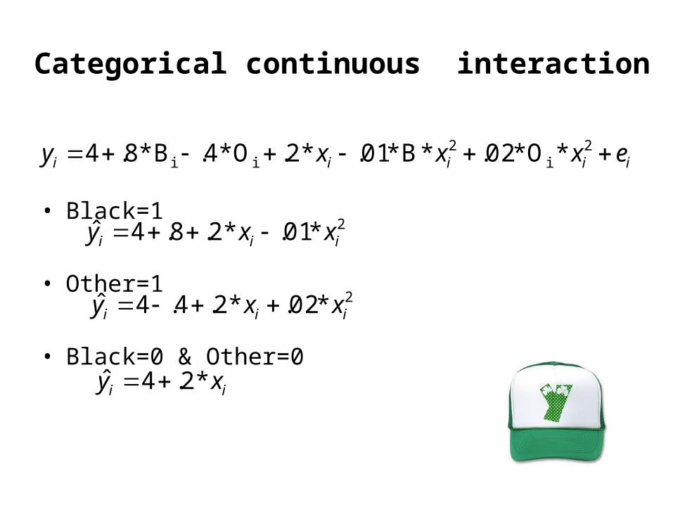
Categorical continuous interaction
• Black=1
• Other=1
• Black=0 & Other=0
iiiii exxxy 2i
2ii *O*02.*B*01.*2.O*4.B*8.4
2*01.*2.8.4ˆ iii xxy
2*02.*2.4.4ˆ iii xxy
ii xy *2.4ˆ
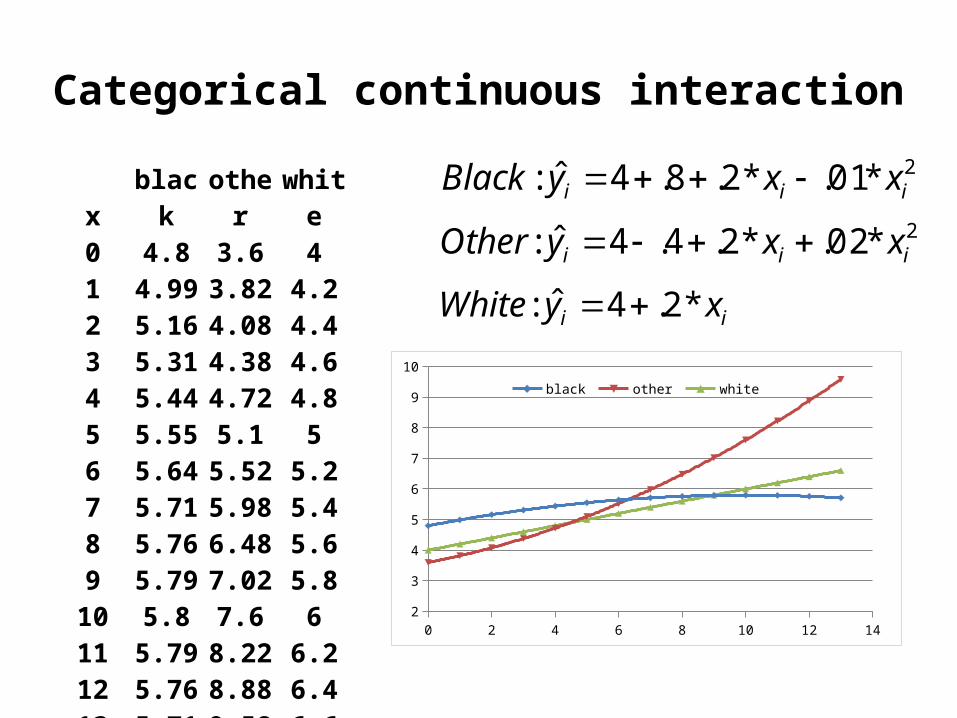
Categorical continuous interaction
xblac
kothe
rwhit
e0 4.8 3.6 41 4.99 3.82 4.22 5.16 4.08 4.43 5.31 4.38 4.64 5.44 4.72 4.85 5.55 5.1 56 5.64 5.52 5.27 5.71 5.98 5.48 5.76 6.48 5.69 5.79 7.02 5.810 5.8 7.6 611 5.79 8.22 6.212 5.76 8.88 6.413 5.71 9.58 6.6
0 2 4 6 8 10 12 142
3
4
5
6
7
8
9
10
black other white
2*01.*2.8.4ˆ: iii xxyBlack 2*02.*2.4.4ˆ: iii xxyOther
ii xyWhite *2.4ˆ:
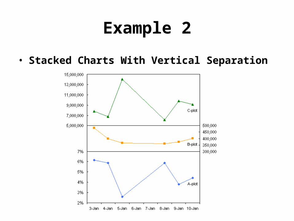
Example 2
• Stacked Charts With Vertical Separation
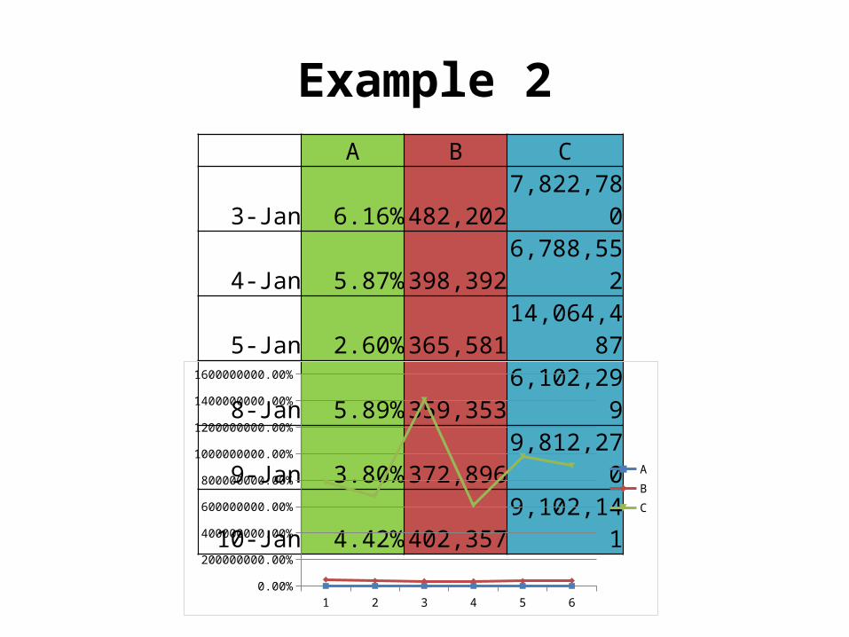
Example 2 A B C
3-Jan 6.16% 482,2027,822,78
0
4-Jan 5.87% 398,3926,788,55
2
5-Jan 2.60% 365,58114,064,4
87
8-Jan 5.89% 359,3536,102,29
9
9-Jan 3.80% 372,8969,812,27
0
10-Jan 4.42% 402,3579,102,14
1
1 2 3 4 5 60.00%
200000000.00%
400000000.00%
600000000.00%
800000000.00%
1000000000.00%
1200000000.00%
1400000000.00%
1600000000.00%
ABC
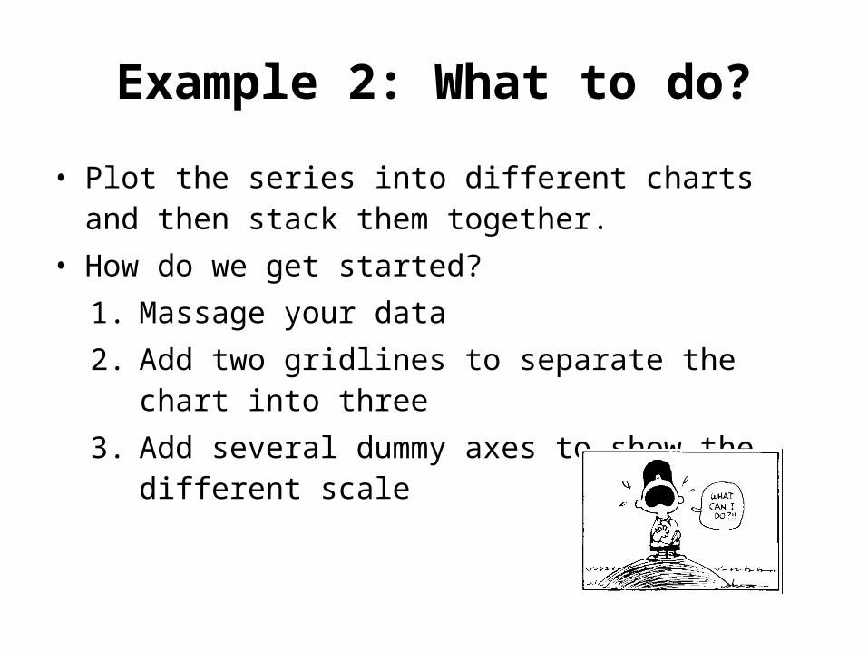
Example 2: What to do?
• Plot the series into different charts and then stack them together.
• How do we get started?1. Massage your data2. Add two gridlines to separate the chart into
three3. Add several dummy axes to show the
different scale
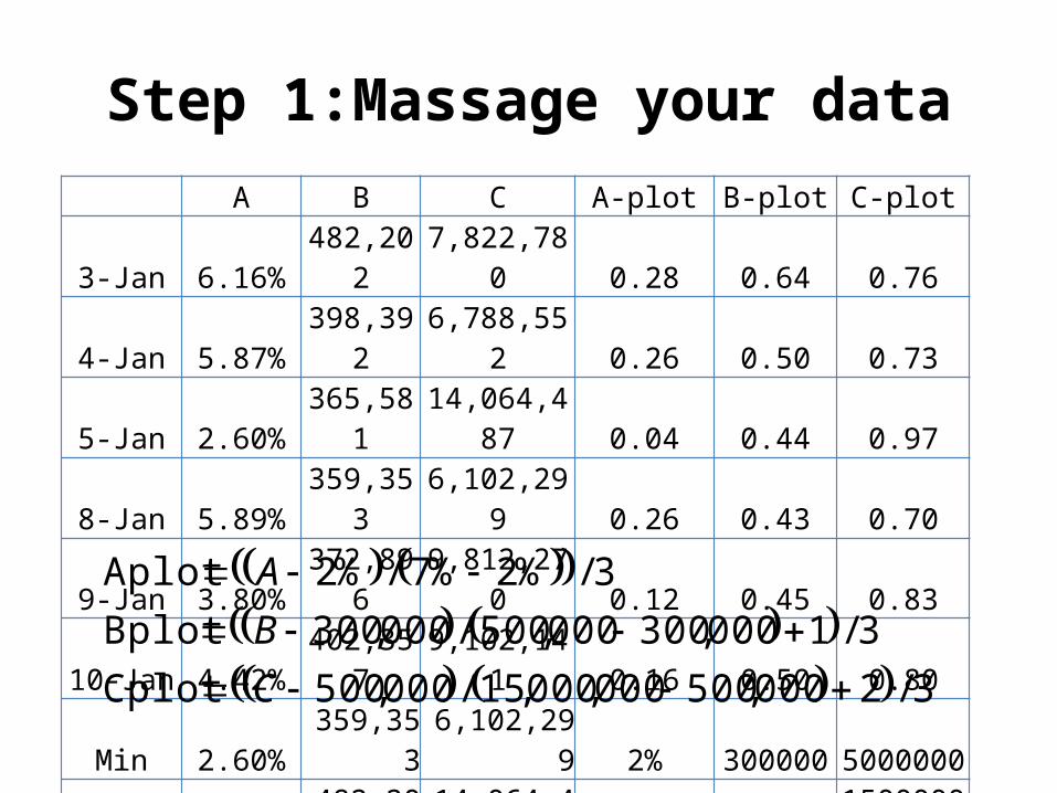
Step 1:Massage your data A B C A-plot B-plot C-plot
3-Jan 6.16%482,20
2 7,822,780 0.28 0.64 0.76
4-Jan 5.87%398,39
2 6,788,552 0.26 0.50 0.73
5-Jan 2.60%365,58
114,064,48
7 0.04 0.44 0.97
8-Jan 5.89%359,35
3 6,102,299 0.26 0.43 0.70
9-Jan 3.80%372,89
6 9,812,270 0.12 0.45 0.83
10-Jan 4.42%402,35
7 9,102,141 0.16 0.50 0.80
Min 2.60%359,35
3 6,102,299 2% 300000 5000000
Max 6.16%482,20
214,064,48
7 7% 5000001500000
0
3/2000,500000,000,15/000,500Cplot
3/1000,300000,500/000,300Bplot
3/%2%7/%2Aplot
C
B
A
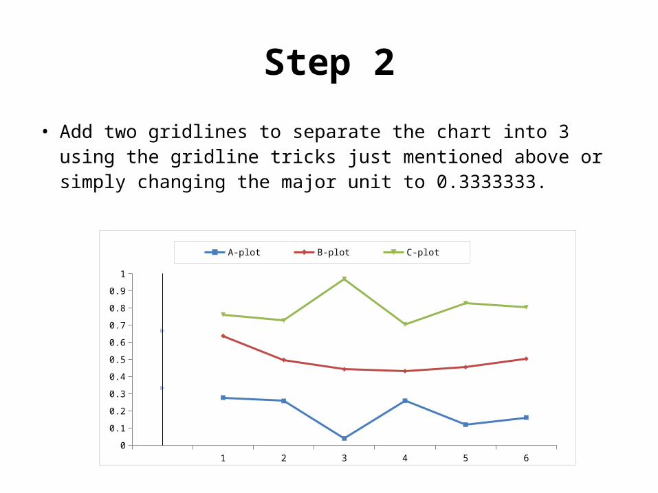
Step 2
• Add two gridlines to separate the chart into 3 using the gridline tricks just mentioned above or simply changing the major unit to 0.3333333.
1 2 3 4 5 60
0.1
0.2
0.3
0.4
0.5
0.6
0.7
0.8
0.9
1
A-plot B-plot C-plot
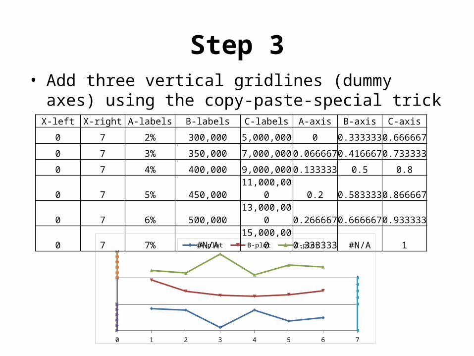
Step 3• Add three vertical gridlines (dummy axes)
using the copy-paste-special trick
0 1 2 3 4 5 6 7
A-plot B-plot C-plot
X-left X-right A-labels B-labels C-labels A-axis B-axis C-axis
0 7 2% 300,000 5,000,000 0 0.3333330.666667
0 7 3% 350,000 7,000,000 0.0666670.4166670.733333
0 7 4% 400,000 9,000,000 0.133333 0.5 0.8
0 7 5% 450,00011,000,00
0 0.2 0.5833330.866667
0 7 6% 500,00013,000,00
0 0.2666670.6666670.933333
0 7 7% #N/A15,000,00
0 0.333333 #N/A 1
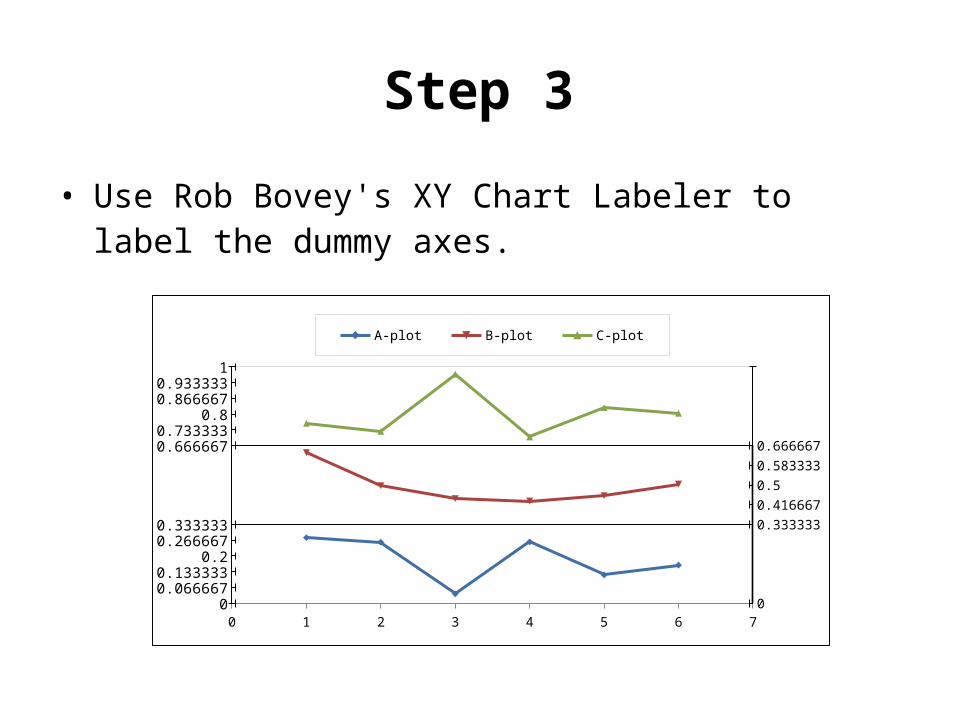
Step 3
• Use Rob Bovey's XY Chart Labeler to label the dummy axes.
0 1 2 3 4 5 6 7
0.6666670.733333
0.80.8666670.933333
1
0.333333
0.416667
0.5
0.583333
0.666667
000.0666670.133333
0.20.2666670.333333
A-plot B-plot C-plot
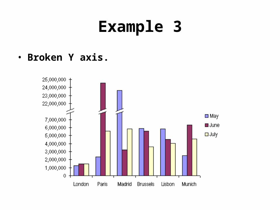
Example 3
• Broken Y axis.
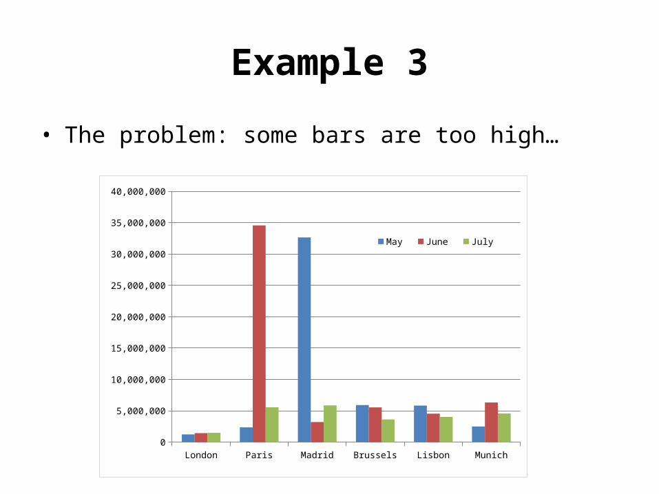
Example 3
• The problem: some bars are too high…
London Paris Madrid Brussels Lisbon Munich0
5,000,000
10,000,000
15,000,000
20,000,000
25,000,000
30,000,000
35,000,000
40,000,000
May June July
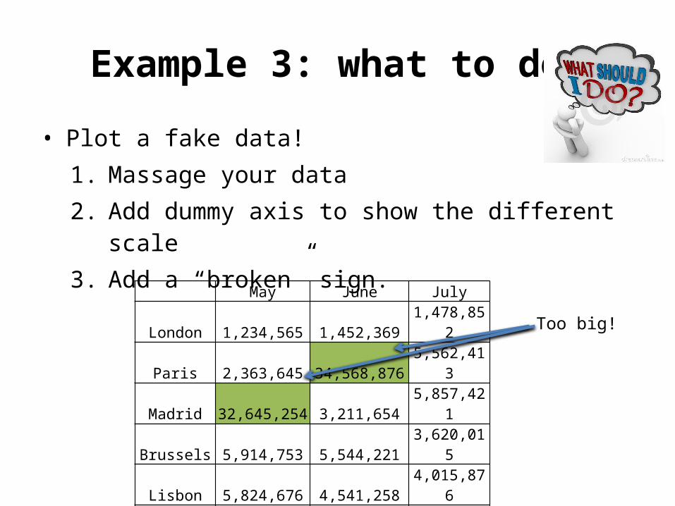
Example 3: what to do?
• Plot a fake data!1. Massage your data 2. Add dummy axis to show the different scale3. Add a “broken” sign.
May June July
London 1,234,565 1,452,369 1,478,852
Paris 2,363,645 34,568,876 5,562,413
Madrid 32,645,254 3,211,654 5,857,421
Brussels 5,914,753 5,544,221 3,620,015
Lisbon 5,824,676 4,541,258 4,015,876
Munich 2,501,478 6,325,698 4,569,872
Too big!
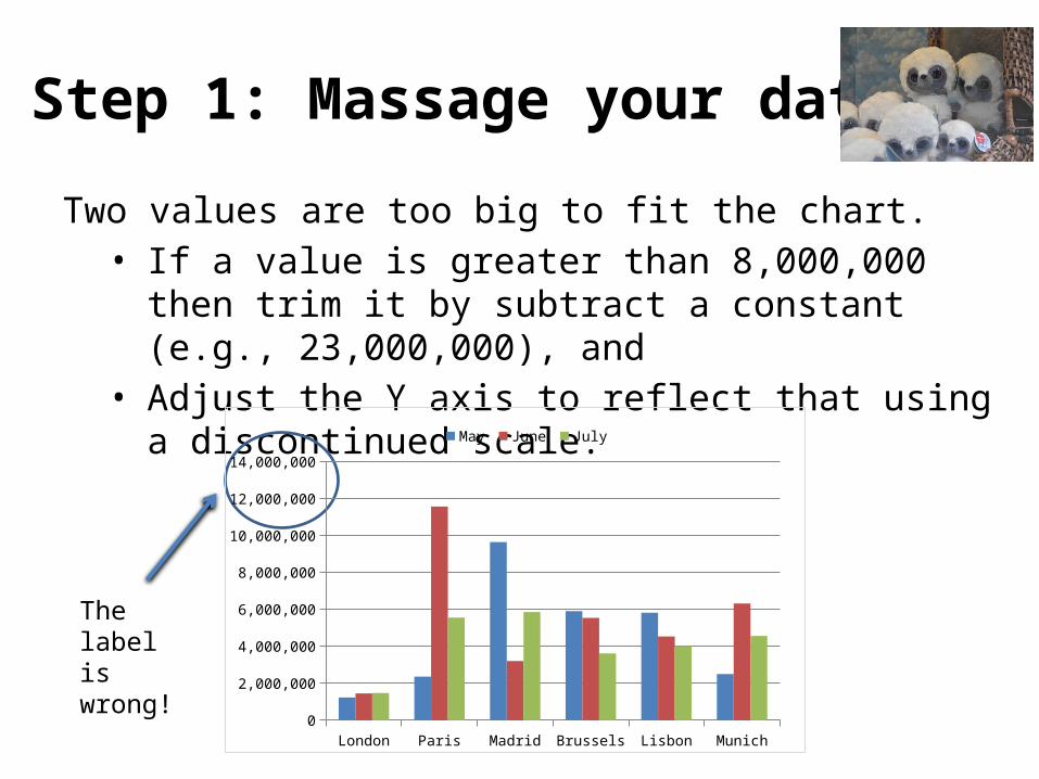
Step 1: Massage your data
Two values are too big to fit the chart. • If a value is greater than 8,000,000 then trim
it by subtract a constant (e.g., 23,000,000), and
• Adjust the Y axis to reflect that using a discontinued scale.
The label is wrong!
London Paris Madrid Brussels Lisbon Munich0
2,000,000
4,000,000
6,000,000
8,000,000
10,000,000
12,000,000
14,000,000
May June July
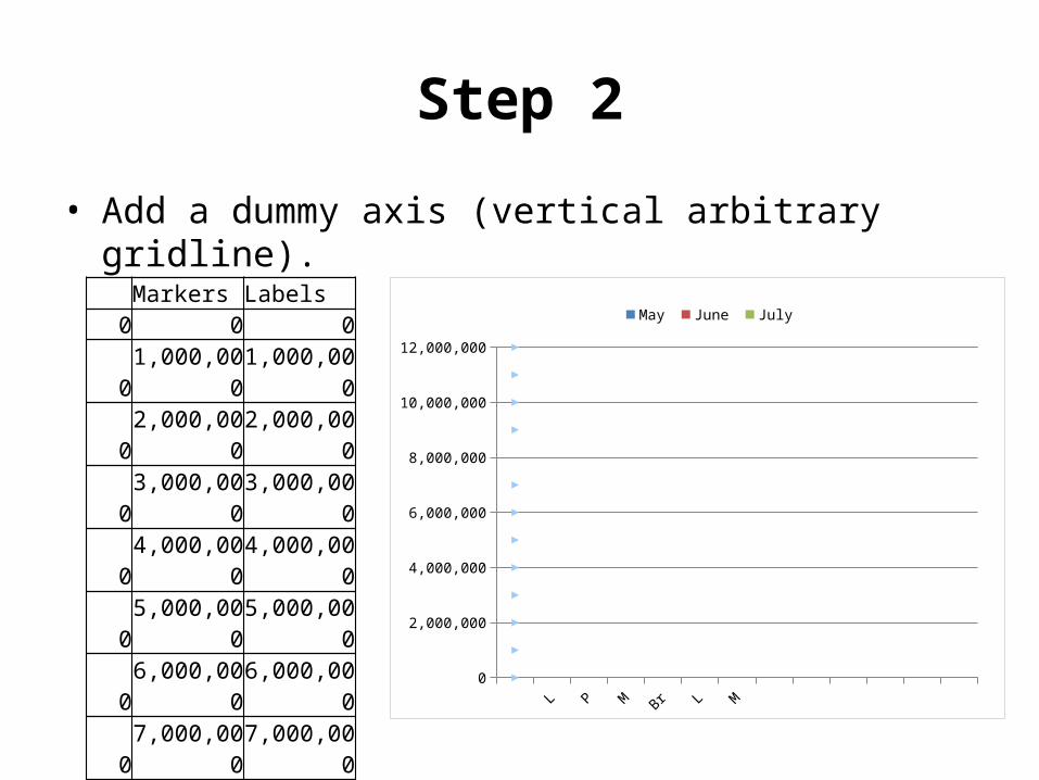
Step 2
• Add a dummy axis (vertical arbitrary gridline).
Markers Labels0 0 0
01,000,00
01,000,00
0
02,000,00
02,000,00
0
03,000,00
03,000,00
0
04,000,00
04,000,00
0
05,000,00
05,000,00
0
06,000,00
06,000,00
0
07,000,00
07,000,00
0
09,000,00
022,000,0
00
010,000,0
0023,000,0
00
011,000,0
0024,000,0
00
012,000,0
0025,000,0
00
Lo PM
aBru Li
Mu
0
2,000,000
4,000,000
6,000,000
8,000,000
10,000,000
12,000,000
May June July
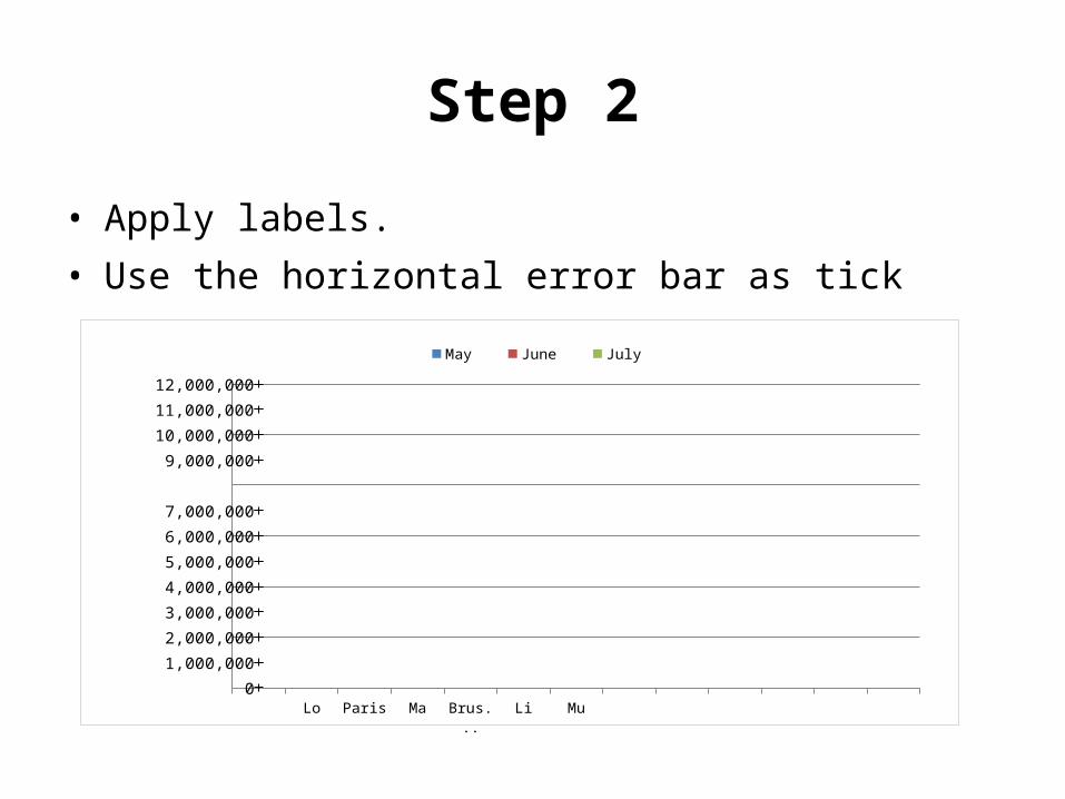
Step 2
• Apply labels.• Use the horizontal error bar as tick
L P M Br Li M
0
1,000,000
2,000,000
3,000,000
4,000,000
5,000,000
6,000,000
7,000,000
9,000,000
10,000,000
11,000,000
12,000,000
May June July
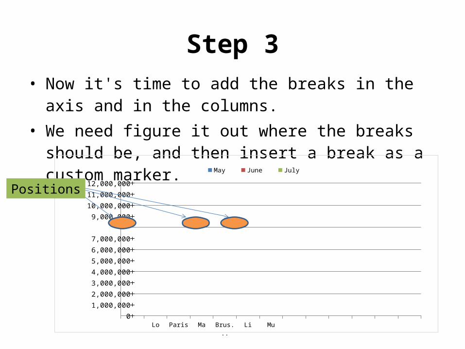
Step 3• Now it's time to add the breaks in the axis and
in the columns.• We need figure it out where the breaks should
be, and then insert a break as a custom marker.
L P M Br Li M
0
1,000,000
2,000,000
3,000,000
4,000,000
5,000,000
6,000,000
7,000,000
9,000,000
10,000,000
11,000,000
12,000,000
May June July
Positions
Step 3
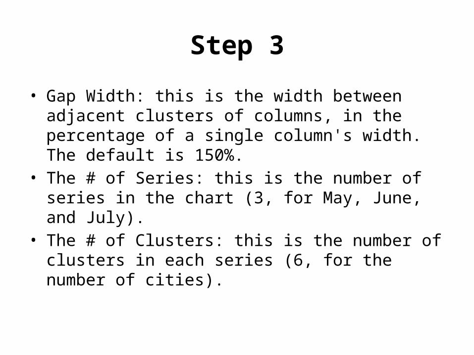
• Gap Width: this is the width between adjacent clusters of columns, in the percentage of a single column's width. The default is 150%.
• The # of Series: this is the number of series in the chart (3, for May, June, and July).
• The # of Clusters: this is the number of clusters in each series (6, for the number of cities).
Step 3
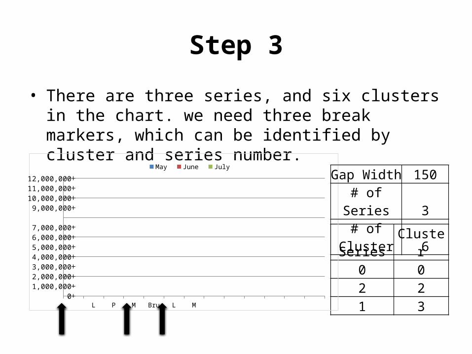
• There are three series, and six clusters in the chart. we need three break markers, which can be identified by cluster and series number.
Series Cluster0 02 21 3
01,000,0002,000,0003,000,0004,000,0005,000,0006,000,0007,000,000
9,000,00010,000,00011,000,00012,000,000
May June July
Gap Width 150# of
Series 3# of
Cluster 6
Step 3
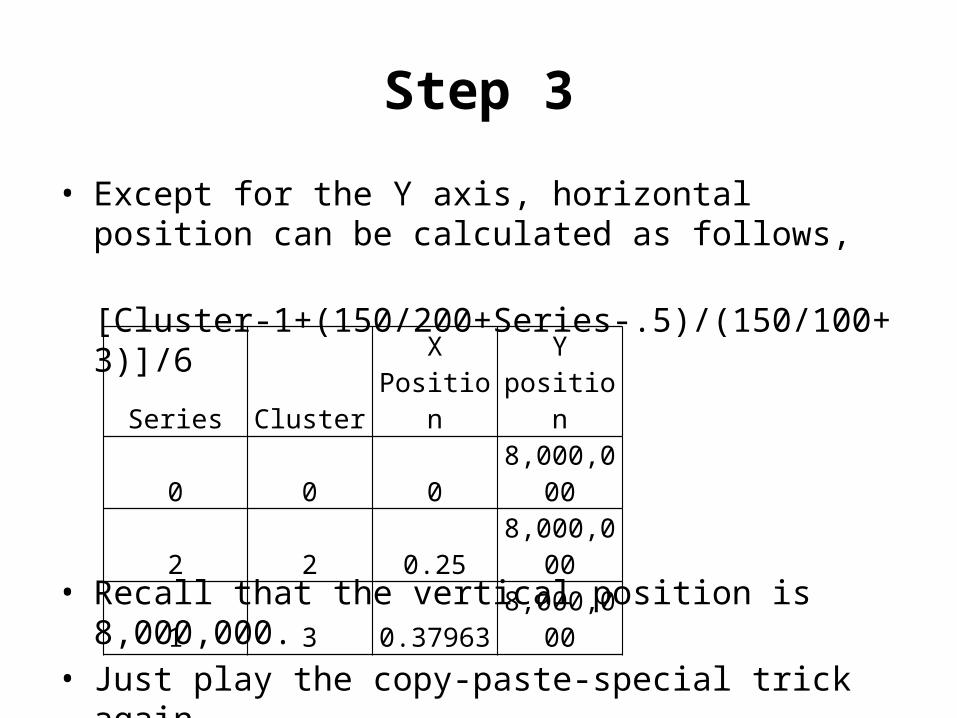
• Except for the Y axis, horizontal position can be calculated as follows,
[Cluster-1+(150/200+Series-.5)/(150/100+3)]/6
• Recall that the vertical position is 8,000,000. • Just play the copy-paste-special trick again.
Series ClusterX
PositionY
position
0 0 08,000,00
0
2 2 0.258,000,00
0
1 3 0.379638,000,00
0
Step 4
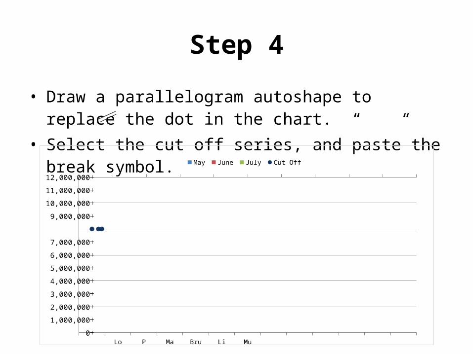
• Draw a parallelogram autoshape to replace the dot in the chart. “ “
• Select the cut off series, and paste the break symbol.
London Paris MadridBrussels Lisbon Munich0
1,000,000
2,000,000
3,000,000
4,000,000
5,000,000
6,000,000
7,000,000
9,000,000
10,000,000
11,000,000
12,000,000
May June July Cut Off
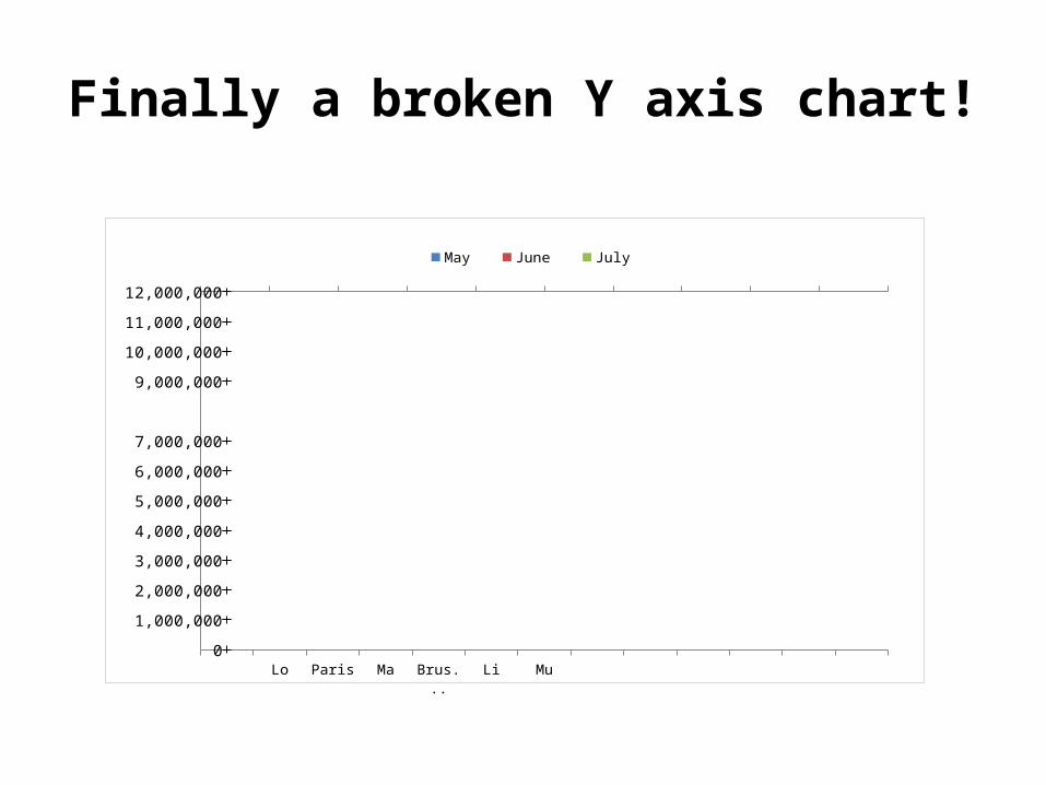
Finally a broken Y axis chart!
L P M Br L M
0
1,000,000
2,000,000
3,000,000
4,000,000
5,000,000
6,000,000
7,000,000
9,000,000
10,000,000
11,000,000
12,000,000
May June July