glo brand guidelines
DESCRIPTION
ÂTRANSCRIPT

Brand Guidelinesv1.4 10.1.10

1
A brand is a symbol,
a container for the thoughts and
feelings on what it represents.
A brand is powerful.
A brand is fragile.
A brand must be protected.
This document outlines how to
harness and protect the Glo brand.
If you come in contact with the Glo
brand, you are a steward.
Please handle it with care.
Direct any questions or brand needs
to Peter at Immersion Digital:

2
About Glo
Glo is an interactive Bible that brings the full text of
the Scripture to life through HD videos, high-resolution
images, zoomable maps, 360-degree virtual tours,
customizable Bible reading plans and much more.
Using the intuitive browsing lenses in Glo, it’s easy
to personalize your Bible experience and find
scripture relevant to your daily life. Glo allows
you to experience the Bible like never before.
Primary Logo
Secondary Logo
Primary Logo On Black
The Glo Brand
The Glo brand is designed to communicate:
This is done through bold, bright, crisp brand colors,
uncluttered layouts and proper use of whitespace.
fresh
clean
simple
easy
bright
modern
exciting
vibrant
light
full
Use Approved Brandmarks Only
Only Immersion Digital LLC and the distributors and
marketing partners it licenses in writing may use the
Glo® trademark. Only the approved brandmarks should
be used. Do not attempt to recreate or replicate. Do
not attempt to approximate colors. Brand files are
available in standard formats upon request.
3
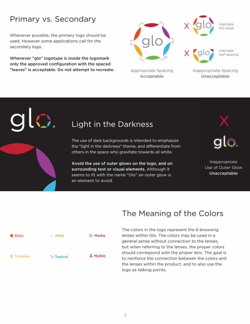
Primary vs. Secondary
Whenever possible, the primary logo should be
used. However some applications call for the
secondary logo.
Whenever "glo" logotype is inside the logomark
only the approved configuration with the spaced
"leaves" is acceptable. Do not attempt to recreate. Appropriate Spacing
Acceptable
Inappropriate Spacing
Unacceptable
X logotypetoo large
improperleaf spacing
Light in the Darkness
The use of dark backgrounds is intended to emphasize
the "light in the darkness" theme, and differentiate from
others in the space who gravitate towards all white.
Avoid the use of outer glows on the logo, and on
surrounding text or visual elements. Although it
seems to fit with the name "Glo" an outer glow is
an element to avoid.
X
X
Inappropriate
Use of Outer Glow
Unacceptable
Media Bible
Timeline
Atlas
Topical MyGlo
The Meaning of the Colors
The colors in the logo represent the 6 browsing
lenses within Glo. The colors may be used in a
general sense without connection to the lenses,
but when referring to the lenses, the proper colors
should correspond with the proper lens. The goal is
to reinforce the connection between the colors and
the lenses within the product, and to also use the
logo as talking points.
4
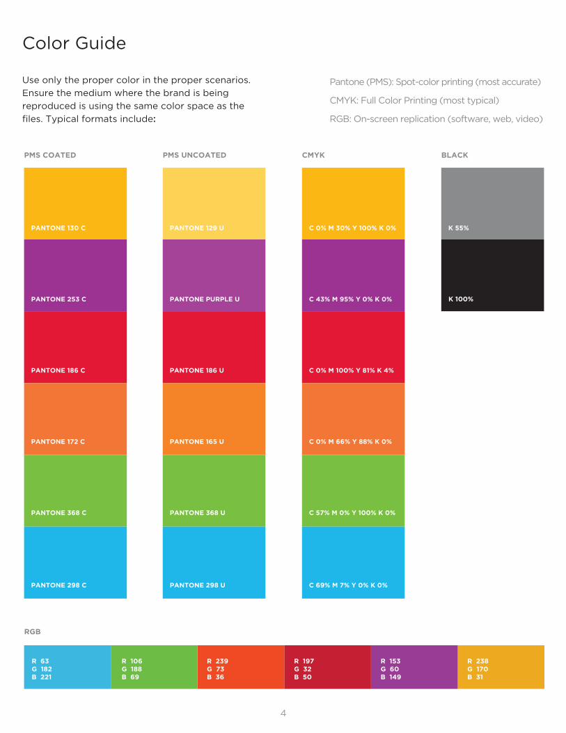
Color Guide
Use only the proper color in the proper scenarios.
Ensure the medium where the brand is being
reproduced is using the same color space as the
files. Typical formats include:
Pantone (PMS): Spot-color printing (most accurate)
CMYK: Full Color Printing (most typical)
RGB: On-screen replication (software, web, video)
K 100%
RGB
R 63G 182B 221
R 106G 188B 69
R 239G 73B 36
R 197G 32B 50
R 153G 60B 149
R 238G 170B 31
5
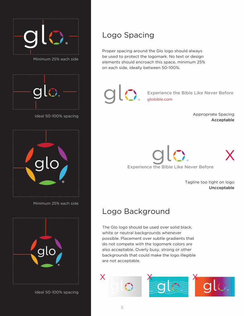
Minimum 25% each side
Ideal 50‐100% spacing
Minimum 25% each side
Ideal 50‐100% spacing
Logo Spacing
Proper spacing around the Glo logo should always
be used to protect the logomark. No text or design
elements should encroach this space, minimum 25%
on each side, ideally between 50-100%.
Experience the Bible Like Never Before
globible.com
Appropriate Spacing
Acceptable
Experience the Bible Like Never Before
Tagline too tight on logo
Uncceptable
X
Logo Background
The Glo logo should be used over solid black,
white or neutral backgrounds whenever
possible. Placement over subtle gradients that
do not compete with the logomark colors are
also acceptable. Overly busy, strong or other
backgrounds that could make the logo illegible
are not acceptable.
XX X
6
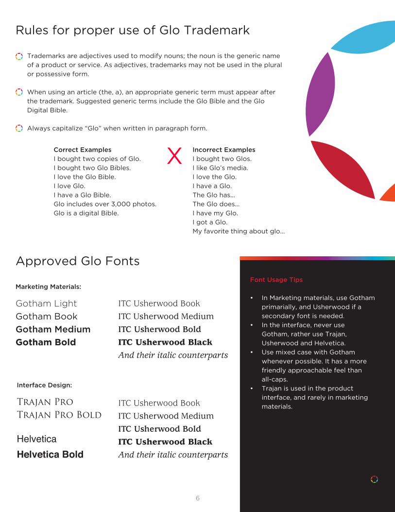
Rules for proper use of Glo Trademark
Trademarks are adjectives used to modify nouns; the noun is the generic name
of a product or service. As adjectives, trademarks may not be used in the plural
or possessive form.
When using an article (the, a), an appropriate generic term must appear after
the trademark. Suggested generic terms include the Glo Bible and the Glo
Digital Bible.
Always capitalize “Glo” when written in paragraph form.
Correct Examples
I bought two copies of Glo.
I bought two Glo Bibles.
I love the Glo Bible.
I love Glo.
I have a Glo Bible.
Glo includes over 3,000 photos.
Glo is a digital Bible.
Incorrect Examples
I bought two Glos.
I like Glo’s media.
I love the Glo.
I have a Glo.
The Glo has...
The Glo does...
I have my Glo.
I got a Glo.
My favorite thing about glo...
X
Approved Glo Fonts
Marketing Materials:
Gotham Light
Gotham Book
Gotham Medium
Gotham Bold
Font Usage Tips
In Marketing materials, use Gotham •
primarially, and Usherwood if a
secondary font is needed.
In the interface, never use •
Gotham, rather use Trajan,
Usherwood and Helvetica.
Use mixed case with Gotham •
whenever possible. It has a more
friendly approachable feel than
all-caps.
Trajan is used in the product •
interface, and rarely in marketing
materials.
ITC Usherwood BookITC Usherwood MediumITC Usherwood BoldITC Usherwood BlackAnd their italic counterparts
Interface Design:
Trajan ProTrajan Pro Bold
HelveticaHelvetica Bold
ITC Usherwood BookITC Usherwood MediumITC Usherwood BoldITC Usherwood BlackAnd their italic counterparts

7
Common Design Elements
Throughout Glo marketing materials, a few
elements frequently appear:
Gradients and the Gradient Bar
This gradient uses the Glo logo
colors in the proper sequential
order to communicate the
seamless nature of the Glo
browsing lenses. It is often used
as a subtle top or bottom bar
that bleeds off the cropped edge.
Subtly flowing gradient can also be
used within text blocks.
Solid Bar
In some cases, a bar with solid
colors segments is used. This
is an acceptable alternative to
communicate the distinct nature
of the lenses. The segments must
be used in the proper sequential
color order.
The Lenses
Using the lens icons on their own
or within the gray lens orb are both
acceptable.
8
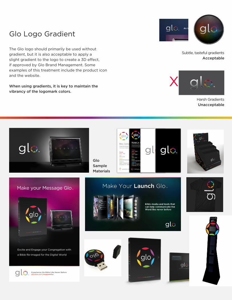
Glo Logo Gradient
The Glo logo should primarily be used without
gradient, but it is also acceptable to apply a
slight gradient to the logo to create a 3D effect,
if approved by Glo Brand Management. Some
examples of this treatment include the product icon
and the website.
When using gradients, it is key to maintain the
vibrancy of the logomark colors.
Subtle, tasteful gradients
Acceptable
Harsh Gradients
Unacceptable
X
Glo
Sample
Materials
Excite and Engage your Congregation with
a Bible Re-imaged for the Digital World
Make your Message Glo
Mobile
407 797 8454Fax
407 513 4828Email
6881 Kingspointe Parkway #17Orlando FL 32819
Lead DeveloperImmersion Digital LLC
Bill Lefler
globible.com
Marketing ManagerImmersion Digital LLC
Rebeca Boletti
bibleglo.combibleglo.com
Office
407 545 2531Mobile
407 235 0185Fax
407 513 4828Email
6881 Kingspointe Parkway #17Orlando, FL 32819
Marketing ManagerImmersion Digital LLC
Rebeca Boletti
Office
407 545 2531Mobile
407 235 0185Fax
407 513 4828Email
6881 Kingspointe Parkway #17Orlando, FL 32819