finding the fingerprints in the bush memo fonts · pdf filefinding the fingerprints in the...
TRANSCRIPT
Finding the Fingerprints in the Bush Memo Fonts
David E. Hailey, Jr., Ph.D. Associate Professor - Technical Communication
The memos in question were released to the public by CBS in September 2004. The memos had been faxed, so questionable document experts suggested that the problem of authentication was insurmountable. That assumption notwithstanding, it may still be possible to trace their production to a type of machine, and possibly even to a specific machine. During the fall of 2004 I examined the faxed version of these memos, and in December of that year I made a number of predictions based on the faxed version of the memos. Subsequent to my first report, Mary Mapes and Mike Smith gave me the opportunity to scan and examine unfaxed photocopies of the same memos. The following pages highlight my findings over the past, approximately14 months, including results of my subsequent examination of the photocopies. Nature of the memos In my opinion, there can no longer a question whether the memos were typed -- they were typed. In the executive summary of a 170 page 2nd report presented to Mapes and Smith, I express my results as:
Having examined the second set of memos and compared them to the first set, I am now confident that these memos were typed for the following reasons: 1. The evidence of character wear and damage is more apparent and persuasive than
ever. 2. The evidence of character interaction is also more apparent and persuasive than
ever. 3. With [no] exceptions, shape and proportion of characters are consistent with my
original statements that they look like what I would have designed if I had been converting monotype (an IBM Pica) to proportional type.
4. Shape and proportion of key characters (e.g., “F,” “L,” “g,” “5”) do not fit Times New Roman or any other digital typeface I have yet found.
5. Headings are neither centered nor aligned with each other (an abnormal characteristic for any digital typeface).
6. Vertical spacing (12/13.8) is not consistent with Word defaults. 7. Vertical spacing includes fractions of carriage returns (digital software does not
normally do partial carriage returns). 8. Lines in at least two memos increasingly penetrate the left margin in a manner
consistent with a faulty platen. 9. Differences in wear in key characters [e.g., the “t”] occur in a manner consistent
with the memos having been produced over a period of time (evolution of quality implies a mechanical process).
10. The left margin of the memos match the ragged nature of typed edges (digital edges are more nearly perfect).
11. There is clear evidence the signature interacts with the signature block in a manner consistent with a loosely held pen and typed text.
In short, the photocopied memos supported all of the contentions and predictions I made in the first report, and added a great deal more evidence. This evidence is all clear and available to anybody prepared to carefully examine the documents.
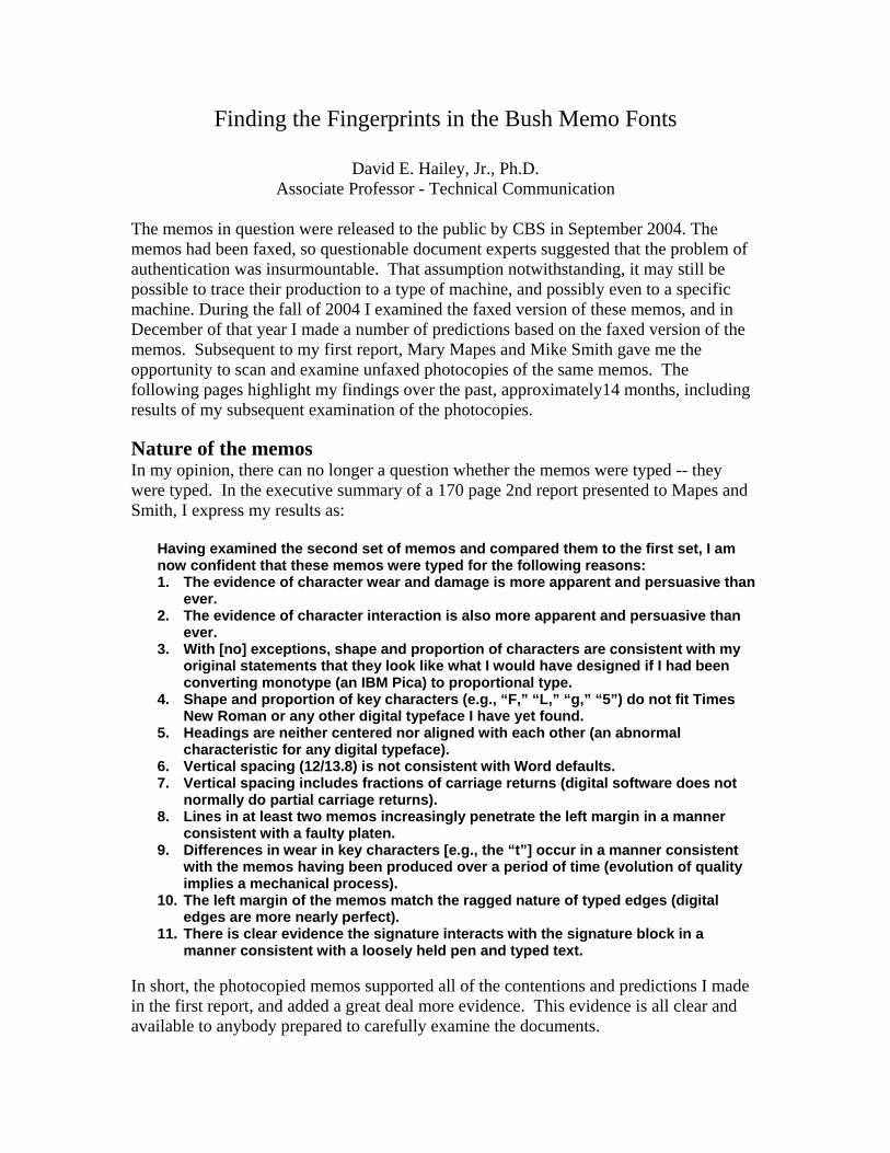
Are the memos done in Times New Roman? No. In an examination of the possibility of Times New Roman being responsible for the memos, several characters prove to be mismatches. Most obvious is the “F,” but a few of the other mismatches include the “1,” “g,” “5,” “#,” and “L.”
Figure 1: Times New Roman “E” and “F” on top row and memo “E” and “F” on the middle row. The bottom row compared TNR to memos (green and black characters respectively) and to an “F” printed from an IBM Selectric Composer.
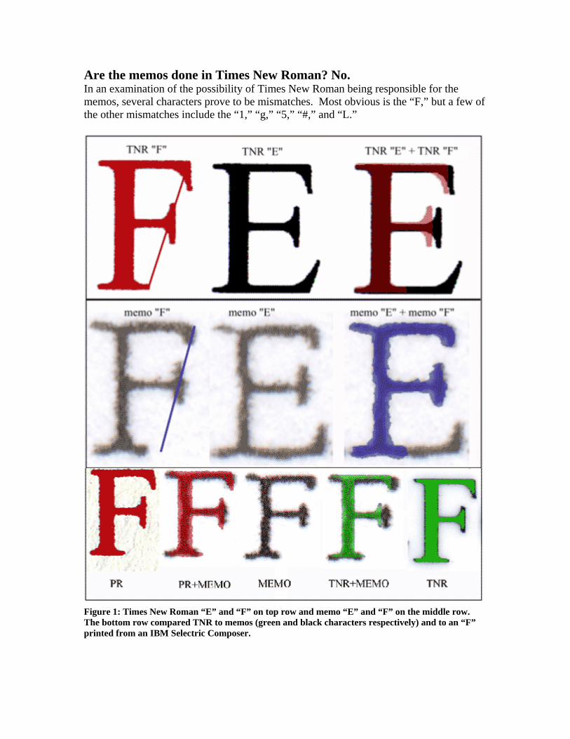
The problem with the “F,” however, is, by itself, enough to preclude Times New Roman from having produced the memos. The problem becomes obvious if we compare the Times New Roman “F” to the Times New Roman “E” -- they do not share the same footprint. The Times New Roman “F” has a slightly shorter top stroke and a 20% shorter middle stroke than the “E.” On the other hand, the “E” and “F” in the memos share the same footprint. The top stroke and middle stroke on the “E” are the same size as the comparable strokes on the “F” (see figure 1). I have been able to track down four different versions of Times New Roman -- Microsoft, Linotype, Monotype, Adobe. In no case, does the “E” and “F” share the same footprint. But in every case, the “E’s” and “F’s” in the memos do share the same footprint. It is not possible for Times New Roman characters to have produced both the “E’s” and the “F’s” in the memos. Are the headings centered? No. One “fact” broadcast by the bloggers and to a lesser extent by the media was that the headings on two of the memos were perfectly centered, and they aligned perfectly with each other. The person who produced that “fact” claimed to have carefully checked his data, but never actually showed how he did it. In fact, it is a simple task to demonstrate that the heading in the memo dated 01 August 1972 is not centered (see figure 2). In this memo, it is possible to show all possible right margins, making it possible to find all possible centers of the document. If the center of the heading does not align within the space of any possible centers, the heading is not centered.
Figure 2: Section taken from a photocopy (pre-faxed) version of the memo dated 01 August 1972. The two red boxes represent all possible margins. The vertical red lines in the center represent all possible centers. The vertical blue line represents the center of the heading. For this heading to be centered, it is necessary for the blue line to occur on top of the red lines. The heading in this document is not centered.
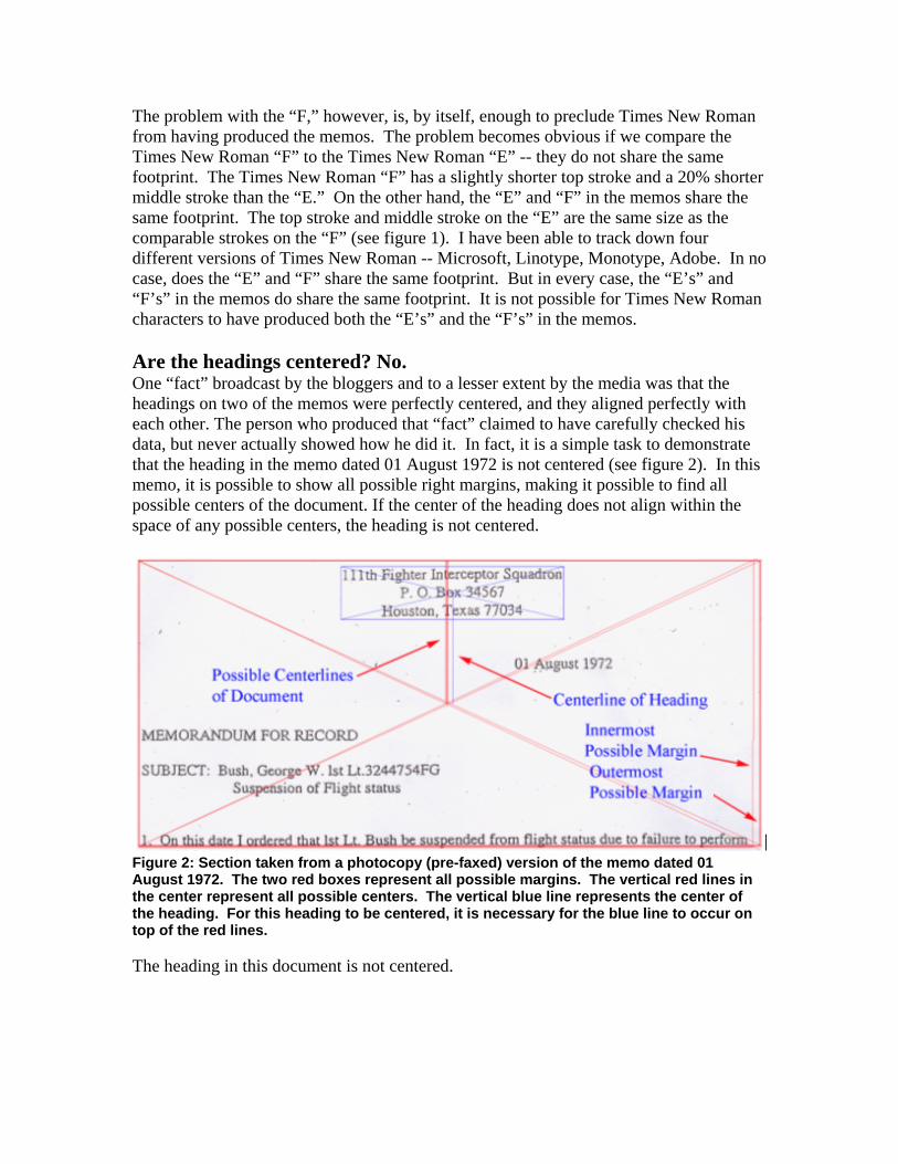
Is spacing computer-like? No. The document does not use Times New Roman default leading or spacing. Figure 3 represents the following processes: 1. Type the document in Word, using Times New Roman, using the format of the document. 2. Print the document and scan it at 1200 dpi. 3. Insert the Times New Roman onto the memo as a red overlay. 4. Align the number 1’s in the first paragraph. 5. Examine for breakdowns in alignment.
Figure 3: Pre-faxed document with TNR overlay in red. The overlay was typed in TNR with default leading and centered. I aligned the “1’s” in the overlay. The extent to which the red text fails to overlay the black text is the extent to which Times New Roman defaults fail when attempting to reproduce the memo. Certain factors become immediately clear: (1) the heading is not centered, (2) default horizontal spacing is not appropriate, (3) default vertical spacing is not appropriate. Any argument that someone created a perfect copy of the memo in 20 minutes using Times New Roman should be immediately suspect. Furthermore, without adjusting every character independently, it is not possible to adjust Word to produce the first line. Adding
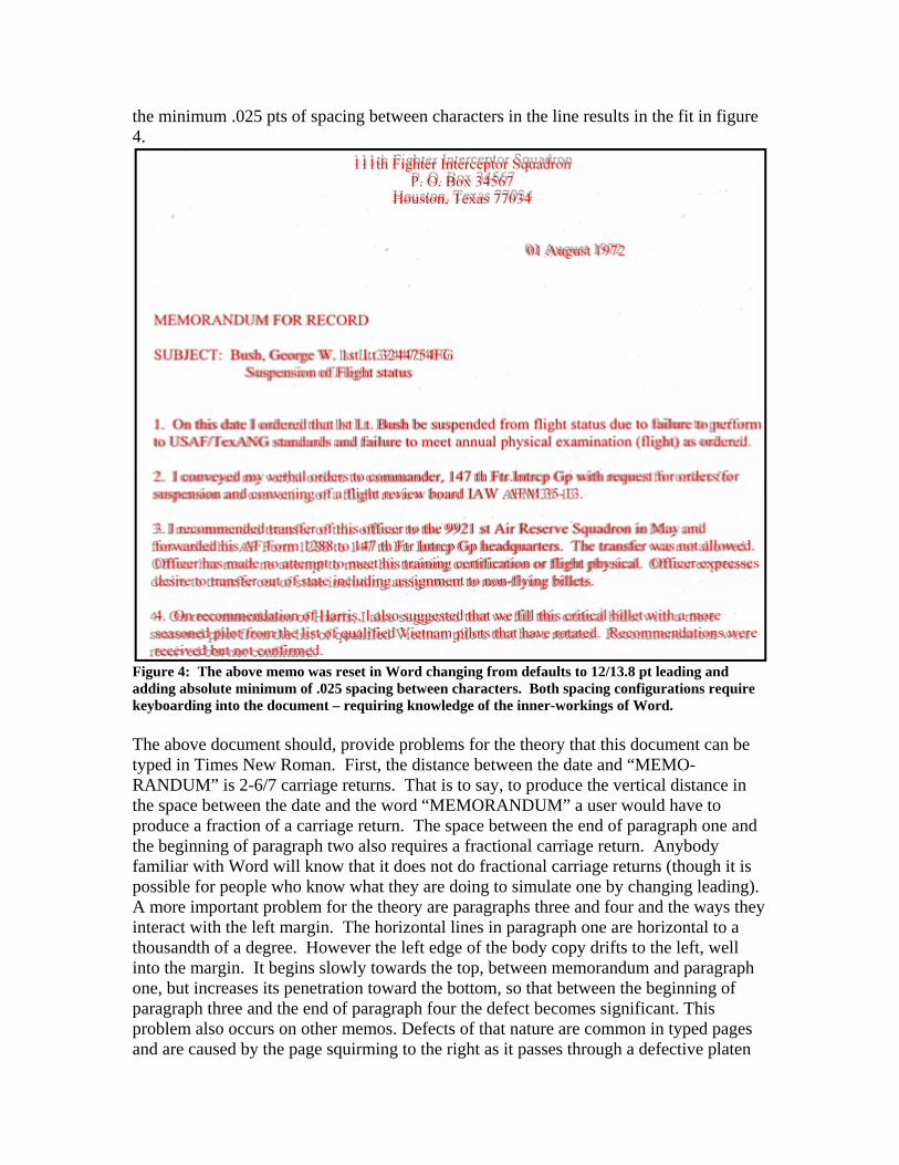
the minimum .025 pts of spacing between characters in the line results in the fit in figure 4.
Figure 4: The above memo was reset in Word changing from defaults to 12/13.8 pt leading and adding absolute minimum of .025 spacing between characters. Both spacing configurations require keyboarding into the document – requiring knowledge of the inner-workings of Word. The above document should, provide problems for the theory that this document can be typed in Times New Roman. First, the distance between the date and “MEMO-RANDUM” is 2-6/7 carriage returns. That is to say, to produce the vertical distance in the space between the date and the word “MEMORANDUM” a user would have to produce a fraction of a carriage return. The space between the end of paragraph one and the beginning of paragraph two also requires a fractional carriage return. Anybody familiar with Word will know that it does not do fractional carriage returns (though it is possible for people who know what they are doing to simulate one by changing leading). A more important problem for the theory are paragraphs three and four and the ways they interact with the left margin. The horizontal lines in paragraph one are horizontal to a thousandth of a degree. However the left edge of the body copy drifts to the left, well into the margin. It begins slowly towards the top, between memorandum and paragraph one, but increases its penetration toward the bottom, so that between the beginning of paragraph three and the end of paragraph four the defect becomes significant. This problem also occurs on other memos. Defects of that nature are common in typed pages and are caused by the page squirming to the right as it passes through a defective platen
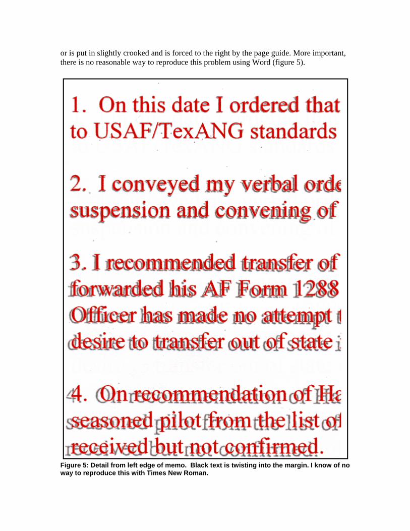
or is put in slightly crooked and is forced to the right by the page guide. More important, there is no reasonable way to reproduce this problem using Word (figure 5).
Figure 5: Detail from left edge of memo. Black text is twisting into the margin. I know of no way to reproduce this with Times New Roman.
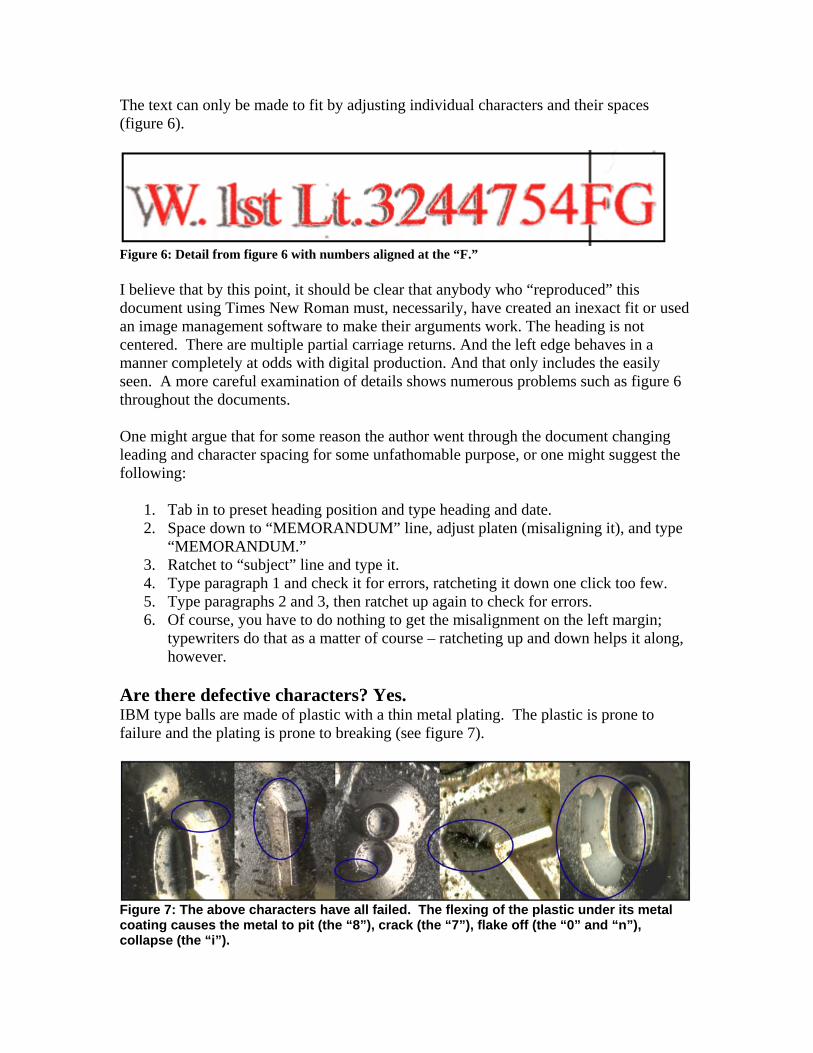
The text can only be made to fit by adjusting individual characters and their spaces (figure 6).
Figure 6: Detail from figure 6 with numbers aligned at the “F.” I believe that by this point, it should be clear that anybody who “reproduced” this document using Times New Roman must, necessarily, have created an inexact fit or used an image management software to make their arguments work. The heading is not centered. There are multiple partial carriage returns. And the left edge behaves in a manner completely at odds with digital production. And that only includes the easily seen. A more careful examination of details shows numerous problems such as figure 6 throughout the documents. One might argue that for some reason the author went through the document changing leading and character spacing for some unfathomable purpose, or one might suggest the following:
1. Tab in to preset heading position and type heading and date. 2. Space down to “MEMORANDUM” line, adjust platen (misaligning it), and type
“MEMORANDUM.” 3. Ratchet to “subject” line and type it. 4. Type paragraph 1 and check it for errors, ratcheting it down one click too few. 5. Type paragraphs 2 and 3, then ratchet up again to check for errors. 6. Of course, you have to do nothing to get the misalignment on the left margin;
typewriters do that as a matter of course – ratcheting up and down helps it along, however.
Are there defective characters? Yes. IBM type balls are made of plastic with a thin metal plating. The plastic is prone to failure and the plating is prone to breaking (see figure 7).
Figure 7: The above characters have all failed. The flexing of the plastic under its metal coating causes the metal to pit (the “8”), crack (the “7”), flake off (the “0” and “n”), collapse (the “i”).
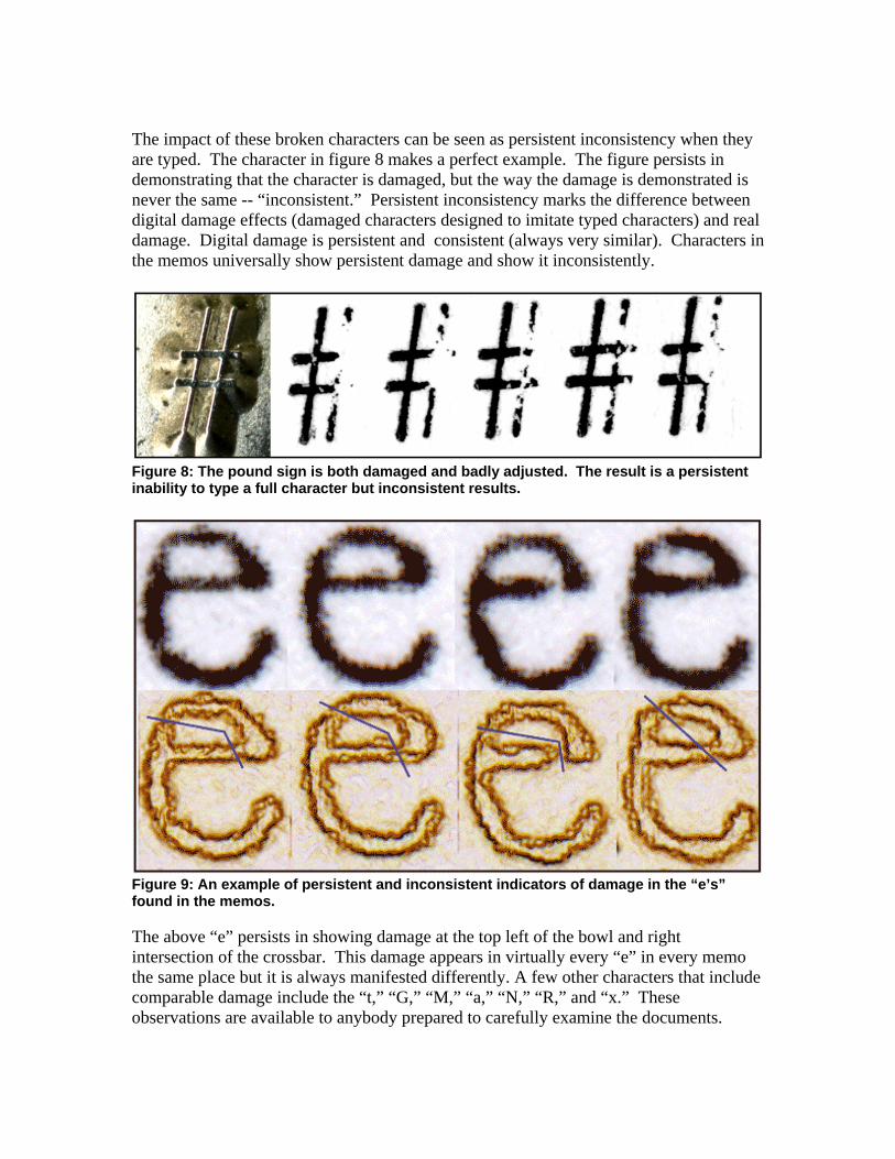
The impact of these broken characters can be seen as persistent inconsistency when they are typed. The character in figure 8 makes a perfect example. The figure persists in demonstrating that the character is damaged, but the way the damage is demonstrated is never the same -- “inconsistent.” Persistent inconsistency marks the difference between digital damage effects (damaged characters designed to imitate typed characters) and real damage. Digital damage is persistent and consistent (always very similar). Characters in the memos universally show persistent damage and show it inconsistently.
Figure 8: The pound sign is both damaged and badly adjusted. The result is a persistent inability to type a full character but inconsistent results.
Figure 9: An example of persistent and inconsistent indicators of damage in the “e’s” found in the memos. The above “e” persists in showing damage at the top left of the bowl and right intersection of the crossbar. This damage appears in virtually every “e” in every memo the same place but it is always manifested differently. A few other characters that include comparable damage include the “t,” “G,” “M,” “a,” “N,” “R,” and “x.” These observations are available to anybody prepared to carefully examine the documents.
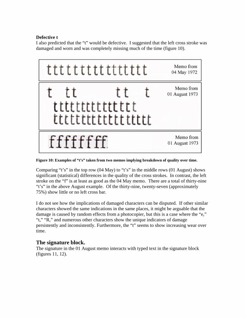
Defective t I also predicted that the “t” would be defective. I suggested that the left cross stroke was damaged and worn and was completely missing much of the time (figure 10).
Figure 10: Examples of “t’s” taken from two memos implying breakdown of quality over time. Comparing “t’s” in the top row (04 May) to “t’s” in the middle rows (01 August) shows significant (statistical) differences in the quality of the cross strokes. In contrast, the left stroke on the “f” is at least as good as the 04 May memo. There are a total of thirty-nine “t’s” in the above August example. Of the thirty-nine, twenty-seven (approximately 75%) show little or no left cross bar. I do not see how the implications of damaged characters can be disputed. If other similar characters showed the same indications in the same places, it might be arguable that the damage is caused by random effects from a photocopier, but this is a case where the “e,” “t,” “R,” and numerous other characters show the unique indicators of damage persistently and inconsistently. Furthermore, the “t” seems to show increasing wear over time. The signature block. The signature in the 01 August memo interacts with typed text in the signature block (figures 11, 12).
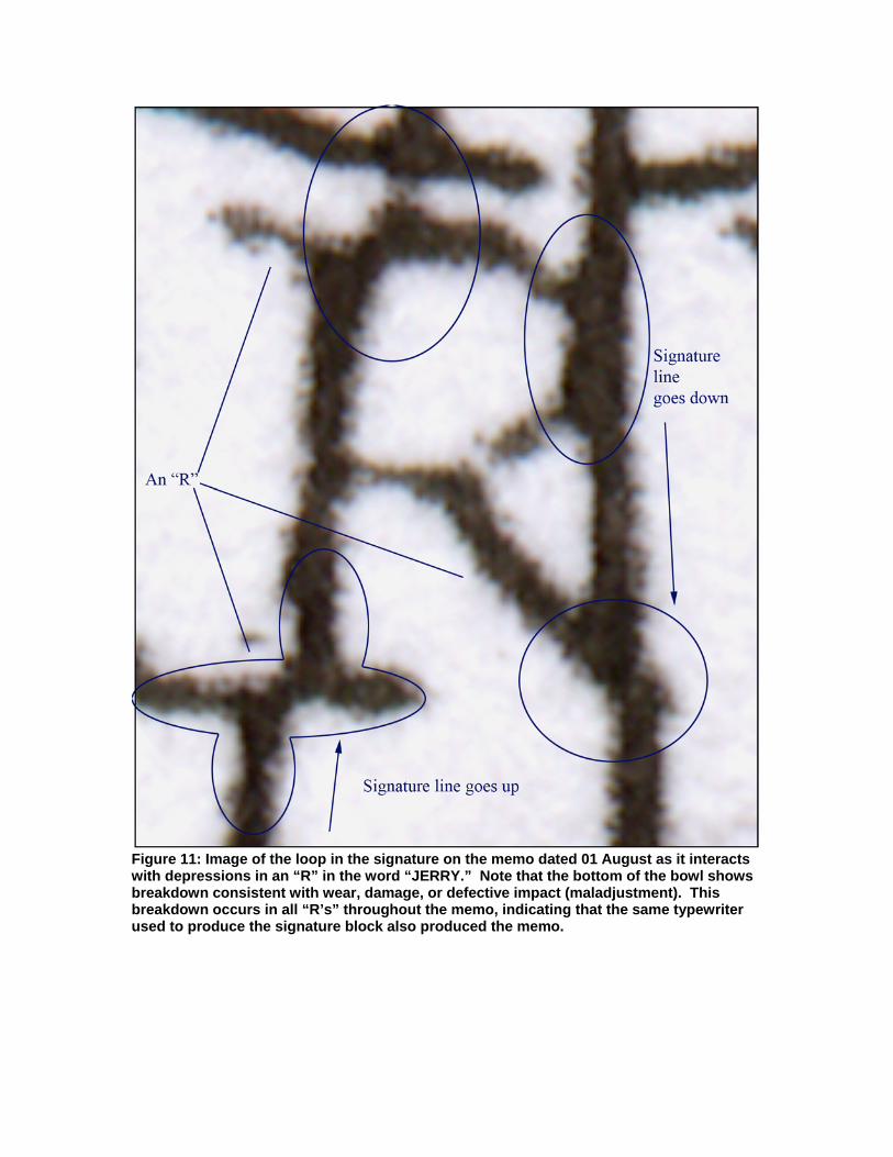
Figure 11: Image of the loop in the signature on the memo dated 01 August as it interacts with depressions in an “R” in the word “JERRY.” Note that the bottom of the bowl shows breakdown consistent with wear, damage, or defective impact (maladjustment). This breakdown occurs in all “R’s” throughout the memo, indicating that the same typewriter used to produce the signature block also produced the memo.
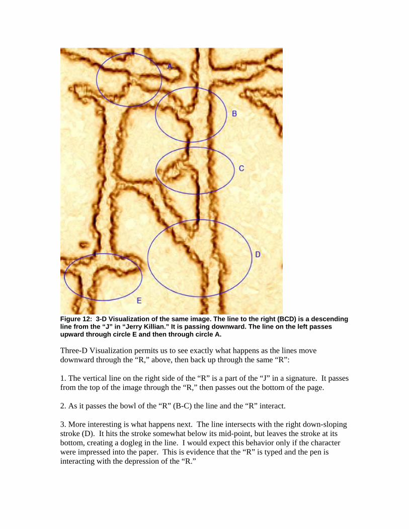
Figure 12: 3-D Visualization of the same image. The line to the right (BCD) is a descending line from the “J” in “Jerry Killian.” It is passing downward. The line on the left passes upward through circle E and then through circle A. Three-D Visualization permits us to see exactly what happens as the lines move downward through the “R,” above, then back up through the same “R”: 1. The vertical line on the right side of the “R” is a part of the “J” in a signature. It passes from the top of the image through the “R,” then passes out the bottom of the page. 2. As it passes the bowl of the “R” (B-C) the line and the “R” interact. 3. More interesting is what happens next. The line intersects with the right down-sloping stroke (D). It hits the stroke somewhat below its mid-point, but leaves the stroke at its bottom, creating a dogleg in the line. I would expect this behavior only if the character were impressed into the paper. This is evidence that the “R” is typed and the pen is interacting with the depression of the “R.”
4. The same line that passes through the right side of the “R” now enters the lower left of the page, on its way to completing the loop. It intersects the lower-left serif on the “R” and stops inking (circle E). 5. The line resumes inking just before it crosses into the impression of the left stem of the “R.” 6. The ink from the pen can be seen following the stroke until at approximately 90% to the top, the pen begins leaving the impression and suddenly jumps into the impression on the top of the “R” (circle A). 7. When the pen leaves the top of the “R” it stops inking for an instant, then proceeds up and out the top of the image. I consider the above to be evidence that the signature is interacting with a typed text. This ties a signature to a typed signature block -- meaning the signature is not cut and pasted onto the block as some have speculated. Since the typeface in the signature block matches the typeface in the memo, the contention the memo was typed is supported. I should point out that many questionable documents experts are uncomfortable with huge enlargements when used to point to problems in signatures. Some witnesses will do massive enlargements to obscure the truth of the matter. In this case, I am not using the enlargement to examine the signature but to point out interactions between the signature and the text of the signature block. The enlargement make obvious to everybody what would normally only be seen by an expert with a linen tester or other magnifying glass. Conclusions The above images represent only about 10% of the images I used in the report, and the above information represents only about 10% of the topics I examined. I have learned from painful experience from bloggers who were prepared to hack my server and change files to suit their needs, so I am unprepared to make any more than this available digitally. But everything in this document is verifiable (usually requiring nothing more than honest and careful observation). I close this by quoting directly from my conclusions in the second report. I believe the memos were typed for the following reasons:
1. They cannot have been done in Times New Roman, so the argument that they were done digitally has no logical support.
2. The evidence of character damage is no longer in question; the “t,” “e,” “a,” “c,” “R,” “o,” “M,” and “N,” are all clearly defective, and in each case the character has unique defects. Other characters not discussed also show signs of being defective.
3. I found good evidence that characters interacted with each other, something only possible with a typewriter or other device that produces characters one at a time and involves physical impact.
4. Spacing in the memos is consistent with using a platen and not consistent with Word or similar digital processes: • spacing of the heading is not centered • headings do not align • fractional returns are consistent with adjusting with a platen • left edge of several memos appears to have drifted to the right causing
characters to penetrate the left margin. • left margin is ragged in a manner that suggests escapement.
5. False color tests (although new and only tentatively valuable) support the contention that characters have different tonal values, indicating different impact pressures during creation. [I do not discuss false color testing in this document.]
6. Apparent interaction between signature and signature block is consistent with a signature using a loosely held pen and a typed text.
I cannot say whether the memos are authentic. Nor can I say for certain that they were produced in Press Roman, although most of the evidence indicates they probably were (or in a derivative) . But I can say that they were not done in TNR, and I am totally persuaded they were typed. More importantly, I have created a fingerprint that makes it possible to identify documents produced on the same machine. There will be such documents all over America. They might be letters of commendation, recommendation, or appreciation; they might be catalogs produced in California or Maine, but wherever they are and whatever they are, eventually they will begin to come to light. When they do, it will become possible to positively authenticate or debunk the memos. If the memos are not authentic, this report should provide the foundation for proving it, and a path for identifying the creators. If they are authentic, that, too, will be revealed in due course. _______________ Dr. Hailey’s particular research interest has been in preservation and archiving processes and critical skills since 1992. More recently (1997), with the advent of digital archives, his research has focused on digital document authenticity and reliability. His experience in producing and examining documents ranges from mechanical traditions typical of the mid-sixties to the digital books typical of the 21st century. Currently, he teaches document design issues at graduate and undergraduate levels.