evaluation media xoxo
TRANSCRIPT

Question 1
Masthead:
When I designed my masthead I wanted to keep the white from the NME masthead but give it a more rebellious theme, I achieved this by adding a spray paint font which is messy but goes well with the ‘Corrupt’ Heading; as Corrupt magazine is all about not about following rules.
Cover Lines/Secondary Images:
For the cover line I used the same layout as NME but changed the bands names, pictures, positioning and changed the text and font of band names.
My Secondary Images and Cover Lines are still in a similar layout to the NME magazine but have been resized and the background made a darker blue as this goes well with the yellow and black text.
Central Image:
The basic layout of the magazine was copied rather accurately as I have changed my hair colour and posed in the same way as ‘Gerard Way’.
The only thing that has been changed and or modified is the Masthead to make the magazine seem more original and not copied completely and also a change in text and the positing of the text are different and give’s a more relax image.
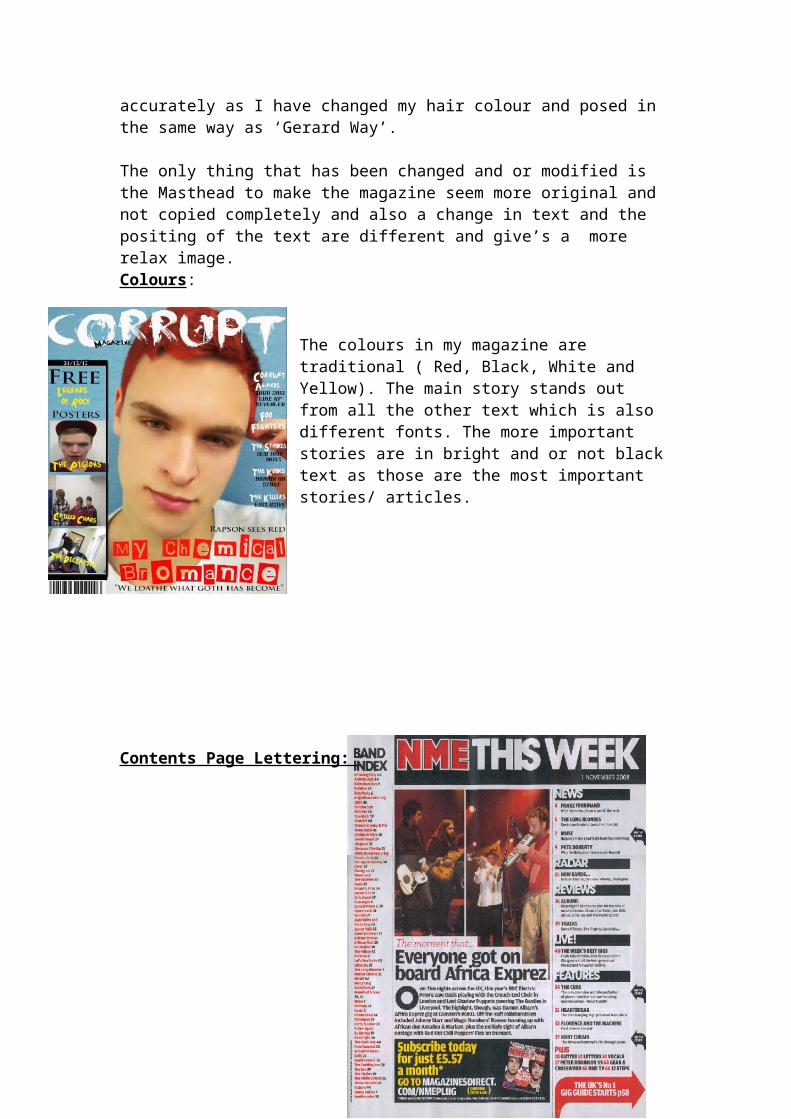
Colours:
The colours in my magazine are traditional ( Red, Black, White and Yellow). The main story stands out from all the other text which is also different fonts. The more important stories are in bright and or not black text as those are the most important stories/ articles.
Contents Page Lettering:
My copy of the NME contents page is basically the same lettering ( Text, Fonts and Layout) the layout is the same except for a few things e.g. the bottom left arrow is a square and the title is smaller and for some reason isn't there but the Masthead is in the Corrupt font.