evaluating and improving the usability of mit app inventor · chapter 1 introduction mit app...
TRANSCRIPT
Evaluating and Improving the Usability ofMIT App Inventor
by
Aubrey Joyce Colter
S.B., Massachusetts Institute of Technology (2013)
Submitted to the Department of Electrical Engineering and ComputerScience
in partial fulfillment of the requirements for the degree of
Master of Engineering in Electrical Engineering and Computer Science
at the
MASSACHUSETTS INSTITUTE OF TECHNOLOGY
June 2016
c○ Massachusetts Institute of Technology 2016. All rights reserved.
Author . . . . . . . . . . . . . . . . . . . . . . . . . . . . . . . . . . . . . . . . . . . . . . . . . . . . . . . . . . . . . . . .Department of Electrical Engineering and Computer Science
May 13, 2016
Certified by. . . . . . . . . . . . . . . . . . . . . . . . . . . . . . . . . . . . . . . . . . . . . . . . . . . . . . . . . . . .Harold Abelson
Class of 1922 Professor of Computer Science and EngineeringThesis Supervisor
Accepted by . . . . . . . . . . . . . . . . . . . . . . . . . . . . . . . . . . . . . . . . . . . . . . . . . . . . . . . . . . .Christopher J. Terman
Chairman, Department Committee on Graduate Theses

2

Evaluating and Improving the Usability of MIT App Inventor
by
Aubrey Joyce Colter
Submitted to the Department of Electrical Engineering and Computer Scienceon May 13, 2016, in partial fulfillment of the
requirements for the degree ofMaster of Engineering in Electrical Engineering and Computer Science
Abstract
MIT App Inventor is a blocks-based programming language for Android apps designedto teach programming skills to middle school and high school students. We aim tomake app development accessible for all.
Anyone learning to program must learn computational thinking methods; AppInventor users must also learn how to use the service. Our target users, teenagers andpeople without programming experience, often conflate the two learning processes:they think App Inventor is hard because learning to program is hard. As such,App Inventor needs a user interface that matches the conventions of commercially-available software our users already know how to use. Such an interface will allowthem to focus on learning how to program and to transfer their knowledge and skillsto other programming languages and environments.
I designed several tasks and conducted a usability study on the existing, publicly-available App Inventor service. Users encountered 75 unique issues and a total of 157issues. This is an average of 5 unique issues and 10.5 total issues per user. I madechanges to the App Inventor source code that addressed 34 of the most commonissues encountered. My intent was to make App Inventor both more usable to noviceprogrammers and more similar to the programming environments that experiencedprogrammers use. Finally, I conducted a usability study with the same tasks on themodified version of App Inventor. Users encountered 65 unique issues, including 19issues encountered in the first study, and 107 total issues. Based on user commentsand behavior, I conclude that my solutions resolved 21 of the original issues, partiallymitigated 9 issues, and did not improved the usability of 4 issues.
Thesis Supervisor: Harold AbelsonTitle: Class of 1922 Professor of Computer Science and Engineering
3

4

Acknowledgments
First, I would like to thank my advisor, Hal Abelson, for allowing me to follow my
passion for user interfaces and human-computer interaction. He gave me the latitude
and resources to explore the usability of App Inventor and has provided valuable
feedback throughout this process.
I could not have completed this project without Andrew McKinney’s support. He
was always excited about the work that I was doing. He helped me formalize my idea
for this thesis, he collaborated with me to prioritize the issues to address after the
first study, and he was willing to help when I was stuck.
I appreciate the generosity of Christopher LaRoche and Katherine Wahl, the MIT
IS&T Usability Team. They helped me refine my usability study tasks, they fit my
project to their busy testing schedule, and they conducted all of the sessions.
Special thanks to my sister, Quinn Colter: in addition to being a usability study
pilot tester while on vacation, she edited my thesis for content and clarity. Her
corrections have significantly improved the usability of this document.
I would not have a thesis without the participation of five pilot testers and twenty-
seven testers. I learned so much about usability tests and human-computer interaction
by observing them. I thank each of the participants for their time.
My friend, Candice Murray, kindly formatted all of my references for LaTeX. My
fellow researcher, Benjamin Xie, helped me troubleshoot issues as I was typesetting
my thesis in LaTeX.
Finally, a big thanks to the members of the App Inventor developer team who
answered my questions, reviewed my code, collaborated with me on projects that
stemmed from this experiment, and edited parts of this thesis.
5

6

Contents
1 Introduction 15
1.1 Motivation . . . . . . . . . . . . . . . . . . . . . . . . . . . . . . . . . 15
1.2 Contributions . . . . . . . . . . . . . . . . . . . . . . . . . . . . . . . 16
2 Related Work 19
3 Introduction to App Inventor 23
3.1 Overview . . . . . . . . . . . . . . . . . . . . . . . . . . . . . . . . . . 23
3.2 Sample App Built with App Inventor . . . . . . . . . . . . . . . . . . 25
3.3 Target User Groups . . . . . . . . . . . . . . . . . . . . . . . . . . . . 25
3.4 Community Outreach . . . . . . . . . . . . . . . . . . . . . . . . . . . 26
3.5 Curricula Developed for App Inventor . . . . . . . . . . . . . . . . . . 27
4 First Usability Study and Analysis 29
4.1 User Groups . . . . . . . . . . . . . . . . . . . . . . . . . . . . . . . . 29
4.2 Design . . . . . . . . . . . . . . . . . . . . . . . . . . . . . . . . . . . 30
4.3 Implementation . . . . . . . . . . . . . . . . . . . . . . . . . . . . . . 31
4.4 Results and Analysis . . . . . . . . . . . . . . . . . . . . . . . . . . . 32
4.4.1 Numerical Analysis . . . . . . . . . . . . . . . . . . . . . . . . 32
4.4.2 Most Common Issues . . . . . . . . . . . . . . . . . . . . . . . 33
4.4.3 Observations about User Behavior and Success . . . . . . . . . 34
4.5 Quotes from Participants about Common Issues . . . . . . . . . . . . 35
7

5 Code Implementation and Rationale 39
5.1 Wording of Menus and Error Messages . . . . . . . . . . . . . . . . . 39
5.1.1 Top Menu Bar and Submenus . . . . . . . . . . . . . . . . . . 40
5.1.2 Dialog Box Messages . . . . . . . . . . . . . . . . . . . . . . . 43
5.1.3 Strings in Designer View . . . . . . . . . . . . . . . . . . . . . 43
5.2 Blocks Issues . . . . . . . . . . . . . . . . . . . . . . . . . . . . . . . 44
5.2.1 Event Handler and Control Blocks . . . . . . . . . . . . . . . 44
5.2.2 Blocks View Toggle Button . . . . . . . . . . . . . . . . . . . 44
5.2.3 App Component and Any Component Blocks . . . . . . . . . 45
5.2.4 Procedures vs. Functions . . . . . . . . . . . . . . . . . . . . . 47
5.2.5 Backpack . . . . . . . . . . . . . . . . . . . . . . . . . . . . . 47
5.3 Trouble Connecting with the Companion . . . . . . . . . . . . . . . . 48
5.4 Clicking did not Match Expectations . . . . . . . . . . . . . . . . . . 48
5.5 Onboarding . . . . . . . . . . . . . . . . . . . . . . . . . . . . . . . . 49
5.6 Other UI Changes . . . . . . . . . . . . . . . . . . . . . . . . . . . . . 50
5.6.1 Basic Component Palette Drawer . . . . . . . . . . . . . . . . 50
5.6.2 Color in App Inventor . . . . . . . . . . . . . . . . . . . . . . 50
6 Second Usability Study and Analysis 53
6.1 User Groups . . . . . . . . . . . . . . . . . . . . . . . . . . . . . . . . 53
6.2 Design . . . . . . . . . . . . . . . . . . . . . . . . . . . . . . . . . . . 54
6.3 Implementation . . . . . . . . . . . . . . . . . . . . . . . . . . . . . . 54
6.4 Results and Analysis . . . . . . . . . . . . . . . . . . . . . . . . . . . 54
6.4.1 Numerical Analysis between Both Studies . . . . . . . . . . . 54
6.4.2 Issue Analysis between Both Studies . . . . . . . . . . . . . . 56
6.4.3 Resolved Issues . . . . . . . . . . . . . . . . . . . . . . . . . . 57
6.4.4 Partially Resolved Issues . . . . . . . . . . . . . . . . . . . . . 58
6.4.5 Unresolved Issues . . . . . . . . . . . . . . . . . . . . . . . . . 61
6.5 Quotes from Participants . . . . . . . . . . . . . . . . . . . . . . . . . 64
8

7 Future Work 67
7.1 Onboarding . . . . . . . . . . . . . . . . . . . . . . . . . . . . . . . . 67
7.2 Tutorials and Walkthroughs . . . . . . . . . . . . . . . . . . . . . . . 68
7.3 More Design Control . . . . . . . . . . . . . . . . . . . . . . . . . . . 68
7.4 Outstanding Issues . . . . . . . . . . . . . . . . . . . . . . . . . . . . 69
7.4.1 Simulator in the Designer View . . . . . . . . . . . . . . . . . 69
7.4.2 Scrolling in the Blocks Workspace . . . . . . . . . . . . . . . . 69
7.4.3 Viewer Screen Sizes . . . . . . . . . . . . . . . . . . . . . . . . 70
7.4.4 Hidden and Non-visible Components . . . . . . . . . . . . . . 70
7.5 Other Thoughts . . . . . . . . . . . . . . . . . . . . . . . . . . . . . . 70
8 Conclusion 73
A Beginner Usability Study Tasks 75
B Technical Usability Study Tasks 77
C Onboarding Script 79
D System Usability Scale (SUS) Form 81
9

10

List of Figures
3-1 Example of the Blocks used in App Inventor . . . . . . . . . . . . . . 24
3-2 Designer View . . . . . . . . . . . . . . . . . . . . . . . . . . . . . . . 25
3-3 Blocks View . . . . . . . . . . . . . . . . . . . . . . . . . . . . . . . . 26
4-1 Plot of SUS Scores by Study Participant . . . . . . . . . . . . . . . . 33
5-1 Original Top Menu Bar . . . . . . . . . . . . . . . . . . . . . . . . . . 41
5-2 New Top Menu Bar . . . . . . . . . . . . . . . . . . . . . . . . . . . . 41
5-3 Original Connect Menu . . . . . . . . . . . . . . . . . . . . . . . . . . 42
5-4 New Test Menu . . . . . . . . . . . . . . . . . . . . . . . . . . . . . . 42
5-5 Original Help Menu . . . . . . . . . . . . . . . . . . . . . . . . . . . . 42
5-6 New Help and About Menus . . . . . . . . . . . . . . . . . . . . . . . 42
5-7 Original Welcome Dialog . . . . . . . . . . . . . . . . . . . . . . . . . 43
5-8 New Welcome Dialog . . . . . . . . . . . . . . . . . . . . . . . . . . . 43
5-9 Original Event Handler and Control Blocks . . . . . . . . . . . . . . . 45
5-10 New Event Handler and Control Blocks . . . . . . . . . . . . . . . . . 45
5-11 Onboarding Box Indicating the Blocks Toggle Button . . . . . . . . . 45
5-12 Onboarding Sequence Boxes for the Blocks Palette . . . . . . . . . . . 46
5-13 Original Backpack in Empty and Nonempty States . . . . . . . . . . 47
5-14 New Backpack in Empty, Hover, and Nonempty States . . . . . . . . 47
5-15 Onboarding Box that Introduces the Backpack . . . . . . . . . . . . . 48
5-16 Right-click Menu in Components Pane . . . . . . . . . . . . . . . . . 49
5-17 Right-click Menu in Viewer Pane . . . . . . . . . . . . . . . . . . . . 49
5-18 First Box in the Onboarding Sequence . . . . . . . . . . . . . . . . . 50
11

5-19 Original User Interface and New Basic Palette Drawer . . . . . . . . . 51
5-20 Original and New Color Palette . . . . . . . . . . . . . . . . . . . . . 51
5-21 Original and New Designer View Comparing Green Color Schemes . . 52
6-1 Scatter Plot of SUS Scores by Study Participant . . . . . . . . . . . . 55
6-2 Success of Solutions to Unique Issues from First Usability Study . . . 56
6-3 Duplicate Issues between Studies . . . . . . . . . . . . . . . . . . . . 56
12

List of Tables
4.1 Table of SUS Scores Across All Users in First Usability Study . . . . 33
6.1 Table of SUS Scores Across All Users in Second Usability Study . . . 55
13

14

Chapter 1
Introduction
MIT App Inventor is a web service designed with the overarching goal of democra-
tizing Android application development [1]. Through freely available curriculum and
tutorials, App Inventor also aims to teach middle school and high school students the
fundamentals of programming. The service employs Blockly, a open-source blocks-
based programming framework [7]. As a project within the MIT Center for Mobile
Learning, we aim to make programming more accessible to young people and people
who do not have a programming background. MIT App Inventor mitigates a lot of
the difficulty intrinsic in programming for Android, which helps our inventors have a
better experience when designing and developing Android apps. Furthermore, App
Inventor tries to make it easier to learn how to program by replacing traditional lines
of code with a more graphical and tactile method of creating code.
1.1 Motivation
App Inventor users must learn how to use the service in addition to learning good
programming practices and techniques. Because App Inventor’s target user groups
are teenagers and people without programming knowledge, App Inventor needs a
high-quality user interface that engages users in an intuitive, pleasant programming
experience.
I have always been interested in human-computer interaction and user interfaces.
15

As a child, I liked teaching myself how to use computer programs, such as Power-
Point and Adobe Premiere. When I was teenager, my grandmother used to bring
her computer to family gatherings so that I could teach her how to use it. From
these experiences, I gained an appreciation for user interfaces that were intuitive and
enjoyable for people to use.
Through my own experience learning to use App Inventor, I have found that it
is not always intuitive. As a master’s student at MIT, I have had the opportunity
as a TA and a Technovation Mentor1 to watch people use App Inventor for the first
time, and I have seen their occasional frustration with it. Because the interface does
not always match their expectations, they underestimate App Inventor’s power and
capability.
Because of these experiences, I wanted to first quantify the issues that users en-
counter with App Inventor. Second, I wanted to try to solve those problems. And
third, I wanted to collect data to see if and how much my fixes improved the usability
of the system. If my fixes proved to be beneficial, meaning they reduced the frequency
with which an error was encountered, I could use the data to justify that the changes
should be included in the public App Inventor service.
1.2 Contributions
My thesis is a three-phase experiment based on MIT App Inventor. First, I designed a
usability study and observed volunteers as they completed the tasks. My participants
were divided into two groups by their prior experience with programming. Second,
based on the individual and collective responses to the tasks in the study, I attempted
to fix 34 of the most common issues in App Inventor. My goal was twofold: 1) to
make App Inventor more usable to novice programmers; and 2) to make it match
other programming environments that experienced developers use. Finally, I observed
participants completing the same usability study tasks in my new version of App
1Technovation is a global competition for young women in middle school and high school. Theymust create a business plan and develop an app that fulfills a need in their community. Teams arementored by industry professionals [27].
16

Inventor. The results from the second usability study show that my changes were
an overall improvement, eliminating 21 and partially mitigating 9 of the originally
discovered 75 unique issues in the public App Inventor service. However, 4 of the
original issues that I addressed were not mitigated by the solution and remain open
problems.
The following chapters explain in more detail each of the steps in my thesis.
In chapter 2, I outline related work, although there was only one paper about the
results from a usability study being applied in code and retested, and one paper
about building a usable programming language for children. Chapter 3 contains a
brief introduction to App Inventor, its screens, and a sample app. In chapter 4, I
describe the design and execution of the first usability study and its results. Chapter
5 is a report of my changes to App Inventor, including before and after screenshots.
Chapter 6 contains the results of the second usability study, which are compared to
the first study’s results. I conclude in chapter 7 with a section about future work
that directly stems from this project, and final thoughts in chapter 8 about what I
learned through this experiment.
17

18

Chapter 2
Related Work
With increased use of personal computers and mobile devices, web-services and soft-
ware companies are spending more resources on design and usability. The usability
field is rapidly expanding to improve the overall user experience and to increase the
marketability of companies’ products.
In my research, I found only one paper that used the results of a usability study
to inform their decisions to redesign the interface, which was then retested. In early
2014, Darejeh et al. published a paper investigating the Ribbon interface in Microsoft
Office products and its learnability for users with low computer literacy [6]. After
an initial usability test of the Ribbon, the authors used their findings to redesign the
Ribbon interface and retested it. Through their data analysis, they showed that their
redesigned Ribbon:
∙ Enabled participants to complete tasks that they could not complete in the
original version;
∙ Increased participants’ speed in completing the given tasks;
∙ Decreased the number of steps that participants took while performing the
tasks.
In 2002, as a result of the work he did for his doctoral thesis, John Pane published
a paper about HANDS, a programming language he developed for children in 5th
grade or older [22]. HANDS is an event-driven programming language, like App
Inventor. His goal was to reduce the difficulty of programming by improving the
19

usability of a development environment’s user interface. They conducted a usability
study with HANDS focusing on queries, aggregate operations, and the high visibility
of data. They concluded that the users, all of whom were non-programmers, who used
HANDS performed significantly better than the users who used a version of HANDS
that had the three studied features disabled.
In 2015, biomedical researchers tested the usability of Printed Educational Mate-
rials (PEMs), packets of information that are a distributed to clinics in an attempt to
change primary care [9]. The researchers note that the information in PEMs rarely
had an impact on physician behavior. Their usability study was structured similarly
to mine, though they used paper materials, and I used a web-based software prod-
uct. They employed a graphic designer to redesign a publicly-available PEM based
on physician feedback, then asked physicians to choose their preferred design, the
original or the redesigned version. They also asked the physicians to rate the PEM
on the System Usability Scale (SUS) 1. They found that their redesigned Therapeutic
Letters were easier to read, which could impact physician behavior. Furthermore,
they concluded that even a single usability test can provide valuable feedback.
In late 2014, Geng et al. discussed the impact of fixing the usability problems
of the Furniture Giveaway website [8]. They analyzed the usability of the 2009 and
2010 versions of the website by comparing the number of steps and amount of time
required to complete specified tasks. They found that site structure, convenience of
functionality, and graphic design improved the users’ online experience .
In 2016 Sheng-yi Hsu et al. wrote a paper about users’ behavior and efficacy using
App Inventor, specifically the Blocks editor [11]. They stated that the benefit of blocks
is that they lower the barrier for learning to program, but unfortunately the App
Inventor Blocks editor does not improve understanding. They defined understanding
as reading, searching, and maintaining code, crucial actions that most developers
spend 35 percent of their time doing. They introduced a “shelf” structure to the
App Inventor Blocks Editor. Users could organize blocks in different “shelves” in the
1The SUS is a form used to assess the subjective usability of a system. I describe more aboutthe SUS and how I used it in my experiements in section 4.4.1
20

workspace and switch between viewing different block shelves for better readability of
large volumes of blocks. They used A/B testing to determine whether their structure
was beneficial to students who knew the basics of programming. They concluded that
the shelves improved the students’ understanding of the code blocks.
In 2005, Yu-chen Hsu published a paper about an experiment using metaphors
to teach beginners and experts about Internet Protocol (IP) [12]. The author gave
participants a pretest, then split the beginners and the experts into four groups; one
group of beginners and one group of experts were taught the metaphor, and the other
two groups were not taught the metaphor. After learning about IP, the researcher
administered a post-test with two different types of questions. This paper shows that
other researchers have divided a population of users into two groups based on their
familiarity with computers, as I did.
In 2015, Andreas Sonderegger et al. performed a usability study in which they
divided their users into two groups: older people (mean age 58.1 years) and younger
people (mean age 23 years) [26]. They claimed that usability improvements intended
to help older users also benefited younger users. They concluded that their results
did not show an age-related effect for effectiveness or accuracy in task completion,
but younger adults performed better on speed-related tasks.
In addition to academic literature about usability studies, there is a wealth of
information about performing usability studies. Jakob Nielsen is known in the field
as the expert of usability studies. He published a paper in 1994 that concluded four
to five participants are sufficient for a usability study [20].
In 2000, Steve Krug published a book about improving the usability of business
websites [14]. In addition to giving suggestions for how businesses can improve the
overall design of their websites, he emphasized usability testing, and included a section
on how businesses can do it themselves without hiring a professional. He insisted that
testing always works, even with the wrong user; any test can show areas in a site that
need improvement. Though his book focused on websites that are used primarily for
finding information and making purchases, many of the principles can be applied to
web-based software like App Inventor.
21

Finally, the United States government maintains a website about usability and
improving user experience [4]. They include guidelines, methods, and templates for
performing usability studies and reporting results.
22

Chapter 3
Introduction to App Inventor
3.1 Overview
Development of MIT App Inventor began in 2009 as a collaboration between Google’s
Mark Friedman and MIT professor Hal Abelson, who was on sabbatical at Google
[1]. Because it was developed at Google, App Inventor was designed to build Android
apps. In January 2012, Google open-sourced App Inventor, and the MIT Center for
Mobile Learning assumed responsibility for maintaining and developing the service.
App Inventor is a free, open-source, world-wide service with over 4.7 million reg-
istered users and an average of 175,000 active weekly users from 195 countries. To
date, users have built more than 14.9 million apps and have published about 30,000
apps on the Google Play Store.
App Inventor makes programming Android apps much easier than programming
in Java using Android Studio or another IDE. Following the tutorials, users are able
to create simple, fully-functioning apps in under an hour.
App Inventor consists of two main screens: the Designer view and the Blocks view.
In the Designer view (see Figure 3-2), users drag and drop components into their app.
If the component is a visible component, such as a Button or Image, the component
is displayed on a mock phone screen within the Designer view. If the component is a
non-visible component, such as the GPS sensor or a database, it is displayed in a list
below the mock phone screen. The components’ special properties (e.g. text that is
23

displayed on the component or a source image) can be customized in a pane in the
Designer view. The components also have unique code blocks associated with their
specific capabilities and properties. Users can access these code blocks by toggling
from the Designer to the Blocks view.
In the Blocks view (see Figure 3-3), rather than traditional lines of text, App
Inventor uses Blockly, an open-source framework for building visual programming
languages [7]. The code is displayed as blocks that link together. Users drag and drop
blocks corresponding to the components they have added to their apps to build the
logic of their apps. The blocks are very readable, meaning users can easily determine
what a segment of code does by reading through the blocks in hierarchical order. For
example, as shown in Figure 3-1, when Button1 is clicked, Sound1 will play.
Figure 3-1: Example of the Blocks used in App Inventor
As illustrated by Figure 3-1, there are different types of blocks available in the
Blocks view depending on the components used in the Designer. App Inventor is an
event-driven language. The yellow when Button1.Click block responds to the event
that the component called Button1 is clicked; the purple call Sound1.Play block is
a procedure unique to Sound components that plays the file set as the component’s
source. Different block types are different colors, allowing the user to easily see how
blocks are related. More block types and their corresponding colors can be seen in
Figure 3-3.
Another feature unique to App Inventor is the Companion App, which allows
live-testing an app during development. The user downloads the Companion App
onto their Android device and uses it to connect their device to App Inventor. Once
connected, the app the user is building is displayed in the Companion (over WiFi
or through a USB connection), and the user can interact with the app as if it were
installed on their device. As the user makes changes to the app in App Inventor,
24

those changes are reflected in the version running through the Companion on their
device.
3.2 Sample App Built with App Inventor
The app shown in Figures 3-2 and 3-3 prompts the user to enter a favorite artist’s
name and then plays a snippet of one of the artist’s songs when the user clicks “Listen!”
1. When the Listen! button (Button1) is clicked, the app makes a call to the
iTunes API via the Web component (Web1).
2. When Web1 receives the JSON result from the iTunes API:
(a) The app parses out the song’s preview URL, title, and artist’s name,
(b) A Label (Label1) is set to display the song’s title and artist’s name,
(c) The Player (Player1) component plays the song snippet from the URL.
Figure 3-2: Designer View
3.3 Target User Groups
Our target audience is middle school and high school students. By giving students an
easier alternative to traditional text-based programming, we hope to introduce them
25

Figure 3-3: Blocks View
to programming at a younger age. We hope that students using our platform will
learn good programming practices, which they can transfer to other programming
languages. Regardless of their future career choices, we think that programming will
be a necessary skill. Programming teaches students to think logically and empowers
them to experiment with technology.
In addition to teenagers and college students, a significant portion of App Inventor
users are end-user programmers. In a survey open from October 2013 through April
2016, 69.6% of 221,771 self-selected users said they used App Inventor at home. Some
of these users are professional developers who use App Inventor to quickly prototype
app ideas, or to teach others how to program. Other users are teaching themselves
to program by using App Inventor. We intended to meet the needs of each of these
groups.
3.4 Community Outreach
App Inventor has a vibrant online and offline community. Many people participate
in the online user forums, with experienced users answering questions from less expe-
26

rienced users, usually helping them debug their apps.
The Master Trainers community is a global group of K-16 educators and other
professionals who have been trained to teach App Inventor in their communities [17].
They teach students and teachers in workshops, classes, and afterschool programs
about programming concepts and give them the tools they need to become app de-
velopers.
App Inventor also has an active open-source community with programmers from
around the world contributing to the service [2]. This community includes students at
MIT who work with the full-time App Inventor developers to hone their programming
skills. They gain real-world experience working on a large codebase, which they can
apply in industry and personal projects.
3.5 Curricula Developed for App Inventor
Many individuals and schools have developed programming curricula using App In-
ventor. The App Inventor team has published many free tutorials on our website.
People outside of the core App Inventor team have also written books and maintain
websites with App Inventor tutorials. Notably, David Wolber at UCSF has writ-
ten two books and maintains an App Inventor curriculum on appinventor.org [30].
Additionally, in middle schools and high schools, teachers have developed their own
curricula for introductory computer science classes.
Several competitions for middle school and high school students use App Inventor
as a way of introducing teenagers to programming. The Technovation Challenge is
a global competition for young women to develop a business plan around an original
app that addresses a need in their communities [27]. The Verizon Innovative App
Challenge invites teenagers to create apps and then compete at the regional, state,
and national level [29]. Both of these competitions utilize mentors from industry to
teach the students how to program and think innovatively.
Working with the Hong Kong Jockey Club Charities Trust and the Hong Kong Ed-
ucation Bureau, we are are developing a computer science curriculum for 4th through
27

6th grade students [15]. Fourth grade students will learn Scratch [25], and 5th and
6th grade students will learn App Inventor. In the first year, a pilot program will run
in 32 primary schools. We plan to expand to the approximately 250 primary schools
in Hong Kong over the course of four years.
28

Chapter 4
First Usability Study and Analysis
4.1 User Groups
App Inventor has three main user groups: teenage and college-age students, who are
generally using the service for class assignments; people with little to no prior pro-
gramming experience who want to learn how to program; and hobbyist programmers
who want to create or prototype Android apps more quickly than by programming
in Java.
Due to the limited timeframe of my Master’s thesis, I chose not to include teenage
participants in my usability study. Working with minors requires additional permis-
sions and precautions, and teenagers are generally less reliable than adults.
Instead, I invited adult novice and hobbyist programmers with no prior exposure
to App Inventor to participate in my usability study. I recruited participants by
emailing MIT mailing lists and by posting a general request in various technical and
non-technical Facebook groups. A brief Google survey established their programming
background and determined their eligibility. In total, eight novice and seven hobbyist
programmers participated in the first study [20]. They ranged in age from 18 to 54
years old. Seven of the study participants were affiliated with MIT.
The novice participants all identified as having one year or less of programming
experience. One participant had prior experience with Scratch. One of the partici-
pants had less than 1 year of experience programming for iOS. Only two of the eight
29

participants had access to an Android phone or tablet.
Three of the hobbyist participants had between 1 and 5 years of programming
experience; two had 5 to 10 years of programming experience; and two participants
had more than 10 years of experience. Five of the hobbyist participants had prior
experience working with a blocks-based language, and one participant had over 5
years of experience programming for iOS. Five of the seven participants had access
to an Android phone or tablet.
I chose to divide my users into “beginner” and “technical” groups so that I could
learn what non-programmers and programmers expect in a development environment.
Novice programmers, based on their experience with common consumer software such
as Microsoft Word and the Adobe Creative Suite, have different expectations than
programmers, who have experience with IDEs. I want App Inventor to conform to
common conventions of consumer software, so that it is easy for new programmers
to learn how to use App Inventor, and so that they do not get frustrated and give
up. I also want App Inventor to match other IDEs so that as novice users become
more competent, the skills and conventions they learn can easily transfer to other
programming environments.
4.2 Design
Before designing the study tasks, I compiled a list of common App Inventor usability
issues. I spoke with two proficient App Inventor users, both of whom have taught
programming with App Inventor to others [24], [28]. As a TA, I helped several MIT
students who were learning App Inventor, both in person and by answering questions
on the class forum [23]. Finally, I informally observed common questions asked on
App Inventor forums [3]. I used this list as a basis for designing two sets of tasks:
one for novice programmers (Beginner Tasks) and one for experienced programmers
(Technical Tasks). (See Appendices A, B for the lists of tasks.)
With direction from Christopher LaRoche and Katherine Wahl, the MIT Infor-
mation Service and Technology (IS&T) Accessibility and Usability Group, I refined
30

the sets of tasks to give the study participants an experience that would simulate the
experience of a first-time App Inventor user in 30 minutes or less [16]. Two novice and
three hobbyist programmers were asked to pilot test the tasks that were subsequently
refined and used for the 15 study participants. Each task set had 8 tasks, but the
participants were asked to stop if they did not complete all of the tasks in 30 minutes.
The Beginner Tasks focused on the Designer view. The Technical Tasks focused
on the Blocks view. The decision to have beginner users primarily interact with the
Designer view and technical users primarily interact with the Blocks view was due to
the limited amount of time we had with each user; I wanted to make sure that we
could test as many of the features of App Inventor as possible. The Designer view is
similar to consumer software products, and the Blocks view is similar to development
environments. This division proved to be logical in my pilot tests, where I noticed
that the experienced programmers were less likely to return to the Designer view once
they found the Blocks view. Furthermore, because code is less intimidating to them,
I wanted to see how they would interact with many blocks.
The Beginner Tasks were inspired by the Hello Purr tutorial on the App Inventor
website [10]. The tasks guided the participant through each of the steps required to
build an App Inventor user’s typical first app. By the end, they had a functioning
app that they were asked to test on an Android phone (either their own, one provided
by our lab, or the App Inventor emulator).
The Technical Tasks guided the participants to open a provided, pre-built app
based on the MoleMash tutorial, an app similar to the whack-a-mole carnival game
[19]. The tasks guided the participants to refactor parts of the provided code and
add an additional feature to the basic app’s scoring methodology.
4.3 Implementation
Chris and Katherine professionally conducted the usability tests as third-party mod-
erators. Approximately half of the participants completed the study in-person at the
MIT IS&T Usability Lab; the other participants completed the study remotely via
31

WebEx. Participants were encouraged to think aloud as they completed the tasks.
All sessions were recorded (screen and audio) for analysis after the study. I was a
silent observer in the Usability Lab for many of the sessions, and I took detailed notes
based on what the participants were saying and doing as they completed the tasks.
Participants were directed to the public App Inventor service. The users who
were participating in the lab were given this web address in the task introductions,
but they started their session on the empty My Projects page. Chris signed in to
App Inventor using his own Google account to reduce the amount of time necessary
to start the study. Remote users were sent a detailed set up email that informed
them they would need to log in to the service with a Google account and included
a screenshot of the My Projects page to show them where they needed to start the
study.
4.4 Results and Analysis
4.4.1 Numerical Analysis
After completing the study, users filled out a System Usability Scale (SUS) form (see
Appendix D). The SUS is a simple, ten-item questionnaire for subjectively assessing
the usability of a system [13]. This form is platform-agnostic and asks participants
to rate their experience using the software on a 5-point Likert scale. A SUS score,
which can range from 0 to 100, represents the overall usability of the system, with
higher numbers representing a more usable experience.
Unfortunately, for the first study, we did not label the completed forms, which
would have allowed us to separate them into beginner and technical groups. Thus, we
cannot determine if the two groups gave different ratings to App Inventor’s usability.
Figure 4-1 shows SUS scores from each of the participants and Table 4.1 shows an
analysis of the scores across all users.
Although I watched many participants struggle through the tasks, they generally
reported on the SUS that App Inventor was easy to use, they would not need a lot of
32

Figure 4-1: Plot of SUS Scores by Study Participant
StandardMean Median Deviation Minimum Maximum
All Users 71.08 71.25 10.47 57.5 97.5
Table 4.1: Table of SUS Scores Across All Users in First Usability Study
training to use it, they thought the functionality was well integrated, and that most
people would be able to easily learn how to use App Inventor. Furthermore, most
participants were able to complete all of the tasks, which probably made them feel
successful. This is a valuable insight suggesting that if people feel successful, they are
more likely to rate the product as easy to use. Thus, if we can help our App Inventor
users, especially the teenage users, feel like they are successfully building apps, they
will be more likely to think that App Inventor is easy to use, and they will continue
programming.
4.4.2 Most Common Issues
Despite the results from the SUS indicating that App Inventor is fairly usable, across
the fifteen users I tabulated 75 unique issues and a total of 157 issues. This is an
average of 5 unique issues and 10.5 total issues per user. I used these issues to decide
which parts of App Inventor I would redesign.
33

The most common issue was that event handler blocks were the same color as
control blocks, which are easier to find. Ten out of the fifteen participants went
to the Control drawer to find a handler for a button being clicked or a canvas being
touched. Although it makes sense from a teaching perspective that the two categories
of blocks are the same color because they both handle the control flow of the app, it
was confusing and frustrating to the users.
In the second most common issue, eight participants had a difficult time finding
the button to toggle to the Blocks view from the Designer view. Ultimately, all of the
users were able to find the button and progress with their tasks; however, it took them
a long time to find it and may have prevented some of the users from completing all
of the tasks in the study. This issue was experienced by both beginner and technical
participants.
The issues that I addressed and their solutions are detailed in Chapter 5.
4.4.3 Observations about User Behavior and Success
The two technical users with more than 10 years of programming experience had the
least amount of difficulty using App Inventor. I propose a few explanations for this
occurrence. First, App Inventor was designed by developers, so it should match these
users’ mental models for design and development environments. Second, these users
are probably the most experienced at learning new programming languages. Although
they had little experience with blocks-based programming languages, I think they
were the least intimidated and it was easy for them to learn the basics of programming
with App Inventor. Finally, they have the most experience being persistent in working
with computers and programming languages, and they assumed that it would work.
One remote participant did not finish the tasks in the time allotted, but after the
session, he sent the remaining answers to the tasks to Katherine. This kind of tenacity
is something that we want to teach to people learning to program, but it probably
comes from years of experience, not from using inherently difficult software. Young
students are unlikely to persevere with a program that is too hard to use.
We had one participant who works on the Scratch development team at MIT.
34

Through watching her, I realized that App Inventor is very similar to Scratch and
matches the Scratch paradigms fairly well. She was more comfortable with the blocks
than any of the other participants. The other technical participants worked on tasks
one at a time, but did not build the full functionality in the allotted time. The
Scratch-proficient participant easily completed the full functionality of the MoleMash
app without guidance from the tasks. She said that she felt like she did not need to
test it because she thought it was easy to do. This suggests that she was confident
in her ability to write correct code, a confidence we hope to instill in young users.
4.5 Quotes from Participants about Common Issues
∙ The most common issue was looking for event handler blocks in the Control
section of the blocks palette. One user said, “Now I just need to find a When
Do. Where’s a when? Can I do an If? There’s a While. You’d think When
would be the first thing.” Another user said, “I thought it would be in Control
because it’s yellow like the other ones! But I don’t see anything here.” A third
user said, “I expected the canvas block to be in control, but I guess it makes
sense.” I discuss my solution to this issue in section 5.2.1.
∙ Eight users had difficulty finding the button to switch to the Blocks view. Many
users asked, “Where is the Blocks view?” One user said, “When I’m switching
between things, my thought is to go to the upper left. I don’t know why I have
that instinct. That’s where I was looking first.” After they found the button,
most users concluded, “I guess it makes sense now, but it was hard to find.” See
section 5.2.2 for my solution.
∙ Five users had trouble connecting to the Companion App. One user tried the
Hard Reset option, and then she tried AI Companion. She said “I only picked AI
Companion because the other 2 options didn’t make sense.” Another user who
completed the study remotely commented, “Connect [the menu option] might
not make sense, but I know about it because I was told to download the app.”
These comments motivated the changes in section 5.3.
35
∙ The technical tasks asked the users to abstract blocks into a function (see
Appendix B, Task 3). One user commented, “I don’t know how to write func-
tions in this app.” Another, after pulling the blocks into a procedure, asked,
“How do I do my call? How do I get it in there?” The confusion about proce-
dures and functions was an error in the usability tasks, which is discussed in
section 5.2.4.
∙ A few users saw the Backpack, but no one knew what it would do. One user
said, “I assume the Backpack is ‘save for later,’ but it isn’t obvious to me what
it is.” Another user found the Backpack with code in it from the previous
participant’s session. He said, “I don’t know what it does, but it’s there.” I
attempted to make the functionality of the Backpack more discoverable with
my changes described in section 5.2.5.
∙ Four users wanted instructions when they first opened App Inventor. One
said, “A popup or tooltip would have been helpful for the completely unedu-
cated.” I created an onboarding sequence with small dialog boxes to guide users
around App Inventor before they start their first project (see section 5.5 and
Appendix C).
∙ Two users commented on the overall usability of the system. One said, “It’s
pretty straightforward. Not intuitive, but easy to see what is happening,” and
another said, “There seems to be a little bit of a learning curve. But it does
seem intuitive once you’re comfortable with it.”
∙ Several users commented on ease of using the blocks. One participant liked
the design of the blocks: “I like how they are shaped. Having the shapes that
coordinate is very nice because it shows me where things go, how they fit, and
what I’m looking for.” Another thought, “The commands for making things
happen to execute various functions is perfect. It’s color coordinated, and I
love that. It’s very easy to conceptualize.” One user said, “I like how the
options are all right there. Having to remember everything that I need to do
in programming is hard. Here I can just fill in the box.” Another user said, “I
noticed there’s a sound effect when a connection is made. It’s good to know it
36

happened.”
∙ Most users had small delight moments when using App Inventor. One of the
participants with more than 10 years of programming experience said, “This is
visual programming! This is kind of fun!” One of the users finished his app,
exclaiming, “It works! Hey, that’s exciting!”
37

38

Chapter 5
Code Implementation and Rationale
Of the 75 unique issues identified in the first usability study, I implemented solutions
for 34 issues. Working with our lead software developer, I prioritized the issues I
would address. We chose the issues that were seen the most often, and the issues that
would be the easiest to fix given the current codebase and my 1-year Master’s thesis
timeline. However, all of the issues have been documented and other MIT students
in our group have chosen some of the issues as their own projects.
Most of the solutions involved very small changes, but in aggregate, they amounted
to considerable changes in App Inventor1. In several cases, one solution addressed
more than one issue. I have included before and after screenshots of App Inventor to
illustrate my solutions. I tried to follow usability practices that I learned from MIT’s
user interface design class [18] and my own usability research [21].
5.1 Wording of Menus and Error Messages
Of the unique issues users faced, 17 were due to outdated wording, long messages in
dialog boxes, or messages that were not as precise or descriptive as they need to be.
These comprise the bulk of the issues I addressed, though they often required the
least amount of time. I documented all of the strings that I changed so that they can1I implemented all of my solutions on a personal branch of the App Inventor source code. I did
not merge them into the public service’s codebase as I completed them because I did not know ifthe solutions would be effective.
39

be translated.
5.1.1 Top Menu Bar and Submenus
Many users indicated that they did not understand the menu wording, which consti-
tute 8 of the unique issues. They had questions like:
∙ What is a checkpoint?
∙ What is the Gallery?
∙ What is a keystore?
∙ What is AI Companion?
One participant thought the Build menu would be where to find blocks, while another
thought it would be where she started a new project. The Guide heading was
confusing to a user because it linked to the Documentation page instead of a tutorial.
I worked with another student to wireframe a new menu. We reorganized menu
item placement and reworded submenu items. After receiving feedback from the
team, she and I implemented the new menu and added it to my branch (see Figures
5-1 and 5-2).
We first changed the top-level menu bar:
∙ We removed Beta from our logo because we are no longer in beta mode. We
removed the 2 from the logo because it originally differentiated App Inventor
2 from App Inventor Classic. Classic was retired in July 2015, so we no longer
need to differentiate between the two services.
∙ Connect became Test (Figures 5-3 and 5-4). We considered renaming it Run,
but ultimately decided we wanted to highlight the live-testing feature unique to
App Inventor.
∙ Build became Package so that it would not be confused with building an app
or building with blocks. We think it is intuitive because packaging an app is
like packaging a gift when it is ready to be given.
∙ Gallery became App Gallery to give the users a hint that apps are in the
Gallery. We kept the word Gallery to match Scratch’s convention.
∙ We removed the Guide button and renamed the Help submenu item Library
40

to Documentation. Both options originally linked to the same page on the App
Inventor website.
∙ We removed Report an Issue from the top bar and created a new About
menu (see Figure 5-6).
∙ We added a Teach item (not shown) that will be placed between About and
English to give educators using App Inventor quick access to the Educators
forum and website once it is finished.
Figure 5-1: Original Top Menu Bar
Figure 5-2: New Top Menu Bar
We also reworded submenu items:
∙ We changed Checkpoint to Save a checkpoint.
∙ We changed Import Keystore to Import app signing keystore to indicate that a
keystore is used to sign an app for the Google Play Store.
∙ Under Test, we changed AI Companion to Companion App over WiFi ; simi-
larly, we changed USB to Companion App over USB. These options now indicate
to users that they should connect the Companion App on their device to App
Inventor via WiFi or USB, respectively (Figure 5-4).
∙ Under Test, we changed Reset Connection to Stop live testing on Companion
App to be more informative of the action while still using few, simple words.
∙ Under Test, we moved Hard Reset to About, and we changed its text to
Update Companion on Emulator, which is consistent with our documentation
(see Figure 5-6).
We removed duplicate items from the top bar and submenus. Report an Issue
was available in the top bar as well as under Help, and it linked to the same page
as the Forum, also under Help. We combined Forum and Report an Issue under
Help. We assume that most users will not need to report an issue because we are
41

Figure 5-3: Original Connect Menu Figure 5-4: New Test Menu
no longer in beta mode. We reorganized some of the menu items to group related
functionality. We moved and renamed several of the menu items under Help to a
new About menu, as shown in Figures 5-5 and 5-6). About became App Inventor
Version, Companion Information became Current Companion Version, and Show
Splash Screen became Show Welcome Splash Screen. In the Help menu, we renamed
Library to Documentation and added a link to the Walkthroughs, which includes the
onboarding sequence (see section 5.5).
Figure 5-5: Original Help Menu Figure 5-6: New Help and About Menus
42

5.1.2 Dialog Box Messages
I reviewed all of the messages shown to users and edited them for style and content.
As much as possible, I tried to reduce the number of words in the messages and make
any button text more descriptive of what the click would do.
The Welcome to App Inventor message that greets users the first time they log in
to App Inventor had too many words that were too small (Figure 5-7). The opening
screen has a lot of empty space, and the dialog box was very small on the screen. I
redesigned the dialog with feedback from the team. I reduced the number of words
and added action buttons to help users get started quickly. I also made the welcome
dialog larger and removed the green outline to make the box feel lighter visually
(Figure 5-8).
Figure 5-7: Original Welcome Dialog
Figure 5-8: New Welcome Dialog
5.1.3 Strings in Designer View
Users made a few comments about strings in the Designer that confused them. One
user was confused that the Palette drawer containing components such as Button,
43

Image, and TextBox, was called User Interface because he thought that he was de-
signing the user interface of his app throughout the tasks. I changed the name of this
drawer to Basic.
Another user was browsing the properties of the Sound component and commented
that he did not know what MinimumInterval was because there were no units. It was
easy to add ‘(ms)’ to the property description for the components with a time interval.
By doing this, users will not need to go to the documentation on a different page to
understand the MinimumInterval property.
Finally, one user did not know what the string ‘Display Hidden Components in
Viewer’ in the Viewer box meant. I changed it to ‘Display Invisible Components’
because components have a Visible property.
5.2 Blocks Issues
5.2.1 Event Handler and Control Blocks
Ten of the fifteen users were frustrated trying to find event handler blocks because
they were the same color as control blocks. Control blocks are much more discoverable
due to the small yellow square next to Control in the Built-in blocks palette. I made
the event blocks a darker shade of yellow and the control blocks a lighter tint of the
same yellow (Figures 5-9 and 5-10).
5.2.2 Blocks View Toggle Button
Eight of the fifteen users had difficulty finding the Blocks view toggle button in the
top right corner the first time they were asked to switch to the Blocks view. To
mitigate this problem, I added a box in my onboarding sequence2 that showed users
the button in the top right corner of the screen. The box required the user to click
the Blocks toggle button before the script would let them continue to the next box
(Figure 5-11).
2See description of the onboarding sequence on page 49.
44

Figure 5-9: Original Event Handler and Control Blocks
Figure 5-10: New Event Handler and Control Blocks
Figure 5-11: Onboarding Box Indicating the Blocks Toggle Button
5.2.3 App Component and Any Component Blocks
Four users found the Any Component expandable section of the blocks palette
before they found the blocks for components they had in their app. I added three
onboarding boxes to explain the different sections of the Blocks palette (Figure 5-12).
45

Figure 5-12: Onboarding Sequence Boxes for the Blocks Palette
46

5.2.4 Procedures vs. Functions
Two technical users had difficulty finding the Procedures built-in blocks. The task
asked them to abstract some blocks into a Function, so they looked for a Function
drawer in the Blocks palette. This was a mistake in the tasks. The task should
have used the word Procedure, which is consistent with the AP Computer Science
Principles curriculum [5, p. 16]. I fixed this mistake in the second usability study
tasks.
5.2.5 Backpack
The Backpack provides a way for users to copy and paste code blocks from one
project or screen to another. Two users specifically stated they did not know what
the Backpack would do. An App Inventor student developer added new Backpack
icons that better indicate the Empty, Hover, and Nonempty states of the Backpack,
shown in Figure 5-14. Now when the Backpack is nonempty, the user sees blocks
spilling out instead of the backpack being almost imperceptibly bigger, as shown in
Figure 5-13.
Figure 5-13: Original Backpack in Empty and Nonempty States
Figure 5-14: New Backpack in Empty, Hover, and Nonempty States
I also added a box in the onboarding sequence about the Backpack, which included
a link to documentation about it on the App Inventor site (see Figure 5-15).
47

Figure 5-15: Onboarding Box that Introduces the Backpack
5.3 Trouble Connecting with the Companion
Two users tried to scan the AI Companion QR code with their devices’ normal QR
code reader app. By changing the menu item text to Companion App over WiFi, we
hint to users that they should scan the QR code with the Companion App. Once
they open the Companion App, it is easy to scan the code.
Because most of the study participants used Windows, they often encountered
an error when starting the Emulator because the necessary (on Windows) aiStarter
program was not already running. I changed the wording on the error to make it
more clear that the program was not running.
5.4 Clicking did not Match Expectations
A few users tried to right-click on a component in the Designer to delete it. Working
with another student, we added a right-click context menu for components. The menu
in the Components pane has options to delete and rename the component (Figure
5-16). The menu for components in the Viewer pane has an option to delete the
selected component (Figure 5-17).
Due to a bug with the Welcome message dialog (Figure 5-7), users had to click the
Start New Project button in the top corner of the My Projects page twice because the
first click dismissed the dialog. This bug confused users because they thought that
48

Figure 5-16: Right-click Menu inComponents Pane
Figure 5-17: Right-click Menu inViewer Pane
the Start New Project button was not responding to their click. I fixed this bug so
that one click dismisses the welcome dialog and propagates to the Start New Project
button.
5.5 Onboarding
Four users asked for quick instructions, onboarding, or an orientation to App Inventor
when they started their tasks. I created an onboarding sequence using a Javascript
“hooks” framework that was written by two App Inventor students but never inte-
grated into the main service. My tour of App Inventor opens when the user clicks
Start My First Project from the new Welcome dialog box (see Figure 5-8), and it is
visible after the user enters a project name, making the onboarding very discoverable
(Figure 5-18). The tour uses small dialog boxes that move around the screen to point
out different features in App Inventor; see Appendix C for the full script of text in
the boxes. The first box also gives the user the option to see annotated screenshots
of the Designer and Blocks views on the main App Inventor site.
By adding the Javascript hooks, I added the capability to guide users through
tutorials directly inside App Inventor. These boxes can validate whether the current
step has been completed, making them more effective than a printed or video tuto-
rial. Another student has been improving the usability of these boxes, by adding a
progress indicator, a skip button to override the validation, and more tutorials. These
49

Figure 5-18: First Box in the Onboarding Sequence
improvements were not complete before the second usability study, so they will be
tested separately.
5.6 Other UI Changes
5.6.1 Basic Component Palette Drawer
I reordered the components in the User Interface/Basic Palette drawer to group
similar components (Figure 5-19). I also moved the Label component closer to the top
so that it would be more visible to users and they would choose it instead of a TextBox
when they wanted to create a caption (see Appendix A, Task 4). The TextBox
component lets the app user enter text, which is not a proper caption component.
5.6.2 Color in App Inventor
One user, a designer, commented on the limited color choices. Though I did not
add more colors, I changed the default colors to basic colors in the same tone, and I
arranged them in rainbow order in the Designer view, instead of alphabetical order
(Figure 5-20).
Finally, I gave App Inventor a fresh coat of green paint, which makes the colors
pop and overall looks nicer (Figure 5-21).
50

Figure 5-19: Original User Interface and New Basic Palette Drawer
Figure 5-20: Original and New Color Palette
51

Figure 5-21: Original and New Designer View Comparing Green Color Schemes
52

Chapter 6
Second Usability Study and Analysis
6.1 User Groups
For the second usability study, I recruited participants primarily at MIT because
in-lab sessions were easier for the session moderator, Chris LaRoche, and partici-
pants were less likely to experience technical difficulties. I found participants through
Facebook groups associated with MIT students and once again asked them to apply
through the brief Google survey. I also contacted applicants for the first usability
study who had not participated.
Once again, I divided the 12 participants into two groups based on their prior
programming experience. Five users completed the Beginner Tasks, and seven users
completed the Technical Tasks. Due to an error on my part, one novice participant
attempted the Technical Tasks. Though the experience was more frustrating for him
than we intended, he had valuable insights and found areas of documentation that did
not match my new version of App Inventor. Thus, we decided to include his session
in the study data.
Ten of the users who participated in this usability study had personal access to
Android phones or tablets, meaning they were familiar with the operating system.
Though not a requirement for eligibility, I think that Android users are more repre-
sentative of App Inventor users because they have experience with the Android OS.
Also, they would have felt more comfortable navigating the short tasks involving the
53

phone. However, iPhone and non-smartphone users were still able to navigate the
phone section of the tasks because the App Inventor Companion App was on the
home screen of the device.
All of the second study users were between the ages of 18 and 30. The beginner
users all stated they had less than one year of programming experience. Three of
the technical users had between 1 and 5 years of programming experience; the other
three had between 5 and 10 years of experience. None of the users were professional
developers.
6.2 Design
We used the same tasks that I designed for the first study. We made a few minor
changes, such as new screenshots, to reflect the changes in my new version of App
Inventor.
6.3 Implementation
All of my code changes are on a branch in my personal Github repository of the App
Inventor source code. We created a separate public instance of App Inventor using
my branch and directed users to http://uiux.appinventor.mit.edu/. Chris prepared
for and conducted the sessions the same way as the first study (see section 4.3).
6.4 Results and Analysis
6.4.1 Numerical Analysis between Both Studies
After the usability study, users completed the SUS form (see Appendix D). This time,
we numbered the SUS forms with the order in which they were completed, so we were
able to associate the forms with the users (see Table 6.1 and Figure 6-1). This means
that in addition to aggregate data, we can break down the scores by user group. The
54

SUS is a score out of 100 with a higher score indicating a technology that is more
usable.
Figure 6-1: Scatter Plot of SUS Scores by Study Participant
StandardMean Median Deviation Minimum Maximum
Beginner Users 58.75 58.75 29.95 27.5 95Technical Users 76.67 76.25 9.03 65 92.5
All Users 67.71 75 23.1 27.5 95
Table 6.1: Table of SUS Scores Across All Users in Second Usability Study
I chose not to do an inferential statistical analysis of these scores and the scores
from the first usability study because the sample sizes are so small. Instead, I simply
compared the scores.
When comparing the SUS scores of the users in the first study to all of the users in
the second study, the averages are quite close: 71.08 and 67.71, respectively. However,
the standard deviations are quite different: 10.47 and 23.1, respectively. There were
two beginner users in the second study who reported very low SUS scores of 27.5;
this score is approximately 2 standard deviations below the mean of the SUS for All
Users in the second study. As previously explained, one of these users was a novice
who completed the Technical Tasks; it is understandable that due to his experience
with App Inventor, he did not perceive the technology to be very usable. However,
55

it is unclear why the other user gave App Inventor such a low SUS score. He said he
had Googled App Inventor before using it (to learn what it does), and it seems that
his expectations were not met. The overall theme of his session was that he seemed
to think that App Inventor should do more of the work for him than it is designed to
do.
6.4.2 Issue Analysis between Both Studies
I attempted to address 34 of the 75 unique issues from the first study. Of the 75
original unique issues, 56 issues were not encountered in the second study, including
21 issues that I addressed. Based on my solutions and user comments and behavior,
I conclude that my solutions resolved those 21 original issues (Figure 6-2). The
remaining 35 unseen issues can be explained by unique users; we cannot control for
users’ inherent variability in expectations, nor for their familiarity with computers
and programming.
Across the twelve users in the second study, I tabulated 65 unique issues and 107
total issues. This is an average of 5.4 unique issues and 8.9 total issues per user. On
average, these users found 0.4 more unique issues and 1.6 fewer total issues each than
the first usability study participants. Of the 65 unique issues, only 19 were issues also
seen in the first study (Figure 6-3). Of these 19 duplicate issues, I did not address
nine and six were mitigated by my solution. Four of the solutions neither improved
nor worsened the usability of the issue.
Figure 6-2: Success of Solutions toUnique Issues from First UsabilityStudy
Figure 6-3: Duplicate Issues betweenStudies
56
6.4.3 Resolved Issues
My solutions, described in Chapter 5, resolved 21 of the original issues, meaning
users did not encounter the issues in the second study. In the following list, I briefly
explain the issue from the first study and describe the solution or reference a longer
description from Chapter 5. Because these issues were resolved, I will merge the
solutions into the App Inventor codebase.
1. Four users were confused by the error messages when the Companion App
disconnected from or could not connect to App Inventor. See section 5.1.
2. A user did not understand the Session is Out of Date warning dialog. See
section 5.1.
3. One user tried to scan the app’s APK download QR code with the Companion
App. See section 5.1.1.
4. Though users usually did not comment on it, observing their interactions showed
that there were too many words on dialog boxes. See section 5.1.2.
5. The splash screen with release information shown when a user signs on to App
Inventor was distracting for new users. We stopped showing the splash screen
by default.
6. Three users were confused by the instructions from the splash screen to set up
the Emulator or an Android device to work with App Inventor. Because the
splash screen was not shown, users did not encounter this issue. The usability
of the setup instructions should be evaluated separately.
7. Clicking the Start New Project button did not work if the Welcome dialog box
was open; three users encountered this bug. See section 5.1.2.
8. Two users were hindered by the discrepancy of using the term procedure in App
Inventor and the term function in the study tasks. See section 5.2.4.
9. Five users said the call block for a procedure was hard for to find without an
example. See section 5.2.4.
10. A user thought the Build menu was where to find blocks; another user thought
it was where she could start a new project. See section 5.1.1.
57

11. A user expected the Guide menu item to link to a tutorial, not App Inventor
documentation. See section 5.1.1.
12. A user asked, “What is a checkpoint?” See section 5.1.1.
13. A user asked, “What is the gallery?” See section 5.1.1.
14. A user asked, “What is ‘Display Hidden Components in Viewer’?” See section
5.1.3.
15. Three users did not understand the AI Companion menu item. See section
5.1.1.
16. Three users asked for a quick orientation. See section 5.5.
17. A user requested a popup or tooltip in the blocks view. See section 5.2.3.
18. A user tried to right-click to delete a TextBox component. See section 5.4.
19. A user did not know what a Sound component’s MinimumInterval property was
because it did not have units. See section 5.1.3.
20. Users were confused by the palette drawer named User Interface. See section
5.6.1.
21. One participant complained that the available colors were limiting. See section
5.6.2.
6.4.4 Partially Resolved Issues
Because my solutions improved the usability of the following 9 issues, I will merge
my solutions into the App Inventor codebase. However, they remain open problems
that should be further investigated and eventually resolved.
Blocks view toggle button is hard to find
The onboarding sequence showed users where to find the Blocks view toggle button.
Six of the study participants, including the five beginner users, stepped through the
onboarding. The onboarding was not easily discoverable for the technical users. Three
of the technical users who did not see the onboarding had a hard time finding the
button. However, this outcome is better than the first usability study, where eight
58

out of fifteen users could not find the toggle. One beginner user said, “The toggles
[between Designer and Blocks] feel far away. I haven’t used anything over here yet.
It’s good that I had to click on the blocks button earlier [in the tour]. That’s how I
remembered how to switch.”
Using a TextBox instead of a Label as a caption
Several of the beginner users still chose the TextBox component to add a caption to
their app, when I was expecting them to choose a Label component. Even though
I reordered the components in the Basic palette, people still chose TextBox without
seeing Label. I think they were predisposed to choose TextBox because of text boxes
in Microsoft Word. When you add a text box in Word, you are adding a caption that
can hover in your document. I think changing the component name to TextEntryBox
or TextField would suggest to users that a TextBox in App Inventor is a component
in which the app user can enter text.
Connecting with the Companion App
I hoped to resolve the issues with connecting the Companion App by changing the
Connect/Test menu wording to be more descriptive (see 5.3); I also mentioned the
top menus in the onboarding sequence. However, a few users still had trouble finding
the 6-digit code to connect to the Companion App. One user thought that the code
must have been emailed to her, while another thought that because he hadn’t finished
his app, he wouldn’t have a code. They did not see the Test menu.
However, once users found the Test menu, they were much less confused by the
submenu options, one user commenting, “Ooo Companion App Over Wifi. That
sounds good.” These users generally had the Companion App open and saw that it
was asking for a code. We should add more descriptive instructions for connecting to
App Inventor on the home screen of the Companion App.
A few other users tried to scan the Companion App QR code with the normal QR
code reader on the phone. I think this problem will not be encountered if the users
set up App Inventor for themselves and download the Companion App on their own
59

devices.
No trash can in Designer view
In both studies, a user did not see the Delete button for components in the Designer
view because they “looked for a little trash can in the corner [of the Designer] because
that’s what it was in the other one [the Blocks view],” but there is no trash can.
Because App Inventor is a heavily drag-and-drop interface, they were not looking for
buttons. I think it makes sense to add a trash can in the corner of the Viewer so
that users can drag and drop components in the Designer view, like they can in the
Blocks view.
Right-click menu
Working with another student, I added a right-click menu that has a Delete option
and a Rename option. A few users in both tests tried to right-click or double-click the
text in a button or label to change it. Because nothing changed when they double-
clicked, they easily understood that was the wrong thing to do. I think it was helpful
to have a right-click context menu in the second study. This menu makes the Designer
view more consistent with the Blocks view interactions. Hopefully we can add more
options to the right-click menu in the Designer view, like changing the text on the
component or linking an image source file.
Keystore menu option is unclear
Overall, three people asked about the Keystore menu options. These options are a
rarely-used feature that allows apps created by different App Inventor accounts to be
signed with the same developer key. This feature is only necessary if an App Inventor
user with multiple accounts wants to list their apps as being created by the same
developer in the Google Play Store. I initially thought about hiding it in a submenu,
but that proved too difficult with the current GWT setup of the drop-down menus.
Instead, I changed the menu wording to include a few more words relating to signing
the app (see section 5.1.1). It did not make things worse, nor did it draw more
60

attention to the menu items, but the users were still confused. I think hiding it in an
“Advanced Options” submenu is the best idea.
Saving the empty screen
App Inventor asks the user to confirm an autosave when the user is in the Blocks
view but has not dragged any blocks into the Workspace. I clarified the wording of
the message and the action buttons, but one user in each study still encountered the
dialog box and was confused by it.
I think this dialog box is will appear more often if users go through the onboarding
sequence. They will be spending more time in the Blocks view, reading the popups
and navigating, without adding any blocks to the Workspace. I think App Inventor
should automatically save the empty screen because the user has given the project a
name. By doing this, the Save the Empty Screen dialog would be eliminated, which
would reduce user confusion.
6.4.5 Unresolved Issues
Because my solutions did not improved the usability of the following 4 issues, I will
not merge my solutions into the App Inventor codebase. These issues will require
more experimentation to develop a usable solution.
Event handler blocks are the same color as control blocks, which are easier
to find
I changed the color of the event handler blocks to be a darker shade of yellow and
the basic control blocks to be a lighter tint of yellow. The colors were distinguishable
when the blocks were placed near each other, as one user noticed toward the end of
her session. However, they were not distinguishable enough to help users understand
that they should not look for an event handler block in the Control drawer. Eight
out of twelve users went to the Control drawer because it has a yellow square icon
next to it.
61

Additionally, I tried to alleviate this issue by adding boxes in the onboarding
sequence to teach users about the three different areas of the Blocks palette (see Figure
5-12). However, these boxes came at the end of the very long onboarding sequence;
based on user behavior, I assume that most users were no longer thoroughly reading.
It is also possible that the users did not have enough knowledge of components at the
time of the onboarding to understand that different blocks would later be available.
When the users could not find the ‘when’ event handler block, many instead chose
the ‘if’ control block and attempted to change the ‘if’ to a ‘when.’ Eventually, most
users were able to find the ‘when’ in the appropriate component drawer. In some
cases, the test moderator had the user move on to the next task without finding the
block. One user summarized, “I thought the built-in blocks were pretty confusing
when I was trying to find something for the button, not knowing that everything
listed over here was a drawer. I thought they [the components listed] were objects,
like they are in the Designer view. Objects that I could move and drop.”
Once users found the components in the Blocks palette, they did not need help
finding component blocks (like event handlers) again. I think creating new icons
for the components that stand out visually would help the users not overlook the
components in the Blocks palette.
Finding the Any Component Blocks before the App Component Blocks
Three users, when looking for event blocks, navigated from the Built-in blocks to
the Any Component expander in the Blocks palette, skipping right over the app
component blocks.
I added a box in the onboarding sequence about the use of Any blocks (see the
last box in Figure 5-12). The box said Any blocks are advanced feature to be used
with similar components, like Sprites. Most users saw Sprites and commented, “I
don’t know what Sprites are.” One user optimistically stated, “That’s okay. I’ll figure
it out.” The users typically did not pull out Any blocks. If they had, they might
have noticed that there are event blocks inside the Any blocks drawers, and the users
would have been able to find the right block.
62

As suggested above, I think that creating new icons for components would help.
I also think I should condense the three onboarding boxes about the Blocks palette
into one box and add arrows to highlight the three different regions. Any blocks are
an advanced feature and are not needed by beginner App Inventor users; they can be
learned later. The onboarding sequence should not mention anything about sprites
because users were unnecessarily confused by them. There was no mention of sprites
in the first study, and no users expressed concerns about them.
Users did not understand the Backpack
Although the Backpack icon changed before the second usability study, people still
did not know its purpose or how they should use it. I think the new icons better
illustrate when blocks have been put in the Backpack. However, users still made
comments like, “What’s this Backpack it’s talking about? I have no idea about the
Backpack. I’m going to add things to it and see what happens,” and, “It makes
me think of carrying things somewhere or packing things. Does it have to do with
compiling code? I’m not really sure.” Finally, one user said, “It doesn’t look like I
can remove things from the Backpack, either,” indicating she did not know how it
worked, and it did not match her intuition about what it should do.
My solution was to add a box in the onboarding sequence about the Backpack (see
section 5.2.5). One beginner user clicked the link for More Information, which took
her to a page on the main App Inventor site that explains the Backpack. On seeing
the page, she said, “Whoa, okay, I’m going to come back to that,” and immediately
closed the window to go back to App Inventor. She found too much information and
was overwhelmed by it because she did not need to use the Backpack for her tasks.
I suggest removing the box from the onboarding sequence because beginner users
do not need to use the Backpack. I want to add more discoverable documentation
about the Backpack when the user starts to use it so that they can learn what it is and
what it does when they are ready and curious. We can also make our documentation
more user-friendly by reducing the number of words on the Backpack page.
63
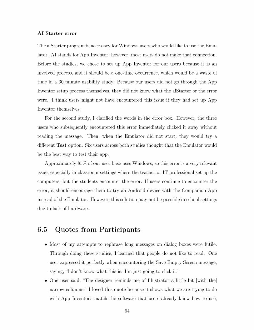
AI Starter error
The aiStarter program is necessary for Windows users who would like to use the Emu-
lator. AI stands for App Inventor; however, most users do not make that connection.
Before the studies, we chose to set up App Inventor for our users because it is an
involved process, and it should be a one-time occurrence, which would be a waste of
time in a 30 minute usability study. Because our users did not go through the App
Inventor setup process themselves, they did not know what the aiStarter or the error
were. I think users might not have encountered this issue if they had set up App
Inventor themselves.
For the second study, I clarified the words in the error box. However, the three
users who subsequently encountered this error immediately clicked it away without
reading the message. Then, when the Emulator did not start, they would try a
different Test option. Six users across both studies thought that the Emulator would
be the best way to test their app.
Approximately 85% of our user base uses Windows, so this error is a very relevant
issue, especially in classroom settings where the teacher or IT professional set up the
computers, but the students encounter the error. If users continue to encounter the
error, it should encourage them to try an Android device with the Companion App
instead of the Emulator. However, this solution may not be possible in school settings
due to lack of hardware.
6.5 Quotes from Participants
∙ Most of my attempts to rephrase long messages on dialog boxes were futile.
Through doing these studies, I learned that people do not like to read. One
user expressed it perfectly when encountering the Save Empty Screen message,
saying, “I don’t know what this is. I’m just going to click it.”
∙ One user said, “The designer reminds me of Illustrator a little bit [with the]
narrow columns.” I loved this quote because it shows what we are trying to do
with App Inventor: match the software that users already know how to use,
64

to minimize the amount of time and effort it takes to learn how to use App
Inventor.
∙ Three users in my second usability study were very concerned about the place-
ment of blocks in the Blocks view, a comment only one user made in the first
study. One user stated, “I don’t know if these blocks flow linearly, and my sus-
picion is they don’t.” I thought this was a curious trend that must depend on
personality and familiarity with programming. Some languages do flow linearly,
and if that is what the participant was accustomed to using, they would expect
something similar in App Inventor.
∙ One user who was not familiar with smartphones had an interesting exchange
trying to connect to the Companion App. He clicked the menu option to get the
QR code and said, “Oh, clever!” But he had difficulty trying to scan the code
due to strange brightness and contrast issues on the screen. He then said, “I’m
going to give up, like an impatient millennial,” and proceeded to type in the
code and said, “I’m glad there’s another way to do it.” After he got the phone
to connect over WiFi, he said, “I don’t have high expectations of consumer
technologies of being able to do fancy things like these.”
∙ About the Palette and all of the available components, one user said, “I like
being able to see the lists of tools that I’m not using. That gives me more ideas
of things that I could make, without already having the idea . . . like an idea
generator.”
∙ Several users commented on the blocks and their ease of use. One said, “I really
like the blocks because not everyone knows code. It was interactive and fun.
Fun as code can be.” And another said, “I think compared to a normal coding
language, it’s much easier to use than writing out the actual code. A lot of
where you mess up is in the formatting. This makes the formatting easy.” A
third user commented, “It’s definitely a lot easier than I thought it would be.”
Finally, one user said, “I think if I were a first-time Android app developer,
I’d be interested in using this over the Android SDK.” These users appreciated
what App Inventor was designed to do, and seemed to have fun while building
65

the apps.
∙ Observing the usability tests was most fun when the participants had a delight
moment with the apps they were building. One beginner user was particu-
larly excited about App Inventor. After reading the onboarding out loud, he
responded to the final box’s “Have fun inventing!” with, “I will.” As he pro-
gressed through the tasks and was able to format the design of the app screen
to his liking, he said, “This is going well. I like my app so far.” After building in
the blocks, he said, “Maybe we get to test it... Yay!... ooh this is fun!... I have
a friend who would love this app.” At the conclusion of his study, he clicked
the button and heard the cat meow, then excitedly said, “It’s working!”
66

Chapter 7
Future Work
In addition to the proposed solutions in Sections 6.4.4 and 6.4.5 for issues not fully
resolved by my work described in Chapter 5, there are several other areas that future
versions of App Inventor could improve.
7.1 Onboarding
The onboarding sequence (see Appendix C) needs to be refined. It would benefit
from its own usability study, in which users are asked to step through it and give
their feedback about whether too much information is included at certain steps or if
necessary information has been omitted from the script. For example, after watching
users, it became clear that there were too many boxes in the sequence, especially
because there was no indication of the length of the onboarding or the user’s current
position.
Users suggested adding arrows or some other visual cue, such as highlighting, to
emphasize a feature or section of interest, in addition to the box moving to different
locations on the screen. One person suggested animating the box around the screen,
instead of having new boxes created each time, which would help guide their eyes
around the screen and be a little less visually jolting.
Finally, one user wanted to end the onboarding early, but he did not realize that
he could click the Close button to do so. Instead, he kept clicking Next until he
67

reached the end. It might be beneficial to add an X in the top corner of the dialog
boxes and remove the Close button, so that the boxes match the convention of closing
windows in the top corner.
7.2 Tutorials and Walkthroughs
We need to differentiate between Tutorials (static guides on the App Inventor website
that teach how to build apps) and Walkthroughs (dynamic guides within the Designer
and Blocks views that validate a user’s progress as they build an app). We need to
use more distinctive names for these two guides that appear next to each other in the
Help menu. We also need to expand the Walkthrough selection; it currently has just
three walkthroughs for building “Easy” apps.
7.3 More Design Control
Several users in both studies wanted more control over the look and feel of the app
they were building. Participants requested more control over the alignment of their
components. Several people expected to be able to drag components to a specific
location on the Viewer’s mock phone screen. We should make the Viewer behave
more like Android Studio or XCode for component arrangement on a screen.
As I observed study participants, many of whom were coders or engineers, it was
clear to me that they expected to be able to do simple design things that currently
are not possible in App Inventor. For example, they became frustrated with App
Inventor when it did not allow them to position a button at the bottom of the screen.
If users could position components and adjust properties, like they can do in Android
Studio, App Inventor apps would be more visually appealing and could compete with
professional quality apps developed in Java. At the end of her session, one participant
said, “You don’t need to be a coder to do this. I could take a designer and get them
to build an app. You could take a coder and get them to design something that’s
probably prettier than what they’d do on their own.”
68

We should add a discoverable option for using more colors in the Designer view.
Currently, a component’s color property in the Designer view is limited to showing
the default colors (see Figure 5-20). We could add a color picker button in the color
property dropdown, giving users more control over the colors displayed in the Viewer.
In the Blocks view, we could add a way for the user to create custom color blocks. We
could replace the current 70-tone color picker with a wheel to allow users to choose
more colors. In the Blocks view, it would be good to show a thumbnail on the RGB
block of the color created with that block.
We should add more default fonts (App Inventor currently only has 3 fonts avail-
able for use), or we should create a way for people to upload their own font files use in
their apps. We could extend the media upload functionality to include font files and
let the user set the font source of a component to use an uploaded font. We should
add more font formatting options so that the users can do what is currently available
in Android Studio.
7.4 Outstanding Issues
7.4.1 Simulator in the Designer View
In total, four participants expected to be able to interact with their app on the mock
phone screen in the Viewer. It would be nice to build a Simulator in the Viewer
so that the user could interact with their app in the same screen in which they are
building it. This would also eliminate the need for the Emulator, which runs slowly
and requires extra software to use on Windows (see section 6.4.5).
7.4.2 Scrolling in the Blocks Workspace
Several people complained that the Blocks view Workspace scrolling behavior was
inconsistent with the rest of App Inventor and their expectations. Blockly has im-
plemented zoom scrolling, like what exists in Google Maps. Before we integrate this
new Blockly functionality into App Inventor, we should perform a small usability test
69

to see if zoom scrolling is behavior that is familiar and useful.
7.4.3 Viewer Screen Sizes
Because Android phone and tablet screens come in a variety of sizes, it would be
useful to have an option to see different screen sizes in the Viewer. This way, the user
can design their apps for a variety of different screens, even if they do not own the
physical devices.
7.4.4 Hidden and Non-visible Components
I changed the string ‘Display Hidden Components in Viewer’ in the Viewer to ‘Display
Invisible Components’ because components have a ‘Visible’ property. However, my
advisor later pointed out that this could be confusing because App Inventor also
has Non-Visible Components. It would be better to keep the string ‘Display Hidden
Components in Viewer’ and instead change the property on the component from
‘Visible’ to ‘Hidden.’ This property would not be selected by default. This change
would make ‘Display Hidden Components in Viewer’ consistent and avoid confusion
with non-visible components.
7.5 Other Thoughts
Many users commented that they would like a version of App Inventor that could
build apps for iOS. This suggestion would be a large undertaking that was only
recently made possible when Swift became open-source. In the US, more consumers
have iPhones, but outside of the US, more consumers have Android devices. In the
future, it would be nice to have an App Inventor feature that allowed users to export
to Android and/or iPhone. However, due to the the different design patterns and
capabilities of Android OS and iOS, it may not be possible for a user to design and
program an app in App Inventor that can then be exported and easily used on both
Android and iOS devices.
70

As more features of App Inventor are added and refined, it is important that we
continue performing small usability tests. Our future usability tests do not need to
be as extensive nor as time and resource intensive as my thesis experiment. They
can be as simple as asking a few friends who are less familiar with App Inventor to
go through a set of informal tasks to verify that what we have changed makes sense
to them. We could also put new features in front of users at our outreach events and
observe their behavior to get a better understand whether or not the new feature is
intuitive to less-experienced users.
My usability studies uncovered over 120 usability-related issues in App Inventor.
These issues will be properly documented so that they can become small projects
for MIT undergraduate students and App Inventor open-source community members
who are passionate about user interfaces, giving more people the ability to contribute
to our project.
71

72

Chapter 8
Conclusion
App Inventor was created to teach people how to program. I used App Inventor to
create my first mobile app almost 5 years ago. More recently, through this project,
App Inventor taught me how to program with GWT and how to work with a large
codebase. Additionally, I learned a lot about how people interact with App Inventor
and can generalize my findings to better understand human-computer interaction.
Many users did not try certain actions they thought should work, and incidentally
do work, in App Inventor. I think that because App Inventor had previously failed
to match their expectations, they no longer wanted to experiment with features that
were not readily apparent. For example, one user did not try to copy multiple blocks
at one time, instead selecting each block individually and copying and pasting it,
then putting all of the blocks back together. In App Inventor, it is possible to copy
multiple blocks that are connected by selecting and copying the parent block. As
another example, three users stated that they wished they could type to get a block
they wanted; if they had tried that in the Workspace, they would have discovered
that the feature exists.
I also learned that people do not like to read. One user stated, “When I see a
bunch of text, I tend to zone out and don’t read it, just rush through it instead.”
Steve Krug insists that users will not read instructions until they have failed to
‘muddle through’—and then they will only skim the instructions and likely not find
the information they need [14, p. 47]. I saw this repeatedly as I observed users
73

‘muddle through’ using App Inventor.
The lessons I have learned about users, usable design, and usability testing will
be beneficial to me as I pursue a career in software development with a focus on
user interfaces and human-computer interaction. Learning about how users think by
observing them has taught me to be more mindful of design decisions that I make. I
have learned the value of usability testing and how to perform it, a skill I can continue
to hone as I conduct tests on future software that I develop.
By making App Inventor more usable, we make the world of programming more
accessible to more people. I have accomplished my goal of making App Inventor
easier to use so that our novice programmers will be less frustrated. I hope that more
young people will be exposed to programming through App Inventor and eventually
be able to use their skills in whatever career they choose.
74

Appendix A
Beginner Usability Study Tasks
Originally, each of the tasks appeared on its own page; to conserve space, they have
been condensed in this reproduction.
Welcome to the App Inventor Usability Study!
Imagine you have an awesome idea for a new app that everybody needs: The Cat’sMeow. Your app will have a picture of a cat that meows when the user pets it. It’ssure to take the Internet by storm!
You do some research, and a friend recommends MIT App Inventor. You want totry designing your awesome cat app for your Android phone.
Task 1:What do you think you should do to start your project?
Task 2:After creating your new project, you start by designing what the app’s screen
will look like. You must add all of the components to the screen before you can addfunctionality to your app. First, you will need to add a button. How do you proceed?
Task 3:Next, you’ll need to add a picture of the cat to the button (source file is "cat.jpg"
on your desktop).
Task 4:You decide to add a text caption under the button, telling the user to pet the cat.
How would you proceed?
75

Task 5:Finally, you need to add the cat’s meow sound (source file is "meow.mp3" on yourdesktop) to the app. How would you do this?
Task 6:To make your app work, you’ll need to add blocks, which are the code of the
program. You want your meow sound to play when you click the button. You canmake that happen by adding these blocks:
Task 7:You want to test what your app does on your phone. You’ve already downloaded
the MIT App Inventor Companion app. How would you proceed?
Task 8:You decide that you don’t need a caption. How would you remove it?
Thank you for your participation today!
76

Appendix B
Technical Usability Study Tasks
Originally, each of the tasks appeared on its own page; to conserve space, they have
been condensed in this reproduction. These are the tasks from the second usability
study; they are only minorly changed from the first study.
Welcome to the App Inventor Usability Study!
You already know how to program (at least the basics), but you’ve never pro-grammed for smart phones. Imagine you want to learn how to program for Android,but you don’t have a lot of time to invest.
You do some research, and a friend recommends MIT App Inventor. You decideto try it out. You think it could help you quickly prototype apps.
Task 1:To help you get started, your friend sent you one of their App Inventor projects.
You’ve saved it onto your desktop as "MoleMash.aia". How would you go aboutopening it up from the App Inventor website?
Task 2:You’ve got your friend’s app open in App Inventor. You want to see what the app
does on your phone. How would you proceed?Feel free to test Mole Mash by using the Companion app throughout the rest of
these tasks.
77

Task 3:You open up the blocks view and notice your friend’s app has these code blocks thatupdate the ScoreLabel text. These blocks are used in two separate places, but do thesame thing.
You want to use good programming practice and abstract these blocks into a proce-dure.How would you continue?
Task 4:Now replace those set ScoreLabel.Text blocks with calls to your procedure in both
places they are currently used.
Task 5:You notice your friend’s app is unfinished. You want to complete the app by
adding functionality for a miss counter. The miss counter will count the number oftimes a player hits the canvas but does not touch the mole.
How would you go about adding a miss variable block, like the score variable block?
Task 6:How would you set the miss variable to 0 when the player resets the game?
Task 7:How would you go about creating a procedure to set the MissLabel text the way
ScoreLabel is set?
Task 8:You will need to add an event handler for when the Canvas is touched. How would
you go about adding this block?
Thank you for your participation today!
78

Appendix C
Onboarding Script
These messages were displayed in popups around the Designer and Blocks views to
quickly teach the user how to use App Inventor.
1. Welcome to App Inventor! Before you get started, we’d like to take you on a
short tour.
2. This view is called the Designer. This is where you will design the look and feel
of your app.
3. This is the Palette. It stores all of the components you can use in your apps in
these labeled drawers.
4. This is the Viewer. It shows what the app will look like on a phone screen.
Drag and drop components from the Palette here to add them to your app.
5. This is the list of Components. All of the components in the viewer will appear
in a nested list here. You can select, rename and delete components from this
column.
6. This is a list of the properties specific to the selected component in the app.
You can change the component’s size, text, color, etc.
7. These buttons toggle between the Designer and Blocks views. In the Blocks
view, you can program the behavior of your app. Click the Blocks button.
8. This is the Workspace. You drag and drop blocks from the drawers on the left
to this workspace and snap them together to program your app’s behavior.
9. These are the built-in blocks. They are always available. You can find general
79

behaviors for your app, such as math, if/else statements, loops, variables, and
procedures.
10. Component blocks will be here, nested under Screen1. These blocks are specific
to the components you added to your app in the Viewer.
11. Any Component blocks operate on groups of similar components and are often
used inside of loops, such as changing the positions of a group of sprites.
12. Up here at the top, you can find options to live-test your app, generate an
installable APK for your app, get help, etc.
13. Have fun inventing!
80

Appendix D
System Usability Scale (SUS) Form
81

82

Bibliography
[1] About Us | Explore MIT App Inventor. http://appinventor.mit.edu/explore/about-us.html. Accessed May 5, 2015.
[2] App Inventor Developers Forum - Google Groups. https://groups.google.com/forum/#!forum/app-inventor-dev. Accessed May 3, 2016.
[3] MIT App Inventor Forum - Google Groups. https://groups.google.com/forum/#!forum/mitappinventortest. Accessed May 2, 2015.
[4] Assistant Secretary for Public Affairs. Home. http://www.usability.gov/. Ac-cessed April 6, 2016.
[5] College Board. AP Computer Science Principles Course and Exam Description,Including the Curriculum Framework.
[6] Ali Darejeh and Dalbir Singh. An investigation on Ribbon interface design guide-lines for people with less computer literacy. Computer Standards & Interfaces,36(5):808–820, September 2014.
[7] N. Fraser. Blockly | Google Developers. https://developers.google.com/blockly/.Accessed April 26, 2016.
[8] Ruili Geng and Jeff Tian. Improving Web Navigation Usability by ComparingActual and Anticipated Usage. IEEE Transactions on Human-Machine Systems,45(1):84–94, February 2015.
[9] Agnes Grudniewicz, Onil Bhattacharyya, K Ann McKibbon, and Sharon EStraus. Redesigning printed educational materials for primary care physicians:design improvements increase usability. Implementation science : IS, 10(1):156,January 2015.
[10] Hello Purr for App Inventor 2. http://appinventor.mit.edu/explore/ai2/hellopurr.html. Accessed September 21, 2015.
[11] Sheng-yi Hsu, Yuan-fu Lou, and Chuen-tsai Sun. Block Shelves for Visual Pro-gramming Languages. May 2016.
[12] Yu-chen Hsu. The effects of metaphors on novice and expert learners’ perfor-mance and mental-model development. Interacting with Computers, pages 770–792, 2006.
83

[13] P. Jordan, B. Thomas, B. Weerdmeester, and I. McClelland. Usability Evaluationin Industry. Taylor & Francis Ltd., 1996.
[14] Steve Krug. Don’t Make Me Think: A Common Sense Approach to Web Usabil-ity. Peachpit, Berkeley, 2 edition, 2006.
[15] K. Lang. MIT App Inventor and Hong Kong Jockey Club Announce JointProject. http://appinventor.mit.edu/explore/blogs/karen/2016/05/mit.html.Accessed May 9, 2016.
[16] C. LaRoche and K. Wahl. Informal personal interview about usability testing.Conducted April 8, 2015.
[17] Mobile Computing & App Development Course | MIT ProfessionalEducation. http://professional.mit.edu/programs/short-programs/educational-mobile-computing. Accessed April 25, 2016.
[18] R. Miller. User Testing. http://courses.csail.mit.edu/6.831/2014/readings/L11-user-testing/, 2015. Accessed April 12, 2015.
[19] MoleMash for App Inventor 2. http://appinventor.mit.edu/explore/ai2/molemash.html. Accessed September 21, 2015.
[20] Jakob Nielsen. Estimating the number of subjects needed for a thinking aloudtest. International Journal of Human-Computer Studies, 41(3):385–397, Septem-ber 1994.
[21] Jakob Nielsen. 10 Heuristics for User Interface Design. https://www.nngroup.com/articles/ten-usability-heuristics/, 1995. Accessed April 14, 2015.
[22] John F. Pane, Brad A. Myers, and Leah B. Miller. Using HCI Techniques toDesign a More Usable Programming System. Proceedings of the IEEE 2002 Sym-posia on Human Centric Computing Languages and Environments (HCC’02),page 198, September 2002.
[23] MIT Mobile Apps Class Help Forum: 2015. https://piazza.com/class/i4k0lv5m3ko6s. Accessed May 2, 2015.
[24] A. Richardson. Informal personal interview about using App Inventor at YouthRadio. Conducted May 1, 2015.
[25] Scratch - Imagine, Program, Share. https://scratch.mit.edu/. Accessed May 3,2016.
[26] Andreas Sonderegger, Sven Schmutz, and Juergen Sauer. The influence of agein usability testing. Applied ergonomics, 52:291–300, January 2016.
[27] Technovation - Girls in Technology Entrepreneurship. http://www.technovationchallenge.org/. Accessed February 4, 2016.
84

[28] G. van Emde Boas. Informal presentation to MIT App Inventor team aboutfrequently encountered usability issues in App Inventor. March 18, 2015.
[29] Verizon Innovative App Challenge. http://appchallenge.tsaweb.org/. AccessedApril 25, 2016.
[30] David Wolber. Learn to build Android apps | Appinventor. http://www.appinventor.org/. Accessed February 18, 2016.
85