earth artefact
DESCRIPTION
My progress so far on Earth ArtefactTRANSCRIPT

EARTH ARTEFACTS A M U E L B A R R A N

The Golden Record is a phonograph record containing sounds and images to portray the diversity of life and were included on both Voyager spacecrafts. The Record is for extraterrestril life forms or even future humans.The collection of images includes many photographs and diagrams both in black and white and color. The first images are of scientific interest, showing mathematical and physical quantities, the
The Golden RecordSolar System and its planets, DNA, and human anatomy and reproduction. The record doesn’t only contain photographs of humanity but also animals, insects, plants and landscapes. Images of humanity depict a broad range of cultures. Also it contains images that show food, architecture, and humans in portraits as well as going about their day-to-day lives. Many pictures are annotated with one
or more indications of scales of time, size, or mass.The record is constructed of gold-plated copper. The record’s cover is aluminum and electroplated upon it is an ultra-pure sample of the isotope uranium-238. Uranium-238 has a half-life of 4.468 billion years. It is possible that a civilization that encounters the record will be able to use the ratio of remaining uranium to daughter elements to determine the age of the record.
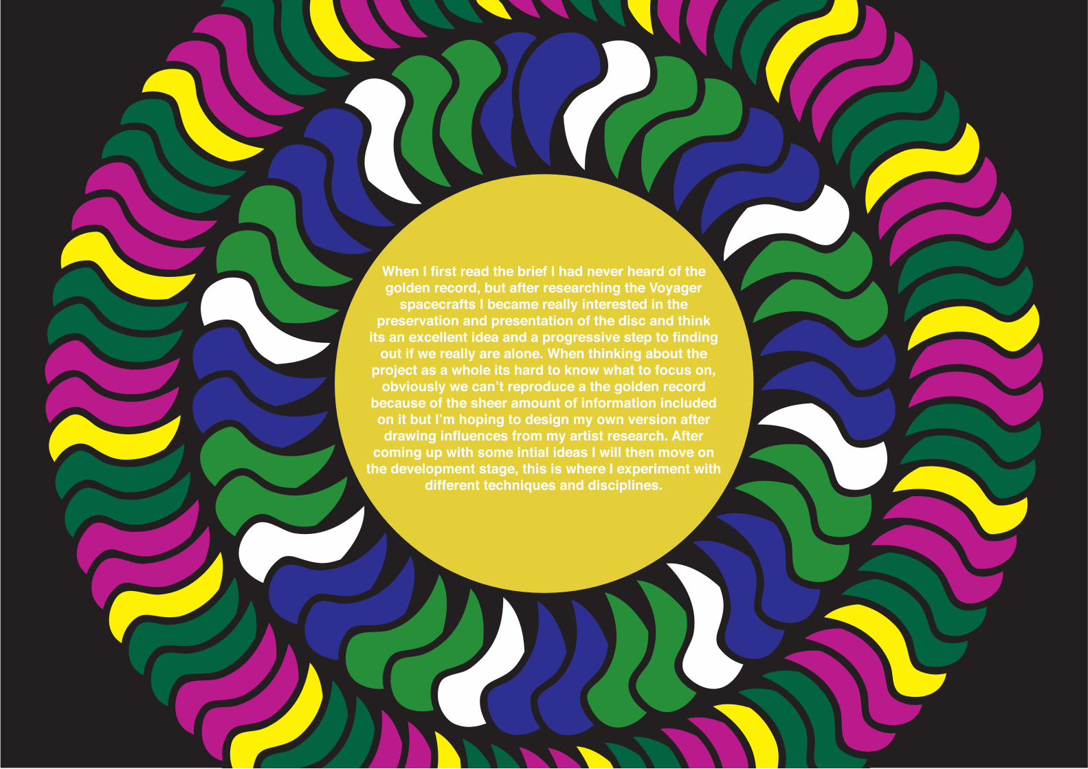
When I first read the brief I had never heard of the golden record, but after researching the Voyager
spacecrafts I became really interested in the preservation and presentation of the disc and think
its an excellent idea and a progressive step to finding out if we really are alone. When thinking about the
project as a whole its hard to know what to focus on, obviously we can’t reproduce a the golden record
because of the sheer amount of information included on it but I’m hoping to design my own version after drawing influences from my artist research. After
coming up with some intial ideas I will then move on the development stage, this is where I experiment with
different techniques and disciplines.

Earth Artifact
Environment People
Language
History
Golden Record
Places
nature
buildings
continents
countries
home
seasons
communication
written word
spoken
spoken culture
diversity
animalsinsects
race
sex
presidents
royalty
memory
life
death
civilisationover-population?
life expectancy
Age
Habitat
Carl Sagan
NASAvoyager 1 & 2
spacetravel
religion
music
filmsport
Time
Watch Calendar
seasonsmonths
days
years
hoursminutes
seconds
Mind Map

C O N C E P T
311 22 3I would like to design a book describing and explaining Earth’s existence, history, population, other life forms, environment etc. The book should act as a fact file for anyone who is new to the planet. I want the book to be filled with imagery and colour.
It’s obviously impossible to include all the information from the golden record but I want to produce a brief version, covering the basics of living on Earth, what else lives here etc.
My second concept is to create a blueprint alphabet book, which will contain each letter of the alphabet
including 5 vector graphics and descriptions of things that can be
found on Earth.
Blueprints are used typically to describe how somethings made and I aim to achieve something
similar. I want the descriptions to be informative and easy to understand.
This also links in with my research into semiotics and how we perceive
signs and symbols.
Information graphics are a great way of being able to show the
statistical evidence and factual knowledge of the Earth.
Infographics that i’m considering to produce could be on topics such as Religion, Population,
Social, Environment etc. I want to use simple pictoral images to make the information more
accessible and interesting.
To design the infographics I will be using Illustrator and Indesign.

David McCandlessDavid McCandless is a British data-journalist, and information designer based in London. He is the founder of the visual blog Information Is Beautiful. Early explorations into the synergy between data visualisation and his work as a journalist led to the development of “Information Is Beautiful.”
McCandless’ work focuses on a variety of different statistics and facts including climate, film, food, health, music, nature, people, power, science etc.
As you can see from his infographics, David can visualise any data and present in new innovative ways.
Because they’re so simple to understand they are so easy to look at, using colour and text together to produce something informative and thought-provoking.

Craig WardCraig Ward is a British born designer and art director currently based in New York.
Occasional artist, sometime author and a contributor to several industry journals, he is known primarily for his pioneering typographic works.
Craig’s work is really creative, for example the “bad typography is everywhere” piece is really clever in that ward uses the strength of the colour red to make that sentence stand out while its over the top of a different sentence.
“I love to create original and unrepeatable letterforms using various uncontrolled and unconventional means or materials and I’m also fond of juxtaposing clean, classically designed typography with chaotic and organic materials and processes.”- Craig Ward.
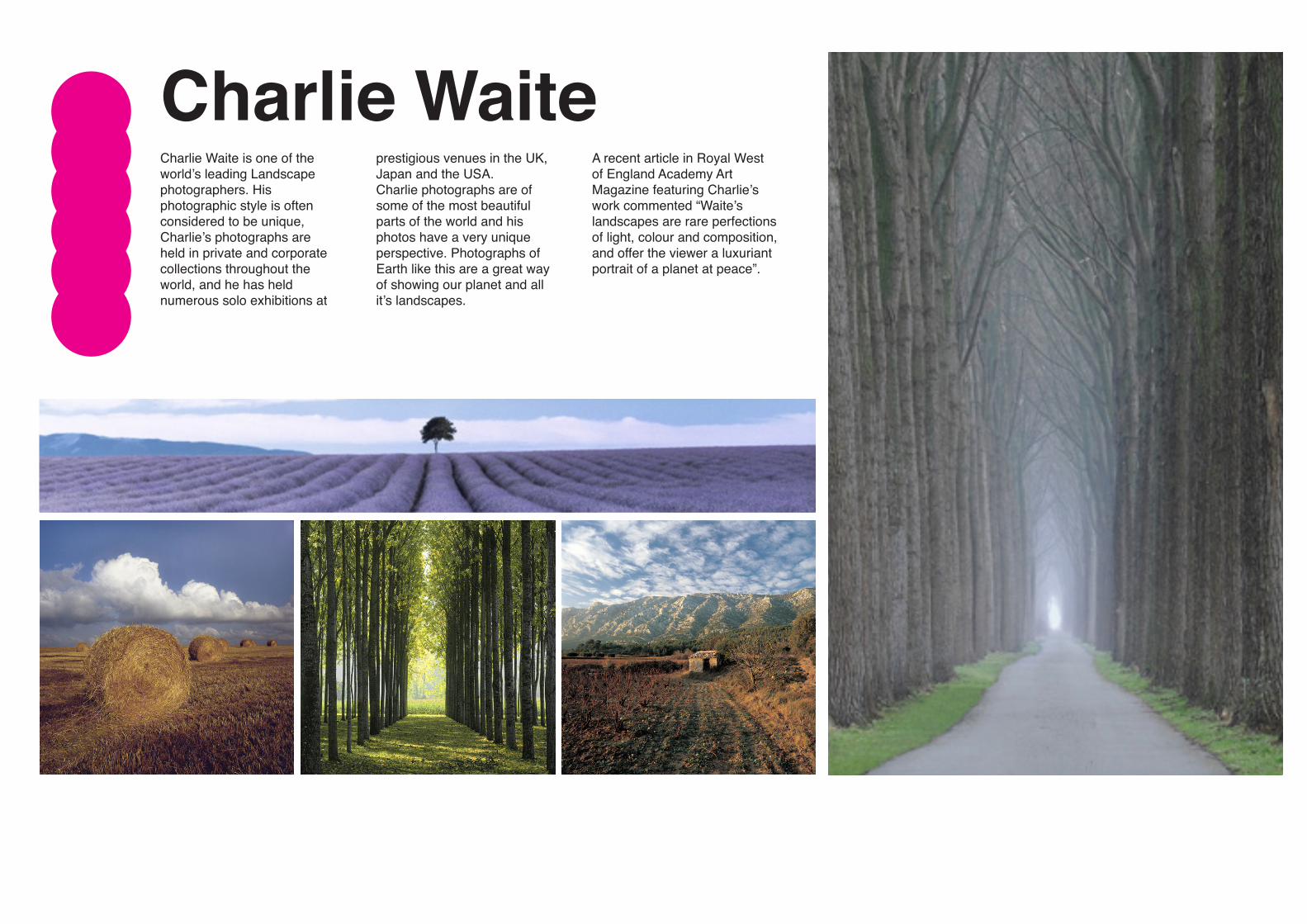
Charlie WaiteCharlie Waite is one of the world’s leading Landscape photographers. His photographic style is often considered to be unique, Charlie’s photographs are held in private and corporate collections throughout the world, and he has held numerous solo exhibitions at
prestigious venues in the UK, Japan and the USA. Charlie photographs are of some of the most beautiful parts of the world and his photos have a very unique perspective. Photographs of Earth like this are a great way of showing our planet and all it’s landscapes.
A recent article in Royal West of England Academy Art Magazine featuring Charlie’s work commented “Waite’s landscapes are rare perfections of light, colour and composition, and offer the viewer a luxuriant portrait of a planet at peace”.
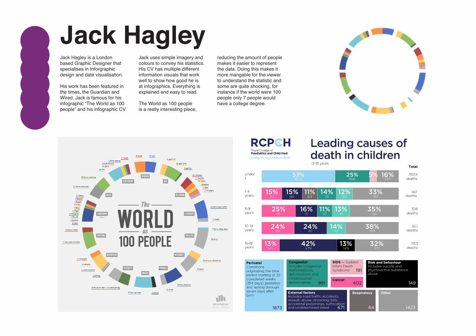
Jack HagleyJack Hagley is a London based Graphic Designer that specialises in Inforgraphic design and date visualisation.
His work has been featured in the times, the Guardian and Wired. Jack is famous for his infographic “The World as 100 people” and his infographic CV.
Jack uses simple imagery and colours to convey his statistics. His CV has multiple different information visuals that work well to show how good he is at infographics. Everything is explained and easy to read.
The World as 100 people is a really interesting piece,
reducing the amount of people makes it easier to represent the data. Doing this makes it more mangable for the viewer to understand the statistic and some are quite shocking, for instance if the world were 100 people only 7 people would have a college degree.

SemioticsSemiotics are important to look at when discussing Earth Artifact, Semiotics are the use of signs to convey information, Road signs are a perfect example, normally they are a vector shapes that display an action, person, danger etc. They are useful because they are universal.
Semiotics can be split into three different catergories; Symbols, signs and icons. Hopefully this universal language we seem to have created can be understood by other life forms.
Semiotics is the study of signs, symbols and signification. It’s the
study of how meaning is created, not what it is.
Symbol
Index
IconGraphic Image
Learned Relation ?Direct Link
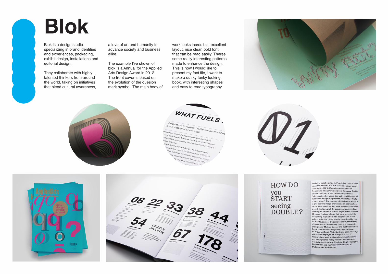
BlokBlok is a design studio specializing in brand identities and experiences, packaging, exhibit design, installations and editorial design. They collaborate with highly talented thinkers from around the world, taking on initiatives that blend cultural awareness,
a love of art and humanity to advance society and business alike.
The example I’ve shown of blok is a Annual for the Applied Arts Design Award in 2012. The front cover is based on the evolution of the quesion mark symbol. The main body of
work looks incredible, excellent layout, nice clean bold font that can be read easily. Theres some really interesting patterns made to enhance the design. This is how I would like to present my fact file, I want to make a quirky funky looking book, with interesting shapes and easy to read typography.
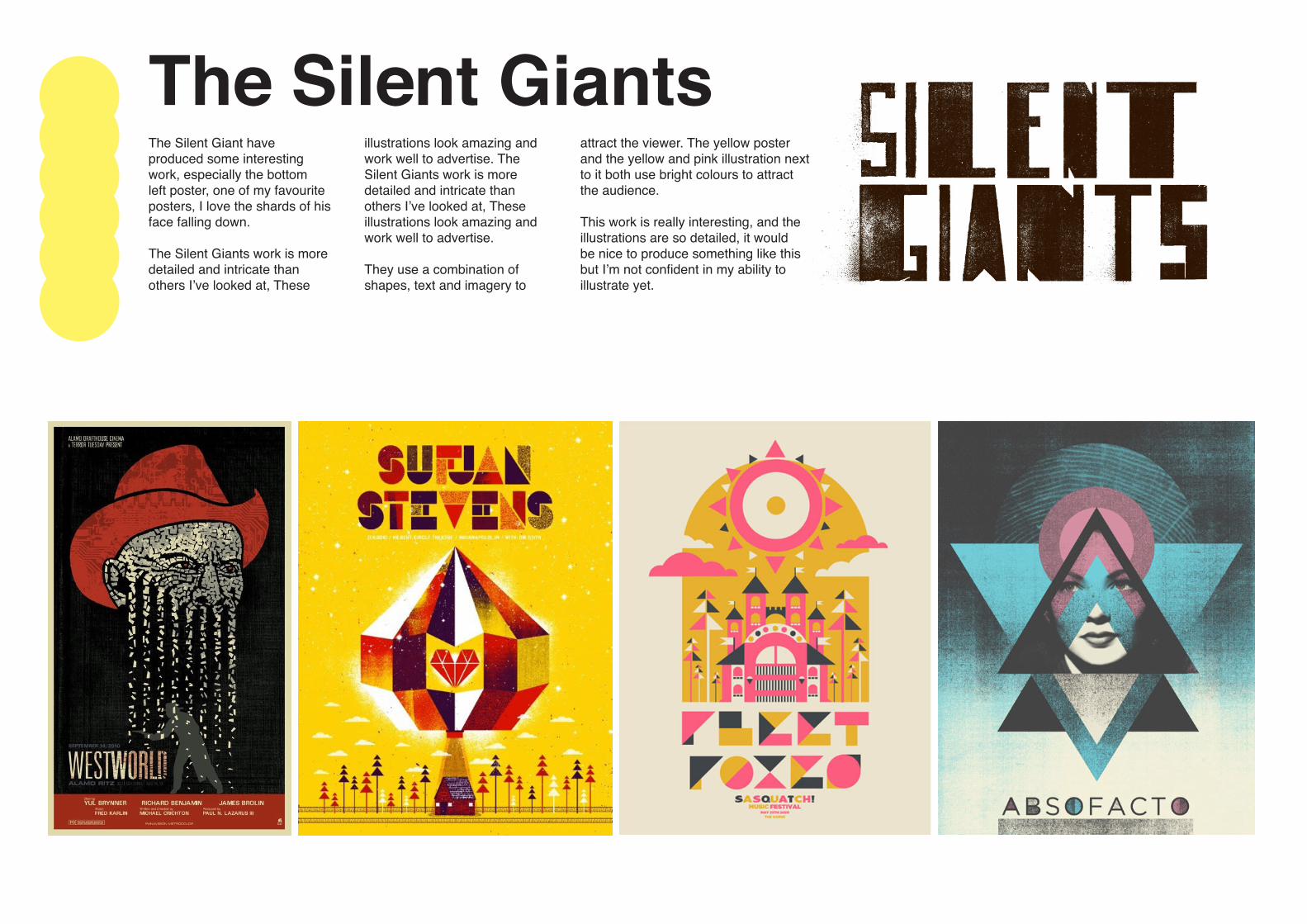
The Silent GiantsThe Silent Giant have produced some interesting work, especially the bottom left poster, one of my favourite posters, I love the shards of his face falling down.
The Silent Giants work is more detailed and intricate than others I’ve looked at, These
illustrations look amazing and work well to advertise. The Silent Giants work is more detailed and intricate than others I’ve looked at, These illustrations look amazing and work well to advertise.
They use a combination of shapes, text and imagery to
attract the viewer. The yellow poster and the yellow and pink illustration next to it both use bright colours to attract the audience.
This work is really interesting, and the illustrations are so detailed, it would be nice to produce something like this but I’m not confident in my ability to illustrate yet.
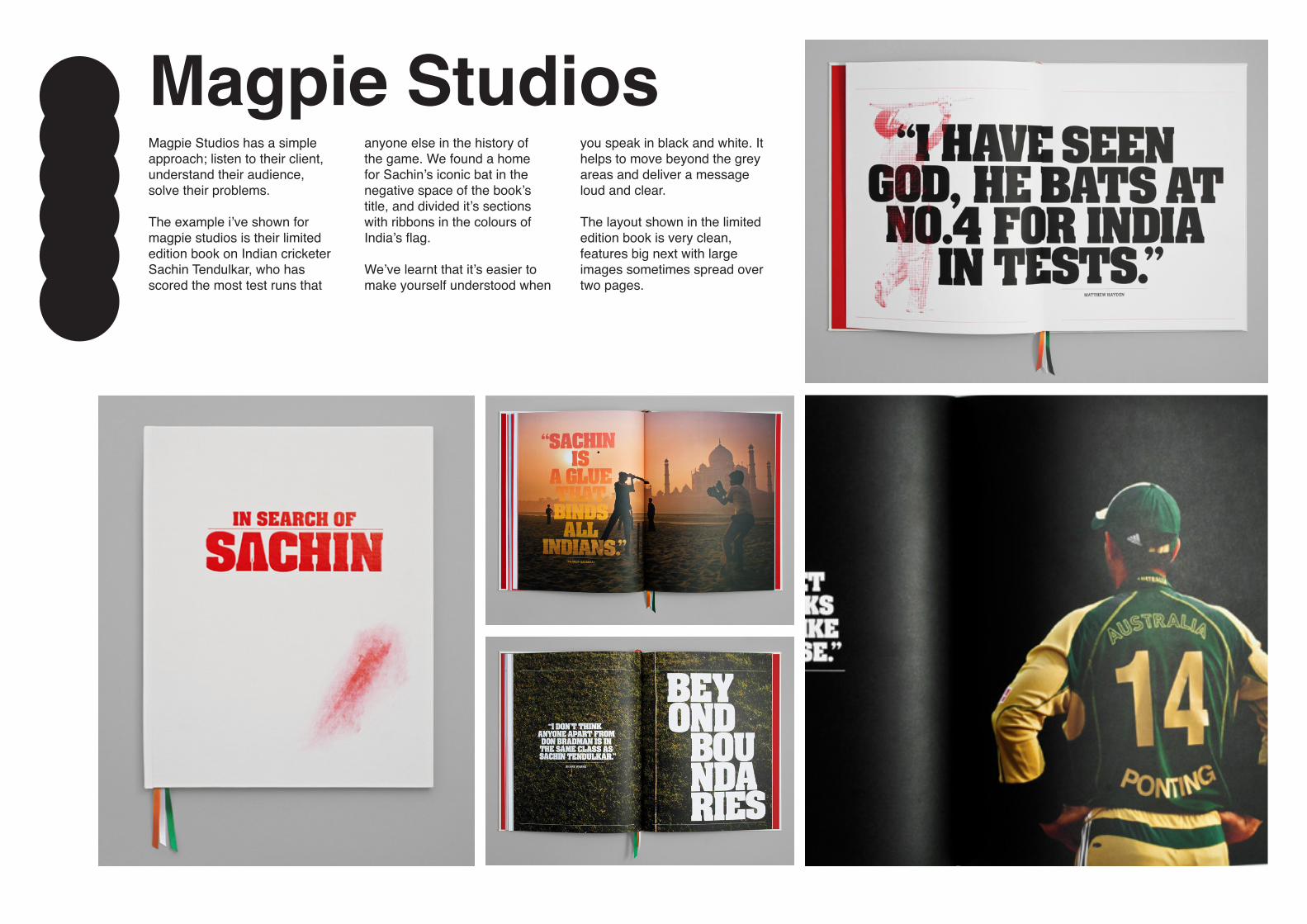
Magpie StudiosMagpie Studios has a simple approach; listen to their client, understand their audience, solve their problems.
The example i’ve shown for magpie studios is their limited edition book on Indian cricketer Sachin Tendulkar, who has scored the most test runs that
anyone else in the history of the game. We found a home for Sachin’s iconic bat in the negative space of the book’s title, and divided it’s sections with ribbons in the colours of India’s flag.
We’ve learnt that it’s easier to make yourself understood when
you speak in black and white. It helps to move beyond the grey areas and deliver a message loud and clear.
The layout shown in the limited edition book is very clean, features big next with large images sometimes spread over two pages.

BarnbrookBarnbrook is one of the most well-known creative studios in Britain. Their designers specialise in producing innovative books, corporate identities, CD covers, custom fonts, websites and magazines.
Barnbrook created a publication called “the little book of shocking eco facts” which
included Bite-sized facts that were presented with meticulous illustrations and designed spreads.
The examples shown are some of my favourite infographics accompanied with some interesting facts. My favourite from the images shown is the agriculture infographic below.The use of the shape of the leaf
and what that symbolises, then using the water drops to emphasise the fact. They also use bright illustrations to demonstrate the fact.
The clever play on the shape of the leaf and the use of the water might be lost on the species that finds the golden record but it could be interesting to produce something similar.
h

ScarletBLVDScarlet Blvd specializes in artistic architectural blueprints, patent art prints and other designed pieces.
Her work allows the viewer to uniquely display iconic architecture, military aircraft or vintage cars.
Scarlet uses her illustrative talents and combined it with the use of blue prints.
The use of blueprints in this way has inspired me to continue with experimentation blue prints and their way of displaying objects in a clean and profesional manner while being informative.
