Download - Latest Web Design Trends for 2014

Latest Web Design Trends 2014March 24th, 2014 - http://www.webmn.net
This deck may use content from 3rd party sources - I have done my best to credit those sources.
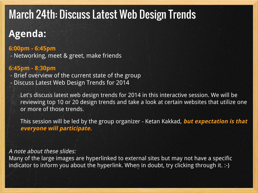
March 24th: Discuss Latest Web Design TrendsAgenda:6:00pm - 6:45pm - Networking, meet & greet, make friends
6:45pm - 8:30pm - Brief overview of the current state of the group - Discuss Latest Web Design Trends for 2014
Let's discuss latest web design trends for 2014 in this interactive session. We will be reviewing top 10 or 20 design trends and take a look at certain websites that utilize one or more of those trends.
This session will be led by the group organizer - Ketan Kakkad, but expectation is that everyone will participate.
A note about these slides: Many of the large images are hyperlinked to external sites but may not have a specific indicator to inform you about the hyperlink. When in doubt, try clicking through it. :-)

We are a group of professionals focusing on All Things Web Design and Web
Technologies; a community built upon four pillars:
Network, Engage, Share, and Learn From Each Other.
Our vision is to build a strong local platform
for learning and knowledge sharing among peers.
December 2011
This meetup group was rescued from planned shutdown.
We hit the reset button and clearly defined group’s objective...

Why this and similar groups need to exist?
Remember: Your active participation is key to this group’s success!

I would like to request your help...•Contribute your skills and time to help turn this group into an authoritative body for All Things Web Designo Suggest topics of broad interesto We all are expert at something, aren't we? Share your web
design related knowledge and expertise with the group. o Volunteer your timeo Make friends and help each othero Most important: Remain Engaged!o If you have a facility big enough for 75 to 100 attendees, we
would love to have your offer of hosting some of our meetups at your office.
•Before you leave, please help make sure that we put tables and chairs back to where they belong.
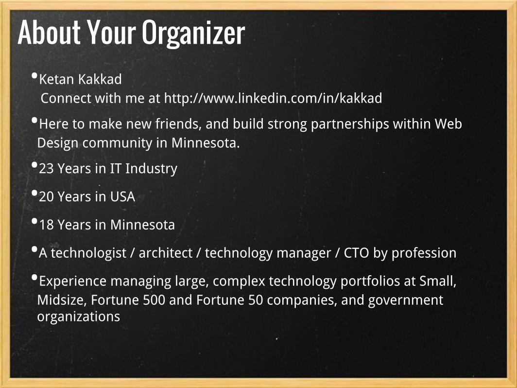
About Your Organizer•Ketan Kakkad Connect with me at http://www.linkedin.com/in/kakkad
•Here to make new friends, and build strong partnerships within Web Design community in Minnesota.
•23 Years in IT Industry
•20 Years in USA
•18 Years in Minnesota
•A technologist / architect / technology manager / CTO by profession
•Experience managing large, complex technology portfolios at Small, Midsize, Fortune 500 and Fortune 50 companies, and government organizations

Today, we will be discussing...•Ubiquitous Web
•Outdated Web Design Trends: 2014
•Latest Web Design Trends: 2014
•Briefly touch base on Frontend vs. Backend

Ubiquitous Web

Outdated Web Design Trends: 2014
Mashable
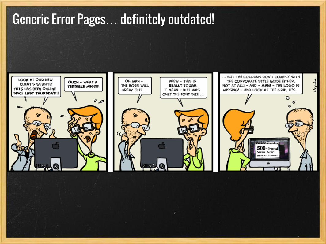
Generic Error Pages… definitely outdated!

Outdated?● Reloading of full pages
○ Oh, its so last decade. ○ Use AJAX/XMLHttpRequest and JavaScript to perform
asynchronous operations and reload parts of the page without having to refresh the whole page.■ Example: don’t require users to submit the whole page to
check if username is available. Use AJAX and API calls to check it without having to Submit->Reload entire page!
○ Usability point of view: GOOD○ SEO point of view: BAD - don’t do this for everything,
specifically avoid AJAX loading of content when you want search engines to index it.
● Flash Intros OR Flash in general● Photo Carousel / Sliders - haven’t we overused them already?● Large Hero Images
○ Unless done right, problematic on mobile devices

Outdated?● Accordions?● Stock Images/Photos
○ There gotta be a better solution. Aren’t we all tired of seeing same photographs again and again?
● Animated GIFs ○ Cool on social media sites or for creating that viral content ○ But avoid it in a business-centric website
● Autoplay Videos○ Widely practiced, but a big turnoff for site visitors
● Automatic Popups (JavaScript powered or otherwise):○ They are so annoying and don’t work on mobile phones most of the time
● This can’t be a 21st century website of a world class institution…○ Can it be?
● Don’t ignore your micro-sites, specifically not when yours is a world class institution!
● And oh, no cufons pleeeez!○ web fonts are much easier to implement for developers○ unlike cufons, web fonts do not require any extra code○ unlike cufons, web fonts don’t have to fallback to web-safe fonts when JavaScript is
disabled○ web fonts uses lot lesser resources on the browser, and are far more accessible!


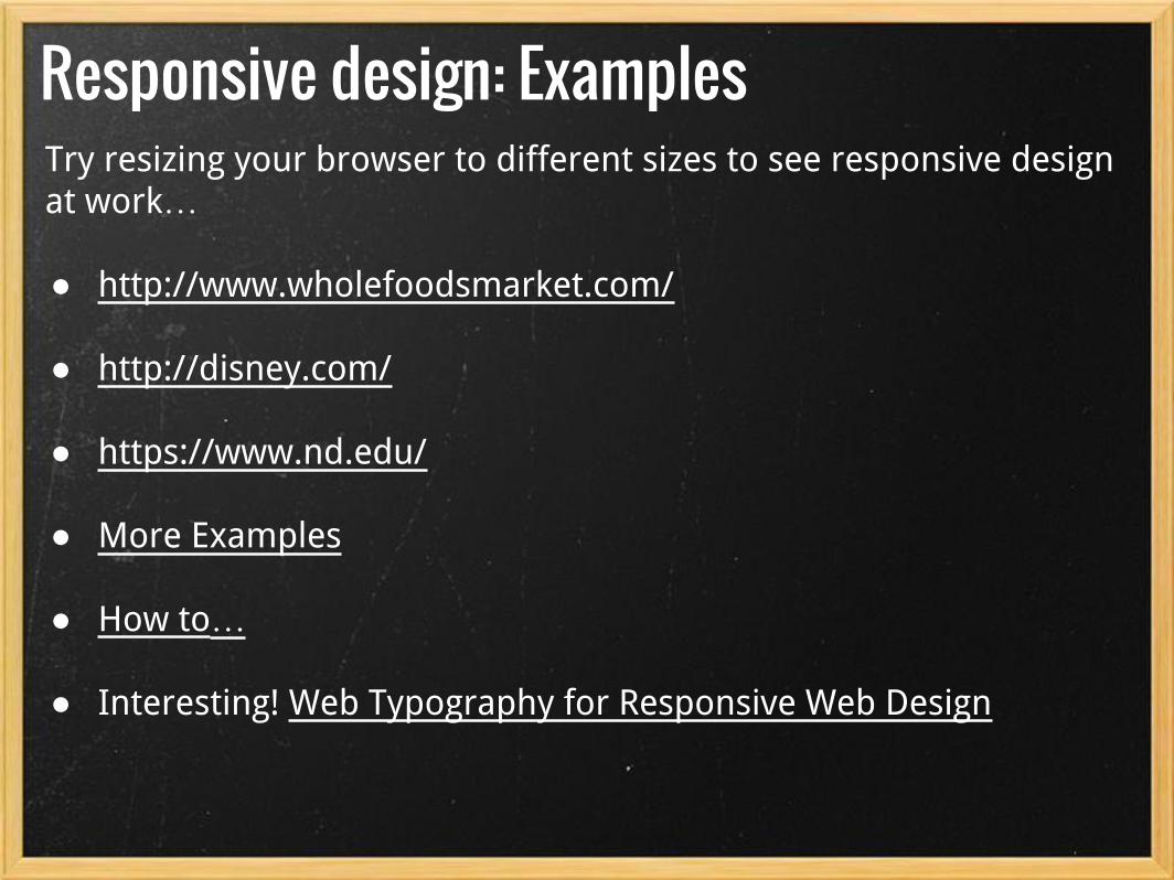
Responsive design: ExamplesTry resizing your browser to different sizes to see responsive design at work…
● http://www.wholefoodsmarket.com/
● http://disney.com/
● https://www.nd.edu/
● More Examples
● How to… ● Interesting! Web Typography for Responsive Web Design

2. Typography within your reach
Typography is one of the fundamental design element of print and web media. However, until recently, our choices were limited to web-safe fonts while still not being certain about specific fonts availability across wide range of operating systems and browsers. While those web-safe fonts served their purpose well, now we have a wide ranging options for rendering websites that is reaching sophistication and aesthetically appealing presentation that of print media.

Typography Examples● 47 Top Typography Tools and Resources
● A More Modern Scale for Web Typography
● For starters, one of the easiest solution: Google Web Fonts
● Beautiful Web Fonts
● NOT FREE, but worth exploring for commercial needs○ Typecast○ Cloud.Typography
● Some examples of web typography
● Interesting! Web Typography for Responsive Web Design
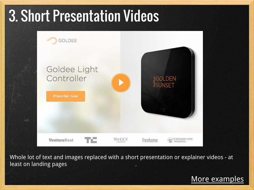
3. Short Presentation Videos
Whole lot of text and images replaced with a short presentation or explainer videos - at least on landing pages
More examples
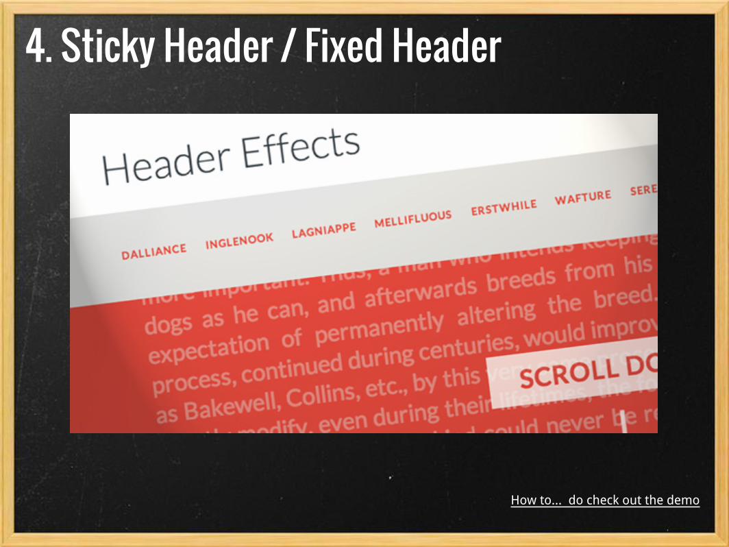
4. Sticky Header / Fixed Header
How to... do check out the demo
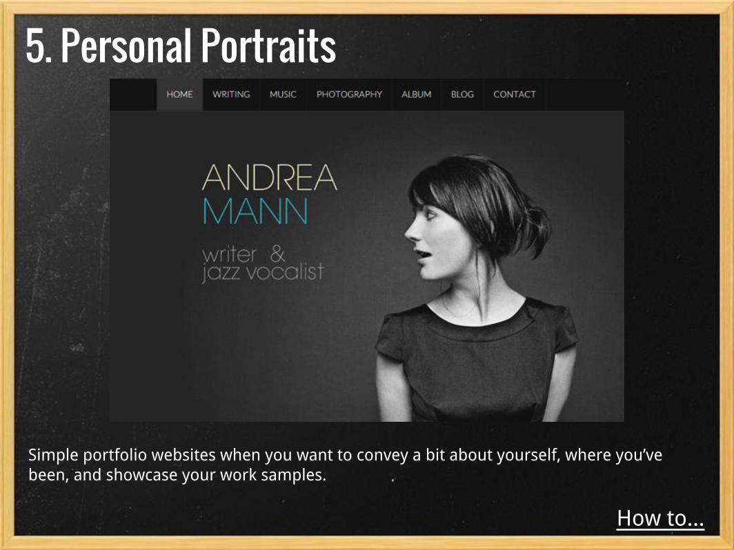
5. Personal Portraits
Simple portfolio websites when you want to convey a bit about yourself, where you’ve been, and showcase your work samples.
How to...

6. Grid Style Layouts
This isn’t something you can force into any old website. There needs to be a purpose, the user experience always comes first. In situations using thumbnail images or text updates the grid layout condenses everything into an easy-to-read format.
How to... Masonry

7. Hero Areas
A hero area is a term borrowed from print design. Basically, this term refers to the design trend in which the top of a web page contains a large image with very little text. The idea is to grab attention, make an impression, create curiosity, and give the visitor a brief snapshot of what the website is about all in a matter of seconds.

Hero image is a term used in web design for a specific type of web banner. A hero image is a large banner image, prominently placed on a web page, generally in the front and center. The hero image is often the first visual a visitor encounters on the site and its purpose is to present an overview of the site's most important content. A hero image often consists of image and text, can be static or dynamic (e.g. a rotating list of images and/or topics).
- wikipedia
“Web design has been trying to look more and more like print and hero images are a part of that.” Source
● When done right with consideration for mobile device traffic, Hero areas provide a user experience that is similar to the front cover of a printed magazine.
7. Hero Areas

8. SVG Images & Icons
Snap.svg is a JavaScript svg animation library that let you bring your svg to life.

9. Single Page Websites
Single page websites look cool and add that WOW factor for the users who are typically accustomed to multi-page websites - that is once user is on your site. If you also need to worry about driving traffic to your site through search engines, you should read this page before taking a plunge into building single page websites.

10. Parallax Scrolling
Parallax scrolling is a special scrolling technique in computer graphics, wherein background images move by the camera slower than foreground images, creating an illusion of depth in a 2D video game and adding to the immersion. Source: wikipedia
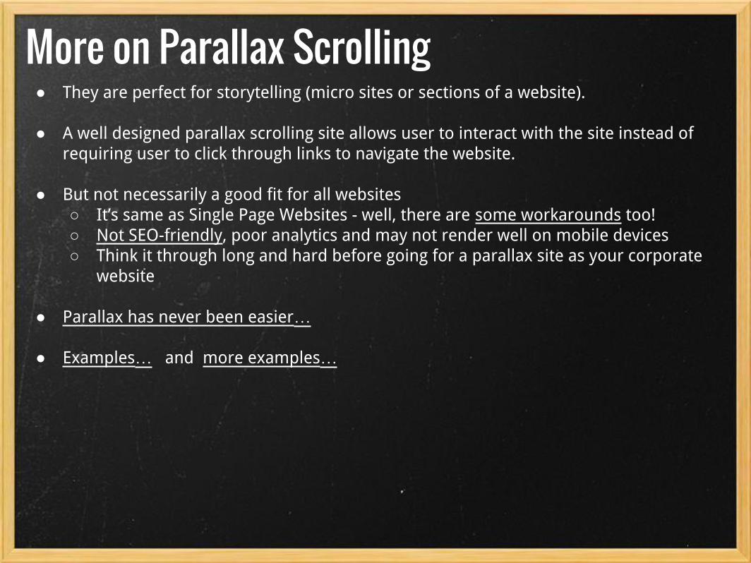
More on Parallax Scrolling● They are perfect for storytelling (micro sites or sections of a website).
● A well designed parallax scrolling site allows user to interact with the site instead of requiring user to click through links to navigate the website.
● But not necessarily a good fit for all websites○ It’s same as Single Page Websites - well, there are some workarounds too!○ Not SEO-friendly, poor analytics and may not render well on mobile devices○ Think it through long and hard before going for a parallax site as your corporate
website
● Parallax has never been easier…
● Examples… and more examples…

There are many more trends to discuss...
But we will not be ableto cover them in today’s session
of 1.5 hours OR
fit them all in this deck.
Some More Fun...● How A Web Design Goes Straight To Hell
● 8 Websites You Need To Stop Building
● What I want from a restaurant website
FRONTEND
BACKENDvs.

Where is disconnect?Often, there is a disconnect between frontend and backend development teams. Why?Its because for both of these teams, their view of the world is very different. They mostly don’t use a common metaphor or a modelling language when describing what they are trying to achieve.
Do we really need a new, common vocabulary?I think, both these sides have a decent understanding of what vocabulary the other side is working with?
Interesting read: I don’t speak your language...

The Way Frontend Developers See It...
Image Credit: usability.gov

The way Backend developers see it...
Image Source: Wikipedia

One orchestra, many roles. What binds them together?
Image Source: Wikipedia

Frontend vs. Backend
Using metaphor of a game of football...
● “FRONTEND” team could be described as members of the team in offensive positions. “BACKEND” team could be described as members of the team in defensive positions.
● As you can see, both parts of the team - frontend and backend - are crucial to your winning strategy.
● Both these teams have very different roles and responsibilities and require unique skillset in most situations.
● But that doesn’t mean that player in defensive position cannot or should not play in offensive role if it becomes necessary.
They are not opposing teams!
Image Credit: apparently from Fox Sports
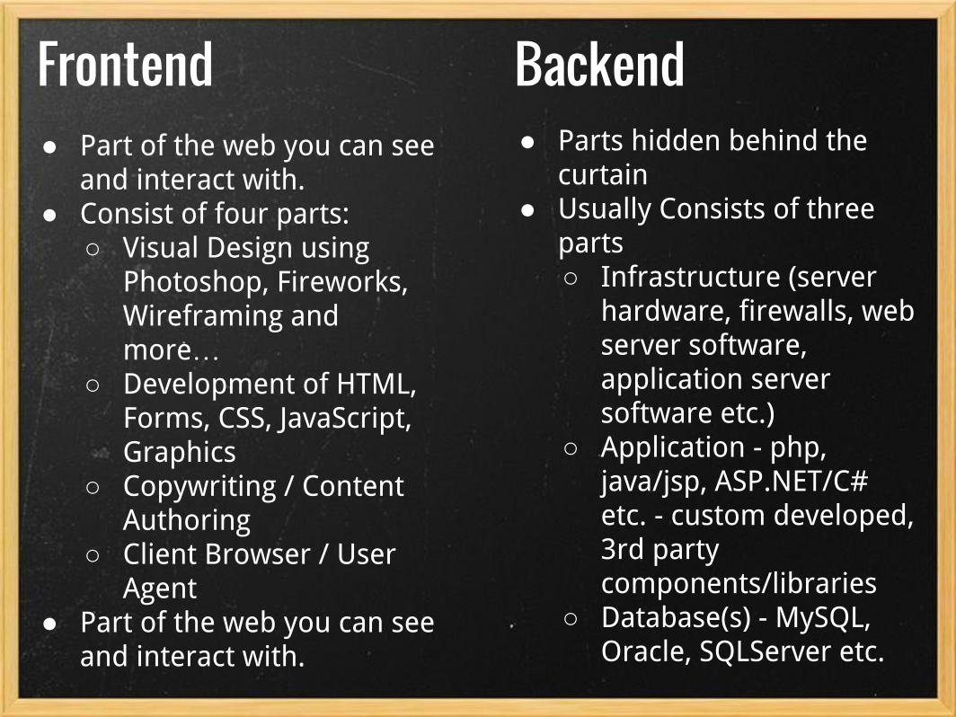
Frontend Backend● Part of the web you can see
and interact with.● Consist of four parts:
○ Visual Design using Photoshop, Fireworks, Wireframing and more…
○ Development of HTML, Forms, CSS, JavaScript, Graphics
○ Copywriting / Content Authoring
○ Client Browser / User Agent
● Part of the web you can see and interact with.
● Parts hidden behind the curtain
● Usually Consists of three parts○ Infrastructure (server
hardware, firewalls, web server software, application server software etc.)
○ Application - php, java/jsp, ASP.NET/C# etc. - custom developed, 3rd party components/libraries
○ Database(s) - MySQL, Oracle, SQLServer etc.
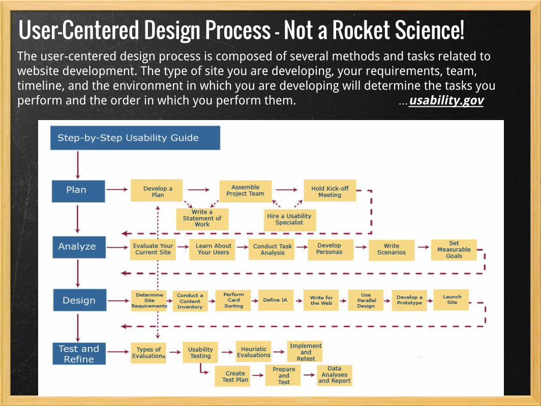
User-Centered Design Process - Not a Rocket Science!The user-centered design process is composed of several methods and tasks related to website development. The type of site you are developing, your requirements, team, timeline, and the environment in which you are developing will determine the tasks you perform and the order in which you perform them. …usability.gov

Website vs. Web ApplicationWebsite
•HTML5•CSS3•JavaScript + bunch of JavaScript libraries and frameworks•Ideally, powered by a CMS•Themes for CMS platforms•Very likely some sort of database•Social media integration•Mostly intended for information delivery•Very little user interaction possible
Web Applications•HTML5, CSS3, JavaScript + bunch of JavaScript libraries and frameworks•Possibly powered by a CMS•May use CMS themes, but more likely the entire user experience is designed and coded from scratch•Mostly user-centric experience requiring user accounts, permissions, and logins/passwords•Heavy on database and middle-tier

Backend ArchitectureThis is a pretty complex topic, but if there is one point I would you to bring home, it is… design API-Centric Web Applications
•Allows Asynchronous data exchanges (AJAX) with the server•Freedom to present your data/content in any shape or form

Is it okay to have a wiki as a website?
Definitely not when you are Yale University - an Ivy League Institution!

Last but not least...
We were lucky to have couple of volunteers who captured some of the main discussion points from our March 24th 2014 session.


