29 Transportation Economic Trends
3 HOW MUCH DOES TRANSPORTATION COST?
The cost of transportation stems from the resources it requires—labor, equipment, fuel, and infrastructure. Many resources are purchased by firms that provide transportation services, such as labor purchased by a railroad or fuel bought by a trucking company. Other resources are purchased directly by the users of transportation, such as fuel purchased by households for automobile travel. In addition, federal, state, and local governments provide most of the transportation infrastructure, such as highways.
The prices that transportation companies charge for transportation services become out-of-pocket costs to travelers and freight shippers, and influence their transportation choices. Because transportation is an input to the production of almost all goods and services, transportation price changes can influence the cost of other goods and services as well. Transportation prices themselves are affected by the prices of inputs, such as labor costs, fuel costs, and the costs of transportation parts.
This chapter discusses costs for three segments of the transportation market:
1. businesses that use transportation to produce and deliver non-transportation goods, such as retail and grocery;
2. producers of transportation services, such as railroads, airlines, or trucking companies; and
3. business and household travelers.
When disaggregate data are not available for business and household travelers, statistics that combine business and household travelers will be used. This chapter also contains a special section on fuel because fuel is a key input to all transportation industries and households.
The prices paid for transportation do not fully account for air pollution, traffic congestion, or other negative effects of transportation. These unaccounted effects represent costs to society, and are known as negative externalities. While negative externalities are an important part of economic analysis, this chapter covers only prices paid.
Costs to Use Transportation Services
This section presents data on transportation costs from two perspectives: (1) the Producer Price Index (PPI) (box 3-1); and (2) the Consumer Price Index for all Urban Consumers (CPI-U) (box 3-2). The PPI for a mode of transportation measures the average change in the selling prices received by producers of transportation services. Prices are from the viewpoint of the seller, and thus exclude items like sales and excise taxes. The CPI-U, on the other hand, is from the viewpoint of the consumer. The CPI-U is a measure of the average change over
How Much Does Transportation Cost? 30
time in the prices paid by urban consumers for a market basket of goods and services.1 The CPI-U also includes user fees (e.g., water and sewer service) and sales and excise taxes paid by the consumer.
Box 3-1: Producer Price Indices The Producer Price Index (PPI) is the weighted average of wholesale or producer prices. These are the prices charged by producers of transportation services. The PPI for a mode of transportation measures the average change in the selling prices received by producers. For example, the rail producer price index is based on a survey of railroad prices charged to shippers. The PPI for trucking services measures the average change over time in the selling price for trucking services. The PPI is different from the Consumer Price Index, which shows changes in prices from the viewpoint of the consumer or purchaser of the transportation services.
The PPI, published by the Bureau of Labor Statistics (BLS), is one of the most widely used measures of price changes for the transportation sector. BLS surveys a sample of individual business establishments. Because prices are from the point of view of the producer of transportation services, they exclude items like sales and excise taxes. Prices are weighted by the size of establishment’s revenue to create indexes for narrowly defined services (e.g., local specialized freight trucking excluding used goods) and are then combined by BLS into aggregated indexes (e.g., all trucking) using value of shipments data from economic censuses of the Bureau of the Census. BLS publishes data for both broad and more narrowly defined services and costs.
Source: U.S. Department of Transportation, Bureau of Transportation Statistics, 2017.
Producer Price Index
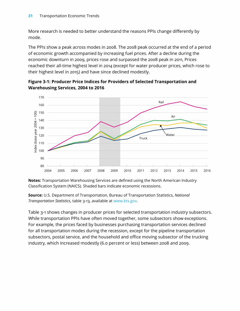
The Producer Price Index (PPI) shows the weighted average of wholesale or producer prices. Figure 3-1 shows PPIs in the transportation industry by mode from 2004 to 2016. Despite periods of modest decline from 2007 to 2009 (during the recession) and from 2014 to 2016, businesses purchasing transportation services saw an overall increase in the relative prices for air, rail, truck, water, and pipeline transportation services. The costs faced by businesses purchasing rail transportation services grew by 54.7 percent, more rapidly than any other transportation mode. The costs faced to purchase truck, water, and air transportation services also increased, with trucking services growing at a slightly slower rate (27.4 percent) than water (29.9 percent) and air (33.9 percent) transportation services.
1 The CPI-U excludes rural consumers to avoid statistical sampling issues.
31 Transportation Economic Trends
More research is needed to better understand the reasons PPIs change differently by mode.
The PPIs show a peak across modes in 2008. The 2008 peak occurred at the end of a period of economic growth accompanied by increasing fuel prices. After a decline during the economic downturn in 2009, prices rose and surpassed the 2008 peak in 2011, Prices reached their all-time highest level in 2014 (except for water producer prices, which rose to their highest level in 2015) and have since declined modestly.
Figure 3-1: Producer Price Indices for Providers of Selected Transportation and Warehousing Services, 2004 to 2016
Notes: Transportation Warehousing Services are defined using the North American Industry Classification System (NAICS). Shaded bars indicate economic recessions.
Source: U.S. Department of Transportation, Bureau of Transportation Statistics, National Transportation Statistics, table 3-13, available at www.bts.gov.
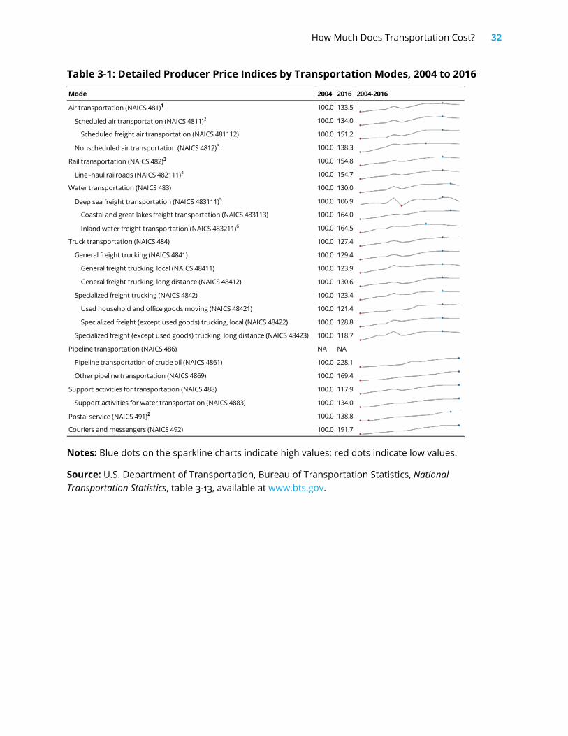
Table 3-1 shows changes in producer prices for selected transportation industry subsectors. While transportation PPIs have often moved together, some subsectors show exceptions. For example, the prices faced by businesses purchasing transportation services declined for all transportation modes during the recession, except for the pipeline transportation subsectors, postal service, and the household and office moving subsector of the trucking industry, which increased modestly (6.0 percent or less) between 2008 and 2009.
80
90
100
110
120
130
140
150
160
170
2004 2005 2006 2007 2008 2009 2010 2011 2012 2013 2014 2015 2016
Inde
x (b
ase
year
200
4 =
100)
Rail
Air
TruckWater
How Much Does Transportation Cost? 32
Table 3-1: Detailed Producer Price Indices by Transportation Modes, 2004 to 2016
Notes: Blue dots on the sparkline charts indicate high values; red dots indicate low values.
Source: U.S. Department of Transportation, Bureau of Transportation Statistics, National Transportation Statistics, table 3-13, available at www.bts.gov.
Mode 2004 2016 2004-2016
Air transportation (NAICS 481)1 100.0 133.5
Scheduled air transportation (NAICS 4811)2 100.0 134.0
Scheduled freight air transportation (NAICS 481112) 100.0 151.2
Nonscheduled air transportation (NAICS 4812)3 100.0 138.3
Rail transportation (NAICS 482)3 100.0 154.8
Line -haul railroads (NAICS 482111)4 100.0 154.7
Water transportation (NAICS 483) 100.0 130.0
Deep sea freight transportation (NAICS 483111)5 100.0 106.9
Coastal and great lakes freight transportation (NAICS 483113) 100.0 164.0
Inland water freight transportation (NAICS 483211)6 100.0 164.5
Truck transportation (NAICS 484) 100.0 127.4
General freight trucking (NAICS 4841) 100.0 129.4
General freight trucking, local (NAICS 48411) 100.0 123.9
General freight trucking, long distance (NAICS 48412) 100.0 130.6
Specialized freight trucking (NAICS 4842) 100.0 123.4
Used household and office goods moving (NAICS 48421) 100.0 121.4
Specialized freight (except used goods) trucking, local (NAICS 48422) 100.0 128.8
Specialized freight (except used goods) trucking, long distance (NAICS 48423) 100.0 118.7
Pipeline transportation (NAICS 486) NA NA
Pipeline transportation of crude oil (NAICS 4861) 100.0 228.1
Other pipeline transportation (NAICS 4869) 100.0 169.4
Support activities for transportation (NAICS 488) 100.0 117.9
Support activities for water transportation (NAICS 4883) 100.0 134.0
Postal service (NAICS 491)2 100.0 138.8
Couriers and messengers (NAICS 492) 100.0 191.7
33 Transportation Economic Trends
Consumer Price Index for Urban Consumers
The Consumer Price Index for Urban Consumers (CPI-U, box 3-2) is a measure of the average change over time in the prices paid by urban consumers for a market basket of consumer goods and services. Economists often use the CPI-U as an indicator of general price trends. Consumer Price Indexes for goods and services, such as ones related to transportation, show changes in prices for those goods and services.
Table 3-2 shows price changes in private and public transportation from 2015 to 2016.2 On average, transportation cost less in 2016 than in 2015 (table 3-2). The CPI-U for both private and public transportation declined from 2015 to 2016 (table 3-2). Costs for private transportation declined by 2.2 percent, resulting primarily from a 11.5 percent decrease in gasoline cost as well as decreases in the cost of other fuels and tires. These decreases were partially offset by increases in the cost of insurance (6.2 percent), parking fees and tolls (2.8 percent), and vehicle maintenance and repairs (1.7 percent).
Public transportation costs overall declined by 1.2 percent due to a 3.3 percent decline in air fares. Not all public transportation prices declined. Ship fares increased 7.4 percent, intracity transportation costs increased by 1.7 percent, and intracity mass transit costs increased by 1.8 percent.
2 In this discussion, “public transportation” refers to common carrier for-hire passenger transportation, including intracity mass transit.

How Much Does Transportation Cost? 34
Table 3-2: Consumer Price Indexes for All Urban Consumers, Transportation-Related Goods and Services
Goods and Services 2015 Average 2016 Average 2015–2016 Change
Overall transportation 199.1 194.9 -2.1%
Private transportation 193.7 189.5 -2.2%
New and used motor vehicles 1 100.8 100.2 -0.5%
New vehicles 147.1 147.4 0.2%
Used cars and trucks 1 2 147.1 143.5 -2.5%
Motor fuel 213.1 188.4 -11.6%
Gasoline (all types) 212.0 187.6 -11.5%
Other motor fuels 1 197.5 165.8 -16.0%
Motor vehicle parts and equipment 144.2 143.6 -0.5%
Tires 126.5 125.4 -0.9%
Motor vehicle maintenance and repair 270.7 275.4 1.7%
Motor vehicle insurance 460.6 489.1 6.2%
Motor vehicle fees 1 178.9 182.6 2.1%
Parking fees and tolls 1 2 215.9 221.9 2.8%
Public transportation 268.7 265.4 -1.2%
Airline fare 292.2 282.6 -3.3%
Other intercity 152.9 158.3 3.6%
Intercity train fare 2 3 110.0 112.4 2.2%
Ship fare 1 2 61.8 66.3 7.4%
Intracity transportation 303.9 308.9 1.7%
Intracity mass transit 2 4 120.2 122.3 1.8%
Notes: “New and used motor vehicles” includes all purchased consumer vehicles. “Public transportation” includes all common carrier for-hire passenger transportation, including intracity mass transit. Taxis are included in “intracity transportation.” The bases for indexes are as follows: (1) Indexes on a December 1997=100 base. (2) Special index based on a smaller sample. (3) Indexes on a December 2007=100 base. (4) Indexes on a December 2009=100 base. (All others) Average of 1982 to 1984=100.
Source: U.S. Department of Labor, Bureau of Labor Statistics, All Urban Consumers (Current Series), Not Seasonally Adjusted, US City Average, available at www.bls.gov/cpi/data.htm.
35 Transportation Economic Trends
Fuel Prices
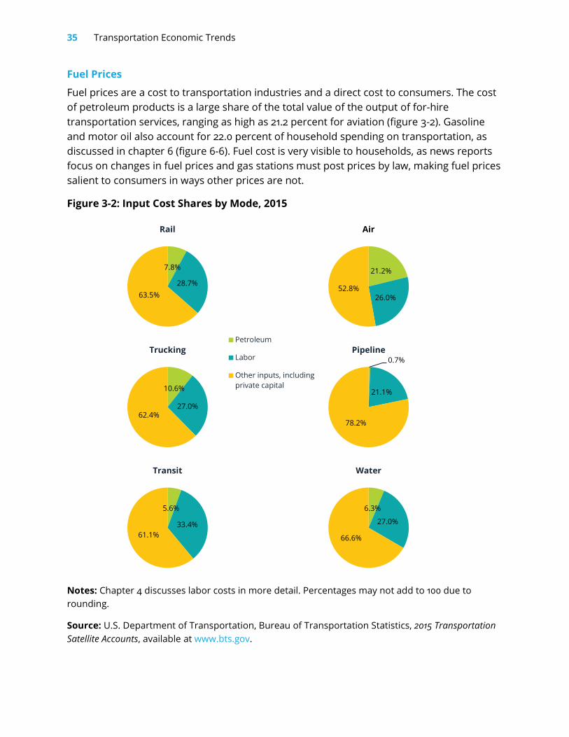
Fuel prices are a cost to transportation industries and a direct cost to consumers. The cost of petroleum products is a large share of the total value of the output of for-hire transportation services, ranging as high as 21.2 percent for aviation (figure 3-2). Gasoline and motor oil also account for 22.0 percent of household spending on transportation, as discussed in chapter 6 (figure 6-6). Fuel cost is very visible to households, as news reports focus on changes in fuel prices and gas stations must post prices by law, making fuel prices salient to consumers in ways other prices are not.
Figure 3-2: Input Cost Shares by Mode, 2015
Notes: Chapter 4 discusses labor costs in more detail. Percentages may not add to 100 due to rounding.
Source: U.S. Department of Transportation, Bureau of Transportation Statistics, 2015 Transportation Satellite Accounts, available at www.bts.gov.
7.8%
28.7%63.5%
Rail
21.2%
26.0%52.8%
Air
10.6%
27.0%62.4%
Trucking0.7%
21.1%
78.2%
Pipeline
5.6%
33.4%61.1%
Transit
6.3%
27.0%
66.6%
Water
Petroleum
Labor
Other inputs, includingprivate capital
How Much Does Transportation Cost? 36
Sales Price of Transportation Fuel
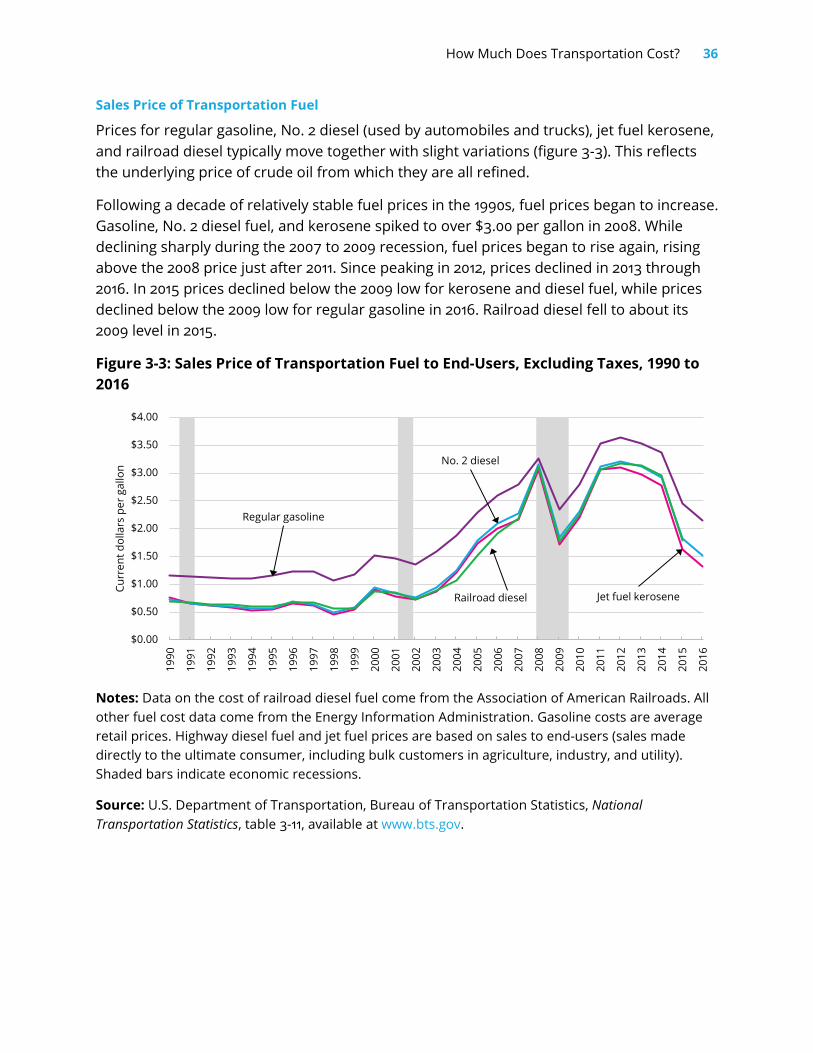
Prices for regular gasoline, No. 2 diesel (used by automobiles and trucks), jet fuel kerosene, and railroad diesel typically move together with slight variations (figure 3-3). This reflects the underlying price of crude oil from which they are all refined.
Following a decade of relatively stable fuel prices in the 1990s, fuel prices began to increase. Gasoline, No. 2 diesel fuel, and kerosene spiked to over $3.00 per gallon in 2008. While declining sharply during the 2007 to 2009 recession, fuel prices began to rise again, rising above the 2008 price just after 2011. Since peaking in 2012, prices declined in 2013 through 2016. In 2015 prices declined below the 2009 low for kerosene and diesel fuel, while prices declined below the 2009 low for regular gasoline in 2016. Railroad diesel fell to about its 2009 level in 2015.
Figure 3-3: Sales Price of Transportation Fuel to End-Users, Excluding Taxes, 1990 to 2016
Notes: Data on the cost of railroad diesel fuel come from the Association of American Railroads. All other fuel cost data come from the Energy Information Administration. Gasoline costs are average retail prices. Highway diesel fuel and jet fuel prices are based on sales to end-users (sales made directly to the ultimate consumer, including bulk customers in agriculture, industry, and utility). Shaded bars indicate economic recessions.
Source: U.S. Department of Transportation, Bureau of Transportation Statistics, National Transportation Statistics, table 3-11, available at www.bts.gov.
Jet fuel kerosene
Regular gasoline
No. 2 diesel
Railroad diesel
$0.00
$0.50
$1.00
$1.50
$2.00
$2.50
$3.00
$3.50
$4.00
1990
1991
1992
1993
1994
1995
1996
1997
1998
1999
2000
2001
2002
2003
2004
2005
2006
2007
2008
2009
2010
2011
2012
2013
2014
2015
2016
Curr
ent d
olla
rs p
er g
allo
n
37 Transportation Economic Trends
Average Motor Gasoline Prices by Region
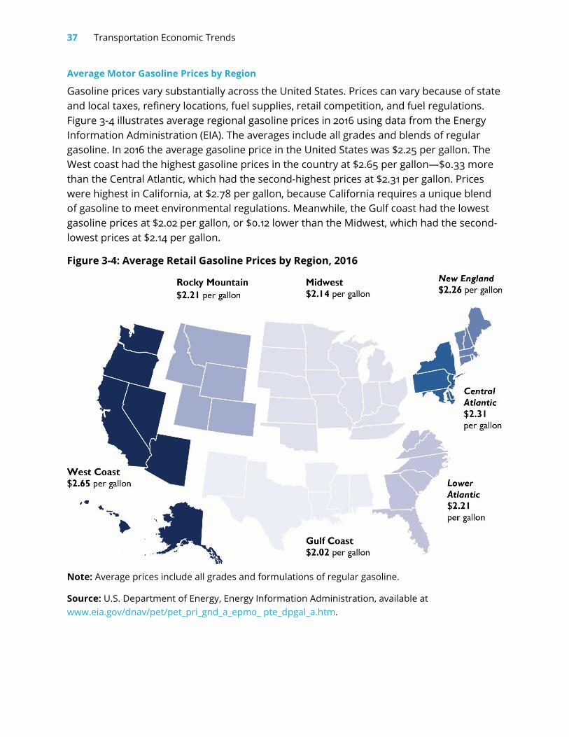
Gasoline prices vary substantially across the United States. Prices can vary because of state and local taxes, refinery locations, fuel supplies, retail competition, and fuel regulations. Figure 3-4 illustrates average regional gasoline prices in 2016 using data from the Energy Information Administration (EIA). The averages include all grades and blends of regular gasoline. In 2016 the average gasoline price in the United States was $2.25 per gallon. The West coast had the highest gasoline prices in the country at $2.65 per gallon—$0.33 more than the Central Atlantic, which had the second-highest prices at $2.31 per gallon. Prices were highest in California, at $2.78 per gallon, because California requires a unique blend of gasoline to meet environmental regulations. Meanwhile, the Gulf coast had the lowest gasoline prices at $2.02 per gallon, or $0.12 lower than the Midwest, which had the second-lowest prices at $2.14 per gallon.
Figure 3-4: Average Retail Gasoline Prices by Region, 2016
Note: Average prices include all grades and formulations of regular gasoline.
Source: U.S. Department of Energy, Energy Information Administration, available at www.eia.gov/dnav/pet/pet_pri_gnd_a_epm0_ pte_dpgal_a.htm.
How Much Does Transportation Cost? 38
Costs to Deliver Transportation Services
There are two types of transportation services: freight transportation services provided to producers of goods and services (e.g., trucking and air freight); and passenger transportation services provided to both producers and household consumers. The price of freight transportation services is a cost to producers of many goods and services, and thus affects the prices of those goods and services. The cost of passenger transportation services directly affects consumers as well as the prices of goods and services because producers also use passenger transportation services to conduct business.
The major inputs to produce transportation services are labor, fuel, materials, and supplies as well as the depreciation of items like airplanes, trucks, railroad locomotives and freight cars, trucking terminals, railroad tracks, and other infrastructure. The depreciation represents the reduction in an asset’s value attributable to wear and tear, accidental damage, obsolescence, and aging. The depreciation and input prices affect the price of freight and passenger transportation. The next subsection presents a measure of equipment costs to the producers of transportation services. Measures of labor costs are presented in chapter 4.
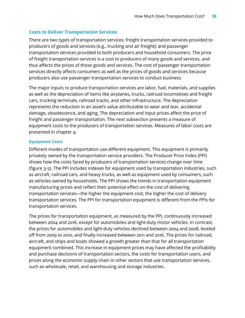
Equipment Costs
Different modes of transportation use different equipment. This equipment is primarily privately owned by the transportation service providers. The Producer Price Index (PPI) shows how the costs faced by producers of transportation services change over time (figure 3-5). The PPI includes indexes for equipment used by transportation industries, such as aircraft, railroad cars, and heavy trucks, as well as equipment used by consumers, such as vehicles owned by households. The PPI shows the trends in transportation equipment manufacturing prices and reflect their potential effect on the cost of delivering transportation services—the higher the equipment cost, the higher the cost of delivery transportation services. The PPI for transportation equipment is different from the PPIs for transportation services.
The prices for transportation equipment, as measured by the PPI, continuously increased between 2004 and 2016, except for automobiles and light-duty motor vehicles. In contrast, the prices for automobiles and light-duty vehicles declined between 2004 and 2008, leveled off from 2009 to 2010, and finally increased between 2011 and 2016. The prices for railroad, aircraft, and ships and boats showed a growth greater than that for all transportation equipment combined. This increase in equipment prices may have affected the profitability and purchase decisions of transportation sectors, the costs for transportation users, and prices along the economic supply chain in other sectors that use transportation services, such as wholesale, retail, and warehousing and storage industries.
39 Transportation Economic Trends
Figure 3-5: Producer Price Indices for Select Transportation Equipment Manufacturing, 2004 to 2016
Note: Producer Price Index data come from the U.S. Bureau of Labor Statistics. Shaded bars indicate economic recessions.
Sources: U.S. Department of Transportation, Bureau of Transportation Statistics, National Transportation Statistics, table 3-14, available at www.bts.gov.
Costs of For-Hire Travel
Households pay for travel in two ways. First, they pay to own and operate passenger vehicles for their own use, as discussed in chapter 6 on household transportation expenditures. Second, they pay fares to use for-hire passenger transportation services for their intercity and intracity travel, as discussed in this chapter.
80
90
100
110
120
130
140
150
2004 2005 2006 2007 2008 2009 2010 2011 2012 2013 2014 2015 2016
Inde
x (b
ase
year
200
4 =
100)
Automobile and light duty motor vehicle
Aircraft
Railroad rolling stock
Ships and boats
All transportation equipment
How Much Does Transportation Cost? 40
For-hire intercity passenger transportation consists of three modes: aviation, rail, and scheduled bus service other than that provided by transit agencies (e.g., Greyhound, Bolt Bus, and Megabus) (box 3-3).3 For-hire intracity travel includes local transit and commuter rail. Local and commuter passengers typically travel much shorter distances than intercity passengers. For example, the average trip length for intercity rail was 39.5 miles, according to the 2009 National Household Travel Survey (NHTS), while the average trip length for transit was 7.2 miles.
Box 3-3: Average Fares Providers of for-hire passenger transportation services, such as airlines, railroads, and transit agencies, charge a variety of fares for different services. The average fare for a mode is defined as the sum of all fare revenue received by the service providers in that mode, divided by the number of one-way trips.
Data on revenue and trips for air come from the U.S. Department of Transportation, Bureau of Transportation Statistics, Office of Airline Information. Revenue is divided by trips. Baggage fees are not included in passenger revenue, and free flights (e.g., frequent-flyer reward trips) are not included in trips.
Data on revenue and trips for rail come from Amtrak’s Annual Report. The annual report gives ticket revenue per passenger mile, which is multiplied by average trip length of passengers.
Data on commuter rail and transit come from the Federal Transit Administration’s National Transit Database. For transit the revenue is divided by unlinked trips. Trips on transit often involve transfers between two buses, or a bus and rail transit. Many transit systems are only able to capture the number of boardings, and cannot link the segments into a complete one-way trip, so unlinked trips (i.e., the number of times a passenger boards a transit vehicle) are used instead. If data on complete one-way trips were available, it would show higher average fares for transit.
Source: U.S. Department of Transportation, Bureau of Transportation Statistics, 2017.
3 Intercity rail service provided by Amtrak (commuter rail service) is included with other intracity modes in intracity passenger fares. Recent intercity bus fare data are currently not available.
41 Transportation Economic Trends
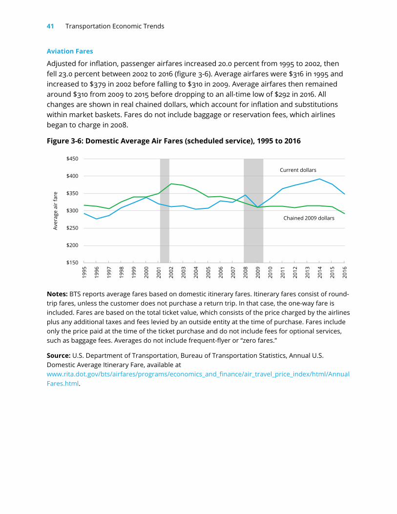
Aviation Fares
Adjusted for inflation, passenger airfares increased 20.0 percent from 1995 to 2002, then fell 23.0 percent between 2002 to 2016 (figure 3-6). Average airfares were $316 in 1995 and increased to $379 in 2002 before falling to $310 in 2009. Average airfares then remained around $310 from 2009 to 2015 before dropping to an all-time low of $292 in 2016. All changes are shown in real chained dollars, which account for inflation and substitutions within market baskets. Fares do not include baggage or reservation fees, which airlines began to charge in 2008.
Figure 3-6: Domestic Average Air Fares (scheduled service), 1995 to 2016
Notes: BTS reports average fares based on domestic itinerary fares. Itinerary fares consist of round-trip fares, unless the customer does not purchase a return trip. In that case, the one-way fare is included. Fares are based on the total ticket value, which consists of the price charged by the airlines plus any additional taxes and fees levied by an outside entity at the time of purchase. Fares include only the price paid at the time of the ticket purchase and do not include fees for optional services, such as baggage fees. Averages do not include frequent-flyer or “zero fares.”
Source: U.S. Department of Transportation, Bureau of Transportation Statistics, Annual U.S. Domestic Average Itinerary Fare, available at www.rita.dot.gov/bts/airfares/programs/economics_and_finance/air_travel_price_index/html/AnnualFares.html.
$150
$200
$250
$300
$350
$400
$450
1995
1996
1997
1998
1999
2000
2001
2002
2003
2004
2005
2006
2007
2008
2009
2010
2011
2012
2013
2014
2015
2016
Aver
age
air f
are
Current dollars
Chained 2009 dollars
How Much Does Transportation Cost? 42
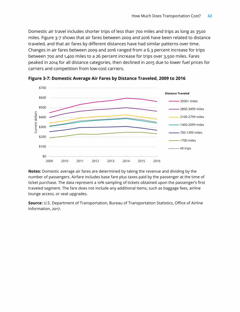
Domestic air travel includes shorter trips of less than 700 miles and trips as long as 3500 miles. Figure 3-7 shows that air fares between 2009 and 2016 have been related to distance traveled, and that air fares by different distances have had similar patterns over time. Changes in air fares between 2009 and 2016 ranged from a 6.3 percent increase for trips between 700 and 1,400 miles to a 26 percent increase for trips over 3,500 miles. Fares peaked in 2014 for all distance categories, then declined in 2015 due to lower fuel prices for carriers and competition from low-cost carriers.
Figure 3-7: Domestic Average Air Fares by Distance Traveled, 2009 to 2016
Notes: Domestic average air fares are determined by taking the revenue and dividing by the number of passengers. Airfare includes base fare plus taxes paid by the passenger at the time of ticket purchase. The data represent a 10% sampling of tickets obtained upon the passenger’s first traveled segment. The fare does not include any additional items, such as baggage fees, airline lounge access, or seat upgrades.
Source: U.S. Department of Transportation, Bureau of Transportation Statistics, Office of Airline Information, 2017.
$0
$100
$200
$300
$400
$500
$600
$700
2009 2010 2011 2012 2013 2014 2015 2016
Curr
ent d
olla
rs
3500+ miles
2800-3499 miles
2100-2799 miles
1400-2099 miles
700-1399 miles
<700 miles
All trips
Distance Traveled

43 Transportation Economic Trends
Intercity Railroad Fares
Amtrak intercity railroad fares represent a complex interaction of demand, operating costs, government subsidies, and regulation. Amtrak fares (in chained 2009 dollars) fluctuated within a narrow band from 1990 to 2014 (figure 3-8). The fares represent ticket revenue per passenger mile multiplied by average trip length of passengers except for years before 1997, where fares are calculated from total transportation revenues.
Amtrak fares fell from about $59 per passenger in 1991 to $52 in 1995 and fluctuated between $52 and $61 from 1995 through 2003. Passenger fares began to rise again in 2004, hitting a peak of about $62 in 2007. Fares declined during the recession but rose above the 2007 peak in 2013. Fares continued to climb, reaching an all-time high of $67 in 2014.
Figure 3-8: Average Amtrak Rail Fares per Average Trip Length, 1990 to 2014
Notes: Fares for years after 1997 are from National Passenger Rail Corporation (Amtrak), Amtrak Annual Report, and calculated as ticket revenue per passenger mile multiplied by average trip length of passengers. Fares for years before 1997 are from National Passenger Rail Corporation (Amtrak), Amtrak Annual Report, Statistical Appendix, and calculated as total transportation revenues divided by Amtrak system passenger trips. Shaded bars indicate economic recessions.
Source: U.S. Department of Transportation, Bureau of Transportation Statistics, National Transportation Statistics, table 3-19, available at www.bts.gov.
$30
$35
$40
$45
$50
$55
$60
$65
$70
$75
1990
1991
1992
1993
1994
1995
1996
1997
1998
1999
2000
2001
2002
2003
2004
2005
2006
2007
2008
2009
2010
2011
2012
2013
2014
Aver
age
fare
per
ave
rage
trip
leng
th
Current dollars
Chained 2009 dollars
How Much Does Transportation Cost? 44
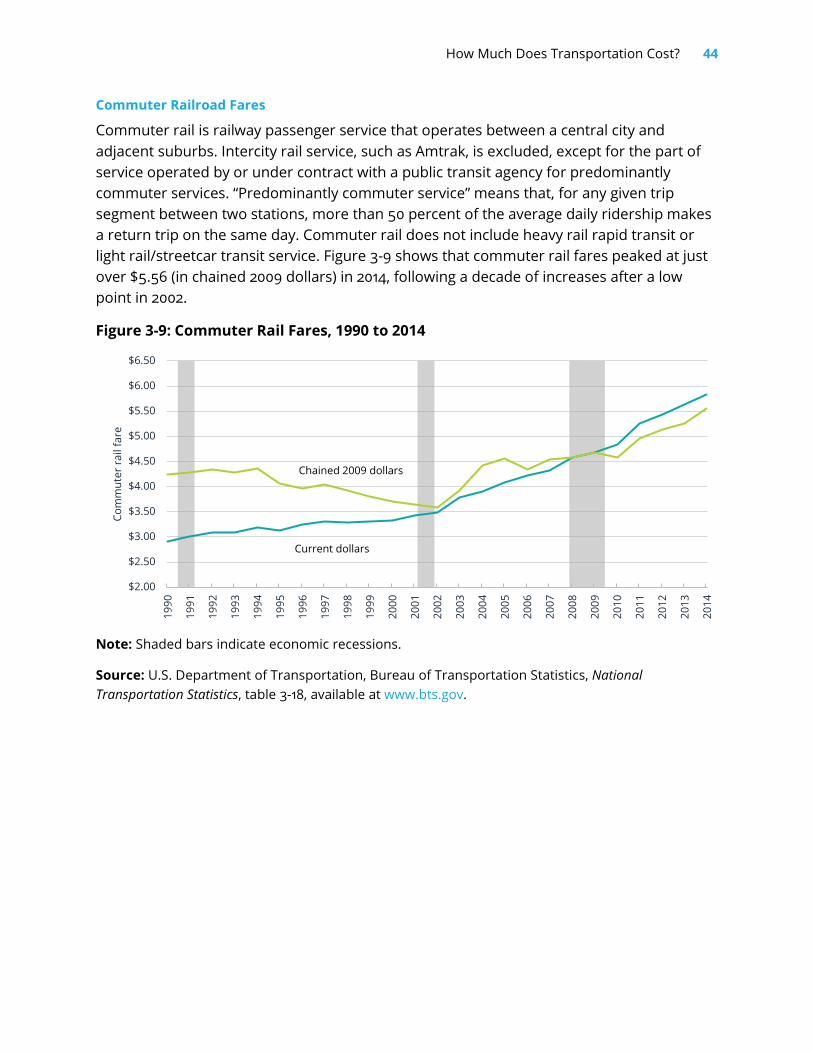
Commuter Railroad Fares
Commuter rail is railway passenger service that operates between a central city and adjacent suburbs. Intercity rail service, such as Amtrak, is excluded, except for the part of service operated by or under contract with a public transit agency for predominantly commuter services. “Predominantly commuter service” means that, for any given trip segment between two stations, more than 50 percent of the average daily ridership makes a return trip on the same day. Commuter rail does not include heavy rail rapid transit or light rail/streetcar transit service. Figure 3-9 shows that commuter rail fares peaked at just over $5.56 (in chained 2009 dollars) in 2014, following a decade of increases after a low point in 2002.
Figure 3-9: Commuter Rail Fares, 1990 to 2014
Note: Shaded bars indicate economic recessions.
Source: U.S. Department of Transportation, Bureau of Transportation Statistics, National Transportation Statistics, table 3-18, available at www.bts.gov.
$2.00
$2.50
$3.00
$3.50
$4.00
$4.50
$5.00
$5.50
$6.00
$6.50
1990
1991
1992
1993
1994
1995
1996
1997
1998
1999
2000
2001
2002
2003
2004
2005
2006
2007
2008
2009
2010
2011
2012
2013
2014
Com
mut
er ra
il fa
re
Current dollars
Chained 2009 dollars
45 Transportation Economic Trends
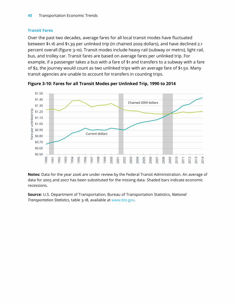
Transit Fares
Over the past two decades, average fares for all local transit modes have fluctuated between $1.16 and $1.39 per unlinked trip (in chained 2009 dollars), and have declined 2.1 percent overall (figure 3-10). Transit modes include heavy rail (subway or metro), light rail, bus, and trolley car. Transit fares are based on average fares per unlinked trip. For example, if a passenger takes a bus with a fare of $1 and transfers to a subway with a fare of $2, the journey would count as two unlinked trips with an average fare of $1.50. Many transit agencies are unable to account for transfers in counting trips.
Figure 3-10: Fares for all Transit Modes per Unlinked Trip, 1990 to 2014
Notes: Data for the year 2006 are under review by the Federal Transit Administration. An average of data for 2005 and 2007 has been substituted for the missing data. Shaded bars indicate economic recessions.
Source: U.S. Department of Transportation, Bureau of Transportation Statistics, National Transportation Statistics, table 3-18, available at www.bts.gov.
$0.50
$0.60
$0.70
$0.80
$0.90
$1.00
$1.10
$1.20
$1.30
$1.40
$1.50
1990
1991
1992
1993
1994
1995
1996
1997
1998
1999
2000
2001
2002
2003
2004
2005
2006
2007
2008
2009
2010
2011
2012
2013
2014
Fare
per
unl
inke
d tr
ip
Current dollars
Chained 2009 dollars


