documentay advertisement
TRANSCRIPT
Research and Planning
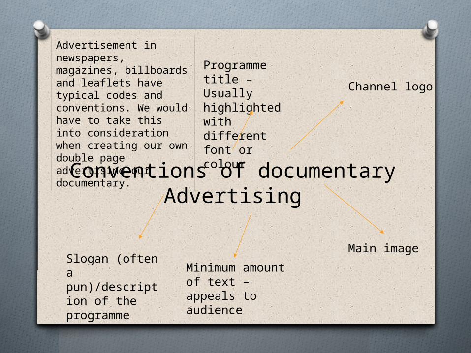
Conventions of documentary Advertising
Channel logo
Main image
Programme title – Usually highlighted with different font or colour
Slogan (often a pun)/description of the programme
Minimum amount of text – appeals to audience
Advertisement in newspapers, magazines, billboards and leaflets have typical codes and conventions. We would have to take this into consideration when creating our own double page advertising our documentary.
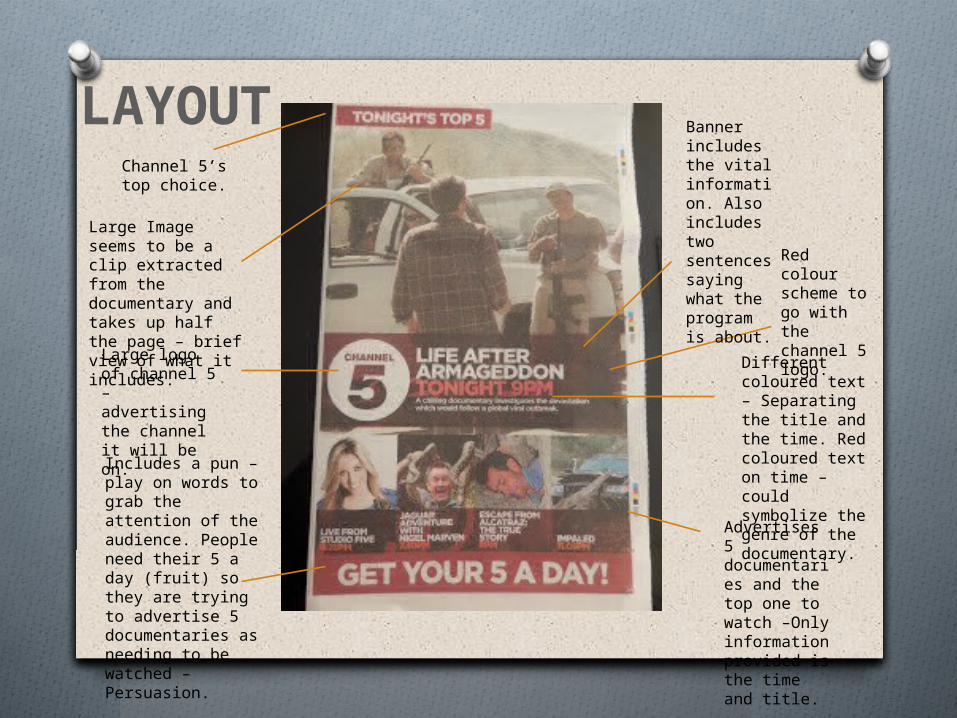
Large logo of channel 5 – advertising the channel it will be on.
Red colour scheme to go with the channel 5 logo.
Different coloured text – Separating the title and the time. Red coloured text on time – could symbolize the genre of the documentary.
Includes a pun – play on words to grab the attention of the audience. People need their 5 a day (fruit) so they are trying to advertise 5 documentaries as needing to be watched – Persuasion.
Advertises 5 documentaries and the top one to watch –Only information provided is the time and title.
Large Image seems to be a clip extracted from the documentary and takes up half the page – brief view of what it includes.
Banner includes the vital information. Also includes two sentences saying what the program is about.
Channel 5’s top choice.
LAYOUT
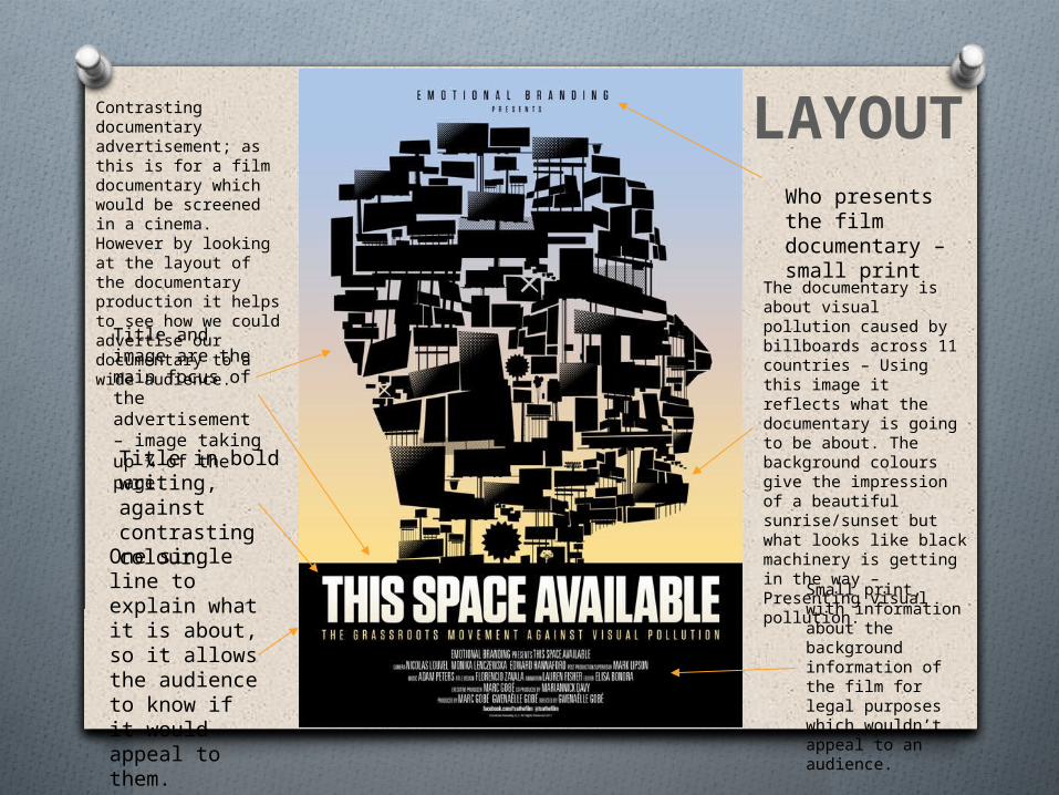
Who presents the film documentary – small print
The documentary is about visual pollution caused by billboards across 11 countries – Using this image it reflects what the documentary is going to be about. The background colours give the impression of a beautiful sunrise/sunset but what looks like black machinery is getting in the way – Presenting visual pollution.
Title in bold writing, against contrasting colour.
One single line to explain what it is about, so it allows the audience to know if it would appeal to them.
Small print, with information about the background information of the film for legal purposes which wouldn’t appeal to an audience.
Contrasting documentary advertisement; as this is for a film documentary which would be screened in a cinema. However by looking at the layout of the documentary production it helps to see how we could advertise our documentary to a wide audience.
Title and image are the main focus of the advertisement – image taking up ¾ of the page.
LAYOUT
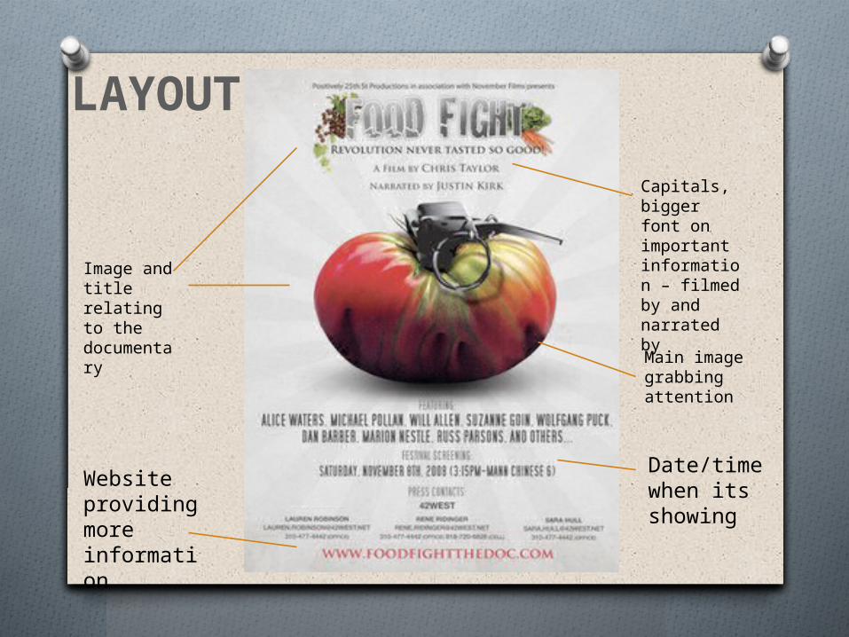
Image and title relating to the documentary
Capitals, bigger font on important information – filmed by and narrated by
Date/time when its showing
Website providing more information
Main image grabbing attention
LAYOUT
Channel 4 Documentaries
O Channel 4 has world-class reputation in Documentaries based on its history of exposing bold subjects to its audiences. It has been know for its significant documentary ideas which bring controversial ideas, which other channels have not have been brave enough to try. Channel 4 is a channel to take into consideration when looking at which channel we would want our documentary to be broadcasted on.
O Documentaries for Our Time - video clip (embeds available) - Channel 4 - Info - Press
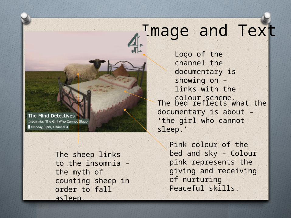
Image and Text
The bed reflects what the documentary is about – ‘the girl who cannot sleep.’
The sheep links to the insomnia – the myth of counting sheep in order to fall asleep.
Logo of the channel the documentary is showing on – links with the colour scheme.
Pink colour of the bed and sky – Colour pink represents the giving and receiving of nurturing – Peaceful skills.
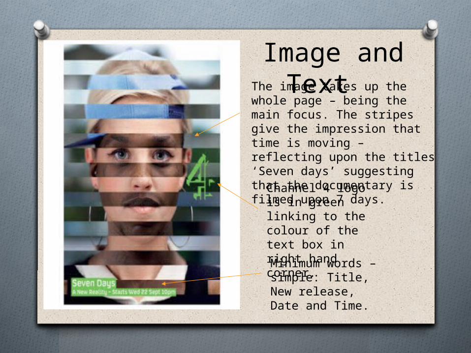
Channel 4 logo is in green linking to the colour of the text box in right hand corner.
Minimum words – simple: Title, New release, Date and Time.
The image takes up the whole page – being the main focus. The stripes give the impression that time is moving – reflecting upon the titles ‘Seven days’ suggesting that the documentary is filmed upon 7 days.
Image and Text
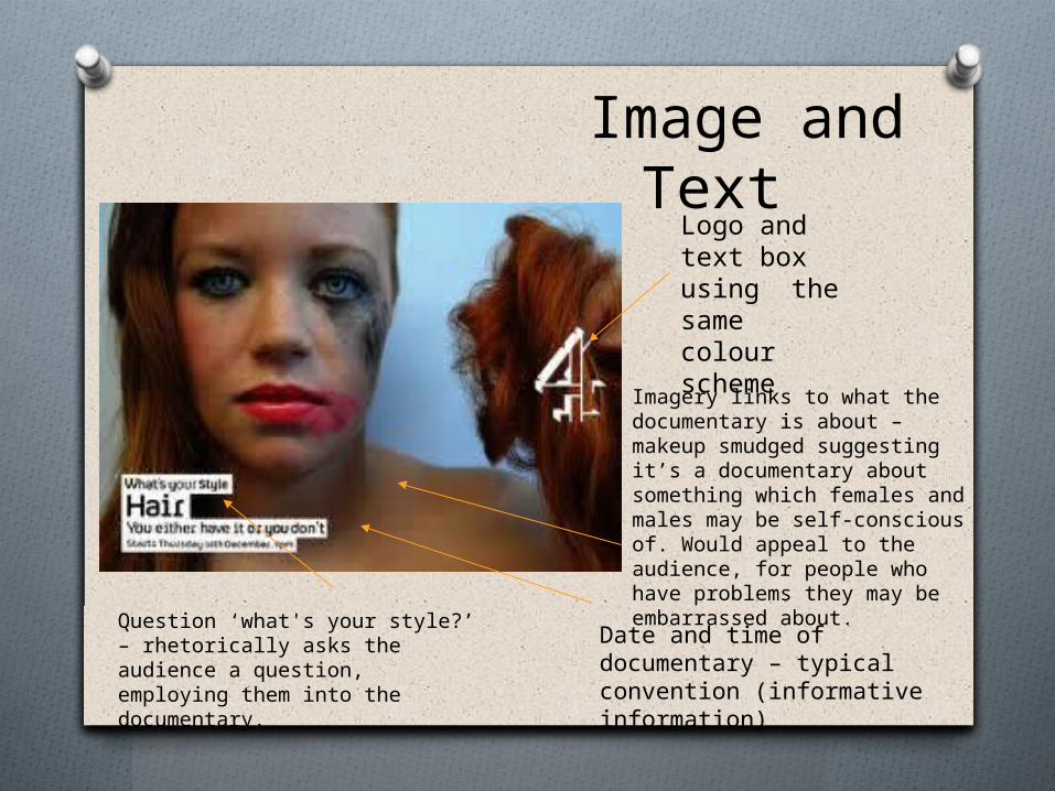
Image and Text
Logo and text box using the same colour scheme
Question ‘what's your style?’ – rhetorically asks the audience a question, employing them into the documentary.
Imagery links to what the documentary is about – makeup smudged suggesting it’s a documentary about something which females and males may be self-conscious of. Would appeal to the audience, for people who have problems they may be embarrassed about.
Date and time of documentary – typical convention (informative information)