distribute or post, copy, - sagepub.com · hypothetical data in table 1.1, for example, indicate...
TRANSCRIPT
1
CHAPTER 1. BIVARIATE REGRESSION: FITTING A STRAIGHT LINE
Social researchers often inquire about the relationship between two vari-ables. Numerous examples come to mind. Do men participate more in politics than women? Is the working class more liberal than the middle class? Are Democratic members of Congress bigger spenders of the tax-payer’s dollar than Republicans? Are changes in the unemployment rate associated with changes in the president’s popularity at the polls? These are specific instances of the common query, “What is the relationship between variable x and variable y?” One answer comes from bivariate regression, a straightforward technique that involves fitting a line to a scatter of points.
Exact Versus Inexact Relationships
Two variables, x and y, may be related to each other exactly or inexactly. In the physical sciences, variables frequently have an exact relationship to each other. The simplest such relationship between an independent variable (the “cause”), labeled x, and a dependent variable (the “effect”), labeled y, is a straight line, expressed in the formula
y = b0 + b1x
where the values of the coefficients, b0 and b1, determine, respectively, the precise height and steepness of the line. Thus, the coefficient b0 is referred to as the intercept, and the coefficient b1 is referred to as the slope. The hypothetical data in Table 1.1, for example, indicate that y is linearly related to x by the following equation:
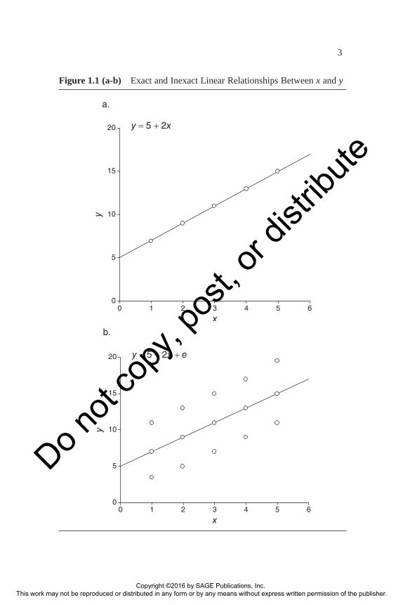
y = 5 + 2x
This straight line is fitted to these data in Figure 1.1a. we note that for each observation on x, one and only one y value is possible. When, for instance, x equals 1, y must equal 7. If x increases one unit in value, then y necessar-ily increases by precisely two units. Hence, knowing the x score, the y score can be perfectly predicted. A real-world example with which we are all familiar is
y x= +32 9 5/
Copyright ©2016 by SAGE Publications, Inc. This work may not be reproduced or distributed in any form or by any means without express written permission of the publisher.
Do not
copy
, pos
t, or d
istrib
ute
2
where temperature in Fahrenheit (y) is an exact linear function of tempera-ture in Celsius (x).
In contrast, relationships between variables in the social sciences are almost always inexact. Practically speaking, this inexactness comes from different sources, such as faulty measures, missing observations, or improp-erly stated relationships. The equation for a linear relationship between two social science variables would be written, more realistically, as
y = b0 + b1x + e
where e is the error term, or disturbance as it is sometimes called, and rep-resents this inexact component. A simple linear relationship for social sci-ence data is pictured in Figure 1.1b. The equation for these data happens to be the same as that for the data of Table 1.1, except for the addition of the error term,
y = 5 + 2x + e
y = 5 + 2x
x y
0 5
1 7
2 9
3 11
4 13
5 15
Table 1.1 Perfect Linear Relationship Between x and y
The error term acknowledges that the prediction equation by itself, writ-ten as follows,
y x∧= +5 2
does not perfectly predict y. (The y∧, read y-hat, distinguishes the predicted
y from the observed y.) Every y value does not fall exactly on the line. Thus, with a given x, there may occur more than one y. For example, with
Copyright ©2016 by SAGE Publications, Inc. This work may not be reproduced or distributed in any form or by any means without express written permission of the publisher.
Do not
copy
, pos
t, or d
istrib
ute
3
0 1 2 3 4 5 60
5
10
15
20
x
y
y = 5 + 2x
a.
Figure 1.1 (a-b) Exact and Inexact Linear Relationships Between x and y
0 1 2 3 4 5 60
5
10
15
20
x
y
y = 5 + 2x + e
b.
Copyright ©2016 by SAGE Publications, Inc. This work may not be reproduced or distributed in any form or by any means without express written permission of the publisher.
Do not
copy
, pos
t, or d
istrib
ute
4
x = 1 (as in Figure 1.1b), we see there is a y = 7, as predicted, but also there is a y = 11. In other words, knowing x, we do not always know y.
This inexactness is not surprising. If, for instance, x = number of elec-tions voted in (since the last presidential election), and y = campaign con-tributions (in dollars), we would not expect everyone who voted in, say, three elections to contribute exactly the same amount to campaigns. Still, we would anticipate that someone voting three times would likely contrib-ute more than someone voting one time and less than someone voting five times. Put another way, a person’s campaign contribution is likely to be a linear function of electoral participation, plus some error, which is the situ-ation described in Figure 1.1b.
The Least Squares Principle
In postulating relationships among social science variables, we commonly assume linearity, as described above. For example, in the simple two vari-able case, we assume the observations follow, or fall along, a straight line. Of course, this assumption is not always correct. But its adoption, at least as a starting point, might be justified on several grounds. First, numerous real relationships have been found empirically to be essentially linear. Second, the linear specification is generally the most parsimonious. Third, our theory is often so weak that we are not at all sure what the nonlinear specification would be. Fourth, inspection of the data themselves may fail to suggest a clear alternative to the straight-line model. (All too frequently, in a plot of x versus y, the figure may look like nothing so much as a large chocolate chip cookie.) Below, we focus on establishing a linear relation-ship between variables. Nevertheless, we should always be alert to the possibility that a relationship is actually nonlinear, following a curve of some sort. (In Chapter 4, we explicitly model the possibility that a relation-ship is nonlinear.)
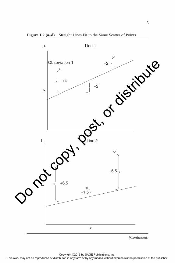
Given that we want to relate y to x with a straight line, the question arises as to which, of all possible straight lines, we should choose. For the data plotted in Figure 1.2a, we have sketched in freehand the line 1, defined by this prediction equation:
y b b x∧= +01 11
One observes that the line does not predict perfectly; for example, the vertical distance from Observation 1 to the line is four units. The predic-tion error for this Observation 1 (e1), or any other observation, i, can be calculated as follows:
prediction error observed predicted= = =∧
e y yi i i− −
Copyright ©2016 by SAGE Publications, Inc. This work may not be reproduced or distributed in any form or by any means without express written permission of the publisher.
Do not
copy
, pos
t, or d
istrib
ute
5
x
yLine 1
+4−2
+2Observation 1
a.
Figure 1.2 (a–d) Straight Lines Fit to the Same Scatter of Points
x
y
+1.5
+6.5
Line 2
+6.5
b.
(Continued)
Copyright ©2016 by SAGE Publications, Inc. This work may not be reproduced or distributed in any form or by any means without express written permission of the publisher.
Do not
copy
, pos
t, or d
istrib
ute
6
x
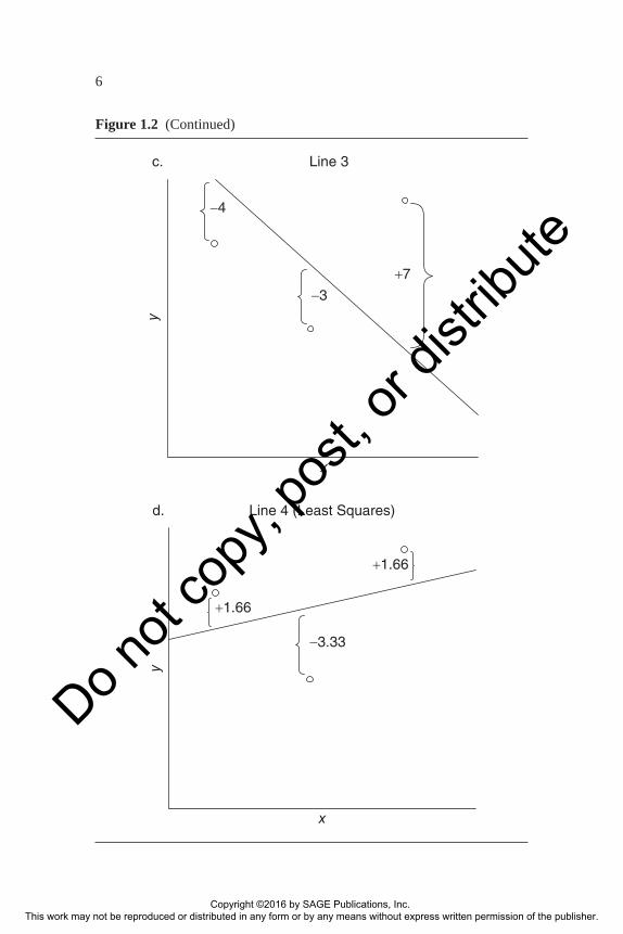
yLine 3
−4
−3
+7
c.
Figure 1.2 (Continued)
x
y
Line 4 (Least Squares)
+1.66
−3.33
+1.66
d.
Copyright ©2016 by SAGE Publications, Inc. This work may not be reproduced or distributed in any form or by any means without express written permission of the publisher.
Do not
copy
, pos
t, or d
istrib
ute
7
Summing the prediction error for all the observations would yield a total pre-diction error (TPE), total prediction error = = + + =
∧Σi i iy y= − −1
3 4 2 2 4( ) ( ) .Clearly, line 1 fits the data better than freehand line 2 (see Figure 1.2b), represented by the equation
y b b x∧= +02 12
(TPE for line 2 = 14.5). However, there are a vast number of straight lines besides line 2 with which line 1 could be compared. Does line 1 reduce prediction error to the minimum, or is there some other line that could do better? Obviously, we cannot possibly evaluate all the freehand straight lines that could be sketched to describe the relationship. Instead, we rely on calculus to discover the values of b0 and b1, which generate the line with the lowest prediction error. (Interestingly, calculus was discovered indepen-dently by mathematicians Newton and Leibnitz, working at about the same time in the 1600s.)
Before presenting this solution, however, it is necessary to modify some-what our notion of prediction error. Note that line 3 (see Figure 1.2c), indicated by the equation,
y b b x∧= +03 13
provides a fit that is clearly less good than line 1. Nevertheless, the TPE = 0 for line 3. This example reveals that TPE is an inadequate measure of error, because the positive errors cancel out the negative errors (here, −4 −3 + 7 = 0). One way to overcome this problem of opposite signs is to square each prediction error. (Taking the absolute value of the prediction errors is another option. However, it fails to account adequately for large errors and is computationally unwieldy. Furthermore, it makes inference problematic.) Our goal, then, becomes one of selecting the straight line that minimizes the sum of the squares of the prediction errors (SSE):
SSE e y yiin
i iin= ∑ = −∑=
∧=
21
21( )
Through the use of calculus, it can be shown that this sum of squares is at a minimum, or “least,” when the coefficients b0 and b1 are calculated as follows:
b y b x0 1= −
bx x y y
x x
i iin
iin1
12
1
=− −∑
−∑=
=
( ) ( )
( )
Copyright ©2016 by SAGE Publications, Inc. This work may not be reproduced or distributed in any form or by any means without express written permission of the publisher.
Do not
copy
, pos
t, or d
istrib
ute
8
These values of b0 and b1 are our “least squares” estimates.1 (For a proof of the least squares solution that does not require the use of calculus, see the Appendix. The least squares method was initially arrived at by French mathematician Legendre and German mathematician Gauss, both practic-ing around 1800.)
Returning to the data used in the freehand examples (Figure 1.2a–c), we now apply least squares to estimate the best-fitting line, as shown in Figure 1.2d. A quick visual inspection shows that the least squares line is closer to the data than our freehand lines. Moreover, we know mathematically the property of least squares guarantees the prediction error is minimized. No other line can improve upon the least squares fit. It should also be noted that the sum of the error terms is 0 for the least squares fitted line. This is a math-ematical consequence of the least squares criterion: eii
n=∑ =1 0. (The other
restriction implied by least squares is the values of the independent variable, x, must be uncorrelated with the error terms: e xi ii
n=∑ =1 0. Using these two
constraints, an interested reader can algebraically derive the same least squares solutions for the intercept and slope coefficients as shown above.)
At this point, it is appropriate to apply this least squares principle in a research example. Suppose we are studying income differences among local government employees in Riverview, a hypothetical medium-size Midwestern city. Exploratory interviews suggest a relationship between income and education. Specifically, those employees with more formal training appear to receive better pay. In an attempt to verify whether this is so, we gather relevant data. (Note that the word data is a plural word. Thus, it is correct to say, for example, “the data are gathered.” It is incorrect to say that “the data is gathered.”)
The Data
We do not have the time or money to interview the entire population: all 320 employees on the city payroll. Therefore, we decide to interview a simple random sample of 32, selected from the personnel list that the city clerk kindly provided.2 (The personnel list totals 320 employees and defines the population of city employees. Our sample from this population can be repre-sented by a lowercase “n,” so we can write n = 32.) The data obtained on the current annual income (labeled variable y) and the number of years of formal education (labeled variable x) of each respondent are given in Table 1.2.
The Scatterplot
From simply reading the numbers in Table 1.2, it is difficult to tell whether there is a relationship between education (x) and income (y). However, the
Copyright ©2016 by SAGE Publications, Inc. This work may not be reproduced or distributed in any form or by any means without express written permission of the publisher.
Do not
copy
, pos
t, or d
istrib
ute
9
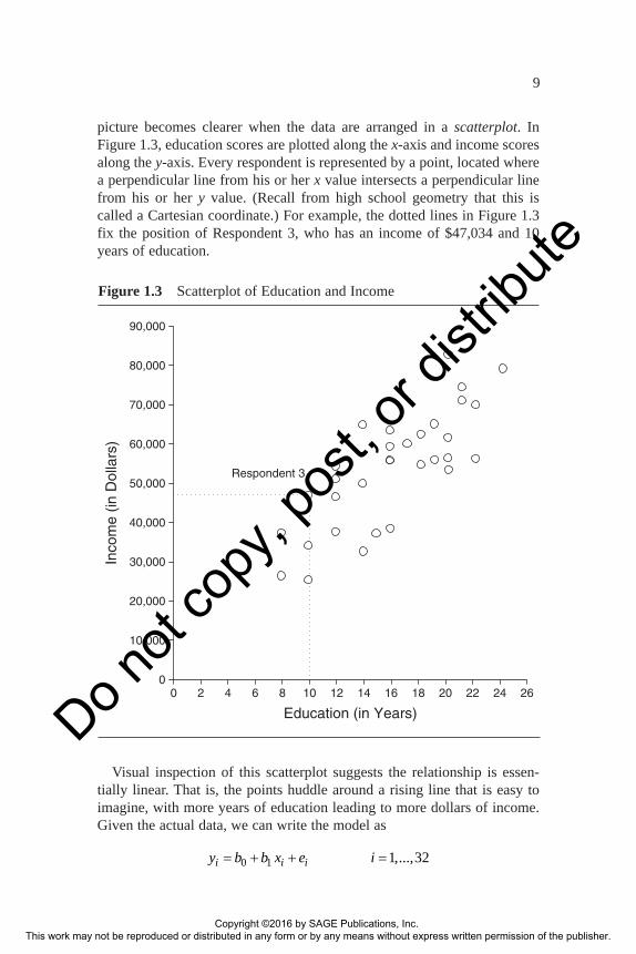
picture becomes clearer when the data are arranged in a scatterplot. In Figure 1.3, education scores are plotted along the x-axis and income scores along the y-axis. Every respondent is represented by a point, located where a perpendicular line from his or her x value intersects a perpendicular line from his or her y value. (Recall from high school geometry that this is called a Cartesian coordinate.) For example, the dotted lines in Figure 1.3 fix the position of Respondent 3, who has an income of $47,034 and 10 years of education.
0 2 4 6 8 10 12 14 16 18 20 22 24 260
10,000
20,000
30,000
40,000
50,000
60,000
70,000
80,000
90,000
Education (in Years)
Inco
me
(in D
olla
rs)
Respondent 3
Figure 1.3 Scatterplot of Education and Income
Visual inspection of this scatterplot suggests the relationship is essen-tially linear. That is, the points huddle around a rising line that is easy to imagine, with more years of education leading to more dollars of income. Given the actual data, we can write the model as
y b b x e ii i i= + + =0 1 1 32,...,
Copyright ©2016 by SAGE Publications, Inc. This work may not be reproduced or distributed in any form or by any means without express written permission of the publisher.
Do not
copy
, pos
t, or d
istrib
ute

10
Respondent Education (in years)
xIncome (in dollars)
y
1 8 26,430
2 8 37,449
3 10 34,182
4 10 25,479
5 10 47,034
6 12 37,656
7 12 50,265
8 12 46,488
9 12 52,480
10 14 32,631
11 14 49,968
12 14 64,926
13 15 37,302
14 16 38,586
15 16 55,878
16 16 59,499
17 16 55,782
18 16 63,471
19 17 60,068
20 18 54,840
21 18 62,466
22 19 56,019
23 19 65,142
24 20 56,343
25 20 54,672
26 20 61,629
27 20 82,726
28 21 71,202
29 21 73,542
30 22 56,322
31 22 70,044
32 24 79,227
Table 1.2 Data on Education and Income
Copyright ©2016 by SAGE Publications, Inc. This work may not be reproduced or distributed in any form or by any means without express written permission of the publisher.
Do not
copy
, pos
t, or d
istrib
ute
11
where y = respondent’s annual income (in dollars), x = respondent’s formal education (in years), b0 = intercept, b1 = slope, and e = error.
Fitting this equation by least squares yields
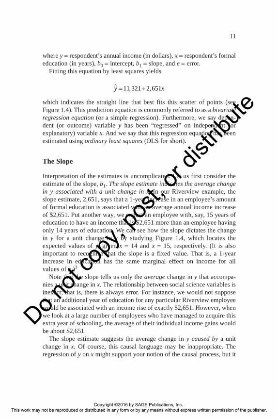
y x∧= +11 321 2 651, ,
which indicates the straight line that best fits this scatter of points (see Figure 1.4). This prediction equation is commonly referred to as a bivariate regression equation (or a simple regression). Furthermore, we say depen-dent (or outcome) variable y has been “regressed” on independent (or explanatory) variable x. And we say that this regression equation has been estimated using ordinary least squares (OLS for short).
The Slope
Interpretation of the estimates is uncomplicated. Let us first consider the estimate of the slope, b1. The slope estimate indicates the average change in y associated with a unit change in x. In our Riverview example, the slope estimate, 2,651, says that a 1-year increase in an employee’s amount of formal education is associated with an average annual income increase of $2,651. Put another way, we expect an employee with, say, 15 years of education to have an income that is $2,651 more than an employee having only 14 years of education. We can see how the slope dictates the change in y for a unit change in x by studying Figure 1.4, which locates the expected values of y, given x = 14 and x = 15, respectively. (It is also important to recognize that the slope is a fixed value. That is, a 1-year increase in education has the same marginal effect on income for all values of x.)3
Note that the slope tells us only the average change in y that accompa-nies a unit change in x. The relationship between social science variables is inexact; that is, there is always error. For instance, we would not suppose that an additional year of education for any particular Riverview employee would be associated with an income rise of exactly $2,651. However, when we look at a large number of employees who have managed to acquire this extra year of schooling, the average of their individual income gains would be about $2,651.
The slope estimate suggests the average change in y caused by a unit change in x. Of course, this causal language may be inappropriate. The regression of y on x might support your notion of the causal process, but it
Copyright ©2016 by SAGE Publications, Inc. This work may not be reproduced or distributed in any form or by any means without express written permission of the publisher.
Do not
copy
, pos
t, or d
istrib
ute
12
cannot establish it. To appreciate this critical point, realize that it would be a simple matter to apply OLS to the following regression equation:
x = b0 + b1y + e
where now x = the dependent variable, and y = the independent variable. Obviously, such a computational exercise would not suddenly reverse the causal order of x and y in the real world. The correct causal ordering of the variables is determined outside the estimation procedure. In practice, it is based on theoretical considerations, research design, good judgment, and past research. With regard to our Riverview example, the actual causal relationship of these variables does seem to be reflected in our original model; that is, shifts in education appear likely to cause shifts in income,
0 2 4 6 8 10 12 14 16 18 20 22 24 260
10,000
20,000
30,000
40,000
50,000
60,000
70,000
80,000
90,000
Education (in Years)
Inco
me
(in D
olla
rs)
+ 2,651
y = 11,321 + 2,651x
intercept
Figure 1.4 The Regression Line for the Income and Education Data
Copyright ©2016 by SAGE Publications, Inc. This work may not be reproduced or distributed in any form or by any means without express written permission of the publisher.
Do not
copy
, pos
t, or d
istrib
ute
13
but the view that changes in income cause changes in formal years of edu-cation is implausible, at least in this instance. Thus, it is only somewhat adventuresome to conclude that a 1-year increase in formal education causes an increase in income of $2,651, on average. (If the researcher favors a more cautious use of language here, he or she might substitute the phrase leads to for the word causes.)
The Intercept
The intercept, b0, is so called because it indicates the point where the regression line “intercepts” the y-axis. It estimates the average value of y when x equals zero. Thus, in our Riverview example, the intercept estimate suggests that the expected income for someone with no formal education would be $11,321. This particular estimate highlights worthwhile cautions to observe when interpreting the intercept. First, one should be leery of making a prediction for y based on an x value beyond the range of the data. In this example, the lowest level of educational attainment is eight years; therefore, it is risky to extrapolate to the income of someone with zero years of education. Quite literally, we would be generalizing beyond the realm of our experience, and so may be way off the mark. (For instance, the relationship between education and income could change to a steep down-ward curve for individuals with less than 8 years of education.) If we are actually interested in those with no education, then we would do better to gather data on them.
A second problem may arise if the intercept has a negative value. Then, when x = 0, the predicted y would necessarily equal the negative value. Often, however, in the real world it is impossible to have a score on y that is below zero; for example, a Riverview employee could not receive a negative income. In such cases, the intercept is “nonsense,” if taken liter-ally. Its utility would be restricted to ensuring mathematically that a predic-tion “comes out right.” It is a constant that must always be added on to the slope component, “b1x,” for y to be properly predicted. Drawing on an analogy from the economics of the firm, the intercept represents a “fixed cost” that must be included along with the “varying costs” determined by other factors, in order to calculate “total cost.”
Prediction
Knowing the intercept and the slope, we can predict y for a given x value. For instance, if we encounter a Riverview city employee with 10 years of
Copyright ©2016 by SAGE Publications, Inc. This work may not be reproduced or distributed in any form or by any means without express written permission of the publisher.
Do not
copy
, pos
t, or d
istrib
ute
14
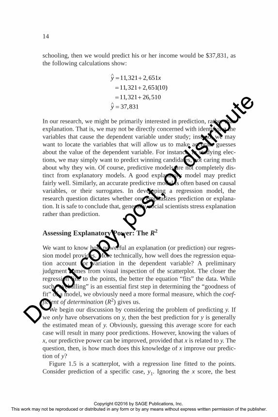
schooling, then we would predict his or her income would be $37,831, as the following calculations show:
y x
y
∧
∧
= += += +=
11 321 2 651
11 321 2 651 10
11 321 26 510
37 831
, ,
, , ( )
, ,
,
In our research, we might be primarily interested in prediction, rather than explanation. That is, we may not be directly concerned with identifying the variables that cause the dependent variable under study; instead, we may want to locate the variables that will allow us to make accurate guesses about the value of the dependent variable. For instance, in studying elec-tions, we may simply want to predict winning candidates, not caring much about why they win. Of course, predictive models are not completely dis-tinct from explanatory models. A good explanatory model may predict fairly well. Similarly, an accurate predictive model is often based on causal variables, or their surrogates. In developing a regression model, the research question dictates whether one emphasizes prediction or explana-tion. It is safe to conclude that, generally, social scientists stress explanation rather than prediction.
Assessing Explanatory Power: The R2
We want to know how powerful an explanation (or prediction) our regres-sion model provides. More technically, how well does the regression equa-tion account for variation in the dependent variable? A preliminary judgment comes from visual inspection of the scatterplot. The closer the regression line to the points, the better the equation “fits” the data. While such “eyeballing” is an essential first step in determining the “goodness of fit” of a model, we obviously need a more formal measure, which the coef-ficient of determination (R2) gives us.
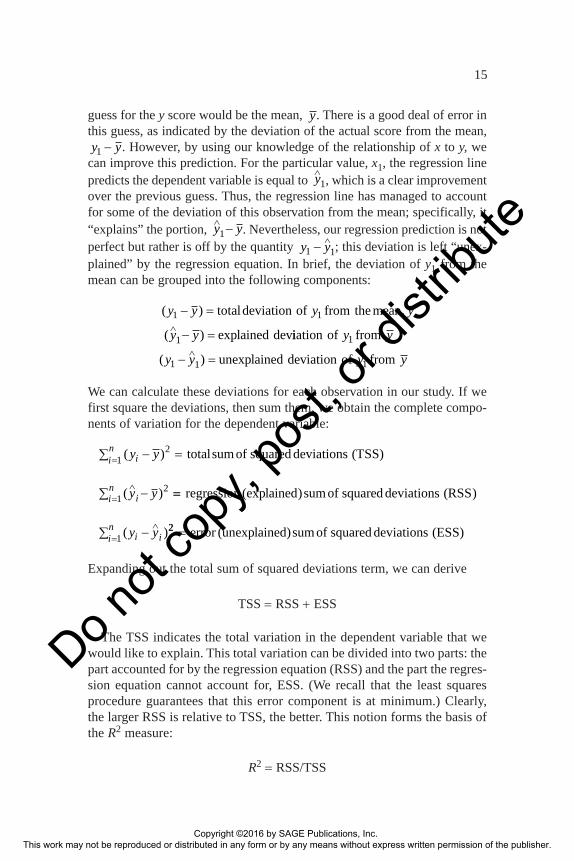
We begin our discussion by considering the problem of predicting y. If we only have observations on y, then the best prediction for y is generally the estimated mean of y. Obviously, guessing this average score for each case will result in many poor predictions. However, knowing the values of x, our predictive power can be improved, provided that x is related to y. The question, then, is how much does this knowledge of x improve our predic-tion of y?
Figure 1.5 is a scatterplot, with a regression line fitted to the points. Consider prediction of a specific case, y1. Ignoring the x score, the best
Copyright ©2016 by SAGE Publications, Inc. This work may not be reproduced or distributed in any form or by any means without express written permission of the publisher.
Do not
copy
, pos
t, or d
istrib
ute
15
guess for the y score would be the mean, y. There is a good deal of error in this guess, as indicated by the deviation of the actual score from the mean, y y1 − . However, by using our knowledge of the relationship of x to y, we
can improve this prediction. For the particular value, x1, the regression line predicts the dependent variable is equal to y
∧1, which is a clear improvement
over the previous guess. Thus, the regression line has managed to account for some of the deviation of this observation from the mean; specifically, it “explains” the portion, y y
∧−1 . Nevertheless, our regression prediction is not
perfect but rather is off by the quantity y y1 1−∧
; this deviation is left “unex-plained” by the regression equation. In brief, the deviation of y1 from the mean can be grouped into the following components:
( ) ,
( ) exp
y y y y
y y
1 1
1
− =
− =∧
totaldeviation from themean
lained dev
of
iiation of from
un lained deviation of from
y y
y y y y
1
1 1 1( ) exp− =∧
We can calculate these deviations for each observation in our study. If we first square the deviations, then sum them, we obtain the complete compo-nents of variation for the dependent variable:
( )
( )
y y
y y
iin
iin
−∑ =
−∑
=
∧=
21
21
totalsumof squared deviations (TSS)
==
−∧
regression lained sumof squared deviations (RSS)(exp )
( )y yi i22
1in=∑ = error (un lained)sumof squared deviations (ESS)exp
Expanding out the total sum of squared deviations term, we can derive
TSS = RSS + ESS
The TSS indicates the total variation in the dependent variable that we would like to explain. This total variation can be divided into two parts: the part accounted for by the regression equation (RSS) and the part the regres-sion equation cannot account for, ESS. (We recall that the least squares procedure guarantees that this error component is at minimum.) Clearly, the larger RSS is relative to TSS, the better. This notion forms the basis of the R2 measure:
R2 = RSS/TSS
Copyright ©2016 by SAGE Publications, Inc. This work may not be reproduced or distributed in any form or by any means without express written permission of the publisher.
Do not
copy
, pos
t, or d
istrib
ute
16
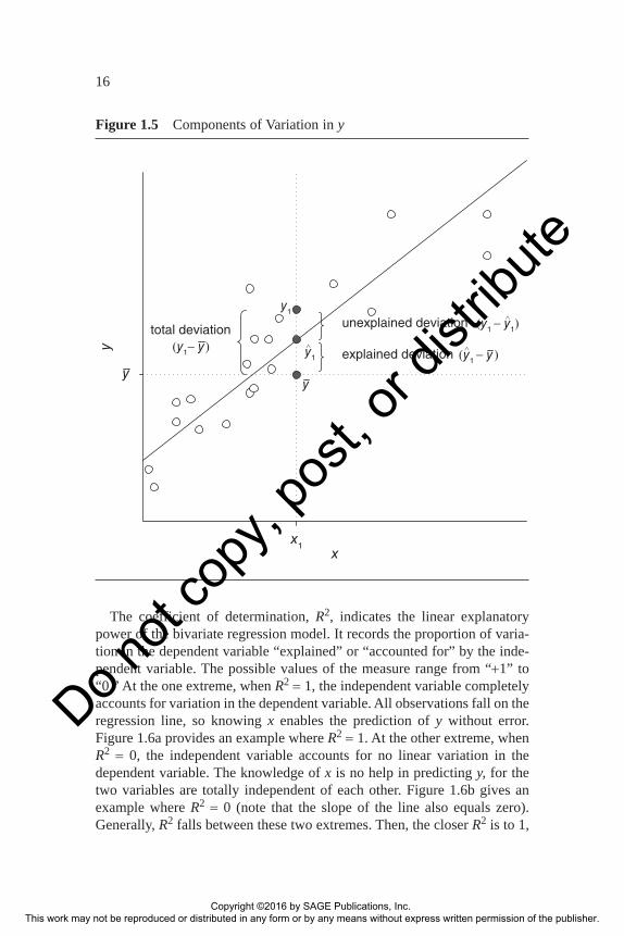
The coefficient of determination, R2, indicates the linear explanatory power of the bivariate regression model. It records the proportion of varia-tion in the dependent variable “explained” or “accounted for” by the inde-pendent variable. The possible values of the measure range from “+1” to “0.” At the one extreme, when R2 = 1, the independent variable completely accounts for variation in the dependent variable. All observations fall on the regression line, so knowing x enables the prediction of y without error. Figure 1.6a provides an example where R2 = 1. At the other extreme, when R2 = 0, the independent variable accounts for no linear variation in the dependent variable. The knowledge of x is no help in predicting y, for the two variables are totally independent of each other. Figure 1.6b gives an example where R2 = 0 (note that the slope of the line also equals zero). Generally, R2 falls between these two extremes. Then, the closer R2 is to 1,
x1
yy
x
y
y1
unexplained deviation
explained deviation
total deviation(y1− y)
(y1 − y )∧
(y1 − y1)∧
y1
∧
Figure 1.5 Components of Variation in y
Copyright ©2016 by SAGE Publications, Inc. This work may not be reproduced or distributed in any form or by any means without express written permission of the publisher.
Do not
copy
, pos
t, or d
istrib
ute
17
R2 = 0
x
y
b.
R2 = 0
x
y
c.
R2 = 1
x
y
a.
Figure 1.6 (a–c) Examples of the Extreme Values of the R2
Copyright ©2016 by SAGE Publications, Inc. This work may not be reproduced or distributed in any form or by any means without express written permission of the publisher.
Do not
copy
, pos
t, or d
istrib
ute
18
the better the fit of the regression line to the points, and the more variation in y is explained by x. In practice, when evaluating a fitted model, what constitutes a good R2 very much depends on the discipline and type of data being analyzed. There is no universal threshold for a meaningful R2 value. In the hard sciences, R2 values above .90 are common, while in the social sciences, an R2 value of .30 could be of note, especially if the data are from public opinion surveys. In our Riverview example, R2 = .62. Thus, we could say that education, the independent variable, accounts for an esti-mated 62% of the variation in income, the dependent variable.
In regression analysis, we are virtually always pleased when the R2 is high, because it indicates we are accounting for a large portion of the variation in the phenomenon under study. Furthermore, a very high R2 (say about .9) is almost essential if our predictions are to be accurate. (In prac-tice, it is difficult to attain an R2 of this magnitude. Thus, quantitative social scientists are generally cautious in making predictions.) However, a sizable R2 does not necessarily mean we have a causal explanation for the depen-dent variable; instead, we may have provided merely a statistical explana-tion. In the Riverview case, suppose we regressed current income, y, on income of the previous year, yt-1. Our revised equation would be as follows:
y = b0 + b1yt−1 + e
The R2 for this new equation could be quite large (above .9), but it would not really tell us what causes income to vary; rather, it offers merely a track-ing, a statistical explanation. The original equation, where education was the independent variable, provides a more convincing causal explanation of income variation, despite the lower R2
of .62.Even if estimation yields an R2 that is rather small (say below .2), disappoint-
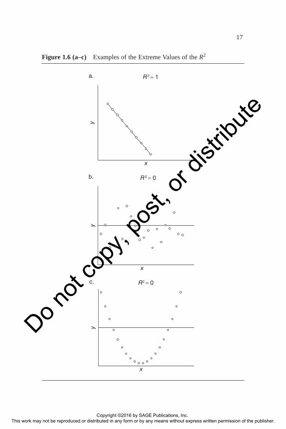
ment need not be inevitable, for it can be informative. It may suggest that the linear assumption of the R2 is incorrect. If we turn to the scatterplot, we might discover that x and y actually have a close relationship, but it is nonlinear. For instance, the curve (a parabola) formed by connecting the points in Figure 1.6c illustrates a perfect relationship between x and y (e.g., y = x2), but R2 = 0. Suppose, however, that we rule out nonlinearity. Then, a low R2 can still reveal that x does help explain y but contributes a rather small amount to that explana-tion. Finally, of course, an extremely low R2 (near 0) offers very useful information, for it implies that y has virtually no linear dependency on x.
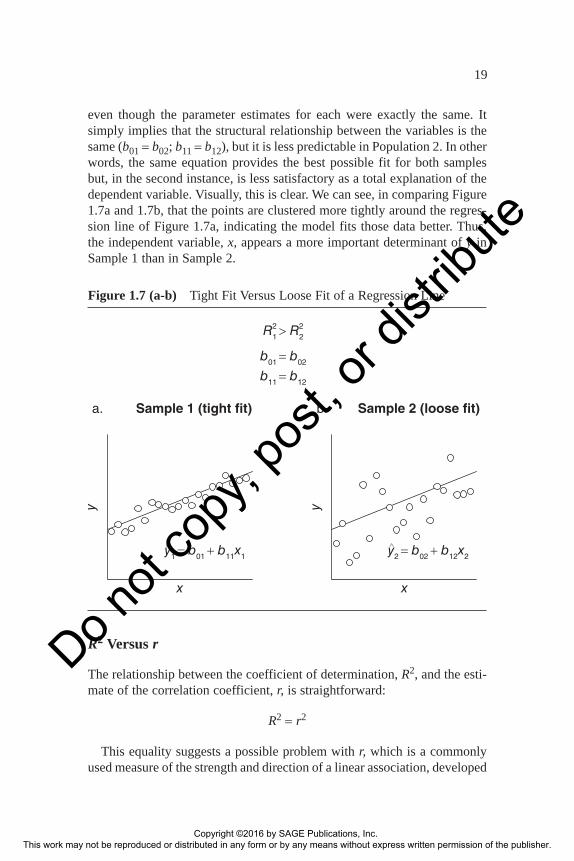
A final point on the interpretation of R2 deserves mention. Suppose we estimate the same bivariate regression model for two samples from differ-ent populations, labeled 1 and 2. (For example, we wish to compare the income-education model from Riverview with the income-education model from Flatburg.) The R2 for Sample 1 could differ from the R2 for Sample 2,
Copyright ©2016 by SAGE Publications, Inc. This work may not be reproduced or distributed in any form or by any means without express written permission of the publisher.
Do not
copy
, pos
t, or d
istrib
ute
19
even though the parameter estimates for each were exactly the same. It simply implies that the structural relationship between the variables is the same (b01 = b02; b11 = b12), but it is less predictable in Population 2. In other words, the same equation provides the best possible fit for both samples but, in the second instance, is less satisfactory as a total explanation of the dependent variable. Visually, this is clear. We can see, in comparing Figure 1.7a and 1.7b, that the points are clustered more tightly around the regres-sion line of Figure 1.7a, indicating the model fits those data better. Thus, the independent variable, x, appears a more important determinant of y in Sample 1 than in Sample 2.
Sample 1 (tight fit)
x
y
a. Sample 2 (loose fit)
x
y
b.
R1 > R2
b01 = b02
b11 = b12
y1 = b01 + b11x1
∧y2 = b02 + b12x2
∧
2 2
Figure 1.7 (a-b) Tight Fit Versus Loose Fit of a Regression Line
R2 Versus r
The relationship between the coefficient of determination, R2, and the esti-mate of the correlation coefficient, r, is straightforward:
R2 = r2
This equality suggests a possible problem with r, which is a commonly used measure of the strength and direction of a linear association, developed
Copyright ©2016 by SAGE Publications, Inc. This work may not be reproduced or distributed in any form or by any means without express written permission of the publisher.
Do not
copy
, pos
t, or d
istrib
ute
20
by Karl Pearson.4 That is, r can inflate the importance of the relationship between x and y. For instance, a correlation of .5 implies to the unwary reader that one half of y is being explained by x, since a perfect correlation is 1.0. Actually, though, we know that the r = .5 means that x explains only 25% of the variation in y (because r2 = .25), which leaves fully three fourths of the variation in y unaccounted for. (The r will equal the R2 only at the extremes, when r = ± 1 or 0.) By relying on r rather than R2, the impact of x on y can be made to seem much greater than it is. Hence, to assess the strength of the relationship between the independent variable and the dependent variable, the R2 is the preferred measure.
Last, it should be noted there is a connection between r and the slope coefficient, b1, in the bivariate regression setting. We can estimate the slope from the correlation coefficient between x and y using the alterna-tive formula
b rs
sxyy
x1 =
Note that the correlation coefficient is standardized, with a range of ±1 (perfect negative, or positive, linear association between x and y). Also, if we first standardize x and y, the correlation coefficient will equal the slope.5 For instance if rxy = −.30, we can say a one-unit standard deviation increase in x will on average be associated with a –.30 standard deviation decrease for y. We are often interested, though, in making interpretations on the scale of the original data. Multiplying rxy by the ratio of the standard deviation of y over the standard deviation of x will return to us the raw unstandardized coefficient, b1, that we get from OLS.
Notes
1. x , read x-bar, is an estimate of the sample mean, xx
nii
n
= ∑ =1
2. Statistical tests for making inferences from a sample to a population, such as the significance test, are based on a simple random sample (SRS). In our Riverview example, we could select a sample of 32 by using a random-number generator where the probability of selection is the same for all 320 employees. Practically speaking, we might apply the Systematic Selection Procedure, which simply means selecting the sample randomly from a list. This generally works well, barring a random start that taps into a relevant cycle (e.g., every tenth person is a manager).
3. Recall from high school algebra that slope is also defined as bRise y
Run x1 =( )
( )
∆∆
Copyright ©2016 by SAGE Publications, Inc. This work may not be reproduced or distributed in any form or by any means without express written permission of the publisher.
Do not
copy
, pos
t, or d
istrib
ute
21
4. See especially his seminal papers that came out in the early 1900s, in Biometrica (e.g., Pearson, 1913). One formula for the sample correlation coefficient between x and y is
r s s sxy xy x y= /
where
sx x y y
nxy xyii
ni= = ∑
− −−
=covariance( )( )1
1
and
s s dard deviationx x
nx xii
n
= = ∑ −−
=tan( )1
2
1
s s dard deviationy y
ny yii
n
= = ∑ −−
=tan( )1
2
1
5. A standardized variable (also known as a z-score) is computed by subtracting the mean from each observation and dividing by the variable’s standard deviation.
For a sample, zx x
sii
x
=−
Copyright ©2016 by SAGE Publications, Inc. This work may not be reproduced or distributed in any form or by any means without express written permission of the publisher.
Do not
copy
, pos
t, or d
istrib
ute

Copyright ©2016 by SAGE Publications, Inc. This work may not be reproduced or distributed in any form or by any means without express written permission of the publisher.
Do not
copy
, pos
t, or d
istrib
ute