designing for complexity by nadine schaeffer
DESCRIPTION
Simplicity is a frequent mantra for designers and a worthy goal. We all have been told, just make it simple; make it like Apple. But life, well, life is infinitely complicated, and sometimes software becomes quite complex as well. So what does a well-intentioned designer do when faced with the challenges of designing for a complex system? That is the focus of this slideshare.TRANSCRIPT

Designing for Complexity
Nadine Schaeffer Principal, Cloudforest Design
1Sunday, March 25, 12Simplicity is a frequent mantra for designers and a worthy goal. Who here has said or been told, Just make it simple; make it like Apple. A show of hands please!
But life, well, life is infinitely complicated, and sometimes software becomes quite complex as well. So what does a well-intentioned designer do when faced with the challenges of designing for a complex system? That is the focus of my talk today.
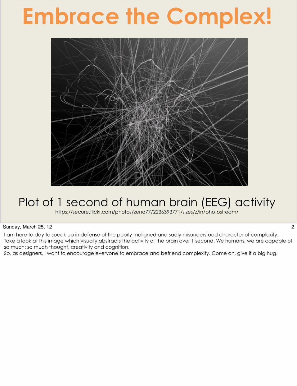
Embrace the Complex!
Plot of 1 second of human brain (EEG) activityhttps://secure.flickr.com/photos/zeno77/2236393771/sizes/z/in/photostream/
2Sunday, March 25, 12I am here to day to speak up in defense of the poorly maligned and sadly misunderstood character of complexity. Take a look at this image which visually abstracts the activity of the brain over 1 second. We humans, we are capable of so much; so much thought, creativity and cognition. So, as designers, I want to encourage everyone to embrace and befriend complexity. Come on, give it a big hug.

A little bit about your humble speaker today:
#DesignForComplexity
3Sunday, March 25, 12Now, who am I to preach to you to embrace the great love of complexity? My name is Nadine Schaeffer, and I am one of the owners of a small UX agency called Cloudforest Design (here is my 1 second pitch – we’re awesome. Hire us for your next design project). Over the past 15 years, I have worked on many a complex piece of software for Oracle, Yahoo!,, Fiserv, Citrix, Apple and many more.
Designing for Complexity
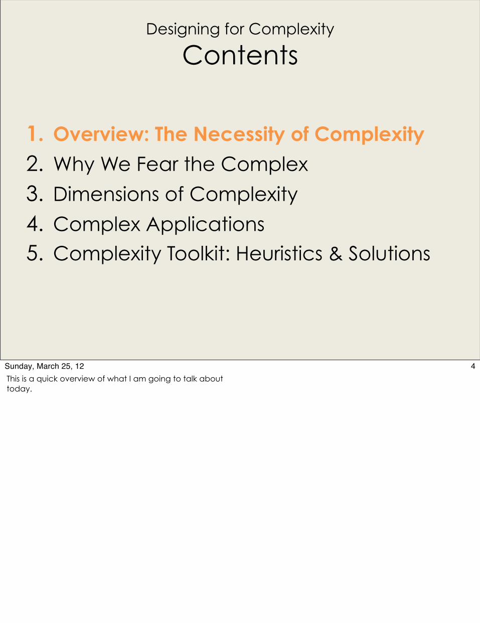
Contents
1. Overview: The Necessity of Complexity
2. Why We Fear the Complex
3. Dimensions of Complexity
4. Complex Applications 5. Complexity Toolkit: Heuristics & Solutions
4Sunday, March 25, 12This is a quick overview of what I am going to talk about today.
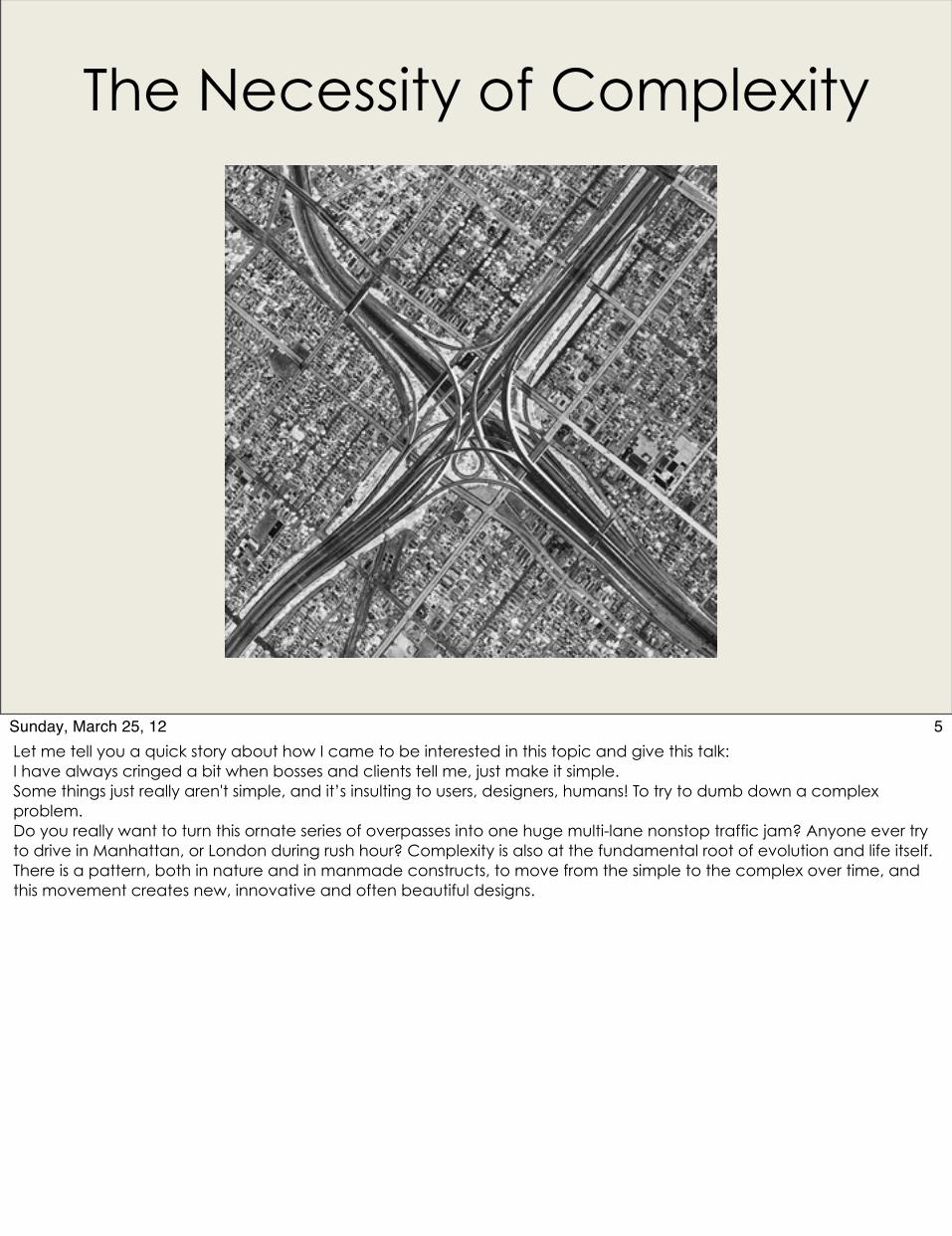
The Necessity of Complexity
5Sunday, March 25, 12Let me tell you a quick story about how I came to be interested in this topic and give this talk: I have always cringed a bit when bosses and clients tell me, just make it simple.Some things just really aren't simple, and it’s insulting to users, designers, humans! To try to dumb down a complex problem. Do you really want to turn this ornate series of overpasses into one huge multi-lane nonstop traffic jam? Anyone ever try to drive in Manhattan, or London during rush hour? Complexity is also at the fundamental root of evolution and life itself. There is a pattern, both in nature and in manmade constructs, to move from the simple to the complex over time, and this movement creates new, innovative and often beautiful designs.

From Novice to Master
https://secure.flickr.com/photos/msimdottv/4339697089/sizes/z/in/photostream/
6Sunday, March 25, 12I would like to suggest this is an appropriate time to shift the overriding design principle in play from “simple” to “efficient”, or even, “adept”. Instead of trying to hide or downplay the complexity of a system, instead, navigate users through the system with frictionless ease towards deep mastery. This is a picture of the space shuttle Endeavor. Humans – we are awesome. We have sent rockets to the moon, built particle accelerators, created an understanding of the deep and wide universe around us. To think that we need simplicity is disingenuous and even insulting. But no engineer was born with the skills to build a rocket at birth. Instead, most of our great minds participate in some system of learning to help them grow in knowledge and skills from novice to master over time. Our software should strive to do the same – to guide people to mastery.

Designing for the Flow
https://secure.flickr.com/photos/chadpodoski/6485538093/sizes/z/in/photostream/
7Sunday, March 25, 12Doing easy things is fun, for sure, but successfully mastering and accomplishing difficult tasks is even more rewarding. What we really want is to get people into the flow state. Look at these surfers. I have tried to surf. It’s really hard! Unless you are a pro, a master (not a novice), in which case, you are in the flow and make it look easy.What is flow?Flow is the mental state of operation in which a person in an activity is fully immersed in a feeling of energized focus, full involvement, and success in the process of the activity. Proposed by Mihály Csíkszentmihályi, the positive psychology concept has been widely referenced across a variety of fields.[1]According to Csíkszentmihályi, flow is completely focused motivation. It is a single-minded immersion and represents perhaps the ultimate in harnessing the emotions in the service of performing and learning. In flow, the emotions are not just contained and channeled, but positive, energized, and aligned with the task at hand.
Simple or Complex?
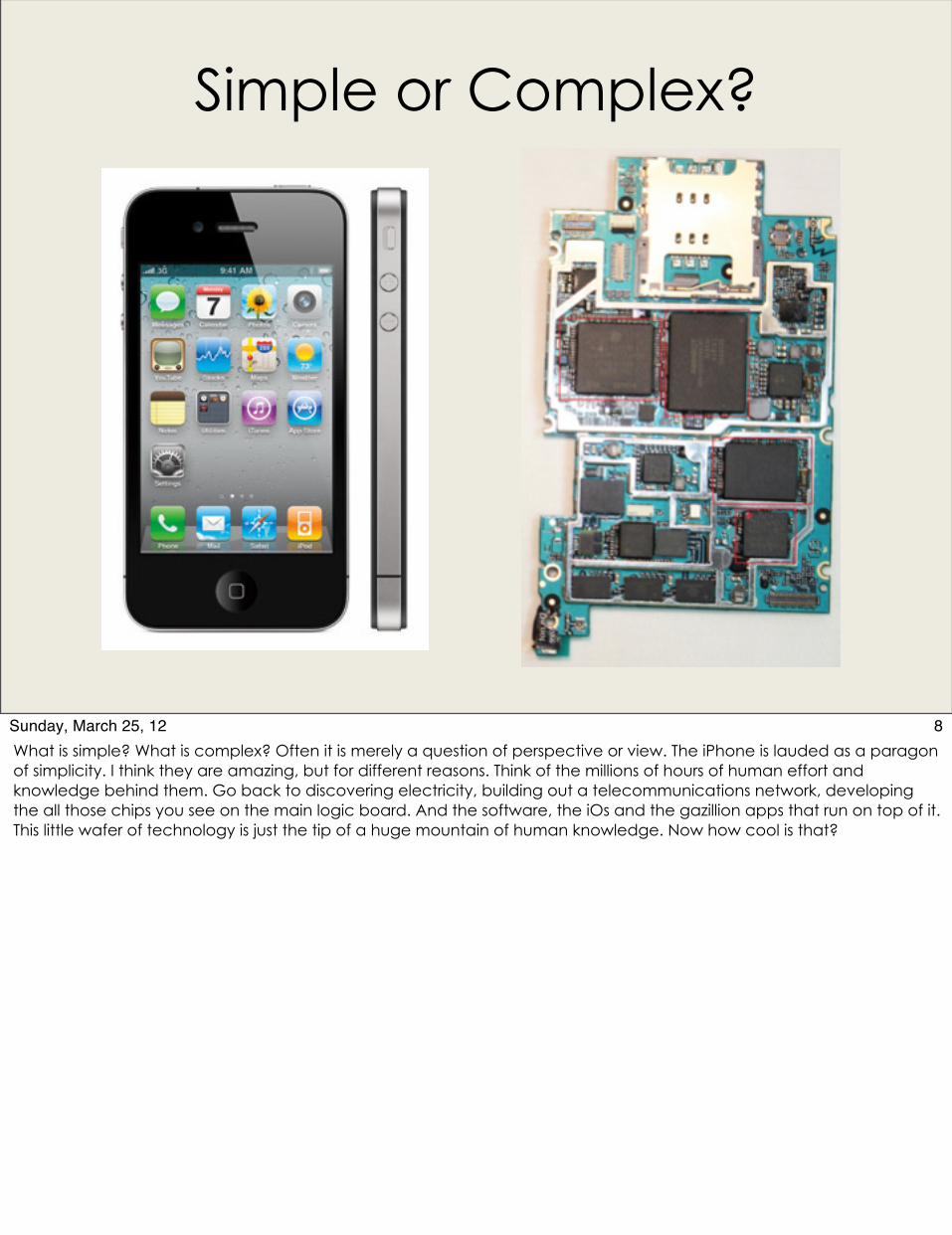
8Sunday, March 25, 12What is simple? What is complex? Often it is merely a question of perspective or view. The iPhone is lauded as a paragon of simplicity. I think they are amazing, but for different reasons. Think of the millions of hours of human effort and knowledge behind them. Go back to discovering electricity, building out a telecommunications network, developing the all those chips you see on the main logic board. And the software, the iOs and the gazillion apps that run on top of it. This little wafer of technology is just the tip of a huge mountain of human knowledge. Now how cool is that?

Complexity is everywhere …
https://secure.flickr.com/photos/cloudforest/381332588/sizes/z/in/photostream/
9Sunday, March 25, 12Any time you look around nature, the pattern of ripples in a river, the colors of the sunset, the growth patterns of trees, you see complexity. This is a very nice Fibonacci spiral pattern that I saw in a little house plant potted in a neighbor’s garden.
And it is beautiful!
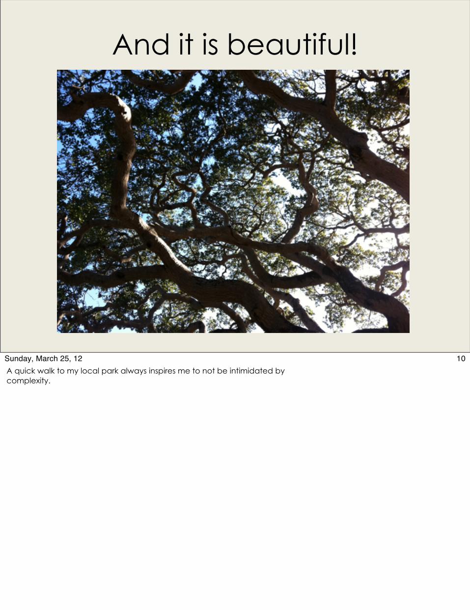
10Sunday, March 25, 12A quick walk to my local park always inspires me to not be intimidated by complexity.
Designing for Complexity
Contents
1. Overview: The Necessity of Complexity
2. Why We Fear the Complex
3. Dimensions of Complexity
4. Complex Applications 5. Complexity Toolkit: Heuristics & Solutions
11Sunday, March 25, 12
Cognitive Load
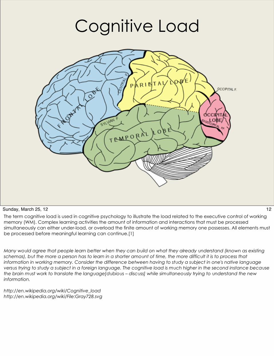
12Sunday, March 25, 12The term cognitive load is used in cognitive psychology to illustrate the load related to the executive control of working memory (WM). Complex learning activities the amount of information and interactions that must be processed simultaneously can either under-load, or overload the finite amount of working memory one possesses. All elements must be processed before meaningful learning can continue.[1]
Many would agree that people learn better when they can build on what they already understand (known as existing schemas), but the more a person has to learn in a shorter amount of time, the more difficult it is to process that information in working memory. Consider the difference between having to study a subject in one's native language versus trying to study a subject in a foreign language. The cognitive load is much higher in the second instance because the brain must work to translate the language[dubious – discuss] while simultaneously trying to understand the new information.
http://en.wikipedia.org/wiki/Cognitive_loadhttp://en.wikipedia.org/wiki/File:Gray728.svg

Complex or Chaotic?
From National Geographic via http://japandisaster11.blogspot.com/2011/05/wave-of-destruction-of-tsunami-in.html
13Sunday, March 25, 12This is a personal theory, but I believe we also fear the complex because it is so very very close to the chaotic, especially when we do not understand or have tools to understand the dimensions and facets of complexity. The picture above is from the aftermath of the tsunami in Japan last year. What was an orderly Japanese village has been transformed almost instantly into a jumbled tangle of chaos. There is good reason to fear this! And I think instinctively, when we observe the complex without the right tools or lenses, it can easily just look like chaos. Anyone who has gotten lost in amid badly designed application navigation with the back button disabled knows exactly what I mean.
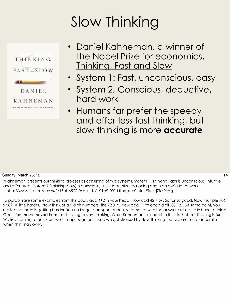
Slow Thinking
• Daniel Kahneman, a winner of the Nobel Prize for economics, Thinking, Fast and Slow
• System 1: Fast, unconscious, easy• System 2, Conscious, deductive,
hard work• Humans far prefer the speedy
and effortless fast thinking, but slow thinking is more accurate
14Sunday, March 25, 12“Kahneman presents our thinking process as consisting of two systems. System 1 (Thinking Fast) is unconscious, intuitive and effort-free. System 2 (Thinking Slow) is conscious, uses deductive reasoning and is an awful lot of work. - http://www.ft.com/cms/s/2/15bb6522-04ac-11e1-91d9-00144feabdc0.html#ixzz1jZfMPkVg
To paraphrase some examples from this book, add 4+2 in your head. Now add 42 + 64. So far so good. Now multiple 706 x 589. A little harder. Now think of a 5 digit numbers, like 72,019. Now add +1 to each digit. 83,120. At some point, you realize the math is getting harder. You no longer can spontaneously come up with the answer but actually have to think! Ouch! You have moved from fast thinking to slow thinking. What Kahneman’s research tells us is that fast thinking is fun. We like coming to quick answers, snap judgments. And we get stressed by slow thinking, but we are more accurate when thinking slowly.
Designing for Complexity
Contents
1. Overview: The Necessity of Complexity
2. Why We Fear the Complex
3. Dimensions of Complexity
4. Complex Applications 5. Complexity Toolkit: Heuristics & Solutions
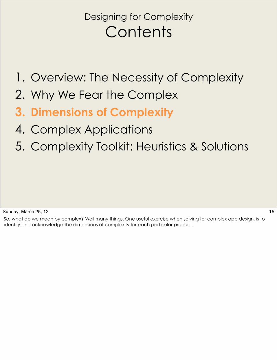
15Sunday, March 25, 12So, what do we mean by complex? Well many things. One useful exercise when solving for complex app design, is to identify and acknowledge the dimensions of complexity for each particular product.
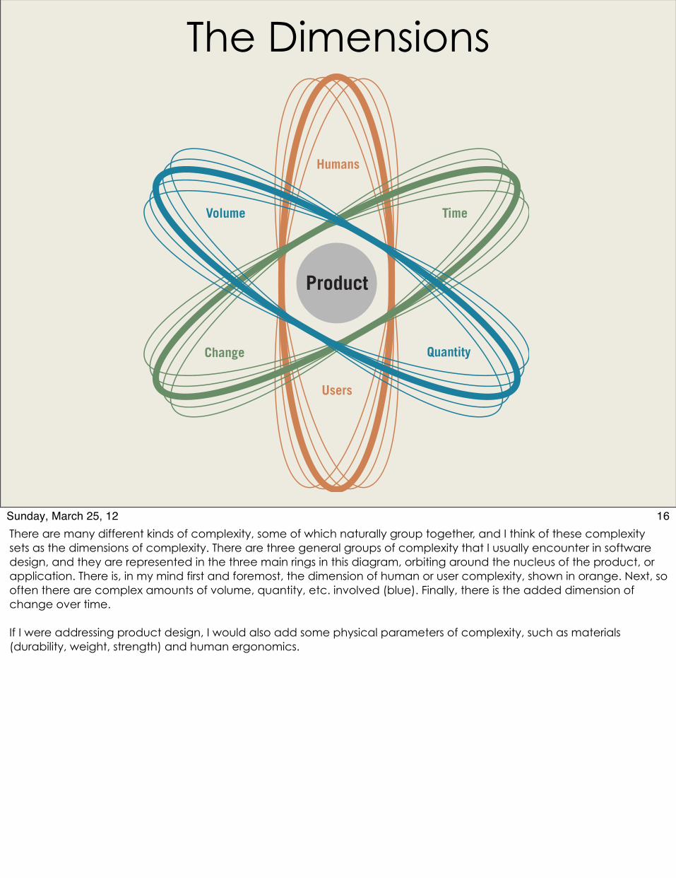
The Dimensions
Product
Humans
Time
Change
Volume
Users
Quantity
16Sunday, March 25, 12There are many different kinds of complexity, some of which naturally group together, and I think of these complexity sets as the dimensions of complexity. There are three general groups of complexity that I usually encounter in software design, and they are represented in the three main rings in this diagram, orbiting around the nucleus of the product, or application. There is, in my mind first and foremost, the dimension of human or user complexity, shown in orange. Next, so often there are complex amounts of volume, quantity, etc. involved (blue). Finally, there is the added dimension of change over time.
If I were addressing product design, I would also add some physical parameters of complexity, such as materials (durability, weight, strength) and human ergonomics.
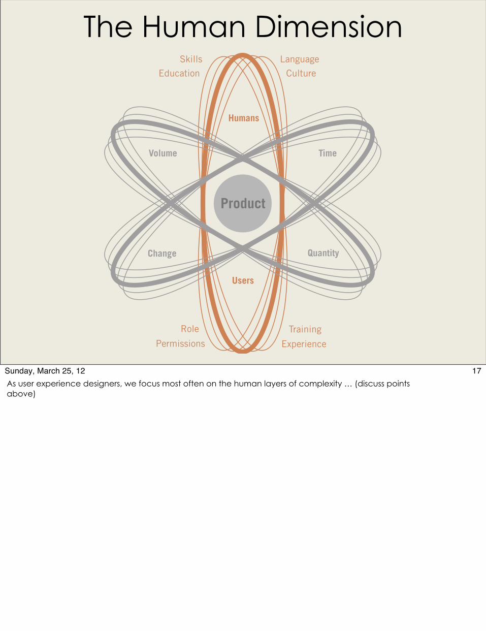
The Human Dimension
Product
Humans
Time
Change
Volume
Users
Quantity
SkillsEducation
Role
PermissionsTraining
Experience
LanguageCulture
17Sunday, March 25, 12As user experience designers, we focus most often on the human layers of complexity … (discuss points above)

The Human Dimension
http://www.flickr.com/photos/ausnahmezustand/4752989186/sizes/z/in/photostream/http://www.flickr.com/photos/yourdon/3386629036/sizes/l/
18Sunday, March 25, 12Remember - Humans are illogical in predictable ways. Emotions of compassion, belonging, helping others but also competition and game play can motivate us through difficult situations.
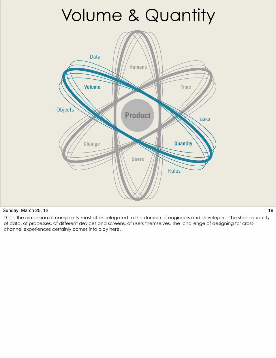
Volume & Quantity
Product
Humans
Time
Change
Volume
Users
Quantity
Data
Objects
Tasks
Rules
19Sunday, March 25, 12This is the dimension of complexity most often relegated to the domain of engineers and developers. The sheer quantity of data, of processes, of different devices and screens, of users themselves. The challenge of designing for cross-channel experiences certainly comes into play here.
Volume & Quantity
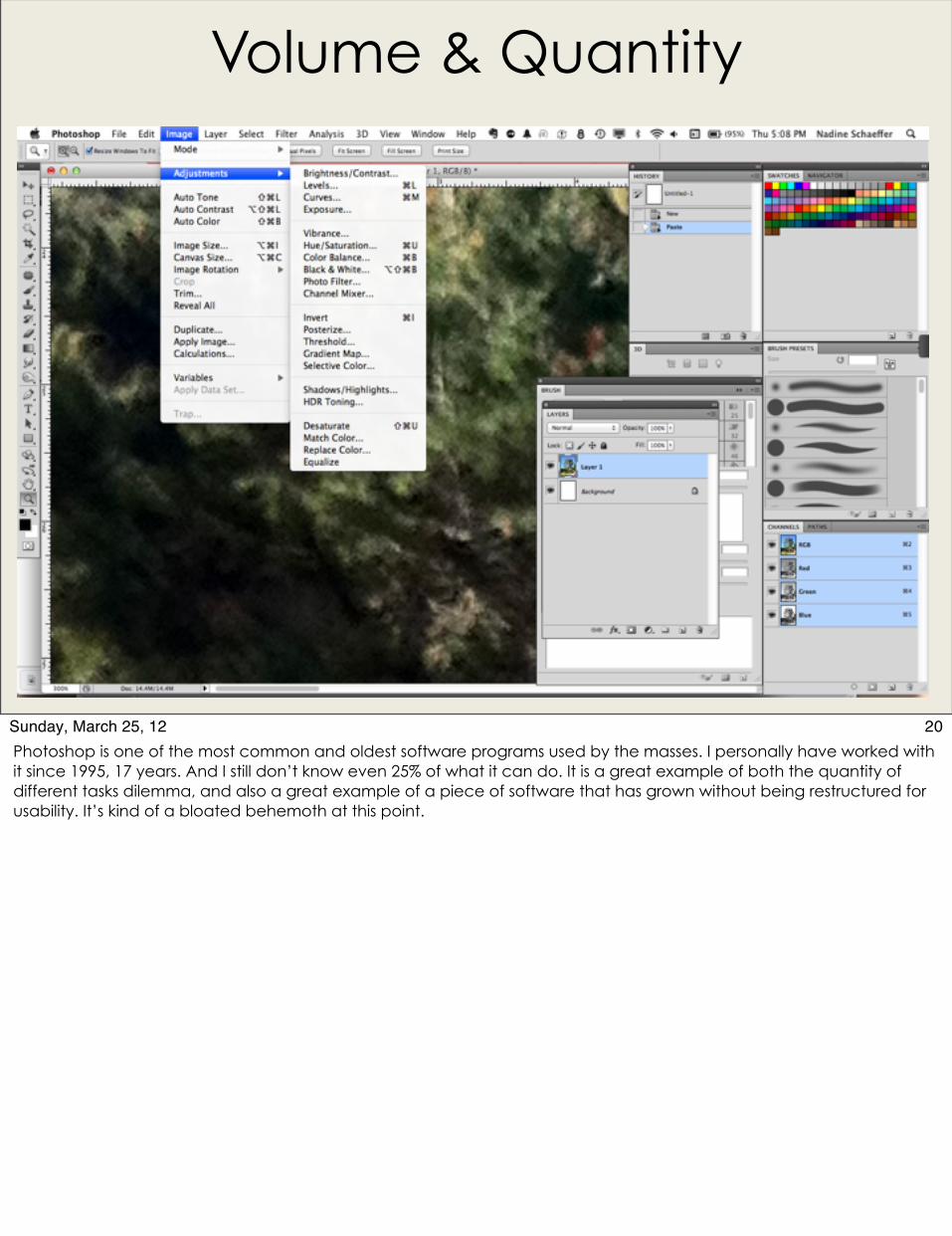
20Sunday, March 25, 12Photoshop is one of the most common and oldest software programs used by the masses. I personally have worked with it since 1995, 17 years. And I still don’t know even 25% of what it can do. It is a great example of both the quantity of different tasks dilemma, and also a great example of a piece of software that has grown without being restructured for usability. It’s kind of a bloated behemoth at this point.
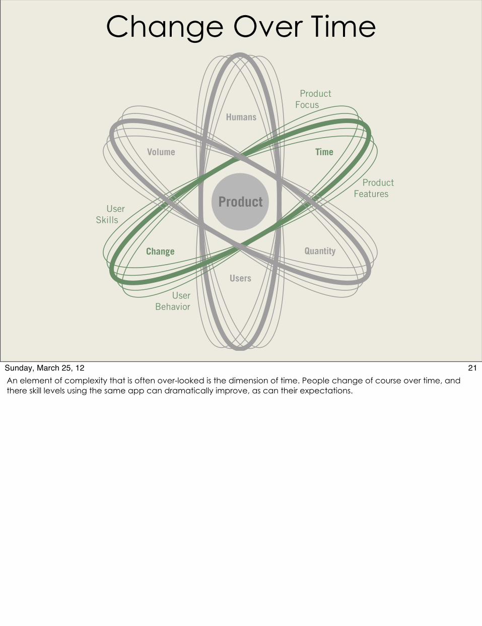
Change Over Time
Product
Humans
Time
Change
Volume
Users
Quantity
UserSkills
UserBehavior
ProductFocus
Product Features
21Sunday, March 25, 12An element of complexity that is often over-looked is the dimension of time. People change of course over time, and there skill levels using the same app can dramatically improve, as can their expectations.
Change Over Time
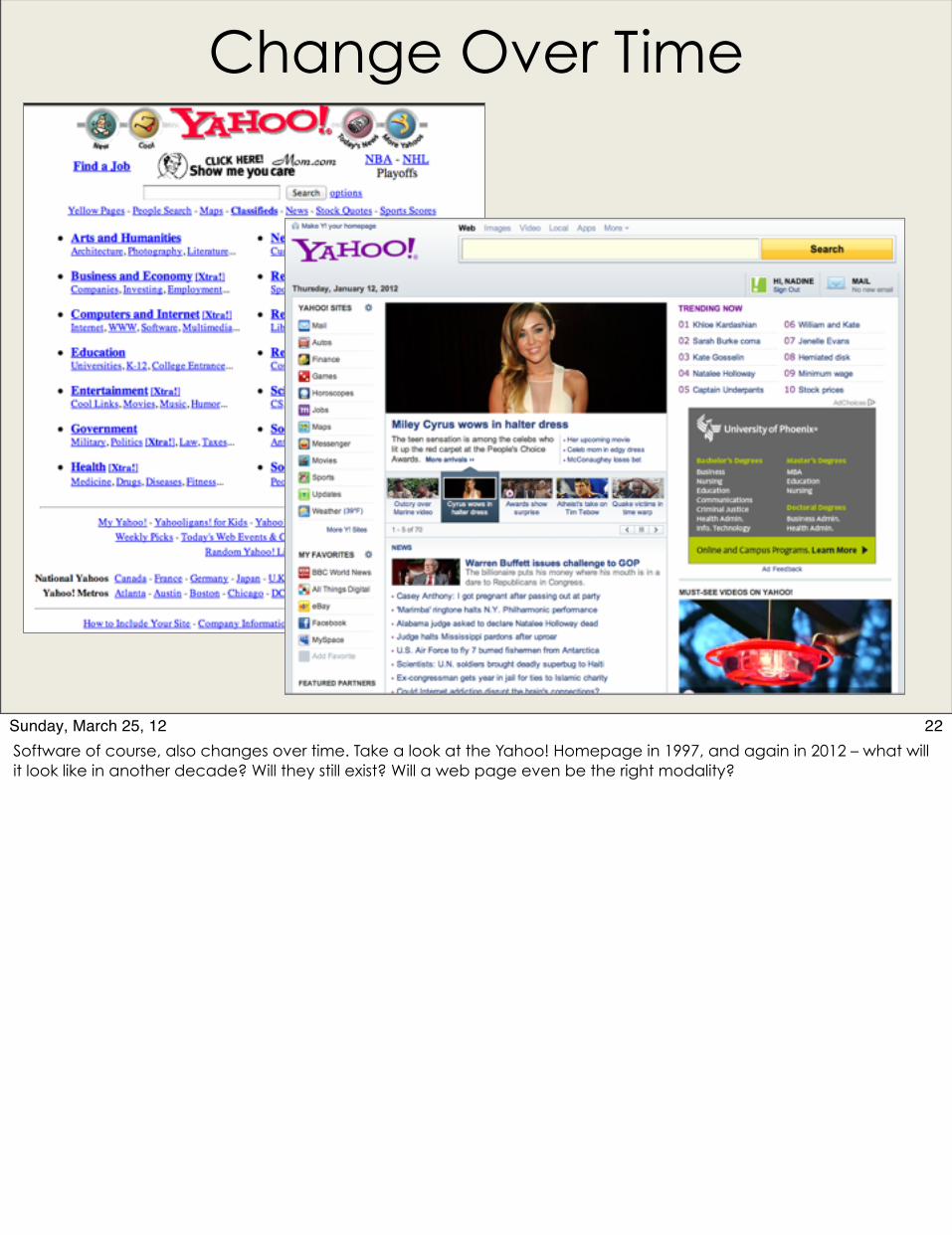
22Sunday, March 25, 12Software of course, also changes over time. Take a look at the Yahoo! Homepage in 1997, and again in 2012 – what will it look like in another decade? Will they still exist? Will a web page even be the right modality?
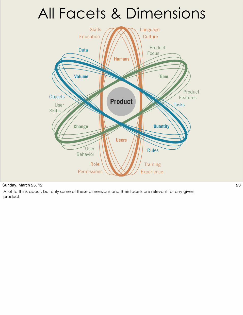
All Facets & Dimensions
Product
Humans
Time
Change
Volume
Users
Quantity
SkillsEducation
Role
PermissionsTraining
Experience
LanguageCulture
UserSkills
UserBehavior
ProductFocus
Product Features
Data
Objects
Tasks
Rules
23Sunday, March 25, 12A lot to think about, but only some of these dimensions and their facets are relevant for any given product.
Designing for Complexity
Contents
1. Overview: The Necessity of Complexity
2. Why We Fear the Complex
3. Dimensions of Complexity
4. Complex Applications 5. Complexity Toolkit: Heuristics & Soutions
24Sunday, March 25, 12Let’s quickly look at some common types of complex apps.
Logistics
http://www.flickr.com/photos/digitalcolony/2754626790/sizes/z/in/photostream/
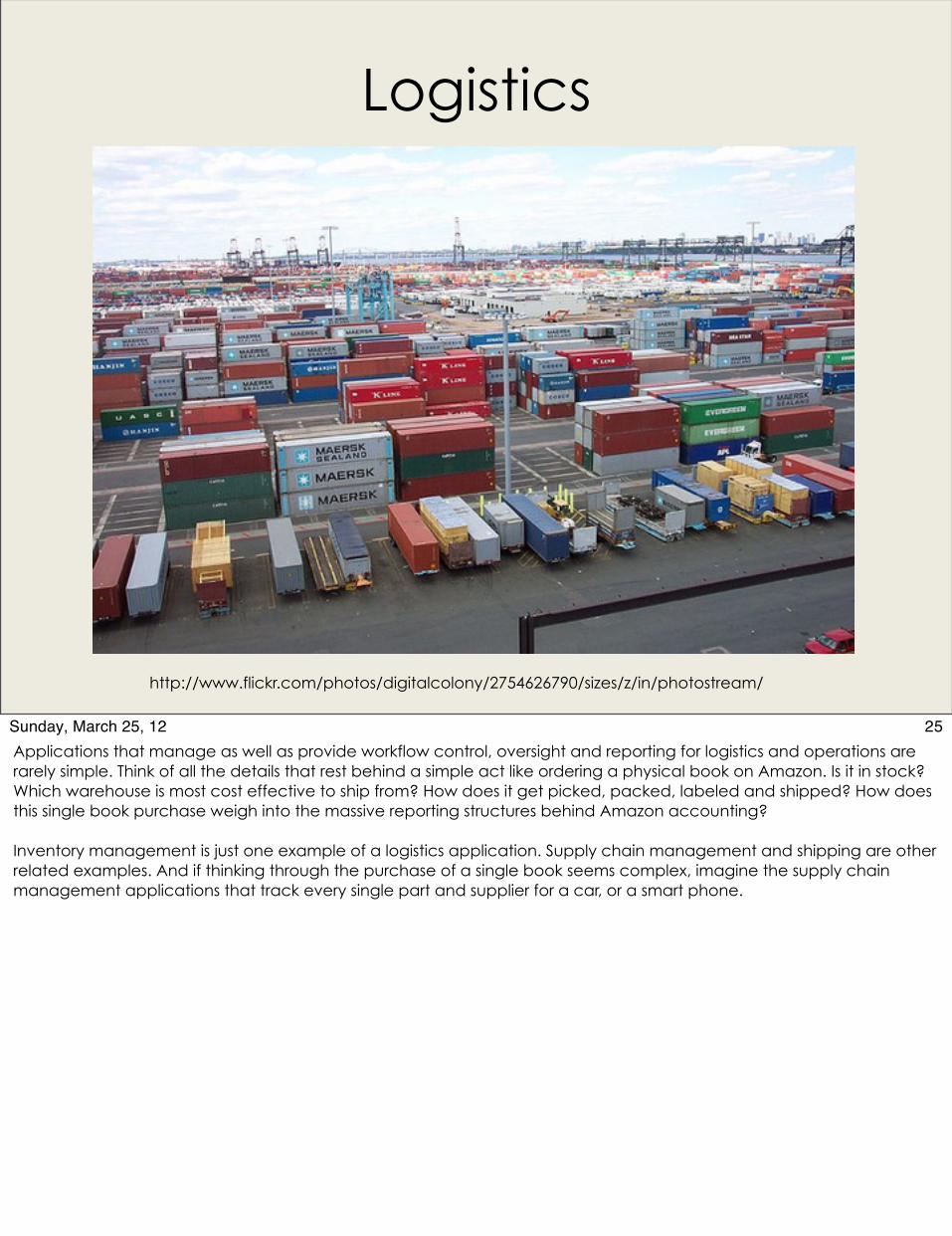
25Sunday, March 25, 12Applications that manage as well as provide workflow control, oversight and reporting for logistics and operations are rarely simple. Think of all the details that rest behind a simple act like ordering a physical book on Amazon. Is it in stock? Which warehouse is most cost effective to ship from? How does it get picked, packed, labeled and shipped? How does this single book purchase weigh into the massive reporting structures behind Amazon accounting?
Inventory management is just one example of a logistics application. Supply chain management and shipping are other related examples. And if thinking through the purchase of a single book seems complex, imagine the supply chain management applications that track every single part and supplier for a car, or a smart phone.

Remote Monitoring
26Sunday, March 25, 12Software to oversee, monitor, maintain and control complex systems from afar are another seriously intricate and involved design challenge. Examples of this type of application would be the infamous systems used for air traffic control as well as train and subway control. I have never seen the software that manages the New York subway system, but it is easy to imagine its detailed demands as well as the possibly life imperiling consequences of thoughtless design choices
Database Management
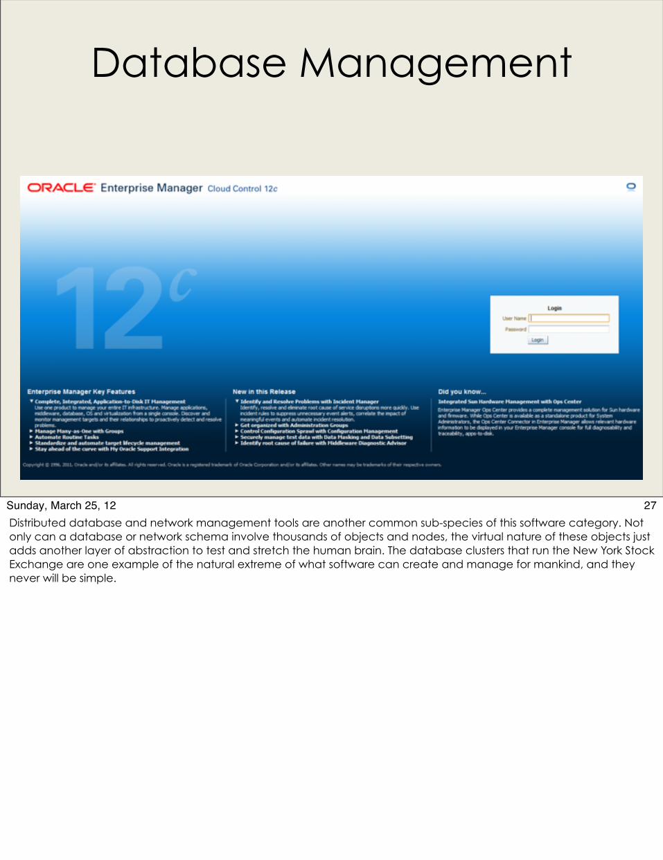
27Sunday, March 25, 12Distributed database and network management tools are another common sub-species of this software category. Not only can a database or network schema involve thousands of objects and nodes, the virtual nature of these objects just adds another layer of abstraction to test and stretch the human brain. The database clusters that run the New York Stock Exchange are one example of the natural extreme of what software can create and manage for mankind, and they never will be simple.
Accounting, Analytics & Finance
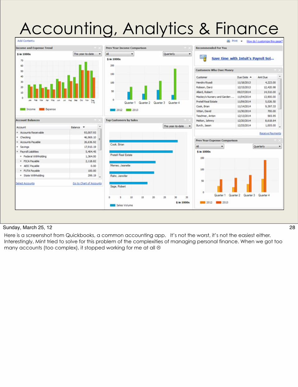
28Sunday, March 25, 12Here is a screenshot from Quickbooks, a common accounting app. It’s not the worst, it’s not the easiest either. Interestingly, Mint tried to solve for this problem of the complexities of managing personal finance. When we got too many accounts (too complex), it stopped working for me at all
Makerly Applications 3d modeling, engineering, complex graphics and video editing
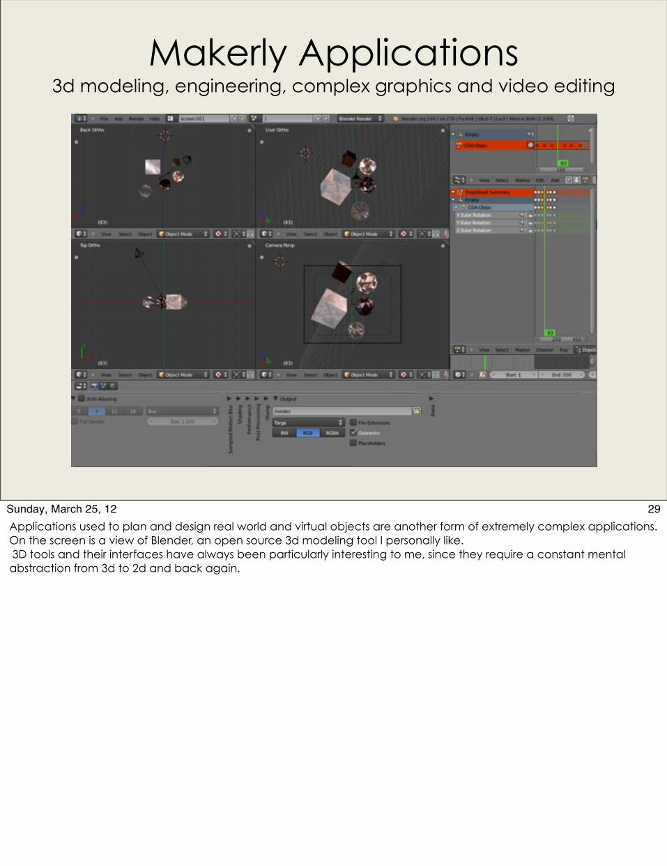
29Sunday, March 25, 12Applications used to plan and design real world and virtual objects are another form of extremely complex applications. On the screen is a view of Blender, an open source 3d modeling tool I personally like. 3D tools and their interfaces have always been particularly interesting to me, since they require a constant mental abstraction from 3d to 2d and back again.
Designing for Complexity
Contents
1. Overview: The Necessity of Complexity2. Why We Fear the Complex3. Dimensions of Complexity4. Complex Applications 5. Complexity Toolkit: Heuristics & Solutions
30Sunday, March 25, 12And finally, the moment you have been waiting for – some common and easy to use design techniques for complex problems.

Prioritize Tasks
WEIGHTING * RANKING * SEGMENTATION * GROUPING
1.2.3
PRIORITIZE PATTERNS DATAVIS ROLES REVEAL ZOOM SOCIALLEARN NO UI
31Sunday, March 25, 12Most enterprise software packages can do hundreds or even thousands of tasks, but not all of theses tasks are equally important or frequent. Therefore, going through an exercise to prioritize use cases can be extremely helpful. Once a designer knows what tasks are most common versus least common, it is far easier to make UI prioritization decisions such as choosing what actions are triggered by big buttons instead of small text links, or what items are in the main navigation versus secondary or tertiary navigation.
This exercise is known as weighting. Weighting allows the human brain to easily identify the most important controls in an application easily. Un-weighted applications can be visually overwhelming, whereas weighting and prioritization guide users to their most common destinations effortlessly.
Segmentation is another corollary to weighting. By grouping tasks around a common theme or object, users will naturally seek and find related controls. Logical groupings can be around objects, or around common workflows. For example, users, groups, roles and permissions are almost always grouped together.• Group controls around a common theme, workflow• Example: Users, groups, permissions• Example: heating, cooling, a/v in a car dashboard
Of course, weighting and segmentation do nothing to help manage complexity if they aren’t approached from the perspective of the personas representing your heaviest users. If you weight your tasks according to the feature bullet points on your product’s sales presentations, or segment tasks according to your organization’s org chart, users will feel the functionality they rely on to do their jobs has been buried.
Use Patterns & Consistency
1.2.3
PRIORITIZE PATTERNS DATAVIS ROLES REVEAL ZOOM SOCIALLEARN NO UI
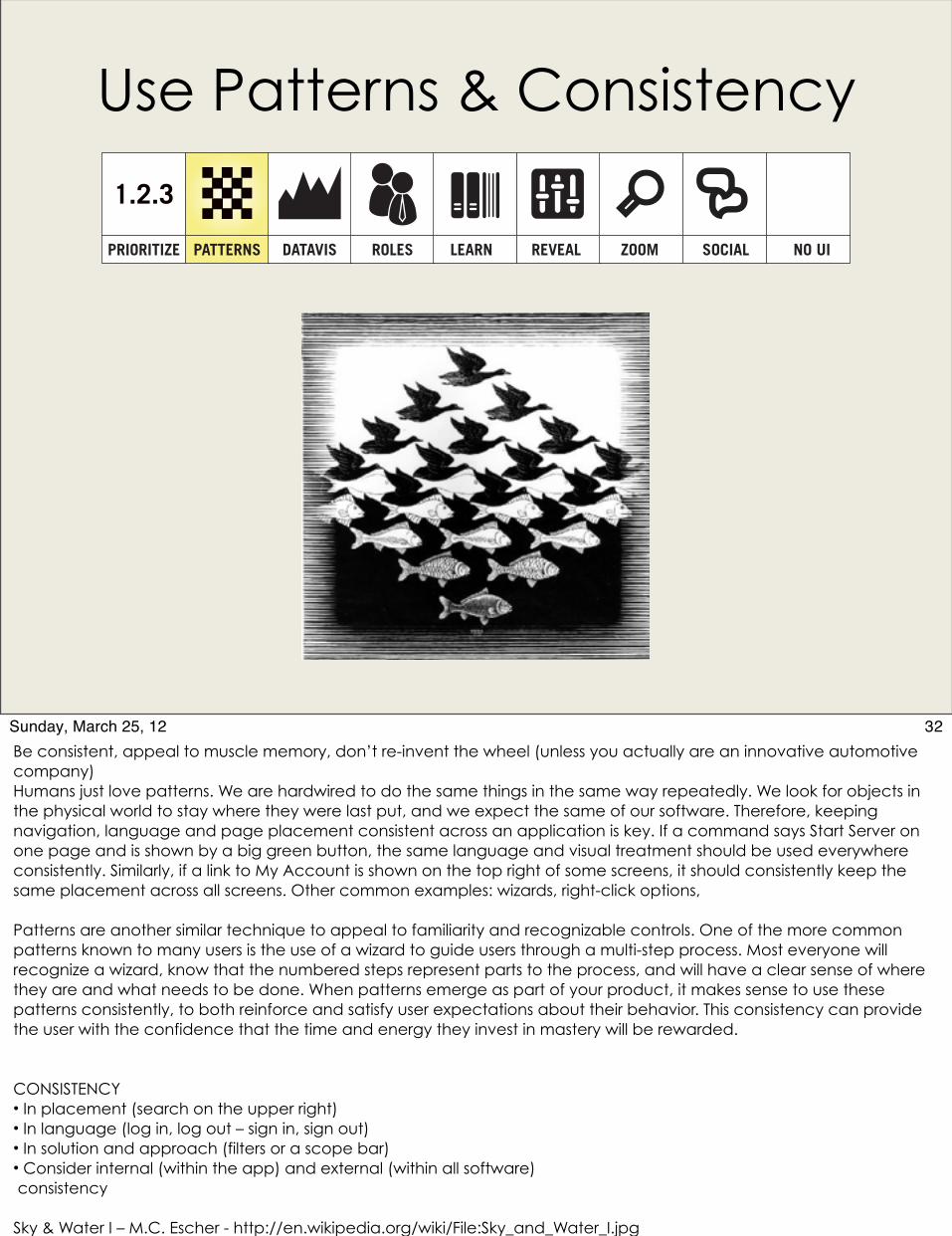
32Sunday, March 25, 12Be consistent, appeal to muscle memory, don’t re-invent the wheel (unless you actually are an innovative automotive company)Humans just love patterns. We are hardwired to do the same things in the same way repeatedly. We look for objects in the physical world to stay where they were last put, and we expect the same of our software. Therefore, keeping navigation, language and page placement consistent across an application is key. If a command says Start Server on one page and is shown by a big green button, the same language and visual treatment should be used everywhere consistently. Similarly, if a link to My Account is shown on the top right of some screens, it should consistently keep the same placement across all screens. Other common examples: wizards, right-click options,
Patterns are another similar technique to appeal to familiarity and recognizable controls. One of the more common patterns known to many users is the use of a wizard to guide users through a multi-step process. Most everyone will recognize a wizard, know that the numbered steps represent parts to the process, and will have a clear sense of where they are and what needs to be done. When patterns emerge as part of your product, it makes sense to use these patterns consistently, to both reinforce and satisfy user expectations about their behavior. This consistency can provide the user with the confidence that the time and energy they invest in mastery will be rewarded.
CONSISTENCY• In placement (search on the upper right)• In language (log in, log out – sign in, sign out)• In solution and approach (filters or a scope bar)• Consider internal (within the app) and external (within all software) consistency
Sky & Water I – M.C. Escher - http://en.wikipedia.org/wiki/File:Sky_and_Water_I.jpg
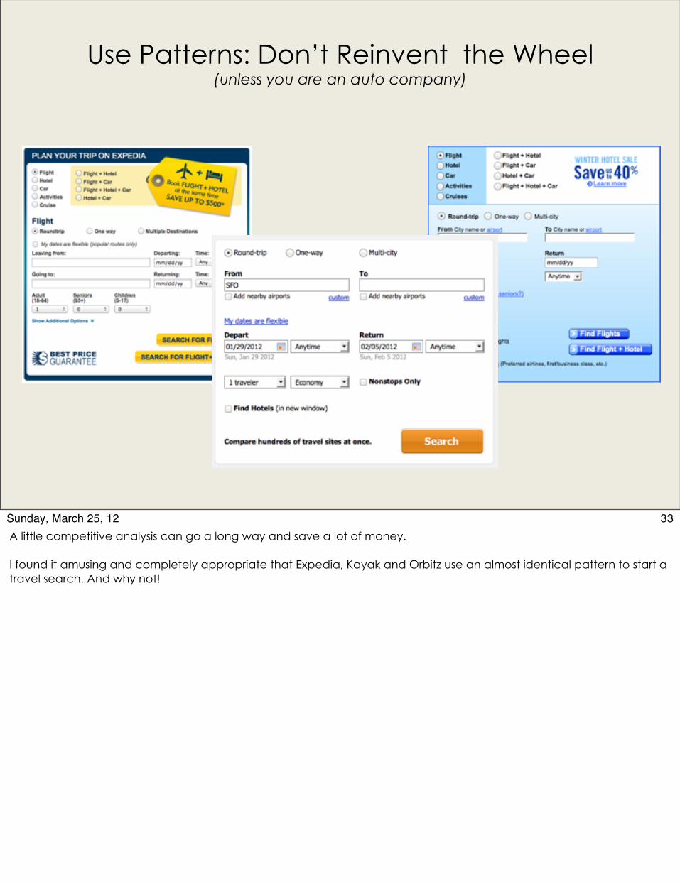
Use Patterns: Don’t Reinvent the Wheel (unless you are an auto company)
33Sunday, March 25, 12A little competitive analysis can go a long way and save a lot of money.
I found it amusing and completely appropriate that Expedia, Kayak and Orbitz use an almost identical pattern to start a travel search. And why not!
Use Data Visualizations
1.2.3
PRIORITIZE PATTERNS DATAVIS ROLES REVEAL ZOOM SOCIALLEARN NO UI
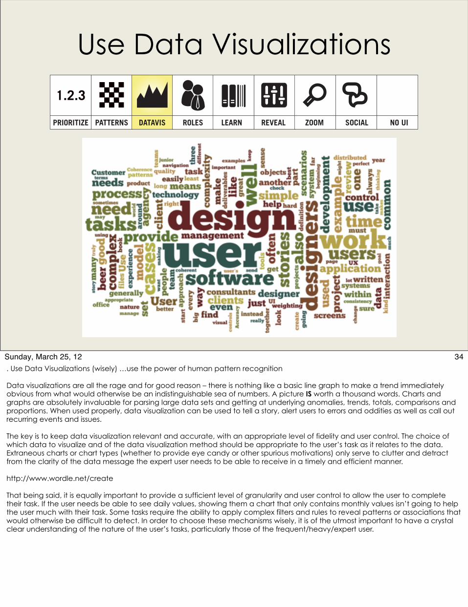
34Sunday, March 25, 12. Use Data Visualizations (wisely) …use the power of human pattern recognition
Data visualizations are all the rage and for good reason – there is nothing like a basic line graph to make a trend immediately obvious from what would otherwise be an indistinguishable sea of numbers. A picture IS worth a thousand words. Charts and graphs are absolutely invaluable for parsing large data sets and getting at underlying anomalies, trends, totals, comparisons and proportions. When used properly, data visualization can be used to tell a story, alert users to errors and oddities as well as call out recurring events and issues.
The key is to keep data visualization relevant and accurate, with an appropriate level of fidelity and user control. The choice of which data to visualize and of the data visualization method should be appropriate to the user’s task as it relates to the data. Extraneous charts or chart types (whether to provide eye candy or other spurious motivations) only serve to clutter and detract from the clarity of the data message the expert user needs to be able to receive in a timely and efficient manner.
http://www.wordle.net/create
That being said, it is equally important to provide a sufficient level of granularity and user control to allow the user to complete their task. If the user needs be able to see daily values, showing them a chart that only contains monthly values isn’t going to help the user much with their task. Some tasks require the ability to apply complex filters and rules to reveal patterns or associations that would otherwise be difficult to detect. In order to choose these mechanisms wisely, it is of the utmost important to have a crystal clear understanding of the nature of the user’s tasks, particularly those of the frequent/heavy/expert user.
Use Interesting Data Viz
Tell a story, make it beautiful • stream graphs• sankey diagrams• sparklines• bubble charts• network graphs• conceptual maps• topography maps
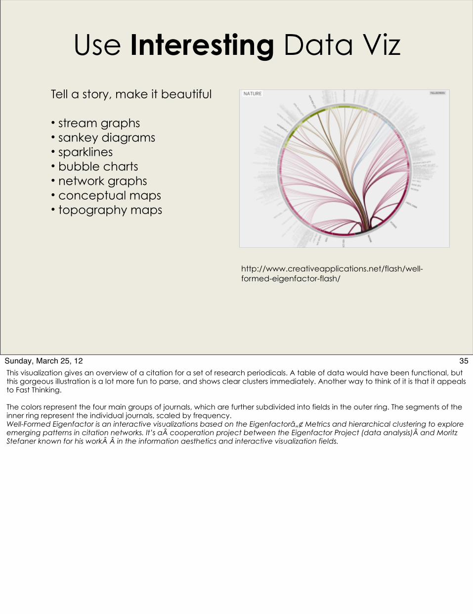
http://www.creativeapplications.net/flash/well-formed-eigenfactor-flash/
35Sunday, March 25, 12This visualization gives an overview of a citation for a set of research periodicals. A table of data would have been functional, but this gorgeous illustration is a lot more fun to parse, and shows clear clusters immediately. Another way to think of it is that it appeals to Fast Thinking.
The colors represent the four main groups of journals, which are further subdivided into fields in the outer ring. The segments of the inner ring represent the individual journals, scaled by frequency.Well-Formed Eigenfactor is an interactive visualizations based on the Eigenfactorâ„¢ Metrics and hierarchical clustering to explore emerging patterns in citation networks. It’s a cooperation project between the Eigenfactor Project (data analysis) and Moritz Stefaner known for his work  in the information aesthetics and interactive visualization fields.

Match UI to Roles1.2.3
PRIORITIZE PATTERNS DATAVIS ROLES REVEAL ZOOM SOCIALLEARN NO UI
36Sunday, March 25, 12Most complex software is designed for not just one type of user, but several. For example, the domain administrator who sets up a process for source control management to be used throughout an entire company is not the developer who will be checking in code. Personas to the rescue! By carefully identifying the different types of users in a system (personas or roles), and the tasks they are required to perform, large chunks of the application can be “hidden” from those users who will never need them. Adobe figured out that web designers and photographers need different apps, and thus Fireworks and Lightroom grew out of Photoshop.Adapting the user interface to the role of the user and their specific needs requires a fair amount of careful planning up front, but it can be a huge aid in removing superfluous commands and complexity from the user’s experience.
•Those Personas sure come in handy• Identify your roles, then do a task ranking per role• Consider users with multiple roles• Roles can be directly tied to permissions
http://en.wikipedia.org/wiki/File:Chapeaux_en_peau_de_castor.jpg
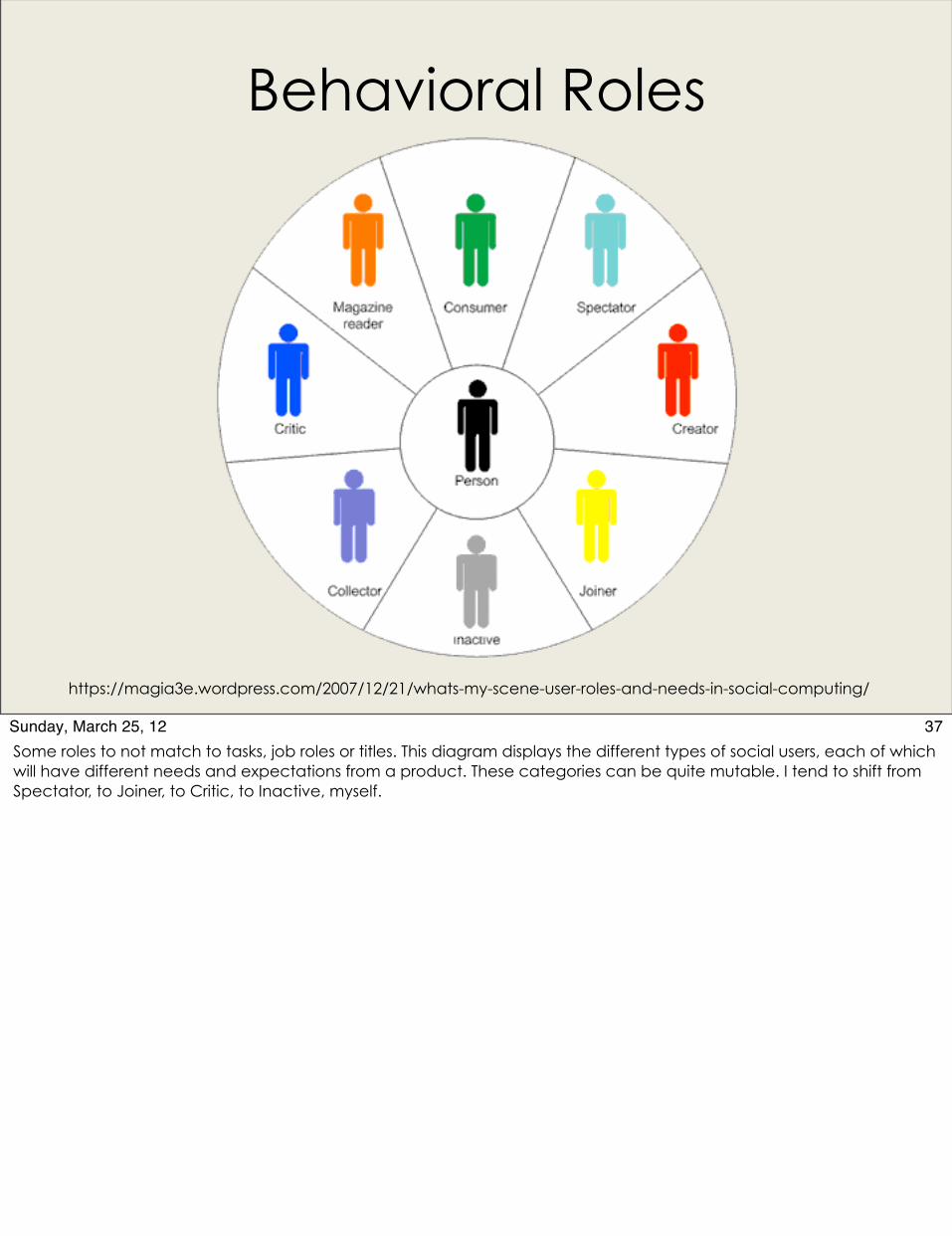
Behavioral Roles
https://magia3e.wordpress.com/2007/12/21/whats-my-scene-user-roles-and-needs-in-social-computing/
37Sunday, March 25, 12Some roles to not match to tasks, job roles or titles. This diagram displays the different types of social users, each of which will have different needs and expectations from a product. These categories can be quite mutable. I tend to shift from Spectator, to Joiner, to Critic, to Inactive, myself.
Learn and Adapt Based on
1.2.3
PRIORITIZE PATTERNS DATAVIS ROLES REVEAL ZOOM SOCIALLEARN NO UI
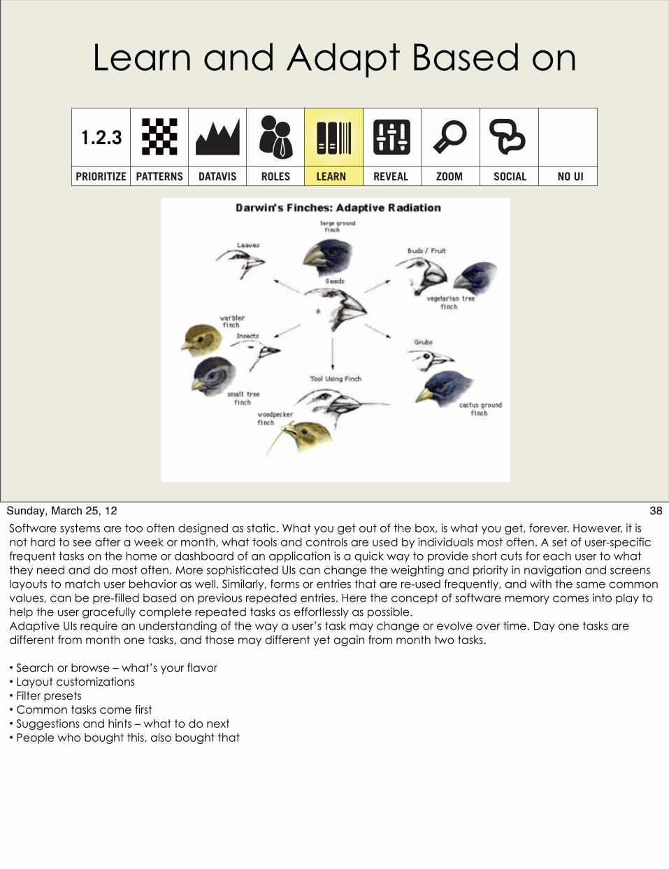
38Sunday, March 25, 12Software systems are too often designed as static. What you get out of the box, is what you get, forever. However, it is not hard to see after a week or month, what tools and controls are used by individuals most often. A set of user-specific frequent tasks on the home or dashboard of an application is a quick way to provide short cuts for each user to what they need and do most often. More sophisticated UIs can change the weighting and priority in navigation and screens layouts to match user behavior as well. Similarly, forms or entries that are re-used frequently, and with the same common values, can be pre-filled based on previous repeated entries. Here the concept of software memory comes into play to help the user gracefully complete repeated tasks as effortlessly as possible.Adaptive UIs require an understanding of the way a user’s task may change or evolve over time. Day one tasks are different from month one tasks, and those may different yet again from month two tasks.
• Search or browse – what’s your flavor• Layout customizations• Filter presets• Common tasks come first• Suggestions and hints – what to do next• People who bought this, also bought that
Expose Some Complexity When
1.2.3
PRIORITIZE PATTERNS DATAVIS ROLES REVEAL ZOOM SOCIALLEARN NO UI
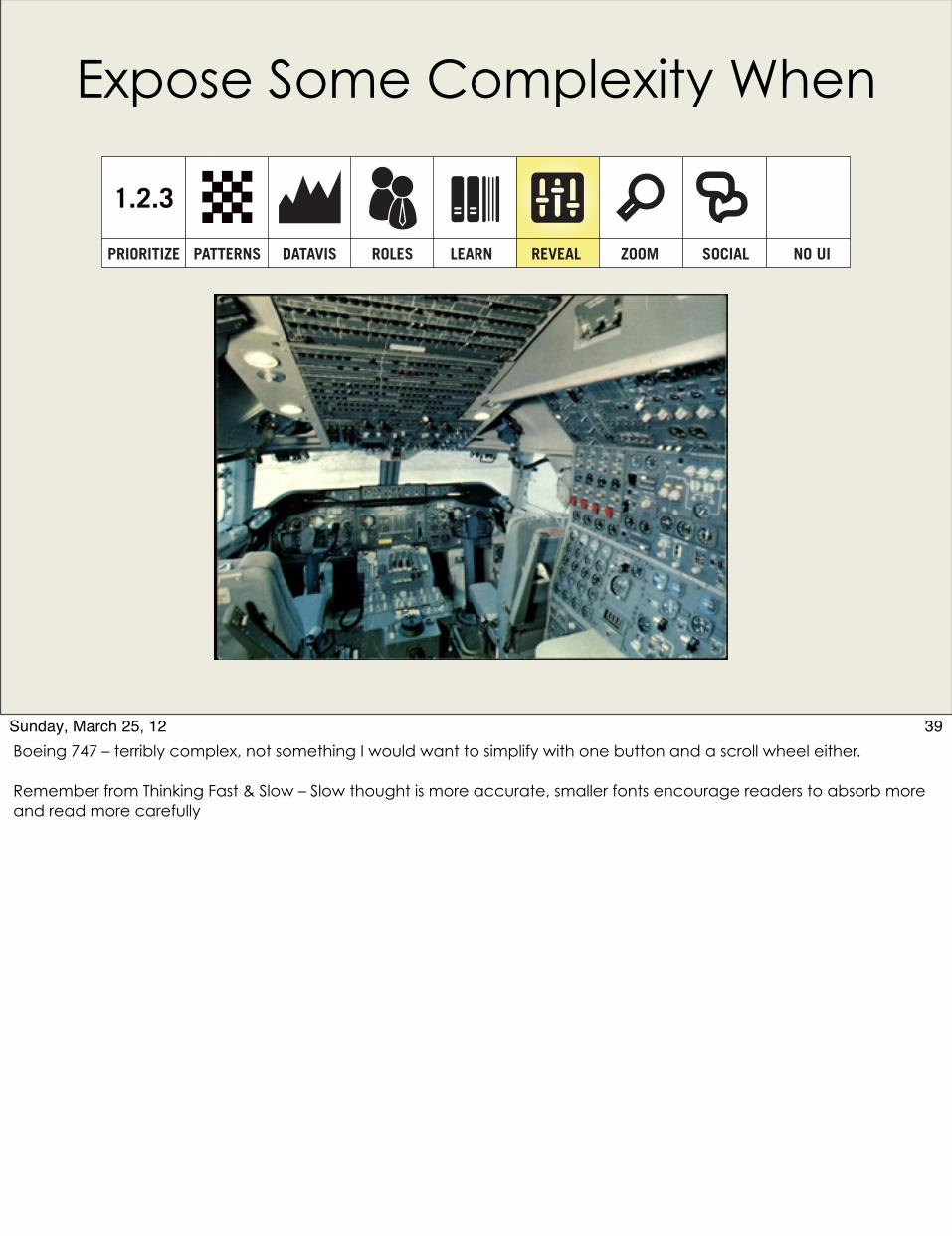
39Sunday, March 25, 12Boeing 747 – terribly complex, not something I would want to simplify with one button and a scroll wheel either.
Remember from Thinking Fast & Slow – Slow thought is more accurate, smaller fonts encourage readers to absorb more and read more carefully
Zoom: It’s All a Question of Perspective
Power of Ten – Charles & Ray Eames - http://powersof10.com/#
1.2.3
PRIORITIZE PATTERNS DATAVIS ROLES REVEAL ZOOM SOCIALLEARN NO UI
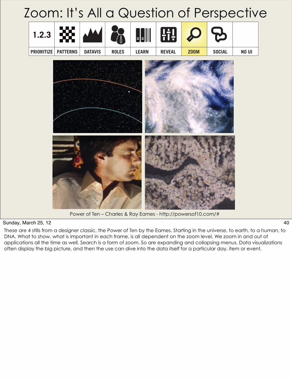
40Sunday, March 25, 12These are 4 stills from a designer classic, the Power of Ten by the Eames. Starting in the universe, to earth, to a human, to DNA. What to show, what is important in each frame, is all dependent on the zoom level. We zoom in and out of applications all the time as well. Search is a form of zoom. So are expanding and collapsing menus. Data visualizations often display the big picture, and then the use can dive into the data itself for a particular day, item or event.

Social & Emotive Design
• Social factors can mitigate complexity; provide motivation• Competition, leaderboards and rankings• Cooperation, sharing, bragging rights and helping others • Think Linux or GitHub or even Facebook
1.2.3
PRIORITIZE PATTERNS DATAVIS ROLES REVEAL ZOOM SOCIALLEARN NO UI
41Sunday, March 25, 12Appeal to the social and human side by utilizing:- Social media, social aspects, etc- Humor & compassion- Sharing & community status- Rewards & accomplishments
And Remember, the Simplest UI is
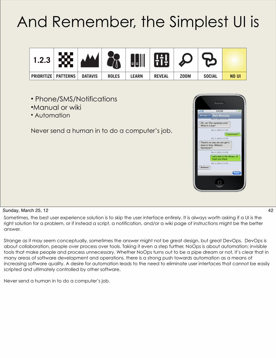
• Phone/SMS/Notifications•Manual or wiki• Automation
Never send a human in to do a computer’s job.
1.2.3
PRIORITIZE PATTERNS DATAVIS ROLES REVEAL ZOOM SOCIALLEARN NO UI
42Sunday, March 25, 12Sometimes, the best user experience solution is to skip the user interface entirely. It is always worth asking if a UI is the right solution for a problem, or if instead a script, a notification, and/or a wiki page of instructions might be the better answer.
Strange as it may seem conceptually, sometimes the answer might not be great design, but great DevOps. DevOps is about collaboration, people over process over tools. Taking it even a step further, NoOps is about automation; invisible tools that make people and process unnecessary. Whether NoOps turns out to be a pipe dream or not, it’s clear that in many areas of software development and operations, there is a strong push towards automation as a means of increasing software quality. A desire for automation leads to the need to eliminate user interfaces that cannot be easily scripted and ultimately controlled by other software.
Never send a human in to do a computer’s job.