delivering e-learning in a mobile world
DESCRIPTION
Arlyn Asch, CTO, Articulate, March, 2015TRANSCRIPT
Delivering E-Learning in a Mobile Worldby Arlyn Asch, CTO, Articulate Demand for Multi-Device Learning
Adopting a multi-device learning strategy delivers many benefits to organizations and learners alike. For organizations, offering training and education across multiple devices extends all the cost, time, and productivity benefits associated with e-learning. Now, learning can happen closer to the point of need. Armed with tablets and smartphones, staff in the field or on the floor have access to performance support the instant they need it.
If online learning gives learners a taste of freedom, multi-device learning untethers them completely. They can choose to take courses wherever they want, and however they want—on a computer, tablet, or smartphone. They’re no longer bound by an office or even a computer unless they want to be. And for many in developing countries, the ability to learn on a smartphone or tablet isn’t just a convenience, it’s a necessity. It’s no wonder that mobile now accounts for 25% of all web usage, up 14% from a year ago.1
1 1 KPCB Internet Trends 2014, Kleiner Perkins Caufield & Byers
Given these realities, global organizations who adopt a multi-device learning strategy will have an easier time standardizing training and education across all their audiences, while continuing to lower costs.
Challenges
While there are many reasons organizations want to deliver e-learning to multiple devices, there are some serious challenges currently undermining mobile learning adoption.
The first is device proliferation. While the explosive growth of mobile puts tablets and smartphones in more hands, it also means there are myriad platforms organizations must consider when developing multi-device e-learning.
Devices range widely in operating system, form factor, processing power, and more. In today’s world, courses will rarely look or perform the same way (or even at all) across all these various devices. As a result, organizations must currently decide which devices they will develop courses for, and then constrain their learners to those particular devices.
The second major challenge stems from the very nature of e-learning. Some e-learning courses are composed of simple slides containing graphics and text. Others include embedded videos and software simulations that demo click paths through an application. And increasingly, many e-learning courses feature media-rich,
2
interactive slides that prompt learners to engage more tactilely with educational content.
Yet while e-learning courses are diverse, they share a common nature: they’re typically slide-based. The positioning of elements on a slide matters in the same way that the positioning of content in a video matters. It’s immutable.
The Star Wars you watch on your TV is exactly the same on your smartphone. It’s just smaller. Princess Leia’s “Help me Obi-Wan Kenobi, you’re my only hope!” hologram won’t disappear when you watch the scene on a phone. We’d never expect the content on a video to reflow or change position to fit smaller devices with different aspect ratios. The video wouldn’t make sense if it did.
The same goes for slide-based e-learning content. The position of elements on the screen must not change, regardless of screen size or aspect ratio. Just like with a video, slide-based e-learning wouldn’t make sense if objects changed position or simply disappeared to fit smaller screen sizes.
So the question becomes, how do you make slide-based e-learning work across multiple devices with different aspect ratios and screen sizes?
3
Requirements for Multi-Device E-Learning
To answer that, we need to look first at what learners, organizations, and course authors require when it comes to multi-device e-learning.
First and foremost, multi-device learning simply won’t be effective and widely adopted until learners have a great experience on each device. Given the maturity of the mobile and tablet markets, they expect it. Courses should take advantage of all possible screen real estate and provide natural, intuitive navigation.
Organizations also must have confidence that their courses will work across any internet-enabled device with any form factor. They shouldn’t have to build or maintain different courses for different devices, or limit their learners to only certain devices. For courses to work across devices, they should be publishable to HTML5, which is supported by nearly every phone and tablet on the market.
Finally, the burden of adopting a multi-device e-learning strategy shouldn’t land on course authors. They shouldn’t have to manually adjust or create courses to fit each device a learner might use (nor could they feasibly accomplish such a Herculean task.)
If we rely on people, rather than technology, to solve the issue of multi-device e-learning, we undermine the very benefits of e-learning: its scalability, cost-effectiveness, and speed of deployment.
4
Is “Responsive Design” for Slide-Based E-Learning the Answer?
Adobe contends that “responsive design” is the answer to delivering slide-based e-learning to multiple devices, and it has oriented its e-learning product strategy around that premise. However, we believe responsive design as reimagined by Adobe fails to meet the critical requirements learners, organizations, and course authors have around multi-device, slide-based e-learning.
To understand why, let’s take a closer look at the mechanics of responsive design. First coining the term “responsive web design” in his 2010 article “Responsive Web Design,” Ethan Marcotte describes the practice of responsive design this way:
“Rather than tailoring disconnected designs to each of an ever-increasing number of web devices, we can treat them as facets of the same experience. We can design for an optimal viewing experience, but embed standards-based technologies into our designs to make them not only more flexible, but more adaptive to the media that renders them.”
The key here is that web developers can code once for an “optimal viewing experience” and let “standards-based technologies” do the heavy lifting of adapting that design to various screen resolutions and sizes. These technologies include flexible grids, media queries, and CSS style sheets that will dynamically resize content, change layouts, scale and swap images, alter text size and leading, and
5
selectively show or hide elements to aid navigation—all based on the viewer’s screen size, platform, and orientation.
The whole point of responsive design is that web developers can make sure the experience of viewing web content will be great on any device without having to write new code for each one—they don’t shoulder the burden of keeping up with the dizzying array of new devices that flood the market. With responsive design, web developers simply define how a website will reposition, resize, hide, or swap content at various screen size and resolution breakpoints. The browser does the hard work, using CSS to guide the way.
Adobe would have e-learning developers believe that this responsive design model is the answer to multi-device, slide-based e-learning. But it’s not. Here’s why.
Responsive web design works because the relative positioning of web content doesn’t really matter. The content still makes sense if text goes from three to two or even one column, or if images are placed in a different spot or disappear altogether. But that’s not the case with slide-based e-learning content. As discussed above, relative position of objects matters in slide-based content. If a slide shows a person pointing at a map, it won’t make sense if the map is repositioned above the person’s head when viewed on a phone.
6
What that means is that when slide-based content is reflowed at various breakpoints, it won’t “just work.” The e-learning author needs to review every slide at each breakpoint to make sure that the content still makes sense. That puts the burden on the course author to manually redesign and reposition objects on each slide for each device learners will use.
Even if organizations are willing to have their e-learning developers manually adjust slides for each breakpoint, Adobe’s responsive design approach won’t let them implement truly universal multi-device e-learning. Remember, there are hundreds of devices on the market, and they’re constantly changing. Given the manual work involved, course authors won’t be able to keep up with them all, so organizations will have to choose to support only a few devices.
Articulate’s Vision for Multi-Device E-Learning
For the reasons outlined above, Articulate does not believe responsive design for slide-based content is the answer to multi-device e-learning. Course authors shouldn’t bear the burden of tweaking the content of every slide in a course for every device, and organizations shouldn’t have to limit the devices they support. At Articulate, we believe that technology, not course developers, should power multi-device e-learning.
Our approach to multi-device e-learning is three-fold.
7
First, we’re providing exceptional HTML5 output that works well on any computer or tablet device with an HTML5 browser. We’re doing that today. Without any extra effort, course developers can deliver a great experience to learners on iPads and Android tablets by simply publishing their Articulate Storyline and Articulate Studio ’13 courses to HTML5.
Second, we’re developing a responsive mobile course player (the frame around your course) tailored specifically for mobile learners. This responsive mobile player responds fluidly to different screen sizes and orientations. It gets out of the way on smaller-screen devices, leaving more real estate for the content itself. On phones, for example, the responsive mobile player hides sidebar menus behind icons, eliminates browser chrome, and delivers mobile-friendly playback controls. The result is an immersive, full-screen experience for learners.
We’ve optimized everything in the responsive mobile player for touch control, including finger-friendly buttons, clear iconography, and improved support for common gestures such as swiping, dragging, and pinch to zoom. Courses take full advantage of the extensive HTML5 support built into the latest mobile browsers, delivering smooth animations and transitions, high performance media playback, and complex interactivity—features previously reserved for learners on desktop and laptop computers.
With our new responsive mobile player, Articulate courses will scale perfectly and automatically across all desktops, laptops, tablets, and mobile phones, just like a video would.
8
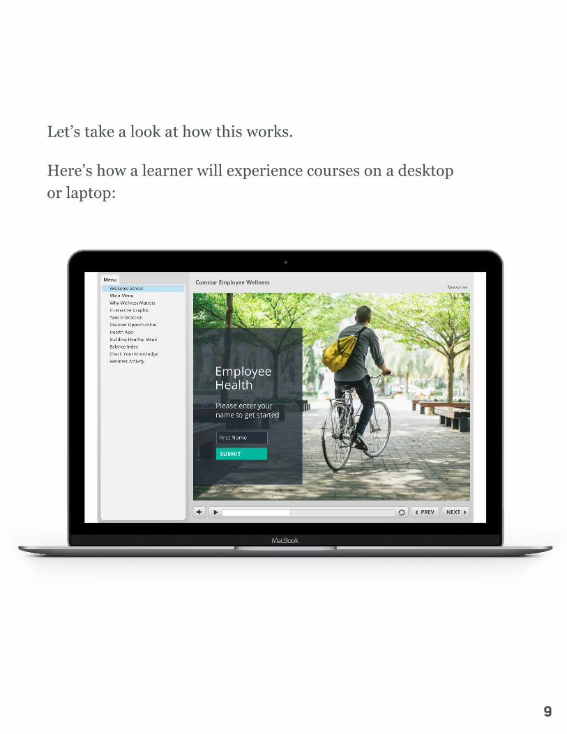
Let’s take a look at how this works.
Here’s how a learner will experience courses on a desktop or laptop:
9
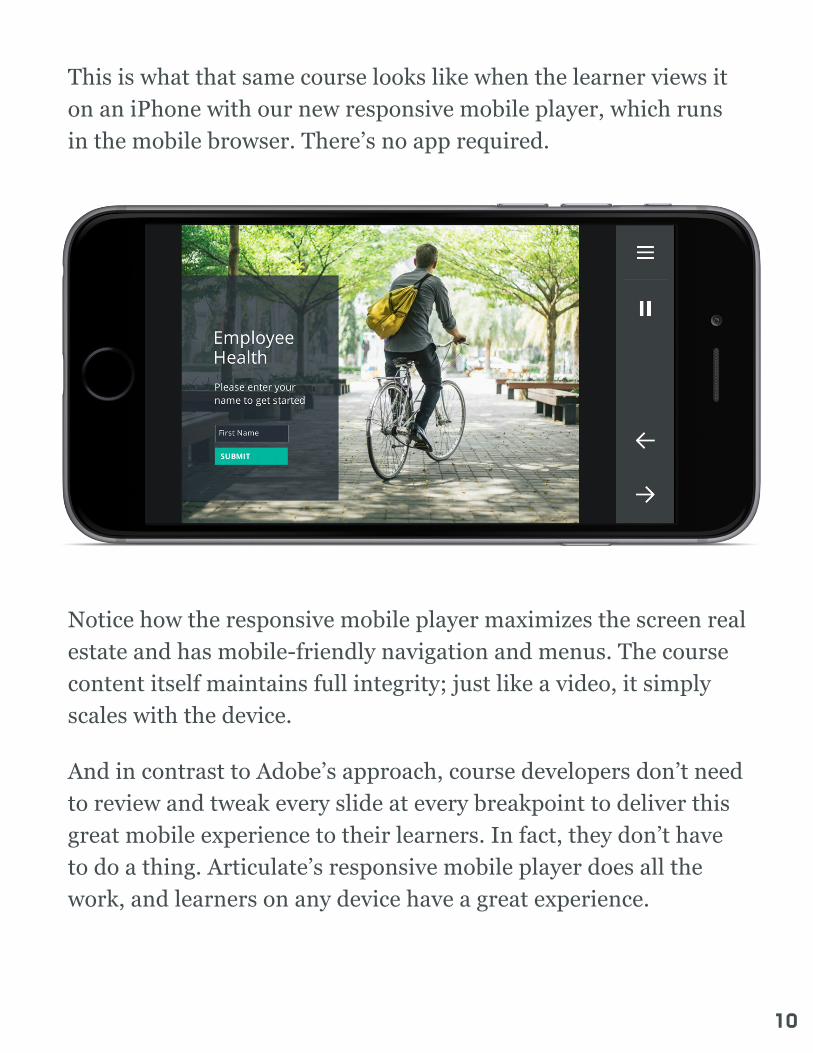
This is what that same course looks like when the learner views it on an iPhone with our new responsive mobile player, which runs in the mobile browser. There’s no app required.
Notice how the responsive mobile player maximizes the screen real estate and has mobile-friendly navigation and menus. The course content itself maintains full integrity; just like a video, it simply scales with the device.
And in contrast to Adobe’s approach, course developers don’t need to review and tweak every slide at every breakpoint to deliver this great mobile experience to their learners. In fact, they don’t have to do a thing. Articulate’s responsive mobile player does all the work, and learners on any device have a great experience.
10

We’re currently developing this responsive mobile player and will release it to market as soon as possible.
Third, while we believe that responsive design isn’t the right solution for slide-based e-learning for all the reasons described above, we do believe responsive design is a natural fit for web-based e-learning.
We’re deep into development on a web-based authoring tool that makes it easy to create responsive web-based courses that include media-rich interactions, scrollable articles, quizzes, and embedded web objects. These web-based courses run directly in modern web browsers without the need for a player.
11
Our new responsive authoring tool leverages all existing technologies that make the web responsive—such as fluid grids and media queries—and eliminates the object positioning problem that plagues Adobe’s responsive approach for slide-based content. Content developed in our new responsive authoring tool can reflow naturally—based on the learner’s screen size, platform, and orientation—without its meaning being destroyed.
Because this new authoring tool is web-based, creating courses is as simple as launching a web browser. There’s no software to download, install, and manage. We’re planning to release this web-based responsive authoring tool this year.
The Future
The world has gone mobile, and at Articulate we’re intent on changing the way this mobile world learns.
We’re confident that our strategy for multi-device e-learning is the right one for organizations, course authors, and learners. It’s this strategy that feeds our aggressive product development pipeline. We’re fully committed to giving organizations everything they need to easily and scalably develop and deploy e-learning that’s fun, engaging, and effective for learners on every device, everywhere.
12© 2015 Articulate Global, Inc. All rights reserved.