delight 2014 | designing for delight workshop, toby sterrett
TRANSCRIPT

Designing for Delight: First Impressions

my name’s toby sterrett, i’m director of ux at Simple.

PORTLAND
we’re based right down the street here in portland

Simple is the way banking should be. Our goal is to eliminate financial stress for our customers. Imagine a bank if you could build it. That’s what we’re shooting for.
Simple Onboarding v1
ok, for some background on our current onboarding and application flow that samuel is going to go over here shortly…

this is where things started for us, our first marketing site from back in 2010. we didn’t have a product yet, so we built a site that was kind of a way for us to put a stake in the ground as to what we intended to build for our vision of personal banking

we had a non-conventional signup form that felt like a mad libs letter to us as people

Onboarding experiments
after building the marketing site we got working on something more “real” - how we were going to approach onboarding

so, most onboarding forms are very stock, especially for banks. they’re usually clean enough, but they’re just so… cold. very “bank” like.

so we kind of tacked the opposite direction and came up with a somewhat extreme test to try out tons of different signup variations so randomly chosen folks could reserve their account
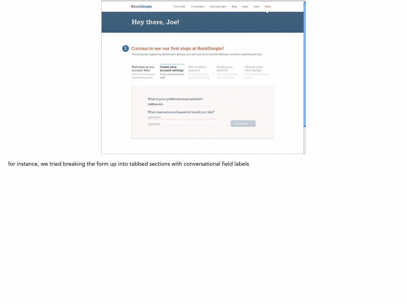
for instance, we tried breaking the form up into tabbed sections with conversational field labels

Get ready to enjoy banking, for a change
as well as a single page with inline promotional ads for our features and more standard labels

and what we ended up with after all the testing was pretty much what we anticipated would be the best: a single page form stripped down as much as possible. this is where we were recently, with some extra stuff up top that got added over the years, which I’ll get into a bit later.

i think we did some pretty cool stuff. one thing we decided upon early on was to encourage customers to use pass phrases instead of passwords. we’ve taken some flack for not letting people use the passwords they use elsewhere, but that’s exactly what we’re trying to prevent. easing people into better security.

we also try to make unpleasant things like ACH as easy as possible to set up by showing exactly where to find your routing/account numbers and giving feedback when properly input

and for the most part, things worked pretty well. we got a good amount of people talking about the sign up process on twitter…

and there was even a credit union blogger who put our claim of signing up in 2-3 minutes to the test, since that sounds pretty much impossible to regular banks and credit unions. happily, we passed the test.
However…but, nothing is perfect, of course. our onboarding flow, while good for banking, left a lot to be desired, and it was time to have a pro look it over so we could know what to work on for a revamping. so we hired samuel to done of his famous breakdowns for us so we could better plan a revamped sign up experience.

Lots Of Things To Work On:
• Remove a bunch of unnecessary crap
• Make signing up seem less overwhelming
• Help alleviate anxiety
• Reduce friction
• Optimize for mobile
here are a few of the things samuel suggested that we could work on in the application process. some things that were pretty obvious to us, and lots of things we had never even considered before. i’m going to mostly be focusing on the actual application process here, since that’s where we’re starting.

I’d love your help
i’m going to go through a list of some of things we wanted to tackle, and i’d love for you all to think of ways you can think of that might be good approaches. then, i’ll show some of our possible solutions as well. so, while i’m going over some of the things we wanted to fix, get thinking on an ideas you might have to address it.

Sign Up Application v2
ok, so here we go, some of the things we’re working on in the v2 of our onboarding in response to some of the work samuel did. we’re starting off working on the actual sign up application, and will be addressing the more marketing and feature checklist stuff after, so that’s what I’ll be going over here.

Remove the cruft
first off, I’ll start with an easy one that’s pretty obvious, one that doesn’t really require any additional help from you all

In the old flow, you visit the home page, see our promo video and see our features, then you’d request an invitation, receive an email that has a link to a promo video and a bunch of copy about what simple is and our features…

then you’d click the link and arrive at the application form, where the top 1/2 of screen was… the same stuff. it was a vestige from the old invitation days, where we were attempting to remind users what we even were. no longer necessary since moving to instant invitations. so, we’ll kill it.

How can we improve this?
well, we’ll kill that stuff and start fresh.

Make applying feel less overwhelming
ok, so another thing to work on is trying to kill the feeling that the form is somewhat daunting and going to be a pain in the ass to fill out. we came at it from the perspective that it’s super short for a bank, but coming at it from the other side - comparing it to other service sign ups - it’s pretty huge.

to make matters worse, when we originally designed the application and ran the tests, it was primarily desktop oriented. we made sure it also worked on mobile, but a long scrolling form on a mobile screen just *feels* even longer and overwhelming

How can we improve this?

our approach moving forward is to try out breaking the sections out into separate panes and reducing content as much as possible so the forms all pretty much fit in the single mobile screens. it’s still the same info, but not seeing the huge scrolling form at least *feels* more manageable. we’re also trying to remove any inputs that aren’t absolutely required to open an account.

Ok, then there was stuff like this. we originally tried out freeform date entry for birthdays with some pretty slick natural language style date parsing and whatnot. but, it broke just enough for us to not trust it. So, we went for the more foolproof method of just having people choose month, day and year. however, this is super cumbersome on mobile.

How can we improve this?
Ok, then there was stuff like this. we originally tried out freeform date entry for birthdays with some pretty slick natural language style date parsing and whatnot. but, it broke just enough for us to not trust it. So, we went for the more foolproof method of just having people choose month, day and year. however, this is super cumbersome on mobile.

Work to platform strengths
one thing we’re trying to do more of is work to platform’s strengths. the three selects actually works pretty well on desktop, but we need something different on mobile.

luckily, html5 date inputs are actually really nice on mobile, unlike on desktops. somehow we had overlooked that before. now you can choose the entire date in one keyboard shot. we’re going through and making sure we’re using the best input methods for all the different fields.

ok, we used to have all these fields for contact info and address. it’s a damn lot of fields.

How can we improve this?
ok, we used to have all these fields for contact info and address. it’s a damn lot of fields.
Automate when possible
one thing we’re trying to do is automate things as much as possible, hopefully removing the need for users to have to enter a bunch of crap

for instance, the contact info area was asking for email… even though we already had it. we were asking for phone type, but when a user is on mobile, we already know exactly what device they’re on. We were also asking for a complete address, including country. this was because we can’t accept international users, but using the trick of just asking for a zip code and then filling out city and state (and implying country) we get everything we need with just 2 fields filled out. we can probably even remove the address2 field until after they enter zip.

back to the funding screen… one thing that’s always been a struggle is its existence in the first place. it’s in the application form because of bank API reasons we have no control over. but since it’s there, we’ve always had trouble with the amount field - explaining that it’s optional, but also has a $500 max, as well as trying to encourage enough to make using the account doable

How can we improve this?
back to the funding screen… one thing that’s always been a struggle is its existence in the first place. it’s in the application form because of bank API reasons we have no control over. but since it’s there, we’ve always had trouble with the amount field - explaining that it’s optional, but also has a $500 max, as well as trying to encourage enough to make using the account doable

some things we’re trying are easy ways to reduce thinking how much to transfer by suggesting a few amount that are easily tappable instead of requiring typing. they can still enter a custom amount if they want, but it’s much easier to just tap on one of the offered amounts and be done with it.

also, we’re taking advantage of the new page based layout to provide a clear cut way to just skip it altogether. our hope in the future is to remove it from the application altogether, but for now we’re hoping this helps.

because we’re opening a bank account, we need to ask for a user’s social security number. this is of course required for IDV verification for banking, but it feels a bit strange when people are approaching this form as though it’s more of a financial startup. we had copy for type 1 SSNs and attempted to answer some common questions, but how can we further help put peoples’ minds at ease here?

How can we improve this?
because we’re opening a bank account, we need to ask for a user’s social security number. this is of course required for IDV verification for banking, but it feels a bit strange when people are approaching this form as though it’s more of a financial startup. we had copy for type 1 SSNs and attempted to answer some common questions, but how can we further help put peoples’ minds at ease here?

we’re attempting to streamline this whole thing as much as possible, and, as cheesy as it feels to do, we’re going to try out the ol’ Padlock Because It’s Secure icon with the field. and by removing all the pomp and circumstance around it, we’re hoping to reduce the streisand effect around it.

and clicking the “why do we need your SSN” link tries to be as clear as possible that it’s only used for ID and that it’s as secure as possible. as straightforward as possible.
Reduce friction during application
another thing that was glaringly apparent was that we really needed to reduce all the dead stops and friction points along the way when signing up.

Application Process
1. Visit homepage
2. Submit email
3. Wait
4. Get invitation email
5. Read, click application link
6. Fill out form
7. Wait
8. Get response email
9. Passphrase in to continue process
10. Download app
11. Sign in on app
the old sign up process had a lot of subtle steps and stops that aren’t really apparent until you step back and look at the whole thing from top to bottom.

Application Process
1. Visit homepage
2. Submit email
3. Wait
4. Get invitation email
5. Read, click application link
6. Fill out form
7. Wait
8. Get response email
9. Passphrase in to continue process
10. Download app
11. Sign in on app
How can we improve this?
the old sign up process had a lot of subtle steps and stops that aren’t really apparent until you step back and look at the whole thing from top to bottom.

to start, we’re going to add a show passphrase button on the *sign in* screen. we have it when you’re setting your passphrase, but it’s obvious that it would help to let people take a glance at what they’re typing in when signing in to make sure they’re not making any dumb mistakes.

beyond that, though, for our next onboarding iteration, we’re going to be leaning heavily on mobile. we’ll always have web signup of course, but doing things on mobile will help us have a pretty streamlined flow with some unexpected perks. a customer will just be able to see our banner on the app store, read about us on the app details page, and install the app right there…
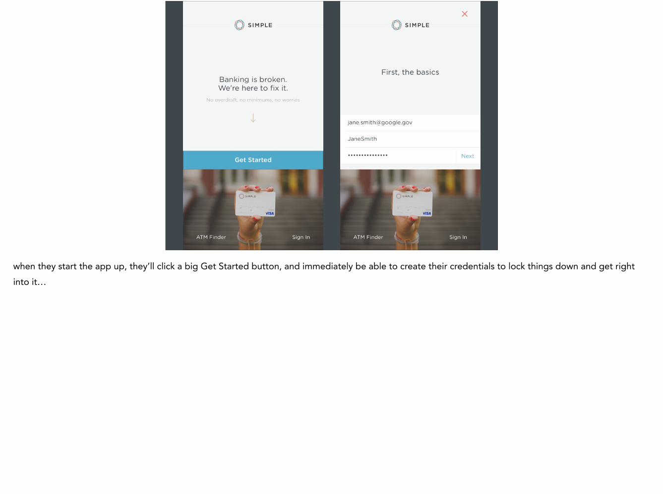
when they start the app up, they’ll click a big Get Started button, and immediately be able to create their credentials to lock things down and get right into it…

here’s where things get better: the mobile app has a mobile unlock code mechanism, so even though you’ll hopefully use a strong passphrase to secure your account, you’ll be able to set an easier to remember PIN to get back into the app later…

once you set your mobile unlock code, you’re right into the new signup form pages, with all the improvements we’ve been discussing…

Your Simple account is now active! Welcome aboard 😃
after you submit the form, a while later you’ll receive a push notification letting you know you’re accepted (or need to provide additional info) and you’ll be able to get right back to where you need by just using your mobile unlock code… or better yet your thumbprint with TouchID, which i’ll get into later.

Awesome, you have a Simple account! What’s next?
Ok, so the user has signed up successfully on an improved signup flow and is now a simple member. However, there are still lots of places for first impressions as they go about using the service and discover new functionality.

Card Packaging
to start, our business is somewhat unique in that after a user signs up and presumably gets accepted, they then receive a physical artifact in the mail - their new card.

when you get a debit or credit card in the mail, this is usually how it arrives. if you’re lucky, you don’t throw it away thinking it’s junk mail. this one actually has a card imprint PRINTED onto the envelope.

and what’s on the inside? an uninspired form letter with a card booger glued to it (which i had never heard of until i tried searching for it) welcome aboard!

we wanted to do something different, something that would let people know right away we were something special. instead of the junk mail envelope, we use a square kraft mailer.

and instead of the form letter with the booger glue, we have a laser etched card holder with a rubber band holding your card to your new wallet.

and yes, we do mean wallet. a lot of folks actually end up using the wallet, loving it, and writing in to ask us for replacements if they wash theirs or the rubber band wears out.

and people definitely noticed. we’ve come across unboxing blog posts…

and instagrams.
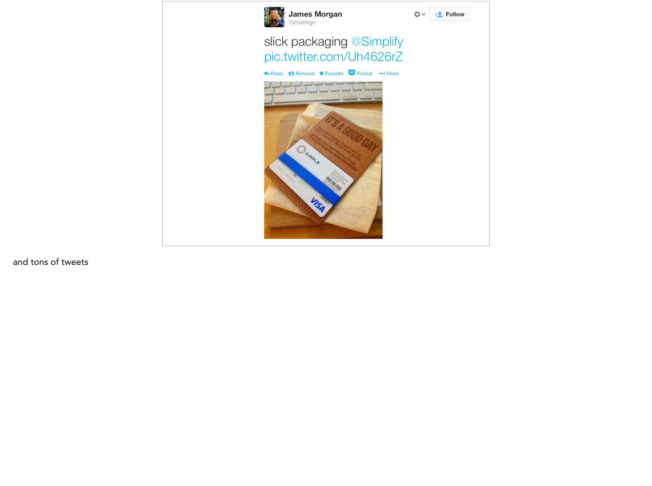
and tons of tweets


sure the packaging is more expensive and labor intensive, but i’m willing to bet that there aren’t many artsy instagram shots of credit card booger glue. it makes a difference in perception, trust, and it’s 100% worth it.
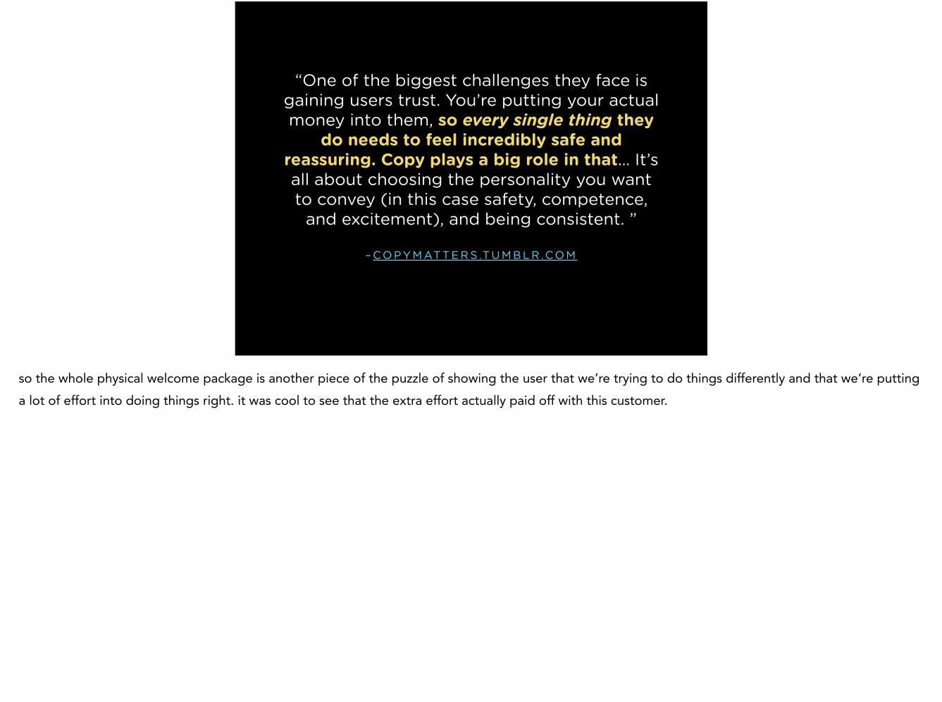
– CO P Y M AT T E R S .T U M B L R .CO M
“One of the biggest challenges they face is gaining users trust. You’re putting your actual money into them, so every single thing they
do needs to feel incredibly safe and reassuring. Copy plays a big role in that… It’s all about choosing the personality you want to convey (in this case safety, competence,
and excitement), and being consistent. ”
so the whole physical welcome package is another piece of the puzzle of showing the user that we’re trying to do things differently and that we’re putting a lot of effort into doing things right. it was cool to see that the extra effort actually paid off with this customer.

Personal Banking
So we’ve gotten people creating accounts and they’ve got their cards in their pockets. Time to move on to the main event - banking. Again, as the person goes out and uses their card for the first time, there are some opportunities to show them how we’re indeed trying to approach banking differently.

Build for the way people think, not the way banking actually works.
one of our core tenets has always been to build for the way people think, not the way banking actually works. under the covers, banking is a huge clusterfuck of awful stuff. we work super hard to try to make that stuff go away as much as possible.

for example, the first time a person uses their card, they’ll get a push notification for the transaction. we’ve always done push notifications for transactions. it’s great for general awareness, and is awesome for detecting fraudulent purchases. most traditional banks don’t even list transactions until it’s cleared, which can take up to a couple days… but that’s not how people think.

this point was something i didn’t even actually think about when we first created the service. it just made intuitive sense to me that transaction history would show you transactions exactly when they happened, not when they cleared to the bank.

when we first launched, the pushes would take a few minutes to get to you. not bad, but after a gigantic migration to a card processing platform that we built from scratch, we now send push notifications literally instantly. it’s kind of like magic, like there’s a physical connection between swiping the card and your phone.

and after the push comes through, you’ll probably want to check out the transaction. this is the way normal transactions come through. that’s pretty much it. very uninspired and not super helpful.

so i started sketching, stuff like different ideas for how transactions could be laid out

and we get a pretty good amount of info for every transaction. selecting any transaction will give you lots of little details. beyond this info, you can also add info, such as changing the name, adding memos, changing category.

over the last couple years we’ve undergone tons of refinement and tweaks and new features, but for the most part we’ve stayed the course - your activity is a story that happens naturally, and that you can personalize to make your own.

Effortless Saving
so we have lots of tools and features for after you’ve spent your money, but what about saving and budgeting for all that spending? one of our flagship features is called goals. originally it started out as a way to easily save money over time. after a couple years of actual use, it’s expanded beyond that a bit and is now used by tons of folks to organize their money into as money buckets as they need to plan for their financial lives.
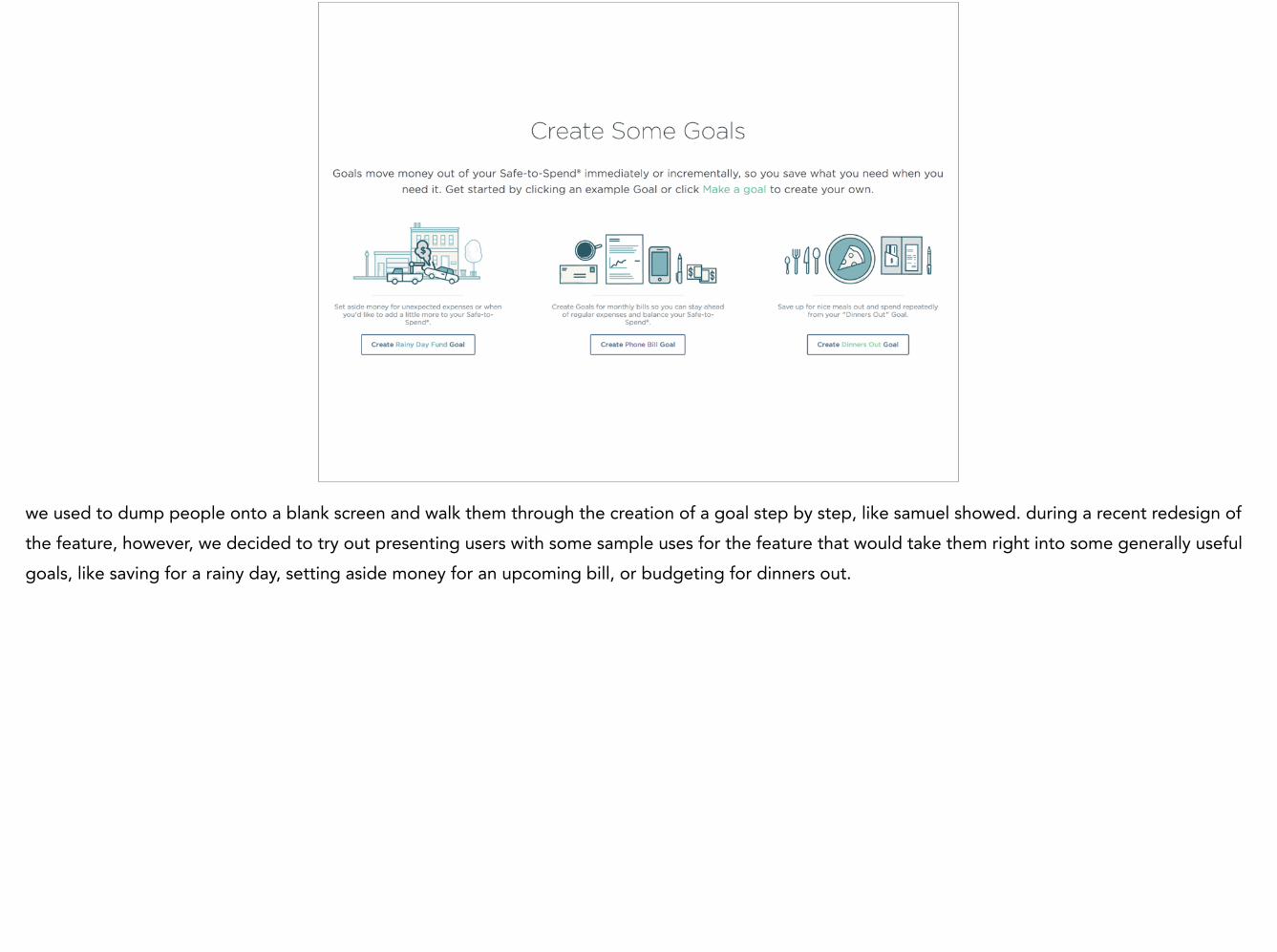
we used to dump people onto a blank screen and walk them through the creation of a goal step by step, like samuel showed. during a recent redesign of the feature, however, we decided to try out presenting users with some sample uses for the feature that would take them right into some generally useful goals, like saving for a rainy day, setting aside money for an upcoming bill, or budgeting for dinners out.

and depending how fine grained you want to get with planning things out, you can do it within goals. these are actually my personal goal buckets, and it’s helped my family a ton.

Goals have a couple modes. The first mode that gets the most play is more of an aspirational mode. Painless save for a distant goal by setting aside a tiny bit every day. For instance, here i have a goal to have $800 to spend on Christmas, all for less than the price of a cup of coffee every day. I don’t even notice it happens.

or you can just set aside any amount for whatever you want to budget for. i’ve been using an internal beta feature lately that automatically sets aside money for all my recurring bills. it’s great for envelope style budgeting, you can spend any transaction from a goal.

and once you get all your money allocated where it needs to be, you can really start to take advantage of our Safe to Spend feature, where we do the math and let you know how much you can spend now, while leaving the other money that you have plans for alone.

And it works. It’s kind of insane to see how many people say it’s changed their lives.

and it’s always heartwarming seeing people save up for things instead of going into debt

and these are the types of things like this that make it all worth it - when what we’re making can help people dig themselves out of a hole and get some control over a huge part of their lives and finally feel some freedom.

Sweating the details
so, that’s the general meat and potatoes of what simple offers and how we approached the basic necessities of personal banking and beyond and how we introduced people to things like swiping their cards and saving money. now i’d like to talk about sweating the details and going beyond just the basics, which can create more of those “first impression” type experiences, even after using the product for a while. when someone feels like they discover something made just for them, it’s like meeting the app all over again.

– F R A N K C H I M E R O
“To delight someone is to give them a small lesson in seeing the world as something
good. It is design’s superpower.”
we agree with this and have tried to sneak in little bits and pieces here and there that aren’t really necessary, but make things just a bit more enjoyable as you discover them

who here has ever seen the site little big details? if so, i’d love for you to start thinking about some details you've seen in apps lately, or even better, that you’ve snuck into some of your own projects. i’m going to show a few examples that i like, and then will ask for some examples from you all.

cool stuff like how yelp lets you search by emoji, and it actually works
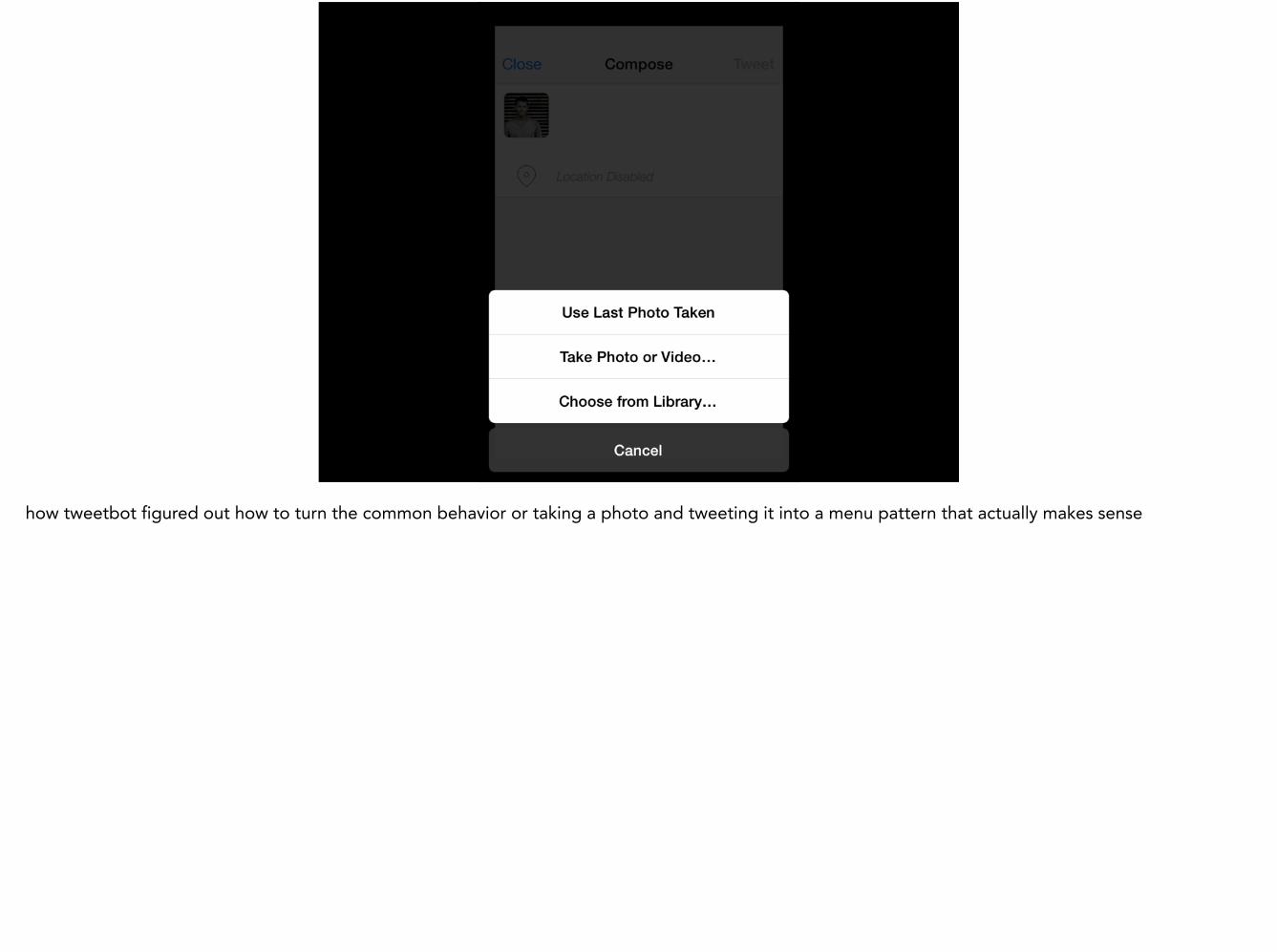
how tweetbot figured out how to turn the common behavior or taking a photo and tweeting it into a menu pattern that actually makes sense
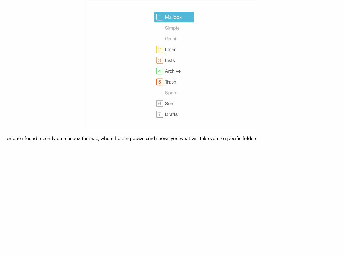
or one i found recently on mailbox for mac, where holding down cmd shows you what will take you to specific folders

How have you been delighted lately?

needless to say, we at simple love these types of interactions, and work super hard on these types of things whenever we see an opportunity

a pretty straightforward example - tons of banks require you to enter your password every time. they offer to store your username though! this encourages a bad password out of convenience, but it’s standard operating procedure for banks. so when you go back to the app the first time, you’ll immediately be pretty pissed.

– O H J I M M Y !
“This is a pretty sad app for such a major bank. It’s clunky and unprofessional. I have an impossible to remember password and every
time I log in with the mobile app I have to pull up my password list on my laptop. Touch ID support would be a MAJOR improvement.”
and people will not hesitate to leave bad reviews about this crappy experience.

so, we’ve always had the mobile unlock code concept, which was a huge improvement over having to type out a password every time you wanted to check your balance or whatever.

but if you look in the corner, we made a recent addition

it’s not something we invented or anything, but applying new stuff like this to a bank is still super foreign to folks

and lots of people agree that it feels like, the future, it feels like magic, and it just feels RIGHT.

we also took advantage of the new extension API in iOS 8 so we could integrate password managers directly into the app, so you could enter in that nice long passphrase much more easily the first time.


it’s pretty awesome to finally have this after many years of wishing for it

another small detail is a byproduct being required to pad transactions at places like restaurants for tips. however, this requirement turns into a delightful feature when it’s paired up with the instant push notifications, since it lets you know how much to tip for 20% before you even get the receipt back from the server.

so, you don’t need to pull out that moray seinfeld willard tip calculator anymore to figure out your 20% tips (this is an actual windows phone app, btw)

and speaking of tips, we realized we could compare the initial hold a restaurant or any other commonly tipped place puts on a card compared to what the final charge was. this lets us show what the breakdown of a tipped transaction is, along with what the percentage is.

we can also do the same thing with cash back at markets, or any fees charged by out of network ATMs. as you can see, the small details do get noticed.

we also try to pinpoint where your transactions took place so you have a nice record of everything. sometimes that results in cool stuff like this, where i did a search for all the transactions that happened on a road trip when we went down to SoCal and back for the holidays.

but sometimes a point on a map isn’t the right thing to do. here’s a map of a super common vendor… in case you can’t tell, it’s for amazon.com - i know, it’s worthless information, but it’s just what happened by default for them because, well, they’re in seattle

so we added these little boxes. there are lots of really common vendors that come through, so we started making these little vendor cards that give you useful links and numbers instead of a worthless map. see a charge from amazon that you can’t remember what it was for? we link you directly to your account to see.

we made a whole bunch of common online charges that would take place of the map, since that didn’t make sense and these would provide a lot more value. we even provided a form for customers to suggest new ones.

and people really appreciate it and get excited when they discover it the first time

another place where we’re trying to make lemonade out of lemons is the whole external account verification process. we detect when small challenge deposits come through from other financial institutions and send you an email to let you know they’re ready to verified. it’s a small touch, but the first time they connect another account they take notice of because they’ve never experienced it before.

we could let people use hashtags within the memos. hashtags were becoming ubiquitous and provided a nice solution for simplifying the UI but still providing users with the capability to create their own taxonomy for their transactions.

we don’t advertise it a ton, which we probably should, but when people discover it because it feels natural to them anyways, they get pretty excited
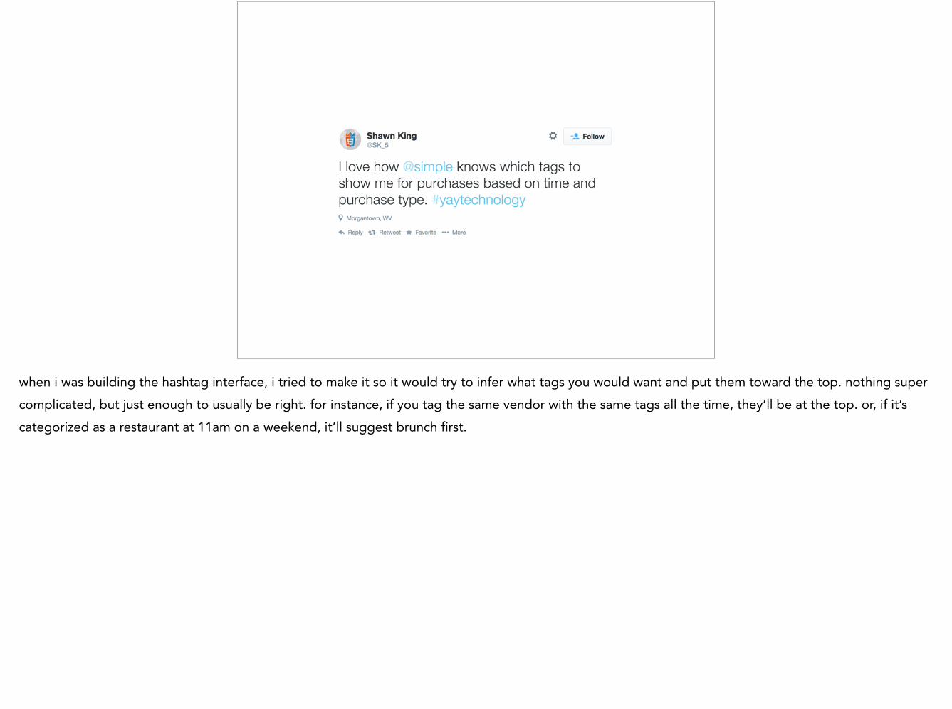
when i was building the hashtag interface, i tried to make it so it would try to infer what tags you would want and put them toward the top. nothing super complicated, but just enough to usually be right. for instance, if you tag the same vendor with the same tags all the time, they’ll be at the top. or, if it’s categorized as a restaurant at 11am on a weekend, it’ll suggest brunch first.

for example, we go to luc lac for work lunches and dinners all the time, so now all i have to do is type a # and it’ll put all those tags right up top to make it easy

sometimes the little details are just the result of having some fun internally while building something out. one really subtle easter egg is if you try to reset your pin to 1234.

it simply shows you an error message that says PIN is ridiculous, because, well, it’s a ridiculous PIN and that’s what Dan, the developer of the feature, put in for the error.

most people will of course never see this, but this person did, and he tweeted about it saying it was his favorite error copy of all time. lots of people responded that they enjoyed it as well.

there’s even the stuff that i never even really thought about or even noticed. this tweet cracked me up, because people truly do notice the smallest details. and, turns out, one of the folks on the team said “oh, yeah, i’ve been making sure that stays lined up”

Customer Relations
so, i’ve gone over lots of features, and i and our customers think they’re pretty great. but when it comes down to it, our greatest feature and biggest source of delight by far is our customer relations team.

over the last couple years, we’ve put together an amazing and quickly growing group of folks dedicated to helping our customers with whatever issues arise right in the same office where everything else happens. be it with the in-app messaging i showed you earlier, on the telephone or on twitter and facebook, customers take notice.

support was baked into the app from the very beginning. like i mentioned, i absolutely hate talking on the phone, and i think lots of folk my age feel the same way. so, you can start a support message at any time directly from any problematic transaction. support will have a direct link to the transaction in question so they can research it and help.

and they aren’t shy about talking about it. people saying we have the best customer support experience they’ve *ever* had isn’t an uncommon occurrence. and how do we do it?
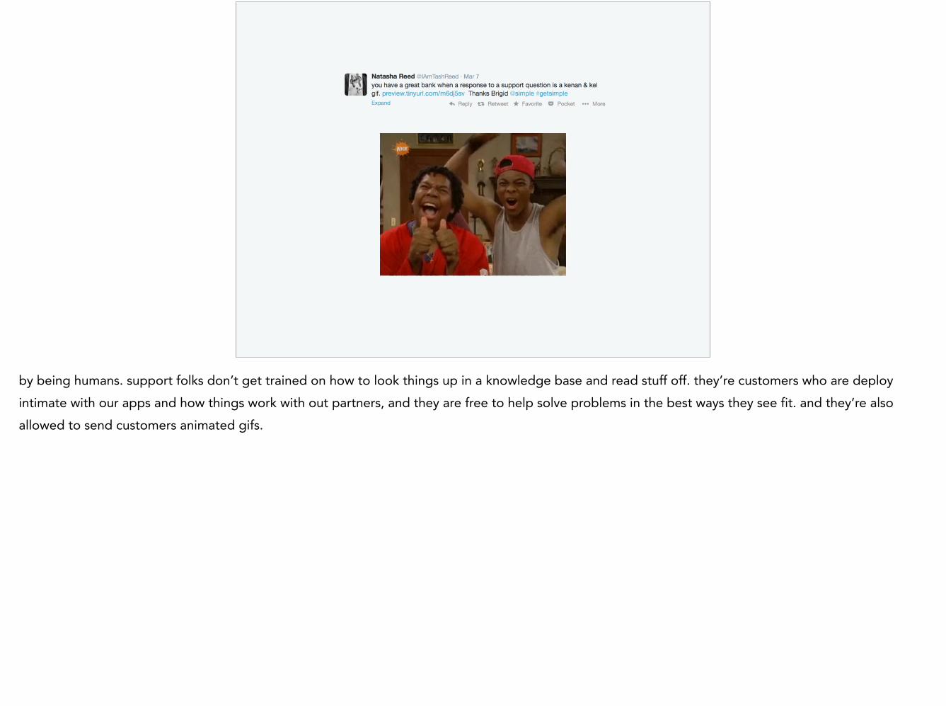
by being humans. support folks don’t get trained on how to look things up in a knowledge base and read stuff off. they’re customers who are deploy intimate with our apps and how things work with out partners, and they are free to help solve problems in the best ways they see fit. and they’re also allowed to send customers animated gifs.

as well as hand made notes just to tell customers they’re awesome and to give them stickers and replacement wallets (see, people *do* use them!)
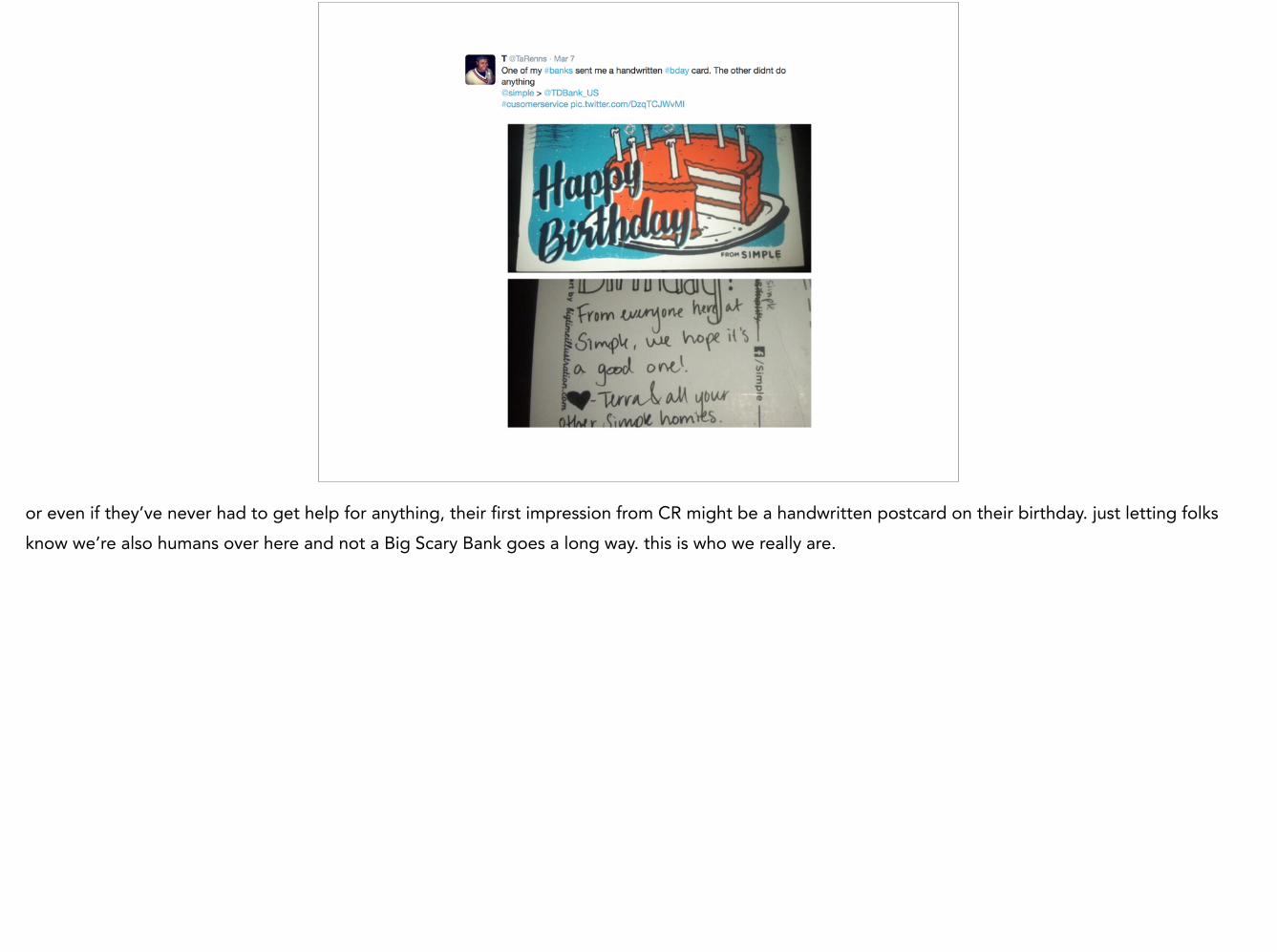
or even if they’ve never had to get help for anything, their first impression from CR might be a handwritten postcard on their birthday. just letting folks know we’re also humans over here and not a Big Scary Bank goes a long way. this is who we really are.

so, that’s how we do things at simple, where I think we’ve got a pretty damn good product and we’re constantly trying to make every first interaction they have with parts of our service as memorable and delightful as we possibly can, whether it’s with our apps or with support or just a passing twitter conversation. I could go on for hours geeking out about all these details, but now i’m going to hand it back over to samuel, where he’s going to help teach us all how to take all these types of details and features and synthesize them down into an onboarding experience that’s super easy and quick for people to understand and get excited about.

Thanks! @takeo