dashboard user guide - documentation.rossvideo.com it systems/dashboard... · ii dashboard user...
TRANSCRIPT
DashBoard Facility Control System User Guide
Version 8.6
ii DashBoard User Guide
Thank You for Choosing RossYou've made a great choice. We expect you will be very happy with your purchase of Ross Technology.
Our mission is to:
1. Provide a Superior Customer Experience
• offer the best product quality and support
2. Make Cool Practical Technology
• develop great products that customers love
Ross has become well known for the Ross Video Code of Ethics. It guides our interactions and empowers our employees. I hope you enjoy reading it below.
If anything at all with your Ross experience does not live up to your expectations be sure to reach out to us at [email protected].
David RossCEO, Ross [email protected]
Ross Video Code of Ethics
Any company is the sum total of the people that make things happen. At Ross, our employees are a special group. Our employees truly care about doing a great job and delivering a high quality customer experience every day. This code of ethics hangs on the wall of all Ross Video locations to guide our behavior:
1. We will always act in our customers’ best interest.
2. We will do our best to understand our customers’ requirements.
3. We will not ship crap.
4. We will be great to work with.
5. We will do something extra for our customers, as an apology, when something big goes wrong and it's our fault.
6. We will keep our promises.
7. We will treat the competition with respect.
8. We will cooperate with and help other friendly companies.
9. We will go above and beyond in times of crisis. If there's no one to authorize the required action in times of company or customer crisis - do what you know in your heart is right. (You may rent helicopters if necessary.)
DashBoard User Guide Contents • iii
DashBoard User Guide• Ross Part Number: 8351DR-004-8.6
• Publication Date: May 3, 2019. Printed in Canada.
• Software Issue: 8.6
The information contained in this Guide is subject to change without notice or obligation.
Copyright
© 2019 Ross Video Limited. Ross® and any related marks are trademarks or registered trademarks of Ross Video Limited. All other trademarks are the property of their respective companies. PATENTS ISSUED and PENDING. All rights reserved. No part of this publication may be reproduced, stored in a retrieval system, or transmitted in any form or by any means, mechanical, photocopying, recording, or otherwise, without the prior written permission of Ross Video. While every precaution has been taken in the preparation of this document, Ross Video assumes no responsibility for errors or omissions. Neither is any liability assumed for damages resulting from the use of the information contained herein.
Patents
Ross Video products are protected by patent numbers US 7,034,886; US 7,508,455; US 7,602,446; US 7,802,802 B2; US 7,834,886; US 7,914,332; US 8,307,284; US 8,407,374 B2; US 8,499,019 B2; US 8,519,949 B2; US 8,743,292 B2; GB 2,419,119 B; GB 2,447,380 B. Other patents pending.
Environmental Information
The equipment that you purchased required the extraction and use of natural resources for its production. It may contain hazardous substances that could impact health and the environment.
To avoid the potential release of those substances into the environment and to diminish the need for the extraction of natural resources, Ross Video encourages you to use the appropriate take-back systems. These systems will reuse or recycle most of the materials from your end-of-life equipment in an environmentally friendly and health conscious manner.
The crossed-out wheeled bin symbol invites you to use these systems.
If you need more information on the collection, reuse, and recycling systems, please contact your local or regional waste administration.
You can also contact Ross Video for more information on the environmental performances of our products.
iv DashBoard User Guide
Company Address
Ross Video Limited
8 John StreetIroquois, OntarioCanada, K0E 1K0
Ross Video Incorporated
P.O. Box 880Ogdensburg, New YorkUSA 13669-0880
General Business Office: (+1) 613 652 4886
Fax: (+1) 613 652 4425
Technical Support: (+1) 613 652 4886
After Hours Emergency: (+1) 613 349 0006
E-mail (Technical Support): [email protected]
E-mail (General Information): [email protected]
Website: http://www.rossvideo.com
DashBoard User Guide Contents • v
Table of Contents
Introduction 1Overview ...............................................................................................................................................................1-1
Features ..............................................................................................................................................................1-2Documentation Terms ...........................................................................................................................................1-2Documentation Conventions .................................................................................................................................1-2
Interface Elements ..............................................................................................................................................1-2User Entered Text ..............................................................................................................................................1-2Referenced Guides .............................................................................................................................................1-3Menu Sequences .................................................................................................................................................1-3Interface Navigation ...........................................................................................................................................1-3Important Instructions ........................................................................................................................................1-3
Getting Help ..........................................................................................................................................................1-3Contacting Technical Support ............................................................................................................................1-3
Installing DashBoard 2Before You Begin .................................................................................................................................................2-1
System Requirements .........................................................................................................................................2-1Installing and Removing the DashBoard Control System Client .........................................................................2-2
Creating a Backup of the Settings and Licensed Features .................................................................................2-2Installing on a Computer Running Microsoft® Windows® ..............................................................................2-2Installing on a Computer Running Apple® Mac® OS® X ...............................................................................2-3Installing on a Computer Running Linux® Fedora® ........................................................................................2-3Removing DashBoard ........................................................................................................................................2-4Installing DashBoard Add-on Programs ............................................................................................................2-4
Getting Started ......................................................................................................................................................2-4Launching DashBoard ........................................................................................................................................2-4Using the Full-Screen Mode ..............................................................................................................................2-5Displaying Multiple DashBoard Windows ........................................................................................................2-5Switching Views Between Multiple Open Panels .............................................................................................2-5Locking the DashBoard window ........................................................................................................................2-5
Viewing Installation Details .................................................................................................................................2-5DashBoard Installation Details Overview ..........................................................................................................2-5Viewing Error Logs ............................................................................................................................................2-6
Managing openGear Frames in DashBoard 3Adding openGear Frames to DashBoard ..............................................................................................................3-1
Using the Automatic Detection Feature .............................................................................................................3-1Manually adding openGear Frames to DashBoard ............................................................................................3-2
Re-naming an openGear Frame in the Tree View ................................................................................................3-2Removing openGear Frames from a Tree View ...................................................................................................3-3Configuring and Accessing a DashBoard Proxy Server .......................................................................................3-3
Configure a DashBoard Proxy Server ................................................................................................................3-4Access Frames Shared by a DashBoard Proxy Server .......................................................................................3-6
Using the DashBoard Interface 4DashBoard Interface Overview .............................................................................................................................4-1
Status Indicators .................................................................................................................................................4-2DashBoard Basic Tree View .................................................................................................................................4-3
Overview ............................................................................................................................................................4-3Using the Basic Tree View ................................................................................................................................4-5
vi • Contents DashBoard User Guide
Using the Advanced Tree View ........................................................................................................................... 4-6Overview ........................................................................................................................................................... 4-6Using the Advanced Tree View ........................................................................................................................ 4-8
The Device Editor Area ........................................................................................................................................ 4-9Overview ........................................................................................................................................................... 4-9Using the Device Editor Feature ..................................................................................................................... 4-10
Using Layouts .................................................................................................................................................... 4-11Overview ......................................................................................................................................................... 4-11Managing Your Layouts .................................................................................................................................. 4-11
Keyboard Shortcuts ............................................................................................................................................ 4-12Overview ......................................................................................................................................................... 4-13Managing the Keyboard Shortcuts .................................................................................................................. 4-14Resolving Conflicts ......................................................................................................................................... 4-15Importing and Exporting Libraries .................................................................................................................. 4-16Resetting to Default Values ............................................................................................................................. 4-16Restoring Keyboard Shortcut Commands for Copy, Cut, Paste, Undo, and Redo ......................................... 4-16
Using DashBoard Help ....................................................................................................................................... 4-17Configuring the DashBoard Help Display Options ......................................................................................... 4-17Importing openGear Help ................................................................................................................................ 4-18
Preferences ......................................................................................................................................................... 4-19Secure Storage ................................................................................................................................................. 4-19
PanelBuilder™ 5About PanelBuilder .............................................................................................................................................. 5-1
CustomPanel Examples ..................................................................................................................................... 5-2PanelBuilder Concepts and Terminology .......................................................................................................... 5-4
Creating a CustomPanel ....................................................................................................................................... 5-8Ultritouch CustomPanel Template .................................................................................................................. 5-10
Edit Mode ........................................................................................................................................................... 5-10The Edit Mode Toolbar ................................................................................................................................... 5-11
Adding Device Editors, Device Summaries, and Device Controls .................................................................... 5-16Device Editors and Device Summaries ........................................................................................................... 5-16Device Controls ............................................................................................................................................... 5-17
Adding Basic Components ................................................................................................................................. 5-19Basic Canvases ................................................................................................................................................ 5-21Tab Groups ...................................................................................................................................................... 5-22Drawers ........................................................................................................................................................... 5-23Image Canvases ............................................................................................................................................... 5-26Split Panels ...................................................................................................................................................... 5-27Tables .............................................................................................................................................................. 5-30Simple Grids .................................................................................................................................................... 5-31Flow Containers (Wrap Content) .................................................................................................................... 5-32Labels .............................................................................................................................................................. 5-33Links to Device Editors or Other CustomPanels ............................................................................................. 5-34Buttons ............................................................................................................................................................. 5-35Line Segments ................................................................................................................................................. 5-37Web Browser Instances ................................................................................................................................... 5-38
NDI Video Panels ............................................................................................................................................... 5-39Adding Data-Backed Components ..................................................................................................................... 5-40
Widgets ............................................................................................................................................................ 5-41Parameter Displays .......................................................................................................................................... 5-43Data-Backed Labels ........................................................................................................................................ 5-44Editable Text Areas ......................................................................................................................................... 5-44Option Choice Controls ................................................................................................................................... 5-45Numeric Choice Controls ................................................................................................................................ 5-46Toggle Choice Controls ................................................................................................................................... 5-46
DashBoard User Guide Contents • vii
Creating a Row, Column, or Grid of Data-Backed Buttons ............................................................................5-48Timers .................................................................................................................................................................5-49
Creating a Timer ..............................................................................................................................................5-49Adding Timer Labels and Timer Control Buttons to a CustomPanel ..............................................................5-50Timer Control Functions ..................................................................................................................................5-51
Assigning Tasks to Buttons, Labels, and Timers ................................................................................................5-52Assigning ogScript Tasks .................................................................................................................................5-52Assigning Pauses ..............................................................................................................................................5-53Assigning RossTalk Commands ......................................................................................................................5-53Assigning CamBot Commands ........................................................................................................................5-54Assigning VDCP Commands ...........................................................................................................................5-55Assigning PBUS Commands ...........................................................................................................................5-56Using the Global List .......................................................................................................................................5-57Assigning Data Modification Tasks .................................................................................................................5-57Assigning Timer Control Tasks .......................................................................................................................5-58Editing a Task ..................................................................................................................................................5-59
Triggering Tasks Externally ...............................................................................................................................5-59Creating a GPI Trigger .....................................................................................................................................5-60Triggering Tasks Using Keyboard Shortcuts ...................................................................................................5-60Triggering Tasks Using RossTalk Messages ...................................................................................................5-61Triggering Tasks Using the ogscript.fireGPI Function ....................................................................................5-62
Editing Components ............................................................................................................................................5-62Component Tree ...............................................................................................................................................5-63Attribute Editor Tabs .......................................................................................................................................5-64Abs Attributes Tab ...........................................................................................................................................5-66Api Attributes Tab ...........................................................................................................................................5-68Basic Attributes Tab .........................................................................................................................................5-69Browser Attributes Tab ....................................................................................................................................5-69Button Attributes Tab .......................................................................................................................................5-69Color Attributes Tab ........................................................................................................................................5-70Container Attributes Tab ..................................................................................................................................5-70Dropspot Attributes Tab ...................................................................................................................................5-71Editor Attributes Tab .......................................................................................................................................5-71Flow Attributes Tab .........................................................................................................................................5-72Label Attributes Tab ........................................................................................................................................5-73Listener Attributes Tab ....................................................................................................................................5-74Lookup Attributes Tab .....................................................................................................................................5-75Meta Attributes Tab .........................................................................................................................................5-75Ndi Attributes Tab ...........................................................................................................................................5-75Ogscript Attributes Tab ....................................................................................................................................5-76Param Attributes Tab .......................................................................................................................................5-77Position/Stretch Attributes Tab ........................................................................................................................5-79Simplegrid Attributes Tab ................................................................................................................................5-80Source Tab .......................................................................................................................................................5-81Split Attributes Tab ..........................................................................................................................................5-81Statuscombo Attributes Tab .............................................................................................................................5-82Style Tab ..........................................................................................................................................................5-82Tab Attributes Tab ...........................................................................................................................................5-87Table Attributes Tab ........................................................................................................................................5-88Table Cell Attributes Tab .................................................................................................................................5-89Tag Attributes Tab ...........................................................................................................................................5-90Task Attributes Tab ..........................................................................................................................................5-91Timer Attributes Tab ........................................................................................................................................5-91Timertask Attributes Tab .................................................................................................................................5-92Tr Attributes Tab ..............................................................................................................................................5-92TreeElement Attributes Tab .............................................................................................................................5-93Widget Attributes Tab ......................................................................................................................................5-93
viii • Contents DashBoard User Guide
Anchor Points and Background Alignment ..................................................................................................... 5-93Locking Panel Proportions ................................................................................................................................. 5-96Parameters and Data Sources ............................................................................................................................. 5-97
The Add/Edit Parameter Window ................................................................................................................... 5-97Creating a New Parameter ............................................................................................................................... 5-98Associating a Data Source with a CustomPanel ........................................................................................... 5-100
Working with ogScript ..................................................................................................................................... 5-101Adding an ogScript-Based Item to the Component Tree .............................................................................. 5-101Editing ogScript Code ................................................................................................................................... 5-103Debugging ogScript Code ............................................................................................................................. 5-105
NK Series Router Control Panels ..................................................................................................................... 5-110
DashBoard Visual Logic 6The Visual Logic Editor ....................................................................................................................................... 6-2
Visual Logic Editor - Areas and Controls ......................................................................................................... 6-3Logic Blocks ...................................................................................................................................................... 6-7
Using DashBoard Visual Logic ............................................................................................................................ 6-9Creating and Populating a New CustomPanel ................................................................................................ 6-10Editing ogScript Code in Existing CustomPanels ........................................................................................... 6-10Importing External APIs from Saved Files ..................................................................................................... 6-10Adding ogScript-Based Items to the Component Tree ................................................................................... 6-11Adding and Linking Logic Blocks .................................................................................................................. 6-12Adding Devices ............................................................................................................................................... 6-12Adding Panel Parameters ................................................................................................................................ 6-12Adding Local Variables ................................................................................................................................... 6-12Adding Logical Controls and Math Operations .............................................................................................. 6-13Creating New Functions .................................................................................................................................. 6-13Using Functions ............................................................................................................................................... 6-13
Creating Internal and External APIs .................................................................................................................. 6-13Internal APIs .................................................................................................................................................... 6-14External APIs .................................................................................................................................................. 6-14
Creating a New Device Type in Visual Logic ................................................................................................... 6-14About Adding Devices .................................................................................................................................... 6-14Creating a New Device Type .......................................................................................................................... 6-15Adding Connection Parameters to the Add Device Dialog Box ..................................................................... 6-17Adding API Blocks to the New Device Type ................................................................................................. 6-18Adding Data Input to Your API Blocks .......................................................................................................... 6-20Example XML File .......................................................................................................................................... 6-24
DataSafe™ 7DataSafe Overview .............................................................................................................................................. 7-1DataSafe Basics .................................................................................................................................................... 7-3
Saving a DataSafe File ...................................................................................................................................... 7-3Restoring Configurations to Devices ................................................................................................................ 7-3Notes on Saving and Restoring Parameters ...................................................................................................... 7-5Forcing DataSafe Updates ................................................................................................................................. 7-5
Configuring Devices 8Configuring Online Devices in DashBoard ......................................................................................................... 8-1
Configuring Devices in DashBoard .................................................................................................................. 8-1Re-naming an openGear Slot in the Tree View ................................................................................................ 8-2Automatic Discovery ......................................................................................................................................... 8-2Troubleshooting ................................................................................................................................................. 8-3Removing Devices from the Tree View ............................................................................................................ 8-3
Using the File Navigator ...................................................................................................................................... 8-3
DashBoard User Guide Contents • ix
Upgrading Device Software ..................................................................................................................................8-4Upgrading Device Software ...............................................................................................................................8-4Troubleshooting the Software Upload Process ..................................................................................................8-5
Adding a USB Joystick or Other USB Game Controller 9

x • Contents DashBoard User Guide
DashBoard User Guide Introduction • 1–1
IntroductionThis chapter contains the following sections:
• Overview
• Documentation Terms
• Documentation Conventions
• Getting Help
Overview
This guide provides an overview of installing, setting up, and using the DashBoard client. For information on using the DashBoard Server and User Rights Management features, refer to the DashBoard Server and User Rights Management User’s Guide.
The DashBoard Control System is built on Ethernet and TCP/IP technology, which allows remote access across LAN architectures. DashBoard offers the ability to view multiple frames with full control and alarming of all populated slots inside an openGear frame. This simplifies the setup of numerous devices in a large installation and offers the ability to centralize monitoring. The devices define their controllable parameters and layout to DashBoard, so the control interface is always up-to-date.
Alarms raised by devices in the frame are reported at the uppermost level, making it quick and easy to identify potential failures or problems.
Monitoring
A network of DashBoard Connect compatible devices can be monitored, allowing users to quickly isolate and correct potential problems from a central monitoring station.
Control
DashBoard offers real-time control of DashBoard Connect compatible devices. Parameter items and menus vary depending on device functionality.
Workflow Automation
DashBoard’s PanelBuilder™ enables you to create customized user interfaces to control a wide range of Ross Video products and third-party systems. PanelBuilder includes a rich set of drag-and-drop tools to make creation of CustomPanel interfaces easy. CustomPanels can be tailored to suit the exact requirements and preferences of each operator. You can further enhance your CustomPanels using Ross Video ogScript functions, to create user interfaces that perfectly match your desired workflow.
DataSafe™
DataSafe enables you to back up and restore device parameters to and from a single file, and to copy parameters from one device to a another device or even a group of devices via DashBoard. This feature allows you to hot-swap devices while retaining configurations, and DashBoard is not required to have the parameters on the new device updated. You can update a subset of devices instead of the entire connected view or to replace a device and have the previous device settings automatically loaded onto the new device. When using openGear cards, this feature is available for frames using the Network Controller Cards series only.
Software Upgrades
You can upgrade the software and firmware on devices, such as openGear cards, in the field using DashBoard. The upgrade utility verifies firmware and software upgrades against device hardware and prevents accidental loading of incorrect files to the wrong hardware. DashBoard is designed to allow for future feature plug-ins and upgrades to allow users the ability to customize control and monitoring needs.
1–2 • Introduction DashBoard User Guide
Features
The following features make DashBoard a unique system for your openGear requirements:
• Automatic discovery of openGear and DashBoard Connect devices
• Access multiple openGear frames on a single control network
• Access multiple DashBoard applications on a single control network
• Ability to have multiple control windows active and available on one screen
• Store and upload configurations to multiple devices (using DataSafe)
• Ability to perform batch software upgrades to allow multiple cards, of the same model, to be upgraded at one time from any DashBoard terminal on the network
• Customize views with the Advanced Tree View feature
• Ability to create customized monitoring and control interfaces using DashBoard PanelBuilder
• Extensible plug-in architecture
• DashBoard software and documentation are available for download from the Ross Video website
• Java™ based for installation in Microsoft® Windows®, Mac® OS, and Linux® Fedora®
• Software and firmware upgrades via Ethernet
Documentation Terms• All references to the DFR-8300 series frame also includes all version of the 10-slot and 20-slot frames and any
available options.
• “Card” refers to openGear terminal devices within openGear frames, including all components and switches.
• “DashBoard window” refers to the main DashBoard client interface.
• “Device” refers to a product that can be monitored and controlled using DashBoard. Devices include NK routers, BlackStorm servers, openGear cards, and DashBoard Connect devices.
• “Frame” refers to any openGear frame within your video system.
• “Network Controller Card” refers to the MFC-8310-N series and MFC-8320-N series cards unless otherwise noted.
• “System” refers to the mix of interconnected production and terminal equipment in your environment.
• “Tree View” refers to the Basic Tree View and Advanced Tree View unless otherwise noted.
• “User” refers to the person who uses the DashBoard client.
Documentation Conventions
Special text formats are used in this guide to identify parts of the user interface, text that a user must enter, or a sequence of menus and sub-menus that must be followed to reach a particular command.
Interface Elements
Bold text is used to identify a user interface element such as a dialog box, menu item, or button. For example:
In the Media Manager Client, click Channel 1 the Channels section.
User Entered Text
Courier text is used to identify text that a user must enter. For example:
In the File Name box, enter Channel01.property.
DashBoard User Guide Introduction • 1–3
Referenced Guides
Italic text is used to identify the titles of referenced guides, manuals, or documents. For example:
DashBoard Server and User Rights Management User’s Guide
Menu Sequences
Menu arrows are used in procedures to identify a sequence of menu items that you must follow. For example, if a step reads “Server > Save As,” you would click the Server menu and then click Save As.
Interface Navigation
Navigation procedures assume that you are running Microsoft® Windows®. If you are running Mac® OS or Linux® Fedora®, menu names and options may differ.
Important Instructions
Star icons are used to identify important instructions or features. For example:
Contact your I.T. Department if you experience communication issues with DashBoard and are running anti-virus software.
Getting Help
To access the built-in Help system, click Help in the main toolbar.
Alternatively a user can press F1 to open Dynamic Help. The user can then click on areas of the window to display corresponding help information.
The DashBoard User Guide is also supplied as a print-ready PDF file on the Ross Video website.
Contacting Technical Support
At Ross Video, we take pride in the quality of our products, but if problems occur, help is as close as the nearest telephone.
Our 24-hour Hot Line service ensures you have access to technical expertise around the clock. After-sales service and technical support is provided directly by Ross Video personnel. During business hours (Eastern Time), technical support personnel are available by telephone. After hours and on weekends, a direct emergency technical support phone line is available. If the technical support person who is on call does not answer this line immediately, a voice message can be left and the call will be returned shortly. This team of highly trained staff is available to react to any problem and to do whatever is necessary to ensure customer satisfaction.
• Technical Support: (+1) 613-652-4886
• After Hours Emergency: (+1) 613-349-0006
• E-mail: [email protected]
• Website: http://www.rossvideo.com

1–4 • Introduction DashBoard User Guide
DashBoard User Guide Installing DashBoard • 2–1
Installing DashBoardThis chapter provides instructions for installing the DashBoard Control System client software. For information on installing the DashBoard URM and Server, refer to the DashBoard Server and User Rights Management User Manual.
The following topics are discussed:
• Before You Begin
• Installing and Removing the DashBoard Control System Client
• Getting Started
• Viewing Installation Details
Before You Begin
Before installing any software for your DashBoard client, ensure that you exit all other programs currently running.
IMPORTANT: If you experience communication issues with DashBoard and are running anti-virus software, consult your I.T. Department. You may need to verify that there are exceptions in your firewall to allow DashBoard access to the following ports:
• Port 5253 — Allows DashBoard to receive TCP data.
• Port 5254 — Allows communication with OGP-JSON-based devices.
System Requirements
Refer to the following sections for information on the system requirements for DashBoard.
Microsoft® Windows® 10, Windows® 8, or Windows® 7 Systems
The following are the minimum requirements when installing DashBoard on a Microsoft® Windows® system:
• 32-bit or 64-bit configurations
• Intel® Pentium 4, 1.6GHz (Intel® Core™ 2 Duo recommended)
• Minimum 2GB RAM (4GB or more recommended)
• 300MB available in HD space
• Microsoft® Internet Explorer® version 8 (minimum)
Note: If you are running DashBoard on a Microsoft® Surface Pro®, you must use a physical keyboard or enable the standard keyboard layout. For more information, see “Installing on a Computer Running Microsoft® Windows®” on page 2–2.
Apple Mac® OS X 10.8.3 (or higher) Systems (64bit)
The following are the minimum requirements when installing DashBoard on a Mac® OS system:
• 64-bit configuration only
• Intel® processor
• Minimum 2GB RAM (4GB or more recommended)
• 300MB available HD space
• Mac® Safari®
2–2 • Installing DashBoard DashBoard User Guide
Linux® Fedora® 25 (or higher) Systems
The following are the minimum requirements when installing DashBoard on a Linux® system:
• 32-bit or 64-bit configurations
• Intel® Pentium 4, 1.6GHz (Intel® Core™ 2 Duo recommended)
• Minimum 2GB RAM (4GB or more recommended)
• 300MB available in HD space
• Mozilla 1.4 GTK2 - 1.7.x GTK2, XULRunner 1.8.x - 1.9.x, 3.6.x and 10.x (but not 2.x nor 4.x - 9.x), WebKitGTK+ 1.2.x and newer
• Version 2.2.1 GTK+ widget toolkit and associated libraries (GLib, Pango) are required
Installing and Removing the DashBoard Control System Client
This section includes instructions on installing the DashBoard client to your computer. The DashBoard software and user guide are available from the Ross Video website at www.rossvideo.com/support/product-documentation/dashboard.
Creating a Backup of the Settings and Licensed Features
Regular backups of your DashBoard settings is recommended, or if you want to create a backup of your DashBoard settings and license files, before installing a new version of DashBoard.
• Microsoft® Windows® — DashBoard automatically uninstalls a previously installed version, but not your settings.
› To create a back up of your settings for Microsoft® XP® and earlier, navigate to the metadata folder. Depending on your operating system version, this folder may be located at c:\Program Files\DashBoard\ workspace. Copy the workspace folder contents to a new location.
› If you are running Microsoft® Vista® or higher, the metadata folder is at: c:\DashBoard\workspace. Copy the folder to a new location.
• Apple® Mac® OS® — DashBoard saves application information to the following location on your computer: /Library/Application Support/openGear/DashBoard. To create a backup of your settings, copy the workspace folder to a different location on your system.
• Linux® Fedora® — DashBoard creates a workspace directory inside of the current DashBoard directory when the application is launched. To create a backup copy of your settings, copy the workspace directory to a different location on your system.
Installing on a Computer Running Microsoft® Windows®
The Install Wizard automatically uninstalls any previous software versions before proceeding. The DashBoard main folder is located at c:\DashBoard.
To install DashBoard on a computer running Microsoft® Windows®:
1. Access the DashBoard software using one of the following methods:
• Download the current version of DashBoard software for Windows from the Ross Video website at www.rossvideo.com/support/software-downloads/dashboard.
• Load the DashBoard software DVD into the DVD/CD ROM tray of your computer.
2. If you are accessing the software from a DVD, the Installation Wizard automatically runs. If the Wizard does not automatically run, you can also install the DashBoard software, navigate to your DVD/CD ROM drive in the Navigation Pane, so that the DVD contents are displayed in the Main Window of Windows Explorer.
3. Launch DBx.x.x-Win-setup.exe to begin installing the DashBoard program onto your computer.
4. Follow the prompts to complete the installation of DashBoard onto your computer.
DashBoard User Guide Installing DashBoard • 2–3
5. If you are running DashBoard on a Microsoft® Surface Pro®, you must use a physical keyboard or enable the standard keyboard layout.
This is because the default virtual keyboards do not contain function keys necessary to use DashBoard's keyboard shortcuts.
To enable the standard keyboard layout:
a. In PC settings, tap General.
b. Under Touch keyboard options, turn on the Make the standard keyboard layout available option.
Note: If you are using Windows 10 with a secondary monitor, objects displayed on the secondary monitor may be scaled by default and may look strange alongside the primary monitor. You can set custom DPI scaling in Control Panel > Display > Change size of items > set a custom scaling level. If you require additional assistance configuring Windows settings, contact the IT department of your organization.
Installing on a Computer Running Apple® Mac® OS® X
If you have a previous version of DashBoard installed, it is recommended that you remove the DashBoard directory from the Applications folder before proceeding.
To install DashBoard on a computer running Apple® Mac® OS® X:
1. Access the DashBoard software using one of the following methods:
• Download the current version of DashBoard software for OS X from the Ross Video website at www.rossvideo.com/support/software-downloads/dashboard.
• Load the DashBoard software DVD into the DVD/CD ROM tray of your computer and navigate to the DashBoard *.pkg file for Apple OS X.
2. Navigate to the *.pkg file specified in step 1.
3. Right-click the *.pkg file and click Open.
4. Follow the prompts to complete the installation of DashBoard onto your computer.
Installing on a Computer Running Linux® Fedora®
If you have a previous version of DashBoard installed and want to keep your settings, remove all folders, except the workspace directory, from the DashBoard directory. Note that the uninstall function of DashBoard may delete the directory that also contains your user data.
To install DashBoard on a computer running Linux® Fedora®:
1. Access the DashBoard software using one of the following methods:
• Download the current version of DashBoard software for LINUX (32 BIT) or for LINUX (64 BIT) from the Ross Video website at www.rossvideo.com/support/software-downloads/dashboard.
• Load the DashBoard software DVD into the DVD/CD ROM tray of your computer.
2. Extract the new DashBoard.tar.gz file to your system. Note that this file contains a top-level directory called DashBoard.
3. To run DashBoard, click the DashBoard icon in the top level of the DashBoard program folder.
If you run DashBoard from the command line, ensure that you switch to the main DashBoard directory before launching DashBoard.
DashBoard creates a workspace directory where the application is launched. This directory includes saved settings and licenses for optional features. To provide consistent retrieval of saved settings and program features, Ross Video recommends that you always launch DashBoard from within the same directory.
2–4 • Installing DashBoard DashBoard User Guide
Removing DashBoard
Create a backup for your settings and licensed features before removing DashBoard if you wish to retain your user data. Refer to the section “Creating a Backup of the Settings and Licensed Features” on page 2-2.
To remove DashBoard from a computer running Microsoft® Windows®:
• Use the Add/Remove Software program located in the Windows® Control Panel.
Deleting the DashBoard directory before running the Add/Remove Software program results in a number of dead registry and Start Menu items on your system. You can delete the directory to remove your user data after you run the Add/Remove Software program.
To remove DashBoard from a computer running Apple® OS X®:
1. Remove your user data from the application support library directory.
2. Delete the DashBoard folder from your computer.
To remove DashBoard from a computer running Linux® Fedora®:
• Delete the DashBoard folder from your computer.
Installing DashBoard Add-on Programs
This section briefly outlines how to install Add-on programs for DashBoard such as:
• openGear Extra Feature Pack — If you have an executable openGear Extra Feature pack, and are running Microsoft® Windows®, use the following procedure to install your feature pack. If you are not running Microsoft® Windows®, refer to the feature pack documentation for installation details.
• Unicode Font Support Pack — This program installs an international character set for DashBoard and provides access to fonts capable of displaying all Unicode characters. This program is not available for systems running Apple Mac® OS®. This option may be required if you are using an openGear device designed with fonts not supported by the base Java font system. Consult your device documentation for requirements and details.
To install a DashBoard Add-on program:
1. Navigate to the openGear website (www.opengear.tv) and download the required add-on program for your system.
2. If you are running Microsoft® Windows®:
• Launch the Setup Wizard for your Add-on program by selecting the corresponding *.exe file.
• Follow the prompts to complete the installation of the Add-on program.
3. If you are running Linux® Fedora®:
• Ensure you are in the main DashBoard directory before extracting the Add-on program.
• Copy the required *.zip to the main DashBoard directory.
• Extract the *.zip file.
Getting Started
This section provides a brief introduction to launching the DashBoard client, and accessing some of its features.
Launching DashBoard
To Launch DashBoard:
1. Ensure that you have installed the DashBoard software as outlined in the section “Installing and Removing the DashBoard Control System Client” on page 2–2.
2. Launch the DashBoard client by double-clicking its icon on your desktop.
3. If you are using DashBoard Server and URM, you will be prompted for a user name and password.
DashBoard User Guide Installing DashBoard • 2–5
Using the Full-Screen Mode
You can set the DashBoard interface to full-screen by performing one of the following:
• Press Shift + F11.
• Select Window > Full Screen from the main DashBoard toolbar.
To exit out of full-screen mode by performing one of the following:
• Press Shift + F11.
• Right-click the DashBoard icon in the Windows system tray and then click Full Screen.
Displaying Multiple DashBoard Windows
When operating in a multi-screen environment, you can open multiple DashBoard windows as follows:
• Select Window > New Window from the main DashBoard menu bar.
Switching Views Between Multiple Open Panels
When multiple DashBoard panels are open in a DashBoard window, the panel you want to use may not be visible. It may be hidden behind other panels.
You can use a keyboard shortcut to switch between panels. This is particularly useful when the DashBoard interface is in full screen mode.
To switch between panels:
• Press and hold the Ctrl key, then press the F6 key repeatedly until the name of the panel you want to use is highlighted, and then release the Ctrl key.
Locking the DashBoard window
You can lock the DashBoard window, preventing users from accessing the DashBoard client running on your computer by performing one of the following:
• Press Shift + F4.
• Select Window > Lock Screen.
To unlock the interface:
• Use the provided Unlock wheel.
Viewing Installation Details
You can view your installation history, activities in DashBoard, and error logs using the DashBoard Installation Details dialog box available from the About DashBoard dialog box.
DashBoard Installation Details Overview
This section briefly explains the components of the DashBoard Installation Details dialog box should you need to view it for troubleshooting purposes or as directed by Ross Video Technical Support.
The DashBoard Installation Details dialog box includes the following tabs:
• Installed Software tab — This tab displays the currently installed DashBoard features, plug-ins, and application details. Details such as software version and ID are also provided.
• Installation History tab — This tab displays information on the current and any previous configurations of DashBoard installed on your computer. Details such as the date of installation and applications installed are also provided. From this dialog, you can also Revert to any previously installed software using the Revert button.
2–6 • Installing DashBoard DashBoard User Guide
• Plug-ins tab — This tab displays the ID, name, provider, and version of the currently installed plug-ins, or add-on programs, for DashBoard.
• Configuration tab — This tab displays information such as platform details, system properties, and user preferences that can be used for troubleshooting.
To view the installation details for your DashBoard client:
1. Launch DashBoard by double-clicking its icon on your desktop.
2. From the main DashBoard toolbar, select Help > About DashBoard > Installation Details. The DashBoard Installation Details dialog box opens.
3. To view details on the currently installed software features and options for your DashBoard application:
• Select the Installed Software tab.
• From the provided list, select the required software feature.
• Click Properties.
4. To view details on your DashBoard installation history:
• Select the Installation History tab.
• Select the required configuration from the Previous configurations: list.
• The Configuration contents pane updates to include a list of the features and options.
5. To view details on the installed plug-ins for your DashBoard application:
• Select the Plug-ins tab.
• Select the required plug-in from the provided list.
• Click Legal Info to display the plug-in licensing agreement.
• Click Show Signing Info to display a new pane that includes the signing date and the signing certificate for the selected plug-in. Click Hide Signing Info to close the pane.
• Click Columns to configure how information is displayed in the Plug-ins tab.
Viewing Error Logs
If you are troubleshooting problems in DashBoard, Ross Technical Support may request that you view the error logs for your local DashBoard application.
To view the error log for your DashBoard application:
1. From the main DashBoard toolbar, select Help > About DashBoard > Installation Details. The DashBoard Installation Details dialog box opens.
2. Select the Configuration tab.
3. Click View Error Log to display the error log in the selected application.
DashBoard User Guide Managing openGear Frames in DashBoard • 3–1
Managing openGear Frames in DashBoard
The DFR-8300 series frames offer remote control and monitoring with the combination of the openGear Network Interface card and the DashBoard Control System. This allows users to remotely monitor and control parameters on DashBoard Connect compatible devices, such as openGear frames and cards. DashBoard connects to an openGear frame using a TCP/IP LAN connection.
When DashBoard is launched, openGear frames are automatically discovered and are available in the Tree View where they can be custom identified, collapsed to view just the frame or opened to view available devices in the frame.
This section includes information about enabling DashBoard to auto-connect to openGear frames, manually adding frames to the Tree View and renaming them, and removing frames from the Tree View. It also explains how to set up a DashBoard proxy server.
It is assumed that if you have the DashBoard Server and URM feature installed, that your user account is configured for write access to the frames communicating with your DashBoard client.
DashBoard uses the open SLP protocol to locate openGear frames on the network. In larger installations, it is recommended to use an SLP Directory Agent (DA). Contact your IT Department for more information on whether your facility uses an SLP DA.
This section includes the following topics:
• “Adding openGear Frames to DashBoard” on page 3–1
• “Re-naming an openGear Frame in the Tree View” on page 3–2
• “Removing openGear Frames from a Tree View” on page 3–3
• “Configuring and Accessing a DashBoard Proxy Server” on page 3–3
For More Information on...
• configuring your openGear frame and Network Controller Card, refer to the DFR-8300 Series User Manual and the MFC-8300 Series User Manual.
• using the Basic Tree View, see “DashBoard Basic Tree View” on page 4–3.
• using the Advanced Tree View, see “Using the Advanced Tree View” on page 4–6.
• configuring your openGear frame and Network Controller Card, refer to the DFR-8300 Series User Manual and the MFC-8300 Series User Manual.
Adding openGear Frames to DashBoard
Each openGear frame lists all devices within the frame, and provides status information in the Tree View. You can also remove and disconnect an openGear frame from DashBoard. There are two methods for adding an openGear frame to the tree view: using the auto-connect feature or manually adding a frame by specifying the IP address of the frame. Both methods are described in this section.
Using the Automatic Detection Feature
By default, the DashBoard Control System auto-detects any openGear frame on the same IP subnet. How often DashBoard queries the network for new frames (the default is every 10 seconds) depends on how the Automatic Detection feature is configured in the Preferences menu. Refer to the section “Automatic Discovery” on page 8–2
3–2 • Managing openGear Frames in DashBoard DashBoard User Guide
for setup details. Refer to the section “DashBoard Basic Tree View” on page 4–3 for information on the toggling the Auto-Connect Devices button.
Manually adding openGear Frames to DashBoard
You must add openGear frames to the Tree View manually when the frame is on a different subnet from your computer running the DashBoard client.
To manually add an openGear frame to a DashBoard Tree View:
1. Click on the Tree View toolbar to open the Select Equipment or Service Type to Add dialog box.
2. Expand the openGear / DashBoard Connect node.
3. Select TCP/IP DashBoard Connect or openGear Device., and then click Next.
The New TCP openGear Frame Connection dialog box appears.
4. In the IP Address box, type the IP address of the frame.
The Detect Frame Information button becomes available.
5. To specify connection settings for the frame, do one of the following:
• To make DashBoard detect the frame properties automatically, click the Detect Frame Information button.
DashBoard retrieves the port, name, unique identifier, and other connection information from the specified IP address. Once DashBoard detects the information, the Automatically Track Updates to Frame Information check box is selected so that any changes are automatically updated in DashBoard.
• To specify frame properties manually, complete the following:
› Display Name — Type the name of the frame, as you want it to appear in DashBoard.
› Protocol — Selected whether the frame communicates over OGP (openGear Protocol), or JSON (JavaScript Object Notation).
› Port — Specify the port used for communication.
› Remember connection settings for this frame — Select to retain the settings.
6. Click Finish to display the frame in the Tree View. Frames added to the Tree View are also displayed in the Advanced Tree View.
7. Repeat the procedure for each frame that you wish to add to the Tree View.
Re-naming an openGear Frame in the Tree View
There are two methods for re-naming an openGear Frame in DashBoard. The first method is for frames manually added to the Tree View as described in the section “Adding openGear Frames to DashBoard” on page 3–1. The second method describes how to re-name an auto-detected frame using the DashBoard menu options available on the MFC-8300 series cards. Both methods are described below.
To re-name a manually added openGear frame:
1. Right-click the frame you wish to rename.
2. Select Rename Frame.
3. Enter the new name for the frame in the text field provided.
To re-name an Auto-Detected openGear frame:
1. Right-click the frame you wish to rename.
2. Select Open to display a Device Editor tab. Note that the tab title displays the name of the frame, and information about the MFC-8300 series Network Controller Card currently installed in the frame.
3. Select the Network tab.
DashBoard User Guide Managing openGear Frames in DashBoard • 3–3
4. Enter a new name for the frame in the Frame Name field.
5. Press Enter.
6. Click Apply.
Removing openGear Frames from a Tree View
This section outlines how to remove an openGear frame from a Tree View in DashBoard. Once a frame is removed, DashBoard no longer reports the status in the Tree View and you are no longer able to monitor or control the affected devices. If communication with a frame is disconnected via the Disconnect option, the status indicator is light gray until the frame is re-connected. If the status indicator is dark gray, with the rest of the node displaying as normal, a connection cannot currently be established to the device.
To remove or disconnect an openGear frame from the Tree View:
1. If the frame you are removing is in a Custom Folder, you must first delete the frame from the Custom Folder before it can be removed from the Tree View.
2. To remove a manually added openGear frame from the Tree View:
• Right-click the openGear frame you wish to remove.
• Select to remove the openGear frame from the Tree View.
3. To disconnect communications to an openGear frame from DashBoard:
• Toggle to off.
• Right-click the openGear frame you wish to disconnect.
• Select .
• The frame status indicator is grayed out in the Tree View.
4. To re-connect to an openGear frame:
• Right-click the frame status indicator.
• Select or toggle to on.
Auto-Discovery
Selecting for an auto-detected frame will temporarily remove the frame but the frame will re-appear in the Tree View again due to the auto-discovery feature of DashBoard. You must first disable the auto-discovery feature before you can remove a frame in this instance. Refer to the section “Automatic Discovery” on page 8–2 for details on configuring the auto-discovery feature.
However, you can still disconnect from an auto-discovered frame by toggling the Automatic Discovery option off.
Configuring and Accessing a DashBoard Proxy Server
A DashBoard proxy server enables users on remote DashBoard clients to connect to openGear frames through the proxy server instead of connecting to them directly.
A DashBoard proxy server is useful in the following situations:
• DashBoard users must control OGP binary devices from distant locations.
Without using a proxy server, DashBoard sometimes experiences a considerable delay when populating the DashBoard tree and accessing devices. This is because the high number of messages exchanged introduces significant cumulative latency. Connecting to devices indirectly via a proxy server at the facility where the devices are located typically provides faster access.
3–4 • Managing openGear Frames in DashBoard DashBoard User Guide
• Some devices can accept only a single connection.
The proxy server connects to the device directly. Remote DashBoard clients connect to the device indirectly via the proxy server.
• You want to expose only a single IP address between sites.
The proxy server enables remote DashBoard clients to use a single IP address to access and control all devices shared by the proxy server. This eliminates any need for remote users to establish separate connections to individual frames.
Configure a DashBoard Proxy Server
You can set up and configure a DashBoard proxy server to share selected frames and devices.
If required later, you can unshare individual frames and/or devices.
To set up and configure a DashBoard proxy server:
1. On the DashBoard proxy server computer, Install DashBoard.
For more information, see “Installing DashBoard” on page 2–1.
2. Add all the local devices to the DashBoard basic tree view.
For more information, see “Adding openGear Frames to DashBoard” on page 3–1.
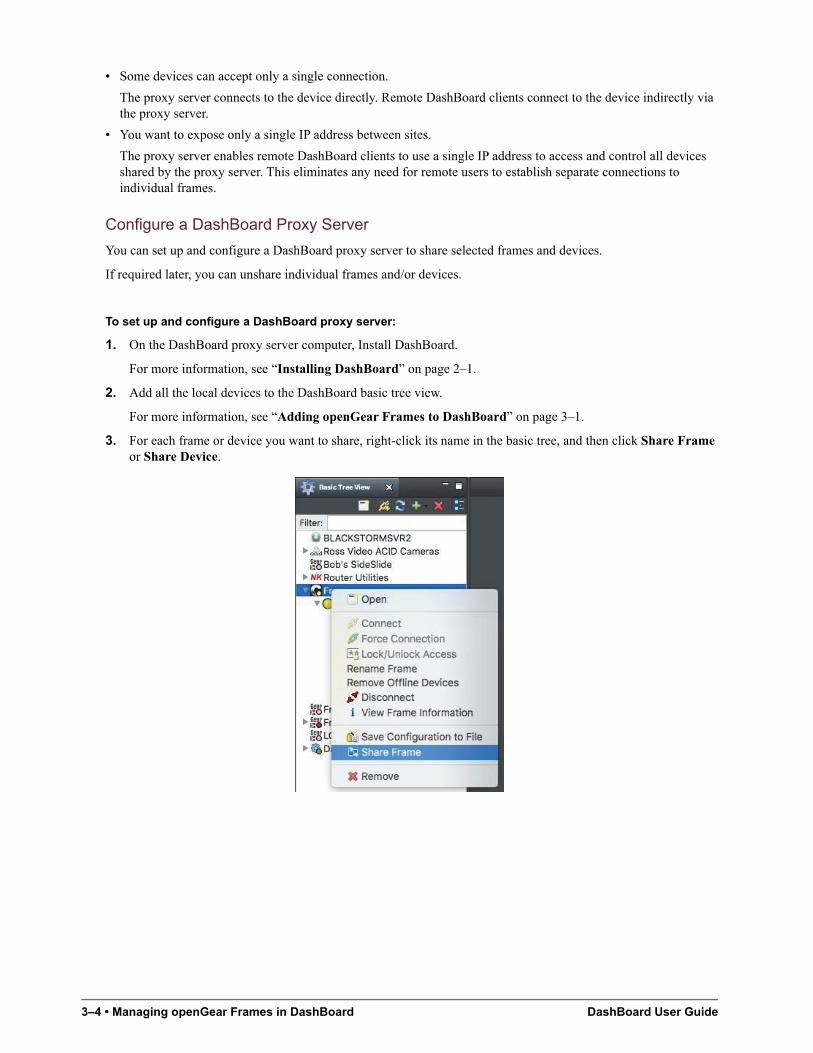
3. For each frame or device you want to share, right-click its name in the basic tree, and then click Share Frame or Share Device.
DashBoard User Guide Managing openGear Frames in DashBoard • 3–5
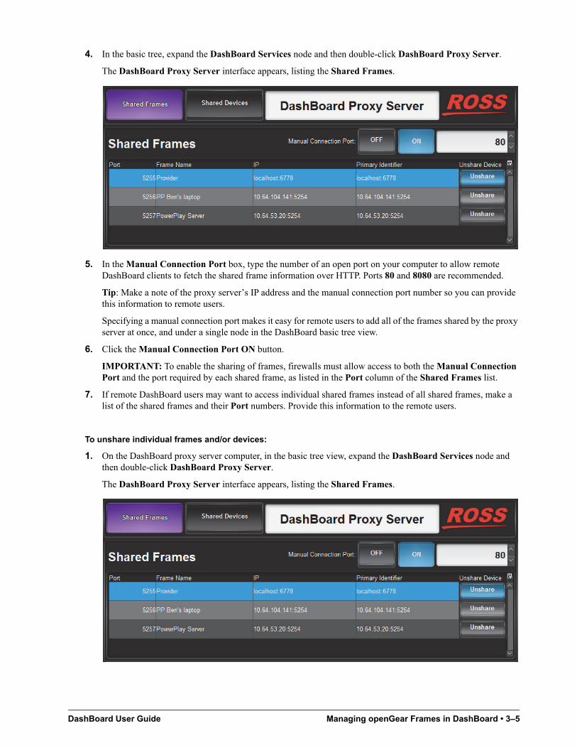
4. In the basic tree, expand the DashBoard Services node and then double-click DashBoard Proxy Server.
The DashBoard Proxy Server interface appears, listing the Shared Frames.
5. In the Manual Connection Port box, type the number of an open port on your computer to allow remote DashBoard clients to fetch the shared frame information over HTTP. Ports 80 and 8080 are recommended.
Tip: Make a note of the proxy server’s IP address and the manual connection port number so you can provide this information to remote users.
Specifying a manual connection port makes it easy for remote users to add all of the frames shared by the proxy server at once, and under a single node in the DashBoard basic tree view.
6. Click the Manual Connection Port ON button.
IMPORTANT: To enable the sharing of frames, firewalls must allow access to both the Manual Connection Port and the port required by each shared frame, as listed in the Port column of the Shared Frames list.
7. If remote DashBoard users may want to access individual shared frames instead of all shared frames, make a list of the shared frames and their Port numbers. Provide this information to the remote users.
To unshare individual frames and/or devices:
1. On the DashBoard proxy server computer, in the basic tree view, expand the DashBoard Services node and then double-click DashBoard Proxy Server.
The DashBoard Proxy Server interface appears, listing the Shared Frames.
3–6 • Managing openGear Frames in DashBoard DashBoard User Guide
2. For each frame you want to unshare, find it in the Shared Frames list and then click the corresponding Unshare button.
The Confirm dialog box appears.
3. Click Yes.
The frame disappears from the list.
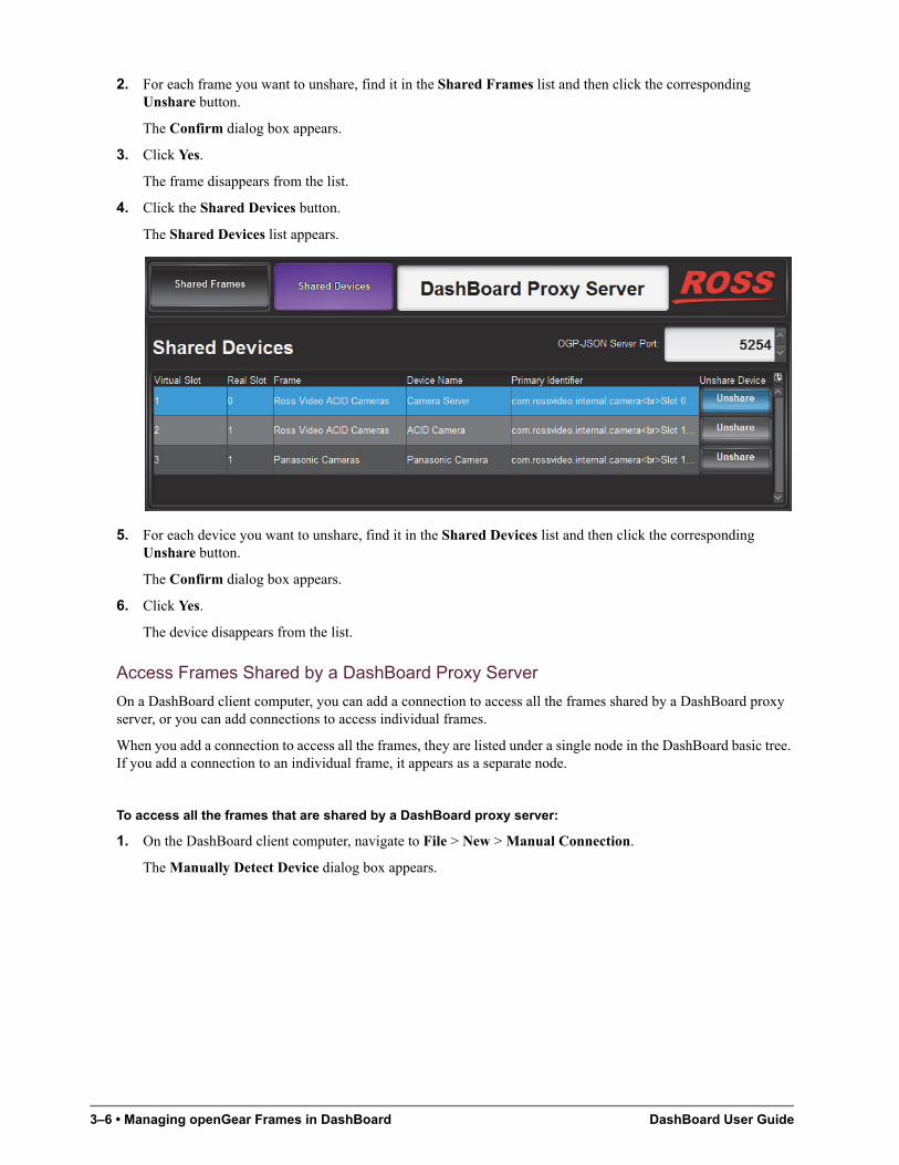
4. Click the Shared Devices button.
The Shared Devices list appears.
5. For each device you want to unshare, find it in the Shared Devices list and then click the corresponding Unshare button.
The Confirm dialog box appears.
6. Click Yes.
The device disappears from the list.
Access Frames Shared by a DashBoard Proxy Server
On a DashBoard client computer, you can add a connection to access all the frames shared by a DashBoard proxy server, or you can add connections to access individual frames.
When you add a connection to access all the frames, they are listed under a single node in the DashBoard basic tree. If you add a connection to an individual frame, it appears as a separate node.
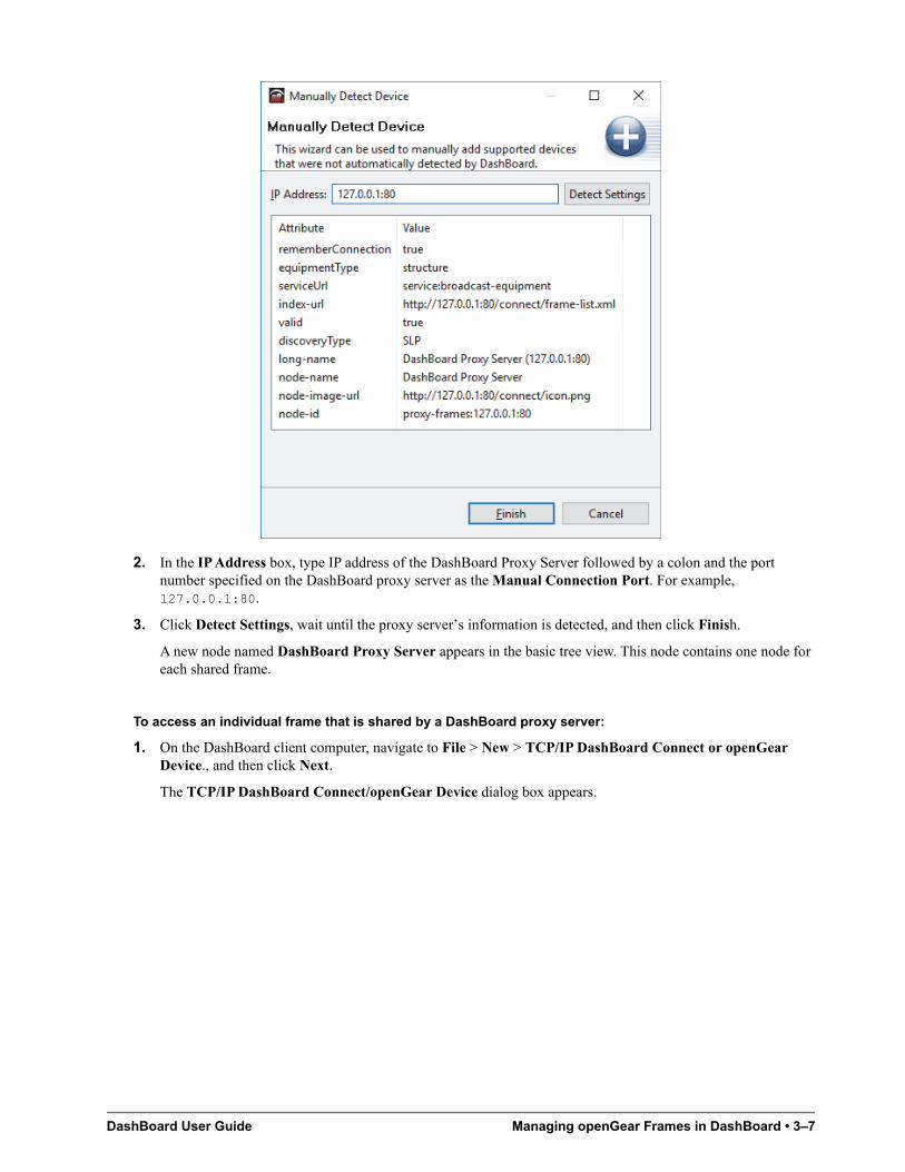
To access all the frames that are shared by a DashBoard proxy server:
1. On the DashBoard client computer, navigate to File > New > Manual Connection.
The Manually Detect Device dialog box appears.
DashBoard User Guide Managing openGear Frames in DashBoard • 3–7
2. In the IP Address box, type IP address of the DashBoard Proxy Server followed by a colon and the port number specified on the DashBoard proxy server as the Manual Connection Port. For example, 127.0.0.1:80.
3. Click Detect Settings, wait until the proxy server’s information is detected, and then click Finish.
A new node named DashBoard Proxy Server appears in the basic tree view. This node contains one node for each shared frame.
To access an individual frame that is shared by a DashBoard proxy server:
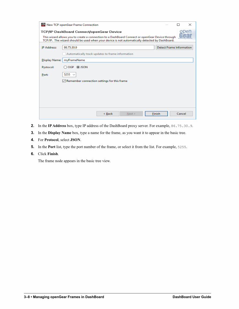
1. On the DashBoard client computer, navigate to File > New > TCP/IP DashBoard Connect or openGear Device., and then click Next.
The TCP/IP DashBoard Connect/openGear Device dialog box appears.
3–8 • Managing openGear Frames in DashBoard DashBoard User Guide
2. In the IP Address box, type IP address of the DashBoard proxy server. For example, 86.75.30.9.
3. In the Display Name box, type a name for the frame, as you want it to appear in the basic tree.
4. For Protocol, select JSON.
5. In the Port list, type the port number of the frame, or select it from the list. For example, 5255.
6. Click Finish.
The frame node appears in the basic tree view.
DashBoard User Guide Using the DashBoard Interface • 4–1
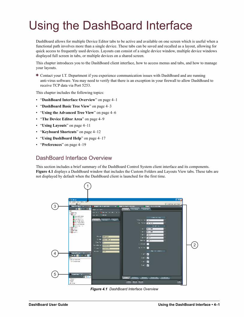
Using the DashBoard InterfaceDashBoard allows for multiple Device Editor tabs to be active and available on one screen which is useful when a functional path involves more than a single device. These tabs can be saved and recalled as a layout, allowing for quick access to frequently used devices. Layouts can consist of a single device window, multiple device windows displayed full screen in tabs, or multiple devices on a shared screen.
This chapter introduces you to the DashBoard client interface, how to access menus and tabs, and how to manage your layouts.
Contact your I.T. Department if you experience communication issues with DashBoard and are running anti-virus software. You may need to verify that there is an exception in your firewall to allow DashBoard to receive TCP data via Port 5253.
This chapter includes the following topics:
• “DashBoard Interface Overview” on page 4–1
• “DashBoard Basic Tree View” on page 4–3
• “Using the Advanced Tree View” on page 4–6
• “The Device Editor Area” on page 4–9
• “Using Layouts” on page 4–11
• “Keyboard Shortcuts” on page 4–12
• “Using DashBoard Help” on page 4–17
• “Preferences” on page 4–19
DashBoard Interface Overview
This section includes a brief summary of the DashBoard Control System client interface and its components. Figure 4.1 displays a DashBoard window that includes the Custom Folders and Layouts View tabs. These tabs are not displayed by default when the DashBoard client is launched for the first time.
Figure 4.1 DashBoard Interface Overview
1
4
5
3
2
4–2 • Using the DashBoard Interface DashBoard User Guide
1. Main DashBoard Toolbar
The Main DashBoard toolbar provides access to menus that enable you to manually add devices, manage your layouts, and enable different tabs in the DashBoard window.
• File — From this menu you can manually add a device or create a new CustomPanel (New), save changes made to device configuration files on your computer (Save, Save As..., Save All), log-off from DashBoard when using DashBoard URM (Sign Out), or close the DashBoard client (Exit).
• Layouts — From this menu you can display a Layouts View tab in the DashBoard window (Show Layouts View), save your current arrangement of tabs in the DashBoard window (Save Layout), lock the DashBoard window to its current state (Maintain Window State/Size/Location), or select from a list of saved layouts to apply.
• Views — From this menu you specify which tabs to display in the current DashBoard window.
• Window — From this menu you can open multiple DashBoard windows on a single screen (New Window), restore the default DashBoard client layout of tabs (Refresh Perspectives), show or hide the main toolbar (Show Toolbar), set the window to the maximum screen size (Full-screen), lock the current DashBoard window (Lock Screen), and set preferences for Automatic discovery of devices on your subnet, automatic login, and software updates (Preferences).
• Help — From this menu you can access the DashBoard online help system (Help Contents), perform checks for DashBoard software updates (Check for Updates), and view details about your current DashBoard client software (About DashBoard).
2. Device Editor
This area displays tabs for each device that you double-click from the Tree View. From this view you can verify the device and connection status, update device parameters, and view read-only device information.When shutting down and then re-starting the DashBoard client, the Device Editor tab state is also saved/restored. Refer to the section “The Device Editor Area” on page 4–9 and your device manual for more information.
3. Basic Tree View Tab
This area lists the devices, such as openGear frames and the cards installed in each frame, that can communicate with DashBoard. From this tab you can open Device Editors, enable or disable auto connections to devices, re-query the network for new devices, manually add new connections, and delete devices from the Tree View. Refer to the section “DashBoard Basic Tree View” on page 4–3 for more information.
4. Advanced Tree View Tabs
The Advanced Tree View feature enables you to create a customized hierarchy of folders and sub-folders in a single tab, where each folder can be expanded to display a list of devices and/or sub-folders. You can re-organize your devices in a Custom Folder tab to suit your workflow by dragging and dropping devices from the Basic Tree View to any open Custom Folder tab. Note that this tab is not displayed by default. For more information on using Custom Folders, refer to the section “Using the Advanced Tree View” on page 4–6.
5. Layouts View Tab
This feature enables you to save and restore a series of Device Editor tabs and the DashBoard window size and position as a layout. Layouts can be recalled using the options in the Main DashBoard toolbar or from a Layouts View tab. Note that saving/restoring a layout restores the current Device Editor tab selection, the divider position and scroll position in opened Device Editor tabs. Note that this tab is not displayed by default. For more information on layouts, refer to the section “Using Layouts” on page 4–11.
Status Indicators
Some devices include a status indicator beside the node in the Tree Views, custom folders and subfolders. The Frame Status Indicator, the Custom Folders, and the subfolders reflect the most severe status of any contained devices.
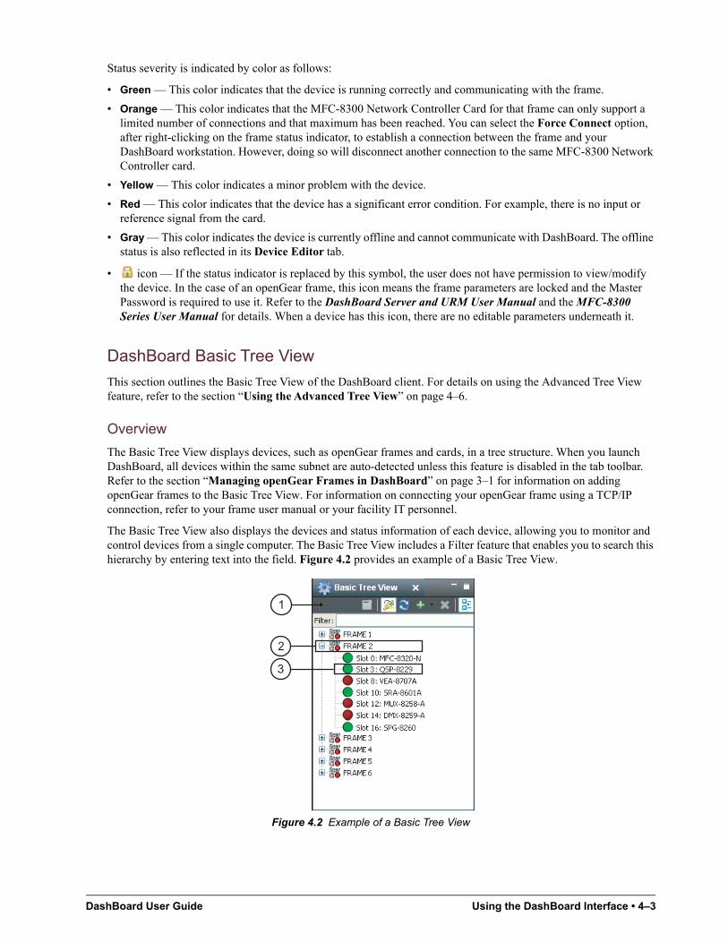
DashBoard User Guide Using the DashBoard Interface • 4–3
Status severity is indicated by color as follows:
• Green — This color indicates that the device is running correctly and communicating with the frame.
• Orange — This color indicates that the MFC-8300 Network Controller Card for that frame can only support a limited number of connections and that maximum has been reached. You can select the Force Connect option, after right-clicking on the frame status indicator, to establish a connection between the frame and your DashBoard workstation. However, doing so will disconnect another connection to the same MFC-8300 Network Controller card.
• Yellow — This color indicates a minor problem with the device.
• Red — This color indicates that the device has a significant error condition. For example, there is no input or reference signal from the card.
• Gray — This color indicates the device is currently offline and cannot communicate with DashBoard. The offline status is also reflected in its Device Editor tab.
• icon — If the status indicator is replaced by this symbol, the user does not have permission to view/modify the device. In the case of an openGear frame, this icon means the frame parameters are locked and the Master Password is required to use it. Refer to the DashBoard Server and URM User Manual and the MFC-8300 Series User Manual for details. When a device has this icon, there are no editable parameters underneath it.
DashBoard Basic Tree View
This section outlines the Basic Tree View of the DashBoard client. For details on using the Advanced Tree View feature, refer to the section “Using the Advanced Tree View” on page 4–6.
Overview
The Basic Tree View displays devices, such as openGear frames and cards, in a tree structure. When you launch DashBoard, all devices within the same subnet are auto-detected unless this feature is disabled in the tab toolbar. Refer to the section “Managing openGear Frames in DashBoard” on page 3–1 for information on adding openGear frames to the Basic Tree View. For information on connecting your openGear frame using a TCP/IP connection, refer to your frame user manual or your facility IT personnel.
The Basic Tree View also displays the devices and status information of each device, allowing you to monitor and control devices from a single computer. The Basic Tree View includes a Filter feature that enables you to search this hierarchy by entering text into the field. Figure 4.2 provides an example of a Basic Tree View.
Figure 4.2 Example of a Basic Tree View
2
3
1
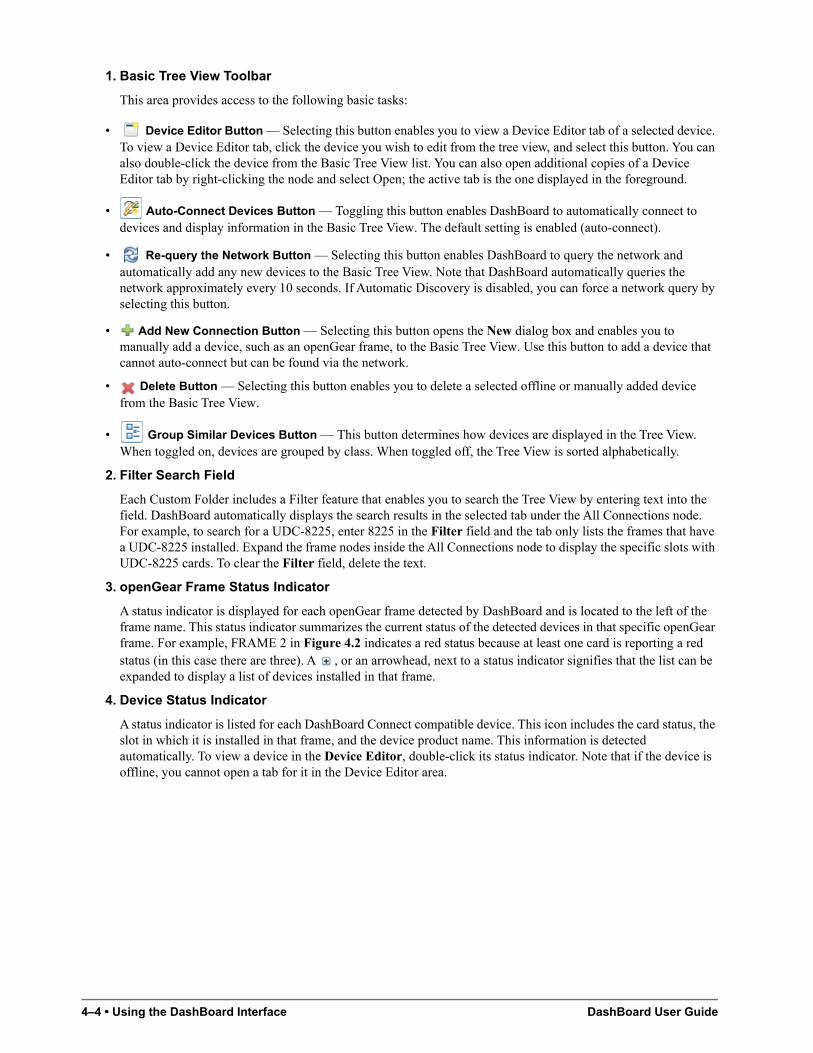
4–4 • Using the DashBoard Interface DashBoard User Guide
1. Basic Tree View Toolbar
This area provides access to the following basic tasks:
• Device Editor Button — Selecting this button enables you to view a Device Editor tab of a selected device. To view a Device Editor tab, click the device you wish to edit from the tree view, and select this button. You can also double-click the device from the Basic Tree View list. You can also open additional copies of a Device Editor tab by right-clicking the node and select Open; the active tab is the one displayed in the foreground.
• Auto-Connect Devices Button — Toggling this button enables DashBoard to automatically connect to devices and display information in the Basic Tree View. The default setting is enabled (auto-connect).
• Re-query the Network Button — Selecting this button enables DashBoard to query the network and automatically add any new devices to the Basic Tree View. Note that DashBoard automatically queries the network approximately every 10 seconds. If Automatic Discovery is disabled, you can force a network query by selecting this button.
• Add New Connection Button — Selecting this button opens the New dialog box and enables you to manually add a device, such as an openGear frame, to the Basic Tree View. Use this button to add a device that cannot auto-connect but can be found via the network.
• Delete Button — Selecting this button enables you to delete a selected offline or manually added device from the Basic Tree View.
• Group Similar Devices Button — This button determines how devices are displayed in the Tree View. When toggled on, devices are grouped by class. When toggled off, the Tree View is sorted alphabetically.
2. Filter Search Field
Each Custom Folder includes a Filter feature that enables you to search the Tree View by entering text into the field. DashBoard automatically displays the search results in the selected tab under the All Connections node. For example, to search for a UDC-8225, enter 8225 in the Filter field and the tab only lists the frames that have a UDC-8225 installed. Expand the frame nodes inside the All Connections node to display the specific slots with UDC-8225 cards. To clear the Filter field, delete the text.
3. openGear Frame Status Indicator
A status indicator is displayed for each openGear frame detected by DashBoard and is located to the left of the frame name. This status indicator summarizes the current status of the detected devices in that specific openGear frame. For example, FRAME 2 in Figure 4.2 indicates a red status because at least one card is reporting a red status (in this case there are three). A , or an arrowhead, next to a status indicator signifies that the list can be expanded to display a list of devices installed in that frame.
4. Device Status Indicator
A status indicator is listed for each DashBoard Connect compatible device. This icon includes the card status, the slot in which it is installed in that frame, and the device product name. This information is detected automatically. To view a device in the Device Editor, double-click its status indicator. Note that if the device is offline, you cannot open a tab for it in the Device Editor area.
DashBoard User Guide Using the DashBoard Interface • 4–5
Using the Basic Tree View
This section briefly summarizes how to use the Basic Tree View features.
To open or close the Basic Tree View tab:
• To open a tab, select Views > Basic Tree View.
• To close a tab, right-click the Basic Tree View tab, then select Close.
To enable automatic discovery:
Note that this method is applicable to all tree views.
1. Confirm the Automatic Discovery feature settings by selecting Window > Preferences. Note that by default, this feature is enabled and DashBoard polls for devices every 10 seconds.
2. Toggle on the Basic Tree View toolbar to enable DashBoard to automatically connect to the listed devices in the Basic Tree View.
To manually add a device to the Basic Tree View:
1. Click on the Basic Tree View toolbar to display the Select Equipment or Service Type to Add dialog box.
2. Select the type of equipment or service you want to add:
• Camera Control — Expand this node, select one of the following, and then tap Next:
› New ACID Camera
› Panasonic Camera
› Sony Camera
• General — Expand this node, select one of the following, and then tap Next:
› Bookmark
› Manual Connection
› New CustomPanel file
• Input Devices — Expand this node, select one of the following, and then tap Next:
› New Game Controller
› New MIDI Controller
• NK Router Series — Expand this node, select one of the following, and then tap Next:
› NK IPS Connection
• XPression — Expand this node, select one of the following, and then tap Next:
› New XPression
• openGear / DashBoard Connect — Expand this node, select one of the following, and then tap Next:
› Frame Demo (from file)
› Import openGear Help Files
› TCP/IP DashBoard Connect or openGear Device
3. Provide the information requested, and then tap Finish.
To display a Device Editor tab
Display a Device Editor tab using one of the following methods:
• From the Basic Tree View, double-click the device node.
• From the Basic Tree View, select the device to edit. Click on the Basic Tree View toolbar.
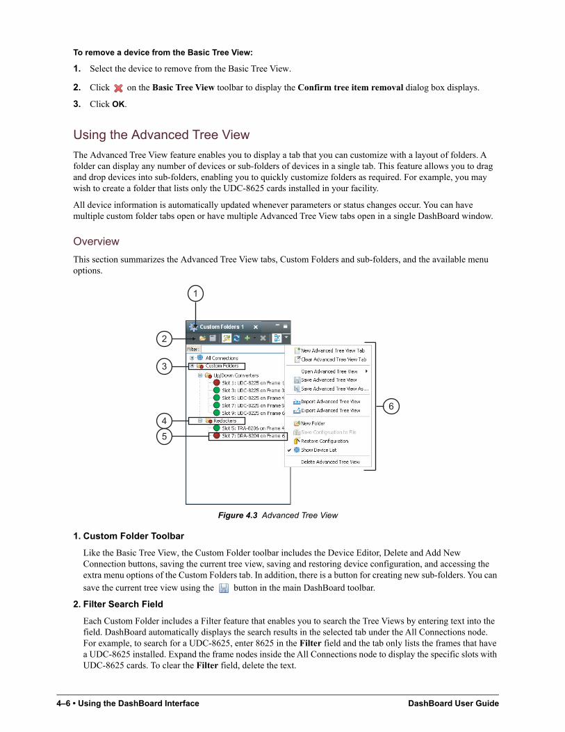
4–6 • Using the DashBoard Interface DashBoard User Guide
To remove a device from the Basic Tree View:
1. Select the device to remove from the Basic Tree View.
2. Click on the Basic Tree View toolbar to display the Confirm tree item removal dialog box displays.
3. Click OK.
Using the Advanced Tree View
The Advanced Tree View feature enables you to display a tab that you can customize with a layout of folders. A folder can display any number of devices or sub-folders of devices in a single tab. This feature allows you to drag and drop devices into sub-folders, enabling you to quickly customize folders as required. For example, you may wish to create a folder that lists only the UDC-8625 cards installed in your facility.
All device information is automatically updated whenever parameters or status changes occur. You can have multiple custom folder tabs open or have multiple Advanced Tree View tabs open in a single DashBoard window.
Overview
This section summarizes the Advanced Tree View tabs, Custom Folders and sub-folders, and the available menu options.
Figure 4.3 Advanced Tree View
1. Custom Folder Toolbar
Like the Basic Tree View, the Custom Folder toolbar includes the Device Editor, Delete and Add New Connection buttons, saving the current tree view, saving and restoring device configuration, and accessing the extra menu options of the Custom Folders tab. In addition, there is a button for creating new sub-folders. You can save the current tree view using the button in the main DashBoard toolbar.
2. Filter Search Field
Each Custom Folder includes a Filter feature that enables you to search the Tree Views by entering text into the field. DashBoard automatically displays the search results in the selected tab under the All Connections node. For example, to search for a UDC-8625, enter 8625 in the Filter field and the tab only lists the frames that have a UDC-8625 installed. Expand the frame nodes inside the All Connections node to display the specific slots with UDC-8625 cards. To clear the Filter field, delete the text.
4
5
3
2
1
6
DashBoard User Guide Using the DashBoard Interface • 4–7
3. Custom Folders
Each Advanced Tree View tab includes a main Custom Folder. In this folder, you can create and re-name sub-folders to organize devices for customized views. The status indicator represents the current status of the devices in the custom sub-folder. If a device in the sub-folder needs attention, the status indicator shows the most critical warning level. For example, the Custom Folders icon in Figure 4.3 indicates a red status because the UDC-8225 in FRAME 1 and the DRA-8204 in FRAME 6 are reporting an error conditions.
Right-clicking a custom folder displays a dialog that includes options for creating a new subfolder, connecting or disconnecting devices, and re-naming the folder. To add devices to a Custom Folder, simply drag a device or frame from the All Connections directory to the desired Custom Folder.
4. Custom Subfolders
A Custom Subfolder displays the devices connected to DashBoard that you have specified. Creating Custom Subfolders allows you to group similar devices together that may be installed in different frames, such as the folders in Figure 4.3. If a device in the sub-folder needs attention, the status indicator shows the most critical warning level. For example, the Reclockers sub-folder in Figure 4.3 indicates a red status because the DRA-8204 in FRAME 6 is reporting an error condition (a red status).
Right-clicking a subfolder displays a dialog that includes options for creating a new sub-subfolder, connecting or disconnecting devices, re-naming the folder, removing the selected subfolder, saving and recalling configuration folders.
5. Device Status Indicator
A status indicator is listed for each device in a sub-folder. This icon includes the device status, the slot and frame in which it is installed (if it is an openGear card), and the device product name. This information is detected automatically, but you can also re-name an openGear frame or card as required. To view a Device Editor tab, double-click the device node. Right-clicking a device displays a menu that includes options for opening the device, restoring or saving the configuration, re-naming the device or removing the device.
6. Custom Folders Extra Options
You may need to select the button on the Custom Folder toolbar to display the available Extra Options.
• New Advanced Tree View tab — This option opens a new Advanced Tree View tab in DashBoard.
• Clear This Advanced Tree View tab — This option closes the current Advanced Tree View and opens a new Advanced Tree View in its place. If you have made any changes to the current Advanced Tree View, you will be prompted to save your work.
• Open Advanced Tree View — This option enables you to select a previously saved Advanced Tree View to open in the current session of DashBoard.
• Save Advanced Tree View — This option saves the selected Advanced Tree View. If you have re-named the main Custom Folder, the new name is now displayed. An asterisk displays next to the Custom Folder tab name when there are unsaved changes for that tab.
• Save Advanced Tree View As… — This option saves the selected Advanced Tree View under a new filename.
• Import Advanced Tree View — This option enables you to import an Advanced Tree View from another location or DashBoard computer.
• Export Advanced Tree View — This option enables you to export an Advanced Tree View to another location or DashBoard computer.
• New Folder — This option enables you to create a new sub-folder in the Advanced Tree View.
• Save Configuration to File — This option is only available when using the MFC-8310-N and MFC-8320-N Network Controller Cards. For more information on this feature, refer to the section “DataSafe Overview” on page 7–1.
4–8 • Using the DashBoard Interface DashBoard User Guide
• Restore Configuration — This option is only available when using the MFC-8310-N and MFC-8320-N Network Controller Cards. For more information on this feature, refer to the section “DataSafe Overview” on page 7–1.
• Show Device List — Selecting this option displays or hides the list of connected frames and devices in the Advanced Tree View tab.
• Delete Advanced Tree View — This option deletes the current Custom Folder from DashBoard.
Using the Advanced Tree View
This section briefly summarizes how to use the Advanced Tree View features.
To open a new Advanced Tree View tab in DashBoard:
• From the DashBoard main toolbar, select Views > Advanced Tree View > New Advanced Tree View Tab.
To add a new subfolder to the Custom Folders:
1. On the Custom Folders toolbar, select . If you do not see this button, click first to display a list of available functions.
2. You are prompted to enter a name for the new subfolder. An asterisk (*) displays at the top of the Custom Folders tab to remind you to save the this tab.
To add devices to a subfolder:
1. Select the device from the All Connections or any available Tree View.
2. Drag and drop the device status indicator to the desired sub-folder.
The Add to Custom Folder? dialog box displays.
3. Re-name the device, if desired, by entering a new name in the Name Prefix field. Note that the new name only applies to the device in the Custom Folder view.
4. Click OK.
To re-name a subfolder:
1. Right-click the subfolder icon.
2. Select Rename to display the Rename dialog box.
3. Enter the new name in the Name: field.
4. Click OK.
To save an Advanced Tree View tab:
• On the Custom Folders toolbar, select . If you do not see this button, click first to display a list of available functions.
To clear an Advanced Tree View tab:
• On the Custom Folder toolbar, select . If you do not see this button, click first to display a list of available functions.
To open or close an Advanced Tree View tab:
• To open a tab, select Views > Advanced Tree View.
• To close a tab, right-click the Custom Folders tab, then select Close.
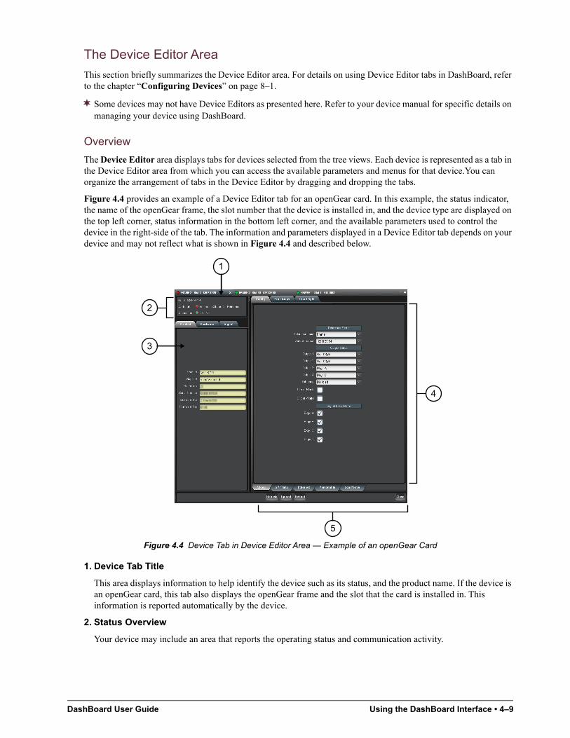
DashBoard User Guide Using the DashBoard Interface • 4–9
The Device Editor Area
This section briefly summarizes the Device Editor area. For details on using Device Editor tabs in DashBoard, refer to the chapter “Configuring Devices” on page 8–1.
Some devices may not have Device Editors as presented here. Refer to your device manual for specific details on managing your device using DashBoard.
Overview
The Device Editor area displays tabs for devices selected from the tree views. Each device is represented as a tab in the Device Editor area from which you can access the available parameters and menus for that device.You can organize the arrangement of tabs in the Device Editor by dragging and dropping the tabs.
Figure 4.4 provides an example of a Device Editor tab for an openGear card. In this example, the status indicator, the name of the openGear frame, the slot number that the device is installed in, and the device type are displayed on the top left corner, status information in the bottom left corner, and the available parameters used to control the device in the right-side of the tab. The information and parameters displayed in a Device Editor tab depends on your device and may not reflect what is shown in Figure 4.4 and described below.
Figure 4.4 Device Tab in Device Editor Area — Example of an openGear Card
1. Device Tab Title
This area displays information to help identify the device such as its status, and the product name. If the device is an openGear card, this tab also displays the openGear frame and the slot that the card is installed in. This information is reported automatically by the device.
2. Status Overview
Your device may include an area that reports the operating status and communication activity.
1
5
2
3
4
4–10 • Using the DashBoard Interface DashBoard User Guide
3. Read-Only Information
Your device may include an area that displays read-only information such as the status parameters as reported by the device. The parameters and options in this area are dependent on the device selected, but can include the product details such as software versions, hardware information, and signal status. In Figure 4.4, the tabs are named Product, Hardware, and Signal, and display as read-only fields.
4. Settings and Parameters Area
The contents of this area are dependent on the device selected but can include source selection, video format and timing settings, alarm reporting options, and audio parameters. All changes to openGear card parameters are immediate. Refer to your device manual for details.
5. Button Area
The following buttons may be available:
• Refresh — Use this button to request the latest information from the device.
• Upload — Use this button to upload new software to the device.
• Reboot — Use this button to instruct the device to reboot.
• Close — Use this button to close the current Device Editor tab.
Using the Device Editor Feature
This section briefly summaries how to use some of the Device Editor features.
To display a Device Editor tab:
Display a Device Editor tab using one of the following methods:
• Double-click a device in a Tree View.
• Right-click the device in a Tree View and select Open.
• Drag and drop the device from the Tree View to the Device Editor area.
To refresh the parameters of a device:
• Click Refresh on the Device Editor tab.
To maximize or minimize a Device Editor tab:
1. Right-click the applicable Device Editor tab.
2. Select Maximize or Minimize from the menu.
To organize the Device Editor tabs:
Organize tabs using one of the following methods:
• Dock or undock the Advanced Tree View and Layout List from the DashBoard window by dragging it outside the DashBoard window.
• Drag and drop the Device Editor tabs to organize a layout as required. For information on saving and recalling layouts, refer to the section “Using Layouts” on page 4–11.
To close a Device Editor tab:
1. Right-click the Device tab you wish to close.
2. Select one of the following options:
• Close — Closes the selected Device Editor tab.
• Close Others — Closes all other Device Editor tabs in the group but the highlighted tab.
• Close All — Closes all Device Editor tabs in that Tab Group.
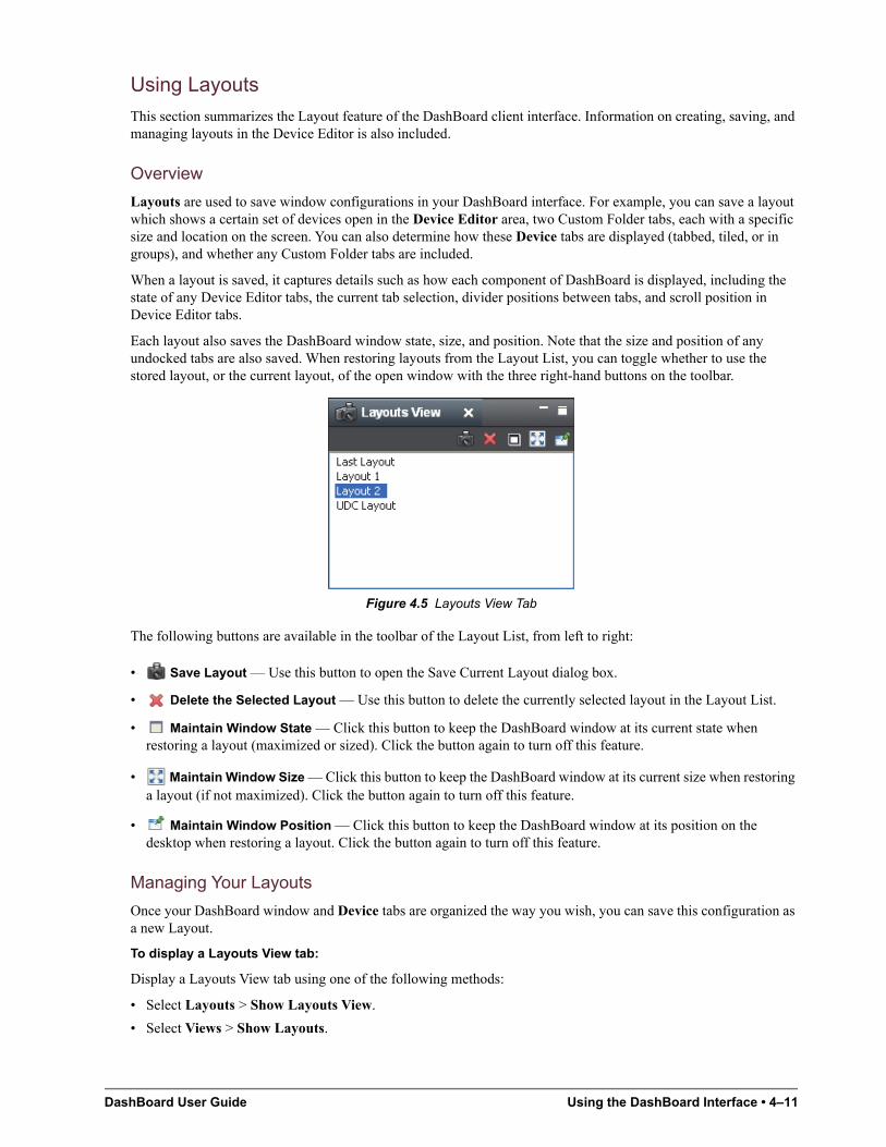
DashBoard User Guide Using the DashBoard Interface • 4–11
Using Layouts
This section summarizes the Layout feature of the DashBoard client interface. Information on creating, saving, and managing layouts in the Device Editor is also included.
Overview
Layouts are used to save window configurations in your DashBoard interface. For example, you can save a layout which shows a certain set of devices open in the Device Editor area, two Custom Folder tabs, each with a specific size and location on the screen. You can also determine how these Device tabs are displayed (tabbed, tiled, or in groups), and whether any Custom Folder tabs are included.
When a layout is saved, it captures details such as how each component of DashBoard is displayed, including the state of any Device Editor tabs, the current tab selection, divider positions between tabs, and scroll position in Device Editor tabs.
Each layout also saves the DashBoard window state, size, and position. Note that the size and position of any undocked tabs are also saved. When restoring layouts from the Layout List, you can toggle whether to use the stored layout, or the current layout, of the open window with the three right-hand buttons on the toolbar.
Figure 4.5 Layouts View Tab
The following buttons are available in the toolbar of the Layout List, from left to right:
• Save Layout — Use this button to open the Save Current Layout dialog box.
• Delete the Selected Layout — Use this button to delete the currently selected layout in the Layout List.
• Maintain Window State — Click this button to keep the DashBoard window at its current state when restoring a layout (maximized or sized). Click the button again to turn off this feature.
• Maintain Window Size — Click this button to keep the DashBoard window at its current size when restoring a layout (if not maximized). Click the button again to turn off this feature.
• Maintain Window Position — Click this button to keep the DashBoard window at its position on the desktop when restoring a layout. Click the button again to turn off this feature.
Managing Your Layouts
Once your DashBoard window and Device tabs are organized the way you wish, you can save this configuration as a new Layout.
To display a Layouts View tab:
Display a Layouts View tab using one of the following methods:
• Select Layouts > Show Layouts View.
• Select Views > Show Layouts.
4–12 • Using the DashBoard Interface DashBoard User Guide
To organize the tabs:
1. Click the tab you wish to move.
2. Drag and drop the tab to the new location within the DashBoard window.
To re-position a tab in DashBoard:
1. Click the tab you wish to move.
2. Position a tab using one of the following methods:
• Drag and drop the tab to the new location within the DashBoard window.
• Undock the tab from the DashBoard window by dragging it outside the DashBoard window.
To save the current layout:
1. Click in Layouts View tab to display the Save Current Layout dialog box.
2. Enter a name for the new layout in the provided text field.
3. Click OK.
To recall a layout:
Recall a layout using one of the following methods:
• Select Layouts from the main DashBoard toolbar. Select a layout from the provided list.
• From the Layouts View tab, double-click the name of the layout. DashBoard restores the tab selection, divider position, and scroll position of any Device Editor tabs that were opened when the layout was last saved.
To rename a layout:
1. Right-click the layout in the Layouts View tab.
2. Select Rename to open the Rename Layout dialog box.
3. Enter a new name for the layout in the provided text field.
4. Click OK. The new name for the layout displays in the Layouts View tab.
To delete a layout:
1. From the Layouts View tab, select the layout you wish to delete.
2. Click to display the Confirm Layout Delete dialog box.
3. Click OK. The layout is deleted from the Layout List.
Keyboard Shortcuts
The Keyboard Shortcuts feature provides the ability to define a library of commands than can be executed through a series of keystrokes in the DashBoard client, DashBoard Connect compatible products, and other DashBoard product plug-ins. The DashBoard client comes with a standard library, but additional commands may be available depending on the plugs-ins you have installed.
This section provides a brief overview of how to manage your library in the DashBoard client. For information on commands available for your specific DashBoard Connect compatible product, refer to its user documentation.
Tip: To view a list of current shortcut commands, from the Window menu, click Preferences, and then in the Preferences dialog box click Keyboard Shortcuts. The list appears.
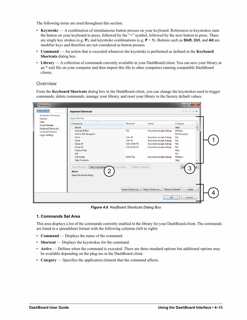
DashBoard User Guide Using the DashBoard Interface • 4–13
The following terms are used throughout this section:
• Keystroke — A combination of simultaneous button presses on your keyboard. References to keystrokes state the button on your keyboard to press, followed by the “+” symbol, followed by the next button to press. There are single key strokes (e.g. P), and keystroke combinations (e.g. P + 1). Buttons such as Shift, Ctrl, and Alt are modifier keys and therefore are not considered as button presses.
• Command — An action that is executed whenever the keystroke is performed as defined in the Keyboard Shortcuts dialog box.
• Library — A collection of commands currently available in your DashBoard client. You can save your library as an *.xml file on your computer and then import this file to other computers running compatible DashBoard clients.
Overview
From the Keyboard Shortcuts dialog box in the DashBoard client, you can change the keystrokes used to trigger commands, delete commands, manage your library, and reset your library to the factory default values.
Figure 4.6 KeyBoard Shortcuts Dialog Box
1. Commands Set Area
This area displays a list of the commands currently enabled in the library for your DashBoard client. The commands are listed in a spreadsheet format with the following columns (left to right):
• Command — Displays the name of the command.
• Shortcut — Displays the keystrokes for the command.
• Active — Defines when the command is executed. There are three standard options but additional options may be available depending on the plug-ins in the DashBoard client.
• Category — Specifies the application element that the command affects.
32
1
4
4–14 • Using the DashBoard Interface DashBoard User Guide
2. Command Management Area
The following buttons are available in this area:
• Copy Shortcut — Creates another instance of the selected command, however the Shortcut (keystrokes) and Active values are not copied.
• New Command — Enables you to add a command that is not currently listed in the Commands Set area.
• Edit Command — Enables you to change elements of the selected command such as the required keystroke(s), and when to execute the command.
• Delete Command — Removes the command from the Commands Set area.
3. Default Shortcut Button
Resets only the selected command to its default values.
4. Library Management Area
The following buttons are available in this area:
• Import Shortcuts — Imports a library to your DashBoard client.
• Export Shortcuts — Saves your current library to an *.xml file on your computer.
• Restore Defaults — Applies the factory default values to all the commands in your current library.
• Apply — Applies your changes made in the Keyboard Shortcuts dialog box. If this button is disabled (grayed out), a conflict is occurring. Refer to the section “Resolving Conflicts” on page 4–15 for details.
• OK — Applies any changes made to your Keyboard Shortcuts library and exits the Preferences dialog box. If this button is disabled (grayed out), more than one command uses the same keystrokes. Refer to the section “Resolving Conflicts” on page 4–15 for details.
• Cancel — Exits the dialog box without applying any changes.
Managing the Keyboard Shortcuts
This section briefly outlines how to perform such tasks as launching the Keyboard Shortcuts dialog box, editing commands, and updating the library.
To navigate to the Keyboard Shortcuts dialog box:
1. Select Window > Preferences to display the Preferences dialog box.
2. Click Keyboard Shortcuts to display the Keyboard Shortcuts dialog box.
To copy a command:
1. Select the command from the list in the Commands Set area.
2. Click Copy Shortcut. The new command is now listed in the Commands Set area.
3. Edit the command as outlined in the section “To edit a command:” on page 4–15.
To edit keystrokes for a command:
1. Select the command from the list in the Commands Set area.
2. Click the appropriate cell in the Shortcut column.
3. Type the keystrokes you wish to assign to the command. For example, you could press D then press H for the Display Help command. The new keystrokes now display in the cell. In the example given, the cell would now display “D, H”. If you press and hold the Ctrl button and then press D, the new keystrokes would display as “Ctrl+D”.
DashBoard User Guide Using the DashBoard Interface • 4–15
To add a new command:
1. Click New Command to display the Command Configuration dialog box.
• The Command Selection dialog box displays a list of available commands. This list is dependent on the plug-ins you have installed in the DashBoard client.
2. Select a command from the list.
3. In the Shortcut field, type the keystrokes you wish to assign to the command.
4. From the Active drop-down menu, specify when to execute the command.
5. Click Next and follow the on-screen instructions.
6. Click Finish to apply your changes, add the new command to the list in the Commands Set area, and return to the Keyboard Shortcuts dialog box.
7. Click OK to apply your changes and exit the dialog box, or click Apply to update the library without exiting the dialog box.
To edit a command:
1. Select the command from the list in the Commands Set area.
2. To edit the keystrokes for the command:
• Click the appropriate cell in the Shortcut column.
• Type the keystrokes you wish to assign to the command.
3. To specify when to execute the command:
• Click the appropriate cell in the Active column.
• Select an option from the drop-down menu. The following options come standard:
› Anywhere — Executes the command whenever the DashBoard client is running and active or when a dialog box is active.
› Anywhere except dialogs — Executes the command only when the DashBoard client is active but not when a dialog box is active.
› Only in dialogs — Executes the command only when a dialog box is open and active.
4. Click OK to apply your changes and exit the dialog box, or click Apply to update the library without exiting the dialog box.
Resolving Conflicts
A conflict occurs when the same keystroke(s) are assigned to one or more commands. The DashBoard client detects when there are conflicts and flags them in the Commands Set area by displaying a red icon next to the affected command names and setting each name in red. The Apply and OK buttons are disabled until the conflict is resolved, and a message is displayed near the top of the dialog box. Refer to step 2 in the section “To edit a command:” on page 4–15 for details on updating the keystrokes for a command.
Keep the following mind:
• You may elect to keep two or more conflicts active. However, if such commands are triggered, the DashBoard client will prompt you to confirm which command to execute.
• When importing a library, conflicts are also flagged, enabling you to select which command to implement before the library is imported.
4–16 • Using the DashBoard Interface DashBoard User Guide
Importing and Exporting Libraries
You can save your library to an *.xml file on your computer and then import that library to another DashBoard client. Note that when importing a library from one DashBoard client to another, ensure that the second client is compatible with the first in terms of DashBoard client software version (DashBoard version 5.1.0 or higher) and installed plug-ins.
To save your library to a file:
1. Click Export Shortcuts to display the Export Shortcuts dialog box. Exporting a library also includes any user-defined commands.
2. Follow the on-screen instructions to save the file to your computer.
To import a library to your DashBoard client:
1. Click Import Shortcuts to display the Import Shortcuts dialog box.
• The Import Shortcuts dialog box displays the commands currently used in your DashBoard client (Old Shortcut column) and a preview of the commands that will be in your library after the import (New Shortcut column).
• You can select whether to view only those commands with assigned keystrokes by selecting the Hide commands with no shortcuts check box.
• Importing a library merges commands, including any user defined commands, with the current library.
2. From the Select shortcuts source: area, specify a library to import using one of the following methods:
• Use the drop-down menu to select a file provided by the plugs-ins you have installed.
• Click to display the Import shortcuts from file dialog box and navigate to the file on your computer. Follow the on-screen instructions and click Open to return to the Import Shortcuts dialog box.
3. Click OK to import the library and return to the Keyboard Shortcuts dialog box.
Resetting to Default Values
You can choose to reset a single command or your entire library to the factory default values. Note that resetting the library also deletes any commands that do not come standard with the DashBoard client or your DashBoard Connect compatible product. For example, any commands that are copies will be deleted, and any standard commands you edited will be reset.
To reset a single command:
1. Select the command from the list in the Commands Set area.
2. Click Default Shortcut.
To reset the library:
1. Click Restore Defaults.
2. Follow the on-screen instructions.
Restoring Keyboard Shortcut Commands for Copy, Cut, Paste, Undo, and Redo
If you upgraded from DashBoard version 5.1 to DashBoard version 6.0, keyboard shortcut commands for Copy, Cut, Paste, Undo, and Redo may be inactive.
To restore these keyboard shortcuts:
1. In DashBoard, on the Window menu, click Preferences.
The Preferences dialog appears.
2. In the list on the left side of the Preferences dialog, click Keyboard Shortcuts.
DashBoard User Guide Using the DashBoard Interface • 4–17
3. In the Keyboard Shortcuts area, in the Command list, click Copy, and then click Default Shortcut.
Repeat this step for Cut, Paste, Undo, and Redo.
4. Click Apply.
5. Click OK.
Using DashBoard Help
The DashBoard Help system is accessed by selecting Help > Help Contents from the main toolbar of DashBoard. The DashBoard Help displays the Contents pane and Search box in the toolbar by default.
The following Help Systems are currently available in DashBoard:
• DashBoard Help — This is the main Help system for the DashBoard Control System that is available by choosing Help > Help Contents from the main toolbar. DashBoard Help provides information on the various features and options available in DashBoard. Context-sensitive Help is also available by selecting an interface item, such as the Basic Tree View tab, and clicking F1 (when running Microsoft® Windows®).
• openGear Help — This feature provides information on individual openGear devices, such as frames and cards. You can access the openGear Help for your device by selecting the device in the Tree Views and clicking F1 (when running Microsoft® Windows®) or by choosing openGear from the Help dialog box. An option is provided for importing new help files for openGear devices.
• URM Help — This feature provides information on the DashBoard User Rights and Management option.
This section briefly summarizes how to configure the DashBoard Help display options and import new help files.
Configuring the DashBoard Help Display Options
This section summarizes how to configure the DashBoard Help display features:
• Open Window Context Help — This is the context-sensitive help that is displayed when you click F1 (when using Microsoft® Windows®) in the main DashBoard window.
• Dialog Context Help — This is the context-sensitive help in a dialog box.
To configure the Help display options for DashBoard:
1. Select Window > Preferences to display the Preferences dialog box.
2. Select Help to display the Help dialog box.
3. Specify the browser used to display the DashBoard Help search results by selecting one of the following options from the Open help search menu.
• In the dynamic help view — Select this option to display the DashBoard Help search results in a new pane of the DashBoard interface. This is the default setting.
• In a browser — Select this option to display the DashBoard Help search results in your default web browser.
4. Specify how to display help documents, such as user manuals in *.pdf format, by selecting one of the following options from the Open help view documents menu.
• In place — The help document is displayed in the same tab as the link to the document. This is the default setting.
• In the editor area — The help document is displayed in a new tab in DashBoard.
• In a browser — The help document is displayed in your default web browser.
4–18 • Using the DashBoard Interface DashBoard User Guide
5. Specify how to display the DashBoard Help contents by selecting one of the following options from the Open help contents menu.
• In the help browser — The DashBoard Help content is displayed in a new pane of the DashBoard interface. This is the default setting.
• In an external browser — The DashBoard Help content is displayed in your default web browser.
6. Specify how the openGear Help is displayed by selecting one of the following options from the Open window context help menu:
• In the dynamic help view — The selected Dialog Context Help is displayed in a new pane of the DashBoard interface. This is the default setting.
• In an infopop — The Help content is displayed as a persistent popup message.
7. Specify how to display the openGear Help by selecting one of the following options from the Open dialog context help menu.
• In a dialog tray — The DashBoard Help content is displayed in a new pane of the DashBoard interface. This is the default setting.
• In an infopop — The Help content is displayed as a persistent popup message.
8. Click Apply to save your changes. You can also click Restore Defaults to disregard any changes you have made.
Importing openGear Help
DashBoard allows you to download and install additional help files provided by your openGear manufacturer, enabling you to display the most recent help files for your device. There are two methods for importing openGear Help:
• Importing openGear Help Files — This method enables you to import a file or directory from a location on your network to your DashBoard workstation. Use this method if you are running Apple® Mac® OS® or Linux® Fedora®.
• Installing a Ross Video openGear Help Pack — This method installs an additional DashBoard Help feature that provides a library of Ross Video openGear user manuals. If you are running Microsoft® Windows®, use the procedure provided in the section “Installing DashBoard Add-on Programs” on page 2–4. Otherwise, use the procedure for importing openGear Help Files.
The Include help content from a remote info-center option is not implemented.
Importing openGear Help Files
This section briefly summarizes how to import openGear Help Files into DashBoard. If your openGear manufacturer has provided a Help Pack Add-on program and your computer is running Microsoft® Windows®, use the procedure “Installing DashBoard Add-on Programs” on page 2–4.
To import openGear Help Files:
1. Contact your openGear manufacturer to determine if additional help files are available for your device(s).
2. From the main toolbar, select File > New > Other... The Select Equipment or Service Type to Add dialog box opens.
3. Expand the openGear node.
4. Select Import openGear Help Files from the list.
5. Click Next >. The Import openGear Help File(s) dialog box opens.
DashBoard User Guide Using the DashBoard Interface • 4–19
6. From the Add Help From list, select the type of file to import:
• File — Select this option if the help file is a PDF, or is in a zip file. Proceed to step 7
• Directory — Select this option if the help file has been extracted to a directory. Proceed to step 7
• Download — Select this option if the help file is to be downloaded from the manufacturer website. Proceed to step 8
7. If you selected File or Directory:
• Click Browse... in the Selected Help area.
• Navigate to the file you wish to import.
• Click Open to return to the Import openGear Help File(s) dialog box. Note that the file location is now displayed in the Selected Help field.
• Click Finish to import the file into DashBoard.
8. If you selected Download:
• Enter the URL of the help file in the Selected Help field.
• Click Finish to import the file into DashBoard.
To view your new help file, choose Help > Help Contents from the main toolbar and select the file from the openGear node.
Preferences
This section briefly outlines additional options available in the Preferences menu in DashBoard.
Secure Storage
Ross Video recommends that the Secure Storage feature be configured only by system administrators, or as directed by Ross Technical Support when troubleshooting.

4–20 • Using the DashBoard Interface DashBoard User Guide
DashBoard User Guide PanelBuilder™ • 5–1
PanelBuilder™PanelBuilder is a DashBoard tool for creating custom interfaces for products from Ross Video, openGear partners, and DashBoard Connect Partners. Supported products include openGear cards, DashBoard Connect devices, CamBot robotic camera systems, XPression graphics systems, BlackStorm video servers, NK Routers, and Carbonite and Vision production switchers.
This section describes how to create CustomPanel interfaces using PanelBuilder features. It contains the following topics:
• “About PanelBuilder” on page 5–1
• “Creating a CustomPanel” on page 5–8
• “Edit Mode” on page 5–10
• “Adding Device Editors, Device Summaries, and Device Controls” on page 5–16
• “Adding Basic Components” on page 5–19
• “NDI Video Panels” on page 5–39
• “Adding Data-Backed Components” on page 5–40
• “Timers” on page 5–49
• “Assigning Tasks to Buttons, Labels, and Timers” on page 5–52
• “Triggering Tasks Externally” on page 5–59
• “Editing Components” on page 5–62
• “Locking Panel Proportions” on page 5–96
• “Parameters and Data Sources” on page 5–97
• “Working with ogScript” on page 5–101
• “NK Series Router Control Panels” on page 5–110
About PanelBuilder
You can quickly and easily create CustomPanel interfaces tailored to the exact requirements and preferences of each operator. CustomPanels can contain custom controls and labels you create, as well as controls and status indicators imported from any number of DashBoard-enabled devices such as Carbonite switchers and openGear cards.
Within PanelBuilder you can:
• Automate custom workflows by using any or all of the following methods:
› Drag and drop buttons, indicators, controls, and entire device editors from devices into CustomPanels.
› Create new buttons, indicators, and controls.
› Include navigational aids such as tabs, tables, labels, and scrollbars to enhance usability.
› Customize the appearance of objects by repositioning, resizing, changing colors, specifying fonts, and adding background graphics.
› Create monitoring and control systems by mixing and matching controls from multiple products on one CustomPanel.
For example, you can create an interface that includes some or all of your openGear cards. An operator can view the operational status of all devices, and then click a button to modify a given device’s configuration settings.
› Embed web browser windows, enabling users to control devices that provide web-based control interfaces.
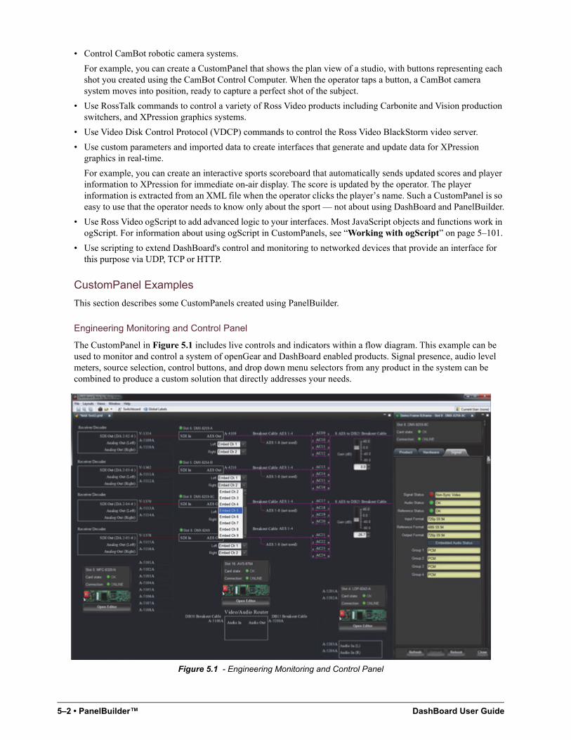
5–2 • PanelBuilder™ DashBoard User Guide
• Control CamBot robotic camera systems.
For example, you can create a CustomPanel that shows the plan view of a studio, with buttons representing each shot you created using the CamBot Control Computer. When the operator taps a button, a CamBot camera system moves into position, ready to capture a perfect shot of the subject.
• Use RossTalk commands to control a variety of Ross Video products including Carbonite and Vision production switchers, and XPression graphics systems.
• Use Video Disk Control Protocol (VDCP) commands to control the Ross Video BlackStorm video server.
• Use custom parameters and imported data to create interfaces that generate and update data for XPression graphics in real-time.
For example, you can create an interactive sports scoreboard that automatically sends updated scores and player information to XPression for immediate on-air display. The score is updated by the operator. The player information is extracted from an XML file when the operator clicks the player’s name. Such a CustomPanel is so easy to use that the operator needs to know only about the sport — not about using DashBoard and PanelBuilder.
• Use Ross Video ogScript to add advanced logic to your interfaces. Most JavaScript objects and functions work in ogScript. For information about using ogScript in CustomPanels, see “Working with ogScript” on page 5–101.
• Use scripting to extend DashBoard's control and monitoring to networked devices that provide an interface for this purpose via UDP, TCP or HTTP.
CustomPanel Examples
This section describes some CustomPanels created using PanelBuilder.
Engineering Monitoring and Control Panel
The CustomPanel in Figure 5.1 includes live controls and indicators within a flow diagram. This example can be used to monitor and control a system of openGear and DashBoard enabled products. Signal presence, audio level meters, source selection, control buttons, and drop down menu selectors from any product in the system can be combined to produce a custom solution that directly addresses your needs.
Figure 5.1 - Engineering Monitoring and Control Panel
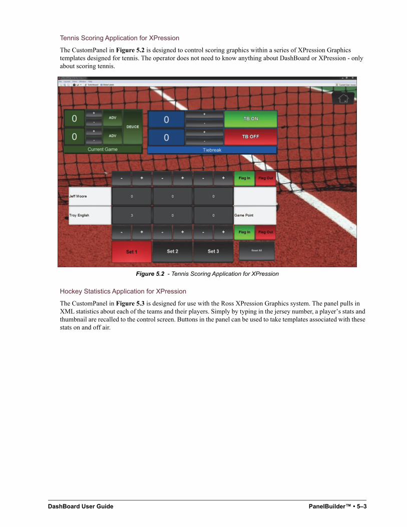
DashBoard User Guide PanelBuilder™ • 5–3
Tennis Scoring Application for XPression
The CustomPanel in Figure 5.2 is designed to control scoring graphics within a series of XPression Graphics templates designed for tennis. The operator does not need to know anything about DashBoard or XPression - only about scoring tennis.
Figure 5.2 - Tennis Scoring Application for XPression
Hockey Statistics Application for XPression
The CustomPanel in Figure 5.3 is designed for use with the Ross XPression Graphics system. The panel pulls in XML statistics about each of the teams and their players. Simply by typing in the jersey number, a player’s stats and thumbnail are recalled to the control screen. Buttons in the panel can be used to take templates associated with these stats on and off air.
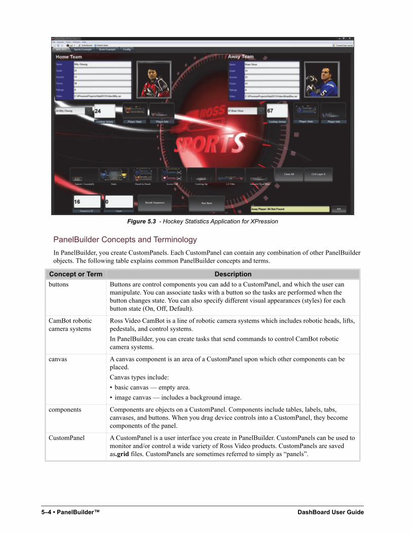
5–4 • PanelBuilder™ DashBoard User Guide
Figure 5.3 - Hockey Statistics Application for XPression
PanelBuilder Concepts and Terminology
In PanelBuilder, you create CustomPanels. Each CustomPanel can contain any combination of other PanelBuilder objects. The following table explains common PanelBuilder concepts and terms.
Concept or Term Description
buttons Buttons are control components you can add to a CustomPanel, and which the user can manipulate. You can associate tasks with a button so the tasks are performed when the button changes state. You can also specify different visual appearances (styles) for each button state (On, Off, Default).
CamBot robotic camera systems
Ross Video CamBot is a line of robotic camera systems which includes robotic heads, lifts, pedestals, and control systems.
In PanelBuilder, you can create tasks that send commands to control CamBot robotic camera systems.
canvas A canvas component is an area of a CustomPanel upon which other components can be placed.
Canvas types include:
• basic canvas — empty area.
• image canvas — includes a background image.
components Components are objects on a CustomPanel. Components include tables, labels, tabs, canvases, and buttons. When you drag device controls into a CustomPanel, they become components of the panel.
CustomPanel A CustomPanel is a user interface you create in PanelBuilder. CustomPanels can be used to monitor and/or control a wide variety of Ross Video products. CustomPanels are saved as.grid files. CustomPanels are sometimes referred to simply as “panels”.
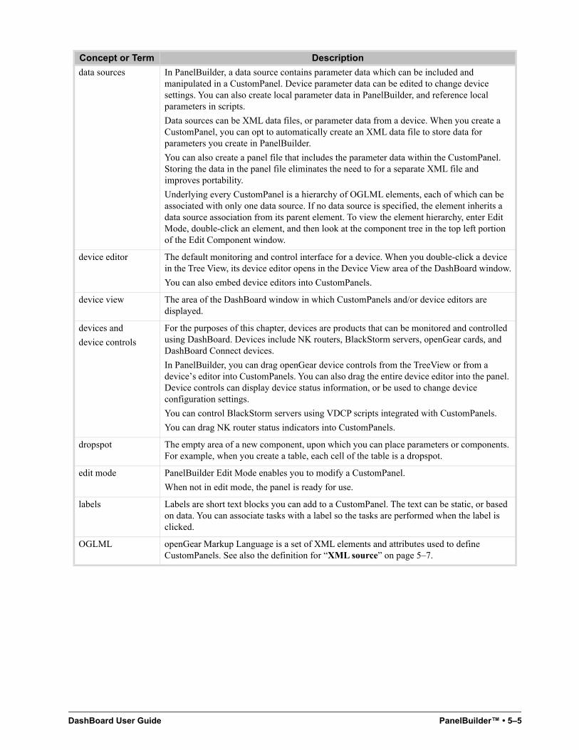
DashBoard User Guide PanelBuilder™ • 5–5
data sources In PanelBuilder, a data source contains parameter data which can be included and manipulated in a CustomPanel. Device parameter data can be edited to change device settings. You can also create local parameter data in PanelBuilder, and reference local parameters in scripts.
Data sources can be XML data files, or parameter data from a device. When you create a CustomPanel, you can opt to automatically create an XML data file to store data for parameters you create in PanelBuilder.
You can also create a panel file that includes the parameter data within the CustomPanel. Storing the data in the panel file eliminates the need to for a separate XML file and improves portability.
Underlying every CustomPanel is a hierarchy of OGLML elements, each of which can be associated with only one data source. If no data source is specified, the element inherits a data source association from its parent element. To view the element hierarchy, enter Edit Mode, double-click an element, and then look at the component tree in the top left portion of the Edit Component window.
device editor The default monitoring and control interface for a device. When you double-click a device in the Tree View, its device editor opens in the Device View area of the DashBoard window.
You can also embed device editors into CustomPanels.
device view The area of the DashBoard window in which CustomPanels and/or device editors are displayed.
devices and
device controls
For the purposes of this chapter, devices are products that can be monitored and controlled using DashBoard. Devices include NK routers, BlackStorm servers, openGear cards, and DashBoard Connect devices.
In PanelBuilder, you can drag openGear device controls from the TreeView or from a device’s editor into CustomPanels. You can also drag the entire device editor into the panel. Device controls can display device status information, or be used to change device configuration settings.
You can control BlackStorm servers using VDCP scripts integrated with CustomPanels.
You can drag NK router status indicators into CustomPanels.
dropspot The empty area of a new component, upon which you can place parameters or components. For example, when you create a table, each cell of the table is a dropspot.
edit mode PanelBuilder Edit Mode enables you to modify a CustomPanel.
When not in edit mode, the panel is ready for use.
labels Labels are short text blocks you can add to a CustomPanel. The text can be static, or based on data. You can associate tasks with a label so the tasks are performed when the label is clicked.
OGLML openGear Markup Language is a set of XML elements and attributes used to define CustomPanels. See also the definition for “XML source” on page 5–7.
Concept or Term Description
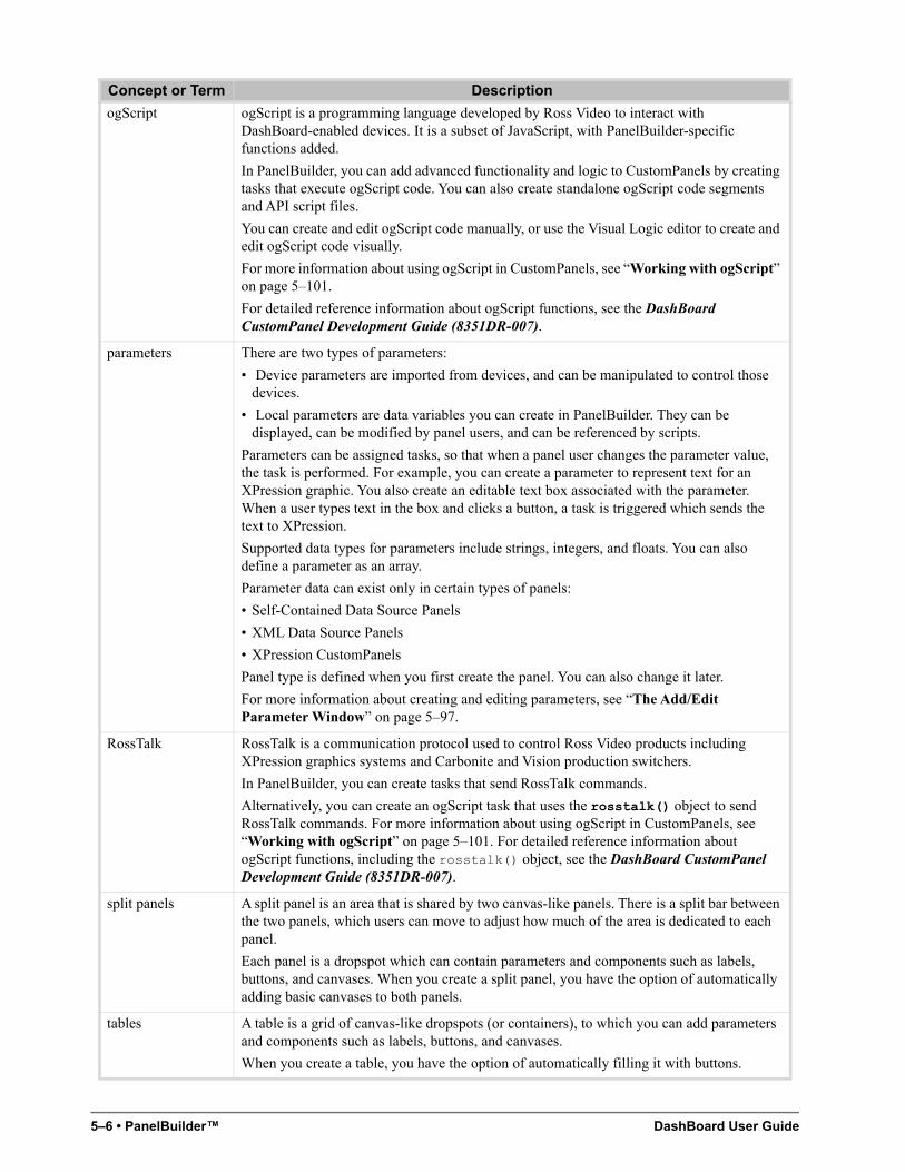
5–6 • PanelBuilder™ DashBoard User Guide
ogScript ogScript is a programming language developed by Ross Video to interact with DashBoard-enabled devices. It is a subset of JavaScript, with PanelBuilder-specific functions added.
In PanelBuilder, you can add advanced functionality and logic to CustomPanels by creating tasks that execute ogScript code. You can also create standalone ogScript code segments and API script files.
You can create and edit ogScript code manually, or use the Visual Logic editor to create and edit ogScript code visually.
For more information about using ogScript in CustomPanels, see “Working with ogScript” on page 5–101.
For detailed reference information about ogScript functions, see the DashBoard CustomPanel Development Guide (8351DR-007).
parameters There are two types of parameters:
• Device parameters are imported from devices, and can be manipulated to control those devices.
• Local parameters are data variables you can create in PanelBuilder. They can be displayed, can be modified by panel users, and can be referenced by scripts.
Parameters can be assigned tasks, so that when a panel user changes the parameter value, the task is performed. For example, you can create a parameter to represent text for an XPression graphic. You also create an editable text box associated with the parameter. When a user types text in the box and clicks a button, a task is triggered which sends the text to XPression.
Supported data types for parameters include strings, integers, and floats. You can also define a parameter as an array.
Parameter data can exist only in certain types of panels:
• Self-Contained Data Source Panels
• XML Data Source Panels
• XPression CustomPanels
Panel type is defined when you first create the panel. You can also change it later.
For more information about creating and editing parameters, see “The Add/Edit Parameter Window” on page 5–97.
RossTalk RossTalk is a communication protocol used to control Ross Video products including XPression graphics systems and Carbonite and Vision production switchers.
In PanelBuilder, you can create tasks that send RossTalk commands.
Alternatively, you can create an ogScript task that uses the rosstalk() object to send RossTalk commands. For more information about using ogScript in CustomPanels, see “Working with ogScript” on page 5–101. For detailed reference information about ogScript functions, including the rosstalk() object, see the DashBoard CustomPanel Development Guide (8351DR-007).
split panels A split panel is an area that is shared by two canvas-like panels. There is a split bar between the two panels, which users can move to adjust how much of the area is dedicated to each panel.
Each panel is a dropspot which can contain parameters and components such as labels, buttons, and canvases. When you create a split panel, you have the option of automatically adding basic canvases to both panels.
tables A table is a grid of canvas-like dropspots (or containers), to which you can add parameters and components such as labels, buttons, and canvases.
When you create a table, you have the option of automatically filling it with buttons.
Concept or Term Description
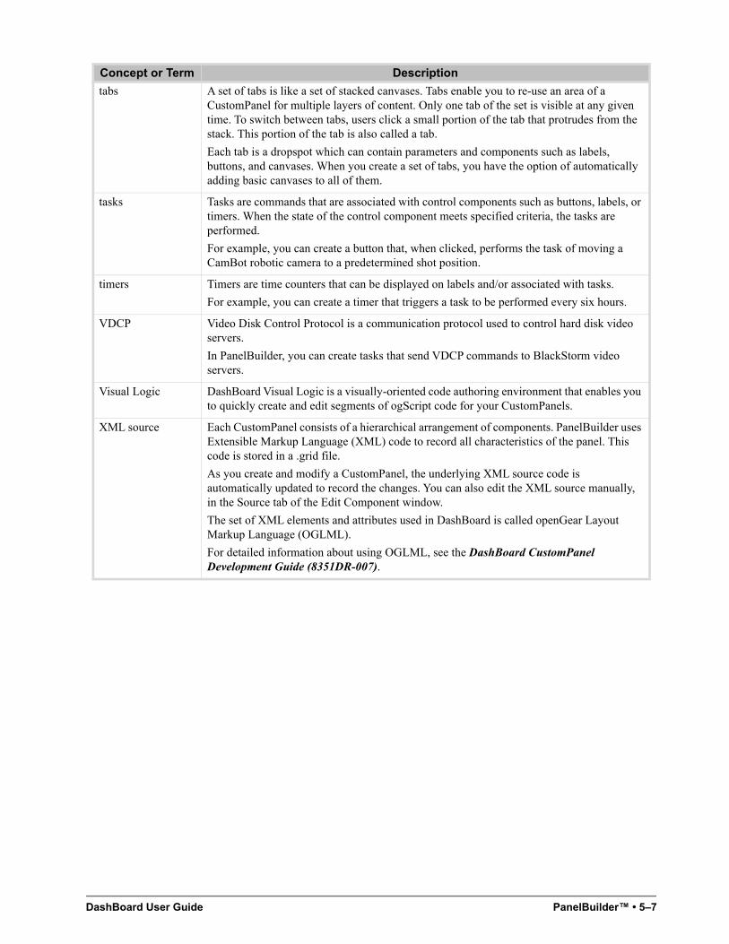
DashBoard User Guide PanelBuilder™ • 5–7
tabs A set of tabs is like a set of stacked canvases. Tabs enable you to re-use an area of a CustomPanel for multiple layers of content. Only one tab of the set is visible at any given time. To switch between tabs, users click a small portion of the tab that protrudes from the stack. This portion of the tab is also called a tab.
Each tab is a dropspot which can contain parameters and components such as labels, buttons, and canvases. When you create a set of tabs, you have the option of automatically adding basic canvases to all of them.
tasks Tasks are commands that are associated with control components such as buttons, labels, or timers. When the state of the control component meets specified criteria, the tasks are performed.
For example, you can create a button that, when clicked, performs the task of moving a CamBot robotic camera to a predetermined shot position.
timers Timers are time counters that can be displayed on labels and/or associated with tasks.
For example, you can create a timer that triggers a task to be performed every six hours.
VDCP Video Disk Control Protocol is a communication protocol used to control hard disk video servers.
In PanelBuilder, you can create tasks that send VDCP commands to BlackStorm video servers.
Visual Logic DashBoard Visual Logic is a visually-oriented code authoring environment that enables you to quickly create and edit segments of ogScript code for your CustomPanels.
XML source Each CustomPanel consists of a hierarchical arrangement of components. PanelBuilder uses Extensible Markup Language (XML) code to record all characteristics of the panel. This code is stored in a .grid file.
As you create and modify a CustomPanel, the underlying XML source code is automatically updated to record the changes. You can also edit the XML source manually, in the Source tab of the Edit Component window.
The set of XML elements and attributes used in DashBoard is called openGear Layout Markup Language (OGLML).
For detailed information about using OGLML, see the DashBoard CustomPanel Development Guide (8351DR-007).
Concept or Term Description
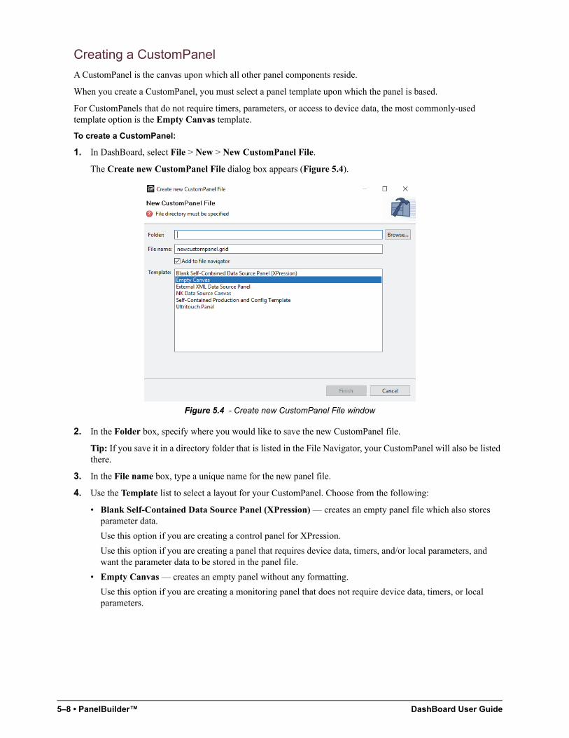
5–8 • PanelBuilder™ DashBoard User Guide
Creating a CustomPanel
A CustomPanel is the canvas upon which all other panel components reside.
When you create a CustomPanel, you must select a panel template upon which the panel is based.
For CustomPanels that do not require timers, parameters, or access to device data, the most commonly-used template option is the Empty Canvas template.
To create a CustomPanel:
1. In DashBoard, select File > New > New CustomPanel File.
The Create new CustomPanel File dialog box appears (Figure 5.4).
Figure 5.4 - Create new CustomPanel File window
2. In the Folder box, specify where you would like to save the new CustomPanel file.
Tip: If you save it in a directory folder that is listed in the File Navigator, your CustomPanel will also be listed there.
3. In the File name box, type a unique name for the new panel file.
4. Use the Template list to select a layout for your CustomPanel. Choose from the following:
• Blank Self-Contained Data Source Panel (XPression) — creates an empty panel file which also stores parameter data.
Use this option if you are creating a control panel for XPression.
Use this option if you are creating a panel that requires device data, timers, and/or local parameters, and want the parameter data to be stored in the panel file.
• Empty Canvas — creates an empty panel without any formatting.
Use this option if you are creating a monitoring panel that does not require device data, timers, or local parameters.
DashBoard User Guide PanelBuilder™ • 5–9
• External XML Data Source Panel — creates an empty panel file and an associated XML data file for local parameters.
Use this option if you are creating a control panel that requires device data, timers, and/or local parameters, and you want the parameter data to exist in a separate XML file.
• NK Data Source Canvas — creates an empty panel with the context set for Ross Video NK Series routers. When you use this option, special buttons for adding NK router control components are available on the EditMode toolbar.
Use this option if you are creating a CustomPanel to control NK Series routers.
• Blank XPression CustomPanel — creates an empty panel and an associated XML data file for parameters.
Use this option if you are creating a CustomPanel that will export data to an XPression Graphics System.
• Self-Contained Production and Config Template — creates a panel that has a title and two buttons labeled Production and Configuration. When clicked, the buttons switch between two tabs. This panel stores parameter data in the panel (.grid) file.
Use this option if you want to create a control panel with multiple tabs. You can edit the panel to add tabs, rename the buttons, and add content to the tabs.
5. If the folder in which you are saving the panel file is not already listed in the File Navigator tab and you want it to be, select the Add to File Navigator check box. This enables you to easily and quickly access your CustomPanels in DashBoard.
6. Click Finish.
The new panel appears as a tab in the Device View.
After you create a CustomPanel, you can add device controls and other components using Edit Mode. For more information, see “Edit Mode” on page 5–10.
To open a saved CustomPanel:
• Do one of the following:
› If the CustomPanel (.grid) file is listed in the File Navigator tab, double-click it.
Tip: If the File Navigator tab is not visible in DashBoard, select Views > File Navigator in the main DashBoard toolbar.
› From the File menu, click Open File, navigate to the CustomPanel (.grid) file, and click Open.
› If you are using Microsoft Windows, in Windows Explorer, navigate to the CustomPanel (.grid) file, and double-click it.
To switch between open CustomPanels:
• Do one of the following:
› Press and hold the Ctrl key, then press the F6 key repeatedly until the name of the panel you want to use is highlighted, and then release the Ctrl key.
This method is particularly useful when the DashBoard interface is in full screen mode.
› If the CustomPanels are listed on tabs just below the main DashBoard toolbar, click the desired tab.
The highlighted CustomPanel appears.
To maximize or restore down a panel view:
• Press Shift+F11.
To list a CustomPanel in the File Navigator tab:
1. If the directory folder containing the desired CustomPanel file (*.grid) is not listed in the File Navigator tab,
select in the File Navigator toolbar.
Tip: If the File Navigator tab is not visible in DashBoard, select Views > File Navigator in the main DashBoard toolbar.
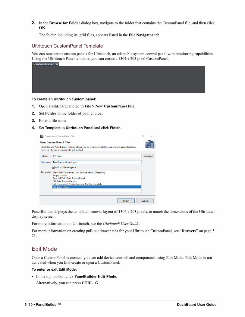
5–10 • PanelBuilder™ DashBoard User Guide
2. In the Browse for Folder dialog box, navigate to the folder that contains the CustomPanel file, and then click OK.
The folder, including its .grid files, appears listed in the File Navigator tab.
Ultritouch CustomPanel Template
You can now create custom panels for Ultritouch, an adaptable system control panel with monitoring capabilities. Using the Ultritouch Panel template, you can create a 1304 x 203 pixel CustomPanel.
To create an Ultritouch custom panel:
1. Open DashBoard, and go to File > New CustomPanel File.
2. Set Folder to the folder of your choice.
3. Enter a file name.
4. Set Template to Ultritouch Panel and click Finish.
PanelBuilder displays the template’s canvas layout of 1304 x 203 pixels, to match the dimensions of the Ultritouch display screen.
For more information on Ultritouch, see the Ultritouch User Guide.
For more information on creating pull-out drawer tabs for your Ultritouch CustomPanel, see “Drawers” on page 5–23.
Edit Mode
Once a CustomPanel is created, you can add device controls and components using Edit Mode. Edit Mode is not activated when you first create or open a CustomPanel.
To enter or exit Edit Mode:
• In the top toolbar, click PanelBuilder Edit Mode.
Alternatively, you can press CTRL+G.
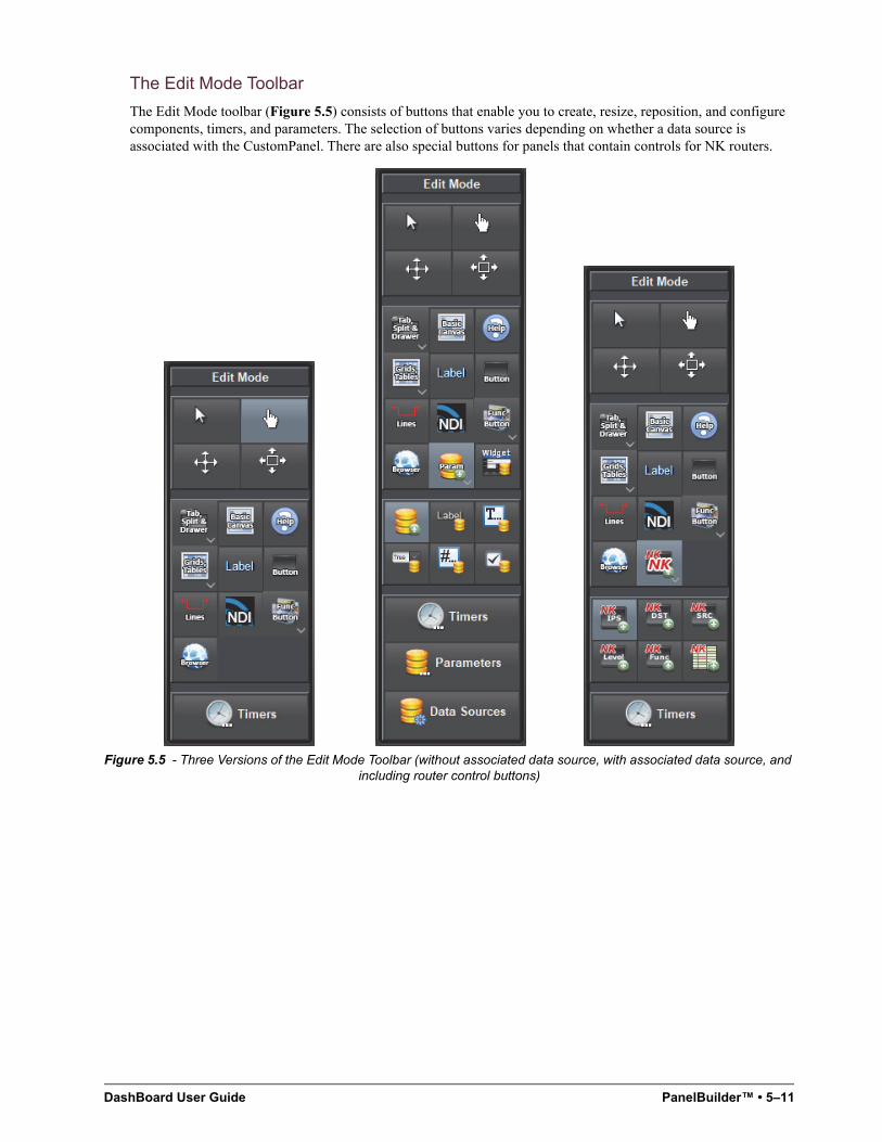
DashBoard User Guide PanelBuilder™ • 5–11
The Edit Mode Toolbar
The Edit Mode toolbar (Figure 5.5) consists of buttons that enable you to create, resize, reposition, and configure components, timers, and parameters. The selection of buttons varies depending on whether a data source is associated with the CustomPanel. There are also special buttons for panels that contain controls for NK routers.
Figure 5.5 - Three Versions of the Edit Mode Toolbar (without associated data source, with associated data source, and
including router control buttons)
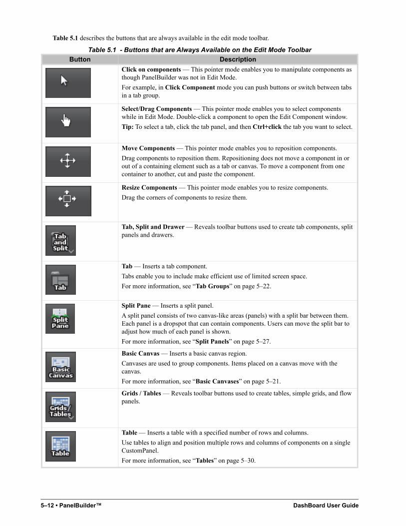
5–12 • PanelBuilder™ DashBoard User Guide
Table 5.1 describes the buttons that are always available in the edit mode toolbar.
Table 5.1 - Buttons that are Always Available on the Edit Mode Toolbar
Button Description
Click on components — This pointer mode enables you to manipulate components as though PanelBuilder was not in Edit Mode.
For example, in Click Component mode you can push buttons or switch between tabs in a tab group.
Select/Drag Components — This pointer mode enables you to select components while in Edit Mode. Double-click a component to open the Edit Component window.
Tip: To select a tab, click the tab panel, and then Ctrl+click the tab you want to select.
Move Components — This pointer mode enables you to reposition components.
Drag components to reposition them. Repositioning does not move a component in or out of a containing element such as a tab or canvas. To move a component from one container to another, cut and paste the component.
Resize Components — This pointer mode enables you to resize components.
Drag the corners of components to resize them.
Tab, Split and Drawer — Reveals toolbar buttons used to create tab components, split panels and drawers.
Tab — Inserts a tab component.
Tabs enable you to include make efficient use of limited screen space.
For more information, see “Tab Groups” on page 5–22.
Split Pane — Inserts a split panel.
A split panel consists of two canvas-like areas (panels) with a split bar between them. Each panel is a dropspot that can contain components. Users can move the split bar to adjust how much of each panel is shown.
For more information, see “Split Panels” on page 5–27.
Basic Canvas — Inserts a basic canvas region.
Canvases are used to group components. Items placed on a canvas move with the canvas.
For more information, see “Basic Canvases” on page 5–21.
Grids / Tables — Reveals toolbar buttons used to create tables, simple grids, and flow panels.
Table — Inserts a table with a specified number of rows and columns.
Use tables to align and position multiple rows and columns of components on a single CustomPanel.
For more information, see “Tables” on page 5–30.
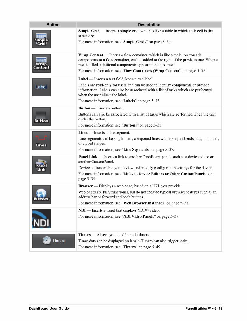
DashBoard User Guide PanelBuilder™ • 5–13
Simple Grid — Inserts a simple grid, which is like a table in which each cell is the same size.
For more information, see “Simple Grids” on page 5–31.
Wrap Content — Inserts a flow container, which is like a table. As you add components to a flow container, each is added to the right of the previous one. When a row is filled, additional components appear in the next row.
For more information, see “Flow Containers (Wrap Content)” on page 5–32.
Label — Inserts a text field, known as a label.
Labels are read-only for users and can be used to identify components or provide information. Labels can also be associated with a list of tasks which are performed when the user clicks the label.
For more information, see “Labels” on page 5–33.
Button — Inserts a button.
Buttons can also be associated with a list of tasks which are performed when the user clicks the button.
For more information, see “Buttons” on page 5–35.
Lines — Inserts a line segment.
Line segments can be single lines, compound lines with 90degree bends, diagonal lines, or closed shapes.
For more information, see “Line Segments” on page 5–37.
Panel Link — Inserts a link to another DashBoard panel, such as a device editor or another CustomPanel.
Device editors enable you to view and modify configuration settings for the device.
For more information, see “Links to Device Editors or Other CustomPanels” on page 5–34.
Browser — Displays a web page, based on a URL you provide.
Web pages are fully functional, but do not include typical browser features such as an address bar or forward and back buttons.
For more information, see “Web Browser Instances” on page 5–38.
NDI — Inserts a panel that displays NDI™ video.
For more information, see “NDI Video Panels” on page 5–39.
Timers — Allows you to add or edit timers.
Timer data can be displayed on labels. Timers can also trigger tasks.
For more information, see “Timers” on page 5–49.
Button Description
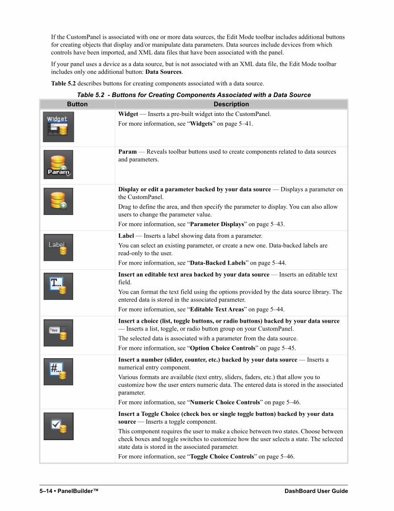
5–14 • PanelBuilder™ DashBoard User Guide
If the CustomPanel is associated with one or more data sources, the Edit Mode toolbar includes additional buttons for creating objects that display and/or manipulate data parameters. Data sources include devices from which controls have been imported, and XML data files that have been associated with the panel.
If your panel uses a device as a data source, but is not associated with an XML data file, the Edit Mode toolbar includes only one additional button: Data Sources.
Table 5.2 describes buttons for creating components associated with a data source.
Table 5.2 - Buttons for Creating Components Associated with a Data Source
Button Description
Widget — Inserts a pre-built widget into the CustomPanel.
For more information, see “Widgets” on page 5–41.
Param — Reveals toolbar buttons used to create components related to data sources and parameters.
Display or edit a parameter backed by your data source — Displays a parameter on the CustomPanel.
Drag to define the area, and then specify the parameter to display. You can also allow users to change the parameter value.
For more information, see “Parameter Displays” on page 5–43.
Label — Inserts a label showing data from a parameter.
You can select an existing parameter, or create a new one. Data-backed labels are read-only to the user.
For more information, see “Data-Backed Labels” on page 5–44.
Insert an editable text area backed by your data source — Inserts an editable text field.
You can format the text field using the options provided by the data source library. The entered data is stored in the associated parameter.
For more information, see “Editable Text Areas” on page 5–44.
Insert a choice (list, toggle buttons, or radio buttons) backed by your data source — Inserts a list, toggle, or radio button group on your CustomPanel.
The selected data is associated with a parameter from the data source.
For more information, see “Option Choice Controls” on page 5–45.
Insert a number (slider, counter, etc.) backed by your data source — Inserts a numerical entry component.
Various formats are available (text entry, sliders, faders, etc.) that allow you to customize how the user enters numeric data. The entered data is stored in the associated parameter.
For more information, see “Numeric Choice Controls” on page 5–46.
Insert a Toggle Choice (check box or single toggle button) backed by your data source — Inserts a toggle component.
This component requires the user to make a choice between two states. Choose between check boxes and toggle switches to customize how the user selects a state. The selected state data is stored in the associated parameter.
For more information, see “Toggle Choice Controls” on page 5–46.
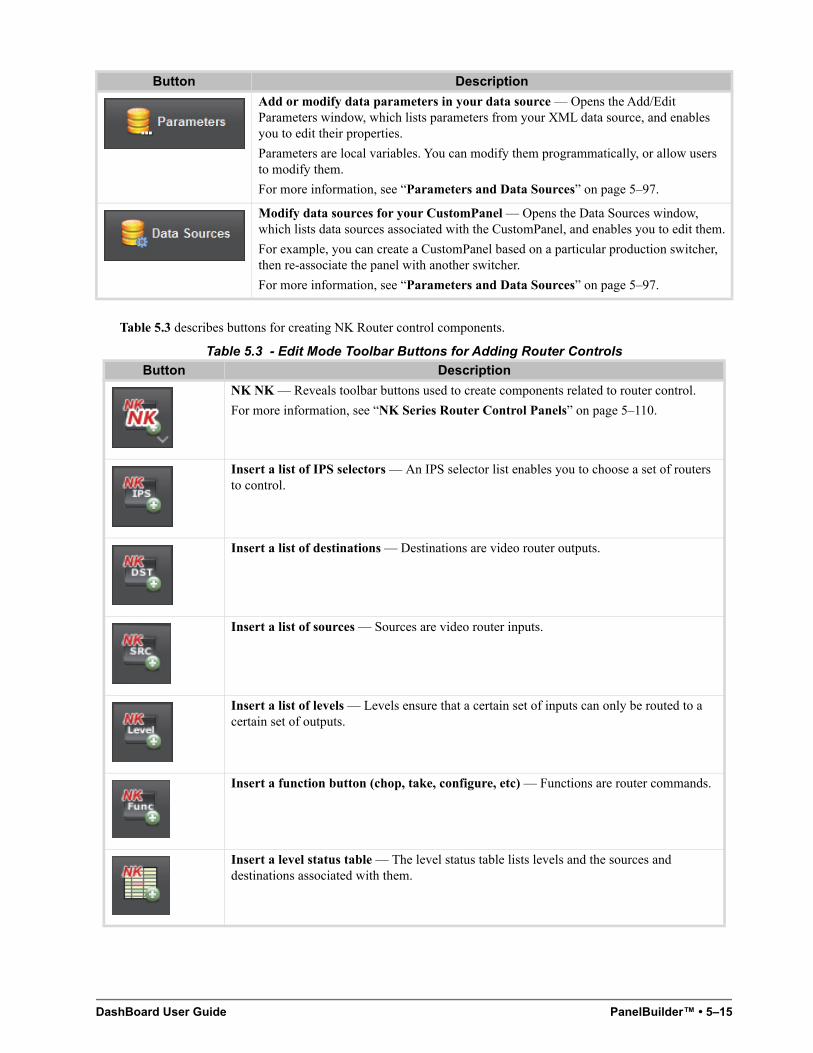
DashBoard User Guide PanelBuilder™ • 5–15
Table 5.3 describes buttons for creating NK Router control components.
Table 5.3 - Edit Mode Toolbar Buttons for Adding Router Controls
Add or modify data parameters in your data source — Opens the Add/Edit Parameters window, which lists parameters from your XML data source, and enables you to edit their properties.
Parameters are local variables. You can modify them programmatically, or allow users to modify them.
For more information, see “Parameters and Data Sources” on page 5–97.
Modify data sources for your CustomPanel — Opens the Data Sources window, which lists data sources associated with the CustomPanel, and enables you to edit them.
For example, you can create a CustomPanel based on a particular production switcher, then re-associate the panel with another switcher.
For more information, see “Parameters and Data Sources” on page 5–97.
Button Description
NK NK — Reveals toolbar buttons used to create components related to router control.
For more information, see “NK Series Router Control Panels” on page 5–110.
Insert a list of IPS selectors — An IPS selector list enables you to choose a set of routers to control.
Insert a list of destinations — Destinations are video router outputs.
Insert a list of sources — Sources are video router inputs.
Insert a list of levels — Levels ensure that a certain set of inputs can only be routed to a certain set of outputs.
Insert a function button (chop, take, configure, etc) — Functions are router commands.
Insert a level status table — The level status table lists levels and the sources and destinations associated with them.
Button Description
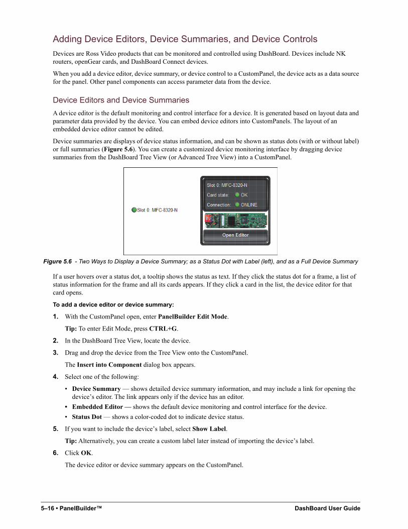
5–16 • PanelBuilder™ DashBoard User Guide
Adding Device Editors, Device Summaries, and Device Controls
Devices are Ross Video products that can be monitored and controlled using DashBoard. Devices include NK routers, openGear cards, and DashBoard Connect devices.
When you add a device editor, device summary, or device control to a CustomPanel, the device acts as a data source for the panel. Other panel components can access parameter data from the device.
Device Editors and Device Summaries
A device editor is the default monitoring and control interface for a device. It is generated based on layout data and parameter data provided by the device. You can embed device editors into CustomPanels. The layout of an embedded device editor cannot be edited.
Device summaries are displays of device status information, and can be shown as status dots (with or without label) or full summaries (Figure 5.6). You can create a customized device monitoring interface by dragging device summaries from the DashBoard Tree View (or Advanced Tree View) into a CustomPanel.
Figure 5.6 - Two Ways to Display a Device Summary; as a Status Dot with Label (left), and as a Full Device Summary
If a user hovers over a status dot, a tooltip shows the status as text. If they click the status dot for a frame, a list of status information for the frame and all its cards appears. If they click a card in the list, the device editor for that card opens.
To add a device editor or device summary:
1. With the CustomPanel open, enter PanelBuilder Edit Mode.
Tip: To enter Edit Mode, press CTRL+G.
2. In the DashBoard Tree View, locate the device.
3. Drag and drop the device from the Tree View onto the CustomPanel.
The Insert into Component dialog box appears.
4. Select one of the following:
• Device Summary — shows detailed device summary information, and may include a link for opening the device’s editor. The link appears only if the device has an editor.
• Embedded Editor — shows the default device monitoring and control interface for the device.
• Status Dot — shows a color-coded dot to indicate device status.
5. If you want to include the device’s label, select Show Label.
Tip: Alternatively, you can create a custom label later instead of importing the device’s label.
6. Click OK.
The device editor or device summary appears on the CustomPanel.
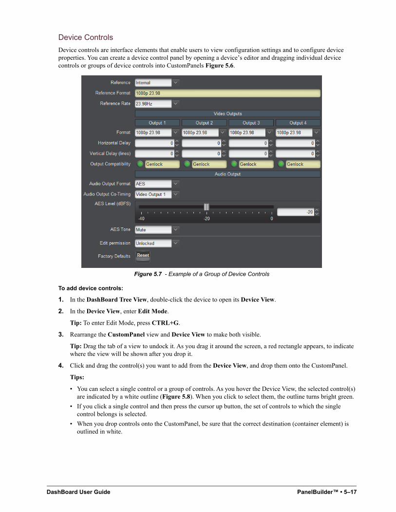
DashBoard User Guide PanelBuilder™ • 5–17
Device Controls
Device controls are interface elements that enable users to view configuration settings and to configure device properties. You can create a device control panel by opening a device’s editor and dragging individual device controls or groups of device controls into CustomPanels Figure 5.6.
Figure 5.7 - Example of a Group of Device Controls
To add device controls:
1. In the DashBoard Tree View, double-click the device to open its Device View.
2. In the Device View, enter Edit Mode.
Tip: To enter Edit Mode, press CTRL+G.
3. Rearrange the CustomPanel view and Device View to make both visible.
Tip: Drag the tab of a view to undock it. As you drag it around the screen, a red rectangle appears, to indicate where the view will be shown after you drop it.
4. Click and drag the control(s) you want to add from the Device View, and drop them onto the CustomPanel.
Tips:
• You can select a single control or a group of controls. As you hover the Device View, the selected control(s) are indicated by a white outline (Figure 5.8). When you click to select them, the outline turns bright green.
• If you click a single control and then press the cursor up button, the set of controls to which the single control belongs is selected.
• When you drop controls onto the CustomPanel, be sure that the correct destination (container element) is outlined in white.
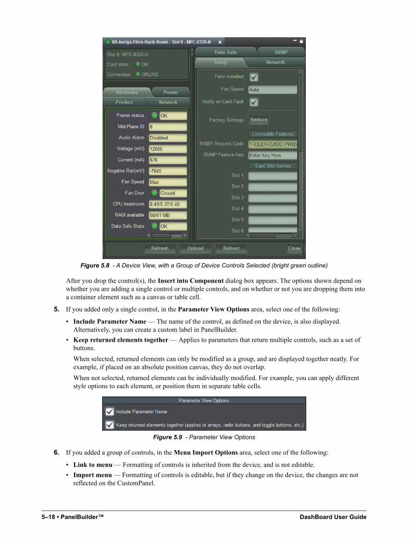
5–18 • PanelBuilder™ DashBoard User Guide
Figure 5.8 - A Device View, with a Group of Device Controls Selected (bright green outline)
After you drop the control(s), the Insert into Component dialog box appears. The options shown depend on whether you are adding a single control or multiple controls, and on whether or not you are dropping them into a container element such as a canvas or table cell.
5. If you added only a single control, in the Parameter View Options area, select one of the following:
• Include Parameter Name — The name of the control, as defined on the device, is also displayed. Alternatively, you can create a custom label in PanelBuilder.
• Keep returned elements together — Applies to parameters that return multiple controls, such as a set of buttons.
When selected, returned elements can only be modified as a group, and are displayed together neatly. For example, if placed on an absolute position canvas, they do not overlap.
When not selected, returned elements can be individually modified. For example, you can apply different style options to each element, or position them in separate table cells.
Figure 5.9 - Parameter View Options
6. If you added a group of controls, in the Menu Import Options area, select one of the following:
• Link to menu — Formatting of controls is inherited from the device, and is not editable.
• Import menu — Formatting of controls is editable, but if they change on the device, the changes are not reflected on the CustomPanel.
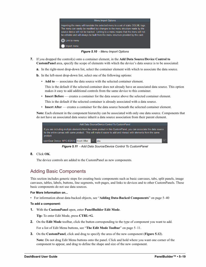
DashBoard User Guide PanelBuilder™ • 5–19
Figure 5.10 - Menu Import Options
7. If you dropped the control(s) onto a container element, in the Add Data Source/Device Control to CustomPanel area, specify the scope of elements with which the device’s data source is to be associated:
a. In the right-most drop-down list, select the container element with which to associate the data source.
b. In the left-most drop-down list, select one of the following options:
• Add to — associates the data source with the selected container element.
This is the default if the selected container does not already have an associated data source. This option makes it easy to add additional controls from the same device to this container.
• Insert Before — creates a container for the data source above the selected container element.
This is the default if the selected container is already associated with a data source.
• Insert After — creates a container for the data source beneath the selected container element.
Note: Each element in the component hierarchy can be associated with only one data source. Components that do not have an associated data source inherit a data source association from their parent element.
Figure 5.11 - Add Data Source/Device Control To CustomPanel
8. Click OK.
The device controls are added to the CustomPanel as new components.
Adding Basic Components
This section includes generic steps for creating basic components such as basic canvases, tabs, split panels, image canvases, tables, labels, buttons, line segments, web pages, and links to devices and to other CustomPanels. These basic components do not use data sources.
For More Information on...
• For information about data-backed objects, see “Adding Data-Backed Components” on page 5–40
To add a component:
1. With the CustomPanel open, enter PanelBuilder Edit Mode.
Tip: To enter Edit Mode, press CTRL+G.
2. On the Edit Mode toolbar, click the button corresponding to the type of component you want to add.
For a list of Edit Menu buttons, see “The Edit Mode Toolbar” on page 5–11.
3. On the CustomPanel, click and drag to specify the area of the new component (Figure 5.12).
Note: Do not drag Edit Menu buttons onto the panel. Click and hold where you want one corner of the component to appear, and drag to define the shape and size of the new component.
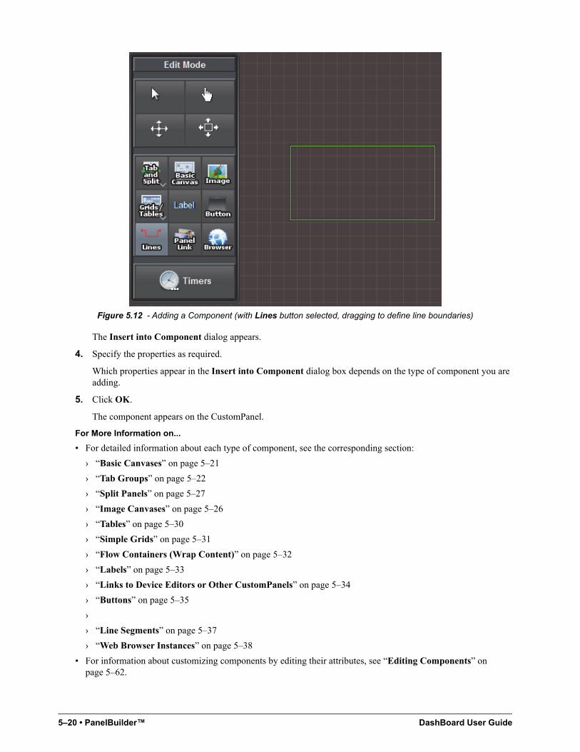
5–20 • PanelBuilder™ DashBoard User Guide
Figure 5.12 - Adding a Component (with Lines button selected, dragging to define line boundaries)
The Insert into Component dialog appears.
4. Specify the properties as required.
Which properties appear in the Insert into Component dialog box depends on the type of component you are adding.
5. Click OK.
The component appears on the CustomPanel.
For More Information on...
• For detailed information about each type of component, see the corresponding section:
› “Basic Canvases” on page 5–21
› “Tab Groups” on page 5–22
› “Split Panels” on page 5–27
› “Image Canvases” on page 5–26
› “Tables” on page 5–30
› “Simple Grids” on page 5–31
› “Flow Containers (Wrap Content)” on page 5–32
› “Labels” on page 5–33
› “Links to Device Editors or Other CustomPanels” on page 5–34
› “Buttons” on page 5–35
›
› “Line Segments” on page 5–37
› “Web Browser Instances” on page 5–38
• For information about customizing components by editing their attributes, see “Editing Components” on page 5–62.
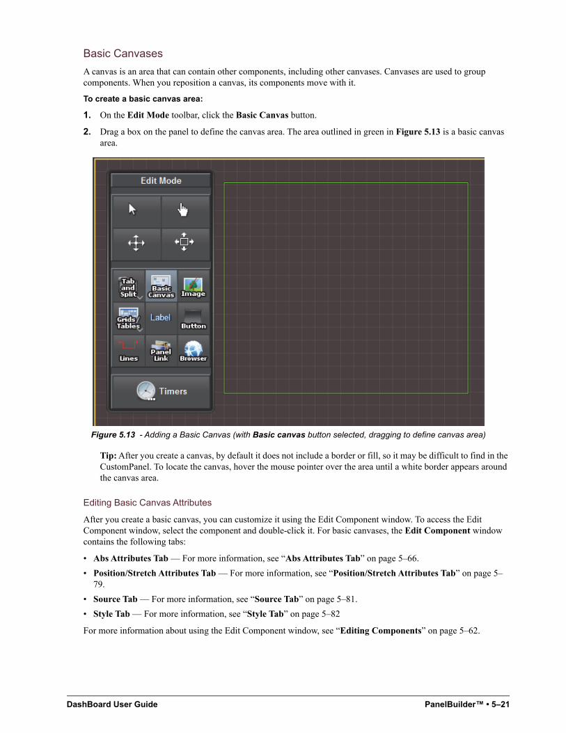
DashBoard User Guide PanelBuilder™ • 5–21
Basic Canvases
A canvas is an area that can contain other components, including other canvases. Canvases are used to group components. When you reposition a canvas, its components move with it.
To create a basic canvas area:
1. On the Edit Mode toolbar, click the Basic Canvas button.
2. Drag a box on the panel to define the canvas area. The area outlined in green in Figure 5.13 is a basic canvas area.
Figure 5.13 - Adding a Basic Canvas (with Basic canvas button selected, dragging to define canvas area)
Tip: After you create a canvas, by default it does not include a border or fill, so it may be difficult to find in the CustomPanel. To locate the canvas, hover the mouse pointer over the area until a white border appears around the canvas area.
Editing Basic Canvas Attributes
After you create a basic canvas, you can customize it using the Edit Component window. To access the Edit Component window, select the component and double-click it. For basic canvases, the Edit Component window contains the following tabs:
• Abs Attributes Tab — For more information, see “Abs Attributes Tab” on page 5–66.
• Position/Stretch Attributes Tab — For more information, see “Position/Stretch Attributes Tab” on page 5–79.
• Source Tab — For more information, see “Source Tab” on page 5–81.
• Style Tab — For more information, see “Style Tab” on page 5–82
For more information about using the Edit Component window, see “Editing Components” on page 5–62.
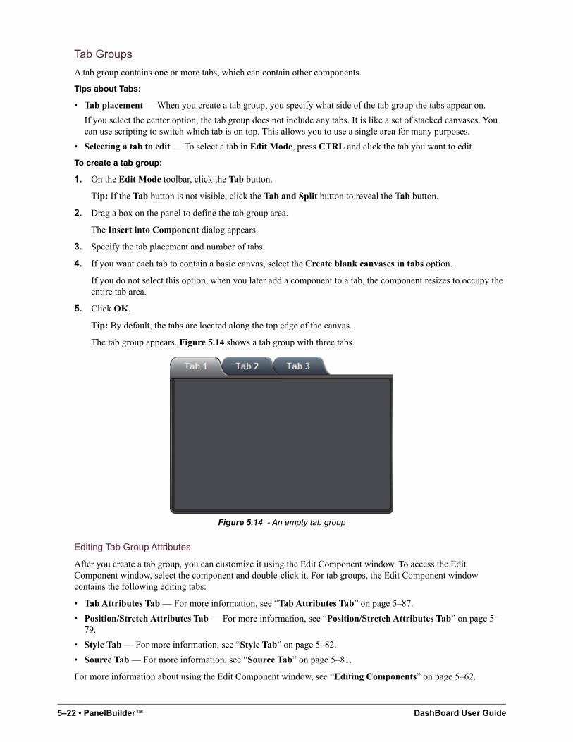
5–22 • PanelBuilder™ DashBoard User Guide
Tab Groups
A tab group contains one or more tabs, which can contain other components.
Tips about Tabs:
• Tab placement — When you create a tab group, you specify what side of the tab group the tabs appear on.
If you select the center option, the tab group does not include any tabs. It is like a set of stacked canvases. You can use scripting to switch which tab is on top. This allows you to use a single area for many purposes.
• Selecting a tab to edit — To select a tab in Edit Mode, press CTRL and click the tab you want to edit.
To create a tab group:
1. On the Edit Mode toolbar, click the Tab button.
Tip: If the Tab button is not visible, click the Tab and Split button to reveal the Tab button.
2. Drag a box on the panel to define the tab group area.
The Insert into Component dialog appears.
3. Specify the tab placement and number of tabs.
4. If you want each tab to contain a basic canvas, select the Create blank canvases in tabs option.
If you do not select this option, when you later add a component to a tab, the component resizes to occupy the entire tab area.
5. Click OK.
Tip: By default, the tabs are located along the top edge of the canvas.
The tab group appears. Figure 5.14 shows a tab group with three tabs.
Figure 5.14 - An empty tab group
Editing Tab Group Attributes
After you create a tab group, you can customize it using the Edit Component window. To access the Edit Component window, select the component and double-click it. For tab groups, the Edit Component window contains the following editing tabs:
• Tab Attributes Tab — For more information, see “Tab Attributes Tab” on page 5–87.
• Position/Stretch Attributes Tab — For more information, see “Position/Stretch Attributes Tab” on page 5–79.
• Style Tab — For more information, see “Style Tab” on page 5–82.
• Source Tab — For more information, see “Source Tab” on page 5–81.
For more information about using the Edit Component window, see “Editing Components” on page 5–62.
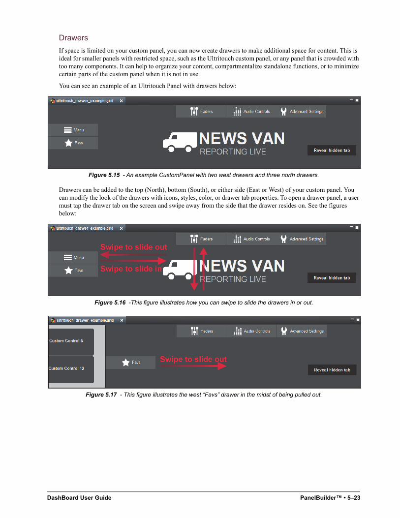
DashBoard User Guide PanelBuilder™ • 5–23
Drawers
If space is limited on your custom panel, you can now create drawers to make additional space for content. This is ideal for smaller panels with restricted space, such as the Ultritouch custom panel, or any panel that is crowded with too many components. It can help to organize your content, compartmentalize standalone functions, or to minimize certain parts of the custom panel when it is not in use.
You can see an example of an Ultritouch Panel with drawers below:
Figure 5.15 - An example CustomPanel with two west drawers and three north drawers.
Drawers can be added to the top (North), bottom (South), or either side (East or West) of your custom panel. You can modify the look of the drawers with icons, styles, color, or drawer tab properties. To open a drawer panel, a user must tap the drawer tab on the screen and swipe away from the side that the drawer resides on. See the figures below:
Figure 5.16 -This figure illustrates how you can swipe to slide the drawers in or out.
Figure 5.17 - This figure illustrates the west “Favs” drawer in the midst of being pulled out.
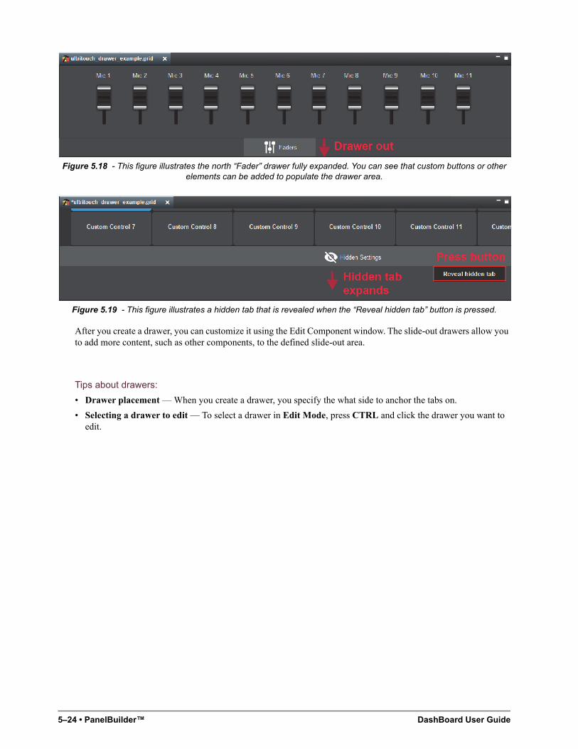
5–24 • PanelBuilder™ DashBoard User Guide
Figure 5.18 - This figure illustrates the north “Fader” drawer fully expanded. You can see that custom buttons or other elements can be added to populate the drawer area.
Figure 5.19 - This figure illustrates a hidden tab that is revealed when the “Reveal hidden tab” button is pressed.
After you create a drawer, you can customize it using the Edit Component window. The slide-out drawers allow you to add more content, such as other components, to the defined slide-out area.
Tips about drawers:
• Drawer placement — When you create a drawer, you specify the what side to anchor the tabs on.
• Selecting a drawer to edit — To select a drawer in Edit Mode, press CTRL and click the drawer you want to edit.
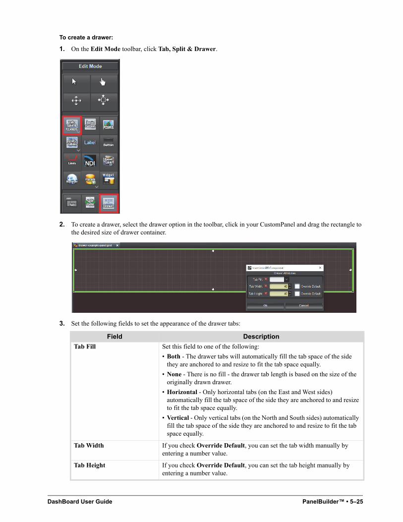
DashBoard User Guide PanelBuilder™ • 5–25
To create a drawer:
1. On the Edit Mode toolbar, click Tab, Split & Drawer.
2. To create a drawer, select the drawer option in the toolbar, click in your CustomPanel and drag the rectangle to the desired size of drawer container.
3. Set the following fields to set the appearance of the drawer tabs:
Field Description
Tab Fill Set this field to one of the following:
• Both - The drawer tabs will automatically fill the tab space of the side they are anchored to and resize to fit the tab space equally.
• None - There is no fill - the drawer tab length is based on the size of the originally drawn drawer.
• Horizontal - Only horizontal tabs (on the East and West sides) automatically fill the tab space of the side they are anchored to and resize to fit the tab space equally.
• Vertical - Only vertical tabs (on the North and South sides) automatically fill the tab space of the side they are anchored to and resize to fit the tab space equally.
Tab Width If you check Override Default, you can set the tab width manually by entering a number value.
Tab Height If you check Override Default, you can set the tab height manually by entering a number value.
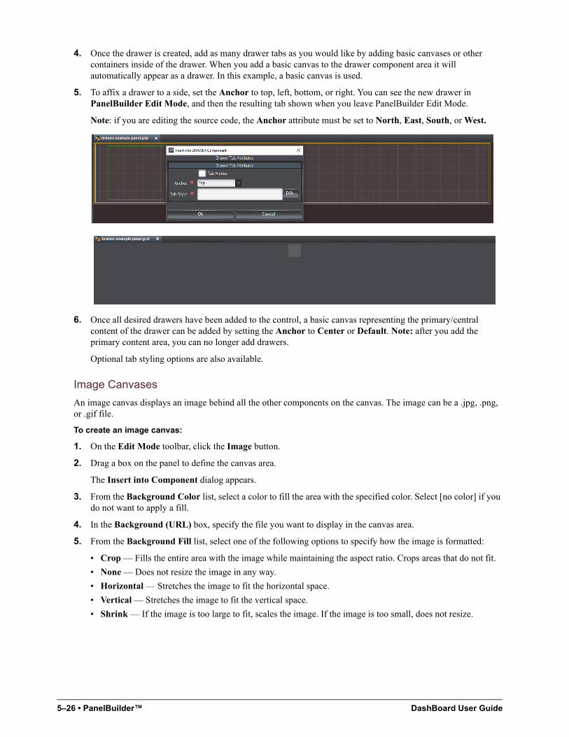
5–26 • PanelBuilder™ DashBoard User Guide
4. Once the drawer is created, add as many drawer tabs as you would like by adding basic canvases or other containers inside of the drawer. When you add a basic canvas to the drawer component area it will automatically appear as a drawer. In this example, a basic canvas is used.
5. To affix a drawer to a side, set the Anchor to top, left, bottom, or right. You can see the new drawer in PanelBuilder Edit Mode, and then the resulting tab shown when you leave PanelBuilder Edit Mode.
Note: if you are editing the source code, the Anchor attribute must be set to North, East, South, or West.
6. Once all desired drawers have been added to the control, a basic canvas representing the primary/central content of the drawer can be added by setting the Anchor to Center or Default. Note: after you add the primary content area, you can no longer add drawers.
Optional tab styling options are also available.
Image Canvases
An image canvas displays an image behind all the other components on the canvas. The image can be a .jpg, .png, or .gif file.
To create an image canvas:
1. On the Edit Mode toolbar, click the Image button.
2. Drag a box on the panel to define the canvas area.
The Insert into Component dialog appears.
3. From the Background Color list, select a color to fill the area with the specified color. Select [no color] if you do not want to apply a fill.
4. In the Background (URL) box, specify the file you want to display in the canvas area.
5. From the Background Fill list, select one of the following options to specify how the image is formatted:
• Crop — Fills the entire area with the image while maintaining the aspect ratio. Crops areas that do not fit.
• None — Does not resize the image in any way.
• Horizontal — Stretches the image to fit the horizontal space.
• Vertical — Stretches the image to fit the vertical space.
• Shrink — If the image is too large to fit, scales the image. If the image is too small, does not resize.
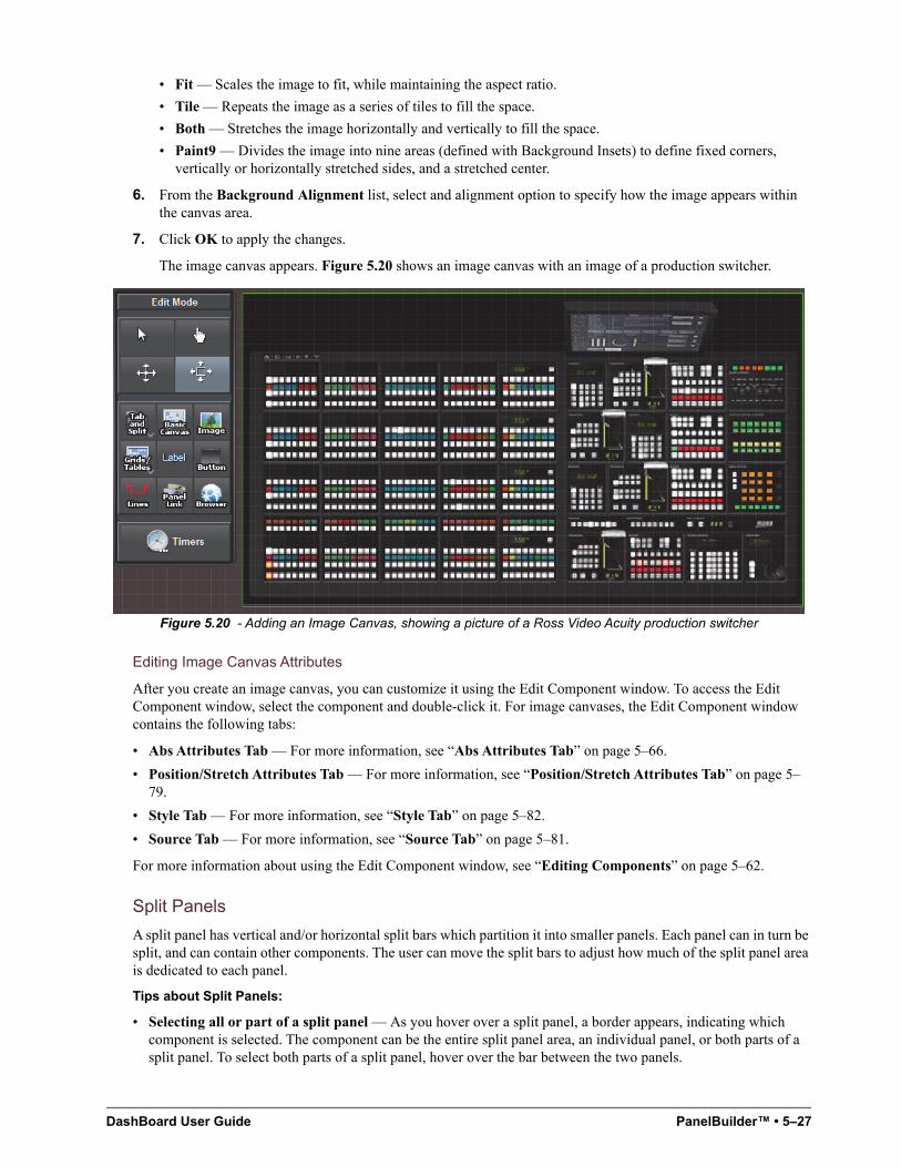
DashBoard User Guide PanelBuilder™ • 5–27
• Fit — Scales the image to fit, while maintaining the aspect ratio.
• Tile — Repeats the image as a series of tiles to fill the space.
• Both — Stretches the image horizontally and vertically to fill the space.
• Paint9 — Divides the image into nine areas (defined with Background Insets) to define fixed corners, vertically or horizontally stretched sides, and a stretched center.
6. From the Background Alignment list, select and alignment option to specify how the image appears within the canvas area.
7. Click OK to apply the changes.
The image canvas appears. Figure 5.20 shows an image canvas with an image of a production switcher.
Figure 5.20 - Adding an Image Canvas, showing a picture of a Ross Video Acuity production switcher
Editing Image Canvas Attributes
After you create an image canvas, you can customize it using the Edit Component window. To access the Edit Component window, select the component and double-click it. For image canvases, the Edit Component window contains the following tabs:
• Abs Attributes Tab — For more information, see “Abs Attributes Tab” on page 5–66.
• Position/Stretch Attributes Tab — For more information, see “Position/Stretch Attributes Tab” on page 5–79.
• Style Tab — For more information, see “Style Tab” on page 5–82.
• Source Tab — For more information, see “Source Tab” on page 5–81.
For more information about using the Edit Component window, see “Editing Components” on page 5–62.
Split Panels
A split panel has vertical and/or horizontal split bars which partition it into smaller panels. Each panel can in turn be split, and can contain other components. The user can move the split bars to adjust how much of the split panel area is dedicated to each panel.
Tips about Split Panels:
• Selecting all or part of a split panel — As you hover over a split panel, a border appears, indicating which component is selected. The component can be the entire split panel area, an individual panel, or both parts of a split panel. To select both parts of a split panel, hover over the bar between the two panels.
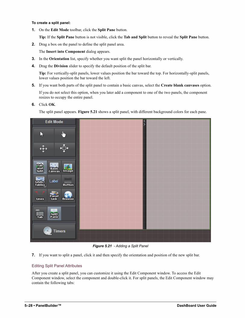
5–28 • PanelBuilder™ DashBoard User Guide
To create a split panel:
1. On the Edit Mode toolbar, click the Split Pane button.
Tip: If the Split Pane button is not visible, click the Tab and Split button to reveal the Split Pane button.
2. Drag a box on the panel to define the split panel area.
The Insert into Component dialog appears.
3. In the Orientation list, specify whether you want split the panel horizontally or vertically.
4. Drag the Division slider to specify the default position of the split bar.
Tip: For vertically-split panels, lower values position the bar toward the top. For horizontally-split panels, lower values position the bar toward the left.
5. If you want both parts of the split panel to contain a basic canvas, select the Create blank canvases option.
If you do not select this option, when you later add a component to one of the two panels, the component resizes to occupy the entire panel.
6. Click OK.
The split panel appears. Figure 5.21 shows a split panel, with different background colors for each pane.
Figure 5.21 - Adding a Split Panel
7. If you want to split a panel, click it and then specify the orientation and position of the new split bar.
Editing Split Panel Attributes
After you create a split panel, you can customize it using the Edit Component window. To access the Edit Component window, select the component and double-click it. For split panels, the Edit Component window may contain the following tabs:
DashBoard User Guide PanelBuilder™ • 5–29
• Split Attributes Tab — For more information, see “Split Attributes Tab” on page 5–81.
• Dropspot Attributes Tab — For more information, see “Dropspot Attributes Tab” on page 5–71.
• Position/Stretch Attributes Tab — For more information, see “Position/Stretch Attributes Tab” on page 5–79.
• Style Tab — For more information, see “Style Tab” on page 5–82.
• Source Tab — For more information, see “Source Tab” on page 5–81.
For more information about using the Edit Component window, see “Editing Components” on page 5–62.
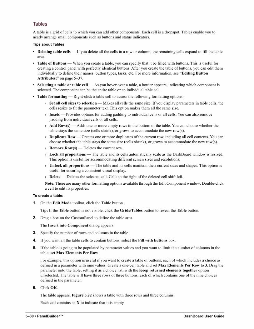
5–30 • PanelBuilder™ DashBoard User Guide
Tables
A table is a grid of cells to which you can add other components. Each cell is a dropspot. Tables enable you to neatly arrange small components such as buttons and status indicators.
Tips about Tables
• Deleting table cells — If you delete all the cells in a row or column, the remaining cells expand to fill the table area.
• Table of Buttons — When you create a table, you can specify that it be filled with buttons. This is useful for creating a control panel with perfectly identical buttons. After you create the table of buttons, you can edit them individually to define their names, button types, tasks, etc. For more information, see “Editing Button Attributes:” on page 5–37.
• Selecting a table or table cell — As you hover over a table, a border appears, indicating which component is selected. The component can be the entire table or an individual table cell.
• Table formatting — Right-click a table cell to access the following formatting options:
› Set all cell sizes to selection — Makes all cells the same size. If you display parameters in table cells, the cells resize to fit the parameter text. This option makes them all the same size.
› Insets — Provides options for adding padding to individual cells or all cells. You can also remove padding from individual cells or all cells.
› Add Row(s) — Adds one or more empty rows to the bottom of the table. You can choose whether the table stays the same size (cells shrink), or grows to accommodate the new row(s).
› Duplicate Row — Creates one or more duplicates of the current row, including all cell contents. You can choose whether the table stays the same size (cells shrink), or grows to accommodate the new row(s).
› Remove Row(s) — Deletes the current row.
› Lock all proportions — The table and its cells automatically scale as the DashBoard window is resized. This option is useful for accommodating different screen sizes and resolutions.
› Unlock all proportions — The table and its cells maintain their current sizes and shapes. This option is useful for ensuring a consistent visual display.
› Delete — Deletes the selected cell. Cells to the right of the deleted cell shift left.
Note: There are many other formatting options available through the Edit Component window. Double-click a cell to edit its properties.
To create a table:
1. On the Edit Mode toolbar, click the Table button.
Tip: If the Table button is not visible, click the Grids/Tables button to reveal the Table button.
2. Drag a box on the CustomPanel to define the table area.
The Insert into Component dialog appears.
3. Specify the number of rows and columns in the table.
4. If you want all the table cells to contain buttons, select the Fill with buttons box.
5. If the table is going to be populated by parameter values and you want to limit the number of columns in the table, set Max Elements Per Row.
For example, this option is useful if you want to create a table of buttons, each of which includes a choice as defined in a parameter with nine values. Create a one-cell table and set Max Elements Per Row to 3. Drag the parameter onto the table, setting it as a choice list, with the Keep returned elements together option unselected. The table will have three rows of three buttons, each of which contains one of the nine choices defined in the parameter.
6. Click OK.
The table appears. Figure 5.22 shows a table with three rows and three columns.
Each cell contains an X to indicate that it is empty.
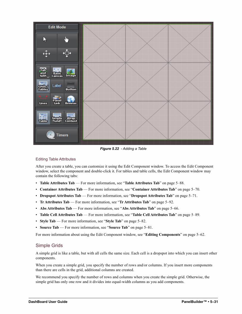
DashBoard User Guide PanelBuilder™ • 5–31
Figure 5.22 - Adding a Table
Editing Table Attributes
After you create a table, you can customize it using the Edit Component window. To access the Edit Component window, select the component and double-click it. For tables and table cells, the Edit Component window may contain the following tabs:
• Table Attributes Tab — For more information, see “Table Attributes Tab” on page 5–88.
• Container Attributes Tab — For more information, see “Container Attributes Tab” on page 5–70.
• Dropspot Attributes Tab — For more information, see “Dropspot Attributes Tab” on page 5–71.
• Tr Attributes Tab — For more information, see “Tr Attributes Tab” on page 5–92.
• Abs Attributes Tab — For more information, see “Abs Attributes Tab” on page 5–66.
• Table Cell Attributes Tab — For more information, see “Table Cell Attributes Tab” on page 5–89.
• Style Tab — For more information, see “Style Tab” on page 5–82.
• Source Tab — For more information, see “Source Tab” on page 5–81.
For more information about using the Edit Component window, see “Editing Components” on page 5–62.
Simple Grids
A simple grid is like a table, but with all cells the same size. Each cell is a dropspot into which you can insert other components.
When you create a simple grid, you specify the number of rows and/or columns. If you insert more components than there are cells in the grid, additional columns are created.
We recommend you specify the number of rows and columns when you create the simple grid. Otherwise, the simple grid has only one row and it divides into equal-width columns as you add components.
5–32 • PanelBuilder™ DashBoard User Guide
To create a simple grid:
1. On the Edit Mode toolbar, click the Simple Grid button.
Tip: If the Simple Grid button is not visible, click the Grids/Tables button to reveal the Simple Grid button.
2. Drag a box on the CustomPanel to define the grid area.
The Insert into Component dialog appears.
3. Beside Rows and/or Columns, select Override Default, and then specify the number of rows and/or columns you want in the simple grid.
4. Click OK.
The simple grid appears. The rows and columns are not apparent until you insert components.
Editing Simple Grid Attributes
After you create a simple grid, you can customize it using the Edit Component window. To access the Edit Component window, select the component and double-click it. For simple grids, the Edit Component window may contain the following tabs:
• Simplegrid Attributes Tab — For more information, see “Simplegrid Attributes Tab” on page 5–80.
• Position/Stretch Attributes Tab — For more information, see “Position/Stretch Attributes Tab” on page 5–79.
• Style Tab — For more information, see “Style Tab” on page 5–82.
• Source Tab — For more information, see “Source Tab” on page 5–81.
For more information about using the Edit Component window, see “Editing Components” on page 5–62.
Flow Containers (Wrap Content)
A flow container is like a table, but without a predefined number of rows and columns.
When you create a flow container, you can specify whether to keep all components widths and/or heights the same.
As you add components to a flow container, each is added to the right of the previous one. When a row is filled, additional components appear in the next row.
To create a flow container (wrap content):
1. On the Edit Mode toolbar, click the Wrap Content button.
Tip: If the Wrap Content button is not visible, click the Grids/Tables button to reveal the Wrap Content button.
2. Drag a box on the CustomPanel to define the flow container area.
The Insert into Component dialog appears.
3. If you want the components to be neatly aligned along the right or left edge of the container, or centered within the container, specify the Horizontal Alignment accordingly.
4. If you want the widths of all components in the container to be the same, select Keep all widths the same.
All component widths will match the width of the widest one.
5. If you want the heights of all components in the container to be the same, select Keep all heights the same.
All component heights will match the height of the tallest one.
6. If Keep all widths the same is selected, and you want all the components to fill a single row if possible, select Fill single line if possible.
If the components widths are small enough that the components can all fit on one row with extra space, the widths are expanded to fill the row.
DashBoard User Guide PanelBuilder™ • 5–33
7. Click OK.
The flow container appears. No rows or columns are apparent until you insert components.
Editing Flow Container Attributes
After you create a flow container, you can customize it using the Edit Component window. To access the Edit Component window, select the component and double-click it. For flow containers, the Edit Component window may contain the following tabs:
• Flow Attributes Tab — For more information, see “Flow Attributes Tab” on page 5–72.
• Position/Stretch Attributes Tab — For more information, see “Position/Stretch Attributes Tab” on page 5–79.
• Style Tab — For more information, see “Style Tab” on page 5–82.
• Source Tab — For more information, see “Source Tab” on page 5–81.
For more information about using the Edit Component window, see “Editing Components” on page 5–62.
Labels
Labels are blocks of stand-alone text. Labels can be used as headers or banners anywhere on the CustomPanel, positioned beside components to provide descriptions of the component function, or added anywhere to provide additional information.
You can also assign tasks to a label, so that PanelBuilder performs the tasks when a user clicks the label. For more information, see “Assigning Tasks to Buttons, Labels, and Timers” on page 5–52.
To create a label:
1. On the Edit Mode toolbar, click the Label button.
2. Drag a box on the panel to define the label area.
The Insert into Component dialog appears.
3. In the Name box, type the text you want to appear on the label.
4. In the ID box, specify an ID (optional).
IDs are used in scripts to refer to objects. If no scripting is required, you do not need to specify an ID.
5. In the Text Alignment box, specify how to align the text within its box.
6. If you want to format the text as a banner, select the Header box.
The background of the label area is automatically set to blue and the text is set to white.
7. Click OK.
The label appears. Figure 5.23 shows a label with a red background.
Tip: By default labels have no borders. You can edit the border settings to create a border around the label.
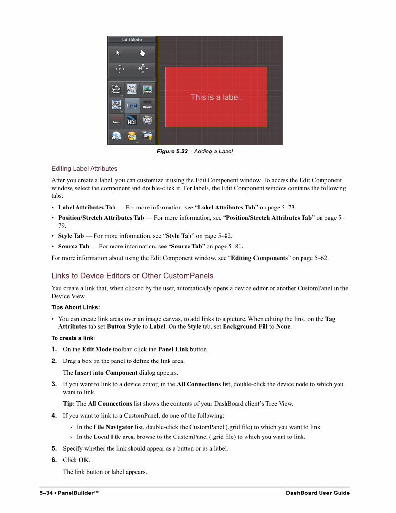
5–34 • PanelBuilder™ DashBoard User Guide
Figure 5.23 - Adding a Label
Editing Label Attributes
After you create a label, you can customize it using the Edit Component window. To access the Edit Component window, select the component and double-click it. For labels, the Edit Component window contains the following tabs:
• Label Attributes Tab — For more information, see “Label Attributes Tab” on page 5–73.
• Position/Stretch Attributes Tab — For more information, see “Position/Stretch Attributes Tab” on page 5–79.
• Style Tab — For more information, see “Style Tab” on page 5–82.
• Source Tab — For more information, see “Source Tab” on page 5–81.
For more information about using the Edit Component window, see “Editing Components” on page 5–62.
Links to Device Editors or Other CustomPanels
You create a link that, when clicked by the user, automatically opens a device editor or another CustomPanel in the Device View.
Tips About Links:
• You can create link areas over an image canvas, to add links to a picture. When editing the link, on the Tag Attributes tab set Button Style to Label. On the Style tab, set Background Fill to None.
To create a link:
1. On the Edit Mode toolbar, click the Panel Link button.
2. Drag a box on the panel to define the link area.
The Insert into Component dialog appears.
3. If you want to link to a device editor, in the All Connections list, double-click the device node to which you want to link.
Tip: The All Connections list shows the contents of your DashBoard client’s Tree View.
4. If you want to link to a CustomPanel, do one of the following:
› In the File Navigator list, double-click the CustomPanel (.grid file) to which you want to link.
› In the Local File area, browse to the CustomPanel (.grid file) to which you want to link.
5. Specify whether the link should appear as a button or as a label.
6. Click OK.
The link button or label appears.
DashBoard User Guide PanelBuilder™ • 5–35
Tip: By default there is no text on link buttons or labels, and link labels have no borders. This is useful for creating invisible link areas. If you want the link to be visible, you can edit the link name to add text, and edit the border settings to create a border.
Editing Link Attributes
After you create a link, you can customize it using the Edit Component window. To access the Edit Component window, select the component and double-click it. For links, the Edit Component window contains the following tabs:
• Tag Attributes Tab — For more information, see “Tag Attributes Tab” on page 5–90.
• Position/Stretch Attributes Tab — For more information, see “Position/Stretch Attributes Tab” on page 5–79.
• Style Tab — For more information, see “Style Tab” on page 5–82.
• Source Tab — For more information, see “Source Tab” on page 5–81.
For more information about using the Edit Component window, see “Editing Components” on page 5–62.
Buttons
Buttons are controls you can add to CustomPanels to enable users to send commands or perform tasks.
This section describes how to create buttons on CustomPanels. For information about how to configure buttons to perform specific tasks, see “Assigning Tasks to Buttons, Labels, and Timers” on page 5–52.
You can create single buttons, or groups of buttons (table of buttons).
To create a single button:
1. On the Edit Mode toolbar, click the Button button.
2. Drag a box on the panel to define the button area.
The Insert into Component dialog appears.
3. In the Name box, type the text you want to appear on or beside the button.
4. In the ID box, specify an ID (optional).
IDs are used in scripts to refer to objects. If no scripting is required, you do not need to specify an ID.
5. In the Type list, click a button type:
• Push — When clicked, PanelBuilder performs the assigned tasks.
The visual appearance of the button changes momentarily while it is being clicked, and then reverts to its default appearance when it is released.
• Toggle — When clicked, switches between two states (ON and OFF).
When the button changes state, PanelBuilder performs the assigned tasks. Alternatively, you can create a script that detects the state change and performs tasks based on which state has been activated.
Tip: The visual appearance (style) of the button can be different for each of three states (Default, Toggle On, and Toggle Off). Toggle button styles are defined on sub-tabs of the Style tab, in the Edit Component window.
• Checkbox — When clicked, switches between two states (ON and OFF).
When the button is ON, the check box contains a check mark. When the button is OFF, the check box is empty.
When the button changes state, PanelBuilder performs the assigned tasks. Alternatively, you can create a script that detects the state change and performs tasks based on which state has been activated.
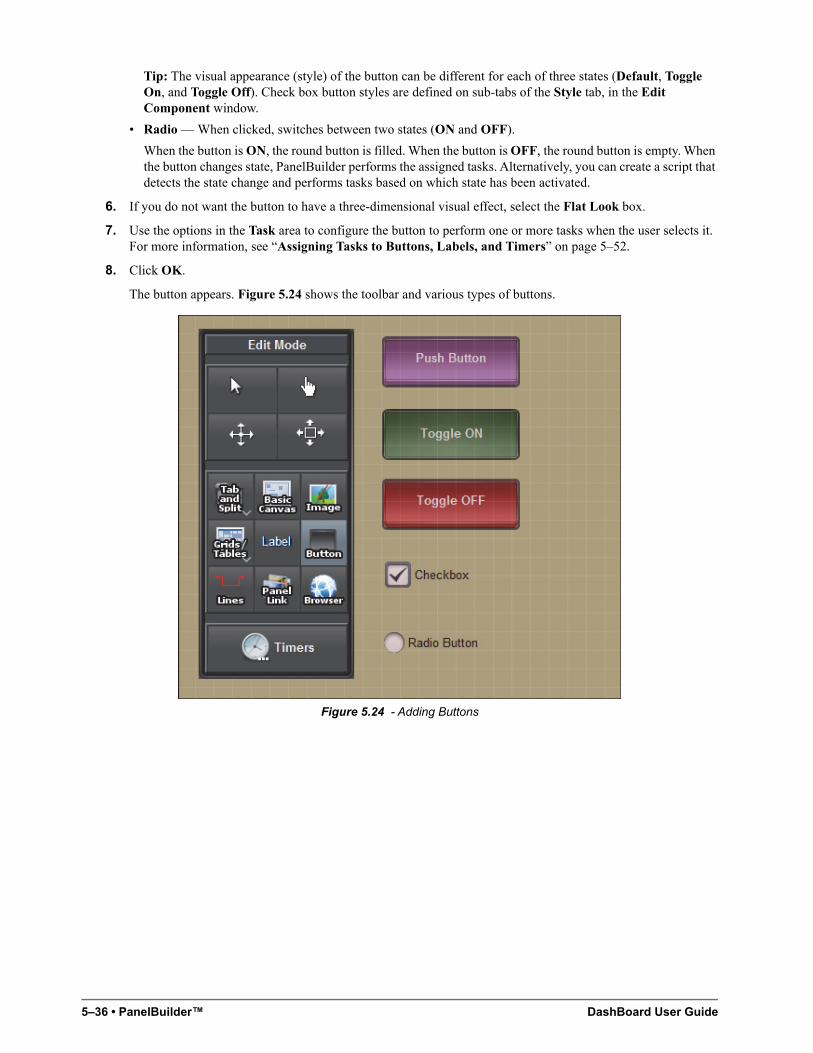
5–36 • PanelBuilder™ DashBoard User Guide
Tip: The visual appearance (style) of the button can be different for each of three states (Default, Toggle On, and Toggle Off). Check box button styles are defined on sub-tabs of the Style tab, in the Edit Component window.
• Radio — When clicked, switches between two states (ON and OFF).
When the button is ON, the round button is filled. When the button is OFF, the round button is empty. When the button changes state, PanelBuilder performs the assigned tasks. Alternatively, you can create a script that detects the state change and performs tasks based on which state has been activated.
6. If you do not want the button to have a three-dimensional visual effect, select the Flat Look box.
7. Use the options in the Task area to configure the button to perform one or more tasks when the user selects it. For more information, see “Assigning Tasks to Buttons, Labels, and Timers” on page 5–52.
8. Click OK.
The button appears. Figure 5.24 shows the toolbar and various types of buttons.
Figure 5.24 - Adding Buttons
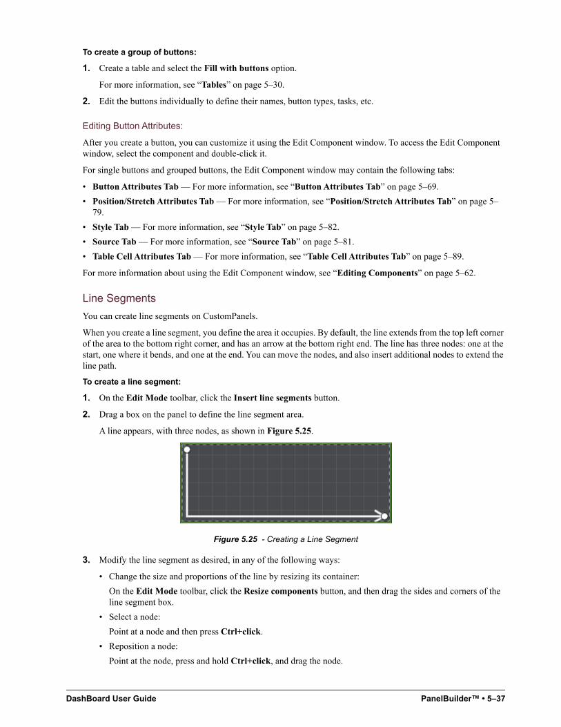
DashBoard User Guide PanelBuilder™ • 5–37
To create a group of buttons:
1. Create a table and select the Fill with buttons option.
For more information, see “Tables” on page 5–30.
2. Edit the buttons individually to define their names, button types, tasks, etc.
Editing Button Attributes:
After you create a button, you can customize it using the Edit Component window. To access the Edit Component window, select the component and double-click it.
For single buttons and grouped buttons, the Edit Component window may contain the following tabs:
• Button Attributes Tab — For more information, see “Button Attributes Tab” on page 5–69.
• Position/Stretch Attributes Tab — For more information, see “Position/Stretch Attributes Tab” on page 5–79.
• Style Tab — For more information, see “Style Tab” on page 5–82.
• Source Tab — For more information, see “Source Tab” on page 5–81.
• Table Cell Attributes Tab — For more information, see “Table Cell Attributes Tab” on page 5–89.
For more information about using the Edit Component window, see “Editing Components” on page 5–62.
Line Segments
You can create line segments on CustomPanels.
When you create a line segment, you define the area it occupies. By default, the line extends from the top left corner of the area to the bottom right corner, and has an arrow at the bottom right end. The line has three nodes: one at the start, one where it bends, and one at the end. You can move the nodes, and also insert additional nodes to extend the line path.
To create a line segment:
1. On the Edit Mode toolbar, click the Insert line segments button.
2. Drag a box on the panel to define the line segment area.
A line appears, with three nodes, as shown in Figure 5.25.
Figure 5.25 - Creating a Line Segment
3. Modify the line segment as desired, in any of the following ways:
• Change the size and proportions of the line by resizing its container:
On the Edit Mode toolbar, click the Resize components button, and then drag the sides and corners of the line segment box.
• Select a node:
Point at a node and then press Ctrl+click.
• Reposition a node:
Point at the node, press and hold Ctrl+click, and drag the node.
5–38 • PanelBuilder™ DashBoard User Guide
• Add a node at the end of the line:
Point to where you want the new node, and the press Ctrl+double-click. The line extends to the new node.
• Add a node along the line:
Point to a node adjacent to where you want the new node, and then press Ctrl+double-click. The new node is created in the same position. Reposition the new node.
• Delete a node:
Point at the node, press Ctrl+click to select the node, and then press Delete.
• Delete the entire line segment:
On the Edit Mode toolbar, click the Select/Drag Components button, click the line segment, and then press Delete.
To further modify a line segment using the Edit Component dialog:
1. In the Edit Mode toolbar, click the Select/Drag components button, double-click the line segment to open the Edit Component dialog, and then click the Source tab.
The source code that defines the line segment appears. A line segment consists of a lines element which contains two or more point elements. The line extends from the first point through each of the subsequent points.
2. Edit general line characteristics as follows:
• To allow the line to travel diagonally from point to point, change the diagonals attribute to true.
• To show arrows at the start and/or end of the line, set the startarrow and/or endarrow attributes to true, respectively.
• Specify whether the horizontal (x) and vertical (y) position of points is defined in pixels or as a percentage of the line segment area:
› For pixels, set the percent attribute to true.
› For percentage, set the percent attribute to false.
3. Edit point characteristics as follows:
• To move a point, edit the point element’s horizontal (x) and vertical (y) position values.
• To add a point, add a point element and define its horizontal (x) and vertical (y) position values.
• To create a closed shape, make the first and last point elements identical.
4. To change the style of the line segment, click the Style tab and then change settings as desired.
5. To change the position or anchoring of the line segment area (container), click the Position/Stretch attributes tab, and then change settings as desired.
6. When you are finished editing the line segment, click Apply and Close.
Web Browser Instances
You can add active web browser instances to your CustomPanel to display fully-interactive web pages. Web browser instances are like canvases, which you can overlay with other components.
Tips about Web Browser Instances:
• Web pages are not displayed in Edit Mode — After you add a web browser instance, you must exit Edit Mode to see the actual web page.
• Not a complete browser — Web pages are fully functional, but do not include typical browser features such as an address bar or forward and back buttons.
DashBoard User Guide PanelBuilder™ • 5–39
To add a web browser instance:
1. On the Edit Mode toolbar, click the Insert web browser button.
2. Drag a box on the panel to define the web browser area.
The Insert into Component dialog appears.
3. In the URL box, type the address of the web page you want to display in the browser.
For example, to display the Ross Video website, type http://www.rossvideo.com.
4. Click OK.
The browser instance appears.
Editing Web Browser Attributes
After you add a web browser instance, you can customize it using the Edit Component window. To access the Edit Component window, select the component and double-click it. For web browser canvases, the Edit Component window contains the following tabs:
• Browser Attributes Tab — For more information, see “Browser Attributes Tab” on page 5–69.
• Position/Stretch Attributes Tab — For more information, see “Position/Stretch Attributes Tab” on page 5–79.
• Style Tab — For more information, see “Style Tab” on page 5–82.
• Source Tab — For more information, see “Source Tab” on page 5–81.
For more information about using the Edit Component window, see “Editing Components” on page 5–62.
NDI Video Panels
You can embed Network Device Interface (NDI™) video into DashBoard CustomPanels.
DashBoard can display any NDI™ video source that is made available on the same subnet through NDI™ Tools such as the NDI™ VLC Plugin, or other applications such as Ross Video XPression.
NDI™ is a trade mark of NewTek Inc. For more information about NDI™ Tools, see the NDI™ section of the NewTek website at http://NDI.NewTek.com/.
To add an NDI™ video panel to a CustomPanel:
1. Create a CustomPanel, and then from the panel, enter Edit Mode.
2. On the Edit Mode Toolbar, tap the NDI button, and then drag on the panel to define the area of a new video display panel.
The Insert into ABS Component dialog box appears, as shown in Figure 5.26.
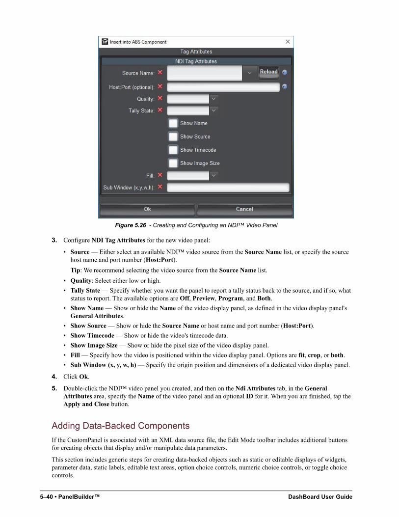
5–40 • PanelBuilder™ DashBoard User Guide
Figure 5.26 - Creating and Configuring an NDI™ Video Panel
3. Configure NDI Tag Attributes for the new video panel:
• Source — Either select an available NDI™ video source from the Source Name list, or specify the source host name and port number (Host:Port).
Tip: We recommend selecting the video source from the Source Name list.
• Quality: Select either low or high.
• Tally State — Specify whether you want the panel to report a tally status back to the source, and if so, what status to report. The available options are Off, Preview, Program, and Both.
• Show Name — Show or hide the Name of the video display panel, as defined in the video display panel's General Attributes.
• Show Source — Show or hide the Source Name or host name and port number (Host:Port).
• Show Timecode — Show or hide the video's timecode data.
• Show Image Size — Show or hide the pixel size of the video display panel.
• Fill — Specify how the video is positioned within the video display panel. Options are fit, crop, or both.
• Sub Window (x, y, w, h) — Specify the origin position and dimensions of a dedicated video display panel.
4. Click Ok.
5. Double-click the NDI™ video panel you created, and then on the Ndi Attributes tab, in the General Attributes area, specify the Name of the video panel and an optional ID for it. When you are finished, tap the Apply and Close button.
Adding Data-Backed Components
If the CustomPanel is associated with an XML data source file, the Edit Mode toolbar includes additional buttons for creating objects that display and/or manipulate data parameters.
This section includes generic steps for creating data-backed objects such as static or editable displays of widgets, parameter data, static labels, editable text areas, option choice controls, numeric choice controls, or toggle choice controls.
DashBoard User Guide PanelBuilder™ • 5–41
For More Information on...
• For detailed information about each type of data-backed object, see the corresponding section:
› “Widgets” on page 5–41
› “Parameter Displays” on page 5–43
› “Data-Backed Labels” on page 5–44
› “Editable Text Areas” on page 5–44
› “Option Choice Controls” on page 5–45
› “Numeric Choice Controls” on page 5–46
› “Toggle Choice Controls” on page 5–46
• For information about customizing components by editing their attributes, see “Editing Components” on page 5–62.
Widgets
You can add pre-built widgets to a CustomPanel. Widgets are DashBoard panel elements stored in files. They can be thought of as self-contained mini-applications. For example, a widget may enable you to select and play videos. You add widgets by referencing them from your CustomPanel.
This section describes how to add existing widgets to a custom panel. It does not describe how to create widgets.
Widgets are defined by a widget descriptor file. The filename of the widget descriptor file ends in .widgetdescriptor. They may also depend on other files, such as pictures.
Before you can add a widget to your panel, you must ensure the widget files (.widgetdescriptor files plus any supporting files) are available in one of the two following locations:
• In a folder named widgets, which must be in the same folder where DashBoard (DashBoard.exe) is installed.
Typically, C:\DashBoard\widgets, or C:\DashBoard Beta\widgets.
• In a folder named widgets, which must be in the same folder where the panel file (.grid file) is located.
To add a pre-built widget:
1. On the Edit Mode toolbar, click the Widget button.
2. Drag a box on the panel to define the widget area.
The Insert into Component dialog appears.
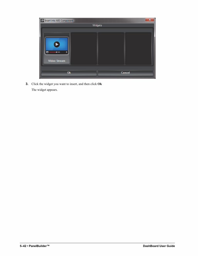
5–42 • PanelBuilder™ DashBoard User Guide
3. Click the widget you want to insert, and then click Ok
The widget appears.
DashBoard User Guide PanelBuilder™ • 5–43
Parameter Displays
You can display a parameter value, which users can change.
You can also associate one or more tasks with the displayed parameter, so that when the parameter value changes, the tasks are performed.
To display a parameter value:
1. On the Edit Mode toolbar, click the Display or edit a parameter backed by your data source button.
Tip: If the button is not visible, click the Param button to reveal the buttons used for adding data-backed components.
2. Drag a box on the panel to define the area.
The Insert into Component dialog box appears.
3. In the Select Parameter area, select the parameter you want to display.
4. Specify whether you want to include the parameter name.
When selected, the name of the parameter, as defined by the data source, is also displayed.
5. If the parameter may return multiple items, specify whether you want them kept together.
• When selected, returned elements can only be modified as a group, and are displayed together neatly. For example, if placed on an absolute position canvas, they do not overlap.
• When not selected, returned elements can be individually modified. For example, you can apply different style options to each element, or position them in separate table cells.
6. Click OK.
The parameter appears on the CustomPanel.
Editing Displayed Parameters
After you display a parameter, you can customize the display using the Edit Component window.
To access the Edit Component window, select the component and double-click it. For displayed parameters, the Edit Component window contains the following tabs:
• Param Attributes Tab — For more information, see “Param Attributes Tab” on page 5–77.
Tip: In the Tasks area of the Param Attributes tab, you can associate one or more tasks with the displayed parameter, so that when the parameter value changes, the tasks are performed.
• Position/Stretch Attributes Tab — For more information, see “Position/Stretch Attributes Tab” on page 5–79.
• Style Tab — For more information, see “Style Tab” on page 5–82.
• Source Tab — For more information, see “Source Tab” on page 5–81.
For more information about using the Edit Component window, see “Editing Components” on page 5–62.
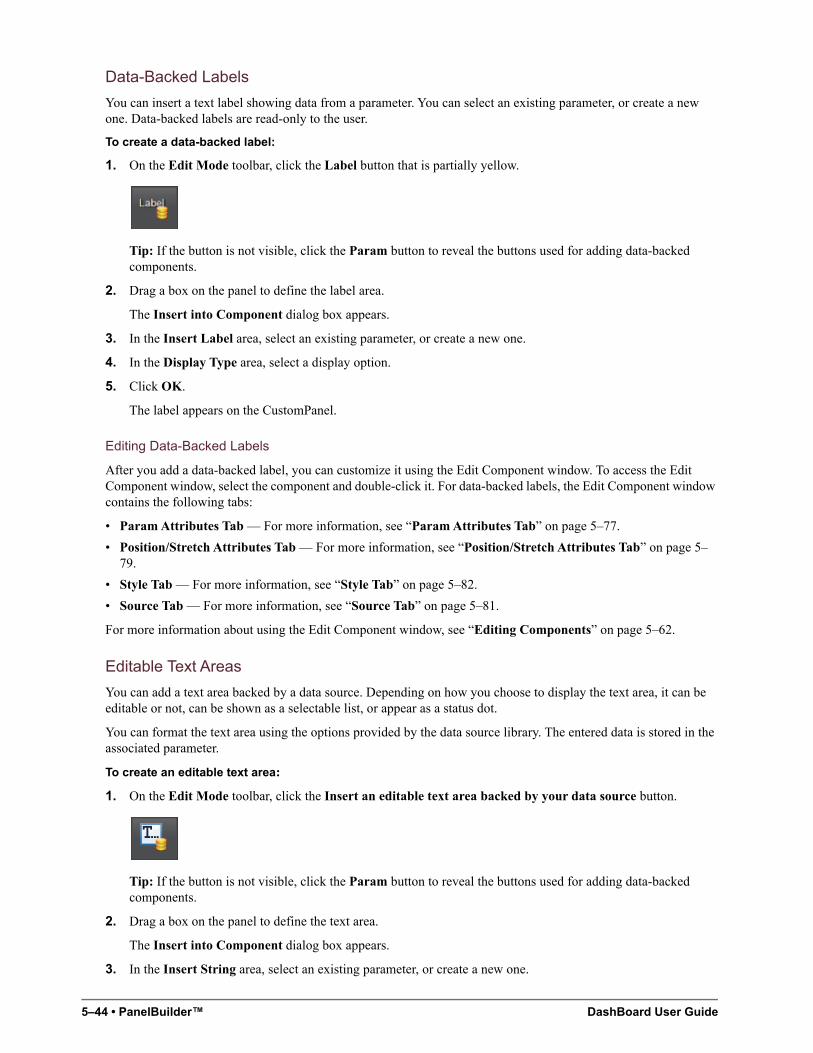
5–44 • PanelBuilder™ DashBoard User Guide
Data-Backed Labels
You can insert a text label showing data from a parameter. You can select an existing parameter, or create a new one. Data-backed labels are read-only to the user.
To create a data-backed label:
1. On the Edit Mode toolbar, click the Label button that is partially yellow.
Tip: If the button is not visible, click the Param button to reveal the buttons used for adding data-backed components.
2. Drag a box on the panel to define the label area.
The Insert into Component dialog box appears.
3. In the Insert Label area, select an existing parameter, or create a new one.
4. In the Display Type area, select a display option.
5. Click OK.
The label appears on the CustomPanel.
Editing Data-Backed Labels
After you add a data-backed label, you can customize it using the Edit Component window. To access the Edit Component window, select the component and double-click it. For data-backed labels, the Edit Component window contains the following tabs:
• Param Attributes Tab — For more information, see “Param Attributes Tab” on page 5–77.
• Position/Stretch Attributes Tab — For more information, see “Position/Stretch Attributes Tab” on page 5–79.
• Style Tab — For more information, see “Style Tab” on page 5–82.
• Source Tab — For more information, see “Source Tab” on page 5–81.
For more information about using the Edit Component window, see “Editing Components” on page 5–62.
Editable Text Areas
You can add a text area backed by a data source. Depending on how you choose to display the text area, it can be editable or not, can be shown as a selectable list, or appear as a status dot.
You can format the text area using the options provided by the data source library. The entered data is stored in the associated parameter.
To create an editable text area:
1. On the Edit Mode toolbar, click the Insert an editable text area backed by your data source button.
Tip: If the button is not visible, click the Param button to reveal the buttons used for adding data-backed components.
2. Drag a box on the panel to define the text area.
The Insert into Component dialog box appears.
3. In the Insert String area, select an existing parameter, or create a new one.
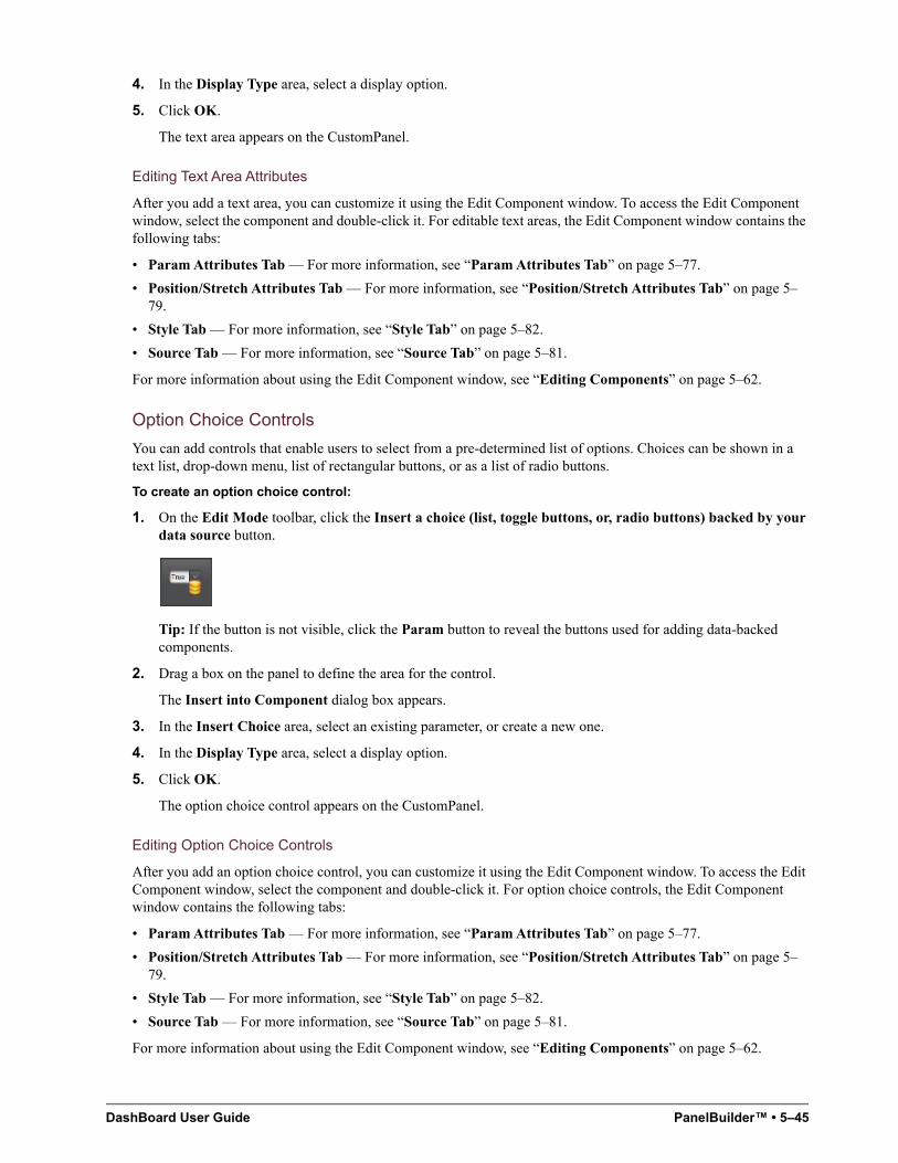
DashBoard User Guide PanelBuilder™ • 5–45
4. In the Display Type area, select a display option.
5. Click OK.
The text area appears on the CustomPanel.
Editing Text Area Attributes
After you add a text area, you can customize it using the Edit Component window. To access the Edit Component window, select the component and double-click it. For editable text areas, the Edit Component window contains the following tabs:
• Param Attributes Tab — For more information, see “Param Attributes Tab” on page 5–77.
• Position/Stretch Attributes Tab — For more information, see “Position/Stretch Attributes Tab” on page 5–79.
• Style Tab — For more information, see “Style Tab” on page 5–82.
• Source Tab — For more information, see “Source Tab” on page 5–81.
For more information about using the Edit Component window, see “Editing Components” on page 5–62.
Option Choice Controls
You can add controls that enable users to select from a pre-determined list of options. Choices can be shown in a text list, drop-down menu, list of rectangular buttons, or as a list of radio buttons.
To create an option choice control:
1. On the Edit Mode toolbar, click the Insert a choice (list, toggle buttons, or, radio buttons) backed by your data source button.
Tip: If the button is not visible, click the Param button to reveal the buttons used for adding data-backed components.
2. Drag a box on the panel to define the area for the control.
The Insert into Component dialog box appears.
3. In the Insert Choice area, select an existing parameter, or create a new one.
4. In the Display Type area, select a display option.
5. Click OK.
The option choice control appears on the CustomPanel.
Editing Option Choice Controls
After you add an option choice control, you can customize it using the Edit Component window. To access the Edit Component window, select the component and double-click it. For option choice controls, the Edit Component window contains the following tabs:
• Param Attributes Tab — For more information, see “Param Attributes Tab” on page 5–77.
• Position/Stretch Attributes Tab — For more information, see “Position/Stretch Attributes Tab” on page 5–79.
• Style Tab — For more information, see “Style Tab” on page 5–82.
• Source Tab — For more information, see “Source Tab” on page 5–81.
For more information about using the Edit Component window, see “Editing Components” on page 5–62.
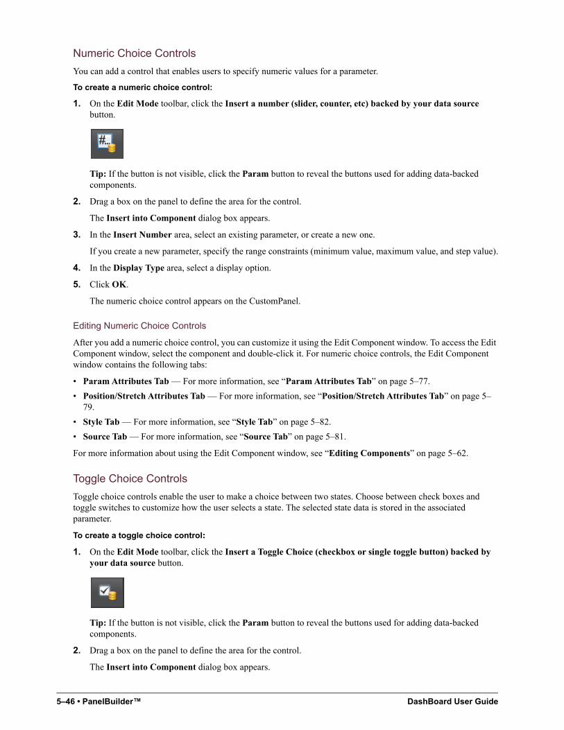
5–46 • PanelBuilder™ DashBoard User Guide
Numeric Choice Controls
You can add a control that enables users to specify numeric values for a parameter.
To create a numeric choice control:
1. On the Edit Mode toolbar, click the Insert a number (slider, counter, etc) backed by your data source button.
Tip: If the button is not visible, click the Param button to reveal the buttons used for adding data-backed components.
2. Drag a box on the panel to define the area for the control.
The Insert into Component dialog box appears.
3. In the Insert Number area, select an existing parameter, or create a new one.
If you create a new parameter, specify the range constraints (minimum value, maximum value, and step value).
4. In the Display Type area, select a display option.
5. Click OK.
The numeric choice control appears on the CustomPanel.
Editing Numeric Choice Controls
After you add a numeric choice control, you can customize it using the Edit Component window. To access the Edit Component window, select the component and double-click it. For numeric choice controls, the Edit Component window contains the following tabs:
• Param Attributes Tab — For more information, see “Param Attributes Tab” on page 5–77.
• Position/Stretch Attributes Tab — For more information, see “Position/Stretch Attributes Tab” on page 5–79.
• Style Tab — For more information, see “Style Tab” on page 5–82.
• Source Tab — For more information, see “Source Tab” on page 5–81.
For more information about using the Edit Component window, see “Editing Components” on page 5–62.
Toggle Choice Controls
Toggle choice controls enable the user to make a choice between two states. Choose between check boxes and toggle switches to customize how the user selects a state. The selected state data is stored in the associated parameter.
To create a toggle choice control:
1. On the Edit Mode toolbar, click the Insert a Toggle Choice (checkbox or single toggle button) backed by your data source button.
Tip: If the button is not visible, click the Param button to reveal the buttons used for adding data-backed components.
2. Drag a box on the panel to define the area for the control.
The Insert into Component dialog box appears.
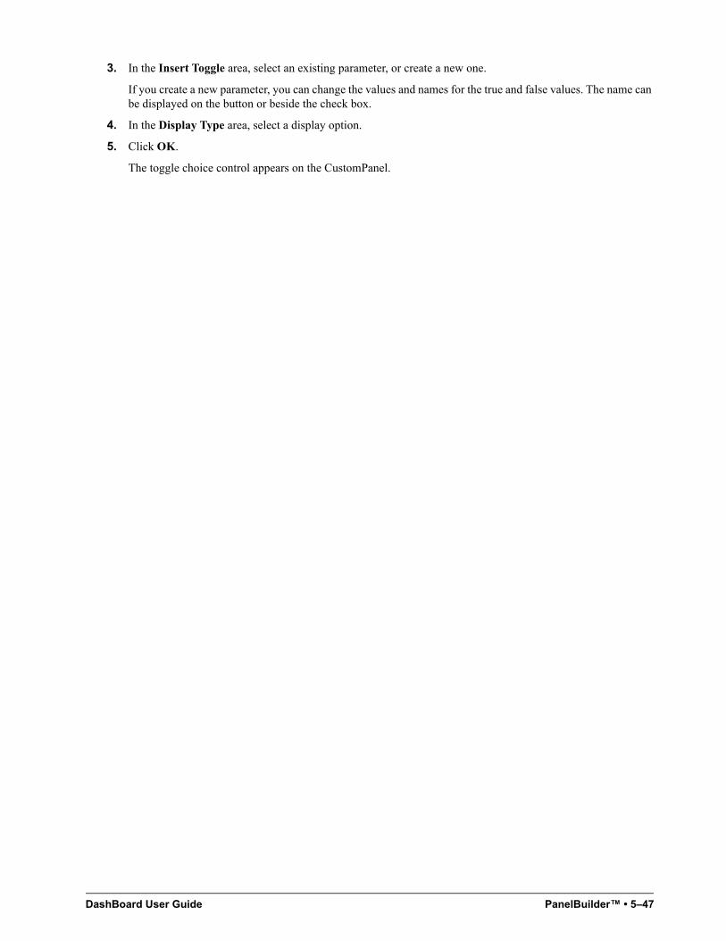
DashBoard User Guide PanelBuilder™ • 5–47
3. In the Insert Toggle area, select an existing parameter, or create a new one.
If you create a new parameter, you can change the values and names for the true and false values. The name can be displayed on the button or beside the check box.
4. In the Display Type area, select a display option.
5. Click OK.
The toggle choice control appears on the CustomPanel.
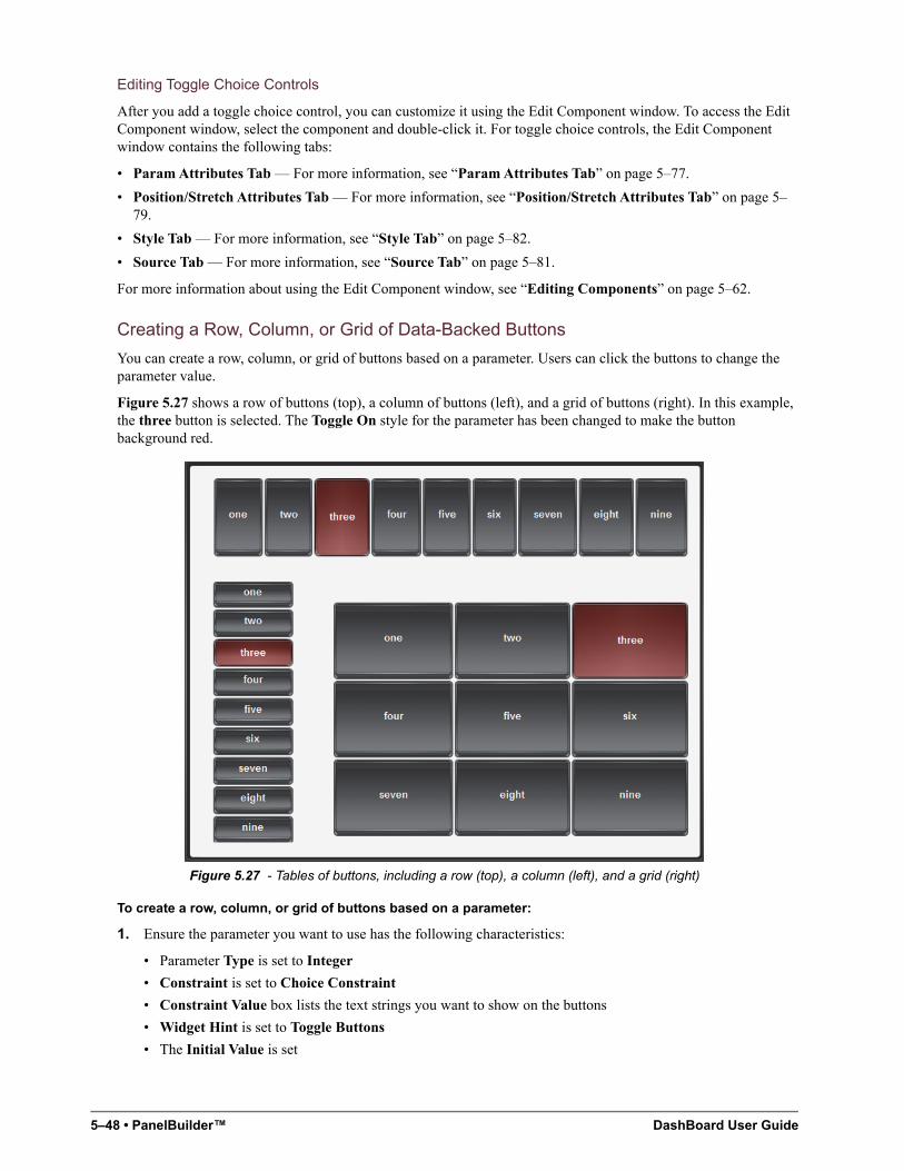
5–48 • PanelBuilder™ DashBoard User Guide
Editing Toggle Choice Controls
After you add a toggle choice control, you can customize it using the Edit Component window. To access the Edit Component window, select the component and double-click it. For toggle choice controls, the Edit Component window contains the following tabs:
• Param Attributes Tab — For more information, see “Param Attributes Tab” on page 5–77.
• Position/Stretch Attributes Tab — For more information, see “Position/Stretch Attributes Tab” on page 5–79.
• Style Tab — For more information, see “Style Tab” on page 5–82.
• Source Tab — For more information, see “Source Tab” on page 5–81.
For more information about using the Edit Component window, see “Editing Components” on page 5–62.
Creating a Row, Column, or Grid of Data-Backed Buttons
You can create a row, column, or grid of buttons based on a parameter. Users can click the buttons to change the parameter value.
Figure 5.27 shows a row of buttons (top), a column of buttons (left), and a grid of buttons (right). In this example, the three button is selected. The Toggle On style for the parameter has been changed to make the button background red.
Figure 5.27 - Tables of buttons, including a row (top), a column (left), and a grid (right)
To create a row, column, or grid of buttons based on a parameter:
1. Ensure the parameter you want to use has the following characteristics:
• Parameter Type is set to Integer
• Constraint is set to Choice Constraint
• Constraint Value box lists the text strings you want to show on the buttons
• Widget Hint is set to Toggle Buttons
• The Initial Value is set
DashBoard User Guide PanelBuilder™ • 5–49
2. Create a table with one row and one column.
For more information, see “Tables” on page 5–30.
3. In the Edit Mode toolbar, click the Display or edit a parameter backed by your data source icon, and then click the table cell.
Tip: If the button is not visible, click the Param button to reveal the buttons used for adding data-backed components.
The Insert into Component dialog appears.
4. Select the parameter, clear the check boxes at the bottom of the dialog, and then click Ok.
5. If you want to change the table to be a single column or a grid of buttons, edit the table, and on the Container Attributes tab, set the Max Elements Per Row to the number of columns you want.
6. If you want to set different styles for different button states, select the parameter in the Component List, and then edit the style settings on the Toggle On and Toggle Off tabs.
7. Resize and reposition the table as required.
Timers
Timers control and display time information. They can be displayed on a CustomPanel, or can operate without being displayed. Timers can include scheduled tasks which run when the timer reaches specified values.
You can create the following types of timers:
• Self — starts and stops manually, and is independent of any other timer.
• Simple clock — matches the time clock of the local computer.
• Time Until — counts down the amount of time remaining until a future date and time.
• Other Timer — links this timer to another timer. Starting or stopping the linked timer also starts or stops this timer.
Tips about Timers:
• Timers are not panel components — To view or manipulate a timer in a CustomPanel, you must create the timer, and then create a panel component such as a data-backed label or button, associated with the timer.
• Timers run tasks — Each timer includes a repeat rate, which defines how often DashBoard performs the list of tasks associated with the timer. For example, if the repeat rate is 500 milliseconds, the tasks are performed twice per second.
• Avoid frequent repeat rates — Each time the timer repeats, it performs all the tasks on the task list. If you set the timer to repeat too frequently, such as once per video field or video frame, DashBoard may not be able to process the task requests quickly enough, and performance may lag or unpredictable results may occur.
The repeat rate should generally be twice as frequent as the minimum display unit. For example, if the display is accurate to one second, the repeat rate should be 500 milliseconds.
• Starting a timer — You will need to create a button to start a timer if it is not using the computer clock. A self timer does not display a time until the timer is reset or started. It appears as a blank item.
• Child timers — The repeat rate for a child timer is controlled by its parent.
Creating a Timer
When you create a timer, you specify how time values are reported, the timer type, start and stop times, and whether you want tasks to be performed at certain intervals during timer operation. Creating a timer does not automatically add it to your CustomPanel.
5–50 • PanelBuilder™ DashBoard User Guide
To create a timer:
1. On the Edit Mode toolbar, click the Timers button.
The Add/Edit Timers dialog appears.
Tip: The Add/Edit Timers dialog box lists all the timers associated with the current CustomPanel.
2. Click Add New.
3. In the Timer ID box, type a name for the timer.
4. In the Display box, do one of the following to specify the time format you want the timer to use:
• Expand the Display list and double-click the format.
• Type the format and then press Enter.
Tip: To view descriptions of the time formatting symbols, click beside the Display list.
5. Click one of the following buttons to specify the type of timer you want:
• Manual — Creates a timer with start and stop times, for counting up or down. You can specify positive or negative values.
Tip: To create a countdown timer, set the start time later than to the stop time.
• Simple Clock — Creates a timer that counts forward, matching the DashBoard computer’s clock time.
• Count Time Until — Allows you to specify a future date and time as a reference. The timer value is the amount of time before the reference time arrives.
• Other Timer — Enables you to copy the properties of an existing timer.
6. If you want the timer to start one or more tasks, in the Tasks area, specify the tasks to perform.
For more information about specifying tasks, see “Assigning Tasks to Buttons, Labels, and Timers” on page 5–52.
7. Click Commit Changes to create the timer and to add it to list of timers.
8. Click Done.
Adding Timer Labels and Timer Control Buttons to a CustomPanel
After you create a timer, you can add a label to display the timer data. You can also add buttons to control the timer.
To add a label that shows timer data:
1. On the Edit Mode toolbar, click the Insert a data-backed label button.
Tip: If the button is not visible, click the Param button to reveal the buttons used for adding data-backed components.
2. Drag a box on the panel to define the label area.
The Insert into Component dialog appears.
3. Select Create New Parameter.
4. In the Name box, type a name for the timer label.
5. Select Timer Value.
6. In the Timer Value list, double-click the timer you want to add.
7. In the Display Type area, select a style for the timer label.
DashBoard User Guide PanelBuilder™ • 5–51
8. Click OK.
To add start and stop buttons for your timer:
1. Create a table containing two buttons.
For detailed instructions, see “To create a group of buttons:” on page 5–37.
Tip: The buttons don’t have to be in a table. The table aligns them neatly.
2. Configure the first button as a Start button:
a. Select from the Edit Mode toolbar.
b. Double-click the first button.
The Edit Component: <button> dialog appears.
c. On the Button Attributes tab, type Start in the Name box.
d. In the Tasks area, click Add.
e. In the Task Type area, click Timer Control.
The Timer Control Editor appears.
f. In the Timer list, double-click the timer you want to control.
g. In the Action list, click Start Timer.
h. Click OK.
i. Click Apply and Close.
3. Configure the second button as a Stop button by repeating Steps 2a to 2i for the second button, but with the following changes:
• In Step 2c, type Stop in the Name field.
• In Step 2g, click Stop Timer in the Action drop-down menu.
• If you want the timer to reset when the Stop button is clicked, select the Reset Timer check box.
Timer Control Functions
There are several timer control functions:
• Start Timer — starts the associated timer.
If you also select the Reset Timer check box, the timer resets before starting.
• Stop Timer — stops the associated timer.
If you also select the Reset Timer check box, the timer resets before stopping.
• Reset Timer — resets the associated timer.
• Set Time — sets the timer to a specific time.
• Add/Remove Time — adds or removes the specified amount of time to a timer. Positive values add time, negative values remove time.
• Set Start Time — sets the start time. The timer begins counting from this time.
• Set Stop Time — sets the stop time. The timer stops counting at this time.
• Set Pattern — sets the display pattern of the timer. You can specify a custom pattern or choose a predefined time format.
For information about how to link timers to buttons on a CustomPanel, see “To add start and stop buttons for your timer:” on page 5–51.
5–52 • PanelBuilder™ DashBoard User Guide
Assigning Tasks to Buttons, Labels, and Timers
You can assign a list of one or more tasks to each button, label, or timer. When the user clicks a label or button, the associated tasks are performed. When a timer reaches its threshold value (repeat rate), its associated tasks are performed.
Note: For labels or buttons, you can also trigger task lists externally, through keyboard shortcuts or RossTalk messages. For more information, see “Triggering Tasks Externally” on page 5–59.
The types of tasks you can assign include the following:
• ogScript — runs a segment of ogScript code. You can also use the provided ogScript Editor to parse XML data.
• RossTalk Script — sends a RossTalk command to a specific device to perform a task. Devices include Carbonite and Acuity production switchers, and XPression graphics systems.
For more information about the RossTalk protocol, see the document, RossTalk-Commands (4802DR-403).
• CamBot — sends a command to a specific Ross Robotics CamBot™ device to perform a task.
• VDCP Command — sends a VDCP command to a Ross BlackStorm Video Server, to perform a task.
• PBus Command — sends a PBus command to XPression, or to another device that uses the PBus protocol.
• Timer Control — performs a timer function, such as count up/down and stop.
• Data Modification — modifies parameter values as specified.
This section describes how to assign tasks, and includes the following topics:
• “Assigning ogScript Tasks” on page 5–52
• “Assigning Pauses” on page 5–53
• “Assigning RossTalk Commands” on page 5–53
• “Assigning CamBot Commands” on page 5–54
• “Assigning VDCP Commands” on page 5–55
• “Assigning PBUS Commands” on page 5–56
• “Using the Global List” on page 5–57
• “Assigning Data Modification Tasks” on page 5–57
• “Assigning Timer Control Tasks” on page 5–58
• “Editing a Task” on page 5–59
Assigning ogScript Tasks
ogScript is a programming language developed by Ross Video to interact with DashBoard-enabled devices. It is a subset of JavaScript, with additional PanelBuilder-specific functions added.
You can add advanced functionality and logic to CustomPanels by creating tasks that execute ogScript code. Tasks can be associated with buttons, labels, parameters, timers, and listeners.
You can create and edit ogScript code manually, or use the Visual Logic editor to create and edit ogScript code visually.
For more information about using ogScript in CustomPanels, see “Working with ogScript” on page 5–101.
To assign an ogScript task:
1. Create the item with which you want to associate the task.
Tasks can be associated with buttons, labels, parameters, timers, and listeners.
2. In Edit Mode, double-click the item, to open the Edit Component window.
3. In the Component Tree, navigate to the item.
DashBoard User Guide PanelBuilder™ • 5–53
4. In the attribute editor area, open the Attributes tab for the item.
The Attributes tab will be one of the following: Button Attributes, Label Attributes, Param Attributes, Timer Attributes, or Listener Attributes.
5. In the Tasks area, click Add.
The Add Task dialog appears.
6. In the Task Type area, click the ogScript button.
7. Do one of the following:
• If you want to create the ogScript code manually, click the ogScript button, and then type or paste the ogScript code into the ogScript Editor.
For detailed reference information about ogScript functions, see the DashBoard CustomPanel Development Guide (8351DR-007).
• If you want to create the ogScript code visually, click the Visual button, and then add and connect logic blocks to create the code.
For more information about the Visual Logic editor, see “DashBoard Visual Logic” on page 6–1
8. Click OK.
The ogScript task is added to the Tasks list.
9. When you are finished creating the task, click Apply Changes or Apply and Close.
Assigning Pauses
You can add timed pauses between tasks in a task list.
To add a pause to a task list:
1. Open a timer or control that includes a task list.
2. In the Tasks area, click the task that you want the pause to follow.
3. Click Add.
The Add Task dialog appears.
4. In the Task Type area, click the Pause button.
The Pause Editor dialog appears.
5. Specify the duration of the pause.
Tip: You can specify the unit of measure in time units (milliseconds, seconds, minutes), or frames (at 24 fps, 25 fps, 30 fps, 50 fps, or 60 fps).
Important Note: Pauses are run on the DashBoard computer and will not be frame accurate. They will roughly be of the duration specified.
6. Click OK.
The pause is added to the Tasks list.
Assigning RossTalk Commands
RossTalk is an Ethernet-based protocol that allows the control of Ross Video devices using simple commands. Refer to the documentation that came with your device to verify which commands it supports.
In PanelBuilder, you can create tasks that send RossTalk commands. For more information about the RossTalk protocol, see the document RossTalk-Commands (4802DR-403).
You can associate commands with buttons, labels, parameters, timers, or listeners.
5–54 • PanelBuilder™ DashBoard User Guide
To assign a RossTalk command:
1. Create the item with which you want to associate the command.
2. In edit mode, double-click the panel, to open the Edit Component window.
3. In the component tree, navigate to the item.
4. In the attribute editor area, open the Attributes tab for the item.
Tip: The Attributes tab will be one of the following: Button Attributes, Label Attributes, Param Attributes, Timer Attributes, or Listener Attributes.
5. In the Tasks area, click Add.
The Add Task dialog appears.
6. In the Task Type area, click the RossTalk button.
The RossTalk Editor dialog appears.
7. Configure the connection to the device. This is the device to which the command will be sent when the task runs. Do one of the following:
• Specify the Host IP address and Port number of the device.
The default port for RossTalk commands is port 7788.
• Select a connection from the Connection list. For information on adding connections to the Connection list, refer to the section “Using the Global List” on page 5-57.
8. In the Command list, double-click the command you want to send.
Tip: The Command list shows all commands. Some may not be applicable to the device you are controlling.
Tip: The Command box is yellow until you provide the IP address of the device (see step 7 on page 5-54).
9. If additional command parameter boxes appear below the Command box, specify parameter values as required.
10. In the Callback Function area, type any commands to be executed after the RossTalk command is completed.
Note: Commands that accept a callback do so because they run asynchronously. Callback commands are not guaranteed to execute before the next task. They are cued and run as soon as possible.
11. Click OK to apply your changes and to close the Add Task dialog.
12. Click Apply Changes or Apply and Close.
Assigning CamBot Commands
This section describes how to assign CamBot commands. You can associate commands with buttons, labels, parameters, timers, or listeners.
To assign a CamBot command:
1. Create the item with which you want to associate the command.
2. In edit mode, double-click the panel, to open the Edit Component window.
3. In the component tree, navigate to the item.
4. In the attribute editor area, open the Attributes tab for the item.
Tip: The Attributes tab will be one of the following: Button Attributes, Label Attributes, Param Attributes, Timer Attributes, or Listener Attributes.
5. In the Tasks area, click Add.
The Add Task dialog appears.
DashBoard User Guide PanelBuilder™ • 5–55
6. In the Task Type area, click the CamBot button.
The CamBot Editor dialog appears.
7. Configure the connection to the CamBot control computer. This is the CamBot control computer to which the command will be sent when the task runs. Do one of the following:
• Specify the Host IP address and Port number of the CamBot control computer.
The default port number is 2050.
• Select a connection from the Connection list. For information on adding connections to the Connection list, refer to the section “Using the Global List” on page 5-57.
8. In the Command list, double-click the command you want to send.
Tip: The Command box is yellow until you provide the IP address of the device (see step 7 on page 5-55).
9. If additional command parameter boxes appear below the Command box, specify parameter values as required.
10. In the Callback Function area, type any commands to be executed after the CamBot command is completed.
Note: Commands that accept a callback do so because they run asynchronously. Callback commands are not guaranteed to execute before the next task. They are cued and run as soon as possible.
11. Click OK to apply your changes and to close the Add Task dialog.
12. Click Apply Changes or Apply and Close.
Assigning VDCP Commands
This section describes how to send Video Disk Control Protocol (VDCP) commands from DashBoard to your Ross BlackStorm Video Server.
You can associate commands with buttons, labels, parameters, timers, or listeners.
To assign a VDCP command:
1. Create the item with which you want to associate the command.
2. In edit mode, double-click the panel, to open the Edit Component window.
3. In the component tree, navigate to the item.
4. In the attribute editor area, open the Attributes tab for the item.
Tip: The Attributes tab will be one of the following: Button Attributes, Label Attributes, Param Attributes, Timer Attributes, or Listener Attributes.
5. In the Tasks area, click Add.
The Add Task dialog appears.
6. In the Task Type area, click the VDCP button.
The VDCP Editor dialog appears.
7. Configure the connection to the device. This is the device to which the command will be sent when the task runs. Do one of the following:
• Specify the Host IP address and Port number of the device.
• Select a connection from the Connection list. For information on adding connections to the Connection list, refer to the section “Using the Global List” on page 5-57.
8. In the Command list, double-click the command you want to send.
Tip: The Command list shows all commands. Some may not be applicable to the device you are controlling.
9. Tip: The Command box is yellow until you provide the IP address of the device (see step 7 on page 5-55).
5–56 • PanelBuilder™ DashBoard User Guide
10. If additional command parameter boxes appear below the Command box, specify parameter values as required.
11. In the Callback Function area, type any commands to be executed after the VDCP command is completed.
Note: Commands that accept a callback do so because they run asynchronously. Callback commands are not guaranteed to execute before the next task. They are cued and run as soon as possible.
12. Click OK to apply your changes and to close the Add Task dialog.
13. Click Apply Changes or Apply and Close.
Assigning PBUS Commands
This section describes how to assign Peripheral BUS (PBUS) commands. You can send PBUS commands to control Ross Video XPression and other PBUS-enabled devices.
For detailed information about using PBUS with XPression, see the document, PBus on XPression.pdf, which is available on your XPression system in the C:\archives directory.
You can associate commands with buttons, labels, parameters, timers, or listeners.
To assign a PBUS command:
1. Create the item with which you want to associate the command.
2. In edit mode, double-click the panel, to open the Edit Component window.
3. In the component tree, navigate to the item.
4. In the attribute editor area, open the Attributes tab for the item.
Tip: The Attributes tab will be one of the following: Button Attributes, Label Attributes, Param Attributes, Timer Attributes, or Listener Attributes.
5. In the Tasks area, click Add.
The Add Task dialog appears.
6. In the Task Type area, click the PBus button.
The PBus Editor dialog appears.
7. Configure the connection to the device. This is the device to which the command will be sent when the task runs. Do one of the following:
• Specify the Host IP address and Port number of the device.
• Select a connection from the Connection list. For information on adding connections to the Connection list, refer to the section “Using the Global List” on page 5-57.
8. In the Device list, select the device to which you want to send the command.
9. In the Command list, double-click the command you want to send:
• Learn — Commands the device to capture and store its current status. The device normally stores whatever data it requires to return to its current state.
• Recall — Commands the device to return to a previously-stored state.
• Trigger — Commands the device to execute an event which has been previously prepared. For example, data for a credit crawl can be read in advance, and then the trigger command executes the credit crawl.
Tip: The Command box is yellow until you provide the IP address of the device.
10. In the Register list, type the register number, which is used as an identifier for the learned status. The register is specified when learning the status and for recalling the status.
11. In the Callback Function area, type any commands to be executed after the PBUS command is completed.
Note: Commands that accept a callback do so because they run asynchronously. Callback commands are not guaranteed to execute before the next task. They are cued and run as soon as possible.
DashBoard User Guide PanelBuilder™ • 5–57
12. Click OK to apply your changes and to close the Add Task dialog.
13. Click Apply Changes or Apply and Close.
Using the Global List
The Global List allows you to add a device connection to a list that enables easy association of commands with a similar device that uses a different IP address. This is helpful if you have multiple networks of devices or if you are moving around from different locations with a custom panel.
To add a device connection to the Global List:
1. Open the Edit Component dialog for a component (button, label, parameter, or listener).
2. Select the associated Attributes tab.
3. Click Add.
The Add Task dialog opens.
4. Specify the Host IP address and Port number of the device.
5. Click the Add Host/Port To Global List button.
The Input dialog opens.
6. Type a name for the host/port and click OK.
The host/port appears in the Connection list.
To assign a device connection using the global list:
1. Open the Edit Component dialog for a a component (button, label, parameter, or listener).
1. Select the associated Attributes tab.
2. Click Edit.
The Edit Task dialog opens.
3. Select a host/name from the Connection list.
4. Click OK.
Assigning Data Modification Tasks
You can create a task that modifies parameter values.
For More Information on...
• parameters, refer to the section, “Parameters and Data Sources” on page 5–97.
You can associate tasks with buttons, labels, parameters, timers, or listeners.
To assign a data modification task:
1. Create the item with which you want to associate the task.
2. In edit mode, double-click the panel, to open the Edit Component window.
3. In the component tree, navigate to the item.
4. In the attribute editor area, open the Attributes tab for the item.
Tip: The Attributes tab will be one of the following: Button Attributes, Label Attributes, Param Attributes, Timer Attributes, or Listener Attributes.
5. In the Tasks area, click Add.
The Add Task dialog appears.
5–58 • PanelBuilder™ DashBoard User Guide
6. In the Task Type area, click the Data Modification button.
The Data Modification Editor dialog appears.
7. In the list of parameters, select the parameter that the task will modify.
8. Choose to either set the parameter to a specific value or to increment / decrement it by a specific amount whenever the user selects it on the CustomPanel. Choose from the following:
• Set to value — Specifies the value of the parameter value.
• Increment/Decrement Value — Increases the parameter value by the specified value. To decrement the parameter value, specify a negative value.
• Set to event property — Changes the parameter to the specified state.
• Set to script — Allows you to modify the parameter value through a small piece of ogScript.
For example, to set the parameter's value to the value of parameter 0x02 subtracted from parameter 0x01, you would type params.getValue(0x01, 0) - params.getValue(0x02).
9. Click OK to apply your changes and close the Add Task dialog.
10. Click Apply Changes or Apply and Close.
Assigning Timer Control Tasks
This section describes how to assign tasks to a timer.
To assign a task to a timer:
1. Create the timer, as described in the section, “To create a timer:” on page 5–50.
2. On the Edit Mode toolbar, click the Timers button.
The Add/Edit Timers dialog appears.
Tip: The Add/Edit Timers dialog lists all the timers associated with the current CustomPanel.
3. In the list of timers, click the timer to which you want to assign a task.
The Timer Properties area shows settings for the timer. The Tasks area shows all task currently assigned to the timer. Some tasks are automatically created
4. In the Repeat Rate boxes, specify how often the list of tasks is to be performed.
5. In the Tasks area, click the Add button.
The Add Task dialog appears.
6. In the Task Type area, click the type of task you want to associate with the timer.
The Editor area updates according to the task type you selected.
7. Define the task using the Editor area of the Add Task dialog.
For more information about defining the task, see one of the following:
› For ogScript tasks, see Steps 5 to 8 in “Assigning ogScript Tasks” on page 5–52
› For RossTalk tasks, see Steps 5 to 12 in “Assigning RossTalk Commands” on page 5–53
› For CamBot tasks, see Steps 5 to 12 in “Assigning CamBot Commands” on page 5–54
› For VDCP tasks, see Steps 5 to 13 in “Assigning VDCP Commands” on page 5–55
› For PBus commands, see Steps 5 to 13 in “Assigning PBUS Commands” on page 5–56
› For data modification tasks, see Steps 5 to 10 in “Assigning Data Modification Tasks” on page 5–57
8. In the Add/Edit Timers dialog, click Commit Changes, and then click Done.
DashBoard User Guide PanelBuilder™ • 5–59
Editing a Task
You can edit any task, change the order that tasks are performed. Each time the task control is activated, all tasks on the list are performed, in the order in which they are listed.
To edit a task
1. Display the Edit Component dialog for your component.
2. Select the Attributes tab.
3. In the Tasks area, select the task you want to edit.
4. Click Edit to display the Edit Task dialog.
5. Use the provided menus to update the task.
6. Click OK to save your changes.
7. Click Apply Changes or Apply and Close.
To arrange the task order:
1. Display the Edit Component dialog for your component.
2. Select the Attributes tab.
3. Select tasks and arrange them in the order you want them to be performed. One task is performed each time the task control is activated. You can arrange tasks as follows:
• First — move the selected task to the top of the task list.
• Move Up — move the selected task up one on the task list.
• Move Down — move the selected task down one on the task list
• Last — move the selected task to the bottom of the task list.
4. Click Apply Changes or Apply and Close.
To delete a task
1. Display the Edit Component dialog for your component.
2. Select the Attributes tab.
3. In the Tasks area, select the task you want to delete.
4. Click Delete to remove the task from the list.
5. Click Apply Changes or Apply and Close.
Triggering Tasks Externally
You can set up tasks to be triggered by external means such as keyboard shortcuts or RossTalk messages received from external systems. You can also use the ogScript function, ogscript.fireGPI.
Tasks are associated with certain types of components. You can create GPI triggers for these components so that when the correct message is received, the component’s tasks are executed.
Note: External triggering is in addition to normal task execution methods. For example, if you create a GPI trigger for a push button, that button’s tasks are executed when the GPI trigger message is received OR when the button is pushed.
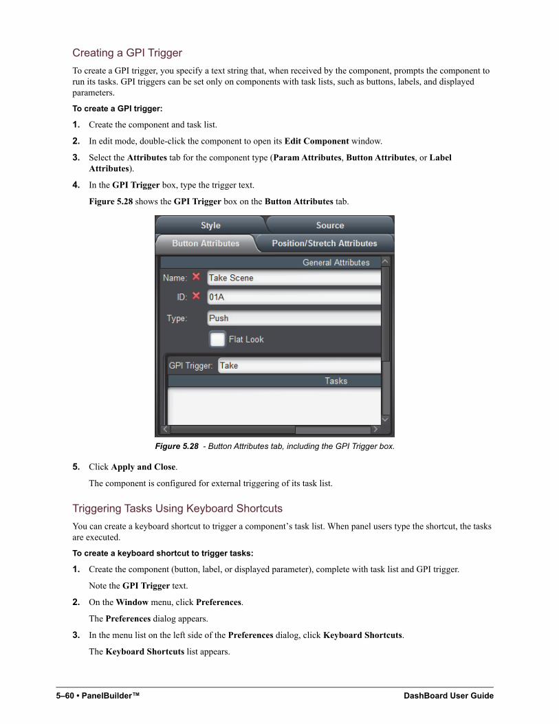
5–60 • PanelBuilder™ DashBoard User Guide
Creating a GPI Trigger
To create a GPI trigger, you specify a text string that, when received by the component, prompts the component to run its tasks. GPI triggers can be set only on components with task lists, such as buttons, labels, and displayed parameters.
To create a GPI trigger:
1. Create the component and task list.
2. In edit mode, double-click the component to open its Edit Component window.
3. Select the Attributes tab for the component type (Param Attributes, Button Attributes, or Label Attributes).
4. In the GPI Trigger box, type the trigger text.
Figure 5.28 shows the GPI Trigger box on the Button Attributes tab.
Figure 5.28 - Button Attributes tab, including the GPI Trigger box.
5. Click Apply and Close.
The component is configured for external triggering of its task list.
Triggering Tasks Using Keyboard Shortcuts
You can create a keyboard shortcut to trigger a component’s task list. When panel users type the shortcut, the tasks are executed.
To create a keyboard shortcut to trigger tasks:
1. Create the component (button, label, or displayed parameter), complete with task list and GPI trigger.
Note the GPI Trigger text.
2. On the Window menu, click Preferences.
The Preferences dialog appears.
3. In the menu list on the left side of the Preferences dialog, click Keyboard Shortcuts.
The Keyboard Shortcuts list appears.
DashBoard User Guide PanelBuilder™ • 5–61
4. Click the New Command button.
The Command Configuration Wizard dialog appears.
5. In the Available Commands list, click Fire GPI Trigger.
6. Click in the Shortcut box, and then type the shortcut sequence.
7. In the Active list, select DashBoard Context, and then click Next.
8. In the GPI Trigger box, type the GPI Trigger text.
9. Optionally, if you want to send an additional piece of text data when the keyboard shortcut is used, type the data in the State box.
The additional data can be used by ogScripts. For example, you may have two different keyboard shortcuts; one that triggers the task list and uses the State text to send an “ON” message to the ogScript to turn something on, and another shortcut with an “OFF” message.
10. In the Execution Level list, select one of the following:
• All Editors — Sends the command to all open panels.
• Active Editor — Sends the command only to the currently active panel.
11. Click Finish.
12. In the Preferences dialog, click OK.
Triggering Tasks Using RossTalk Messages
A component’s tasks are externally triggered when the GPI Trigger text is received by the panel. One method of sending the GPI Trigger text is to embed it in a RossTalk command. DashBoard must first be configured to listen for RossTalk commands.
The RossTalk sendMessage function is part of the ogScript language. In the following example, the GPI Trigger message “StartClock” is sent to the local computer (localhost), via port 7788:
rosstalk.sendMessage('localhost', 7788, 'GPI StartClock');
You can also include state data in the message. In the following example, the same GPI trigger is sent, but with state data, reset, appended to the GPI command. You can access the state data using the event.getState() function, as shown in the second line of the example. The second line checks whether the event.getState() function exists before calling it. This is important because the function is available only when the tasks are triggered through GPI, and not when triggered by other means such as a button click or parameter change.
rosstalk.sendMessage('localhost', 7788, 'GPI StartClock:reset');var resetTimer = event.getState && event.getState() == 'reset';
For more information about using ogScript in CustomPanels, see “Working with ogScript” on page 5–101.
For detailed reference information about ogScript functions, see the DashBoard CustomPanel Development Guide (8351DR-007).
To Configure DashBoard to Listen for RossTalk Commands
1. On the Window menu, click Preferences.
The Preferences dialog appears.
2. In the menu list on the left side of the Preferences dialog, click RossTalk GPI Listener.
The RossTalk GPI Listener settings appear.
3. Beside Global GPI Listener, select Enable.
4. In the Listen Port box, specify the port for receiving RossTalk commands.
Tip: The default port is 7788.
5. Click OK.
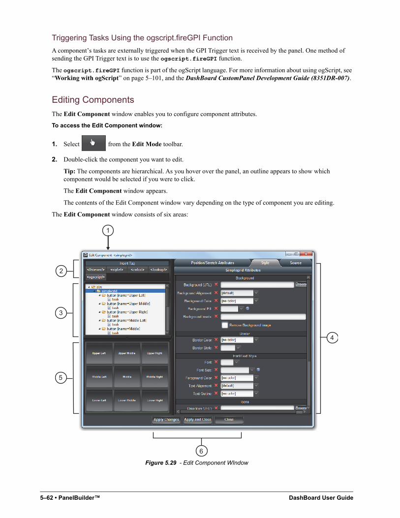
5–62 • PanelBuilder™ DashBoard User Guide
Triggering Tasks Using the ogscript.fireGPI Function
A component’s tasks are externally triggered when the GPI Trigger text is received by the panel. One method of sending the GPI Trigger text is to use the ogscript.fireGPI function.
The ogscript.fireGPI function is part of the ogScript language. For more information about using ogScript, see “Working with ogScript” on page 5–101, and the DashBoard CustomPanel Development Guide (8351DR-007).
Editing Components
The Edit Component window enables you to configure component attributes.
To access the Edit Component window:
1. Select from the Edit Mode toolbar.
2. Double-click the component you want to edit.
Tip: The components are hierarchical. As you hover over the panel, an outline appears to show which component would be selected if you were to click.
The Edit Component window appears.
The contents of the Edit Component window vary depending on the type of component you are editing.
The Edit Component window consists of six areas:
Figure 5.29 - Edit Component WIndow
6
5
4
3
2
1
DashBoard User Guide PanelBuilder™ • 5–63
1. Title Area
The title area indicates the type of component you are editing.
2. Insert Tag Area
This area consists of buttons that enable you to add items to the component tree. The buttons represent items which cannot be added through the graphic interface of PanelBuilder. For more information, see “Component Tree” on page 5–63.
3. Component Tree
This area shows component information for the entire CustomPanel, presented in a hierarchy. Use the component tree to select which item you want to edit. The current item is highlighted blue.
Tip: You can scroll through components by using the up and down keys
4. Attribute Editor
The attribute editor area consists of tabs listing editable attributes of the selected component. Which tabs are shown depends on the type of component you are editing.
5. Preview Area
This area shows the component you are editing. If you apply changes, the preview area updates.
6. Apply Buttons
Use the various Apply buttons to commit any changes you have made:
• Apply Changes — Applies the changes and keeps the Edit Component window open afterwards.
• Apply and Close — Applies the changes and closes the Edit Component window.
• Close — Closes the Edit Component window without applying any changes.
Component Tree
This area shows component information for the entire CustomPanel, presented in a hierarchy. Use the component tree to select which item you want to edit. The current item is highlighted blue.
While most items in the tree are created by using the graphical interface of PanelBuilder, some cannot be created this way. They are created by inserting metadata tags into the tree, by clicking buttons in the Insert Tags area above the tree.
When you click a button, the tag is added to the tree, within a <meta> tag. After you add a tag, select it in the tree and then use the tabs in the Attribute Editor area to customize it.
You can insert the following types of tags:
• <listener/> — Creates a listener object, which enables DashBoard to receive messages and data from external devices over the network.
For information about specifying listener attributes, see “Listener Attributes Tab” on page 5–74.
• <style/> — Creates a style definition. You can create named style definitions which can be applied to objects within the same container object. This is useful for creating common visual themes across components. By changing a setting in the style definition, you can change that setting for all components that reference the style definition.
Tip: A style preset is available only to objects within its parent container object. To create a set of style presets for the entire panel, create them immediately below the top level container object (typically abs).
To apply a style definition to an object, select the style name from the Defined Style list on the Style tab for the object.
Tip: Predefined style settings can be overridden individually for a given object.
For information about specifying style attributes, see “Style Tab” on page 5–82.
5–64 • PanelBuilder™ DashBoard User Guide
• <color/> — Creates a color definition. You can create named color definitions which can be referenced from anywhere. This is useful for creating common visual themes across components. By changing settings in the color definition, you can change that setting for all components that reference that color definition.
For information about specifying color attributes, see “Color Attributes Tab” on page 5–70.
• <lookup/> — Creates a data lookup table, which can be read using ogScript functions.
For information about specifying lookup attributes, see “Lookup Attributes Tab” on page 5–75.
• <ogscript/> — Creates a named section of ogScript code, which can be referenced. You can also associate the ogScript with an action and a UI element, so that the ogScript is executed when the action is performed on the UI element. For example, you can make the ogScript run when the user drags the mouse (ondrag).
For information about specifying ogScript attributes, see “Ogscript Attributes Tab” on page 5–76.
• <api/> — Creates an Application Program Interface (API) section of ogScript code. You can set the API to execute immediately when the panel is loaded, or not. Functions within the <api/> tag have global scope, which enables them to be called from anywhere else in the panel.
For information about specifying API attributes, see “Api Attributes Tab” on page 5–68.
Attribute Editor Tabs
The attribute editor area of the Edit Component window consists of tabs listing editable attributes of the selected component. Which tabs are shown depends on the type of component you are editing. To edit component attributes, specify values and then apply the changes. If you want to use the default value, click the next to the attribute name.
The Source tab is present for every component. It shows the underlying XML source code that defines the selected component. You can edit the XML code directly in the Source tab, or paste XML code into it. To view or edit the XML source for the entire CustomPanel, select the top element in the component tree and then view its Source tab.
Tip: To quickly view the source for a component, press and hold the Shift key, and double-click. The View Source window appears. The XML source cannot be edited in this window.
Some tabs are divided into two areas: Current Attributes and Unused Attributes. The Current Attributes area shows the attribute values currently applied to the selected component. Only attributes that have been edited appear here. The Unused Attributes area shows attributes for which default values apply. For example, in the following Style tab, only the border and background attributes have been defined:
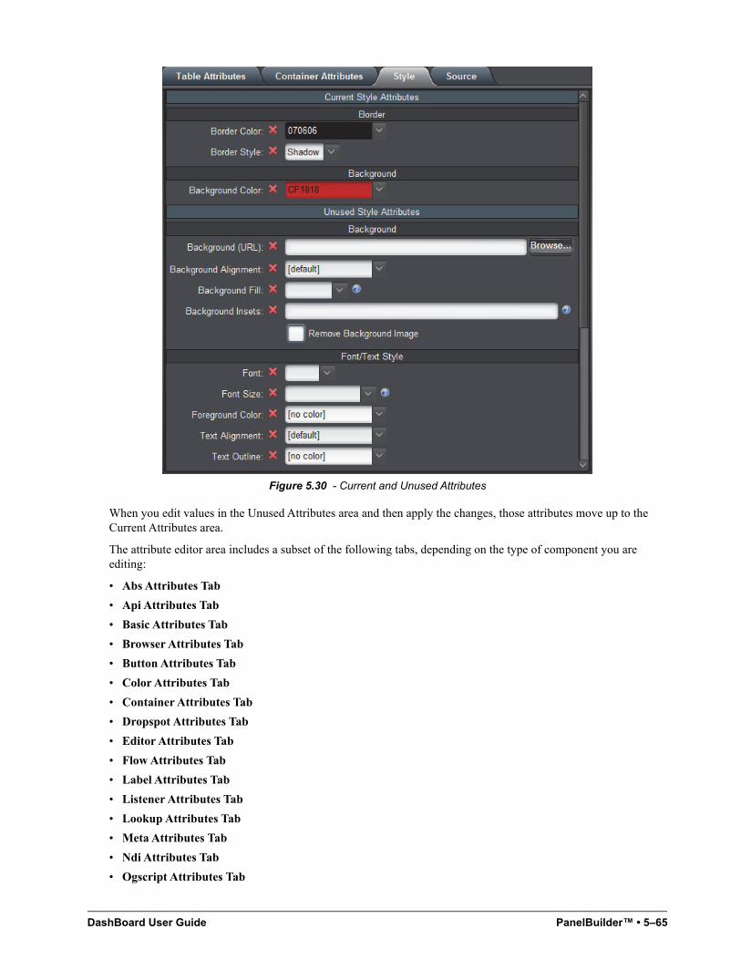
DashBoard User Guide PanelBuilder™ • 5–65
Figure 5.30 - Current and Unused Attributes
When you edit values in the Unused Attributes area and then apply the changes, those attributes move up to the Current Attributes area.
The attribute editor area includes a subset of the following tabs, depending on the type of component you are editing:
• Abs Attributes Tab
• Api Attributes Tab
• Basic Attributes Tab
• Browser Attributes Tab
• Button Attributes Tab
• Color Attributes Tab
• Container Attributes Tab
• Dropspot Attributes Tab
• Editor Attributes Tab
• Flow Attributes Tab
• Label Attributes Tab
• Listener Attributes Tab
• Lookup Attributes Tab
• Meta Attributes Tab
• Ndi Attributes Tab
• Ogscript Attributes Tab
5–66 • PanelBuilder™ DashBoard User Guide
• Param Attributes Tab
• Position/Stretch Attributes Tab
• Simplegrid Attributes Tab
• Source Tab
• Split Attributes Tab
• Statuscombo Attributes Tab
• Style Tab
• Tab Attributes Tab
• Table Attributes Tab
• Table Cell Attributes Tab
• Tag Attributes Tab
• Task Attributes Tab
• Timer Attributes Tab
• Timertask Attributes Tab
• Tr Attributes Tab
• TreeElement Attributes Tab
• Widget Attributes Tab
Abs Attributes Tab
Abs Attributes apply to the following types of components:
• “Basic Canvases” on page 5–21
• “Image Canvases” on page 5–26
Attribute Description
General Attributes
Name Type a name or description for the Abs canvas.
This name is used as a reference in the Component Tree. It does not appear in the CustomPanel interface.
ID Type a scripting ID for the Abs canvas.
Virtual Width Enter or select a width in pixels for the virtual width of the canvas.
This determines how wide the workspace canvas is. For example, if using a large monitor, you might want to use a high number of pixels to accommodate a greater number of components. Conversely, if using a smaller monitor, you might want to use a lower number of pixels.
Select the default check box to use the default virtual width of 1,079 pixels.
Virtual Height Enter or select a height in pixels for the virtual height of the canvas.
This determines how tall the workspace canvas is. For example, if using a large monitor, you might want to use a high number of pixels to accommodate a greater number of components. Conversely, if using a smaller monitor, you might want to use a lower number of pixels.
Select the default check box to use the default virtual height of 931 pixels.
DashBoard User Guide PanelBuilder™ • 5–67
Lock Contents (widget root)
Select this check box to disable the selection of sub-elements in the canvas. This allows for easy selection, copy, and paste of a component.
Elements under the widget root can only be selected by selecting the item node in the tree. Users can not add to, or directly modify, the contents of a widget, move a widget, or resize a widget. This allows the block of code for the widget to be self-contained and able to be dragged and dropped elsewhere with ease.
Scrolling Click the menu and select an option for adding scroll bars to the Abs canvas:
• True — use vertical and/or horizontal scroll bar, if needed.
• False — do not use scroll bars for the Abs canvas.
• Vertical — add a vertical scroll bar to the Abs canvas.
• Horizontal — add a horizontal scroll bar to the Abs canvas.
• Always — always use vertical and horizontal scroll bars for the Abs canvas.
Data Source/Device Control
openGear or XPression DataLinq
or
NK Series Routers
Select a device for context:
• openGear or XPression DataLinq — this option opens the Select Device for Context dialog box, where you can select an openGear card or XPression DataLinq XML file to associate with the panel.
NK Series Routers — this option opens the Select IPS dialog box, where you can select a router node.
Note: If both boxes are clear, the panel is not associated with a device or data source.
XPression DashBoard Linq Port
If you want to stream XML data to an XPression system directly without sharing an XML file, specify the port to use on the DashBoard computer and select Enable Streaming.
Note: You must also set up a DashBoard DataLinq source on the XPression DataLinq server. The DashBoard Linq must point to the IP address and port of the DashBoard computer that hosts the CustomPanel from which you want to stream data.
NK Series Routers Select the check box to associate the panel with NK Series routers for device control.
Remote Task Triggering
Internal RossTalk GPI Listener
Specifies the TCP/IP port to monitor for RossTalk commands for this container object and its children.
RossTalk GPI commands are formatted as GPI [trigger]:[state].
This setting is available only if this container object has its context attribute set to opengear (contexttype=opengear).
VDCP Task Server Port
Specifies the TCP/IP port to use for publishing all of the current object’s tasks with trigger IDs as VDCP clips.
Tasks can be listed, cued, and played through devices capable of VDCP communication over TCP/IP.
This setting is available only if this container object has its context attribute set to opengear (contexttype=opengear).
HTTP Trigger Server Port
Tasks assigned to this object with trigger IDs are published to a web page hosted at the specified port (http://localhost:[port]/).
Tasks can be triggered by going to http://localhost:[port]/[trigger ID]/[State].
This setting is available only if this container object has its context attribute set to opengear (contexttype=opengear).
Attribute Description
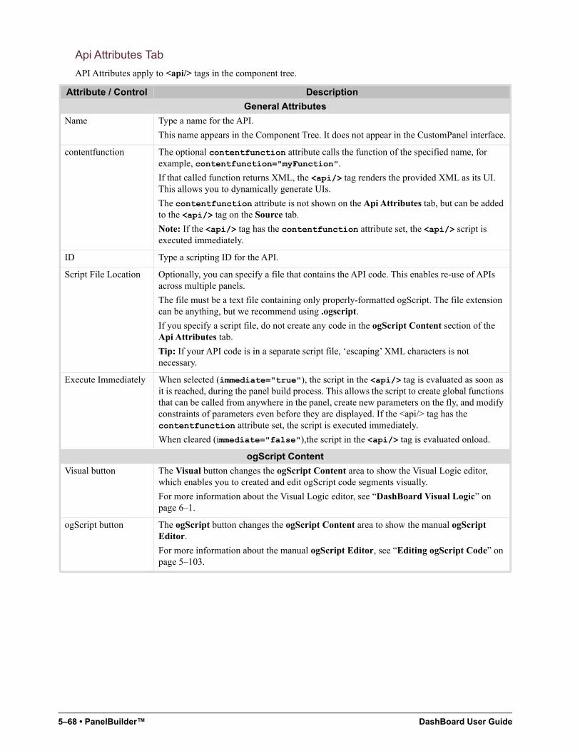
5–68 • PanelBuilder™ DashBoard User Guide
Api Attributes Tab
API Attributes apply to <api/> tags in the component tree.
Attribute / Control Description
General Attributes
Name Type a name for the API.
This name appears in the Component Tree. It does not appear in the CustomPanel interface.
contentfunction The optional contentfunction attribute calls the function of the specified name, for example, contentfunction="myFunction".
If that called function returns XML, the <api/> tag renders the provided XML as its UI. This allows you to dynamically generate UIs.
The contentfunction attribute is not shown on the Api Attributes tab, but can be added to the <api/> tag on the Source tab.
Note: If the <api/> tag has the contentfunction attribute set, the <api/> script is executed immediately.
ID Type a scripting ID for the API.
Script File Location Optionally, you can specify a file that contains the API code. This enables re-use of APIs across multiple panels.
The file must be a text file containing only properly-formatted ogScript. The file extension can be anything, but we recommend using .ogscript.
If you specify a script file, do not create any code in the ogScript Content section of the Api Attributes tab.
Tip: If your API code is in a separate script file, ‘escaping’ XML characters is not necessary.
Execute Immediately When selected (immediate="true"), the script in the <api/> tag is evaluated as soon as it is reached, during the panel build process. This allows the script to create global functions that can be called from anywhere in the panel, create new parameters on the fly, and modify constraints of parameters even before they are displayed. If the <api/> tag has the contentfunction attribute set, the script is executed immediately.
When cleared (immediate="false"),the script in the <api/> tag is evaluated onload.
ogScript Content
Visual button The Visual button changes the ogScript Content area to show the Visual Logic editor, which enables you to created and edit ogScript code segments visually.
For more information about the Visual Logic editor, see “DashBoard Visual Logic” on page 6–1.
ogScript button The ogScript button changes the ogScript Content area to show the manual ogScript Editor.
For more information about the manual ogScript Editor, see “Editing ogScript Code” on page 5–103.
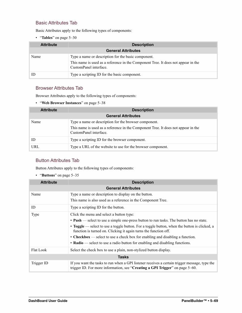
DashBoard User Guide PanelBuilder™ • 5–69
Basic Attributes Tab
Basic Attributes apply to the following types of components:
• “Tables” on page 5–30
Browser Attributes Tab
Browser Attributes apply to the following types of components:
• “Web Browser Instances” on page 5–38
Button Attributes Tab
Button Attributes apply to the following types of components:
• “Buttons” on page 5–35
Attribute Description
General Attributes
Name Type a name or description for the basic component.
This name is used as a reference in the Component Tree. It does not appear in the CustomPanel interface.
ID Type a scripting ID for the basic component.
Attribute Description
General Attributes
Name Type a name or description for the browser component.
This name is used as a reference in the Component Tree. It does not appear in the CustomPanel interface.
ID Type a scripting ID for the browser component.
URL Type a URL of the website to use for the browser component.
Attribute Description
General Attributes
Name Type a name or description to display on the button.
This name is also used as a reference in the Component Tree.
ID Type a scripting ID for the button.
Type Click the menu and select a button type:
• Push — select to use a simple one-press button to run tasks. The button has no state.
• Toggle — select to use a toggle button. For a toggle button, when the button is clicked, a function is turned on. Clicking it again turns the function off.
• Checkbox — select to use a check box for enabling and disabling a function.
• Radio — select to use a radio button for enabling and disabling functions.
Flat Look Select the check box to use a plain, non-stylized button display.
Tasks
Trigger ID If you want the tasks to run when a GPI listener receives a certain trigger message, type the trigger ID. For more information, see “Creating a GPI Trigger” on page 5–60.
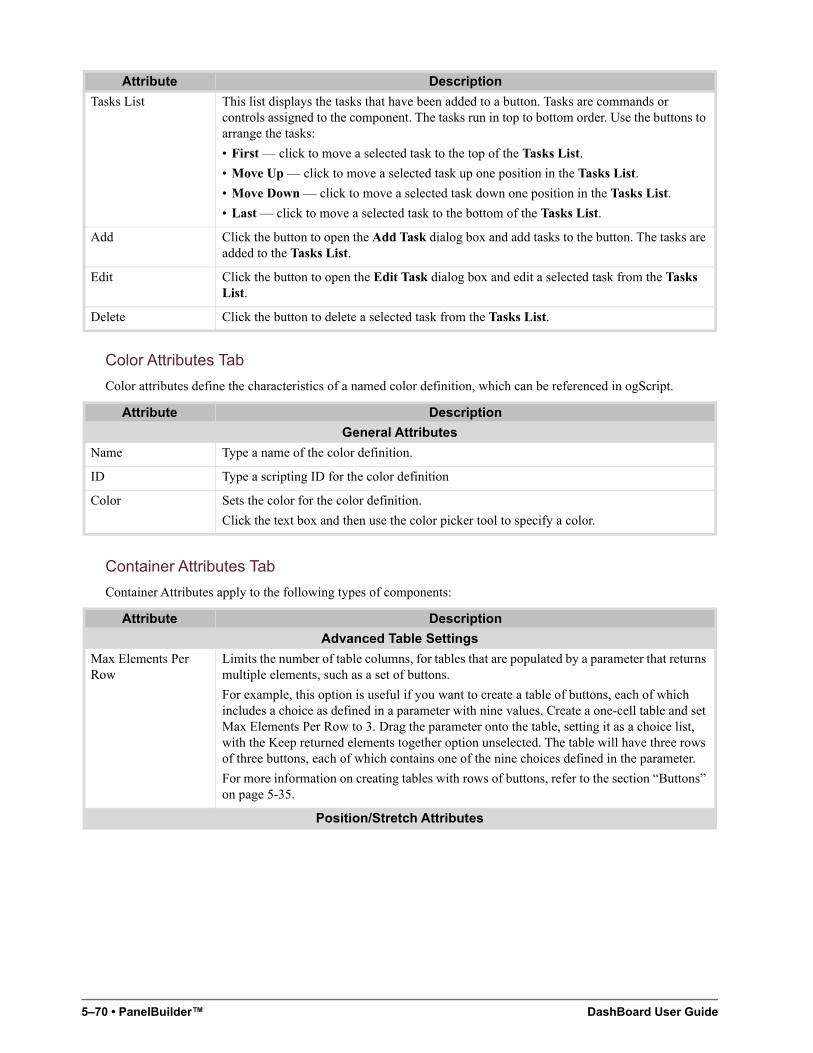
5–70 • PanelBuilder™ DashBoard User Guide
Color Attributes Tab
Color attributes define the characteristics of a named color definition, which can be referenced in ogScript.
Container Attributes Tab
Container Attributes apply to the following types of components:
Tasks List This list displays the tasks that have been added to a button. Tasks are commands or controls assigned to the component. The tasks run in top to bottom order. Use the buttons to arrange the tasks:
• First — click to move a selected task to the top of the Tasks List.
• Move Up — click to move a selected task up one position in the Tasks List.
• Move Down — click to move a selected task down one position in the Tasks List.
• Last — click to move a selected task to the bottom of the Tasks List.
Add Click the button to open the Add Task dialog box and add tasks to the button. The tasks are added to the Tasks List.
Edit Click the button to open the Edit Task dialog box and edit a selected task from the Tasks List.
Delete Click the button to delete a selected task from the Tasks List.
Attribute Description
General Attributes
Name Type a name of the color definition.
ID Type a scripting ID for the color definition
Color Sets the color for the color definition.
Click the text box and then use the color picker tool to specify a color.
Attribute Description
Advanced Table Settings
Max Elements Per Row
Limits the number of table columns, for tables that are populated by a parameter that returns multiple elements, such as a set of buttons.
For example, this option is useful if you want to create a table of buttons, each of which includes a choice as defined in a parameter with nine values. Create a one-cell table and set Max Elements Per Row to 3. Drag the parameter onto the table, setting it as a choice list, with the Keep returned elements together option unselected. The table will have three rows of three buttons, each of which contains one of the nine choices defined in the parameter.
For more information on creating tables with rows of buttons, refer to the section “Buttons” on page 5-35.
Position/Stretch Attributes
Attribute Description
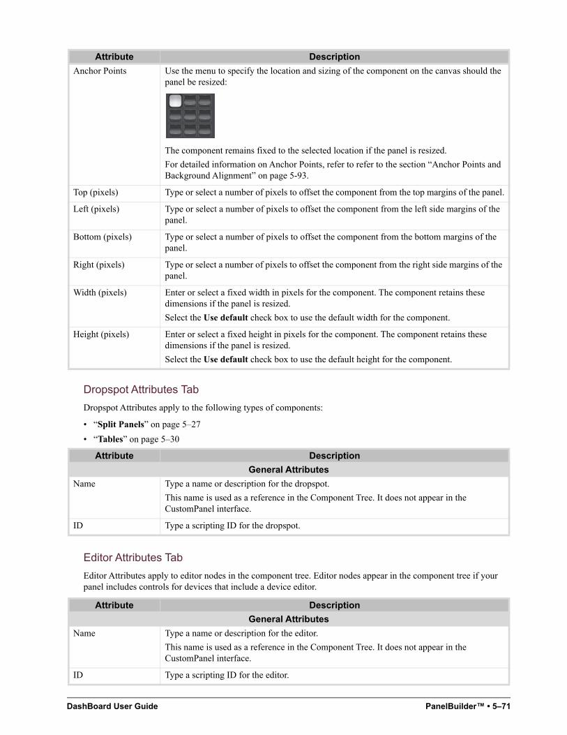
DashBoard User Guide PanelBuilder™ • 5–71
Dropspot Attributes Tab
Dropspot Attributes apply to the following types of components:
• “Split Panels” on page 5–27
• “Tables” on page 5–30
Editor Attributes Tab
Editor Attributes apply to editor nodes in the component tree. Editor nodes appear in the component tree if your panel includes controls for devices that include a device editor.
Anchor Points Use the menu to specify the location and sizing of the component on the canvas should the panel be resized:
The component remains fixed to the selected location if the panel is resized.
For detailed information on Anchor Points, refer to refer to the section “Anchor Points and Background Alignment” on page 5-93.
Top (pixels) Type or select a number of pixels to offset the component from the top margins of the panel.
Left (pixels) Type or select a number of pixels to offset the component from the left side margins of the panel.
Bottom (pixels) Type or select a number of pixels to offset the component from the bottom margins of the panel.
Right (pixels) Type or select a number of pixels to offset the component from the right side margins of the panel.
Width (pixels) Enter or select a fixed width in pixels for the component. The component retains these dimensions if the panel is resized.
Select the Use default check box to use the default width for the component.
Height (pixels) Enter or select a fixed height in pixels for the component. The component retains these dimensions if the panel is resized.
Select the Use default check box to use the default height for the component.
Attribute Description
General Attributes
Name Type a name or description for the dropspot.
This name is used as a reference in the Component Tree. It does not appear in the CustomPanel interface.
ID Type a scripting ID for the dropspot.
Attribute Description
General Attributes
Name Type a name or description for the editor.
This name is used as a reference in the Component Tree. It does not appear in the CustomPanel interface.
ID Type a scripting ID for the editor.
Attribute Description
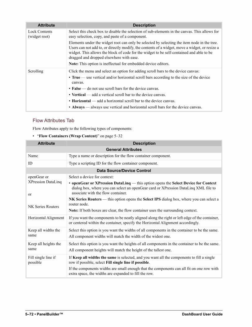
5–72 • PanelBuilder™ DashBoard User Guide
Flow Attributes Tab
Flow Attributes apply to the following types of components:
• “Flow Containers (Wrap Content)” on page 5–32
Lock Contents (widget root)
Select this check box to disable the selection of sub-elements in the canvas. This allows for easy selection, copy, and paste of a component.
Elements under the widget root can only be selected by selecting the item node in the tree. Users can not add to, or directly modify, the contents of a widget, move a widget, or resize a widget. This allows the block of code for the widget to be self-contained and able to be dragged and dropped elsewhere with ease.
Note: This option is ineffectual for embedded device editors.
Scrolling Click the menu and select an option for adding scroll bars to the device canvas:
• True — use vertical and/or horizontal scroll bars according to the size of the device canvas.
• False — do not use scroll bars for the device canvas.
• Vertical — add a vertical scroll bar to the device canvas.
• Horizontal — add a horizontal scroll bar to the device canvas.
• Always — always use vertical and horizontal scroll bars for the device canvas.
Attribute Description
General Attributes
Name Type a name or description for the flow container component.
ID Type a scripting ID for the flow container component.
Data Source/Device Control
openGear or XPression DataLinq
or
NK Series Routers
Select a device for context:
• openGear or XPression DataLinq — this option opens the Select Device for Context dialog box, where you can select an openGear card or XPression DataLinq XML file to associate with the flow container.
NK Series Routers — this option opens the Select IPS dialog box, where you can select a router node.
Note: If both boxes are clear, the flow container uses the surrounding context.
Horizontal Alignment If you want the components to be neatly aligned along the right or left edge of the container, or centered within the container, specify the Horizontal Alignment accordingly.
Keep all widths the same
Select this option is you want the widths of all components in the container to be the same.
All component widths will match the width of the widest one.
Keep all heights the same
Select this option is you want the heights of all components in the container to be the same.
All component heights will match the height of the tallest one.
Fill single line if possible
If Keep all widths the same is selected, and you want all the components to fill a single row if possible, select Fill single line if possible.
If the components widths are small enough that the components can all fit on one row with extra space, the widths are expanded to fill the row.
Attribute Description
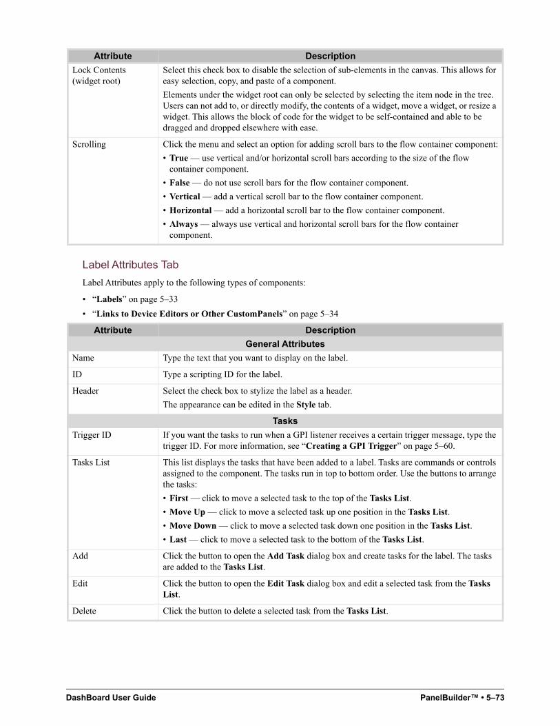
DashBoard User Guide PanelBuilder™ • 5–73
Label Attributes Tab
Label Attributes apply to the following types of components:
• “Labels” on page 5–33
• “Links to Device Editors or Other CustomPanels” on page 5–34
Lock Contents (widget root)
Select this check box to disable the selection of sub-elements in the canvas. This allows for easy selection, copy, and paste of a component.
Elements under the widget root can only be selected by selecting the item node in the tree. Users can not add to, or directly modify, the contents of a widget, move a widget, or resize a widget. This allows the block of code for the widget to be self-contained and able to be dragged and dropped elsewhere with ease.
Scrolling Click the menu and select an option for adding scroll bars to the flow container component:
• True — use vertical and/or horizontal scroll bars according to the size of the flow container component.
• False — do not use scroll bars for the flow container component.
• Vertical — add a vertical scroll bar to the flow container component.
• Horizontal — add a horizontal scroll bar to the flow container component.
• Always — always use vertical and horizontal scroll bars for the flow container component.
Attribute Description
General Attributes
Name Type the text that you want to display on the label.
ID Type a scripting ID for the label.
Header Select the check box to stylize the label as a header.
The appearance can be edited in the Style tab.
Tasks
Trigger ID If you want the tasks to run when a GPI listener receives a certain trigger message, type the trigger ID. For more information, see “Creating a GPI Trigger” on page 5–60.
Tasks List This list displays the tasks that have been added to a label. Tasks are commands or controls assigned to the component. The tasks run in top to bottom order. Use the buttons to arrange the tasks:
• First — click to move a selected task to the top of the Tasks List.
• Move Up — click to move a selected task up one position in the Tasks List.
• Move Down — click to move a selected task down one position in the Tasks List.
• Last — click to move a selected task to the bottom of the Tasks List.
Add Click the button to open the Add Task dialog box and create tasks for the label. The tasks are added to the Tasks List.
Edit Click the button to open the Edit Task dialog box and edit a selected task from the Tasks List.
Delete Click the button to delete a selected task from the Tasks List.
Attribute Description
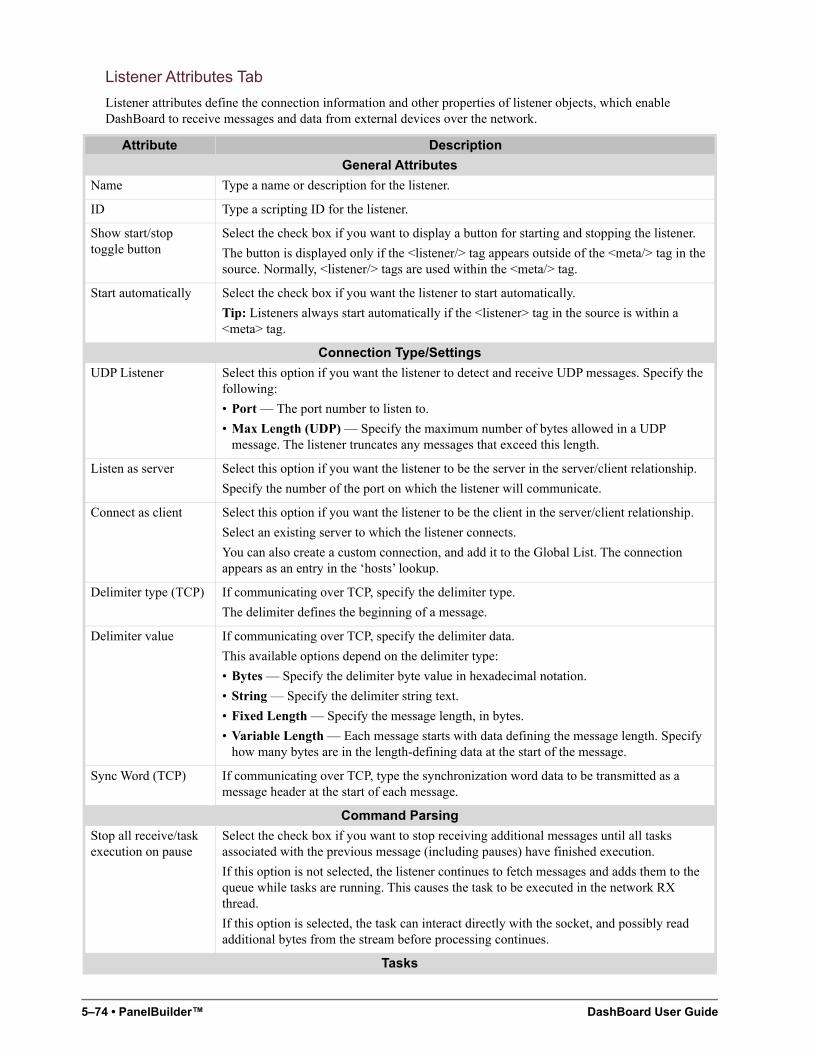
5–74 • PanelBuilder™ DashBoard User Guide
Listener Attributes Tab
Listener attributes define the connection information and other properties of listener objects, which enable DashBoard to receive messages and data from external devices over the network.
Attribute Description
General Attributes
Name Type a name or description for the listener.
ID Type a scripting ID for the listener.
Show start/stop toggle button
Select the check box if you want to display a button for starting and stopping the listener.
The button is displayed only if the <listener/> tag appears outside of the <meta/> tag in the source. Normally, <listener/> tags are used within the <meta/> tag.
Start automatically Select the check box if you want the listener to start automatically.
Tip: Listeners always start automatically if the <listener> tag in the source is within a <meta> tag.
Connection Type/Settings
UDP Listener Select this option if you want the listener to detect and receive UDP messages. Specify the following:
• Port — The port number to listen to.
• Max Length (UDP) — Specify the maximum number of bytes allowed in a UDP message. The listener truncates any messages that exceed this length.
Listen as server Select this option if you want the listener to be the server in the server/client relationship.
Specify the number of the port on which the listener will communicate.
Connect as client Select this option if you want the listener to be the client in the server/client relationship.
Select an existing server to which the listener connects.
You can also create a custom connection, and add it to the Global List. The connection appears as an entry in the ‘hosts’ lookup.
Delimiter type (TCP) If communicating over TCP, specify the delimiter type.
The delimiter defines the beginning of a message.
Delimiter value If communicating over TCP, specify the delimiter data.
This available options depend on the delimiter type:
• Bytes — Specify the delimiter byte value in hexadecimal notation.
• String — Specify the delimiter string text.
• Fixed Length — Specify the message length, in bytes.
• Variable Length — Each message starts with data defining the message length. Specify how many bytes are in the length-defining data at the start of the message.
Sync Word (TCP) If communicating over TCP, type the synchronization word data to be transmitted as a message header at the start of each message.
Command Parsing
Stop all receive/task execution on pause
Select the check box if you want to stop receiving additional messages until all tasks associated with the previous message (including pauses) have finished execution.
If this option is not selected, the listener continues to fetch messages and adds them to the queue while tasks are running. This causes the task to be executed in the network RX thread.
If this option is selected, the task can interact directly with the socket, and possibly read additional bytes from the stream before processing continues.
Tasks
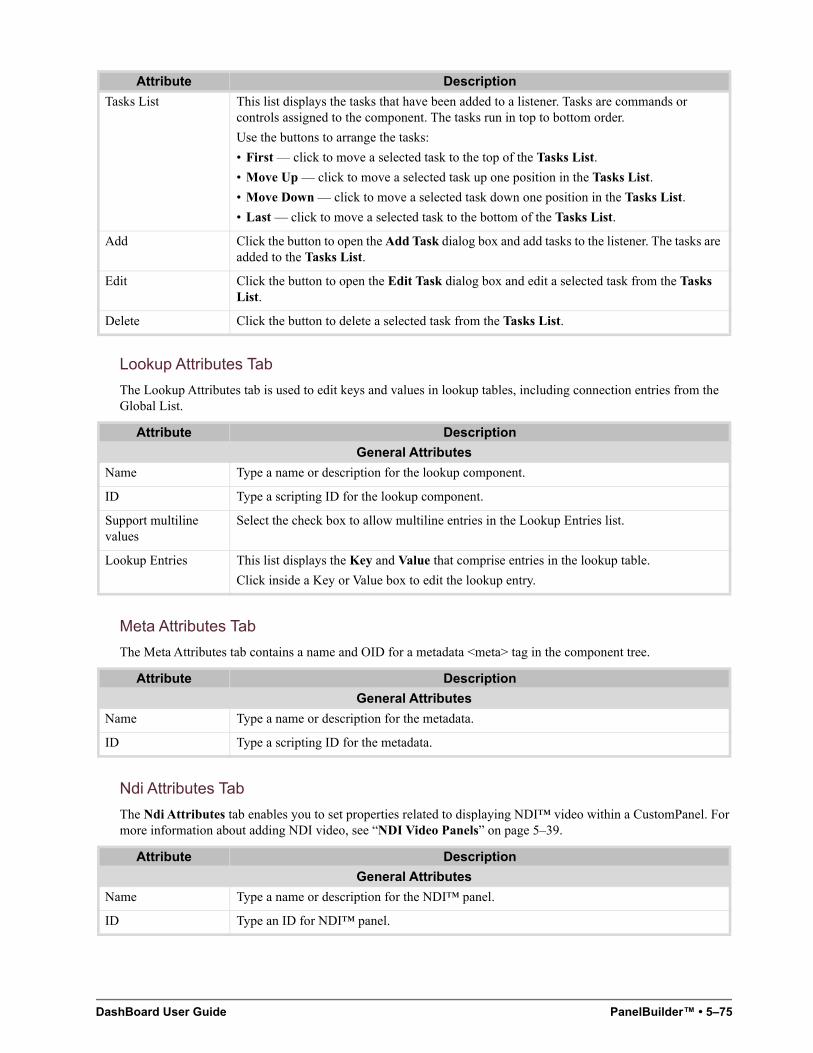
DashBoard User Guide PanelBuilder™ • 5–75
Lookup Attributes Tab
The Lookup Attributes tab is used to edit keys and values in lookup tables, including connection entries from the Global List.
Meta Attributes Tab
The Meta Attributes tab contains a name and OID for a metadata <meta> tag in the component tree.
Ndi Attributes Tab
The Ndi Attributes tab enables you to set properties related to displaying NDI™ video within a CustomPanel. For more information about adding NDI video, see “NDI Video Panels” on page 5–39.
Tasks List This list displays the tasks that have been added to a listener. Tasks are commands or controls assigned to the component. The tasks run in top to bottom order.
Use the buttons to arrange the tasks:
• First — click to move a selected task to the top of the Tasks List.
• Move Up — click to move a selected task up one position in the Tasks List.
• Move Down — click to move a selected task down one position in the Tasks List.
• Last — click to move a selected task to the bottom of the Tasks List.
Add Click the button to open the Add Task dialog box and add tasks to the listener. The tasks are added to the Tasks List.
Edit Click the button to open the Edit Task dialog box and edit a selected task from the Tasks List.
Delete Click the button to delete a selected task from the Tasks List.
Attribute Description
General Attributes
Name Type a name or description for the lookup component.
ID Type a scripting ID for the lookup component.
Support multiline values
Select the check box to allow multiline entries in the Lookup Entries list.
Lookup Entries This list displays the Key and Value that comprise entries in the lookup table.
Click inside a Key or Value box to edit the lookup entry.
Attribute Description
General Attributes
Name Type a name or description for the metadata.
ID Type a scripting ID for the metadata.
Attribute Description
General Attributes
Name Type a name or description for the NDI™ panel.
ID Type an ID for NDI™ panel.
Attribute Description
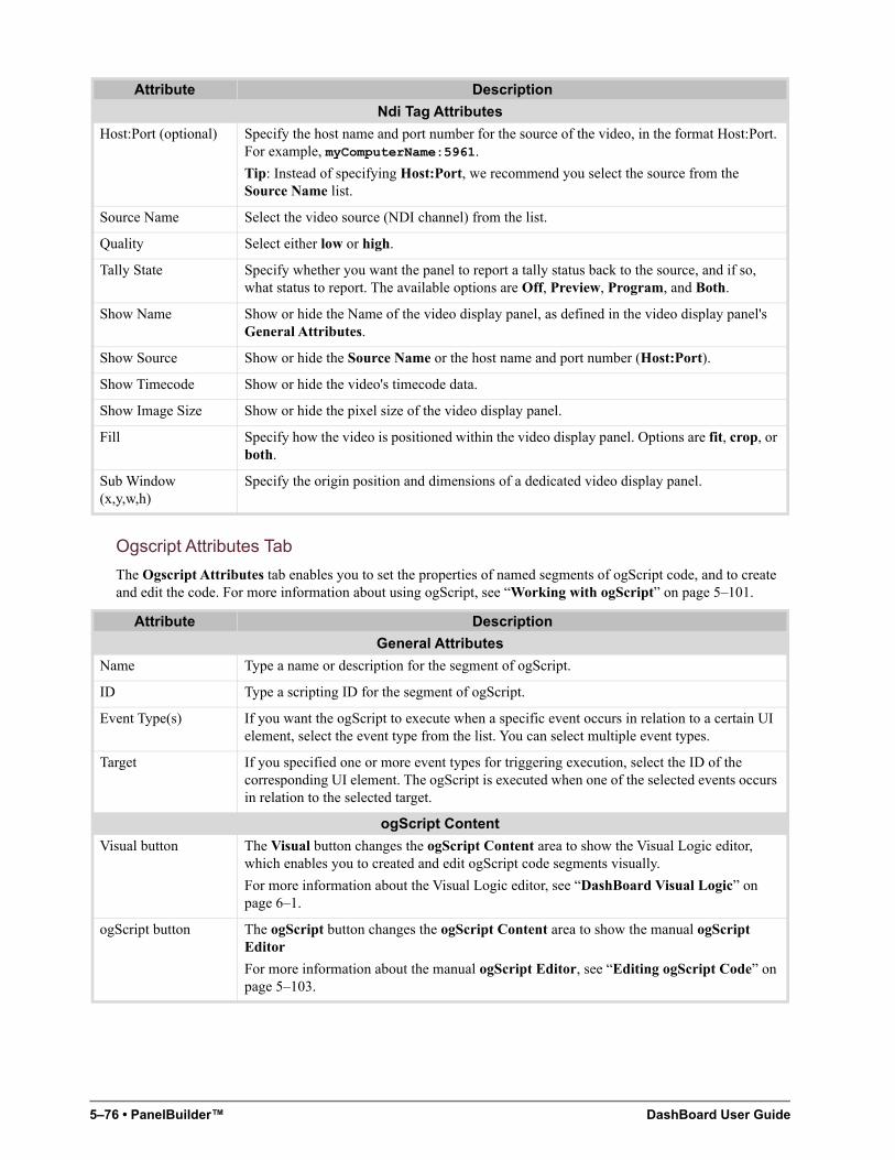
5–76 • PanelBuilder™ DashBoard User Guide
Ogscript Attributes Tab
The Ogscript Attributes tab enables you to set the properties of named segments of ogScript code, and to create and edit the code. For more information about using ogScript, see “Working with ogScript” on page 5–101.
Ndi Tag Attributes
Host:Port (optional) Specify the host name and port number for the source of the video, in the format Host:Port. For example, myComputerName:5961.
Tip: Instead of specifying Host:Port, we recommend you select the source from the Source Name list.
Source Name Select the video source (NDI channel) from the list.
Quality Select either low or high.
Tally State Specify whether you want the panel to report a tally status back to the source, and if so, what status to report. The available options are Off, Preview, Program, and Both.
Show Name Show or hide the Name of the video display panel, as defined in the video display panel's General Attributes.
Show Source Show or hide the Source Name or the host name and port number (Host:Port).
Show Timecode Show or hide the video's timecode data.
Show Image Size Show or hide the pixel size of the video display panel.
Fill Specify how the video is positioned within the video display panel. Options are fit, crop, or both.
Sub Window (x,y,w,h)
Specify the origin position and dimensions of a dedicated video display panel.
Attribute Description
General Attributes
Name Type a name or description for the segment of ogScript.
ID Type a scripting ID for the segment of ogScript.
Event Type(s) If you want the ogScript to execute when a specific event occurs in relation to a certain UI element, select the event type from the list. You can select multiple event types.
Target If you specified one or more event types for triggering execution, select the ID of the corresponding UI element. The ogScript is executed when one of the selected events occurs in relation to the selected target.
ogScript Content
Visual button The Visual button changes the ogScript Content area to show the Visual Logic editor, which enables you to created and edit ogScript code segments visually.
For more information about the Visual Logic editor, see “DashBoard Visual Logic” on page 6–1.
ogScript button The ogScript button changes the ogScript Content area to show the manual ogScript Editor
For more information about the manual ogScript Editor, see “Editing ogScript Code” on page 5–103.
Attribute Description
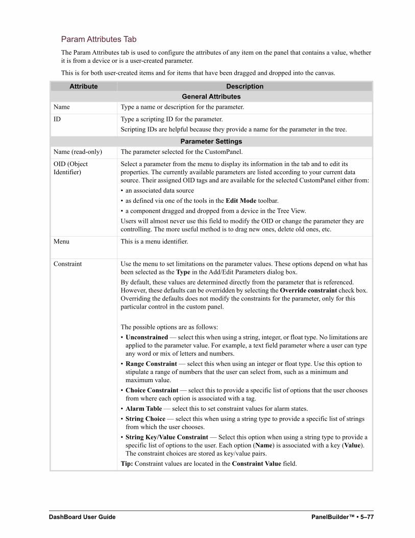
DashBoard User Guide PanelBuilder™ • 5–77
Param Attributes Tab
The Param Attributes tab is used to configure the attributes of any item on the panel that contains a value, whether it is from a device or is a user-created parameter.
This is for both user-created items and for items that have been dragged and dropped into the canvas.
Attribute Description
General Attributes
Name Type a name or description for the parameter.
ID Type a scripting ID for the parameter.
Scripting IDs are helpful because they provide a name for the parameter in the tree.
Parameter Settings
Name (read-only) The parameter selected for the CustomPanel.
OID (Object Identifier)
Select a parameter from the menu to display its information in the tab and to edit its properties. The currently available parameters are listed according to your current data source. Their assigned OID tags and are available for the selected CustomPanel either from:
• an associated data source
• as defined via one of the tools in the Edit Mode toolbar.
• a component dragged and dropped from a device in the Tree View.
Users will almost never use this field to modify the OID or change the parameter they are controlling. The more useful method is to drag new ones, delete old ones, etc.
Menu This is a menu identifier.
Constraint Use the menu to set limitations on the parameter values. These options depend on what has been selected as the Type in the Add/Edit Parameters dialog box.
By default, these values are determined directly from the parameter that is referenced. However, these defaults can be overridden by selecting the Override constraint check box. Overriding the defaults does not modify the constraints for the parameter, only for this particular control in the custom panel.
The possible options are as follows:
• Unconstrained — select this when using a string, integer, or float type. No limitations are applied to the parameter value. For example, a text field parameter where a user can type any word or mix of letters and numbers.
• Range Constraint — select this when using an integer or float type. Use this option to stipulate a range of numbers that the user can select from, such as a minimum and maximum value.
• Choice Constraint — select this to provide a specific list of options that the user chooses from where each option is associated with a tag.
• Alarm Table — select this to set constraint values for alarm states.
• String Choice — select this when using a string type to provide a specific list of strings from which the user chooses.
• String Key/Value Constraint — Select this option when using a string type to provide a specific list of options to the user. Each option (Name) is associated with a key (Value). The constraint choices are stored as key/value pairs.
Tip: Constraint values are located in the Constraint Value field.
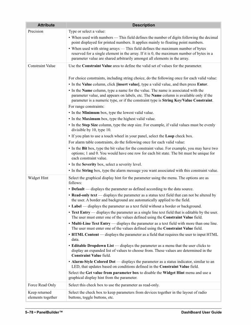
5–78 • PanelBuilder™ DashBoard User Guide
Precision Type or select a value:
• When used with numbers — This field defines the number of digits following the decimal point displayed for printed numbers. It applies mainly to floating point numbers.
• When used with string arrays — This field defines the maximum number of bytes reserved for a single element in the array. If it is 0, the maximum number of bytes in a parameter value are shared arbitrarily amongst all elements in the array.
Constraint Value Use the Constraint Value area to define the valid set of values for the parameter.
For choice constraints, including string choice, do the following once for each valid value:
• In the Value column, click [insert value], type a valid value, and then press Enter.
• In the Name column, type a name for the value. The name is associated with the parameter value, and appears on labels, etc. The Name column is available only if the parameter is a numeric type, or if the constraint type is String Key/Value Constraint.
For range constraints:
• In the Minimum box, type the lowest valid value.
• In the Maximum box, type the highest valid value.
• In the Step Size column, type the step size. For example, if valid values must be evenly divisible by 10, type 10.
• If you plan to use a touch wheel in your panel, select the Loop check box.
For alarm table constraints, do the following once for each valid value:
• In the Bit box, type the bit value for the constraint value. For example, you may have two options; 1 and 0. You would have one row for each bit state. The bit must be unique for each constraint value.
• In the Severity box, select a severity level.
• In the String box, type the alarm message you want associated with this constraint value.
Widget Hint Select the graphical display hint for the parameter using the menu. The options are as follows:
• Default — displays the parameter as defined according to the data source.
• Read-only text — displays the parameter as a status text field that can not be altered by the user. A border and background are automatically applied to the field.
• Label — displays the parameter as a text field without a border or background.
• Text Entry — displays the parameter as a single line text field that is editable by the user. The user must enter one of the values defined using the Constraint Value field.
• Multi-Line Text Entry — displays the parameter as a text field with more than one line. The user must enter one of the values defined using the Constraint Value field.
• HTML Content — displays the parameter as a field that requires the user to input HTML data.
• Editable Dropdown List — displays the parameter as a menu that the user clicks to display an expanded list of values to choose from. These values are determined in the Constraint Value field.
• Alarm-Style Colored Dot — displays the parameter as a status indicator, similar to an LED, that updates based on conditions defined in the Constraint Value field.
Select the Get value from parameter box to disable the Widget Hint menu and use a graphical display hint from the parameter.
Force Read Only Select this check box to use the parameter as read-only.
Keep returned elements together
Select the check box to keep parameters from devices together in the layout of radio buttons, toggle buttons, etc.
Attribute Description
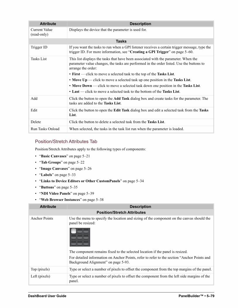
DashBoard User Guide PanelBuilder™ • 5–79
Position/Stretch Attributes Tab
Position/Stretch Attributes apply to the following types of components:
• “Basic Canvases” on page 5–21
• “Tab Groups” on page 5–22
• “Image Canvases” on page 5–26
• “Labels” on page 5–33
• “Links to Device Editors or Other CustomPanels” on page 5–34
• “Buttons” on page 5–35
• “NDI Video Panels” on page 5–39
• “Web Browser Instances” on page 5–38
Current Value (read-only)
Displays the device that the parameter is used for.
Tasks
Trigger ID If you want the tasks to run when a GPI listener receives a certain trigger message, type the trigger ID. For more information, see “Creating a GPI Trigger” on page 5–60.
Tasks List This list displays the tasks that have been associated with the parameter. When the parameter value changes, the tasks are performed in the order listed. Use the buttons to arrange the order:
• First — click to move a selected task to the top of the Tasks List.
• Move Up — click to move a selected task up one position in the Tasks List.
• Move Down — click to move a selected task down one position in the Tasks List.
• Last — click to move a selected task to the bottom of the Tasks List.
Add Click the button to open the Add Task dialog box and create tasks for the parameter. The tasks are added to the Tasks List.
Edit Click the button to open the Edit Task dialog box and edit a selected task from the Tasks List.
Delete Click the button to delete a selected task from the Tasks List.
Run Tasks Onload When selected, the tasks in the task list run when the parameter is loaded.
Attribute Description
Position/Stretch Attributes
Anchor Points Use the menu to specify the location and sizing of the component on the canvas should the panel be resized:
The component remains fixed to the selected location if the panel is resized.
For detailed information on Anchor Points, refer to refer to the section “Anchor Points and Background Alignment” on page 5-93.
Top (pixels) Type or select a number of pixels to offset the component from the top margins of the panel.
Left (pixels) Type or select a number of pixels to offset the component from the left side margins of the panel.
Attribute Description
5–80 • PanelBuilder™ DashBoard User Guide
Simplegrid Attributes Tab
Simplegrid Attributes apply to the following types of components:
• “Simple Grids” on page 5–31
Bottom (pixels) Type or select a number of pixels to offset the component from the bottom margins of the panel.
Right (pixels) Type or select a number of pixels to offset the component from the right side margins of the panel.
Width (pixels) Enter or select a fixed width in pixels for the component. The component retains these dimensions if the panel is resized.
Select the Use default check box to use the default width for the component.
Height (pixels) Enter or select a fixed height in pixels for the component. The component retains these dimensions if the panel is resized.
Select the Use default check box to use the default height for the component.
Attribute Description
General Attributes
Name Type a name or description for the simplegrid component.
ID Type a scripting ID for the simplegrid component.
Data Source/Device Control
openGear or XPression DataLinq
or
NK Series Routers
Select a device for context:
• openGear or XPression DataLinq — this option opens the Select Device for Context dialog box, where you can select an openGear card or XPression DataLinq XML file to associate with the simplegrid.
NK Series Routers — this option opens the Select IPS dialog box, where you can select a router node.
Note: If both boxes are clear, the table uses the surrounding context.
Rows If you want to specify the maximum number of rows in the simple grid, select Override Default and then specify the number of rows.
By default there is only one row. The grid is divided into as many columns as the number of components you insert.
Columns If you want to specify the number of columns in the simple grid, select Override Default and then specify the number of columns.
Note: If the simple grid contains more components than there are cells to hold them, additional columns are created.
Attribute Description
DashBoard User Guide PanelBuilder™ • 5–81
Source Tab
In the Edit Component window, the Source tab is present for every component. It shows the underlying XML source code that defines the selected component. You can edit the XML code directly in the Source tab, or paste XML code into it. To view or edit the XML source for the entire CustomPanel, select the top element in the component tree and then view its Source tab.
Tip: To quickly view the source for a component, press and hold the Shift key, and double-click. The View Source window appears. The XML source cannot be edited in this window.
Split Attributes Tab
Split Attributes apply to the following types of components:
• “Split Panels” on page 5–27
Lock Contents (widget root)
Select this check box to disable the selection of sub-elements in the canvas. This allows for easy selection, copy, and paste of a component.
Elements under the widget root can only be selected by selecting the item node in the tree. Users can not add to, or directly modify, the contents of a widget, move a widget, or resize a widget. This allows the block of code for the widget to be self-contained and able to be dragged and dropped elsewhere with ease.
Scrolling Click the menu and select an option for adding scroll bars to the simplegrid component:
• True — use vertical and/or horizontal scroll bars according to the size of the simplegrid component.
• False — do not use scroll bars for the simplegrid component.
• Vertical — add a vertical scroll bar to the simplegrid component.
• Horizontal — add a horizontal scroll bar to the simplegrid component.
• Always — always use vertical and horizontal scroll bars for the simplegrid component.
Editor Feature Description
Line Wrap Select the check box to enable line wrapping, so all the code is visible without scrolling horizontally.
ogScript Code When selected, the code display is optimized for editing ogScript.
When cleared, the code display is optimized for editing OGLML (XML).
Tip: Alternatively, you can edit ogScript in the manual ogScript Editor or in the Visual Logic editor. For more information, see “Working with ogScript” on page 5–101.
Search If you want to find a particular string within your code, type the string in the Search box, and click Find Next.
Tips:
• To immediately find the same string again, press Enter.
• To move the cursor into the Search box, press Ctrl+f.
Attribute Description
General Attributes
Name Type a name or description for the split panel component.
ID Type a scripting ID for the split panel component.
Data Source/Device Control
Attribute Description
5–82 • PanelBuilder™ DashBoard User Guide
Statuscombo Attributes Tab
Statuscombo Attributes apply to devices in the component tree with status dot indicators. Statuscombo nodes appear in the component tree if your panel includes devices that include a status indicator.
Style Tab
In the Edit Component window, the Style tab is present for every component.
If you are setting the style for a checkbox button or toggle button, you can specify separate styles for each button state. The Style tab has a sub-tab for each state (Default, Toggle On, Toggle Off).
openGear or XPression DataLinq
or
NK Series Routers
Select a device for context:
• openGear or XPression DataLinq — this option opens the Select Device for Context dialog box, where you can select an openGear card or XPression DataLinq XML file to associate with the split panel.
NK Series Routers — this option opens the Select IPS dialog box, where you can select a router node.
Note: If both boxes are clear, the split panel uses the surrounding context.
XPression DashBoard Linq Port
If you want to stream XML data to an XPression system directly without sharing an XML file, specify the port to use on the DashBoard computer, and select Enable Streaming.
Note: You must also set up a DashBoard DataLinq source on the XPression DataLinq server. The DashBoard Linq must point to the IP address and port of the DashBoard computer that hosts the CustomPanel from which you want to stream data.
NK Series Routers Select the check box to associate the component with NK Series routers for device control.
Lock Contents (widget root)
Select this check box to disable the selection of sub-elements in the canvas. This allows for easy selection, copy, and paste of a component.
Elements under the widget root can only be selected by selecting the item node in the tree. Users can not add to, or directly modify, the contents of a widget, move a widget, or resize a widget. This allows the block of code for the widget to be self-contained and able to be dragged and dropped elsewhere with ease.
Scrolling Click the menu and select an option for adding scroll bars to the split panel:
• True — use vertical and/or horizontal scroll bars according to the size of the split panel.
• False — do not use scroll bars for the split panel.
• Vertical — add a vertical scroll bar to the split panel.
• Horizontal — add a horizontal scroll bar to the split panel.
• Always — always use vertical and horizontal scroll bars for the split panel.
Attribute Description
General Attributes
Name Type a name or description for the device.
ID Type a scripting ID for the device.
Attribute Description
Background
Background (URL) Type a URL or file path to an image to use as the background for the component, or click Browse and use the Open dialog box to locate a file.
Attribute Description
DashBoard User Guide PanelBuilder™ • 5–83
Background (Use OGP)
Select Override Default and then specify an external object ID that provides an image to use as the background for the component.
If you are using an OGP-based device as the data source for your panel, you can access external objects to serve-up images for use here (if the device has made them available). External objects are a special data type available on OGP-based devices.
Background Alignment
Use the menu to specify where to position the background of the component in relation to the component face:
The component remains fixed to the selected location if the panel is resized.
For detailed information on Anchor Points and Background Alignment, refer to the section “Anchor Points and Background Alignment” on page 5-93.
Background Color Sets the color of the background of the object.
Click the text box and then use the color picker tool to specify a color.
Background Fill Click the list and select a fill mode for the background:
• Crop — crop the image to fit the canvas.
• None — remove the image from the canvas.
• Horizontal — stretch the image horizontally on the canvas according to the Background Alignment menu. For example, if the Background Alignment is set to Center, the image will be stretched horizontally in the canvas and centered on the canvas.
• Vertical — stretch the image vertically on the canvas according to the Background Alignment menu. For example, if the Background Alignment is set to Center, the image will be stretched vertically in the canvas and centered on the canvas.
• Shrink — scale the image to fit the canvas area.
• Fit — fit the image to the canvas.
• Tile — repeat the image in a grid pattern on the canvas.
• Both — resize the image to fit the canvas.
• Paint9 — position the image according to nine-box layout within the canvas.
Background Insets Type a number in pixels for the background inset.
Insets are groups of four numbers (in pixels): top, left, bottom, right. The Background Insets are used to define the corners of a 9-box background. A 9-box is when the corners of the box are a fixed size, the sides have a fixed width, the top and bottom have a fixed height, and the center grows.
For example, for the following image:
• top = red
• left = green
• bottom = yellow
• right = blue
The image is 342 x 155 pixels. The left is 95 pixels and the top is 50 pixels.
Attribute Description
5–84 • PanelBuilder™ DashBoard User Guide
Focus/Active Overlay (URL)
Specify an image to layer on top of the component (usually a button) whenever it has focus.
Type or browse to specify the URL of the image.
Look Click the list and select an appearance style for the background. Options include Flat, Normal, Label, and Round.
Mask (URL) Specify an image to use as the alpha component for the shape of a button.
Type or browse to specify the URL of the image.
Nudge Adjusts the position of the text, icon, and background. Accepts an X, Y offset value, in pixels. The X axis is horizontal, and the Y axis is vertical. Positive values are right/down, and negative values are left/up.
For example, an offest value of 10, -20 moves the item ten pixels to the right and twenty pixels upwards.
Remove Background Image
Select the check box to remove the background image from the component.
Remove Focus/Active Overlay
Normally, DashBoard properties remain as set unless new values are applied.
The Focus/Active Overlay is an image that is layered on top of the component (usually a button) when that component has focus.
The Remove Focus/Active Overlay check box enables you to remove the overlay image without replacing it with another image.
To remove the Focus/Active Overlay image without replacing it, select the Remove Focus/Active Overlay check box.
Remove Mask Image Normally, DashBoard properties remain as set unless new values are applied.
The Remove Mask Image check box enables you to remove the mask image without replacing it with another image.
To remove the mask image without replacing it, select the Remove Mask Image check box.
Border
Border Color Sets the color of the border of the object.
Click the text box and then use the color picker tool to specify a color.
Border Style Click the menu and select a style for the canvas border:
• Shadow — use a dropdown shadow of the edges of the canvas as the border.
• None — do not use a border.
• Etched — use an engraved appearance as the border for the edges of the canvas.
The border style is mutually exclusive with color.
Grid Color Sets the color of the lines between cells in a table.
Click the text box and then use the color picker tool to specify a color.
Font/Text Style
Font Click the menu and select a font:
• Mono — use a typewriter style font.
• Default — use the default font. The default font is Arial Bold.
• Bold — use a bold font.
Font Size Click the menu and select a font size for the text ranging from Smallest to Biggest, or enter a font point size in the box.
The text will be truncated if it does not fit on the canvas area.
Attribute Description
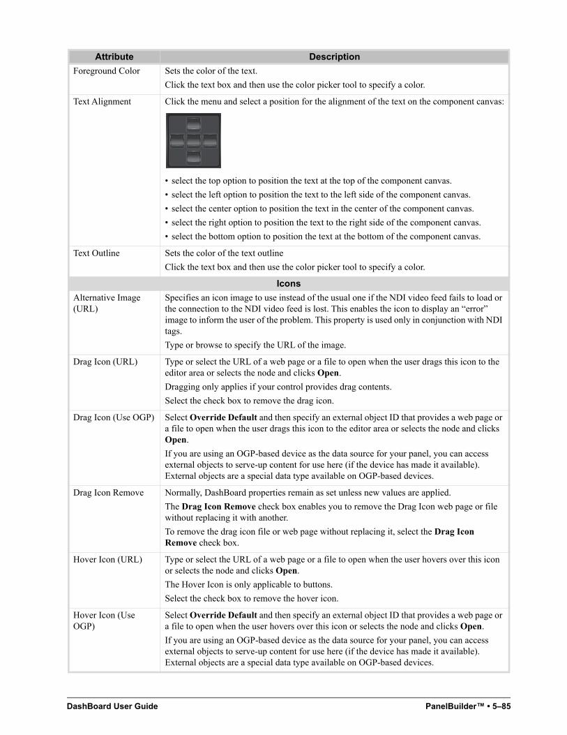
DashBoard User Guide PanelBuilder™ • 5–85
Foreground Color Sets the color of the text.
Click the text box and then use the color picker tool to specify a color.
Text Alignment Click the menu and select a position for the alignment of the text on the component canvas:
• select the top option to position the text at the top of the component canvas.
• select the left option to position the text to the left side of the component canvas.
• select the center option to position the text in the center of the component canvas.
• select the right option to position the text to the right side of the component canvas.
• select the bottom option to position the text at the bottom of the component canvas.
Text Outline Sets the color of the text outline
Click the text box and then use the color picker tool to specify a color.
Icons
Alternative Image (URL)
Specifies an icon image to use instead of the usual one if the NDI video feed fails to load or the connection to the NDI video feed is lost. This enables the icon to display an “error” image to inform the user of the problem. This property is used only in conjunction with NDI tags.
Type or browse to specify the URL of the image.
Drag Icon (URL) Type or select the URL of a web page or a file to open when the user drags this icon to the editor area or selects the node and clicks Open.
Dragging only applies if your control provides drag contents.
Select the check box to remove the drag icon.
Drag Icon (Use OGP) Select Override Default and then specify an external object ID that provides a web page or a file to open when the user drags this icon to the editor area or selects the node and clicks Open.
If you are using an OGP-based device as the data source for your panel, you can access external objects to serve-up content for use here (if the device has made it available). External objects are a special data type available on OGP-based devices.
Drag Icon Remove Normally, DashBoard properties remain as set unless new values are applied.
The Drag Icon Remove check box enables you to remove the Drag Icon web page or file without replacing it with another.
To remove the drag icon file or web page without replacing it, select the Drag Icon Remove check box.
Hover Icon (URL) Type or select the URL of a web page or a file to open when the user hovers over this icon or selects the node and clicks Open.
The Hover Icon is only applicable to buttons.
Select the check box to remove the hover icon.
Hover Icon (Use OGP)
Select Override Default and then specify an external object ID that provides a web page or a file to open when the user hovers over this icon or selects the node and clicks Open.
If you are using an OGP-based device as the data source for your panel, you can access external objects to serve-up content for use here (if the device has made it available). External objects are a special data type available on OGP-based devices.
Attribute Description
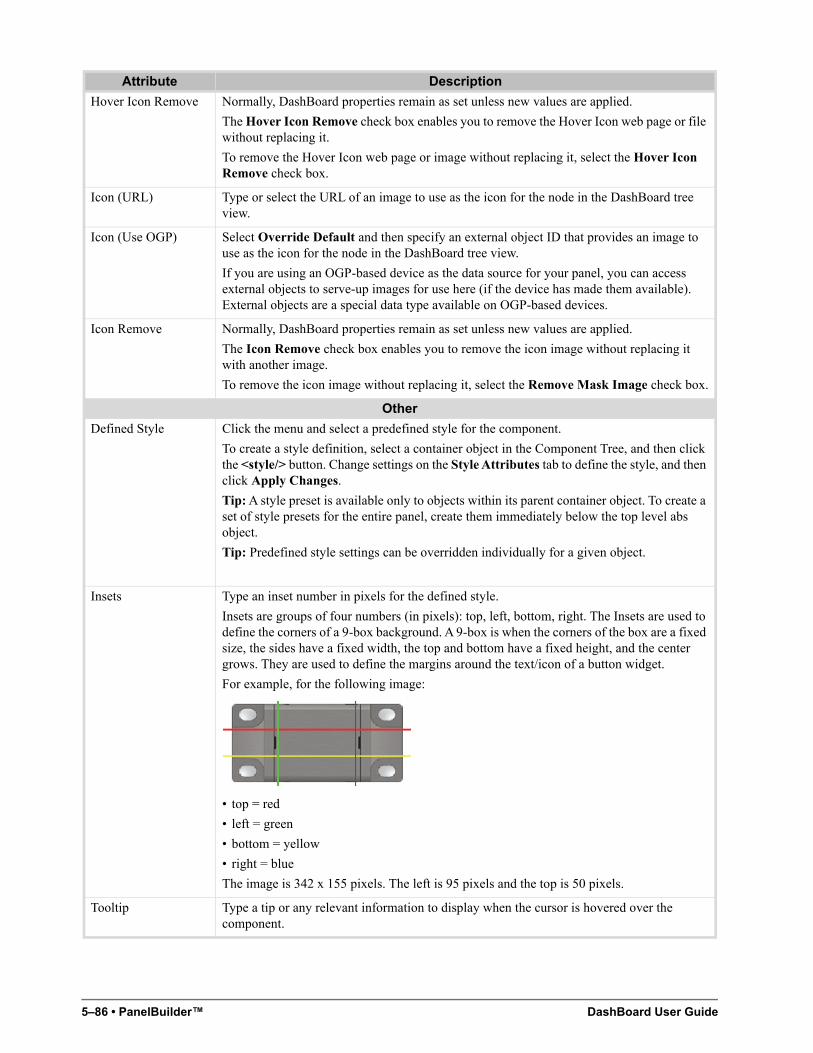
5–86 • PanelBuilder™ DashBoard User Guide
Hover Icon Remove Normally, DashBoard properties remain as set unless new values are applied.
The Hover Icon Remove check box enables you to remove the Hover Icon web page or file without replacing it.
To remove the Hover Icon web page or image without replacing it, select the Hover Icon Remove check box.
Icon (URL) Type or select the URL of an image to use as the icon for the node in the DashBoard tree view.
Icon (Use OGP) Select Override Default and then specify an external object ID that provides an image to use as the icon for the node in the DashBoard tree view.
If you are using an OGP-based device as the data source for your panel, you can access external objects to serve-up images for use here (if the device has made them available). External objects are a special data type available on OGP-based devices.
Icon Remove Normally, DashBoard properties remain as set unless new values are applied.
The Icon Remove check box enables you to remove the icon image without replacing it with another image.
To remove the icon image without replacing it, select the Remove Mask Image check box.
Other
Defined Style Click the menu and select a predefined style for the component.
To create a style definition, select a container object in the Component Tree, and then click the <style/> button. Change settings on the Style Attributes tab to define the style, and then click Apply Changes.
Tip: A style preset is available only to objects within its parent container object. To create a set of style presets for the entire panel, create them immediately below the top level abs object.
Tip: Predefined style settings can be overridden individually for a given object.
Insets Type an inset number in pixels for the defined style.
Insets are groups of four numbers (in pixels): top, left, bottom, right. The Insets are used to define the corners of a 9-box background. A 9-box is when the corners of the box are a fixed size, the sides have a fixed width, the top and bottom have a fixed height, and the center grows. They are used to define the margins around the text/icon of a button widget.
For example, for the following image:
• top = red
• left = green
• bottom = yellow
• right = blue
The image is 342 x 155 pixels. The left is 95 pixels and the top is 50 pixels.
Tooltip Type a tip or any relevant information to display when the cursor is hovered over the component.
Attribute Description
DashBoard User Guide PanelBuilder™ • 5–87
Tab Attributes Tab
Tab Attributes apply to the following types of components:
• “Tab Groups” on page 5–22
Attribute Description
General Attributes
Name Type a name or description for the tab component.
ID Type a scripting ID for the tab component.
Lock Contents (widget root)
Select this check box to disable the selection of sub-elements in the canvas. This allows for easy selection, copy, and paste of a component.
Elements under the widget root can only be selected by selecting the item node in the tree. Users can not add to, or directly modify, the contents of a widget, move a widget, or resize a widget. This allows the block of code for the widget to be self-contained and able to be dragged and dropped elsewhere with ease.
Scrolling Click the menu and select an option for adding scroll bars to the tab component:
• True — use vertical and/or horizontal scroll bars according to the size of the tab component.
• False — do not use scroll bars for the tab component.
• Vertical — add a vertical scroll bar to the tab component.
• Horizontal — add a horizontal scroll bar to the tab component.
• Always — always use vertical and horizontal scroll bars for the tab component.
Data Source/Device Control
openGear or XPression DataLinq
or
NK Series Routers
Select a device for context:
• openGear or XPression DataLinq — this option opens the Select Device for Context dialog box, where you can select an openGear card or XPression DataLinq XML file to associate with the tab.
NK Series Routers — this option opens the Select IPS dialog box, where you can select a router node.
Note: If both boxes are clear, the table uses the surrounding context.
XPression DashBoard Linq Port
If you want to stream XML data to an XPression system directly without sharing an XML file, specify the port to use on the DashBoard computer, and select Enable Streaming.
Note: You must also set up a DashBoard DataLinq source on the XPression DataLinq server. The DashBoard Linq must point to the IP address and port of the DashBoard computer that hosts the CustomPanel from which you want to stream data.
Advanced Tab Settings
Tab Placement Click the menu and select a position for the placement of the tabs on the canvas.
The tabs are placed on top of each other without any visual tabs, allowing you to create links to each tab and flip between them.
Remote Task Triggering
Internal RossTalk GPI Listener
Specifies the TCP/IP port to monitor for RossTalk commands for this container object and its children.
RossTalk GPI commands are formatted as GPI [trigger]:[state].
This setting is available only if this container object has its context attribute set to opengear (contexttype=opengear).
5–88 • PanelBuilder™ DashBoard User Guide
Table Attributes Tab
Table Attributes apply to the following types of components:
• “Tables” on page 5–30
VDCP Task Server Port
Specifies the TCP/IP port to use for publishing all of the current object’s tasks with trigger IDs as VDCP clips.
Tasks can be listed, cued, and played through devices capable of VDCP communication over TCP/IP.
This setting is available only if this container object has its context attribute set to opengear (contexttype=opengear).
HTTP Trigger Server Port
Tasks assigned to this object with trigger IDs are published to a web page hosted at the specified port (http://localhost:[port]/).
Tasks can be triggered by going to http://localhost:[port]/[trigger ID]/[State].
This setting is available only if this container object has its context attribute set to opengear (contexttype=opengear).
Attribute Description
General Attributes
Name Type a name or description for the table component.
ID Type a scripting ID for the table component.
Data Source/Device Control
openGear or XPression DataLinq
or
NK Series Routers
Select a device for context:
• openGear or XPression DataLinq — this option opens the Select Device for Context dialog box, where you can select an openGear card or XPression DataLinq XML file to associate with the table.
NK Series Routers — this option opens the Select IPS dialog box, where you can select a router node.
Note: If both boxes are clear, the table uses the surrounding context.
XPression DashBoard Linq Port
If you want to stream XML data to an XPression system directly without sharing an XML file, specify the port to use on the DashBoard computer, and select Enable Streaming.
Note: You must also set up a DashBoard DataLinq source on the XPression DataLinq server. The DashBoard Linq must point to the IP address and port of the DashBoard computer that hosts the CustomPanel from which you want to stream data.
Lock Contents (widget root)
Select this check box to disable the selection of sub-elements in the canvas. This allows for easy selection, copy, and paste of a component.
Elements under the widget root can only be selected by selecting the item node in the tree. Users can not add to, or directly modify, the contents of a widget, move a widget, or resize a widget. This allows the block of code for the widget to be self-contained and able to be dragged and dropped elsewhere with ease.
Scrolling Click the menu and select an option for adding scroll bars to the table component:
• True — use vertical and/or horizontal scroll bars according to the size of the table component.
• False — do not use scroll bars for the table component.
• Vertical — add a vertical scroll bar to the table component.
• Horizontal — add a horizontal scroll bar to the table component.
• Always — always use vertical and horizontal scroll bars for the table component.
Attribute Description
DashBoard User Guide PanelBuilder™ • 5–89
Table Cell Attributes Tab
Table Cell Attributes apply to the following types of components:
• “Tables” on page 5–30
Table cell attributes can also apply to buttons if a table of buttons is created:
• “Buttons” on page 5–35
Attribute Description
Table Cell Alignment
Alignment If a table cell is not set to fill both and the control is smaller than the cell, this controls where the cell's control is anchored in the cell. Use the menu to specify where to position the table cell:
The table cell remains fixed to the selected location if the table is resized.
Fill Click the menu and select a fill mode for the table cell:
• None — remove the image from the table cell.
• Horizontal — stretch the image horizontally in the table cell according to the Alignment menu. For example, if the Alignment is set to Center, the image will be stretched horizontally in the table cell and centered in the table cell.
• Vertical — stretch the image vertically in the table cell according to the Alignment menu. For example, if the Alignment is set to Center, the image will be stretched vertically in the table cell and centered in the table cell.
• Both — resize the image to fit the table cell.
Horizontal Weight (%)
Use the slide bar to determine the amount of horizontal space in the column for the table cell. The size of a cell is calculated by comparing the relative values of the cells across a column.
DashBoard will use the largest value in the column. If you want to reduce the column size, the weight of all cells in the column need to be shrunk.
Users might find it convenient to have the values across a column add to 100%.
Vertical Weight (%) Use the slide bar to determine the amount of vertical space in the row for the table cell.The size of a cell is calculated by comparing the relative values of the cells across a row.
DashBoard will use the largest value in the row. If you want to reduce the row size, the weight of all cells in the row need to be shrunk.
Users might find it convenient to have the values across a row add to 100%.
Colspan Type or select an amount of column cells for the cell to span.
Select the Default check box to use the default column span.
Rowspan Type or select an amount of row cells for the cell to span.
Select the Default check box to use the default row span.
Width Type or select an amount of pixels for the width of the cell.
Select the Default check box to use the default cell width. The default is 1.
Height Type or select an amount of pixels for the height of the cell.
Select the Default check box to use the default cell height. The default is 1.
5–90 • PanelBuilder™ DashBoard User Guide
Tag Attributes Tab
Tag Attributes apply to the following types of components:
• “Basic Canvases” on page 5–21
• “Tab Groups” on page 5–22
• “Image Canvases” on page 5–26
• “Split Panels” on page 5–27
• “Tables” on page 5–30
• “Labels” on page 5–33
• “Links to Device Editors or Other CustomPanels” on page 5–34
• “Buttons” on page 5–35
• “Web Browser Instances” on page 5–38
Insets Type an inset number for the table cell
Insets are groups of four numbers: top, left, bottom, right. They are used to define the margins around the text/icon of a button widget.
Advanced Attributes
Orientation If multiple elements are returned, the selected orientation determines if the elements are placed in rows (vertical) or columns (horizontal). Click the menu and select an orientation:
• Horizontal — select to orientate the table cell horizontally. Use the Expected # Elements to configure the number of elements to span.
• Vertical — select to orientate the table cell vertically. Use the Expected # Elements to configure the number of elements to span.
Expected # Elements Enter an amount of elements to fill the table if multiple elements are returned. If a small number of elements, or none, are returned, this number of elements will create empty cells in order to maintain the table structure.
Attribute Description
External Link
All Connections Select the radio button to specify a device on the network for the link.
Use the menu to select a device from the Basic Tree View.
File Navigator Select the radio button to specify a *.grid file for the link.
Use the menu to select a file from the File Navigator.
Local File Select the radio button to specify a file from a local computer or a server for the link.
Click Browse to use the Open dialog box to select a file from a location on a local computer or sever.
Button Style Select a method for displaying the link for the component:
• Button — select to use a button component as the style for the link.
• Label — select to use a label component as the style for the link.
General Attributes
Name Type a name or description for the link.
ID Type a scripting ID for the link.
Attribute Description
DashBoard User Guide PanelBuilder™ • 5–91
Task Attributes Tab
Task Attributes apply to task components.
Timer Attributes Tab
The Timer Attributes apply to Timer widgets:
• “Timers” on page 5–49
Attribute Description
General Attributes
Name Type a name or description for the task.
ID Type a scripting ID for the task.
ogScript Content
Visual button The Visual button changes the ogScript Content area to show the Visual Logic editor, which enables you to created and edit ogScript code segments visually.
For more information about the Visual Logic editor, see “DashBoard Visual Logic” on page 6–1.
ogScript button The ogScript button changes the ogScript Content area to show the manual ogScript Editor.
For more information about the manual ogScript Editor, see “Editing ogScript Code” on page 5–103.
Attribute Description
General Attributes
Name Type a name or description for the timer.
ID Type a scripting ID for the timer. The default is Timer ID.
Timer Properties
Timer ID Type a name for the timer.
Display Specify the time format for the timer:
• Use the list to select the format.
• Type the format and then press Enter.
To view descriptions of the time formatting symbols, click beside the Display list.
Time Source Select a radio button to specify the type of timer to use:
• Self — starts and stops manually, and is independent of any other timer.
• Simple clock — matches the time clock of the local computer.
• Time Until — counts down the amount of time remaining until a future date and time.
• Other Timer — links this timer to another timer. Starting or stopping the linked timer also starts or stops this timer.
Start Specify the timer value to begin counting from. Only Self timers use this value.
Stop Specify the timer value to stop counting at. Only Self and Time Until timers use this value.
Repeat Rate In the Every box, enter or select an amount of time to control how often the timer tasks are run.
Use the list next to the Every box to select a unit of time for the repeat rate.
For more information about the repeat rate, click beside the list used to select a unit of time.
5–92 • PanelBuilder™ DashBoard User Guide
Timertask Attributes Tab
Timertask Attributes apply to the following types of components:
• “Timers” on page 5–49
Tr Attributes Tab
TableRow (Tr) Attributes apply to the following types of components:
• “Tables” on page 5–30
Tasks
Tasks List This list displays the tasks that have been added to a label. Tasks are commands or controls assigned to the component. Use the buttons to arrange the tasks:
• First — click to move a selected task to the top of the Tasks List.
• Move Up — click to move a selected task up one position in the Tasks List.
• Move Down — click to move a selected task down one position in the Tasks List.
• Last — click to move a selected task to the bottom of the Tasks List.
Add Click the button to open the Add Task dialog box and create tasks for the timer. The tasks are added to the Tasks List.
Edit Click the button to open the Edit Task dialog box and edit a selected task from the Tasks List.
Delete Click the button to delete a selected task from the Tasks List.
Attribute Description
General Attributes
Name Type a name or description for the timer task.
ID Type a scripting ID for the timer task.
ogScript Content
Visual button The Visual button changes the ogScript Content area to show the Visual Logic editor, which enables you to created and edit ogScript code segments visually.
For more information about the Visual Logic editor, see “DashBoard Visual Logic” on page 6–1.
ogScript button The ogScript button changes the ogScript Content area to show the manual ogScript Editor.
For more information about the ogScript Editor, see “Editing ogScript Code” on page 5–103.
Attribute Description
General Attributes
Name Type a name or description for the table row.
ID Type a scripting ID for the table row.
Attribute Description
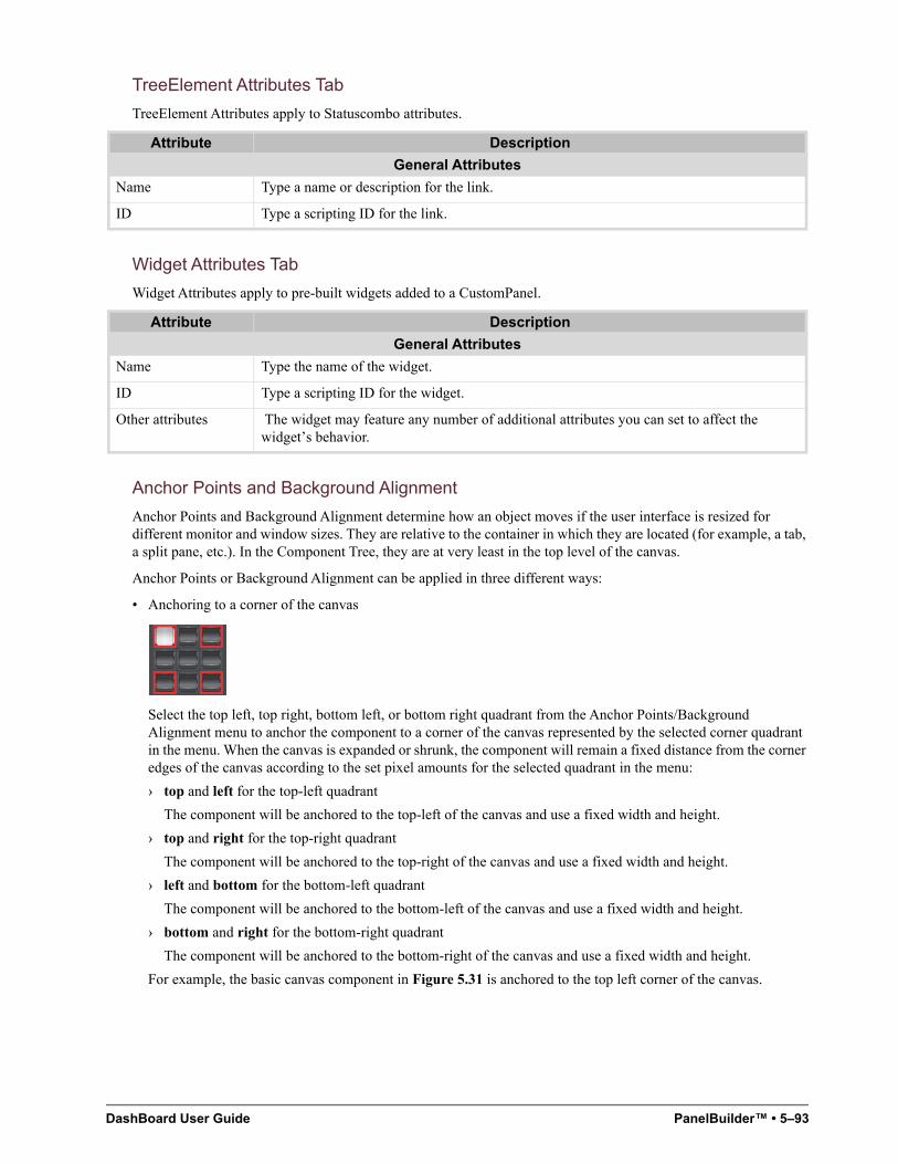
DashBoard User Guide PanelBuilder™ • 5–93
TreeElement Attributes Tab
TreeElement Attributes apply to Statuscombo attributes.
Widget Attributes Tab
Widget Attributes apply to pre-built widgets added to a CustomPanel.
Anchor Points and Background Alignment
Anchor Points and Background Alignment determine how an object moves if the user interface is resized for different monitor and window sizes. They are relative to the container in which they are located (for example, a tab, a split pane, etc.). In the Component Tree, they are at very least in the top level of the canvas.
Anchor Points or Background Alignment can be applied in three different ways:
• Anchoring to a corner of the canvas
Select the top left, top right, bottom left, or bottom right quadrant from the Anchor Points/Background Alignment menu to anchor the component to a corner of the canvas represented by the selected corner quadrant in the menu. When the canvas is expanded or shrunk, the component will remain a fixed distance from the corner edges of the canvas according to the set pixel amounts for the selected quadrant in the menu:
› top and left for the top-left quadrant
The component will be anchored to the top-left of the canvas and use a fixed width and height.
› top and right for the top-right quadrant
The component will be anchored to the top-right of the canvas and use a fixed width and height.
› left and bottom for the bottom-left quadrant
The component will be anchored to the bottom-left of the canvas and use a fixed width and height.
› bottom and right for the bottom-right quadrant
The component will be anchored to the bottom-right of the canvas and use a fixed width and height.
For example, the basic canvas component in Figure 5.31 is anchored to the top left corner of the canvas.
Attribute Description
General Attributes
Name Type a name or description for the link.
ID Type a scripting ID for the link.
Attribute Description
General Attributes
Name Type the name of the widget.
ID Type a scripting ID for the widget.
Other attributes The widget may feature any number of additional attributes you can set to affect the widget’s behavior.
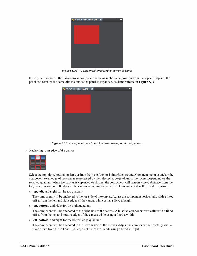
5–94 • PanelBuilder™ DashBoard User Guide
Figure 5.31 - Component anchored to corner of panel
If the panel is resized, the basic canvas component remains in the same position from the top left edges of the panel and remains the same dimensions as the panel is expanded, as demonstrated in Figure 5.32.
Figure 5.32 - Component anchored to corner while panel is expanded
• Anchoring to an edge of the canvas
Select the top, right, bottom, or left quadrant from the Anchor Points/Background Alignment menu to anchor the component to an edge of the canvas represented by the selected edge quadrant in the menu. Depending on the selected quadrant, when the canvas is expanded or shrunk, the component will remain a fixed distance from the top, right, bottom, or left edges of the canvas according to the set pixel amounts, and will expand or shrink:
› top, left, and right for the top quadrant
The component will be anchored to the top side of the canvas. Adjust the component horizontally with a fixed offset from the left and right edges of the canvas while using a fixed a height.
› top, bottom, and right for the right quadrant
The component will be anchored to the right side of the canvas. Adjust the component vertically with a fixed offset from the top and bottom edges of the canvas while using a fixed a width.
› left, bottom, and right for the bottom edge quadrant
The component will be anchored to the bottom side of the canvas. Adjust the component horizontally with a fixed offset from the left and right edges of the canvas while using a fixed a height.
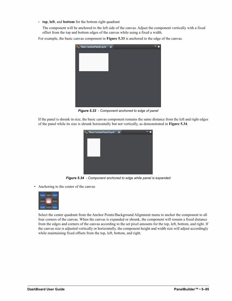
DashBoard User Guide PanelBuilder™ • 5–95
› top, left, and bottom for the bottom right quadrant
The component will be anchored to the left side of the canvas. Adjust the component vertically with a fixed offset from the top and bottom edges of the canvas while using a fixed a width.
For example, the basic canvas component in Figure 5.33 is anchored to the edge of the canvas.
Figure 5.33 - Component anchored to edge of panel
If the panel is shrunk in size, the basic canvas component remains the same distance from the left and right edges of the panel while its size is shrunk horizontally but not vertically, as demonstrated in Figure 5.34.
Figure 5.34 - Component anchored to edge while panel is expanded
• Anchoring to the center of the canvas
Select the center quadrant from the Anchor Points/Background Alignment menu to anchor the component to all four corners of the canvas. When the canvas is expanded or shrunk, the component will remain a fixed distance from the edges and corners of the canvas according to the set pixel amounts for the top, left, bottom, and right. If the canvas size is adjusted vertically or horizontally, the component height and width size will adjust accordingly while maintaining fixed offsets from the top, left, bottom, and right.
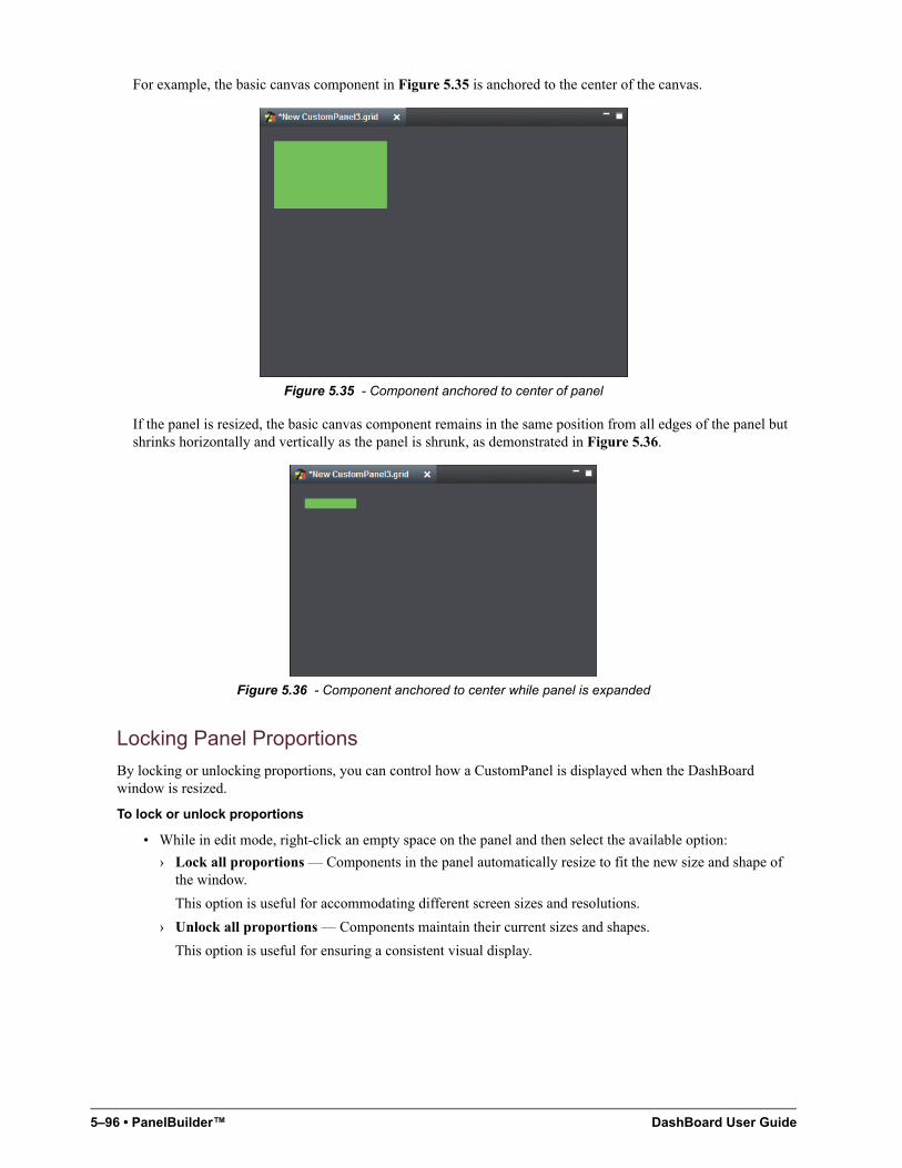
5–96 • PanelBuilder™ DashBoard User Guide
For example, the basic canvas component in Figure 5.35 is anchored to the center of the canvas.
Figure 5.35 - Component anchored to center of panel
If the panel is resized, the basic canvas component remains in the same position from all edges of the panel but shrinks horizontally and vertically as the panel is shrunk, as demonstrated in Figure 5.36.
Figure 5.36 - Component anchored to center while panel is expanded
Locking Panel Proportions
By locking or unlocking proportions, you can control how a CustomPanel is displayed when the DashBoard window is resized.
To lock or unlock proportions
• While in edit mode, right-click an empty space on the panel and then select the available option:
› Lock all proportions — Components in the panel automatically resize to fit the new size and shape of the window.
This option is useful for accommodating different screen sizes and resolutions.
› Unlock all proportions — Components maintain their current sizes and shapes.
This option is useful for ensuring a consistent visual display.
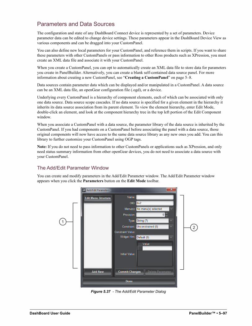
DashBoard User Guide PanelBuilder™ • 5–97
Parameters and Data Sources
The configuration and state of any DashBoard Connect device is represented by a set of parameters. Device parameter data can be edited to change device settings. These parameters appear in the DashBoard Device View as various components and can be dragged into your CustomPanel.
You can also define new local parameters for your CustomPanel, and reference them in scripts. If you want to share these parameters with other CustomPanels or pass information to other Ross products such as XPression, you must create an XML data file and associate it with your CustomPanel.
When you create a CustomPanel, you can opt to automatically create an XML data file to store data for parameters you create in PanelBuilder. Alternatively, you can create a blank self-contained data source panel. For more information about creating a new CustomPanel, see “Creating a CustomPanel” on page 5–8.
Data sources contain parameter data which can be displayed and/or manipulated in a CustomPanel. A data source can be an XML data file, an openGear configuration file (.ogd), or a device.
Underlying every CustomPanel is a hierarchy of component elements, each of which can be associated with only one data source. Data source scope cascades. If no data source is specified for a given element in the hierarchy it inherits its data source association from its parent element. To view the element hierarchy, enter Edit Mode, double-click an element, and look at the component hierarchy tree in the top left portion of the Edit Component window.
When you associate a CustomPanel with a data source, the parameter library of the data source is inherited by the CustomPanel. If you had components on a CustomPanel before associating the panel with a data source, those original components will now have access to the same data source library as any new ones you add. You can this library to further customize your CustomPanel using OGP tags.
Note: If you do not need to pass information to other CustomPanels or applications such as XPression, and only need status summary information from other openGear devices, you do not need to associate a data source with your CustomPanel.
The Add/Edit Parameter Window
You can create and modify parameters in the Add/Edit Parameter window. The Add/Edit Parameter window appears when you click the Parameters button on the Edit Mode toolbar.
Figure 5.37 - The Add/Edit Parameter Dialog
12
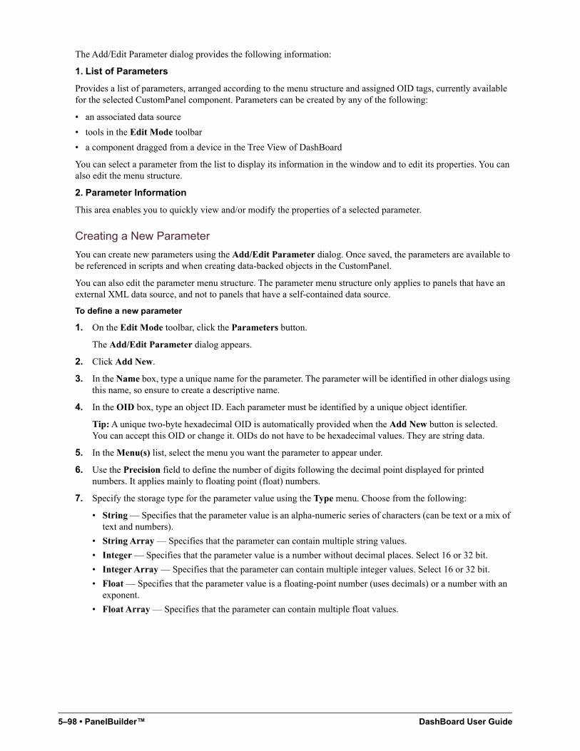
5–98 • PanelBuilder™ DashBoard User Guide
The Add/Edit Parameter dialog provides the following information:
1. List of Parameters
Provides a list of parameters, arranged according to the menu structure and assigned OID tags, currently available for the selected CustomPanel component. Parameters can be created by any of the following:
• an associated data source
• tools in the Edit Mode toolbar
• a component dragged from a device in the Tree View of DashBoard
You can select a parameter from the list to display its information in the window and to edit its properties. You can also edit the menu structure.
2. Parameter Information
This area enables you to quickly view and/or modify the properties of a selected parameter.
Creating a New Parameter
You can create new parameters using the Add/Edit Parameter dialog. Once saved, the parameters are available to be referenced in scripts and when creating data-backed objects in the CustomPanel.
You can also edit the parameter menu structure. The parameter menu structure only applies to panels that have an external XML data source, and not to panels that have a self-contained data source.
To define a new parameter
1. On the Edit Mode toolbar, click the Parameters button.
The Add/Edit Parameter dialog appears.
2. Click Add New.
3. In the Name box, type a unique name for the parameter. The parameter will be identified in other dialogs using this name, so ensure to create a descriptive name.
4. In the OID box, type an object ID. Each parameter must be identified by a unique object identifier.
Tip: A unique two-byte hexadecimal OID is automatically provided when the Add New button is selected. You can accept this OID or change it. OIDs do not have to be hexadecimal values. They are string data.
5. In the Menu(s) list, select the menu you want the parameter to appear under.
6. Use the Precision field to define the number of digits following the decimal point displayed for printed numbers. It applies mainly to floating point (float) numbers.
7. Specify the storage type for the parameter value using the Type menu. Choose from the following:
• String — Specifies that the parameter value is an alpha-numeric series of characters (can be text or a mix of text and numbers).
• String Array — Specifies that the parameter can contain multiple string values.
• Integer — Specifies that the parameter value is a number without decimal places. Select 16 or 32 bit.
• Integer Array — Specifies that the parameter can contain multiple integer values. Select 16 or 32 bit.
• Float — Specifies that the parameter value is a floating-point number (uses decimals) or a number with an exponent.
• Float Array — Specifies that the parameter can contain multiple float values.
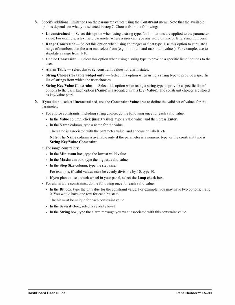
DashBoard User Guide PanelBuilder™ • 5–99
8. Specify additional limitations on the parameter values using the Constraint menu. Note that the available options depends on what you selected in step 7. Choose from the following:
• Unconstrained — Select this option when using a string type. No limitations are applied to the parameter value. For example, a text field parameter where a user can type any word or mix of letters and numbers.
• Range Constraint — Select this option when using an integer or float type. Use this option to stipulate a range of numbers that the user can select from (e.g. minimum and maximum values). For example, use to stipulate a range from 1-10.
• Choice Constraint — Select this option when using a string type to provide a specific list of options to the user.
• Alarm Table — select this to set constraint values for alarm states.
• String Choice (for table widget only) — Select this option when using a string type to provide a specific list of strings from which the user chooses.
• String Key/Value Constraint — Select this option when using a string type to provide a specific list of options to the user. Each option (Name) is associated with a key (Value). The constraint choices are stored as key/value pairs.
9. If you did not select Unconstrained, use the Constraint Value area to define the valid set of values for the parameter:
• For choice constraints, including string choice, do the following once for each valid value:
› In the Value column, click [insert value], type a valid value, and then press Enter.
› In the Name column, type a name for the value.
The name is associated with the parameter value, and appears on labels, etc.
Note: The Name column is available only if the parameter is a numeric type, or the constraint type is String Key/Value Constraint.
• For range constraints:
› In the Minimum box, type the lowest valid value.
› In the Maximum box, type the highest valid value.
› In the Step Size column, type the step size.
For example, if valid values must be evenly divisible by 10, type 10.
› If you plan to use a touch wheel in your panel, select the Loop check box.
• For alarm table constraints, do the following once for each valid value:
› In the Bit box, type the bit value for the constraint value. For example, you may have two options; 1 and 0. You would have one row for each bit state.
The bit must be unique for each constraint value.
› In the Severity box, select a severity level.
› In the String box, type the alarm message you want associated with this constraint value.
5–100 • PanelBuilder™ DashBoard User Guide
10. Specify the graphical display hint for the parameter using the Widget Hint menu. Choose from the following:
• Default — Displays the parameter as defined according the data source.
• Read-only text — Displays the parameter as a status text field that cannot be altered by the user. A border and background is automatically applied to the field.
• Label — Displays the parameter as a text field without a border or background.
• Text Entry — Displays the parameter as a single line text field that is editable by the user. The user must enter one of the values defined using the Constraint Value field.
• Multi-Line Text Entry — Displays the parameter as a text field with more than one line. The user must enter one of the values defined using the Constraint Value field.
• HTML Content — Displays the parameter as a field that requires the user to input HTML data.
• Editable Dropdown List — Displays the parameter as a menu that the user clicks to display an expanded list of values to choose from. These values are determined by the Constraint Value field.
• Alarm-Style Colored Dot — Displays the parameter as a status indicator, similar to an LED, that updates based on conditions defined in the Constraint Value field.
11. In the Initial Value area, specify the initial value for the parameter. If the parameter is an array, you can specify multiple values.
12. Click Commit Changes to save your new parameter.
13. Click Done to exit the dialog.
To edit the parameter menu structure
1. On the Edit Mode toolbar, click the Parameters button.
The Add/Edit Parameter dialog appears.
2. Click Edit Menu Structure.
The Add/Edit Menus dialog appears.
3. In the list on the left, click the folder under which you want the new menu to appear (Status or Config).
4. In the Menu Name box, type a name for the menu.
5. Click Insert Menu.
6. If you want to delete a menu, click it in the list on the left, and then click Delete Menu.
7. When you are satisfied with the menu structure, click Save Menu.
8. Click Done.
Associating a Data Source with a CustomPanel
You can associate a specific data source, such as an openGear card or other DashBoard Connect devices, or a saved configuration file (*.ogd) with a CustomPanel. Doing so enables you to use that data source as a library of parameters which you can then manipulate. Additional tools in the CustomPanel’s Edit Mode toolbar enable you to quickly select components based on a specific device. Which components are available depends on the specific device you have selected. For example, the components of an UDC-8625A-B differ from those of an XPression™ Real-time Motion Graphics System. We highly recommended you become familiar with the device(s) before using this PanelBuilder feature.
Associating a Data File with a CustomPanel
Associating a saved configuration file (*.ogd) enables you to use the parameters saved in that file as a type of library for the CustomPanel. Once you have successfully associated a data file to the CustomPanel, the Edit Mode toolbar automatically updates to display the new tool options. You can also use a data file as a base for creating an interface in DashBoard that auto-populates fields in a Ross XPression system, or to familiarize yourself with PanelBuilder features without directly impacting a device.
DashBoard User Guide PanelBuilder™ • 5–101
To associate a data file with a CustomPanel
1. Select from the Edit Mode toolbar.
2. Double-click the CustomPanel area. The border displays the Edit Component: <abs> dialog when the mouse button is released.
3. Select the Abs Attributes tab.
4. In the Device Control area, select the openGear check box.
5. Click configure to display the Select Device for Context dialog.
6. Click Select a file.
7. Click Browse... to display the Select Device Data Source dialog.
8. Navigate to the required *.ogd file.
9. Click Select Device Data Source to close the dialog and update the File field.
10. Click OK.
11. Click Apply Changes or Apply and Close.
Working with ogScript
ogScript is a programming language developed by Ross Video to interact with DashBoard-enabled devices. It is a subset of JavaScript, with PanelBuilder-specific functions added.
In PanelBuilder, you can add advanced functionality and logic to CustomPanels by creating Component Tree items that execute ogScript code.
This section contains the following topics:
• “Adding an ogScript-Based Item to the Component Tree” on page 5–101
• “Editing ogScript Code” on page 5–103
• “Debugging ogScript Code” on page 5–105
Adding an ogScript-Based Item to the Component Tree
The following types of Component Tree items can include ogScript code segments:
• api items (<api/> tags)
An api item is a collection of ogScript functions that can be accessed from anywhere in the CustomPanel. You can also create a separate API script file to make the functions available to multiple CustomPanels.
• ogscript items (<ogscript/> tags)
An ogscript item is a standalone segment of ogScript code that can be referenced from within the CustomPanel.
• task items assigned to panel components
ogScript tasks can be assigned to buttons, labels, parameters, listeners, and timers (timertask item).
Creating an API Item in the Component Tree
To create an API with callable functions:
1. In the Insert Tag area above the Component Tree, click the <api/> button.
A new api item appears within the highest level container item (usually abs) in the Component Tree.
2. On the Api Attributes tab, in the General Attributes area, specify a Name and an ID for the new API.
5–102 • PanelBuilder™ DashBoard User Guide
3. If you want the script in the API to be executed immediately, before the rest of the panel is loaded, select the Execute Immediately check box.
When this option is selected, the script in the <api/> tag is evaluated as soon as it is reached, during the panel build process. This allows the script to create global functions that can be called from anywhere in the panel, create new parameters on the fly, and modify constraints of parameters even before they are displayed.
For more information about creating an API, see “Creating Internal and External APIs” on page 6–13.
4. Specify other attributes as needed. For more information, see “Api Attributes Tab” on page 5–68.
5. Do one of the following:
• If you want to create the ogScript functions manually, click the ogScript button, and then type or paste the ogScript code into the ogScript Editor.
For more information about editing ogScript manually, see “Editing ogScript Code” on page 5–103.
For detailed reference information about ogScript functions, see the DashBoard CustomPanel Development Guide (8351DR-007).
• If you want to create the ogScript functions visually, click the Visual button and then add the new functions.
For more information about adding functions, see “Creating New Functions” on page 6–13.
For more information about using the Visual Logic editor, see “DashBoard Visual Logic” on page 6–1.
6. Click Apply Changes or Apply and Close.
Creating an ogscript item in the Component Tree
To create an ogscript item in the Component Tree:
1. In the Edit Component window, in the Insert Tag area above the Component Tree, click the <ogScript/> button.
A new ogscript item appears within the highest level container element (usually abs) in the Component Tree.
2. On the Ogscript Attributes tab, in the General Attributes area, specify a Name and ID for the ogScript code segment.
3. Specify other attributes as needed. For more information, see “Ogscript Attributes Tab” on page 5–76.
4. Do one of the following:
• If you want to create the ogScript code manually, click the ogScript button, and then type or paste the ogScript code into the ogScript Editor.
For more information about editing ogScript manually, see “Editing ogScript Code” on page 5–103.
For detailed reference information about ogScript functions, see the DashBoard CustomPanel Development Guide (8351DR-007).
• If you want to create the ogScript code visually, click the Visual button and then add and connect logic blocks to create the code.
For more information about using the Visual Logic editor, see “DashBoard Visual Logic” on page 6–1.
5. Click Apply Changes or Apply and Close.
Creating an ogScript Task Assigned to a Panel Component
To create an ogScript task assigned to a panel component:
1. Create the panel component to which you want to assign the new ogScript task (button, label, parameter, listener, or timer).
In the Edit Component window, in the Component Tree, click the component to which you want to assign the task.
The Attributes tab for the component type appears.
DashBoard User Guide PanelBuilder™ • 5–103
2. In the Tasks area, click Add.
The Add Task window appears, with the Task Type set to ogScript.
3. Do one of the following:
• If you want to create the ogScript code manually, click the ogScript button, and then type or paste the ogScript code into the ogScript Editor.
For more information about editing ogScript manually, see “Editing ogScript Code” on page 5–103.
For detailed reference information about ogScript functions, see the DashBoard CustomPanel Development Guide (8351DR-007).
• If you want to create the ogScript code visually, click the Visual button and then add and connect logic blocks to create the code.
For more information about using the Visual Logic editor, see “DashBoard Visual Logic” on page 6–1.
4. When you are finished creating the code, click OK.
5. Click Apply Changes or Apply and Close.
Editing ogScript Code
You can edit ogScript code manually, or use the Visual Logic editor to edit it visually.
This section describes how to edit ogScript code manually. For information about editing ogScript code visually, see “DashBoard Visual Logic” on page 6–1.
ogScript is a programming language developed by Ross Video to interact with DashBoard-enabled devices. It is a subset of JavaScript, with PanelBuilder-specific functions added. Editing ogScript code requires JavaScript coding skills.
When you edit ogScript code manually, you do it in one of the following interfaces:
• Source tab — text editing only.
• Manual ogScript Editor — text editing plus use of the script palette, which is a tool that enables you to drag pre-made code templates into the current code segment.
Note: If you create or edit a segment of ogScript code manually, you cannot later edit that code in the Visual Logic editor.
To create or edit ogScript manually:
1. Create a CustomPanel, and add an ogScript-based item to the Component Tree.
For more information, see “Adding an ogScript-Based Item to the Component Tree” on page 5–101.
2. In the Component Tree, click an ogScript-based item (api, ogscript, task, or timertask).
3. If you want to edit the code on the Source tab (text only), click the Source tab.
The Source tab shows the source code for the item that is selected in the Component Tree. If the selected item is ogScript-based, the Source tab shows the OGLML element for the item (api, task, ogscript, timertask). Place your ogScript code between opening and closing tags of the element.
4. If you want to edit the code in the manual ogScript Editor, click the Attributes tab for the item (for example, Task Attributes), and then click the ogScript button.
The manual ogScript Editor shows the ogScript code for the item selected in the Component Tree.
Tip: To use the script palette, select the script palette check box. For more information, see “Using the Script Palette” on page 5–104.
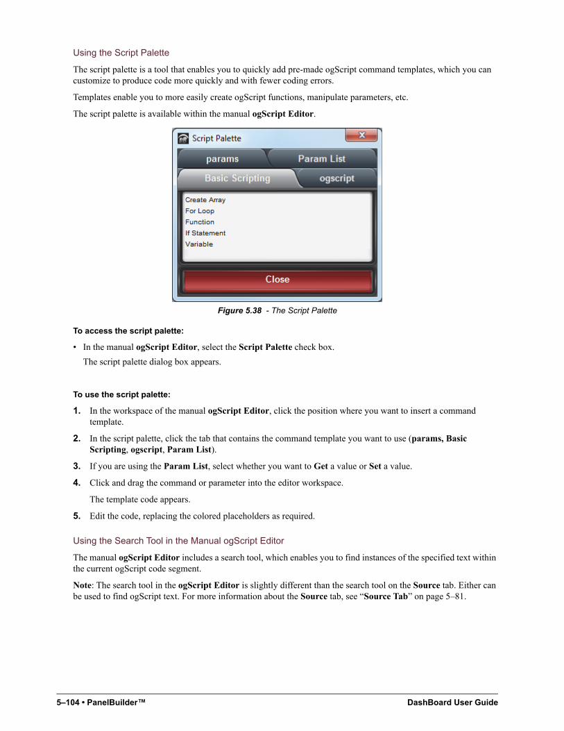
5–104 • PanelBuilder™ DashBoard User Guide
Using the Script Palette
The script palette is a tool that enables you to quickly add pre-made ogScript command templates, which you can customize to produce code more quickly and with fewer coding errors.
Templates enable you to more easily create ogScript functions, manipulate parameters, etc.
The script palette is available within the manual ogScript Editor.
Figure 5.38 - The Script Palette
To access the script palette:
• In the manual ogScript Editor, select the Script Palette check box.
The script palette dialog box appears.
To use the script palette:
1. In the workspace of the manual ogScript Editor, click the position where you want to insert a command template.
2. In the script palette, click the tab that contains the command template you want to use (params, Basic Scripting, ogscript, Param List).
3. If you are using the Param List, select whether you want to Get a value or Set a value.
4. Click and drag the command or parameter into the editor workspace.
The template code appears.
5. Edit the code, replacing the colored placeholders as required.
Using the Search Tool in the Manual ogScript Editor
The manual ogScript Editor includes a search tool, which enables you to find instances of the specified text within the current ogScript code segment.
Note: The search tool in the ogScript Editor is slightly different than the search tool on the Source tab. Either can be used to find ogScript text. For more information about the Source tab, see “Source Tab” on page 5–81.
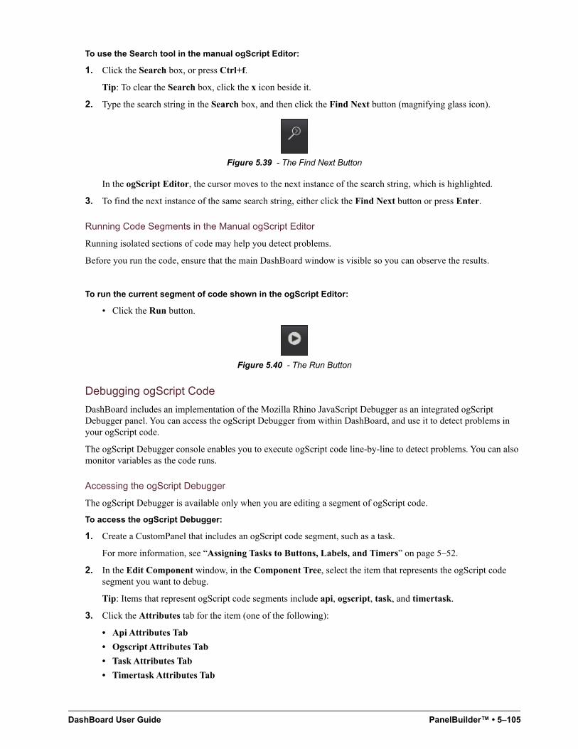
DashBoard User Guide PanelBuilder™ • 5–105
To use the Search tool in the manual ogScript Editor:
1. Click the Search box, or press Ctrl+f.
Tip: To clear the Search box, click the x icon beside it.
2. Type the search string in the Search box, and then click the Find Next button (magnifying glass icon).
Figure 5.39 - The Find Next Button
In the ogScript Editor, the cursor moves to the next instance of the search string, which is highlighted.
3. To find the next instance of the same search string, either click the Find Next button or press Enter.
Running Code Segments in the Manual ogScript Editor
Running isolated sections of code may help you detect problems.
Before you run the code, ensure that the main DashBoard window is visible so you can observe the results.
To run the current segment of code shown in the ogScript Editor:
• Click the Run button.
Figure 5.40 - The Run Button
Debugging ogScript Code
DashBoard includes an implementation of the Mozilla Rhino JavaScript Debugger as an integrated ogScript Debugger panel. You can access the ogScript Debugger from within DashBoard, and use it to detect problems in your ogScript code.
The ogScript Debugger console enables you to execute ogScript code line-by-line to detect problems. You can also monitor variables as the code runs.
Accessing the ogScript Debugger
The ogScript Debugger is available only when you are editing a segment of ogScript code.
To access the ogScript Debugger:
1. Create a CustomPanel that includes an ogScript code segment, such as a task.
For more information, see “Assigning Tasks to Buttons, Labels, and Timers” on page 5–52.
2. In the Edit Component window, in the Component Tree, select the item that represents the ogScript code segment you want to debug.
Tip: Items that represent ogScript code segments include api, ogscript, task, and timertask.
3. Click the Attributes tab for the item (one of the following):
• Api Attributes Tab
• Ogscript Attributes Tab
• Task Attributes Tab
• Timertask Attributes Tab
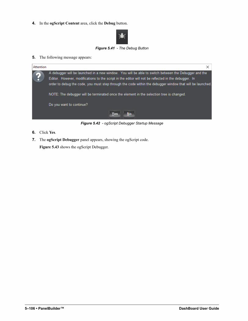
5–106 • PanelBuilder™ DashBoard User Guide
4. In the ogScript Content area, click the Debug button.
Figure 5.41 - The Debug Button
5. The following message appears:
Figure 5.42 - ogScript Debugger Startup Message
6. Click Yes.
7. The ogScript Debugger panel appears, showing the ogScript code.
Figure 5.43 shows the ogScript Debugger.
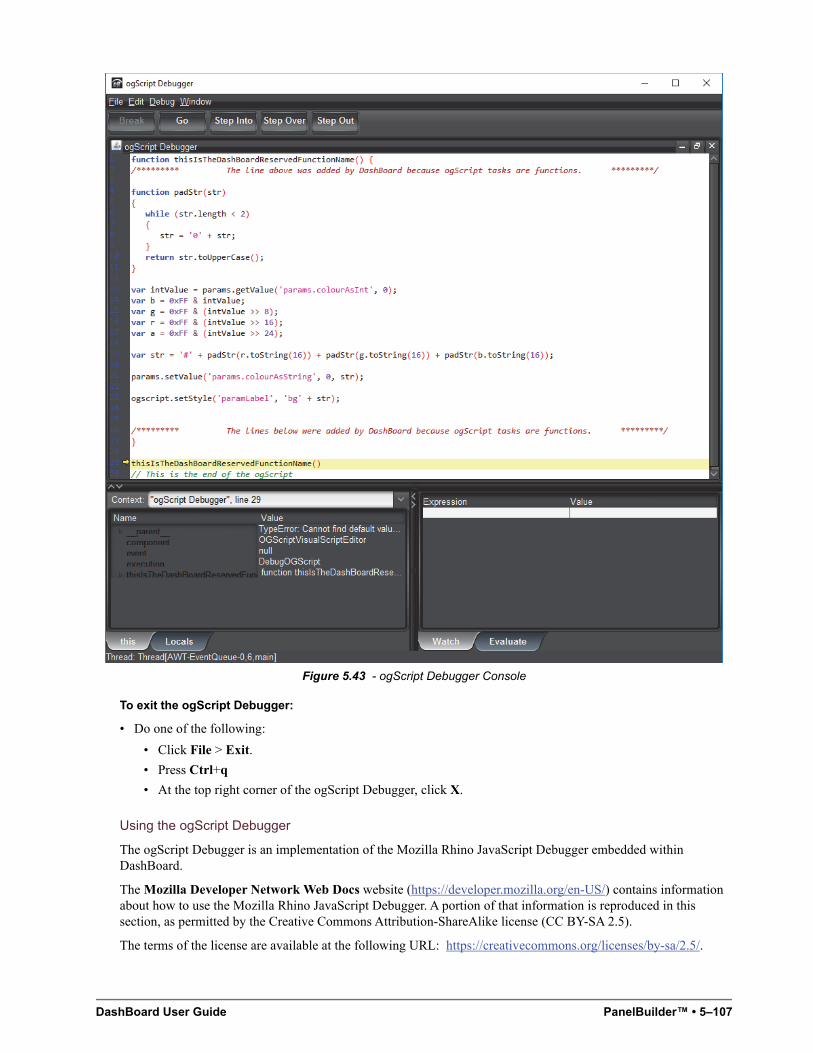
DashBoard User Guide PanelBuilder™ • 5–107
Figure 5.43 - ogScript Debugger Console
To exit the ogScript Debugger:
• Do one of the following:
• Click File > Exit.
• Press Ctrl+q
• At the top right corner of the ogScript Debugger, click X.
Using the ogScript Debugger
The ogScript Debugger is an implementation of the Mozilla Rhino JavaScript Debugger embedded within DashBoard.
The Mozilla Developer Network Web Docs website (https://developer.mozilla.org/en-US/) contains information about how to use the Mozilla Rhino JavaScript Debugger. A portion of that information is reproduced in this section, as permitted by the Creative Commons Attribution-ShareAlike license (CC BY-SA 2.5).
The terms of the license are available at the following URL: https://creativecommons.org/licenses/by-sa/2.5/.
5–108 • PanelBuilder™ DashBoard User Guide
As of the date this Help System was published (May 3, 2019), the copied information was available on the MDN Web Docs website, at the following URL:
https://developer.mozilla.org/en-US/docs/Mozilla/Projects/Rhino/Debugger#Controlling_Execution.
The remainder of this section consists entirely of information created by Mozilla Contributors. For more information, see https://developer.mozilla.org/en-US/docs/Mozilla/Projects/Rhino/Debugger$history.
Controlling Execution
The debugger provides the following facilities for you to control the execution of scripts you are debugging:
Step Into
To single step entering any function calls, you may do any of the following:
• Select the Debug->Step Into menu item on the menu bar
• Press the Step Into button on the toolbar
• Press the F11 key on the keyboard
Execution will resume. If the current line in the script contains a function call control will return to the debugger upon entry into the function. Otherwise control will return to the debugger at the next line in the current function.
Step Over
To single step to the next line in the current function, you may do any of the following:
• Select the Debug->Step Over menu item on the menu bar
• Press the Step Over button on the toolbar
• Press the F7 key on the keyboard
Execution will resume but control will return to the debugger at the next line in the current function or top-level script.
Step Out
To continue execution until the current function returns you may do any of the following:
• Select the Debug->Step Out menu item on the menu bar
• Press the Step Out button on the toolbar
• Press the F8 key on the keyboard
Execution will resume until the current function returns or a breakpoint is hit.
Go
To resume execution of a script you may do any of the following:
• Select the Debug->Go menu item on the menu bar
• Press the Go button on the toolbar
• Press the F5 key on the keyboard
DashBoard User Guide PanelBuilder™ • 5–109
Execution will resume until a breakpoint is hit or the script completes.
Break
To stop all running scripts and give control to the debugger you may do any of the following:
• Select the Debug->Break menu item on the menu bar
• Press the Break button on the toolbar
• Press the Pause/Break key on the keyboard
Break on Exceptions
To give control to the debugger whenever a JavaScript is exception is thrown select the Debug->Break on Exceptions checkbox from the menu bar. Whenever a JavaScript exception is thrown by a script a message dialog will be displayed and control will be given to the debugger at the location the exception is raised.
Break on Function Enter
Selecting Debug->Break on Function Enter will give control to the debugger whenever the execution is entered into a function or script.
Break on Function Exit
Selecting Debug->Break on Function Return will give control to the debugger whenever the execution is about to return from a function or script.
Moving Up and Down the Stack
The lower-left (dockable) pane in the debugger main window contains a combo-box labeled "Context:" which displays the current stack of the executing script. You may move up and down the stack by selecting an entry in the combo-box. When you select a stack frame the variables and watch windows are updated to reflect the names and values of the variables visible at that scope.
Setting and Clearing Breakpoints
The main desktop of the debugger contains file windows which display the contents of each script you are debugging. You may set a breakpoint in a script by doing one of the following:
• Place the cursor on the line at which you want to set a breakpoint and right-click with the mouse. This action will display a pop-up menu. Select the Set Breakpoint menu item.
• Simply single-click on the line number of the line at which you want to set a breakpoint.
If the selected line contains executable code a red dot will appear next to the line number and a breakpoint will be set at that location.
You may clear breakpoint in a script by doing one of the following:
• Place the cursor on the line at which you want to clear a breakpoint and right-click with the mouse. This action will display a pop-up menu. Select the Clear Breakpoint menu item.
• Simply single-click on the red dot or the line number of the line at which you want to clear a breakpoint.
The red dot will disappear and the breakpoint at that location will be cleared.
5–110 • PanelBuilder™ DashBoard User Guide
Viewing Variables
The lower-left (dockable) pane in the debugger main window contains a tab-pane with two tabs, labeled "this" and "Locals". Each pane contains a tree-table which displays the properties of the current object and currently visible local variables, respectively.
This
The properties of the current object are displayed in the this table. If a property is itself a JavaScript object the property may be expanded to show its sub-properties. The this table is updated each time control returns to the debugger or when you change the stack location in the Context: window.
Locals
The local variables of the current function are displayed in the Locals table. If a variable is itself a JavaScript object the variable may be expanded to show its sub-properties. The Locals table is updated each time control returns to the debugger or when you change the stack location in the Context: window
Watch Window
You may enter arbitrary JavaScript expressions in the Watch: table located in the lower-right (dockable) pane in the debugger main window. The expressions you enter are re-evaluated in the current scope and their current values displayed each time control returns to the debugger or when you change the stack location in the Context: window.
Evaluation Window
The Evaluate pane located in the lower-right (dockable) pane in the debugger main window contains an editable command line where you may enter arbitrary JavaScript code. The code is evaluated in the context of the current stack frame. The window maintains a history of the commands you have entered. You may move backward or forward through the history by pressing the Up/Down arrow keys on the keyboard.
NK Series Router Control Panels
You can create a CustomPanel to control Ross Video NK Series video routers. PanelBuilder includes special tools for making the creation of a router control panel easy.
For comprehensive information about NK Series routers and Internet Protocol Servers, consult the user manuals that came with your NK Series router system.
Router control panels created in PanelBuilder typically include the following components:
• A list of Internet Protocol Server (IPS) selectors. An IPS is a device that controls one or more routers. An IPS selector list enables you to choose a set of routers to control.
• A list of levels. Levels are logical groups of inputs and outputs. Levels ensure that a certain set of inputs can only be routed to a certain set of outputs. This is useful in facilities that deal with multiple video formats, to prevent routing of one signal format to a device that expects to receive a different format.
• One or more lists of sources. Sources are video router inputs.
• One or more lists of destinations. Destinations are video router outputs.
• A group of functions. Functions are router commands, such as chop, take, configure, etc.
• A level status table. The level status table lists levels and the sources and destinations associated with them.
To create a router control panel, you create a CustomPanel, then add the components listed above.
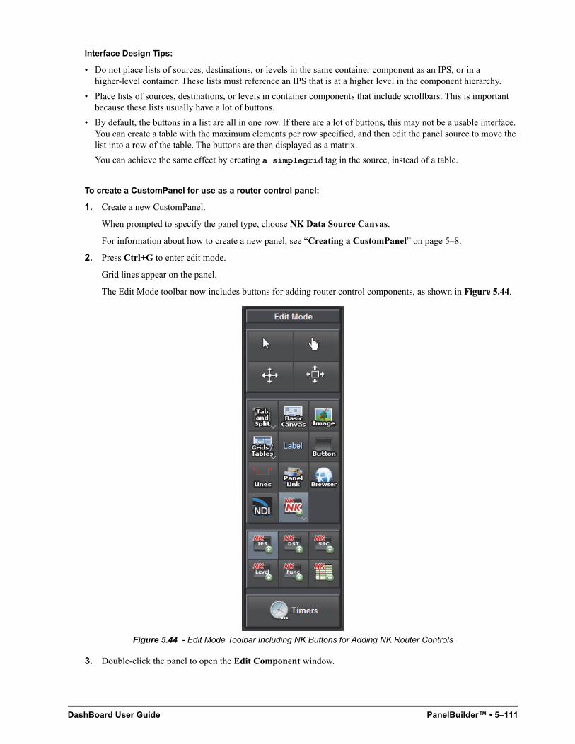
DashBoard User Guide PanelBuilder™ • 5–111
Interface Design Tips:
• Do not place lists of sources, destinations, or levels in the same container component as an IPS, or in a higher-level container. These lists must reference an IPS that is at a higher level in the component hierarchy.
• Place lists of sources, destinations, or levels in container components that include scrollbars. This is important because these lists usually have a lot of buttons.
• By default, the buttons in a list are all in one row. If there are a lot of buttons, this may not be a usable interface. You can create a table with the maximum elements per row specified, and then edit the panel source to move the list into a row of the table. The buttons are then displayed as a matrix.
You can achieve the same effect by creating a simplegrid tag in the source, instead of a table.
To create a CustomPanel for use as a router control panel:
1. Create a new CustomPanel.
When prompted to specify the panel type, choose NK Data Source Canvas.
For information about how to create a new panel, see “Creating a CustomPanel” on page 5–8.
2. Press Ctrl+G to enter edit mode.
Grid lines appear on the panel.
The Edit Mode toolbar now includes buttons for adding router control components, as shown in Figure 5.44.
Figure 5.44 - Edit Mode Toolbar Including NK Buttons for Adding NK Router Controls
3. Double-click the panel to open the Edit Component window.
5–112 • PanelBuilder™ DashBoard User Guide
4. On the ABS Attributes tab, in the Data Source/Device Control area, ensure that the NK Series Routers check box is selected.
5. Beside the NK Series Routers check box, click configure.
The Select IPS dialog appears.
6. Click the IPS you want to associate with your router control panel, and then click OK.
7. Click Apply and Close.
To Add a list of IPS selectors:
1. On the Edit Mode toolbar, click the NK IPS button.
Tip: If the NK IPS button is not visible, click the NK NK button to reveal the NK IPS button.
2. Drag a box on the panel to define the list area.
A row of buttons appears. Each button represents one IPS, which can be selected by the user.
To insert a list of destinations:
1. Create a container component, such as a basic canvas, to contain the list.
Note: Do not place lists of destinations in the same container component as an IPS selector, or in a higher-level container. These lists must reference an IPS selector that is at a higher level in the component hierarchy.
2. On the Edit Mode toolbar, click the NK DST button.
Tip: If the NK DST button is not visible, click the NK NK button to reveal the NK DST button.
3. Drag a box on the panel to define the list area.
The Insert into Component dialog appears.
4. Do one of the following, and then click Ok:
• If you want to include all destinations in the list, select the Show all (dynamic) check box.
• If you want to include only some destinations, deselect the Show all (dynamic) check box, and then select the individual destinations you want to include in the list.
The destination buttons appear.
To insert a list of sources:
1. Create a container component, such as a blankblank canvas, to contain the list.
Note: Do not place lists of sources in the same container component as an IPS selector, or in a higher-level container. These lists must reference an IPS selector that is at a higher level in the component hierarchy.
2. On the Edit Mode toolbar, click the NK SRC button.
Tip: If the NK SRC button is not visible, click the NK NK button to reveal the NK SRC button.
3. Drag a box on the panel to define the list area.
The Insert into Component dialog appears.
4. Do one of the following, and then click Ok:
• If you want to include all sources in the list, select the Show all (dynamic) check box.
• If you want to include only some sources, deselect the Show all (dynamic) check box, and then select the individual sources you want to include in the list.
The source buttons appear.
To insert a list of levels:
1. Create a container component, such as a basic canvas, to contain the list.
Note: Do not place lists of levels in the same container component as an IPS selector, or in a higher-level container. These lists must reference an IPS selector that is at a higher level in the component hierarchy.
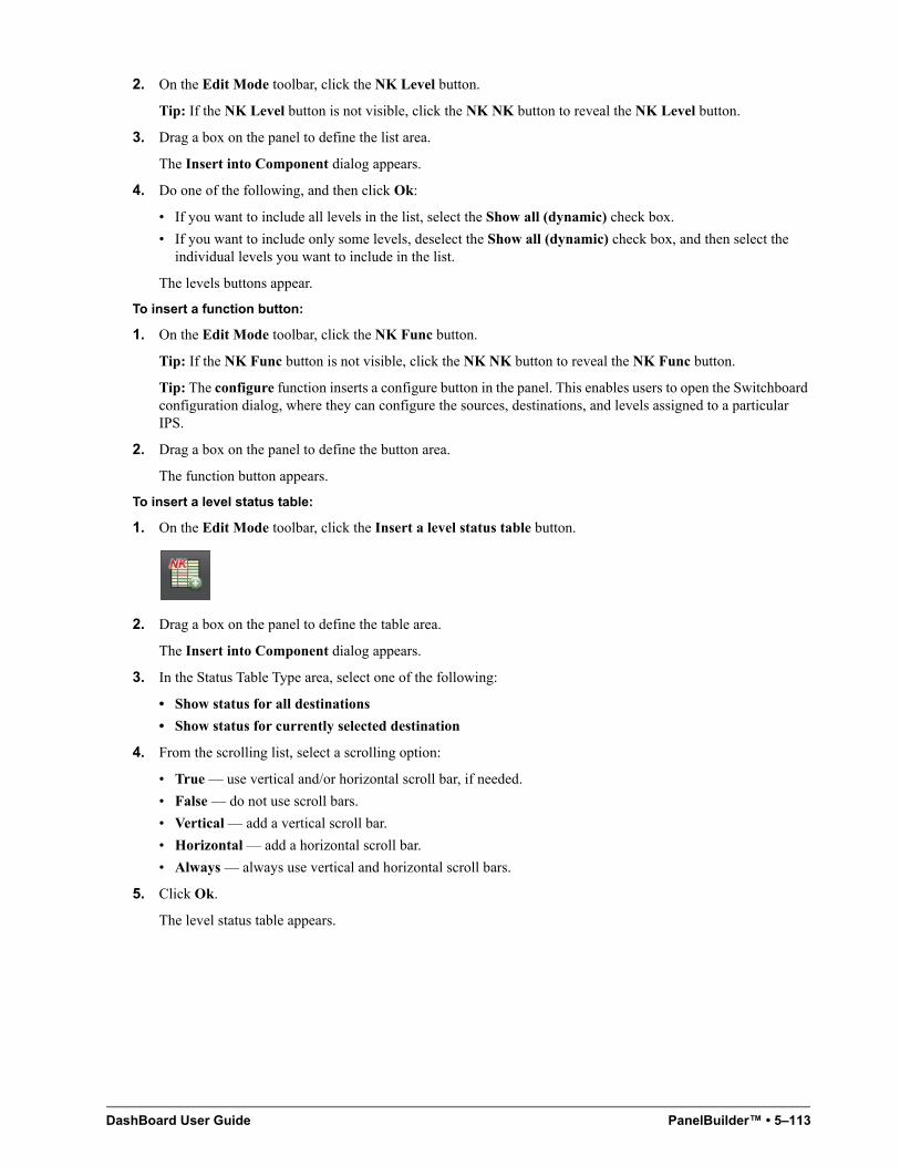
DashBoard User Guide PanelBuilder™ • 5–113
2. On the Edit Mode toolbar, click the NK Level button.
Tip: If the NK Level button is not visible, click the NK NK button to reveal the NK Level button.
3. Drag a box on the panel to define the list area.
The Insert into Component dialog appears.
4. Do one of the following, and then click Ok:
• If you want to include all levels in the list, select the Show all (dynamic) check box.
• If you want to include only some levels, deselect the Show all (dynamic) check box, and then select the individual levels you want to include in the list.
The levels buttons appear.
To insert a function button:
1. On the Edit Mode toolbar, click the NK Func button.
Tip: If the NK Func button is not visible, click the NK NK button to reveal the NK Func button.
Tip: The configure function inserts a configure button in the panel. This enables users to open the Switchboard configuration dialog, where they can configure the sources, destinations, and levels assigned to a particular IPS.
2. Drag a box on the panel to define the button area.
The function button appears.
To insert a level status table:
1. On the Edit Mode toolbar, click the Insert a level status table button.
2. Drag a box on the panel to define the table area.
The Insert into Component dialog appears.
3. In the Status Table Type area, select one of the following:
• Show status for all destinations
• Show status for currently selected destination
4. From the scrolling list, select a scrolling option:
• True — use vertical and/or horizontal scroll bar, if needed.
• False — do not use scroll bars.
• Vertical — add a vertical scroll bar.
• Horizontal — add a horizontal scroll bar.
• Always — always use vertical and horizontal scroll bars.
5. Click Ok.
The level status table appears.

5–114 • PanelBuilder™ DashBoard User Guide
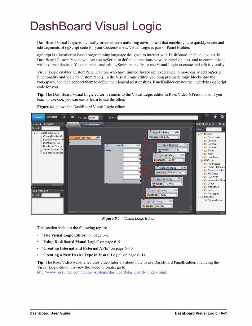
DashBoard User Guide DashBoard Visual Logic • 6–1
DashBoard Visual LogicDashBoard Visual Logic is a visually-oriented code authoring environment that enables you to quickly create and edit segments of ogScript code for your CustomPanels. Visual Logic is part of Panel Builder.
ogScript is a JavaScript-based programming language designed to interact with DashBoard-enabled devices. In DashBoard CustomPanels, you can use ogScript to define interactions between panel objects, and to communicate with external devices. You can create and edit ogScript manually, or use Visual Logic to create and edit it visually.
Visual Logic enables CustomPanel creators who have limited JavaScript experience to more easily add ogScript functionality and logic to CustomPanels. In the Visual Logic editor, you drag pre-made logic blocks into the workspace, and then connect them to define their logical relationships. PanelBuilder creates the underlying ogScript code for you.
Tip: The DashBoard Visual Logic editor is similar to the Visual Logic editor in Ross Video XPression, so if you learn to use one, you can easily learn to use the other.
Figure 6.1 shows the DashBoard Visual Logic editor.
Figure 6.1 - Visual Logic Editor
This section includes the following topics:
• “The Visual Logic Editor” on page 6–2
• “Using DashBoard Visual Logic” on page 6–9
• “Creating Internal and External APIs” on page 6–13
• “Creating a New Device Type in Visual Logic” on page 6–14
Tip: The Ross Video website features video tutorials about how to use DashBoard PanelBuilder, including the Visual Logic editor. To view the video tutorials, go to http://www.rossvideo.com/control-systems/dashboard/dashboard-u/index.html.
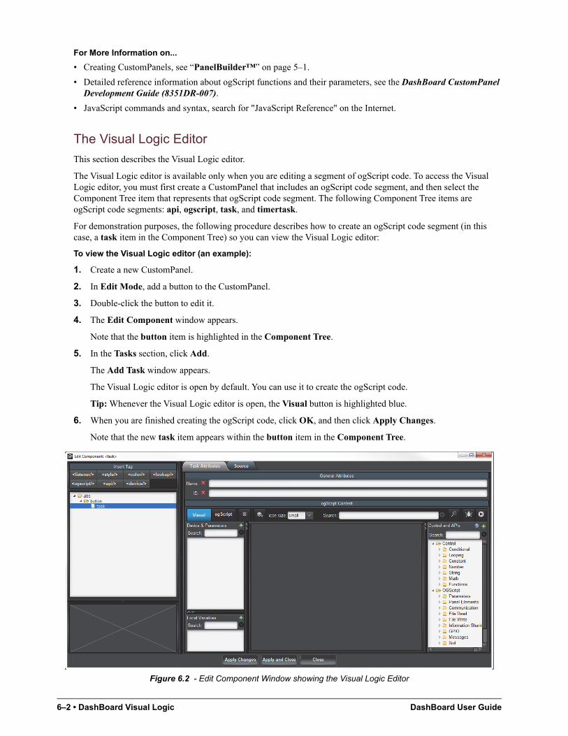
6–2 • DashBoard Visual Logic DashBoard User Guide
For More Information on...
• Creating CustomPanels, see “PanelBuilder™” on page 5–1.
• Detailed reference information about ogScript functions and their parameters, see the DashBoard CustomPanel Development Guide (8351DR-007).
• JavaScript commands and syntax, search for "JavaScript Reference" on the Internet.
The Visual Logic Editor
This section describes the Visual Logic editor.
The Visual Logic editor is available only when you are editing a segment of ogScript code. To access the Visual Logic editor, you must first create a CustomPanel that includes an ogScript code segment, and then select the Component Tree item that represents that ogScript code segment. The following Component Tree items are ogScript code segments: api, ogscript, task, and timertask.
For demonstration purposes, the following procedure describes how to create an ogScript code segment (in this case, a task item in the Component Tree) so you can view the Visual Logic editor:
To view the Visual Logic editor (an example):
1. Create a new CustomPanel.
2. In Edit Mode, add a button to the CustomPanel.
3. Double-click the button to edit it.
4. The Edit Component window appears.
Note that the button item is highlighted in the Component Tree.
5. In the Tasks section, click Add.
The Add Task window appears.
The Visual Logic editor is open by default. You can use it to create the ogScript code.
Tip: Whenever the Visual Logic editor is open, the Visual button is highlighted blue.
6. When you are finished creating the ogScript code, click OK, and then click Apply Changes.
Note that the new task item appears within the button item in the Component Tree.
Figure 6.2 - Edit Component Window showing the Visual Logic Editor
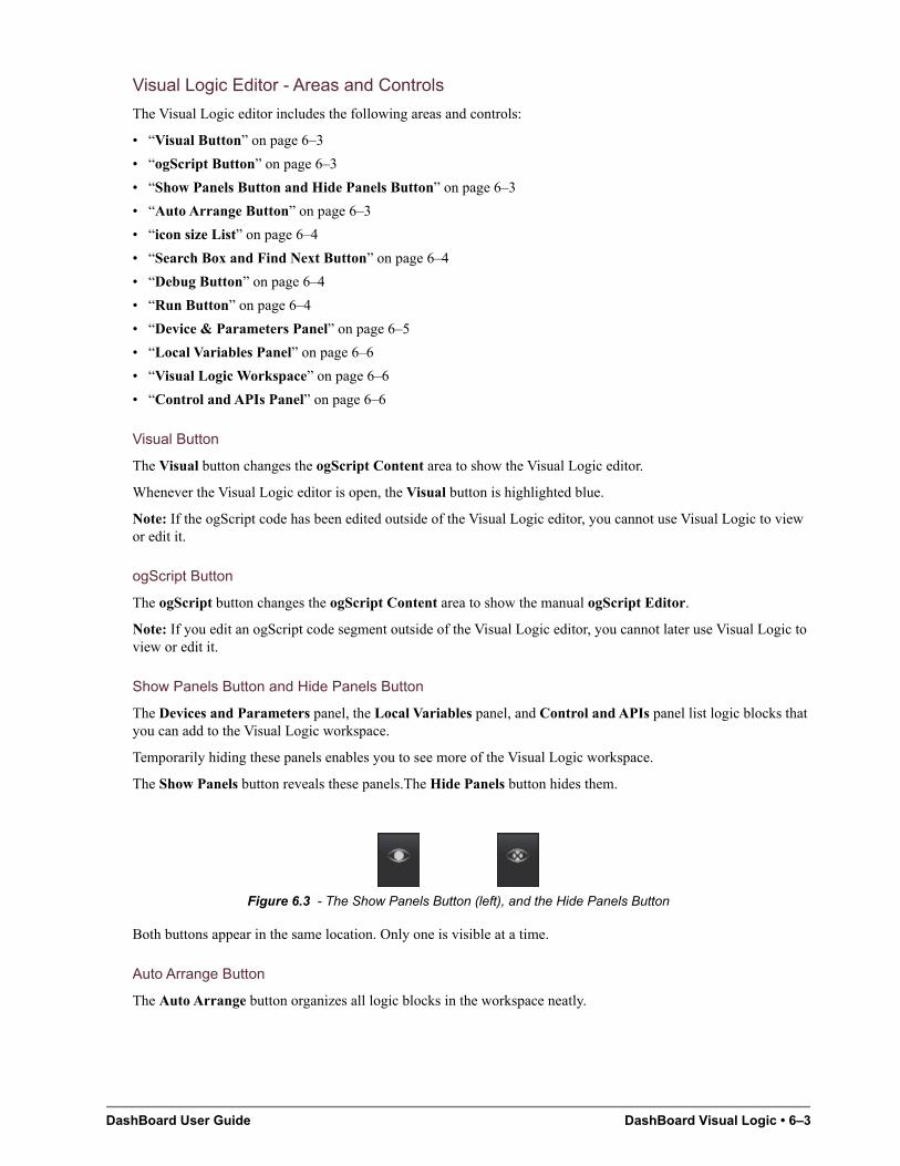
DashBoard User Guide DashBoard Visual Logic • 6–3
Visual Logic Editor - Areas and Controls
The Visual Logic editor includes the following areas and controls:
• “Visual Button” on page 6–3
• “ogScript Button” on page 6–3
• “Show Panels Button and Hide Panels Button” on page 6–3
• “Auto Arrange Button” on page 6–3
• “icon size List” on page 6–4
• “Search Box and Find Next Button” on page 6–4
• “Debug Button” on page 6–4
• “Run Button” on page 6–4
• “Device & Parameters Panel” on page 6–5
• “Local Variables Panel” on page 6–6
• “Visual Logic Workspace” on page 6–6
• “Control and APIs Panel” on page 6–6
Visual Button
The Visual button changes the ogScript Content area to show the Visual Logic editor.
Whenever the Visual Logic editor is open, the Visual button is highlighted blue.
Note: If the ogScript code has been edited outside of the Visual Logic editor, you cannot use Visual Logic to view or edit it.
ogScript Button
The ogScript button changes the ogScript Content area to show the manual ogScript Editor.
Note: If you edit an ogScript code segment outside of the Visual Logic editor, you cannot later use Visual Logic to view or edit it.
Show Panels Button and Hide Panels Button
The Devices and Parameters panel, the Local Variables panel, and Control and APIs panel list logic blocks that you can add to the Visual Logic workspace.
Temporarily hiding these panels enables you to see more of the Visual Logic workspace.
The Show Panels button reveals these panels.The Hide Panels button hides them.
Figure 6.3 - The Show Panels Button (left), and the Hide Panels Button
Both buttons appear in the same location. Only one is visible at a time.
Auto Arrange Button
The Auto Arrange button organizes all logic blocks in the workspace neatly.
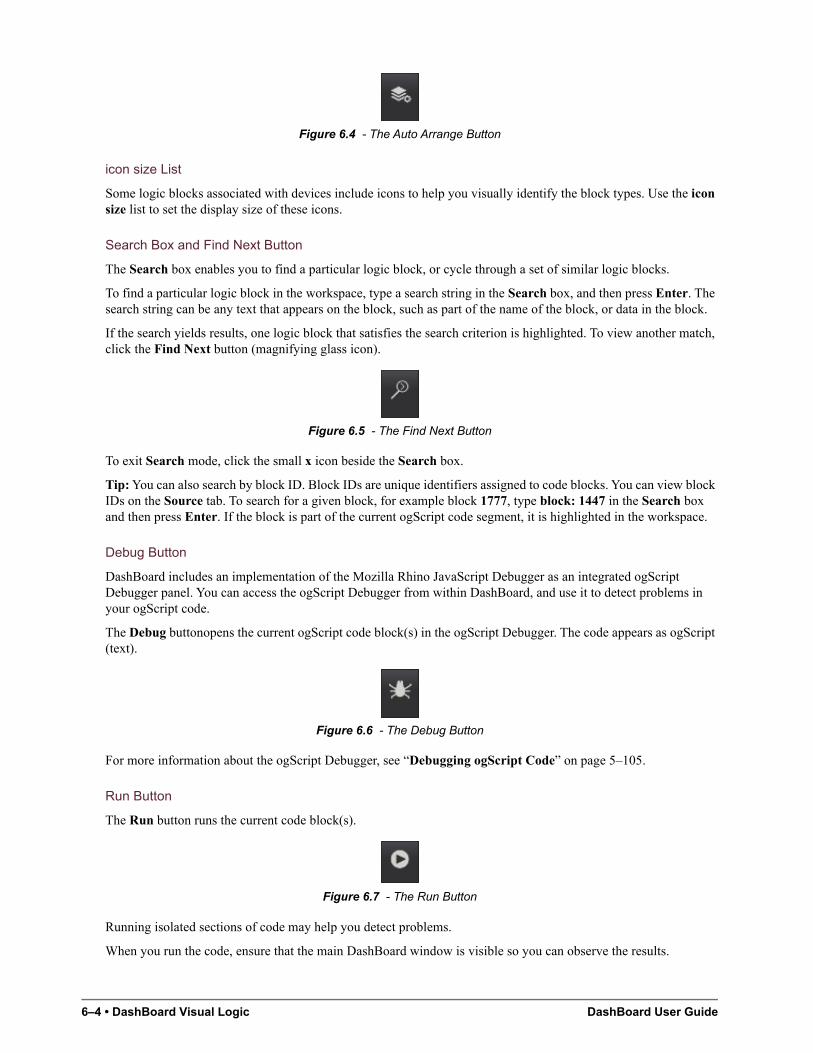
6–4 • DashBoard Visual Logic DashBoard User Guide
Figure 6.4 - The Auto Arrange Button
icon size List
Some logic blocks associated with devices include icons to help you visually identify the block types. Use the icon size list to set the display size of these icons.
Search Box and Find Next Button
The Search box enables you to find a particular logic block, or cycle through a set of similar logic blocks.
To find a particular logic block in the workspace, type a search string in the Search box, and then press Enter. The search string can be any text that appears on the block, such as part of the name of the block, or data in the block.
If the search yields results, one logic block that satisfies the search criterion is highlighted. To view another match, click the Find Next button (magnifying glass icon).
Figure 6.5 - The Find Next Button
To exit Search mode, click the small x icon beside the Search box.
Tip: You can also search by block ID. Block IDs are unique identifiers assigned to code blocks. You can view block IDs on the Source tab. To search for a given block, for example block 1777, type block: 1447 in the Search box and then press Enter. If the block is part of the current ogScript code segment, it is highlighted in the workspace.
Debug Button
DashBoard includes an implementation of the Mozilla Rhino JavaScript Debugger as an integrated ogScript Debugger panel. You can access the ogScript Debugger from within DashBoard, and use it to detect problems in your ogScript code.
The Debug buttonopens the current ogScript code block(s) in the ogScript Debugger. The code appears as ogScript (text).
Figure 6.6 - The Debug Button
For more information about the ogScript Debugger, see “Debugging ogScript Code” on page 5–105.
Run Button
The Run button runs the current code block(s).
Figure 6.7 - The Run Button
Running isolated sections of code may help you detect problems.
When you run the code, ensure that the main DashBoard window is visible so you can observe the results.
DashBoard User Guide DashBoard Visual Logic • 6–5
Device & Parameters Panel
The Devices and Parameters panel lists API functions and parameters associated with devices and panel parameters.
Devices:
• Expand the name of a device to reveal its API functions and/or parameters. You can drag the functions and parameters into the workspace to use them in your ogScript code. The functions and parameters are designed to provide control of the device.
• To add a device to the list, click the green + icon, select a device type, and then specify properties of the device.
• You can add devices from the DashBoard tree, or add a new device of one of the following types: Acuity, CamBot, Carbonite, Graphite, PBus, VDCP, and XPression.
Tip: You can also create an entirely new device type. For more information, see “Creating a New Device Type in Visual Logic” on page 6–14.
6–6 • DashBoard Visual Logic DashBoard User Guide
Panel Parameters:
• Expand Panel Parameters to reveal a list of the parameters available in the CustomPanel. You can drag parameters into the workspace to use them in your ogScript code. Parameter values can be routed to other logic blocks for logical operations.
Note: The Panel Parameters folder is visible only if your CustomPanel includes panel parameters.
• For information about creating new panel parameters, see “Parameters and Data Sources” on page 5–97.
Search:
• The Search box enables you to find API functions or parameters that have names containing the search string.
• To search, type a search string in the Search box, and then press Enter. The list is filtered to show only logic blocks that satisfy the search criterion.
• To exit Search mode and view the entire list, click the small x icon beside the Search box.
Local Variables Panel
The Local Variables panel lists variables that can be used within the current ogScript code block only. You can create local variables. Some logic blocks (such as the for loop block) also create local variables.
To create a new local variable, click the green + icon, specify the variable type, Variable Name, and Initial Value. You can also set the Block Color.
Tip: You can use block colors to group logic blocks visually in the workspace.
Search:
• The Search box enables you to find local variables that have names containing the search string.
• To search, type a search string in the Search box, and then press Enter. The list is filtered to show only those that satisfy the search criterion.
• To exit Search mode and view the entire list, click the small x icon beside the Search box.
Visual Logic Workspace
The central area of the Visual Logic editor is the workspace. This is where you drag in objects (such as parameters, variables, and functions) to create logic blocks, and then link the blocks to establish logical connections between them.
If the segment of ogScript code you are editing has multiple functions, each function appears on a separate tab in the Visual Logic workspace.
Tip: The workspace is usually larger than the available display space. Use the scroll bars on the right and bottom of the workspace to adjust the view.
Control and APIs Panel
The Control and APIs panel lists logic blocks associated with logical operations (controls) and API functions (including ogScript functions).
Control:
The Control folder contains logic blocks that perform logical and mathematical operations. You can use these logic blocks to test conditions (if, switch), set up loops (for, while), parse and manipulate string data, and perform mathematical calculations.
ogScript:
The ogScript folder contains ogScript functions that can get/set parameter values, manipulate panel elements, read and write to files, read/write/parse messages, communicate by HTTP, FTP, UDP, and TCP/IP, and more.
For detailed reference information about ogScript functions, see the DashBoard CustomPanel Development Guide (8351DR-007).
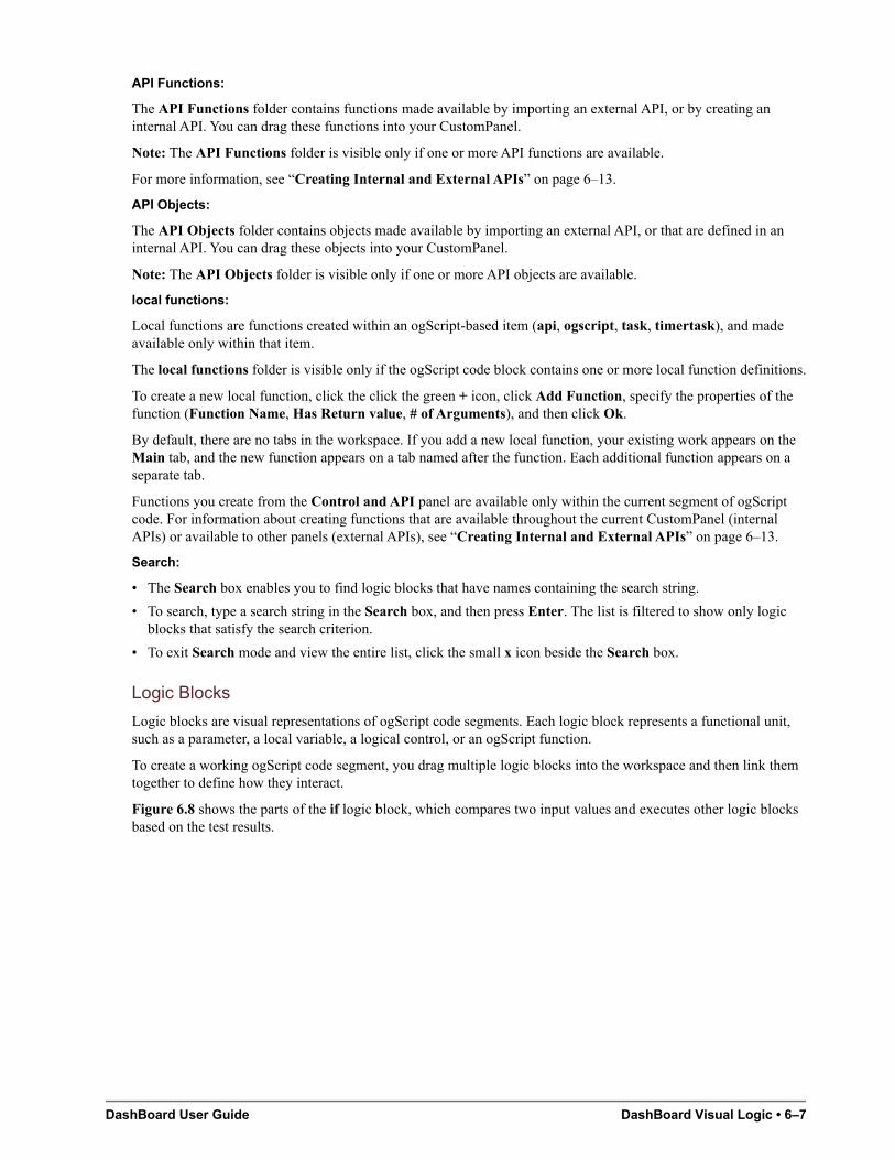
DashBoard User Guide DashBoard Visual Logic • 6–7
API Functions:
The API Functions folder contains functions made available by importing an external API, or by creating an internal API. You can drag these functions into your CustomPanel.
Note: The API Functions folder is visible only if one or more API functions are available.
For more information, see “Creating Internal and External APIs” on page 6–13.
API Objects:
The API Objects folder contains objects made available by importing an external API, or that are defined in an internal API. You can drag these objects into your CustomPanel.
Note: The API Objects folder is visible only if one or more API objects are available.
local functions:
Local functions are functions created within an ogScript-based item (api, ogscript, task, timertask), and made available only within that item.
The local functions folder is visible only if the ogScript code block contains one or more local function definitions.
To create a new local function, click the click the green + icon, click Add Function, specify the properties of the function (Function Name, Has Return value, # of Arguments), and then click Ok.
By default, there are no tabs in the workspace. If you add a new local function, your existing work appears on the Main tab, and the new function appears on a tab named after the function. Each additional function appears on a separate tab.
Functions you create from the Control and API panel are available only within the current segment of ogScript code. For information about creating functions that are available throughout the current CustomPanel (internal APIs) or available to other panels (external APIs), see “Creating Internal and External APIs” on page 6–13.
Search:
• The Search box enables you to find logic blocks that have names containing the search string.
• To search, type a search string in the Search box, and then press Enter. The list is filtered to show only logic blocks that satisfy the search criterion.
• To exit Search mode and view the entire list, click the small x icon beside the Search box.
Logic Blocks
Logic blocks are visual representations of ogScript code segments. Each logic block represents a functional unit, such as a parameter, a local variable, a logical control, or an ogScript function.
To create a working ogScript code segment, you drag multiple logic blocks into the workspace and then link them together to define how they interact.
Figure 6.8 shows the parts of the if logic block, which compares two input values and executes other logic blocks based on the test results.
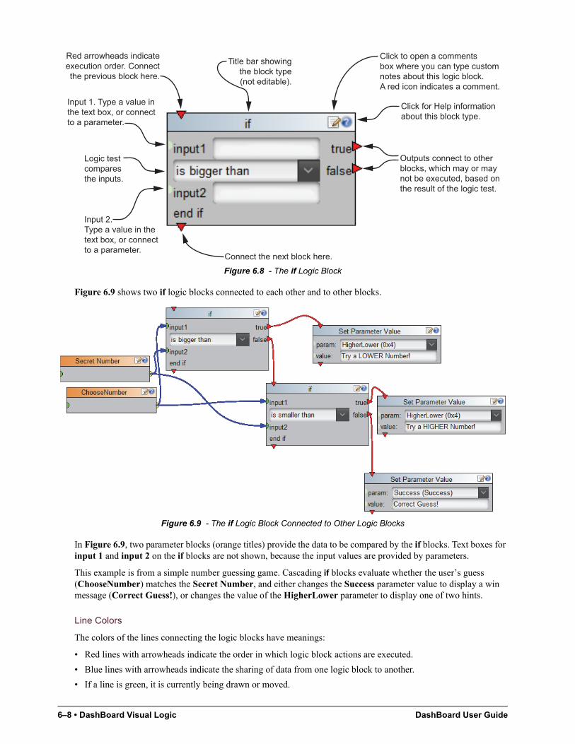
6–8 • DashBoard Visual Logic DashBoard User Guide
Figure 6.8 - The if Logic Block
Figure 6.9 shows two if logic blocks connected to each other and to other blocks.
Figure 6.9 - The if Logic Block Connected to Other Logic Blocks
In Figure 6.9, two parameter blocks (orange titles) provide the data to be compared by the if blocks. Text boxes for input 1 and input 2 on the if blocks are not shown, because the input values are provided by parameters.
This example is from a simple number guessing game. Cascading if blocks evaluate whether the user’s guess (ChooseNumber) matches the Secret Number, and either changes the Success parameter value to display a win message (Correct Guess!), or changes the value of the HigherLower parameter to display one of two hints.
Line Colors
The colors of the lines connecting the logic blocks have meanings:
• Red lines with arrowheads indicate the order in which logic block actions are executed.
• Blue lines with arrowheads indicate the sharing of data from one logic block to another.
• If a line is green, it is currently being drawn or moved.
Red arrowheads indicateexecution order. Connectthe previous block here.
Connect the next block here.
Title bar showingthe block type(not editable).
Click to open a commentsbox where you can type customnotes about this logic block.A red icon indicates a comment.
Click for Help informationabout this block type.
Outputs connect to otherblocks, which may or maynot be executed, based onthe result of the logic test.
Logic testcomparesthe inputs.
Input 1. Type a value inthe text box, or connectto a parameter.
Input 2.Type a value in thetext box, or connectto a parameter.
DashBoard User Guide DashBoard Visual Logic • 6–9
Data Inputs and Outputs
A green dot on the left side of a logic block indicates a data input.
A yellow dot on the right side of a logic block indicates a data output.
Data inputs and outputs appear on almost every type of logic block, including parameter blocks, local variable blocks, math blocks, most control blocks, most device blocks, and all ogScript blocks.
Data can come from parameters, local variables, and math blocks. Some blocks also accept typed input, or provide a drop-down list of valid values.
To share data from one logic block to another, click and drag from a data output point (yellow dot) on one block to a data input point (green dot) on another block. You can share data from one block to multiple other blocks.
Linking Blocks in Sequence
It is often important to make one operation occur before another. You can link logic blocks to define their order.
Red arrowheads on the top and bottom of a logic block are connection points. To arrange two blocks in order, click and drag from the bottom connection point of the first block to the top connection point of the second block.
Some blocks have red arrowheads on their right sides. These blocks can execute other blocks. For example, a block that contains a logic test can execute other blocks based on the result of the test. Each possible test result has a connection point. Blocks connected to one of these points may or may not be executed, depending on the result of the logic test.
Block Colors
The title bars of logic blocks are colored, to visually group the blocks. By default, parameter blocks are orange and all other blocks are light blue. When you add a device or create a local variable, you can specify its block color.
Using DashBoard Visual Logic
This section describes how to use the DashBoard visual Logic editor to add ogScript functionality to your panels.
Tip: The DashBoard Visual Logic editor is also a handy tool for learning ogScript syntax. You can add and connect blocks in the Visual Logic editor, then view the resulting ogScript code on the Source tab.
Topics in this section include:
• “Creating and Populating a New CustomPanel” on page 6–10
• “Editing ogScript Code in Existing CustomPanels” on page 6–10
• “Importing External APIs from Saved Files” on page 6–10
• “Adding ogScript-Based Items to the Component Tree” on page 6–11
• “Adding and Linking Logic Blocks” on page 6–12
• “Adding Devices” on page 6–12
• “Adding Panel Parameters” on page 6–12
• “Adding Local Variables” on page 6–12
• “Adding Logical Controls and Math Operations” on page 6–13
• “Creating New Functions” on page 6–13
6–10 • DashBoard Visual Logic DashBoard User Guide
Creating and Populating a New CustomPanel
The DashBoard Visual Logic editor helps you create ogScript code segments to add functionality to components in CustomPanels. Before you can use Visual Logic, you have to create the CustomPanel components that the ogScript code will manipulate.
To create and populate a CustomPanel:
1. Create a new CustomPanel.
The panel can be any type, but if you want to use parameters, it must include a data source.
For more information, see “Creating a CustomPanel” on page 5–8.
2. Populate the panel with components you want to include, such as buttons, labels, parameters, and timers.
For more information, see “Adding Basic Components” on page 5–19, “Adding Data-Backed Components” on page 5–40, and “Timers” on page 5–49.
3. If you want to control or monitor a device that appears in the basic tree, add any device control from the device to your CustomPanel. All the device’s functions and parameters are made available.
For more information about how to add a device control to your CustomPanel, see “Adding Device Editors, Device Summaries, and Device Controls” on page 5–16.
Editing ogScript Code in Existing CustomPanels
You can edit ogScript code segments in existing panels. If the code was created using Visual Logic and was never edited manually, you can edit it in the Visual Logic editor. Otherwise, it can be edited manually only.
This section describes how to access ogScript code segments associated with existing CustomPanel components and Component Tree items.
To access existing ogScript code segments:
1. Open the CustomPanel.
2. Press Ctrl+g or click the PanelBuilder Edit Mode button to enter Edit Mode.
3. Double-click the panel to open the Edit Component window.
4. In the Component Tree, click the item you want to edit.
The following types of Component Tree items are ogScript code segments: api, ogscript, task, timertask.
On the Attributes tab for the item, the ogScript is available for editing. If the Visual button is blue, the ogScript was created and edited only in Visual Logic, and can be edited in the Visual Logic editor. If the ogScript button is blue, the code can be edited manually only.
Tip: When you are finished editing the ogScript code, be sure to Apply Changes.
Importing External APIs from Saved Files
You can import external API script files into your CustomPanel. Importing an API enables you to call the API functions from your CustomPanel. They become available in the Visual Logic editor.
Note: External API script files are imported by reference, so if the original API script file changes, your CustomPanel may be affected.
To import an external API
1. In your CustomPanel, in Edit Mode, double-click the CustomPanel.
The Edit Component window appears.
2. In the Component Tree, click the top-level container item (usually abs).
DashBoard User Guide DashBoard Visual Logic • 6–11
3. In the Insert Tags area, click the <api/> button.
An api item appears within a meta folder below the selected container.
4. On the Api Attributes tab, in the General Attributes section, specify a Name and an ID for the api item.
5. Beside the Script File Location box, click Browse, browse to the API script file, and then click Open.
Tip: API script file names typically have a .ogscript file extension.
6. Click Apply Changes.
The functions from the imported API script file are available in the Control and APIs panel of the Visual Logic editor.
Adding ogScript-Based Items to the Component Tree
The following types of Component Tree items can include ogScript code segments created using the Visual Logic editor:
• api items (<api/> tags)
• ogscript items (<ogscript> tags)
• task items (ogScript tasks can be assigned to buttons, labels, parameters, and listeners)
• timertask items (ogScript tasks can be assigned to timers)
To add an ogScript-based item to the Component Tree:
• To create a standalone segment of ogScript code that can be referenced from within the panel:
a. In the Component Tree, click the container item where you want the ogScript-based item to appear.
b. In the Insert Tag area above the Component Tree, click the <ogScript/> button.
A new ogscript item appears in the Component Tree.
The Visual Logic editor appears.
c. In the General Attributes area, specify a Name and ID for the ogScript code segment.
• To create ogScript code for a new ogScript task assigned to an existing button, label, parameter, timer, or listener:
a. In the Component Tree, click the item to which you want to assign the new ogScript task (button, label, parameter, timer, or listener).
The Edit Component window appears.
b. In the Tasks area, click Add.
The Add Task window appears, with the Task Type set to ogScript and the Visual Logic editor open by default.
• To create an API with callable functions:
a. In the Component Tree, click the container item where you want the new API to appear.
b. In the Insert Tag area above the Component Tree, click the <api/> button.
A new api item appears in the Component Tree.
The Visual Logic editor appears.
c. On the Api Attributes tab, in the General Attributes area, specify a Name and an ID for the new API.
d. If you want the script in the API to be executed immediately, before the rest of the panel is loaded, select the Execute Immediately check box.
When this option is selected, the script in the <api/> tag is evaluated as soon as it is reached, during the panel build process. This allows the script to create global functions that can be called from anywhere in the
6–12 • DashBoard Visual Logic DashBoard User Guide
panel, create new parameters on the fly, and modify constraints of parameters even before they are displayed.
For more information about creating an API, see “Creating Internal and External APIs” on page 6–13.
Adding and Linking Logic Blocks
To create ogScript code segments in Visual Logic, you drag logic blocks into the workspace and then link them to define their logical relationships.
You can drag logic blocks into the workspace from the Devices and Parameters panel, the Local Variables panel, and the Control and APIs panel.
Tip: As an alternative to dragging, you can double-click the logic block to add it to the workspace.
To link logic blocks, you click and drag from a connection point on one block, to a connection point on another block.
For more information about working with logic blocks, see “Logic Blocks” on page 6–7.
Adding Devices
Several Ross Video devices and other DashBoard-enabled devices expose functions and parameters you can use in your CustomPanels. The functions and parameters are designed to enable you to monitor and control the devices.
The Devices and Parameters tree lists API functions and parameters associated with devices and panel parameters.You can add devices from the Basic Tree, or add Ross Video device type templates and connect them to real devices later.
To add a device to the Devices and Parameters tree:
• In the Devices and Parameters panel, click the green + icon, select a device type, and then specify properties of the device.
• You can add devices from the DashBoard Basic Tree, or add a device template of one of the following types: Acuity, CamBot, Carbonite, Graphite, PBus, VDCP, and XPression.
Tip: You can also create an entirely new device type. For more information, see “Creating a New Device Type in Visual Logic” on page 6–14.
Adding Panel Parameters
Panel parameters are listed in the Devices and Parameters tree. Expand the Panel Parameters folder to reveal a list of the parameters available in the CustomPanel.
You can drag parameters into the workspace to use them in your ogScript code. Parameter values can be routed to other logic blocks for logical operations.
For more information about parameters, see “Parameters and Data Sources” on page 5–97.
Adding Local Variables
You can create local variables. Some logic blocks (such as the for loop block) also create local variables.
Local variables can be dragged from the Local Variables panel into the Visual Logic workspace.
The scope of local variables is restricted to the current function.
To create a local variable:
• In the Local Variables panel, click the green + icon, select a variable type, and then specify properties of the variable.
Local variable types include Boolean, Date, Generic Variable, Number, and String.
DashBoard User Guide DashBoard Visual Logic • 6–13
Adding Logical Controls and Math Operations
The Control folder contains logic blocks that perform logical and mathematical operations.
You can use these logic blocks to test conditions (if, switch), set up loops (for, while), parse and manipulate string data, and perform mathematical calculations.
Creating New Functions
From the Control and APIs panel, you can create a new function that is available within the current segment of ogScript code.
Functions created in the Control and APIs panel appear in a folder named local functions. They are available only within the current segment of ogScript code. For information about creating functions that are available throughout the current CustomPanel (internal APIs) or available to other panels (external APIs), see “Creating Internal and External APIs” on page 6–13.
By default, there are no tabs in the workspace. If you add a new function, your existing work appears on the Main tab, and the new function appears on a tab named after the function. Each additional function appears on a separate tab.
To create a new function, click the click the green + icon, click Add Function, specify the properties of the function (Function Name, Has Return value, # of Arguments), and then click Ok.
Using Functions
In the Control and APIs folder, the following function folders contain functions you can drag into the workspace:
• ogScript — Contains functions developed by Ross Video to interact with DashBoard-enabled devices. ogScript is a subset of JavaScript, with PanelBuilder-specific functions added.
For detailed reference information about ogScript functions and their parameters, see the DashBoard CustomPanel Development Guide (8351DR-007).
• API Functions — Contains functions imported from an external API.
The API Functions folder is visible only if one or more external APIs have been added to the CustomPanel.
For more information, see “Importing External APIs from Saved Files” on page 6–10.
• API Objects — Contains objects imported from an external API.
The API Objects folder is visible only if one or more external APIs have been added to the CustomPanel.
For more information, see “Importing External APIs from Saved Files” on page 6–10.
• local functions — Contains functions that are available only within the current segment of ogScript code.
The local functions folder is visible only if the current segment of ogScript code contains one or more function definitions.
For more information, see “Creating New Functions” on page 6–13.
Creating Internal and External APIs
A DashBoard API is a collection of ogScript functions:
• An internal API exists within a CustomPanel. Its functions are available only within its CustomPanel.
• An external API is stored in a separate API script file, which can be referenced by any CustomPanel that can access the API script file.
You can create APIs to facilitate reuse of your custom functions.
6–14 • DashBoard Visual Logic DashBoard User Guide
Internal APIs
An internal API contains functions that are made available within the current CustomPanel.
To create an internal API:
1. In the Component Tree, in the Insert Tag area, click <api/>.
The Visual Logic editor appears. A new api item appears in the Component Tree.
2. Create one or more new functions, giving each a meaningful name so they are easily referenced from other parts of the CustomPanel.
For more information, see “Creating New Functions” on page 6–13.
The functions are automatically made available to be used in any segment of ogScript within the CustomPanel.
External APIs
An external API contains functions that are stored in an API script file, which can be referenced by any CustomPanel that can access the API script file.
The API script file must be a text file containing only valid ogScript (JavaScript).
To create an external API:
1. Create valid ogScript code that you want to save as your external API:
• Using a text editor — You can use any text editing or code editing tool.
• Using DashBoard — You can write the code in the ogScript Editor, or use Visual Logic editor and then view the code on the Source tab. Copy the code and paste it into a text editor.
2. Save the API script file.
You can use any file extension, but we recommend using .ogscript. For example, myAPI.ogscript.
3. Place the file on the same network as the DashBoard computers that will use the API.
Creating a New Device Type in Visual Logic
The DashBoard Visual Logic editor enables you to add several existing device types to the Devices and Parameters tree so you can control them. For more information, see “Adding Devices” on page 6–12.
You can also create completely new device types, to control other devices not available by default.
This section describes how to create new device types, including logic blocks.
Note: This is an advanced topic. Most users will never need to add new device types. Knowledge about authoring XML files is useful for understanding this section.
About Adding Devices
In the Visual Logic editor, you can add devices with which you want to work to the Devices and Parameters tree. To do so, you click + and select the type of device you want to add.
Figure 6.10 shows a list of the device types available by default.
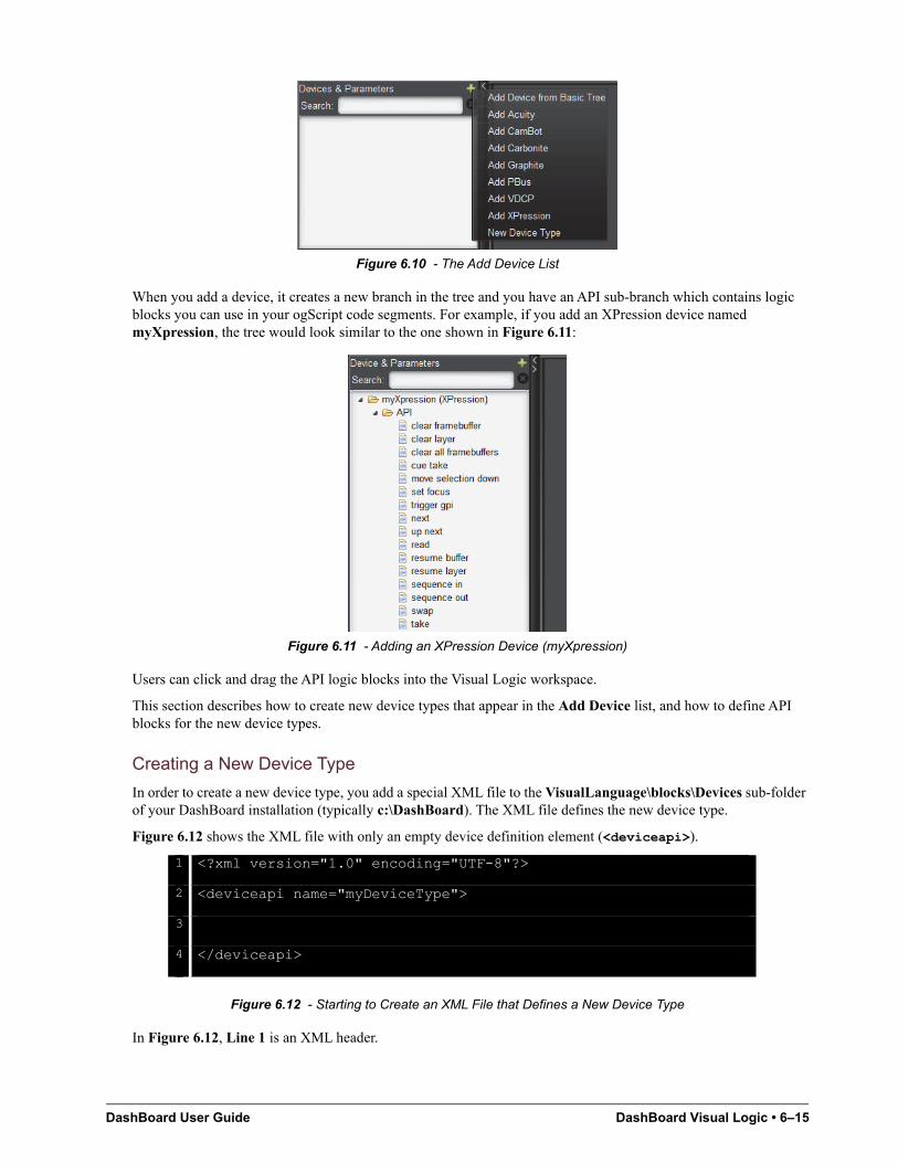
DashBoard User Guide DashBoard Visual Logic • 6–15
Figure 6.10 - The Add Device List
When you add a device, it creates a new branch in the tree and you have an API sub-branch which contains logic blocks you can use in your ogScript code segments. For example, if you add an XPression device named myXpression, the tree would look similar to the one shown in Figure 6.11:
Figure 6.11 - Adding an XPression Device (myXpression)
Users can click and drag the API logic blocks into the Visual Logic workspace.
This section describes how to create new device types that appear in the Add Device list, and how to define API blocks for the new device types.
Creating a New Device Type
In order to create a new device type, you add a special XML file to the VisualLanguage\blocks\Devices sub-folder of your DashBoard installation (typically c:\DashBoard). The XML file defines the new device type.
Figure 6.12 shows the XML file with only an empty device definition element (<deviceapi>).
Figure 6.12 - Starting to Create an XML File that Defines a New Device Type
In Figure 6.12, Line 1 is an XML header.
1 <?xml version="1.0" encoding="UTF-8"?>
2 <deviceapi name="myDeviceType">
3
4 </deviceapi>
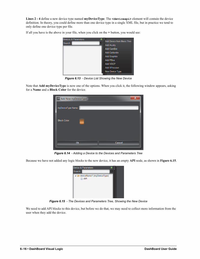
6–16 • DashBoard Visual Logic DashBoard User Guide
Lines 2 - 4 define a new device type named myDeviceType. The <deviceapi> element will contain the device definition. In theory, you could define more than one device type in a single XML file, but in practice we tend to only define one device type per file.
If all you have is the above in your file, when you click on the + button, you would see:
Figure 6.13 - Device List Showing the New Device
Note that Add myDeviceType is now one of the options. When you click it, the following window appears, asking for a Name and a Block Color for the device.
Figure 6.14 - Adding a Device to the Devices and Parameters Tree
Because we have not added any logic blocks to the new device, it has an empty API node, as shown in Figure 6.15.
Figure 6.15 - The Devices and Parameters Tree, Showing the New Device
We need to add API blocks to this device, but before we do that, we may need to collect more information from the user when they add the device.
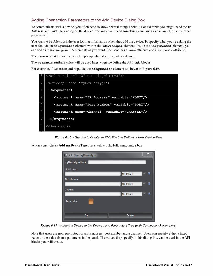
DashBoard User Guide DashBoard Visual Logic • 6–17
Adding Connection Parameters to the Add Device Dialog Box
To communicate with a device, you often need to know several things about it. For example, you might need the IP Address and Port. Depending on the device, you may even need something else (such as a channel, or some other parameter).
You want to be able to ask the user for that information when they add the device. To specify what you’re asking the user for, add an <arguments> element within the <deviceapi> element. Inside the <arguments> element, you can add as many <argument> elements as you want. Each one has a name attribute and a variable attribute.
The name is what the user sees in the popup when she or he adds a device.
The variable attribute value will be used later when we define the API logic blocks.
For example, if we create and populate the <arguments> element as shown in Figure 6.16.
Figure 6.16 - Starting to Create an XML File that Defines a New Device Type
When a user clicks Add myDeviceType, they will see the following dialog box:
Figure 6.17 - Adding a Device to the Devices and Parameters Tree (with Connection Parameters)
Note that users are now prompted for an IP address, port number and a channel. Users can specify either a fixed value or the value from a parameter in the panel. The values they specify in this dialog box can be used in the API blocks you will create.
1 <?xml version="1.0" encoding="UTF-8"?>
2 <deviceapi name="myDeviceType">
3 <arguments>
4 <argument name="IP Address" variable="HOST"/>
5 <argument name="Port Number" variable="PORT"/>
6 <argument name="Channel" variable="CHANNEL"/>
7 </arguments>
8 </deviceapi>
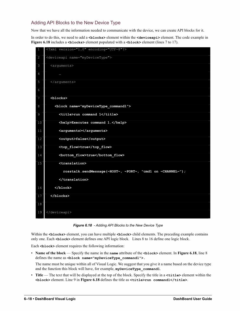
6–18 • DashBoard Visual Logic DashBoard User Guide
Adding API Blocks to the New Device Type
Now that we have all the information needed to communicate with the device, we can create API blocks for it.
In order to do this, we need to add a <blocks> element within the <deviceapi> element. The code example in Figure 6.18 includes a <blocks> element populated with a <block> element (lines 7 to 17).
Figure 6.18 - Adding API Blocks to the New Device Type
Within the <blocks> element, you can have multiple <block> child elements. The preceding example contains only one. Each <block> element defines one API logic block. Lines 8 to 16 define one logic block.
Each <block> element requires the following information:
• Name of the block — Specify the name in the name attribute of the <block> element. In Figure 6.18, line 8 defines the name as <block name="myDeviceType_command1">.
The name must be unique within all of Visual Logic. We suggest that you give it a name based on the device type and the function this block will have, for example, myDeviceType_command1.
• Title — The text that will be displayed at the top of the block. Specify the title in a <title> element within the <block> element. Line 9 in Figure 6.18 defines the title as <title>run command1</title>.
1 <?xml version="1.0" encoding="UTF-8"?>
2 <deviceapi name="myDeviceType">
3 <arguments>
4 …
5 </arguments>
6
7 <blocks>
8 <block name="myDeviceType_command1">
9 <title>run command 1</title>
10 <help>Executes command 1.</help>
11 <arguments></arguments>
12 <output>false</output>
13 <top_flow>true</top_flow>
14 <bottom_flow>true</bottom_flow>
15 <translation>
rosstalk.sendMessage(~HOST~, ~PORT~, "cmd1 on ~CHANNEL~");
</translation>
16 </block>
17 </blocks>
18
19 </deviceapi>
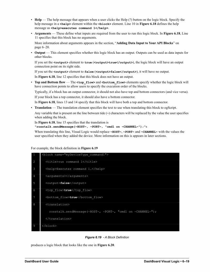
DashBoard User Guide DashBoard Visual Logic • 6–19
• Help — The help message that appears when a user clicks the Help (?) button on the logic block. Specify the help message in a <help> element within the <block> element. Line 10 in Figure 6.18 defines the help message as <help>executes command 1</help>.
• Arguments — These define what inputs are required from the user to run this logic block. In Figure 6.18, Line 11 specifies that this block has no arguments.
More information about arguments appears in the section, “Adding Data Input to Your API Blocks” on page 6–20.
• Output — This element specifies whether this logic block has an output. Outputs can be used as data inputs for other blocks.
If you set the <output> element to true (<output>true</output>), the logic block will have an output connection point on its right side.
If you set the <output> element to false (<output>false</output>), it will have no output.
In Figure 6.18, line 12 specifies that this block does not have an output.
• Top and Bottom flow — The <top_flow> and <bottom_flow> elements specify whether the logic block will have connection points to allow users to specify the execution order of the blocks.
Typically, if a block has an output connector, it should not also have top and bottom connectors (and vice versa).
If your block has a top connector, it should also have a bottom connector.
In Figure 6.18, lines 13 and 14 specify that this block will have both a top and bottom connector.
• Translation — The translation element specifies the text to use when translating this block to ogScript.
Any variable that is present on the line between tide (~) characters will be replaced by the value the user specifies when adding the block.
In Figure 6.18, line 15 specifies that the translation is "rosstalk.sendMessage(~HOST~, ~PORT~, "cmd1 on ~CHANNEL~");"s
When translating this line, Visual Logic would replace ~HOST~, ~PORT~ and ~CHANNEL~ with the values the user specified when they added the device. More information on this is appears in later sections.
For example, the block definition in Figure 6.19
Figure 6.19 - A Block Definition
produces a logic block that looks like the one in Figure 6.20.
1 <block name="myDeviceType_command1">
2 <title>run command 1</title>
3 <help>Executes command 1.</help>
4 <arguments></arguments>
5 <output>false</output>
6 <top_flow>true</top_flow>
7 <bottom_flow>true</bottom_flow>
8 <translation>
rosstalk.sendMessage(~HOST~, ~PORT~, "cmd1 on ~CHANNEL~");
</translation>
9 </block>
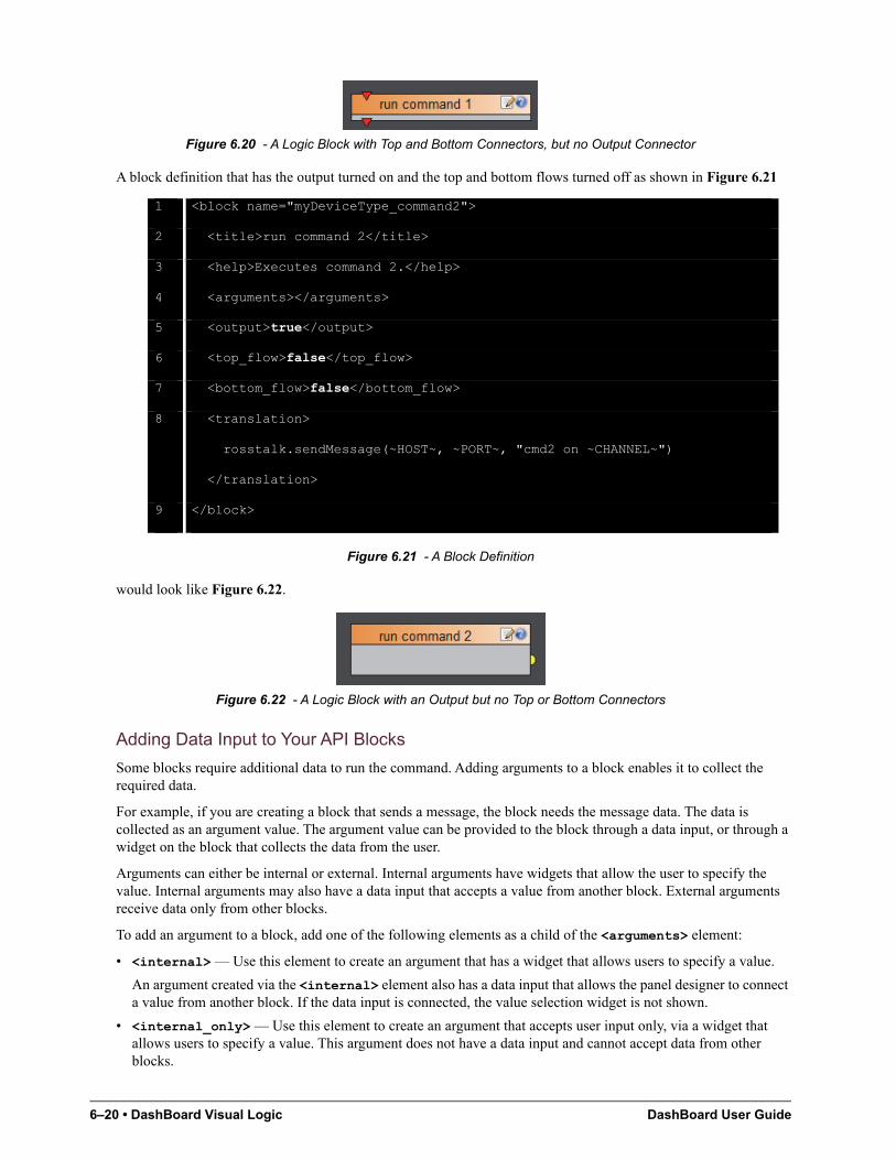
6–20 • DashBoard Visual Logic DashBoard User Guide
Figure 6.20 - A Logic Block with Top and Bottom Connectors, but no Output Connector
A block definition that has the output turned on and the top and bottom flows turned off as shown in Figure 6.21
Figure 6.21 - A Block Definition
would look like Figure 6.22.
Figure 6.22 - A Logic Block with an Output but no Top or Bottom Connectors
Adding Data Input to Your API Blocks
Some blocks require additional data to run the command. Adding arguments to a block enables it to collect the required data.
For example, if you are creating a block that sends a message, the block needs the message data. The data is collected as an argument value. The argument value can be provided to the block through a data input, or through a widget on the block that collects the data from the user.
Arguments can either be internal or external. Internal arguments have widgets that allow the user to specify the value. Internal arguments may also have a data input that accepts a value from another block. External arguments receive data only from other blocks.
To add an argument to a block, add one of the following elements as a child of the <arguments> element:
• <internal> — Use this element to create an argument that has a widget that allows users to specify a value.
An argument created via the <internal> element also has a data input that allows the panel designer to connect a value from another block. If the data input is connected, the value selection widget is not shown.
• <internal_only> — Use this element to create an argument that accepts user input only, via a widget that allows users to specify a value. This argument does not have a data input and cannot accept data from other blocks.
1 <block name="myDeviceType_command2">
2 <title>run command 2</title>
3 <help>Executes command 2.</help>
4 <arguments></arguments>
5 <output>true</output>
6 <top_flow>false</top_flow>
7 <bottom_flow>false</bottom_flow>
8 <translation>
rosstalk.sendMessage(~HOST~, ~PORT~, "cmd2 on ~CHANNEL~")
</translation>
9 </block>
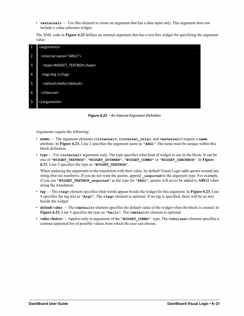
DashBoard User Guide DashBoard Visual Logic • 6–21
• <external> — Use this element to create an argument that has a data input only. This argument does not include a value selection widget.
The XML code in Figure 6.23 defines an internal argument that has a text box widget for specifying the argument value:
Figure 6.23 - An Internal Argument Definition
Arguments require the following:
• name — The argument elements (<internal>, <internal_only>, and <external>) require a name attribute. In Figure 6.23, Line 2 specifies the argument name as "ARG1" The name must be unique within this block definition.
• type — For <internal> arguments only. The type specifies what kind of widget to use in the block. It can be one of "WIDGET_TEXTBOX", "WIDGET_SPINNER", "WIDGET_COMBO" or "WIDGET_CHECKBOX". In Figure 6.23, Line 3 specifies the type as "WIDGET_TEXTBOX".
When replacing the arguments in the translation with their value, by default Visual Logic adds quotes around any string (but not numbers). If you do not want the quotes, append _unquoted to the argument type. For example, if you use "WIDGET_TEXTBOX_unquoted" as the type for "ARG1", quotes will never be added to ARG1 when doing the translation.
• tag — The <tag> element specifies what words appear beside the widget for this argument. In Figure 6.23, Line 4 specifies the tag text as "Arg1". The <tag> element is optional. If no tag is specified, there will be no text beside the widget.
• default value — The <default> element specifies the default value of the widget when the block is created. In Figure 6.23, Line 5 specifies the type as "hello". The <default> element is optional.
• value choices — Applies only to arguments of the "WIDGET_COMBO" type. The <choices> element specifies a comma-separated list of possible values from which the user can choose.
1 <arguments>
2 <internal name="ARG1">
3 <type>WIDGET_TEXTBOX</type>
4 <tag>Arg 1</tag>
5 <default>hello</default>
6 </internal>
3 </arguments>
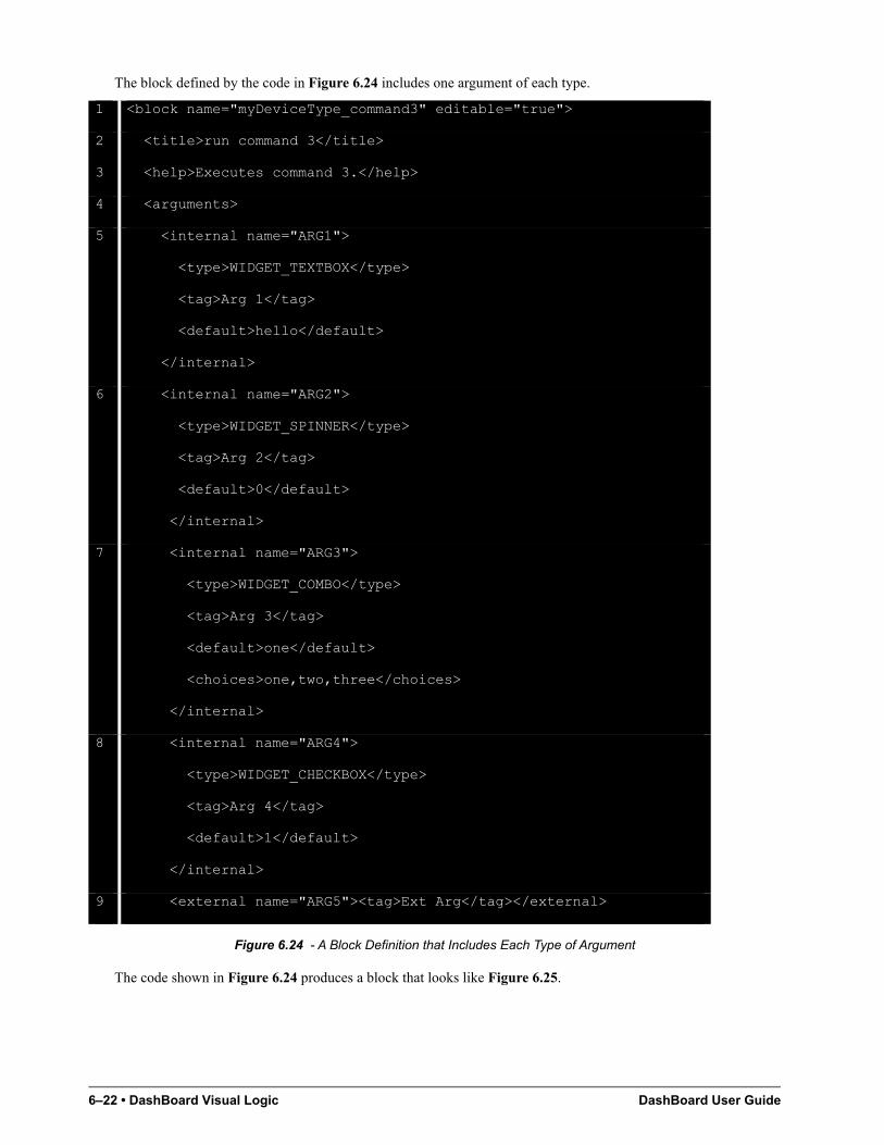
6–22 • DashBoard Visual Logic DashBoard User Guide
The block defined by the code in Figure 6.24 includes one argument of each type.
Figure 6.24 - A Block Definition that Includes Each Type of Argument
The code shown in Figure 6.24 produces a block that looks like Figure 6.25.
1 <block name="myDeviceType_command3" editable="true">
2 <title>run command 3</title>
3 <help>Executes command 3.</help>
4 <arguments>
5 <internal name="ARG1">
<type>WIDGET_TEXTBOX</type>
<tag>Arg 1</tag>
<default>hello</default>
</internal>
6 <internal name="ARG2">
<type>WIDGET_SPINNER</type>
<tag>Arg 2</tag>
<default>0</default>
</internal>
7 <internal name="ARG3">
<type>WIDGET_COMBO</type>
<tag>Arg 3</tag>
<default>one</default>
<choices>one,two,three</choices>
</internal>
8 <internal name="ARG4">
<type>WIDGET_CHECKBOX</type>
<tag>Arg 4</tag>
<default>1</default>
</internal>
9 <external name="ARG5"><tag>Ext Arg</tag></external>
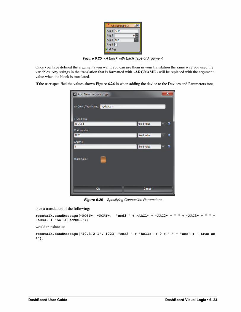
DashBoard User Guide DashBoard Visual Logic • 6–23
Figure 6.25 - A Block with Each Type of Argument
Once you have defined the arguments you want, you can use them in your translation the same way you used the variables. Any strings in the translation that is formatted with ~ARGNAME~ will be replaced with the argument value when the block is translated.
If the user specified the values shown Figure 6.26 in when adding the device to the Devices and Parameters tree,
Figure 6.26 - Specifying Connection Parameters
then a translation of the following:
rosstalk.sendMessage(~HOST~, ~PORT~, "cmd3 " + ~ARG1~ + ~ARG2~ + " " + ~ARG3~ + " " + ~ARG4~ + "on ~CHANNEL~");
would translate to:
rosstalk.sendMessage("10.3.2.1", 1023, "cmd3 " + "hello" + 0 + " " + "one" + " true on 4");
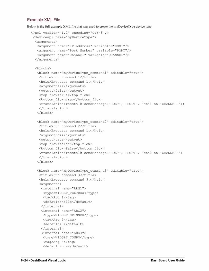
6–24 • DashBoard Visual Logic DashBoard User Guide
Example XML File
Below is the full example XML file that was used to create the myDeviceType device type.
<?xml version="1.0" encoding="UTF-8"?> <deviceapi name="myDeviceType"> <arguments> <argument name="IP Address" variable="HOST"/> <argument name="Port Number" variable="PORT"/> <argument name="Channel" variable="CHANNEL"/> </arguments>
<blocks> <block name="myDeviceType_command1" editable="true"> <title>run command 1</title> <help>Executes command 1.</help> <arguments></arguments> <output>false</output> <top_flow>true</top_flow> <bottom_flow>true</bottom_flow> <translation>rosstalk.sendMessage(~HOST~, ~PORT~, "cmd1 on ~CHANNEL~"); </translation> </block>
<block name="myDeviceType_command2" editable="true"> <title>run command 2</title> <help>Executes command 1.</help> <arguments></arguments> <output>true</output> <top_flow>false</top_flow> <bottom_flow>false</bottom_flow> <translation>rosstalk.sendMessage(~HOST~, ~PORT~, "cmd2 on ~CHANNEL~") </translation> </block>
<block name="myDeviceType_command3" editable="true"> <title>run command 3</title> <help>Executes command 3.</help> <arguments> <internal name="ARG1"> <type>WIDGET_TEXTBOX</type> <tag>Arg 1</tag> <default>hello</default> </internal> <internal name="ARG2"> <type>WIDGET_SPINNER</type> <tag>Arg 2</tag> <default>0</default> </internal> <internal name="ARG3"> <type>WIDGET_COMBO</type> <tag>Arg 3</tag> <default>one</default>
DashBoard User Guide DashBoard Visual Logic • 6–25
<choices>one,two,three</choices> </internal> <internal name="ARG4"> <type>WIDGET_CHECKBOX</type> <tag>Arg 4</tag> <default>true</default> </internal> <external name="ARG5"> <tag>Ext Arg</tag> </external> </arguments> <output>false</output> <top_flow>true</top_flow> <bottom_flow>true</bottom_flow> <translation>rosstalk.sendMessage(~HOST~, ~PORT~, "cmd3 " + ~ARG1~ + ~ARG2~ + " " + ~ARG3~ + " ~ARG4~ on ~CHANNEL~");</translation> </block> </blocks> </deviceapi>

6–26 • DashBoard Visual Logic DashBoard User Guide
DashBoard User Guide DataSafe™ • 7–1
DataSafe™This chapter provides instructions for configuring and using the DataSafe™ feature in DashBoard. Refer to the MFC-8300 Series User Manual for details on setting up your MFC-8300 series Network Controller Card.
The following topics are discussed:
• DataSafe Overview
• DataSafe Basics
DataSafe Overview
DataSafe enables you to save openGear card parameters to a file, and later restore those parameters to one or more cards of the same type. Multiple configuration sets can be stored if required. This gives you the flexibility of configuring a large number of cards identically from a single stored configuration. This feature is enabled or disabled on a slot-by-slot basis and currently defaults to OFF.
This feature is available for frames using the MFC-8310-N and MFC-8320-N series cards only. Refer to your openGear card manual for more information on using DataSafe with your card.
Figure 7.1 DataSafe Tab Overview
1. DataSafe Tab
The DataSafe tab is available in the Device Editor of a MFC-8310-N series or MFC-8320-N series Network Controller Card. The tab lists the cards installed in the frame in slot ascending order. The following items are displayed in the tab:
• Slot Name — The slot name is set in the Card Slots Names field of the Setup tab. The physical slot that the card is installed in is indicated by the number in brackets after the Slot Name. For more information on re-naming slots, refer to the section “Re-naming an openGear Slot in the Tree View” on page 8–2.
• Card Type and Software Rev fields — This area indicates the card installed in the slot and the software version. The information is displayed in the form of xxxx :: #### :: y where xxxx represents the card type, #### represents the software revision, and y represents the card status. If the field is blank, there is no saved data for
1
2
3
7–2 • DataSafe™ DashBoard User Guide
this slot. For example, in Slot 3 of Figure 7.1, the QSP-8229 is running with software version 3.0 build 615 while Slot 2 does not have a card installed (therefore the field is blank).
• Correct Mismatch fields — This area includes the Update Slot button. Clicking this button automatically updates the slot with the new card information indicated in the Conflict field.
• Conflict fields — This field is blank if the card currently in the slot has the same card type and software version as the saved DataSafe data. When the software version or the card type do not match the saved data for the slot, the Conflict field for that slot is populated with the new information, alerting the user that a new configuration is available for that slot. The information is displayed in the form of xxxx :: #### :: y where xxxx represents the card type, #### represents the software revision, and y represents the card status. If the field is blank, there is no saved data for this slot.
• Disable check box — This option disables the DataSafe feature for that slot.
• Force button — If any slots have a software version mismatch, the Force button allows the user to load the current DataSafe data to the cards and overwrites the frame-stored data with the card’s current settings. This button is enabled only if a software version incompatibility exists. For more information on forcing DashBoard to update cards with software incompatibilities, refer to the section “Forcing DataSafe Updates” on page 7–5.
• Mask Warning check box — The MFC-8300 series Network Controller card displays a warning in the Data Safe State field of the Hardware tab if any of the card slots have an error. For example, if a card is installed that does not match the last saved data for that slot. If the check box is selected, no warnings are displayed in DashBoard. The default setting is to display warnings and errors.
2. Save/Restore Device Parameters in the Basic Tree View
The following DataSafe options may be available when you right-click a device in the Tree View:
• Open — Selecting this option enables you to display a Device Editor tab for the selected device.
• Save Configuration to File — Selecting this option displays the Export Slot to file dialog from which you can save a DataSafe file for the specific card on your DashBoard host machine. For more information on saving DataSafe files, refer to the section “Saving a DataSafe File” on page 7–3.
• Restore Configuration — Selecting this option displays the Restore Configuration Wizard from which you can restore from a DataSafe file for the specific card(s) on your DashBoard host machine. For more information on recalling configurations from a file, refer to the section “Restoring Configurations to Devices” on page 7–3.
3. Save/Restore Configurations for Devices in the Advanced Tree View
With the Advanced Tree View feature, the following options are available in the Custom Folder toolbar:
• Save Configuration to File — Selecting this option displays the Export to file dialog from which you can save the configuration of all the devices in the Custom Folder View to a single DataSafe file.
• Restore Configuration — Selecting this option displays the Configuration Wizard from which you can recall all configurations for all devices in the Custom Folder View from a *.tvc file.
DashBoard User Guide DataSafe™ • 7–3
DataSafe Basics
This section provides instructions for saving and recalling DataSafe files. DashBoard saves all card parameter values to the file which is stored locally on the DashBoard client host machine.
Some openGear cards have card-edge jumper settings that disable remote control. Ensure that your card is configured to enable control from DashBoard before saving and recalling DataSafe files.
Saving a DataSafe File
DashBoard enables you to save card parameters to a unique DataSafe file which you can name and store on your computer. If you are using the Advanced Tree View, an option also exists that enables you to save the configuration of all devices in the specified custom folder. Both methods are described in this section.
Saving a DataSafe File for a Specific Device
This section outlines how to save a DataSafe file containing all of the data of a specific card including the card parameters and settings, frame name, slot name and number, card type, and software revision. This option is always available regardless of which MFC-8300 series Network Controller card is used and which software options have been purchased.
To save a DataSafe file for a specific device:
1. From the Tree View, right-click the card you wish to save the configuration for.
2. Select to display the Export to file dialog box.
3. Navigate to the location you wish to save the file to.
4. Enter a filename in the File name: field.
5. Ensure the Save as type: field is set to openGear Device File (*.ogd).
6. Click Save.
Saving a DataSafe File for a Group of Devices
This section outlines how to save the configuration of devices in the Custom Folder View to a single DataSafe file. This file is in the format *.tvc (Tree View Configuration) and is stored on the DashBoard host machine.
To save a DataSafe file for a group of devices:
1. From the Advanced Tree View, select the Custom Folder to save the configuration for.
2. Select to display the Export to file dialog box.
3. Navigate to the location you wish to save the file to.
4. Enter a filename in the File name: field.
5. Ensure the Save as type: field is set to Tree View Configuration (*.tvc).
6. Click Save.
Restoring Configurations to Devices
DashBoard can send a DataSafe file to a specific MFC-8300 Network Controller Card and slot for use. Once received, the Network Controller Card updates the card if the installed card matches the data sent. You can also choose to copy parameters from a card to a single device or group of devices. Both methods are described in this section.
As part of the recall process, DashBoard opens a DataSafe file, examines the card type and software revision, and determines what devices on the network in the current Tree View that match. The user can then select which card(s) to update with the new values.
You must have an MFC-8310-N series or MFC-8320-N series installed in the frame to recall DataSafe data or files.
7–4 • DataSafe™ DashBoard User Guide
Restoring a DataSafe File
This section outlines how to recall a saved DataSafe file on your DashBoard host machine to a single type of device your network.
To recall a DataSafe file:
1. From the Tree View, right-click the device to update.
2. Select to display the Restore Configuration Wizard dialog box.
3. From the Configuration Source list, select Load Parameters from a File.
4. Click Next > to display the Select Device File menu.
5. In the Configuration File field, enter the DataSafe file to download to your card or click Browse... to navigate to the file location on your DashBoard host machine.
• Ensure that the select file is a valid *.ogd file.
• Information, such as the card type, slot and frame names, is displayed in the Device Info: field. An error message will also display in this field if a card type or software version mismatch will occur.
6. Click Next > to display the Select Destination menu. The Select Destination menu provides a list of the compatible cards based on the card selected in step 1
7. Select the device(s) to recall the file to:
• From the Select Destination list, select the check box(es) for the devices you wish to recall the file to.
• Verify that the device(s) you wish to recall the file to. The Error/Warning fields indicate any errors, such as incompatible software or card type mismatch.
8. Click Finish.
Restoring Parameters for a Group of Devices
You can recall all configurations for all devices in the Advanced Tree View from a *.tvc file. Card parameters will only load from the DataSafe file if the card type matches and the software versions are compatible.
To recall parameters for a group of devices in the Advanced Tree View:
1. From the Advanced Tree View, select the Custom Folder to recall the configuration file for.
2. Select from the Custom Folders toolbar to display the Restore Configuration Wizard.
3. From the Configuration Source field, select Load Parameters from a File to display the Select Device File menu.
4. To enter a filename in the Configuration File: field:
• Click Browse... to navigate to the file location on your DashBoard host machine.
• Ensure that the select file is a valid *.tvc file.
• Information, such as the card type, slot and frame names, is displayed in the Device Info: field. An error message will also display in this field if a card type or software version mismatch will occur.
5. Click Next > to display the Select Destination menu. The Select Destination menu provides a list of the compatible cards based on the card selected in step 1
6. Select the devices to restore as follows:
• From the Select Destination list, select the check box(es) for the devices you wish to recall the file to.
• The Error/Warning fields indicate any errors such as incompatible software or a card type mismatch.
7. Click Finish.
DashBoard User Guide DataSafe™ • 7–5
Copying Parameters
To copy parameters from one device to another:
1. From the Tree View, right-click the device to update.
2. Select to display the Restore Configuration Wizard dialog box.
3. From the Configuration Source, select Copy Parameters from another Card.
4. Click Next > to display the Select Source Device menu.
5. From the provided list, select the card whose settings will be copied.
6. Click Next > to display the Select Destination menu.
7. From the provided list, select the device(s) to copy the parameters to. The Error/Warning fields indicate errors such as software or card type mismatch.
8. Click Finish.
Notes on Saving and Restoring Parameters
This section provides brief operational notes when saving and restoring parameters:
• The Restore Configuration Wizard dialog box includes the Hide invalid destinations check box. Selecting this check box hides cards in the Select Destination list that are not applicable based on the card type you selected to restore and the software of that card. Only those cards that are the same type and compatible software versions will be listed.
• The Select Destination list displays the frame and cards in the same format as seen in the Tree View. For example, if the frame node is expanded in the Tree View, the same node is expanded in the Select Destination list.
• You can select all devices in a single frame by selecting the checkbox beside the frame entry in the Select Destination list.
• The indicator beside the frame name in the Select Destination list indicates that at least one device in that frame is selected. A checkbox beside the frame name indicates that all the devices in that frame are selected.
Forcing DataSafe Updates
If any slots have a software version mismatch, the Force button allows the user to have the current DataSafe data loaded to any slots where a software mismatch is occurring. This button and text only displays if a software version mismatch occurs in the DataSafe tab.
A mismatch is reported in the Conflict field of a slot if a new card is installed into that slot is a different card type, or has a software incompatible version, than the current DataSafe file. If this new card remains installed into that slot for more than approximately 24 hours, then the parameters of the new card will automatically be saved as the new DataSafe file.
The following tasks are performed when the Force button is clicked:
• Loads all of the data from the card
• Stores the data as the new DataSafe data
• Clears the information in the Conflict field
• Updates the Slot field in the DataSafe tab

7–6 • DataSafe™ DashBoard User Guide
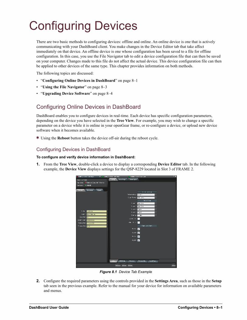
DashBoard User Guide Configuring Devices • 8–1
Configuring DevicesThere are two basic methods to configuring devices: offline and online. An online device is one that is actively communicating with your DashBoard client. You make changes in the Device Editor tab that take affect immediately on that device. An offline device is one whose configuration has been saved to a file for offline configuration. In this case, you use the File Navigator tab to edit a device configuration file that can then be saved on your computer. Changes made to this file do not affect the actual device. This device configuration file can then be applied to other devices of the same type. This chapter provides information on both methods.
The following topics are discussed:
• “Configuring Online Devices in DashBoard” on page 8–1
• “Using the File Navigator” on page 8–3
• “Upgrading Device Software” on page 8–4
Configuring Online Devices in DashBoard
DashBoard enables you to configure devices in real-time. Each device has specific configuration parameters, depending on the device you have selected in the Tree View. For example, you may wish to change a specific parameter on a device while it is online in your openGear frame, or re-configure a device, or upload new device software when it becomes available.
Using the Reboot button takes the device off-air during the reboot cycle.
Configuring Devices in DashBoard
To configure and verify device information in DashBoard:
1. From the Tree View, double-click a device to display a corresponding Device Editor tab. In the following example, the Device View displays settings for the QSP-8229 located in Slot 3 of FRAME 2.
Figure 8.1 Device Tab Example
2. Configure the required parameters using the controls provided in the Settings Area, such as those in the Setup tab seen in the previous example. Refer to the manual for your device for information on available parameters and menus.
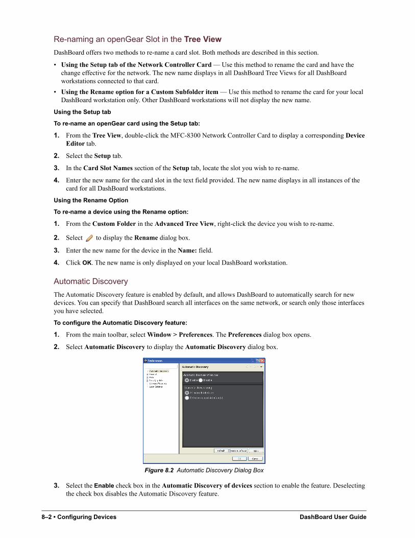
8–2 • Configuring Devices DashBoard User Guide
Re-naming an openGear Slot in the Tree View
DashBoard offers two methods to re-name a card slot. Both methods are described in this section.
• Using the Setup tab of the Network Controller Card — Use this method to rename the card and have the change effective for the network. The new name displays in all DashBoard Tree Views for all DashBoard workstations connected to that card.
• Using the Rename option for a Custom Subfolder item — Use this method to rename the card for your local DashBoard workstation only. Other DashBoard workstations will not display the new name.
Using the Setup tab
To re-name an openGear card using the Setup tab:
1. From the Tree View, double-click the MFC-8300 Network Controller Card to display a corresponding Device Editor tab.
2. Select the Setup tab.
3. In the Card Slot Names section of the Setup tab, locate the slot you wish to re-name.
4. Enter the new name for the card slot in the text field provided. The new name displays in all instances of the card for all DashBoard workstations.
Using the Rename Option
To re-name a device using the Rename option:
1. From the Custom Folder in the Advanced Tree View, right-click the device you wish to re-name.
2. Select to display the Rename dialog box.
3. Enter the new name for the device in the Name: field.
4. Click OK. The new name is only displayed on your local DashBoard workstation.
Automatic Discovery
The Automatic Discovery feature is enabled by default, and allows DashBoard to automatically search for new devices. You can specify that DashBoard search all interfaces on the same network, or search only those interfaces you have selected.
To configure the Automatic Discovery feature:
1. From the main toolbar, select Window > Preferences. The Preferences dialog box opens.
2. Select Automatic Discovery to display the Automatic Discovery dialog box.
Figure 8.2 Automatic Discovery Dialog Box
3. Select the Enable check box in the Automatic Discovery of devices section to enable the feature. Deselecting the check box disables the Automatic Discovery feature.
DashBoard User Guide Configuring Devices • 8–3
4. Select a Discovery mode as follows:
• All network interfaces — Select this option to enable DashBoard to find openGear cards only on the local network. DashBoard queries the network every 10 seconds and display new devices in the Tree Views. This is the default setting.
• Selected network interface(s) — Select this option to enable DashBoard to query the specified network every 10 seconds and display new devices in the Tree Views.
5. Click Apply.
Troubleshooting
If you are unable to make changes to the parameters of a device, or the Upload or Reboot buttons are disabled:
• verify that any edit permissions for the device are enabled in the Device tab.
• verify any relevant controls on your device hardware are set to enable remote control.
Not all openGear devices support the edit permissions feature and it is recommended that you refer to the documentation for your device for details. This control typically appears on the Setup tab of the Device View
Removing Devices from the Tree View
If a device is still listed in the Tree View, but with a grayed out status indicator, then DashBoard is no longer communicating with the device. You can remove such devices from the Tree View using the following procedure.
To remove all offline devices in an openGear frame:
1. In the Tree View, right-click the frame containing offline devices.
2. Select Remove offline devices to remove the offline devices from the Tree View.
Using the File Navigator
The File Navigator tab in DashBoard enables you to quickly navigate, manage, and update device configuration files. A device configuration file stores the configuration of a specific device. This functions much like the DataSafe feature for openGear cards where you can save the settings of one device to a file and recall that same file to a device of the same model. The File Navigator enables you to edit the settings of a device separate from the actual device, allowing you to store the new configuration as a separate file or update the current one.
Just like the other tree views, the File Navigator tab displays device configuration files in a hierarchy. But the hierarchy is determined by the folder organization on your computer. Note that when you collapse a folder in the File Navigator tab, every device file under the folder is disconnected.
To display a File Navigator tab:
1. Select Views from the main toolbar.
2. Select File Navigator to display a new File Navigator tab in the DashBoard window.
To display your device files in a File Navigator tab:
1. Click on the File Navigator toolbar to display the Browse For Folder dialog box.
2. Navigate to the folder on your computer where your device configuration files are stored.
3. Select OK to close the dialog box and update the tree view in the File Navigator tab. The selected folder is displayed.
To edit a device file:
1. In the tree view of the File Navigator tab, expand the node of the folder to view a list of available device configuration files. You can also search the file hierarchy by entering text in the Filter field.
2. Double-click the file you wish to edit to establish a connection to it. The icon will no longer be grayed-out.
8–4 • Configuring Devices DashBoard User Guide
3. Display a Device Editor tab in the DashBoard window.
4. Configure the device parameters as required. An asterisk (*) displays on the File Navigator tab and on the applicable Device Editor tab whenever there are unsaved changes in a device configuration file. The file that has unsaved changes is also set in blue in the File Navigator tab.
5. Save your changes using one of the options in the File menu. You can also use the provided buttons on the DashBoard main toolbar.
To remove a device file from the File Navigator tab:
1. In the tree view of the File Navigator tab, select the file you wish to remove. Note that this does not delete the file from your computer.
2. Click on the File Navigator toolbar.
3. Click OK.
To refresh a directory:
1. Right-click the folder in the tree view of the File Navigator tab.
2. Click Reload.
Upgrading Device Software
DashBoard enables you to upload software updates to multiple devices available in the Tree View. You can select any number of similar devices to upgrade (upload software files to) and monitor the upgrade progress. This section summarizes the upload software process. The process may differ for your specific device. Refer to your device user manual for information on upgrading the software before proceeding.
Upgrading Device Software
To upload software to a device:
1. Contact your Ross Technical Support representative for the latest software version for your device.
2. Display the Device tab of the device you wish to upload software to.
3. In the Device tab, click Upload to display the Select File Upload menu of the Upload Software Wizard.
4. Select a file to upload as follows:
• Click Browse... to navigate to the *.bin upload file you wish to upload. DashBoard automatically selects the last directory that you loaded a file from.
• Select a file to upload.
• Select Open to return to the Select File Upload menu.
• The Select File Upload dialog box now displays the path to the selected file, and information on the selected file such as name, type, load size, and creation date. A warning is displayed in the Warnings field when software conflicts occur, such as the selected file will downgrade the selected device.
5. Click Next > to display the Select Destination menu.
6. Select the device(s) you wish to upload the selected software file to as follows:
• Note that only the device you selected in is selected.
• If you wish to include other devices, select the desired devices from the Select drop-down list using one of the following options:
› Select All — This option selects all the similar devices. The selected software file will be uploaded to all devices on the network.
› Select Without Warnings — This option selects only those devices that do not include a conflict with the selected software file.
DashBoard User Guide Configuring Devices • 8–5
› Select Without Warnings (include downgrades) — This option uploads the software to similar devices that do not have any conflicts, but will include those devices that will be downgraded if the selected software file is uploaded to them.
› Select None — This option clears all the check boxes in the Device field.
› Click Select.
• The Device field, located below the Select drop-down list, displays information such as the device name and slot information, frame it is installed in, the current software version, and any applicable error messages are displayed.
• You can also select the devices to upgrade by selecting or clearing the corresponding check boxes in the Device field.
• If the Hide invalid destinations check box is selected, the menu only displays similar devices for the selected software file. For example, if you are attempting to upload a software file for a UDC-8625, only UDC-8625 cards will be displayed. If the check box is cleared, all devices currently installed on the network are displayed but are grayed out.
7. Click Finish. The Uploading to Selected Devices menu displays and the upload process begins. A progress bar displays in the Uploading to Selected Devices menu for each device you selected in 6
Clicking during an upload can leave the device in an invalid state.
8. Monitor the upgrade process bar(s) displayed in the Uploading to Selected Devices menu while the software is upgraded to your device. You can also display the Uploading to Selected Devices menus as a new tab in DashBoard, allowing you to work in other DashBoard areas during the upload, by selecting the Run in Background.
9. When the upload is complete, click OK to close the Uploading to Selected Devices menu.
Troubleshooting the Software Upload Process
Use the following information if the software upload process has failed:
• If the “Selected file does not exist” or “Selected file is not a valid upload file” error conditions are displayed in the Upload Failed dialog box, select OK from the dialog box and re-start the upload process and select the correct file.
• If a “No response from device” condition is encountered, the upload failed while in progress due to loss of power or communications. Verify that the device is powered on and that you have communication to the openGear frame. You must then restart the upload process.

8–6 • Configuring Devices DashBoard User Guide
DashBoard User Guide Adding a USB Joystick or Other USB Game Controller • 9–1
Adding a USB Joystick or Other USB Game Controller
This section describes how to set up a USB joystick or other USB controller to control PIVOTCam cameras, in conjunction with the PIVOTCam Control Panel.
The PIVOTCam Control Panel is a DashBoard panel that enables you to configure and control PIVOTCam robotic cameras. For information about installing and using the PIVOTCam Control Panel, see the PIVOTCam Control Panel User Guide (4506DR-001-xx).
PIVOTCam functions that can be controlled by a USB controller fall into three groups; camera selection, camera motion (pan, tilt, zoom, and focus), and paintbox controls (lens iris and lens shutter speed).
Depending on the USB controller(s) available, you can control all functions with a single controller, or add a separate controller for each group of functions.
You can also configure otherwise unassigned buttons on the controller to open DashBoard device views or panels.
Note: When you press a controller button to open a device view or panel other than the PIVOTCam Control Panel, the controller cannot select or control cameras until the PIVOTCam Control Panel is the active panel (in focus). We recommend that you assign a button to open the PIVOTCam panel.
Note: USB controllers can control PIVOTCam cameras only. If you have a Lightning Control System that includes other types of cameras, the controller can not control them.
To add a USB controller to control PIVOTCam cameras:
1. Close DashBoard.
2. Plug the USB controller into a USB port on the DashBoard computer.
3. Start DashBoard and then open the PIVOTCam Control panel.
When DashBoard starts, it detects the controller.
4. In DashBoard, on the File menu, select New, and then select Other.
The New dialog box appears.
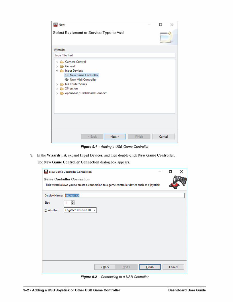
9–2 • Adding a USB Joystick or Other USB Game Controller DashBoard User Guide
Figure 9.1 - Adding a USB Game Controller
5. In the Wizards list, expand Input Devices, and then double-click New Game Controller.
The New Game Controller Connection dialog box appears.
Figure 9.2 - Connecting to a USB Controller
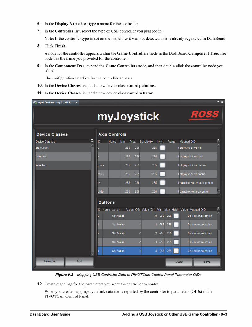
DashBoard User Guide Adding a USB Joystick or Other USB Game Controller • 9–3
6. In the Display Name box, type a name for the controller.
7. In the Controller list, select the type of USB controller you plugged in.
Note: If the controller type is not on the list, either it was not detected or it is already registered in DashBoard.
8. Click Finish.
A node for the controller appears within the Game Controllers node in the DashBoard Component Tree. The node has the name you provided for the controller.
9. In the Component Tree, expand the Game Controllers node, and then double-click the controller node you added.
The configuration interface for the controller appears.
10. In the Device Classes list, add a new device class named paintbox.
11. In the Device Classes list, add a new device class named selector.
Figure 9.3 - Mapping USB Controller Data to PIVOTCam Control Panel Parameter OIDs
12. Create mappings for the parameters you want the controller to control.
When you create mappings, you link data items reported by the controller to parameters (OIDs) in the PIVOTCam Control Panel.
9–4 • Adding a USB Joystick or Other USB Game Controller DashBoard User Guide
Tip: To determine which Axis Controls and Buttons correspond to physical controls on the controller, move the controller’s joystick and push its buttons while observing changes in the Value column.
Relevant columns in the Axis Controls mapping table are as follows:
• ID - The ID of the control, as reported by the controller. This is not configurable.
• Name - You can name the controls for future reference. (optional).
• Sensitivity - Responsiveness of the input. This is configurable.
• Invert - When selected, reverses the direction of joystick motion required to move the axis. For example, if the camera is ceiling mounted, select Invert for pan and tilt so when you move the joystick, the camera moves as desired.
• Value - Shows the current data value reported by the controller. This is useful for testing.
• Mapped OID - Specify the parameter OID from the PIVOTCam Control Panel to be mapped to the control.
Relevant columns in the Buttons mapping table are as follows:
• ID - The ID of the control, as reported by the controller. This is not configurable.
Tip: If you are going to use buttons on the controller for camera selection, the button ID values correspond to the camera numbers in the DashBoard panel that controls the cameras. The ID values start at 0.
• Name - You can name the controls for future reference. (optional).
• Action - If you are going to use buttons on the controller for camera selection, set Action for each such button to Set Value.
• Value (Off) - This is the value of the parameter when the button is not pressed.
• Value (On) - This is the value of the parameter when the button is pressed.
• Value - Shows the current data value reported by the controller. This is useful for testing.
• Mapped OID - Specify the parameter OID from the PIVOTCam Control Panel to be mapped to the control. For buttons, the parameter OID is selector.selection.
Tip: If you are configuring multiple controllers and dividing the control functions among them, the controls within each device class must be assigned to a single controller. The name of each parameter OID starts with the name of its device class (selector, ptzjoystick, or paintbox).
The parameters that can be mapped are as follows:
Parameter (Mapped OID) Description
selector.selection Camera selection. Map this parameter to a set of buttons to be used for selecting the camera to be controlled. Each row in the Buttons table corresponds to a button on the controller.
For each button you want to assign as the selector for a camera, do the following:
In the Name column, assign a camera name for future reference (optional).
Set Action to Set Value.
Set Value Off to -1
Set Value (On) to a camera number (0, 1, 2, 3, etc.)
Note the ID numbers of the camera selection buttons. You will need to know these numbers when you create mapping between the camera selection buttons and the camera control panel.
ptzjoystick.vel.tilt Tilt axis
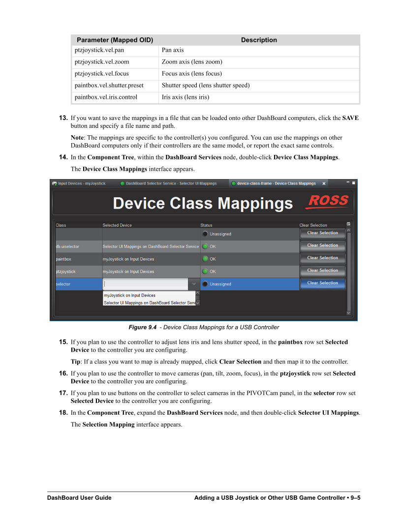
DashBoard User Guide Adding a USB Joystick or Other USB Game Controller • 9–5
13. If you want to save the mappings in a file that can be loaded onto other DashBoard computers, click the SAVE button and specify a file name and path.
Note: The mappings are specific to the controller(s) you configured. You can use the mappings on other DashBoard computers only if their controllers are the same model, or report the exact same controls.
14. In the Component Tree, within the DashBoard Services node, double-click Device Class Mappings.
The Device Class Mappings interface appears.
Figure 9.4 - Device Class Mappings for a USB Controller
15. If you plan to use the controller to adjust lens iris and lens shutter speed, in the paintbox row set Selected Device to the controller you are configuring.
Tip: If a class you want to map is already mapped, click Clear Selection and then map it to the controller.
16. If you plan to use the controller to move cameras (pan, tilt, zoom, focus), in the ptzjoystick row set Selected Device to the controller you are configuring.
17. If you plan to use buttons on the controller to select cameras in the PIVOTCam panel, in the selector row set Selected Device to the controller you are configuring.
18. In the Component Tree, expand the DashBoard Services node, and then double-click Selector UI Mappings.
The Selection Mapping interface appears.
ptzjoystick.vel.pan Pan axis
ptzjoystick.vel.zoom Zoom axis (lens zoom)
ptzjoystick.vel.focus Focus axis (lens focus)
paintbox.vel.shutter.preset Shutter speed (lens shutter speed)
paintbox.vel.iris.control Iris axis (lens iris)
Parameter (Mapped OID) Description
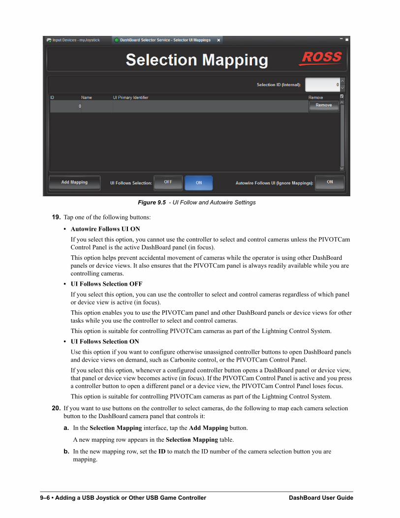
9–6 • Adding a USB Joystick or Other USB Game Controller DashBoard User Guide
Figure 9.5 - UI Follow and Autowire Settings
19. Tap one of the following buttons:
• Autowire Follows UI ON
If you select this option, you cannot use the controller to select and control cameras unless the PIVOTCam Control Panel is the active DashBoard panel (in focus).
This option helps prevent accidental movement of cameras while the operator is using other DashBoard panels or device views. It also ensures that the PIVOTCam panel is always readily available while you are controlling cameras.
• UI Follows Selection OFF
If you select this option, you can use the controller to select and control cameras regardless of which panel or device view is active (in focus).
This option enables you to use the PIVOTCam panel and other DashBoard panels or device views for other tasks while you use the controller to select and control cameras.
This option is suitable for controlling PIVOTCam cameras as part of the Lightning Control System.
• UI Follows Selection ON
Use this option if you want to configure otherwise unassigned controller buttons to open DashBoard panels and device views on demand, such as Carbonite control, or the PIVOTCam Control Panel.
If you select this option, whenever a configured controller button opens a DashBoard panel or device view, that panel or device view becomes active (in focus). If the PIVOTCam Control Panel is active and you press a controller button to open a different panel or a device view, the PIVOTCam Control Panel loses focus.
This option is suitable for controlling PIVOTCam cameras as part of the Lightning Control System.
20. If you want to use buttons on the controller to select cameras, do the following to map each camera selection button to the DashBoard camera panel that controls it:
a. In the Selection Mapping interface, tap the Add Mapping button.
A new mapping row appears in the Selection Mapping table.
b. In the new mapping row, set the ID to match the ID number of the camera selection button you are mapping.
DashBoard User Guide Adding a USB Joystick or Other USB Game Controller • 9–7
Tip: You noted the camera selection button IDs when you mapped them to the selector.selection OID in Step12.
c. Specify a Name for the mapping, such as the camera number. This step is optional.
d. In the UI Primary Identifier list, in the Open Panels folder, select the camera control panel for the camera type.
e. Repeat Step20a to Step20d for each camera selection button you want to configure.
21. If there are unassigned buttons on the controller and you want to configure them to open device views or panels, do the following:
a. Tap the Add Mapping button.
A new mapping row appears in the Selection Mapping table.
b. In the new mapping, set ID to any number, except those you configured as Value (On) values in previous button mappings.
c. Specify a Name for the mapping (optional).
d. For UI Primary Identifier, navigate to select the panel or device view that you want DashBoard to open whenever you press the controller button you are configuring.
Tip: If you want to select a panel, you must first open the panel’s .grid file so the panel appears in the Open Panels list.
Tip: Make a note of the ID value and which panel or device view it is intended to open.
e. Repeat Step21a to Step21d for each button you want to configure.
f. In the Component Tree, within the Input Devices node, double-click the controller node you added.
The configuration interface for the controller appears.
g. In the Buttons table, for each button you want to assign to open a panel or device view, configure settings in the corresponding row as follows:
• In the Name column, specify a name the mapping for future reference (optional).
• Set Action to Set Value.
• Set Value Off to -1.
• Set Value (On) to the number you mapped for the desired action in step Step21b.
• Set Mapped OID to selector.selection.
h. If you want to save the mappings in a file that can be loaded onto other DashBoard computers, click the SAVE button and provide a file name and path.
Note: The mappings are specific to the controller(s) you configured. You can use the mappings on other DashBoard computers only if their controllers are the same model, or report the exact same controls.

9–8 • Adding a USB Joystick or Other USB Game Controller DashBoard User Guide