creative brief photography - visma · creative brief photography photo material for visma - from a...
TRANSCRIPT

Creative Brief photography Photo material for Visma
- from a technical and contextual point of view

Keywords Slight over exposure - highligts
More saturation than normal Short depth of field
A majority of image of Brightness Calm backgrounds Distinct contrasts
Harmony (with a touch of joy)
Calm Real environments
(read the notes field)
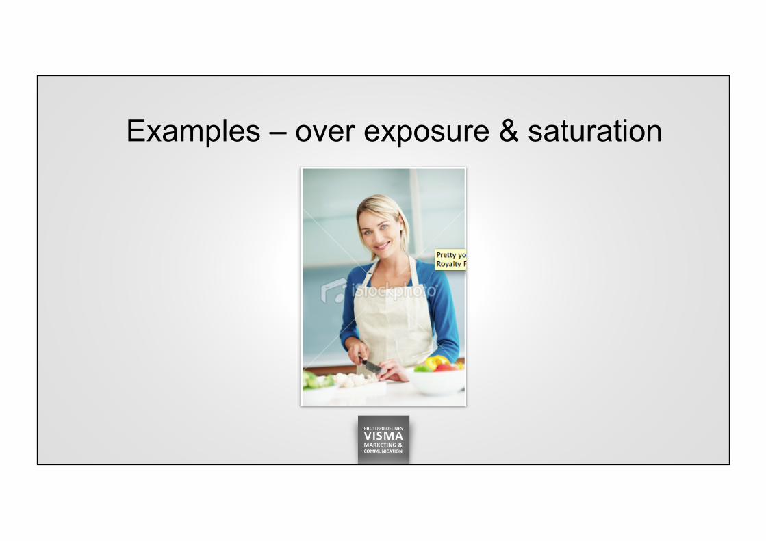
Examples – over exposure & saturation

Examples – environment & over exposure

Examples – environment & over exposure

Examples – environment & over exposure

Examples – short depth of field

Example – bright background & context of use
As you can see here the context of user for the photo is brigh and grey. Thus putting images into the context is much easier when we have bright photos. And if you look at the girl – a) she as lightings evenly on her face AND you can b) clearly see her eyes. These are
the two main requirements for photography of people – evenly lighting in face and that you can clearly see the eyes of the person. In addition – the background here is bright and overexposed.

Poor example – poor lighting (shadows in face) and poor background.
This is the way you should not do it: 1. As you can see here the guy has shadows around eyes and generally poor lighting on his face. The lighting should be evenly spread across the face. And, his eyes
are two black holes. 2. Background is not optimal. It’s contextual – but should be brighter. In this case if you want to show a context – try to find something that is brighter. Especially for this
front page format. It would work better in ”product page thumbnail images.”

How not to do it
• Do not use too many people in the same picture – unless it is natural in the context.
• Clothing: do not use prominently dark colors. • Avoid cluttered backgrounds

NOT! - These kinds of environments and/or photo aesthetics!
h#p://www.istockphoto.com/stock-‐photo-‐7384989-‐mid-‐thir8es-‐female-‐professional.php?st=17280f0%00 h#p://www.istockphoto.com/stock-‐photo-‐12601471-‐young-‐girl-‐working-‐on-‐laptop.php?st=5a013e4%00 h#p://www.istockphoto.com/stock-‐photo-‐7433260-‐mid-‐thir8es-‐female-‐drawing-‐diagram.php

1. If girl participates in image – she should be in focus 2. Left part too dark – right part better brightness 3. Dark sweater – use bright sweater
This part of the image is usable

1. To many things happening in the picture – too many stories 2. Laptop and girl diverts attention to the object in focus 3. Background nervous and cluttered (metal bars and glass)
This part of the image is usable

Would have been an ok image except for the dark sweater
This part of the image is more usable

Distinct contrasts – to make the images more interesting and captivating.
Slight over exposure – highligts. This will give a more creative touch and together with Slight saturation it shows that an “artist” has made the photos.
Short depth of field – increase the “drama”, intensity but also gives the editor a good way of
putting text on the “out of focus” part of the image.
Harmony (with a touch of joy). Calm – environments should be limited to not much content. If it’s a lot of content it should be in a way (out of focus) so that almost creates a “noice” in the
background.
Real environments - We truly need to increase the reach – not only showing people smiling in offices. For more examples of imagery based on real environments take a look at the top banner guide. This is an example of a more ‘real’ work space with nice light props – but a bit
too “american” maybe.
http://www.istockphoto.com/stock-photo-20667306-creatively-charged.php?st=02f7a0d