creating a brand
TRANSCRIPT

Creating a brand.Mitchell Grail
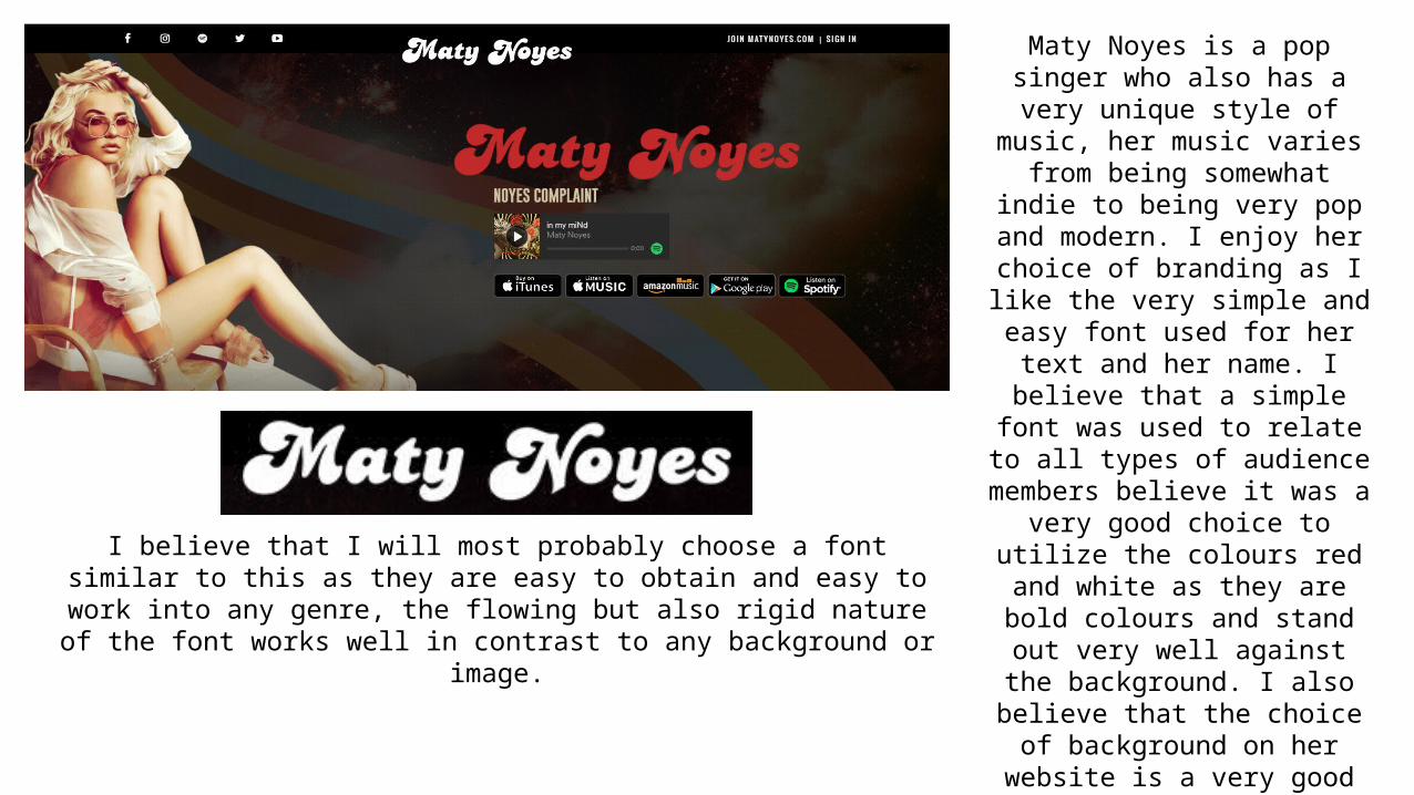
Maty Noyes is a pop singer who also has a very unique style of music, her music varies from being somewhat
indie to being very pop and modern. I enjoy her choice of branding as I like the very simple and easy font used for her text and her name. I
believe that a simple font was used to relate to all types of audience
members believe it was a very good choice to utilize the colours red and white as they are bold colours and
stand out very well against the background. I also believe that the
choice of background on her website is a very good one as it
seems calculated as matches well with the picture of the singer on the
left side.
I believe that I will most probably choose a font similar to this as they are easy to obtain and easy to work into any genre, the flowing but also rigid nature of the font
works well in contrast to any background or image.
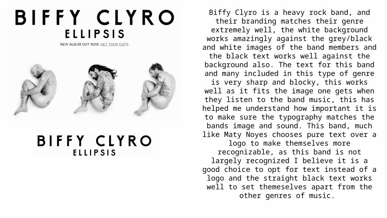
Biffy Clyro is a heavy rock band, and their branding matches their genre extremely well, the white background works amazingly against the grey/black and white images
of the band members and the black text works well against the background also. The text for this band and many
included in this type of genre is very sharp and blocky, this works well as it fits the image one gets when they listen to
the band music, this has helped me understand how important it is to make sure the typography matches the
bands image and sound. This band, much like Maty Noyes chooses pure text over a logo to make themselves more
recognizable, as this band is not largely recognized I believe it is a good choice to opt for text instead of a logo and the
straight black text works well to set themeselves apart from the other genres of music.
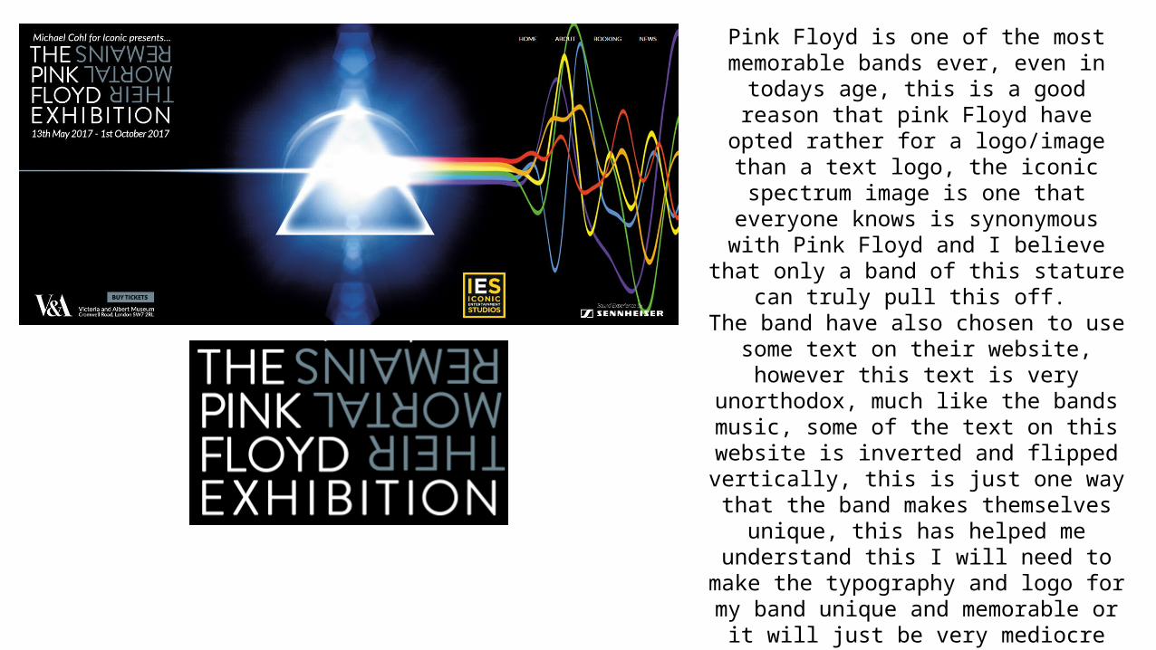
Pink Floyd is one of the most memorable bands ever, even in todays age, this is a good reason
that pink Floyd have opted rather for a logo/image than a text logo, the iconic
spectrum image is one that everyone knows is synonymous with Pink Floyd and I believe that
only a band of this stature can truly pull this off.
The band have also chosen to use some text on their website, however this text is very
unorthodox, much like the bands music, some of the text on this website is inverted and
flipped vertically, this is just one way that the band makes themselves unique, this has
helped me understand this I will need to make the typography and logo for my band unique
and memorable or it will just be very mediocre and mundane.
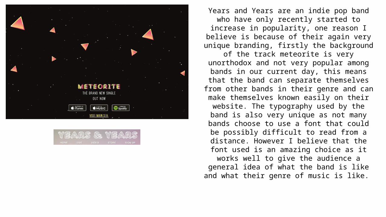
Years and Years are an indie pop band who have only recently started to increase in popularity, one reason I believe is because of their again very unique branding,
firstly the background of the track meteorite is very unorthodox and not very popular among bands in our
current day, this means that the band can separate themselves from other bands in their genre and can make
themselves known easily on their website. The typography used by the band is also very unique as not many bands choose to use a font that could be possibly difficult to read from a distance. However I believe that
the font used is an amazing choice as it works well to give the audience a general idea of what the band is like and
what their genre of music is like.
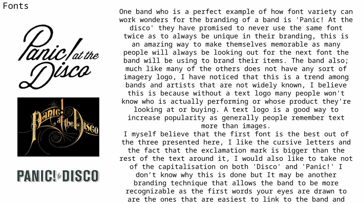
FontsOne band who is a perfect example of how font variety can work wonders for the
branding of a band is 'Panic! At the disco' they have promised to never use the same font twice as to always be unique in their branding, this is an amazing way to make themselves memorable as many people will always be looking out for the next font the band will be using to brand their items. The band also; much like many of the others does not have any sort of imagery logo, I have noticed that this is a trend
among bands and artists that are not widely known, I believe this is because without a text logo many people won't know who is actually performing or whose product
they're looking at or buying. A text logo is a good way to increase popularity as generally people remember text more than images.
I myself believe that the first font is the best out of the three presented here, I like the cursive letters and the fact that the exclamation mark is bigger than the rest of the text around it, I would also like to take not of the capitalisation on both 'Disco'
and 'Panic!' I don’t know why this is done but It may be another branding technique that allows the band to be more recognizable as the first words your eyes are drawn to are the ones that are easiest to link to the band and therefore the ones that are
capitalized.
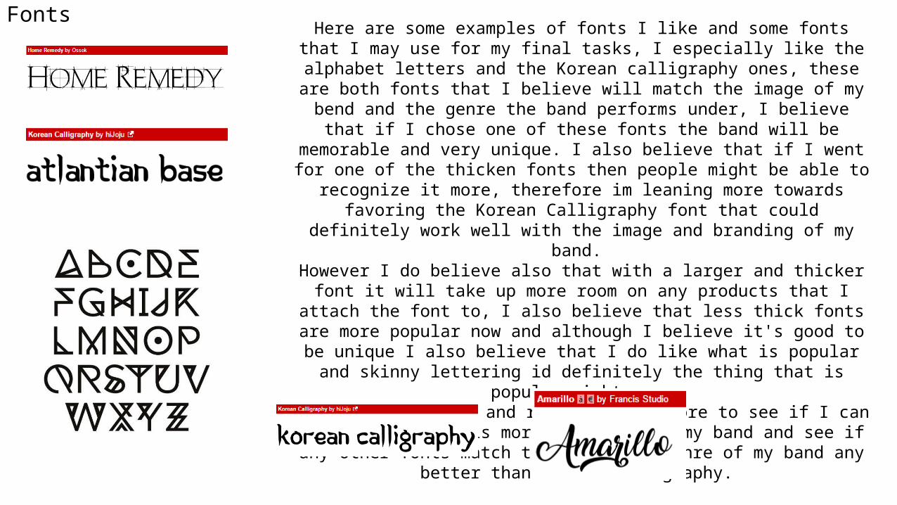
FontsHere are some examples of fonts I like and some fonts that I may use for my final
tasks, I especially like the alphabet letters and the Korean calligraphy ones, these are both fonts that I believe will match the image of my bend and the genre the band
performs under, I believe that if I chose one of these fonts the band will be memorable and very unique. I also believe that if I went for one of the thicken fonts then people might be able to recognize it more, therefore im leaning more towards favoring the Korean Calligraphy font that could definitely work well with the image
and branding of my band. However I do believe also that with a larger and thicker font it will take up more room on any products that I attach the font to, I also believe that less thick fonts are more popular now and although I believe it's good to be unique I also believe that I do like what is popular and skinny lettering id definitely the thing that is popular right now.
I am going to wait and research some more to see if I can find a font that is more suitable for my band and see if any other fonts match the image and genre of my
band any better than Korean Calligraphy.