compilation logos
TRANSCRIPT
SAS Logos
Henry Buckham
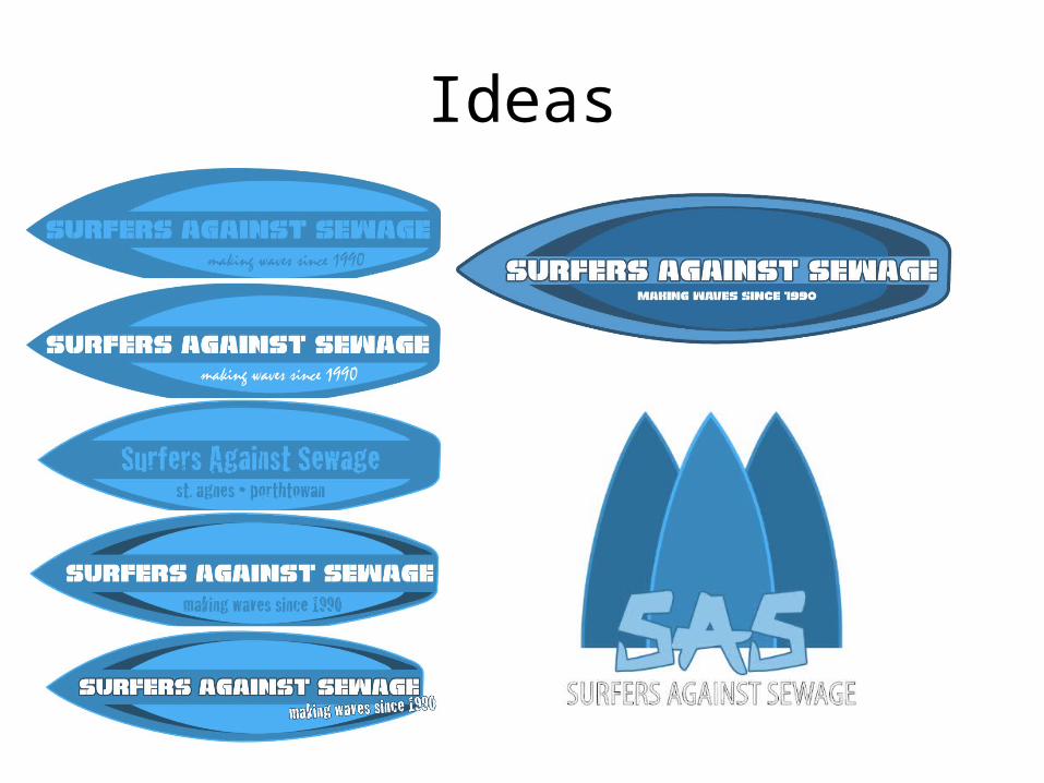
Ideas
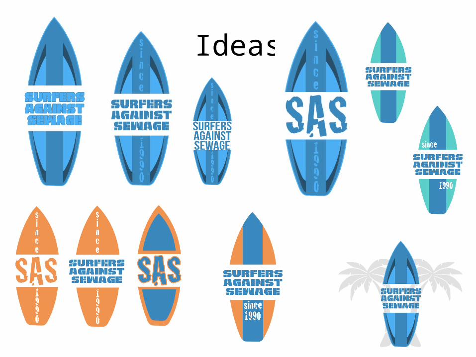
Ideas
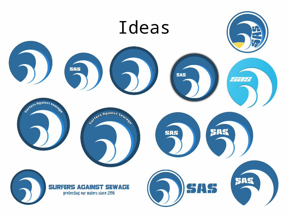
Ideas
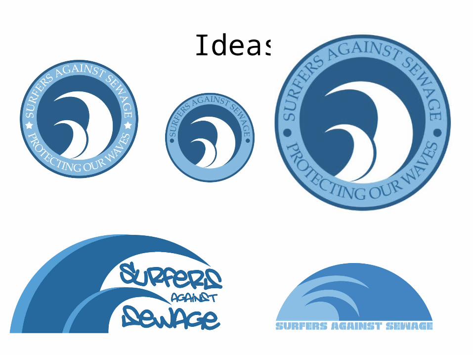
Ideas
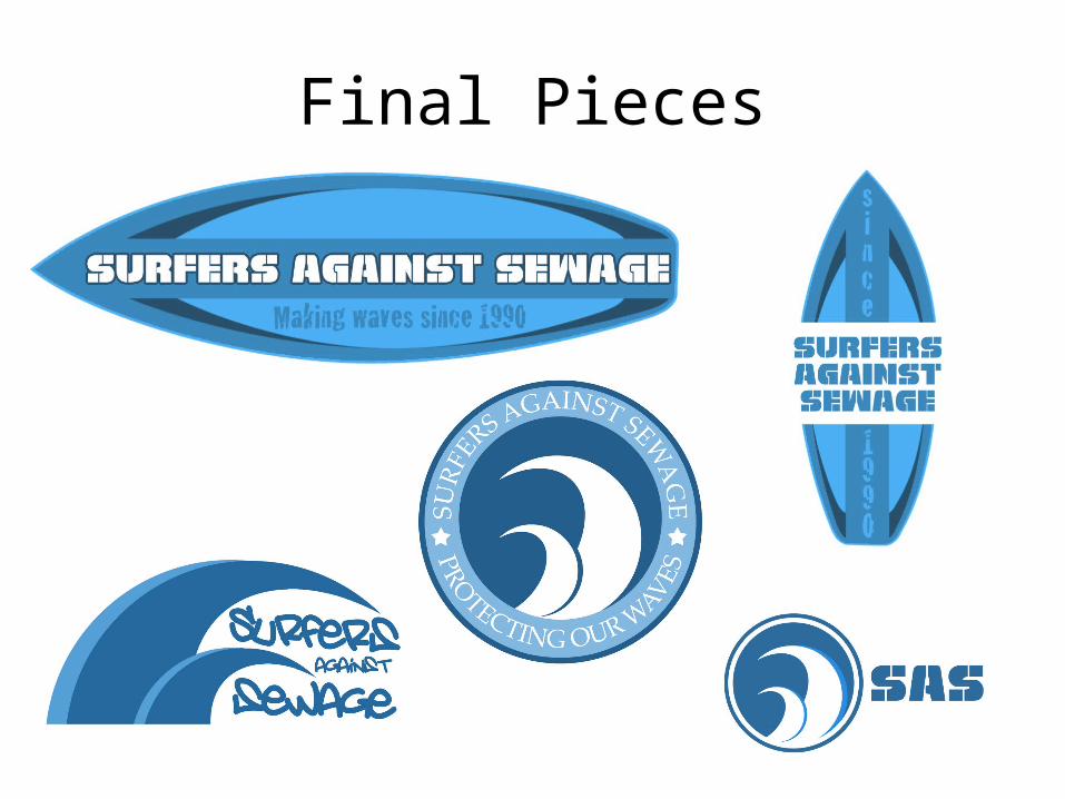
Final Pieces
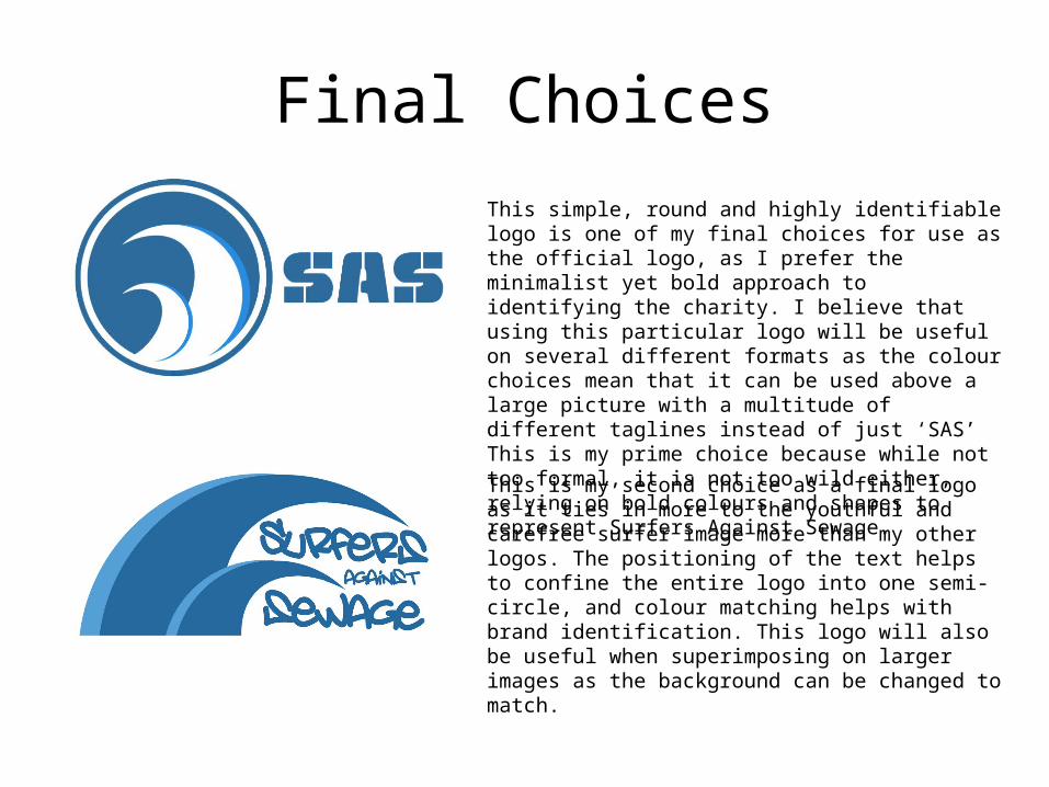
Final ChoicesThis simple, round and highly identifiable logo is one of my final choices for use as the official logo, as I prefer the minimalist yet bold approach to identifying the charity. I believe that using this particular logo will be useful on several different formats as the colour choices mean that it can be used above a large picture with a multitude of different taglines instead of just ‘SAS’ This is my prime choice because while not too formal, it is not too wild either, relying on bold colours and shapes to represent Surfers Against Sewage.
This is my second choice as a final logo as it ties in more to the youthful and carefree surfer image more than my other logos. The positioning of the text helps to confine the entire logo into one semi-circle, and colour matching helps with brand identification. This logo will also be useful when superimposing on larger images as the background can be changed to match.
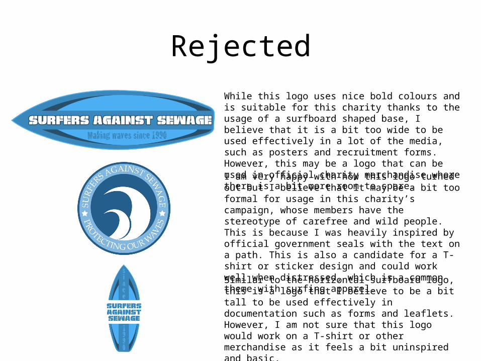
RejectedWhile this logo uses nice bold colours and is suitable for this charity thanks to the usage of a surfboard shaped base, I believe that it is a bit too wide to be used effectively in a lot of the media, such as posters and recruitment forms. However, this may be a logo that can be used in official charity merchandise where there is a bit more room to spare.
I am very happy with how this logo turned out but I believe that it may be a bit too formal for usage in this charity’s campaign, whose members have the stereotype of carefree and wild people. This is because I was heavily inspired by official government seals with the text on a path. This is also a candidate for a T-shirt or sticker design and could work well when distressed, which is a common theme with surfing apparel.
Similar to the horizontal surfboard logo, this is a logo that I believe to be a bit tall to be used effectively in documentation such as forms and leaflets. However, I am not sure that this logo would work on a T-shirt or other merchandise as it feels a bit uninspired and basic.