color theory, terminology, & color systems. pigment color system the traditional color system...
TRANSCRIPT
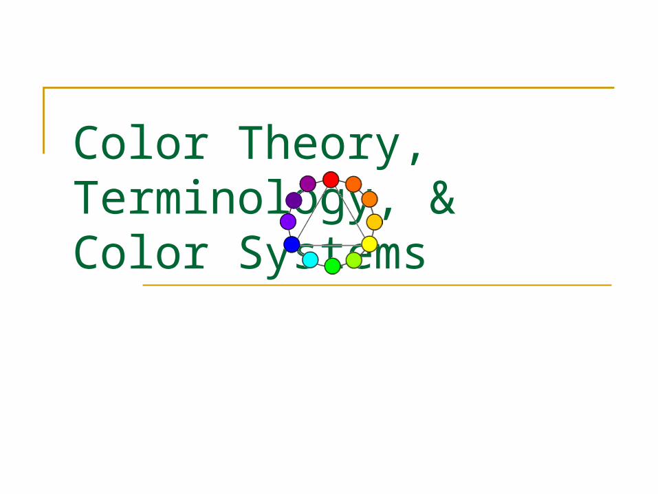
Color Theory, Terminology, & Color Systems
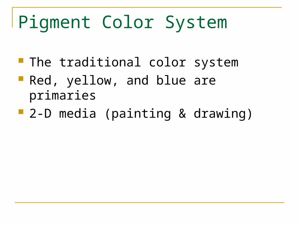
Pigment Color System
The traditional color system Red, yellow, and blue are primaries 2-D media (painting & drawing)
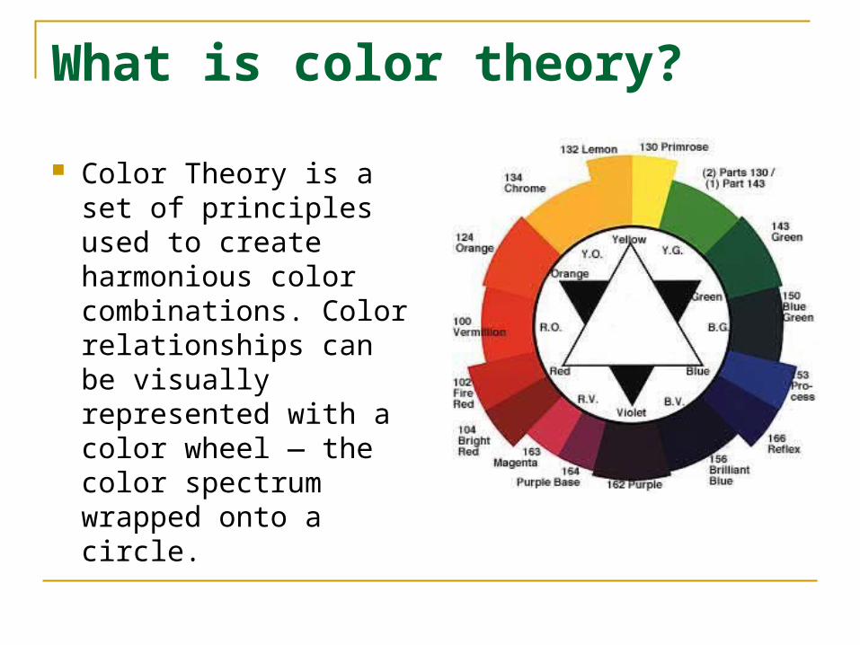
What is color theory?
Color Theory is a set of principles used to create harmonious color combinations. Color relationships can be visually represented with a color wheel — the color spectrum wrapped onto a circle.
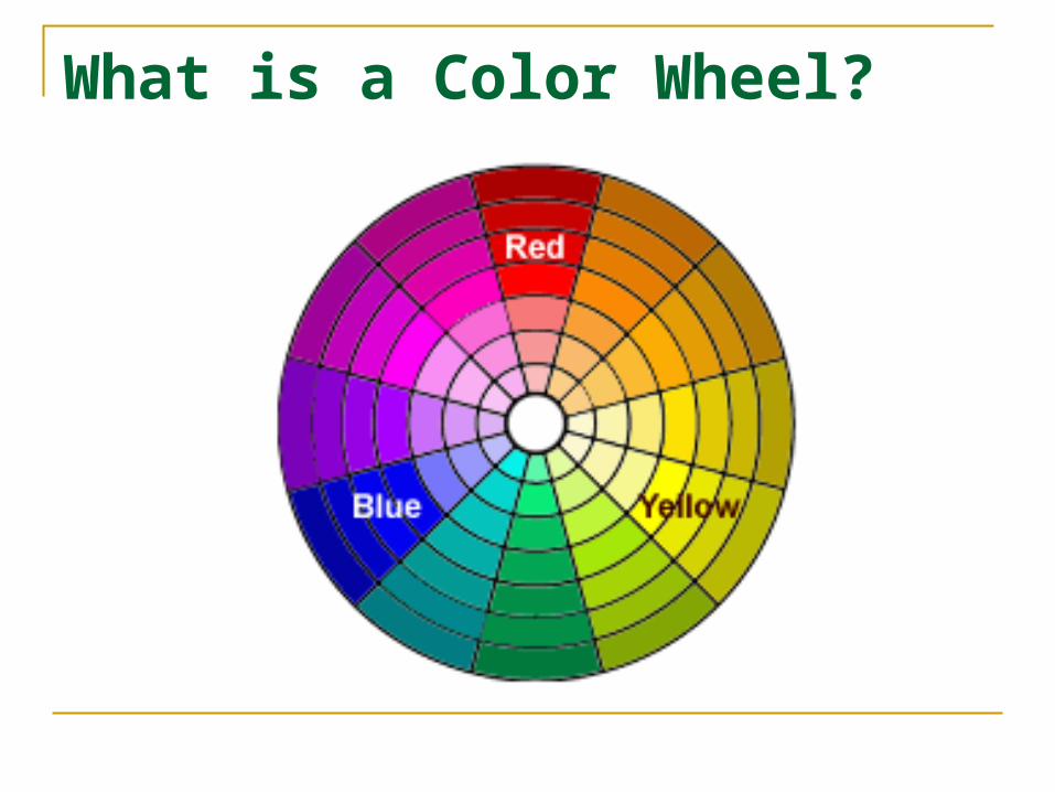
What is a Color Wheel?
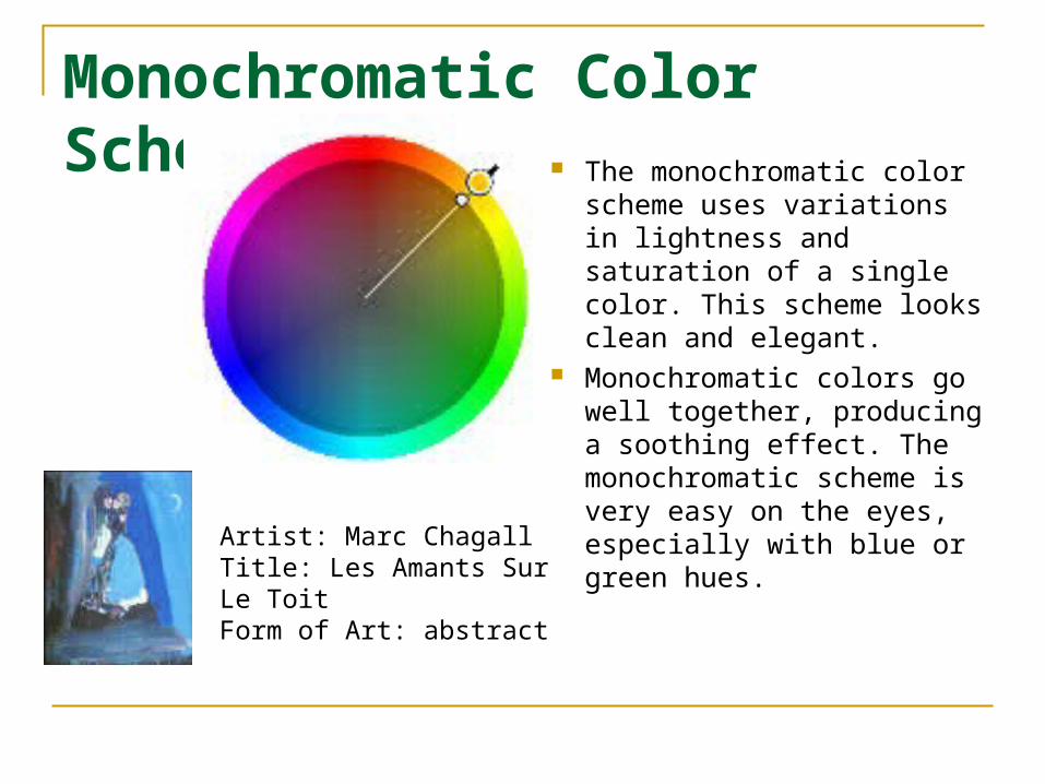
Monochromatic Color Scheme The monochromatic color
scheme uses variations in lightness and saturation of a single color. This scheme looks clean and elegant.
Monochromatic colors go well together, producing a soothing effect. The monochromatic scheme is very easy on the eyes, especially with blue or green hues.
Artist: Marc ChagallTitle: Les Amants Sur Le ToitForm of Art: abstract
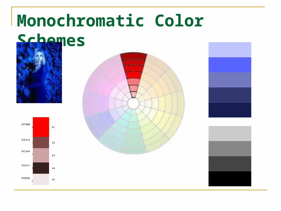
Monochromatic Color Schemes
#FF0000 #
1
#7E4747
#2
#CCA4A4
#
3
#361F1F
#4
#F0E8E8
#5
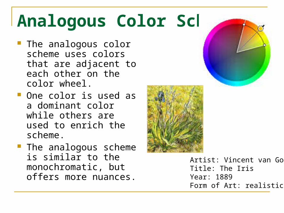
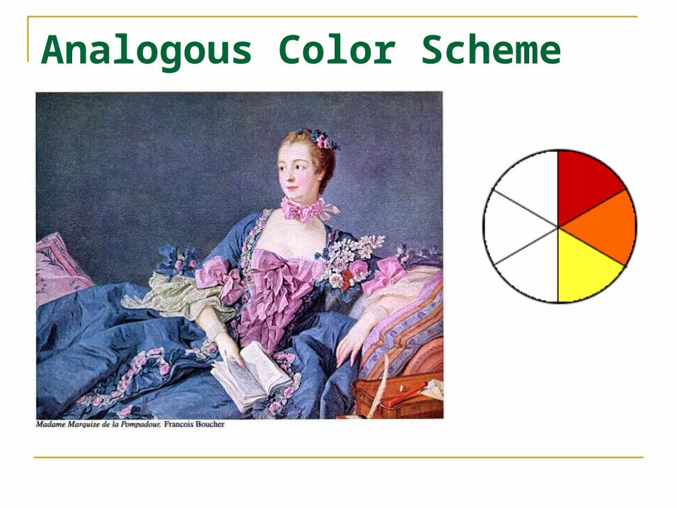
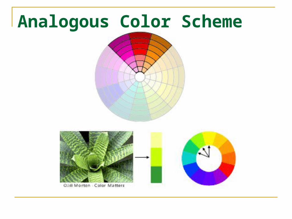
Analogous Color Scheme The analogous color
scheme uses colors that are adjacent to each other on the color wheel.
One color is used as a dominant color while others are used to enrich the scheme.
The analogous scheme is similar to the monochromatic, but offers more nuances.
Artist: Vincent van GoghTitle: The IrisYear: 1889Form of Art: realistic
Analogous Color Scheme
Analogous Color Scheme
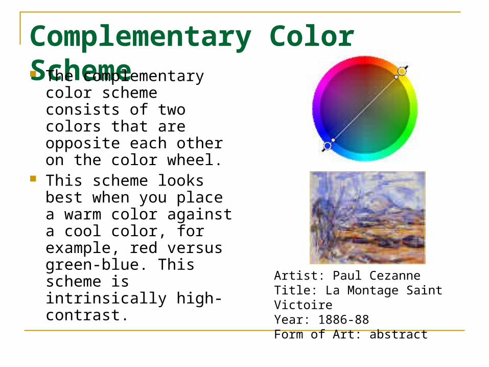
Complementary Color Scheme The complementary
color scheme consists of two colors that are opposite each other on the color wheel.
This scheme looks best when you place a warm color against a cool color, for example, red versus green-blue. This scheme is intrinsically high-contrast.
Artist: Paul Cezanne Title: La Montage Saint VictoireYear: 1886-88Form of Art: abstract

Complementary Color Schemes
1
#FF0000
#009900
2
3#FF757
5
#002800
4
5#FFFFF
F
#111111
6
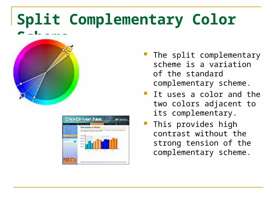
Split Complementary Color Scheme
The split complementary scheme is a variation of the standard complementary scheme.
It uses a color and the two colors adjacent to its complementary.
This provides high contrast without the strong tension of the complementary scheme.
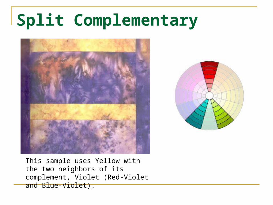
Split Complementary
This sample uses Yellow with the two neighbors of its complement, Violet (Red-Violet and Blue-Violet).
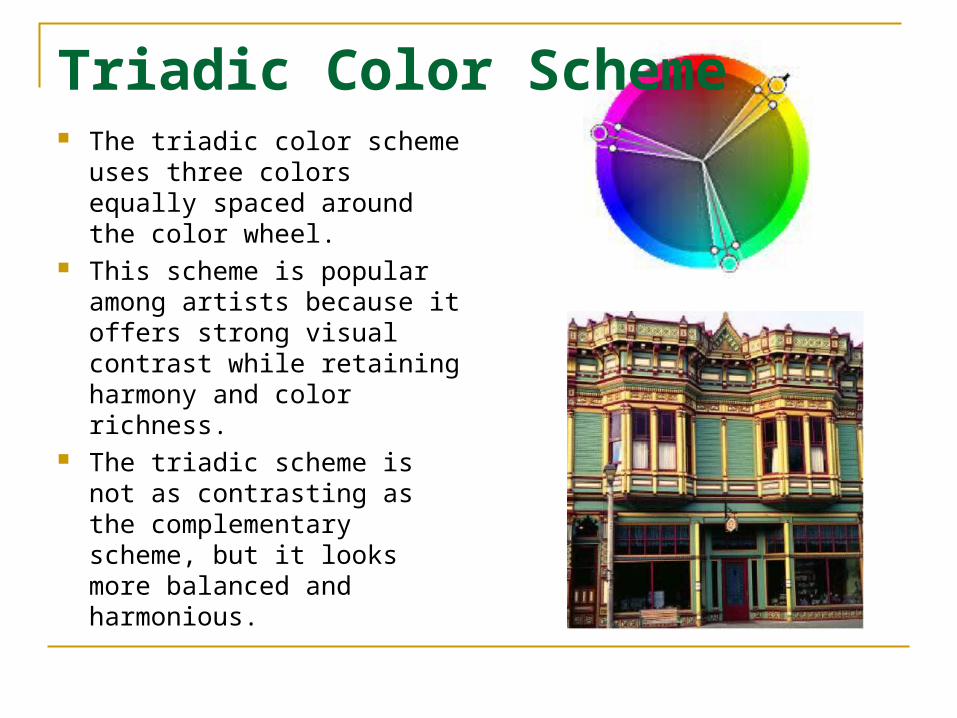
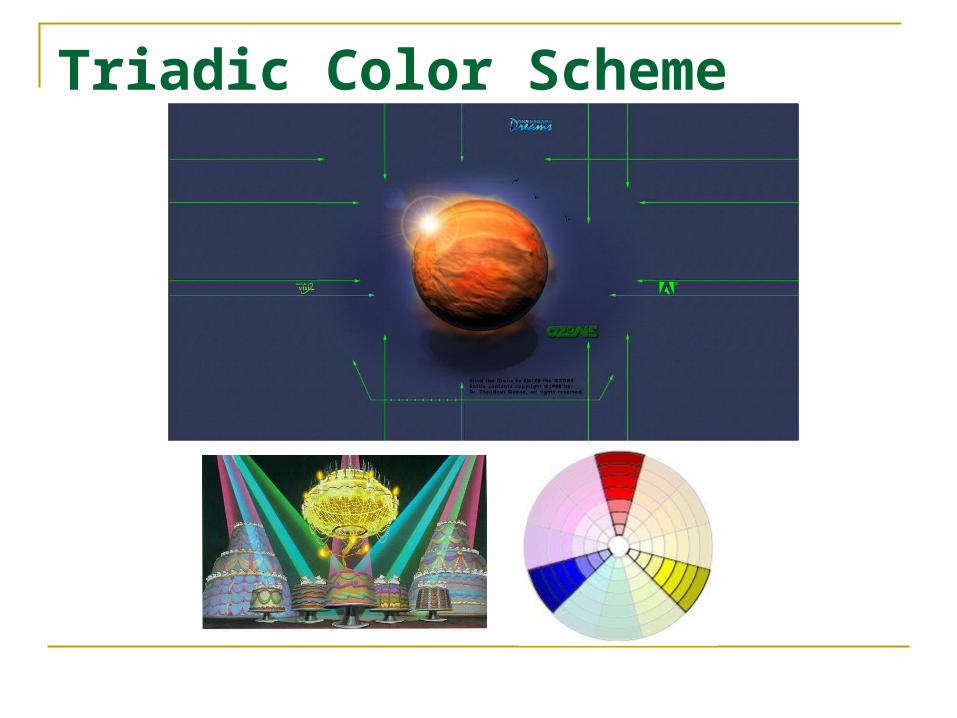
Triadic Color Scheme The triadic color scheme
uses three colors equally spaced around the color wheel.
This scheme is popular among artists because it offers strong visual contrast while retaining harmony and color richness.
The triadic scheme is not as contrasting as the complementary scheme, but it looks more balanced and harmonious.
Triadic Color Scheme
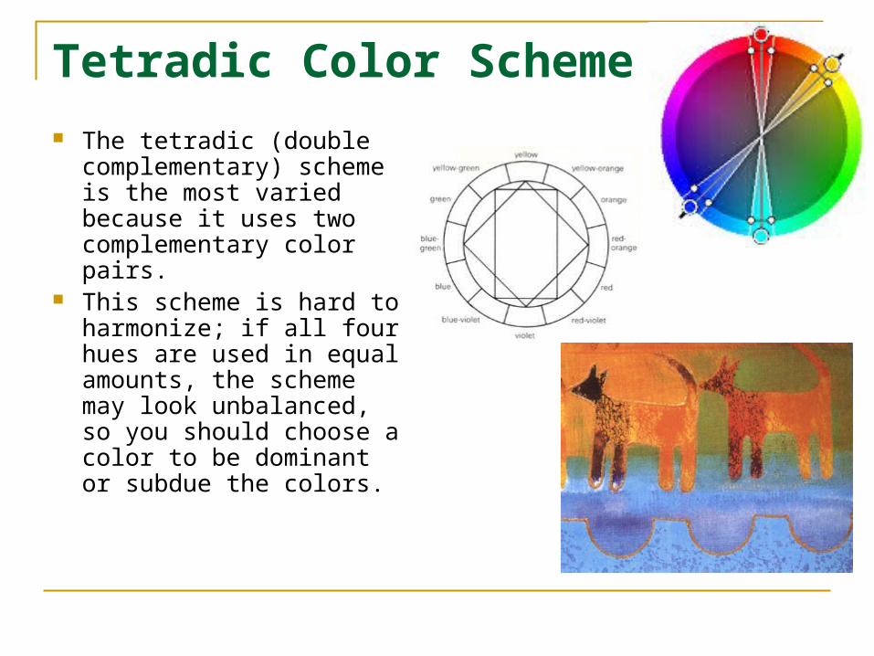
Tetradic Color Scheme
The tetradic (double complementary) scheme is the most varied because it uses two complementary color pairs.
This scheme is hard to harmonize; if all four hues are used in equal amounts, the scheme may look unbalanced, so you should choose a color to be dominant or subdue the colors.
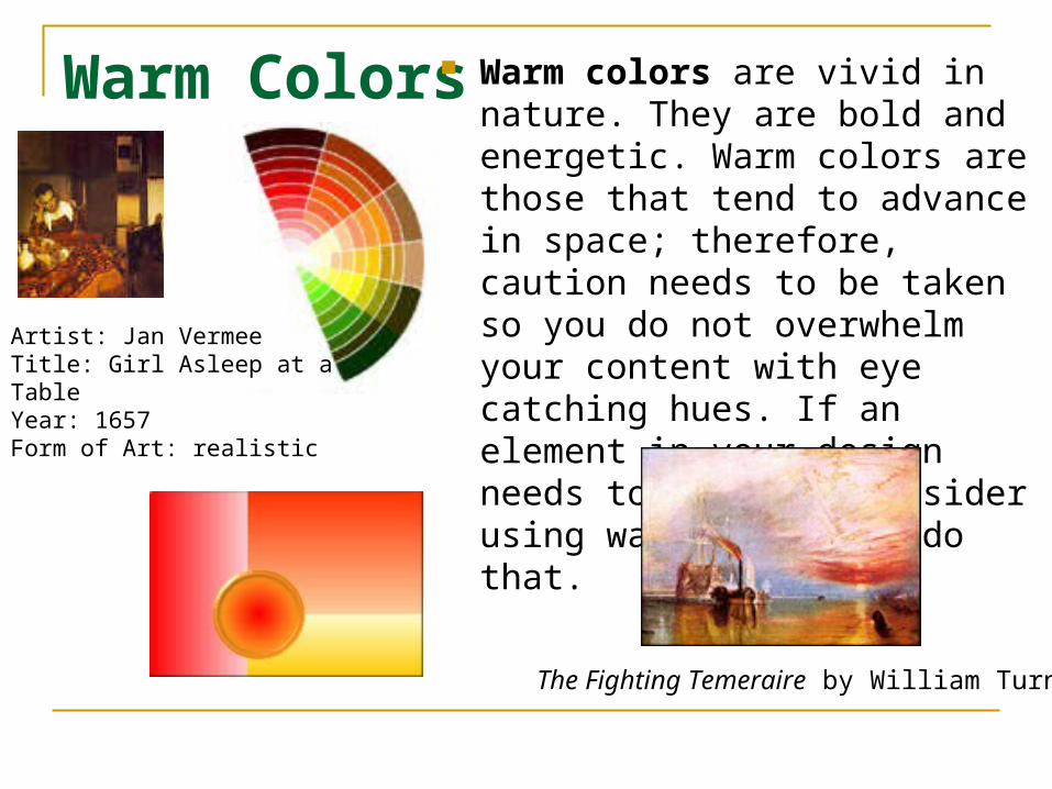
Warm Colors Warm colors are vivid in nature. They are bold and energetic. Warm colors are those that tend to advance in space; therefore, caution needs to be taken so you do not overwhelm your content with eye catching hues. If an element in your design needs to pop out, consider using warm colors to do that.
Artist: Jan VermeeTitle: Girl Asleep at a Table Year: 1657Form of Art: realistic
The Fighting Temeraire by William Turner
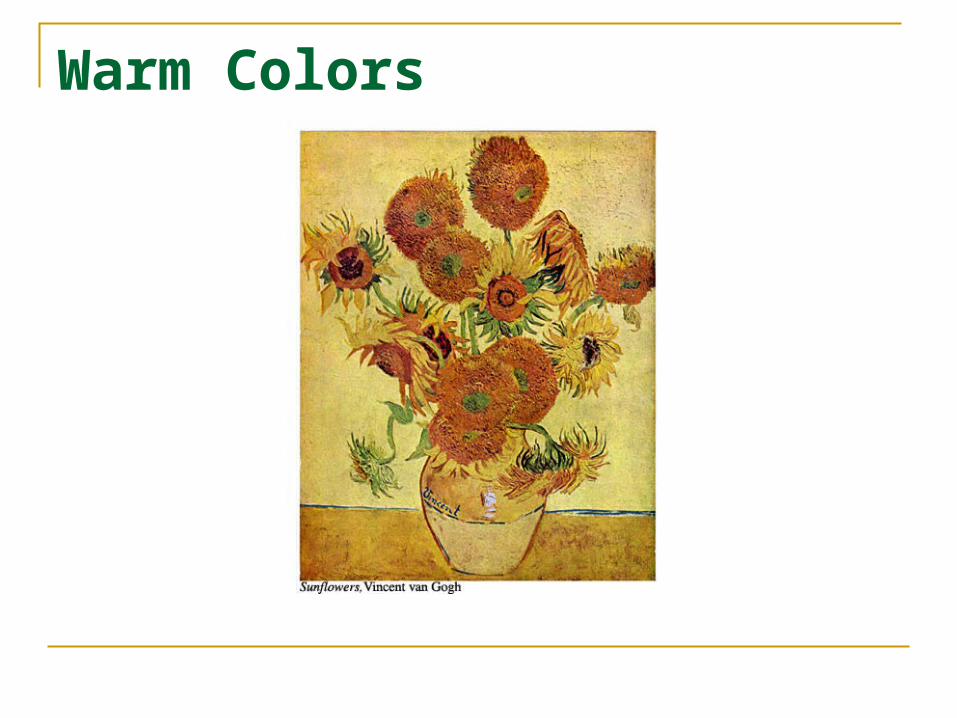
Warm Colors

Cool Colors Cool colors are
soothing in nature. They give an impression of calm and rarely overpower the main content or message of a design. Cool colors tend to recede; therefore, if some element of your design needs to be in the background, give it cool tones.
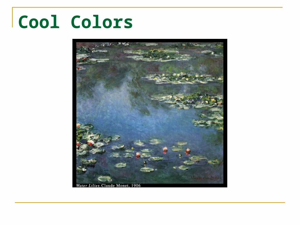
Cool Colors
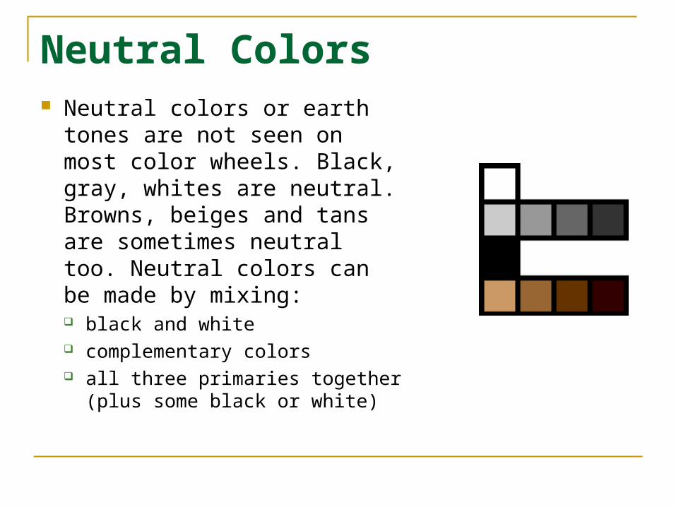
Neutral Colors Neutral colors or earth tones
are not seen on most color wheels. Black, gray, whites are neutral. Browns, beiges and tans are sometimes neutral too. Neutral colors can be made by mixing: black and white complementary colors all three primaries together (plus
some black or white)
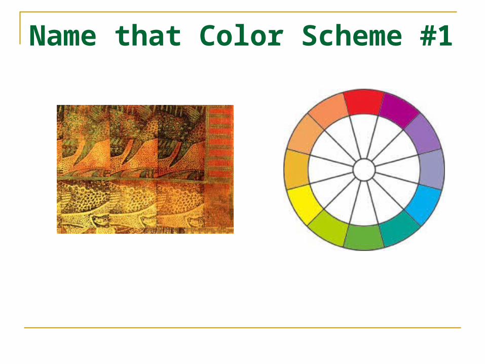
Name that Color Scheme #1
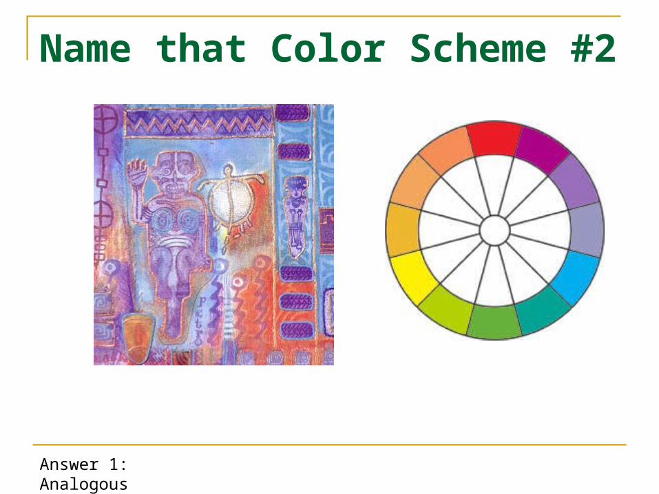
Name that Color Scheme #2
Answer 1: Analogous
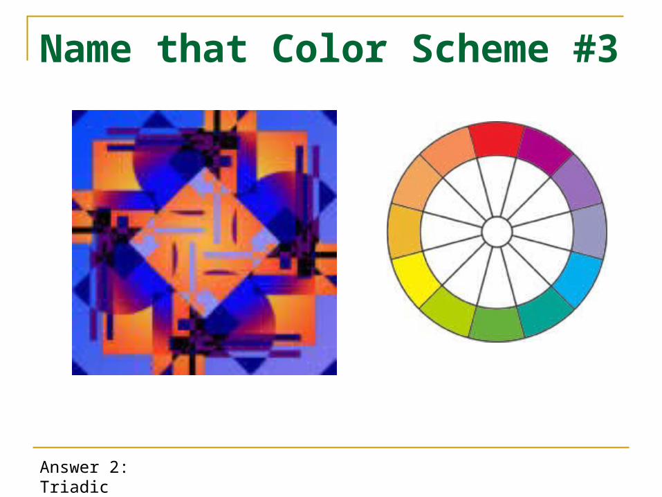
Name that Color Scheme #3
Answer 2: Triadic

Name that Color Scheme #4
Answer 3: Complementary
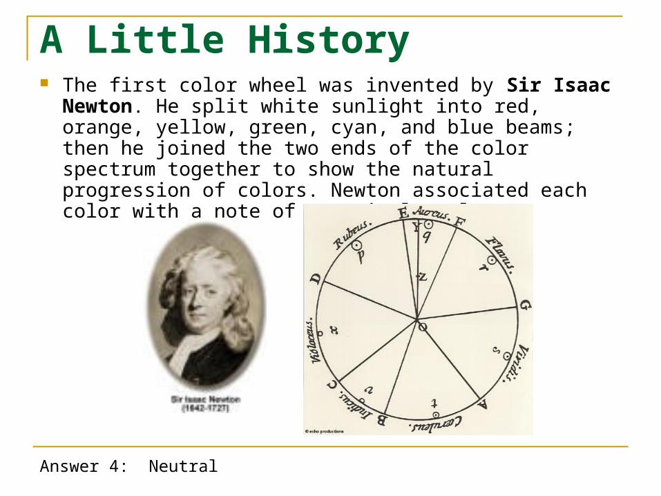
A Little History The first color wheel was invented by Sir Isaac Newton.
He split white sunlight into red, orange, yellow, green, cyan, and blue beams; then he joined the two ends of the color spectrum together to show the natural progression of colors. Newton associated each color with a note of a musical scale.
Answer 4: Neutral
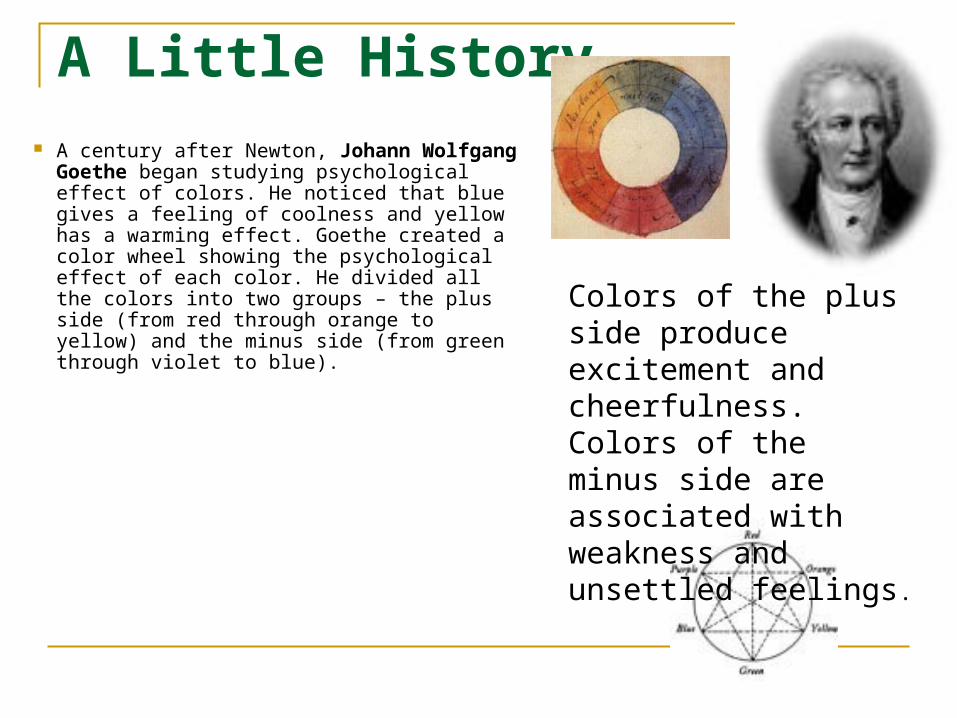
A Little History A century after Newton, Johann Wolfgang
Goethe began studying psychological effect of colors. He noticed that blue gives a feeling of coolness and yellow has a warming effect. Goethe created a color wheel showing the psychological effect of each color. He divided all the colors into two groups – the plus side (from red through orange to yellow) and the minus side (from green through violet to blue).
Colors of the plus side produce excitement and cheerfulness. Colors of the minus side are associated with weakness and unsettled feelings.
2 More Color Systems
The Subtractive System: used in the 4-color print process; the primary colors are Cyan, Yellow, and Magenta
Additive Color System: The 3 primary colors (Red, Green, & Blue) add to white light
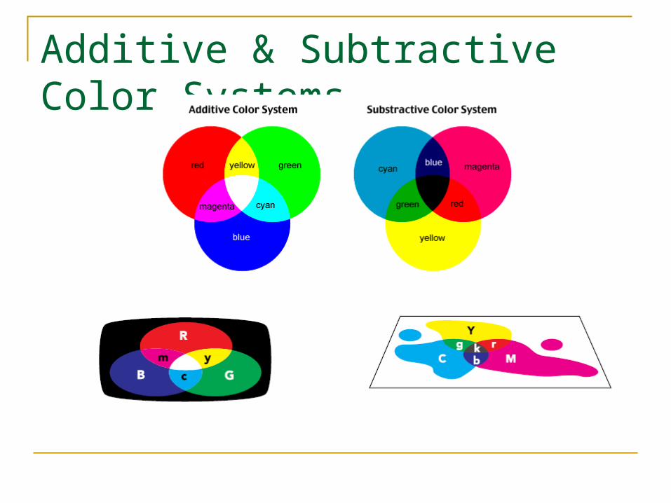
Additive & Subtractive Color Systems
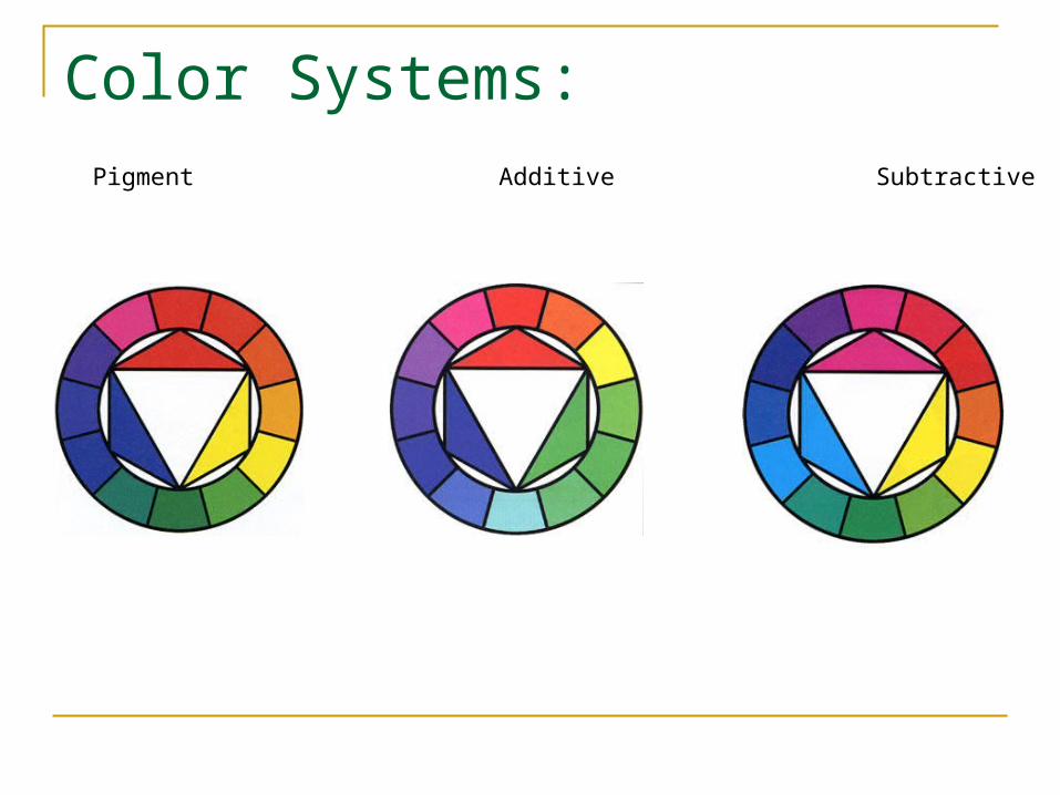
Color Systems:
Pigment Additive Subtractive
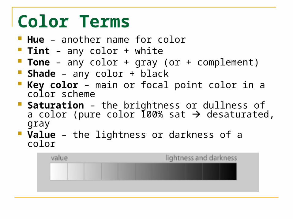
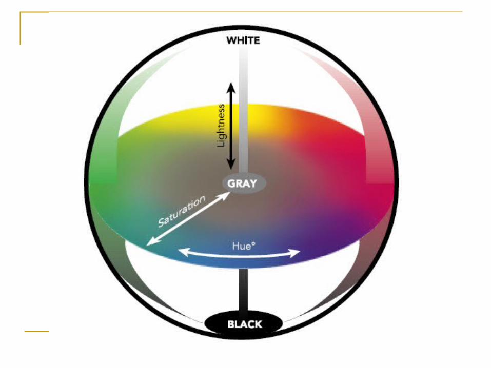
Color Terms Hue – another name for color Tint – any color + white Tone – any color + gray (or + complement) Shade – any color + black Key color – main or focal point color in a color
scheme Saturation – the brightness or dullness of a color
(pure color 100% sat desaturated, gray Value – the lightness or darkness of a color
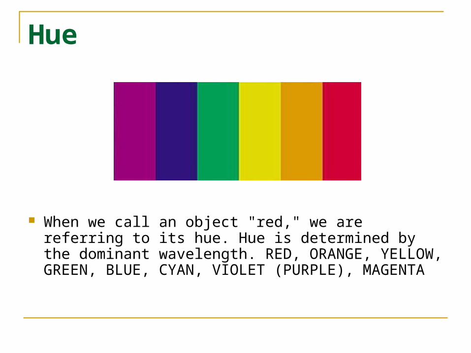
Hue
When we call an object "red," we are referring to its hue. Hue is determined by the dominant wavelength. RED, ORANGE, YELLOW, GREEN, BLUE, CYAN, VIOLET (PURPLE), MAGENTA
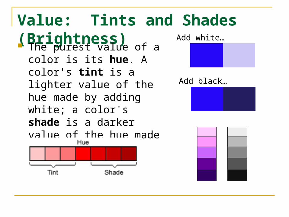
Value: Tints and Shades (Brightness) The purest value of a color
is its hue. A color's tint is a lighter value of the hue made by adding white; a color's shade is a darker value of the hue made by adding black.
Add white…
Add black…
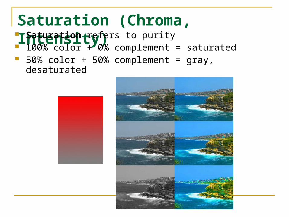
Saturation (Chroma, Intensity) Saturation refers to purity
100% color + 0% complement = saturated 50% color + 50% complement = gray, desaturated

Video – YUV Color Space The YUV model defines a color space in terms of one
luma and two chrominance components. The YUV color model is used in the PAL, NTSC, and SECAM composite color video standards. Previous black-and-white systems used only luma (Y) information and color information (U and V) was added so that a black-and-white receiver would still be able to display a color picture as a normal black and white pictures.
YUV models human perception of color more closely than the standard RGB model used in computer graphics hardware.
Y stands for the luma component (the brightness) and U and V are the chrominance (color) components.
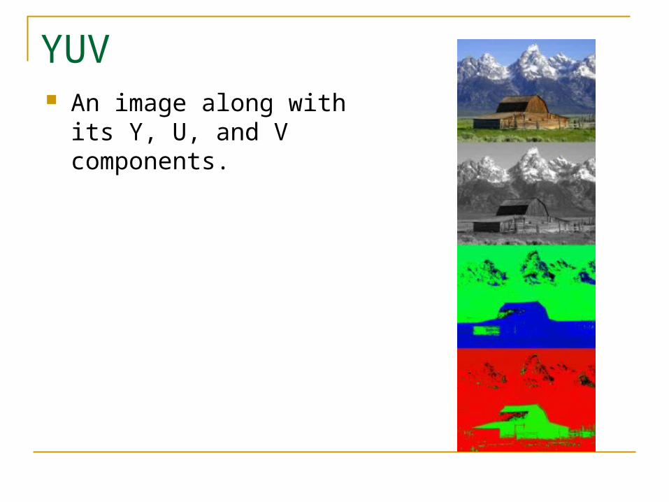
YUV An image along with its Y,
U, and V components.
NTSC Colors
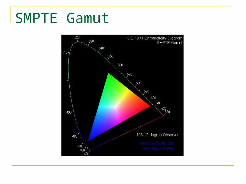
SMPTE Gamut