chapter 15 the mobile web. objectives describe the important characteristics of mobile web browsing...
Post on 21-Dec-2015
218 views
TRANSCRIPT
Chapter 15The Mobile Web
Objectives
• Describe the important characteristics of mobile web browsing platforms
• Explain three strategies for effectively handling mobile clients
• Describe significant mobile web protocols• Describe several common mobile
operating systems and web browsers• Explain best principles for design content
for mobile web clients
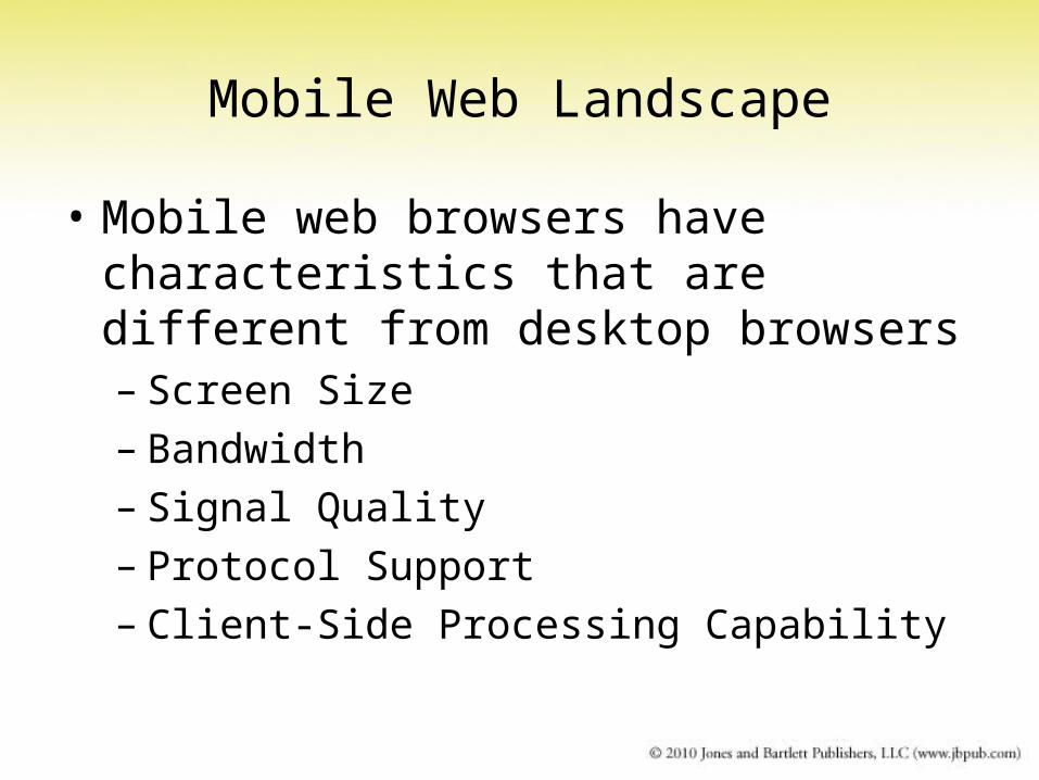
Mobile Web Landscape
• Mobile web browsers have characteristics that are different from desktop browsers– Screen Size– Bandwidth– Signal Quality– Protocol Support– Client-Side Processing Capability
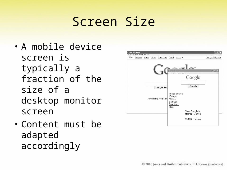
Screen Size
• A mobile device screen is typically a fraction of the size of a desktop monitor screen
• Content must be adapted accordingly
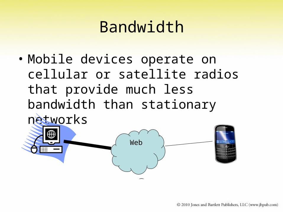
Bandwidth
• Mobile devices operate on cellular or satellite radios that provide much less bandwidth than stationary networks
Web
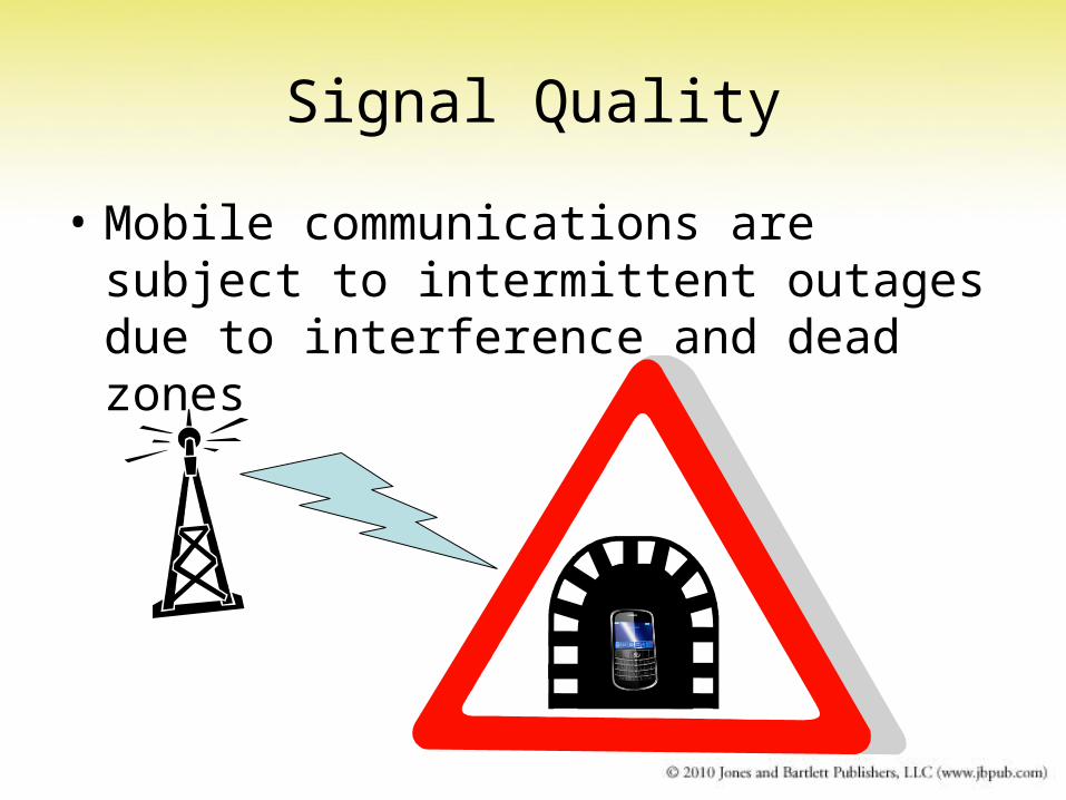
Signal Quality
• Mobile communications are subject to intermittent outages due to interference and dead zones
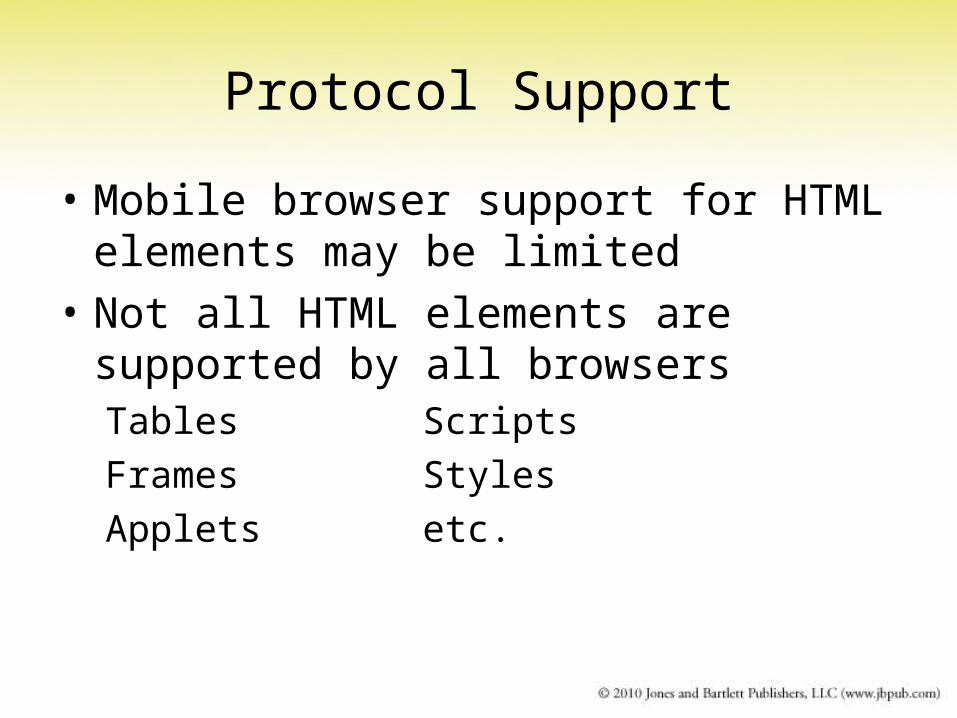
Protocol Support
• Mobile browser support for HTML elements may be limited
• Not all HTML elements are supported by all browsersTables Scripts
Frames Styles
Applets etc.

Client-Side Processing Capability
• Mobile platforms have smaller processors and limited battery life
• Scripts and plug-ins (flash, applets, pdf, etc.) that require extra processing may be disabled
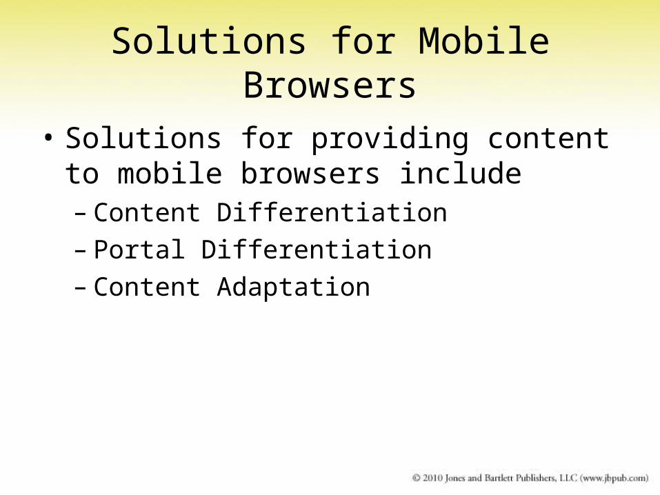
Solutions for Mobile Browsers
• Solutions for providing content to mobile browsers include– Content Differentiation– Portal Differentiation– Content Adaptation
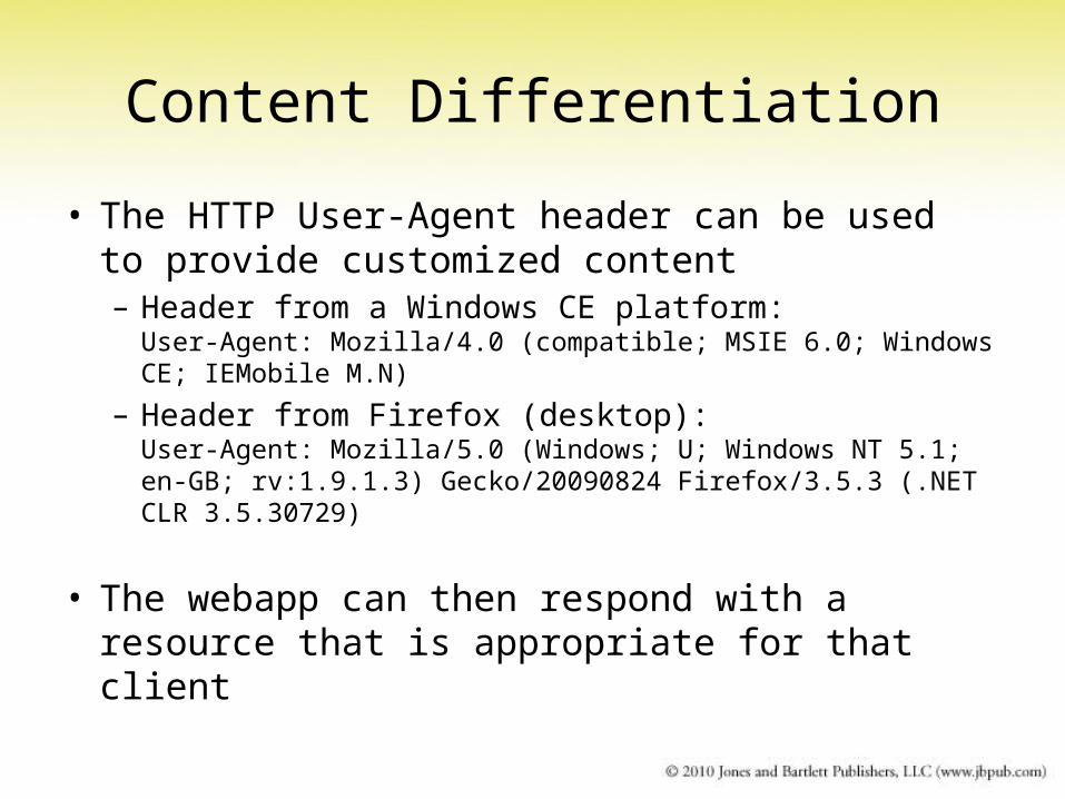
Content Differentiation
• The HTTP User-Agent header can be used to provide customized content– Header from a Windows CE platform:
User-Agent: Mozilla/4.0 (compatible; MSIE 6.0; Windows CE; IEMobile M.N)
– Header from Firefox (desktop):User-Agent: Mozilla/5.0 (Windows; U; Windows NT 5.1; en-GB; rv:1.9.1.3) Gecko/20090824 Firefox/3.5.3 (.NET CLR 3.5.30729)
• The webapp can then respond with a resource that is appropriate for that client
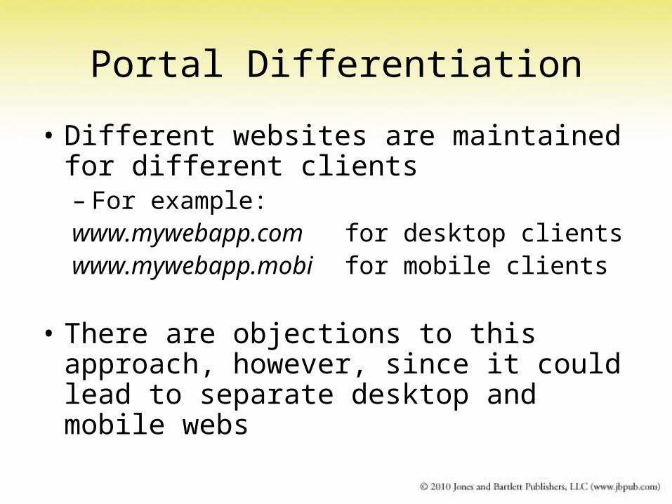
Portal Differentiation
• Different websites are maintained for different clients– For example:www.mywebapp.com for desktop clientswww.mywebapp.mobi for mobile clients
• There are objections to this approach, however, since it could lead to separate desktop and mobile webs
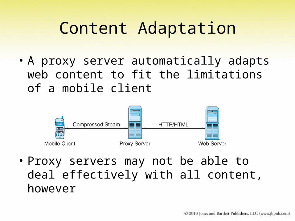
Content Adaptation
• A proxy server automatically adapts web content to fit the limitations of a mobile client
• Proxy servers may not be able to deal effectively with all content, however
Mobile Device Protocols
• Mobile Web Protocols include– XHTML Basic– WAP– iMode
XHTML Basic
• Adopted by W3C in 2000 as a standard for creating XHTML docs for limited clients
• Some HTML elements are excluded from XHTML Basic/1.1:– Frames– Image Maps– Nested Tables– Bidirectional Text– Text Editing (<ins> and <del> tags)
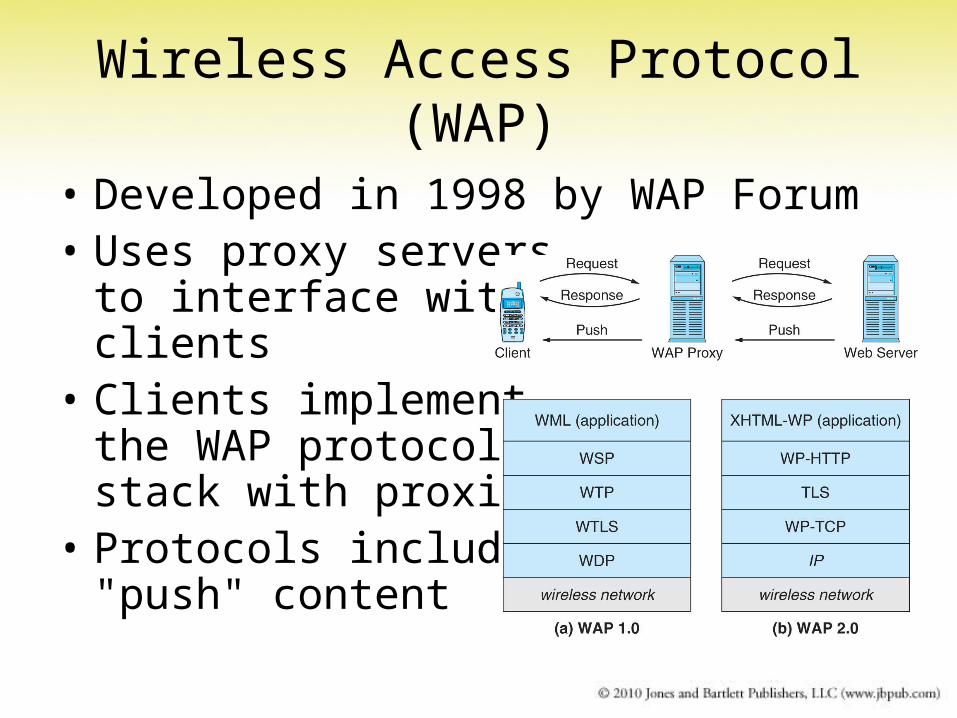
Wireless Access Protocol (WAP)
• Developed in 1998 by WAP Forum• Uses proxy servers
to interface with clients
• Clients implement the WAP protocolstack with proxies
• Protocols include"push" content
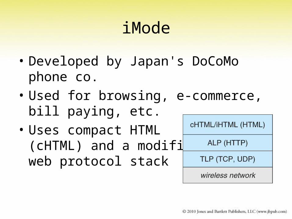
iMode
• Developed by Japan's DoCoMo phone co.
• Used for browsing, e-commerce, bill paying, etc.
• Uses compact HTML(cHTML) and a modifiedweb protocol stack
Mobile Web SoftwareMicro Operating Systems
• Android: open source, by Google and the Open Handset Alliance
• PalmOS: developed for PalmPilot PDAs
• Symbian: proprietary OS for smart mobile phones; widely used
• Windows Mobile: proprietary; mini version of MS Windows
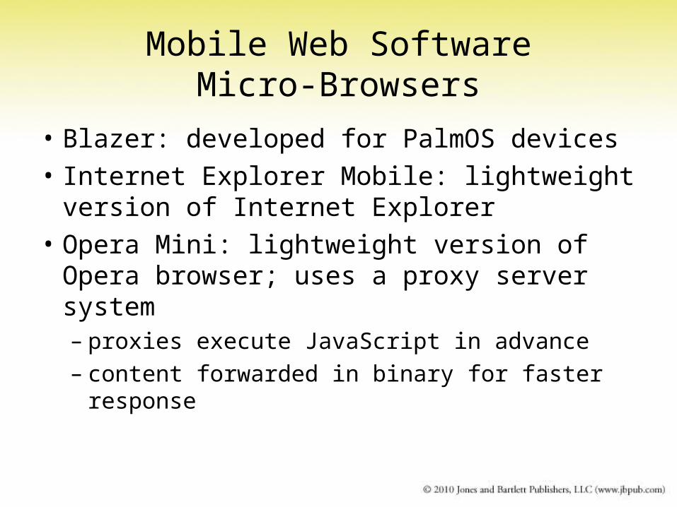
Mobile Web SoftwareMicro-Browsers
• Blazer: developed for PalmOS devices
• Internet Explorer Mobile: lightweight version of Internet Explorer
• Opera Mini: lightweight version of Opera browser; uses a proxy server system– proxies execute JavaScript in advance– content forwarded in binary for faster
response
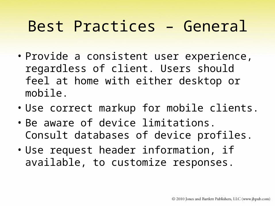
Best Practices – General
• Provide a consistent user experience, regardless of client. Users should feel at home with either desktop or mobile.
• Use correct markup for mobile clients.
• Be aware of device limitations. Consult databases of device profiles.
• Use request header information, if available, to customize responses.
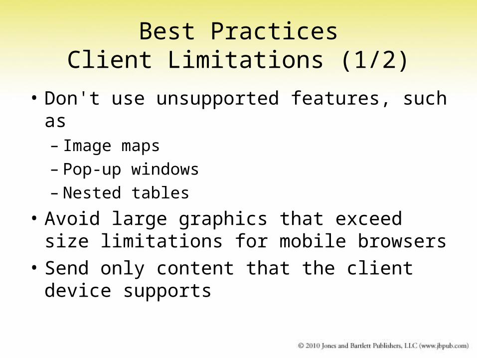
Best PracticesClient Limitations (1/2)
• Don't use unsupported features, such as– Image maps– Pop-up windows– Nested tables
• Avoid large graphics that exceed size limitations for mobile browsers
• Send only content that the client device supports
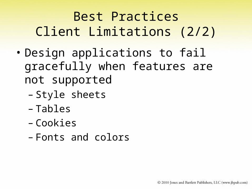
Best PracticesClient Limitations (2/2)
• Design applications to fail gracefully when features are not supported– Style sheets– Tables– Cookies– Fonts and colors
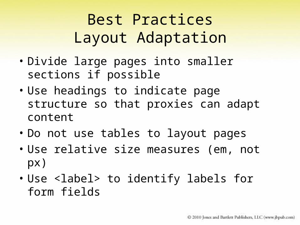
Best PracticesLayout Adaptation
• Divide large pages into smaller sections if possible
• Use headings to indicate page structure so that proxies can adapt content
• Do not use tables to layout pages
• Use relative size measures (em, not px)
• Use <label> to identify labels for form fields
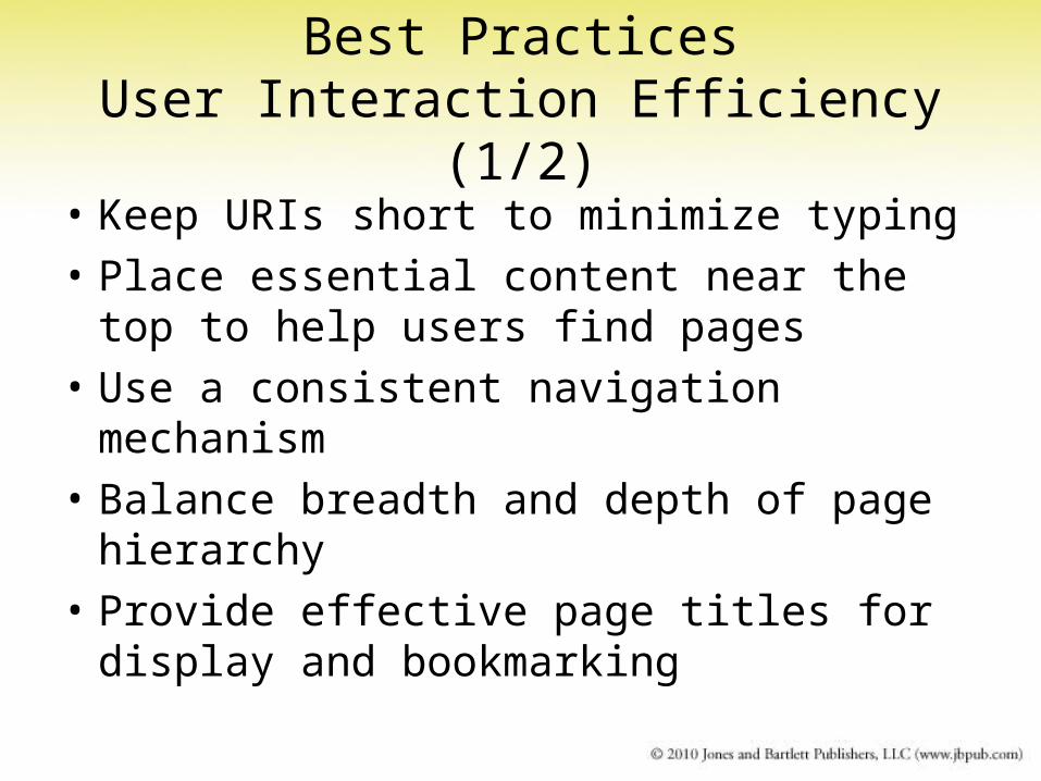
Best PracticesUser Interaction Efficiency (1/2)
• Keep URIs short to minimize typing
• Place essential content near the top to help users find pages
• Use a consistent navigation mechanism
• Balance breadth and depth of page hierarchy
• Provide effective page titles for display and bookmarking

Best PracticesUser Interaction Efficiency (2/2)
• Provide a text equivalent for each non-text item (image, applet, script, etc.)
• Minimize key strokes for data entry: provide default entries and menus
• Use scrolling in one dimension only
• Provide helpful error messages with links (back, retry, home, etc.)
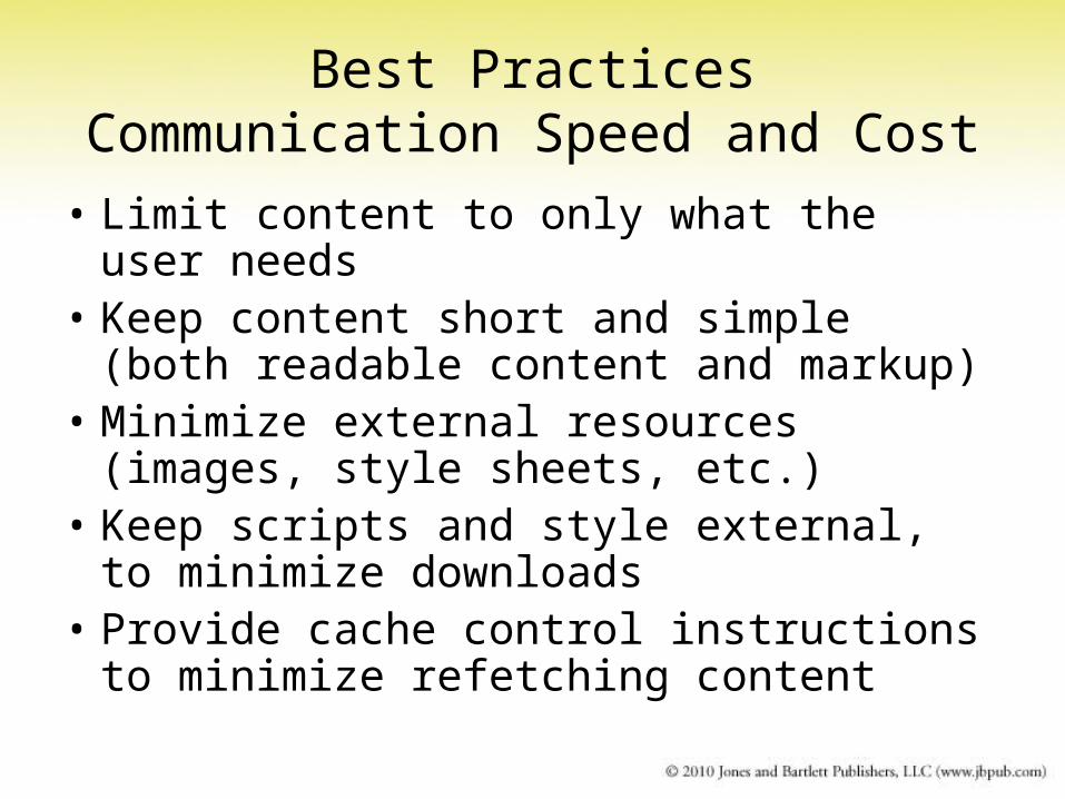
Best PracticesCommunication Speed and Cost
• Limit content to only what the user needs• Keep content short and simple (both
readable content and markup)• Minimize external resources (images, style
sheets, etc.)• Keep scripts and style external, to
minimize downloads• Provide cache control instructions to
minimize refetching content
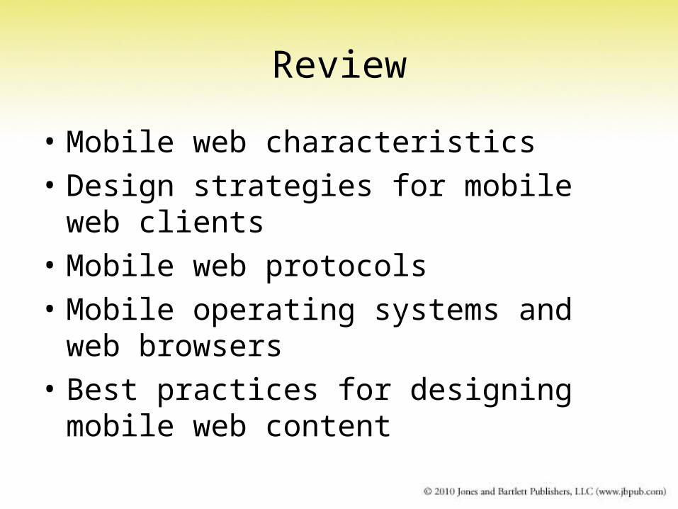
Review
• Mobile web characteristics
• Design strategies for mobile web clients
• Mobile web protocols
• Mobile operating systems and web browsers
• Best practices for designing mobile web content